
Welcome to the concrete jungle! – Design 5 of 10 – Manhattan!
Manhattan was one of the easiest cities to think of and find ideas for. It is a place full of buildings and architecture so tying this one in with the rest of the designs was easy. I began thinking of famous and iconic buildings in Manhattan; the Empire State Building being one of them. I then went to Pinterest to see what other images came up. There was a lot of images of the hustle and bustle of the city… skyscrapers, shops, people, yellow taxis, cars and pedestrian crossings.
I knew I wanted to play with the idea of the Empire state building and the fact that Manhattan and New York is like a concrete jungle. Central park played a part in my thoughts and ideas; I wanted to include a bit of nature in my design – this also allows the opportunity to bring some green into my design which would be a great contrast against the skyline of Manhattan.

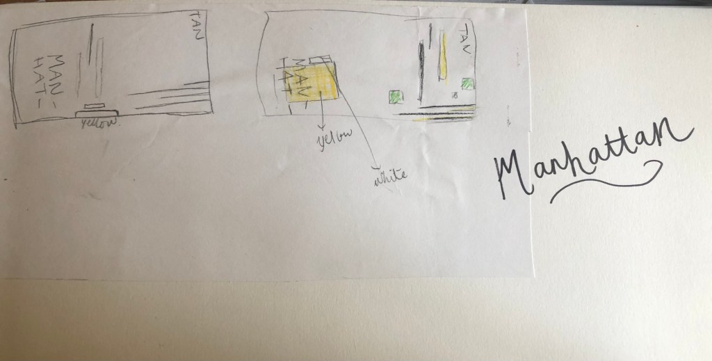
I used a block of yellow on the bottom left, once again this ties in with the rest of my designs so far. This yellow block represents a yellow New York taxi. The grey blocks that feature on it are the wheels and the top of the taxi. I placed a tiny block of colour at the top left also to add some interest and to draw the eye up to the top to work its way around the design. Yellow and black contrast each other brilliantly and they also represent the yellow cabs and the pedestrian crossings. The Empire state building I portrayed on the right side of the cover. I used blocks of black rectangles to represent this. It is abstract and can be portrayed in any way you want to; it could be the black lines on a pedestrian crossing or it could be the towers of the Empire State building.
In this design I feel the black and yellow equally fight with each other for attention, they are both very dominant in the design. The grey adds a little accent of colour to break it up.

This is the final mock up for Manhattan. I am pleased with this design, the colours work and contrast each other fantastic! It is modern and stands out and it maintains an abstract approach but it is still obvious as to what is being portrayed. The layout stays in keeping with the rest of the designs.
