The Brief:
After completing the previous “Tango with the Cows” exercise I now have a rough idea about the poem and what message it is trying to give to the reader. I dissected the poem into tiny fragments and pieced it back together to come up with my own conclusion of what it means but overall the poem is quite obvious and literal which means that when it comes to choosing images to portray the poem in a book for this exercise, the images that I choose will more than likely be the images that a 100 people completing this exercise would also choose!
I started off by sketching a few ideas out in my sketchbook and by writing some ideas down and listing the potential things from the poem I could find images for and use in my book…
This exercise also seemed like a good refresher in Photoshop!

The things I listed from the poem in my list I used in my book but the sketches that I initially drew out didn’t go to plan – the ideas changed depending on what free images I could source and use.
I downloaded a lot of the images I used in this exercise from Pexels; I have used images from here quite a lot!
Some of the images were also my own from photographs that I have taken from over the months and years and totally forgot about until I realized that they have potential in this exercise!
I decided to keep the images relatively small and sized them at 10x10cm each.
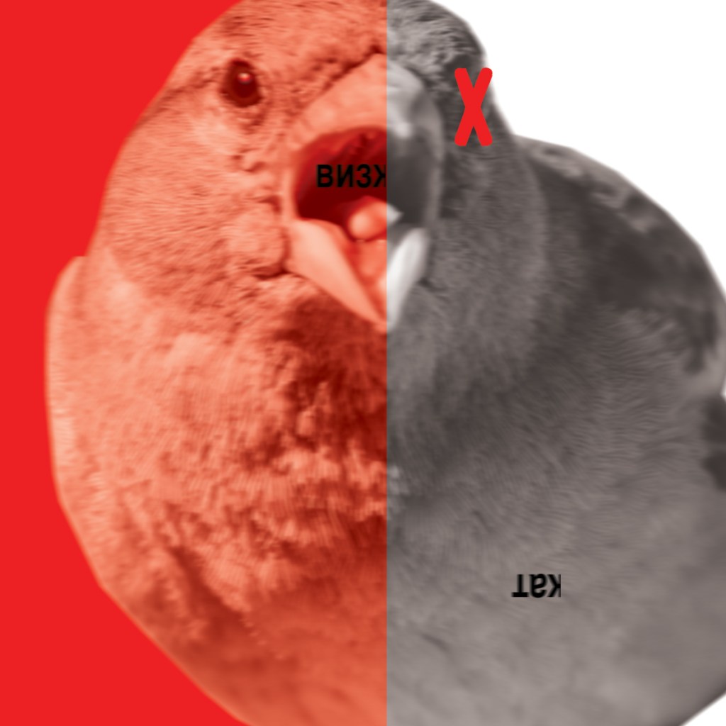
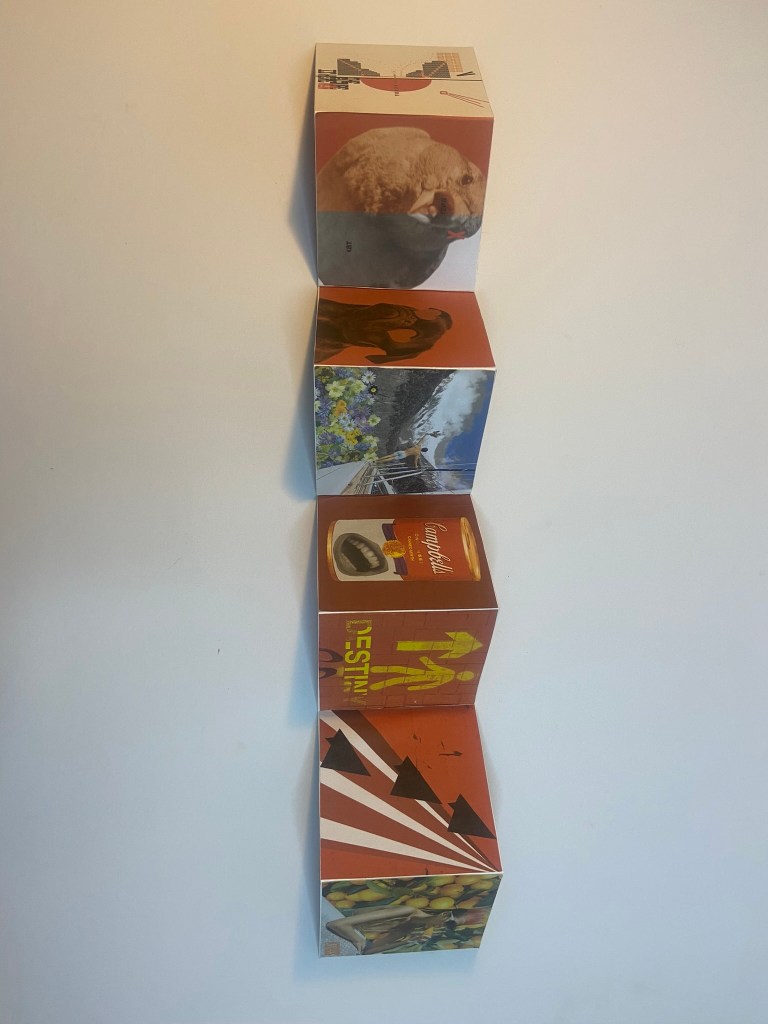
1) Squeal of a Sparrow
I started off firstly with the Sparrow; “Life is shorter than the squeal of a Sparrow” I wanted to somehow show the Sparrow beginning to “squeal” before ultimately his life was shorter and he died. I went on Pexels and found an image of a Sparrow that seemed like a good match and that I could manipulate in Photoshop.

I knew that I wanted Red to be the dominant colour in all of the book – this featured a lot in Russian, communist propaganda posters of the time and also it mirrored the style of my design in the previous exercise.
What I ended up with was this!

I used the same typeface (Russian) that I used in my previous design and I translated “squeal” into Russian to make it feel more authentic. The Sparrow has started to “squeal” until it is cut short and all the colour is gone and the life is taken away to leave black and white and half of the word “squeal” has dropped dead onto its back. I quite like the use of the red X on the birds eye to symbolize that the bird is dead but to also add contrast against the black and white.
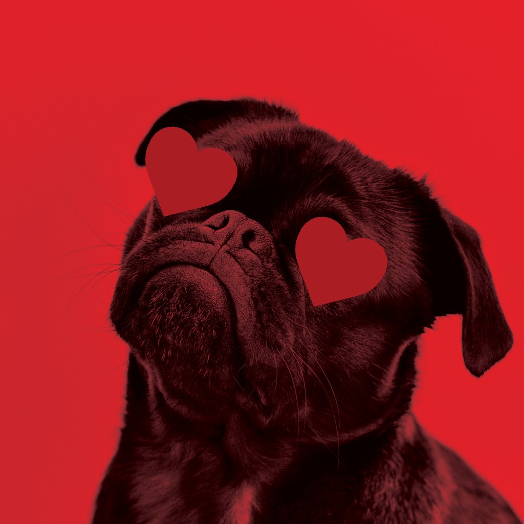
2) “Like a Dog, regardless”
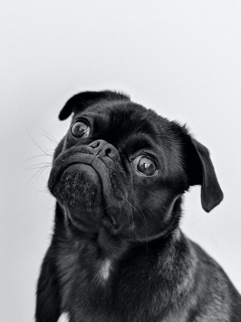
I feel like the whole vibe of this poem is a sarcastic p*ss take! For that reason I wanted to try and not make the images I chose for my book too serious. This part of the poem I think is a mickey take on sitting loyal and sitting dumb like a loyal dog.. In my head I had the idea of a big dog like an Alsatian or a Labrador but instead I decided to go with a Pug as they are possibly one of the most mischievous, yappy and self centered dogs! Once again using Pexel I sourced a free image of a Pug that I felt would work well in my book:
I decided to use very little/if any wording on my images because I wanted the images to speak for themselves and hold their own narrative so simply for this design I placed a couple of love hearts over his eyes to show a loyal love and that was that for this image!
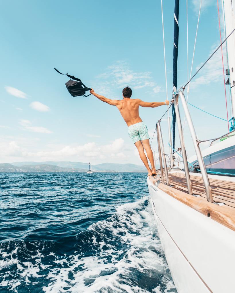
3) “Sailing on an Ice flow down the river in Spring”
The idea for this from my initial sketches through to final image was quite similar.. I had the strong image in my head of a random mix of images all collaged together to make something ridiculously unreal! I had the idea of a vintage 1950s man sailing a boat with Swiss mountains and blue sky in the background swimming in a sea of spring flowers!
I started off by sourcing another free image from Pexels of a man sailing on a boat, the image didn’t take itself seriously – I mean the man was half dressed which made it insane for sailing in the ice flow! I then brought the image into Photoshop and cut around the Mediterranean sea and tropical backdrop to try and match it with some snowy Swiss Alps!
I then went and found another free image of something that I could relate to a picturesque Swiss background and again, removed the bottom of the image so that I could quite easily montage the 2 images together:

I then just needed some lovely, bright Spring flowers and then the collaged image would be complete! I found this one, again it was free on Pexels:
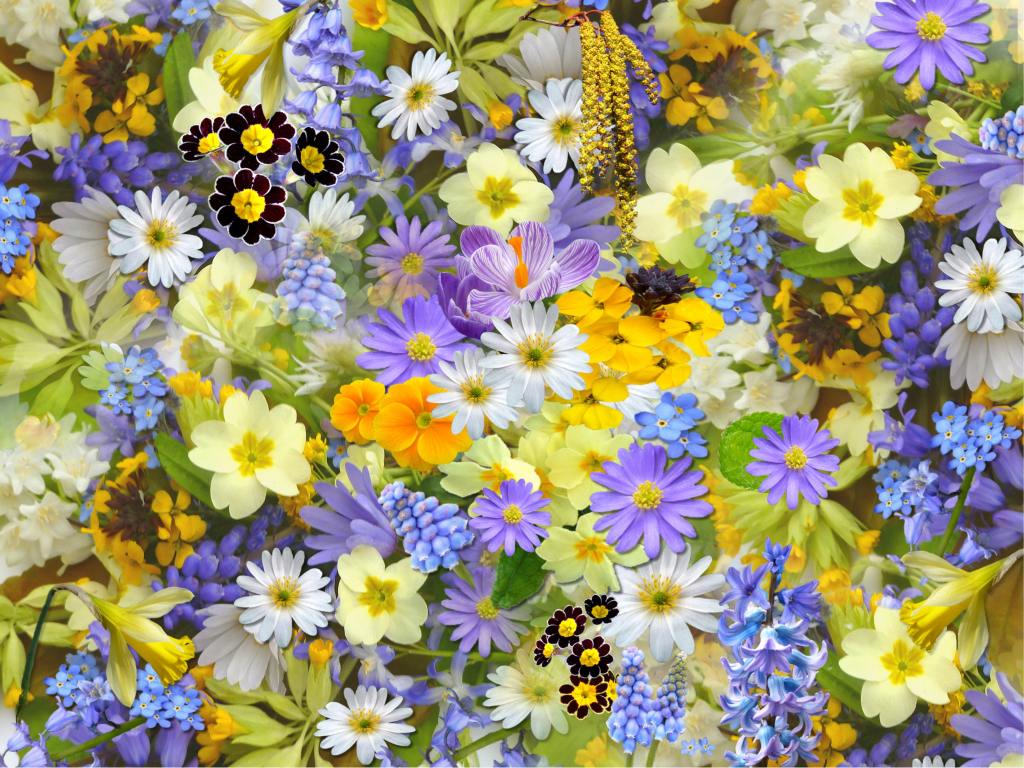
I liked how the flowers were a contrast of colours; the pop of bright, spring like yellow against the cool, icy blues!
The final collaged image turned out to look like this!
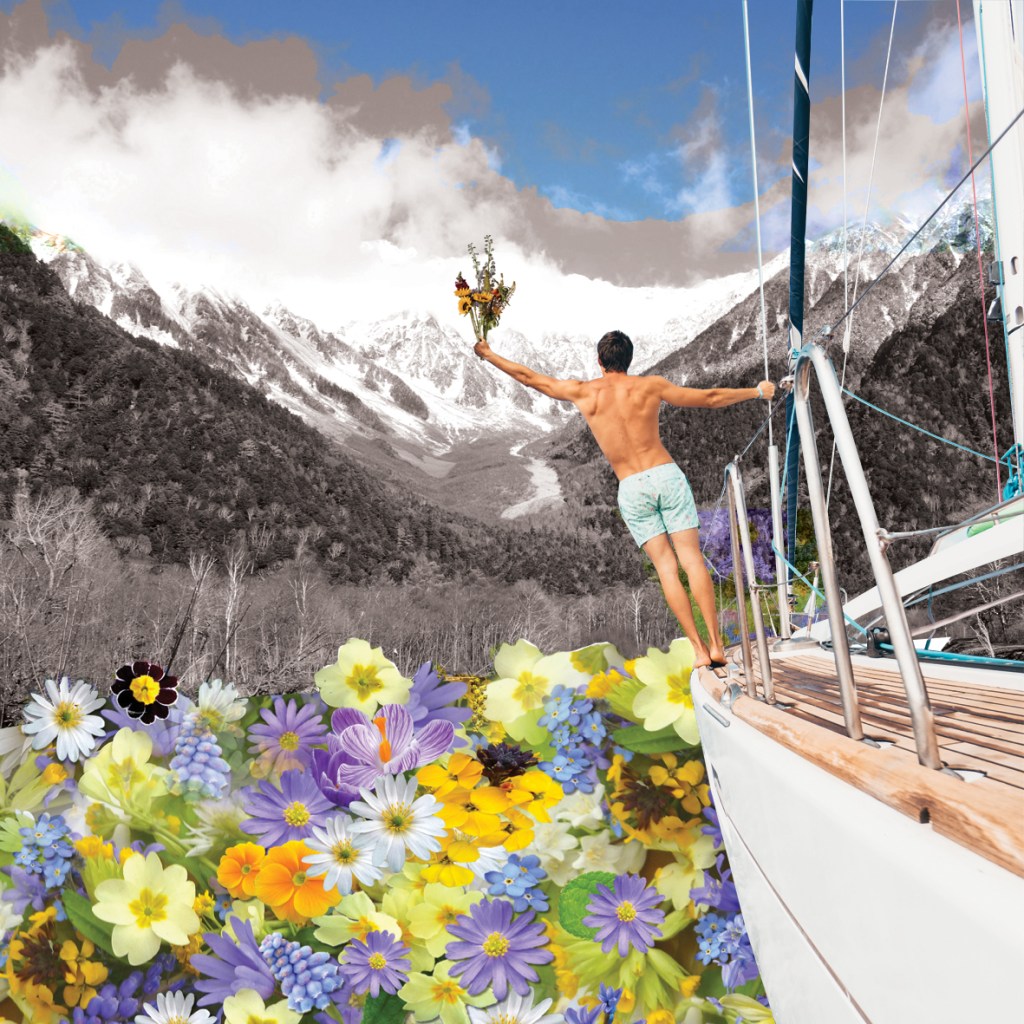
I decided to make the cold, Swiss mountains black and white to emphasis the cold and to also contrast against the warm spring blue sky and flowers. I also found a free image of a spring bouquet on Pexels that I cut around and manipulated in Photoshop to place in the mans hands as if he were sailing with a gift to the beauty of the landscape!
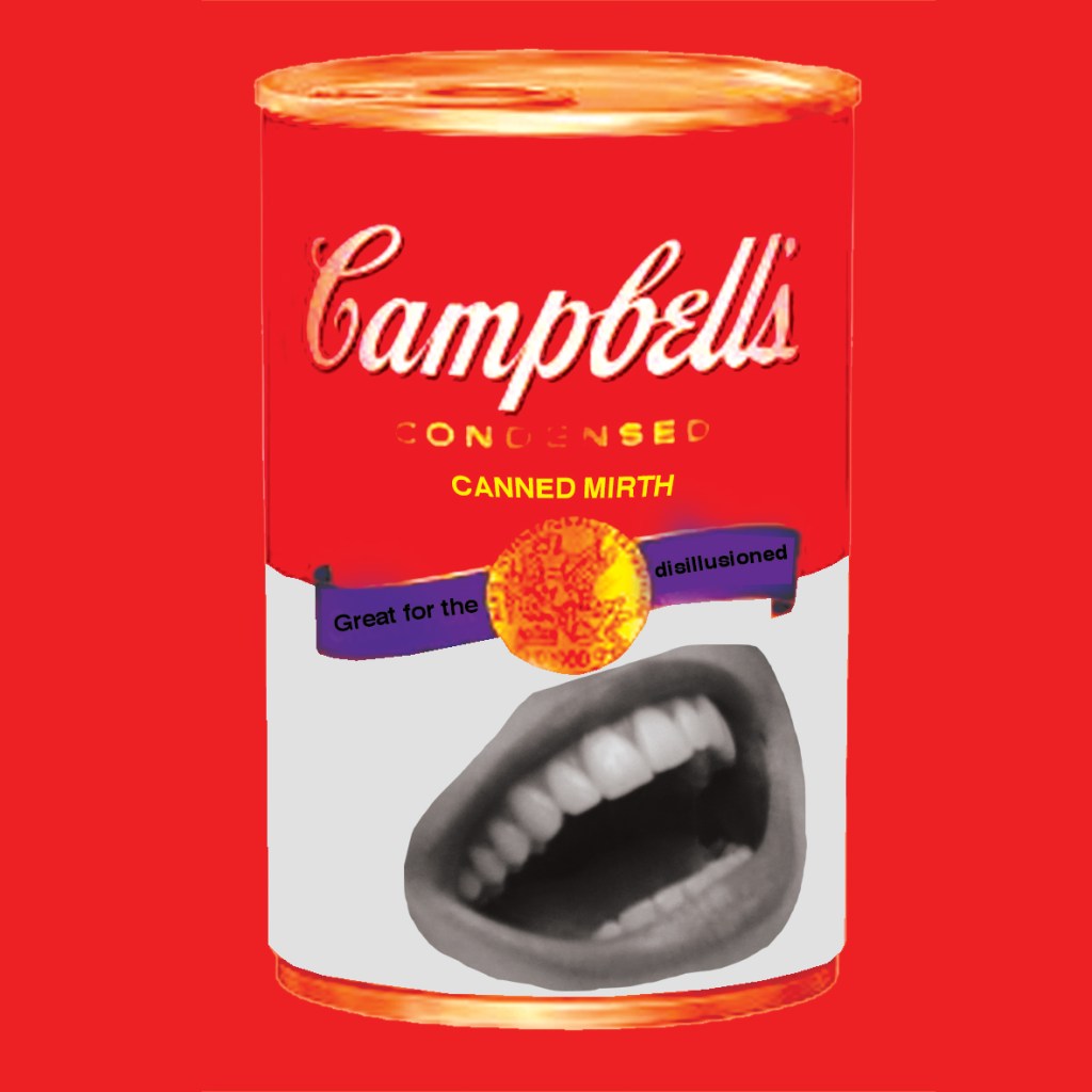
4) “With tinned merth..”
The image that I initially conjured up in my head and initially sketched and the image I ended up creating were again very similar. I had the idea of an Andy Warhol style 1950s soup can with a cheesy smile on it and a sarcastic slogan about how it would help with depression or feeling disillusioned..
I found an image of a Soup can on Waitrose website; usually I would never steal an image like this from a website because the quality of web images is poor to then take into Photoshop and manipulate further; however, I wasn’t too bothered this time as I knew the image wasn’t going to be taken seriously and the type of style that I wanted to create in this book was not professional or ” well put together” it was more roughly collaged and cut paste.

I put a filter over the image to give it a vintage feel and then found a free image of a woman with a nice smile that I then cut and pasted onto the can.

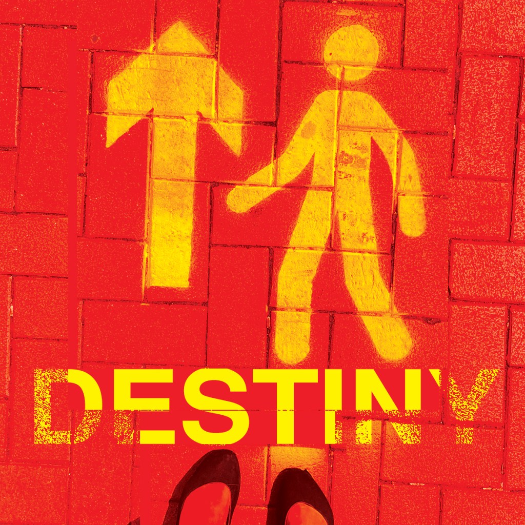
5) “… we look at our destiny”
For this part of the poem. the idea of standing at a turning point with a direction arrows in front appeared in the forefront of my mind! I then remembered when it was the Covid lockdown days that I took a photograph of some freshly painted “one way” signs painted on the floor throughout my town. I remember feeling at the time that the sign was very much how everyone must have felt; being directed one way against our will and not really knowing where we could end up. I decided to use the photo of this sign because it could also symbolize destiny and the feeling of not really knowing truly where we might be heading.

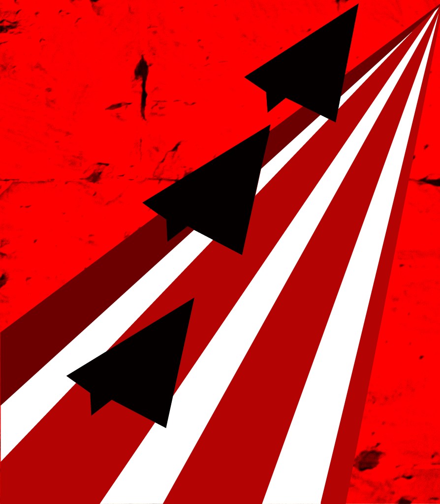
6) “..Conquerors of the air”
The idea I originally had in my head for this was 3 fighter planes from WW2 – I struggled to find a copyright free image for this! Instead I opted for some illustration work, I had the idea to create 3 blocks of colour in the shape of paper airplanes and then have them taking off from a runway made out of stripes.
I wanted a real gritty feeling to the collage also, so I added a texture behind the image of a textured brick wall.
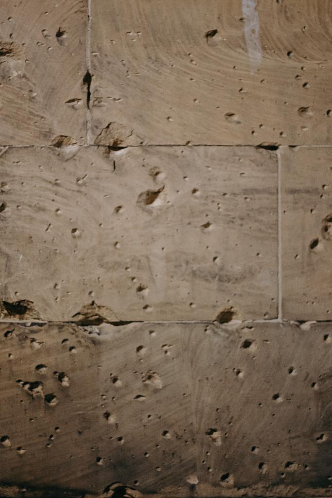
Once again I kept the image in a signature Red to tie in with the rest of the images and to create a them throughout the book.

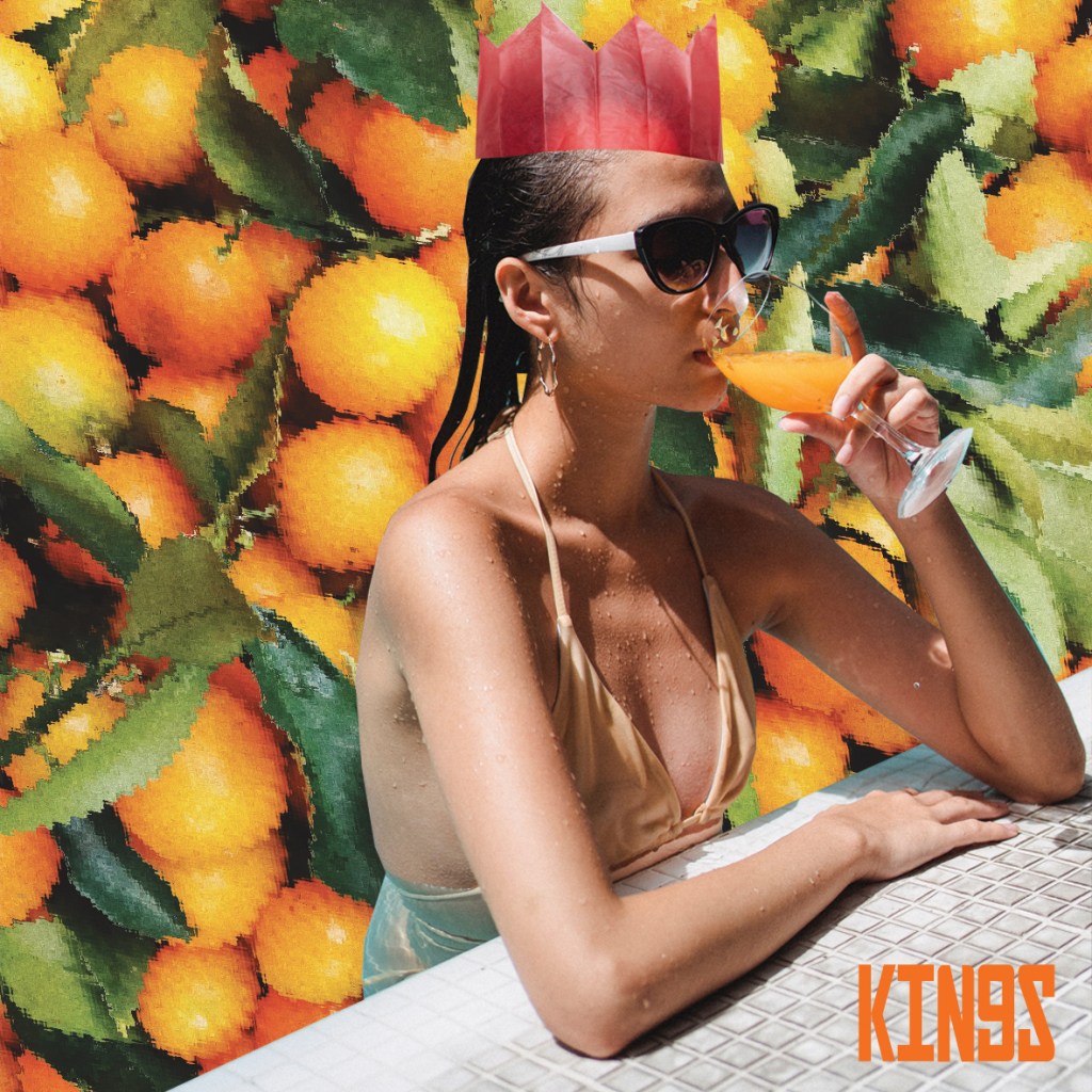
7) “Kings of Orange groves”
In my original thoughts and initial sketches I had the idea of a 1950s housewife living her surburban dream drinking a glass of Orange juice that they have reveled in planting and growing. Once again though I struggled with finding a copyright free image of a 1950s housewife so instead I put a modern twist on it when I stumbled upon a woman drinking a glass of Orange juice in a swimming pool – it summed up the materialistic, blasé feel of the suburban people in the poem; the “Bourgeis-ness” of the people.
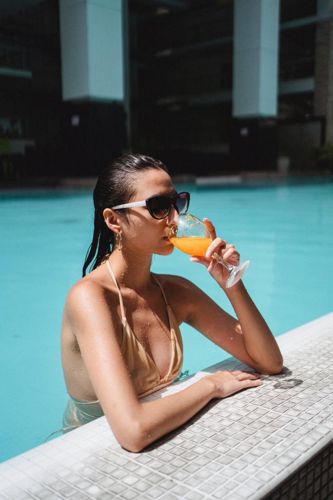
I cut around the pool and I had the idea to do something similar to the ice flow and have her swimming in a pool of her “wealth”- the Oranges. The poem calls the people “Kings”, again I feel that this is in a very sarcastic manner. I did originally want to place a crown on he head but then I thought I would add some humor and p*ss take to the piece by making her crown a paper hat. It shows how these people were disillusioned by their lives. I also added a ripple filter onto the Oranges which help to make them look like they are underwater.

8) “Cattle”
My original idea for this collage was to show greed towards money behind the idea of keeping the cattle. The “cows” of this poem were very interested in making money and profit. The cattle were a means to an end for the people to have this.
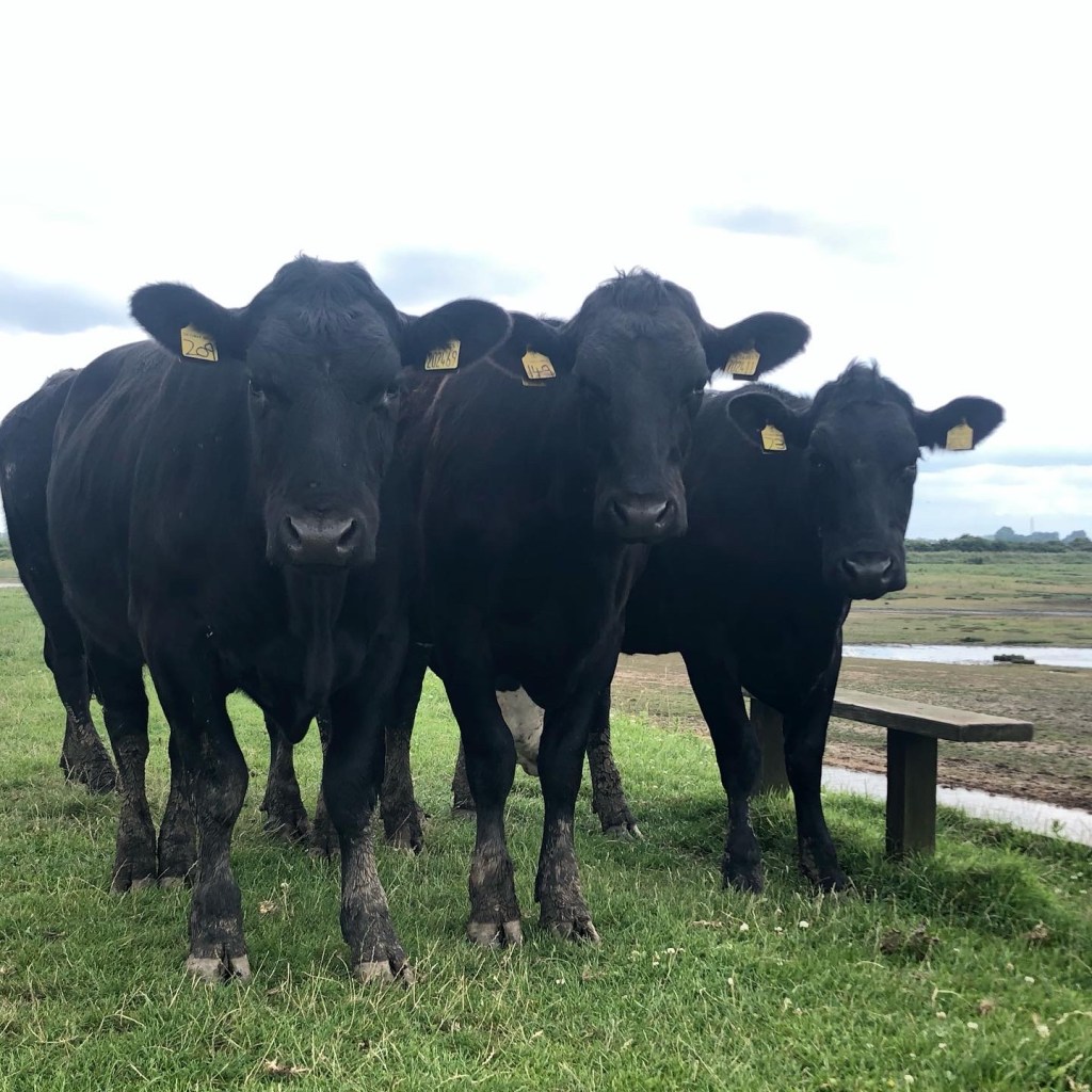
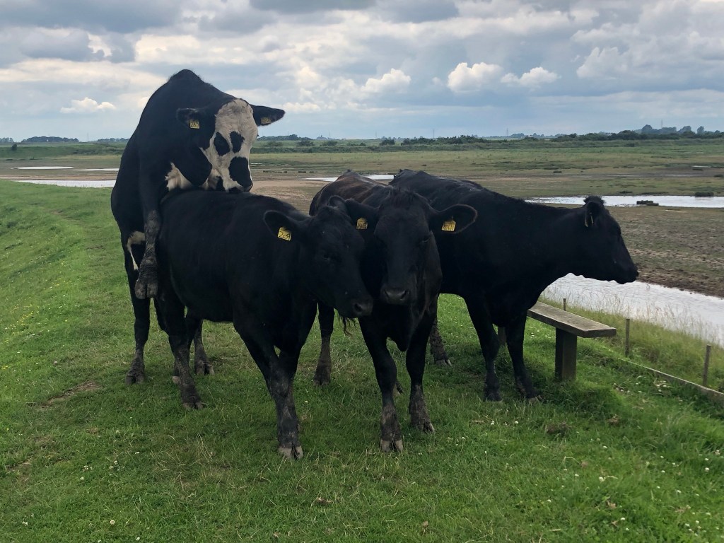
I had the idea of some Highland Cows copy and pasted onto a design with dollar notes covering their faces. I started to look for free images once again and found a load of cute ones I could have used.. however, I like to try and use my own images whenever I can and I remembered that a few years ago I went to a marsh where there was lots of wild cows that I photographed. There was one I took of 3 near enough identical cows “bros!” and I decided to use this for my image!
I then needed to find some money… when I searched it always came up with American Dollars, this would be useless for my piece as the book was about a Russian poem! I then did a generic search in Google images and found on Wikipedia a Russian note – again, not particularly bothered about the poor quality of the web image I continued to save it to use in Photoshop. I knew I wanted to be putting filters over my work anyway, the quality of the work didn’t need to be precise.

I had the note overlapping the photo; using a Red photo filter for the Cows and then making the money the colour of money and greed! – Green!
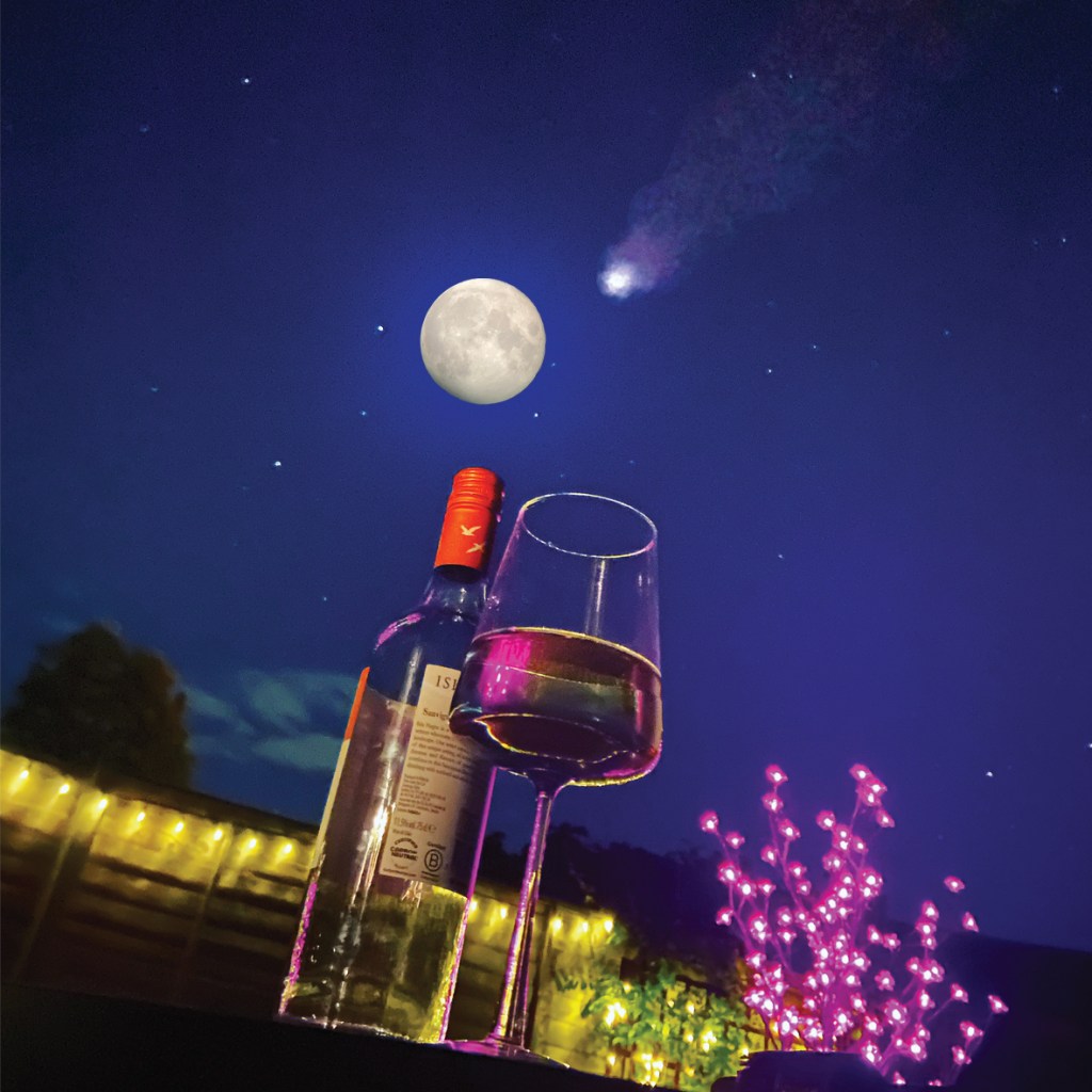
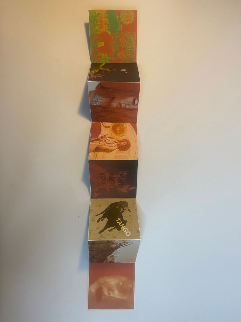
9) “Drink a glass of wine to the health of comets..”
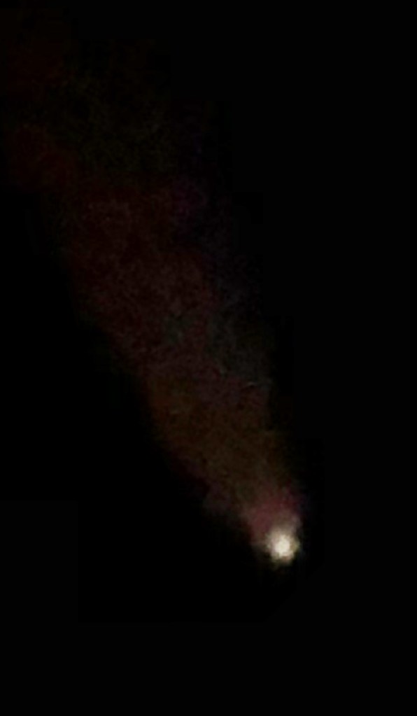
My original idea for this again differs from the image I eventually went with. I had the idea again of suburban 1950s couple having a glass of wine and holding a stethoscope up to a comet.. a tongue-in-cheek, playful approach… however, once again trying to find free, copyright images of a 1950s couple was challenging.. I then remembered back to when I got my new iPhone in May and I was drinking wine outside with a firepit on a really clear night and messing around to see how good my new camera was. I took a really good photo that I Instagrammed at the time because it was so clear! The night sky was a royal blue and the stars were twinkling! It then reminded me of how me and my fiancé have also photographed the moon through his telescope before and also one of the first nights we spent together photographing and watching comet Neowise from 2020. If I could merge all these photographs I could create my image for this part of the poem.


What I ended up with was this!
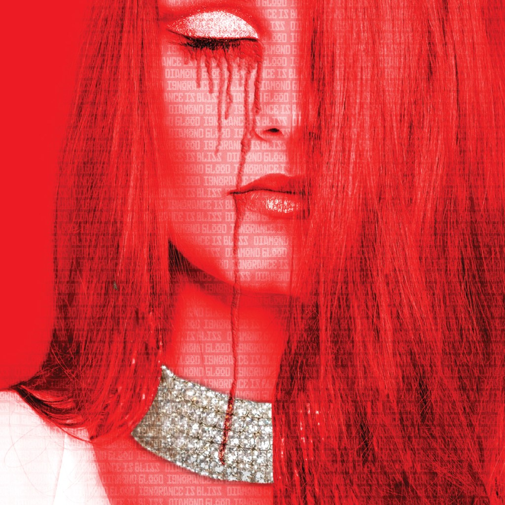
10) “Diamond Blood”
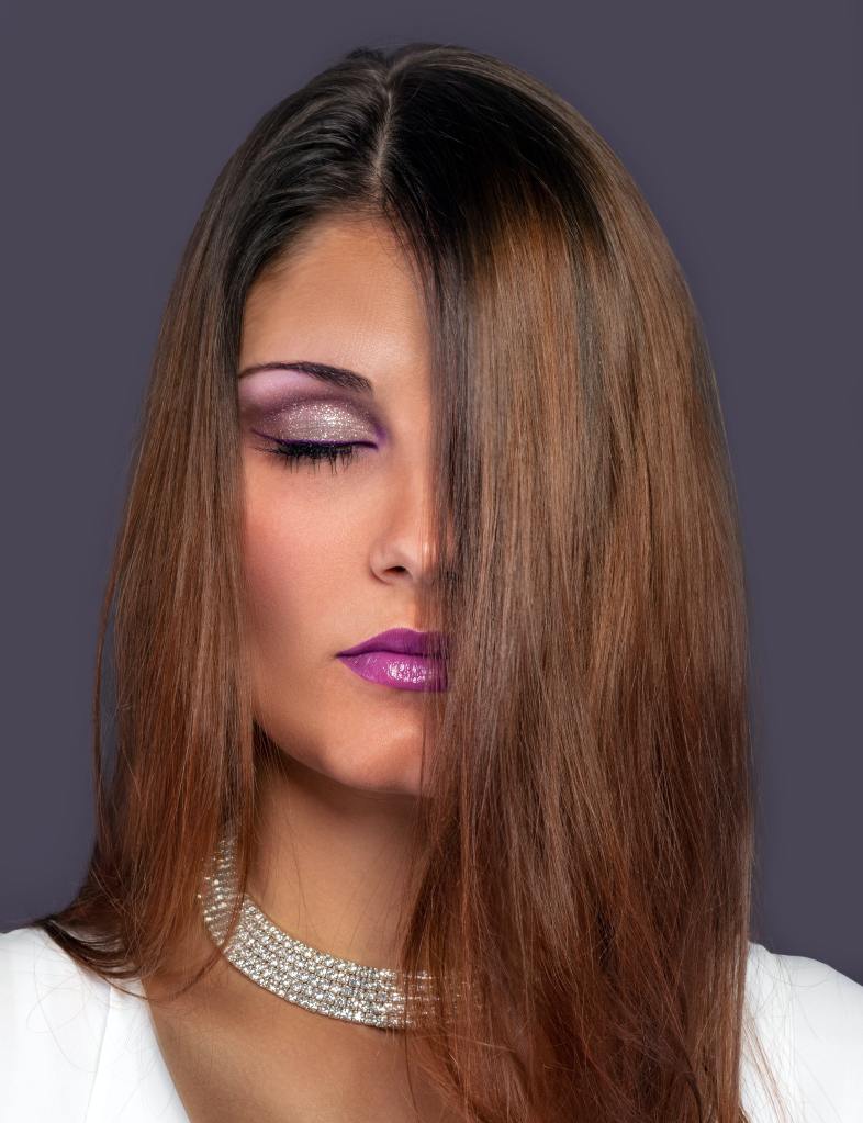
Diamond blood is where diamonds are mined in a war zone and the money and profit from these diamonds is used to fund terrorism or war. I feel like the people in this poem knew exactly where there diamonds were being sourced from but carried on naively “ignorance is bliss” throughout their daily suburban lives. I wanted to show a woman wearing a really lavish necklace but with the blood stains on her. Once again I started to find an image on Pexels that would show a lady wearing lavish diamond jewellery. I found this one which I felt I could work with and I liked the fact she had her eyes closed which showed her ignorance and lack of wanting to see the truth behind the industry she was helping to profit!
I gave it that very communist, vintage feeling making Red the prominent colour again; it also represents blood. I copied a section of the necklace and montaged it over her eyelid just for that little bit more lavish extravagance! I created the blood dripping from her closed eyes using the paintbrush tool on multiply and adding a bit of noise to create a jagged effect. Using the bevel and emboss tool I then added a bit of depth to the blooded tears to make them look a bit more realistic.
I overlapped the words “diamond blood and Ignorance is bliss” all across the image to make it clear what was happening as this to the unfamiliar is more complicated in meaning.
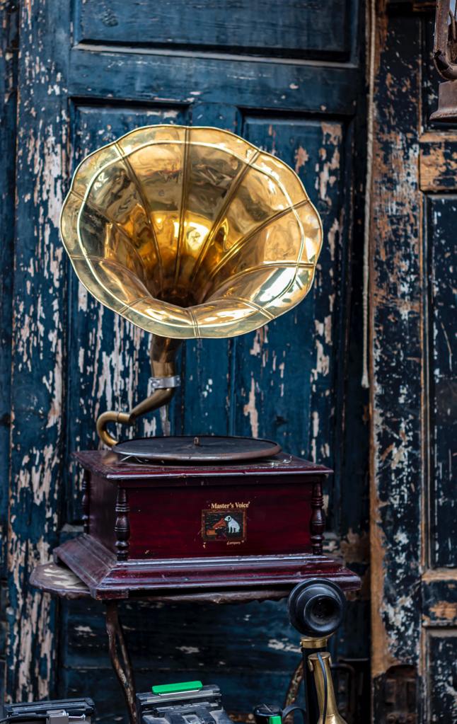
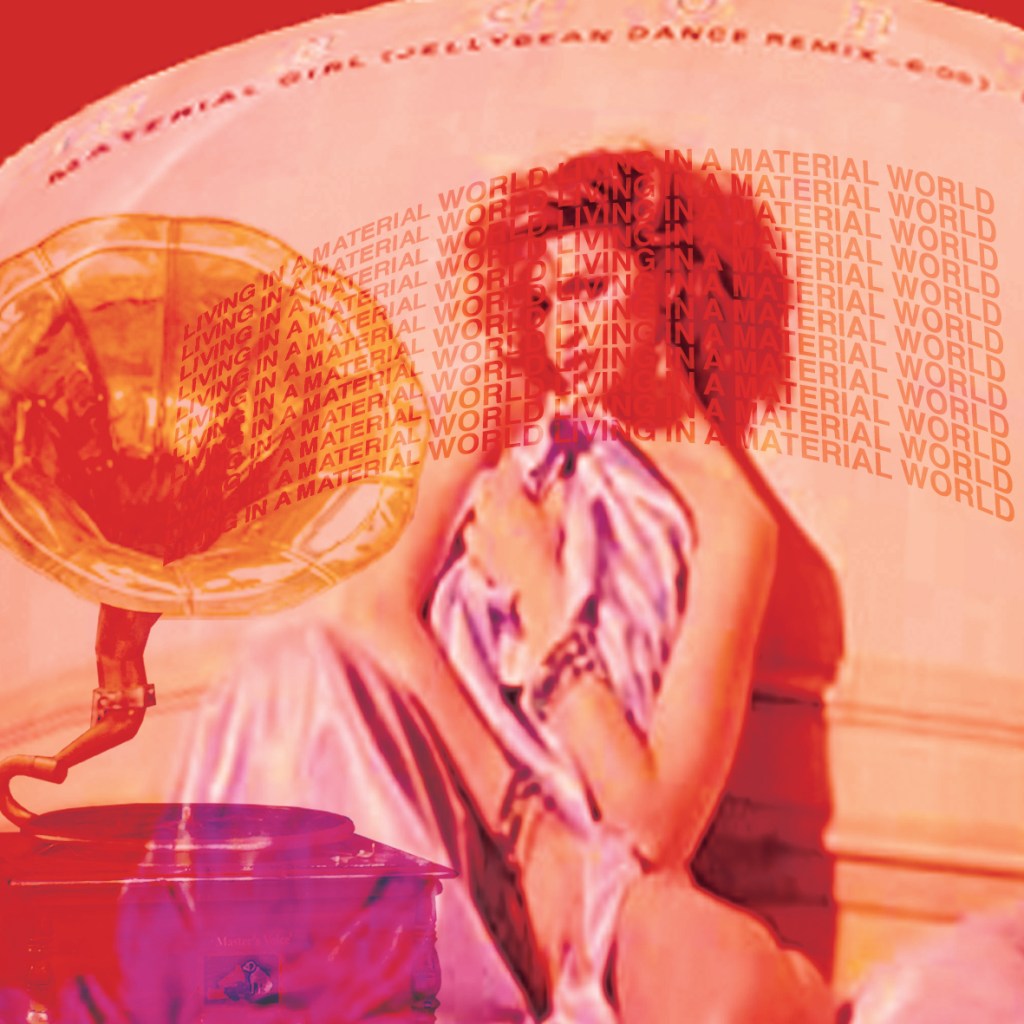
11) “We’ll get a record player..”
There is only one image of a record player that sits in my mind and that’s like one of the big HMV Gramophones! Buying a record player in this poem signifies the materialistic side of the people again – they are living in suburban hell but cover their angst and worries with materialistic objects such as the record player. The one and only perfect record to play on this would be Madonna and Material Girl! I decided to put that modern twist into the image and include the cover of the Material Girl vinyl on the front of my image. First though I needed to find a record player! – I found a free photo of a record player on Pexels to cut around in Photoshop and use:
I then saved an image directly from Amazon of Madonna’s Material Girl vinyl; again, not caring much for the low quality of the image:
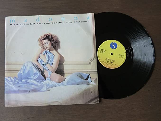
I then typed some of the lyrics from the song to look as though they were blasting out of the speakers of the record player.

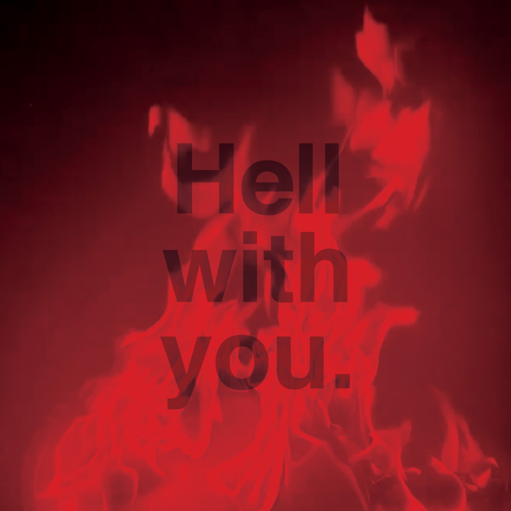
12) “Well, to hell with you!”
There is only one visual that is conjured up when hell is mentioned and that is the fiery flames that fill the pits of hell! I have so many photos of flames from our firepit that I have taken over the months that I decided to use one for this image rather than using another stock image!
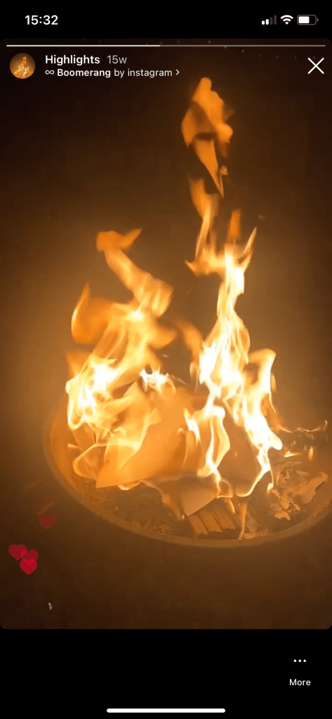
I kept it short and simple with the rest of it! Good ol Helvetica with “Hell with you” over the top.

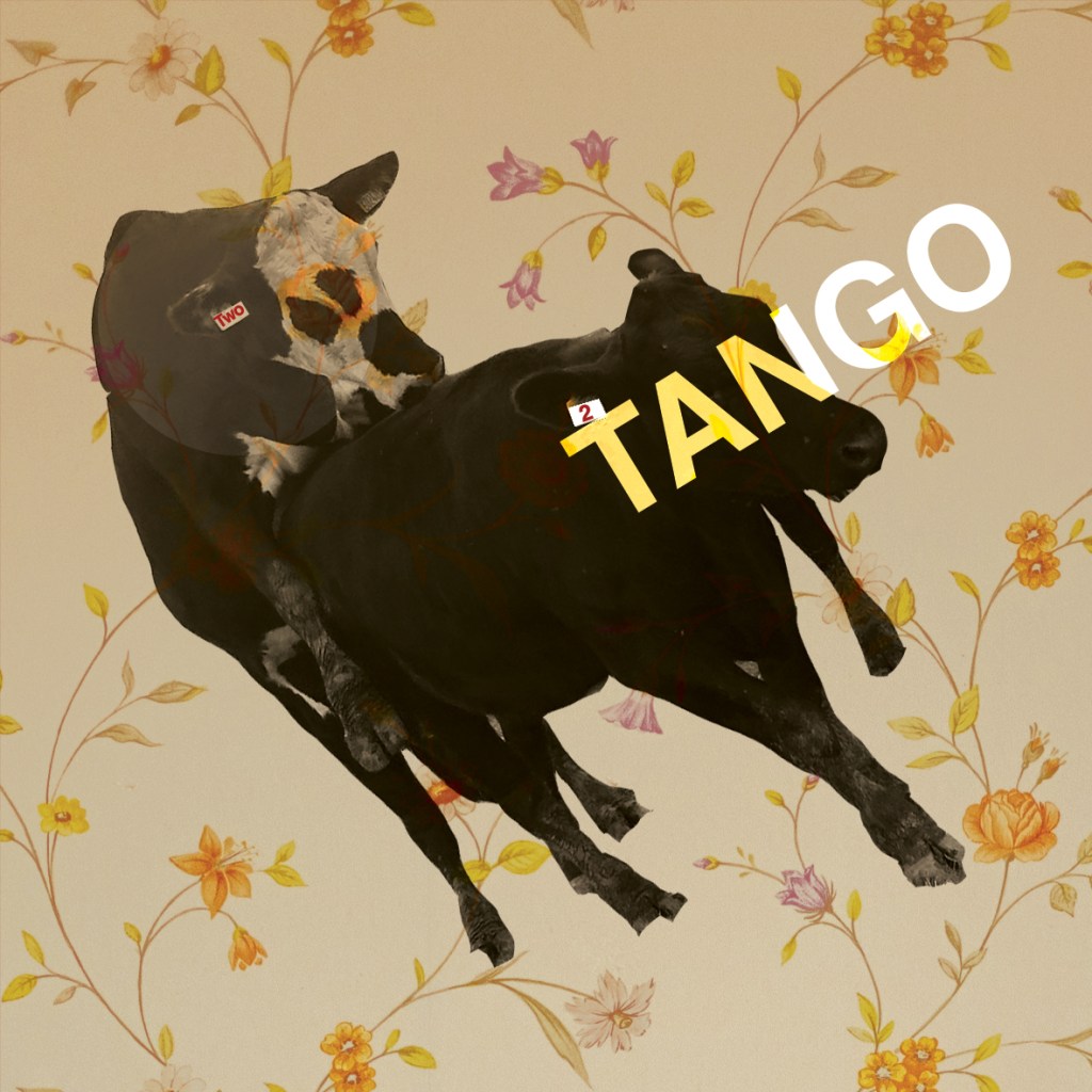
13) “I want one to dance one tango with Cows..”
This is the part of the book that I have possibly done differently to how anyone else might have done! With this part of the poem it is all to easy to picture a Cows head imposed onto a humans body in a Tango dancing move. I thought back to the photographs of the cows I took from that trip to the Marsh and funnily remembered how I accidentally caught aa snap of 2 cows in the act! “It takes 2 to tango!!”
Immediately I thought of this photo of the 2 cows against a floral suburban backdrop with maybe a big grin imposed onto one of the cows, (a bit like the tinned mirth!) as the main image! I tried it but it did look a bit distasteful and like I was trying to reference humans having sex with cows! – so I quickly dismissed that idea and simply used the term “It takes 2 to Tango”.
The pretty floral wallpaper I found on Pexels:


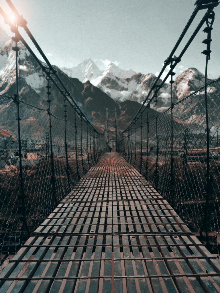
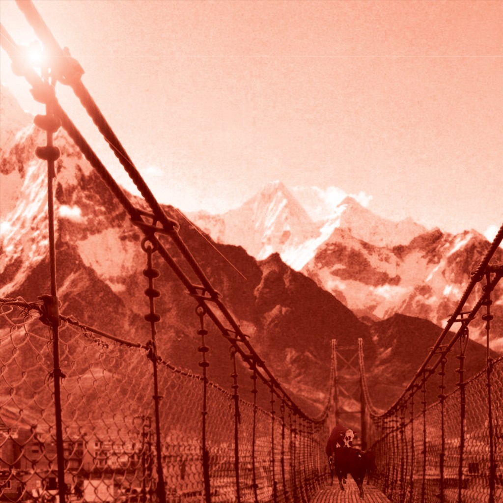
14) “Build bridges”
This was an obvious image to pick. I went onto Pexels and found a bridge with a Swiss picturesque mountain background to match the feel of the ice flow narrative. I liked this bridge because it is very Urban and modern looking which is what the poem is wanting the suburban people to do… take a step across the urban bridge and take a glimpse of modernity and new times.
I put the red photo filter over the top of it so that the image looked in keeping with the rest of the book and then I sneakily added in that infamous photo of the cows doing the Tango in the middle of the bridge!
15) “to the tears of crimson girls..”
I never actually knew who the “Crimson girls” were in this poem… Red is a daring colour and I guess for girls to be red I might make an assumption and assume that they are ladies of the night or professional sexually active females.. basically women causing taboo of the time by refusing to just being a basic housewife and living a suburban life under the eye of a man. I could be totally wrong though! As I don’t know why they would be crying either!.. Either way I sourced another free image from Pexels and went to work changing it in Photoshop to meet the criteria of my book.

I did originally think to make her tears red but I figured that would look too much like the diamond blood image. Instead I opted to make her hair and lips Red, I like the way that the paint brush tool makes her lipstick look like it has been blotted and rubbed onto her face! I cropped out a lot of the original photo choosing to concentrate on part of the image only. This image turned out quite faint with all the Red and when I printed it out it looked quite muted but again, I will go with my original musings of them being ladies of the night and I feel that the quite secretive, faded image adds to the mystery!

16) The poem itself
For the 16th narrative I chose to include my design for the poem from the previous exercise; It would feature as the first picture of the book.


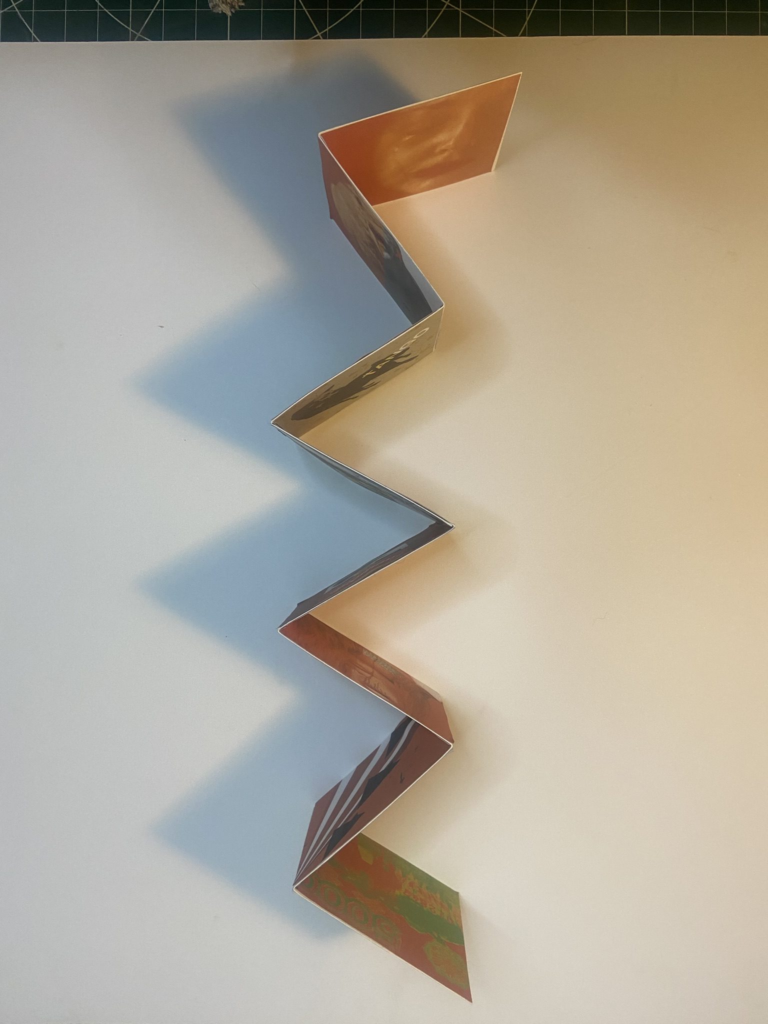
Making the folded narrative book
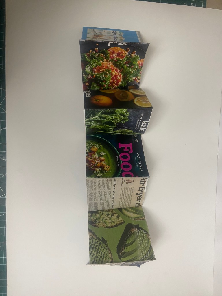
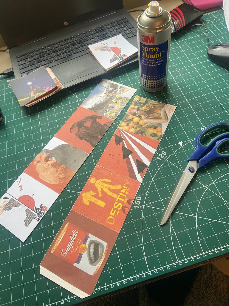
For my book to be folded and stable and hold its own weight when it is stood up, I needed to use a white board for the backing. I have 16 images and I needed to distribute them evenly on both sides of the folded book so I placed the beginning 8 narratives of the poem on one side and the remaining 8 on the other side. Sadly I have been stuck at home with really bad flu for 3 weeks now and haven’t been at work to use the lovely colour laser printer so I had to do a home DIY job and print my images out using the inkjet printer. This is not something I would want to do all of the time because the quality of inkjet printers are poor – they don’t give that glossy professional look and feel that laser printers give. My inkjet printer is only a basic A4 home printer so there is no way that I could rearrange all of my pages to fit onto one sheet of paper! I needed to organize my images into groups and print them into groups to then photo mount onto the whiteboard backing. I printed all my images onto A4 plain white copy paper. If I was to have these professionally printed I would make sure that they were printed on a high quality, glossy lightweight card.
Tutor Feedback / Reworked Designs
When I submitted this exercise I knew that I had not achieved the best that I could do. I was pushed for time and I went with the easiest option rather than pushing outside the box and matching the effort that I had put in with dissecting the poem in the previous exercise. My tutor feedback reflected what I already knew; it lacked thought, creativity and it did not match my own ideas that I had of the poem. I decided to try and fix this by creating new images which would better match my interpretation of the poem.
From reading the original poem (and as I explained in the previous exercise), my interpretation of the poem was that it was about a group of superficial, unhappy, privelledged, middle class, suburban people who blissfully live in ignorance and are happy to live in a facade of fakeness.
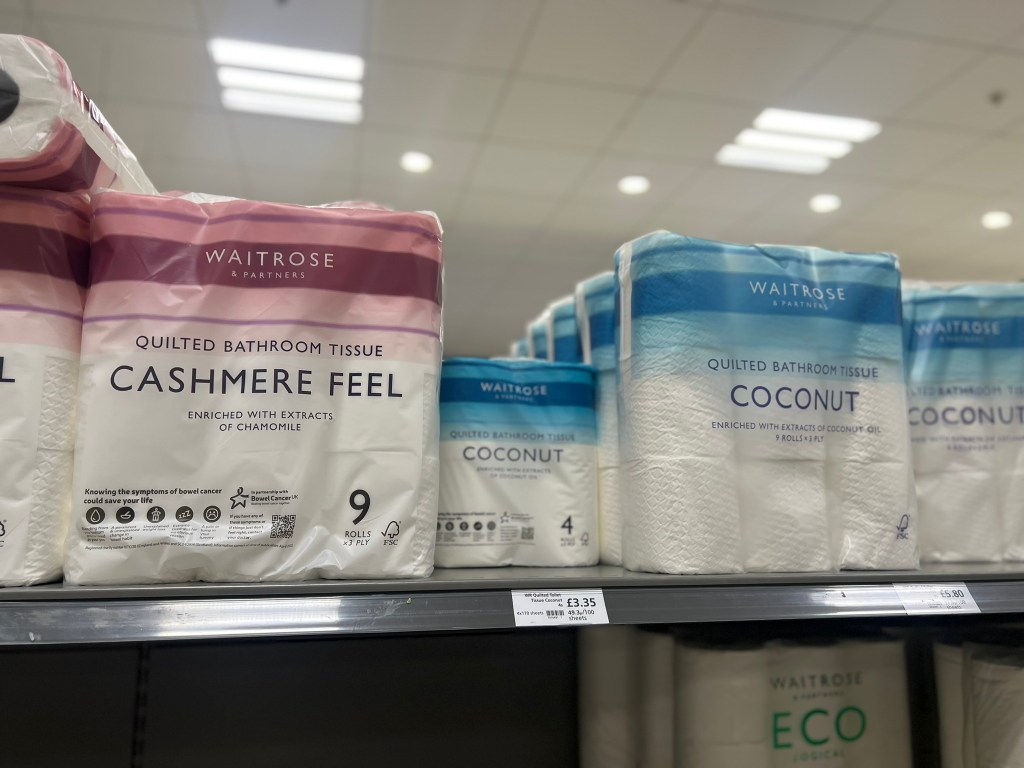
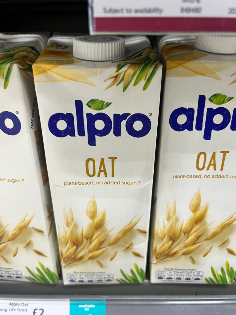
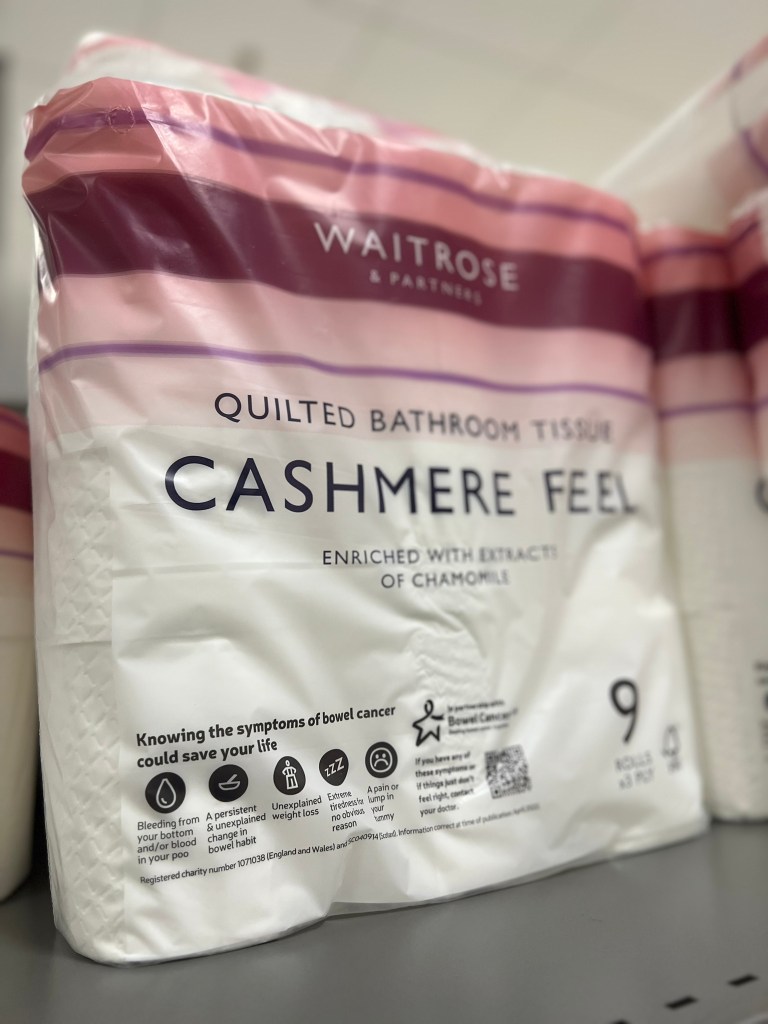
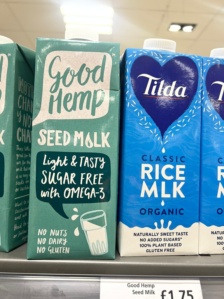
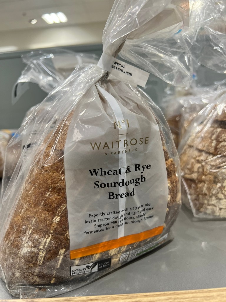
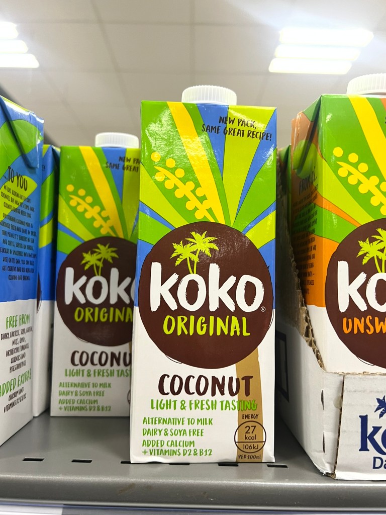
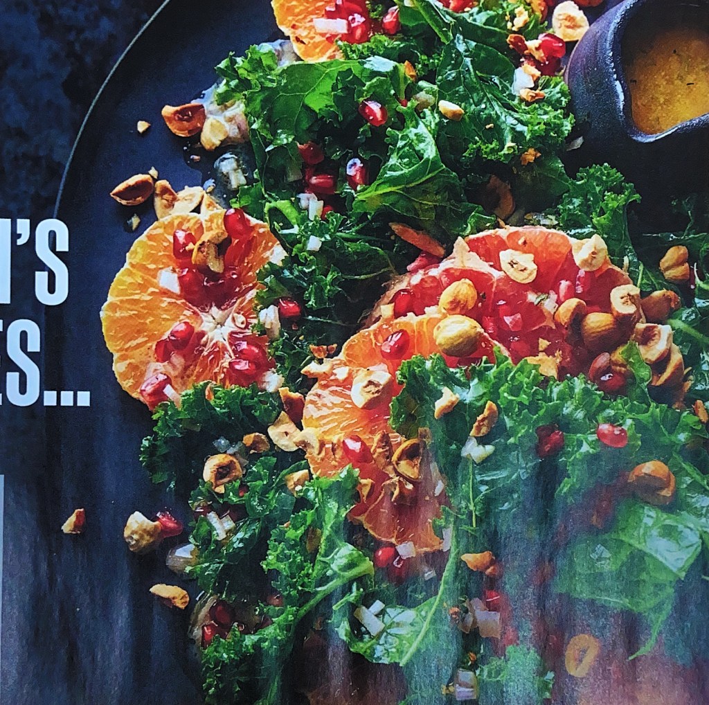
I did a bit of research into middle class living and a lot of the things that popped up online were to do with things overheard in Waitrose and the middle class families that shop there and buy middle class things such as avocados, cashmere toilet roll, all different kinds of nut milk, Quinoa etc.. to trick themselves into thinking they are much more elite than what they actually are!
I decided to use this in my favor and I went to Waitrose, took some photographs of some of the items that were written about in the articles and then bought a Waitrose magazine and took one of their free Waitrose Weekend newspapers as material to potentially take images from or to print onto.
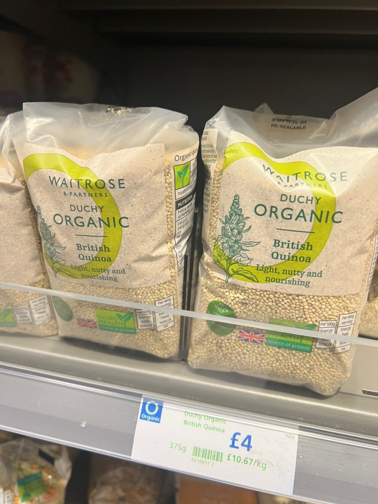


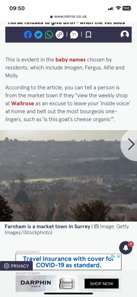

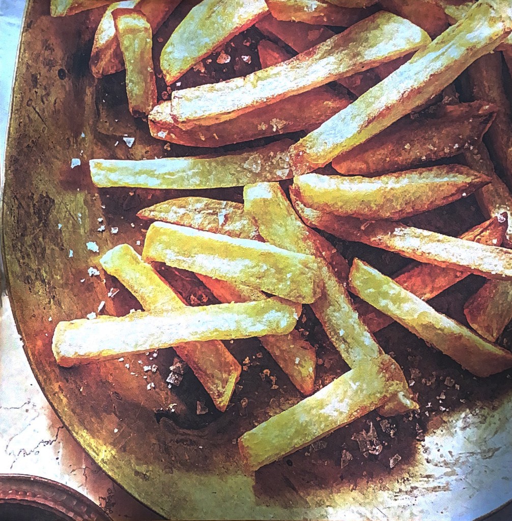
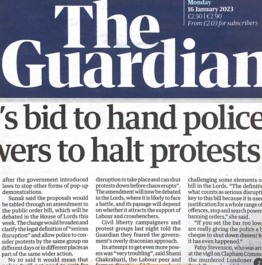
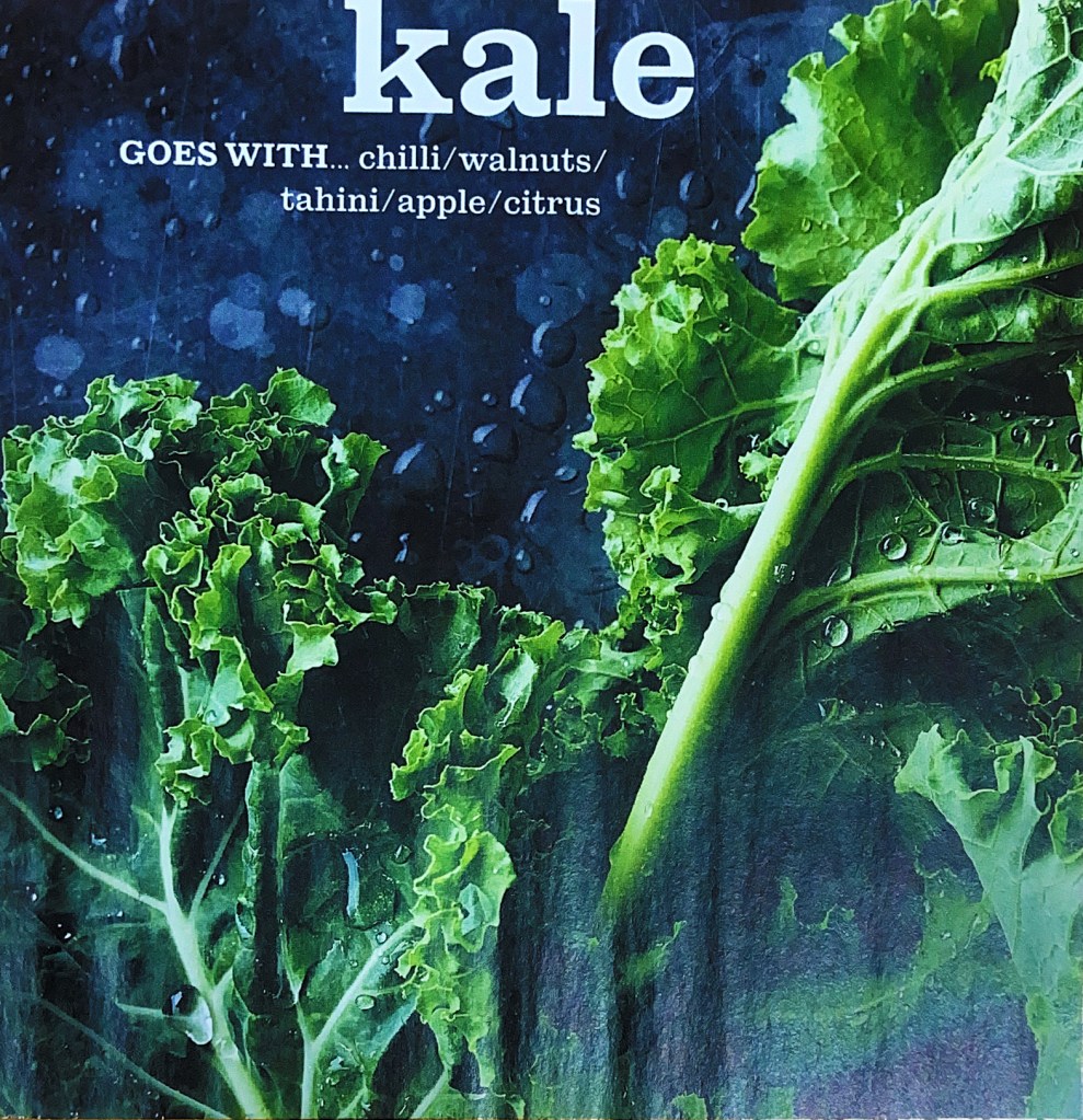
I then used the Waitrose magazine and the newspaper to cut out relevant, appropriate images that might closely match my interpretation of the poem. The images with the Airfryer were quite humorous as this is an icon of middle- class, lockdown suburban bliss! This is something that sums up everybody following a trend like sheep! I also found in my local newspaper a report about a fight that incurred over an Airfryer which gave me ideas for my design… The increase in fuel prices best sums up technology and greed, The Guardian newspaper is the middle class paper so I have used a piece of that to use in my design and I also have images of Oranges, Kale and avocados which relate back to the Oramge Groves but also represent middle-class Waitrose! I have to say though, I do not shop in Waitrose and I still buy Avocados, have an Air Fryer and have Kale in my stir frys!


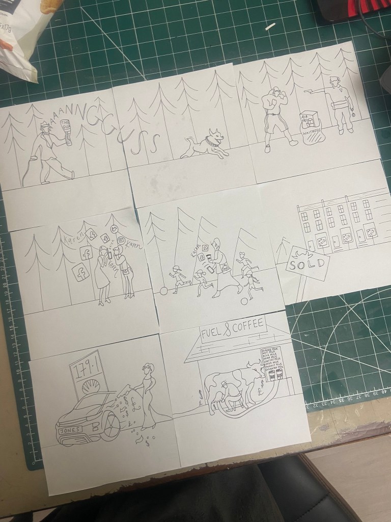
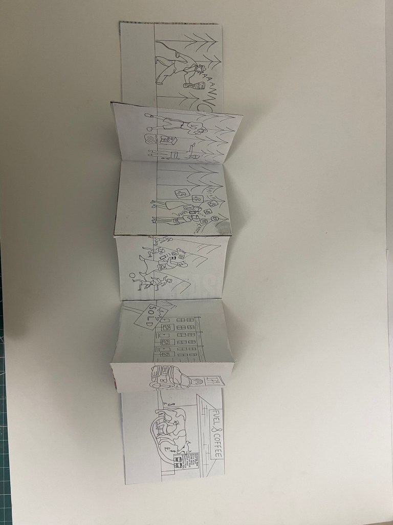
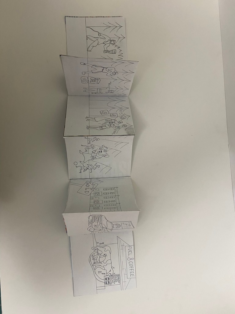
Instead of sourcing all images from the Internet, existing images or newspapers/magazines, I wanted to try and draw a narrative using illustrations as the interpretation I had of the poem would be very difficult to piece together trying to find appropriate images to montage together to create the desired design.
The illustrations below are what I drew for the narrative.
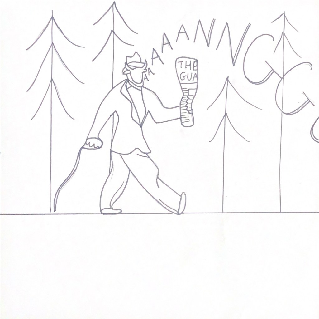
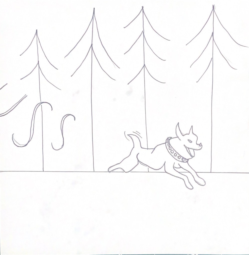
It starts with a smartly dressed man walking his dog in the suburban park, the Dog who is called Angus (middle class!) after picking up The Guardian newspaper from his local Waitrose!
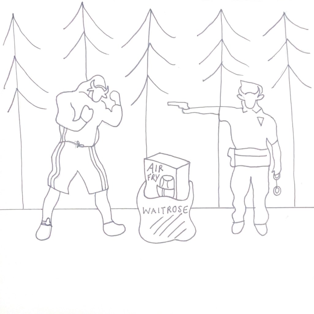
It then moves further into Suburban woodland with a man and a police officer having an altercation over an Air Fryer in a Waitrose bag. Both parties are wearing Cow masks to represent the fake mask of façade that is being portrayed and it also shows the fight against the “Cows” where they are trying so hard to maintain that middle-class front and rebel against change.
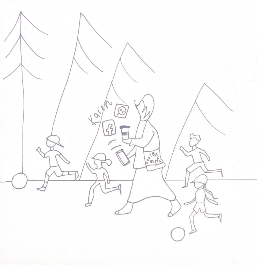
It then progresses forward to a scene where a couple of gossiping women are watching the fight from afar and are photographing it all to send to their fellow Football mums and to plaster all over social media. This is a nod to the “Karen” trend where groups of self absorbed, narrow minded women live their lives according to Facebook and try to tell others how to live their lives!
The next scene shows the Football mums and their little darlings catching up on the recent gossip. This all portrays a self absorbed, priveledged, narrow minded environment.
The next scene shows the suburban life changing and a more rural environment coming about; this represents the fear of the “Cows” moving in and stealing their suburban bliss and changing it.
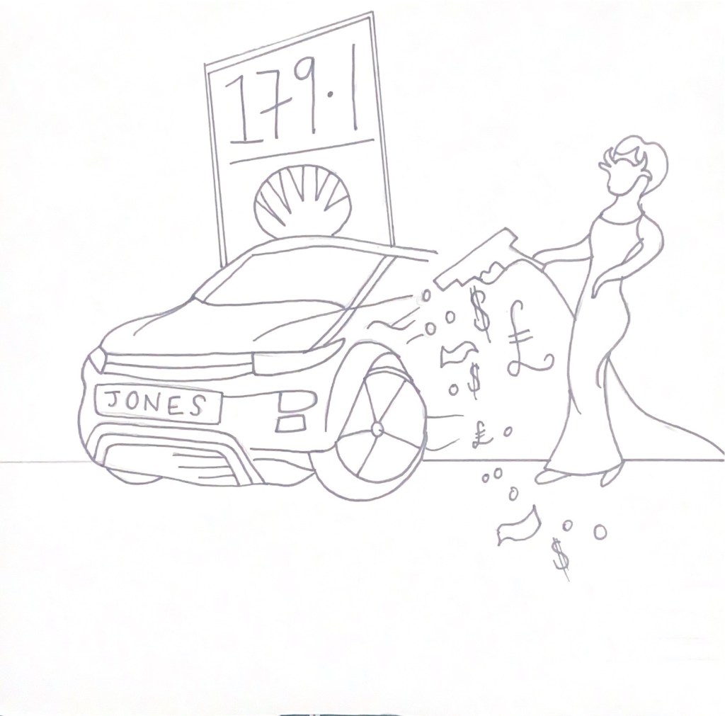
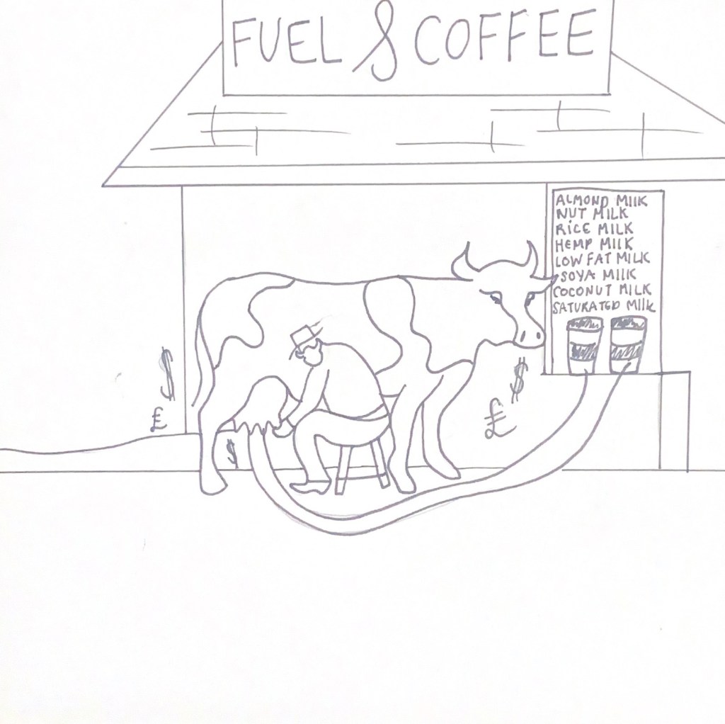
The fuel and coffee scenes show the greed and the unnecessary money gained and spent.


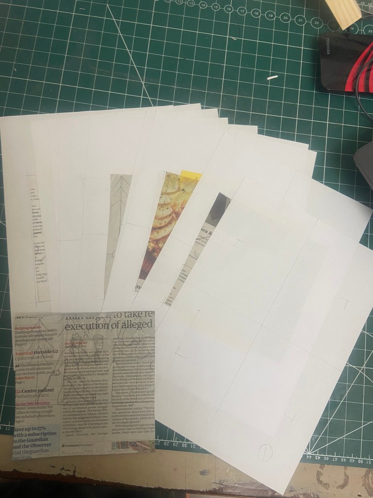
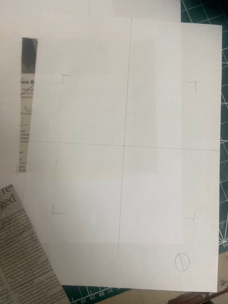
I then started to work out how I would print the images onto the back of the Waitrose magazine and newspaper pieces I had cut out. I stuck the squares that I had cut out already in the middle of A4 sheets that I had measured out the exact middle and then printed my images directly over the top. It worked but it didn’t; the magazine and newspaper were too heavy for my finely drawn illustrations so I ended up resorting to printing them onto plain A4 white paper so that they would be easily seen.