
- Mind mapping
- First Ideas
- Colour palettes
- Research points
- Development of ideas
- Digital Development
- Final artwork
- Final Mock up
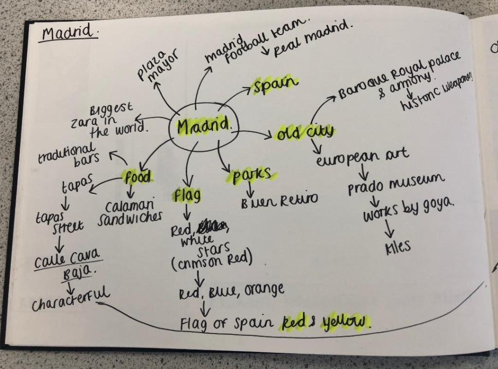
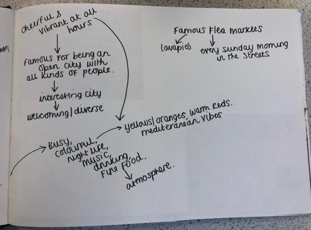
I started off feeling really overwhelmed by this exercise. As I mentioned in my introductory post, this exercise is notoriously difficult and challenging for many students and with this in the back of my mind I subconsciously was a little bit apprehensive about it! I started off with the first city on the list which was Madrid; A nice little start to the exercise as I am familiar with Spain even though I have never visited Madrid itself. I decided to mind map Madrid and see where my trail of thoughts led me…
Mind Mapping
I have to admit I did have a stalk on google of what some other students had done for this assignment.. the general outcome for this exercise was based around architectural buildings of the cities or famous landmarks which is completely understandable as the obvious outcome for “coloured blocks” would be buildings. I wanted however to try a different approach and see where that took me.
First Ideas
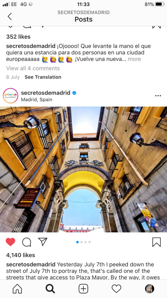
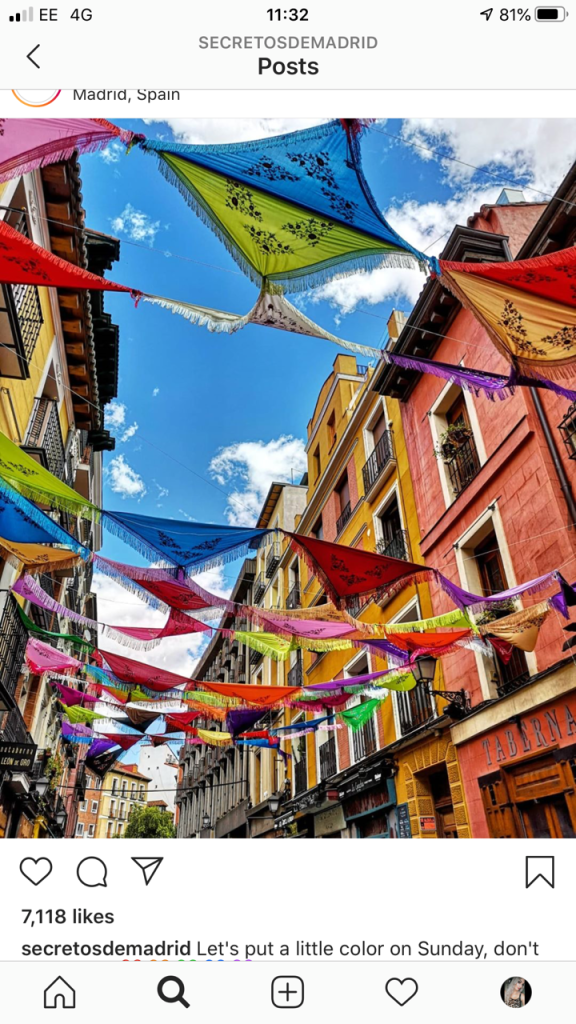
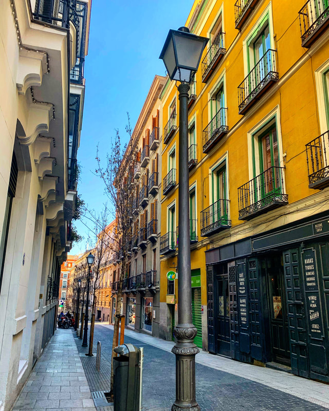
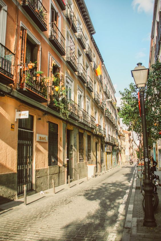
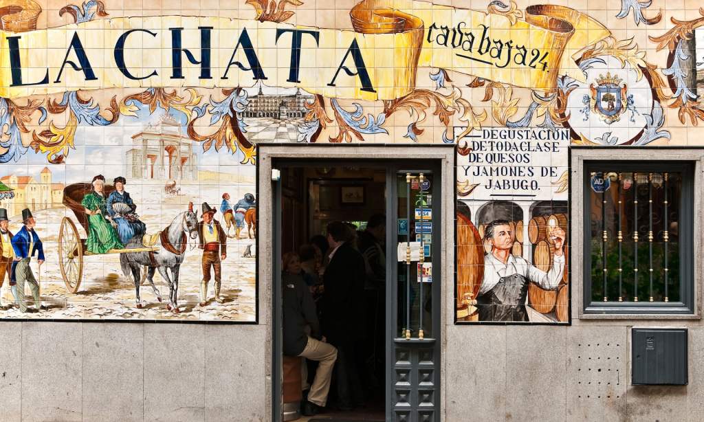
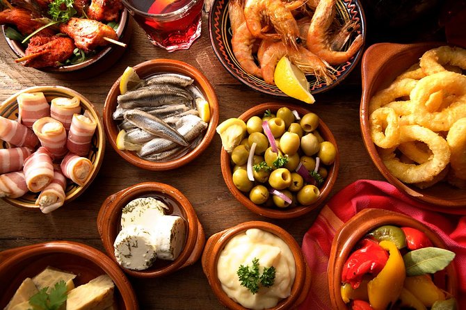
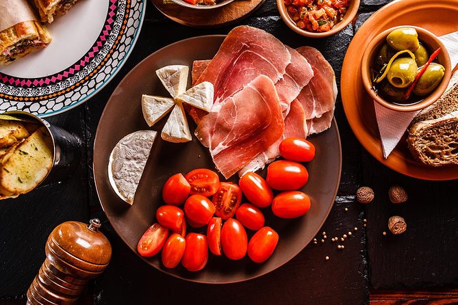
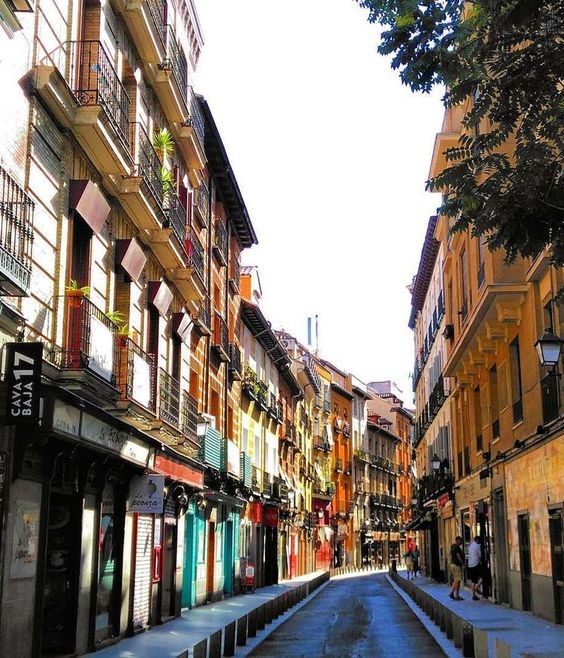
When I think of Spain in general I think of warmth and warm Reds, Yellows, Oranges, Black, busy, colourful, music, wine drinking, Tapas eating and a chilled way of life. Red, Yellow and Black features in the Spanish flag so I knew I had to use these colours within the design. Socialising, eating and drinking out is a big part of Spanish culture, especially having a drink and tapas in the afternoons or evenings so I wanted to convey this feeling throughout my design. I started to research on Google and Pinterest the different hotspots of places to eat in Madrid. The place which kept coming up the most was Caja Bava which is a brightly coloured street filled with Tapas bars. I collected several images of this street which I documented within my sketchbook and also pinned on Pinterest. I even watched a video of a short tour of the street just to get a feel for what it look like and the vibes it gives out.
These were also a few of the images which inspired me the most:


Colour Palettes
I had no idea what design I might create but I knew I would have to work out some kind of colour scheme, this is what I worked on next.
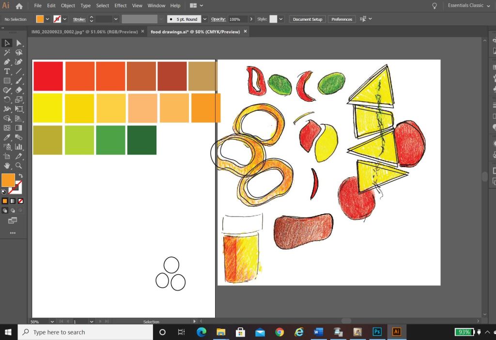
I used the photos that inspired me the most and in Photoshop using the eyedropper tool I picked out the colours that were most prominent in the photos. These would form a base for my colour palette.
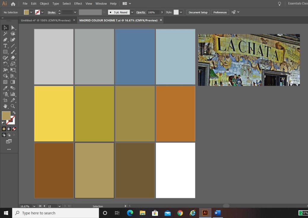
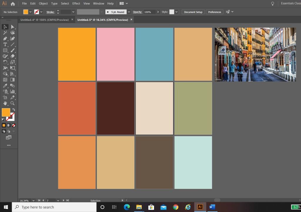

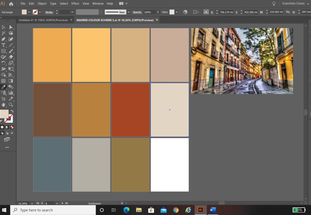
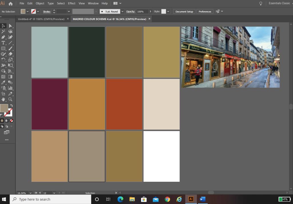


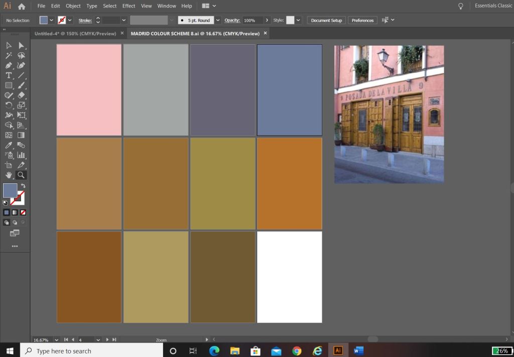
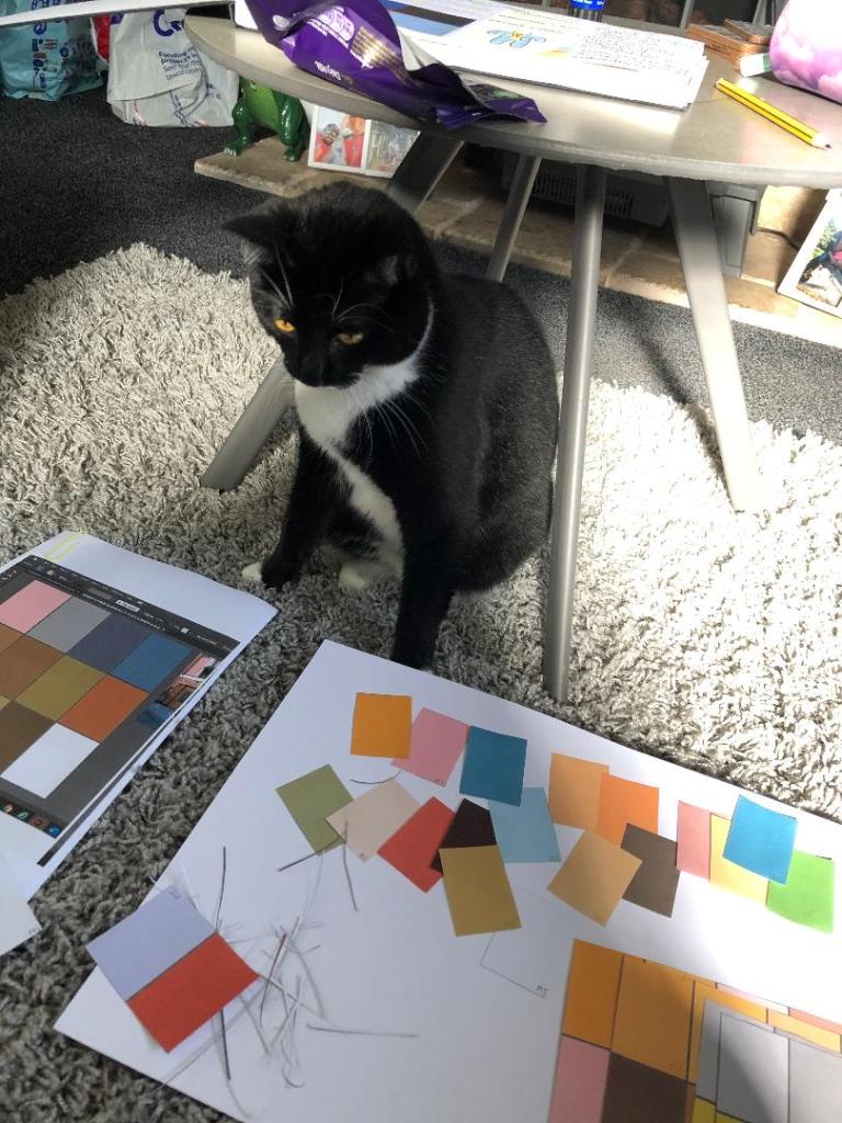
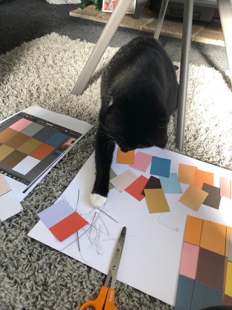
The above screenshots were the palettes that I created from these colours. I then decided to print all of the palettes out and arrange them all onto one sheet to pick out the main colours that could be used; I wanted to organise them into dominant, subordinate and accent colours. I had a little bit of help from my boyfriends cat Bridgette with this!…
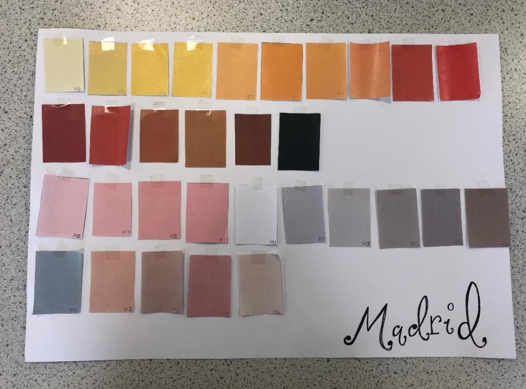
The above colours were the ones that I narrowed down. I feel that they reflect the vibes, buildings, warmth and atmosphere of Spain and Madrid. After organising them in an order where I could see what colours worked with each other I then went on to think about the first design and how I would feature the abstract blocks of colour into my design…
Research points
I looked at a wide range of research points for this first design, I was really unsure of where to turn with the “abstract coloured blocks” I did an extensive browse on Pinterest (link below) where I created several folders filled with different images and I also looked up various abstract art and artists. As I said in my previous post I had help from one of my art teacher friends who directed me to a few artists to look into.

I found that researching into Henry Matisse was the most beneficial. Matisse towards the end of his life created art form cut out shapes which he then made into collages and blocks of colour. I did not think originally that these could be classed as blocks of colour but the more I researched into the artist I realised that he was quite renowned for his work related to colour.
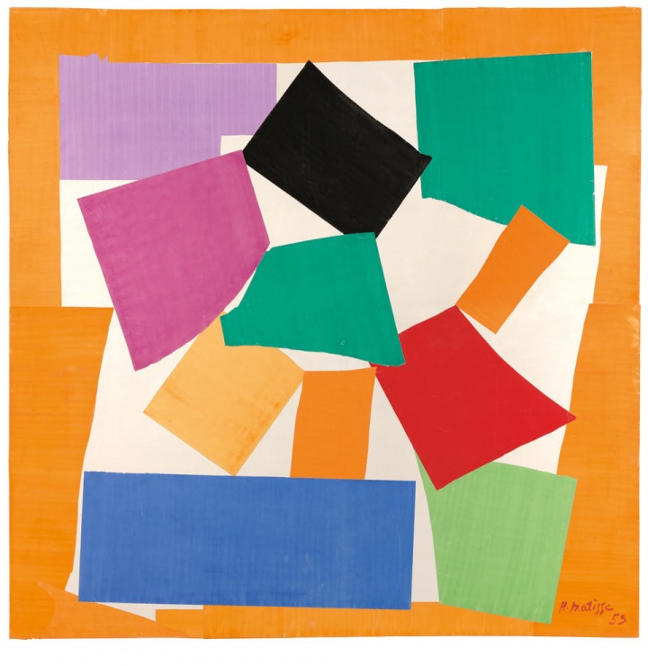
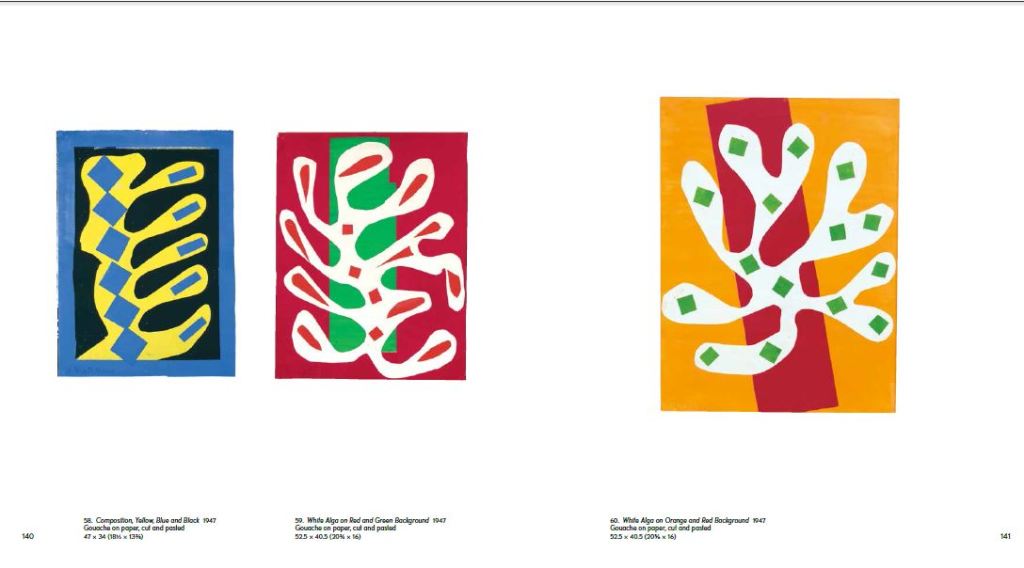
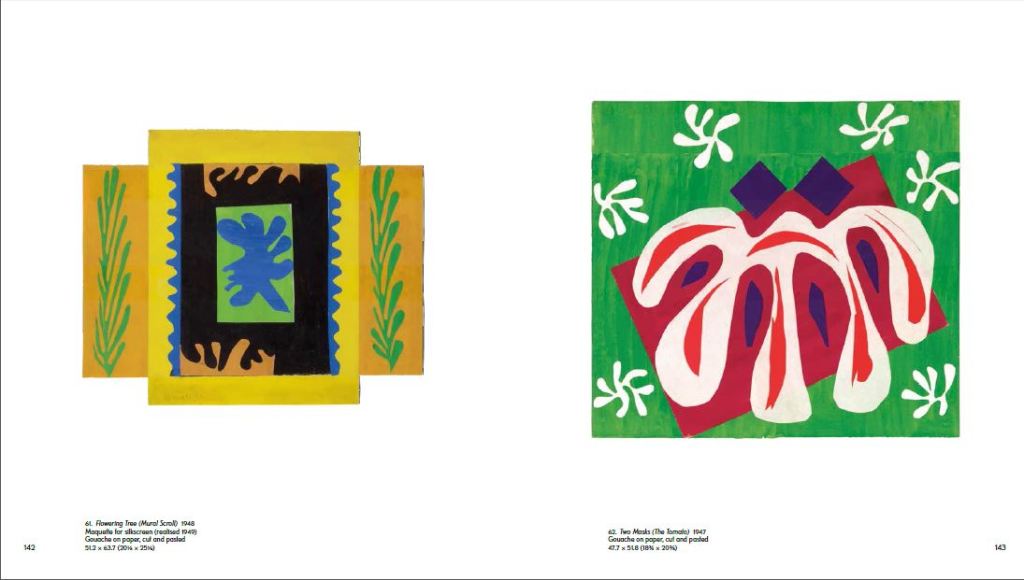
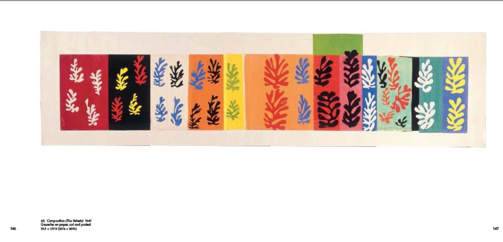
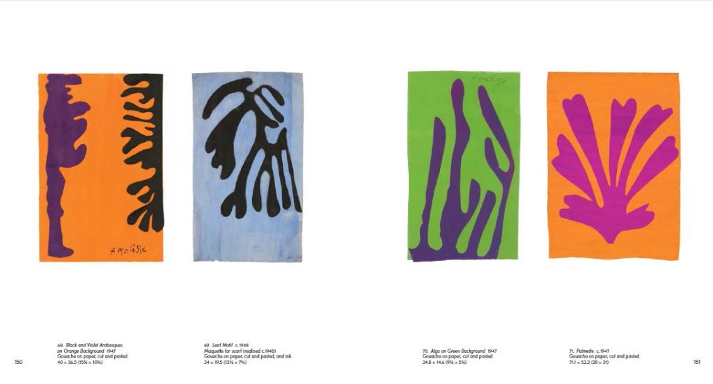
Matisse cut out a lot of leaf shapes from paper and used them to create abstract pieces – These were still considered as blocks of colour and it inspired me to think about creating simplistic shapes from objects that exist of one block colour and then make them abstract.
Development of Ideas
I started firstly to design and develop ideas down the food route; As I wrote further up my post, I wanted to explore around Spanish food as it is a big part of Spanish culture. I wanted to convey the bright colours, the exciting food itself, the social aspect and the busy yet laid back Mediterranean lifestyle.
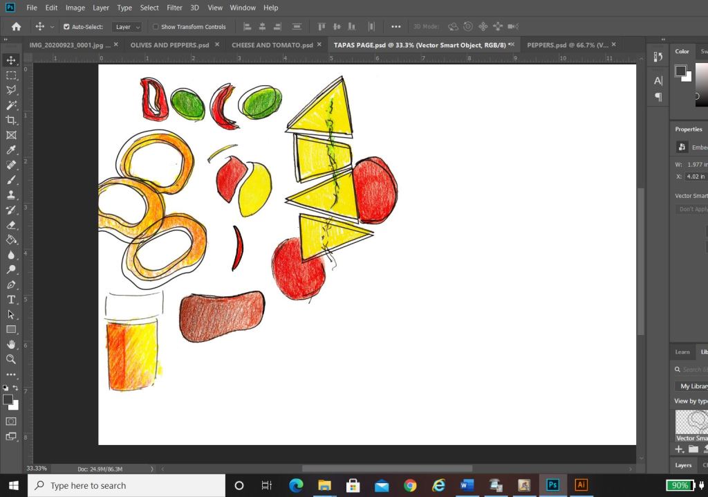
In my sketchbook I drew some initial sketches of some Tapas food just to give me a feel for what I could potentially include on a design.. I ended up really liking these little sketches and went on to create digital versions of them to try out on my digital designs;


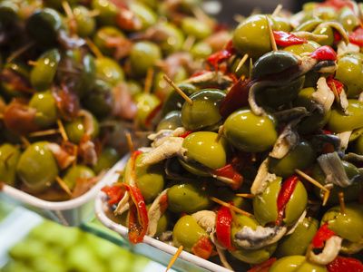
I created coloured sketches of Tapas food – Olives, Cheese, Tomatoes, Ham, Peppers, Chillis and Calamari. Calamari sandwiches are a massive deal in Madrid. 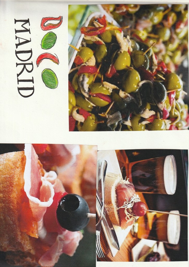
Digital Development
Development Idea 1

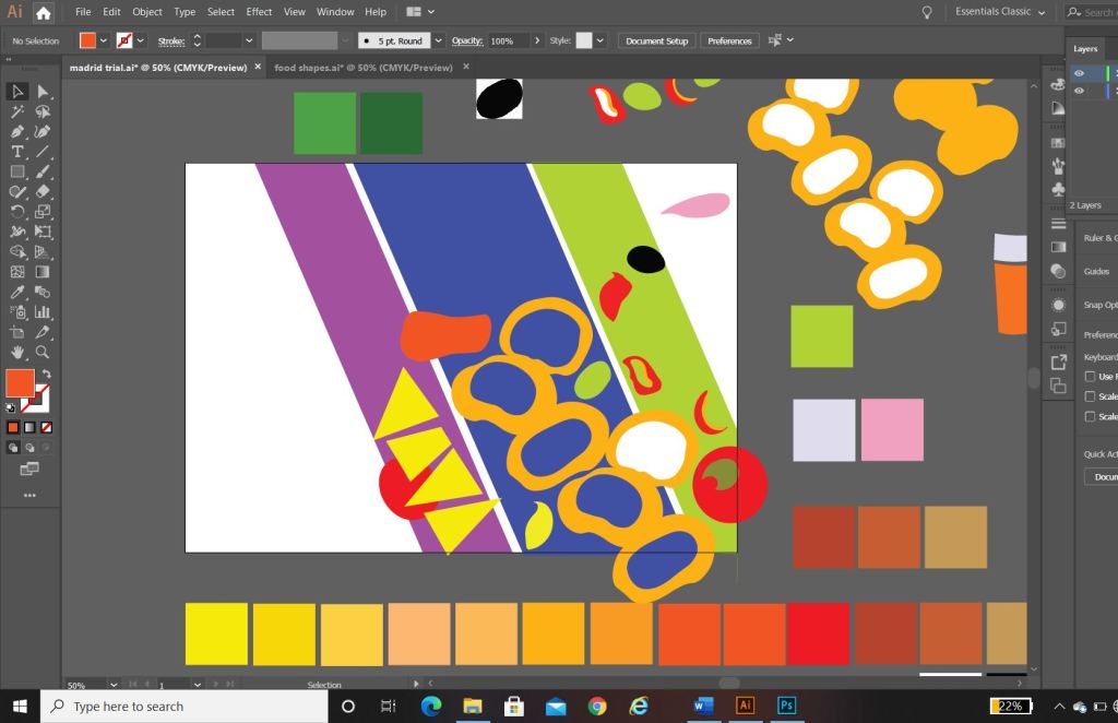

I started to rearrange the digital drawings of my food in different ways to try and form an abstract design with coloured blocks.. It was tricky! – I concentrated mostly around the calamari illustration; Calamari sandwiches are a delicacy in Madrid! They are a pretty big deal! I situated the Calamari illustrations between coloured blocks to try and get an abstract representation of Calamari in bread or a bread roll/bap. All in all I just felt that it was too “busy” and not quite abstract enough for my liking. I really struggled to interpret food as coloured blocks.. I hated to admit defeat as I really wanted to take a different direction from everyone else, however, landscapes and buildings are best interpreted as coloured blocks. I did a few more experimental layouts for my food idea and then swiftly moved on to try and rework the whole exercise out again.


Back to the drawing board!
Development Idea 2
What I created next was completely accidental and out of sheer boredom and frustration with the exercise at the time! – I sat at my laptop screen on Illustrator and just drew random lines all over the place in a complete daydream and loss at what I was doing! By the time I had finished I could see a resemblance to the Kio Towers (leaning towers of Madrid) and then I gradually started to bring other influences in to it…

This started to look like the Kio Towers (the leaning towers of Madrid!) 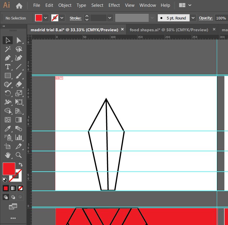
I then added in the statue of Calvo Sotelo which is situated between the Kio Towers! 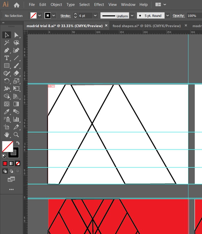
The towers together also look like an “M” for Madrid 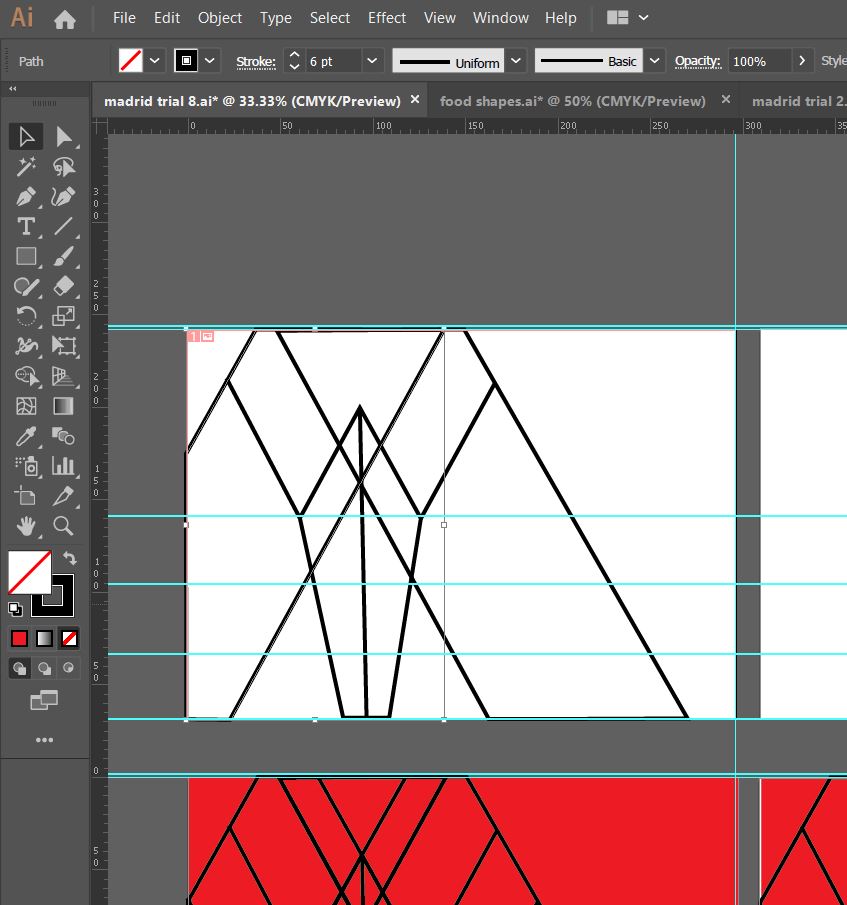
The 3 elements all joined together! 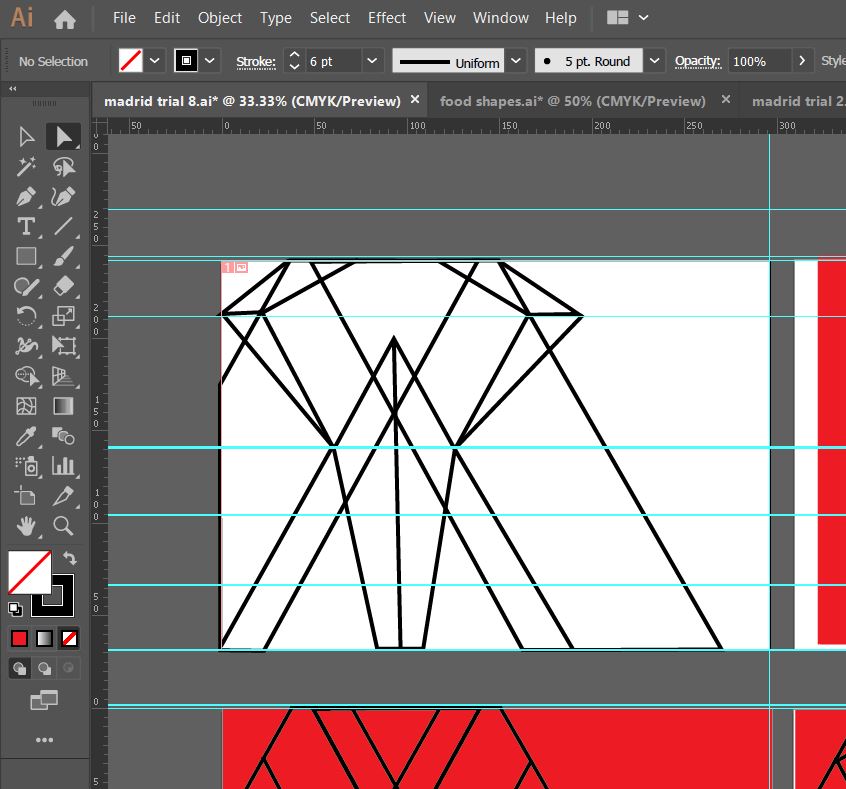
I then added in the last feature… it looks like a Spanish bull with its horns coming out the top of the design. 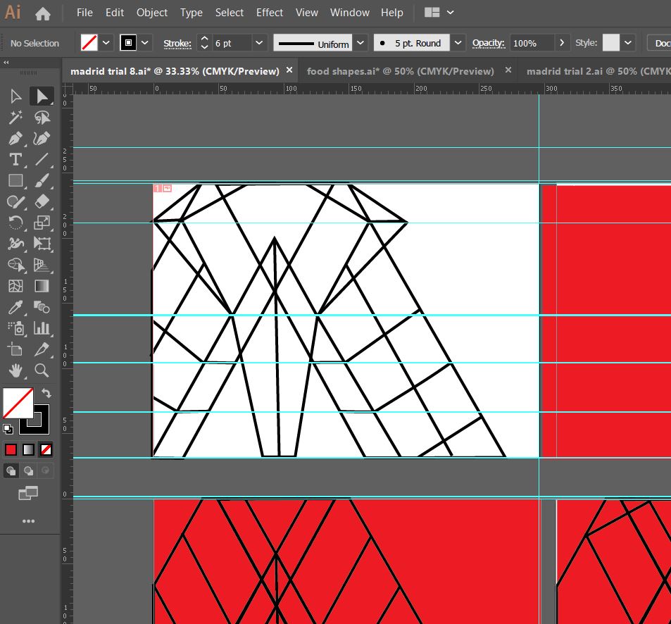
All of the elements together to create this abstract piece!
I liked the geometric, modern feel of the abstract architectural illustration.
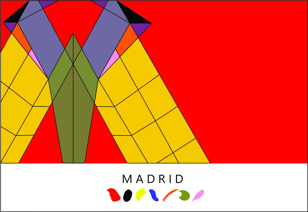
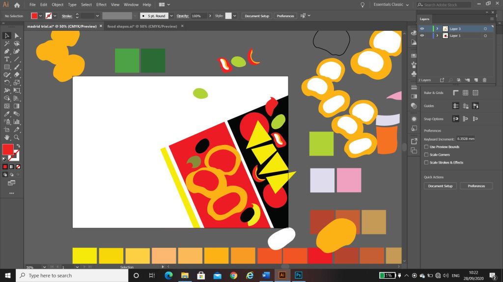
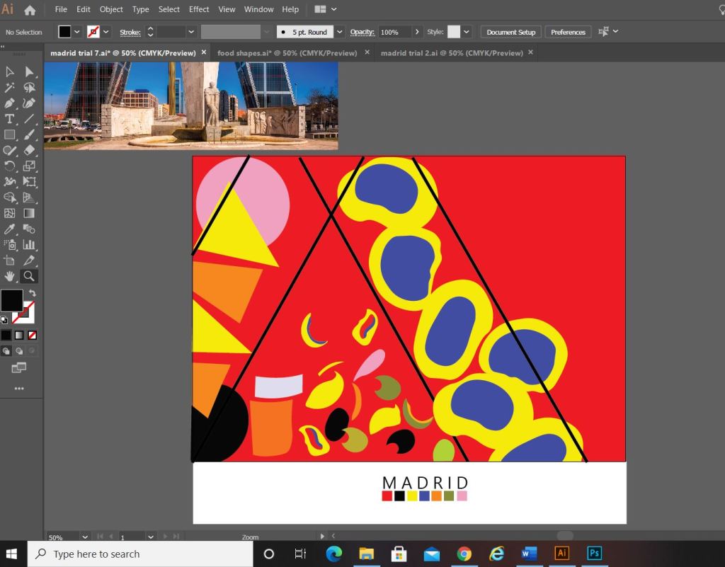
What I ended up designing was this above; I still really liked my little drawings of the food and was trying to find ways still to incorporate them into the design. I decided to use them below “Madrid” as a colour key for the piece; The colour of each food is a colour that featured on my original colour chart and which I have also used on the above abstract design. I did think that the food icons could also technically be classed as the blocks of colour. The colours are very “Spanish” in feel with the Red and Yellow but I have added contrasting colours in there with the Pink and Blue.
I wanted the typeface for “Madrid” to be simplistic. I knew I wanted it to be a sans-serif font as these are always the best for legibility, readability and best suited for titles and headings. I don’t really like using fonts or typefaces that are gimmicky or that are not well established, therefore I did question myself about choosing a typeface that I was unfamiliar with.. however, the one I chose (Leelawadee) did seem quite appealing and attractive for the piece. The only issue I had with the whole design was that the typography did not match the “abstract” feel; in fact I still felt that the whole piece wasn’t edgy or abstract enough. The blocks of colour that I used seemed flat, it seemed as if I was just colouring in blocks for the sake of making them a colour. I think I had too many colours, my thought process moving on from this stage was to potentially limit the amount of colours to possibly 3. I could pick 3 colours that have strong relations to the country (e.g. the country’s flag colours). For Madrid it would be yellow, red and Black.
Development Idea 3
I tried the design again but this time around tried not to play “too safe”. I wanted to experiment more with the typography and the layout (although not too much!.. I chose good ol Helvetica again for the font!) I had the idea to break Madrid up into its syllables and rearrange them coming slightly off the page.

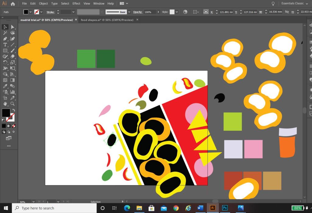
The above screenshots show how the development progressed.. I much prefer this idea. I messed around with the orientation of “Madrid” at the end of my experimenting I found that Madrid should be written facing the spine and not the pages. It has more impact when you look at it, it stands out and it looks more abstract in design even though there is still a strong geometric influence to it. I have added the red bars in the design because they help to frame the overall design and give it structure. The red boxes are focal points that draw your attention to the design. I made one much smaller and thicker than the other for contrast. I feel in general the design is comfortable to look at; the eye flows comfortably throughout it. I then had to develop it further to get the coloured blocks into the design.
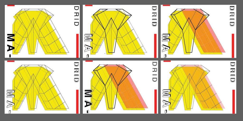
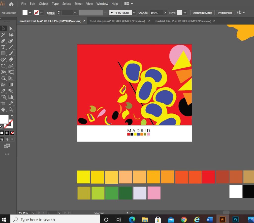
I developed it further (above) experimenting with outlines on the text and contrast of the typography with line weight and thickness. I started to add colour to the blocks. I also outlined the shape of the abstract bull which ties in nicely to Madrid and Spain as a country. The colours I have used are Red and yellow with Black and white added in. The Red and yellow I overlapped and lowered the opacity to mix the colours to create an orange hue. The middle bottom design stands out the most for me.. it has contrast with the typography (Bold vs. regular, black vs. white, big vs. small), the overall layout is more abstract, the bull line work ties in nicely to the city and country and the colours all contrast and compliment each other and are blocks. (yellow=dominant, orange= subordinate and the light pinky red and bold red are accents)…
….
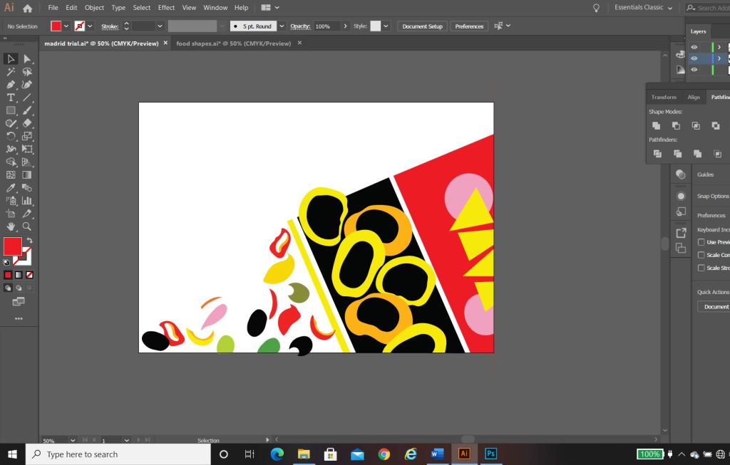
However, I still felt like it was “too busy” the line work took away the “block” aspect of the brief. I wanted to keep the design as simplistic as possible, so I went about developing it even further.

This is what my final design looks like! I simplified it right down to the basic shapes which I think helps you to recognise the landmarks in the design better. I added accent colours in each corner to draw the eye and attention over the whole design.
“Once I get the first one designed and finished, the others should flow quite easily”
Amy Holmes – This was said to her boyfriend after almost ripping her hair out from trying to find an outcome for 1/10 guidebooks! 😀
Exactly what I said above! I knew that this exercise was notoriously difficult and that after I had the first one designed the other 9 should flow and follow the same design thought process and layout etc.. This was true, the others flowed along quite nicely afterwards with the exception of hitting a few “brick walls” along the way.
Take a look at my other 9 posts to see the final designs for each city!
