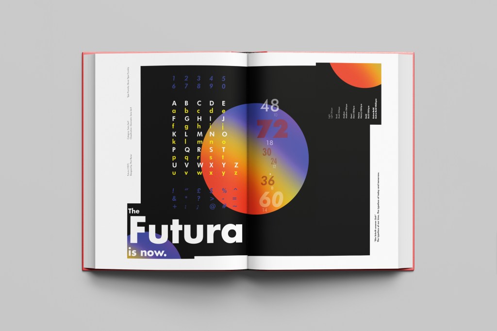
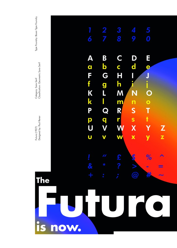
Futura is the last Sans-Serif typeface in my collection! I chose this one because again it is a classic and it also ties in well with the Bauhaus era along with the other Sans-Serif typefaces that I have chosen.
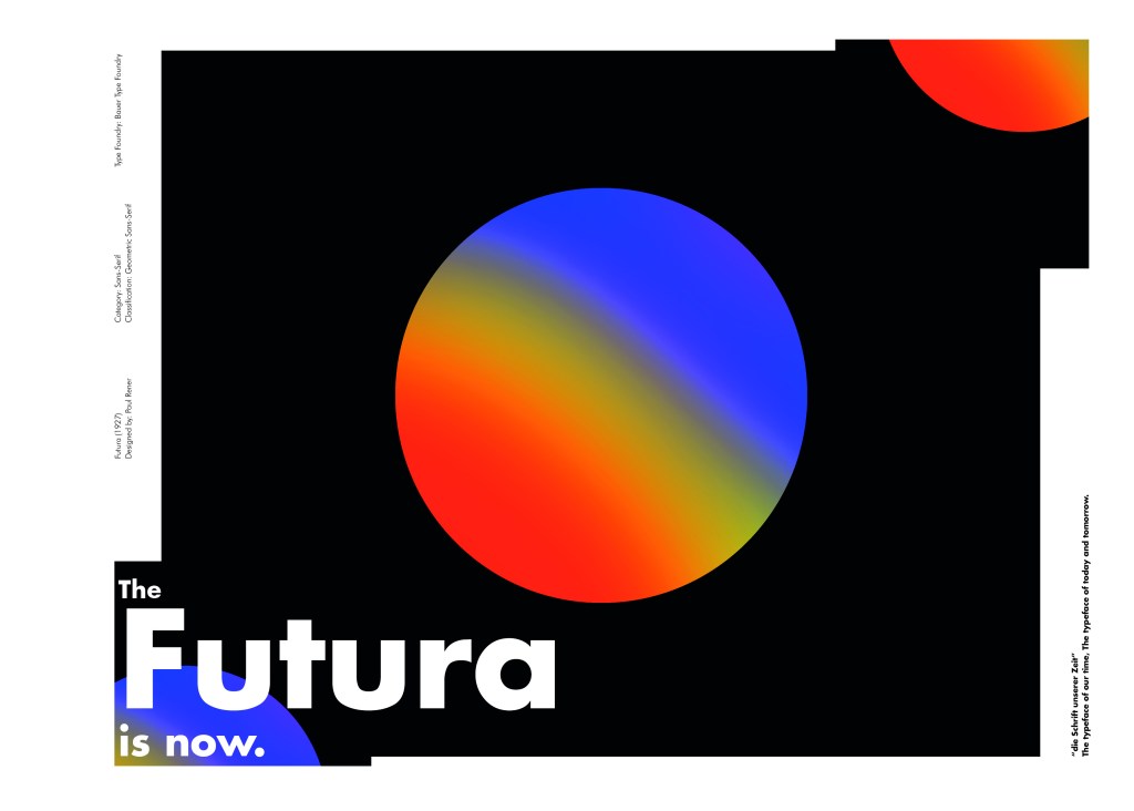
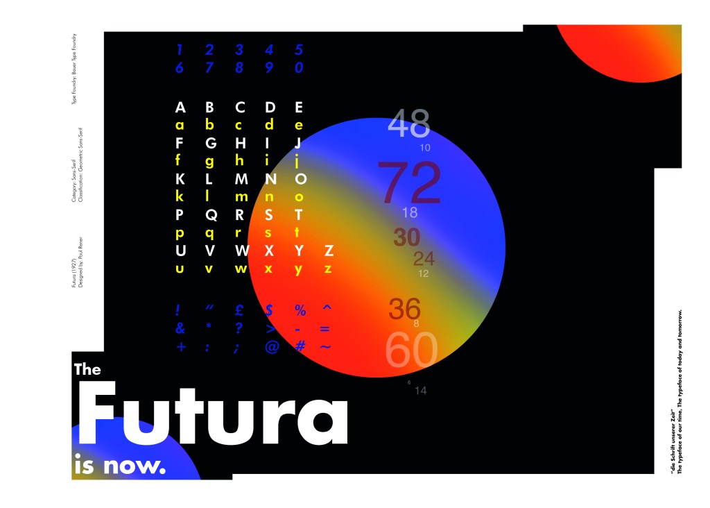
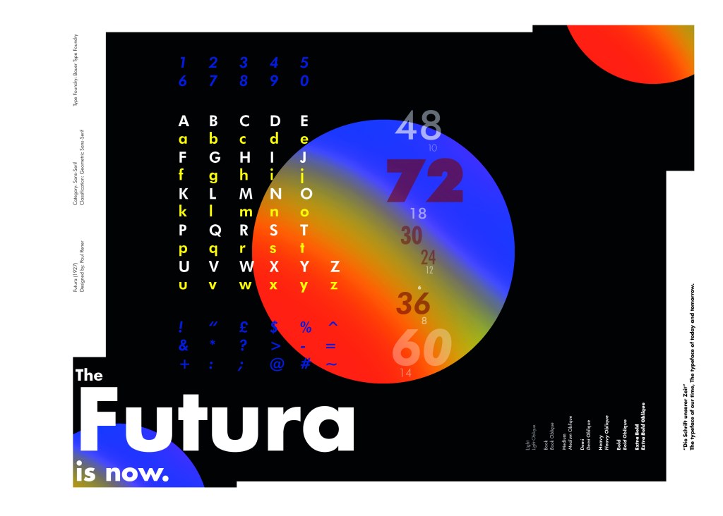
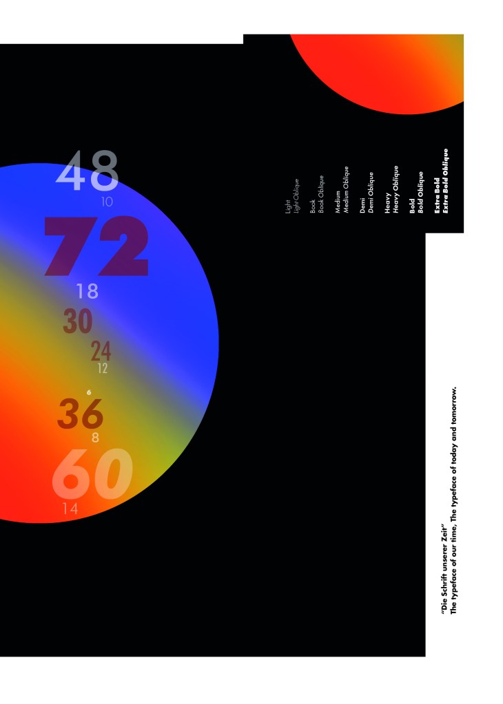
I did take a more modern approach when designing this layout though; instead of staying with traditional Bauhaus colours (Red, Yellow, Black, White) I was inspired by a German slogan “die Schrift unserer Zeit” (“the typeface of our time”) It gave me futuristic/modern vibes and I decided to play off this when designing my layout!
Futura reminds me of “future” and the future is modern and a mystery to us yet… I designed Futura around the theme of modern, futuristic space vibes with vibrant colours and an interesting layout.
“The Futura is now“
I had the idea to create planet-like orbs using Photoshop by using my brush tool and layer masks. I used this technique on one of my posters that I did for the “365 a poster a day challenge” I started a few years back. I masked the orb area out and making my paintbrush big, airbrushed different colours over each other to create a planet effect. I then copied it twice more create 2 in both corners. I really like the effect it gave. The bright colours contrast against the black to really make the design stand out. I also created contrast between small and big text.
Design Development – The stages of reaching my final design and layout!

The final page layouts

The final mockup