
I feel like for the last week or so I have gone round in circles between 2 design ideas and how I could make them work together without making the book cover seem “too much”…
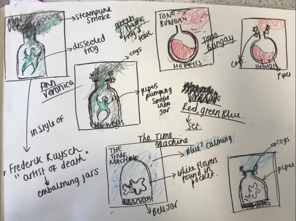
The first idea I had (from the first pages of my sketchbook) was the 2 white flowers inside a bell jar; I then went on to try and make this have some steampunk influence with the use of cogs, thermometer and piping but after further development I realised that it would be a lot nicer kept much simpler and potentially as a simplistic ink drawing.
the first sketches 
The Steampunk influence
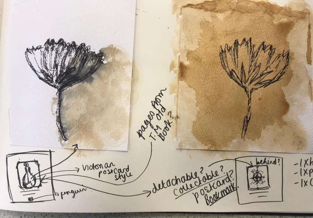
I then explored with the possibility of drying flowers (they are still drying out and I may return to this idea yet!) and using this as part of the front cover – photography with the Victorian influence of flower drying. The idea then moved on to me looking into Victorian botanical drawings inside old botanical books and ink tattoo style illustrations which would be modern yet play a massive influence on the ink drawing I visualised for my cover.

The first photo idea 
The botanical style
I realised that I would need a mix of the 2; the feminine, botanical flower influence mixed in with some scientific, industrial, steampunk, “time” element.
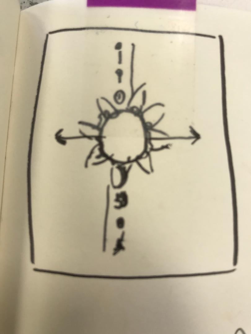
My other design idea was using symbolism. Inspired by tattoo designs I found on Pinterest; I featured the moon, the sun, the flowers, the talking rings from the book and orbiting rings to represent space and time. With just the flowers alone it would not be fully representative of “time” the time machine or the subject of the book. This style would be quite modern; I was thinking of ink drawing it but then importing it into Photoshop and doing similar to the Skillshare tutorial that I watched earlier on in my research stage where the designer altered the colours and made it look much more modern.

I toyed with how I could use both ideas on one design without making it all look too much…
I then explored with the idea of using 2 different designs on one page by using different media for each idea and then overlaying them somehow on the cover… maybe like a collage or different textured paper on different colours to add some contrast to the 2 pieces. I had an idea in my head of drawing the bell jar, a top part of a skull sat at the bottom of the jar and the 2 white flowers growing out of one of the eye sockets. (the skull representing the darkness from the Morlochs underground) I want to push myself to create something that is “darker” than what I would usually explore. In my last assignment the feedback was to explore with different textures so I feel that this ties in nicely. I then thought I could potentially draw this design onto textured, mottled, old looking paper and make it look like one of the old Victorian botanical books/postcards I looked into…
It was then a question of how do I get the other design concept on there…
From my earlier research I had already looked into book jackets, designs on inside covers and laser cut covers.. I established that these were better suited for hardback editions. Designing for a paperback edition leaves less scope for creativity and I feel like I shall have to pick between my 2 ideas. I have had the idea though to potentially take the brief further as I would ideally like to use both of these designs:
- Create one paperback, ornate cover where I shall pick one of the design idea concepts only (possibly the botanical one).
- Create one hardback edition where I shall use both of the design concepts and place the botanical design on the front with the “time” design on an inside cover.
- Create a special collectors edition where I shall use the botanical design as a detachable postcard or bookmark which when removed from the cover will reveal the “time” design underneath.

My next stage from here is to start with drawing some ink drawings of my designs and seeing what they look like and how they work and to also look into different types of paper and textures!
