The Botanist and The Alchemist bars
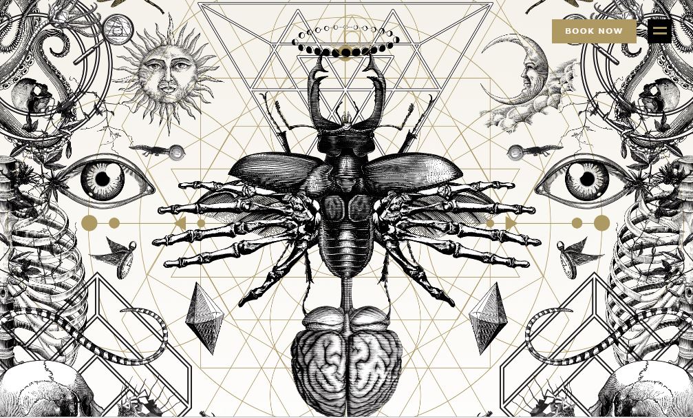
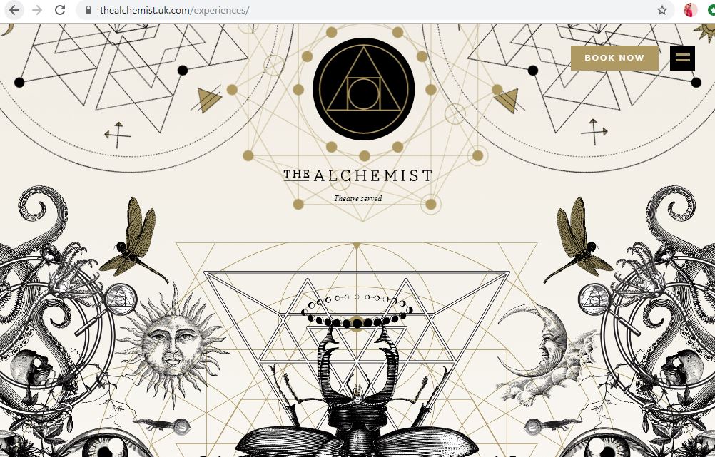
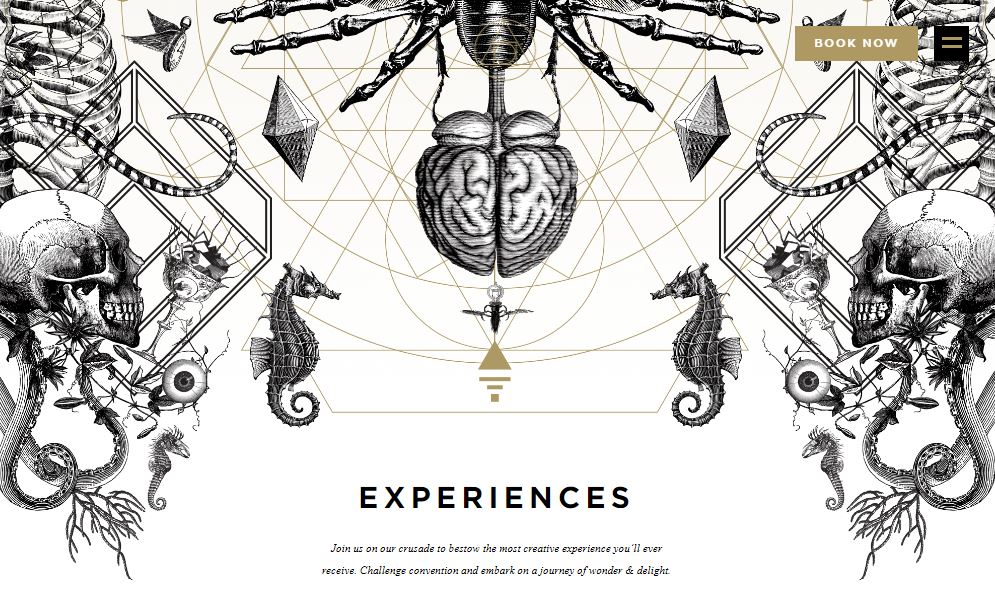
Yesterday I was asking ideas for my designs from our textiles teacher at school who I work closely with everyday; she asked me if I had ever been to two bars called “The Alchemist” and “The Botanist” as these would help me possibly with ideas! – I have heard of them, (I have heard of The Alchemist because I am aware that they do really extravagant looking cocktails!) – however, being from the shire where nothing much goes on, I have never yet been to one! I had a look at the websites and instantly knew that the designs that I saw on there would help inspire me for my own!
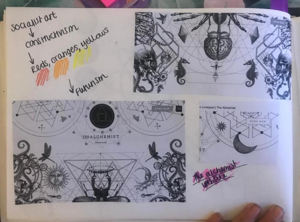
The designs that feature on The Alchemist website are monochrome which I love, they have elements of Steampunk as there are cogs and machinery as part of the designs.. but they also have a touch of femininity about them with the delicate flower drawings. There is repetition in some designs and symmetry just like the William Morris ones I looked at.
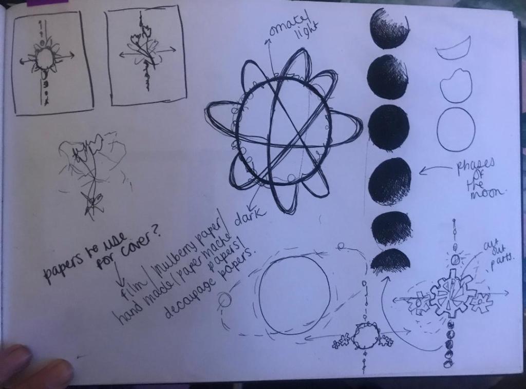
I decided to print some of the website pages out, stick them in my sketchbook and sketch ideas around them..
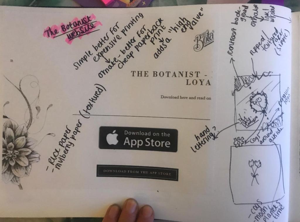
Whilst sketching these ideas I watched a video on Skillshare by Jessica Hische, a lettering artist explaining how she designs book covers. One of the helpful pointers I took from her was: Make the design simple if it is a costly print job, if it is a paperback book and a less costly print job make it “ornate” this will add a high end value to it.
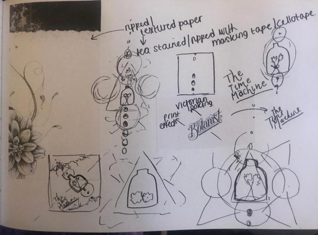
In my sketches I explored around little ideas based around science and space and line drawings of delicate flowers etc.. I brought back the bell jar idea in the later ones though as I feel as much as I was quick to dismiss it for a while, it is still relevant to the book and still a good idea.
I looked at The Botanist Typography and copied next to it in the same style, The Time Machine – I felt the way this looked worked well! Obviously I will make mine look different! (I might even do hand lettering for it)

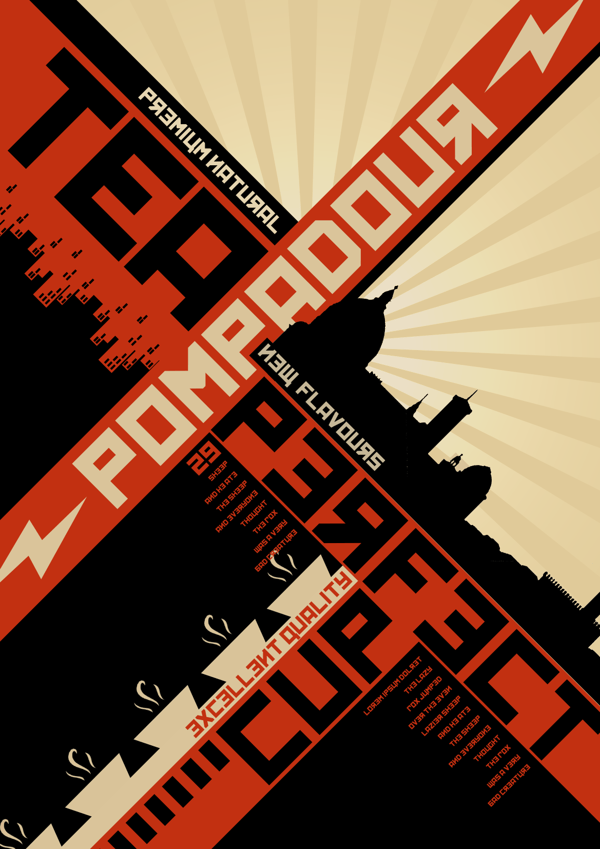
The slanted positioning of it too made me think of De Stijl and Constructivism art – The way that the work is very geometric and typography at angles… It made me think that I could do the layout of the book similar to this idea… Here are some examples of what I mean:
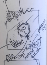
By the end of this little sketching session I had this idea below which I liked the feel of the most. The design would be on a mottled, ripped sheet with a contrasting background behind it. The centre part would feature the flowers, the bell jar or both and all around it would be mechanical cogs, crystals, ivory.. all relating back to the actual time machine. the typography would be alongside it at an angle which relates back to the Socialist views of the author and the hidden meaning of the book.
I am now going to sketch some more developments of this to see how it could work!
