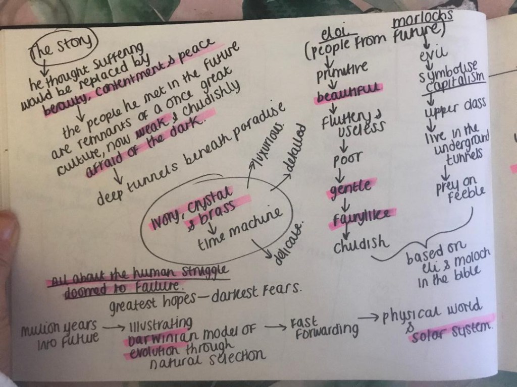
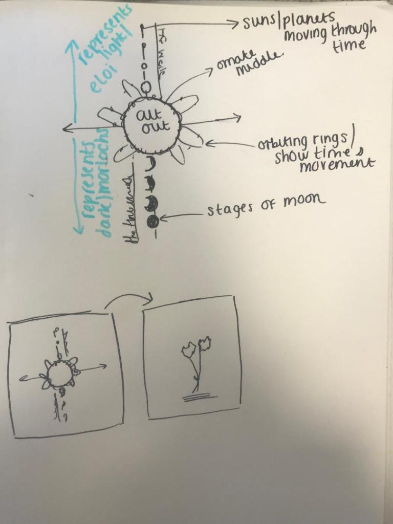
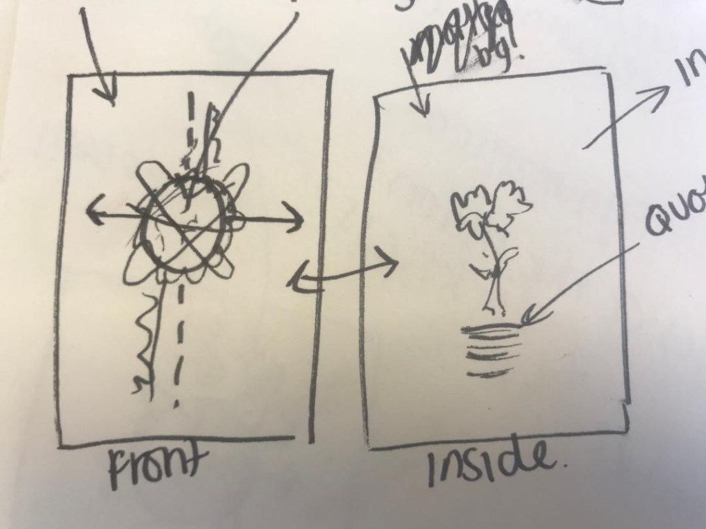
From my last post where I was toying with the idea of a more simplistic cover of 2 white flowers, I have done some more sketches and a bit more research! – I know I go overkill on research but I find that exhausting every avenue gets me useful links between my designs. The more knowledge about the book, the more ideas I get for my designs!
I won’t lie, I have only skimmed this book… flicked through some pages and scanned with my eye for the useful bits. I have also done some YouTube reviews and read what avid fans on Amazon have said about it! – all this is useful because actually everyone focuses on the true meaning of the story rather than the time travelling. The true meaning behind the book is actually quite thought provoking, romantic and sad!..
The time traveller (who has no name) travelled in time to the future (in an ivory, crystal and brass time machine – which might be useful in my designs!) as he thought that the suffering of his people would be replaced by beauty, contentment and peace in the future. He was wrong, the people he met in the future were remnants of a once great culture. The people known as Eloi were socialists – gentle, beautiful, kind fairy like people. They were very primitive and only had basic supplies, they were poor. They were however also weak, childish and afraid of the dark. They lived above the ground in fear of the Morlochs. The Morlochs lived underground in dark tunnels, they were the opposite of who the Elois were. They were Upper class capitalists, nasty and preyed on the feeble. These 2 groups of people in the book were metaphors for upper and lower class in HG Wells Victorian times. They symbolised capitalism in Victorian England which was something HG Wells was deeply against. The book is about the human race and how it is doomed to fail.
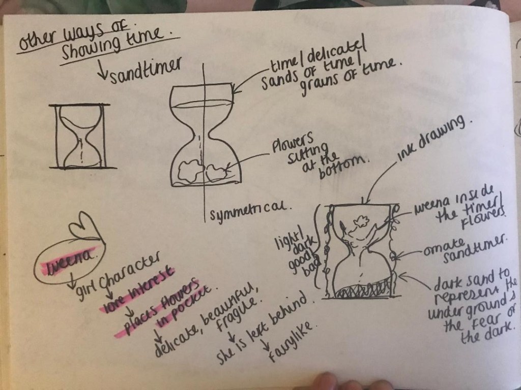
The first ideas I had for the bell jar and cogs I now feel is too harsh for the design of this book. I now feel that I want to focus on the soft, delicate nature of the book.
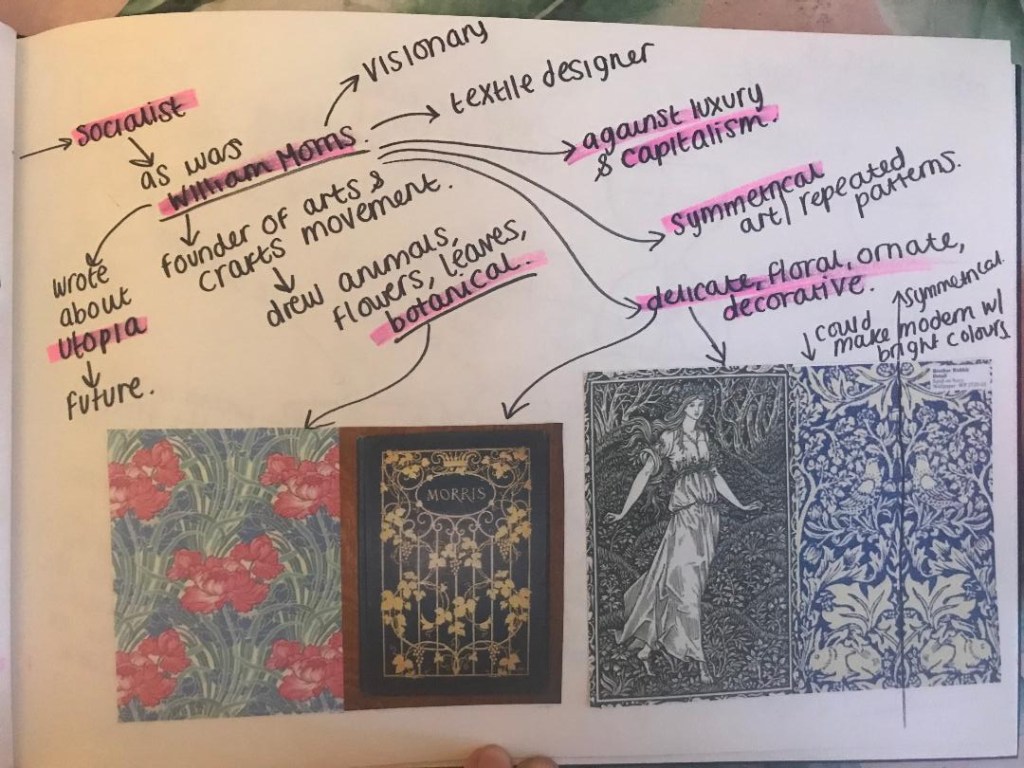
I had a look at the style of William Morris. He was a textiles designer, a poet and he was also interested in Science Fiction and the future just Like HG Wells. He published a book based around Utopia. He was also a socialist just as HG Wells was. He was against capitalism.
His style of work is very ornate and bases around plants, flowers and botany. His work is very symmetrical and repeated.
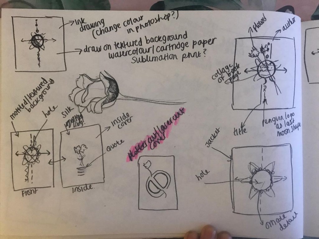
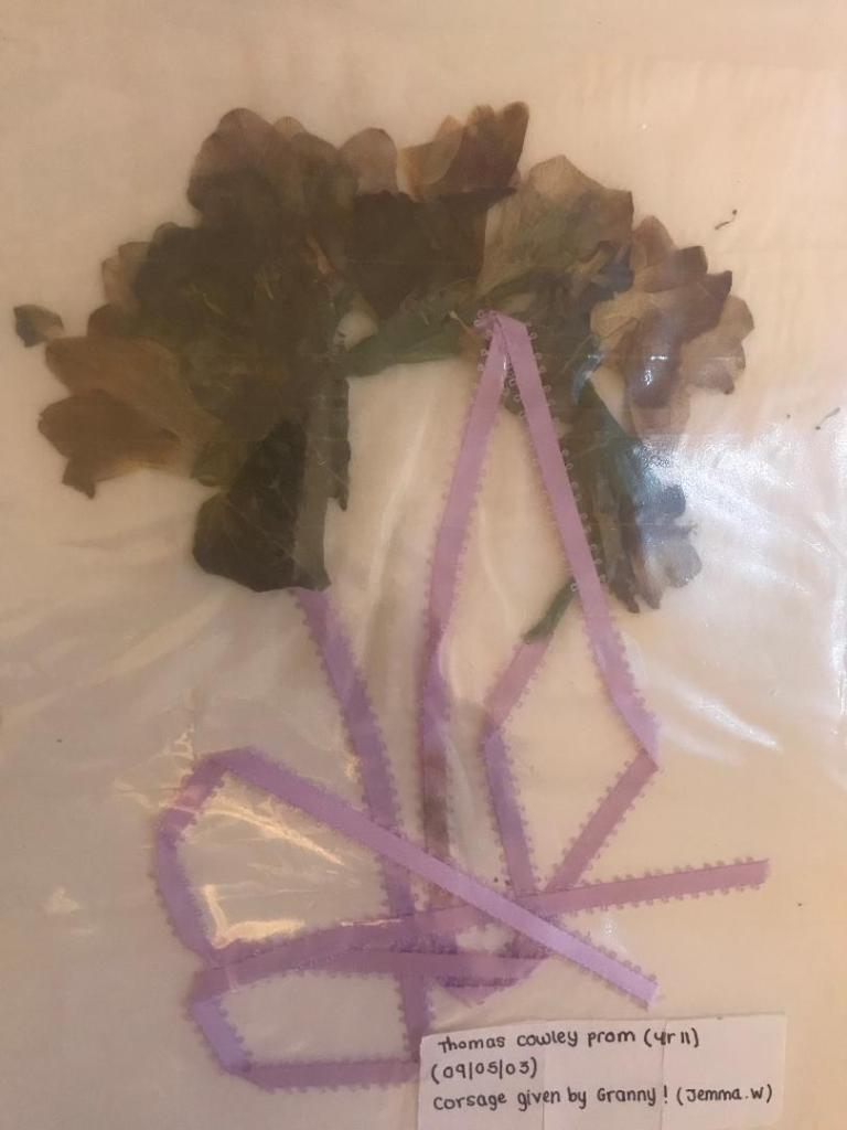
These are pages out of my sketchbook that I have done to explore ideas around this, there is also one of my now really dead 15 year old prom corsage!! (I really didn’t press this professionally!)
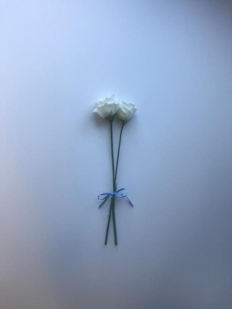
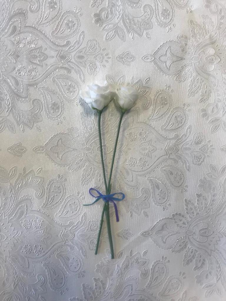
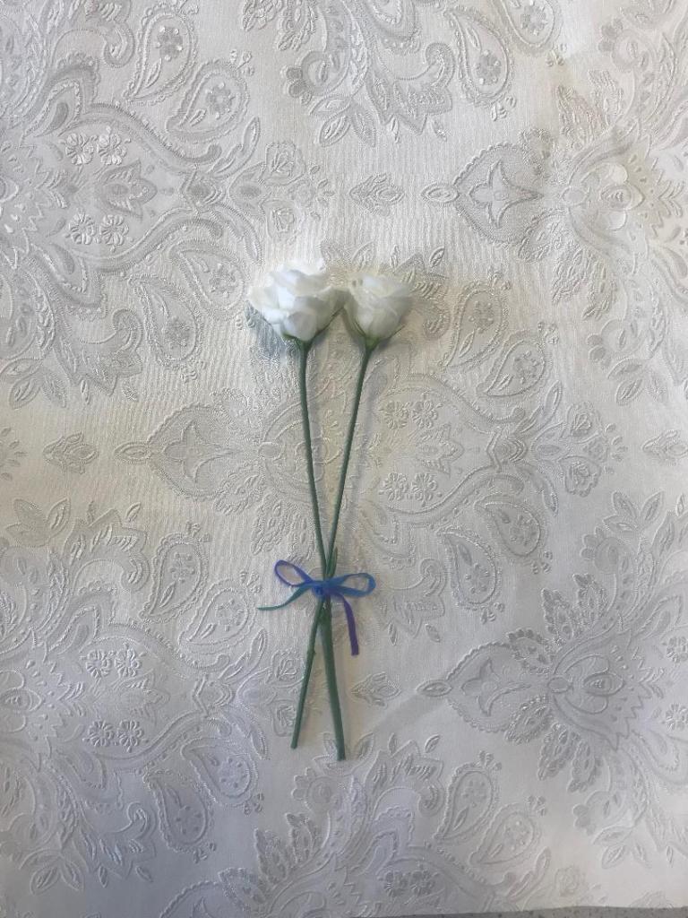
I decided to buy a bunch of white flowers with the idea to photograph 2 of the flowers. I thought that if I photographed them alive first and then dead and pressed I could choose between whichever option looks the best.

looking pretty at my school desk! 
Looking pretty in my home office!
I have photographed them on different textures; card, silk and a decorated wallpaper. The silk did not look good, you couldn’t really see the shine of the fabric as I wanted and there were a lot of creases. The card worked the best. I am going to also try and find some mulberry paper (paper for decoupage) as this will really give a textured look.
These are some I have taken so far:
I felt that this idea would work for a hardcover book more than paperback- (I would use the flower photograph for the hard front cover and then make a book cover jacket which would go over the top with cut out parts where you can see the flower through) although I could adjust the design to work for paperback. I explored around symbolism a bit for the idea… The image below tries to show roughly how it would be and look like..
If I was to adjust this to make it suitable for a paperback I would put all the elements together just on one cover.
I shall have a play around again and see what works the best!
