What makes good book design?
What makes books timeless throughout the styles and years?
Who are some famous book designers and why is their work successful?
These are all the questions I need to answer to help me effectively with my designs.
I watched a video on skillshare by Chip Kidd, an american Graphic Designer and Book designer about what makes good book design. He shared some of his favourite book covers and then showed some of his work also. He shared tips and pointers; some of which I actually already knew about how to go about designing a stunning contemporary cover.
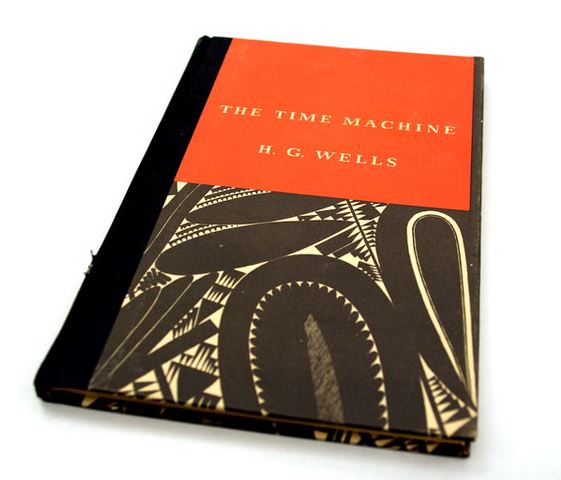
To my surprise one of the first books on his “show and tell” was actually The Time Machine by HG Wells! The design and cover he shared is a rare edition published by Random House in 1931. The designer was William Addison Dwiggins; I shall admit that before I sat down and read about him and his work I did not know much about this designer who first coined the phrase “Graphic Designer”.

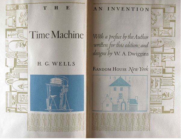
I was shocked at this cover though because I actually thought it was modern! When I realised it was designed in 1931 I was thinking “Wow…. this is what a timeless cover looks like!” I then sat and thought about what made it so timeless… the hierarchy, the contrast of the complimentary bold striking colours, the simplistic serif typeface (I believe he designed this himself!), the image used is stripped back to its simplest form…. It is minimalist. I think it works because it is minimalist.
Something a stranger in a shop told me once during light chit chat when I said I was trying to juggle 20 metaphorical balls all at once!! was to “keep it simple”, life in general.. This rule applies to great design I think.
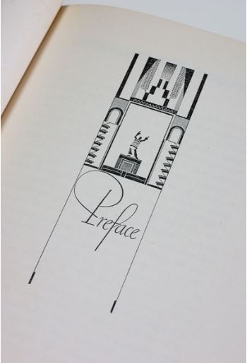
The great thing about this book is the attention to detail. Dwiggins really pays attention and puts love into all the pages. The cover is a masterpiece in itself but then he goes further by adorning the preface page with illustrations and then the inside covers he illustrates what he believes is what the time machine would actually look like. He goes into radical thinking by creating the Random House publishing logo as part of his illustration; he makes it the house from the story in his illustration.
I am now searching for a copy of this book! I want to own a piece of design greatness! It is a hardback version however; I would be designing a paperback cover. At the start of the 20th century paperbacks were brought in, shortly afterwards Penguin came about and this really saw the rise of the paperback as a “lifelong” book. Books that could be used over and over again and stand the test of time.
He did “show and tell” on a few more book designs and designers. Some of the designers he mentioned that I could look more into are:
- Jan Tschichold – He designed the popular Penguin book covers. Visual hierarchy is everything with these books. The layout is iconic.
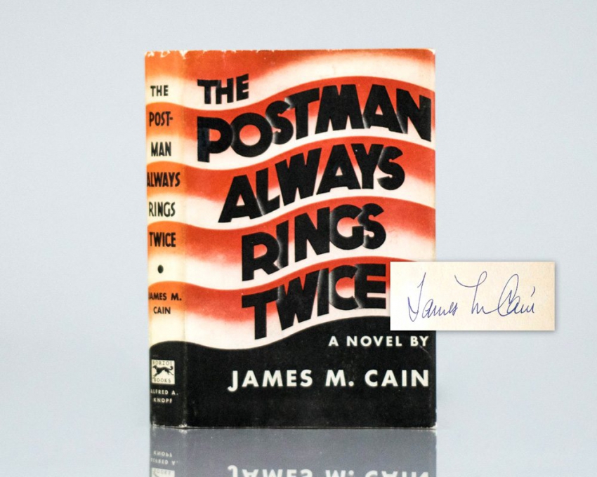
- Arthur Hawkins Junior – He designed with Typography – iconically with “The postman always rings twice”
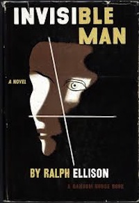
- E McKnight Kauffer – The invisible man – He took vintage classics and put a modern, minimalistic approach to them. He designed mostly posters.
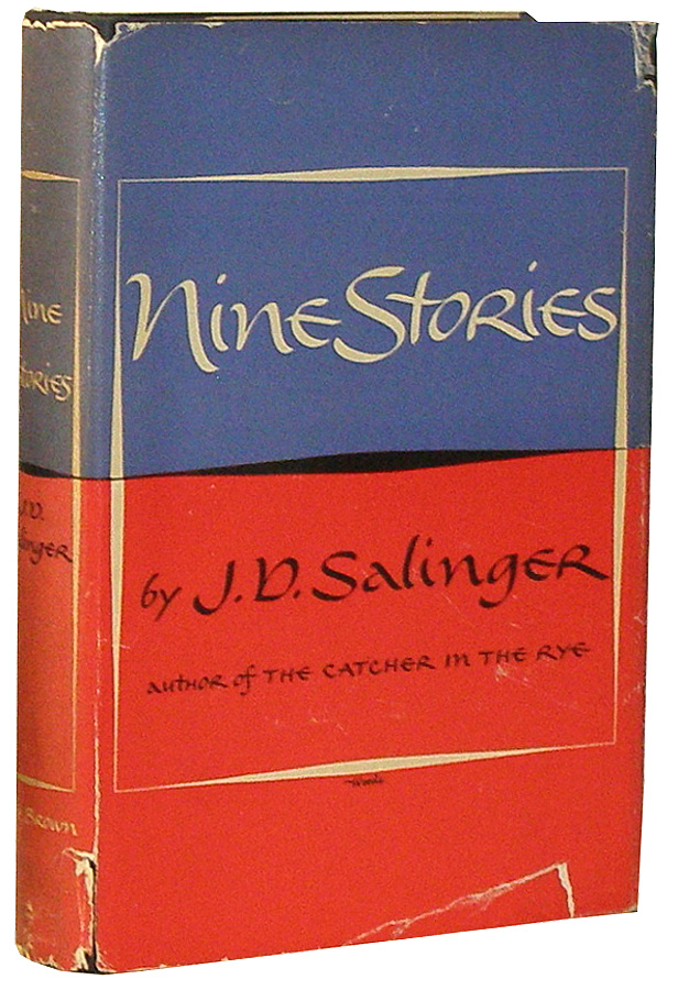
- Miriam Woods – nine stories – although I really do dislike the typography on this!!
- Shirley Smith
- Peter Saville – Minimalism – Designed the Joy Division cover bringing Content and form together.

Where do you start with designing a cover?
I need to look at previous editions of the books I am designing for and see what could/should have been done differently and what has been overlooked. I have to create something that has not been done before; it needs to be timeless and stand the test of style through the ages.
The cover visually tells the story of the book at first glance, so how do you go about knowing what to put on the cover? what images? what pictures?
I have read pages of all the books to try and pick out details about the characters, places in the books, items… anything that is relevant to the overall story that could be used for the cover. As the books are meant to be a series, I also thought that trying to find a link between all 3 books to tie them together would be a good idea; something that all 3 books have in common to use on all 3 to make them a “unit”. The only thing that springs to mind before I do some initial ideas is science, love and war!
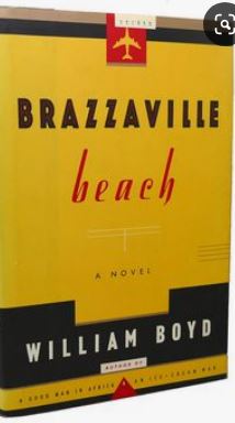
Chip Kidd went on to explain a cover he did for Brazzaville Beach in the early 90s. He said that one of the (possibly) least important things in the story (but one that was repeated throughout the story) was the fact that the main character smoked a brand of cigarettes. Kidd has an interest in cigarette packets and their designs so decided to incorporate this into the design. He made the cover of the book resemble a packet of cigarettes, the type that the main character might smoke. I think that this is an example of radical thinking; he has approached it differently, instead of using the most obvious images for the cover he has looked into finer details and used something that might have otherwise been overlooked.
From doing my brainstorming ideas the other day I did write that I had noted Ann Veronica kept a dissected frog in a jar.. I think that this is similar to what Kidd did with BrazzaVille Beach. I haven’t taken an obvious object or being such as an image of Ann Veronica herself, but taken something that tells you about who she is as a character, her interests, the science link but doesn’t directly tell you what the book is about.
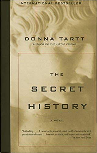
Kidd also talked about book covers. The fact that when timeless books are worthy of being classics they are protected by being covered in a shiny, film like protective cover. (Libraries, classic bookstores do it..) He decided to automatically add this value to one of the book covers he designed without it even having to become a “classic”. The book was “The secret history” it added appeal to it because it already looked like a classic.
Kidd talks about “taking homage” basically meaning find anything that gives you inspiration and draw upon it to help you with your designs. I feel I do a lot of this already but it just reiterates for me the importance of noticing everything around me and using it, recording it whenever possible!
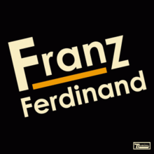
He went into art movements of the early 20th century, something else I know I have knowledge of but that I need to look further into. The movements he spoke about were De Stijl, Art Deco, Futurism and Constructivism. Possibly one of the most iconic (for me anyway as a teenager!) was Franz Ferdinand album art which was influenced by this movement.
Here is a little slideshow of books and ideas Kidd touched upon! I really enjoyed the video and I feel like I have learned about designers and techniques I previously knew nothing about.