Without going too much into my feelings.. my bruised, trampled pride! This is a subject that has recently affected my life… I didn’t want to turn it completely into a negative experience though, I decided to write about it to a) get it all off my chest and bring closure for myself and b) for good practise; practise layouts, typography, Photoshop, InDesign… pretty much everything I have sucked at until now of course! ;p
I have always loved magazines and the area I would potentially like to go into is magazine design. I thought that this article would be the perfect starting point for a “fake” practise article.
Let’s turn a great big negative into a positive!
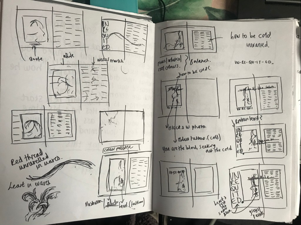
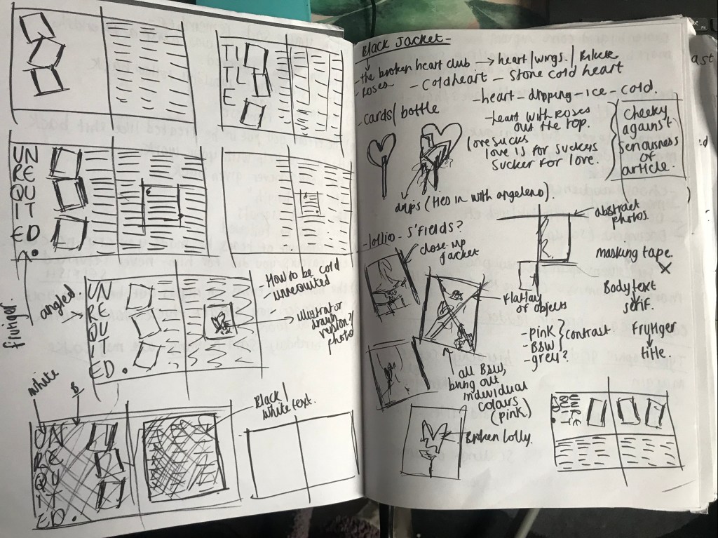
I wrote up my feelings, my story, factual snippets etc and then decided on the type of design I might want to use for my fake magazine article!
I wanted to include myself in the article (as narcissistic and self indulgent as this may sound!) After all it is my article, my feelings, my opinions and my story! This involved photographs.. I wanted the photographs to be serious and professional looking but also reflect me and be a bit cheeky in appearance. I wanted them to be quite vulnerable and to reflect how I am feeling right now. I paint a lot of faux leather jackets so decided that I could paint one with a slogan on the back that might reflect the subject of my article.
I decided on “Love sucks” because it is playful in approach, modern and appeals to the younger generation. I wanted the photographs to be black and white but for the pink on the back of the jacket to show.
Here is my thought process:
I enlisted my sister (who is a bit of a pro with a Nikon 😉 to help take my photographs.
I then took them into Photoshop and adjusted them to make them suitable for my article! These are what I ended up with. 2 out of the 3 photographs were actually outtakes! They were not in my original sketches at all!
These are what I ended up with!

outtake 1! 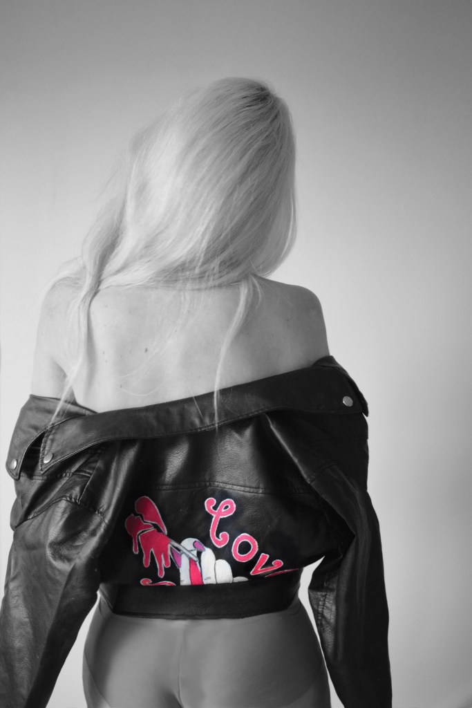
outtake 2! 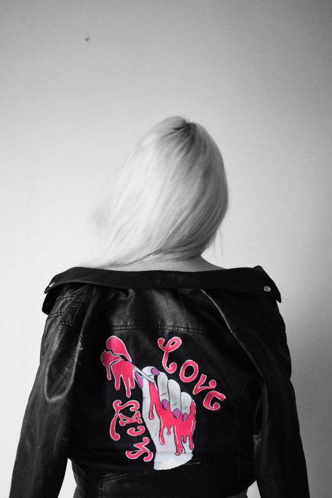
the one that I did vision!
I then realised that the amount of effort put into this so far needed equal effort in making the actual article look good! I suck at Indesign, grids and typography! (well I think I do!) as much as I enjoy it, it is one of them subjects that I never seem to master; although I think this is because I have never spent the time studying it and practising!
I needed to create a typographic grid.. After researching and watching a tutorial as to how to get it right.. I created one! I filled it with placeholder text to get a feel for what typeface I would use and how it would potentially look.

Typographic grid practise.
This is what I ended up with!
I then placed my article into the document and messed around with the layout, typeface and point sizes etc..
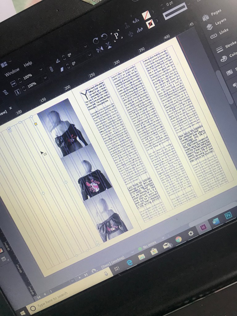
This is currently where I am at! It is no where near finished! I still have to add the title and rearrange some more as at the moment the text is quite “heavy” to read.
Also I am debating on justified vs left alligned..
I like the look of justified, always have despite the fact it is frowned upon a fair bit in design. I have always believed that justifying text is justifed (see what I did there! :p) when it involves a lot of body text. Fully justifying text takes a lot of time and work to get it right (as I am finding out!) I have spent a lot of time already altering the line spacing, the leading, trying to fix all the rivers in my text.. it is hard work! I then went to the shop last night and decided to look at some existing magazines… ideally I would have liked to look at Vanity Fair as their layouts are very “text heavy” and they set the standards for high quality articles.. however, I don’t think my town is that stylish because I can’t seem to find a copy anywhere! The magazines I did look at such as Grazia, Cosmopolitan and Hello Fashion magazine all have their articles left alligned. It is now making me wonder whether to carry on adjusting and fixing what I have.. or simply set it to left alligned. I fancy a challenge though and for someone that is not too savvy at layouts as of yet, I could do with the practise!
Answers on a postcard please ;p
