
I am trying to do a practise piece a week (alongside actually sending my first assignment off!) I want to improve my skills using Photoshop, Illustrator and Indesign. I want to trial some pieces around what I am interested in; Magazine Design.
I got the idea for this piece from a name that a group of my old gym mates used to call me for wearing my pink lipsticks.. “Shit the bed Pink!”I was reminded of this phrase a few weeks ago when one of the girls suggested I needed to design a lipstick and call it this shade! I was thinking about what “fake” article I could do for my practise and decided that I could do this!
The idea is “shit the bed pink!” – It’s not for your Grandma. When people think of bright pink lipsticks they either think of their Grandma wearing the most hideous shades of neon candy pink or they think of Pat Butcher from Eastenders back in the day! (showing my age!) I wanted to show in this article that pink is the new modern IT colour and that it is definitely not just for your Granny.
I decided to use my own photographs, I did a nice little flat-lay on my patio which involved one of my Grandmas old pink floral tea cup and saucer, some pink food colouring to dye the “tea” pink, a lacy doily and a nice little cross stitch handkerchief my Grandma cross stitched and a selection of my favourite lipglosses I use on the daily! I also included Polaroids of Baddie Winkle; she is a 92 year old Instagram star, renowned for her love of pink and dressing like she is 20! I thought this would show an edgy, cool, humerous side to “It’s not for your grandma”
I took the flat lay photograph how I wanted it to appear (took about a million photos actually!) and then imported them in to edit in Photoshop. I wanted a clean, crisp, modern look to my spread. I wanted the colours really pop.
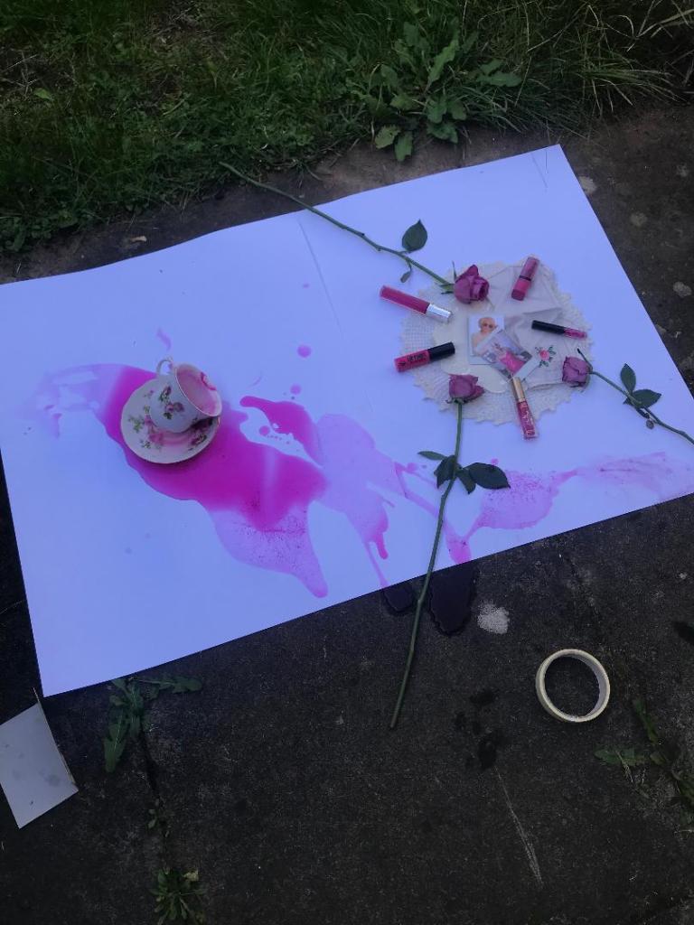
This is the flat-lay I set up on my patio for the main image!

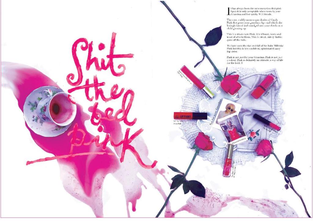
This is the final layout! I am the least experienced with designing layouts and using InDesign so I decided to give it a go! I watched a tutorial on using the software, I have used it before in the past but a long time ago! I needed a refresher! My weakness is also Typography even though I have an interest in it.. I wanted a sophisticated typeface that looked feminine and soft but also professional. I decided to download Didot. I like the serif style of it and the way the curves on the letters look very feminine and elegant. I messed around with an illuminated letter and glyph at the end of the body text.
The only things I would be really picky with are I would make the “Pink” stronger in appearance as it blends into the puddle a bit. I would also add actual shades of the lipsticks next to the images of them, this is how it would appear in a professional magazine.
