I have decided to try and create at least one piece of practise work a week.. Although it does not directly tie in with my uni work it will help me to progress and learn and to try out new things. Another important thing to remember also is that it will be improving my confidence with using design software again. I could also potentially use some of these ideas and use them in my uni work if it was appropriate.
The first piece I created I wanted to give it a go using Photoshop again. I have never been strong using Photoshop, I have never quite got the hang on editing photos; then again the last time I properly used Photoshop was over 10 years ago when tutorials and software was not readily available.. We had to rely on a “dummies how to guide ..” book! ;D
I like scouring Pinterest for deep and interesting quotes and stumbled across one by Gertrude Stein – “A rose is a rose is a rose” one of my favourite quotes I live by is “It is what it is” and this pretty much has a similar meaning; it means “things are as they seem” things are and are meant to be exactly as they are.
I decided to use the “power of 3” and use 3 roses for my piece. One of my fears in life at the moment is that I feel I am dangerously falling behind everyone else my age.. I feel like I am lacking in life compared to what others are doing and achieveing. It is something I tell myself to get into control; everyone moves along at their own pace in life, there are no deadlines. I worry that time will run out and before I know it I will be old and done! I wanted to portray this originally with 3 roses at different time ages.. one being fresh, one being mid age and one that is withered and dead. I decided against this and just went for 3 identical roses.
I knew roughly that I wanted the layout for this piece to be clean and sharp looking. I knew how I wanted to arrange the type on the page roughly also.. this helped me in arranging the roses for the flatlay photography piece. I photographed the roses outside on my patio using white card as a backdrop.

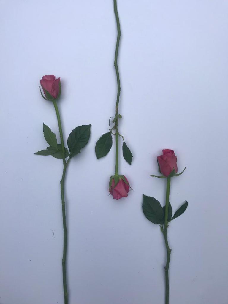
I took many different photos at different angles but came to the decision that these 2 would be the final ones,
I then went about altering the image in Photohop, changing the brightness/contrast/saturation/levels etc..
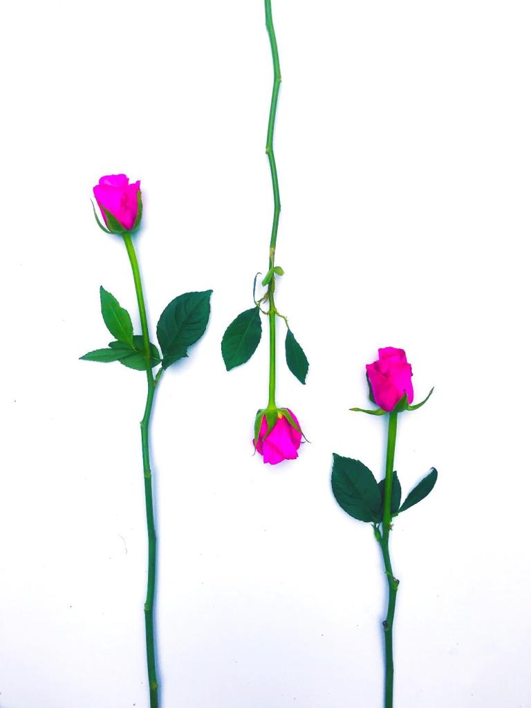
I was really happy with the outcome! I changed the colour of the rose to really make the pink pop! I changed the levels to also make the white of the background stronger and brighter.
I then went about the layout for the piece. I wanted it to be clean and minimalist.
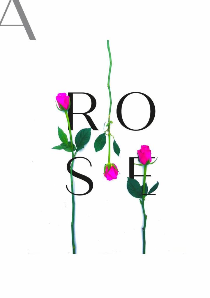
I used a typeface called “Quiche Sans” I feel that it stands out but also looks feminine, delicate and clean cut. I am interested in fashion and beauty magazine design so I feel that this would work well within one of them. I used layer masks to make the text work around the photo of the Roses.
I then wanted to include a little bit of text. “A rose is a rose is a rose” and position the wording around the 3 roses. I wanted the design to be quite spacious and minimalistic.
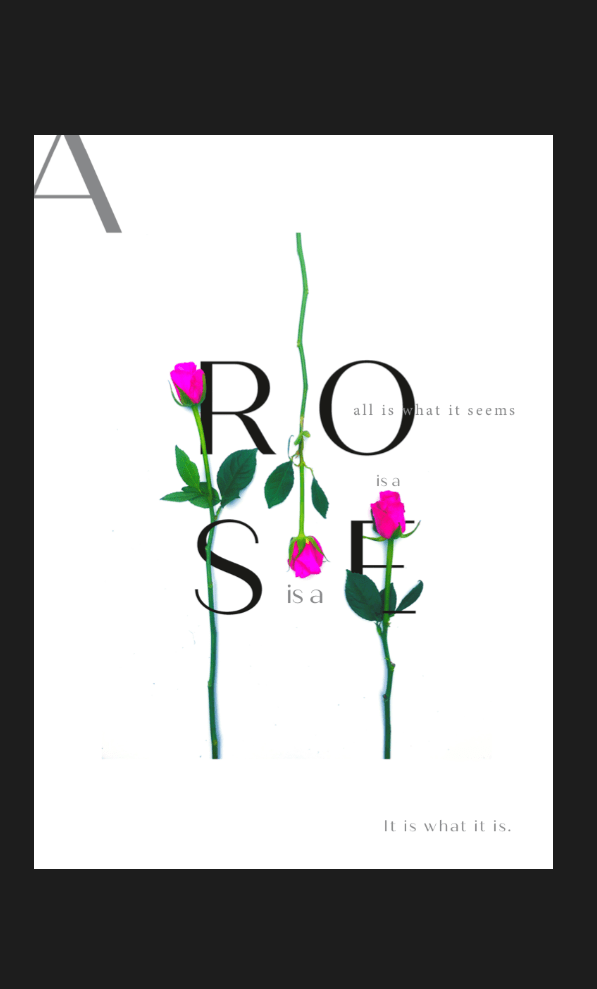
This is the finished piece!
