It has been a while since I wrote my last post but since my last post I have actually completed (I think!) the fronts of my postcards!!! 😀 (I still have the back to design however).
I changed a lot on my design since the last post. I completely reworked the final 2 postcards – still keeping the same idea and concept but just completely changed them around!
I was feeling frustrated on my last post that I could not find a way to include the wing onto the design, I spent days trying to think of ways and then decided I needed a break from seeing it and did some other illustration side projects! By the time I went back to it a few days later I was actually surprised that I actually knew instantly where to go with it and what needed doing! I completed the final 2 postcards in 2 days! This was good but it also made me feel silly because I have spent so long on this assignment in general!
These are what I have for the postcards!
Postcard 1 and 3 have not changed, They are still the same illustrations that I did.
Postcards 2 and 4 however have changed a lot!
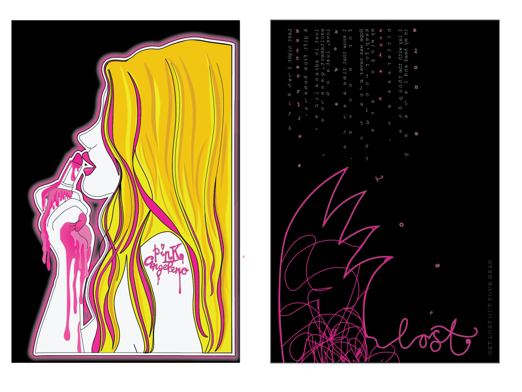
I shall start with Postcard 2! – This one is the postcard that I wanted to express emotion and feeling through. I wanted it to be raw and honest and show who I am on the inside. In the last post what I ended up with was a very dark and spacious design; I decided that it did not tie in all too well with the other pink, bright and girly postcards so I needed to find a way to keep it edgy but also bring it back a little bit!
I am interested in typography; I have stated before though that I feel It is not one of my strongest areas. My original ideas for this design were using the typewriter and using mixed media and raw type for the design. This changed though to me finding a suitable font which looked like typewriter type and using that instead. In my last post the placement of this text was set in the middle of the design, I have also changed this. One of my original ideas was for the text to “fall down” I decided to position the text along the top of the postcard and reflect it so that the text is backwards. You can still read it from left to right except that the text is backwards now. This makes it more believable for it to fall down to the bottom of the page. I then took the last words of the sentence and dropped them down the page. The idea for this wasn’t to be legible or easy on the eye to read. It is supposed to be messy and confusing and more of a visual impact than being legible. The mind is a messy place and this reflects in my type. The content of the text is still the same, it is still my original poem writing that I did.
The next problem was getting that wing in!… I decided that it needed to be simplistic and not too big so as to not take the attention away from the main design and also so that the negative space was not lost. I drew an outline of a wing in rough with the pencil tool and decided to keep it because it actually looked alright! In theme with the other designs I made it pink and put a neon glow behind it. I then wanted to get the “get lost” heading in there somewhere but decided that the original “get lost” that I designed worked better with the LA themed postcard (being that it is about Angeleno and “lost” Angeles etc) I needed an alternative heading for this postcard. I still wanted it to be about getting lost in your head so in the same style as the wing I took the pencil tool and drew an outline of “lost” I then tidied up the curves, put a neon glow behind it and I felt like it worked.
In the theme of a “messy mind” I thought I would add some pink scribbles into the wing.. this would add some detail as well as highlight the messy mind. After I had finished this I felt like I liked the effect and the overall design but that also it reminded me of the “mind” logo that already exists. I hadn’t thought about this existing logo at all prior to this design so a part of me was dissapointed that it resembled it slightly but there was also another part of me that was reassured that my thought process thinks in a similar kind of way to the professionals! 😀

The above images are postcards 2 and 4. Again, 2 has not changed. The idea for 4 however stays the same but the style has been changed! This postcard represents my love for LA. I wanted to also though keep it similar to postcard 3 with the edgy rawness of it.
I decided that I wanted to try something different for the inside of the wing; I still kept the shape of it to look like the Californian west coast but I felt like I wanted to try something a bit different with the inside of it.
I visited LA 5 years ago and while I was there I took a fair few photos! I browsed through the photos trying to find something that might look appropriate. What I found was a photo of the LA skyline from up in the Hollywood Hills. The photo looked murky and dull (even though it was a heatwave of a day!) from the haze of the sun and the smog from the city down below.I felt that this looked raw and edgy enough for my design. The original photo looked good but I felt it needed to tie in with the pink theme so I took the original photograph and altered it in Photoshop to make it completely pink. This is what it turned out like:

I then imported it back into Illustrator and clipped the photograph to the shape of the wing.
One of my really early ideas was to include bands I like or lyrics into the design. One song that stands out to me as LA themed in particular is “Under the Bridge” by the Red Hot Chilli Peppers. It is a song where basically he explores loneliness and isolation (mainly through drug use however!) but explains how he felt like the only reliable thing he had in his life was living in LA and just moping around the city. I decided that these were good lyrics to include. They tie in well also with postcard 2. I used a grid system but also lined the lines from the pylons in the photograph to my text. I decided to place the text into what look like white torn pieces of paper. I felt this gives a more alternative look.
There are still elements of Illustration on this postcard as the illustration from postcard 2 crosses over onto this one with the hand. (I have also realised from looking at it that the foot should also cross over, I will need to fix this!)
I have again dropped some of the text on this postcard to look like it is falling and most importantly have used the original “Get lost – Angeleno” logo. I have also used the drip effect which I drew in Illustrator and used in the first 2 postcards. Overall I really like the look of this postcard!
Let me know what you think! – I am pleased however with what I have achieved so far! 🙂
