So.… my last post slated the grid. F**k that grid!… I take all of that back! I thought I could take my normal approach to “playing it by eye” but my eyes suck on this design!
I decided firstly to work on the text design I put on my previous post. I messed around with a whole load of ways for it to appear! (I think I saved 10 layouts for it in total!) changing the colours, adding dripping text, taking away dripping text, adding ink splats, making it blurry, taking the blur away!….. exhausting!
I reached this version and decided this worked. However, the problem was then getting all the text I wanted to appear onto it with the typewriter type. There was a massive bulk of text!

The photos above show how I tried to mess around with the layout and getting the typewriter text into such a small confined space! This was a trial run really to see what it could look like.
I then imported the photo of the text into Photoshop and adjusted it to then bring into Illustrator. This is what I ended up with. I didn’t like it. There is too much going on.. it looks cramped, nothing particularly stands out on it. I came to realise that my typewriter idea was nothing more than a good idea. I can not make it work on this design. My next idea was to use “fake” type written text… use an existing font which looks like typewriter text. I chose Courier New as it seemed the closest. The next step was to change the text because there was just way too much of it to take in! I sat and thought for ages about what I could use in its place; What shows the thoughts and emotions that run through my head? What shows who I am deep down inside? What could show my vulnerability and “raw” me….
A few months ago during a bittersweet moment in my life, I documented this late at night in my sketchbook (I write things that I feel in poem form in my sketchbook at times when I feel I need to vent! – It’s like a visual Bridget Jones’s diary! ha!)
Even though I wrote this piece after several glasses of vino (potentially whiskey too!) I actually really love the sentiment of it. It means something to me and it is still something I am dealing with.. so I decided to alter the wording slightly to fit in the theme of the “angeleno” and see how this might work on my design instead..
Does it show who I am? Check! Does it show raw feeling and emotion? Check! Is it vunerable? Check! Does it run deeper than just aesthetics? Check! Can I tie it in with the theme of the design? Check! Has it 100% been created and written by me? Check!

I did make a typo in “adrenaline”
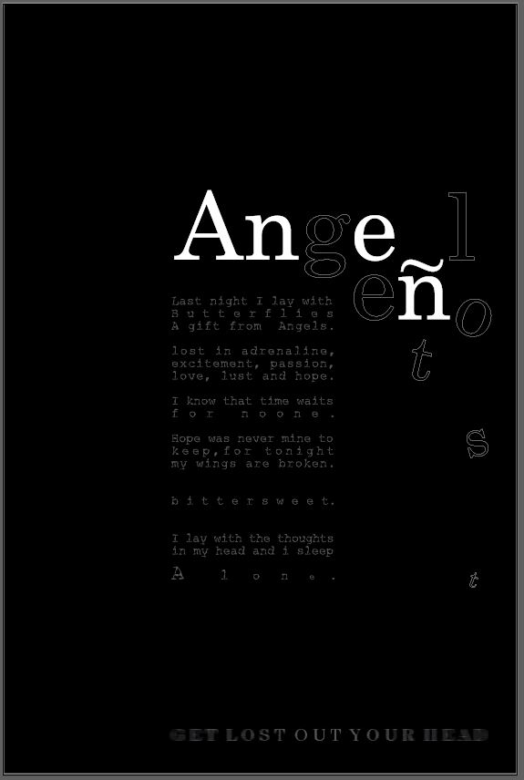
What I ended up with was this. At the time of designing this I thought I had got it spot on… the next day however, hated it! Loved the poem.. that makes the piece in my opinion! Hated the layout, colours… The background colour needed to be black to tie in with the rest of the postcards so I knew I would have to alter a lot of the design to reach this outcome.
This is when I realised that despite my “f**k the grid” I actually needed the grid. I then spent time splitting this piece in a 3×3 grid. What I then ended up with was a million times better! This is also the part where I experimented with a million different ways to display the “Angeleno” part. The eye was drawn to the “Ange” but nothing else.. I needed the hidden “get lost” part to be visually visible more. These are some of the layouts I tried out!
This last photo is where I am currently at. Using the grid has definitely given it more structure and made the design visually work better!
The black background works better than the white and now ties in with the other 3 postcards. I chose to use white for the “Angeleno” text. I think that the transparent cut out part on the “Get lost” works because it is not tying to be as visible as the rest of the text and also part of the letters are getting lost by being cut up.
I have justified the text.. I did think against this but I feel it works well. I have altered the kerning on some of the sentences to stretch some of the words out. I wanted to emphasise the “bittersweet” and the “for no one” and “alone” these were the most important feelings in this piece of writing. “Alone” is in its own space and getting lost into the rest of the design.
I have yet to add more pink into the design. I also need to try and incorporate the wing into the design. I am not sure how I am going to do that just yet…I also want to put some words getting lost floating into the background.
I am pleased with where I am at with it at the moment, it is certainly a lot better than it was!


