
Working some more on my Cherub design idea I decided to scrap the Angeleno Cherub and just concentrate on the Typography aspect of the design only.
I have ideas in my head of how I want the type to look but it is taking some time getting it right. Typography; although I am interested in it the most, it is the one area I have always struggled to get right.
I need to interlink “Angeleno” with “Get Lost” cleverly, to try to make the two work together and to be easily redable to the viewer but also visually show the “getting lost” element.
I drew up some thumbnail sketches again to try and visually get my ideas down on paper:

Mostly on the left hand side page; Trying to work around the positioning of the type. I need to create some kind of grid system for the layout of the type.

Here I was trying to experiment more with the colours of the page. I need this one to match the other 3 postcards and to do that I need to have elements of pink and yellow. I was thinking about a yellow wing and making the pink a part of the type somehow.
I have done some research into some of layouts and ideas that I really like:

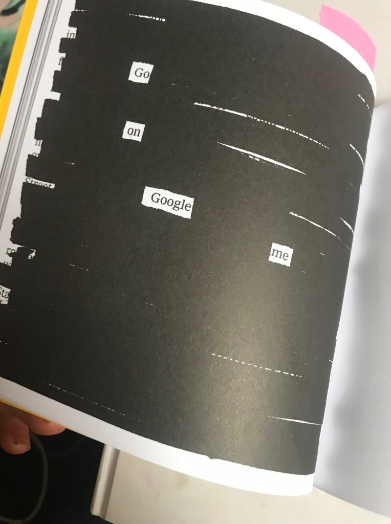
This page is from David Carsons book. I like how you can visually see what the name is although it has partially disappeared. This kind of idea would work well with the “getting lost”

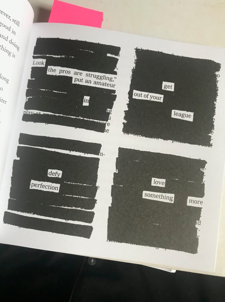
This is also from David Carsons book. It cleverly shows elements of text missing. It is combining type and making it visual. Visually conveying what it literally is saying.
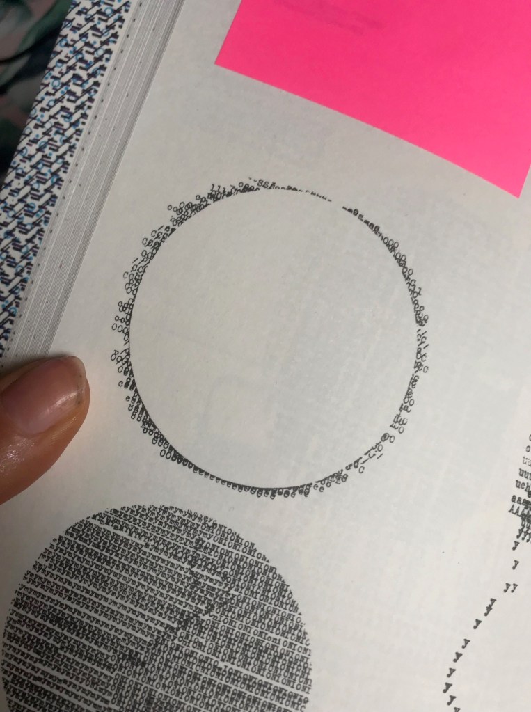


These are from “Typewriter Art” by Barrie Tullet. In my head I want to make the wing from typewriter type but it is difficult to line up the words perfectly to the shape of my design. Having studied these images closely I think I have now figured out a way to do it more flawlessly.
Moving away from the typewriter element for a moment, these are some of the ideas for the get lost type element. I have experimented with ink, Styrofoam block printing and just a simple plain style. I originally wanted the grunge look to appear on my design, I need to think of ways to still bring this in without making the design too much.

Experimenting with Styrofoam block printing.


Moving forward I think I like the idea of this but the current lettering is hand drawn so is not as professional as what it could be. I think I am going to choose an existing font and then use it as a starting point to mould into my own type. I then need to work on the layout and spacing of the lettering.
Some more design inspiration that came to me this morning however was from a book called “Show your work” (I might write a blog post about this book at a later date). I was pulling it out of storage for a friend to borrow and flicking though the pages gave me some inspiration for type layout.

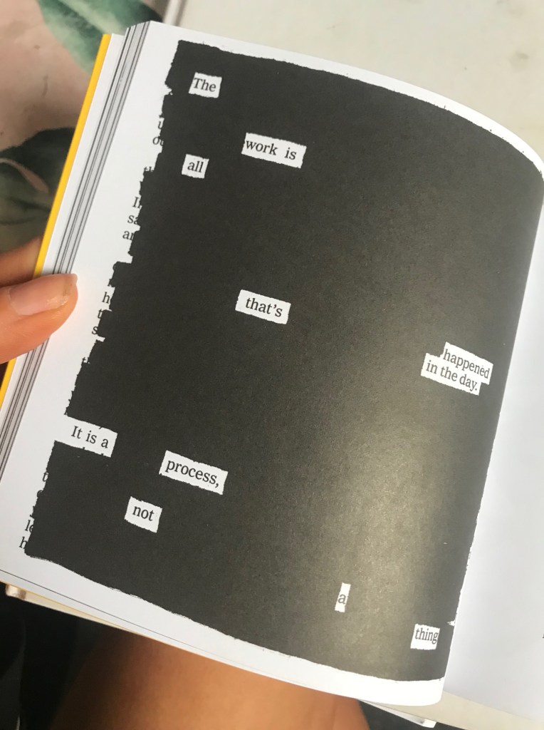


I like the cool, spacey, chilled back vibe of these pages. They have the sort of feel I am aspiring for in my designs at the moment.
