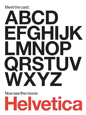
A post appeared on my Facebook news feed of inspiring films for Designers. One of them that was mentioned was Helvetica. I decided to download it on my Amazon prime and give it a watch!
The film consists of interviews from lots of designers from different age ranges and backgrounds giving their opinions on the infamous typeface. The majority of the designers featured in this film use Helvetica religiously within their work and would consist it the best typeface. Most of these designers however I noticed originate as designers from the 1950s onwards and what I would refer to as “old school type” The young blood that they interview such as David Carson rebel against the formalities and the old traditions and reinvent type in a different way.
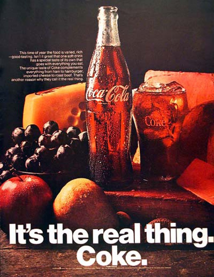
In the 1950s after the war, it brought about the Swiss way of designing! Swiss designers paved the way in type and the general outlook was that type should be simplistic, straight to the point and do what it is simply meant to do; be readable, clear and basic! Helvetica was designed in 1957 purely for just this! – clarity, no meaning to its form and to be used in signage. It became a hallmark for the International Typographic style. The film covers how it started as a typeface, how it changed name and showed many major brands that use it in their branding; There are many diverse brands who use it in very different ways – American Apparel, American Airlines and Coke in one of their early advertisements. Many adverts in the 1950s/60s used very “fun” hand lettered style fonts in their advertisements, it showed how this changed when Coke simply released their advert with a simple image and “It’s the real thing. Coke.” in Helvetica Bold; there is nothing else fancy needed, the typeface speaks for itself – the seriousness and confidence of it simply tells the reader “Drink Coke. End of!”
The interview then moves on to some of the more “modern” designers; David Carson being one of the most iconic. He is very humerous in the film by printing out several words in Helvetica and explaining how the typeface does not do the words justice. E.g. Explosive written in Helvetica not looking explosive at all! In the 90s Carson stuck 2 fingers up to the formalities and the traditions of type, took away the mathematical grid systems and basically experimented and rebelled with the image of type. He admits that he had no real training or idea what he was doing and was naive to the fact that he had caused such uproar against the traditionalists and that it just sort of happened how it happened! He brought about Grunge type. He designed a magazine layout for his Ray gun magazine – an interview with Bryan Ferry in which he stated that it was the most boring interview he had ever had to publish or design around and that no one would really care about anything the interview said; messing around with typefaces for the article he came across Dingbats (completely unreadable) but for the impact and the logic he felt behind it he published and designed it his way with that font! He has his own unique, rebelness “careless” way of designing type and this is why his work against the type designers of the Helvetica Swiss era stood out. After the 90s grunge type era had ran its course there was no way to go back to what once was… the traditionalists had to invent new systems.


Overall it was a good film showing the importance of Helvetica and how well it does its job as one of the most popular typefaces of all time. It has definitely shown me more how type can have such an impact in your work and how it is seen and “heard”.
