
I have drawn out postcard 1 on Illustrator….. The hard task is now deciding how I want it to look and which colour scheme to go with!
I originally stated I wanted the postcards to all be the same colours (Pink, Black and white) and be very simplistic and just simple line drawings. I have now had a rethink about this…
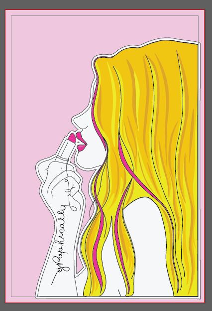
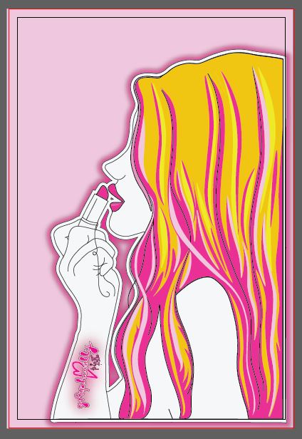
In my learning log sketchbook I collected examples from Paperchase of neon cards that I like the style and look of. I tried to replicate this in my Graphically Pink logo and I have now looked into replicating this for the first postcard. This would be the middle image above; I believe that this stands out the most because there is a contrast in colours, however I am still unsure that it stands out as well as the first image due to the hair being “busy”. I might change the blonde in the hair to a light pink yet to try and see if that makes a difference. The pink and the Black work well together, it is a pop of colour. I still like the first simplistic version though, I feel that the pink background works well against the simple hair colours. I am wondering though whether this would be enough to attract attention though and whether it would be enough to attract people to potentially buy into it.
I have also put cost implications onto my designs for industry printing by adding more colours.
I shall have a look into the pros and cons of each design… relook again tomorrow and see where I can further improve!
Positives:
- The colours work well together
- The hair colours work well and it doesn’t look too “busy”
- There are elements of pink throughout, keeping the theme but not overloading the design with pink
- It is keeping within what I originally stated I wanted by being simplistic and keeping its line drawing element.
Cons:
- The colours don’t “pop” there is no contrast in colours
- Nothing stands out on the whole image

Positives:
- The neon affect works
- “Graphically pink” comes across with the pink although maybe not entirely with the “graphic” (I feel greys when I think of that)
- The colours contrast; there is a pop of colour.
Cons:
- The hair feels too “busy” whether there is too much line drawing and colours within it or whether it is the yellow not working with the other colours I will have to rethink
Positives:
- has the neon affect
- conveys the pink
Cons:
- Still needs a “wow” factor – to stand out more.
The logo on the postcards also needs work and improvement. I have placed it on there for now to get a feel for how it might look and also so I am clear on the placement of it.
