Over the last few days I have been looking into ideas for 3 of my postcards. I know the brief is to create a minimum of 3, however I want to create 6.
I want to look into Aesthetics v Ergonomics. I tried to look into design terminology that best described appearances and how the mind and body work and the two that stood out to me and best described what I am trying to achieve were Aesthetics and Ergonomics.
What I mean by this idea is that the expected final outcome would be for me to create 3 postcards based purely around who I am and what I like etc… These could be images relating to what I look like, what my favourite colours are, images potentially of my interests and hobbies. From looking at these postcards you would get a look into the aesthetics of who I am. Aesthetics are superficial in this case. I want to get across who I am beyond what you see in appearance.
This is where I thought of a second batch of postcards relating to the mind and body and am calling them the “ergonomics”. Ergonomics is how the body and mind react or work with something. You can mould designs to react to a human body; i.e you can design a pen with a spongy finger grip to make it more comfortable to hold and for the hand to write with. I want to create 3 postcards based purely around the mind and body of me. How my mind and body react.
I have already stated that the first 3 postcards are going to be very visual, a lot of pink and a lot of my influence. Hopefully they will be attractive to look at and be appealing to a female target audience. I want them to represent Graphically Pink, my love of LA and Girl empowerment.
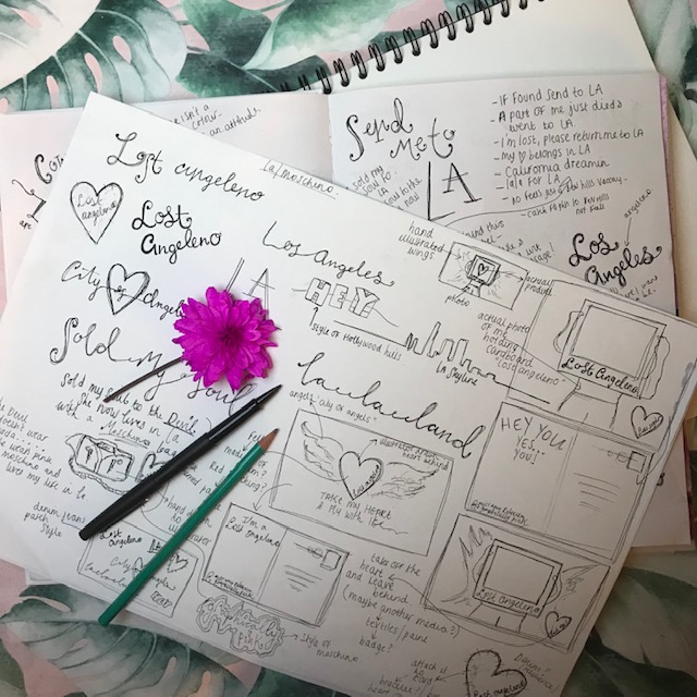
From my research into postcards I then started to look at how I could make them into a series.. Looking at the Cosy Club examples they all link and use the same imagery and typography. I wanted to be able to put all mine side by side and be able to link them all together. Branding is very important; particularly self branding which is what this is to a certain degree. It is showcasing who I am and what I can achieve. I looked into different layouts and ways in which I could tie them all in together.
The idea I initially have is a side profile illustration I have drawn of a girl applying lipstick. I thought that this could be an idea for postcard 1 and tie in with the Graphically Pink and the fact that I am renowned for my bright pink lip colours… however, I then got to think about how it might look too repetitive repeating the same illustration over the series of 3 postcards each with a different theme (1 with Graphically Pink, 2 with LA etc) I then had the idea of what if I used the same illustration but cut it into 3 parts over the series of 3 postcards… In theory when the postcards are laid out on a table for example and placed together they will form one main big image but each one as individuals would still tell their own story…
What I have so far is a rough idea of how this could work. I have my drawn illustration all put together as one image but cut in places to form the 3 postcards. The illustration in general (although it is not of me!) represents pieces of me. It is very girly and feminine. Pink is the main theme. It has an almost innocent vulnerability to it showing a softer personality but also has a strong underlying message in certain parts of it.
The first postcard would purely be the image of the girl applying the pink lipstick with the “Graphically Pink” running down her arm. The second image is her lower half of her body. I have tried to make this very feminine and delicate with the use of her naked top half body and pink, lacy, girly underwear. The nakedness of her top half and the use of underwear I am still debating.. It has to reflect me and what I stand for and the last impression I want is for the image to be taken out of context! (flashback to 2005 when I drew a business card with one of my fashion illustrations on it and the lecturer asked me if it was my intention to become a stripper when I got older with my “long legs”.. hmmm!) This is where I would definitely have to think about the cultural diversity of a design and who it might offend. The girls lower body though is covered in sailor style tattoos; each one represents either Pink, LA or girl empowerment. (Tattoo design; another interest of mine!) Although the girl shows a slight vulnerability in being half naked and in underwear she does portray a tough, sassy, rebellious streak with her feminist tattoos. There is a side to this that I am trying to get across that girls can be girls, women can be women and still have a voice, Have their own opinions and be who or dress how they want and still be strong individuals. The underwear also is meant to relate back to the Barbie logo or the Moschino Barbie logo which I showed in my learning log pages and also possibly to the meaning behind the Barbie branding “Girls can be whoever they want to be”.
Be who you are basically.
It still has a lot of improvement… There are still things I need to rethink and alter and the third postcard which is the wings relating to the city of Angels is still very much at the initial ideas stage.