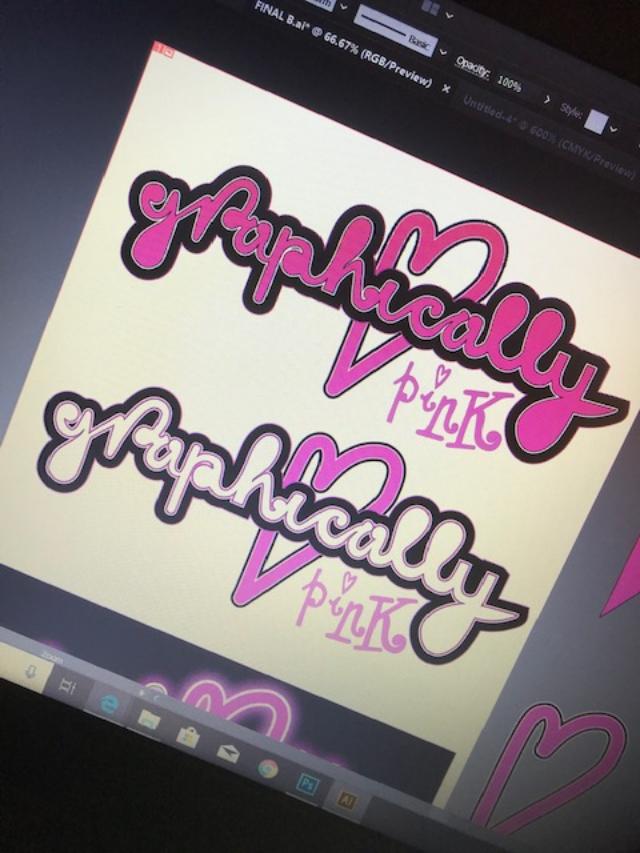
Update on my blog logo!
I know it’s not crucial to have this on my blog but I want to see it through to the end so that my page has some sort of identity! I am still getting back into using Illustrator! – Its been a long while! I’ve been having a go messing around with different effects to see what I can come up with! It was a 1am finish last night/this morning so what I have is still in my eyes a work in progress! – I am still not happy with what I see! It still comes across as flat and amateur looking in my eyes.. Although I wanted a fun logo; something big and bold, nothing too serious that conveys everything pink and which reflects me and my blog. It also have influence and inspiration from the Barbie logo and the Moschino Barbie logo which I have documented in my research and from my first ideas for assignment one.
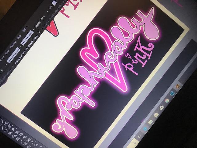
Trying it out in Neon
I like the neon effect – some of the postcards I documented in my learning log sketchbook use a similar neon effect. I might adjust this slightly though; I might add another Gaussian blur around the white areas on the lettering to try and brighten that glow. I like this but it is how well it would work without the black background.
