The Brief
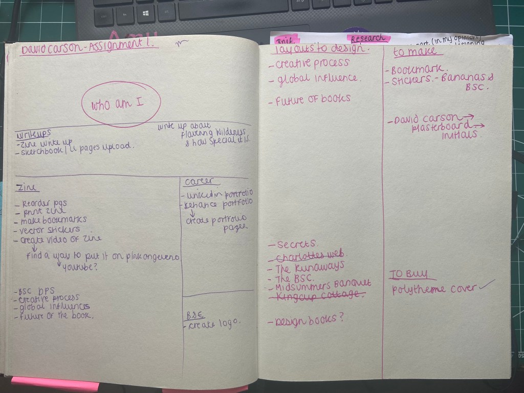
The Order of the Creative Process documentation
- The Brief
- First thoughts
- Designing the pages
- Research
- The pages
- The stickers
- Paginating pages
- Proofing
- Printing and binding my zine
- Mock ups and photographs of my zine!
- The video of my zine
- Distributing my zine
- Conclusion
- Supporting sketchbook pages
First Thoughts
When I first read through this brief I really liked the idea of producing my own publication and I started having lots of initial ideas for it; I also thought though that the brief was jam packed full of pointers that I had to meet. The brief was asking for a lot to be met in such a short publication, I knew that there was no way that I would be sticking to a 16 page fanzine but this was OK because the brief stated I could add more if I wished.
At the point of starting this brief I had absolutely no idea what a zine was. It took me a further few weeks to even realise I was pronouncing it was wrong! – z-eye-n instead of z-een. I knew that a lot of researching would need to be done first for me to be heading in the right direction of this brief. To be able to design and make a zine I first needed to disect everything about a zine! What one is – where they come from – what zines exist now – is there a zine community? – what content goes in a zine? – how are they presented? – etc, etc…
Research
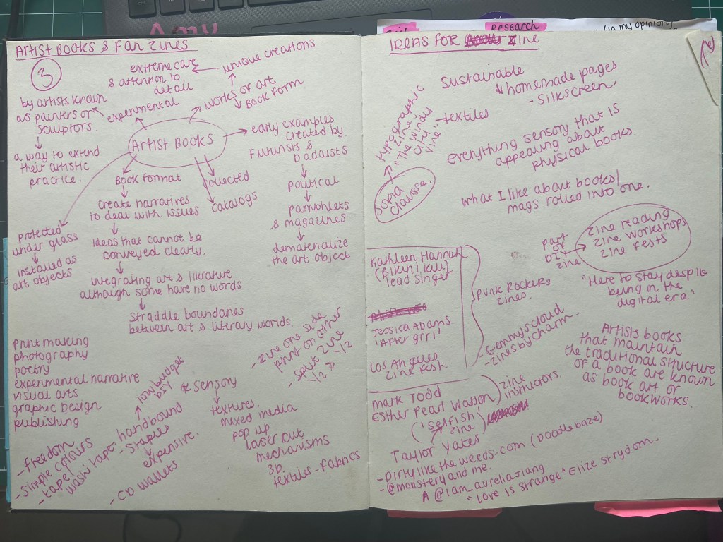
I started off by reading the OCA recommended book – Fanzines by Teal Trigg. This gave me a visual of the Punk influence of the early zines – it gave me knowledge of the “cut and paste” style that has clearly been adopted and further adapted through the years for modern day zines.
I then did some research online to see what kind of zines exist around the world – and also local to me! There are zine fairs worldwide where people meet up and set up stalls with their merchandise and zines for people to buy. There are zine book clubs. There is a zine group who meet up in Lincoln which is about 50 miles from me! They have a discord group and also before Covid they used to meet up at a coffee bar near the Strait to share ideas and the zines that they have made. I found some information about zines also on Lincoln University’s website – it seems that their Graphic Design students also study it! The more I was reading about zines the more I realised that this was like a secret underground movement that I had been missing out on!
Pinterest is always a good source of visual research for me and this is where I started – I wanted to look into the “cut and paste” style as this is emphasized a lot in the brief. I like how this brief has no emphasis on just being digital and that I was able to bring in all different elements of media. I have always been quite hands on arty and I was excited at the prospect of being able to incorporate some more skills.
The “cut and paste” style reminded me a lot of my own sketchbooks – full of random doodles, sketches, written notes, lists, things stuck in… I was getting more of an idea of what I could include in a zine.
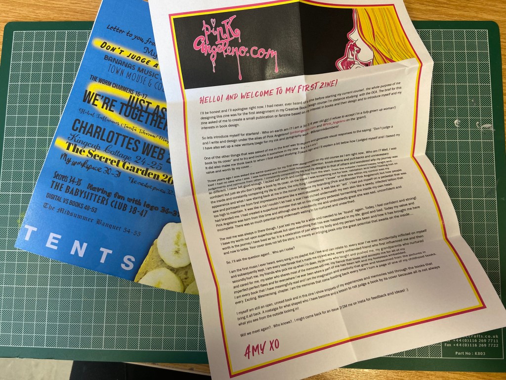
Once I read about the history of zines and their origins I then felt like I needed to go out and source some zines for myself. I didn’t want to just rely on the internet for inspiration – I couldn’t see the finished product in real. I wanted to feel the texture of the pages – even smell the pages! – see how they were packaged, how they were displayed and sold in a shop but also to help inspiring artists like myself! – I know I would love it if someone liked my zine enough to purchase it!
My fiance Chris at the weekends is very much a “Lets stay home” kinda guy!… especially when F1 is on the TV… However on this occasion I managed to drag him out the house to take me to Rushden Lakes Shopping Centre to go and raid Magazine Heaven for their zines. I absolutely love Magazine Heaven! It is well known with friends and family that I have a love for looking at and buying magazines! I could spend hours in there looking at all the different ones! I did my homework prior and found that Magazine Heaven sold quite a few of zines – there was even photographs of them online so I knew exactly what I was looking for when I went in there! I think it took 45 minutes in total of looking for the zines -Chris loved me sending him around the whole shop floor armed with screenshots of several zines I was looking for!
The zines that I found were all published publications by independent artists or small businesses; there was none in there that had been handmade or placed there by local artists.
I wrote a post about what we found previously though! This is the link:
I also bought a couple from Etsy which helped; one was written about body image by a 14 year old girl.. it was beautifully written, composed and put together. With more of an idea of what I was expected to achieve I then had to start sketching up some ideas and dissecting that brief a little bit more!
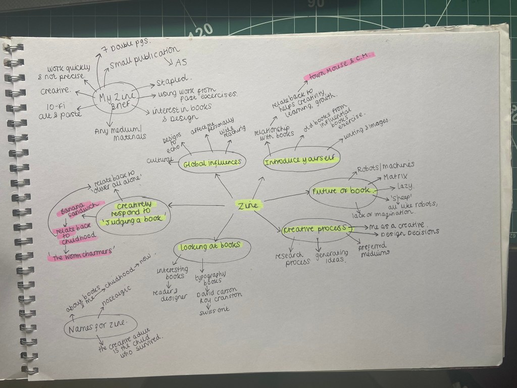
When I first have a brief in front of me I like to go through it and highlight key pointers and make notes of what is expected of me. I usually do this in my sketchbook so that all my findings, ideas, sketches and notes are altogether in one place.


The brief specified that I needed to produce a stapled, simple folded 16 page (or more in my case!) zine; it then goes on to contradict itself by asking me to “extend to challenging some of the assumptions about what a fanzine should look like or how it is made“. The ideas I thought of when mind mapping this was 3D, posters, pop-out elements, envelopes with hidden notes in there and other 2D or 3D elements to interact with. This would be tricky though when the brief wants a simple, stapled publication. I thought about a 16 sided concertina style zine with pop-out elements and somehow still bind it together with staples.. I also looked at past students work online it seemed that everyone had stuck to the brief and not been too adventurous. I wanted to push the boundaries but still meet the brief. I then had the idea of sticking to a simple zine booklet but including hidden little features in the zine.
My final zine is all digitally put together. It includes aspects of different media that I have drawn, collaged, photographed or written but then imported in to take into Photoshop and make digital. For years I did everything by hand – I absolutely hated digital simply because I couldn’t do it! Starting Core Concepts really pushed me out of my comfort zone and forced me to learn. I now love working in digital! If I produce anything by hand I almost always will import it in and manipulate it digitally. Being digital also allows for easier mass reproduction. I printed 10 copies of my final finished zine to distribute out but I could have done many more with it being digital! It still has traditional handmade roots that zines are renowned for but produced digitally for a much more professional finish!
Going back to the brief – What I also found interesting was that the brief asked me to use some of the work I had produced so far in Unit 1 – this meant bringing some of my findings and ideas and research from the exercises into my final assignment. The last pointer of the brief was:
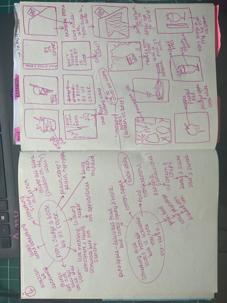
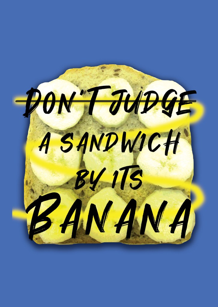
“How can you creatively respond to one or more of the following book sayings – bookworms, a closed/open book, the oldest trick in the book, you can’t judge a book by its cover, in someones good/bad books or by the book. Can any of your images, text or ideas also feed into your cover designs?”
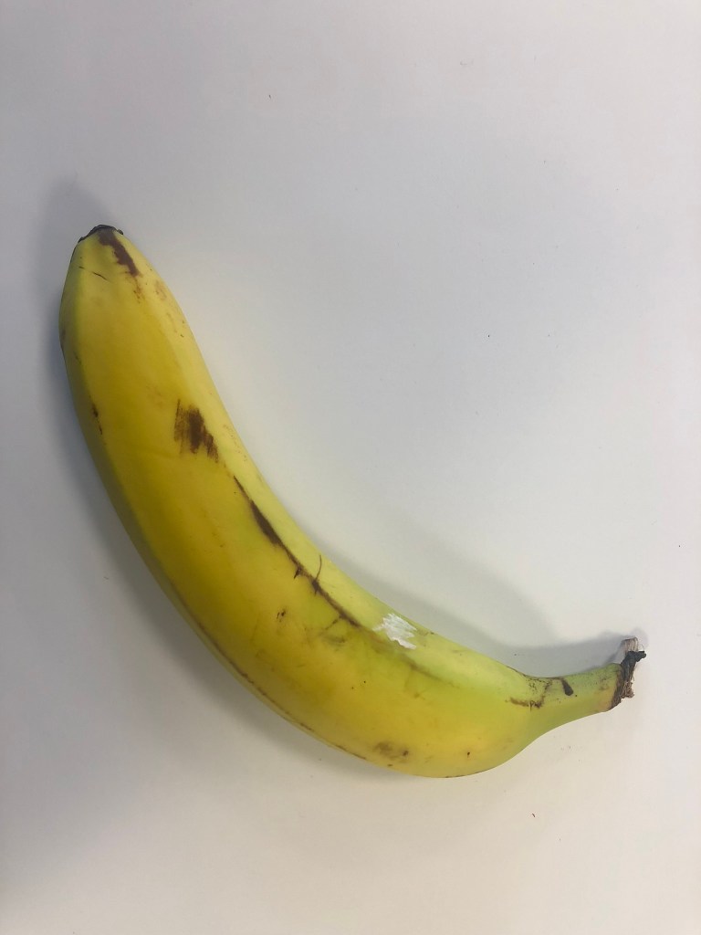
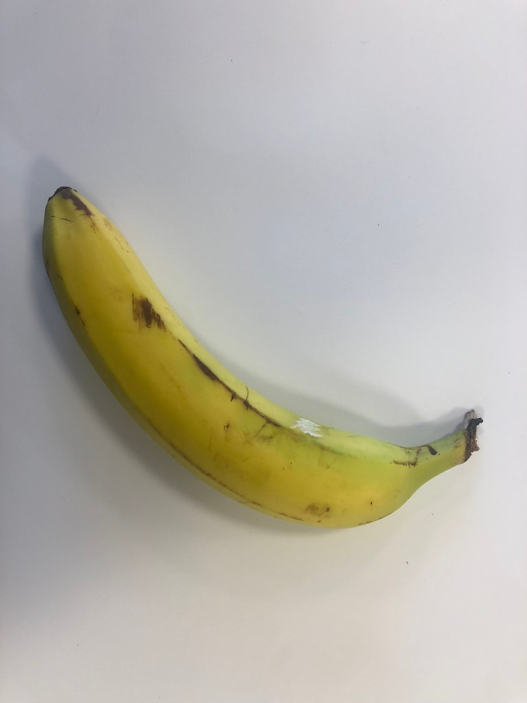
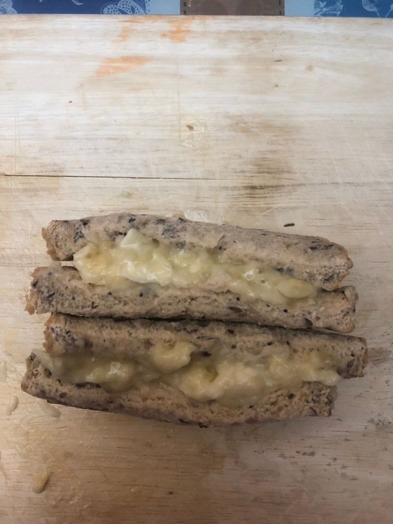
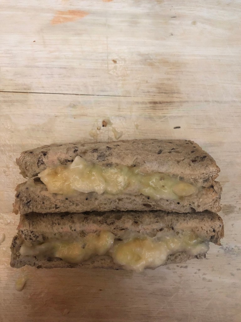
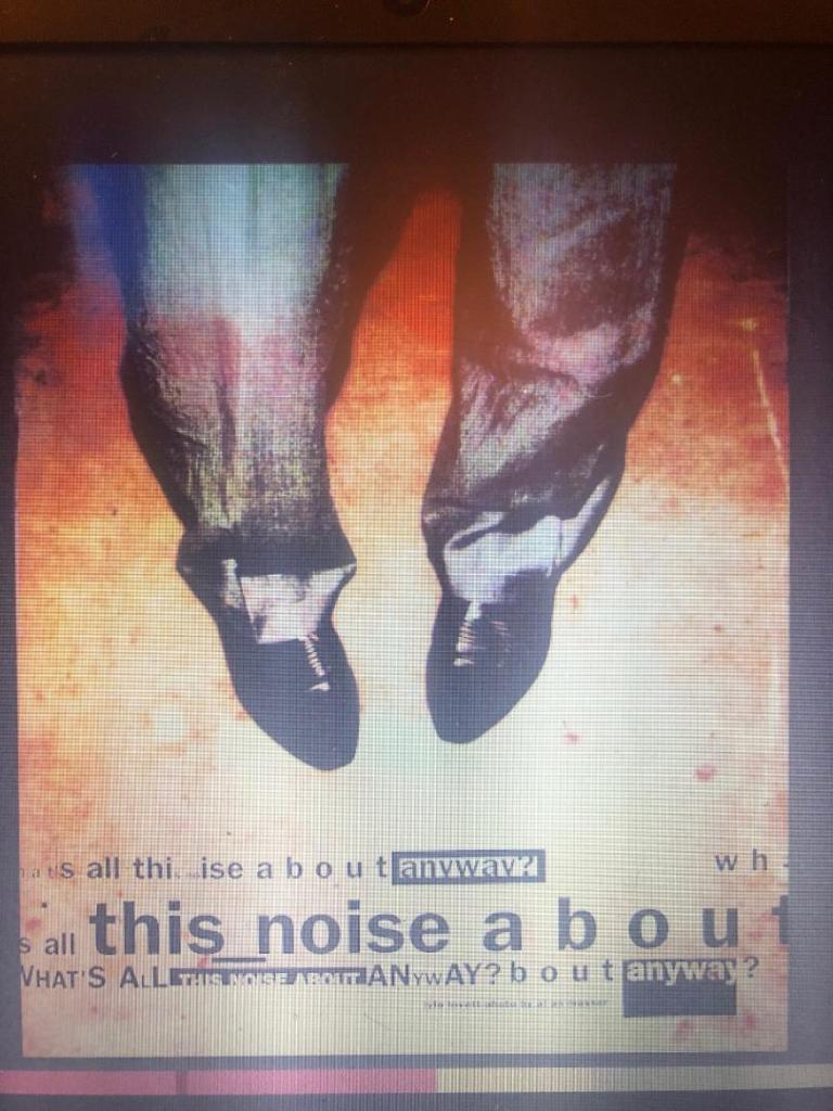
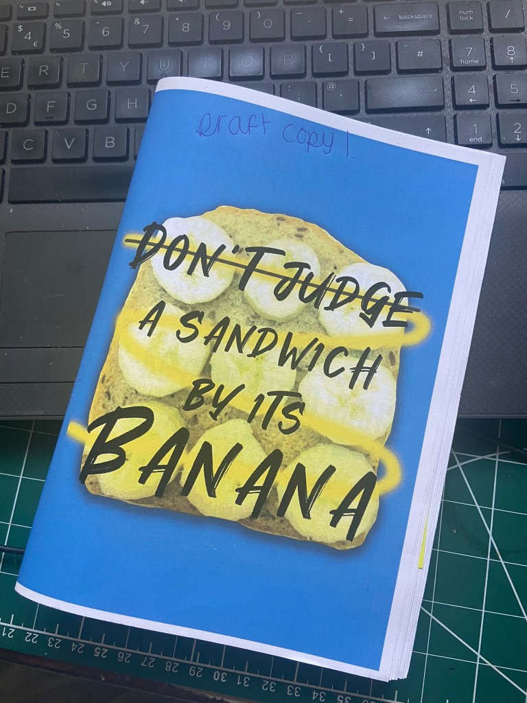
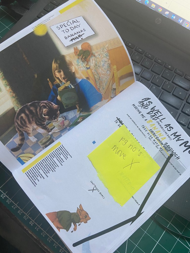
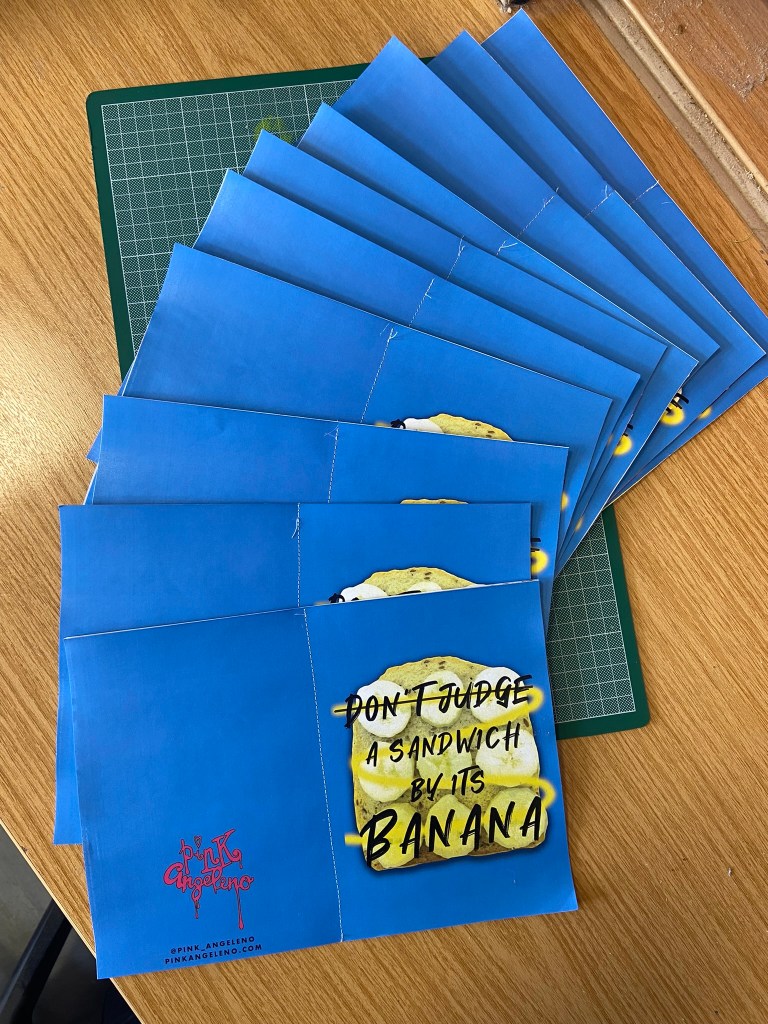
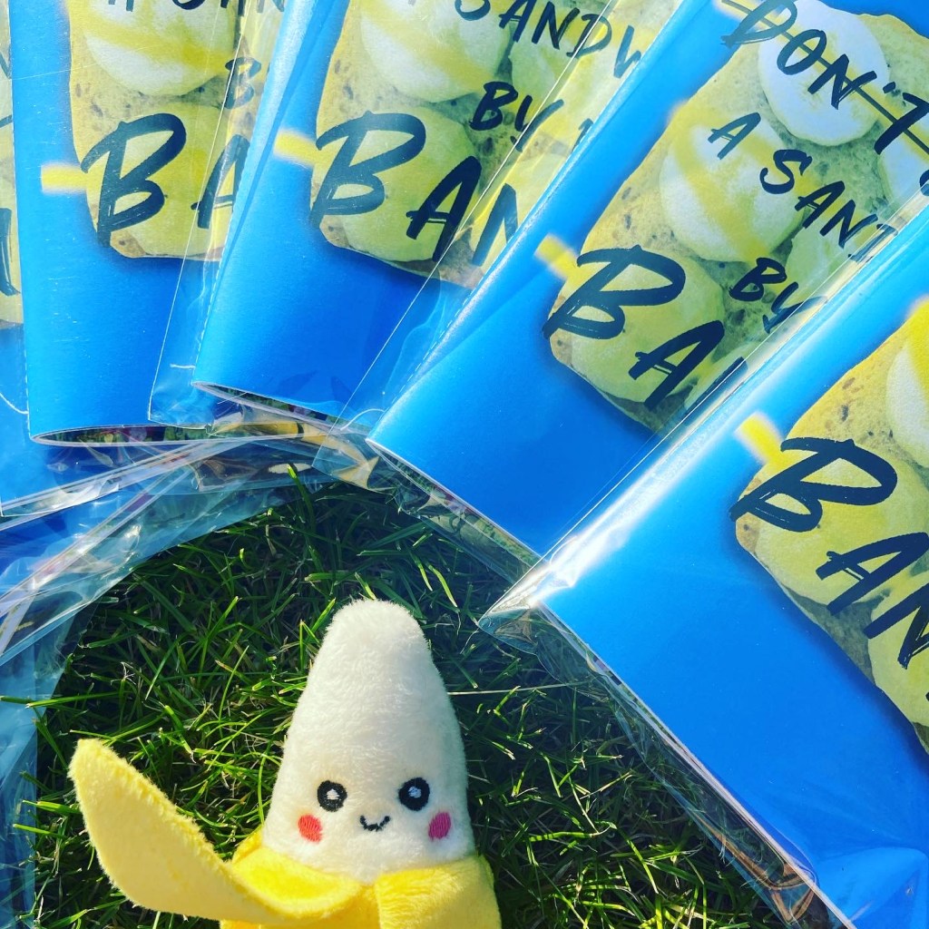
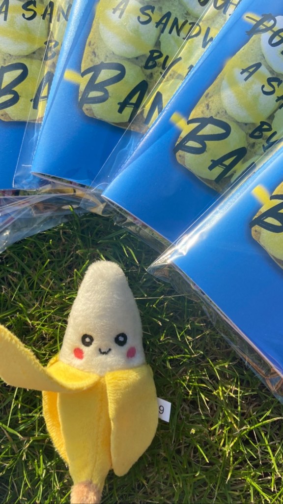
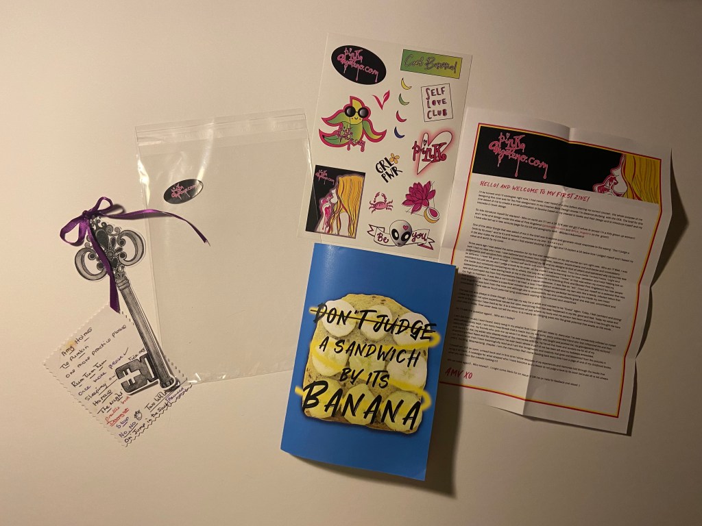
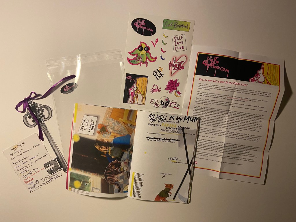
I really liked the design outcome I achieved in one of the previous exercises for this; I chose “Don’t judge a book by its cover” but put my own spin on it in my design with the Banana sandwich and “Don’t judge a sandwich by its banana!”, basically meaning that yes, it is a weird combination but don’t knock it until you’ve tried it! The story of the banana sandwich also goes back to my childhood on a Sunday night where that was my tea that my dad made me and my Mum trying to force a glass of milk down me alongside it! I knew that I could make that the cover of my zine and link the meaning behind my design and the story behind the design into my zine.
Here is the link to that exercise:
Designing the pages
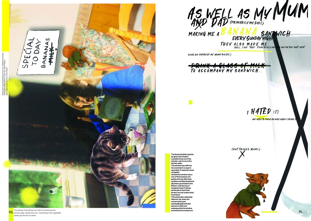
Pages 8-11: “Don’t judge a sandwich by its banana!”
I knew that I wanted my zine to reflect me and to not only meet the key points of the brief but also to tell MY story. Afterall this is an introductory piece! I have since referred to my finished zine like a bands first album where they are telling the stories through their songs! -It has been a labour of love and I have told my stories through the books I read as a child! The brief stated that my zine must introduce myself and my interests in book design – I like to think that in my finished zine I have shown how my interest of books was born, grew and developed and how the things I learned from these books and the memories made linked on to further growth and development into my adult life. These memories also tell a story in themselves!
I knew that the Banana sandwich story was the first of many for this zine! I already had my cover designed from the previous exercise (below is a reminder!) now I just needed to make that cover into a story for my zine and then I knew the rest would flow from there!
I decided to go digital with this article just so that it matched the theme of the front cover. I was going to tell the story of how as a child I used to have them banana sandwiches every Sunday night and that dreaded glass of milk! I was going to link it in with how nice they actually taste and just how you “don’t judge a book by its cover” you don’t judge a sandwich by its banana because it actually tastes alright!
That would be one key point of the brief met! *thumbs up!
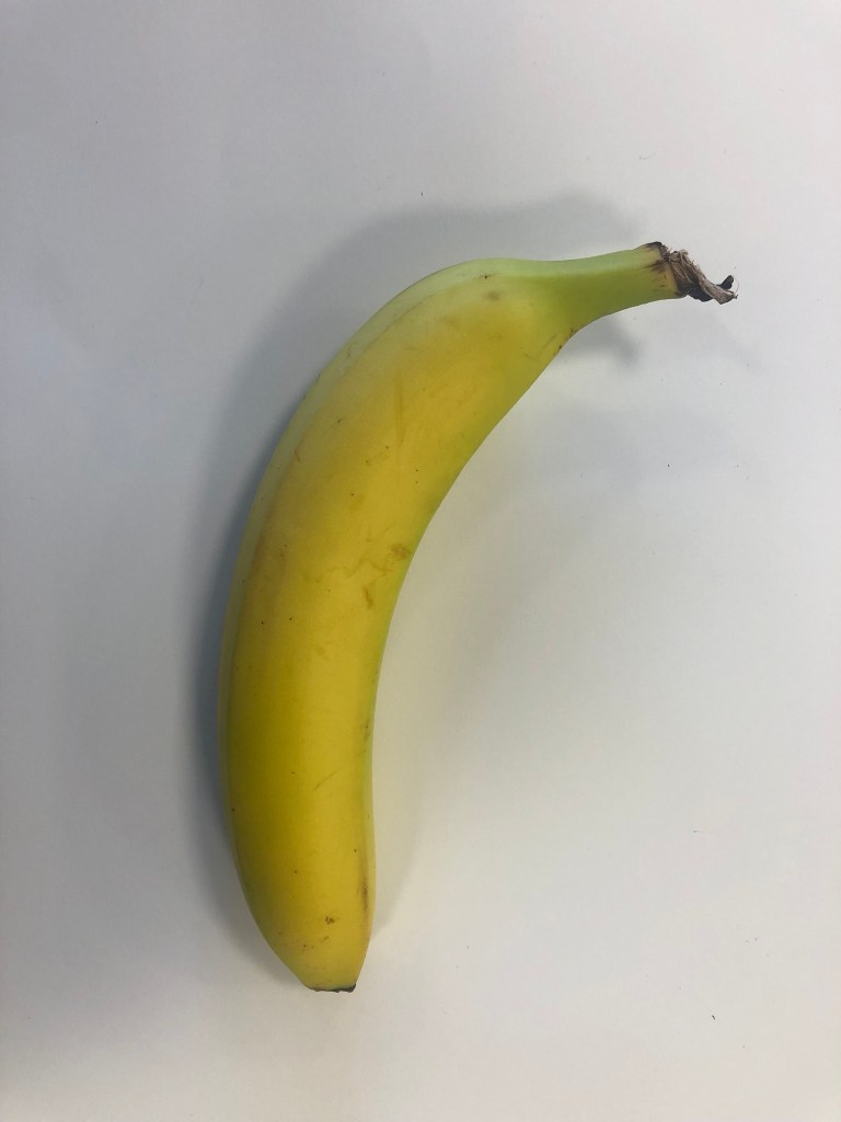
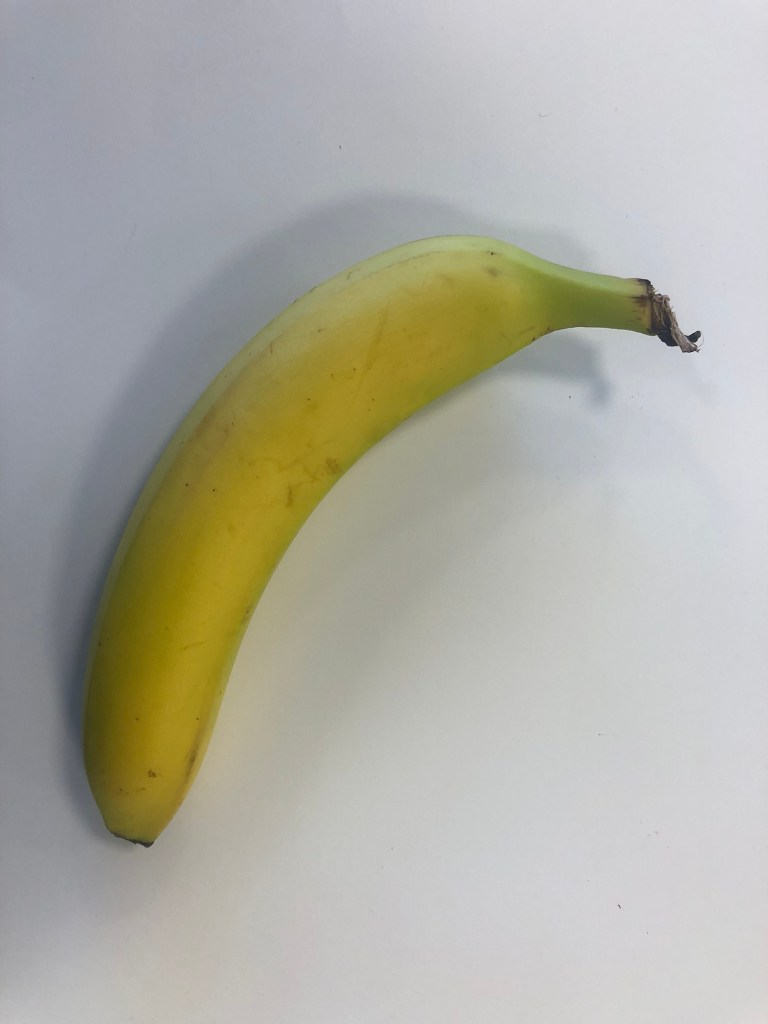
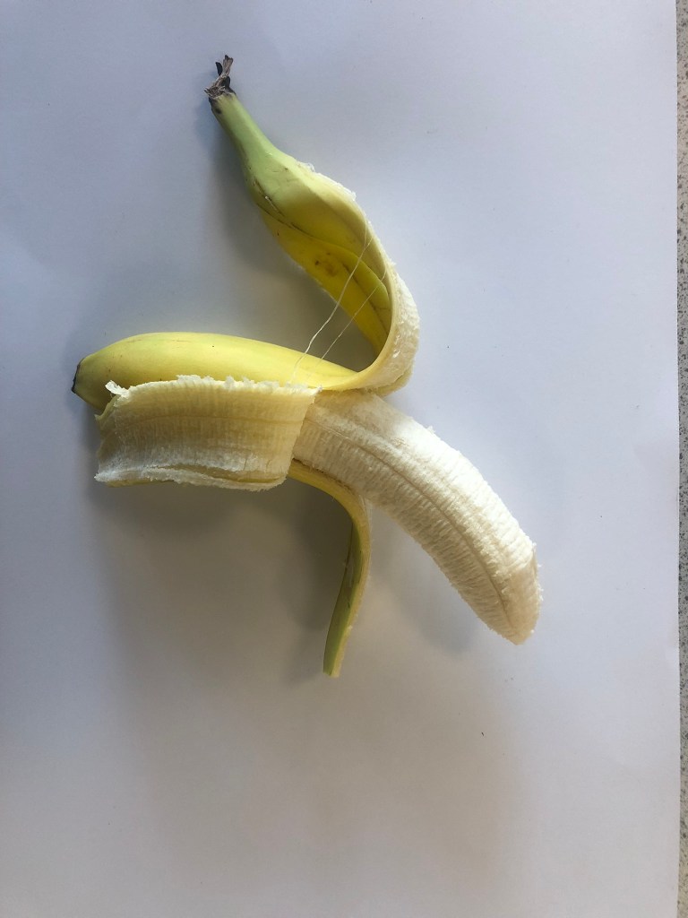
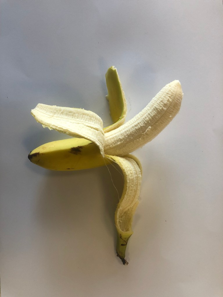
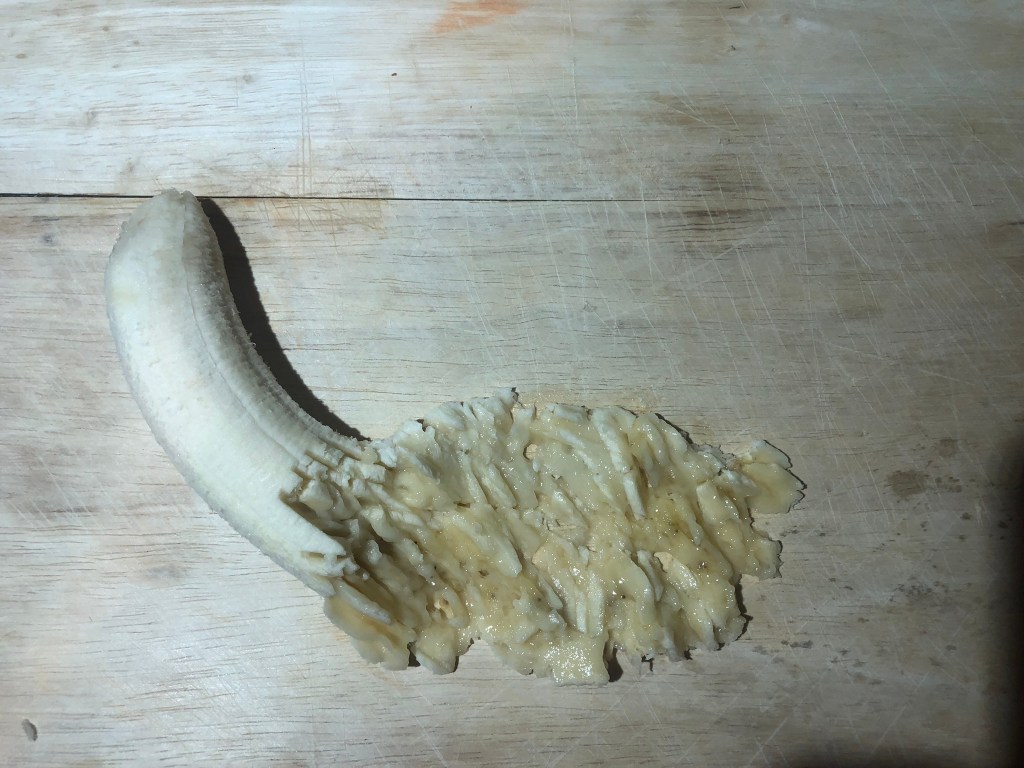
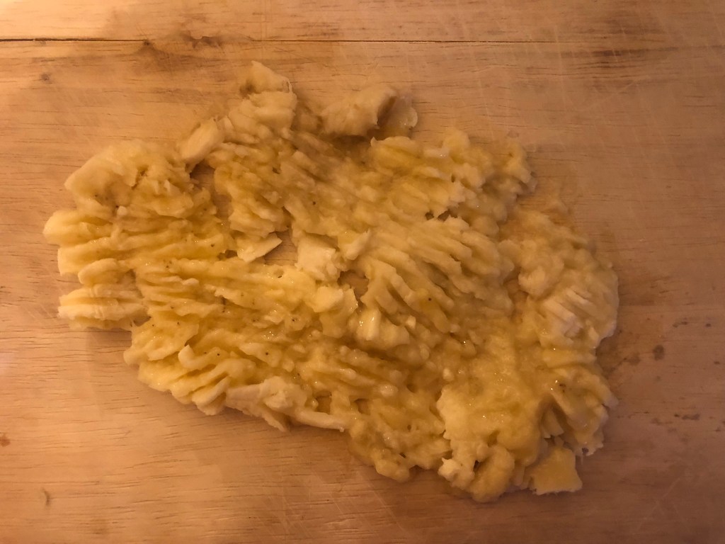
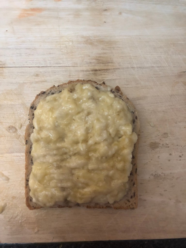
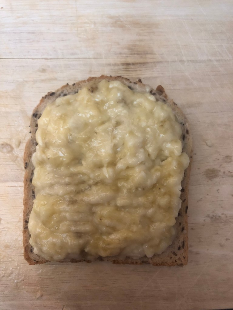
I knew I needed to make this first layout look like the front cover so that the 2 would be easily associated with each other. I decided that I would use the same fonts, colours etc.. First things first though, I couldn’t do a piece about banana sandwiches without actually showing a banana sandwich! This is where I got snappy happy and practical in the kitchen in my previous exercise! I used a photo from the montage of photos that I took and used that for my piece!


I set a new document up in InDesign and using a grid system I worked out where I wanted everything to go. I wanted there to be an element of white “negative” space and for my design to not be constrained to a box and to be able to breathe which is why there is white space around the outside! The layout is quirky and fun, it doesn’t take itself too seriously! I like it!

I then bought a zine mockup from an independent designer on Behance so that I could mock up my layouts on a zine mockup which would then be suitable for presenting my work on social media and for presenting in my portfolio.

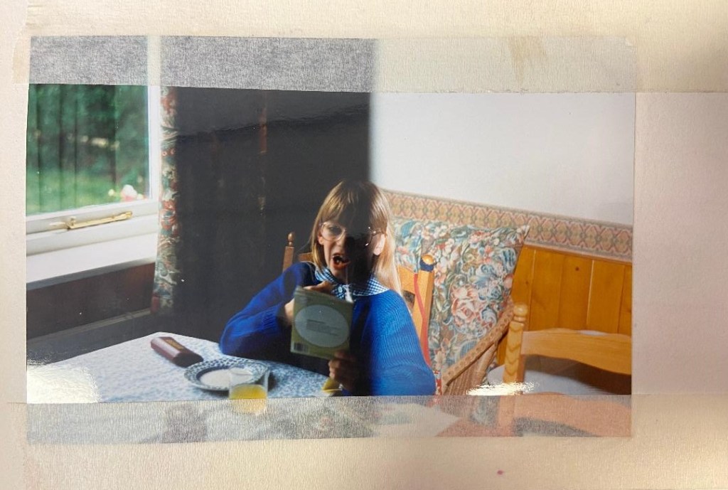
I hadn’t finished telling my story though! – I hadn’t explained the glass of milk! I had met the brief in making sure that I included “Don’t judge a book by its cover” but I hadn’t so far included anything relating to the books I once read.. I then remembered that I had a photo of me when I was 7 years old sitting at the kitchen table eating a banana sandwich reading a book! This was ideal to include in my zine! What better way to make it more personal than to add photographs of me in there?!
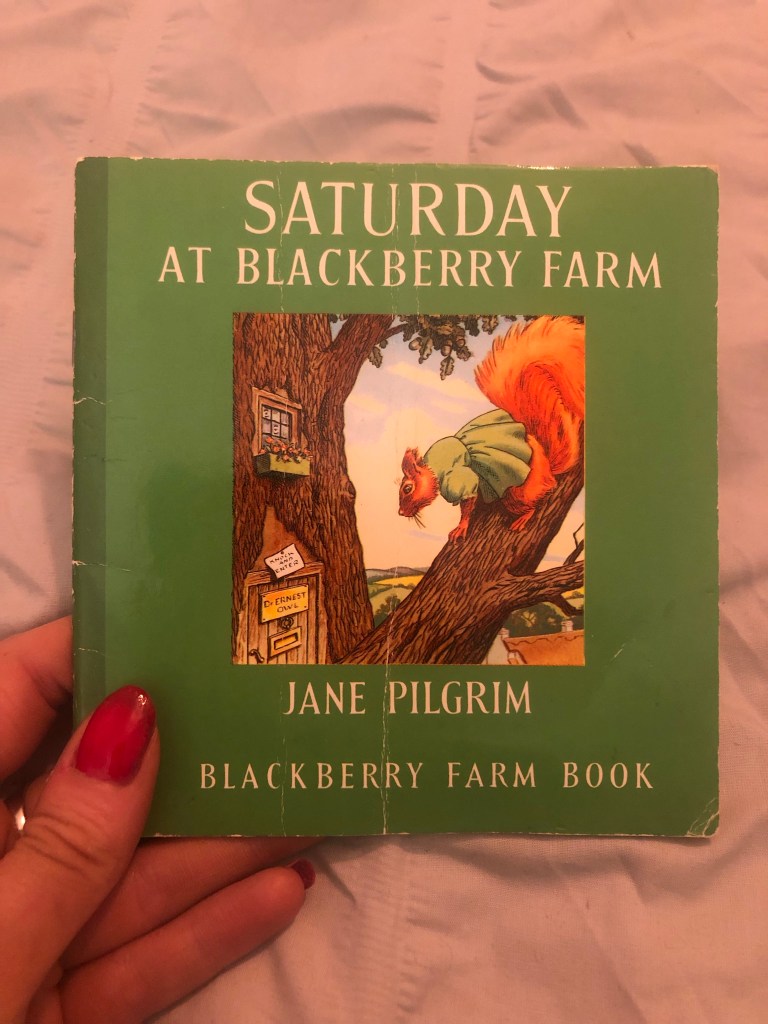
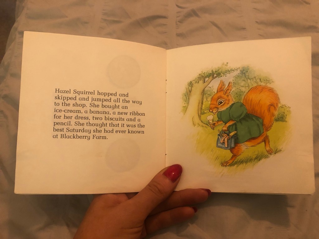
Even though my layout digital I wanted to experiment further…. I wanted to create more of that “cut and paste” style. How could I achieve that digitally though?.. I took one of my favourite books from the era of that photograph “Saturday at Blackberry Farm” and photographed a few pages with the main characters and decided I would have them running about on my photograph. In the photo of me I am concentrating and absorbed by the pages in my book and this was perfect! It would be like the characters were a figment of my imagination but I am making them real by reading and bringing them to life! It is also a digital montage- I have taken snippets of another publication and used them on my work – just as I would if I was cutting and pasting physical papers.
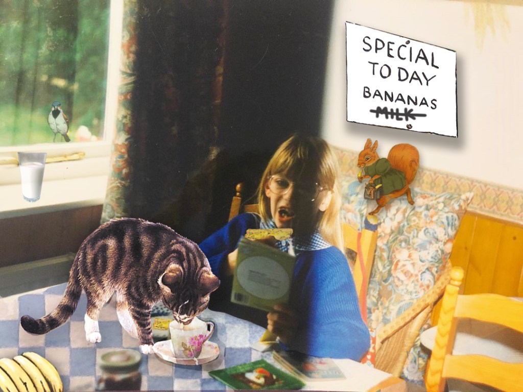
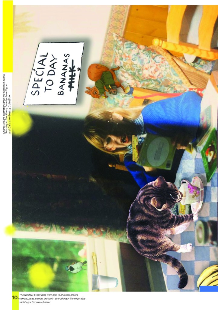
I then added the yellow paint blobs to represent mashed banana and included the text that I wanted on my page. Again, I tried to use a similar layout to the previous one I designed and keep an element of negative white space.
I then went on to design the right hand page. This would be the page that explained my dislike for the milk that accompanied my banana sandwich! As I have wrote in many previous posts, I love the experimental typography that David Carson produces and after watching his Masterclass I decided to give it a go for my page!
I am designing in digital for this layout but the experimental, rough looking typography could have been scribbled or written on the page and that is the effect I wanted. I wanted something that looked like it hadn’t tried too hard and that wasn’t well put together. Carson always tows the fine line between legibility and readability and I wanted to experiment with that in my own work.
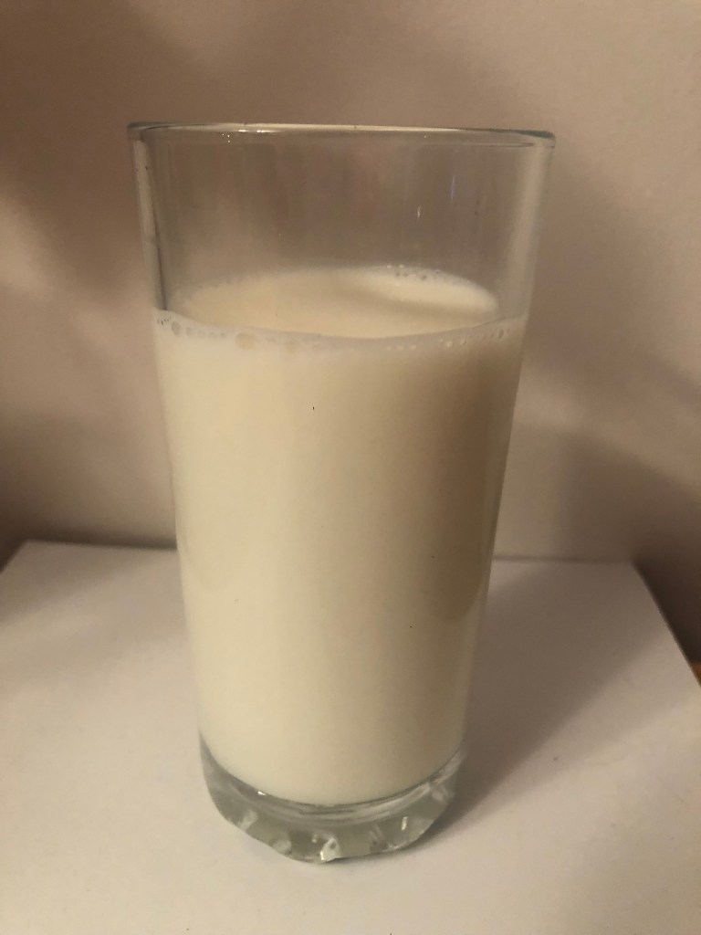
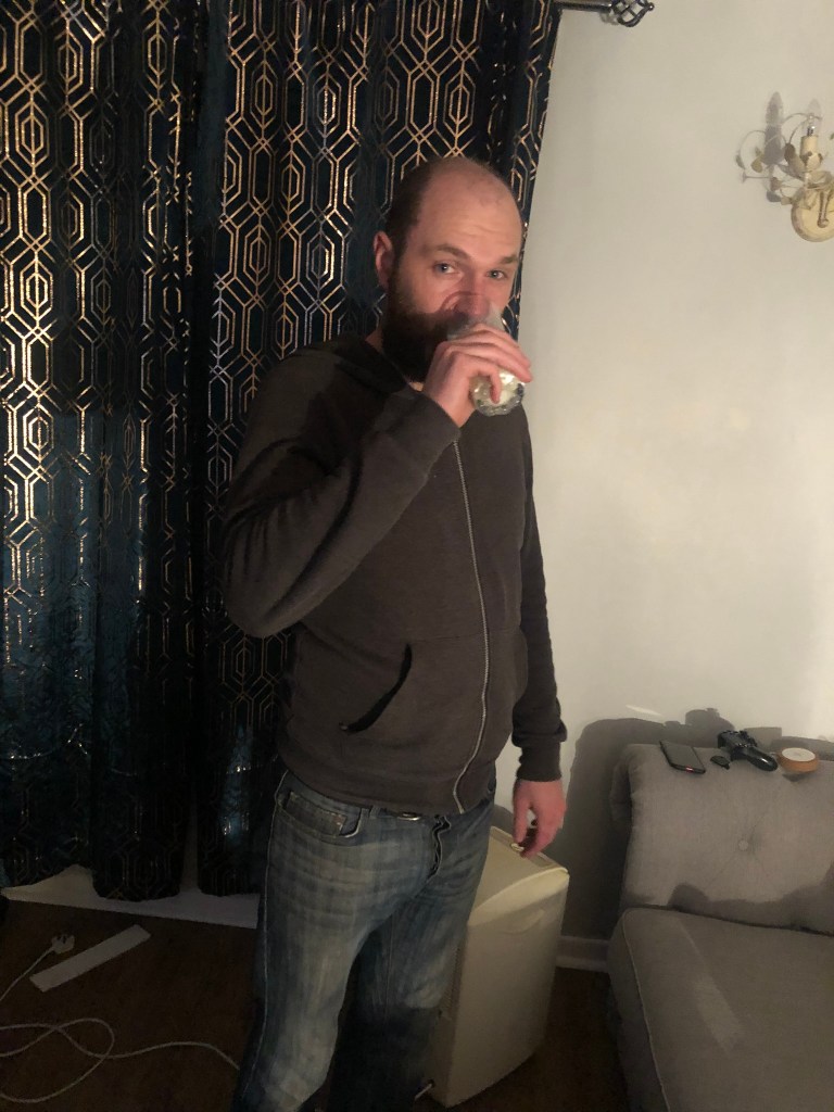
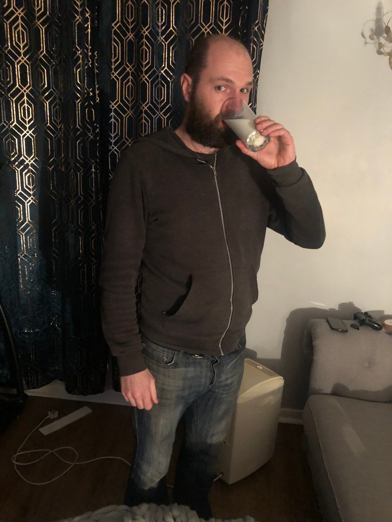
Again for this I needed to get snappy happy and photograph that dreaded glass of milk! Who drank the milk after I had poured it and photographed it? – Chris. Yuck!!
I photographed the milk at several different angles which would help me to manipulate it better in Photoshop!


There were several variations of this page that I produced before I was happy with the final outcome:
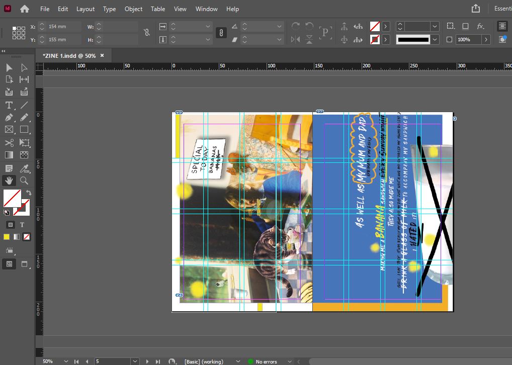

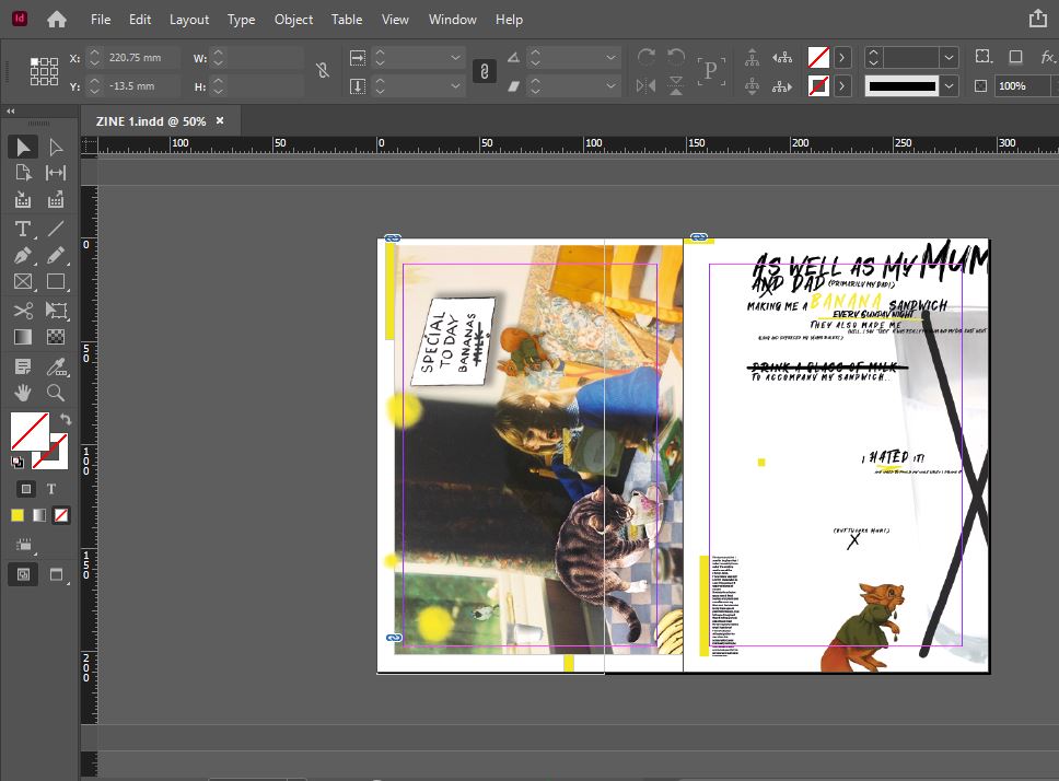
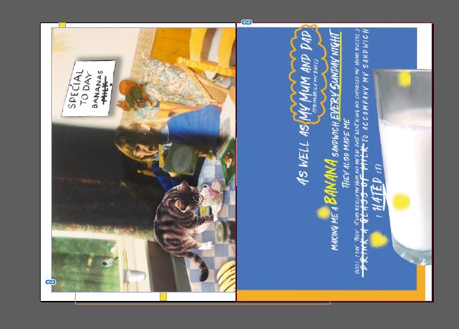
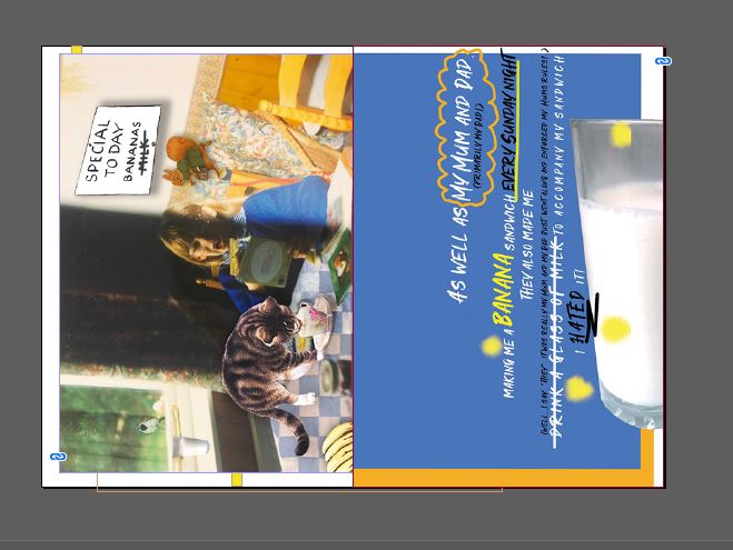
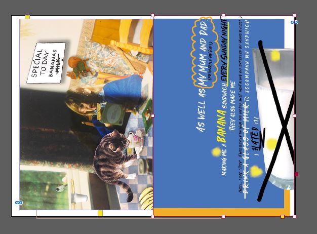
Originally I wanted this page Blue again to tie in with the cover and the previous double page spread but I decided that white tied in well with milk and also it allowed the design to breathe! I like space in a design and this just seemed to have a calmer feel to it!

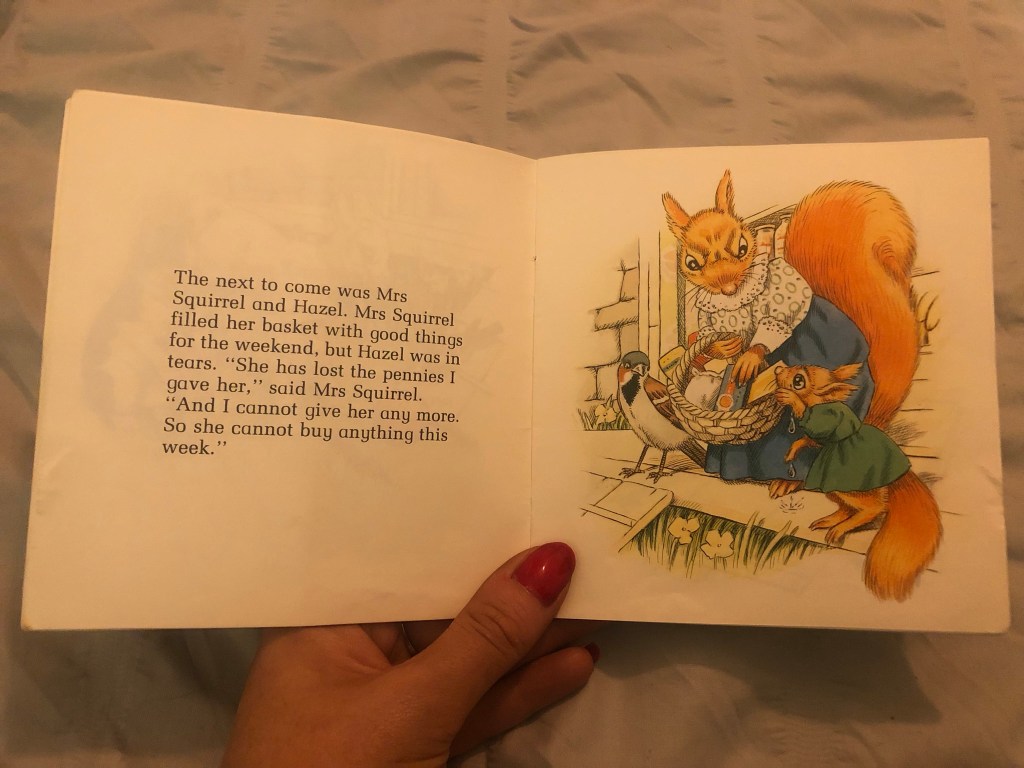
I used the sad illustration of Hazel the Squirrel to highlight my distaste for the milk! I liked it! I then added the story at the bottom to reflect the imagery.
This was the whole double page spread:
I really liked it! It was a strong start! It then got me mind mapping about further childhood books that were important to me or that have played a part in my adult life which I could possibly include in my zine.
After designing 2 really nostalgic, fun double page spreads for my zine I couldn’t wait to see what else I could come up with!

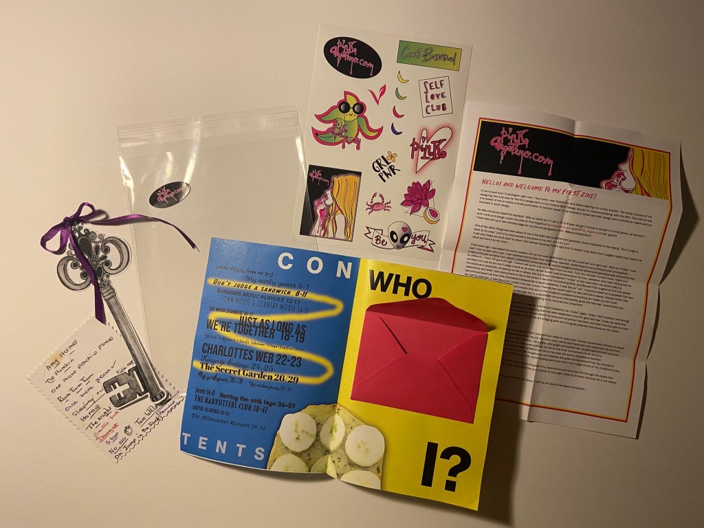
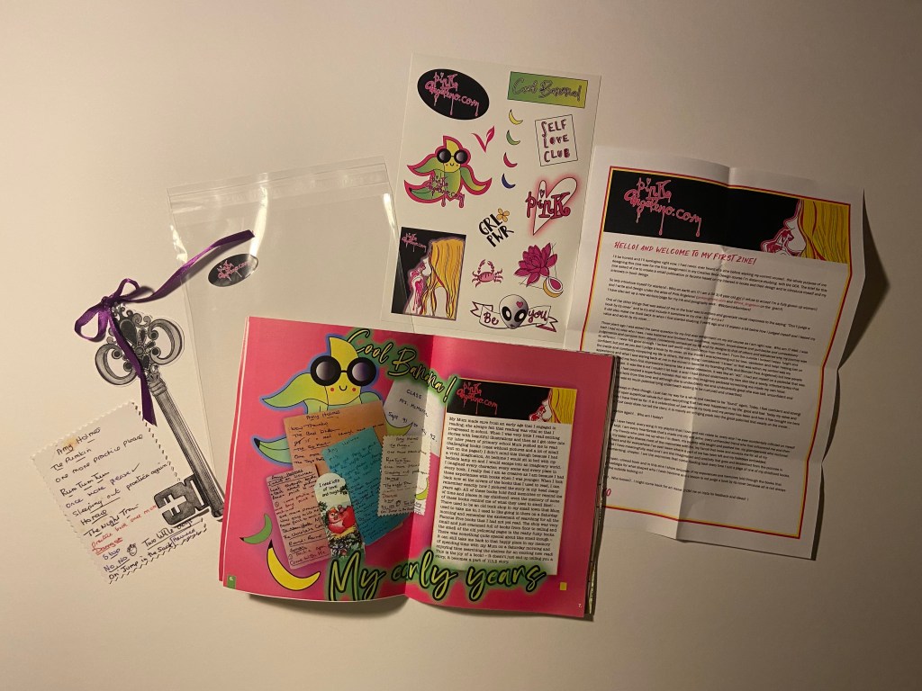
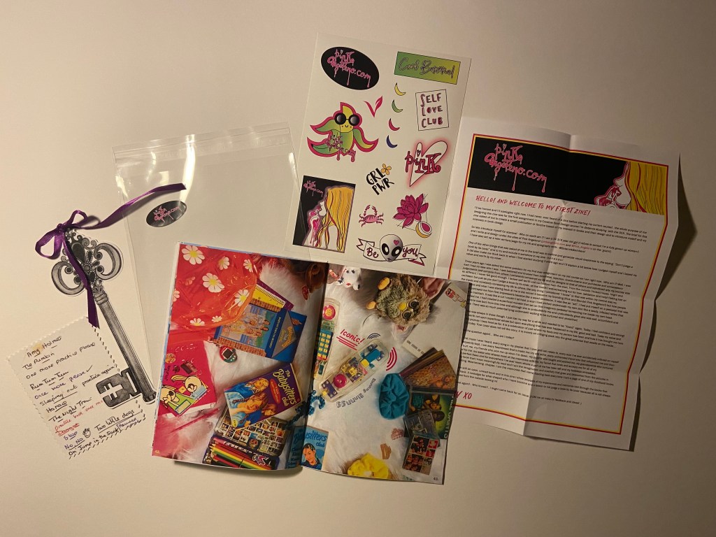
Some of the zines that I had researched had freebies hidden inside them when I opened them and one artist of a zine sent me a sticker free with theirs in the post – this gave me a further idea to maybe produce some stickers to place inside the zine relating to my brand (Pink Angeleno) and also Bananas as this is the theme of the zine! I drew some silly sketches (below!) for ideas for this!
For the “Who am I?” introductory section that needed to be included in my zine I also had the idea to place an envelope inside with a little letter from myself to the reader (again, sketches show this below!) – it just makes it a bit more personal and unique! If I was selling my zine in a shop this could also be signed with my signature and the number of the edition they have; e.g. a limited run of 50 and someone could have 3/50 in their hands. Zines are printed in limited numbers generally which makes them more unique and special.

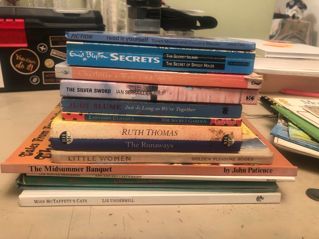
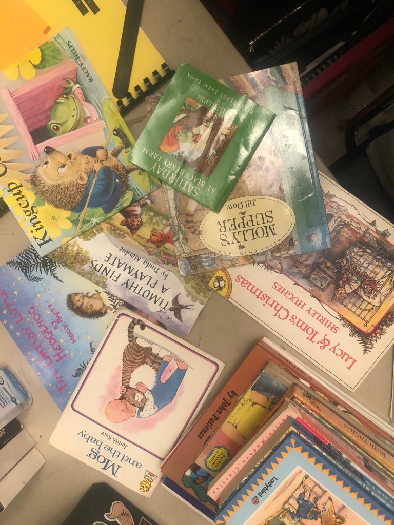
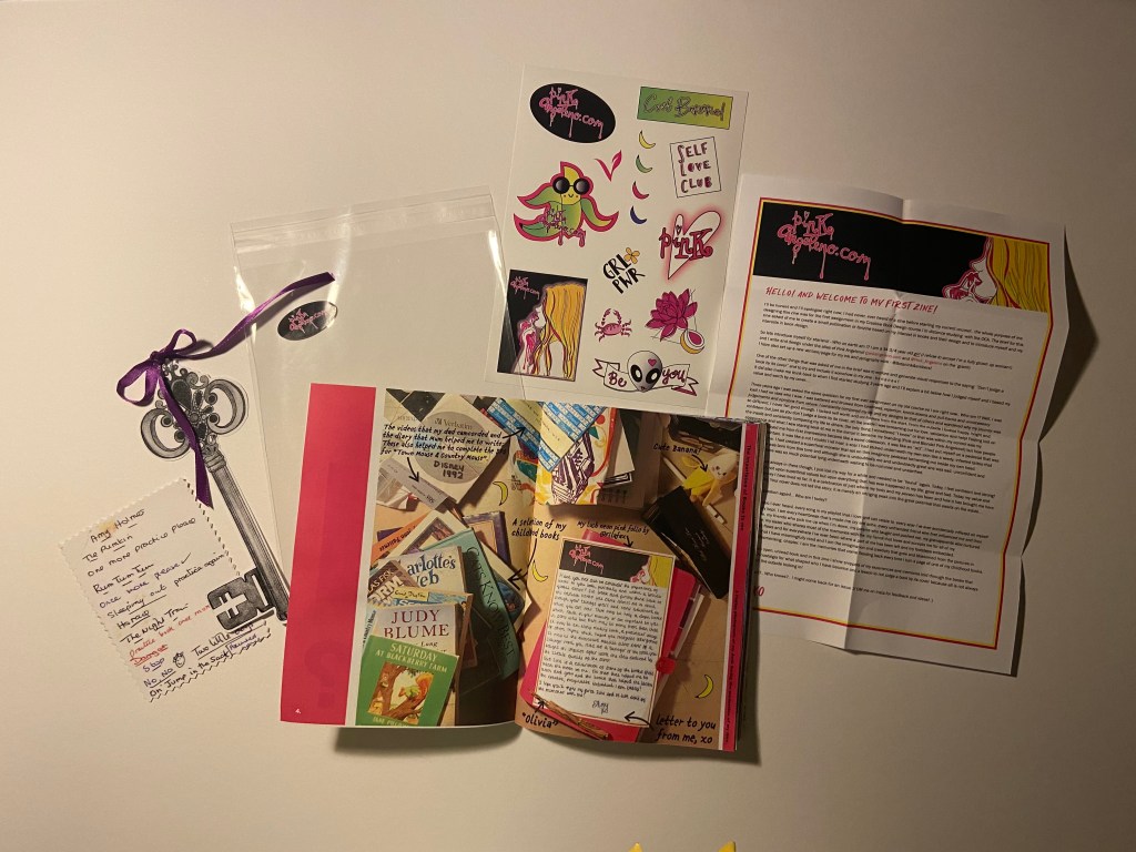
I made a list of books that had an influence on me growing up or that I just loved and I began to think about the stories I could tell as to why they were so influential to me as a child or now an adult and how reading helped shape me as a person.
I had already listed a lot in the previous exercise “Influential books”:
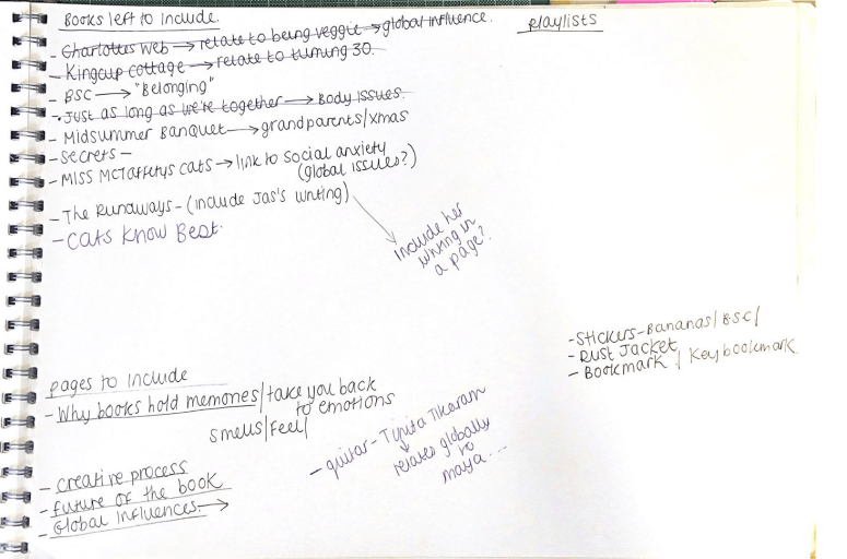
I then began mind mapping ideas around not only stickers as an additional extra but also dust jackets for the finished zine to keep it protected and to make it look more professional to give away or to sell in a shop or a stall. I thought that free bookmarks would also be a nice added touch.
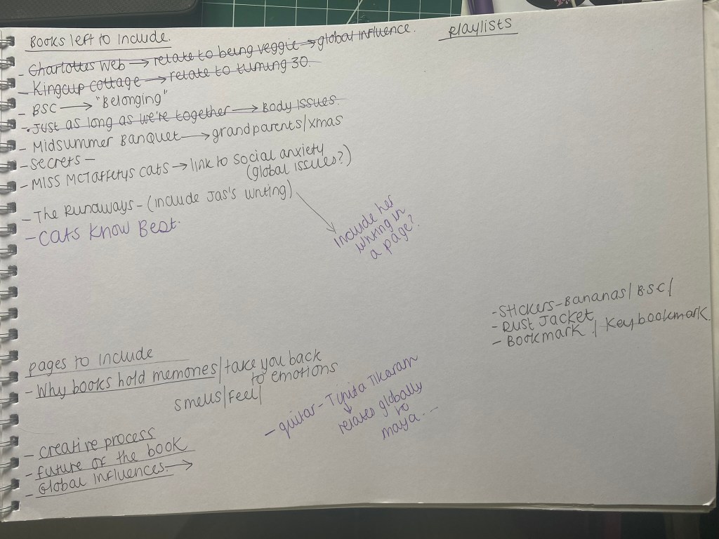
The books I chose to feature in my zine were:
- Saturday at Blackberry Farm
- Town Mouse and Country Mouse
- The Worm Charmers
- Just as Long as we’re together
- Charlottes Web
- Kingcup Cottage
- The Secret Garden
- Secrets
- The Babysitters Club
- Flowering Wilderness
- The Midsummers Banquet
I shall start from the beginning of my zine to explain the rest of the process!
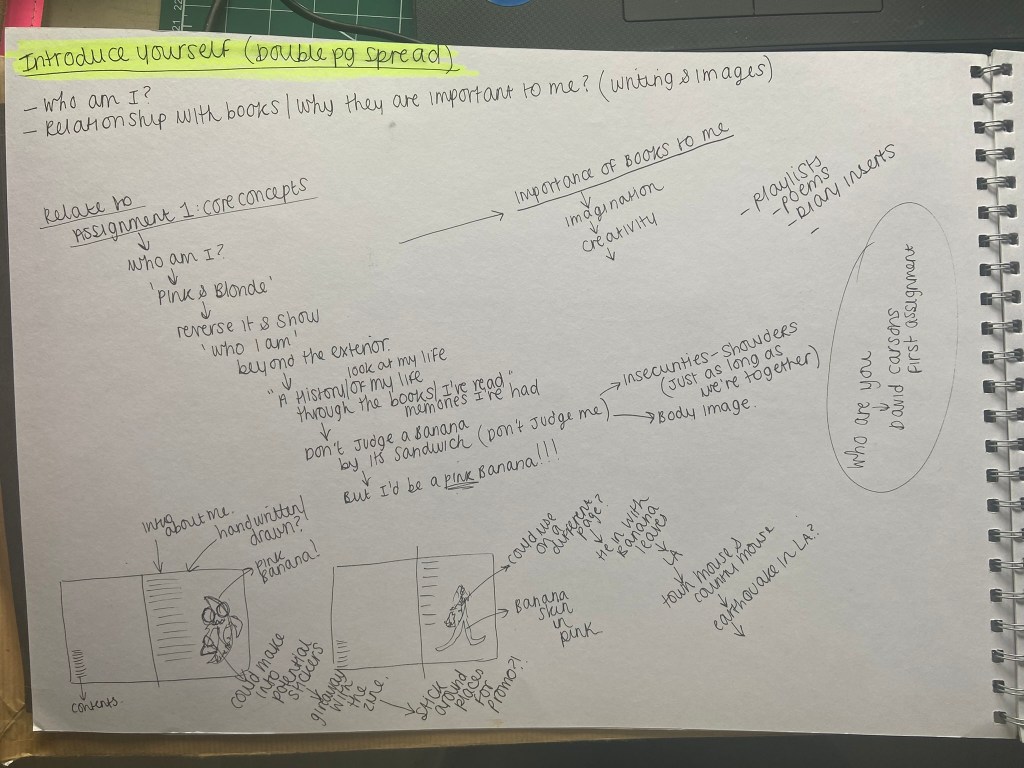
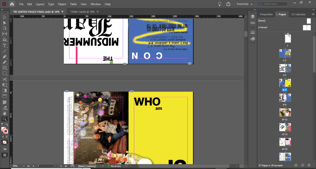
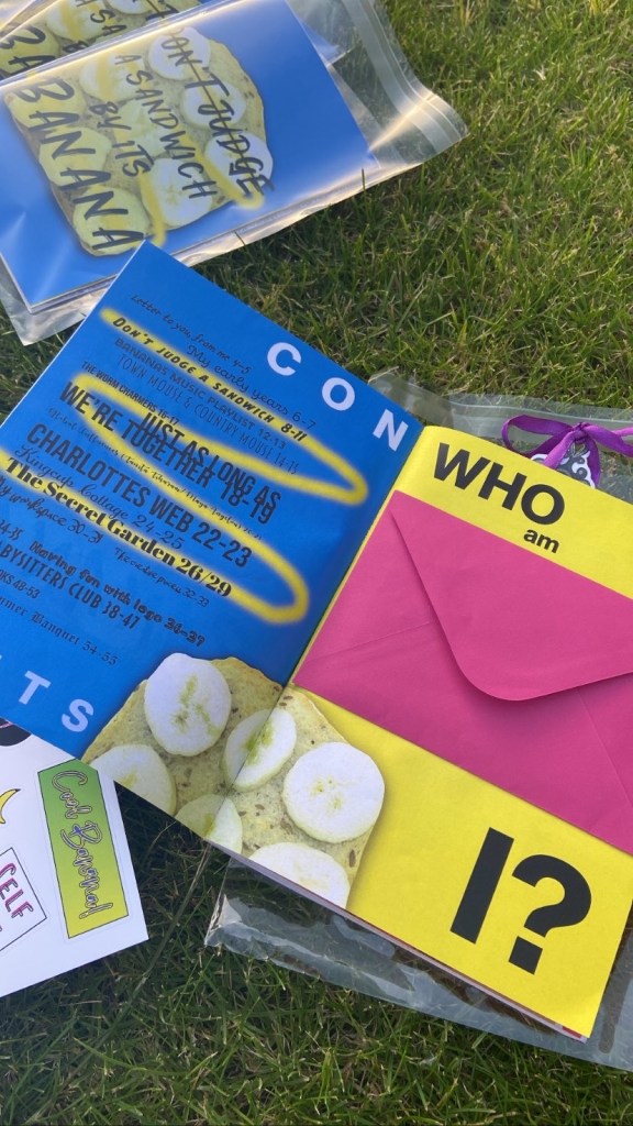
Pages 2-3: Contents and Who am I
The idea for my contents page came again from David Carson. I watched his Masterclass and one of the lessons he taught explained the process of him designing a contents page for a surfing magazine; in the lesson he was explaining that why would you just do a boring list of numbers followed by the pages, why do what is expected from a contents page? Why not make it more creative and make some elements bigger than others and be more experimental with the layout. I decided to take this approach for my contents page. The general rule of thumb is to not use any more than 3 typefaces in a piece.. I used loads! A zine isn’t supposed to be a perfect piece of design or literature. It is meant to be experimental, fun and creative. I defied the rules and went with what I thought worked! My zine is compiled of a story per every double page spread. I chose a typeface that I thought represented the story and theme behind every double page spread. I kept it in theme with the front cover and with the “contents” title I split the word up and changed the point size ever so slightly to add some contrast in the design.

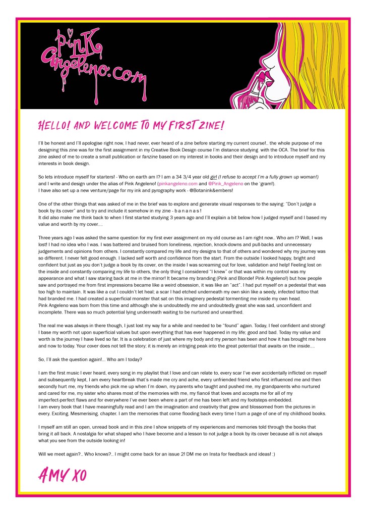
On the right hand side page featured “Who am I?”. This is the quickest page I have completed in my life! I just wanted a lot of negative space and some bold text with the title. I knew I was going to go with the envelope stuck on this page with my introductory letter so not much thought would be needed! I love the contrast between the 2 pages – the cool blue and the bright, warm yellow!


I made the letter inside by designing a simple letterhead with my Pink Angeleno logo and colour scheme and then by just writing the content on there! The content of the letter explains who I am and the journey of self discovery and confidence I have been on the last 2/3 years since joining and studying with OCA. It explains how I judged myself wrongly (again relating back to not judging a book by its cover!) and I have written it as though my zine is going to be published and passed around welcoming feedback and comments from fellow ziners!

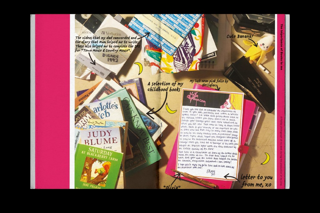
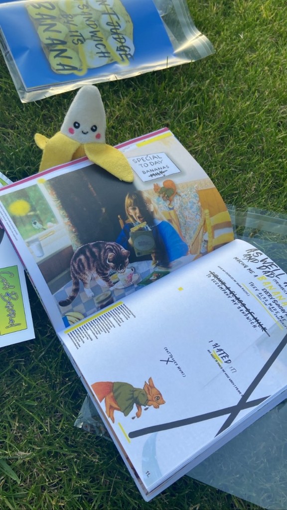
Pages 4-5: The Importance of Books
This double page layout is very similar to the layout I designed for “Story of my space“. I really liked the introduction on the brief for one of the previous exercises -“Influential books”. I wanted to include it in my zine as a nice introduction leading on to what I had to say about why books are so important and to what my zine is all about! Again, in a personal way I decided this time to hand write it as a personal letter – using again a printed version of my letterhead! I did a little bit of flatlay photography and I took a photograph to use as the background arranging my work in an interesting way that relates back to the content of my zine.
I then imported the photograph into Photoshop to adjust the brightness/contrast/levels etc and then imported it into Illustrator so that I could draw on top of the photograph and add text. It then got imported as a jpeg into InDesign for the rest of the layout to be completed.


Pink was the main colour of this layout and I feel it really worked well! – the contrast between the pale yellow background against the strong pink works well! As always keeping the layout similar to the previous ones I designed and including negative space on there!
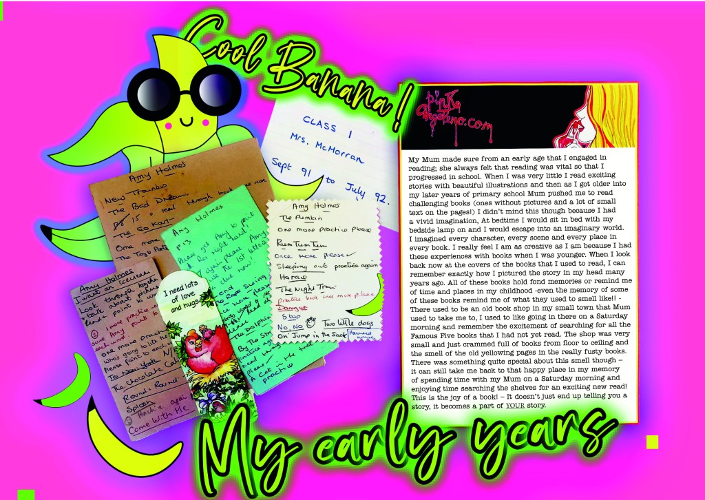
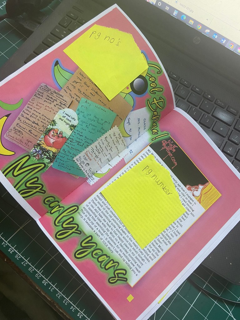
Page 6-7: My early years
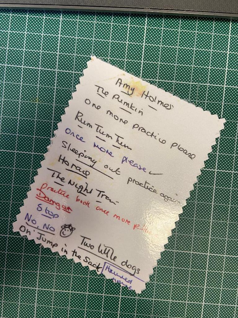
This double page spread was inspired by some of my old primary school reading cards that I found in some boxes in my garage. The cards used to be old Christmas cards ripped in half to write on the backs of them. I remember at the time when the teacher used to get me to choose a card for my parents and her to write notes on about my reading; I used to want to find the prettiest one but sometimes ended up with crappy ones like the one I have reproduced for my zine!- I decided to reproduce and laminate one of my reading cards as a bookmark for my zine; it has an old Victorian, creepy Christmas scene on the back of it and was obviously picked at a time when there were no other pretty ones!! Some of the comments and names of the books make me laugh!
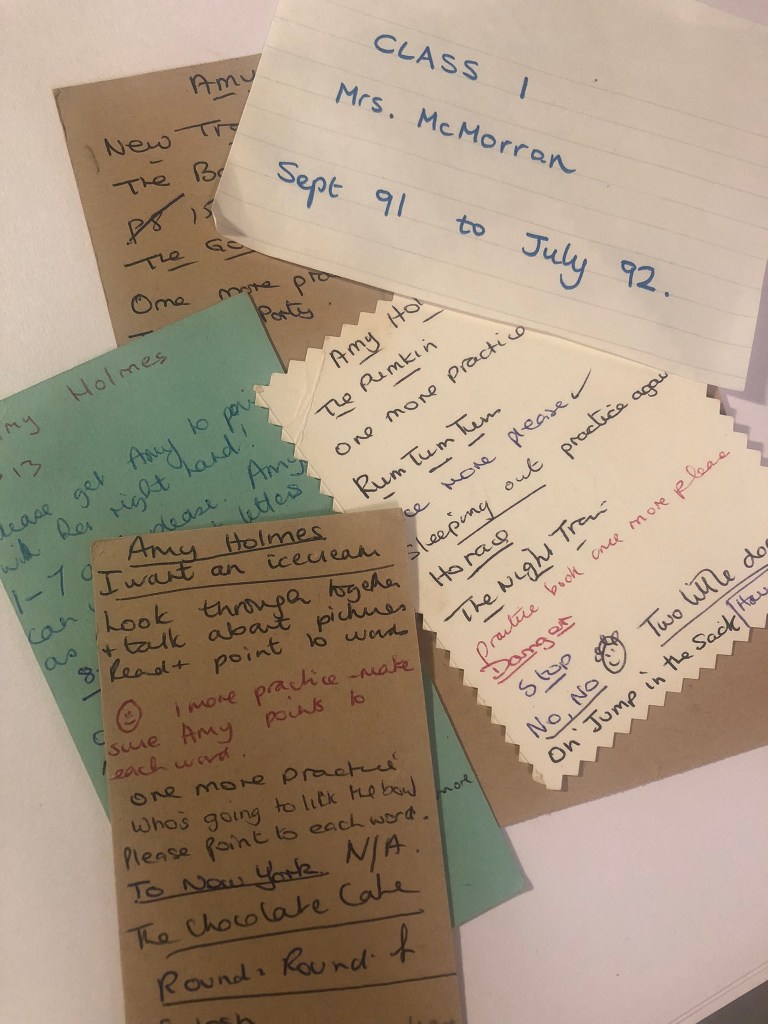

I wanted to include these as an article in my zine because they seemed too good not to!! I decided to create a double page spread about my early childhood and learning to read and how much books were so important to my learning, development and imagination! – how having such a positive relationship with books has helped make me the creative individual I am today!
Similar to the last layouts I used the letterhead paper to write my piece about how from an early age I engaged with reading… I wanted the layout to be quite childlike; bright, illustrative, fun, happy… Earlier on I mentioned I was playing around sketching ideas for potential stickers for my zine of cartoon bananas; I made one come to life by drawing it out in Illustrator and turning him into vector art!


I then chose the font for the article which is called Angelwine; it is a very chilled out looking typeface and suited the cool appearance of the banana – so much so that I wrote Cool banana on the piece! The banana ties in to the childlike vibes of the piece but also to the main zine itself being banana themed!
The colour scheme I love! The cool blue and lime green clashing with the bright yellow set against the vibrant fuschia pink background! Again, the pink ties in to my branding and represents me whilst the cool colours represent the banana and cool.

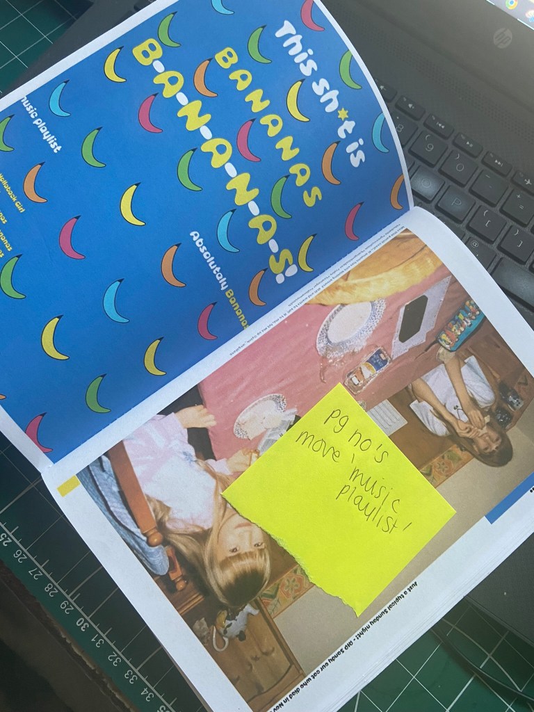
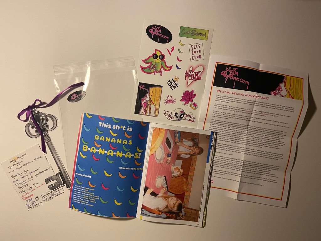
Pages 12-13: Bananas playlist
From researching the zines that I bought from Magazine Heaven and Etsy, one of the things that I noticed was that a few of them had playlists for the reader to listen to while they connected with the stories, articles, poems in the zine. I decided that this was a nice touch and went out to try and find some songs that related to bananas! I found a few; Hollaback girl and this shit is bananas.. being some of the lyrics I knew! I made this one the title piece for the page! I just wanted to make a fun double page spread to slot in between my stories. I went onto Illustrator and also made some vector art of some bananas to use as the background for this piece.
On the right page I found another classic photograph of me, my sister and our old cat Sandy circa 2001 on a Sunday evening once again having a banana sandwich and with my sister and Sandy having a Ham one! I liked including old photographs in my zine because it felt more personal to me and it allows the reader to identify and relate to the stories more. The photographs themselves tell a story!- that is what this zine is all about! Stories!!


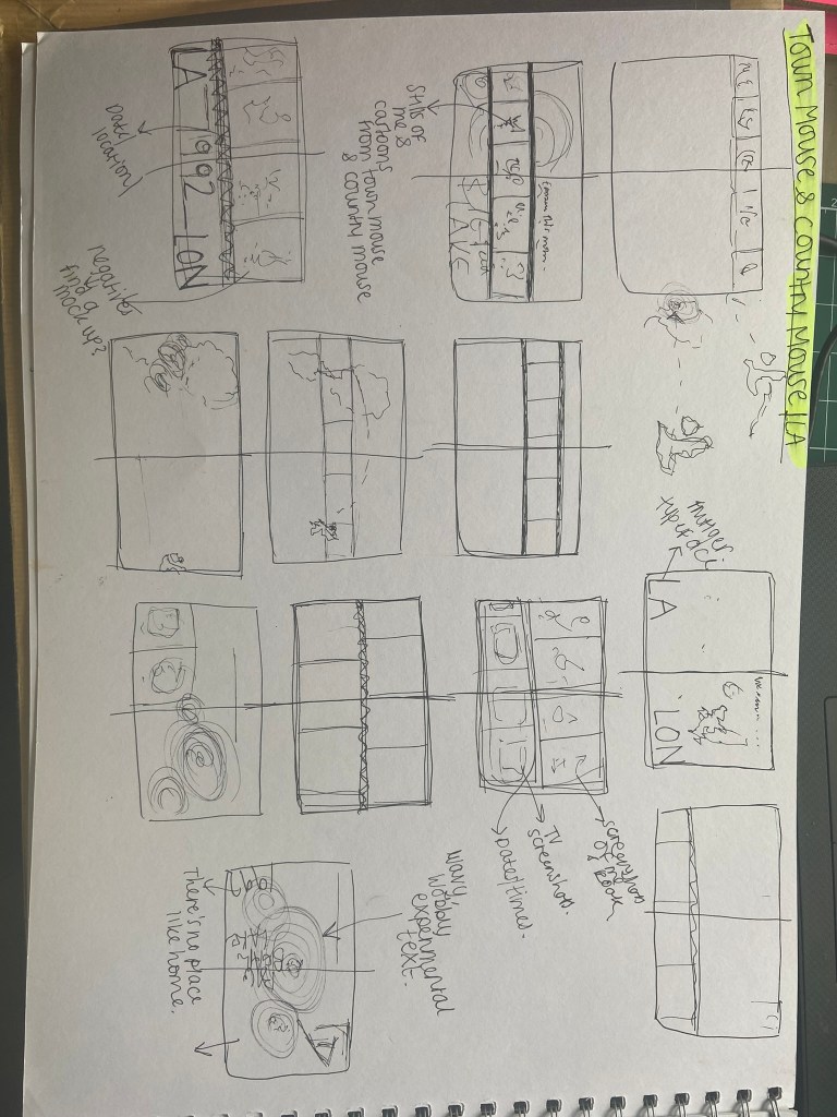
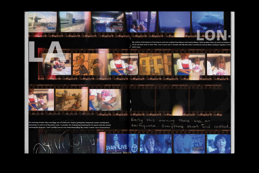
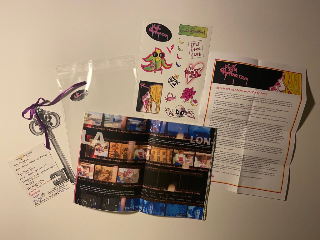
Pages 14-15: Town Mouse and Country Mouse
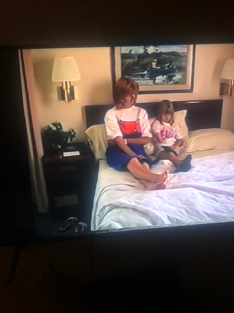
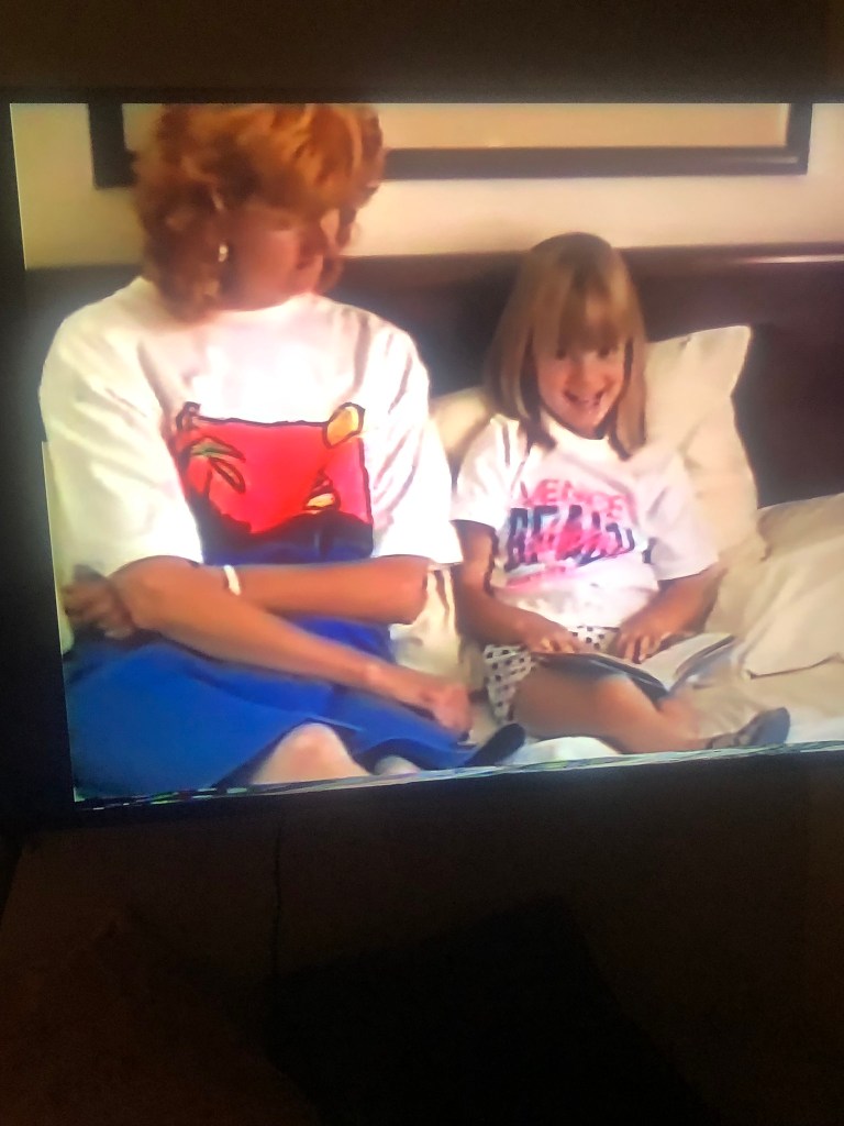
This double page spread is dedicated to Town Mouse and Country Mouse; this is an important book in the history of me and the books that have influenced and inspired me. This is the first book that I can remember reading along to when I was learning to read. My first memory of this book was in a hotel room in LA when I was 4 years old in 1992. I remember reading along with my Mum when an earthquake hit! It was the Landers and Big Bear earthquake and it was a biggy measuring 6.4. My dad had a Camcorder at the time and loved filming EVERYTHING! (which is actually pretty amazing now when I rewatch all the videos back!) he filmed me and my Mum reading along to the pages of Town Mouse and Country Mouse and I decided that I needed to use this in my zine to show how an interest in reading at such a young age helped me to grow and develop – the importance of books and reading!
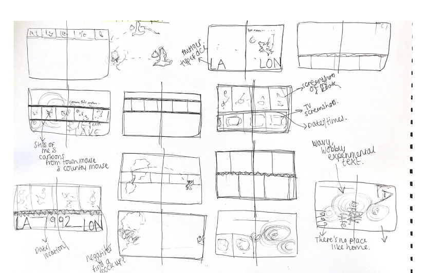
To design this double page spread I had the idea of photographing stills from the video footage and imposing it onto negatives which would go across the page. I went to work by playing the old footage back and pausing frames and photographing them:


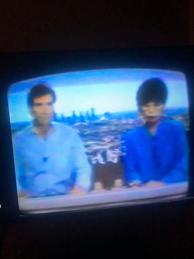
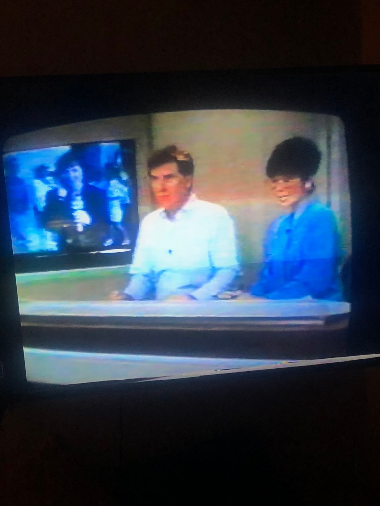
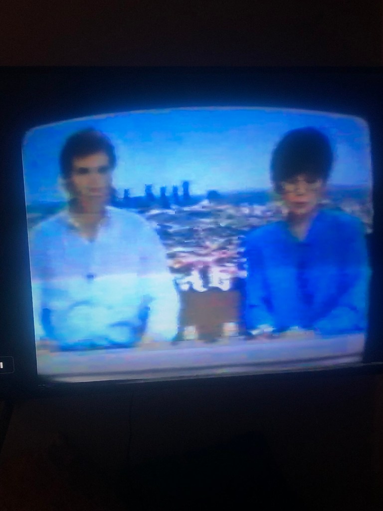
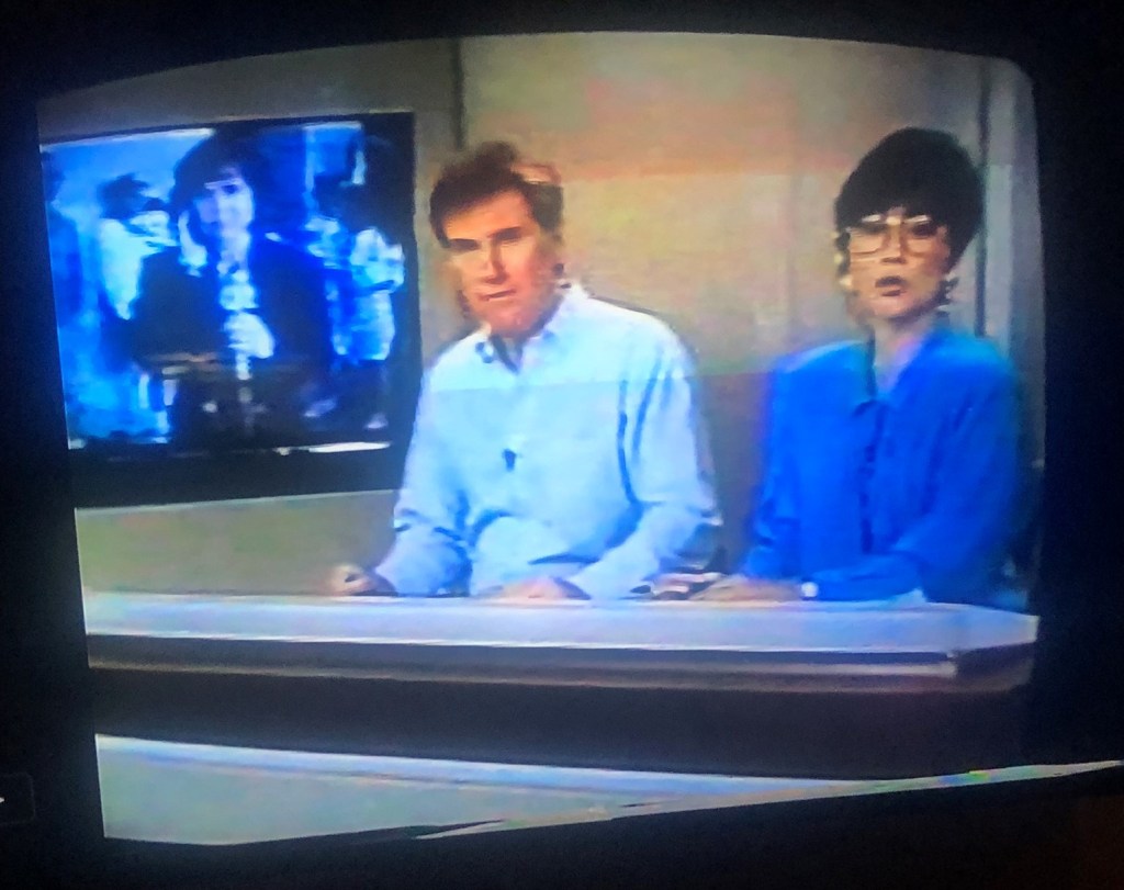


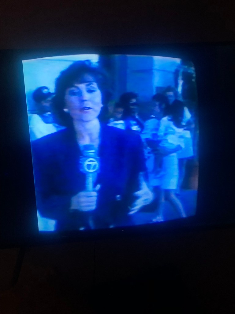
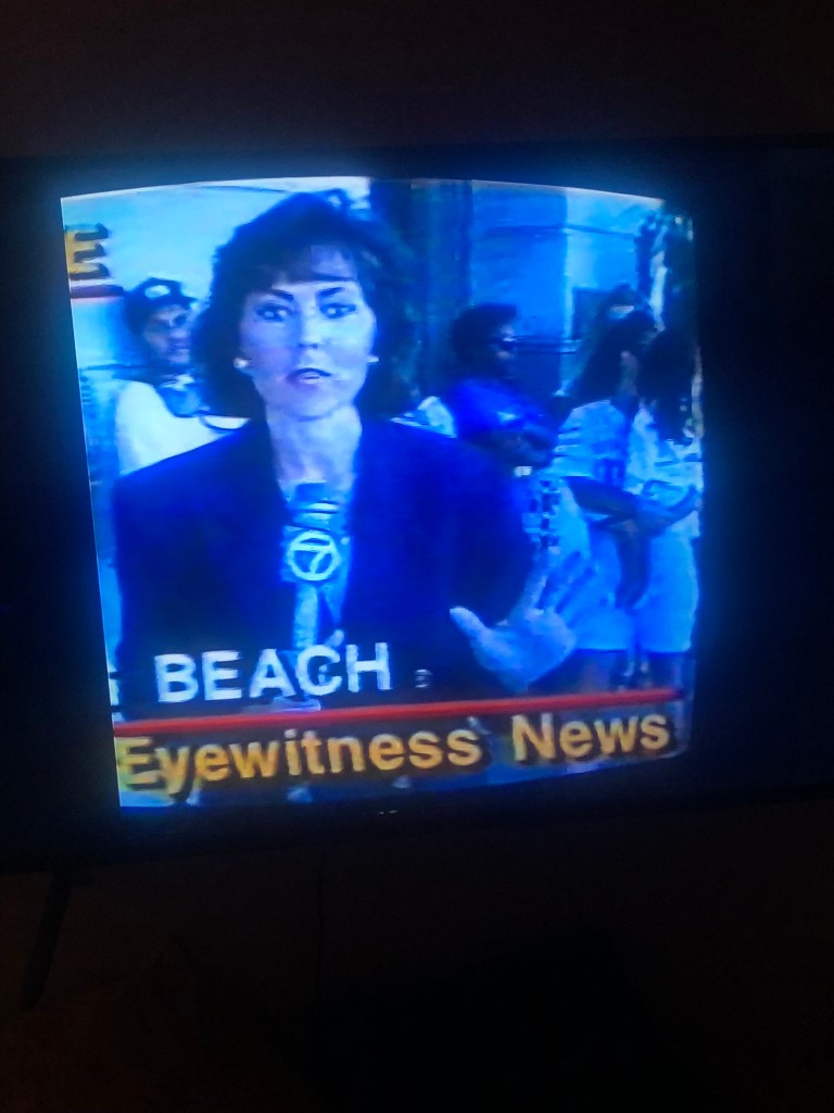


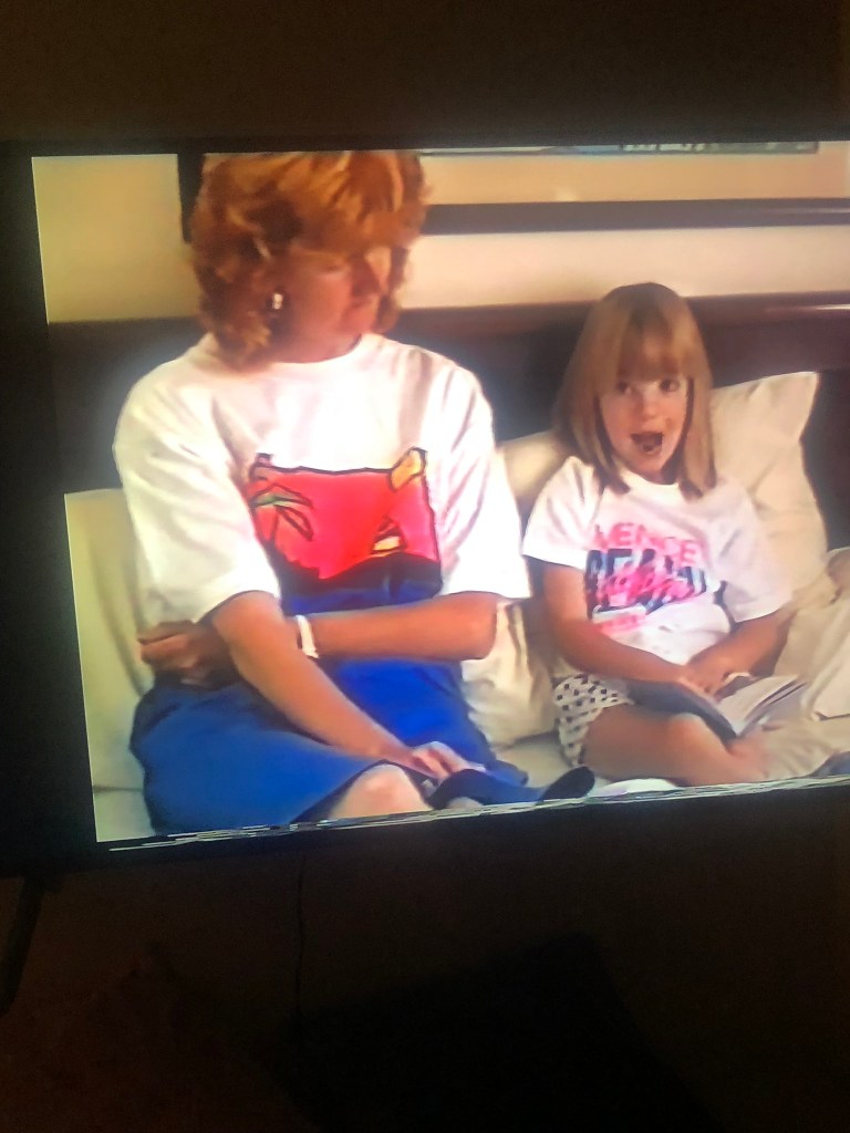
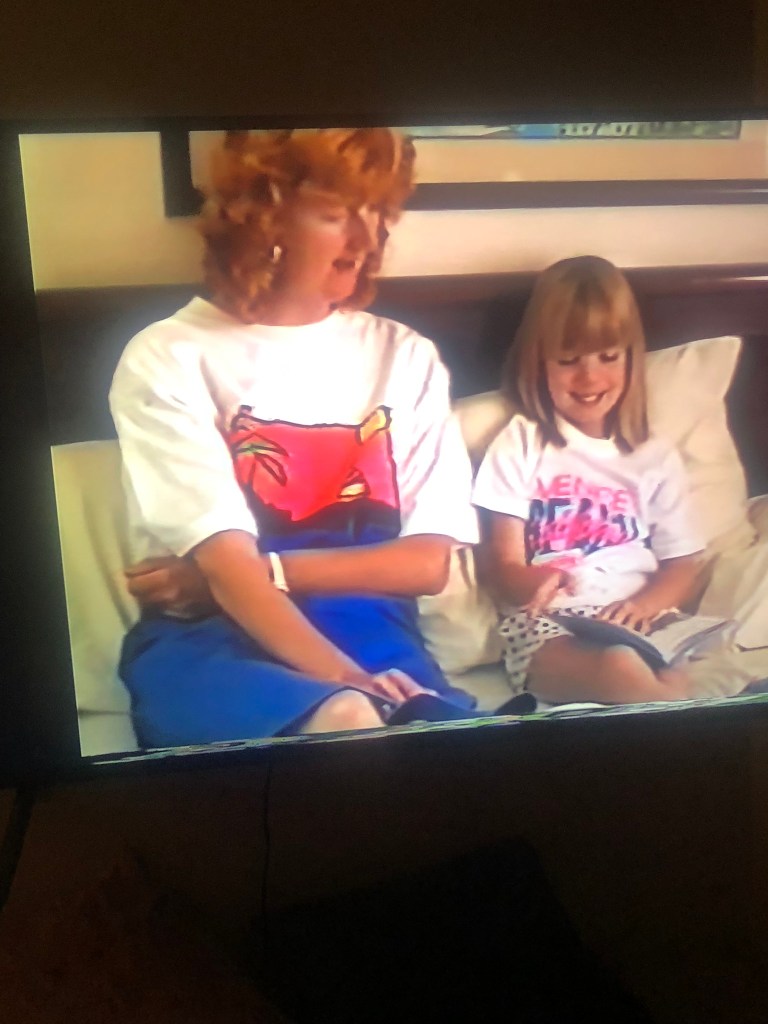
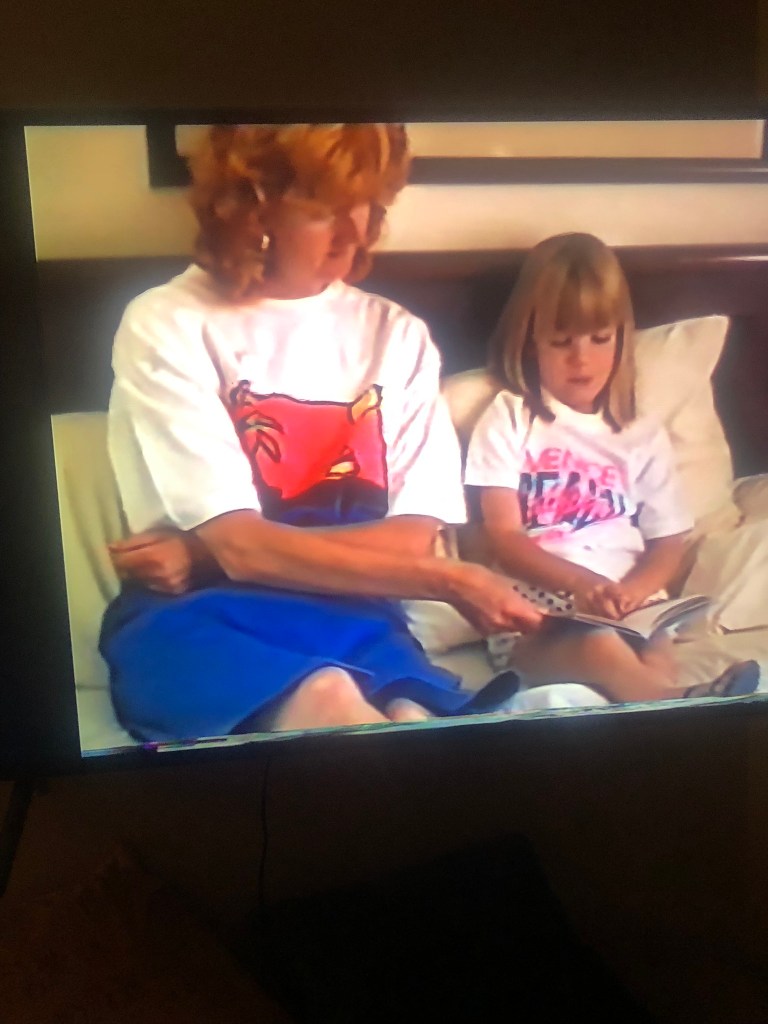

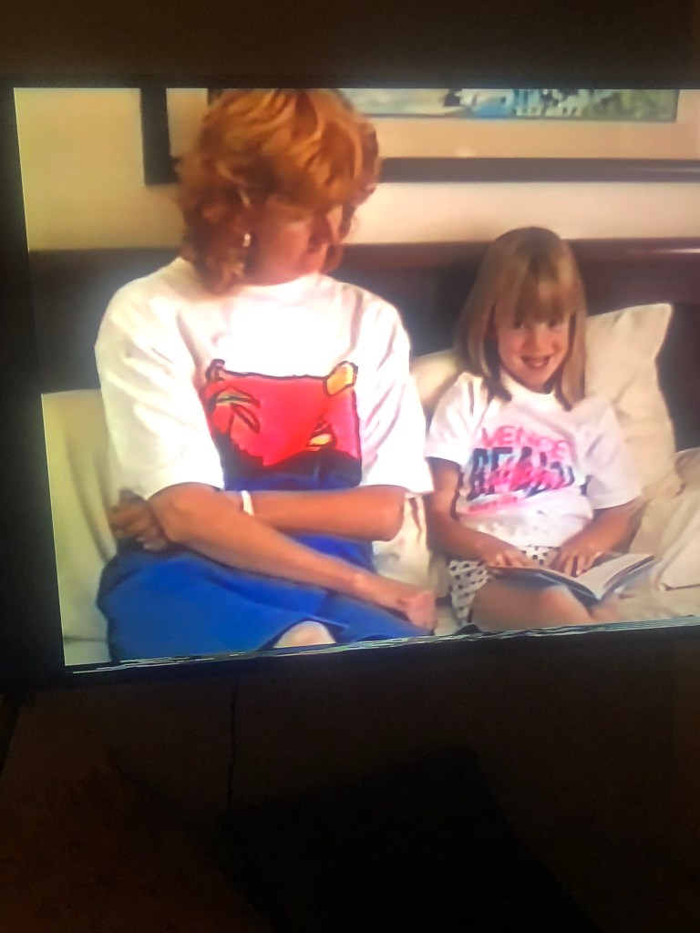


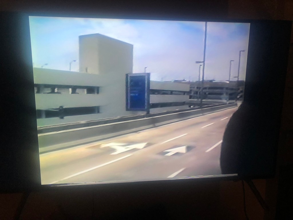
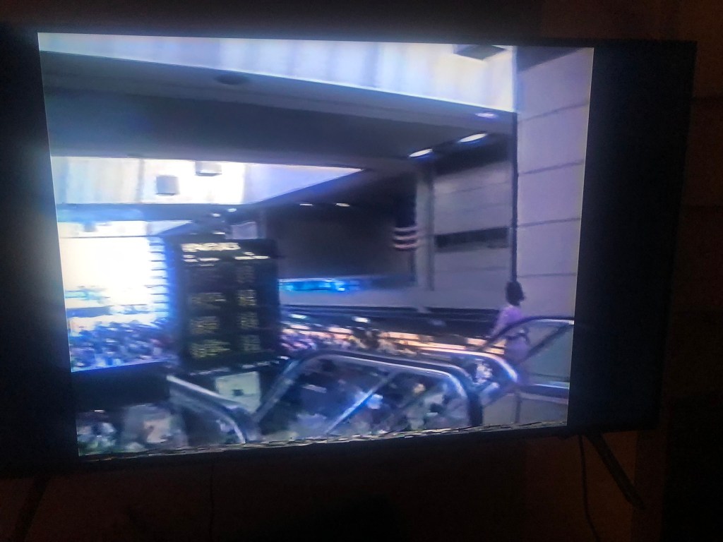

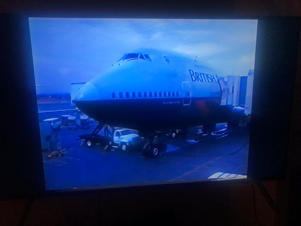


I photographed a range of video frames so that I had a wide variety to choose from. I wanted some also that showed being on holiday and which showed the TV news report from the earthquake because that is also a part of the story and memory! I also photographed snippets from the Town mouse and Country mouse book to mix in with the photographs in the negatives.
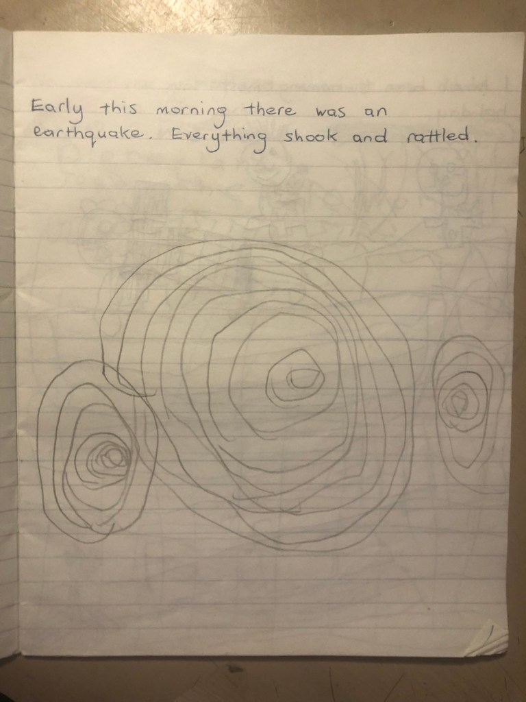
I also have a sketchbook from the holiday that my Mum made into a holiday diary, she also used it to help me learn to write. She would write a sentence and then I would repeat the same sentence below hers. In this sketchbook she wrote a sentence about the earthquake and I drew the seismic waves below it, I decided to use these in my zine!
I then had the task of importing all the photos I wanted to use into Photoshop and tweak the brightness/contrast/levels/vibrance etc… I then found a negative mockup online that I bought from a designer which made the process of placing the photographs into the photo spaces on the negatives much easier! I wanted some negative space once again so I left a space in the middle of the right page.
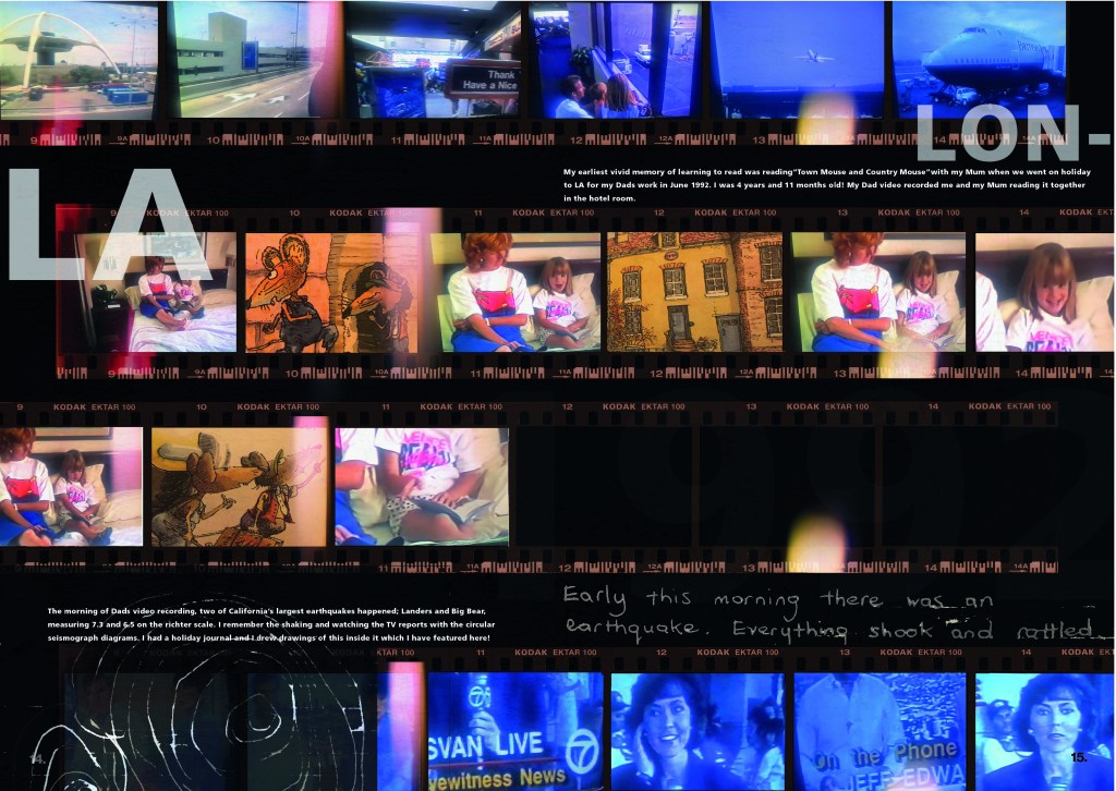
I used Frutiger typeface which ties in nicely to the airport/holiday feels!
Pages 16-17: The Worm Charmers
The typography I used on this layout was again inspired by David Carsons Masterclass:
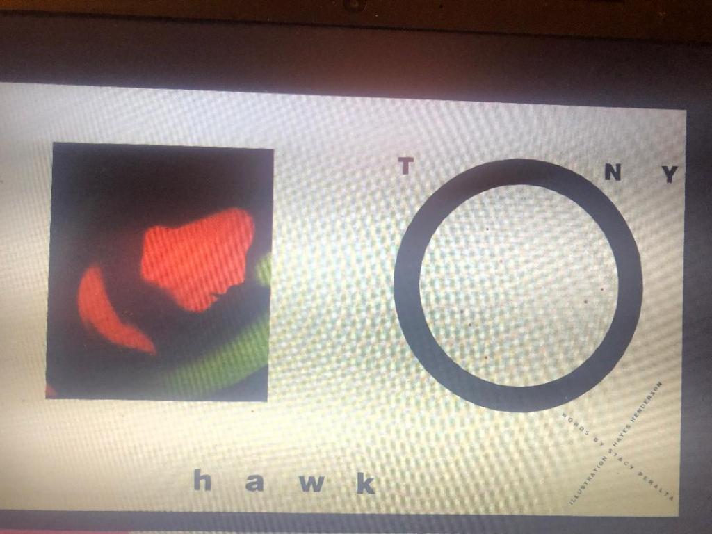
My quick photograph that I took of the screen as I was watching it doesn’t so it much justice as the “o” has text to fit the inside of it. I really liked this idea for the title of my piece!
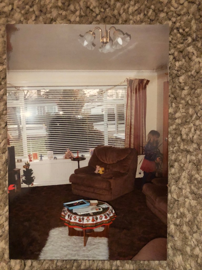
I didn’t know what images to use for my layout; I knew I needed to use the cover of the book but wanted to make it a little more interesting… I have personal memories of this book and where I used to read it in my Mum and Dads house that I wanted to include but to start with I struggled to know how to do it. I used to read this book propped up against my Mum and Dads old comfy brown sofa chair right next to the warm radiator and finding a photo of this in my Mums photo album helped to give me the idea what I went with for these pages…
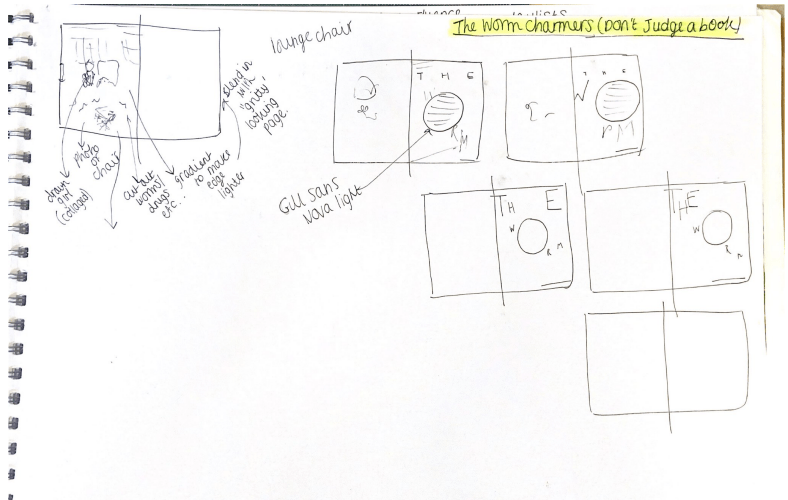
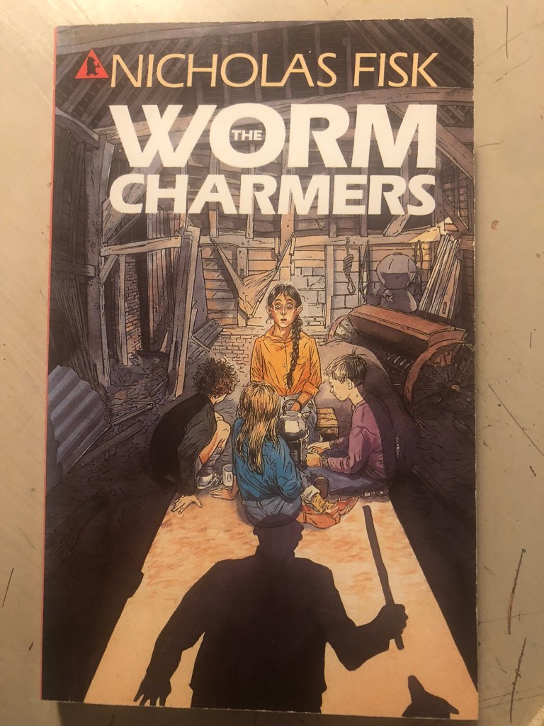
I decided to take the original cover of The Worm Charmers and alter the cover to place Mum and Dads old chair on it. One of the little girls on the cover of the original book looked like me as a child and I thought about using her to represent me!
This is the original cover:
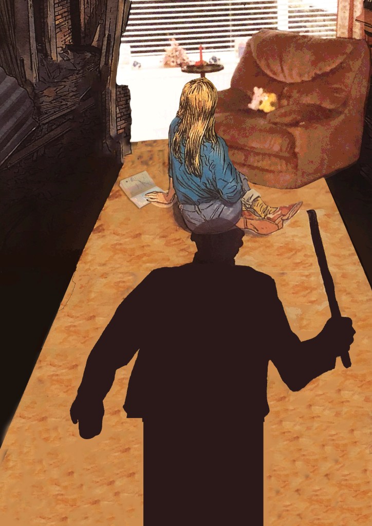
My photoshop manipulation skills aren’t all too great but I tried my best to blend the photograph into the original image. I also added a book on the floor to represent The Worm Charmers. I think the image overall works quite good!
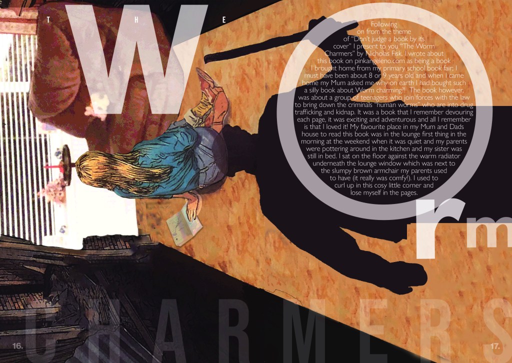
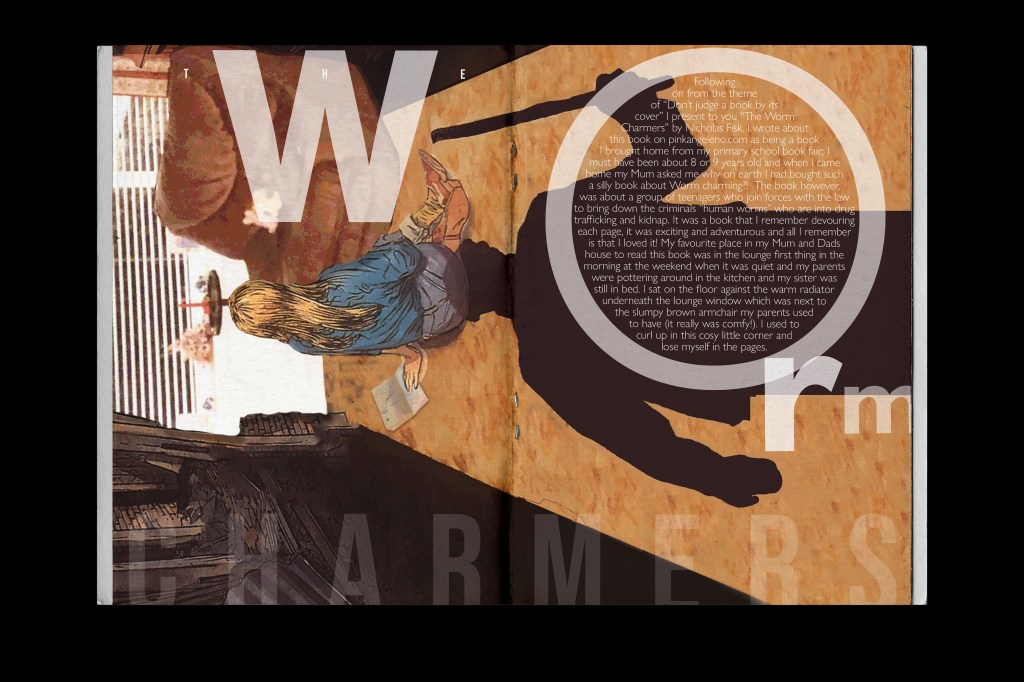
I quite like how this layout turned out! The spacing between the letters and the contrast between the light/dark/small/big text.
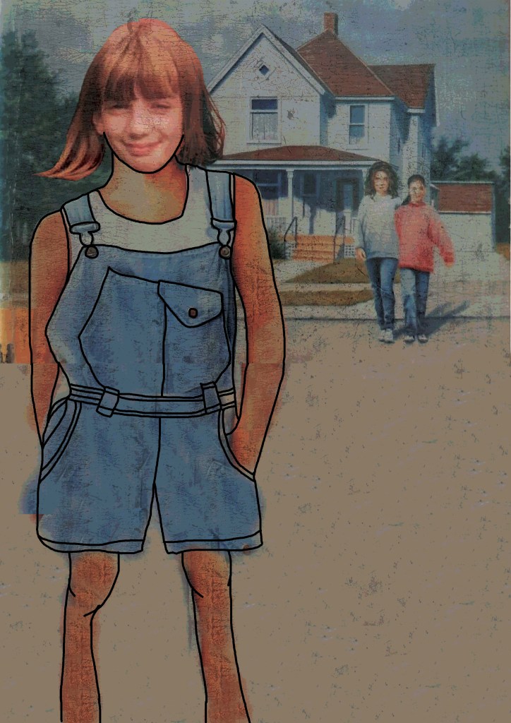
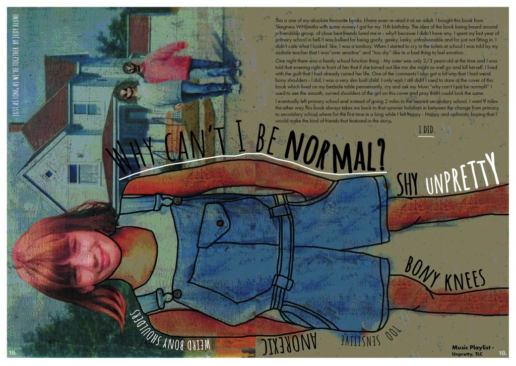
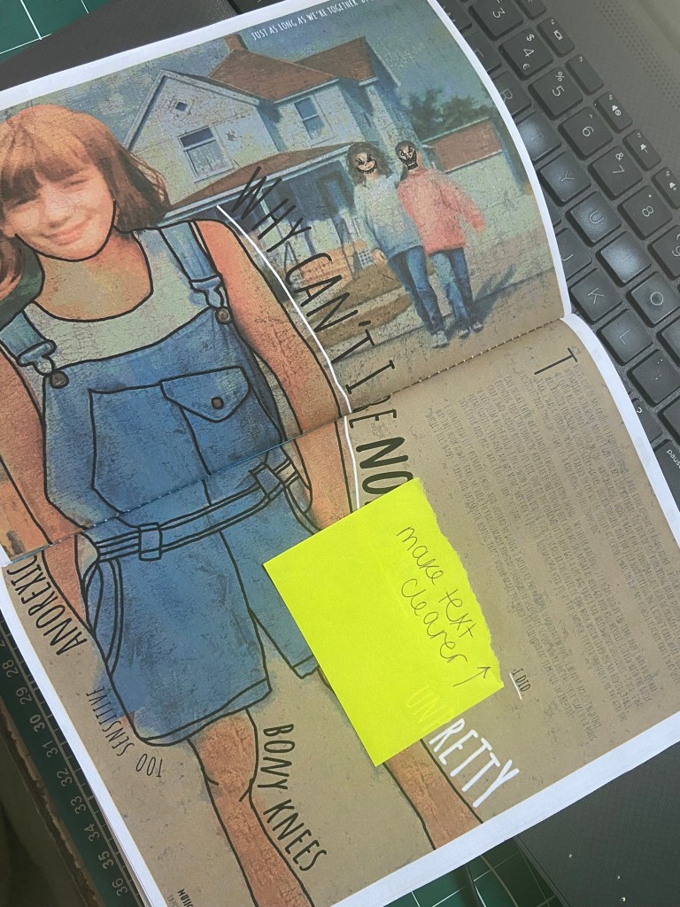
Pages 18-19: Just as long as we’re together
This was one of my most memorable books growing up. I read this in the summer holidays between leaving primary school and starting secondary school. I was bullied badly in the last year of primary school for not being “cool” and not fitting in with a clique. When I bought this book I bought it on the basis it was about a strong friendship group and that is what I craved back then. I wanted to have a group of girl mates who wouldn’t be nice to me one day and ignore me the next! When I read the story I hoped that I could possibly have what the main character Steph had. I resonated with the front cover so much too which showed an illustration of Steph in denim dungarees and her normal frame.
This is the original cover:
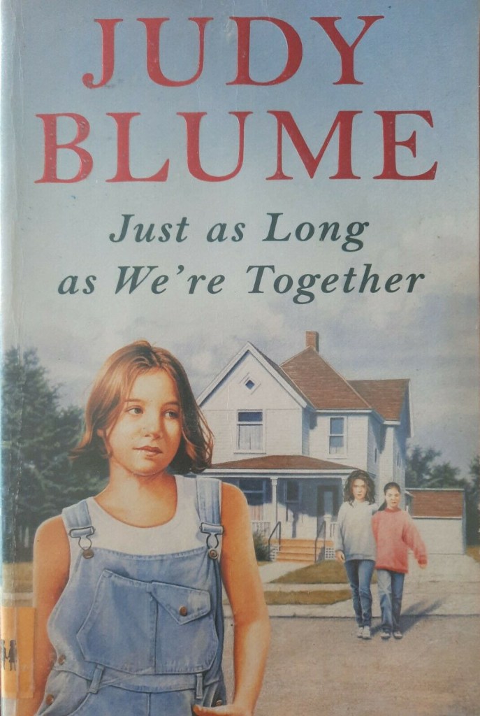
I was painfully skinny as a child and used to get bullied for this, I used to hate my bony shoulders – I used to look at the illustration of Steph and wish I had perfect rounded shoulders like she did…
For this design I decided to try my hand at photo manipulation again in Photoshop and use a photograph of me from that era and impose it onto the illustration of Steph! I wanted it to look childlike and like it had been doodled onto the cover so I added a thick black line around the outside of her. Around the outside of the design I wanted to write words that represented the cruel comments I used to get and how I was feeling. As mentioned earlier some of the zines I researched had playlists in.. the only song that comes to mind when I think of body image is Unpretty by TLC. I included this on there.
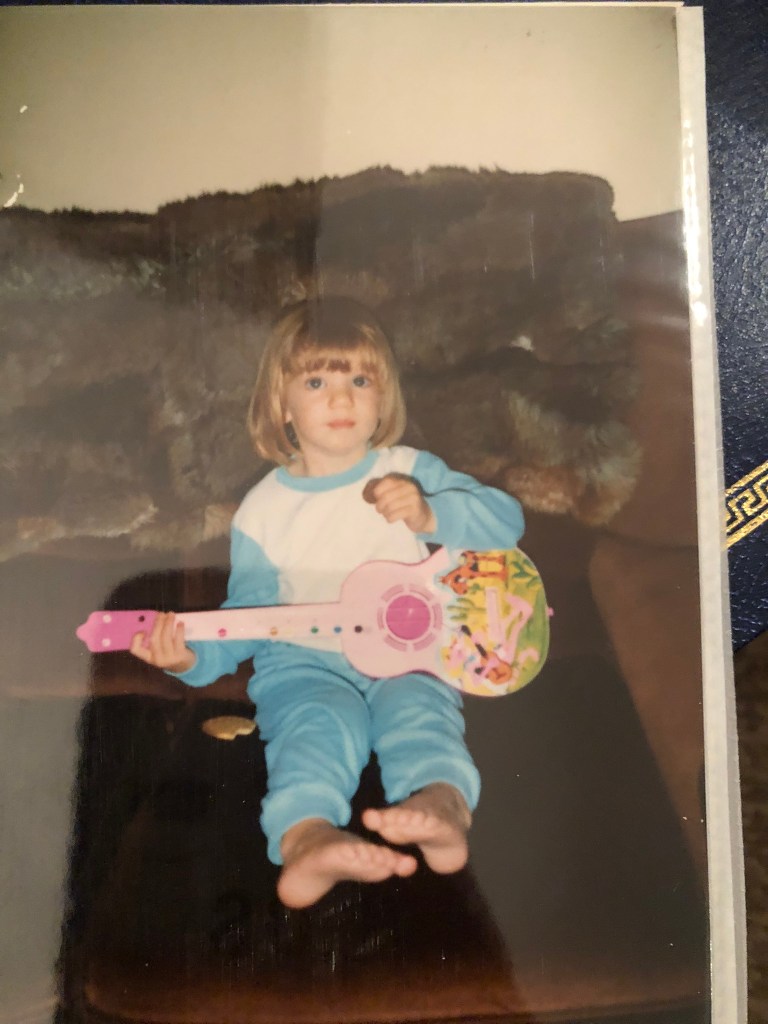
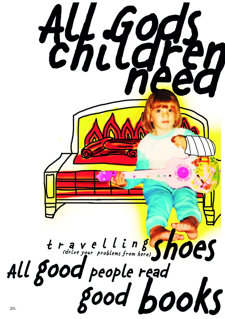
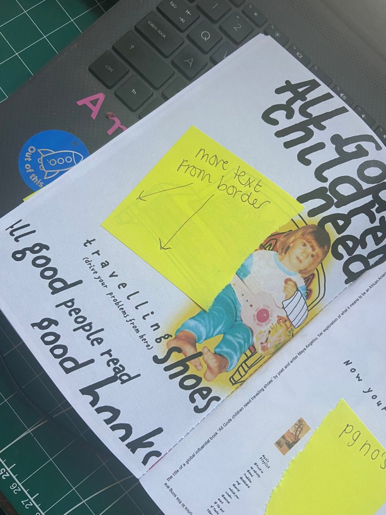
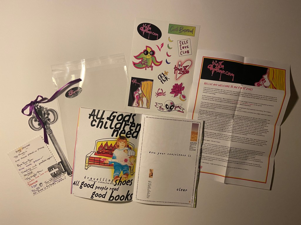
Pages 20-21: Global influences
This double page spread is about one of my earliest memories from my childhood to a song that my Dad used to play a lot of at the time – Tanita Tikaram, Twist in my sobriety. I have this song and album on my phone playlist and when it came on random when I was designing my zine I listened carefully to one line of the lyrics “All good people read good books” and I wondered to myself if I could use that lyric to create something arty in my zine. I didn’t really know what the lyrics meant to this song so I actually googled it and found out that the lyrics are actually a title to an influential book by poet/author Maya Angelou; she was African/American and wrote a lot about her struggles as a black woman to fit in to society. Her work has been widely read globally and has influenced and inspired a lot of African/American people. This was perfect! I could tell the story of my memory and continue to make my zine personal to me as well as link it to something globally impactful.
I wanted to continue making my zine digital but knew I needed to use different mediums and media throughout. My memory involves me dancing around my Mum and Dads old living room in our old bungalow age 3 with my plastic guitar to Tanita Tikaram and my Dad doing the same but with a wooden ukulele until I fell on the hot fire and injured my arm and ended up in A&E. I googled an old photo of what the fire looked like and then decided to draw it and colour it in really fiery colours. Again, I found a photograph of myself aged 3 with the guitar that I thought would be personal and relatable to include:
Again, with influence from David Carson I tried to do some more experimental typography – experimenting with text bleeding off the edges.
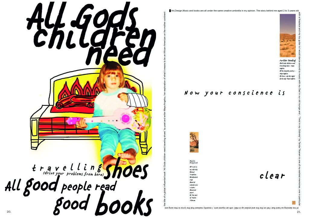
The left hand side page is very busy and bright and I wanted the right hand page to be much more calming than that. I love negative space and wanted a lot of it for this design. The only images I used relate back to Maya Angelous subject in her book – her homeland South Africa. I wanted the colours of this to match the warm Oranges, Reds and Yellows of the fire on the previous page. I also followed the rule of 3 by adding a subtle orange square at the bottom of the page. Design psychology is that design elements work better in 3’s and also it allows the eye to be drawn all the way down the layout. I carried on the lyrics from the left page to the right page “now your conscience is clear“… clear can also relate to the negative white space on the page.
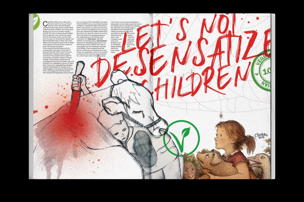
Pages 22-23: Charlottes Web
This was another influential book for me growing up. It was one that was read as a classroom read by my year 4 teacher and then I loved it so much that I asked my Mum to buy me it to read by myself. I think this book influenced me to be vegetarian as an adult.
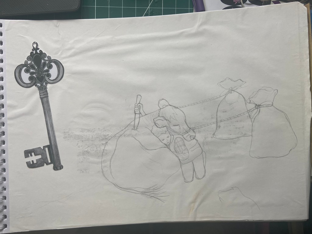
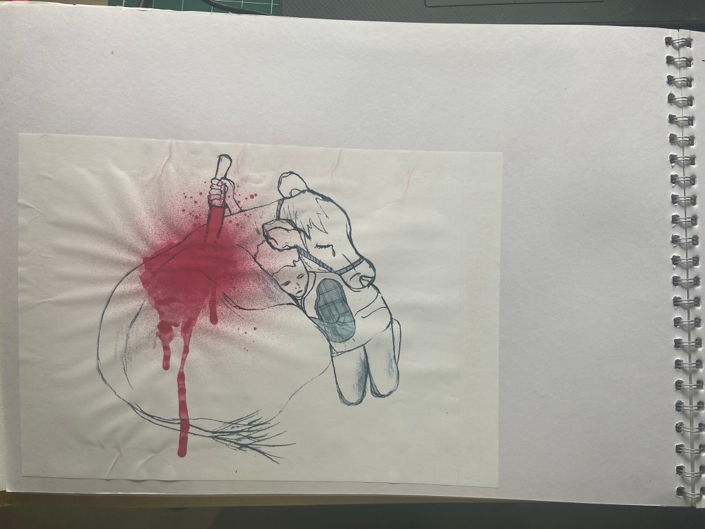
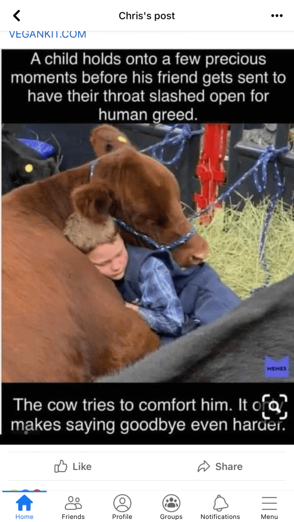
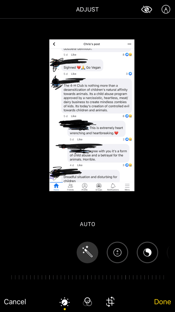
There was a post that I saw on Facebook which helped inspire the layout for this. The post showed a little boy at a cattle market where his parents were selling off his cow for meat, he was hugging the cow goodbye. It really made my heart ache and pulled at my feels. This is a similar story to that of Wilbur the pig and Fern in Charlottes Web and that is why I associated the 2 together. Being read this story as a young child made me aware of the importance of feeling empathy and compassion towards other living beings. It allowed me to show and feel love between humans and animals. The comments on the Facebook post were “child abuse” and “desensitization” and these really struck out to me. I had to use them in my piece. I wanted to use the photograph of the child and his cow but figured that would be a copyright issue, so I decided to draw the photograph and use my drawing instead:
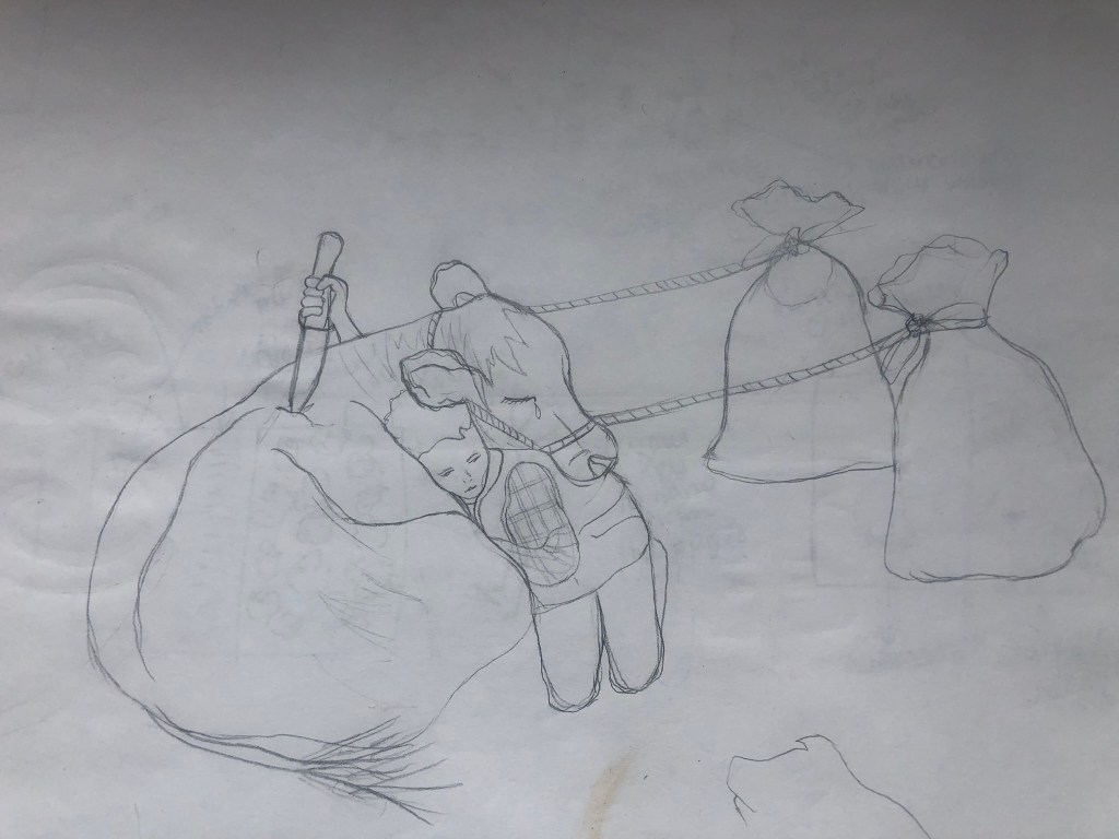
I then took my drawing and needed to gore it up ever so slightly to get the point across that I was trying to make. I wanted the innocent little boy to be holding a knife and to back stab the cow; this shows how nice humans can be but also shows the sly, back handed greed stabbing the knife in the back.
I decided to use a runny water colour in a deep red to create the appearance of blood on the cow…

I then imported my drawing into Photoshop to work my magic on the rest of the layout.
I wanted a striking, bold title for this piece and the comments from the original Facebook post kept ringing in my head, I decided to go with “let’s not desensitize children“. The typeface I used also resembled smeared on, painted blood.
The cover of Charlottes Web that I have and that I read as a child has illustrations of Fern and some of the other farmyard animals on it. The illustration isn’t particularly cheerful and I thought I could use this to my advantage on my piece. I have this sad drawing of a cow being killed by his human friend and then I have the sad illustration of Fern and friends from Charlottes Web… what if I used these as an audience witnessing the murder of the cow?… I set to work putting the images together in Photoshop. I also drew a spiders web and had Charlotte (the spider) dangling down watching it all happen before her spidery eyes! I included some Vegetarian logos on there too to show how it has influenced me as an adult able to make my own decisions, my decision to be a Vegetarian out of love for the animals.

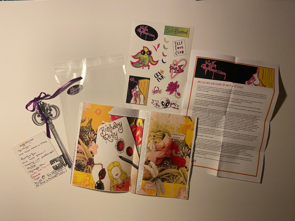
Pages 24-25: Kingcup Cottage
This is another book that pulled at my heart strings as a child. Again, it taught me empathy and how important it is to acknowledge and care for others feelings. Francesca the Frog lives in a damp. watery house and wants to organize a birthday party for herself and invite all of her friends.. she spends ages making lovely food and making her house look decorative but when the other animals receive her invites they are cruel and selfish and do not want to go because her house is cold, wet and damp.. instead of letting her know they rip her invites up or one animal using it as a sail for his toy boat. When the day of the party comes Francesca is left all alone crying at her party. I remember as a young child seeing the illustration of Francesca crying and feeling really sad for her (my heart still hurts when I see the illustration now!!). This book reminds me of when I turned 30.. I went to a lot of trouble to organise a party at my old house, i made food, brought drink… balloons.. banners and I said to my Mum that I was worried that people would not turn up for mine and I would end up sad and lonely like Francesca!- Luckily that did not happen but I thought I would make that the memory to accompany this book!
For my 30th I made my own dress.. (ish…) I took a really old vintage red dress and adapted it to make it look more modern and suit me on the day. I spent ages beforehand drawing out designs and ideas for this outfit and what kind of jewellery I would wear and how I would style my hair etc… I have used one of them drawings on my layout! My birthstone is Ruby as I am born in July so the theme was Red. Red is a strong colour on this layout! I then used the sad illustration of Francesca and a photograph of me in my red dress which I collaged together to create a cut and paste, collage effect.

The text on this layout is a little on the smaller side.. but again, zines do not have to be perfect publications and have particular layouts and it is readable so I allowed myself a free pass for it! I made the text wrap around the outside of my first image.
This layout is very full on.. there is very little negative space and a lot for the eyes to take on! I like the bright colours from the original illustrations mixed in with my own drawings and photographs.
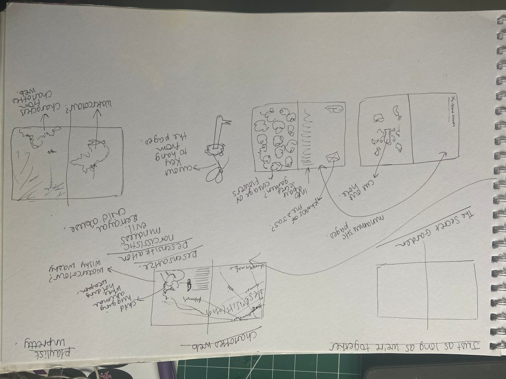
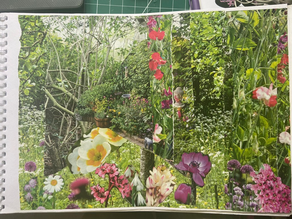
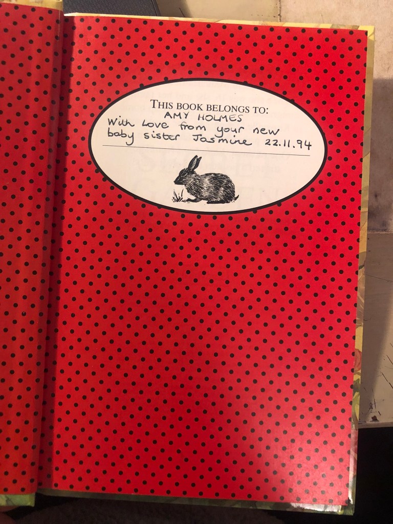
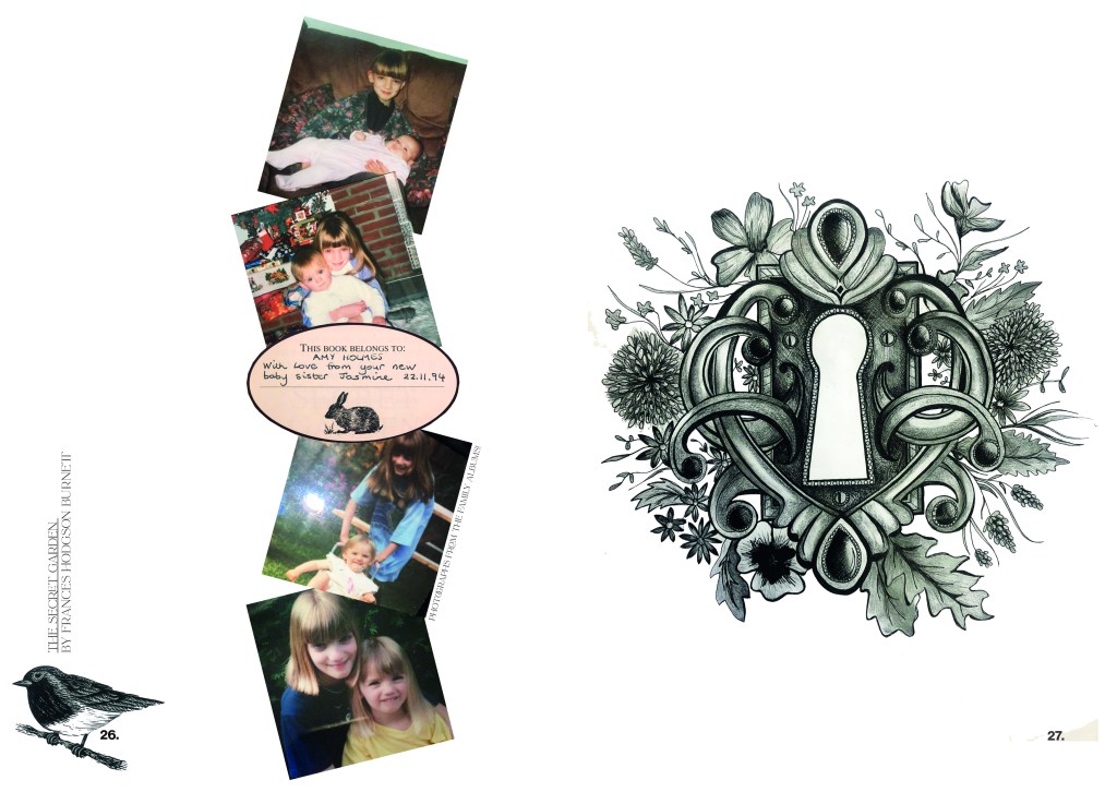
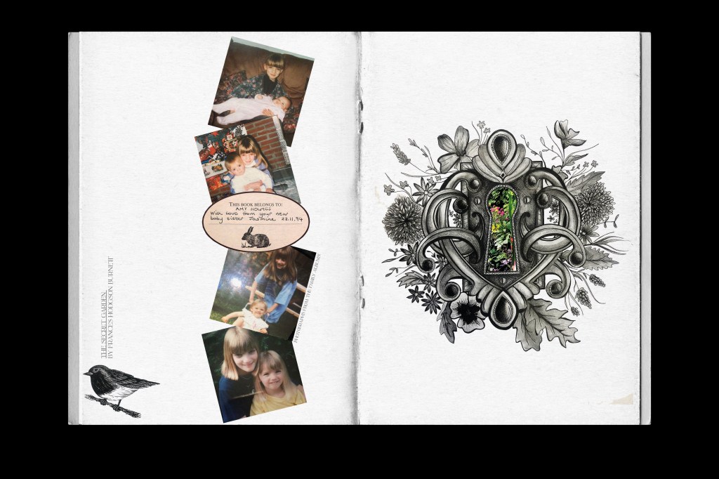
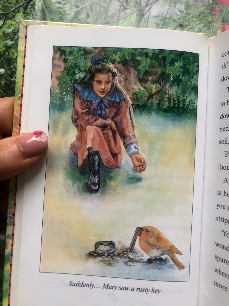
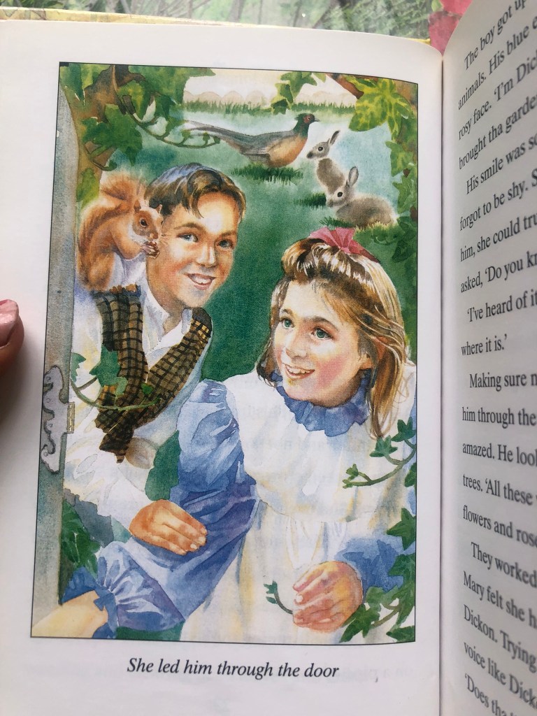
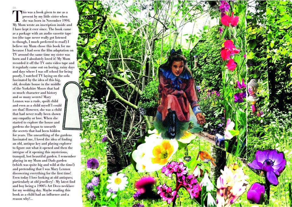
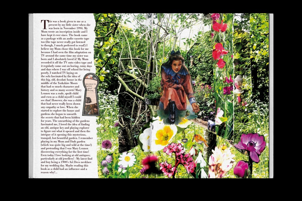
Pages 26-29: The Secret Garden
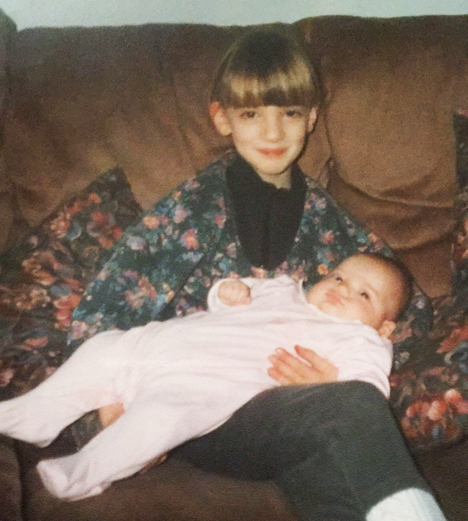
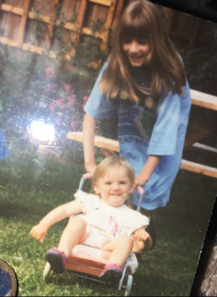
The Secret Garden was a book that was given to me by my Mum and Dad as a present from my then newborn sister Jasmine. It was a book and cassette duo but I barely listened to the cassette I just wanted to read the book! As I mentioned in my previous post, my Mum tape recorded the film off TV for me and I loved it so I guess her idea was for me to enjoy the book too!

I remember watching the film and reading the book as a child and being fascinated by finding hidden objects and hidden gardens. My Mum used to take me to a garden centre in our village at the time and I found what I thought back then was a hidden garden. In my head no-one else but me had discovered this gem.. It was a tiny little track leading behind the garden centre and it was adorned with flowers and overgrown bushes and trees, it has hidden ornaments that had eroded away over the years and I was genuinely fascinated by it – quite possibly because of this book! About 7 years ago when I lived with my ex partner in a big, old, Edwardian house I was digging one day and found a hidden sign like something out of Alice in Wonderland which also fascinated me.. when I eventually moved out and got the next house on my own I had a patio area which was covered in ivy and I placed this sign there and that was like my secret garden! Even many years later this book had an impact!
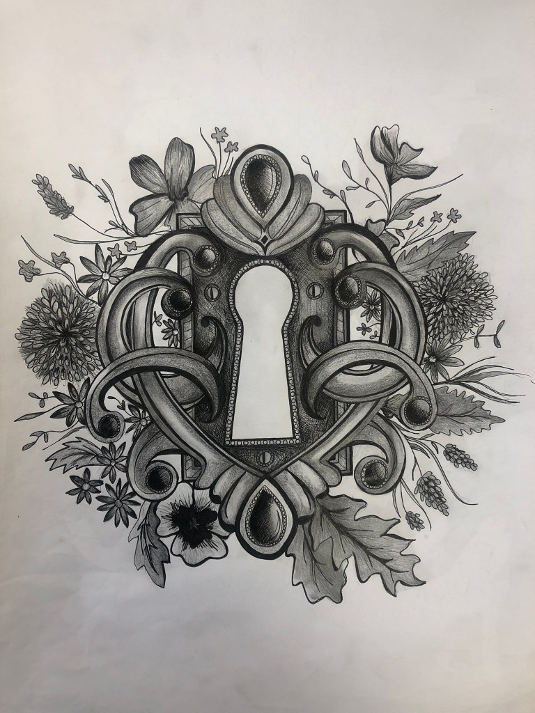
For this layout I wanted to try and bring the same intrigue!- I wanted there to be like hidden, surprise elements and little details for the reader to find! I wanted to bring in different medias for this one so I decided upon an ink drawing (which I loved doing!) and a collage!
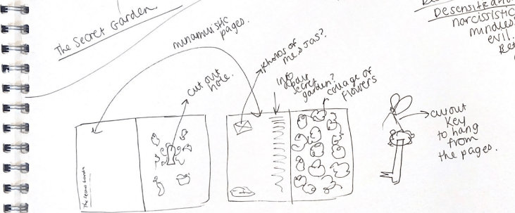
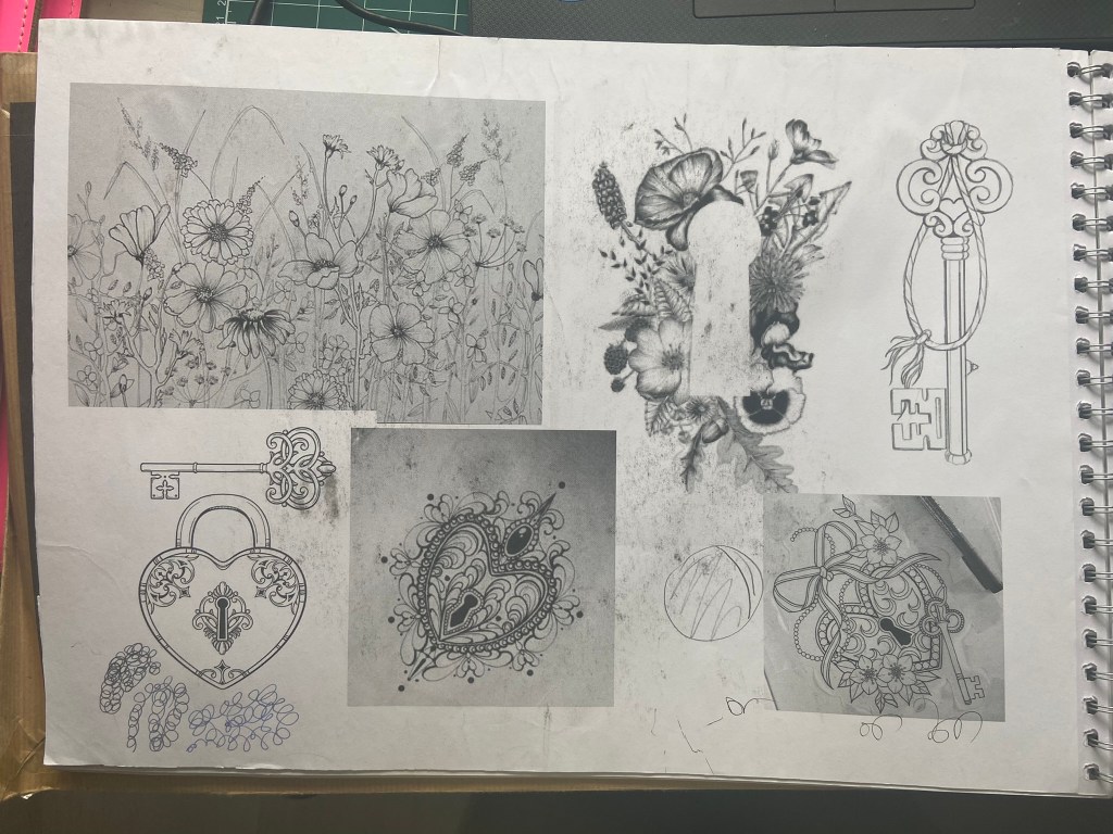
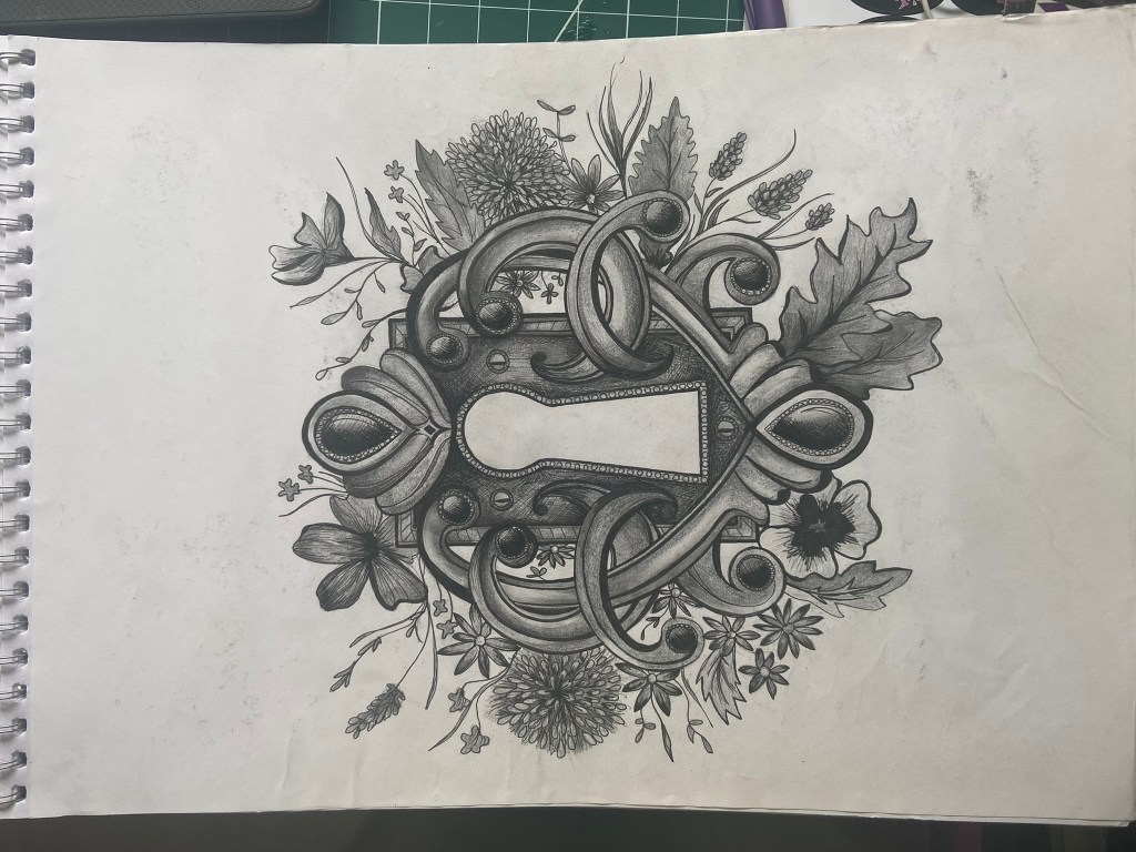
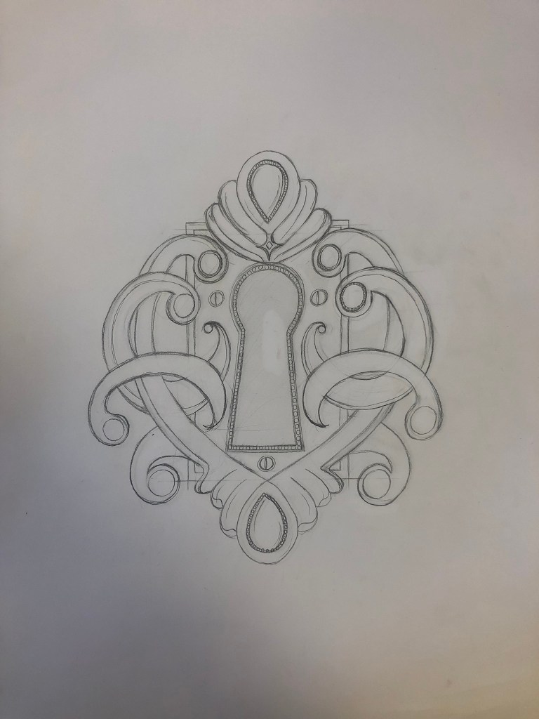
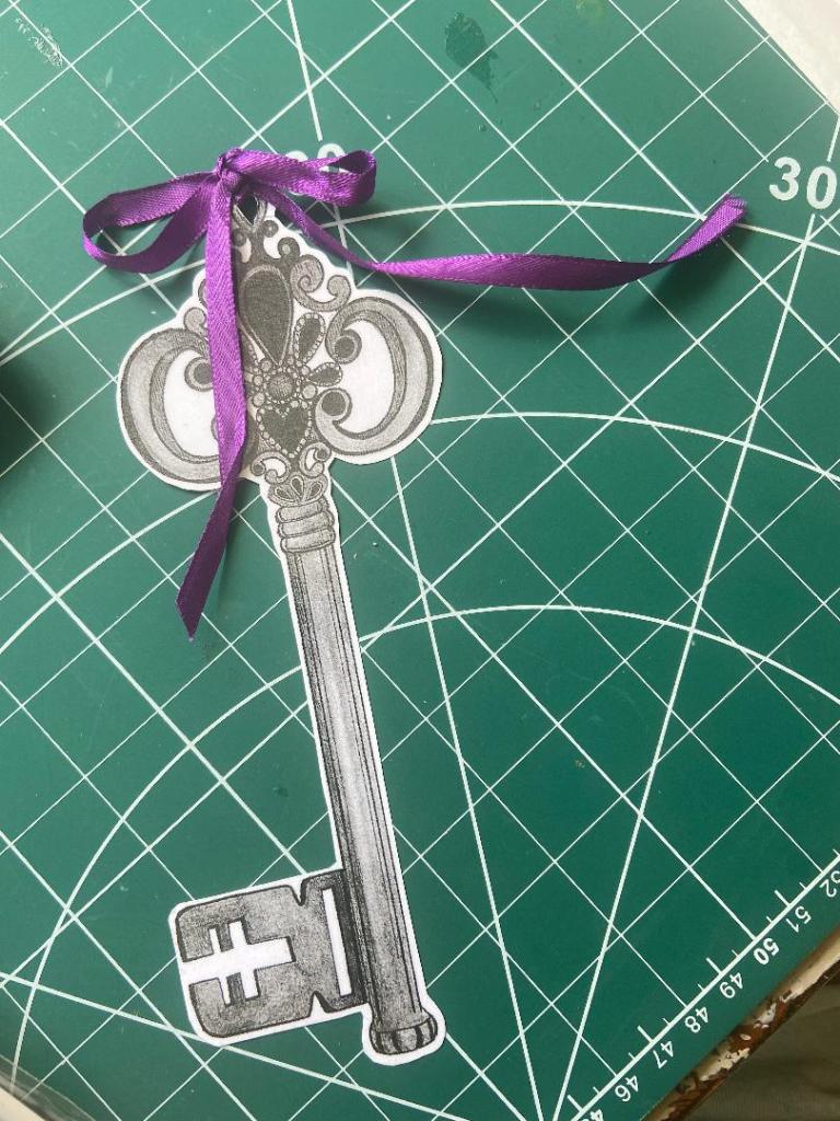
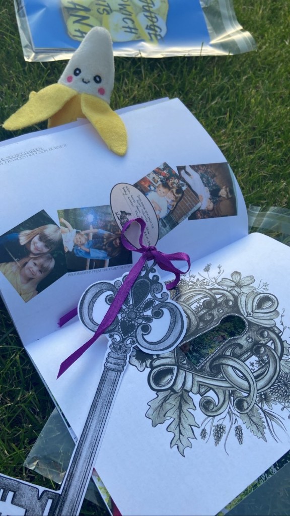
When I think of The Secret Garden I always think of a lock on a really old heavy wooden door covered in flowers and ivy and hidden! I wanted to try and achieve that in my drawing! The key is also a massive part of the story so I had the idea of again, an ink drawing of a key and maybe using it as a bookmark separate to the zine as if it were a real lock and key, placing some ribbon through it too to make it really decorative! I also thought it would be a really cool idea to cut the hole out of the lock in my zine so that you can see through to the other page!
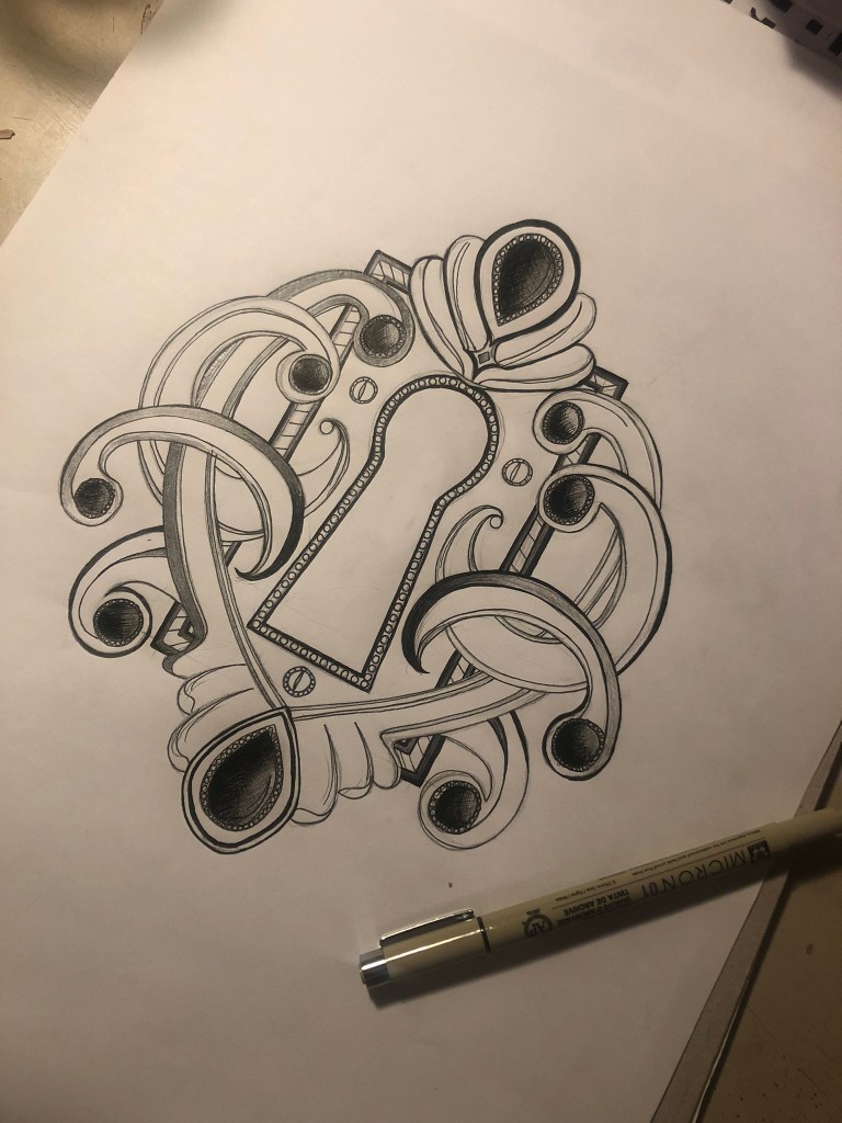


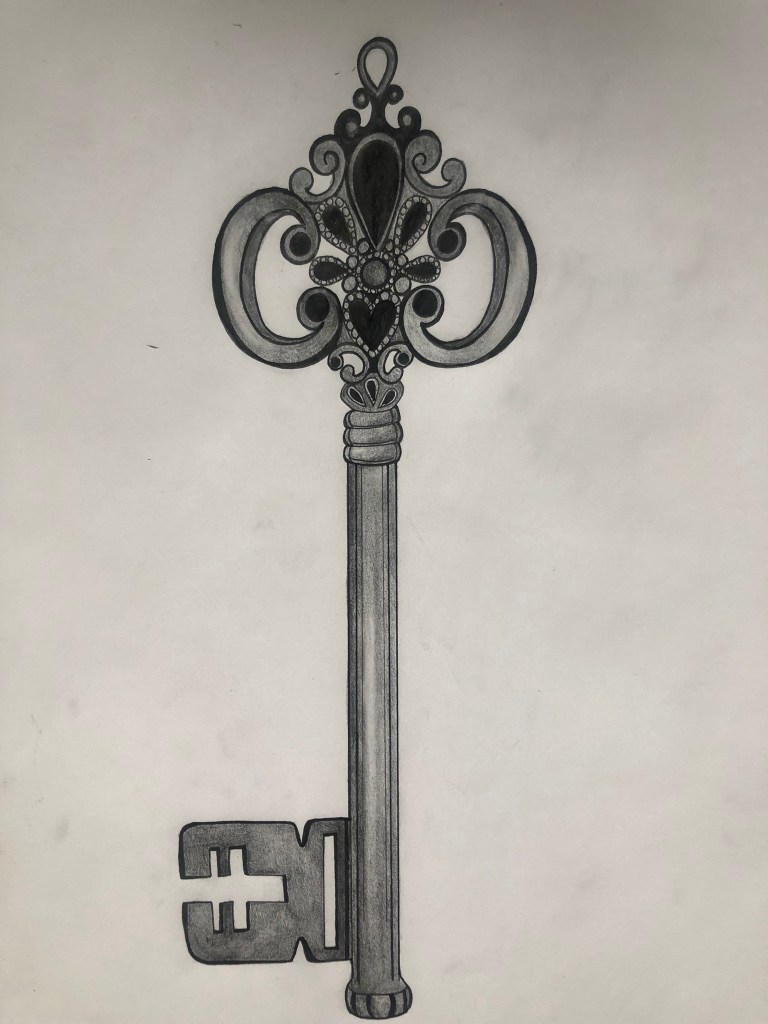
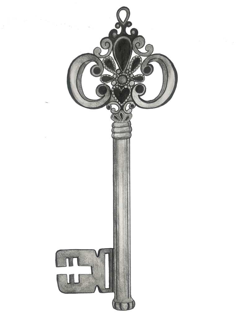
In the original book I have there are black and white drawings which tied in well with mine, I used some of these drawings to place in the corners of my layout. I also once again found some photographs of me and my sister through the years growing up as this book really was a celebration of her being born.


I also included the original “This book belongs to” where my Mum wrote in it!

The first double page spread for The Secret Garden was very minimalistic and clean:
I then went about designing the second double page spread for this book which would have the story behind why I have chosen this book to be featured in my zine etc!…
I decided to try out a collage and for this I went to Tesco on my lunch break and grabbed a copy of Gardeners World!- it seemed like the only gardening magazine with a lot of photographs in it! I then went about cutting out flowers, trees, bushes… anything that would make a good collage and look like an old abandoned garden!!
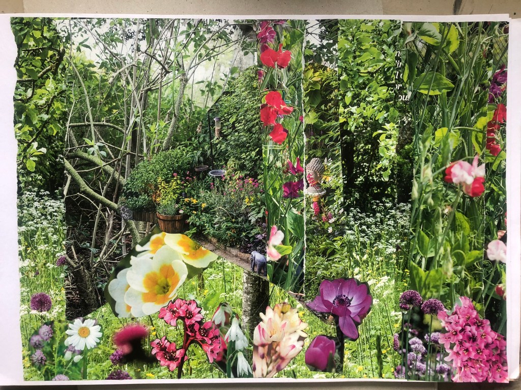
I then decided to try my Photoshop manipulation again by taking original drawings from the book and merging it into my collage!
These were the illustrations in the book that I could choose from!


I then cut around the illustrations in Photoshop and went ahead placing them on my collage!

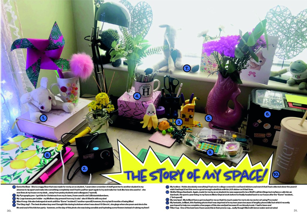
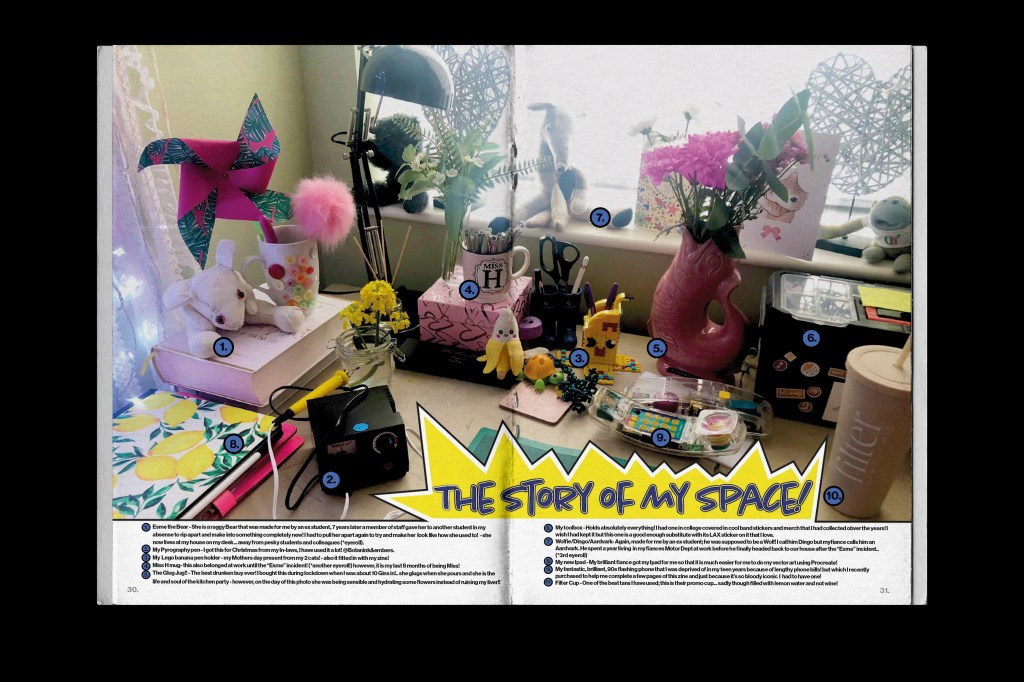
Pages 30-31: The story of my space
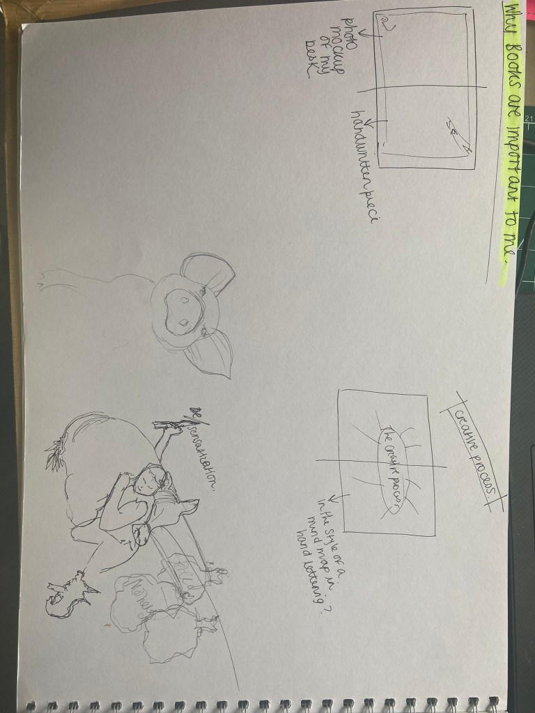
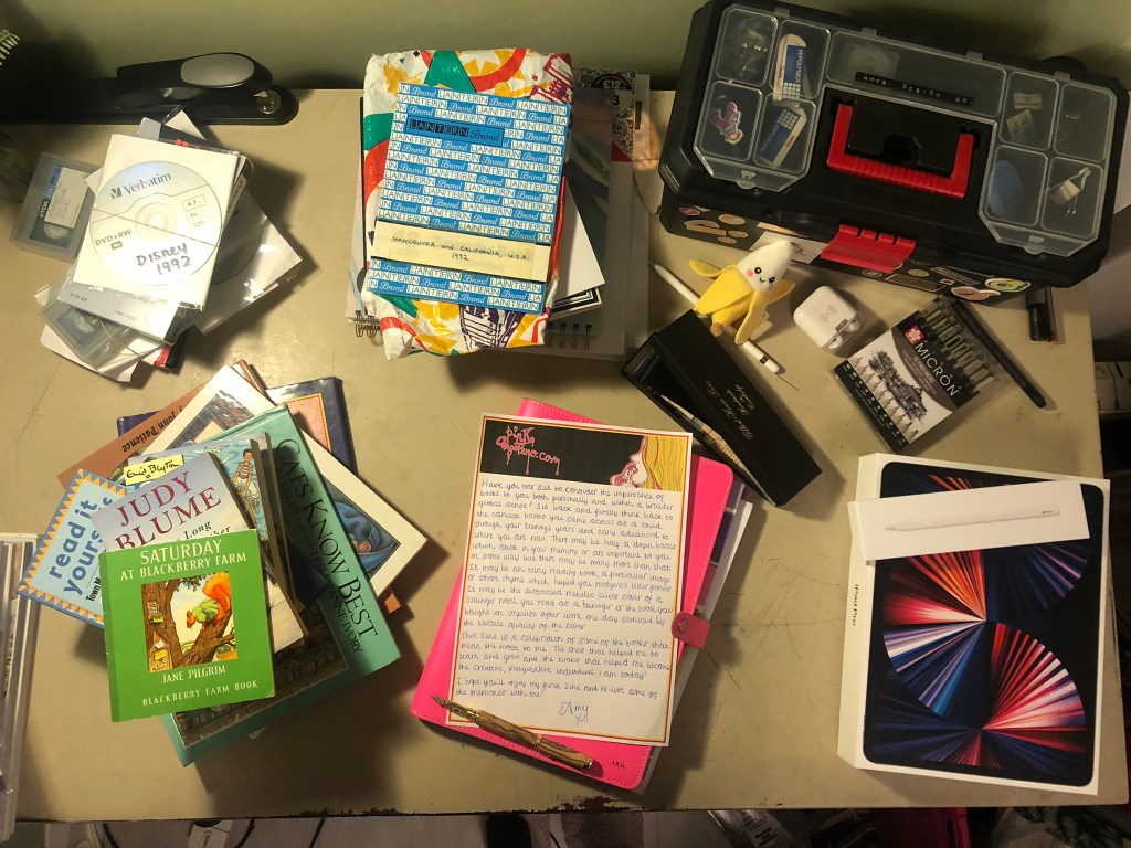
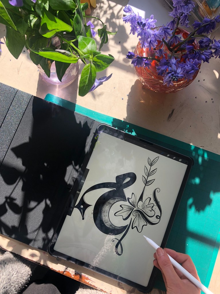
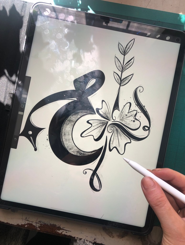
This page was to show part of my creative process which was asked of me in the brief! I thought if I showed something personal like the space I work in that it would give the reader an insight into who I am and what I like! I decided to photograph my desk in my house and use it as the double page spread! I thought back to Core Concepts where one of the exercises I had to do was information graphics by creating a map or layout of something and showing a key to what’s what. I decided to do similar for this piece! Show my desk and use a key to label and annotate important things on it!

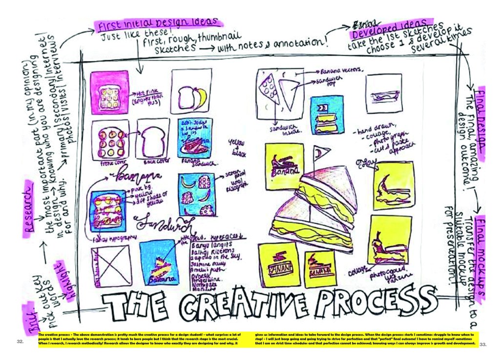
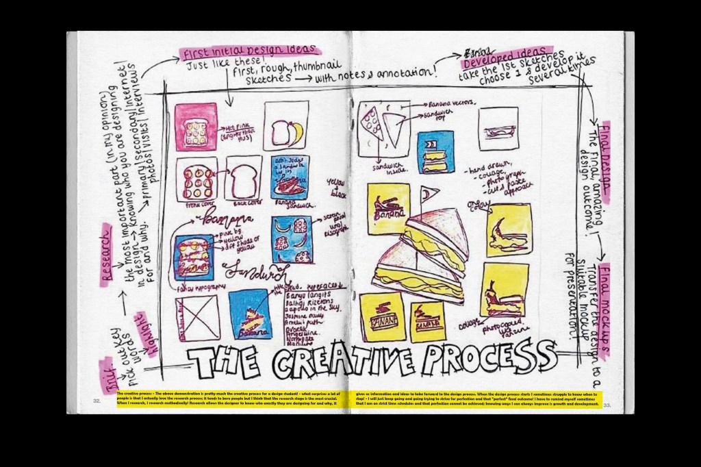
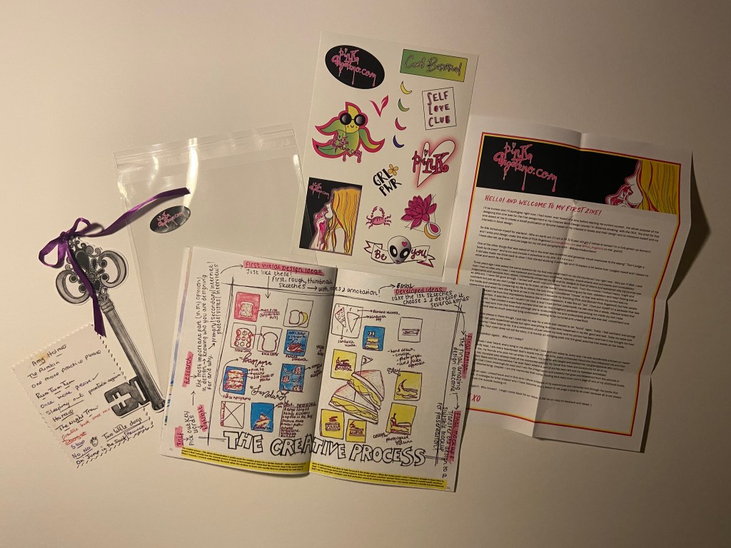
Pages 32-33: The Creative Process
This was another double page spread that is designed to show the creative process that I go through when being given a brief to work to. I decided to use a page out of my sketchbook to illustrate this; it was a page I did while sketching ideas for the “Don’t judge a book by it’s cover” exercise which resulted in the “Don’t judge a sandwich by its banana” design outcome. I then wrote annotations around the outside of it explaining each step (in order!) of the creative process that I go through when designing for a brief.
In keeping with a handmade DIY zine I have been very doodly for this layout to try and include other media apart from just digital (even though it is digitally put together).
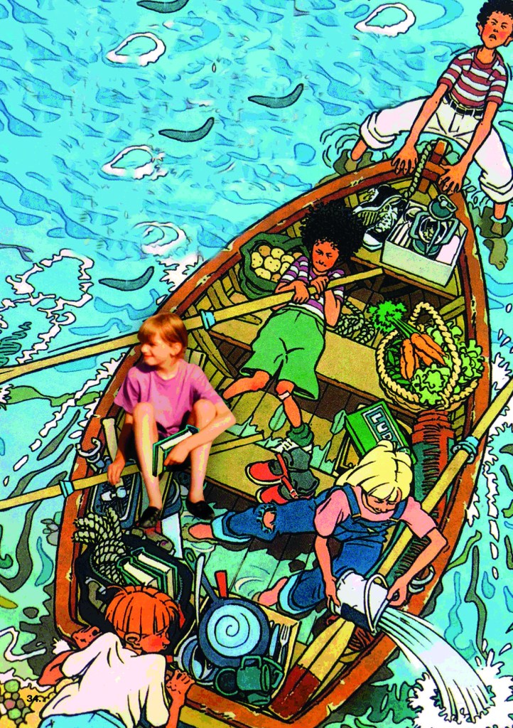
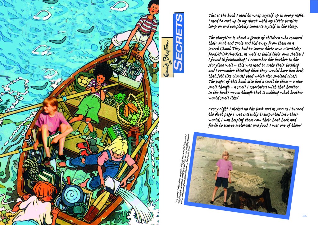
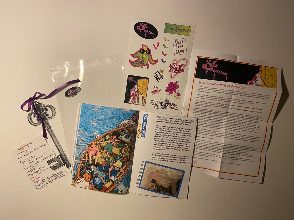
Pages 34-35: Secrets by Enid Blyton
This was one of my favourite books growing up! It was full of adventure and intrigue and I loved it!

The cover illustration for the book is already a really nice cover and insight into the book so I thought I would keep that and just manipulate in Photoshop once again a photograph of me onto it.
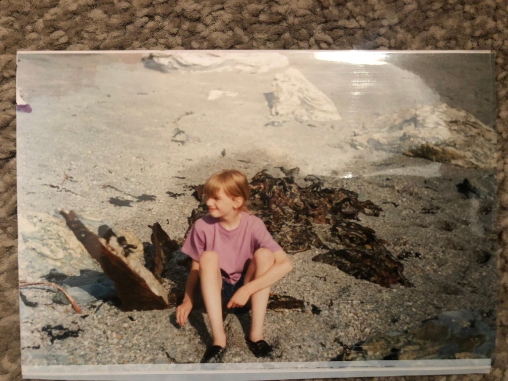
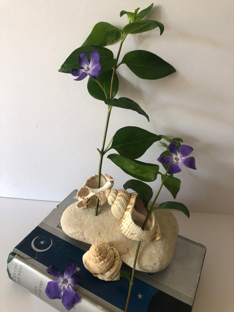
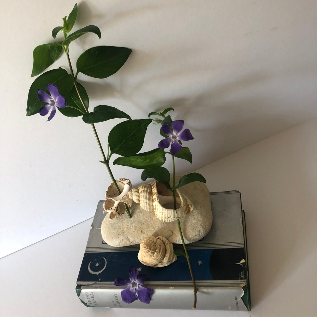
There are photographs of me taken around the time I first read this book at the Jurassic Coast down south where me and my Dad were looking at old ship wrecks and finding cool shells and old treasure! This book inspired the adventurer in me and was possibly the main reason that in them photographs I was loving life so much exploring! I decided to use them photographs in this layout to pretend that I was one of them! When I used to read the book I used to be swept away into their world and my imagination made me one of them. I think me making myself one of the characters on the book show how imagination can transport you anywhere. I also made me have a book which again I manipulated in to show that I am reading pages from it and imagining myself to be in the story.
I tried to add a posterise filter effect to my photograph to try and make myself look a little less real and a little more illustrated! I am still yet to learn a lot in Photoshop!
For the second page I wrote about my memories surrounding the book and a little about the storyline and once again added a personal photograph of me with a bit of writing explaining it!


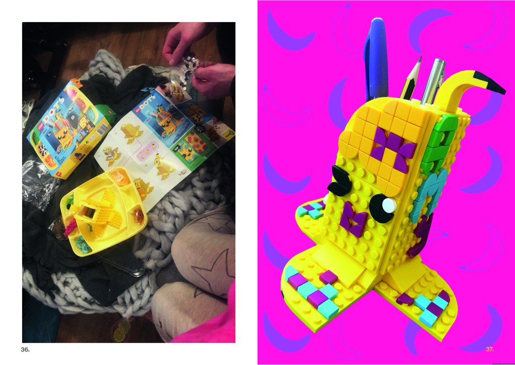
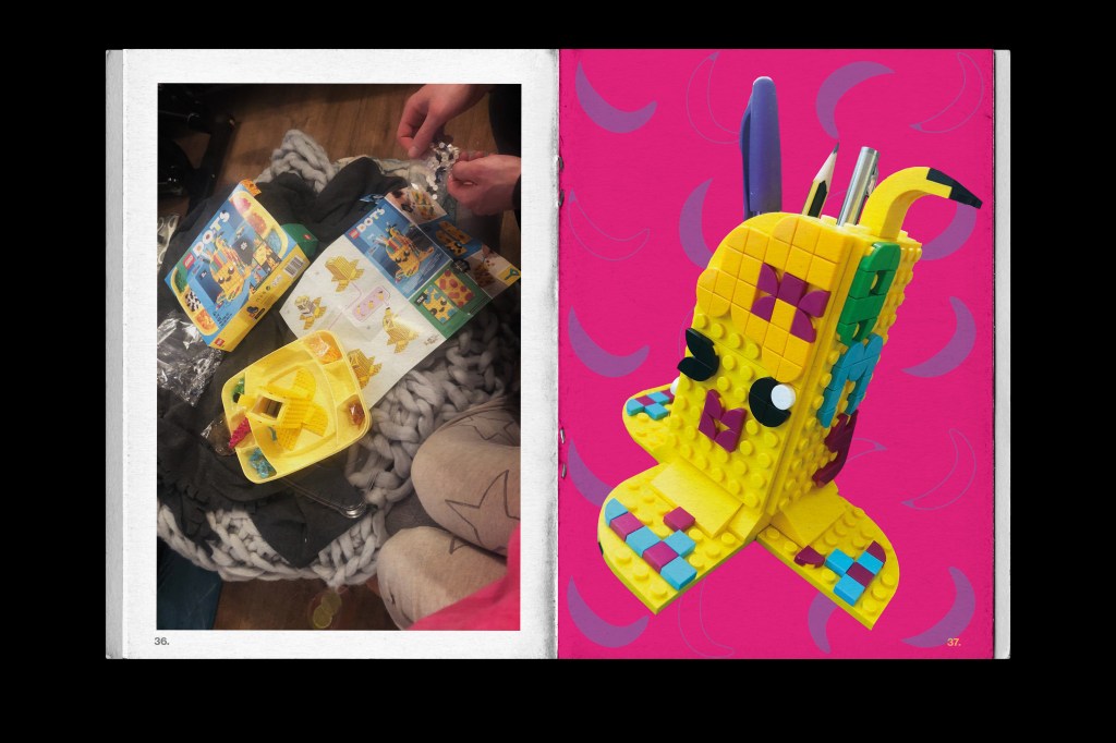
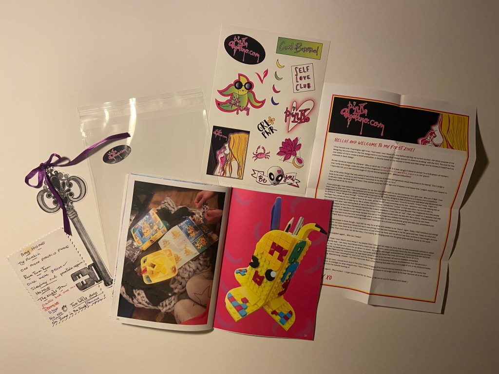
Pages 36-37: Playing with Lego
This layout was purely just something fun to add into the zine! For Mothers day my fiance bought me the Lego Dots Banana pen holder set from our 2 cats! He got me the Banana purely because I wanted to build it and include it in my zine considering it is banana themed!
I took a photo of us sat building it and then took a photo of the finished pen holder! I took the final photograph and then cut around it with the lasso tool in Photoshop and put a nice vibrant pink background behind it! The contrast between the Pink and Yellow is spot on!
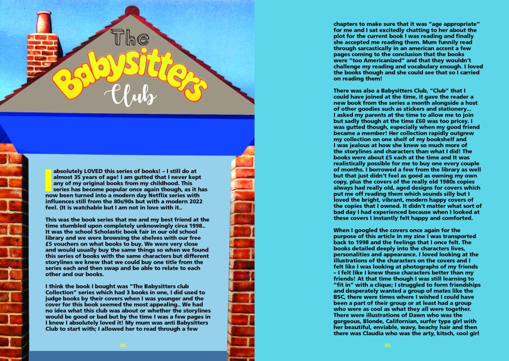
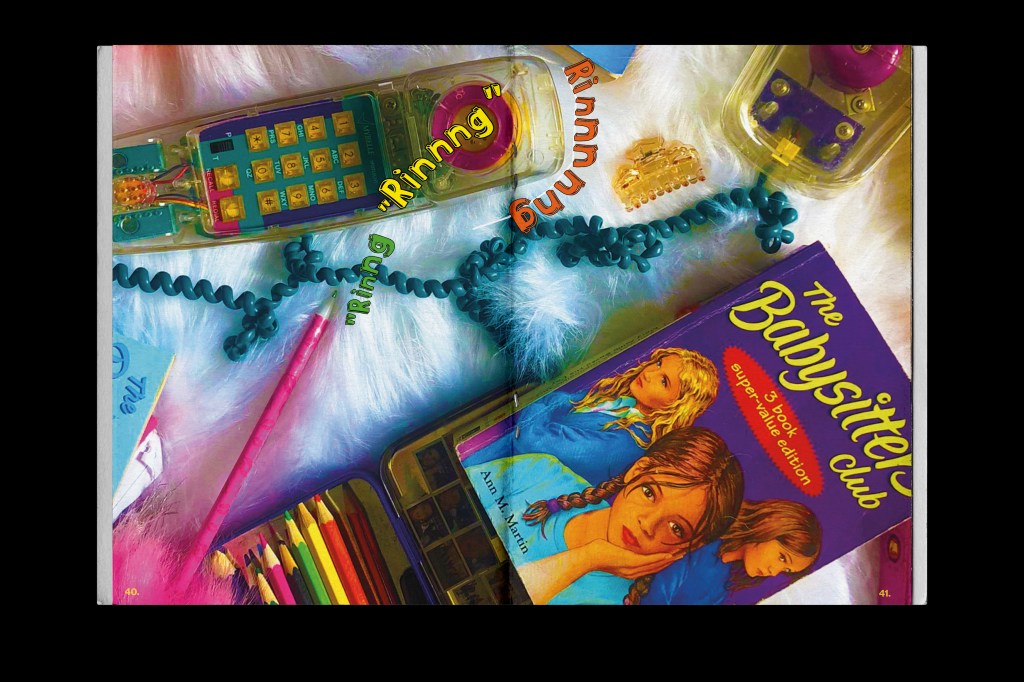
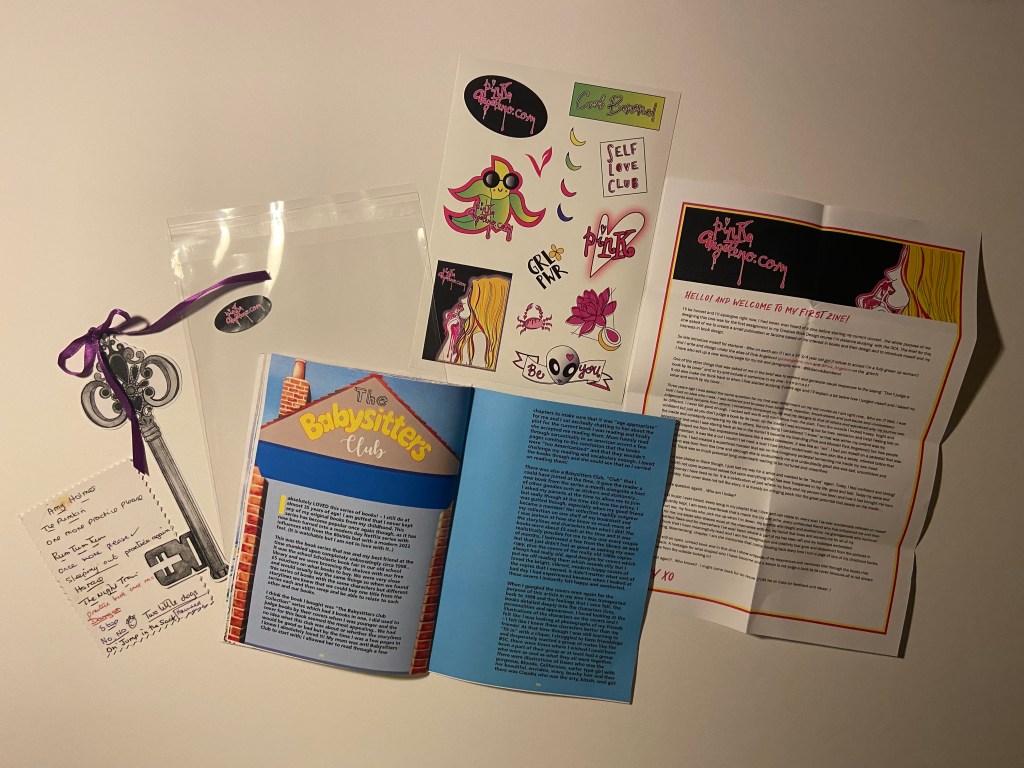
Pages 38-47: The Babysitters Club
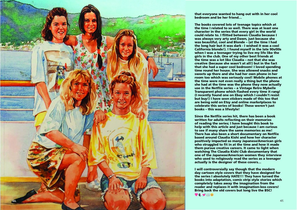
This was a big section of my zine!- but it was the series of books that I loved the most! It was probably one of the last times I read properly again too! When I hit my late teens I hardly read at all; only biography’s and books relating to Design!
The Babysitters Club was a HUGE part of my childhood and early teens; as I wrote about in one of my previous posts! (influential books) and I really wanted to do it justice in my blog!
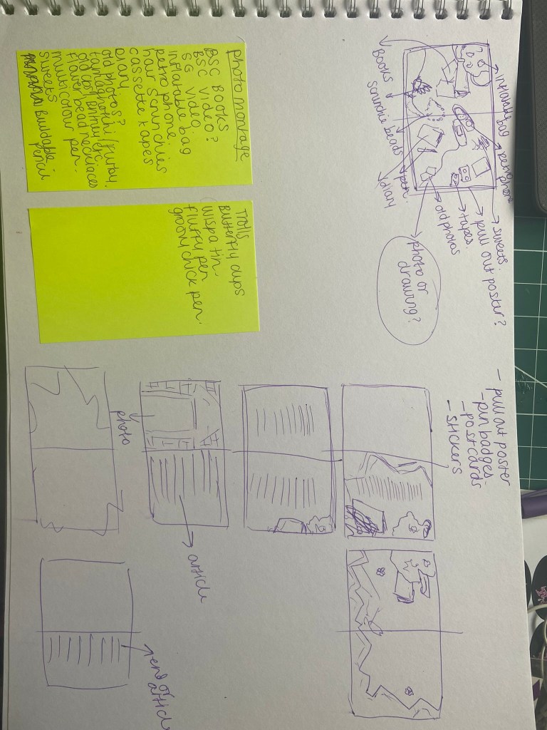
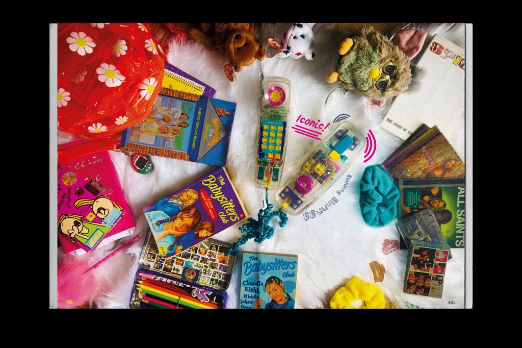
The write up I did on this series was quite lengthy so I knew it would have to go over a few pages! I wanted to set up some photo props for this article too! I have quite a lot of stuff from the 90s when I was a teenager and thought it would be cool to use them as I read these books around the same time. These books also sum up the lives of teenagers from the 80s/’90s so it seemed perfect! My original idea was to also create stickers and a pull out poster but time constraints held me back from that!
Instead when I was off work for 12 days with Covid I decided to rearrange my living room (with the energy I absolutely didn’t have!) to lay out my props and do some flatlay photography to use for this article:

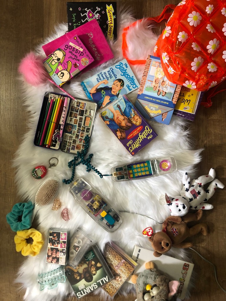
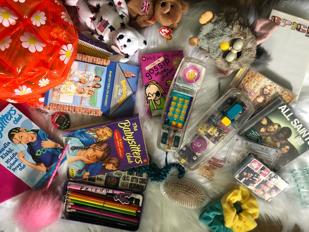
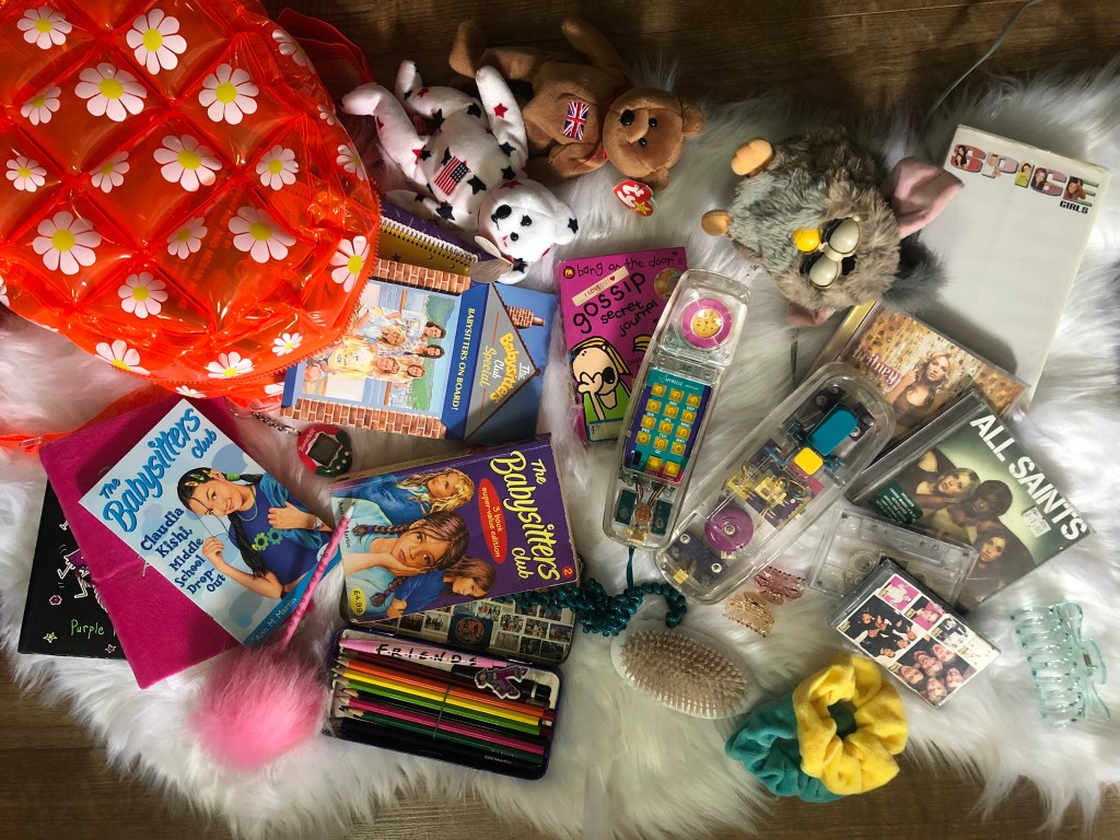

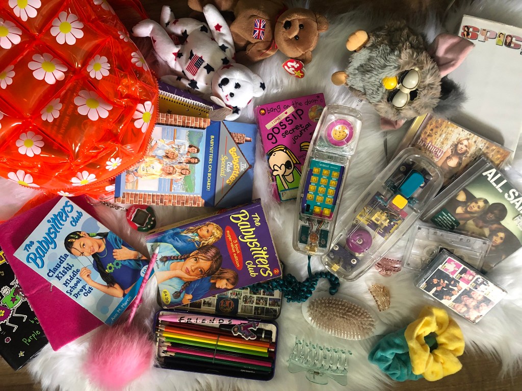

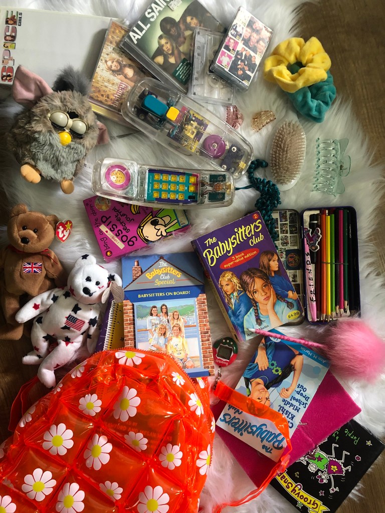
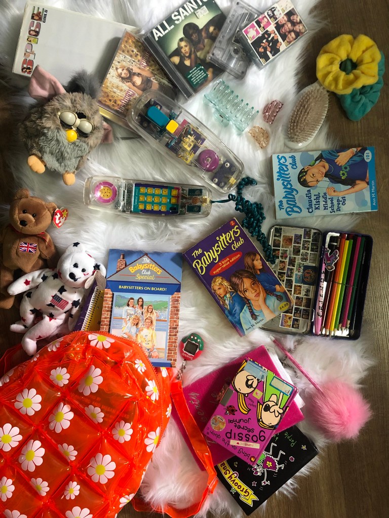
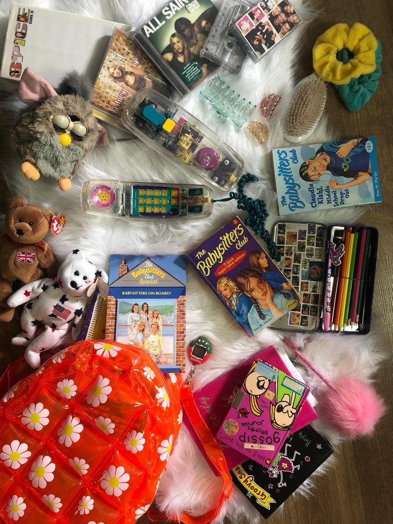


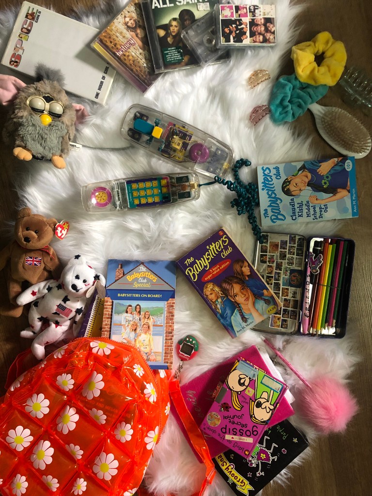
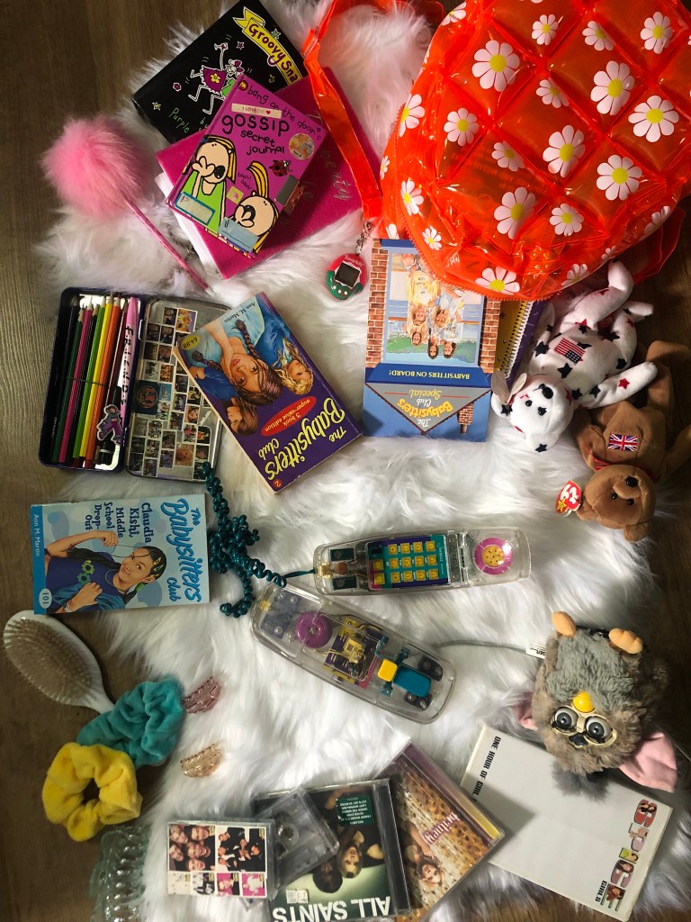

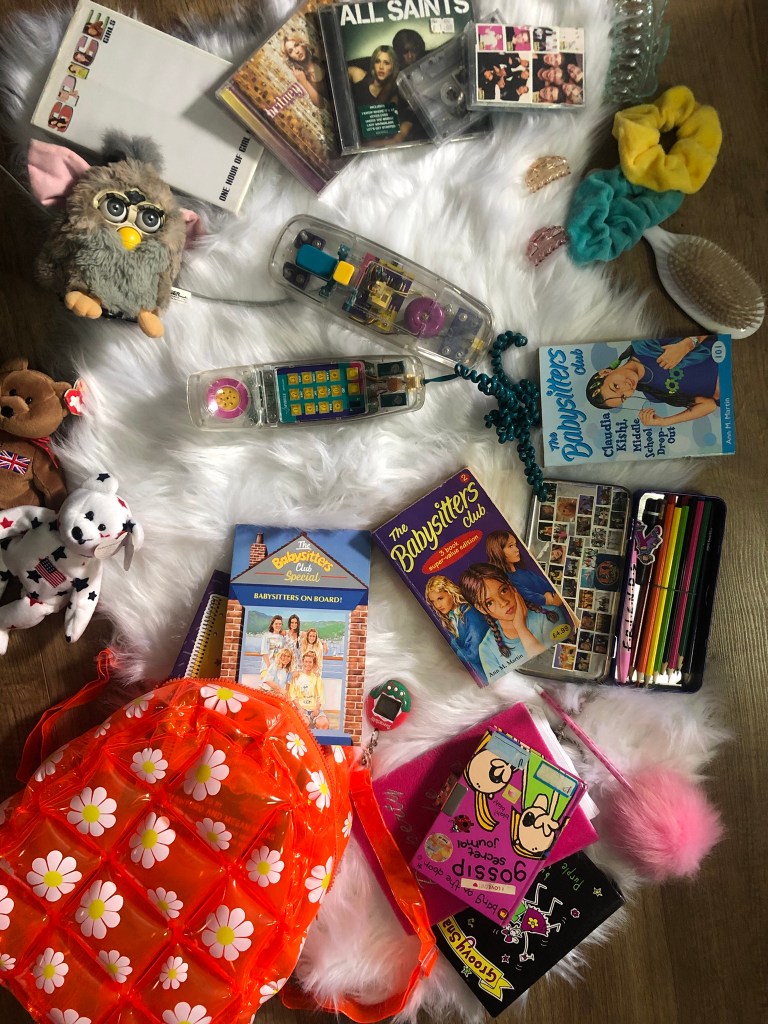
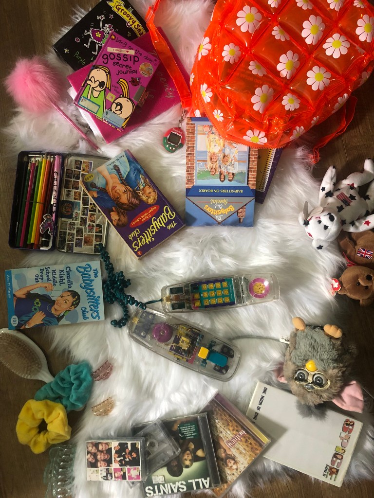
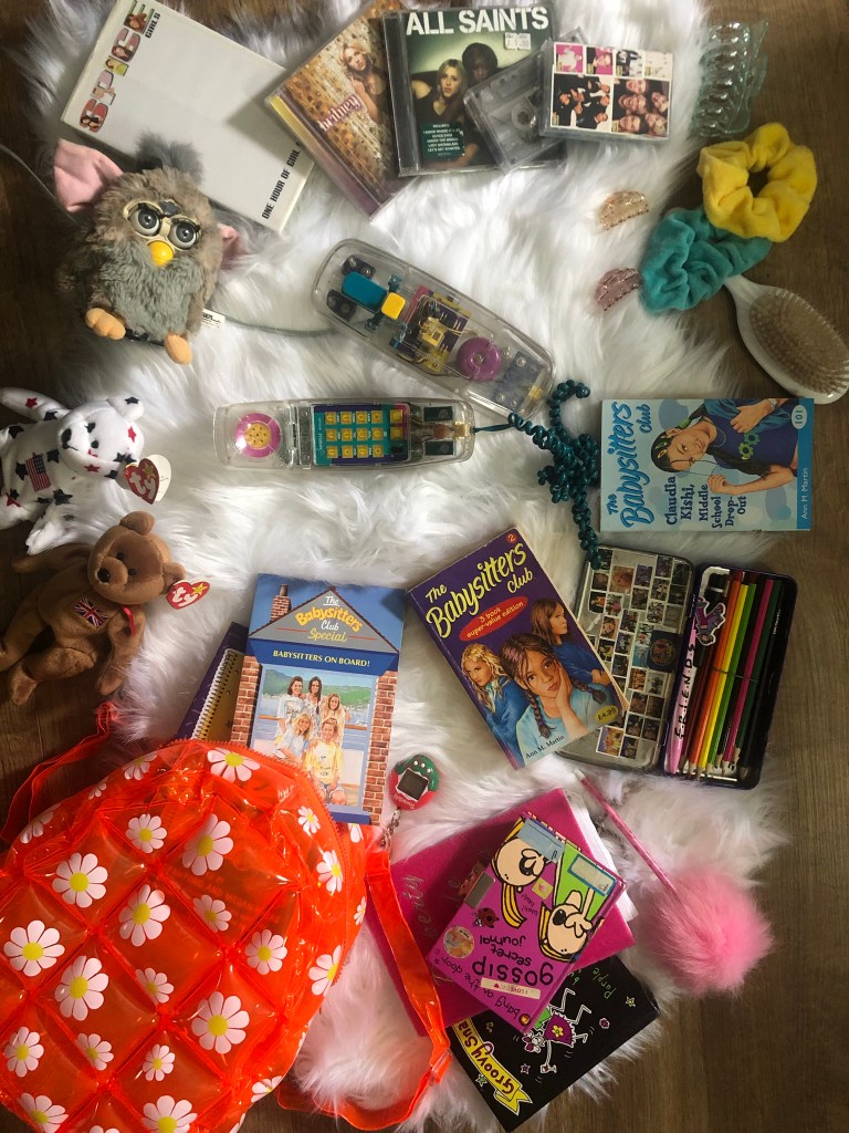
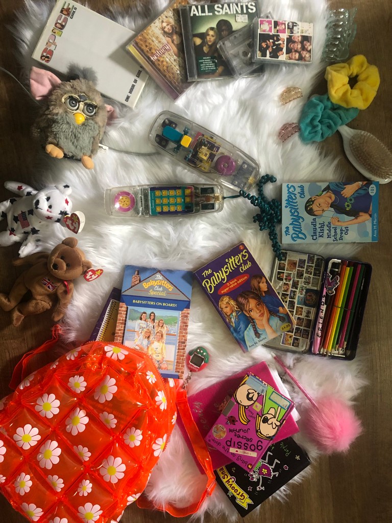
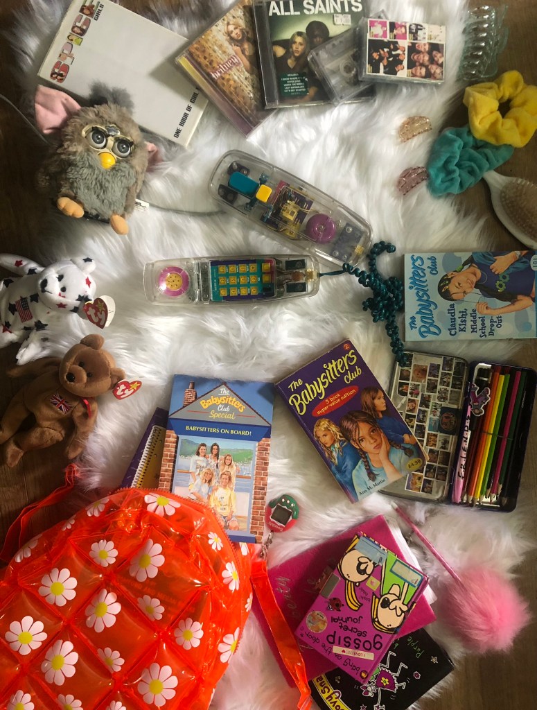

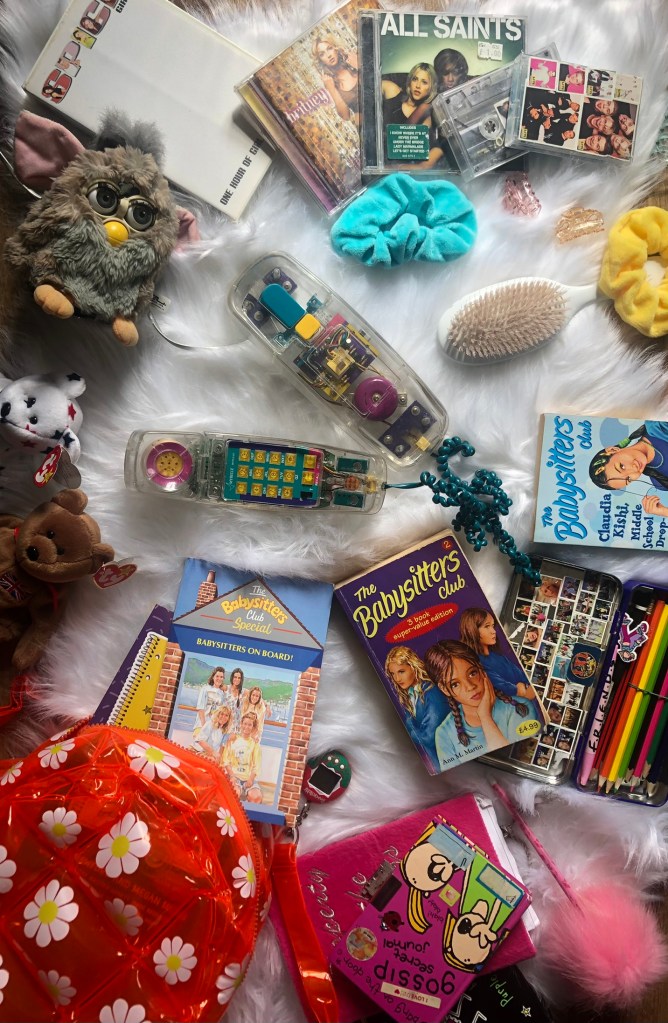

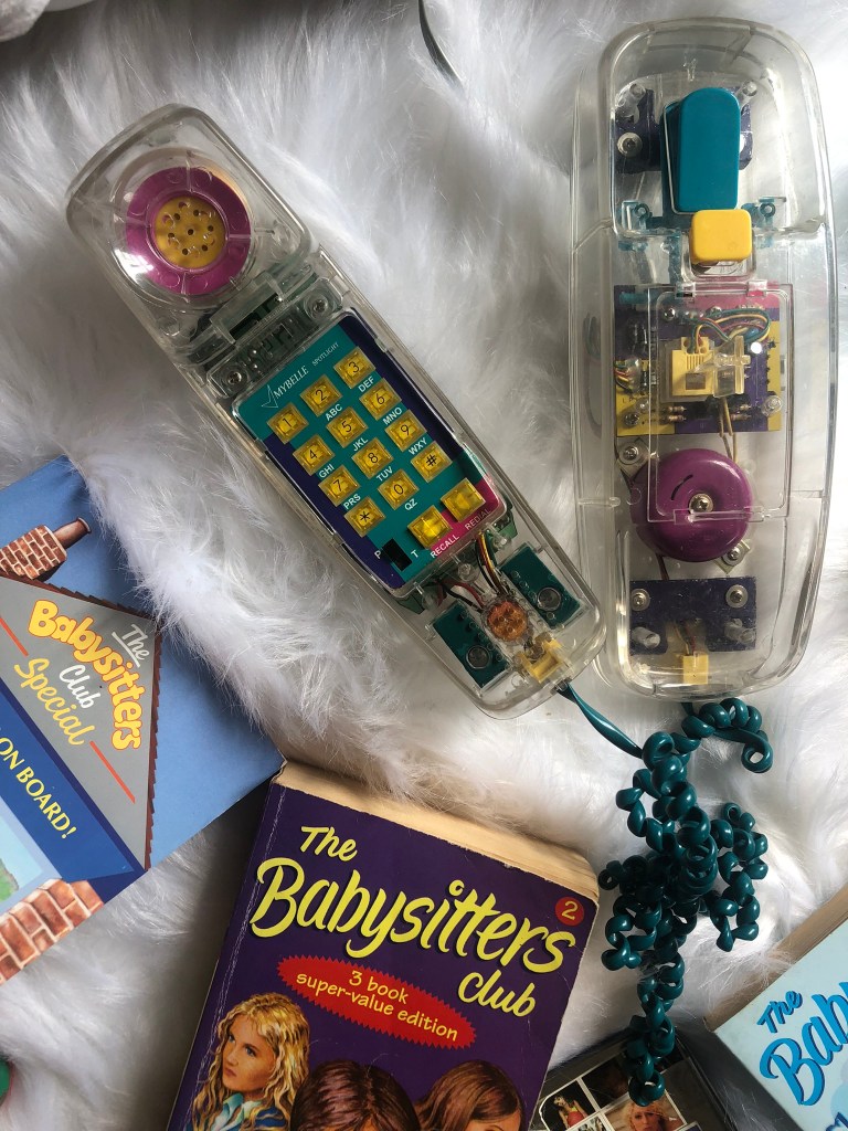
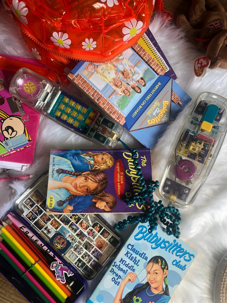

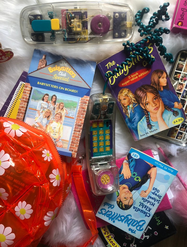
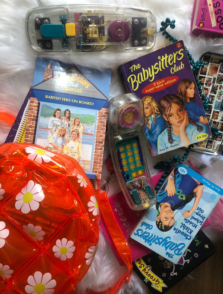
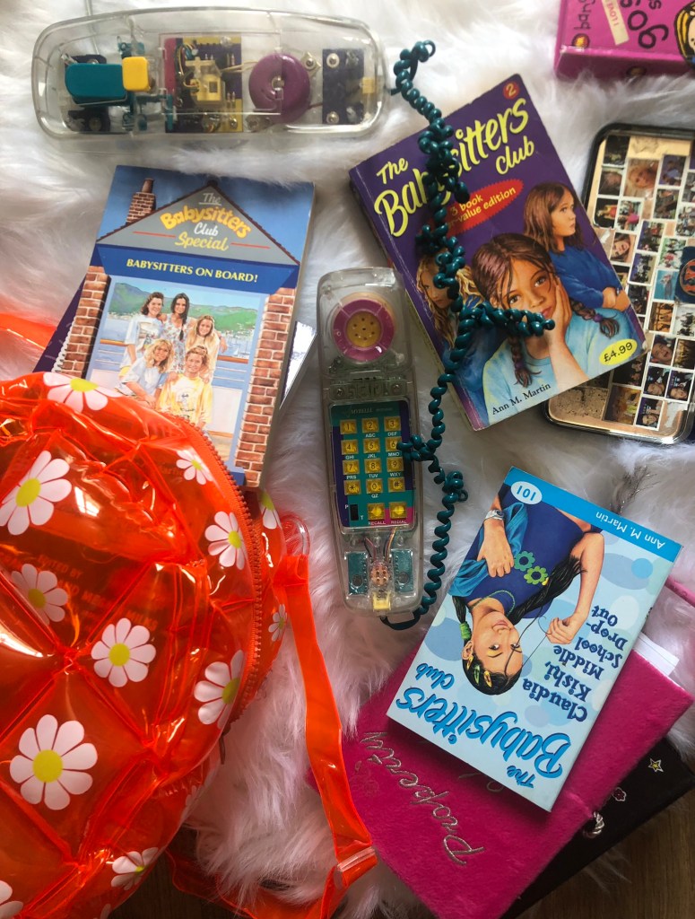
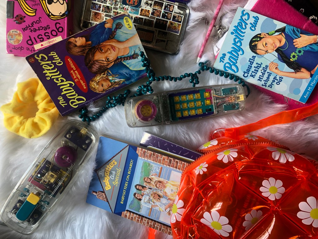
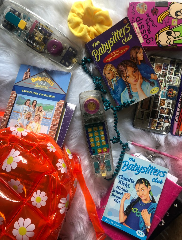
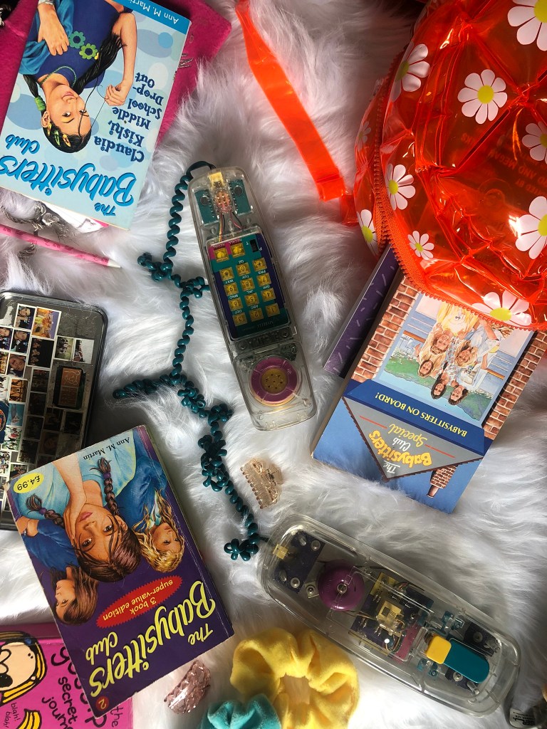

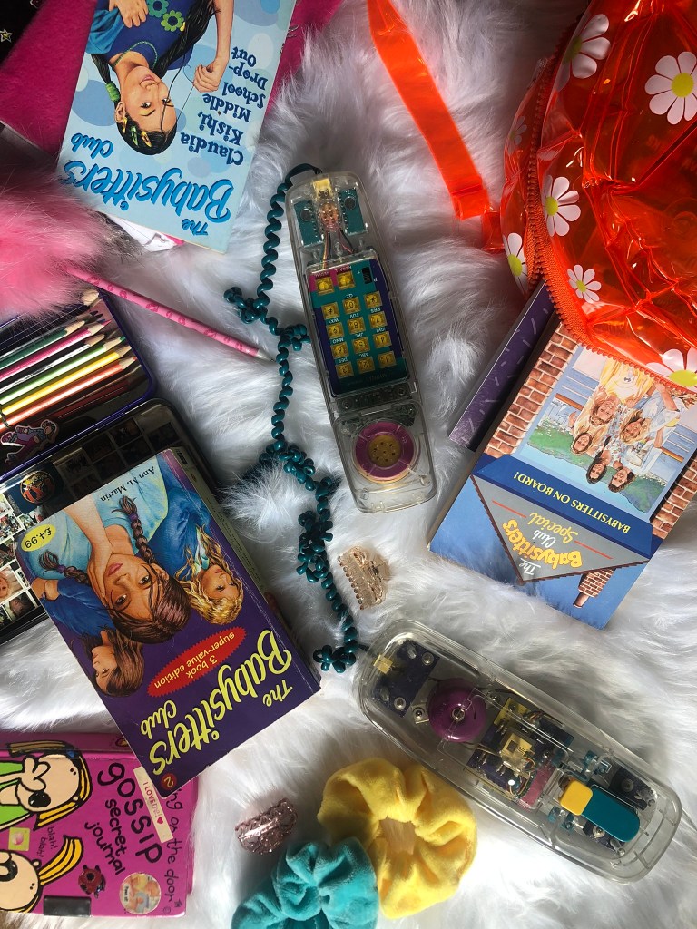

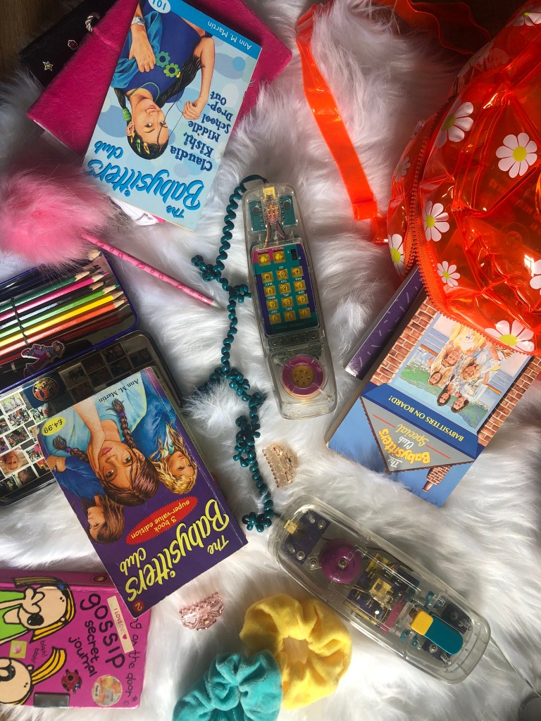

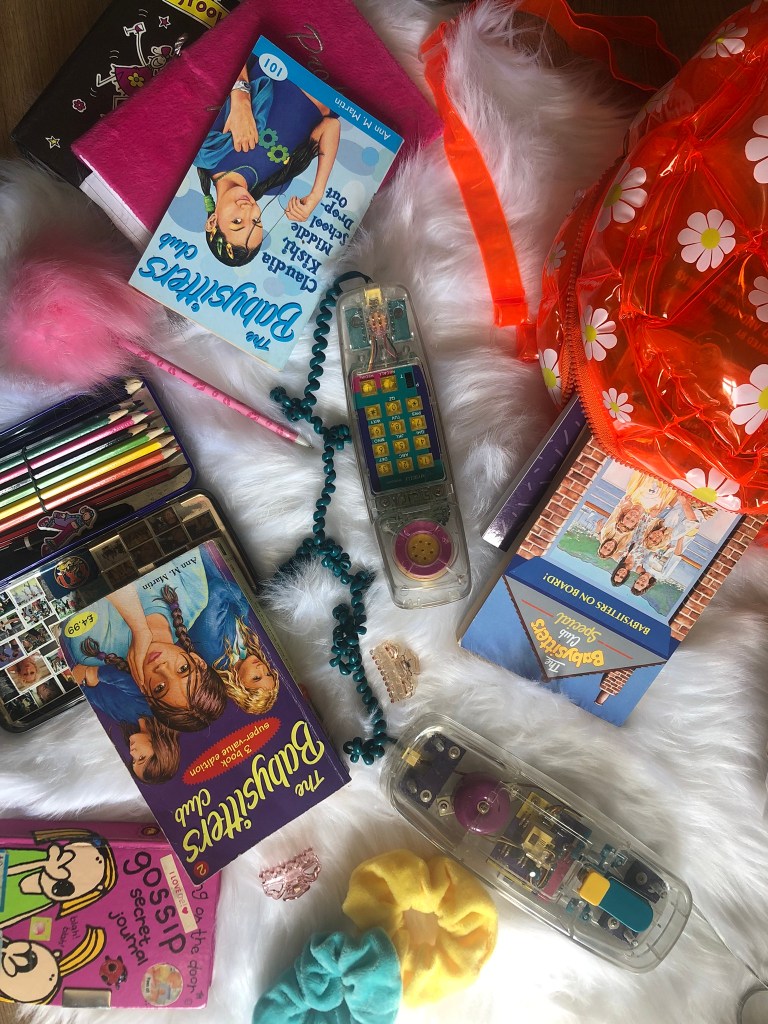


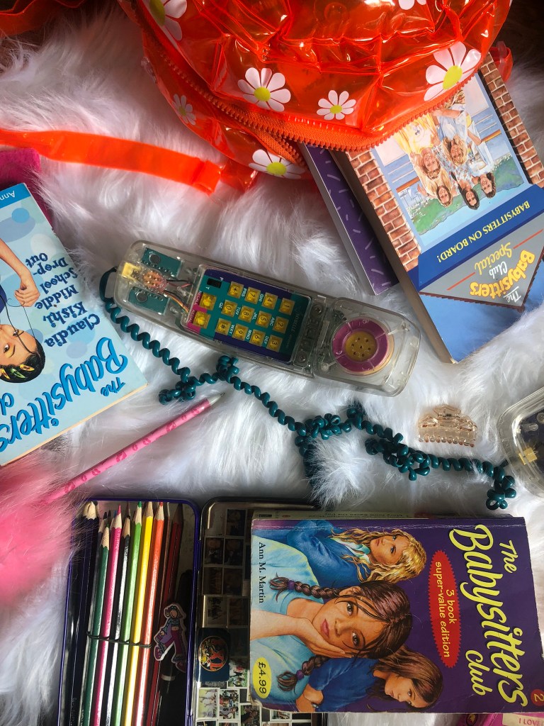
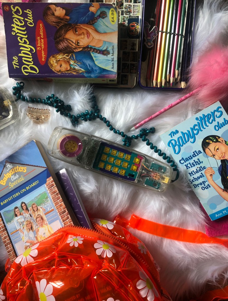

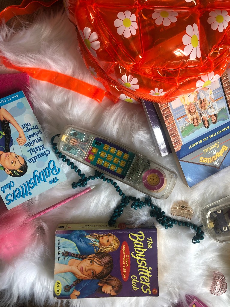

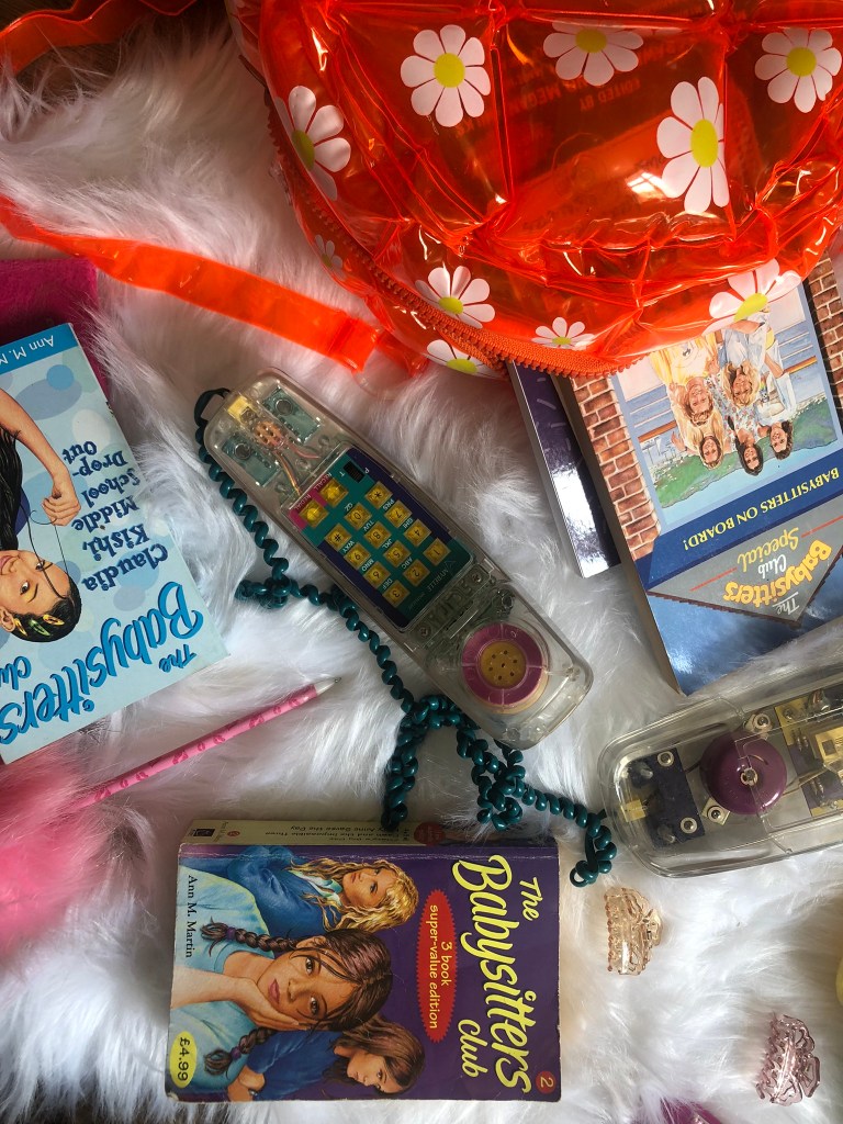
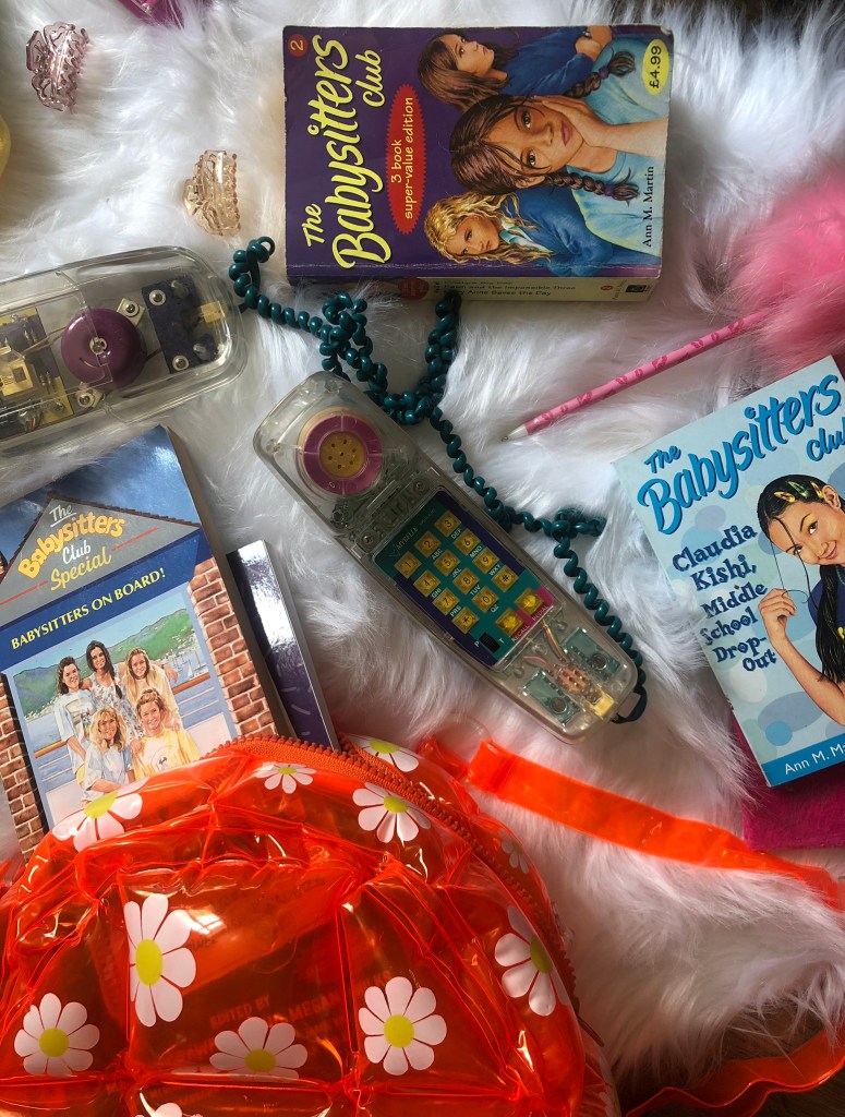
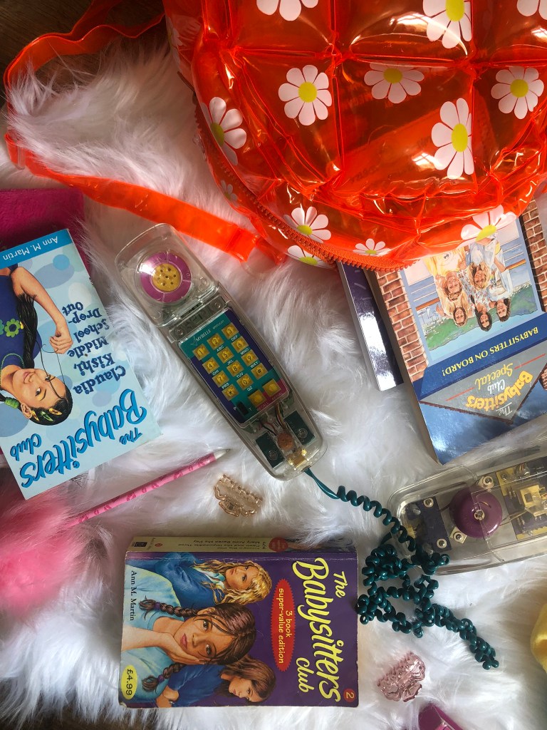
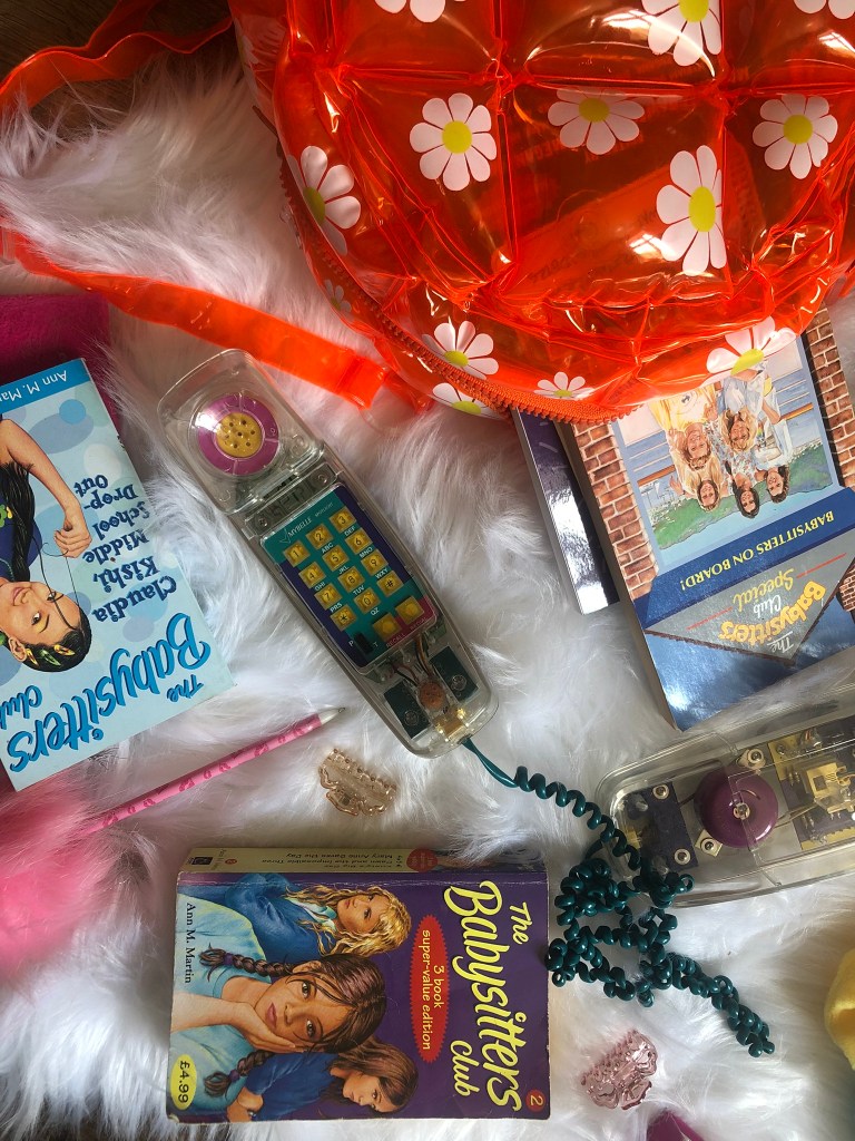
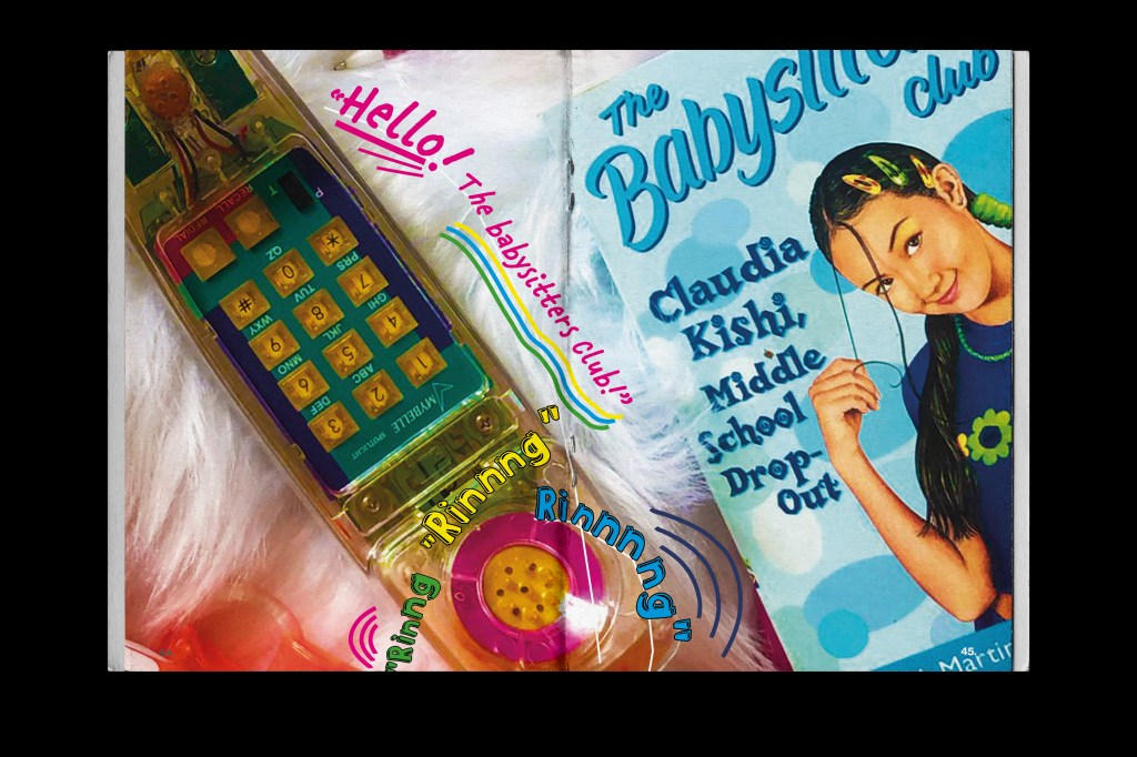
I had to go and repurchase a few of the items such as the books, the phone and the inflatable bag. The books I bought were exactly the same ones I read as a child except for when I reached my late teens I gave them away to charity shops because I felt like I was too old for them and would never want to read them again! The phone was a massive influence in my teen years because my friend Liz owned it and we spent so many nights round hers phoning boys and friends and having a laugh! I was never allowed one because I ran up the phone bill! This phone is also iconic in the Babysitter Club series because it features in them! Claudia owns it and they use it as the Babysitter Club hotline!
I also know that I took a lot of photos because I wanted to get the right shots for my piece!
I chose the final photographs that I wanted to use and then took them into Photoshop to alter and adjust:
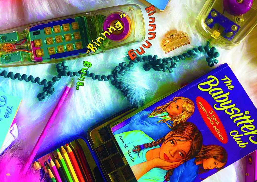

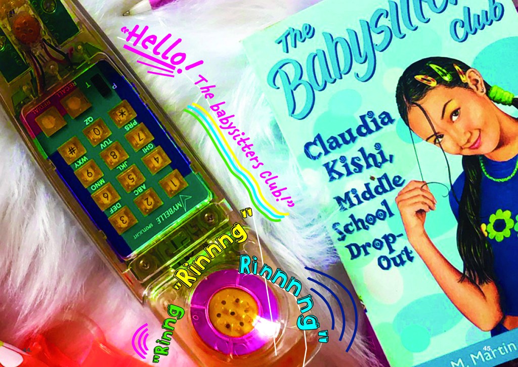
I wanted to make them look fun and something that I would have enjoyed looking at or blu tacking to my wall when I was a teenager! I added some animated text onto the photographs to make them more fun and childlike.
I wanted to make one of these spreads into a full size poster to come free with the zine but with time constraints and also the cost restraints with having it printed large it just wasn’t feasible.
The other 2 double page spreads are for my lengthy write up about the series! I ran the text over the 2 spreads and I kept a similar colour scheme and layout so that it is obvious that they relate with each other.
The theme of the covers of the books is universal throughout (except for the limited editions and summer series) and I wanted to bring that same theme into my zine:

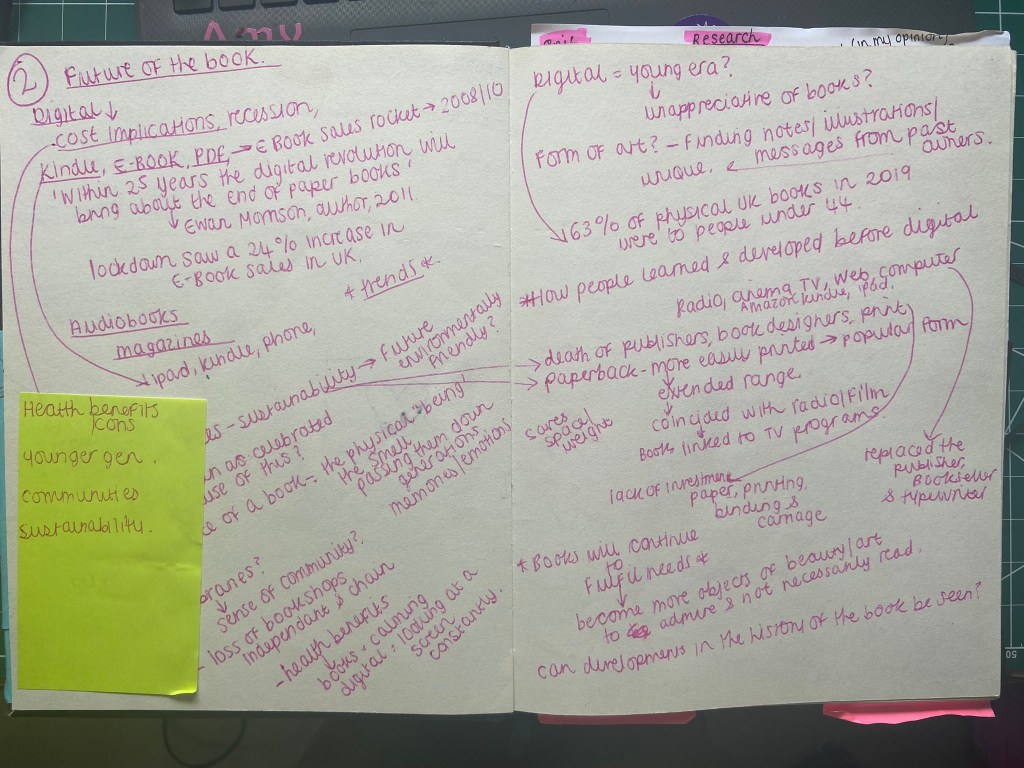
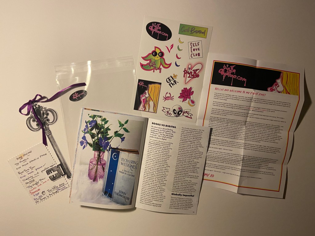
Pages 48-53: Books vs Digital
The brief stated that I needed to find global influences and links back to the books that I talk about in my zine. From doing the exercise influential books I had already made a list of books that could link back or have connections to more global subjects.
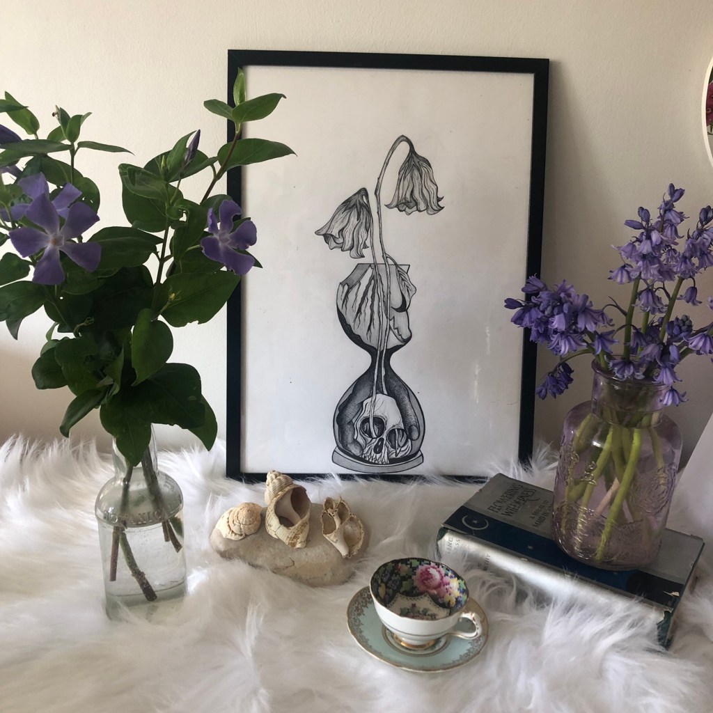
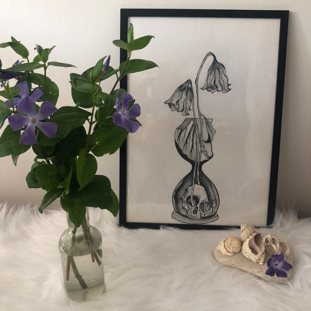
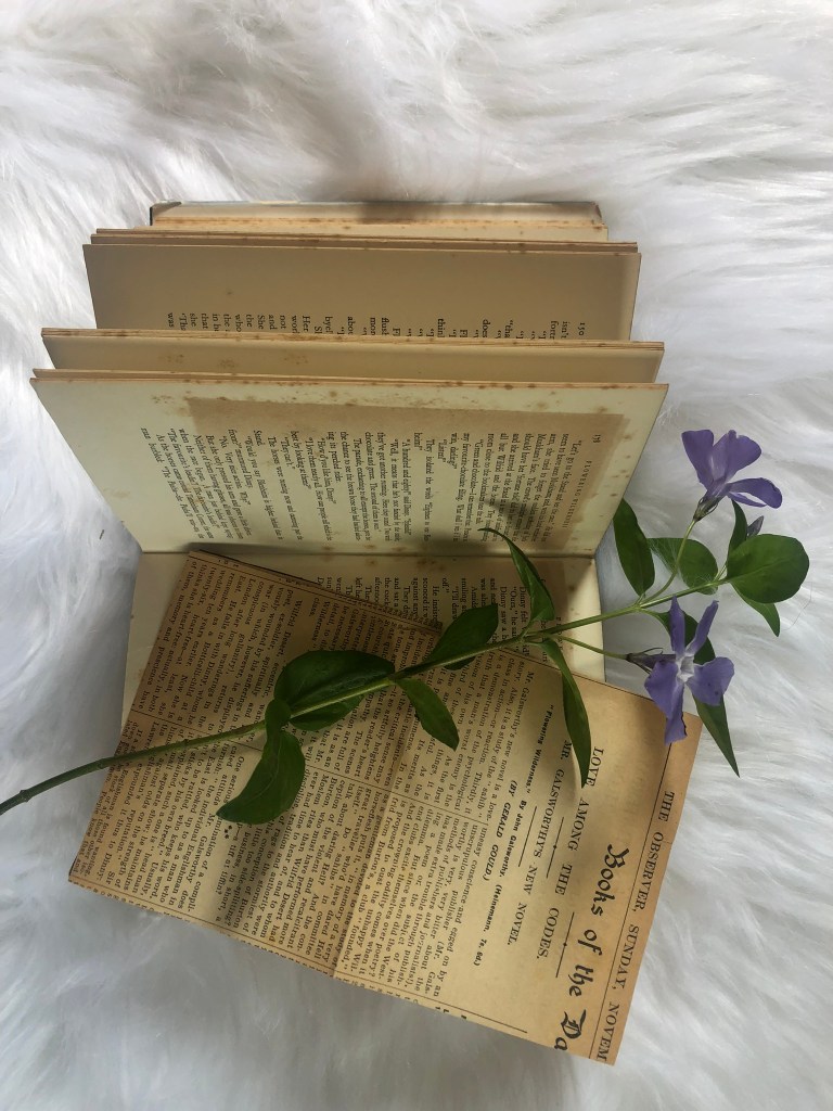
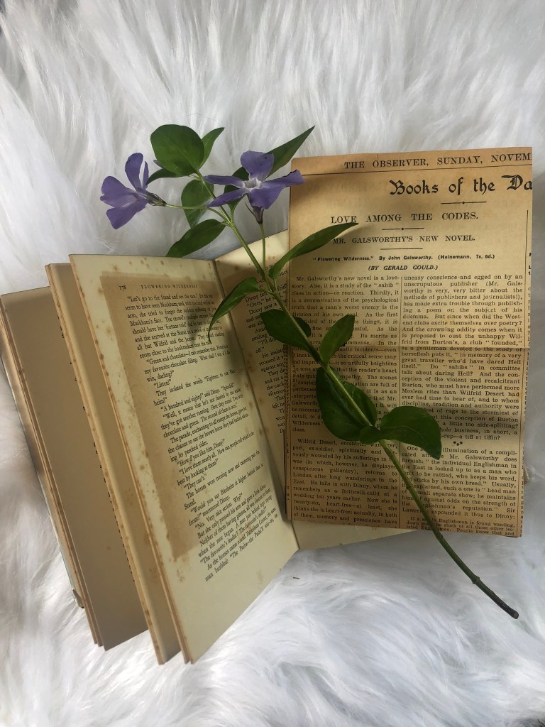
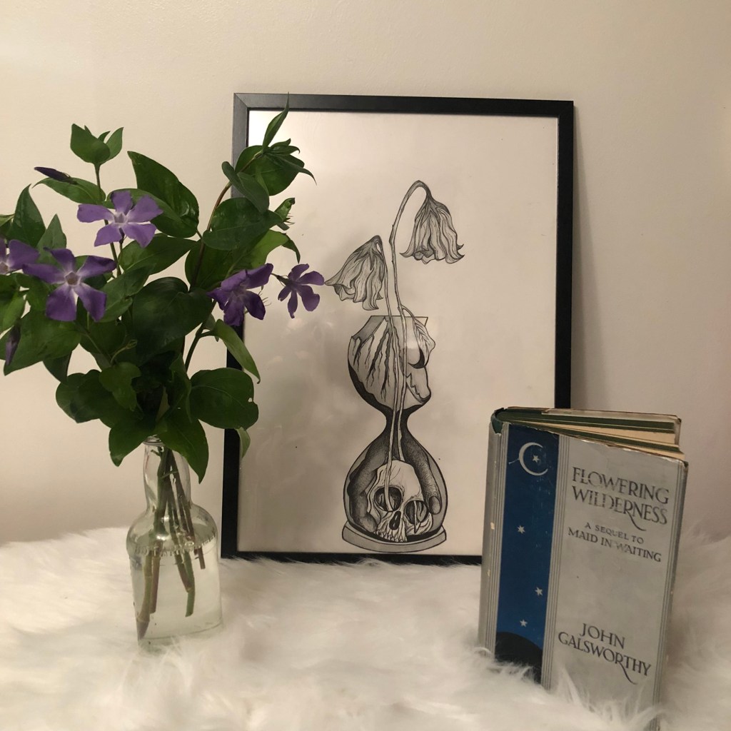
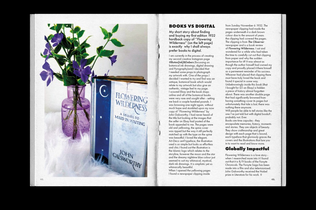
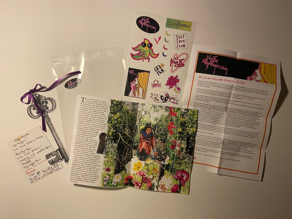
However, when creating new content for a potential creative sideline I came across a first edition copy of Flowering Wilderness and when I researched into the title (just out of curiosity) I found that it linked to further global influences that I could use to feature in my zine.
I bought the book off Ebay for £5 because I liked the simplistic looking design of the cover and also the typeface on the cover. I was really looking for an old Botanical book to use as a photo prop for my new Instagram page Botan(ink) and Embers which will be a mix of my botanical ink drawings and some pyrography. Instead I came across this cover and just loved it! It looked whimsical and boho and it has the flowers link into the title. I even liked how the book cover was torn down the spine. It is a truly beautiful book! This also argued my case that books are better than digital because you can’t find beauty in digital. You cannot find beauty in a worn down digital book!
I explain in this piece how books are time capsules; they encapsulate memories, history, stories and are objects of beauty! They show craftmanship and great design with each page that is bound and each typeface that gloriously graces the covers and the illustrations that lure you in. I explained that how in this book I found a newspaper clipping from the time the book was published (1932). The clipping had been produly placed in the book as a keepsake as the article was a beaming review of the book. Whoever owned the book must have been so proud of the work that had gone into it. There is a story behind the clipping; who put it there? did they know the author? was it the author?.. you just won’t ever get that with digital. Argument settled and won!
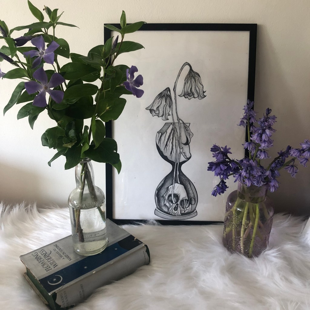
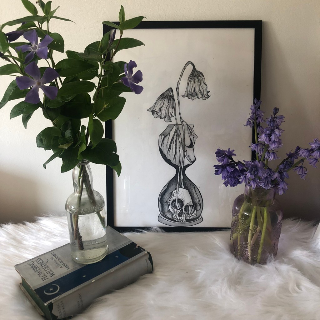
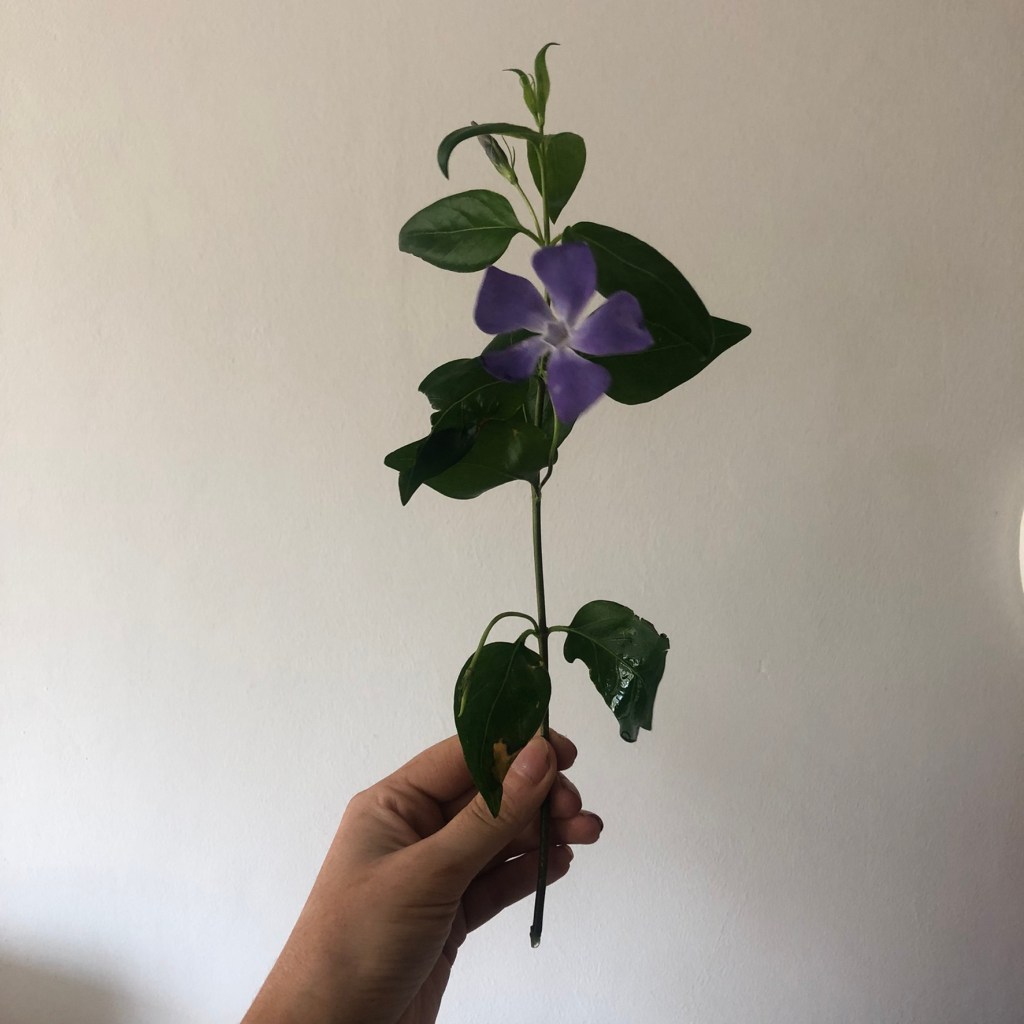
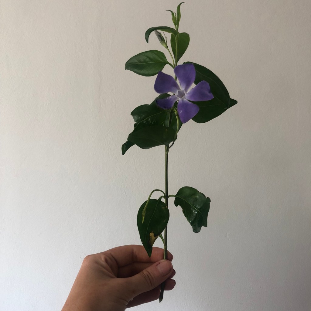
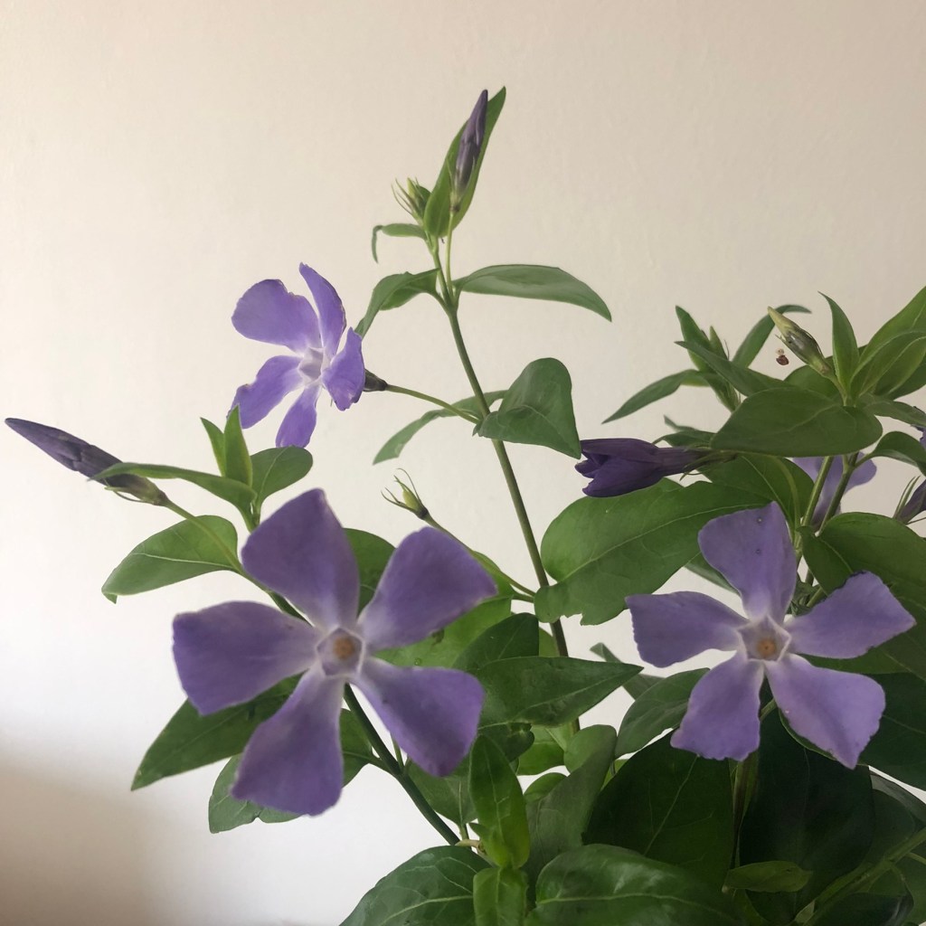
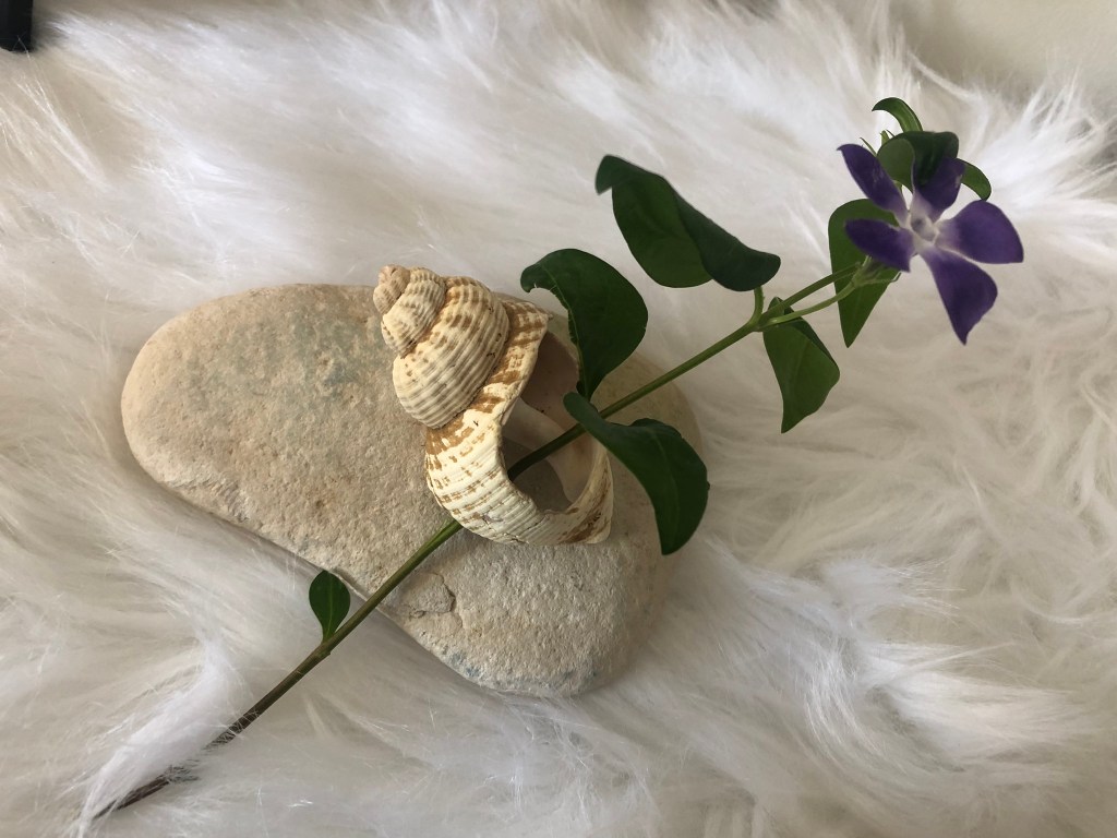
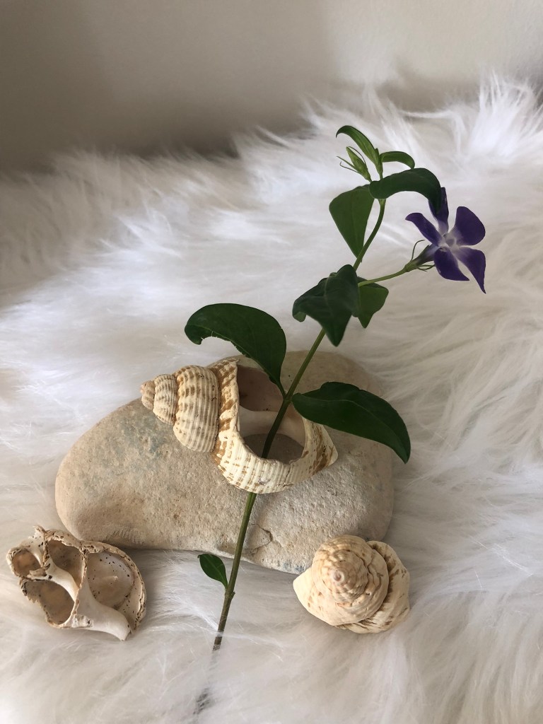
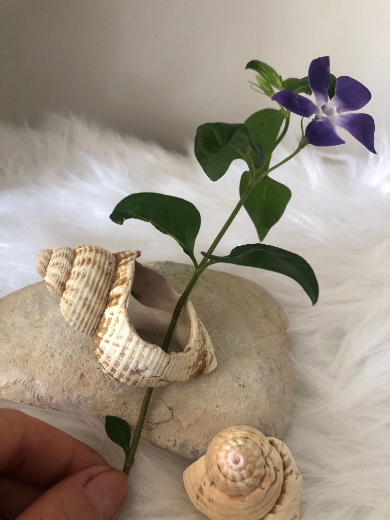
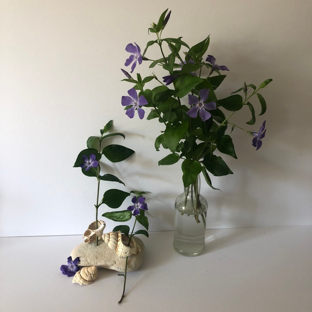
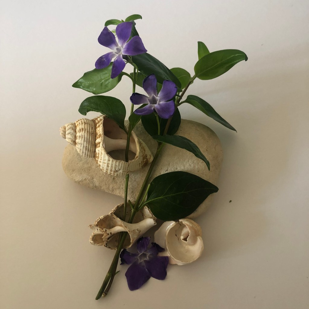
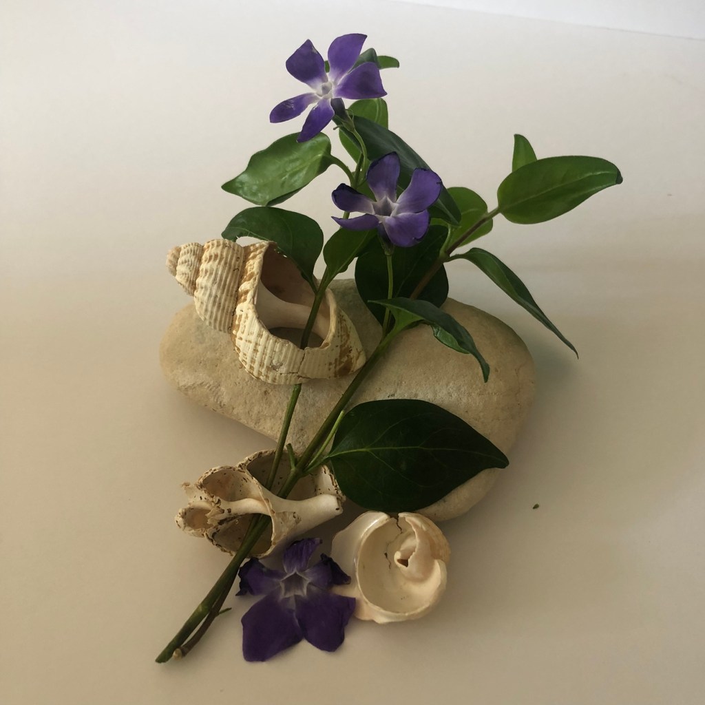
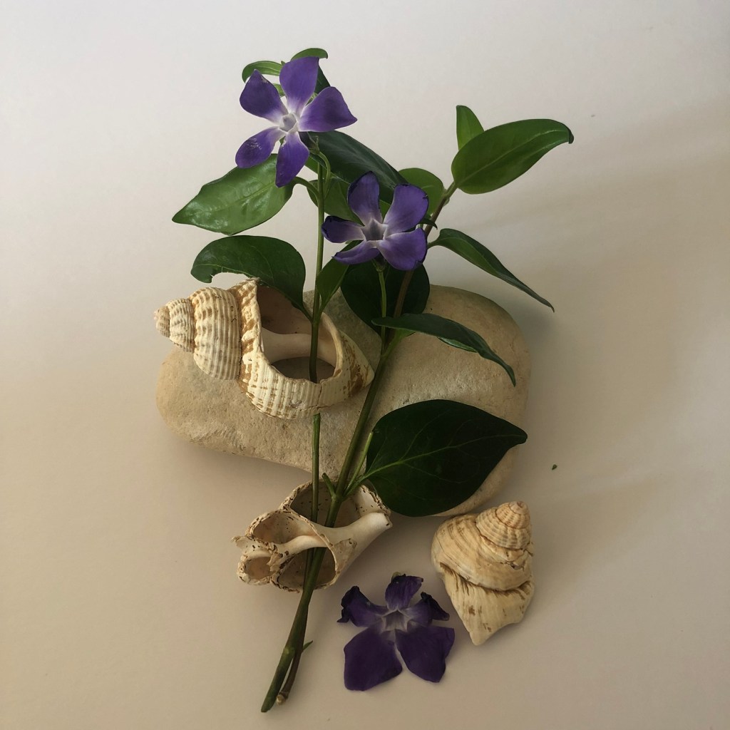
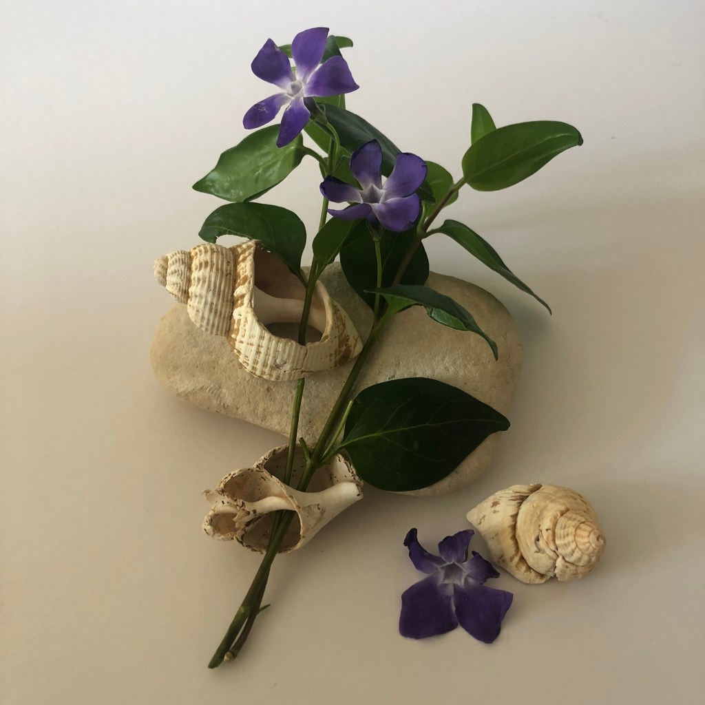
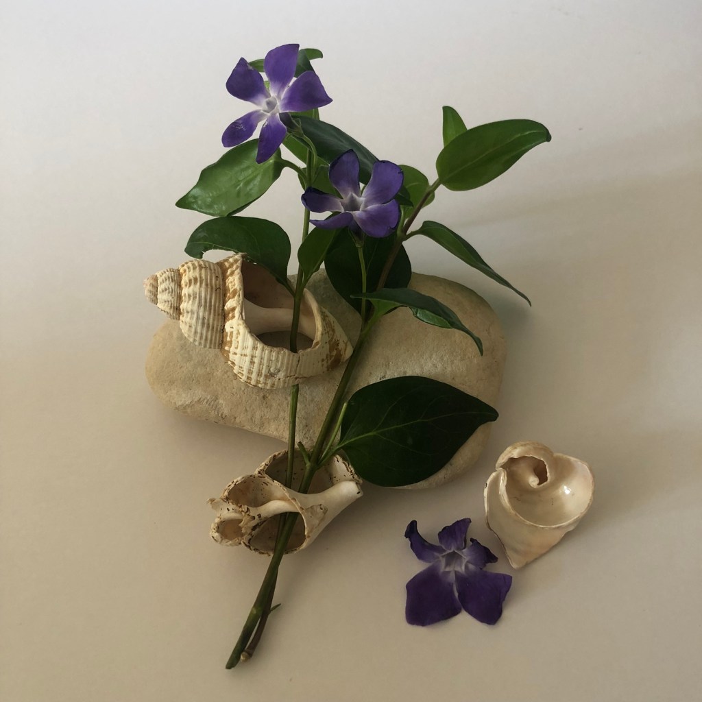
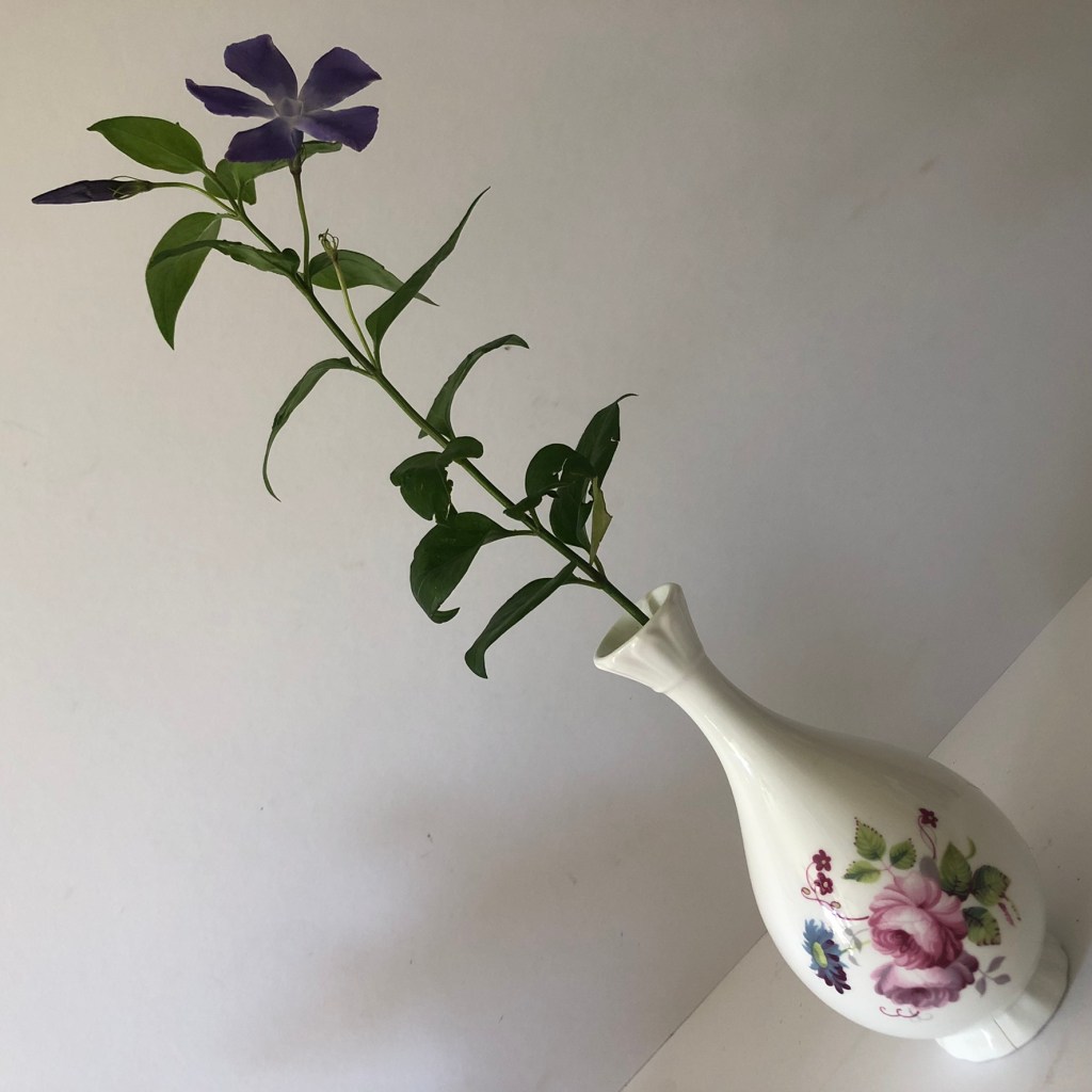
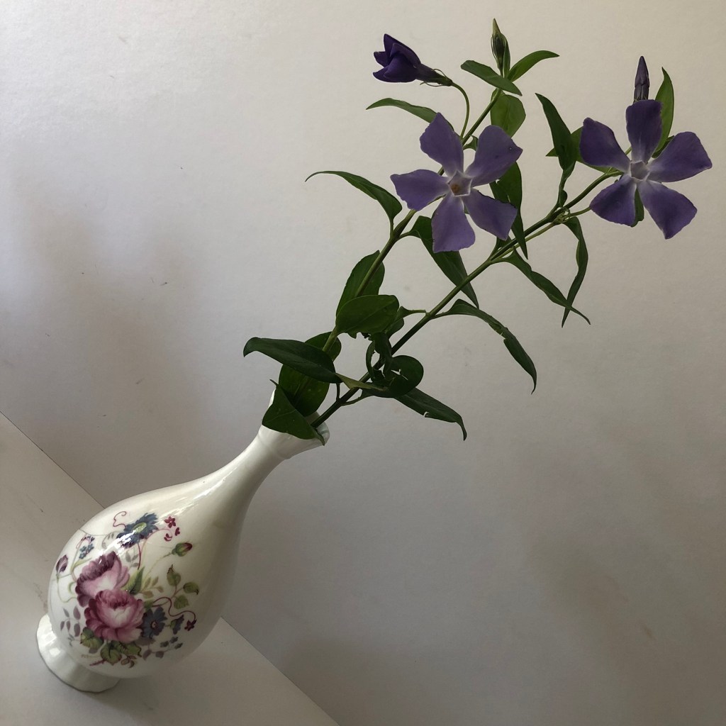
Once again I took loads of photos but purely for my Instagram page because I had no idea that I would be featuring this book in my zine at the point! I am a little bit obsessed with Periwinkles and when I had Covid and I couldn’t go anywhere I dragged my other half around to different countryside spots to find some wild ones to pick for decoration around the house, to photograph and I also tried to press some inside my books.
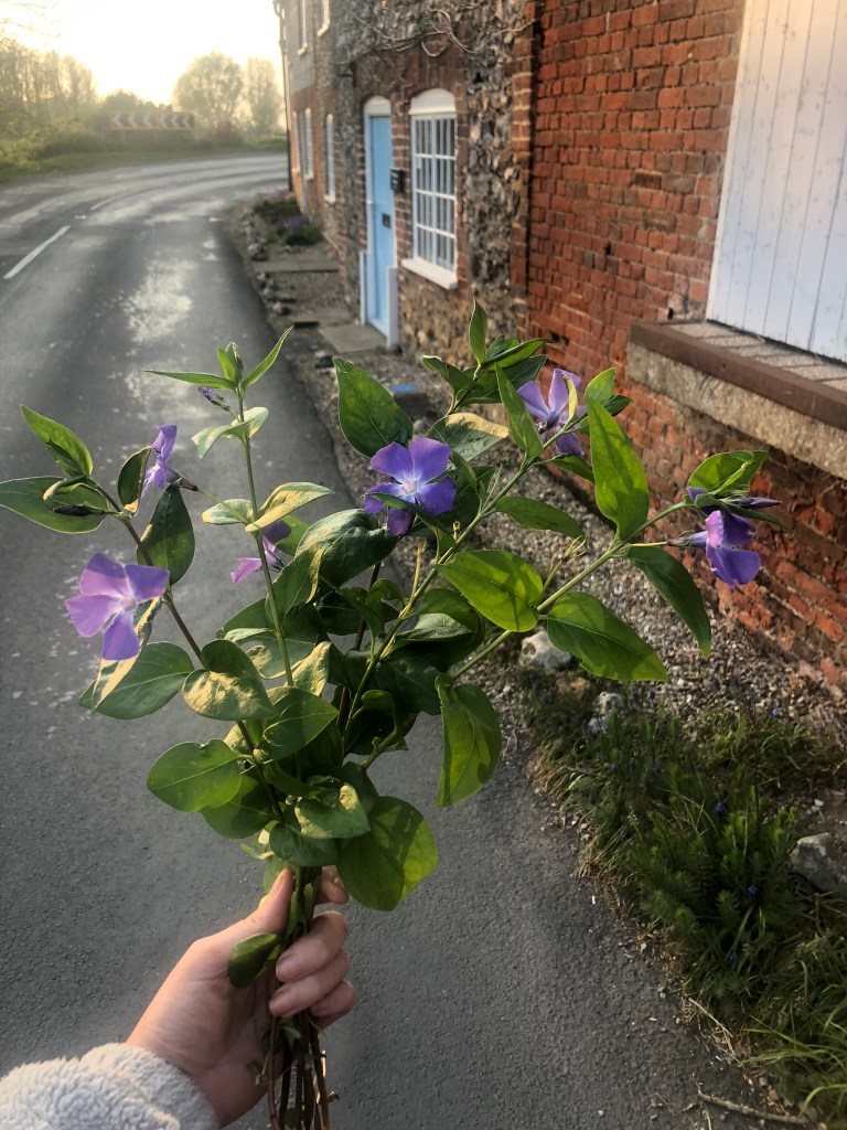

I found the ones above in a little roadside village on the Norfolk coast road! I was quick picking them and taking the photos because it was on a blind bend! The brickwork of the houses though was so lovely and the views so picturesque!


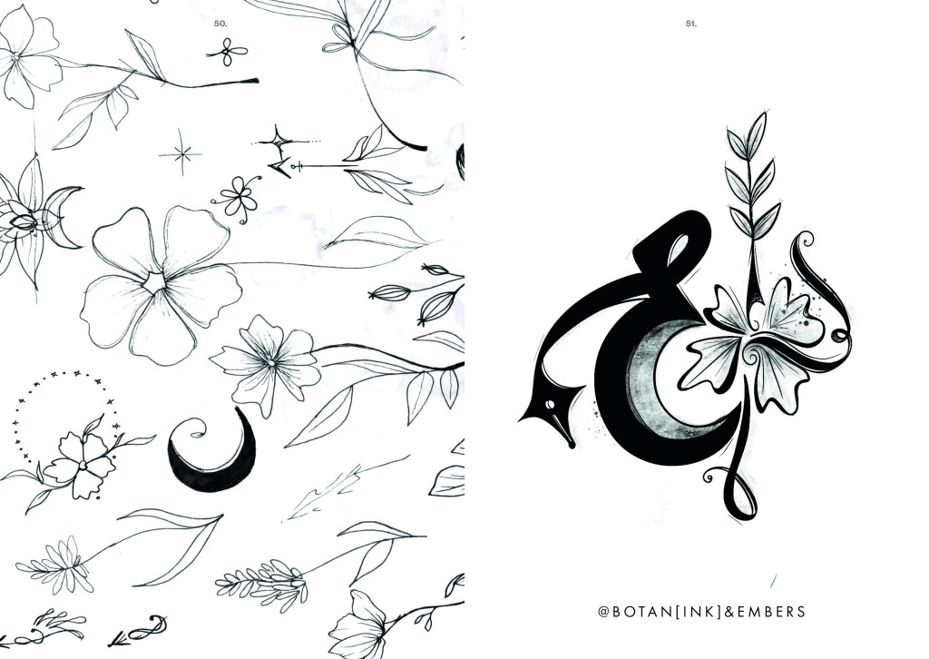
I added in a little bit of self promo here! (above!) with the logo I created for my Instagram page Botan(ink) and Embers… I’m yet to add content so watch this space!
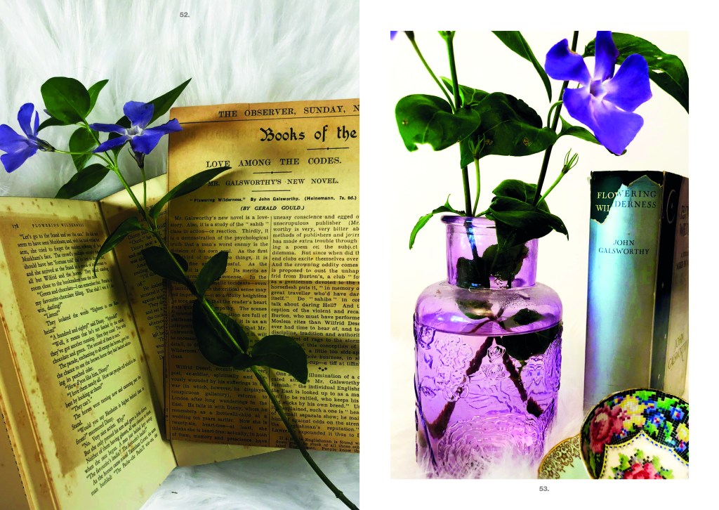
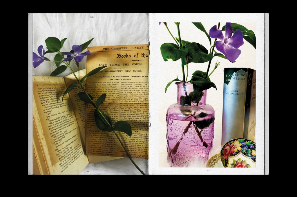
The photographs above were just too beautiful to not use! – one also shows the clipping of the newspaper that was carefully and proudly kept inside the book.
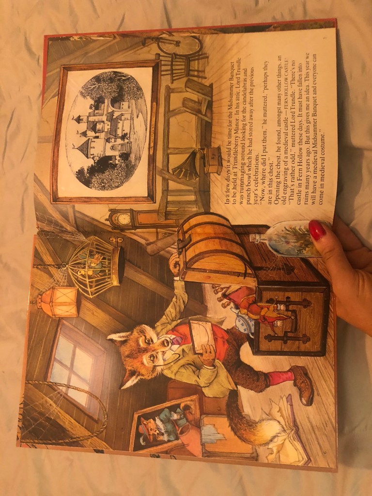
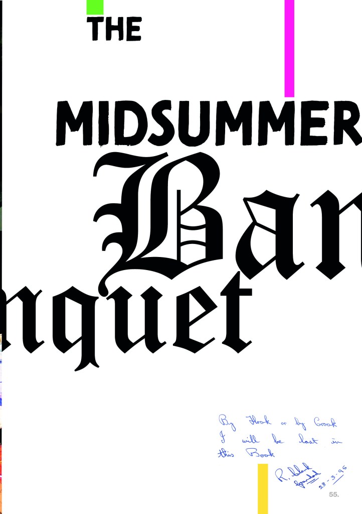
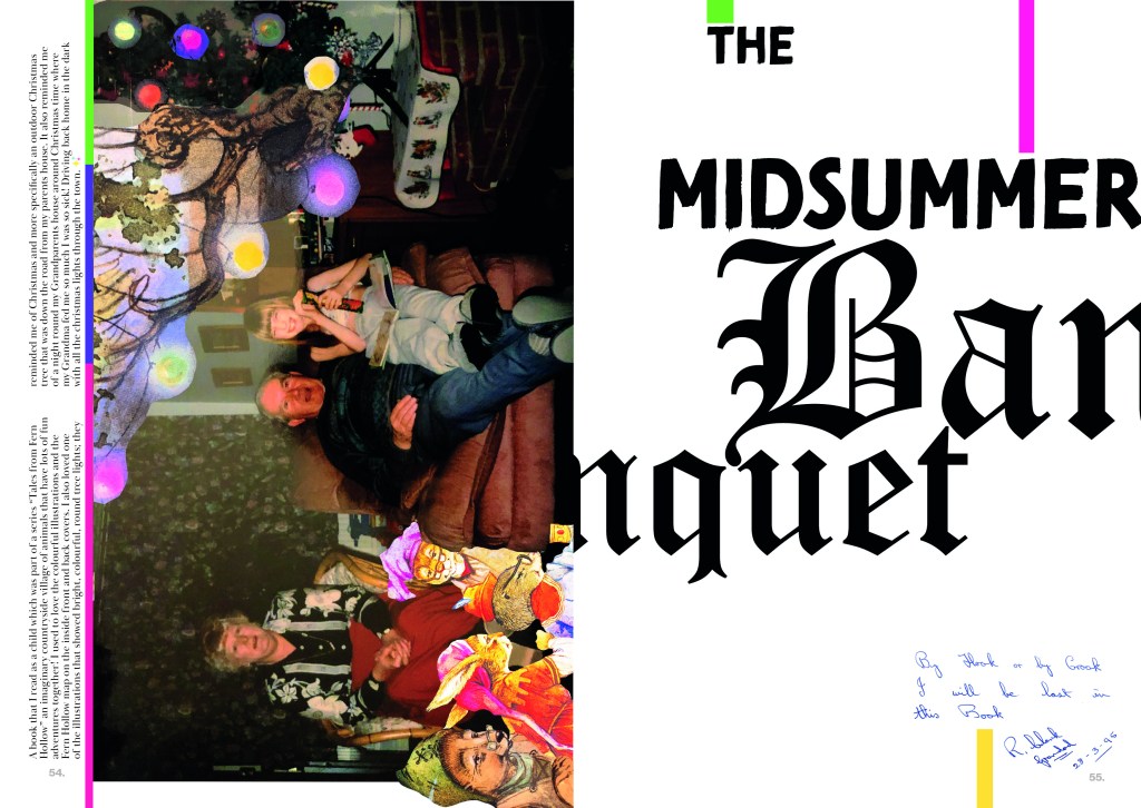
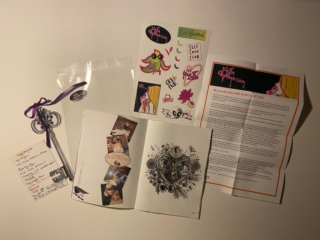
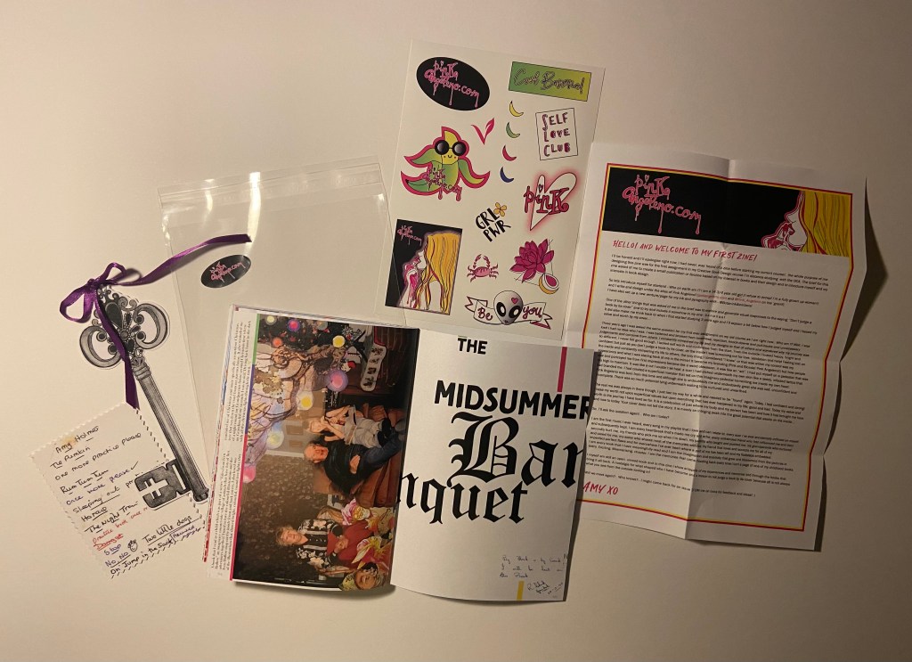
Pages 54-55: The Midsummers Banquet
This page I dedicated to my grandparents; (my Grandma is no longer here sadly) I never read the book with them ever and they probably would have no recollection of it but the illustrations inside trigger a memory that involves them and that to me is as important as the book itself. This is what books are about! They evoke and awaken memories and feelings!
I always loved the bright lights in one of the illustrations in this book – it reminded me of a Christmas when I had a MASSIVE meal at my grandparents (my grandma loved to feed us treats and make sure we had enough to eat!!) My Dad was driving us home through town and they had just turned on our towns christmas lights which were twinkling through the dark car windows at us. I remember I felt so sick from all the food! I had an old antique bell in my hand that I think I had rescued from a stash my Grandma and Grandad had randomly found and were showing us that night! The bright Christmas lights reminded me of the lights in this story and ever since then whenever I see this book that memory surfaces!


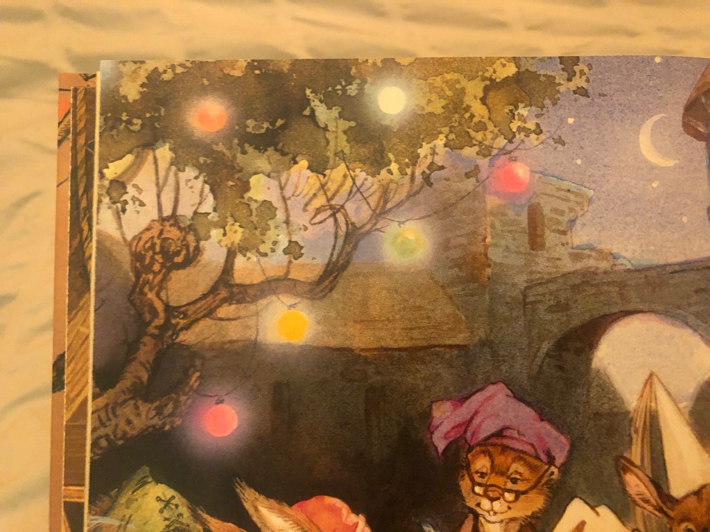
I knew this layout would have to surround this memory! Memories tell the story as much as the book!
I found a photograph of me with my grandparents at Christmas time which tied in well with this memory! I am reading a book (not The Midsummers Banquet) and eating a tube of Fruit Pastilles or something sat next to the mini Christmas Tree..

I then had the idea to merge the Christmas lights from the book into the photograph of the tree… I then had the idea to merge in some of the characters from the book in there too! I started to work my magic in Photoshop again! – although I really do need to take a lesson in photo manipulation because I have attempted a lot of it in this zine!

I took influence from David Carson again for the typography. I wanted to use contrast in the type – serif and sans-serif- big and small. Banquet very much portrays a medieval feeling with its serif font, whilst the rest of the type contrasts against that with their sans-serif font.
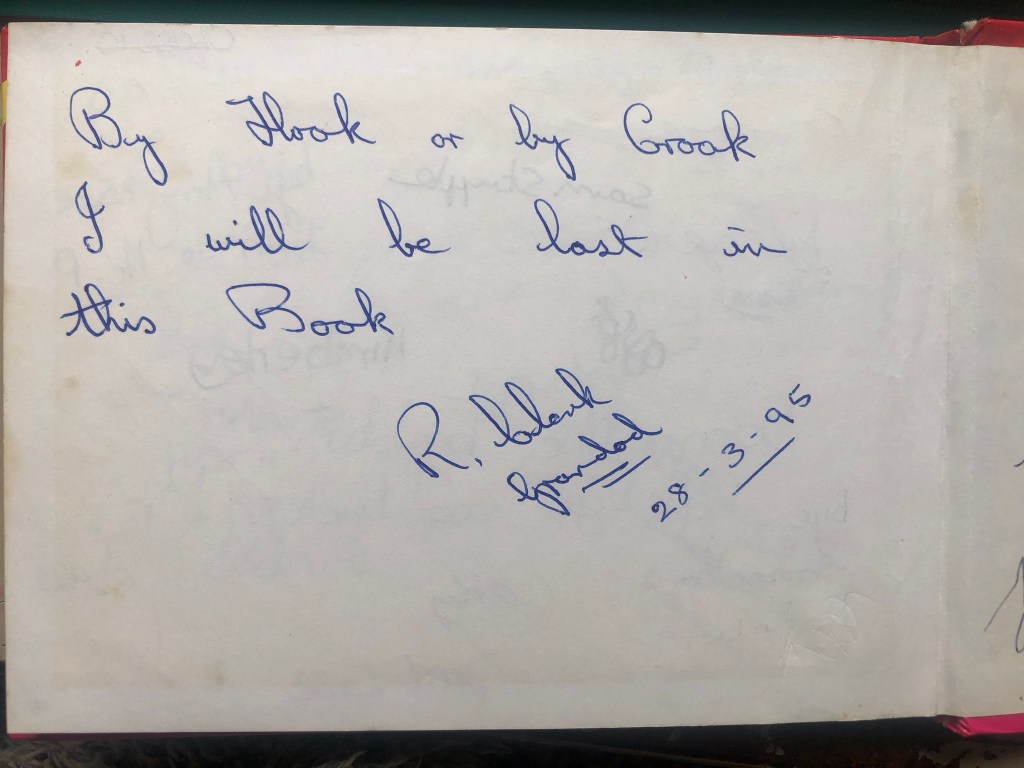
I also used a quote my Grandad wrote in my Disney autograph book way back in 1995 which I thought would be ideal for the last page of my zine!
Below I used the “rule of 3” again where I created 3 blocks of colour which relate to the colours of the Christmas lights and help with hierarchy to help your eyes travel down the design.

The Back cover!
Not much to say about this page really! – The colour matches the front cover and I have added some self promo for my website and Instagram page by including my logo and Instagram handle!
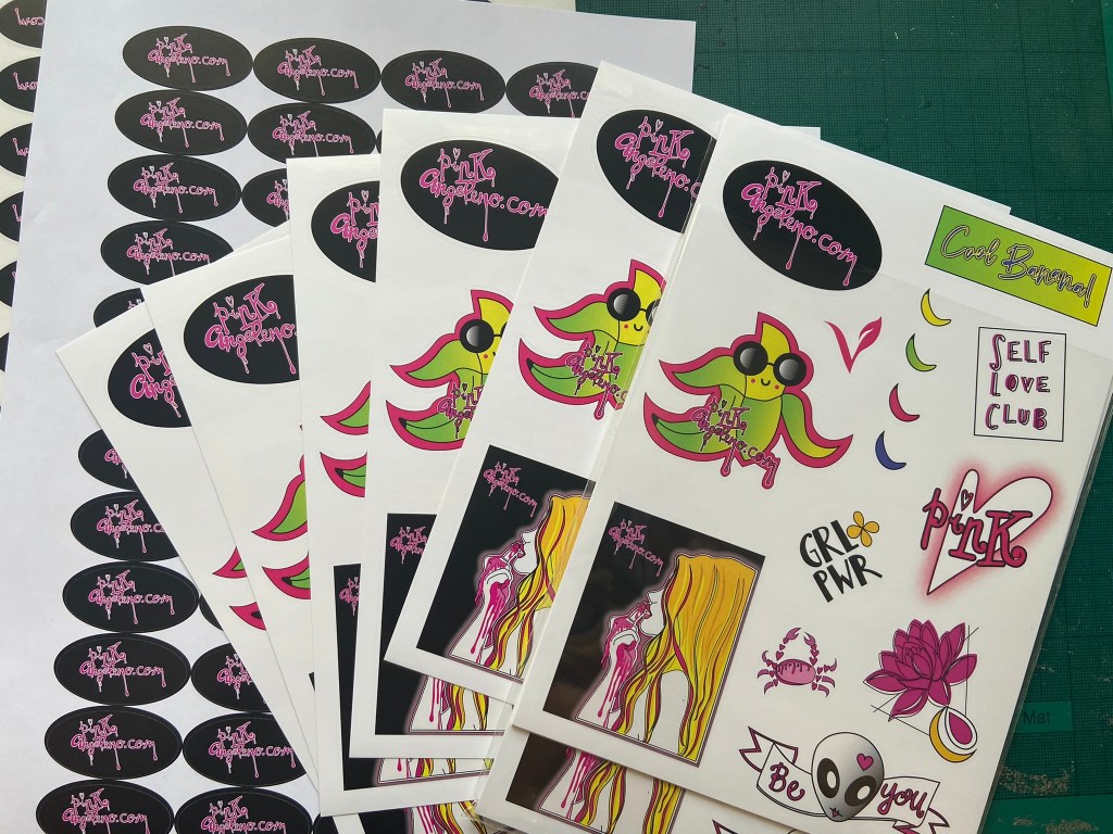
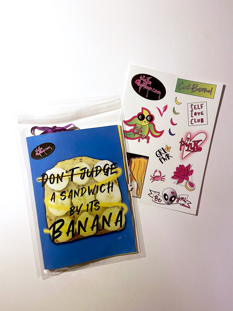
The stickers!
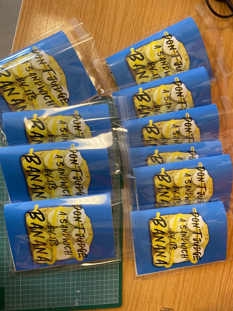
I ordered some clear plastic A5 wallets from Amazon to put my finished zine in: (zines actually- because I printed quite a few of them to try and distribute around!- I’ll come back to that later!..)
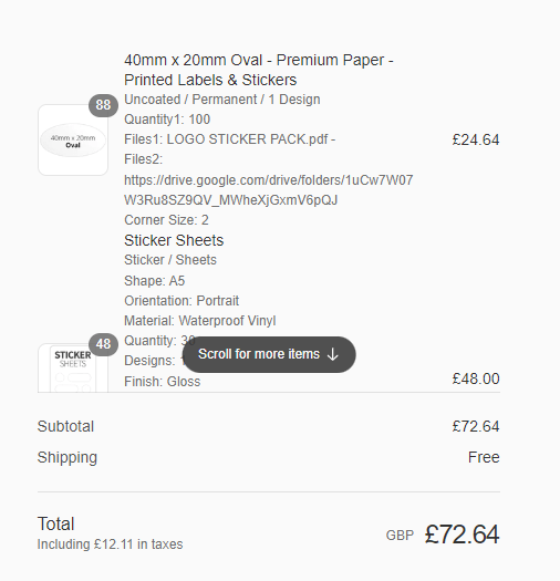
I then decided I would quite like to print some of my past and present vector work into stickers as a freebie with my zine! It was a nice and easy process! I went through stickershopuk and they arrived within days!
I decided I wanted the sticker pack sets that they can print for you. This allowed me to have up to 20 stickers on a sheet of all my different designs.
All I needed to do was create my A5 sheet in Illustrator with all my artwork on and provide them with cut lines around the artwork so they knew where to cut! It is my first time sending off for professional print so I was a bit apprehensive as to whether I had sent the correct files etc.. I should have more faith in myself because the files I sent were perfect and turned out really good! I sent a PDF version which allows much better quality than just a jpeg itself.
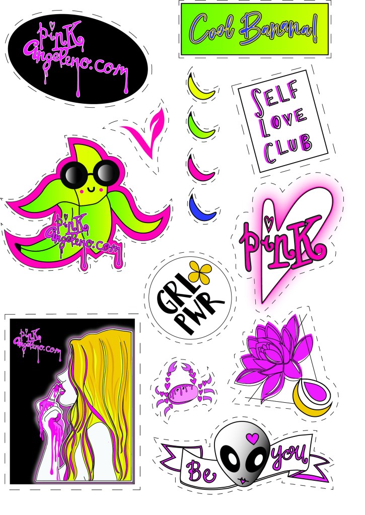
I also wanted some pages of the same sticker with just my website name on so I created a single image for them too:
I wanted the sticker above to stick on the back of the cellophane cover when you go to open the zine.
The stickers were not cheap! – but hopefully they were worth it!
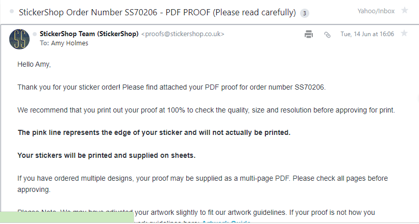
Before they began printing I had to approve the proofs they sent.. all was fine!
When they arrived I was very pleased!
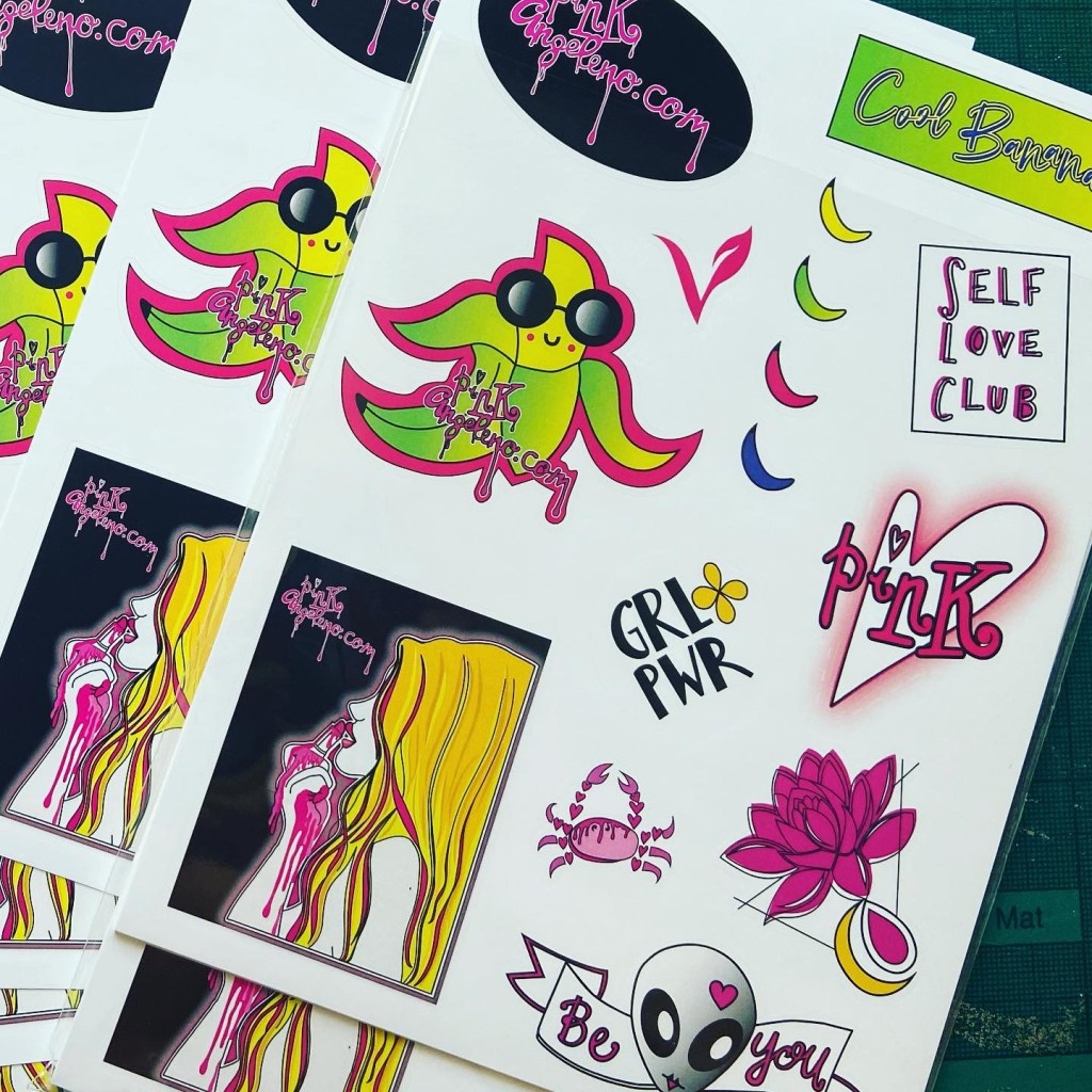
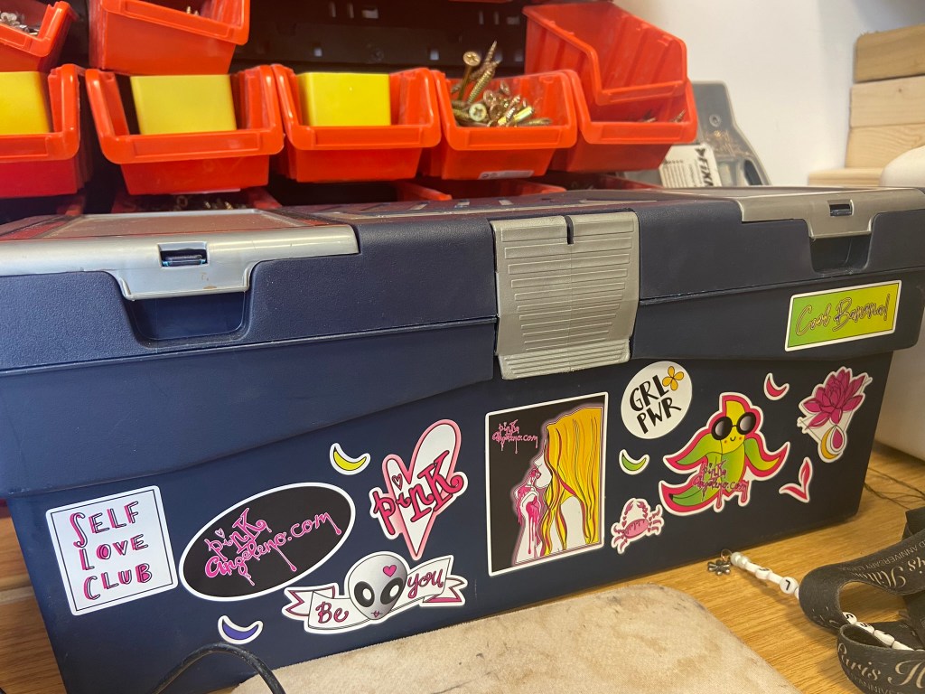
They also looked amazing when I put some on my work toolbox!
Paginating pages
When I had finished designing my zine in InDesign I had a file full of double page spreads that were not correctly paginated (see below)
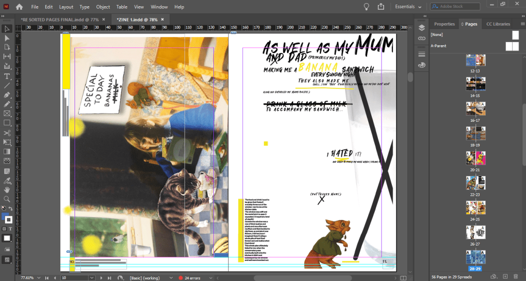
I exported each single page and each double page spread into separate folders so that I could import them easily into a new document (see below!)
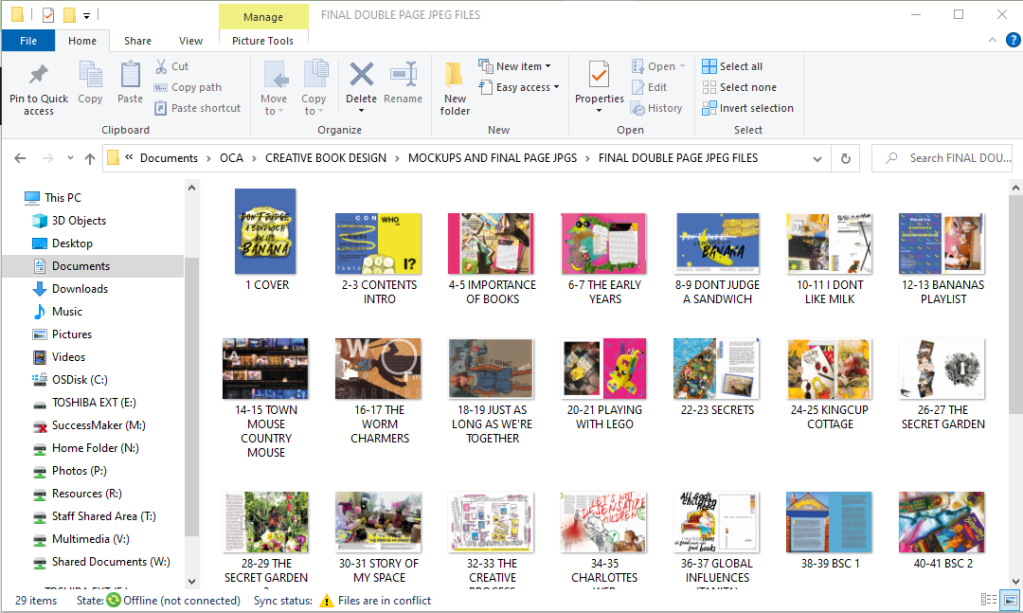

I then created a new document to import the jpegs onto their correct pages. This was simple because whenever I altered and changed anything on the original document it linked to the new document:

Paginating pages should have been easy because InDesign has a built in feature that allows you to print books. InDesign automatically paginates the pages for you! – Also as well as this I completed the exercise previously which shows you how to arrange pages! Which I did once again:
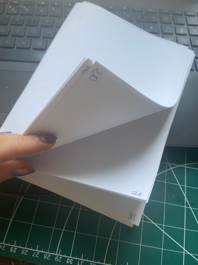
In my case though the process was an absolute nightmare! I was printing (sneakily!) to the really nice quality laser colour printer at work and for some reason when you print 2 sided to it it flips the pages upside down! *eyeroll* this meant that I had to paginate the pages and then flip some upside down too so that when they were printed they would print the correct way! I am sure there must be a much simpler solution to this!- this is something perhaps I need to study into more depth when I have more time but I must have spent about 3 days sweating like a crazy woman stood at the printer trying to get it right!
Proofing
After all the hard work, sweat and almost tears (from the paginating!) that had gone into my zine I wanted to make sure that when I printed it out there were minimal mistakes in it. I proof printed it in completely the wrong (and costly!!) way to be honest, I should have printed it out in black and white but I wanted to see what the colour quality was like and I felt like I could properly see what needed changing by printing it out as it should be. I printed a few proofs with alterations before the final finished version!
I changed page numbers, typos, changed print borders, moved things away from the bleed areas.. changed the size of type so it was legible and readable, changed the quality of jpegs and images.. I found a lot of changes that I then had to go back and correct!


Printing and binding my zine
When my zine was proof read and all correct I then printed a few copies out! This is where I defied the brief slightly; I totally forgot that the brief asked of me to simple staple my zine together.. I guess this is where I haven’t met the brief! However, the way I bound my publication together is still acceptable and professional and is still one of the ways I researched in my previous exercises. I work in DT within education and have access to sewing machines so I machine straight line stitched down the spine of my zines. It is a very secure method and it looks professional!
I then also experimented with printing vs photocopying. I found that printing in colour and black and white directly from the file on the computer was fine. The quality was not compromised in any way. However, when I photocopied a printed colour copy the quality was definitely not as good!- this would be the way that the zine would be cheaply made and distributed too.
Below you can see the difference between the two by looking at the logo quality on the back:
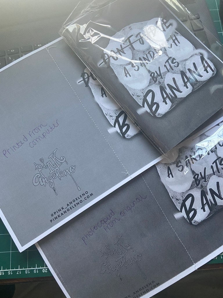
The way I have digitally made my zine so high quality would be ideal for being professionally printed and for being sold in a bookshop. For anything that needs to be made cheaply and distributed quickly in black and white would need to be much more hand made.
Final zine mock ups and photographs!


The video of my zine!
The video of my zine took me a while to accomplish as well! I knew I wanted to do a video to show it properly in real life! I got Chris to film me leafing through the pages on my desk and then the idea was to take it into Instagram on my @Pink_Angeleno account and try to add audio and turn it into a reel!
This didn’t work as the music I wanted use (Ealot-“It’s time”) wasn’t one of the songs that I could choose on Instagram. I would need to import my video elsewhere and then import the audio in separate. However, I was able to speed up the video a lot using Instagram and then resave the video back to my phone to import elsewhere. Working with video is something I have never had any experience in; I would like to improve in this area!
I then found in Creative cloud Adobe Premiere Rush and this worked a treat! I bought the music off Amazon for 79p and was able to then save it to my computer and import it over to place over the top of my video. Chris calls the music I have chosen “elevator music” but I just love the happy vibes it gives off! It is perfect music for time lapses etc!..
Distributing my zine (or at least attempting to!)
As I mentioned above, my zine is quite high quality so would be better to be professionally printed and distributed in bookshops and magazine shops (such as Magazine Heaven).
I did think I would contact a zine group in Lincoln which is one of my nearest cities and see if they could direct me as to where to send my zines! I was thinking it would be great publicity for my Instagram page to just get my zine out there and get feedback and public attention!
The zine group I contacted consisted of 27 members, which to be honest I don’t know what I was expecting from such a small group at all but I was hoping they would be helpful than what they were!!
They all seem to be happy to stay a small group and happy to communicate about meeting up down forums and discord but not particularly helpful in advising me – a newbie ziner who actually wanted some help! *eyeroll…*
This is what I posted in their group and no-one actually responded to me:

There was then a lad who basically copied what I had done and advertised his cool, punk, music, underground zine and asked again for people to go and download a copy from his webpage… (this is where I need to become more geeky and learn how to use websites more!!)
Not being bitter or anything (obviously! ;p), I then deleted my post and left their group.
All I can conclude is that I don’t like beans and that they obviously don’t like banana sandwiches?! ;p
So with much thanks to Beans and Zines, I am still looking for other places and people to help me promote my work!
I might just take some of my stickers and stick them around towns and cities to bring traffic to my Instagram page!
Also, we are renovating our house at the moment and adding a wall into a bedroom to make 2 bedrooms. It is an old 1600s cottage so it already has a lot of history but Chris came up with the idea to bury one of our wedding invites with a photograph of us into the plasterboard wall and then maybe one day when we are long gone someone will find it and know who lived here and the date! I might bury one of my zines in there too! Can you imagine in 100 years when someone knocks the wall down and finds my zine and gets to read all of my stories?! Amazing!! – Stories will live on always!
Conclusion
I really enjoyed this assignment! Having come into this with absolutely no idea whatsoever of what a zine was I can now honestly say that if I had free time on my hands I would go and design some more and join some zine fests! The only thing I found difficult was the paginating of the pages! This took a lot of my time trying to get my head around and sort out!
I would like to think I have most of the points in the brief and met them in creative ways. I have created a much lengthier zine than the 16 pages that was asked of me; but I really enjoyed this assignment and I really wanted to get as many childhood books that inspired me in there as possible to give a better understanding about my interests and my history with literature so far! I have tried to use designs and research from the previous exercises too to include in my zine; such as the main front cover and the “Don’t judge a sandwich by its Banana” article which coincide with the Don’t judge a book by its cover exercise. I have global influences in there, musical influences from book titles and my whole zine is basically a journey from my childhood to now through the books that have influenced, inspired and helped me to grow and develop into the creative adult I am today. I have introduced myself in there through the form of personal letters, memories, photographs and through my designs themselves.
Although my zine is entirely digital, I have tried to add elements of other different mixed media such as Ink drawing, collage, paints, photo manipulation, handwriting, photographs, flat lay photography and by using physical items such as the bookmarks and the letter inside to open. I have used the traditional cut and paste style but modernized it by bringing it into digital.
I have looked into the future of the book and presented an argument across about how I feel books are so much more than just reading books.. they are objects of craftmanship, beauty, information.. they hold memories, they are heirlooms and artefacts to pass through the generations and in their own rights tell their own stories about their owners and previous owners.
Overall I am very proud of my work that I have completed and that of my finished zine and shall now continue to go on a search for where to leave a few copies for some feedback and to hopefully achieve what I strongly argued in my zine; sharing information through the form of physical pages but not only that, sharing photographs and memories for many more years to come!
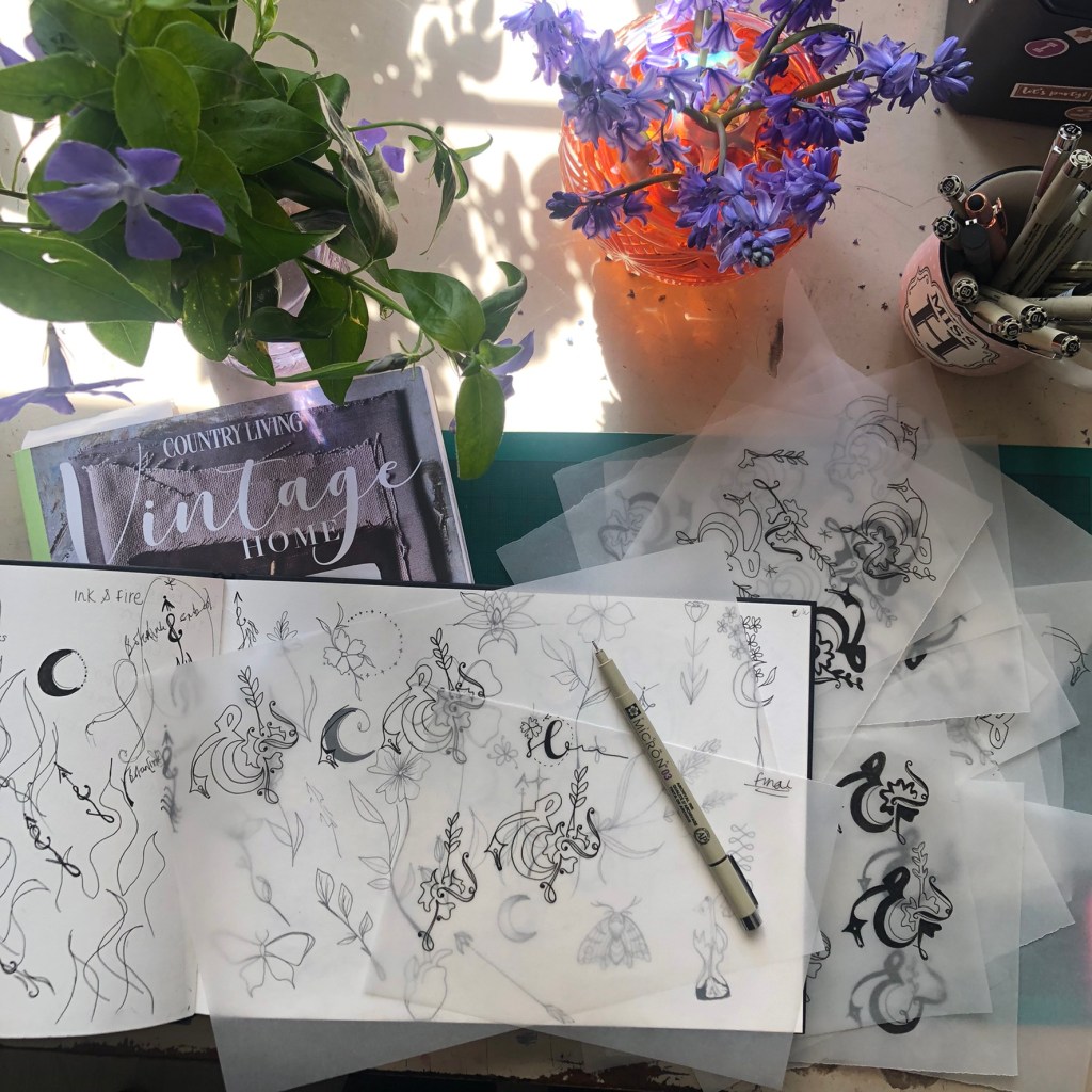
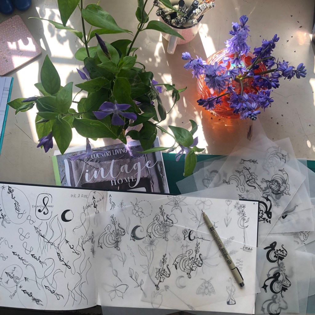
Sketchbook Pages