Assignment 1 – Say Hello

The Brief –

For this assignment I wanted to introduce myself through Pink Angeleno as this is how I brand my work on social media and on this blog and I know that my tutor already knows who I am and what my work is like, but many people always ask me why Pink Angeleno is Pink Angeleno.

Pink Angeleno was born in 2019 when I first started my course, I needed a brand name that represented me and my work and I was really struggling because I had no idea if I was actually good at Design or whether it was just a pipe dream. I had no idea who I was at that point, where I was going, what I was doing or whether what I was producing was any good. I felt absolutely lost and just dreamed of running away to live a happy, sunshine-unicorn-rainbow life in LA! I do love LA and California and held on to the dream that I might make it back there one day.. I was like an Angeleno that was just lost and living elsewhere! I also loved the colour Pink and this is the colour that everyone associated me and my designs with. it only seemed appropriate that the original name I chose – “Graphically Pink” morphed into Pink Angeleno. I wanted the energy, the fast pace, the colours, the vibes, the excitement and adventure, the street art, the hidden places and the glamour of that lifestyle. I wanted Pink Angeleno to showcase my OCA work but I also wanted it to represent this “pipe dream”. As it turned out though, Pink Angeleno has served me well as I have returned to LA and I know where I am going as a Graphic Designer.

I wanted to come up with a design that would be suitable for this assignment but something that I could also use moving forwards to represent my brand.

I explored in my mind the boundaries of the brief… The brief stated “greetings card” but I wondered whether a post card could class as a greetings card. After doing some research and searching Google for some one sided “post card style” greetings cards, I realised that they are two very separate things and that I should stick to what the original brief wanted.

The brief allowed any type of media but I decided to do this assignment digitally using Illustrator.

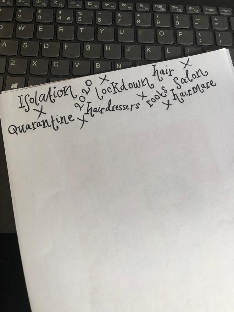
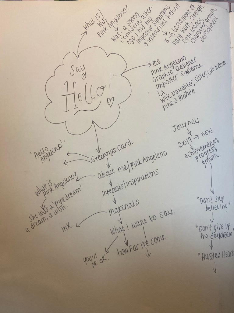
I started off with brainstorming some ideas in my sketchbook about what I might want to include on my design:

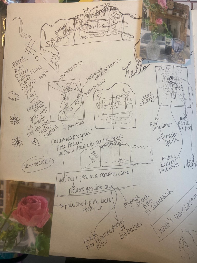
*The photos of the Roses on the page are nothing to do with this assignment but I am trying to document as much as I can in my sketchbooks – I had a lovely evening of dog sitting my Dads dogs and he lives in a countryside 1600s house with a big garden full of amazing flowers and I sat down on this night with a glass of wine, cut a rose from the garden, lit the fire and sat down to sketch. It was bliss.. so I decided to document the moment!

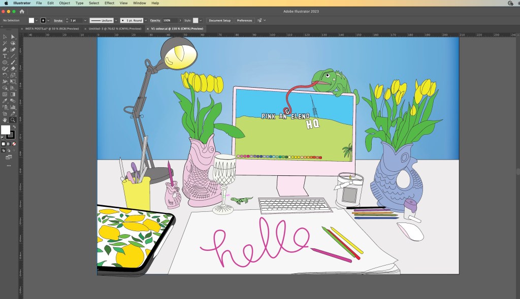
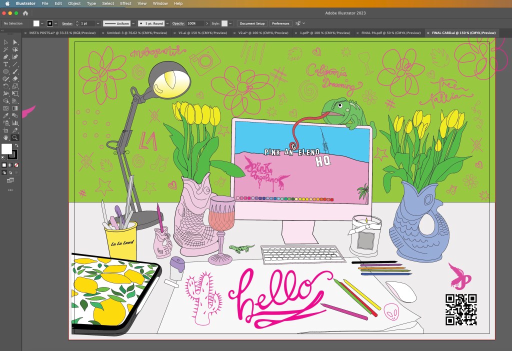
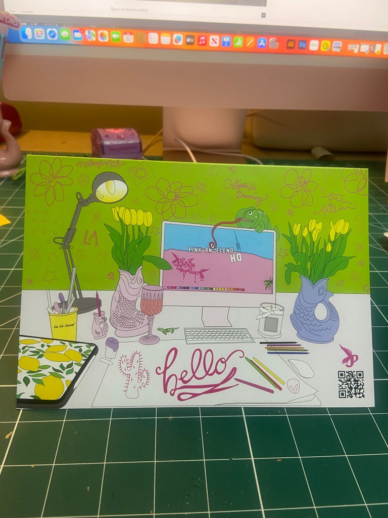
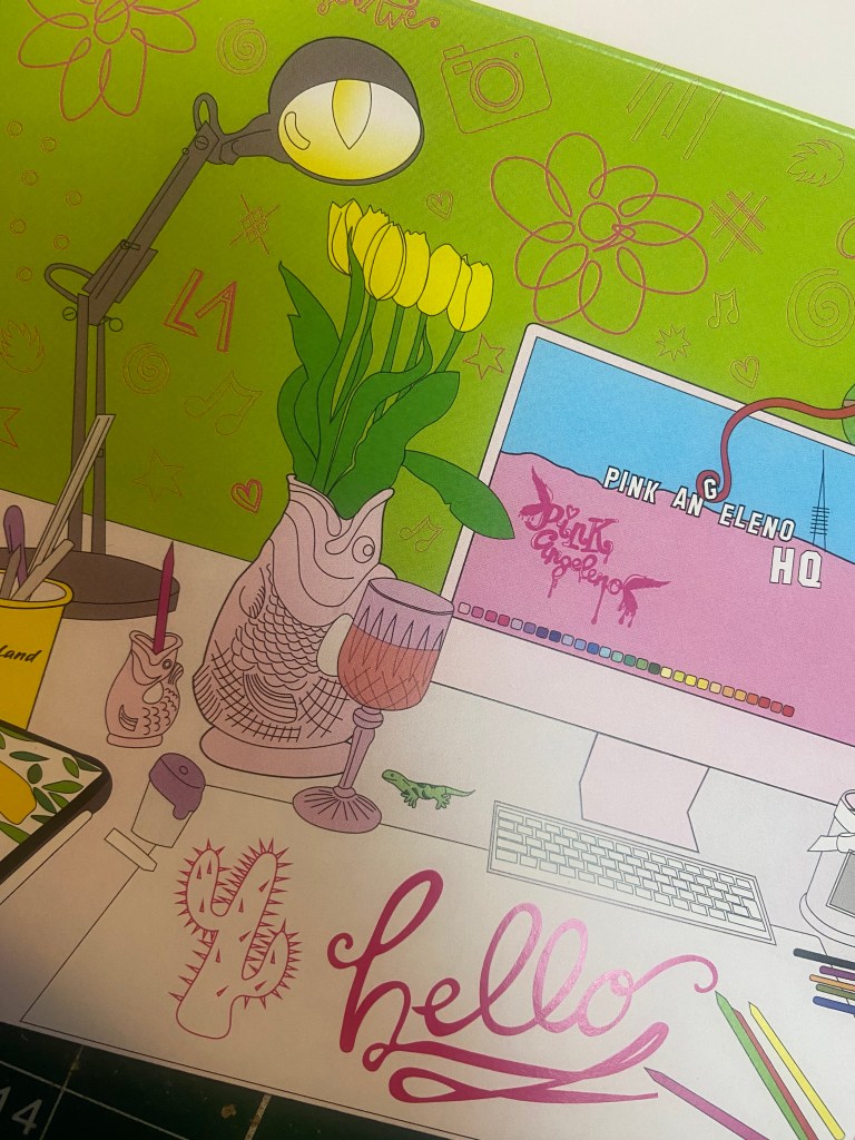
I sometimes on my social media post a photo of my desk space with the caption “Greetings from Pink Angeleno HQ” SO I decided to move forwards with this idea. I had the idea to illustrate my working space on the front of the card. I then had the idea to make the card have a design on the front and the inside and allow the design from the front to flow on the inside of the card. How I imagined this was to have my Mac on my desk space have a wallpaper which would then continue onto the inside. The wallpaper I had in mind was the Hollywood sign and then on the inside of the card I would illustrate more of the Hollywood Hills from a photograph I actually took whilst I was hiking the Hollywood Hills and include some little illustrations around the outside of other things in LA that I liked which would sum up my interests and why I called Pink Angeleno “Pink Angeleno”.

I also explored the idea of pop up cards and more complex designs – I later decided to keep it simple though as this is an introductory, simple brief and I felt it didn’t require the complexity. It would also be easier for the print process being one sided and a simple A5 tent-fold card.

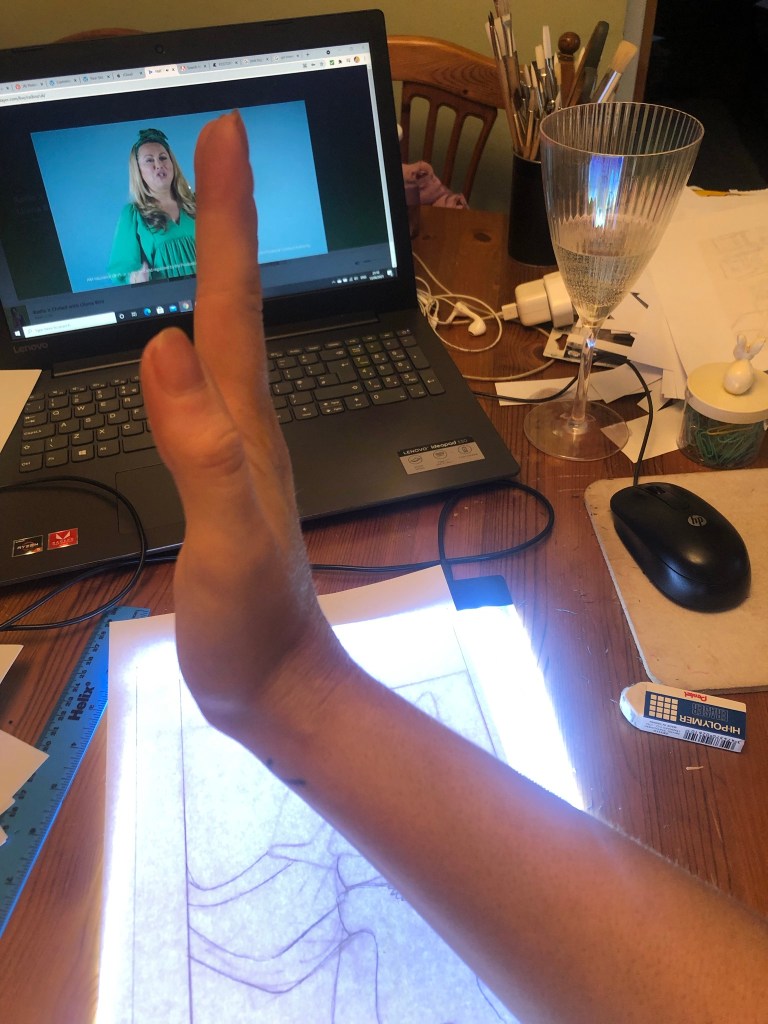
I took a photograph of my desk space:

From the photograph I then drew out the first initial drawing of my desk space in Illustrator. I missed out the non important “clutter” and kept the essential items from my desk space. Once I had the basic drawing I could then go about adding colour:

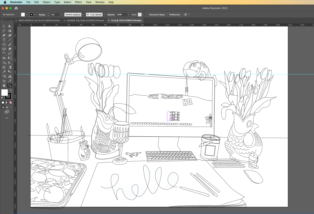
I added colour and I just didn’t think much of it. It had everything in the illustration from my desk space but it didn’t show Pink Angeleno… there was nothing pink truly about it and the only element that hinted on LA was the wallpaper on the Mac. I have my cuddly toy chameleon (George!) sitting on top of my Mac and thought it would be fun to make him interact with the screen in the illustration!

I then sat and thought more about Pink Angeleno and how to best illustrate this on my greetings card. My current Pink Angeleno brand was neither here nor there.. I had a drawing I drew for my first ever OCA assignment which was a similar one to this… Create a postcard sharing who you are and the illustration I created for this I have kept as part of pink Angelenos identity all the way through. it is significant as this is how people identify my design and work and it is how It all came about:

I knew that I cannot reuse old work, but I then wondered if I could update Pink Angeleno which would help with my assignment and also create more of a solid brand for my work moving forwards.

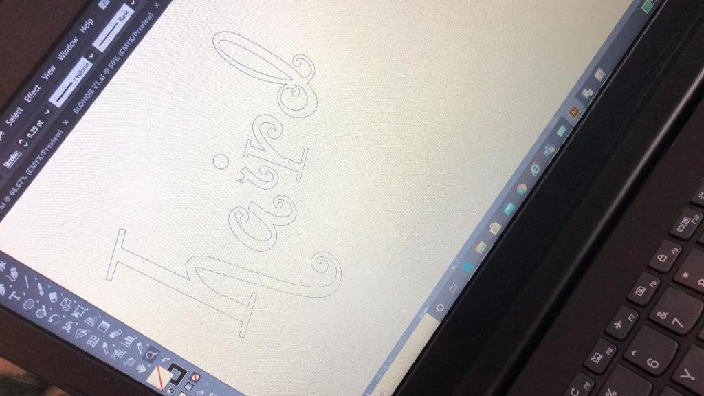
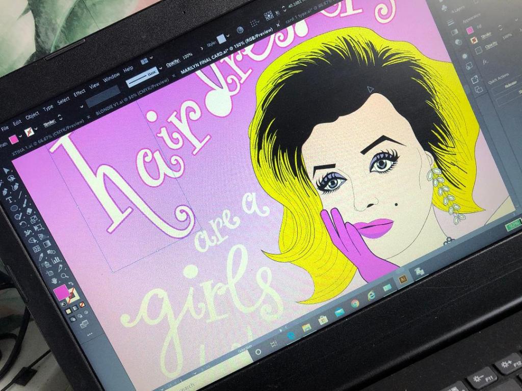
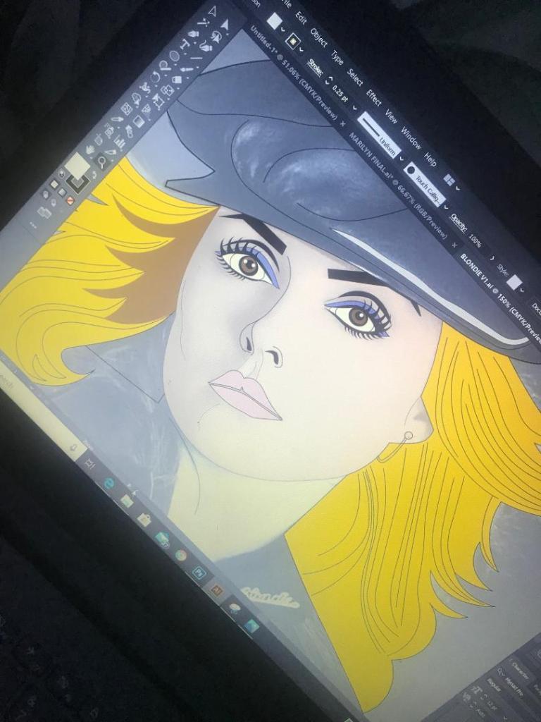
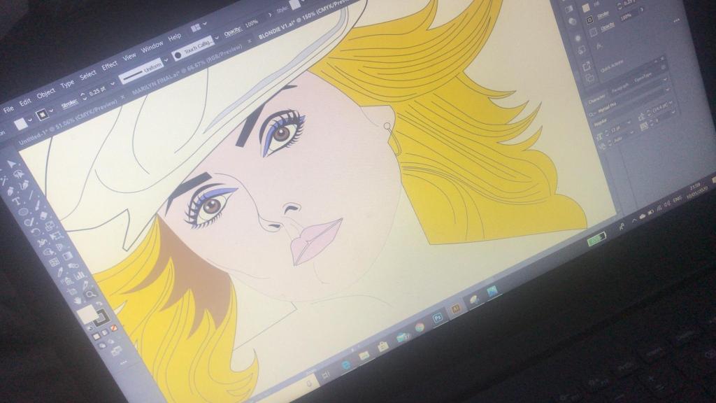
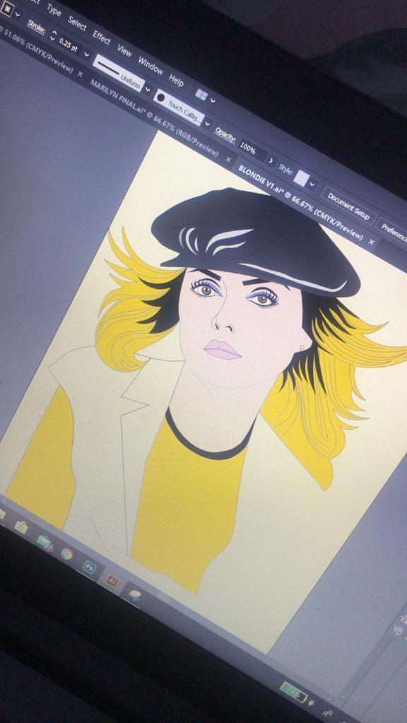
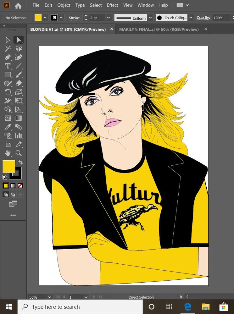
Pink Angeleno is very vector based, a lot of my work are illustrations that I have drawn and then created into Vector art using Illustrator so I knew that my work for this assignment would be the same.

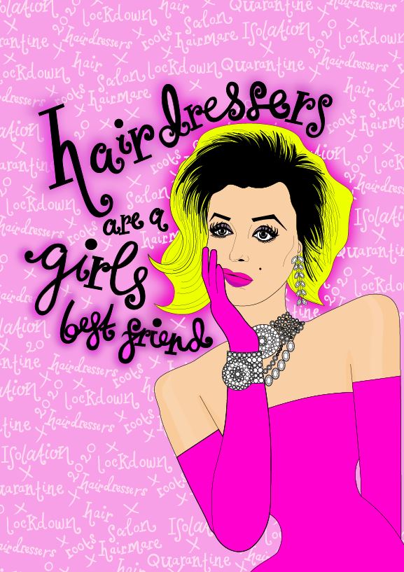
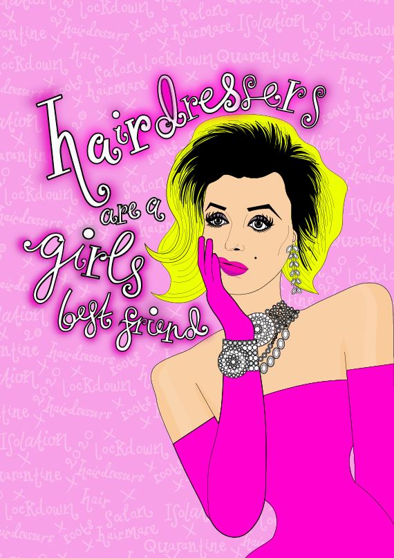
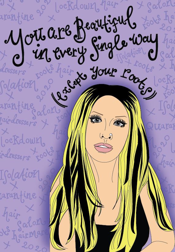
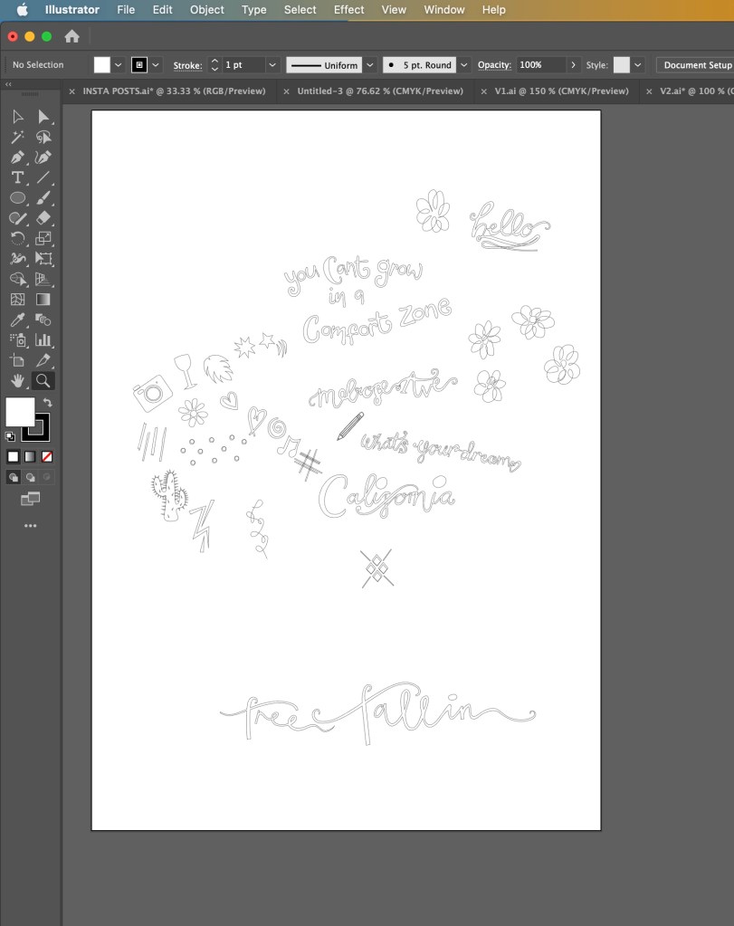
Once again, I turned to my sketchbook and started to sketch out little ideas that I feel sum up what Pink Angeleno stands for.

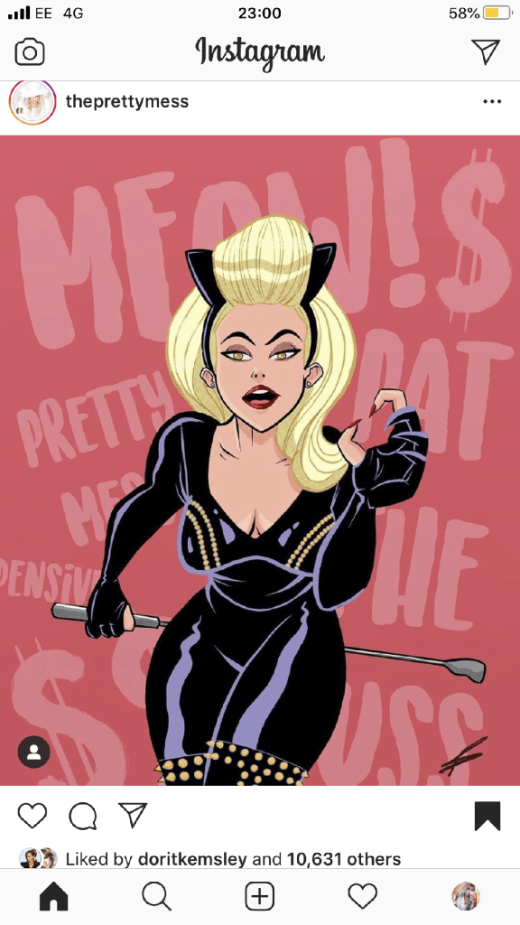
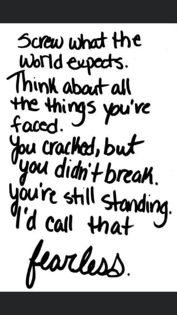
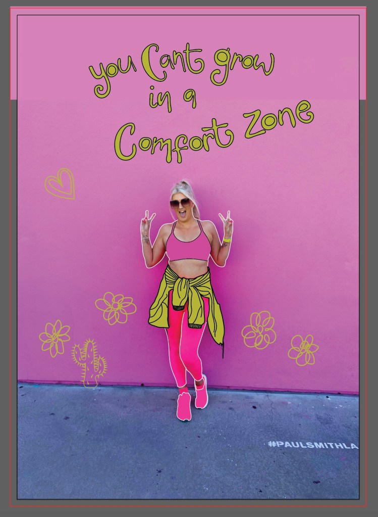
“You can’t grow in a comfort zone” is pivotal to me – it is what made me jump out of my seat and go for it in the first place. in my first ever sketchbook I drew a random doodle of this so it was only relevant to use it as part of this. Free Falling, a song by Tom Petty describes the emotion of wanting to fall off the top of the Hollywood Hills – it is I believe a song about getting out of a relationship but I associate it more with a feeling of escaping reality – that is very much the basis of the origins of Pink Angeleno. Melrose Avenue is just a cool place – shady in some areas I guess- but just a cool place! It is full of street art, graffiti, bright colours, thrift shops, unique bars and everything quintessentially LA!

Here are a few snaps I took of Melrose:

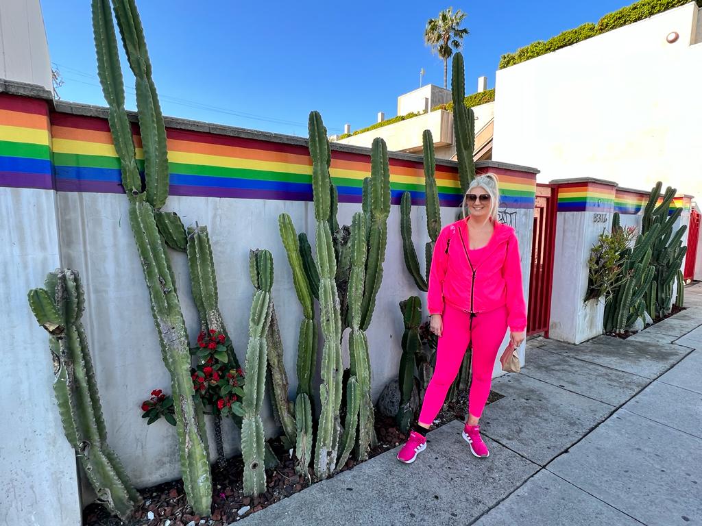
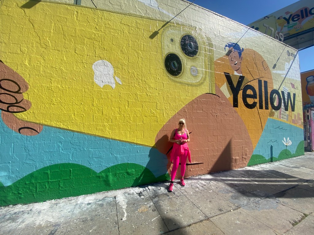
Cool right?… oh… also, here is my husband enjoying it too! – (with my Barbie bag!) 😛

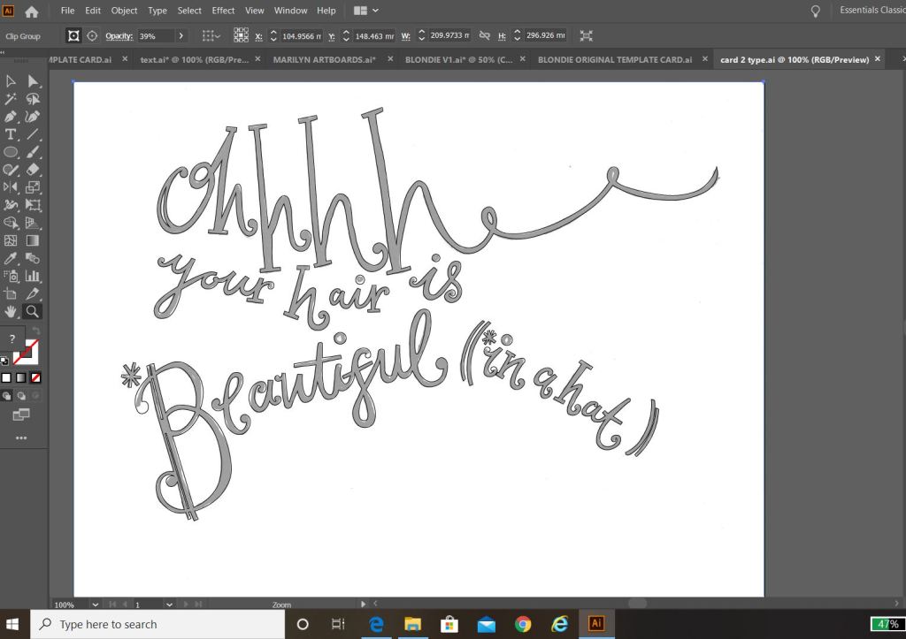
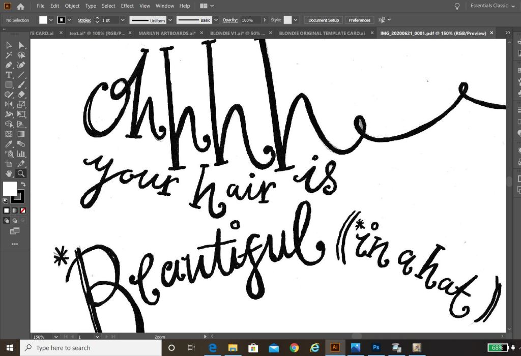
“What’s your dream?” is an iconic line from Pretty Woman the film that I just had to include.

From drawing all of these I then had the idea to scrap the original idea and use the photograph of me in front of the Paul Smith Pink wall as a basis for a completely new idea..

I thought about using the photograph to create something like this:

I put both ideas on the back burner until I had drawn out my illustrations:

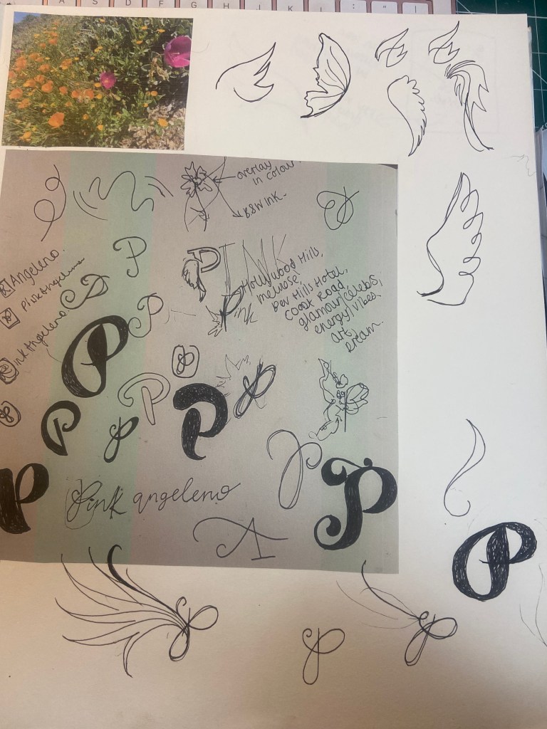
I then figured I needed to rebrand my Pink Angeleno logo ever so slightly.. the first ever original drawing I did for it was back in 2019 and I didn’t know or take into consideration then the readability and size of it when making it as part of a logo..

After a lot of thought though I didn’t want to lose the original identity of it as it means a lot to me so I went to work adapting it and making it as part of a basic logo.

I sketched up some more ideas for a logo – these manifested as a simple letter P with angel (or Angeleno) wings:

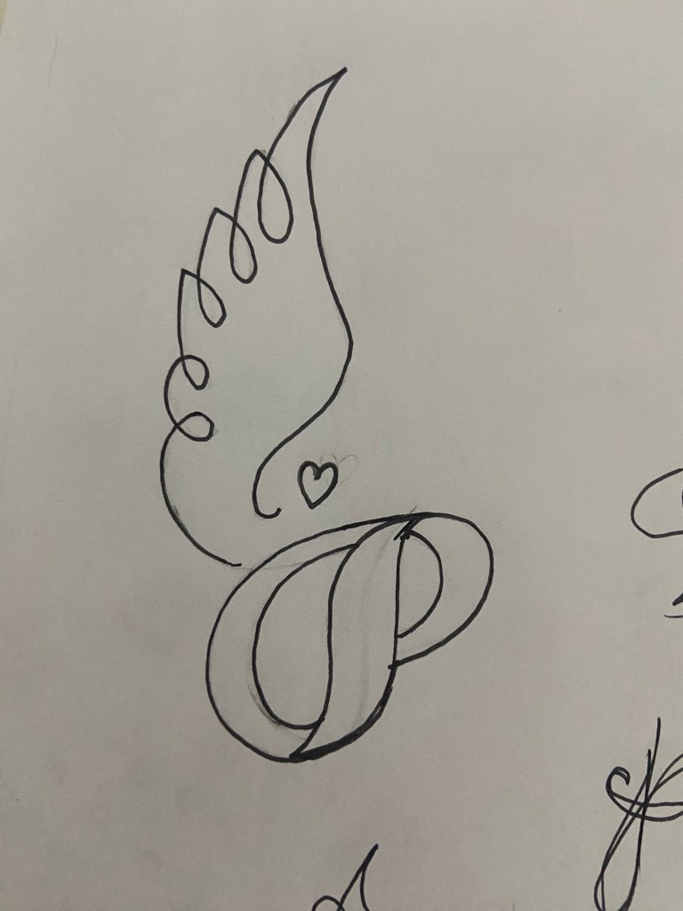
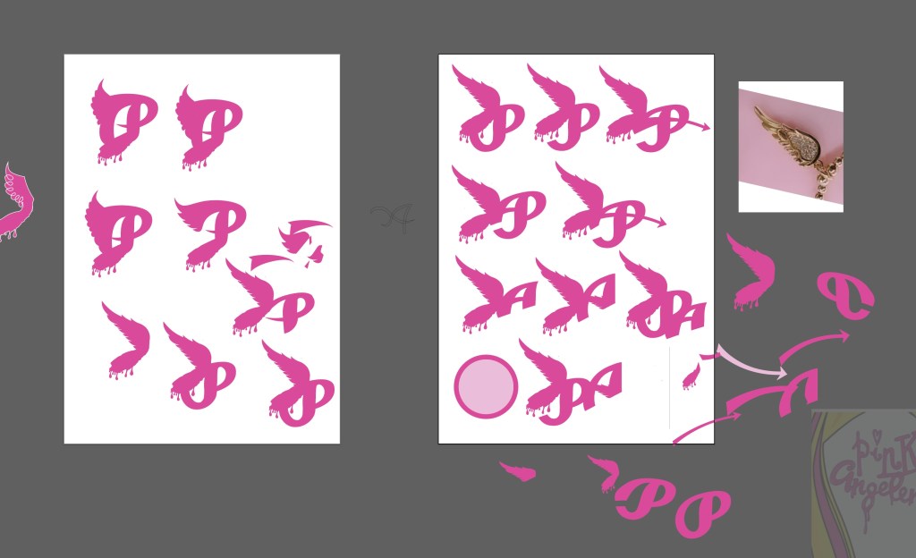
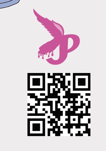
This was the final logo that I settled on and I quickly made it as part of my social media!

I also gave my original drawings a “glow up” and adapted them with my illustrations from my sketch book.

I then went back to both of my ideas for my greetings card and decided to go back to the first original drawing and idea but just to include the recent illustrations I had drawn. I used the colour combo of Pink and Green just because I love the colour pop and the colours remind me of a Watermelon, summer splash combo!

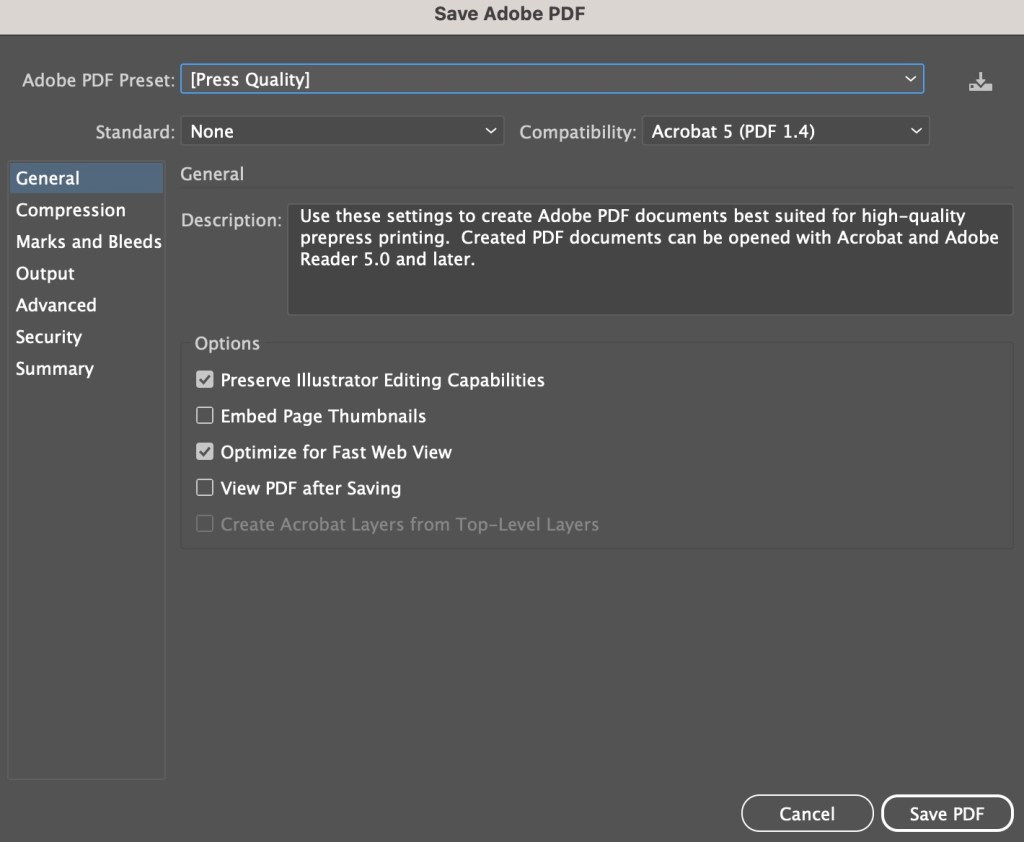
The colours of it here are extremely bright and vivd because I have saved it as a RGB PNG suitable for screens; however the file format I saved for print was a PDF format:

I also added a QR code onto it.. What better way to show who I am than a card with a direct link to my website? Instant promo and info on who I am.

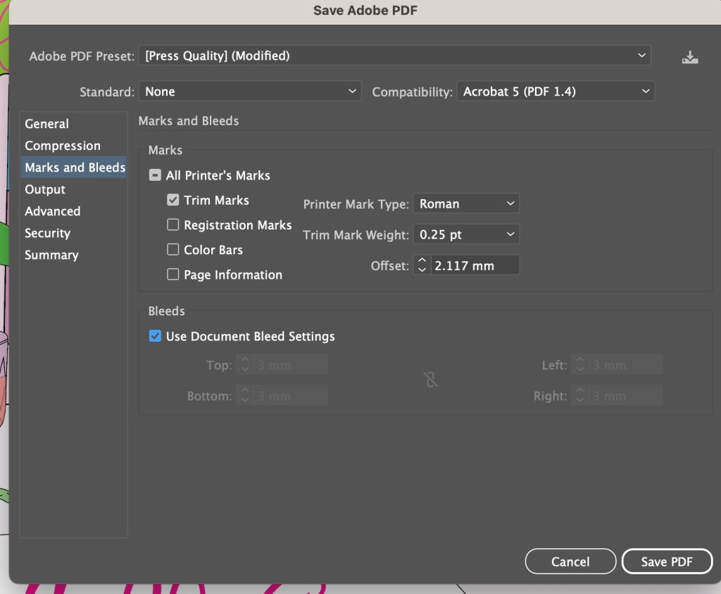
My document was set up in Illustrator to an A5 size with a 3mm bleed.

I have never sent anything off for professional print before, but as I now work as a Graphic Designer in my new job, I have experience of sending artwork off to print with various print companies. One of the companies we use is printed.com. I only wanted 1 printed card which not many companies can do without a minimum of 10 prints but printed.com were able to print just 1 of my cards which was ideal and saved me unnecessary, added expense.

http://www.printed.com

I set my card up for print in PDF format following these steps:

I then attached It and sent it off for print

It came back 4 days later and looked absolutely perfect!

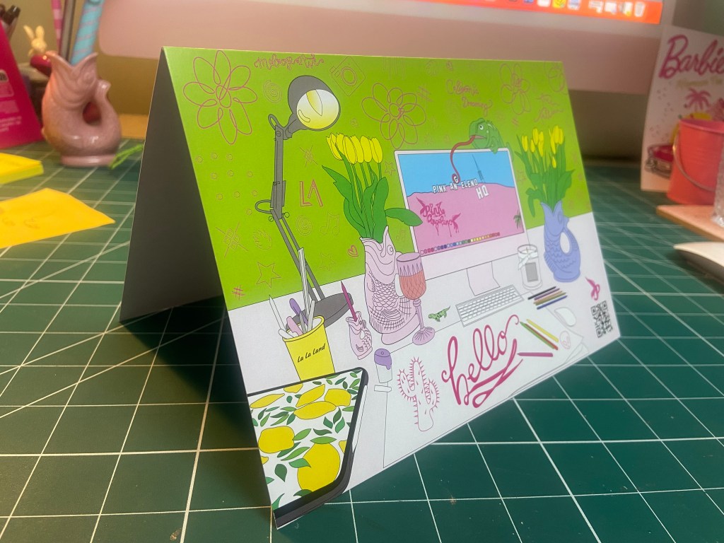
They even sent an extra copy which was really good!

The Final Card

Development of text: hand to vector lettering

This post is dedicated to my initial ideas and thought process through to the final art development of the text that appears on the front and inside my greetings cards.

This post consists of:

  • Ideas
  • Research
  • Text artwork development

Ideas

The hardest part of this assignment was knowing how to display the messages of the cards and getting the typography right.

I did not want to use simplistic text – I did not want to choose a font and type the message out onto the card and that be that! To choose a typeface or a font and use it effectively would require me to choose an appropriate font to match the feel of my cards which I knew would have to be fun, vibrant and humorous. I knew this would possibly turn out to be a disaster because I definitely did not want “fun” “gimmicky” fonts on my cards! – (think Comic Sans!) The only way forward was to create my own vector lettering using Illustrator – although this could also be a challenge!

Research

I started to look around to find inspiration. I found it in several places.. random Instagram posts, quotes I had seen online, products I found in shops.. These are some of the images which helped to inspire the text on my cards;

This was a post on Instagram that I stumbled upon. The style of illustration is very similar to my own. I like the appearance of the text in the background. This is the sort of thing I had in mind for my own design. It looks like a brush effect has even created this style of text.

This is a quote that again I stumbled across, I was not even interested by the quote but the style of lettering on it. It looks like someone handwriting, which gave me the idea that I could too hand write the message and then import it into Illustrator and trace around it to create some vector type.

This image above again I found on Instagram; what is relevant about this post is that they have used Dolly Parton as the main focus on some postcards who is one of the blonde icons I had in mind for using on my own designs.

The above image I took a photo of whilst I was at work. My “double life” or my second job is within the retail sector (I work toiletries!) I saw this Simple bottle and the black background text on it gave me an idea as to what sort of style I could do in my own designs. The text is very much like bubble writing – at a guess it is vector lettering.

This image above is the image that inspired me the most for my card designs. It is the cover of Debut magazine that I own and I liked the style of writing and how it looks. Out of all the images I have found I shall try and replicate this image within my own designs more.

Development of vector lettering

As I stated at the beginning of this post, I did not want to use an existing font because I thought I would struggle with finding a suitable one to match the feel of my cards and to also give a professional appearance. I decided to create my own vector lettering from my own style of hand lettering…

I created 2 pieces of text for each card:

  • The main card title
  • The background text of the card

I started off by drawing out on paper the original text I planned to use for my main card title. I drew out my text using my papermate flair pen (these are ideal for ink drawings and lettering!) and then imported them into Illustrator via my scanner to trace around using the pen tool to make into vector lettering.

These are my hand drawn original lettering drawings that I then imported into illustrator to trace around:

These are the beginning stages of the main titles of each card:

The last thing to do was to create the background text for the cards.

Most of the inspiration for the background lettering that I used on my designs came from the Debut magazine cover; the cover is full of words that relate to that particular magazine which I decided I could bring forward into my own design (apart from I have used words that relate to hair, roots and lockdown)

Again, just like I did for the main text of the cards I drew out by hand the lettering for the background text and then imported it into illustrator to trace around. I chose to use the words: lockdown, Quarantine, roots, salon, hairdresser, 2020, hairmare, isolation and hair. I felt that these words best summed up the lockdown hair nightmare best!

I then imported it into Illustrator.

I then changed the colours of the text to match the cards and changed the stroke of the lettering and copied it over to the card documents to place behind the “blonde icons” (Marilyn, Debbie Harry and Christina Aguilera). I then cropped out any words that I did not need or that were out of the print border.

I then saw an inconsistency within my series of cards with the colours that I used for the text. On the Marilyn card I used white as the main text colour whereas on the rest I used black, black works a lot better. The black stands out much more and it also shows a pattern within my designs; they all follow the same colour scheme. The following images will show my development in this stage:

I then finally reached the stage where I was relatively happy with the front of my 3 designs!

Here they are in all their glory! 🙂

The next stage was to write the inside messages of the cards. I was unsure as to whether I wanted to use the same style of hand lettering that I had used on the front of all my designs or whether I wanted to use a more simplistic approach. Most greetings cards that are on the market use simple sans-serif fonts to feature inside the cards. I tried this out for mine using Helvetica. I also toyed with different messages for each of the cards; “Atomic (blonde)” for inside Blondies, “Don’t look at me” for Christina (the starting famous lyrics to Beautiful) and finally “I’m rooting for you” was the message I originally thought of with Marilyn’s.

This is what I ended up with. When I put it next to the designs it just didn’t look right. It looked like it did not belong with the cards. I decided to use the same hand lettering that I used in the rest of my designs with the same message –

“I’m rooting for you”

Again, I drew it out and traced around it in Illustrator to place on the inside of the cards.

Card 2 – Design development

The second card that I designed in my series was based around Debbie Harry (Blondie).

Debbie Harry is another iconic blonde of our time, she seemed suitable to use for one of the illustrations in my range of cards. One of Blondies most iconic songs is “Atomic” where the lyrics are: “Oh, your hair is beautiful” I decided to put a twist on this and use the lyrics as the message on my card but change it to “Oh, your hair is beautiful.. (in a hat)”. Debbie Harry was well known for wearing baker boy style hats and hats are ideal right now for covering dodgy isolation hair and roots!

All I needed to do at this point was to find a photograph online of Debbie Harry wearing a hat to be able to draw inspiration from and trace around.

This was the image that I found on Google and the beginnings of tracing around it using the pen tool in Illustrator!

This is exactly the same process as what I did with Marilyn. I traced around the image completely in Illustrator with the pen tool and just added colour, texture, tone etc! I wanted to represent Debbie Harry as true as possible from the “Atomic” music video and this image that I have found of her is not from that video.. therefore I had to find several separate images of her outfits to draw from. I did try and play the music video and screengrab from that but the resolution was too poor. In the music video she wears an iconic “Vulture” t-shirt, I searched online to find this logo to draw from.

These images below show the progress at this tracing out stage;

I actually found Blondie a lot more easier to draw out than what I did Marilyn. I don’t know whether that is because I was a little rusty from not illustrating for so long and now I have got back into the swing of things I have picked up pace?.. However, I am pleased with how she turned out!

This is my final finished drawing of Blondie;

Again, the same goes as with Marilyn – I need to research and come up with ways of how I am going to portray the message. As I explained in my previous post I want the text on the card to be in the same similar illustrative approach to the drawings… I am going to do a separate post to research my findings and document the design development around the rest of the cards.

Responding to Tutor feedback…

“Be sure to use photographic reference with care: for example, the image used as reference
for Debbie Harry doesn’t give you the clear information you need in relation to the folded
hand and visual info for the little finger. Identifying this type of issue means you just need to
reference the position, getting someone to model the position so that the fingers are not
distorted in their translation”.

I completely agree with the feedback that Bee gave me for this piece of work. Even though I have a qualification in Life Drawing, over the years my drawing skills have become a bit rusty!

I found a random image online at the time and I traced the fingers on the hand from that onto my drawing of Debbie Harry as the original photo of Debbie Harry I used as reference did not include her fingers. I tried to go back and find the image I did use to reference the hands and fingers from in my archive of photographs but sadly I did not keep it!

I have however taken this advice and used it in future exercises and assignments… for Assignment 5 I drew illustrations for a children’s book – in this me and my boyfriend modelled in photographs to use as reference and to give me an idea of scale for my own drawings! (I am so sorry Chris for including the photo of you topless ;D…I needed a reference for someone clutching something in their arm… the Pokemon toy got the short straw!)