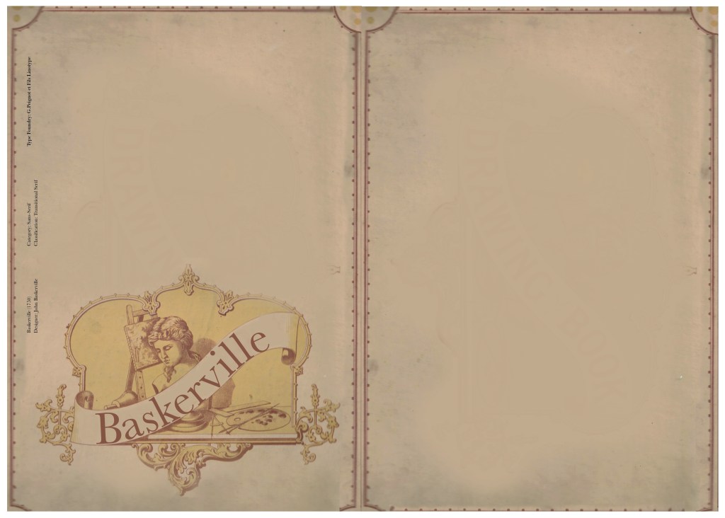
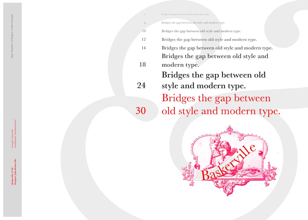
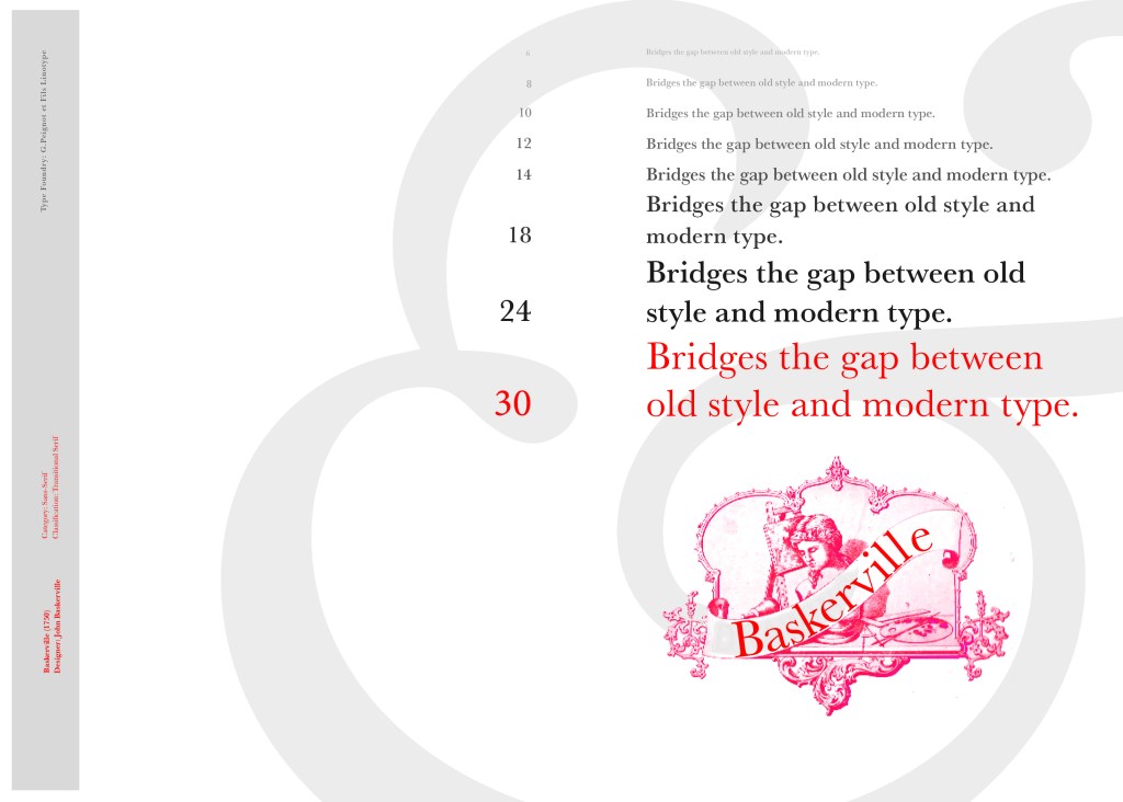
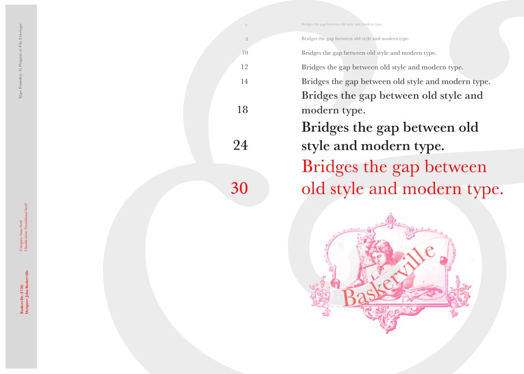
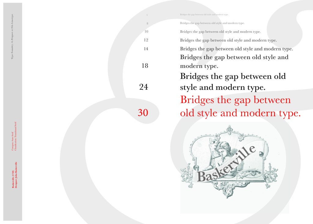
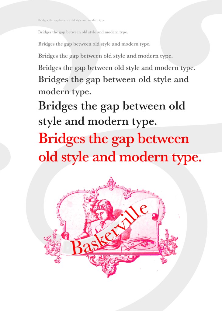
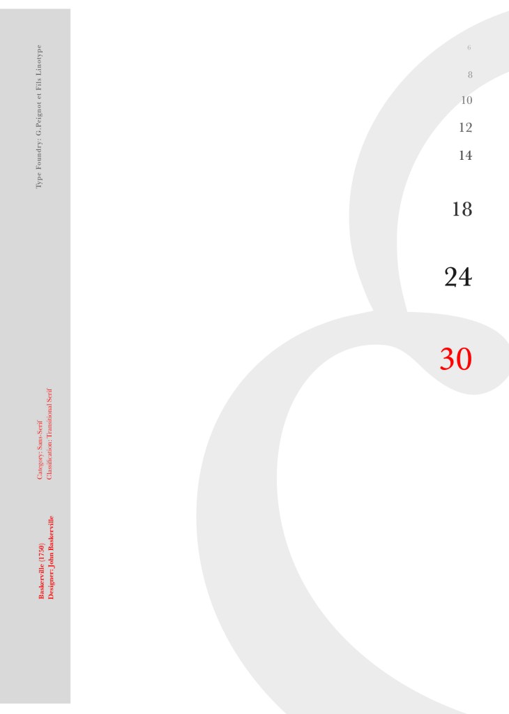
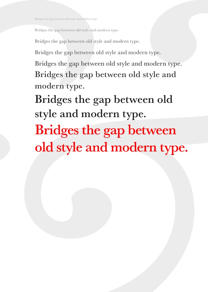
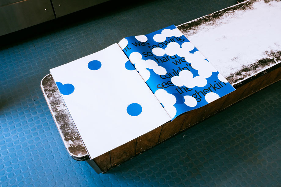
I started off my Serif typefaces with Baskerville. Baskerville was designed in the 1750s by John Baskerville in Birmingham, UK. Baskerville typeface showed contrast between thick and thin strokes and making serifs sharper and more tapered. Baskerville was inspired by Calligraphy and the typeface was and still is very popular in book design. John Baskerville wanted to create books of the greatest possible quality and his typeface certainly made this happen.
My idea for this design was to create a layout representing book design. My original idea was to create an old book and then incorporate Baskerville typeface and the characters into it.
I feel like I spent ages doing this design because I messed around with one idea trying to perfect it all day and then decided in the evening that the simplified version would be much better! I wanted to keep the old fashioned style but still try and bring in a modern vibe!
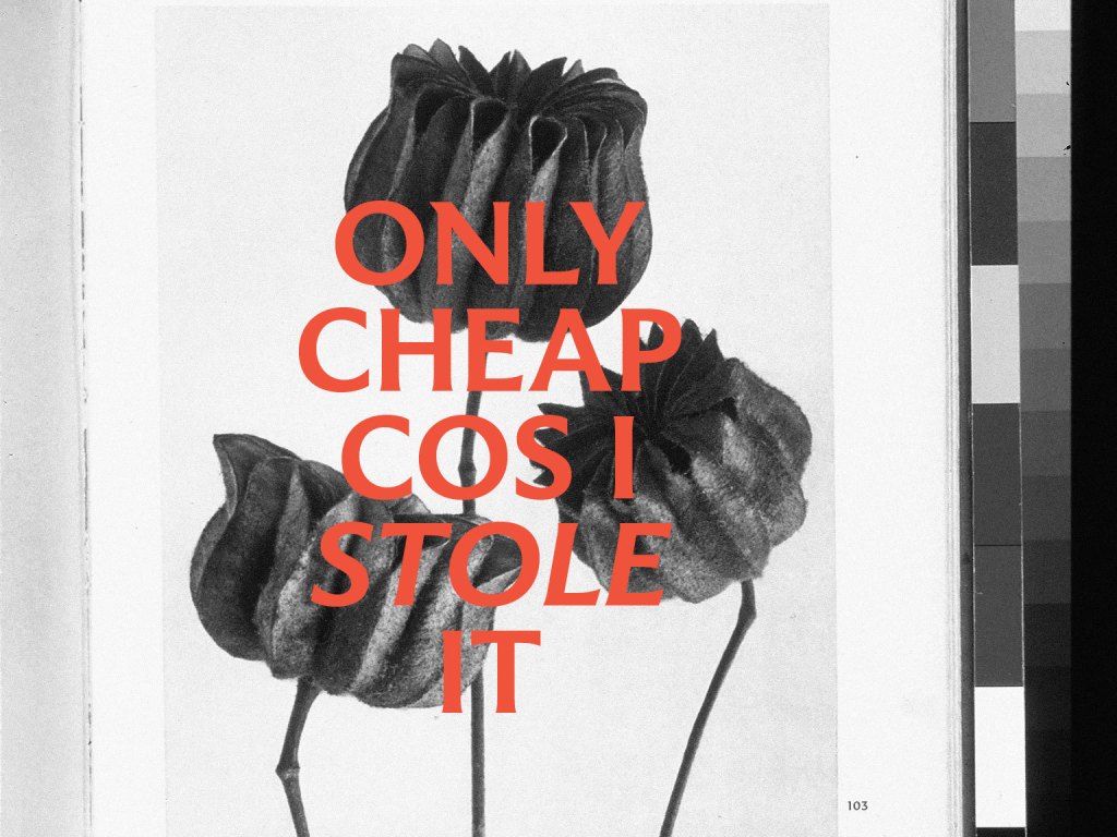
At home I have some old sketchbooks from 1905.. inside are all clothing patterns that have been drawn, there are blank pages that appear in the book though which are quite yellow and mottled with age and my initial idea was to scan these pages in to use as textures for my design. However, when I was scanning them in, the cover of one of the sketchbooks fell apart (they had been covered in brown paper) and underneath the brown paper was an old Edwardian/Victorian Cherub image with the words “Drawing book” I thought that would be a good idea to bring into my design but change the words “Drawing book” to “Baskerville”
**INSERT IMAGES OF DRAWING BOOK
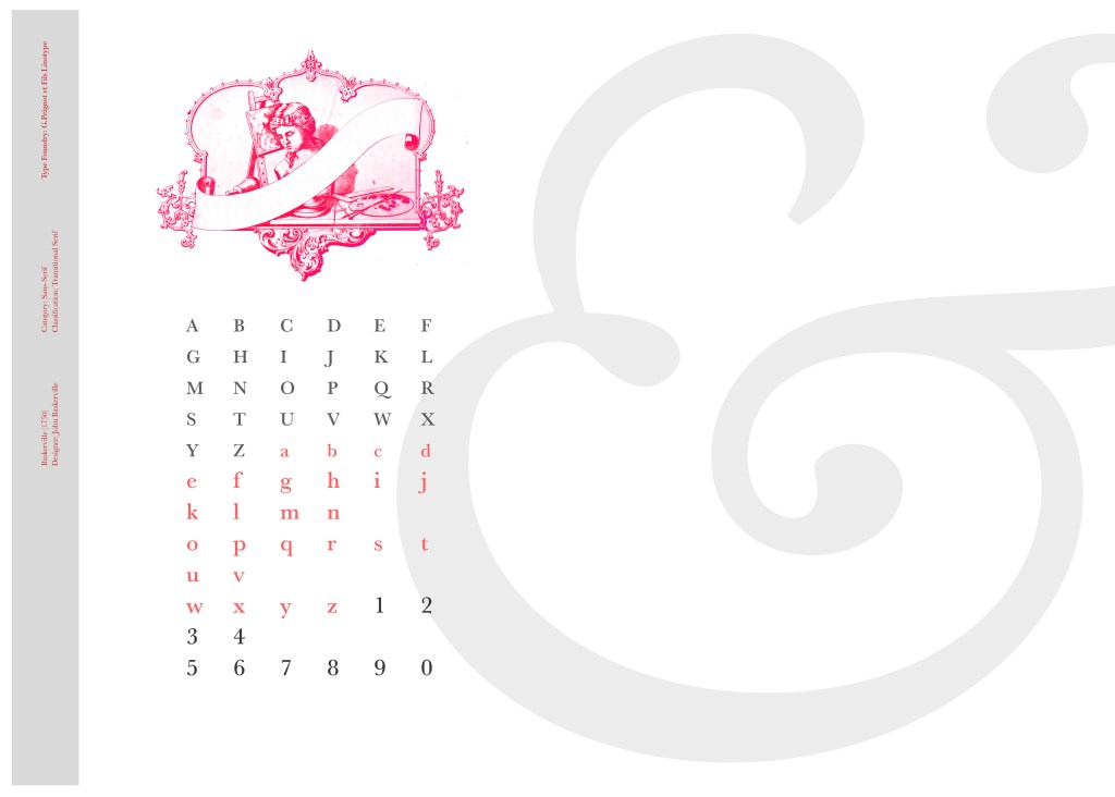
I changed the colour of the Cherub image to try and make it look more modern.. I wasn’t convinced though. I also changed the name “Drawing book” to “Baskerville” in Photoshop. When I did my research on Baskerville, it is well known for its glamourous looking ampersand which I instantly recognised from the V&A logo. I decided to use that in the design as it adds that old traditional feel but with a modern twist.
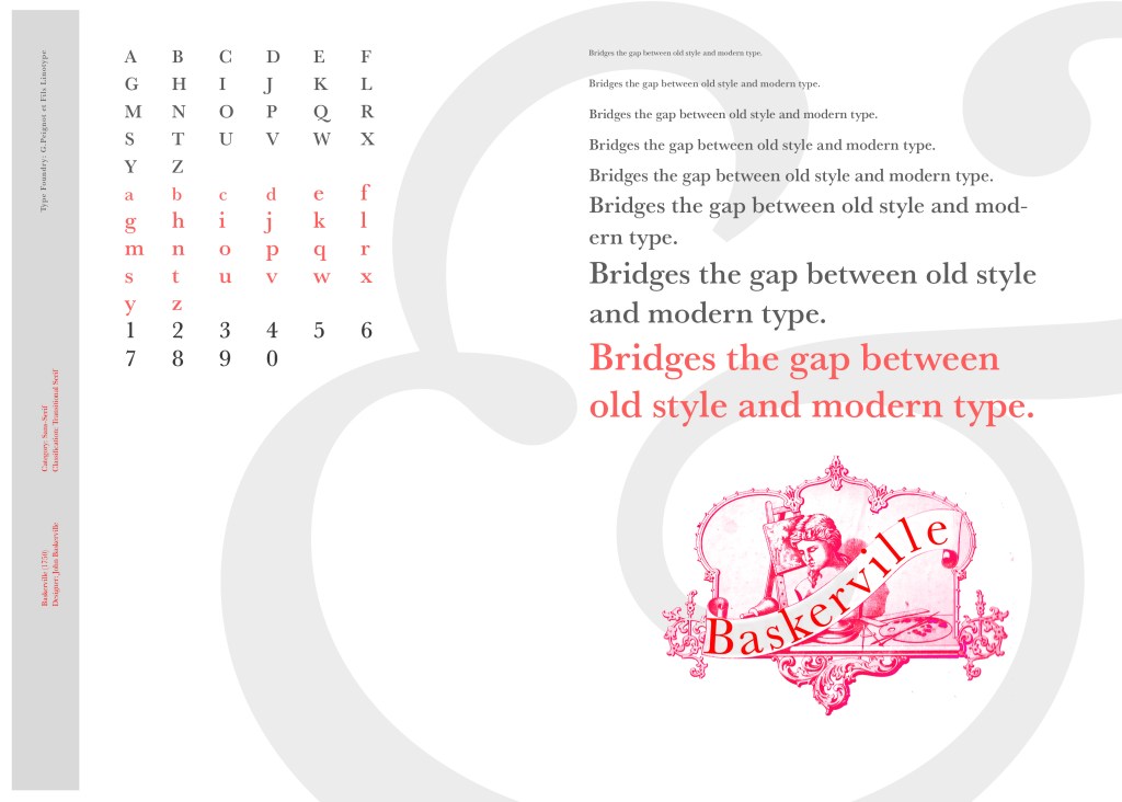
“Bridging the gap between old style and modern type” was a quote I found that summarises Baskerville and that was the same feel that I wanted to carry through my design. I also used the quote to show off the different weights, variations and pt. sizes of Baskerville.
Digital Development
After doing much digital design development I realised (many hours later!) that the layout looked far better with just the ampersand. Let that ampersand do the talking!
The final mockup
The final design and layout is very simplistic and minimalist but I think it keeps an old fashioned traditional feel with a much more modern look.
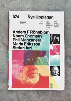
When I first read this brief I knew I would enjoy it because magazine and book design is an area in design that I particularly enjoy. From reading the brief it seemed to be a continuation of the exercise “If the face fits” where it is based around type specimen books and type foundries. I had already researched into type foundries in the previous exercise (If the face fits) so I already had some background knowledge as to what I would be designing. From my understanding of the brief it was asking me to design a typeface to use for the magazine but to also design the magazine in a similar way to which a publication would be released by a type foundry to promote their typefaces.
I knew I wanted my Type Magazine to be one of the high quality Matte or glossy magazines that cost a small fortune in the shops! ;p One of my favourite magazine venues is Magazine Heaven with my nearest being based at Rushden Lakes and inside there they have a whole host of Art and Design magazines which range anywhere from £6-£15.
Magazine Heaven at Rushden Lakes
The next step for me in this assignment was to see what magazines were already on the market and how I could make my magazine look similar to what already exist out there. I also needed to research into type foundry publications and typefaces that I could create for my own publication.
Research
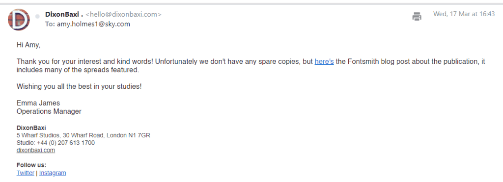
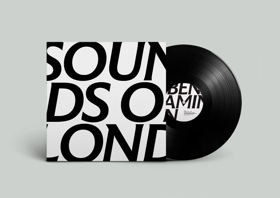
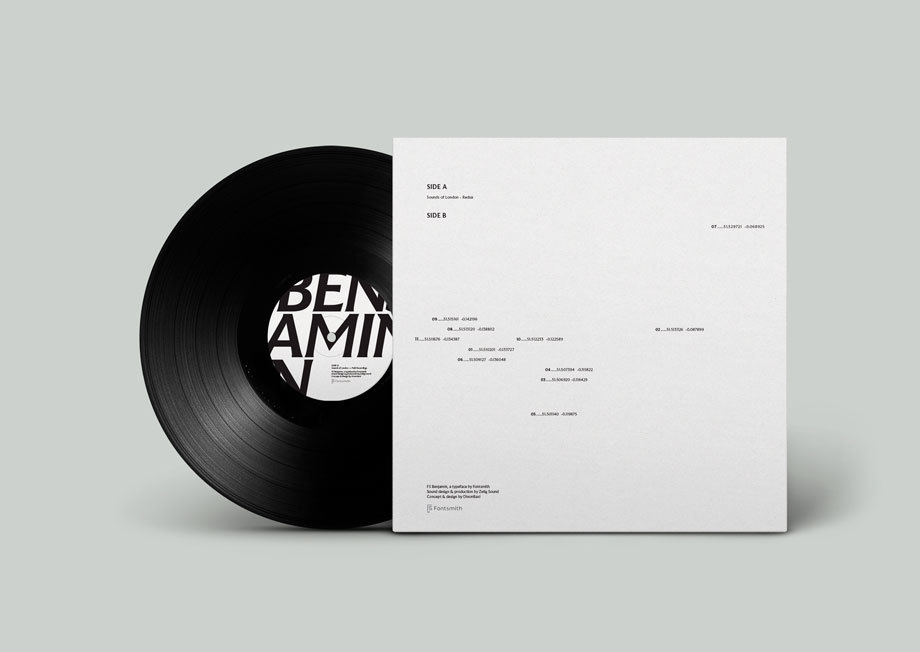
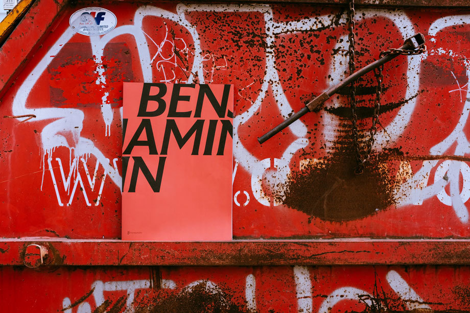
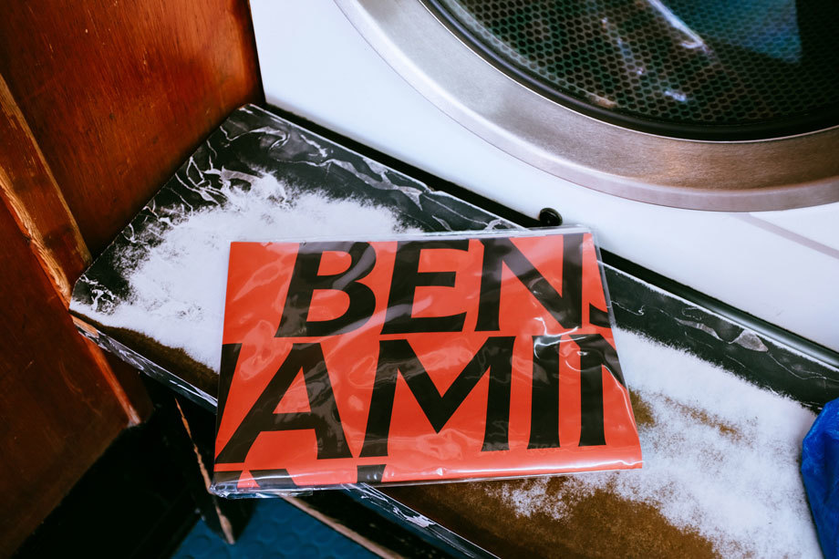
As always I did some intense research for this assignment; some of which I did before I started this assignment as part of the exercise “If the face fits”. I came across a magazine publication for a typeface called FS Benjamin that I really liked and enquired with the type foundry to see if they had any of the print copies left to send me; unfortunately they didn’t but they sent me a link to their blog to their typeface to have a look at the content on there. It was then that I researched into who Fontsmith were as I had no idea really as to what type foundries did. Here is the content they sent me for the typeface:
I really liked the modern, simplistic, catchy and witty way that they advertised their typeface in their print publication. FS Benjamin was designed around the theme of London. It was inspired by the noises, the smells, the atmosphere, the buildings and the people. The name Benjamin FS originates from the real full name of “Big Ben”. It was inspired by the contrast that there is in and around London; the old signs and old buildings juxtaposed against the modern glass architecture that now surrounds the city. I liked the idea that they had designed a typeface around something and thought that I could do similar in my own design. I started to think of things that inspired me lately or what I have a passion for.
As well as producing a print publication in the form of a magazine to promote their typeface they also collaborated with Dixon Baxi a branding company to host an evening to promote the typeface and create a playlist of sounds and music on Vinyl as part of the print publication that match the mood and feel of FS Benjamin and London. I really liked this idea; it is taking the idea further than just selling a typeface as a typeface, they are making it into an atmosphere, a mood and vibes. It is not just selling the typeface it is also selling what the typeface represents, the idea behind the type and the city behind it.
I had a lot of ideas and inspiration to draw from this!
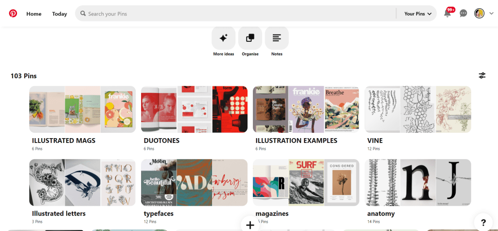
My other research came in the form of researching Pinterest. I always find Pinterest a great way to find inspiration and to be able to organise pins into sections that are easy for me to refer back to or to find. I created a new board for this assignment and then added sub sections to the board and researched into;
A lot of these sub sections shall be explained further into my post.
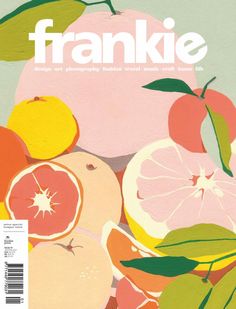
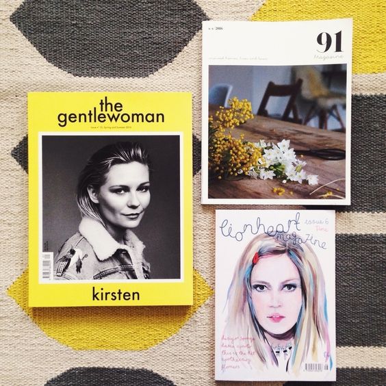
Now was the time to research into existing Art and Design magazines that already grace the shelves of fancy newsagents.
I wanted my magazine to be very simple and minimalist. I wanted it to look high quality and to be a high end magazine that would feature in a magazine shop such as Magazine Heaven. I wanted to have one main eye catching, attractive image on the cover to draw peoples attention to the magazine. In my head I could imagine it to be produced out of high quality recycled heavy weight gsm paper (ideally with a matte finish!) so these are the sort of magazines that I was researching into. My only thoughts were now how to create a magazine and a look around a typeface that I was to design…
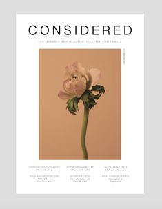
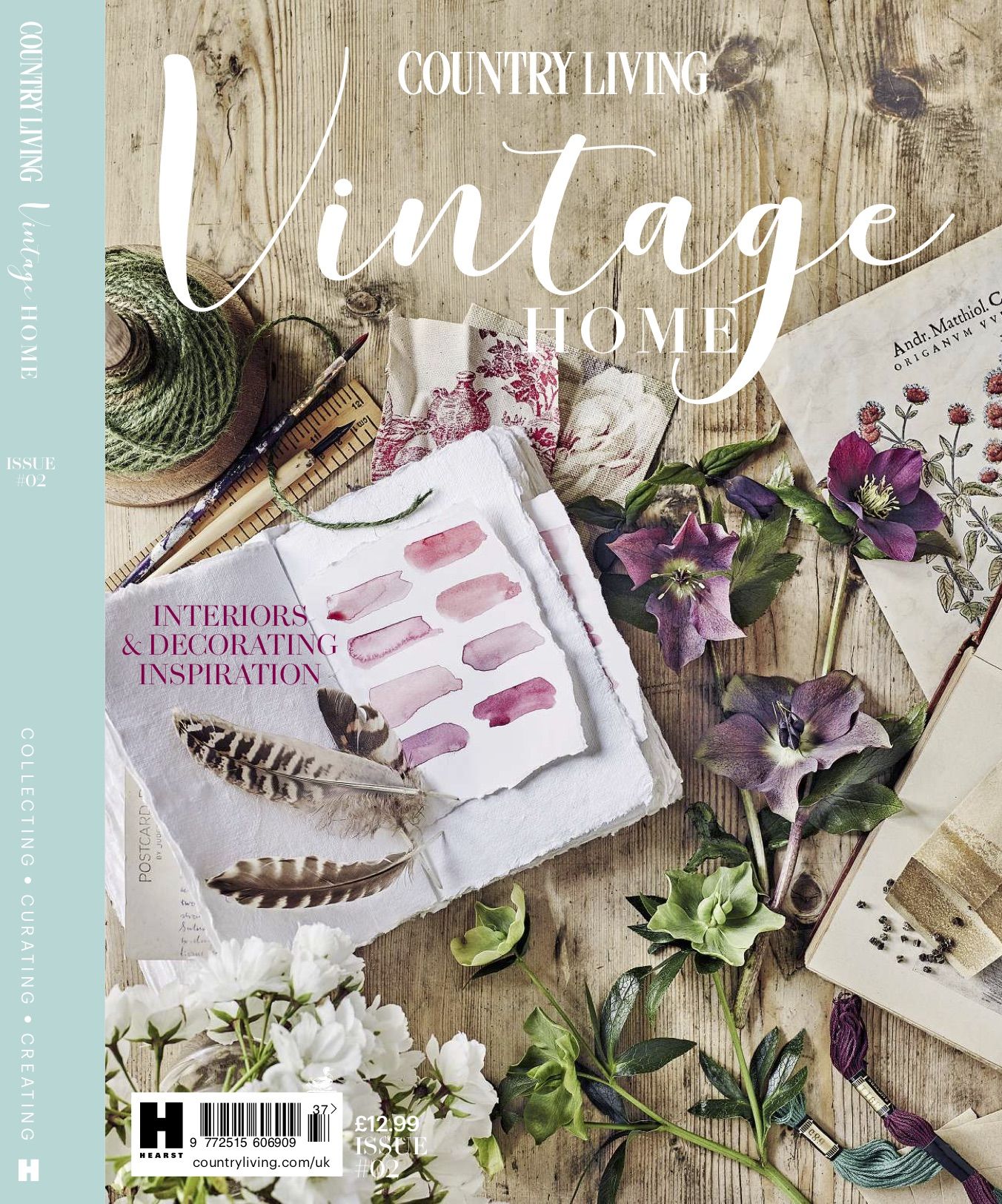
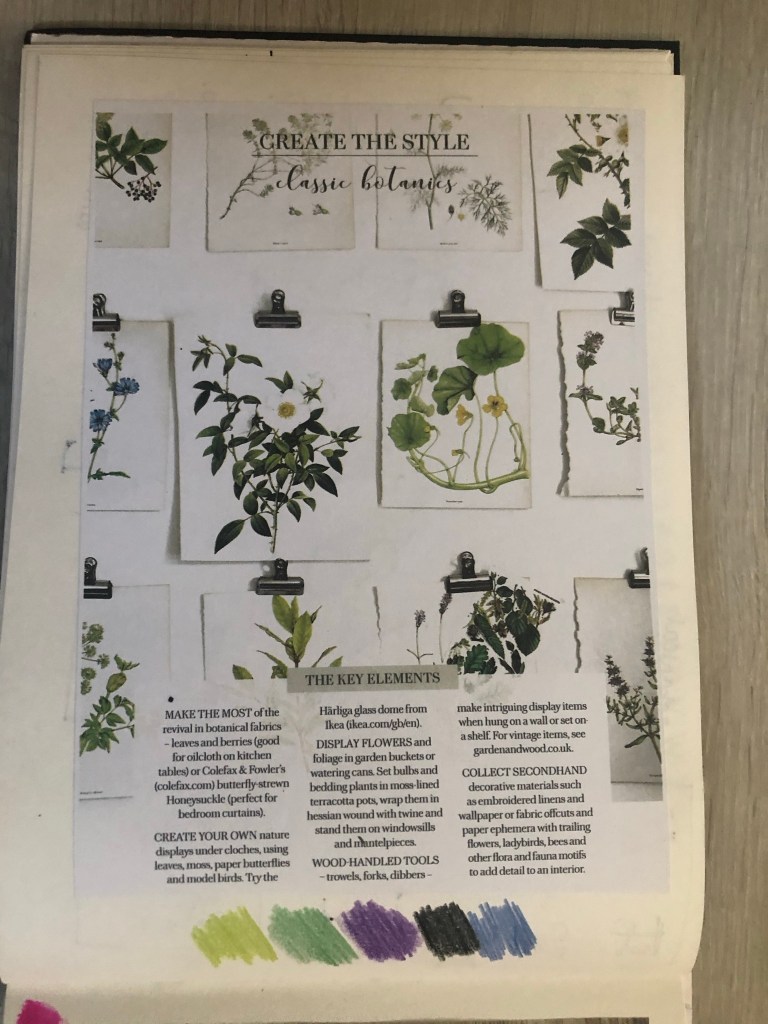
Another one of my favourite magazines of the moment is a Country Living Vintage Home magazine that I bought on a whim (for a really pricey buy of £13!!) I saw it in WHSmiths a few months ago and just really loved the look of the front cover and the Botanical section that was in there and all of the vintage drawings and finds!
For some reason at the moment I really like the Botanical trend. I like the old vintage books, the cartridge paper that some of the old botanical drawings are drawn on, I like the colours and the ink drawn drawings and I like the feminine, old fashioned book typefaces that are used in the vintage plant specimen books. I had to buy this magazine just to draw inspiration from or just to look at every time I feel uninspired! – That is exactly what I did when I started ideas for this assignment. I looked at the book and knew I wanted to create a typeface based around the botanical influence whilst taking inspiration from timeless, old fashioned typefaces that appear on those old plant specimen books.
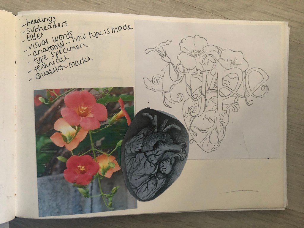
Another factor which makes the botanical theme perfect to use in my designs and type is that my article in my magazine has to be based on the anatomy of type; anatomy relates to plant anatomy and also human anatomy. I could use the type anatomy as a simile for plant or human anatomy. I did some dark, anatomy style art for my Time Machine book designs and had the idea that I could do similar for this.
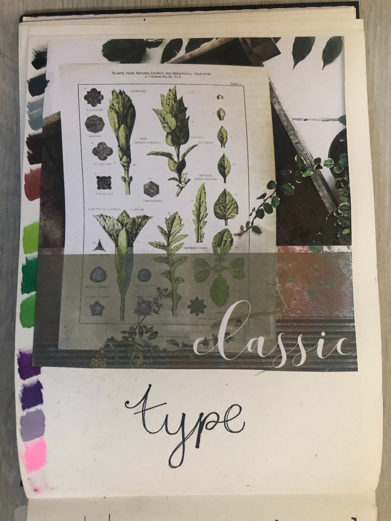
I felt like Baskerville or Mrs Eaves was the ideal typeface to match the botanical theme I was aiming for. Even though Mrs Eaves is not a vintage typeface it is based around Baskerville which is. It was also designed for use in book design. I also really love the intricate, ornate ligatures of Mrs Eaves, I wanted to try and recreate that with my own typeface. I have a pretty style of hand lettering so I figured I would use that but add in inspiration from Mrs Eaves and Baskerville.
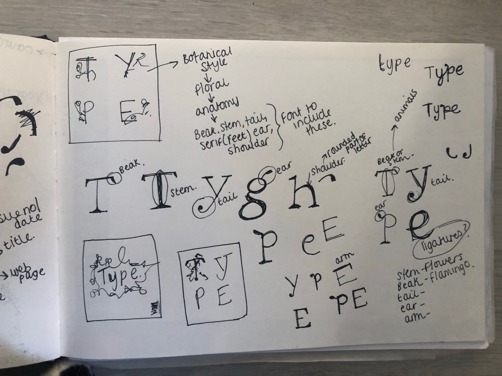
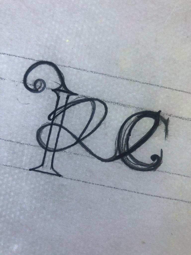
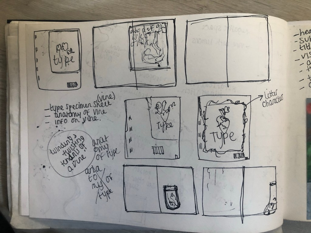
I started off with drawing some rough sketches of the different parts of a typeface and some different styles that I could explore. I particularly liked the PE ligature that I sketched. This gave me ideas for the rest of the typeface.
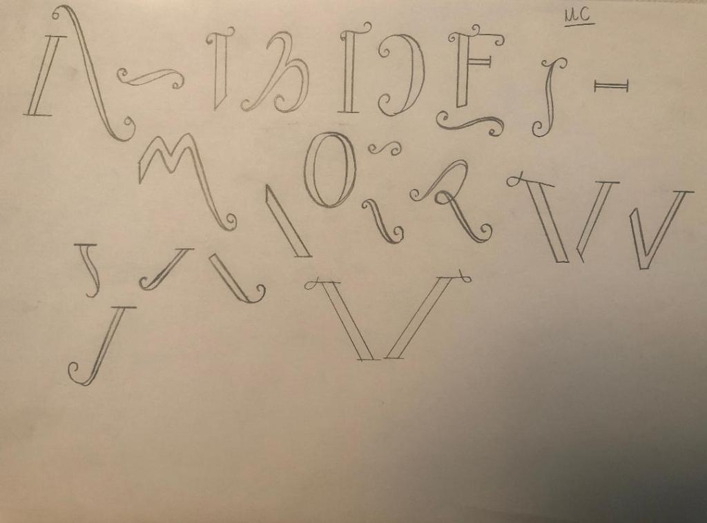
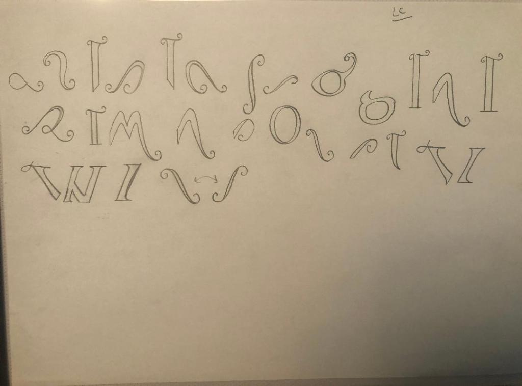
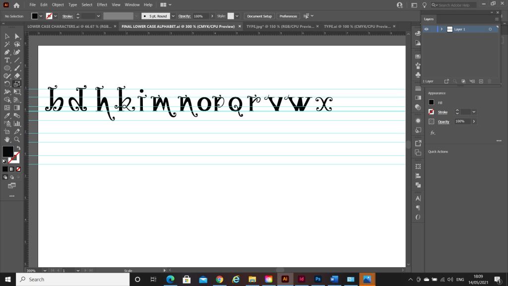
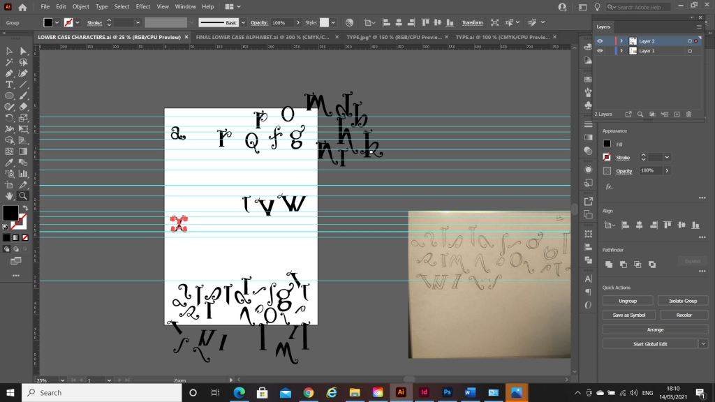
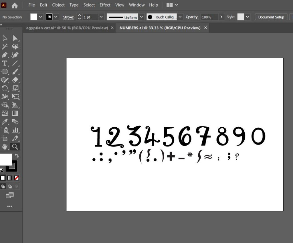
I used a specimen sheet of Baskerville from a previous exercise (A typographic jigsaw puzzle) where the typeface was dissected into all its parts to piece back together again. I figured that I could use this as a base to design my own typeface from. It gave me ideas of how to design my typeface, I knew I would have to design it all as completely separate parts (dissected) and then piece the letters together from the parts. Once I designed certain parts of the letters; such as the stem, I realised I could then use them again in other letters, e.g. I could use the stem I designed on all lowercase letters such as b,d,h,l but also use it again on the uppercase characters like D,T,H,F,E etc.. The bowl on the b could also be used on the d.
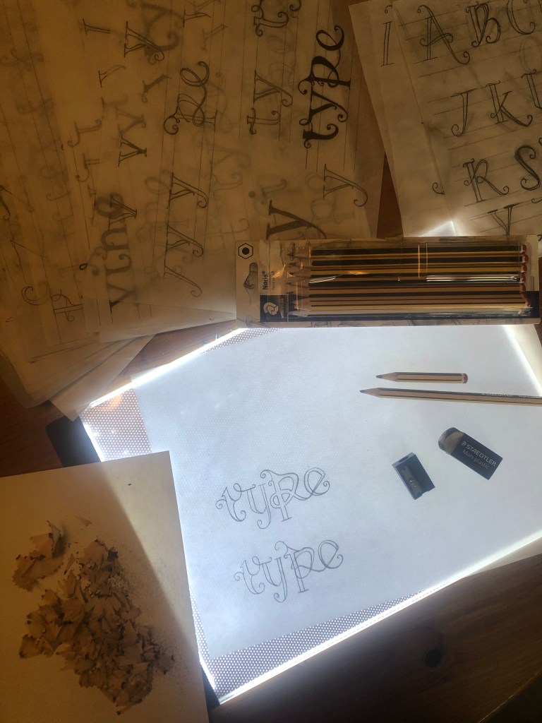
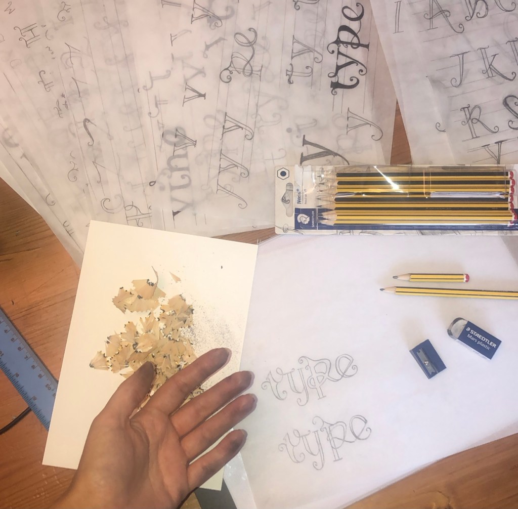
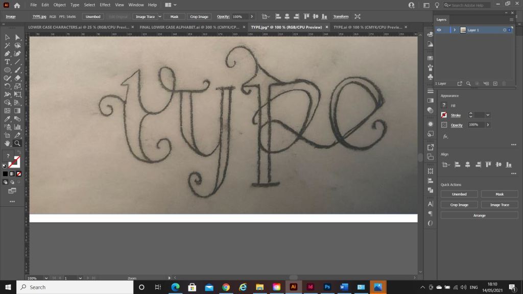
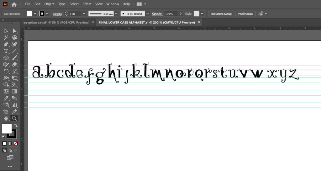
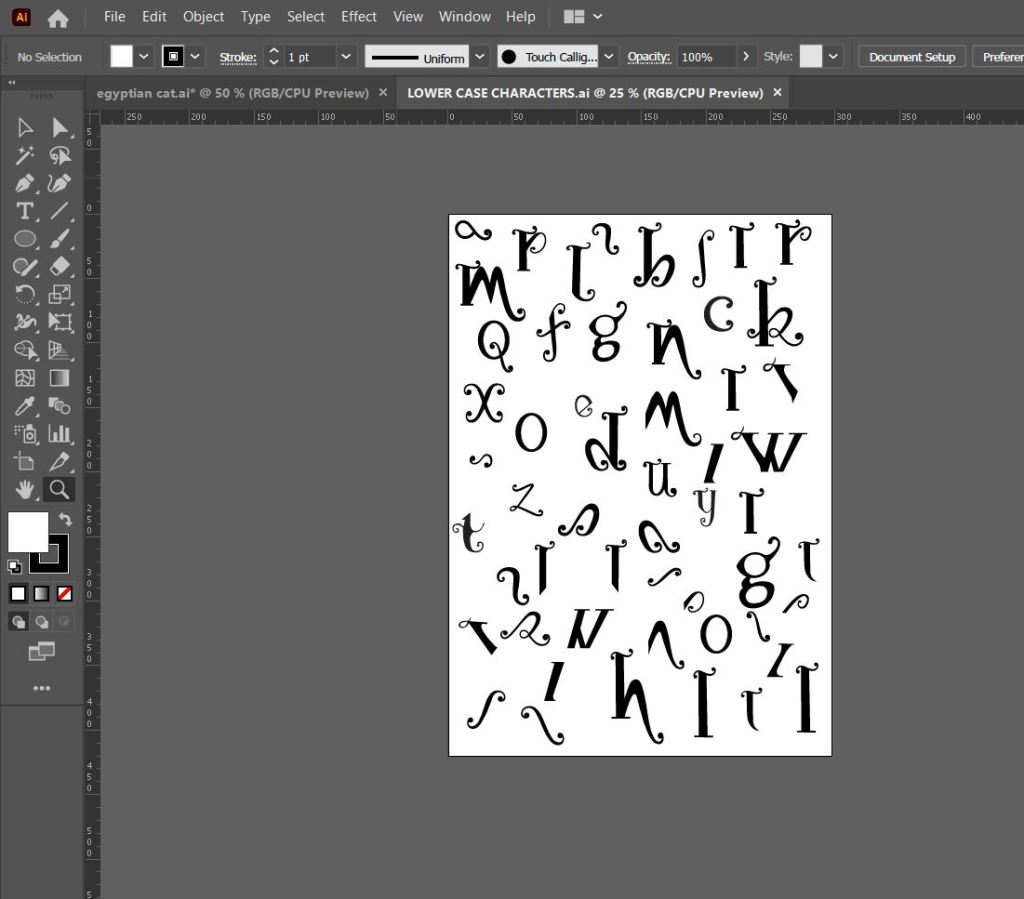
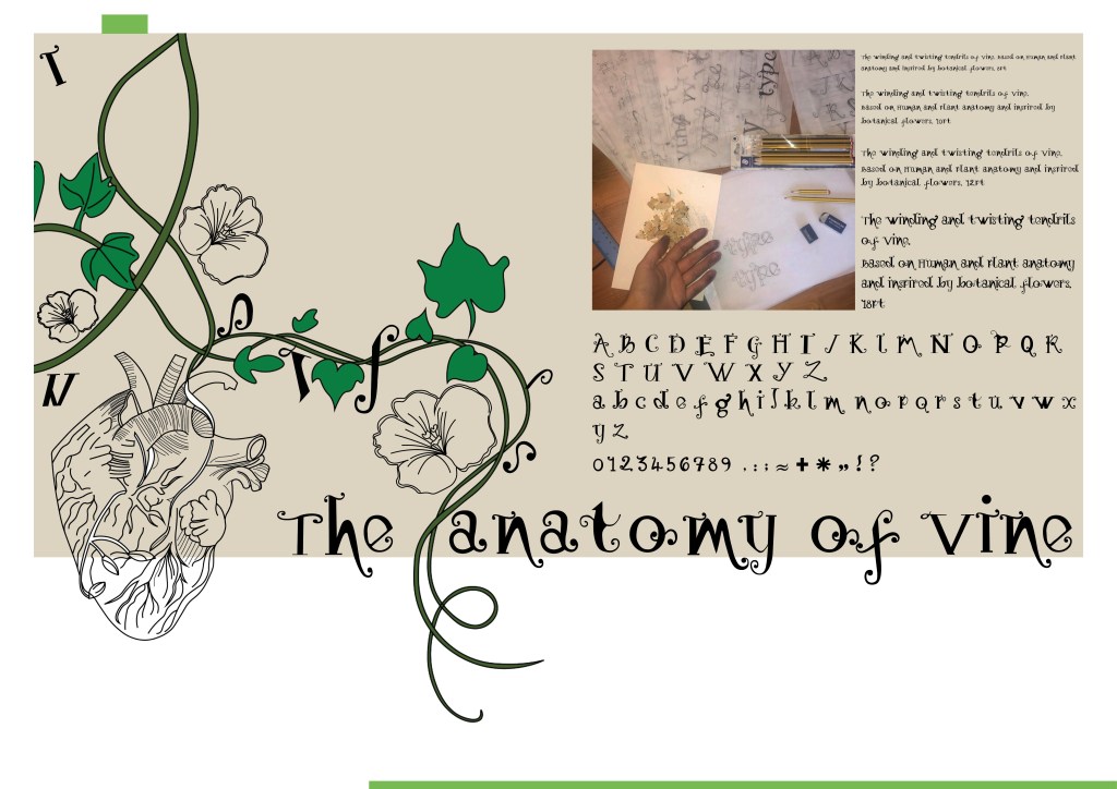
What happened next was that I spent endless hours with a pack of tracing paper, armed with erasers and a whole pack of HB pencils and I sketched out my upper and lower case alphabet for my typeface. Before I mastered the full alphabet though, I drew out “Type” first as this needed to be perfect as this is the focal point of my whole magazine.
Once I perfected “Type” I then created the rest of the alphabet- lowercase, uppercase, numbers and symbols.
The sheet above are the parts I created that would make up all of the uppercase letters and alphabet.
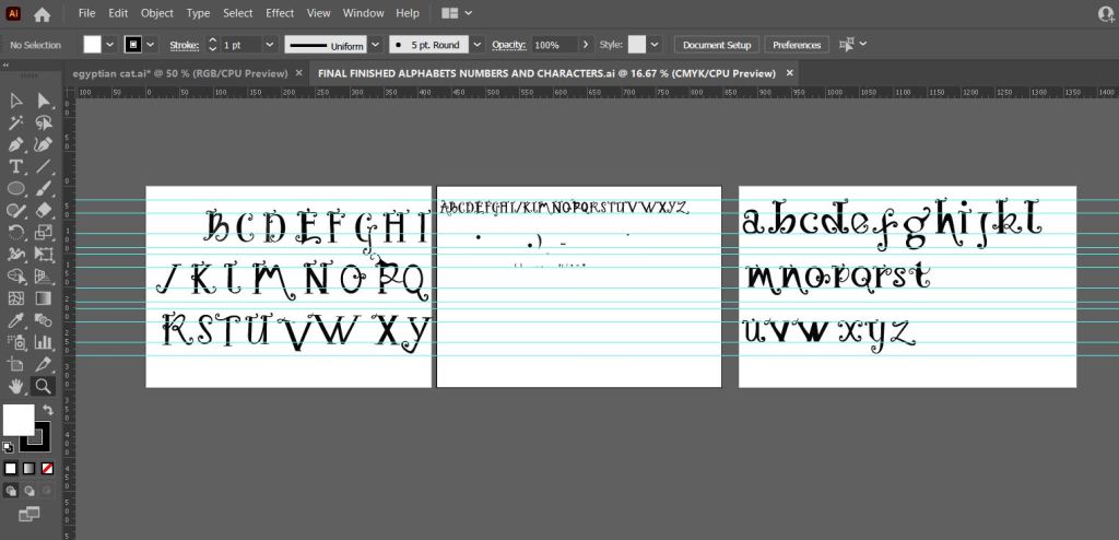
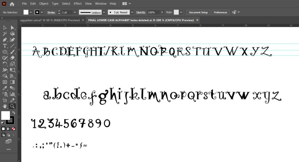
This is how my letters turned out. It looks very Avante Garde and reminds me of Biba! It also looks like a Led Zeppelin Stairway to Heaven poster I used to have in my house. Clearly without knowing it I have some 1970s influences!
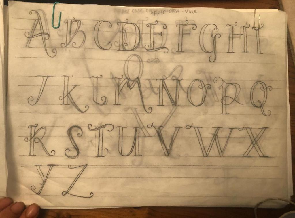
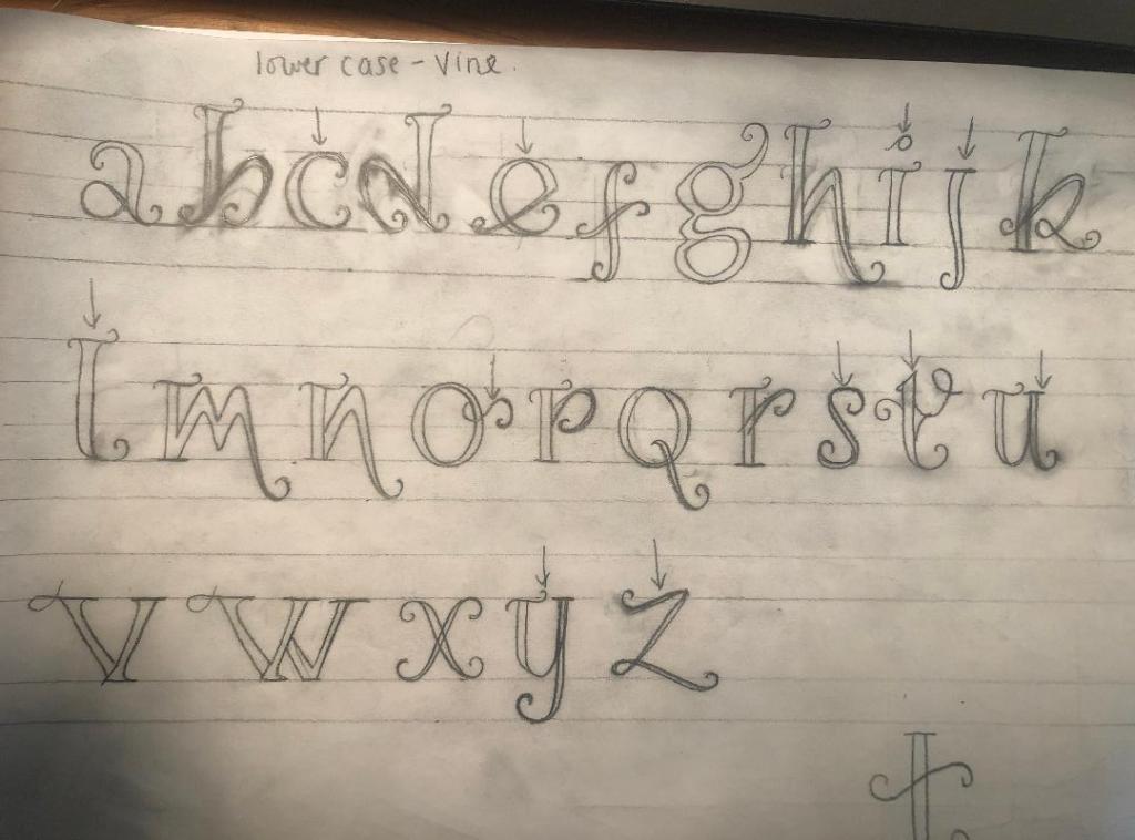
The sheet above are the parts that make up the lowercase letters and eventual lower case alphabet.
Above is the final lowercase alphabet! I actually quite like the b and d. Again, I am feeling a 1970’s vibe with this!
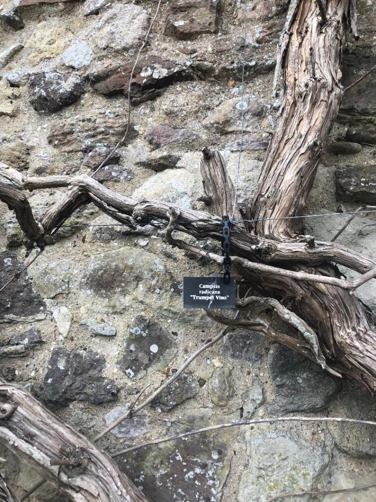
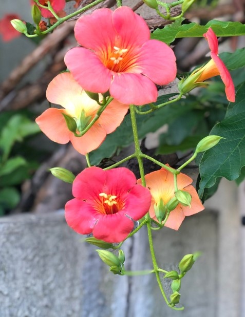
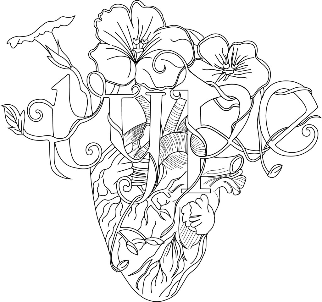
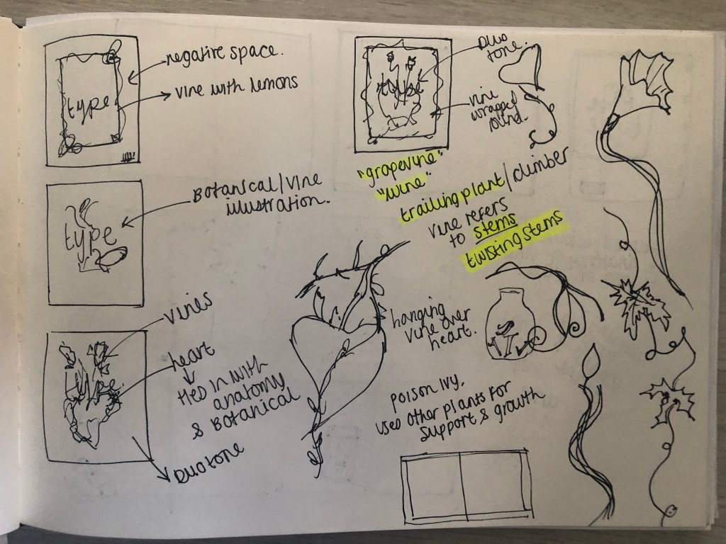
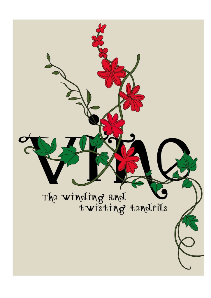
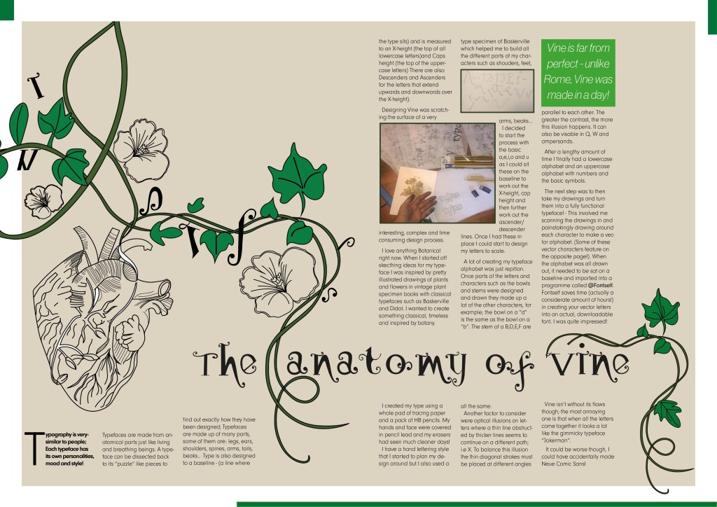
I needed a name for my typeface and asked my boyfriend Chris for any ideas, he actually came up with the name I used for it – Vine! In his opinion it looks like a vine with all the twists and twirls and to be honest it tied in perfectly with the plant botanical influence I wanted to use. I had also visited Beaulieu Estate whilst doing this assignment and there was a trumpet Vine there that I took a photo of as inspiration and to potentially use in my magazine design.
The trumpet Vine at Beaulieu
Digital Development
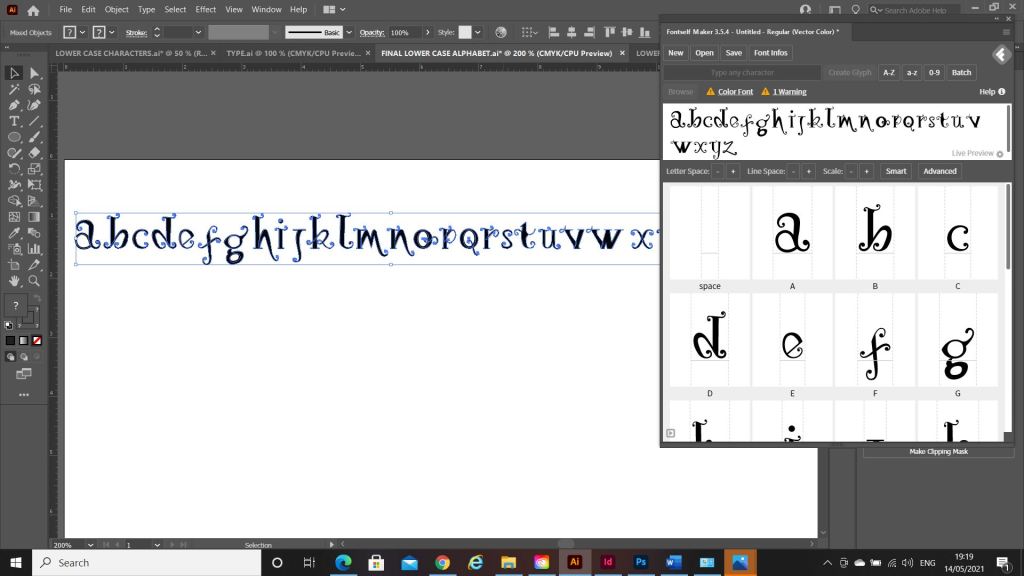
The next stage was a painstakingly long one! I had to take my drawings of Vine and draw them in Illustrator and turn it into Vector lettering to eventually import into a programme I bought called Fontself which turns your vector lettering into an actual font! How exciting!!
Eventually I drew out all the parts of the letters and pieced them together to form my letters. I then imported them into Photoshop to measure them out on a baseline and to an X-height and Cap height etc..
I mentioned earlier that I bought and used Fontself to create my typeface. I downloaded it from their website and then it is opened up in Photoshop where you can drag your letters into the programme directly from Photoshop to create your font!
When the typeface has been made by Fontself it can then be downloaded as an actual font!
The only downside to my font is that it actually looks like the gimmicky, tacky font called Jokerman! I did watch a YouTube video on how to use Fontself though by Chris Do and he did seem to design a version of Comic Sans so it could always be worse! Also, because I did not spend as much time as I would have liked creating the typeface the sizes all came out wrong from my hand drawn baseline. That is why letters such as the J sit way too high. It takes years and years to perfect a typeface though so I am pretty pleased with the one I have created and also it has given me an idea of how type is created! Even if I have done it in an amateur way, I have gone through the correct process of designing a typeface. I did read about optical illusions after I had created this though and wished I had created the X differently. Where a thin line is obstructed by thicker lines they seem to continue on a different path; i.e the X. To balance this illusion the thin diagonal strokes must be placed at different angles parallel to each other. The greater the contrast, the more this illusion happens. It can also be visible in Q, W and ampersands. I would definitely have another go at designing a typeface however, maybe when I have more time though and deadlines are not looming!
My next step was to figure out how to turn my title into a beautiful magazine cover!
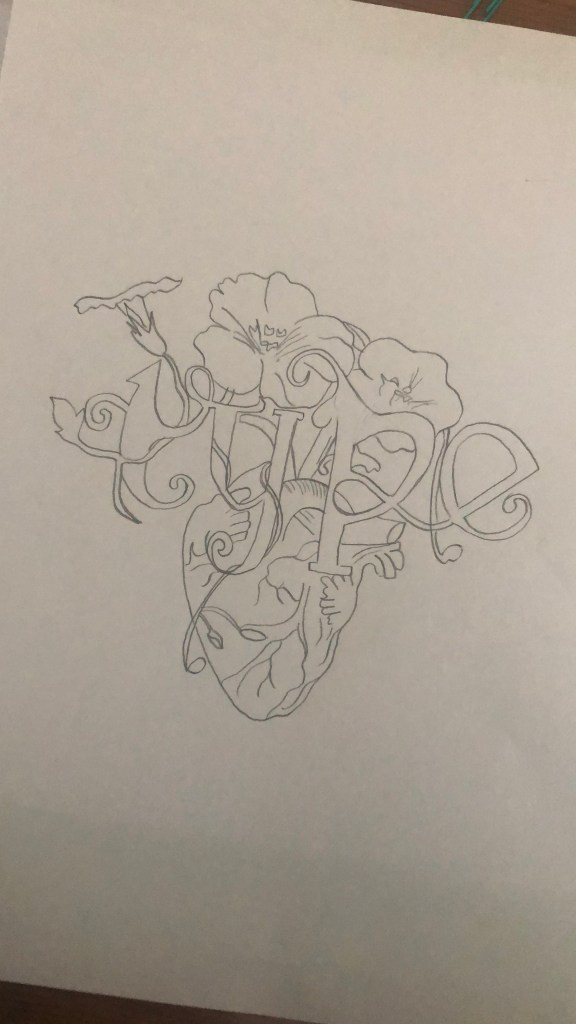
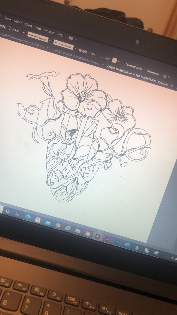
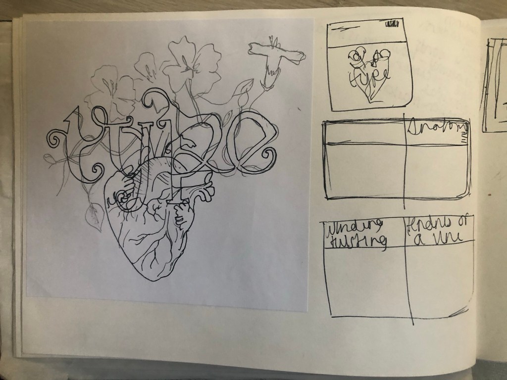
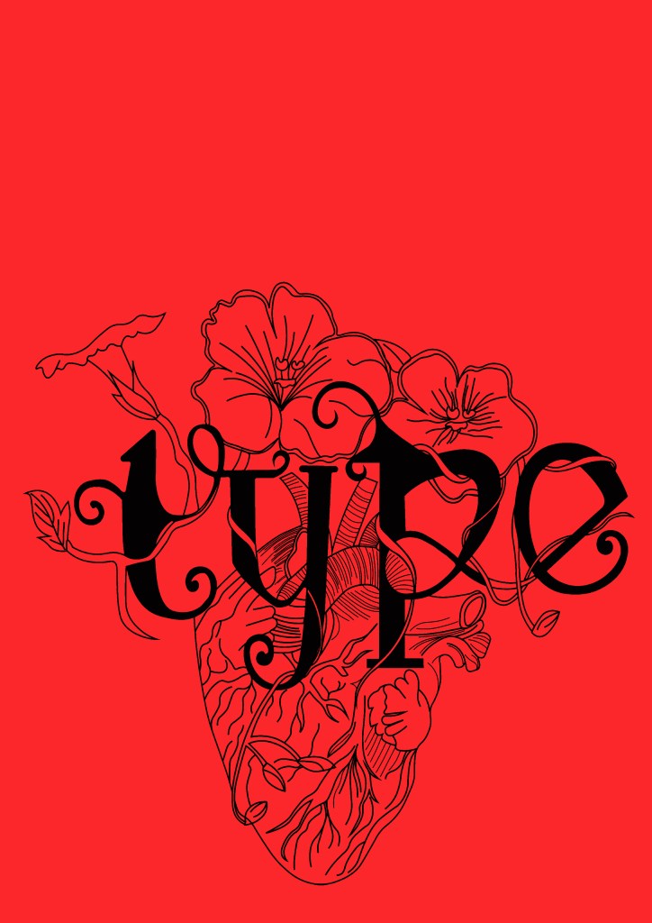
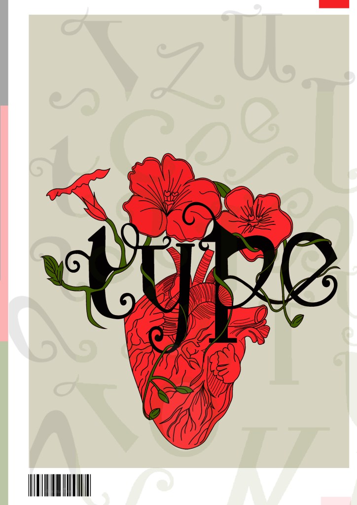
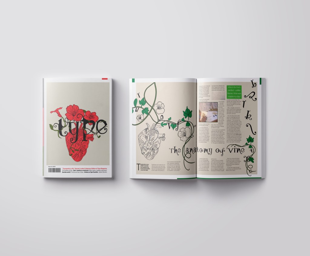
I already mentioned how I had the idea to use a drawing as the main image for my magazine cover; similar to what I achieved with my HG Wells titles that I did earlier in the course. I had the idea to create an anatomical design which links to the anatomy of type but is also similar to plant and human anatomy. Whatever design I chose to do would also have to relate back to Vine also.
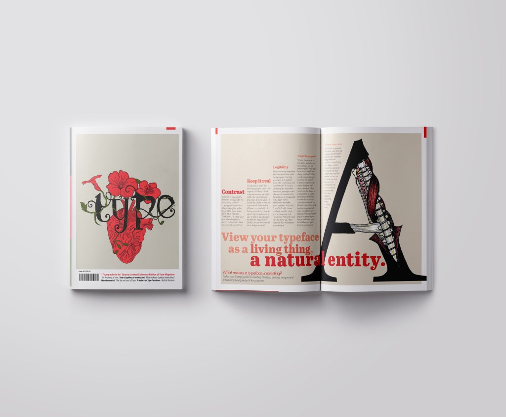
This is the design I came up with; very similar to the art I did for one of my HG Wells covers, in fact I used the drawing of the heart I used for that in this. The heart relates back to the human anatomy and the vine that is wrapped around the heart and the type represents the fact that it is also living in the same way. I also googled vine flowers and it came back with Red flowers which matched the colour scheme I was going after.
The heart I used in my HG Wells covers
Once I had drawn it up, it really did look like a good piece of vector art!
As much as I love Black and White line drawings, with vector art it just doesn’t look as good. I had the idea to do Duotones on this but none of the colour schemes I came out with really worked. I decided in the end to colour it in. Once I had it coloured it in, it gave me once again Avant Garde vibes.. like the sort of illustration you would have found on a 1920s postcard or in an illustrated Victorian style flower book. Either way, I liked it!
Now was the time to start designing the magazine cover!
Designing the magazine cover
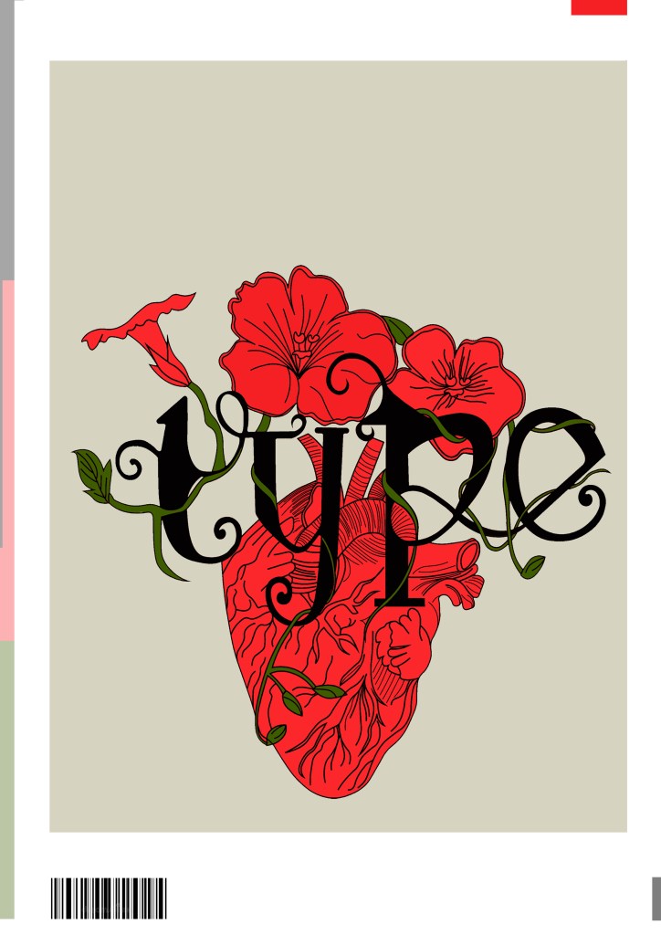
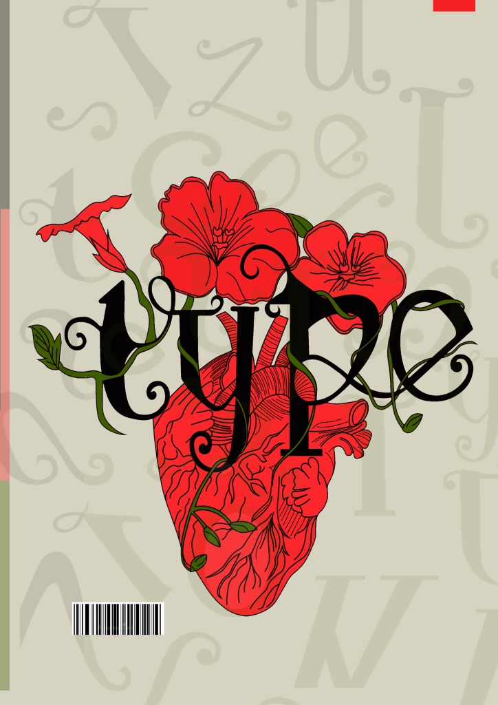
I wanted a cover with lots of negative space, to look minimalistic and to be instantly eye catching and bold to look at and these were the final contenders for my front covers. I really struggled to choose between the middle one I went with and the bottom one with the parts of the letters in the background. Everyone I asked chose the bottom design, but in the end I thought the simple plain background worked better and didn’t take the attention away from the main image. It felt like the bottom one was trying to hard to compete against itself. I did ask one of my colleagues at work (she is a Textiles teacher) and she said when she saw it, it reminded her of one of the matte expensive magazines you buy from fancy exhibitions and museums! BOOM! I met my own expectations! ;p
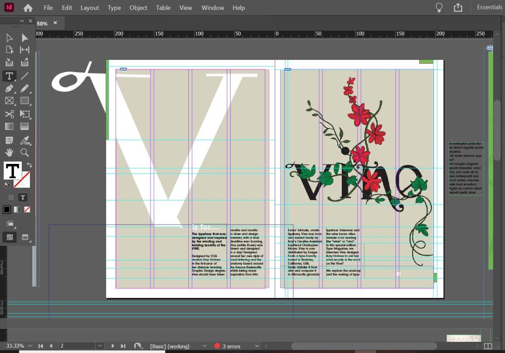
I created the illustration in Illustrator and then exported it as a PNG with a transparent background so that I could import it into InDesign and change the colour background to whatever I wanted. I worked to a 4 column grid. The typefaces I used along the bottom of the magazine were Helvetica, Meta condensed Bold and Meta condensed book italic. They all work well together and bring contrast to the layout.
Designing the introductory pages
On pages 2-3 I really wanted to give an introduction on what I was going to write about rather than going straight into the article. The brief specified that I must mention the anatomy of type and write about what I have learned from how type is designed. I decided to put a twist on it and write about how I made my own typeface; I had the idea to do “The anatomy of Vine” an article telling the reader the process involved with making Vine. I would put a spin on it and make out the magazine was interviewing the designer (which would be me). To do this though it meant that I needed to keep a similar layout and theme to the front cover. I would also need to showcase my font- Vine. This particular article would be more like a type foundries publication that they would produce when they were promoting one of their typefaces (just like FS Benjamin). With this idea in mind I then created the next phase of my magazine design and drew an illustration to represent Vine.
My printer ran out of ink! (above!)
I then did exactly the same as before and turned my art into vector art. I did not need to draw around the text though as that is now an installed, useable font! ;D
I really toyed once again with which version to go with. I really liked the contrast in colour against the bottom grey and the top left bright green and really did think that the green would have been a better option to choose because of this, but then I decided to keep the pages in repetition with the front cover and went with the grey.
I wanted my illustration to fill the whole right hand page and then have an intro on the left. The introduction is basically a blurb which says that Type Magazine is interviewing the designer of Vine and is exploring the anatomy of type. I wanted to keep negative space and not have the pages crammed full of information. I wanted to keep the clarity and cleanliness. I decided to use an enlarged V (In Vine typeface) for the left hand side and then sticking to the same 4 column grid I placed my introductory text in the 4 columns along the bottom. I made sure that the text was aligned to the baseline grid so that the text aligned along the bottom. The green boxes along the edge are just to bring some contrast ad colour into the design.
Designing the Anatomy of Type (Vine) article
I am not going to lie.. I pretty much winged this part of the assignment! I started from scratch in InDesign with no prior sketches, just an idea in my head and then kept on developing it from there!
These are all the versions of it that I tried out before I reached my final version (bottom right)
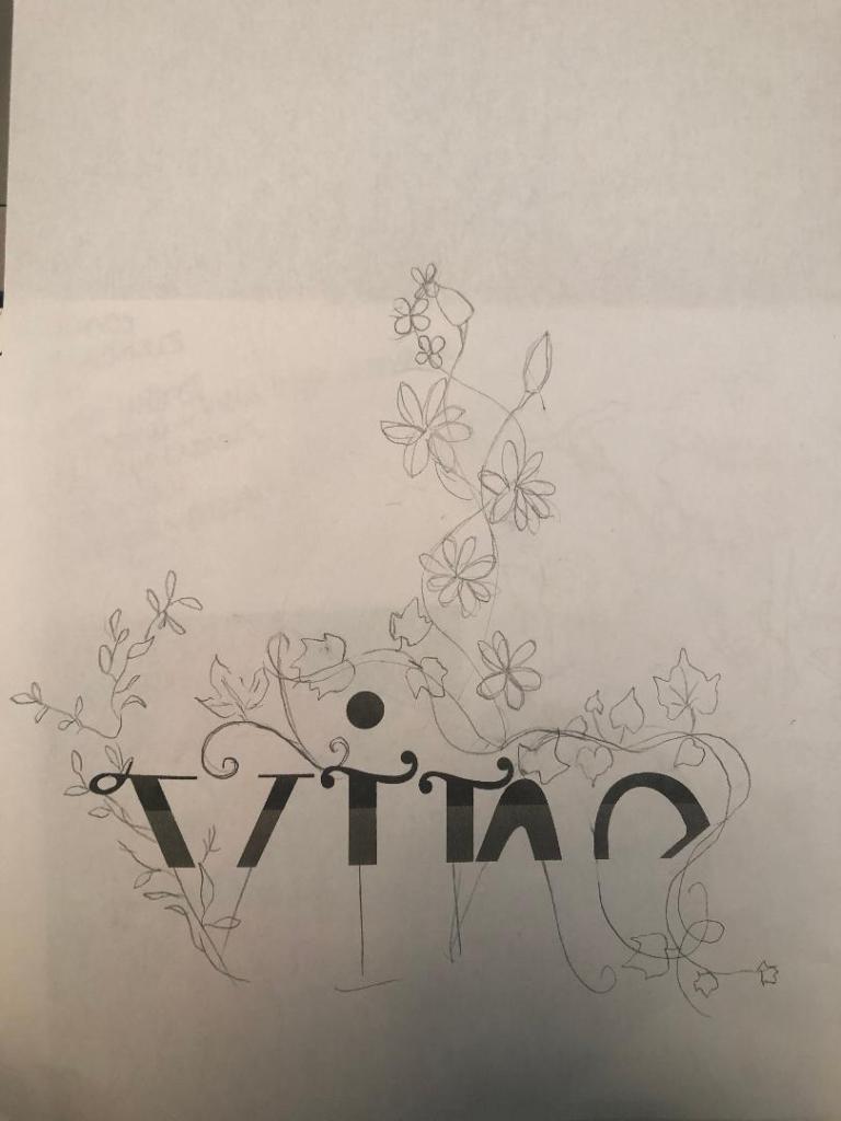
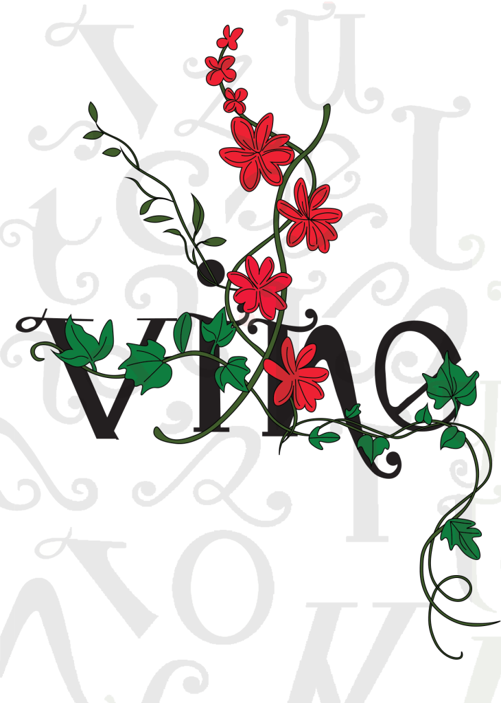
I wanted to have that illustrative element in it again to match the rest of the article so I took pieces off the illustrations I had drawn already to create a new illustration. I wanted it to also look like the Vine was alive as much as the typography so had parts of the letters growing off the vine and a heart growing from one of the branches; again, this ties in with the anatomy part.
I originally wanted the text to flow through the piece as if it were a vine; winding up the page, but with the amount of text this was impossible. The only way was to stick to a 4 column grid again and have the text flow throughout it. I used green at certain points in the design for contrast and that “pop” of colour. I used a pull quote in a green box to separate the text up and I used some photographs of where I designed the typeface.
Designing “What makes a typeface interesting?” article
I also designed this article slightly differently.. I also winged this and developed it as I went along! One thing I knew though was that I did not want to use the heading “What makes a typeface interesting?” I googled exactly what does make a typeface interesting and it came up with 5 points:
Contrast
Originality
Legibility
What is the purpose
It’s more than a font
These points made perfect sense to me and I easily wrote up an article stating what was important about all of these facts and how they helped to make great type!
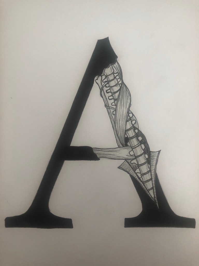
I did however read a good quote – “View your typeface as a living being, a natural entity” oohh it felt deep! I loved it! It tied in again with how I was trying to liken type to human and plant anatomy. I searched Pinterest for “Type anatomy” and there were images of type being torn apart to reveal bones and muscles. I loved this idea! I drew my own version of it on a letter A. I would use this as the main image for that article!
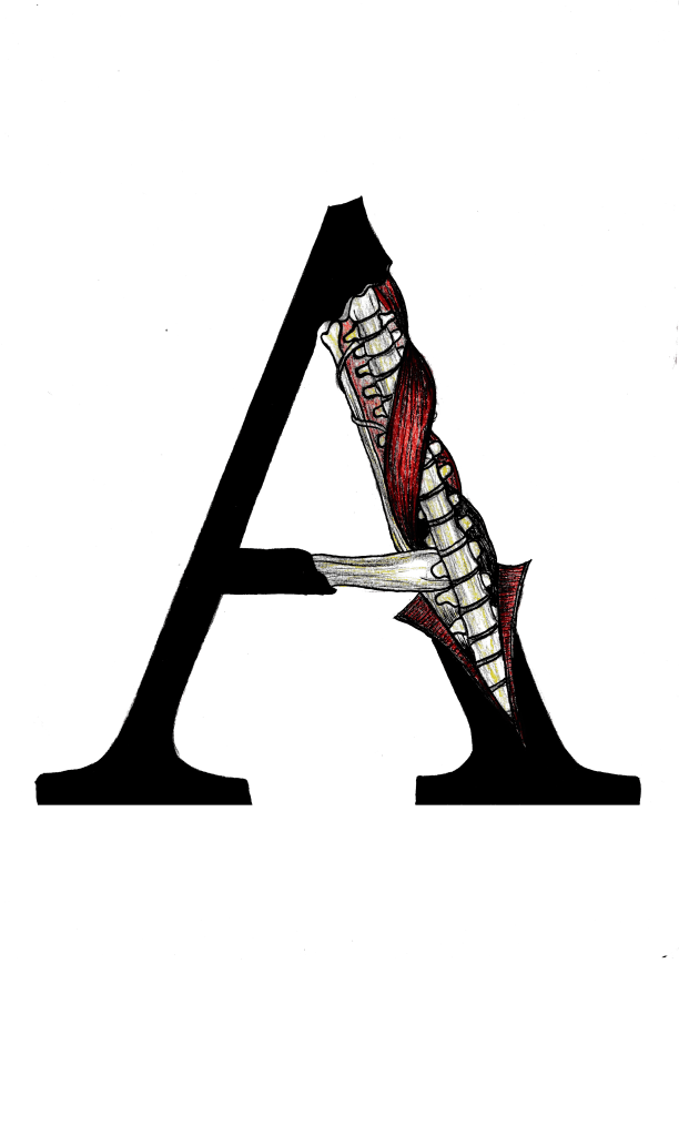
I drew the first version in Black and White and scanned it in and then went back to the original and added colour just so I had two versions I could choose from. Eventually I decided that the colour one was the best and I imported it into Photoshop to tweak and adjust the levels and colours etc.
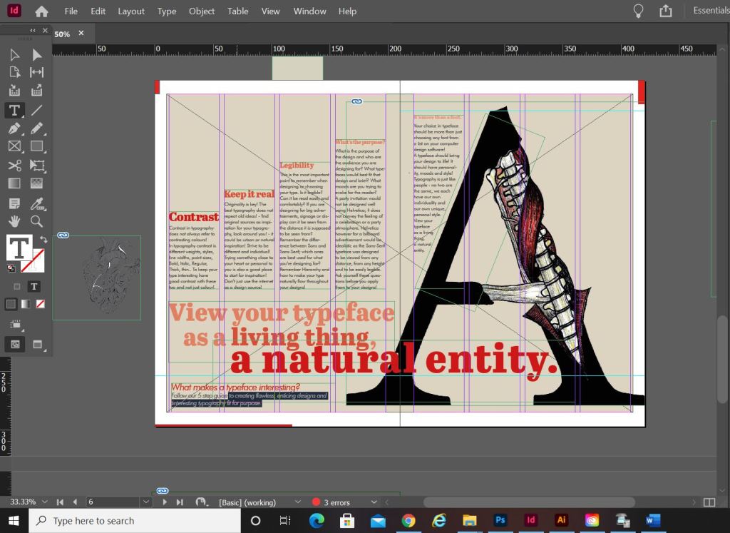
I am actually quite pleased with how this double page spread turned out. I did worry for it at the beginning because I just could not get the sizing of the “A” right or get the heading to look right. In the end it worked out better when I broke the heading up into different point sizes and lowered the opacity on parts of the type. I used the quote that I found as a main heading; I felt like that would draw attention more and add more curiosity to the article than directly saying what the article is about. I kept the same 4 column grid layout but decided to place the text slightly differently; I placed the text in an upwards direction to resemble evolution. To add more depth and for that element of contrast I also used different point sizes and changed the opacity for the headings as they moved upwards.
The typefaces that I used for this layout were;
Abril Titling for the main heading
Futura light for the main body text
Futura light Italic for the sub heading along the bottom
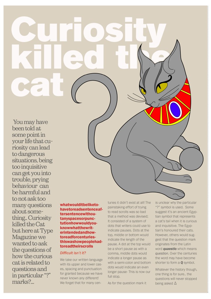
Designing “Question marks” article
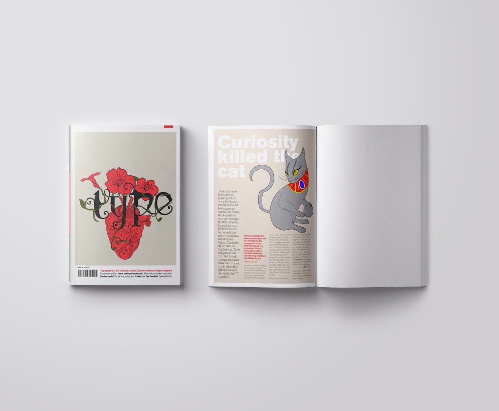
This is the section of the brief that really confused me. I was actually wondering whether it was a trick question and the answer was so simple that It was staring me in the face! However, I had a snoop at fellow students work and it seems that none of them were any the wiser! The only answer that I could think of was that the brief was asking for a history of the question mark… I mean, who did come up with that for a symbol? a squiggly weird shape! – this is where I got the idea for my final page!..
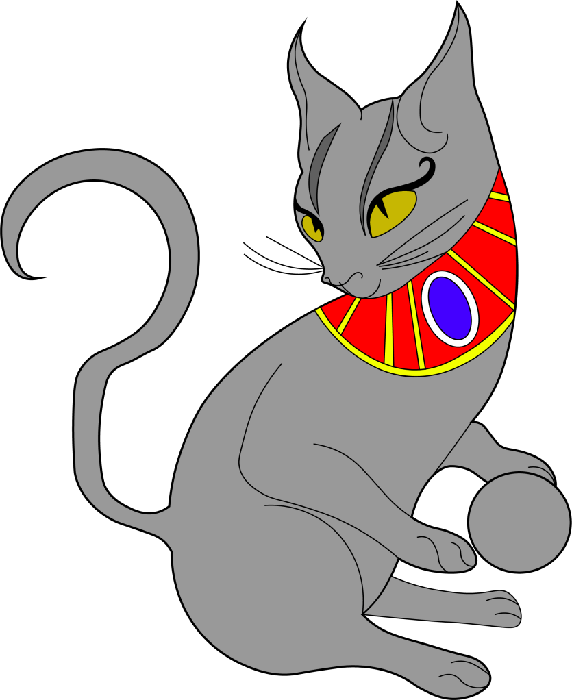
I searched on Google and found the above link, that explained to me that the question mark was possibly invented at the time of the Egyptians and the design of the question mark based on a cats curly tail! Well!.. I have heard things that make less sense! -With this in mind I thought about drawing an illustration of an Egyptian cat to use on my design and make its tail in the shape of a question mark. It also made me think of the quote “Curiosity killed the cat” – this is also where a person is curious for answers!!
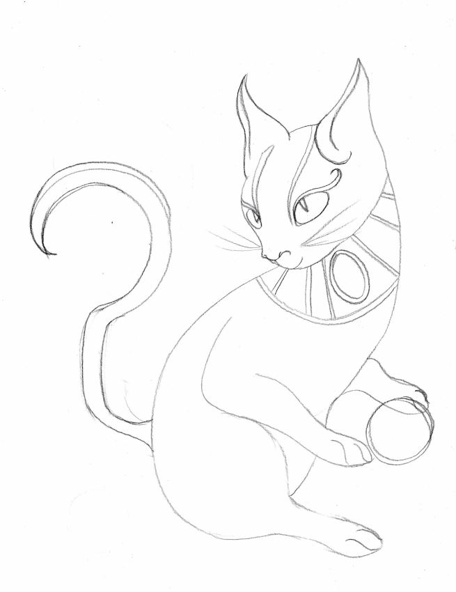
This is the drawing I ended up with! In his/her paws is a ball which makes up the lower point of the question mark on his tail! Again, I went into Illustrator and drew him/her in vector!
It was then time to work on the final page. I decided to make the final page a single page because I really did not think I would have that much information on the question mark to fill a whole double page spread.. plus also I am aware that the brief states “short” article and mine currently are like essays! :S (I wanted to get the layouts right though and not cram the information all on a double page spread!)
The typefaces I used for this page were:
Berthold Akzidenz Grotesk – the main heading
Sutro Light – for the side blurb (which is Egyptian designed)
Franklin Gothic Light – for the body text
I struggled with hyphenation in the left introduction blurb column.. I struggled to choose a point size that would fill the space but also stop the words from having hyphens. In the end I went along with it because I have seen magazines use hyphens and also because I did not want massive rivers between the text; I am still learning how to adjust the tracking/kerning accordingly. Changing some of the text to Red brought attention to that specific part of the article which is actually quite important to see why this article is as important as it is and also because of contrast again! It adds a pop of colour!
Conclusion
Overall I am pleased with how this assignment has turned out! When I started this typography unit I felt very scared and overwhelmed and now I can say that I have learned so much and I am feeling confident about using typography in my future designs from now on! I particularly love book and magazine design so really enjoyed this brief. I am becoming more familiar using InDesign now, again, I felt a little overwhelmed when I first started. I still need to improve on tracking/kerning etc to make sure that my type looks perfect on my layouts but that will come with further practise! I think I have met what the brief has asked of me, except I have possibly gone about it in a slightly different way.. The only thing I could have improved on was to make the articles “short” but I was too busy experimenting with how to lay everything out whilst still keeping negative space and making it interesting. I had a lot of information to fit on one double page spread!
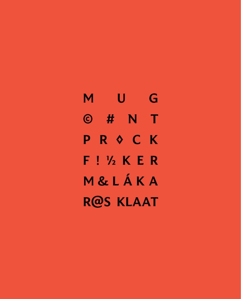
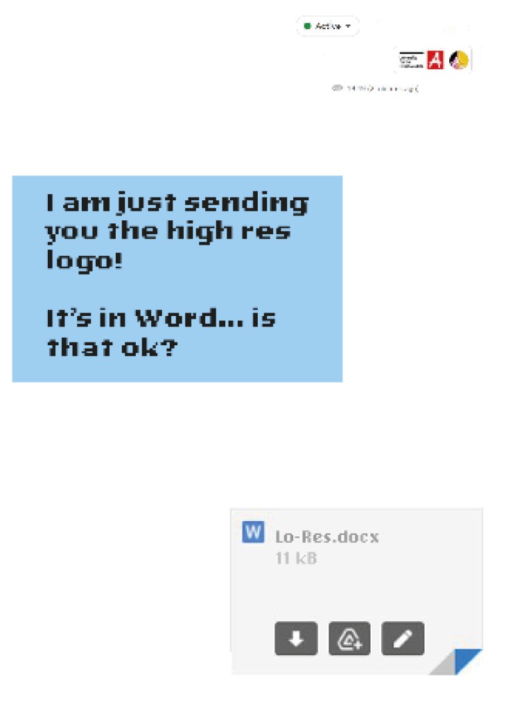
When it comes to decorative/ fun or “gimmicky” typefaces I am not very knowledgeable! In my work I mostly use Sans-Serif which is why I have made my specimen book “Sans heavy”! For this section of my specimen book I had to do my research and look into different typefaces that I could use for pixelated/fixed width fonts. I started by looking at Adobe fonts on Typekit. I found one called Lo-Res which gave me the most ideas for my design. It is also designed by Zuzana Licko which is interesting because she very successfully designed Mrs Eaves but this typeface in my opinion seems a far cry from that! I cannot say I am a fan of this typeface at all; in fact, I am not a fan of this category at all and I shall probably never use this typeface or any in this particular category ever again unless the brief directly states it! It did however still give me good ideas for my design…
I follow an Instagram account called “Designer humour” and it is full of funny memes relating to the design industry and stupid things clients ask or say, this typeface made me instantly think of one of those memes that I read;
“I am just sending you the Hi- res logo… It’s in Word is that OK?“
Lo-Res is a very pixelated, hard to read typeface and it lends itself well to the quote above! I decided to create the whole layout in the style of an email from a non-designer sending a designer their “high res” files!
Digital Development
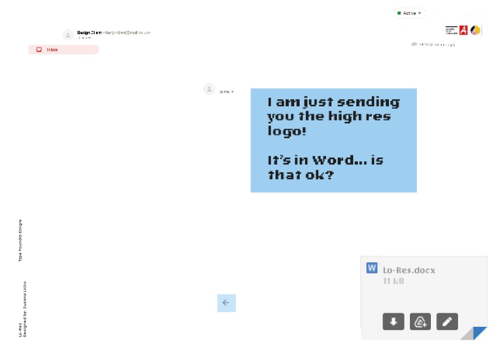
I had the idea in my head of making the whole double page spread look like the screen of a computer with the emails open and for there to be an email on there from the “non-designer” with a Microsoft Word attachment which I would then link back to Lo-Res.
I firstly needed an email with a fake Word document to then edit in Photoshop. I got my boyfriend to send me a fake email with a word attachment on it so that I could use this as a base for my design.
I deleted Chris’s name and information and replaced it with a fake name. I then started designing different layouts around this. I found that using the whole screen on my layout was too much to look at. I needed to strip it down to its bare minimum. I started to delete elements down to it’s essential to see if it made the overall design better.
Once I deleted elements it did make the overall design better.. I then decided to move around what was left on my page for better hierarchy. The eye needed to flow and skim over the content better. What I ended up with was a lot of negative space with elements thoughtfully placed across the spread. I added there are 2 main focal points on the design and that is the Word attachment and the Lo-Res quote. It needs to be clear almost straight away what the pages are all about.
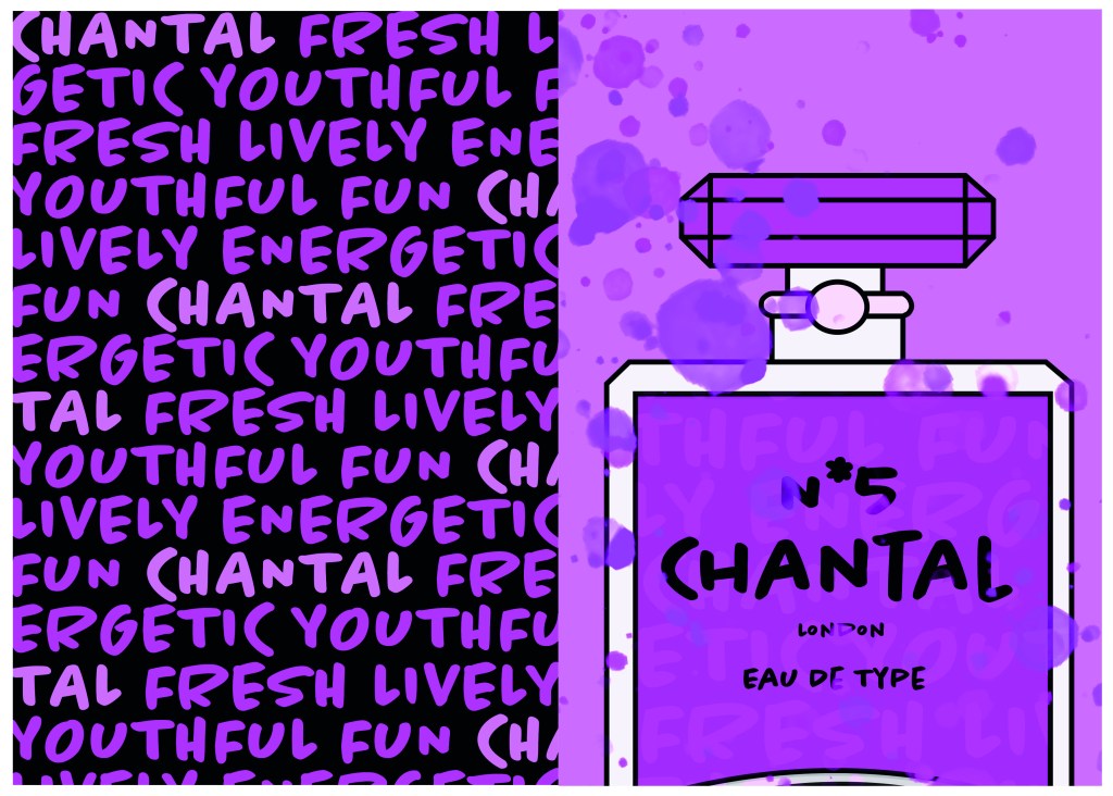
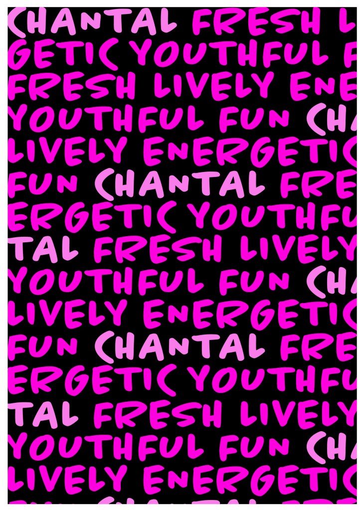
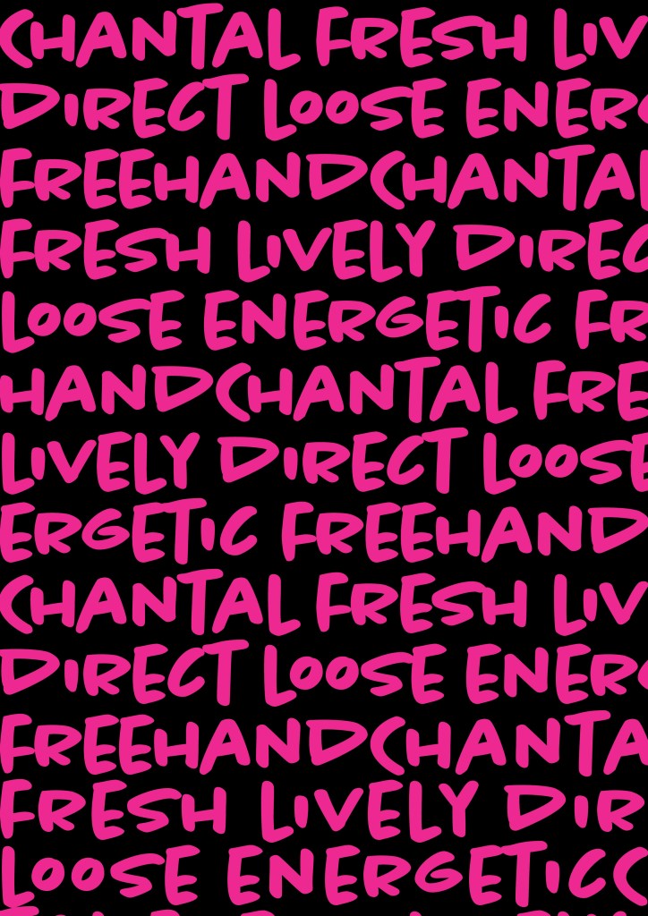
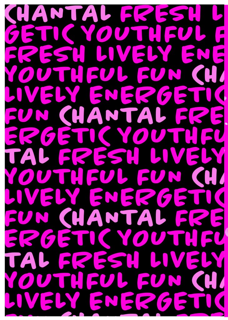
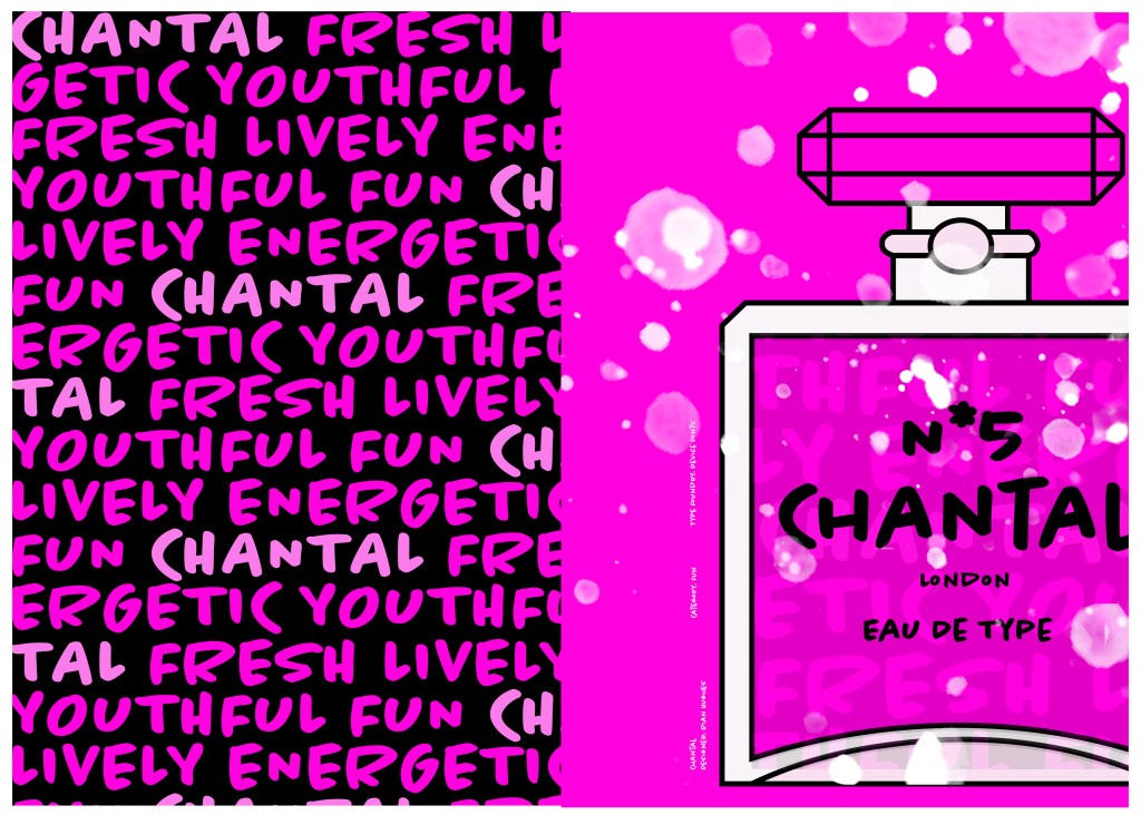
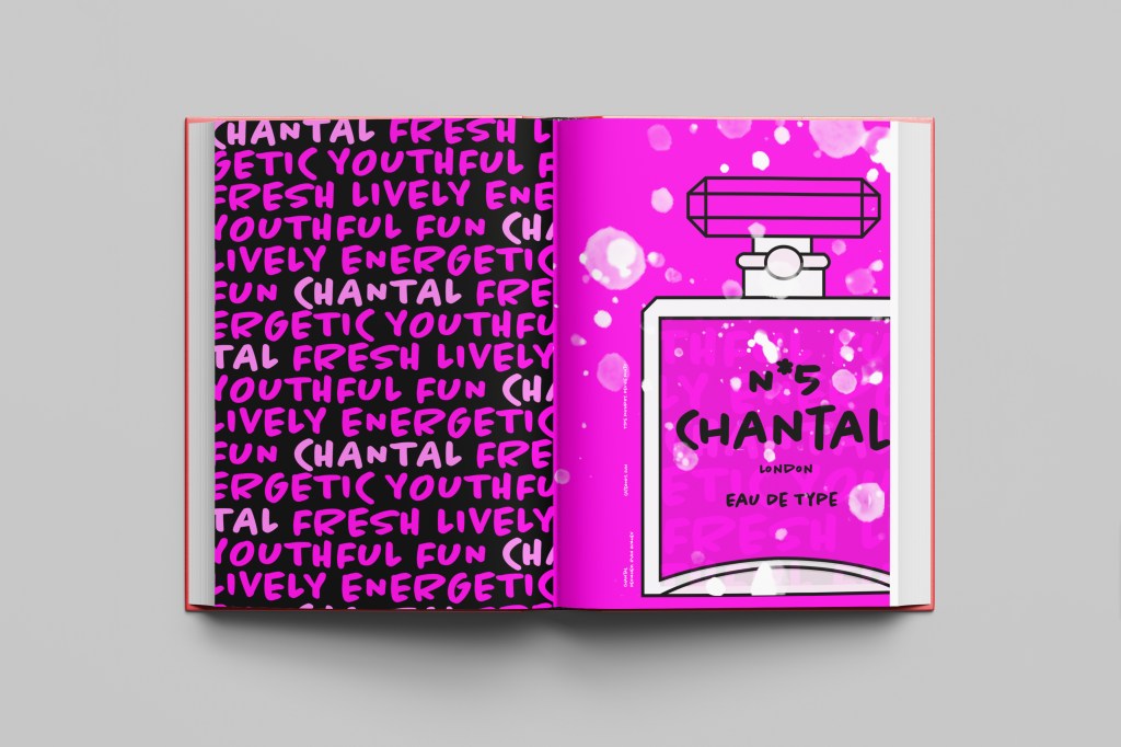
When it comes to decorative/ fun or “gimmicky” typefaces I am not very knowledgeable! In my work I mostly use Sans-Serif which is why I have made my specimen book “Sans heavy”! For this section of my specimen book I had to do my research and look into different typefaces that I could use for decorative fonts. I started by looking at Adobe fonts on Typekit. I found this one called Chantal which from first sight gave me lots of idea what I could do for the design for it in my specimen book!
Chantal was designed by Rian Hughes in England, other than the designer there is limited other information about the typeface so I designed the layout for the pages how I thought the typeface should be used and interpreted the typeface in my own way.
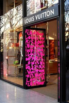
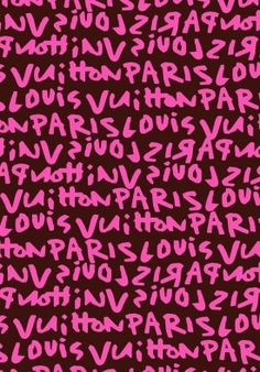
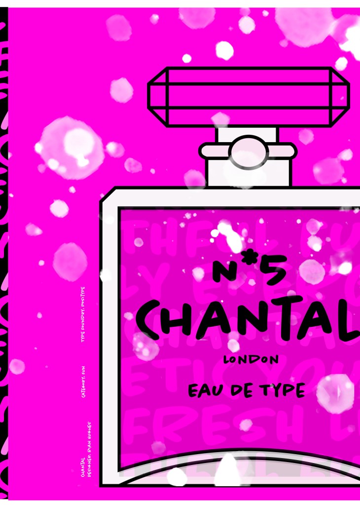
From first sight looking at Chantal it instantly made me think of a Louis Vuitton design that was used on handbags a few years back and also on some of their shop displays, I thought I could recreate a similar thing for my design. As well as reminding me of the Louis Vuitton designs it also reminded me of some Chanel bottle designs that I have seen and pinned on Pinterest, luckily Chantal is a play on words with Chanel so I chose to do a fun, gimmicky play on Chanel with Chantal!
Chantal seems to me to be a typeface that doesn’t take itself too seriously! It looks like it has a lot of fun! I really enjoyed designing these pages for Chantal, it is probably one of y favourite layouts and it is definitely a typeface I shall use in my future designs!
Images from my Pinterest account
Digital Development
I designed and created most of my design for this using Illustrator and Photoshop. I started off by designing the left side page first. The first page was inspired by the Louis Vuitton design and I had the vision of the first page filled with pure type. I typed out my text how I wanted it (I used the words Fresh, energetic, youthful, fun and lively as this is how the typeface was described on Adobe Fonts) and I repeated the words across the page, I converted them all into shapes so that I could adjust the colours further and move elements if I needed to. Using a black background and a vivid hot pink gave the design contrast and made it look really modern and eye catching. This design is clearly going to be aimed at women, I am not sure that the typeface is aimed at Females specifically but that is how I have interpreted it.
The next stage was to design the “Chanel” play on words part of the design. I decided to draw out one of the famous Chanel No5 perfume bottles in Illustrator but change the name to “Chantal no5”, London (where the typeface was made) and Eau de Type. I really liked how it came out! I then added some effects to the bottle; I used the paint brush tool to create like bubbles of the perfume spraying out and I used part of the type and lowered the opacity to place it behind the perfume bottle to look like the bottle is filled with type. I am really pleased with how it all turned out!
I only came across one problem while creating this design (one that I was able to sort out easily). I accidentally created my Illustrator document in RGB which was good because it gave really vibrant colours but it is not suitable for print; my InDesign document was set to “Print” which meant that when I imported the Illustrator document over to InDesign it came out really dull. I changed the settings over and it soon fixed itself and the colours came out looking lovely again!
When I had created the pages in Illustrator I then exported them and imported them into InDesign to create the final layout. I added the text in white on the right hand side which gives information about the type and the designer.
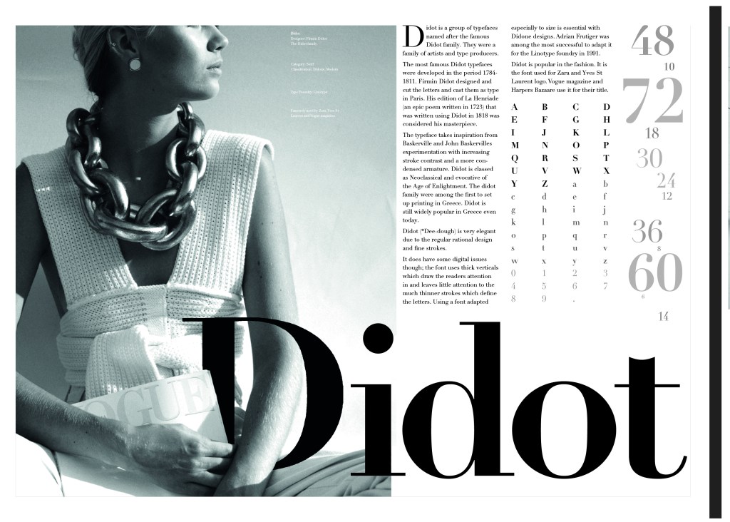
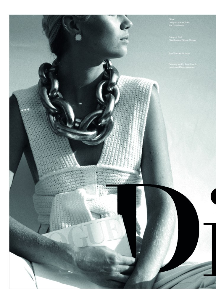
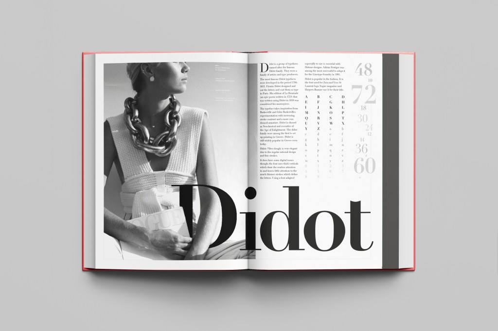
This was the typeface I was quite looking forward to designing for! Didot typeface is very elegant looking and is used in glossy, expensive fashion magazines such as Vogue and Harpers Bazaar. Didot is named after the Didot family who were artists and printers. Didot was inspired by Baskerville which is another reason why I have used it as part of my type specimen book.
Didot is most famous for being on the cover of Vogue as “Vogue”, because of this I wanted to create a layout that represents high fashion magazines. Vogue magazine always has a celebrity or a fashion model on their cover so I wanted to include a similar thing in my layout. I went onto Pexels website and typed in “Vogue” and it came up with an image of a woman in fashionable clothing holding a Vogue magazine close to her chest. It seemed like the perfect image to use for this design!
There were a few more variations of this photograph as well which I downloaded in case I wanted to use different images on my layout:
Photographs courtesy of Dziana Hasanbekava (pexels-dziana-hasanbekava-5480694) from Pexels.com
The next step was to import the photograph into Photoshop and then adjust the colours. I wanted it to have a Sepia filter to it; Black and White photography suits High quality fashion magazines more and looks good on a layout for contrast. I wanted to put the “Didot” heading on my layout but didn’t just want to place it on the page with no creativity.. I decided to make the D part of the photograph by using layer masks again to mask part of the D out to look like she is carrying the D as an accessory in the photograph. I think it works well! I decided to do the rest of the layout in a similar style to a fashion magazine with the text in 3 columns and one column talking about the history of Didot.
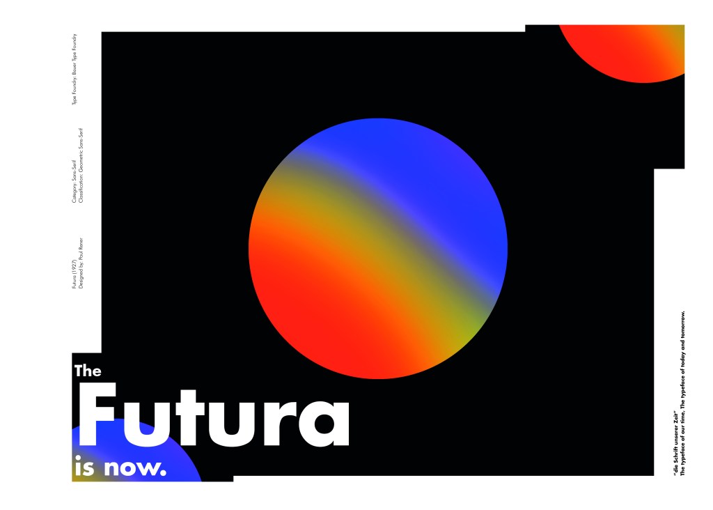
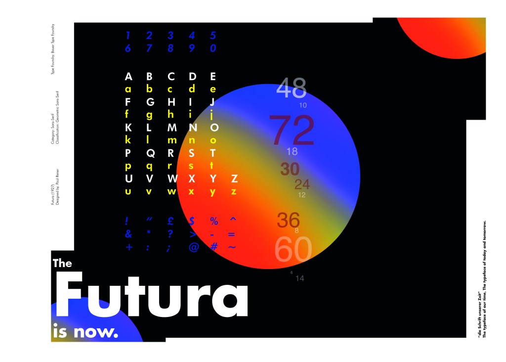
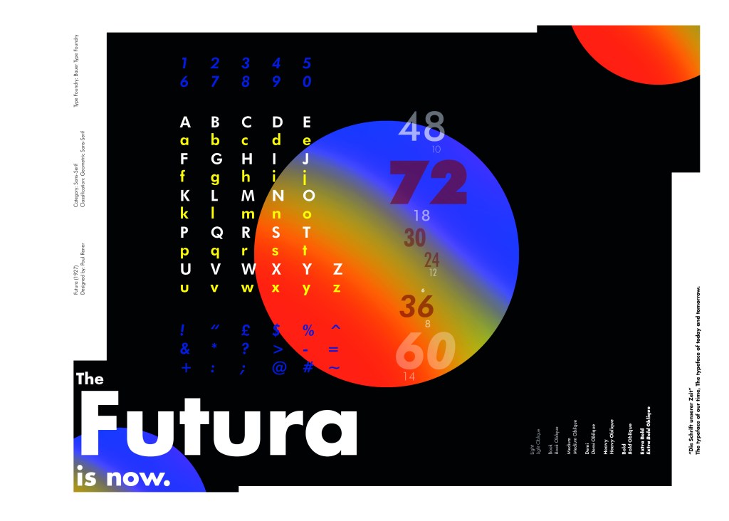
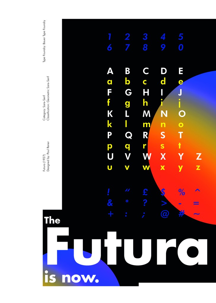
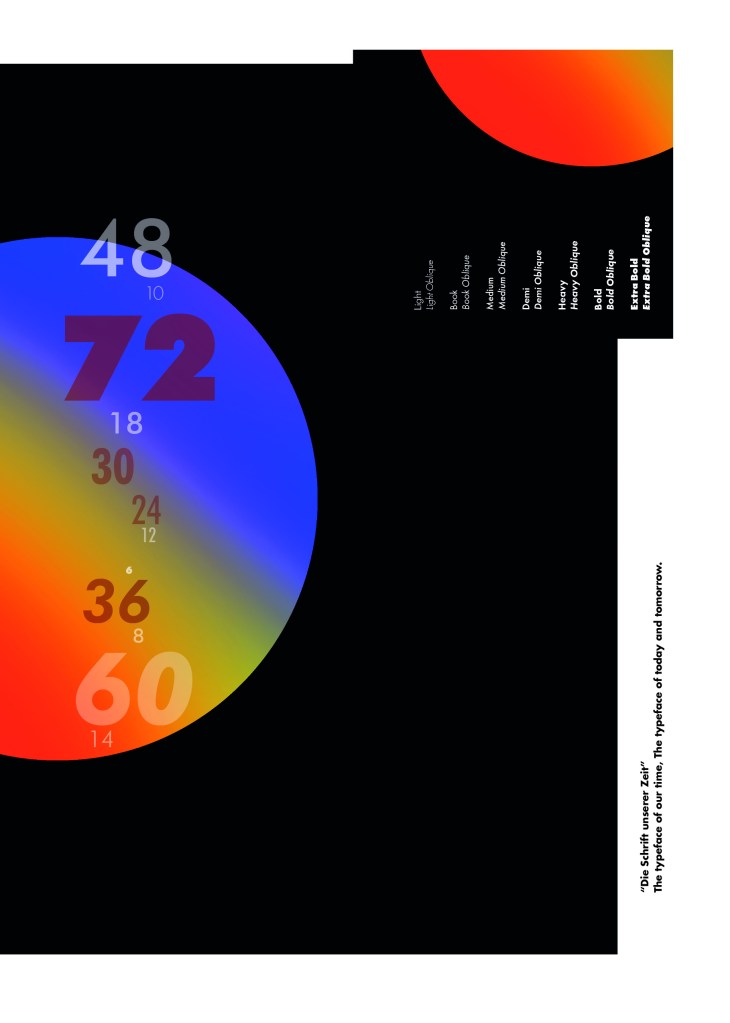
Futura is the last Sans-Serif typeface in my collection! I chose this one because again it is a classic and it also ties in well with the Bauhaus era along with the other Sans-Serif typefaces that I have chosen.
I did take a more modern approach when designing this layout though; instead of staying with traditional Bauhaus colours (Red, Yellow, Black, White) I was inspired by a German slogan “die Schrift unserer Zeit” (“the typeface of our time”) It gave me futuristic/modern vibes and I decided to play off this when designing my layout!
Futura reminds me of “future” and the future is modern and a mystery to us yet… I designed Futura around the theme of modern, futuristic space vibes with vibrant colours and an interesting layout.
“The Futura is now“
I had the idea to create planet-like orbs using Photoshop by using my brush tool and layer masks. I used this technique on one of my posters that I did for the “365 a poster a day challenge” I started a few years back. I masked the orb area out and making my paintbrush big, airbrushed different colours over each other to create a planet effect. I then copied it twice more create 2 in both corners. I really like the effect it gave. The bright colours contrast against the black to really make the design stand out. I also created contrast between small and big text.
Design Development – The stages of reaching my final design and layout!
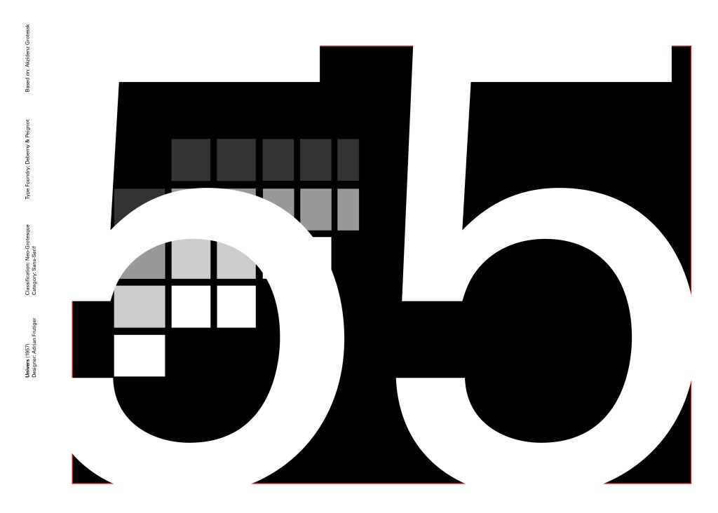
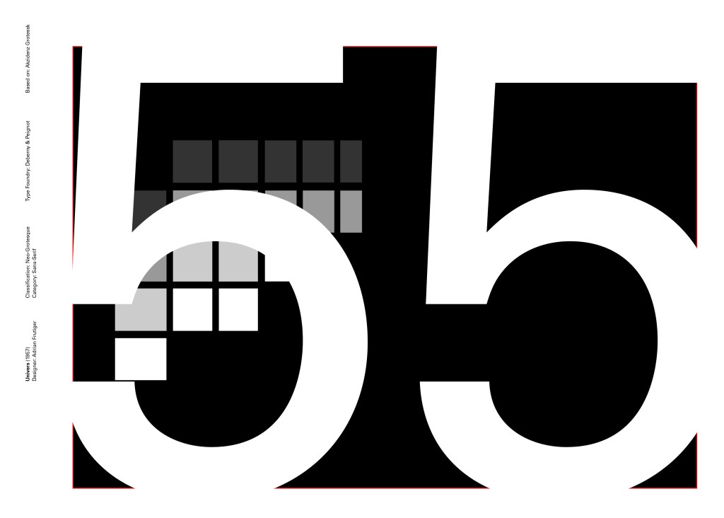
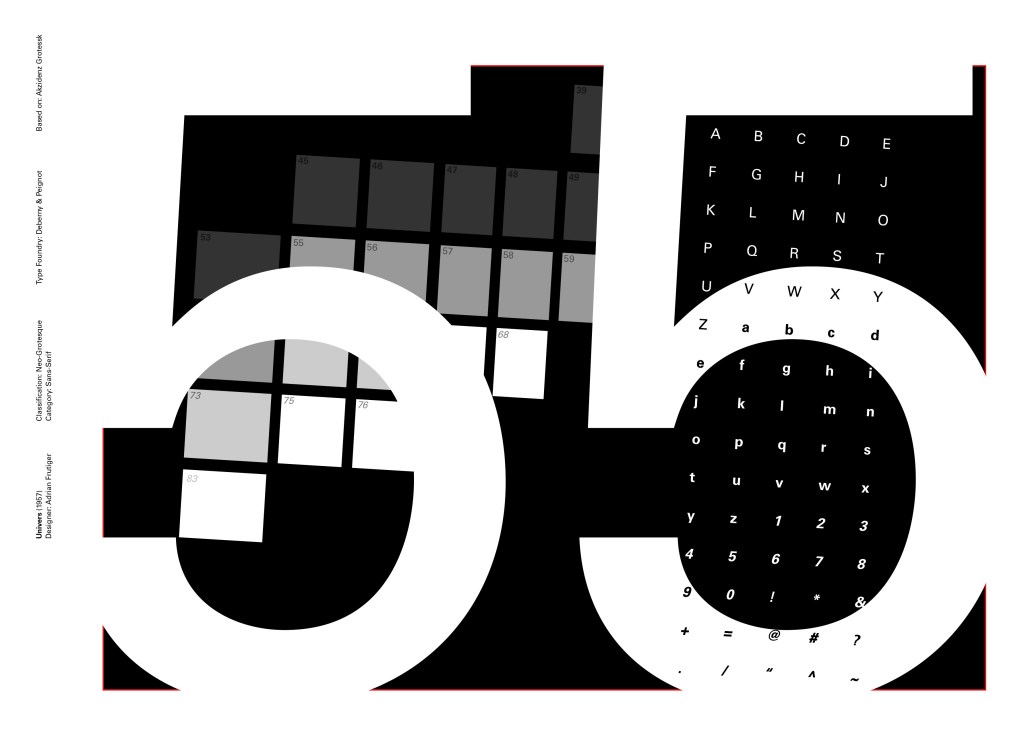
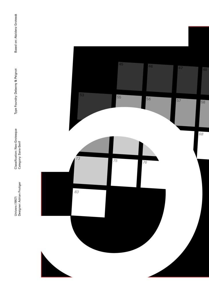
Another typeface I chose for my Sans-Serif collection was Univers. I have already used Helvetica and Akzidenz Grotesk and this is the third typeface that relates to all those; they are all based upon Akzidenz Grotesk. Univers again played a crucial role in Swiss style. I did worry that by doing all three of these typefaces that they would be too similar as they are often mistaken for each other but if I am creating a specimen book for my own personal use I would use all 3 of the typefaces in my work.
I tried to make the design for this slightly different to the others that I completed to date; Univers referenced the periodic table and Adrian Frutiger took a different approach to designing it then anyone ever had before. He wanted a table system that showed the different typeface weights and variations as numbers instead of names. Frutiger has since used this method in more of his type designs.
55 was crucial in the design of Univers; how Frutiger designed the whole typeface was to design “55 Roman” first and then base the other variations and weights around that. I decided to use this as the main design in my typeface book. I tried to be more experimental with this layout, using the 55 as part of the negative space in my design. I did want to bring in the periodic table element but struggled to keep it looking clean and simplistic. In the end I used blocks of colour to represent the periodic table influence on the typeface and I think this worked well.
Design Development – The stages of reaching my final design and layout!
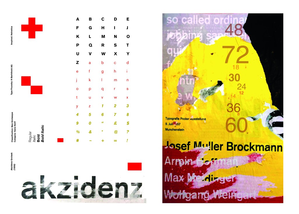
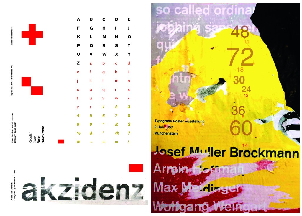
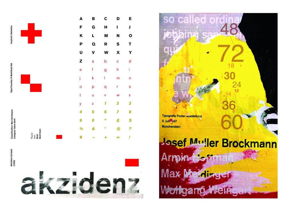
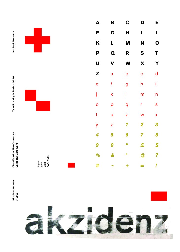
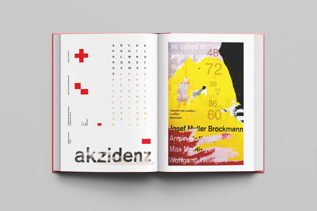
I wanted to carry on down a similar path for my next typeface, Akzidenz Grotesk was the next best Sans-Serif to choose. Akzidenz Grotesk’s history goes back further than Helvetica’s but despite this, they are still closely related. Akzidenz Grotesk was the inspiration behind the design of Helvetica.
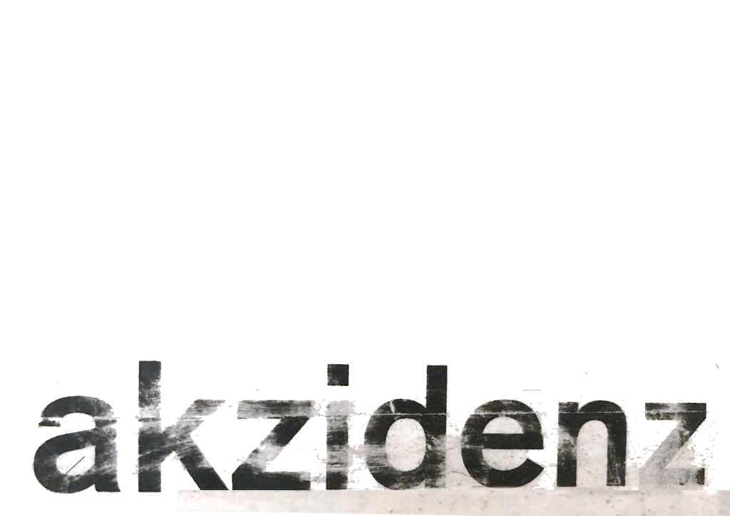
Akzidenz Grotesk was known as the “jobbing” typeface; what this means is that it was heavily used in trade printing, advertising and forms that were made at the time. The typeface was designed to be seen from a distance. “Akzidenz” comes from the German language and means trade printing for an occasion or event. The latin term refers to it as “that which happens, a casual event, a chance”. I liked this saying and used it further in my design (I will come to that later!)
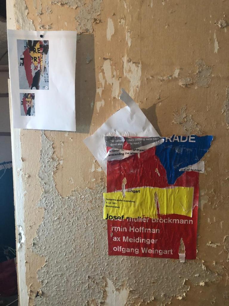
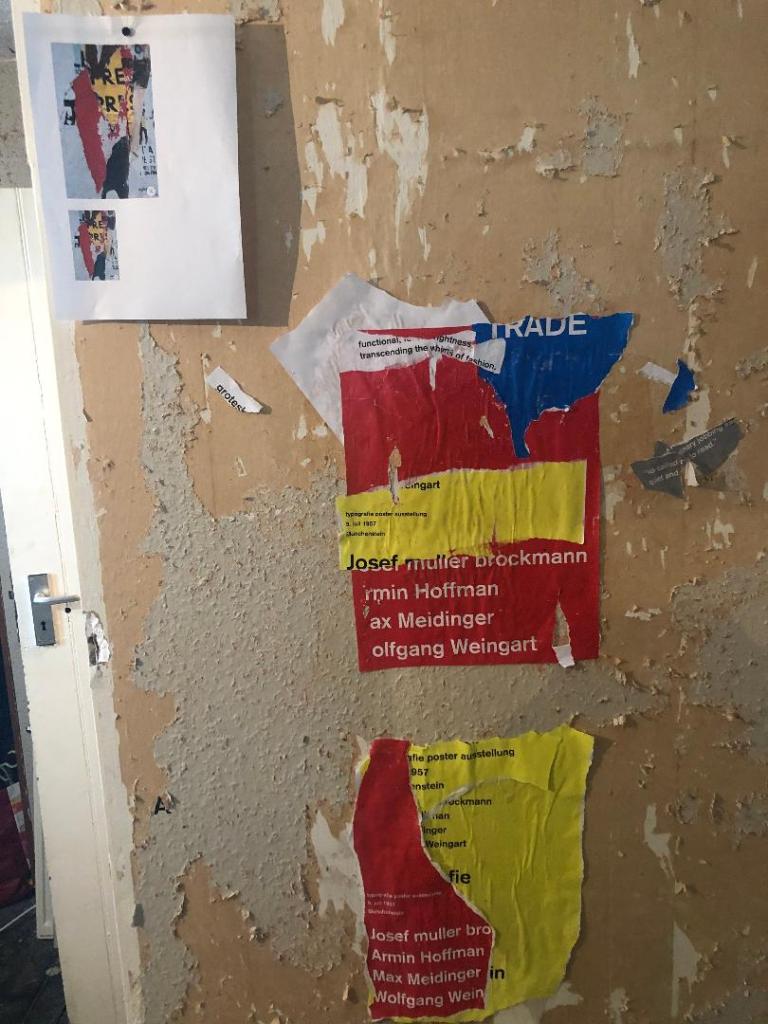
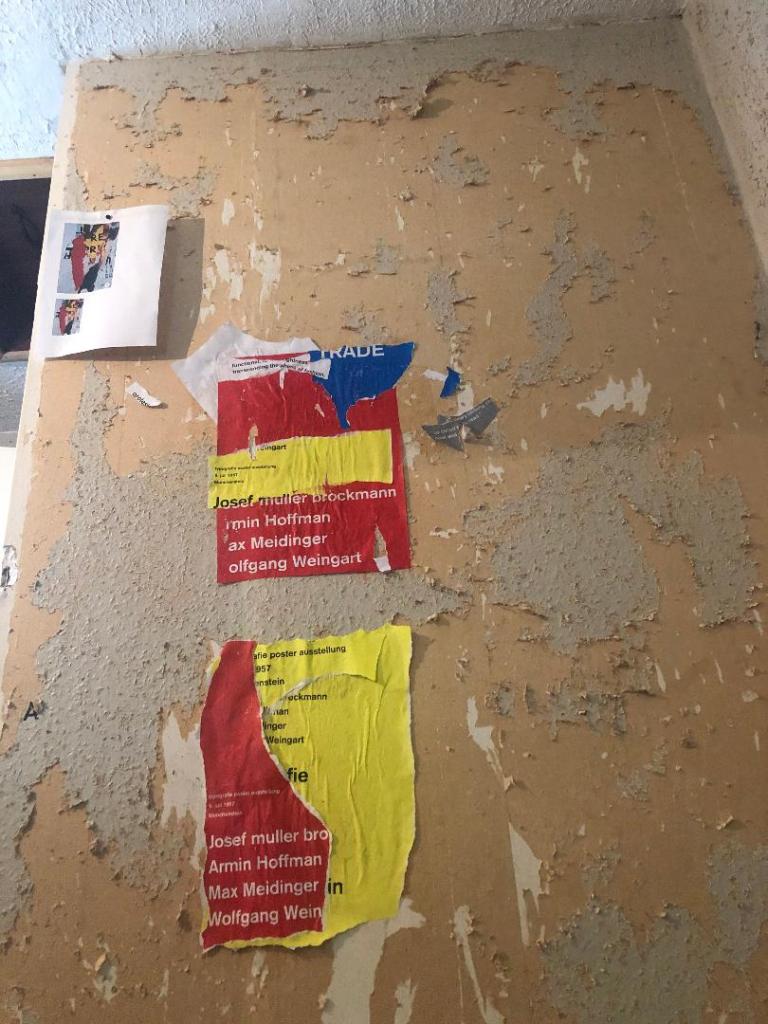
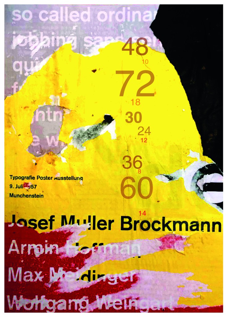
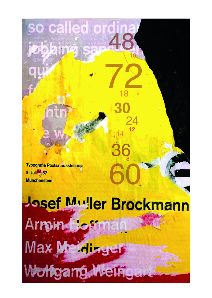
Keeping in mind that Akzidenz Grotesk was used predominantly in advertising and posters I decided to base my design around this, researching further I also found that Josef Muller Brockmann heavily used Akzidenz Grotesk in his poster designs.
Josef Muller Brockmann
Brockmann was a Swiss Graphic Designer but also the pioneer of the International Typographic Style which tied in brilliantly with this typeface. He was recognised for his clean use of typography, shapes and colours in his designs. His work mainly consisted of poster design. I bought a book about him and studied his posters to see how I could get a similar style for my own design. I also did some in depth research on Pinterest again to get some ideas and a feel for his style.
I found an image on Pinterest which caught my attention and gave me an idea for my design:
Composition 5 by Eduardo Seco
I liked the way the colours pop and contrast each other and the different styles/weights and sizes of the text also work together to create contrast. I felt I could create something like this using Akzidenz Grotesk, the Bauhaus colours and make it look like “trade printing or advertising with the modern influence of “Swiss Grit”.
I wanted to create the poster layout for my type specimen pages but just didn’t know how to do it…yet.
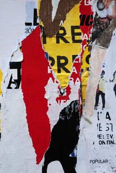
Using the image from Pinterest to vaguely copy, I knew I had to layer up and collage different posters to recreate that torn and ripped look. I decided to create a poster with a made up event (A typography exhibition in honour of Josef Muller Brockmann) then layer up behind it contrasting colours and different type relating to Akzidenz Grotesk. The only implication was that I wanted to actually create my poster on a real wall and photograph it and then import it into Photoshop to do any adjustments etc.. The issue was where would I find an urban wall when I live in the country? and how would I even get out to photograph one during lockdown?.. I then looked no further than home because we are currently renovating our house and the upstairs second bedroom wall is being ripped out and is covered in plaster, paint ripped off.. ideal for the urban look! I created a few A3 pages with different colours and pages filled with Akzidenz Grotesk type and then printed them off to later PVA glue onto the wall with a roller which I hoped would give a wrinkled, worn feel.
I enlisted my boyfriend with the roller to help glue them on! I needed someone who (no offence to Chris because he is super talented with cars and a brilliant Motor Vehicle Teacher! :p) has no creative flair or direction and would just stick random pieces anywhere without overthinking it! I procrastinate too much and am too regimental in my approach which is something I did not really want! I wanted it to look random and “rough” . At the end of the evening after doing these posters I decided I needed to go away and have another go printing off more sheets and make further alterations. The blue that I used was too much and it wasn’t layered how I wanted it to be. We just ripped pieces of paper and layered them on top of each other, what I needed to do was to print 4/5 pages and stick them all on top of each other and rip into them to reveal a page at a time.
The next day in my lunchbreak at work I decided to trial a test piece on some card I ripped off a cardboard box; it was rough in texture so I thought it would have the same similar feel to a wall. It turned out to be perfect! I scrapped the wall idea totally and used this as my final piece for my design.
I then imported it into Photoshop and made some minor adjustments like changing the brightness/contrast etc. I also added the type point sizes onto the side of it to show what the type looks like at different sizes. I created 2 more pages on my Indesign document below my Helvetica pages and imported my collage poster into Indesign to start my final layout!
Digital Development
Again, I wanted a layout that was minimalistic and clean with lots of negative space. I decided to place the poster on the right hand side page and place the character alphabet of Akzidenz Grotesk on the left side.
I wanted to use Red as a predominant colour again as it represents Swiss design and also the Bauhaus influence. I wanted to be in keeping with the “Swiss Grit” style of the poster though with the “Akzidenz Grotesk” heading and decided to try something experimental and different… I watched an interview with Chris Ashworth about a year ago where he explained what sort of experimental “grit” typography he does such as sticking type to the bottom of his twin girls school shoes so that when they return back from school in the evening the type is all ragged to give that worn down texture. He then uses this in his pieces rather than using digital textures. I wanted to do something similar for the type on my page. I decided though to try the cellotape method… I made friends with a Graphic Design student on Instagram who is also into Swiss Grit and he did a demo on his page of how he created his “gritty” type. He printed his type out using a laser/inkjet printer and then covered the text with cellotape and gradually pulled away at it to rip the ink off the page onto the cellotape. It worked! It gave a great gritty texture to my type which I then imported in and tweaked to become part of my layout.
Design Development – The stages of reaching my final design and layout!
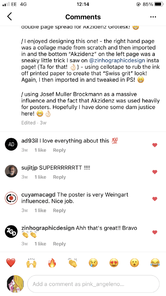
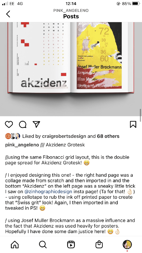
The final layouts were received VERY well when I uploaded them onto Instagram. It got the most likes my page has ever got and everyone seemed to love it! I felt very proud of this piece when it was done!
My Instagram screenshots
The final design pages and final mock up
The final mock up!
Responding to Tutor feedback…
“The sketchbooks evidence in between stages, idea development and layout/mark making: do you have any evidence of the planning for the laying for the Aksidenz poster? Is this a place where you could experiment with textures and layering with surfaces and drawing media?“
I have sketches in my sketchbook and images that I found on Pinterest that inspire the collage that I did for the Akzidenz Grotesk poster:
Work by Eduardo Seco
I agree with the feedback that I didn’t document the Akzidenz Grotesk collage all too well… but it was created entirely how it is pronounced!.. a complete happy AKZIDENT!
I had no idea really how to put the collage together for Akzidenz Grotesk. I tried first on the wall of my house PVA glueing different sheets of coloured paper that I printed out from my printer at work and this just did not work. I tried rubbing Letraset on the walls too, My plan originally was to create the poster on the wall using Letraset letters or printed type on sheets of paper that I would dampen and then rub off onto the wall!
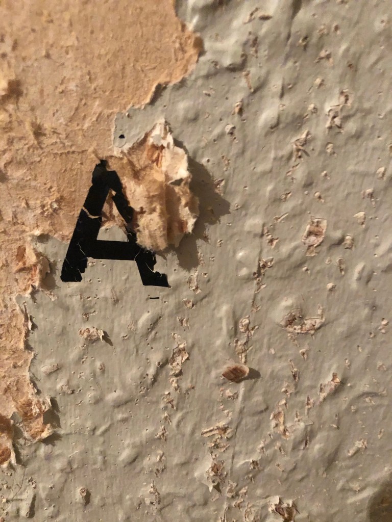
Another thing that inspired me was a few photographs I took of the side of my old cooker… When I moved house in October 2020 I rented my house and inside it I had an awful, old cooker (possibly from the 1970s!!) when I moved it out to clean it I noticed some markings on the side of it. It was quite cool and I took the photos to bank in my resources for any future projects:
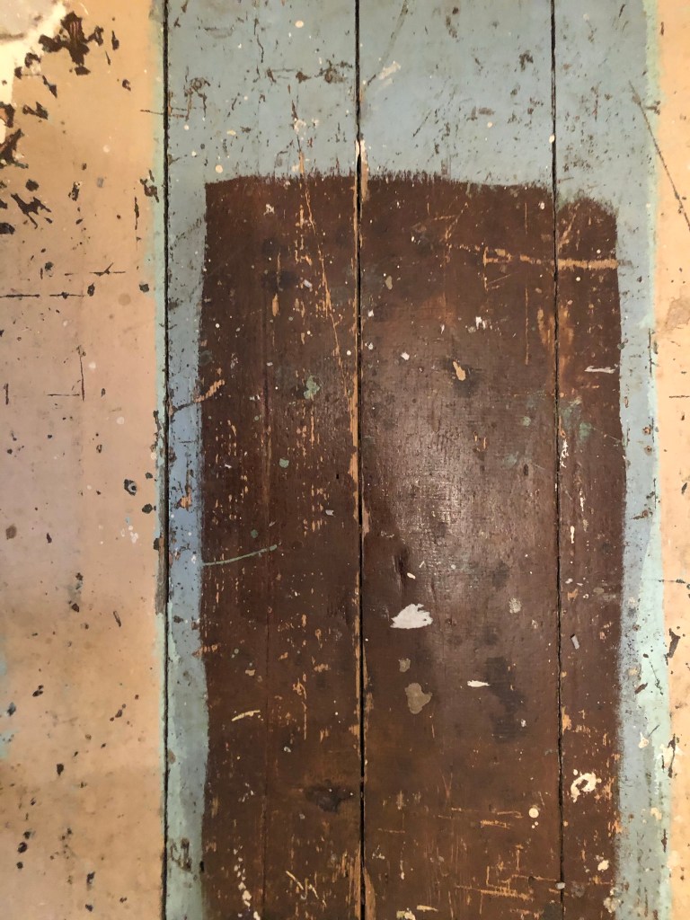
I knew I wanted to create this kind of effect but I was struggling as to know how…I then had the idea of photographing some different textures and then importing them into Photoshop to play around with for my poster. These were some of the textures I found, (again, they were all from the upstairs of my house which is currently now only starting to be renovated!)
The textures idea just wasn’t gritty enough for me though… This is where I went to work the next day feeling really frustrated at the fact that I didn’t know how best to create the idea I had in my head!!
I have a very rigid “Neat” approach to my work, everything I do is very structured and organised and I couldn’t quite get myself to create something “messy” enough!- I needed to switch off and just become careless and wreckless to see what I could create!! I had another go on my lunch break when I had the classroom to myself; I filled a paint palette up with PVA, found a screen printing roller to layer it on smooth and what I ended up with was the unexpected, perfect finished piece! I have photos that I have found in my design archive of me creating this final piece but other than me being really inspired by some collage work I found on Pinterest it happened without any prior planning or any planned sketchbook experimental work.. it was completely by accident! A really happy accident! I literally just created pages in Microsoft Word (my work laptop did not have Adobe at the time!) of block coloured pages and pages with some type using Akzidenz Grotesk, I printed them out using the laser printer and then layered them up on top of each other using PVA glue. Carelessly I just ripped sections away to reveal layers underneath. The idea was to create the feel of a really old billboard that has had hundreds of posters ripped off and layered on in its time in a really rural area of a city..
The final piece was perfect for me! In fact it seems such a shame to pack it away with all my Core Concepts work that I have thought about framing it as a showpiece!
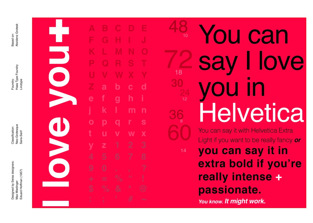
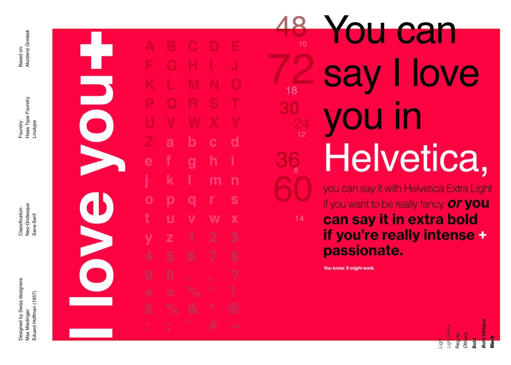
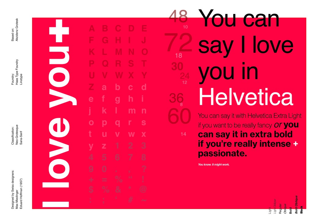
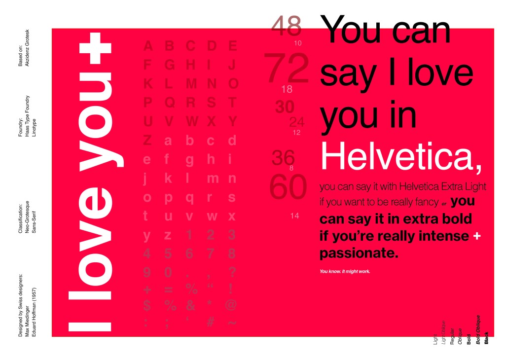
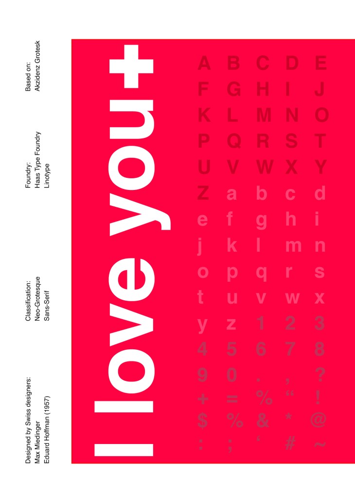
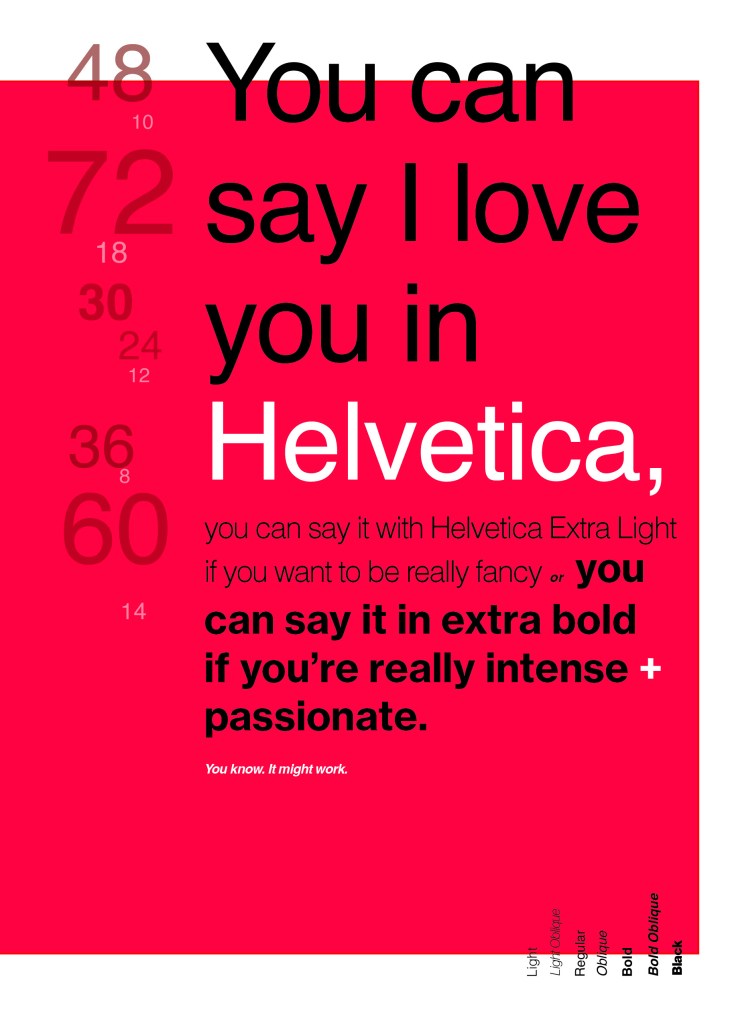
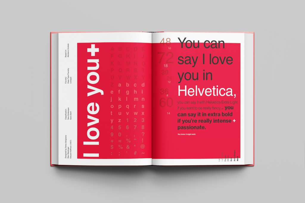
When you think of Sans-Serif there is only one typeface that comes to mind immediately and that is Helvetica. Helvetica is possibly a designers all time favourite. It was designed in 1957 in a new world after the war where the need for function over beauty prevailed. There was a need for clarity, function, cleanliness and for text to be readable, legible and straight forward communicating. The mantra was “less is more” and “form follows function”. The focus became on the content rather than the design and any ornate detailing. The designs of the time were very mathematical; Designers of the time designed religiously around the grid. Bauhaus at the time was also a massive influence.
For this design I wanted to represent everything that this typeface stands for; minimalism, cleanliness, Swiss designed and legible. I started off by doing some intensive research into the typeface; I used Pinterest as I always do to look at lots of type specimen books that already exist for Helvetica. I watched the film Helvetica again, I bought a book all about the history of Helvetica.. I really went deep with the research!
I noticed that a lot of type specimen books use “The quick brown fox jumped over the lazy dog” to showcase their typefaces with the different styles/weights/widths etc.; I did not want to do that. It just did not fit in with the feel of the typeface at all! I was really making myself nervous about completing this double page layout for the fact that I wanted to do the typeface justice and didn’t want to design something awful. I decided to refresh myself on the typeface by re-watching the film “Helvetica” for some inspiration and ideas, It was from this that I got the idea to use one of the quotes from the film;
You can say, “I love you,” in Helvetica. And you can say it with Helvetica Extra Light if you want to be really fancy. Or you can say it with the Extra Bold if it’s really intensive and passionate, you know, and it might work.
Massimo Vignelli
I decided it would be a good idea to use this on my main design to replace “The Quick Brown Fox”. I actually used Helvetica Extra Light and Extra Bold when I wrote the quote to show the different styles and weights of Helvetica on my type specimen page.
I used Red as the dominant colour and the red Swiss cross in my design to represent the origins of Helvetica.
I then started to lay everything out onto my pages and reorganise. I wanted a lot of negative space. It needed to be minimal and to not be ornate in any way.
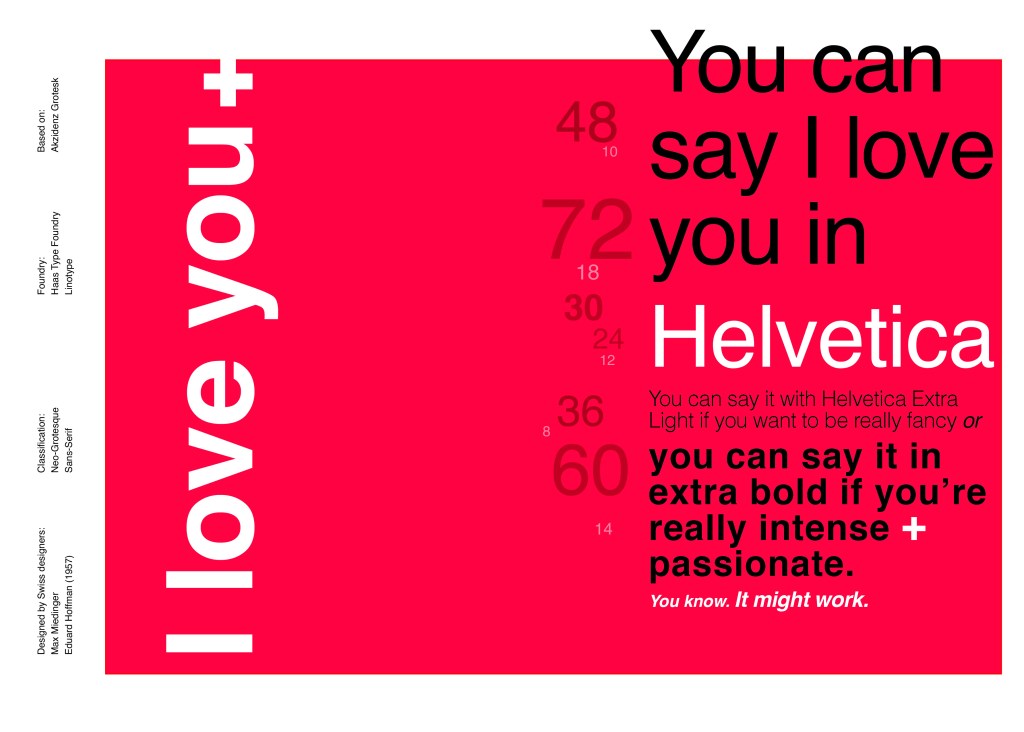
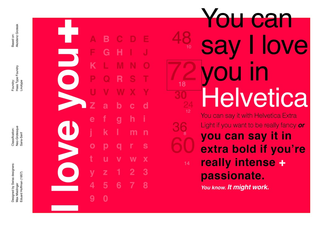
Design Development – The stages of reaching my final design and layout!
I was really happy with how my final design and layout turned out and it was also well received on social media when I uploaded it to my college Instagram page!