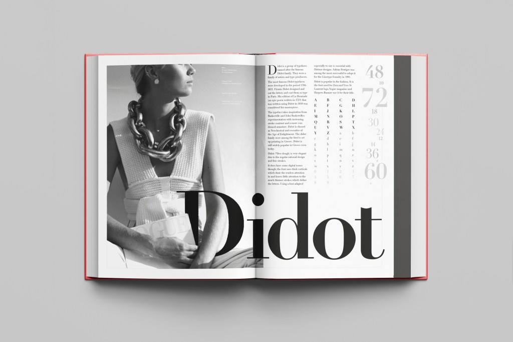
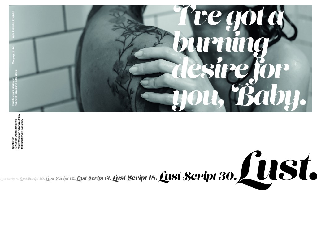
Script Typeface called “Lust”
When it comes to decorative/ fun or “gimmicky” typefaces I am not very knowledgeable! In my work I mostly use Sans-Serif which is why I have made my specimen book “Sans heavy”! For this section of my specimen book I had to do my research and look into different typefaces that I could use for Script fonts. I started by looking at Adobe fonts on Typekit. I found one called Lust which attracted me the most and the name of the typeface gave me scope to use that in my design.
Lust was designed by Neil Summerour in the USA. There is limited information on this typeface other than letting the look and name of it do the talking!
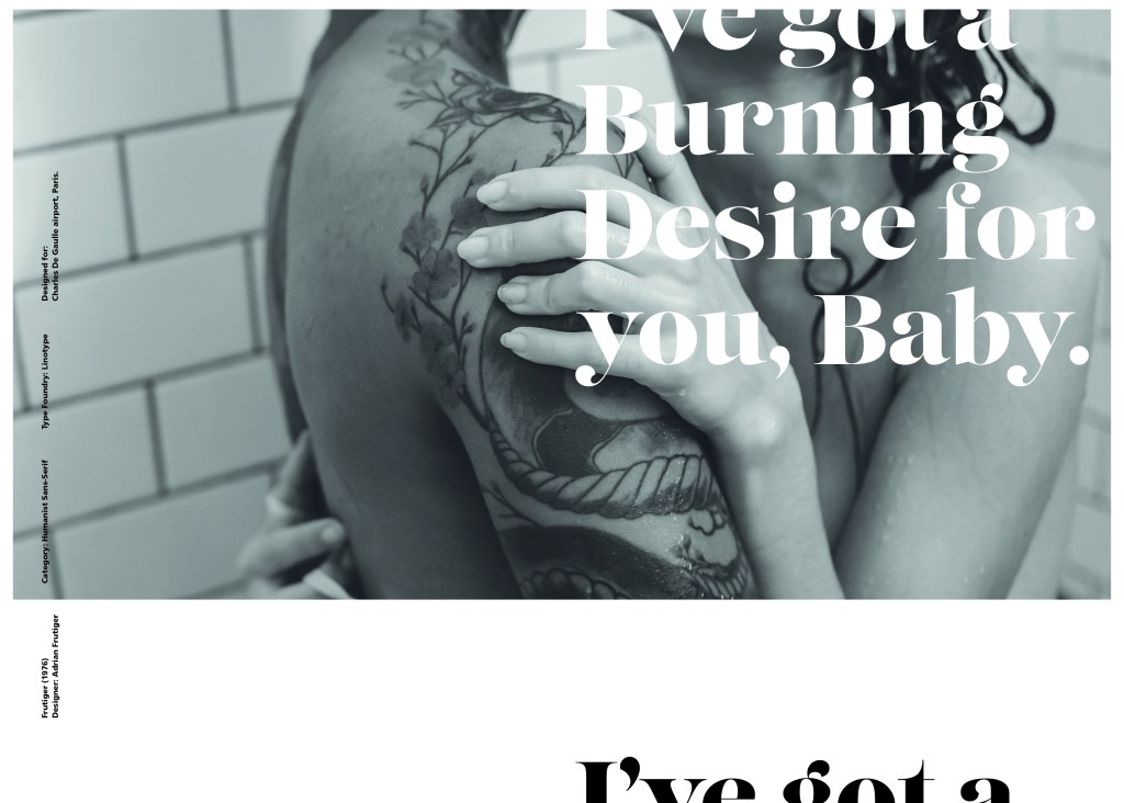
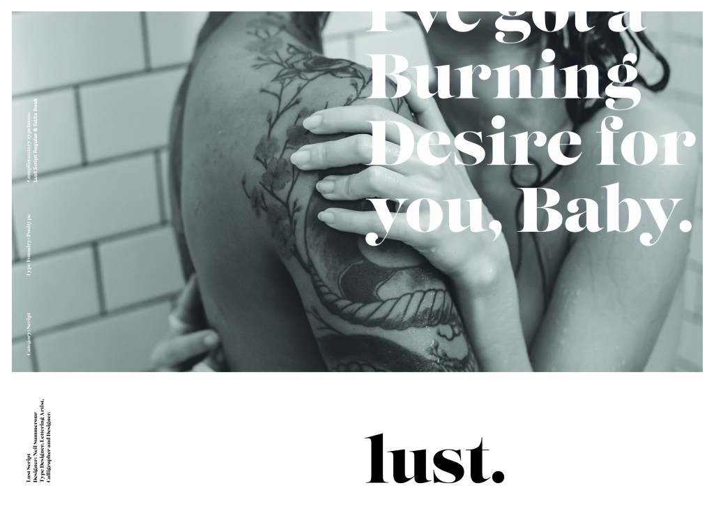
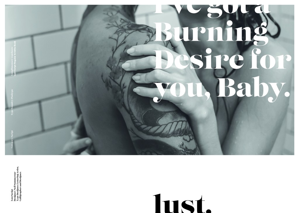
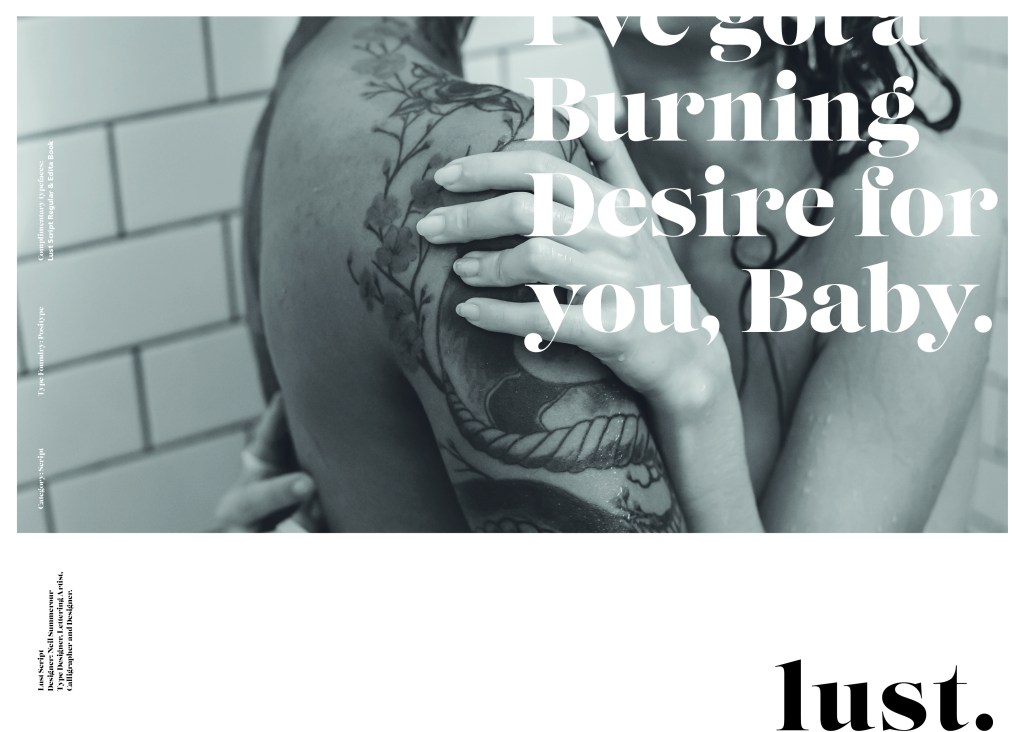
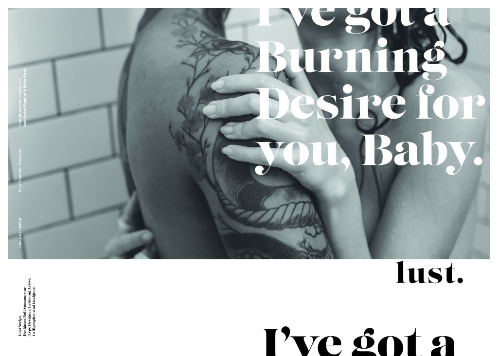
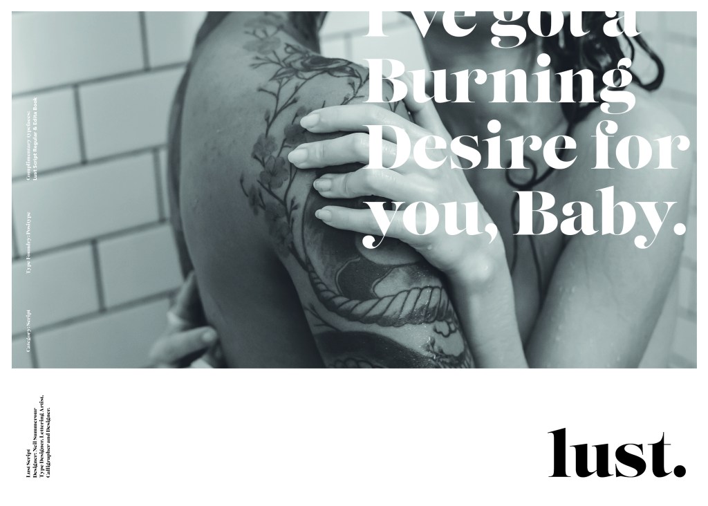
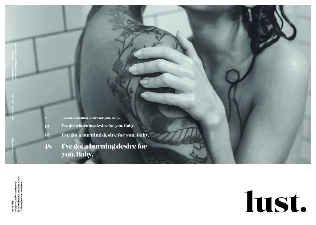
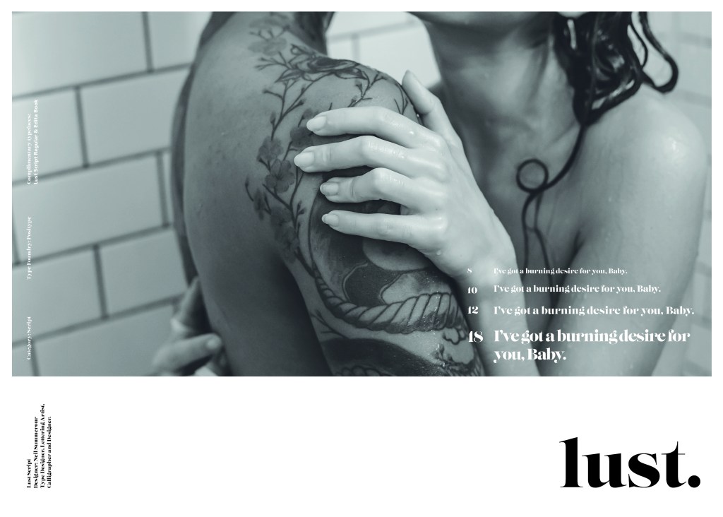
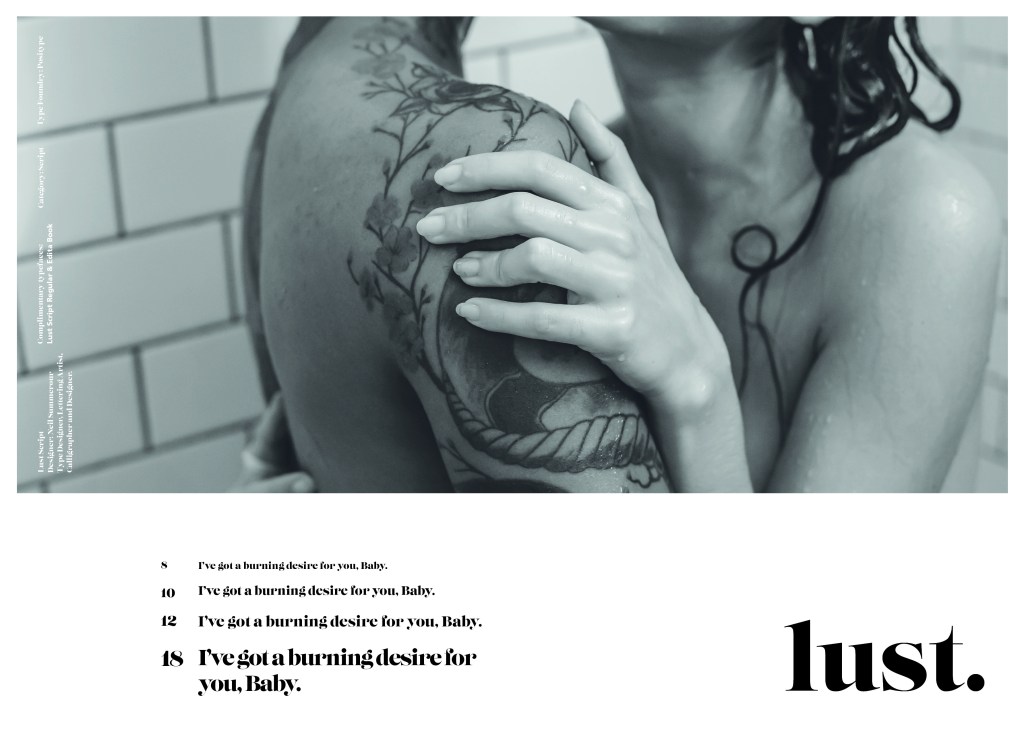
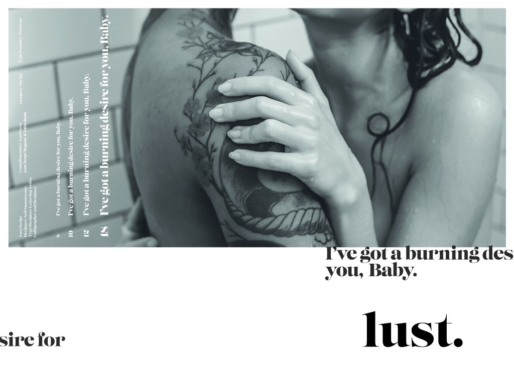
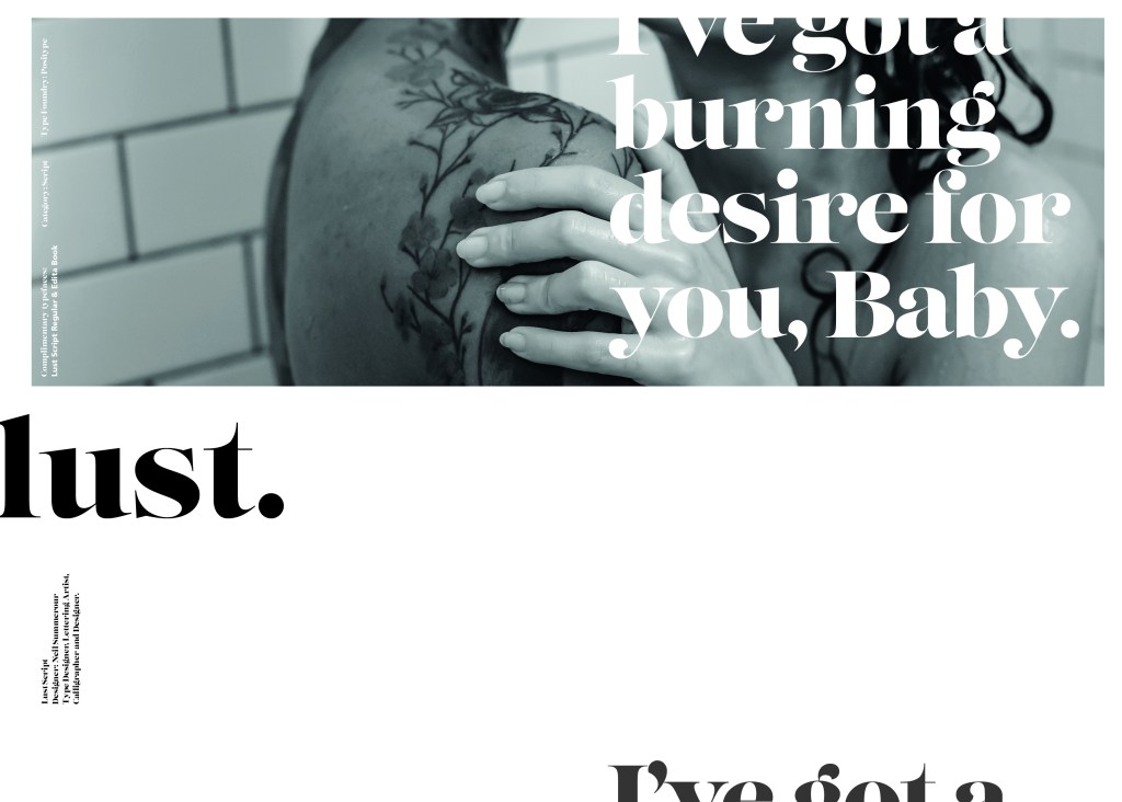
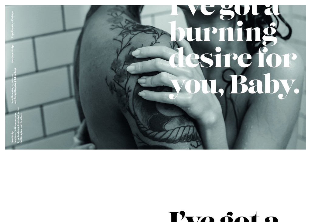
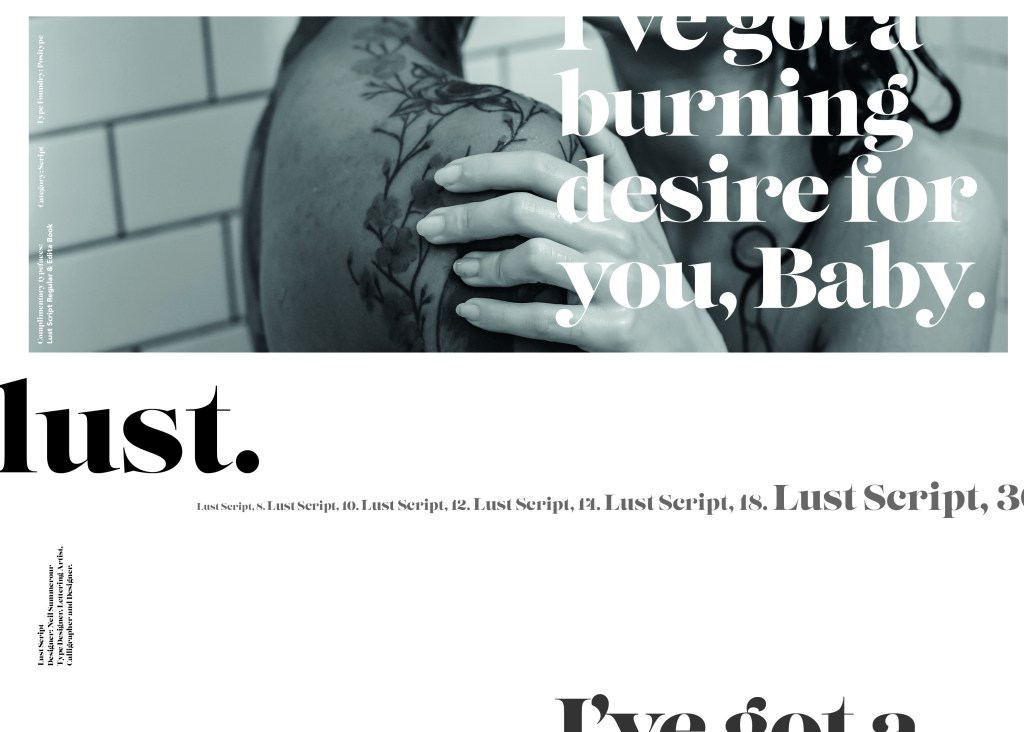
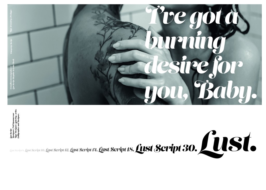
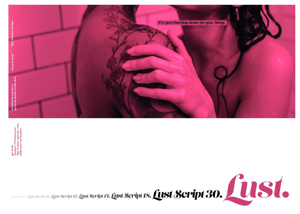
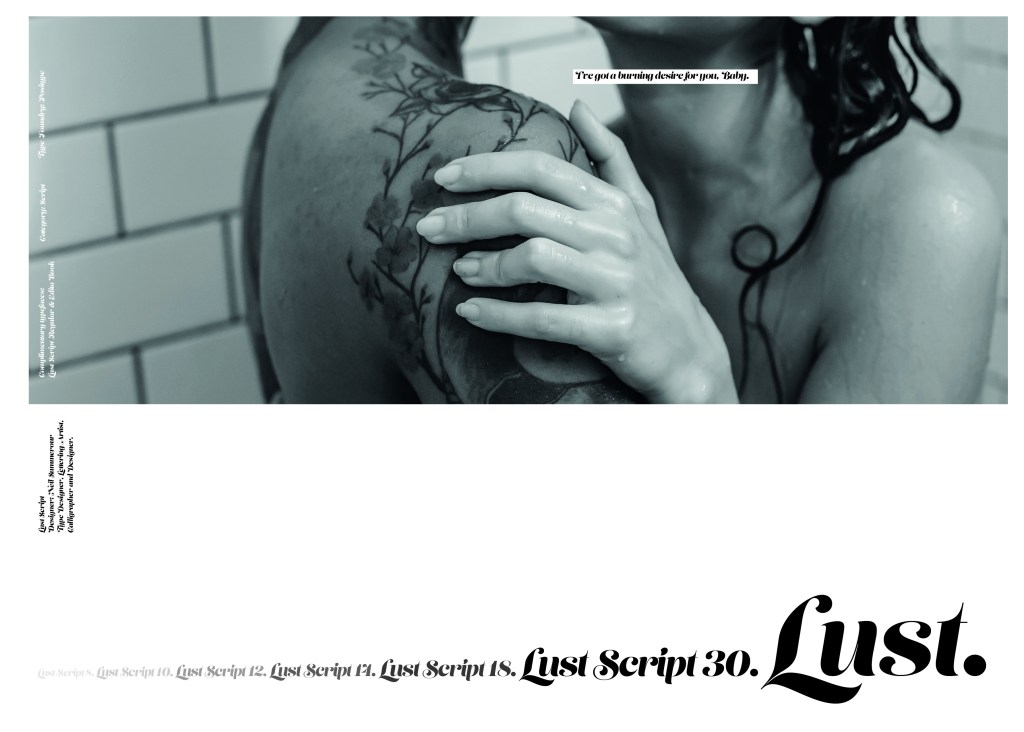
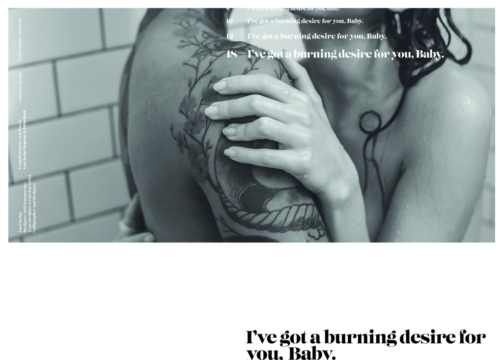
The typeface is very modern and looks very feminine to me, just like its name though it manages to lure you in with its swirls and curls and fancy serifs. I wanted to design around “lust” and my first thoughts were of a seductive image or an intimate couple. To help give me a better idea I searched Pexels.com for any relevant images I could use on my layout. I actually searched for the image I used on my final piece in my work time on my work laptop.. the image download was called “Erotic shower” (**shocked face!! – just hope my workplace does not check internet history!!) LOL!
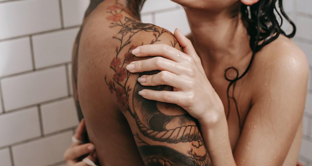
This design surprisingly was the most developed piece I have done; I seemed to trial many versions of this before I got to the final piece! The piece was originally in Black and White until I realised it looked very cold considering it should be about love and lust and all things warm and fuzzy! – I took the original photograph and put a reddy- pink filter on it and that improved it greatly!
I also had the idea again to use a phrase or quote instead of “The Quick Brown Fox….” for some reason when I see this image and read “Lust” it reminds me of a Lana Del Rey song called Burning Desire, I used the chorus from that song in my early development to replace “The Quick Brown Fox” but it looked too busy, eventually I settled on having it in small inside the photograph. It seems like a little thought bubble or moment between the 2 people now with the location I have put it. It adds just another little bit of interest to the piece.
Digital Design Development


The Final design

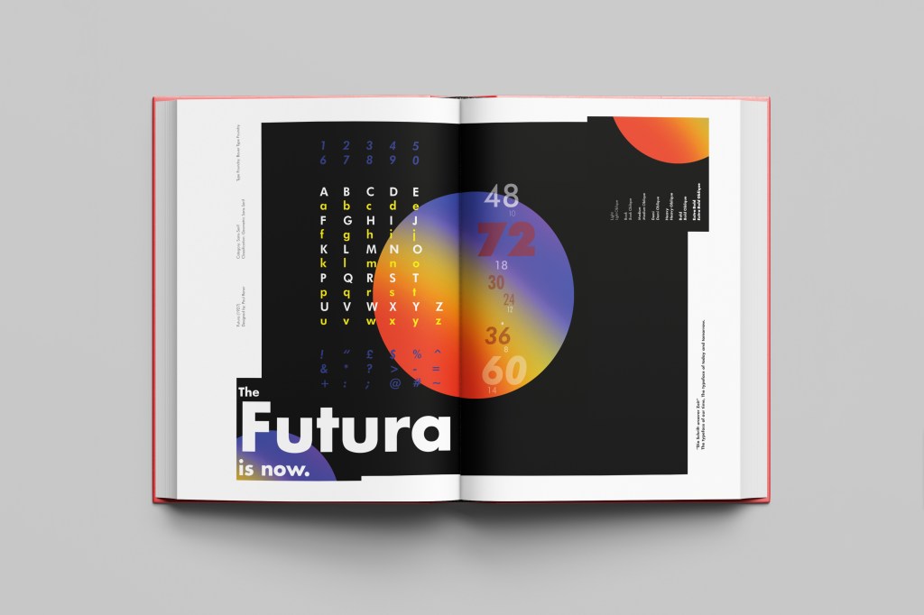
The Final Mockup