If the face fits (part 1: Type specimen book) Baskerville

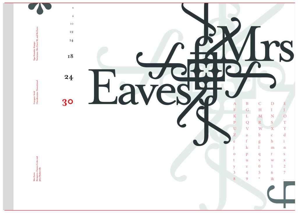
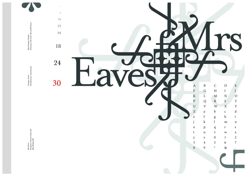
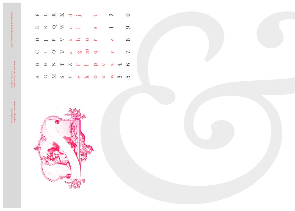
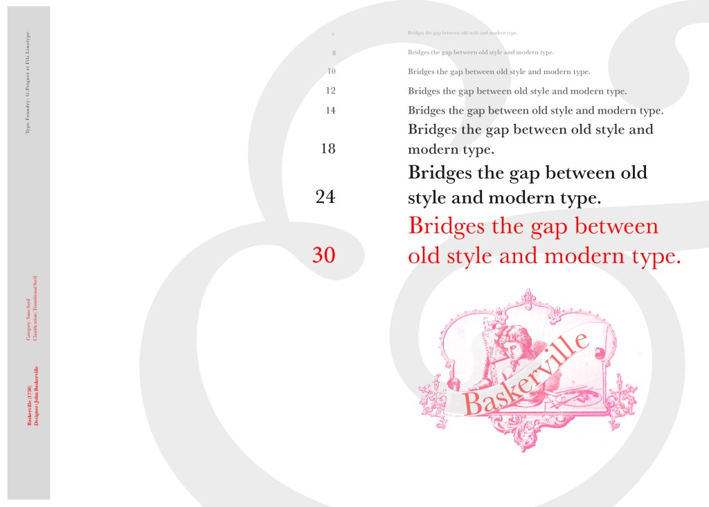
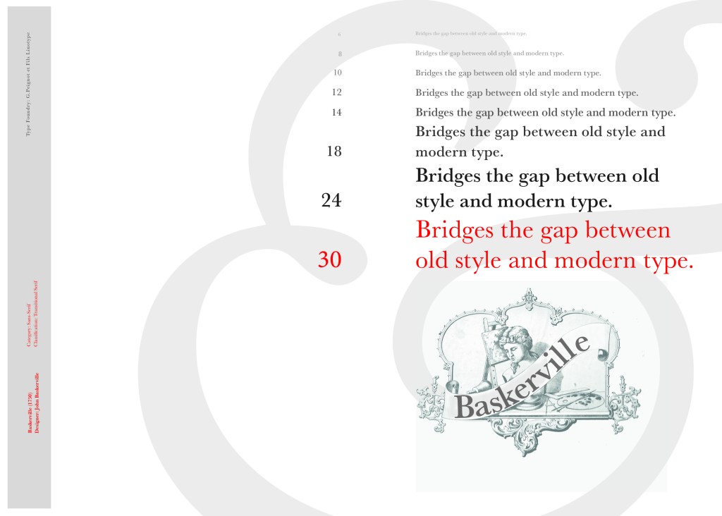
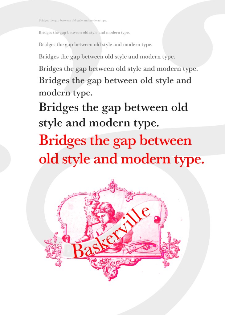
I started off my Serif typefaces with Baskerville. Baskerville was designed in the 1750s by John Baskerville in Birmingham, UK. Baskerville typeface showed contrast between thick and thin strokes and making serifs sharper and more tapered. Baskerville was inspired by Calligraphy and the typeface was and still is very popular in book design. John Baskerville wanted to create books of the greatest possible quality and his typeface certainly made this happen.

My idea for this design was to create a layout representing book design. My original idea was to create an old book and then incorporate Baskerville typeface and the characters into it.

I feel like I spent ages doing this design because I messed around with one idea trying to perfect it all day and then decided in the evening that the simplified version would be much better! I wanted to keep the old fashioned style but still try and bring in a modern vibe!

At home I have some old sketchbooks from 1905.. inside are all clothing patterns that have been drawn, there are blank pages that appear in the book though which are quite yellow and mottled with age and my initial idea was to scan these pages in to use as textures for my design. However, when I was scanning them in, the cover of one of the sketchbooks fell apart (they had been covered in brown paper) and underneath the brown paper was an old Edwardian/Victorian Cherub image with the words “Drawing book” I thought that would be a good idea to bring into my design but change the words “Drawing book” to “Baskerville”

**INSERT IMAGES OF DRAWING BOOK

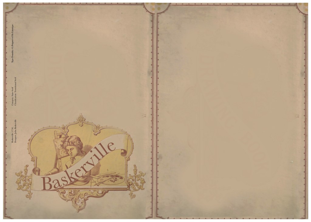
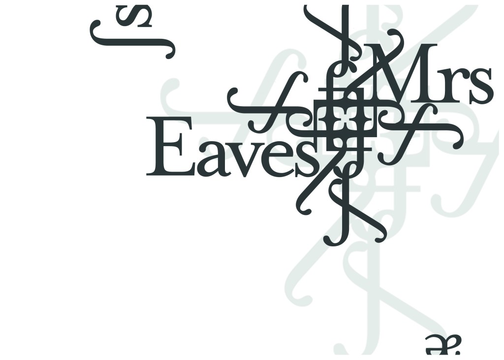
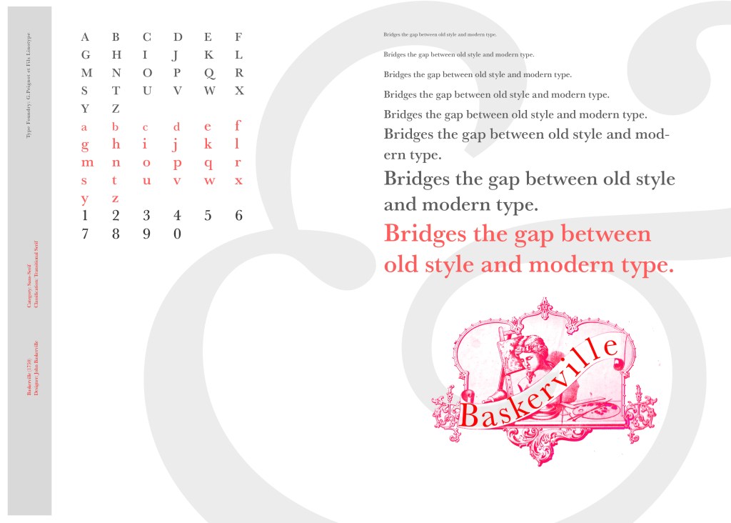
I changed the colour of the Cherub image to try and make it look more modern.. I wasn’t convinced though. I also changed the name “Drawing book” to “Baskerville” in Photoshop. When I did my research on Baskerville, it is well known for its glamourous looking ampersand which I instantly recognised from the V&A logo. I decided to use that in the design as it adds that old traditional feel but with a modern twist.

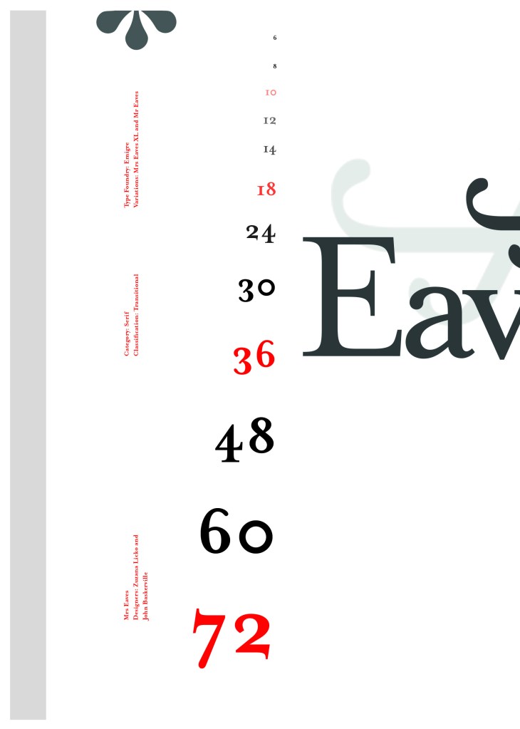
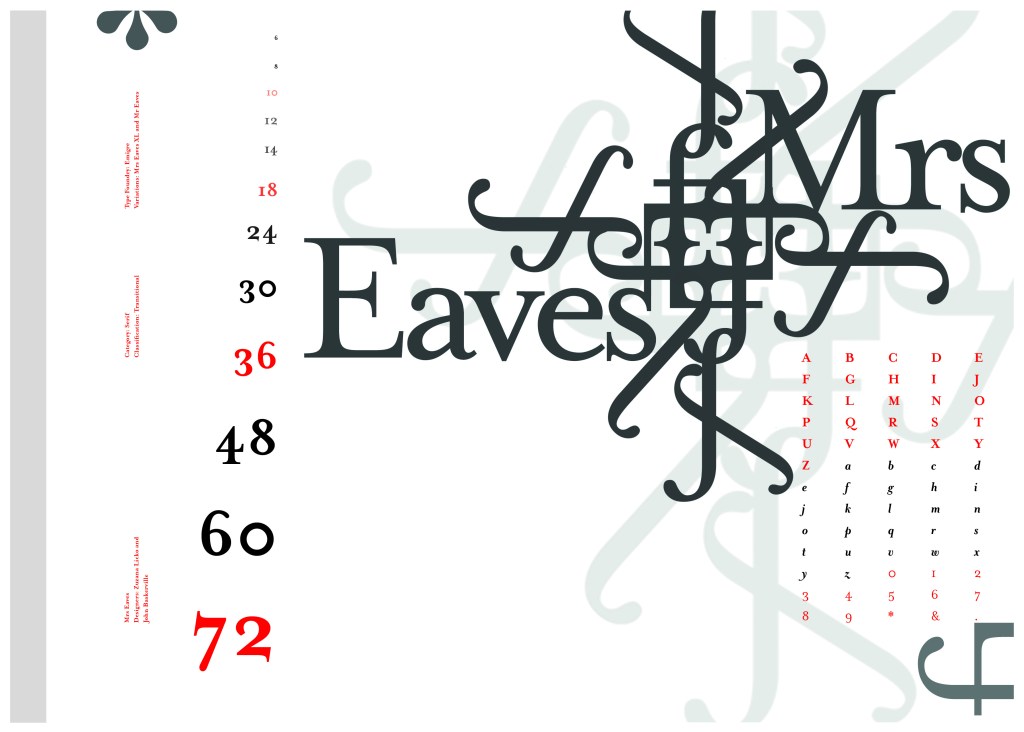
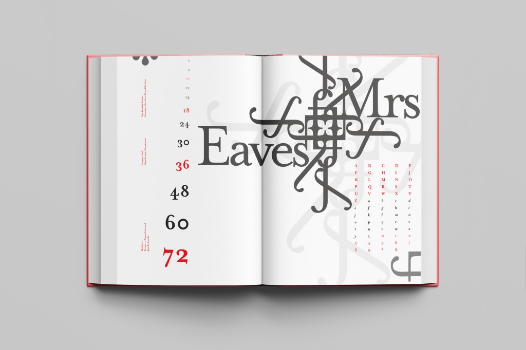
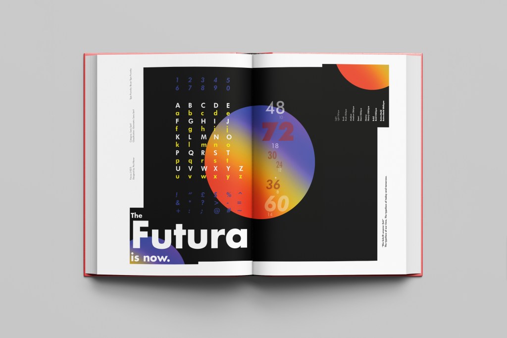
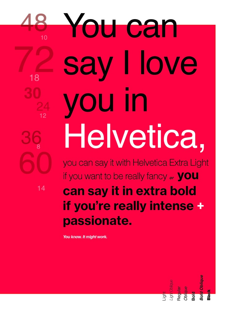
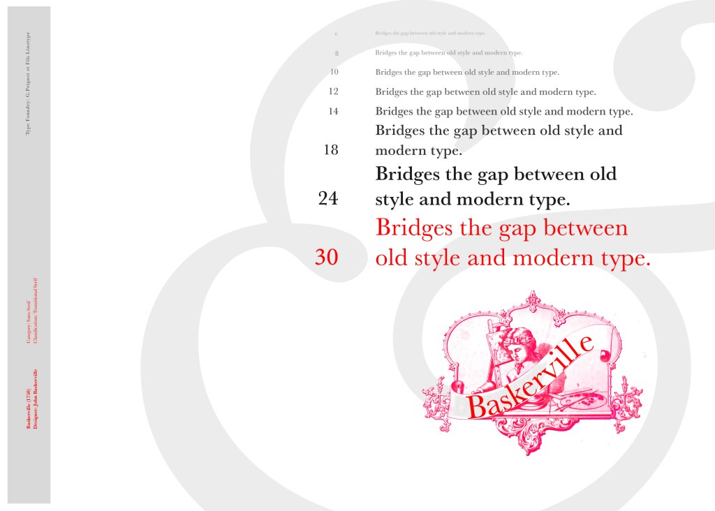
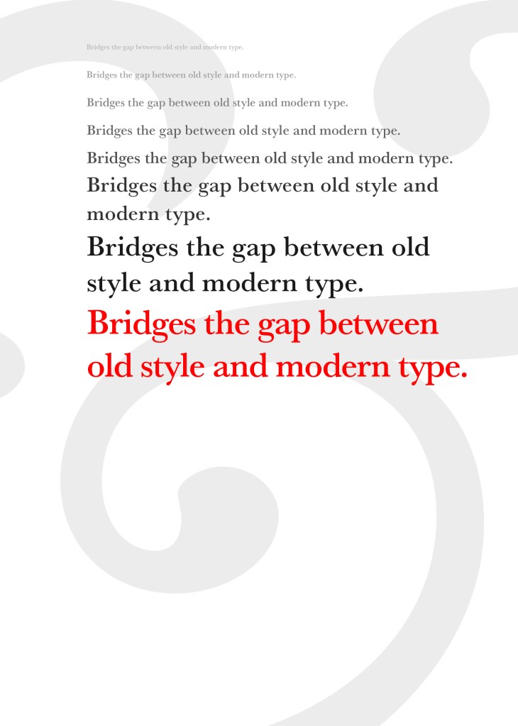
“Bridging the gap between old style and modern type” was a quote I found that summarises Baskerville and that was the same feel that I wanted to carry through my design. I also used the quote to show off the different weights, variations and pt. sizes of Baskerville.

Digital Development

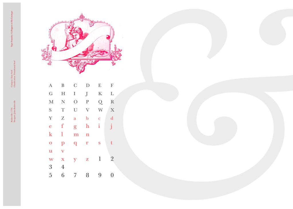
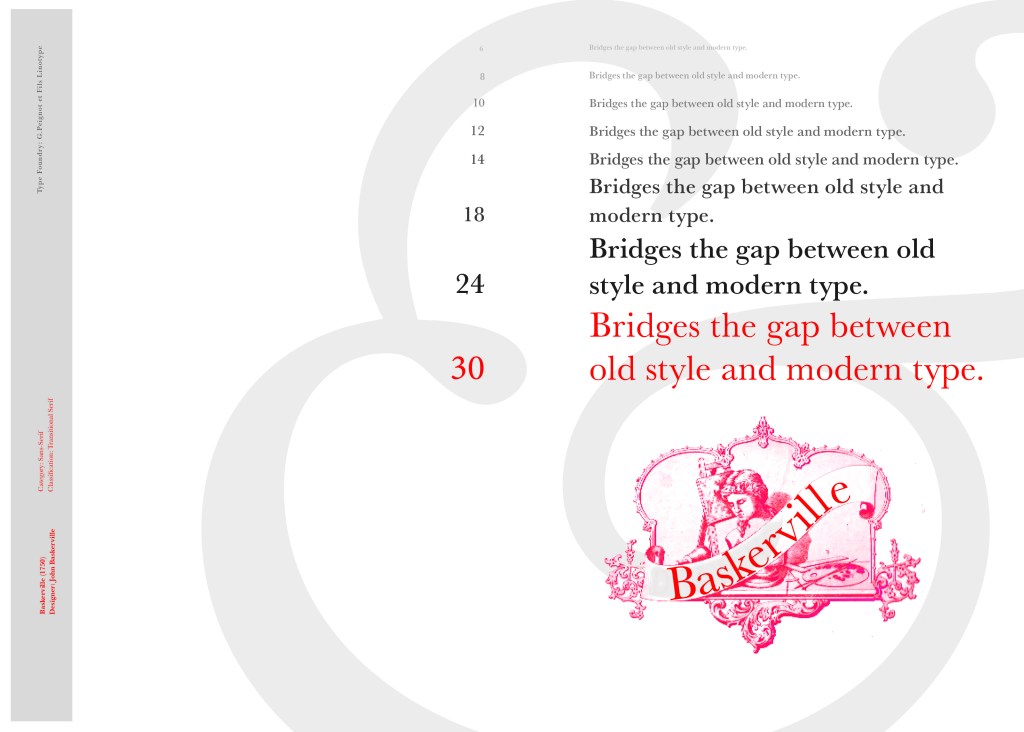
After doing much digital design development I realised (many hours later!) that the layout looked far better with just the ampersand. Let that ampersand do the talking!

The final mockup

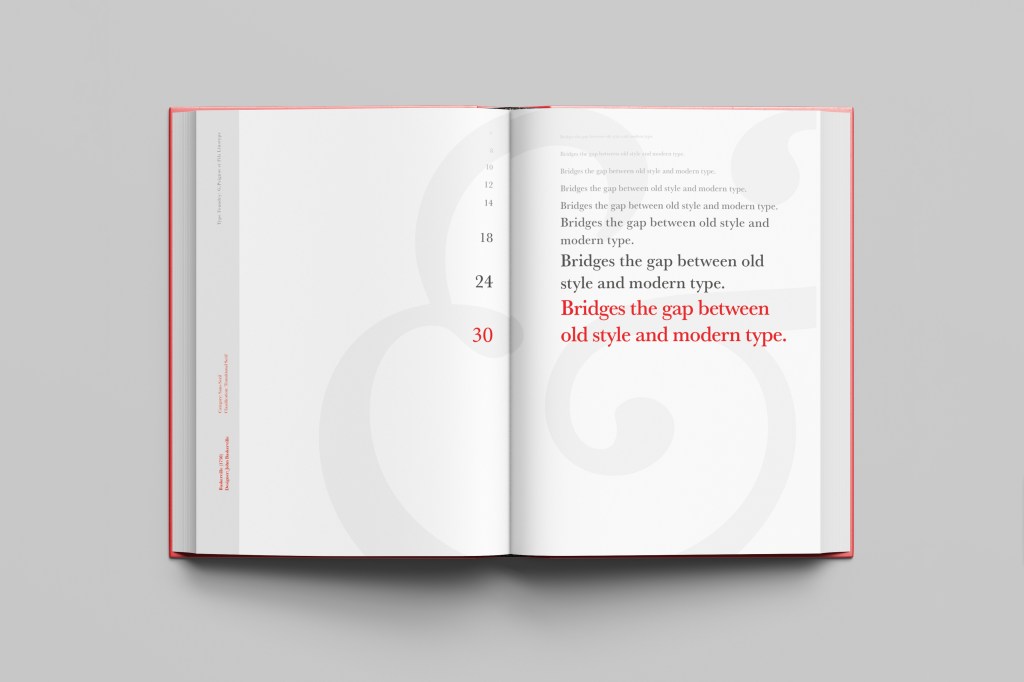
The final design and layout is very simplistic and minimalist but I think it keeps an old fashioned traditional feel with a much more modern look.

If the face fits (part 1: Type specimen book) Chantal

When it comes to decorative/ fun or “gimmicky” typefaces I am not very knowledgeable! In my work I mostly use Sans-Serif which is why I have made my specimen book “Sans heavy”! For this section of my specimen book I had to do my research and look into different typefaces that I could use for decorative fonts. I started by looking at Adobe fonts on Typekit. I found this one called Chantal which from first sight gave me lots of idea what I could do for the design for it in my specimen book!

Chantal was designed by Rian Hughes in England, other than the designer there is limited other information about the typeface so I designed the layout for the pages how I thought the typeface should be used and interpreted the typeface in my own way.

From first sight looking at Chantal it instantly made me think of a Louis Vuitton design that was used on handbags a few years back and also on some of their shop displays, I thought I could recreate a similar thing for my design. As well as reminding me of the Louis Vuitton designs it also reminded me of some Chanel bottle designs that I have seen and pinned on Pinterest, luckily Chantal is a play on words with Chanel so I chose to do a fun, gimmicky play on Chanel with Chantal!

Chantal seems to me to be a typeface that doesn’t take itself too seriously! It looks like it has a lot of fun! I really enjoyed designing these pages for Chantal, it is probably one of y favourite layouts and it is definitely a typeface I shall use in my future designs!

Digital Development

I designed and created most of my design for this using Illustrator and Photoshop. I started off by designing the left side page first. The first page was inspired by the Louis Vuitton design and I had the vision of the first page filled with pure type. I typed out my text how I wanted it (I used the words Fresh, energetic, youthful, fun and lively as this is how the typeface was described on Adobe Fonts) and I repeated the words across the page, I converted them all into shapes so that I could adjust the colours further and move elements if I needed to. Using a black background and a vivid hot pink gave the design contrast and made it look really modern and eye catching. This design is clearly going to be aimed at women, I am not sure that the typeface is aimed at Females specifically but that is how I have interpreted it.

The next stage was to design the “Chanel” play on words part of the design. I decided to draw out one of the famous Chanel No5 perfume bottles in Illustrator but change the name to “Chantal no5”, London (where the typeface was made) and Eau de Type. I really liked how it came out! I then added some effects to the bottle; I used the paint brush tool to create like bubbles of the perfume spraying out and I used part of the type and lowered the opacity to place it behind the perfume bottle to look like the bottle is filled with type. I am really pleased with how it all turned out!

I only came across one problem while creating this design (one that I was able to sort out easily). I accidentally created my Illustrator document in RGB which was good because it gave really vibrant colours but it is not suitable for print; my InDesign document was set to “Print” which meant that when I imported the Illustrator document over to InDesign it came out really dull. I changed the settings over and it soon fixed itself and the colours came out looking lovely again!

When I had created the pages in Illustrator I then exported them and imported them into InDesign to create the final layout. I added the text in white on the right hand side which gives information about the type and the designer.

The really dull version

Design Development

The Final design

The exported Jpeg

The Final Mockup

If the face fits (Part 1: Type specimen book) Mrs Eaves

The last Serif typeface I chose was Mrs Eaves. I like the story behind this typeface and it also ties in nicely with Baskerville.

Mrs Eaves was designed in 2006 by Zuzana Licko in 1996. It is a variant of Baskerville. Baskerville is known for being absolutely perfect, stark and sometimes hard to read and Licko went out to create a version that was softer and more feminine in approach.

Mrs Eaves was named after Sarah Eaves; Baskervilles live in housekeeper who would later become his mistress and eventual wife. It was the story that drew me in to this typeface.. Sarah Eaves was John Baskervilles live in house keeper whose husband went on to leave her and her 5 children. Sarah in time became Baskervilles creative assistant and mistress and then when Sarah’s estranged husband died, they were married. Sarah Eaves was very much the woman forgotten in typography.

I wanted to bring an element of this story into the design; again, similar to Baskerville I had the idea to create a book design for the layout and tell the story of Mrs Eaves but then I saw that Mrs Eaves has the most beautiful ligatures and I wanted to do something with this. At college when I was 17 we had a project (similarly worded to this exercise actually!) called “create a type-FACE” or something similar where I had to create an actual face out of typefaces. I thought about creating a similar thing on my layout using just ligatures. I had the idea of a very feminine pattern and then possibly repeat printing it across the page. What I ended up with though was slightly different; I am a little bit disappointed because this is one of my least favourites looking back on it and it seemed to have so much more potential at the beginning but time was very much against me in this exercise.

I created a very similar layout to Baskerville as the 2 are related back to each other and then started messing around with the ligatures to make a feminine looking pattern. The pattern I created looks a bit like a Celtic cross, it reminds me of something that would appear in a stained glass window. It has a traditional yet modern feel to it. I tried to turn the opacity down on the design as I still think it looks a bit harsh but tuning it down just made it disappear into the backdrop.

Digital Development

The final layout

The final mockup

If the face fits (Part 1: Type Specimen book): Futura

Futura is the last Sans-Serif typeface in my collection! I chose this one because again it is a classic and it also ties in well with the Bauhaus era along with the other Sans-Serif typefaces that I have chosen.

I did take a more modern approach when designing this layout though; instead of staying with traditional Bauhaus colours (Red, Yellow, Black, White) I was inspired by a German slogan “die Schrift unserer Zeit” (“the typeface of our time”) It gave me futuristic/modern vibes and I decided to play off this when designing my layout!

Futura reminds me of “future” and the future is modern and a mystery to us yet… I designed Futura around the theme of modern, futuristic space vibes with vibrant colours and an interesting layout.

The Futura is now

I had the idea to create planet-like orbs using Photoshop by using my brush tool and layer masks. I used this technique on one of my posters that I did for the “365 a poster a day challenge” I started a few years back. I masked the orb area out and making my paintbrush big, airbrushed different colours over each other to create a planet effect. I then copied it twice more create 2 in both corners. I really like the effect it gave. The bright colours contrast against the black to really make the design stand out. I also created contrast between small and big text.

Design Development – The stages of reaching my final design and layout!

The final page layouts

The final mockup

If the face fits(Part 1: Type Specimen book) Frutiger

Following on from Univers, I chose to do another famous typeface by Adrian Frutiger.

Frutiger is a Sans-Serif and was designed to be legible at any size. It was originally commissioned by Roissy Airport in Paris, (Charles De Gaulle) when it was first built to design all the signage in the airport. The airport wanted a new directional sign system. It was going to be named “Roissy” in 1972 after its success but was then Frutiger was approached to make the typeface suitable for print and it was then named after the designer himself.

The way forward for this layout design seemed quite obvious; to base it around signage and CDG airport. The first idea I had was to make the layout look like a baggage tag or boarding pass with the barcodes and airport names etc.. taking a little bit of inspiration from my Casetify Pangram phone case… My idea was to scan some barcodes in and then create another “swiss grit” style design.

CASETiFY iPhone 12 Case - Pangram Custom by Pangram Pangram

I did ask my boyfriend if he had any boarding passes kicking around from his visit to Dubai a few years back (I haven’t travelled abroad in a few years now!) and he did have one boarding pass that I managed to take a QR code from and import into my design;

I also keep a bag full of different cardboard and paper textures and barcodes and anything interesting I could potentially use in my designs; I found a relevant barcode that I could use.

I felt like I needed some images of airport signage next. I did not want to take images from the internet because they would be very low resolution and would ruin my clean, legible design. The only way I could use airport images in my work was to import a web image of a sign and then trace around it in Illustrator to produce a high quality vector image. I did this for a plane and an arrow.

After I had collected these bits I decided to just take it straight into Adobe to try and make into a layout for the typeface. As you can see from the design development, It took me several attempts to get to the final piece! I had a lot of design elements to cram onto one page and I wanted to keep it as clean and as minimal as I could so it was a case of moving elements around the page to see what worked the best. I wanted the design to flow and to not be “too busy”. I think the version I decided on works the best.

Design Development – stages to the final design!

The final design and mock up.

If the face fits(Part 1: Type Specimen book) Univers

Another typeface I chose for my Sans-Serif collection was Univers. I have already used Helvetica and Akzidenz Grotesk and this is the third typeface that relates to all those; they are all based upon Akzidenz Grotesk. Univers again played a crucial role in Swiss style. I did worry that by doing all three of these typefaces that they would be too similar as they are often mistaken for each other but if I am creating a specimen book for my own personal use I would use all 3 of the typefaces in my work.

I tried to make the design for this slightly different to the others that I completed to date; Univers referenced the periodic table and Adrian Frutiger took a different approach to designing it then anyone ever had before. He wanted a table system that showed the different typeface weights and variations as numbers instead of names. Frutiger has since used this method in more of his type designs.

55 was crucial in the design of Univers; how Frutiger designed the whole typeface was to design “55 Roman” first and then base the other variations and weights around that. I decided to use this as the main design in my typeface book. I tried to be more experimental with this layout, using the 55 as part of the negative space in my design. I did want to bring in the periodic table element but struggled to keep it looking clean and simplistic. In the end I used blocks of colour to represent the periodic table influence on the typeface and I think this worked well.

Design Development – The stages of reaching my final design and layout!

The final design pages and final mock up

If the face fits(Part 1: Type Specimen book) Helvetica

Pages 1-2: Helvetica (Sans-Serif)

When you think of Sans-Serif there is only one typeface that comes to mind immediately and that is Helvetica. Helvetica is possibly a designers all time favourite. It was designed in 1957 in a new world after the war where the need for function over beauty prevailed. There was a need for clarity, function, cleanliness and for text to be readable, legible and straight forward communicating. The mantra was “less is more” and “form follows function”. The focus became on the content rather than the design and any ornate detailing. The designs of the time were very mathematical; Designers of the time designed religiously around the grid. Bauhaus at the time was also a massive influence.

For this design I wanted to represent everything that this typeface stands for; minimalism, cleanliness, Swiss designed and legible. I started off by doing some intensive research into the typeface; I used Pinterest as I always do to look at lots of type specimen books that already exist for Helvetica. I watched the film Helvetica again, I bought a book all about the history of Helvetica.. I really went deep with the research!

I noticed that a lot of type specimen books use “The quick brown fox jumped over the lazy dog” to showcase their typefaces with the different styles/weights/widths etc.; I did not want to do that. It just did not fit in with the feel of the typeface at all! I was really making myself nervous about completing this double page layout for the fact that I wanted to do the typeface justice and didn’t want to design something awful. I decided to refresh myself on the typeface by re-watching the film “Helvetica” for some inspiration and ideas, It was from this that I got the idea to use one of the quotes from the film;

You can say, “I love you,” in Helvetica. And you can say it with Helvetica Extra Light if you want to be really fancy. Or you can say it with the Extra Bold if it’s really intensive and passionate, you know, and it might work.

Massimo Vignelli

I decided it would be a good idea to use this on my main design to replace “The Quick Brown Fox”. I actually used Helvetica Extra Light and Extra Bold when I wrote the quote to show the different styles and weights of Helvetica on my type specimen page.

I used Red as the dominant colour and the red Swiss cross in my design to represent the origins of Helvetica.

I then started to lay everything out onto my pages and reorganise. I wanted a lot of negative space. It needed to be minimal and to not be ornate in any way.

Design Development – The stages of reaching my final design and layout!

I was really happy with how my final design and layout turned out and it was also well received on social media when I uploaded it to my college Instagram page!