The Time Machine: Digital Development

Yesterday I decided to have a go importing my hand drawn ink design into Photoshop and have a play around!

I am not a pro at Photoshop to say the least, so the tutorial I watched on Skillshare a while back that I wrote in my blog about really helped me!..

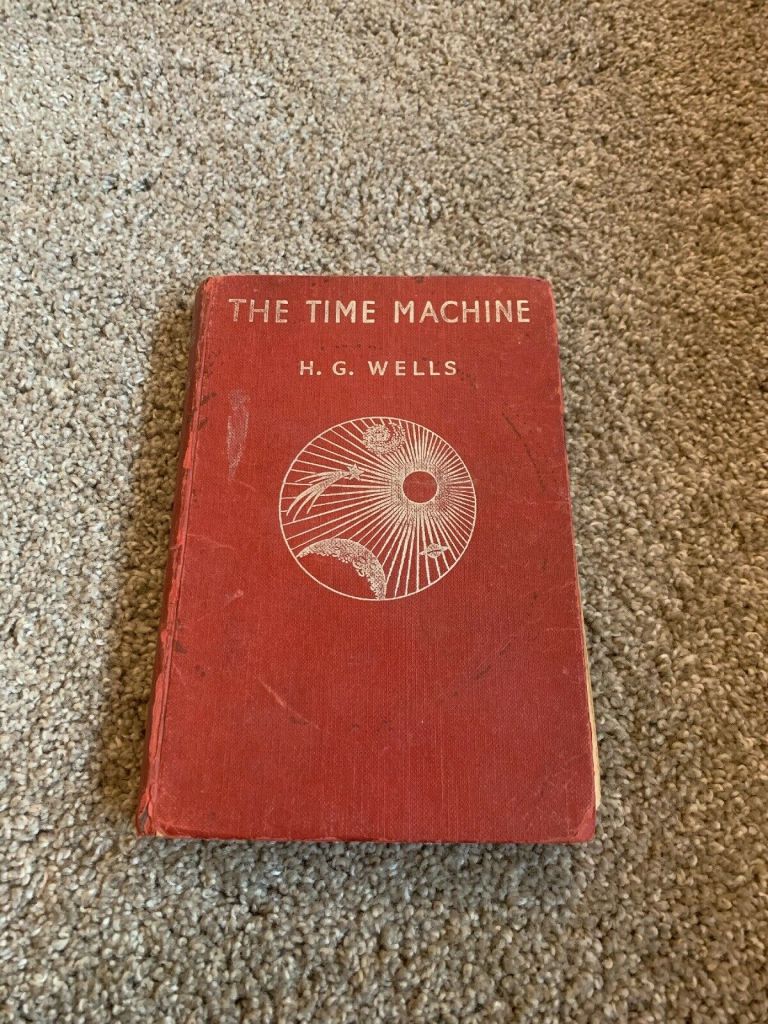
I decided to change the colours, I want each of the 3 books I design to use 3 different colours and work as a series in that the designs are the same and also the colours tie them together. The flowers in the Time Machine are white but dead, brown and withered at the ends so I decided to alter the colours to match this… I went with a white/murky yellow/black colour scheme.

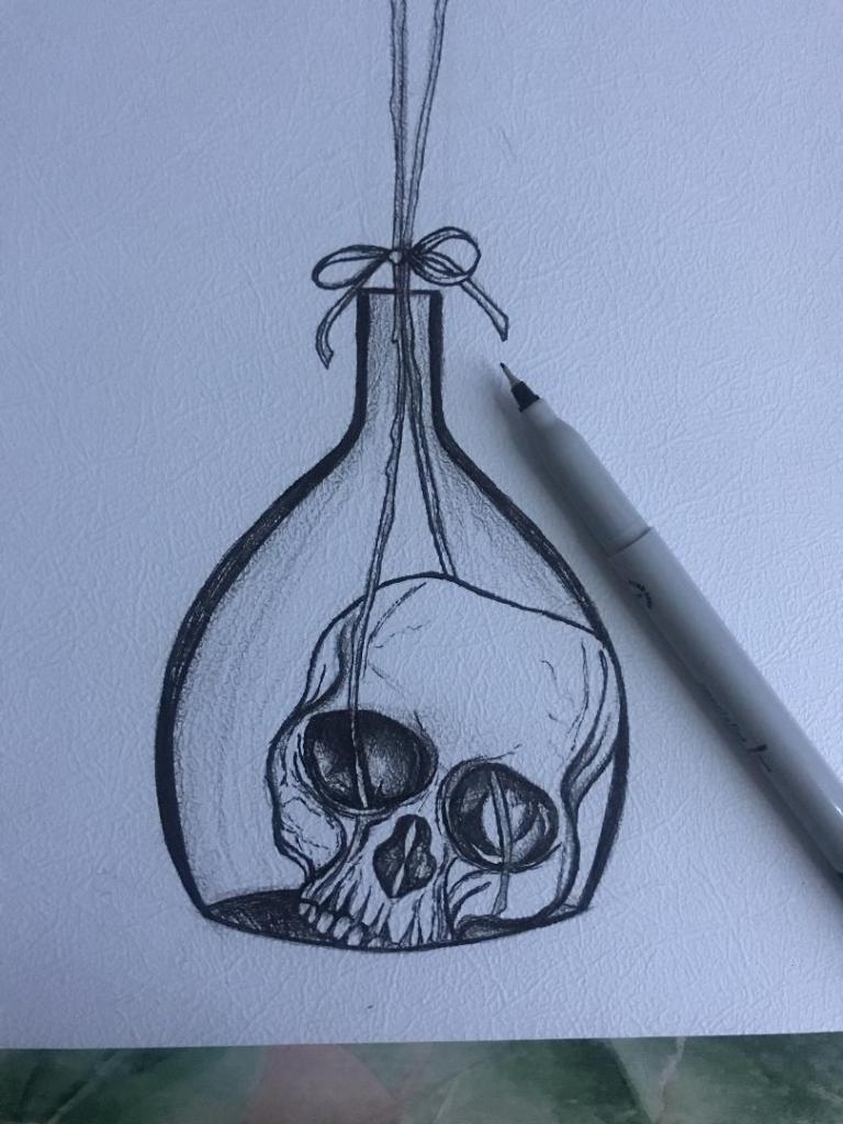
To get me familiar with changing the colours and doing certain things in Photoshop I had a play around first, this was the trial starter piece..

Using the pen tool to draw around areas and making them a selection so that I could add colour to the area and then multiply to blend it in with my line drawing. I then created a clipping mask on a duplicate layer to further blend more colour in.

When I felt more confident I then started on a proper version;

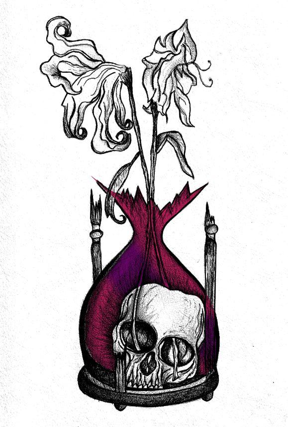
This one I kept the colours quite subtle… I coloured in all of the flower shapes with a murky yellowish colour and carried this on into the hourglass. I liked it but it didn’t shout out at me..

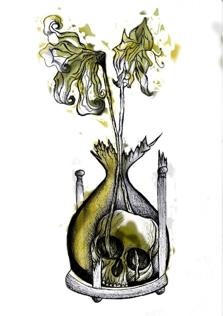
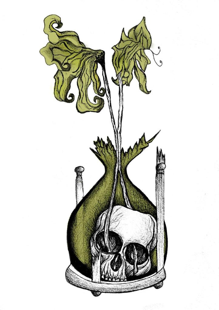
With this version I messed around more with the colours and blending them to create 2 tone effects. I accidentally moved the flowers layer but actually quite liked it being out of the shape slightly.. It gave a mix of the 2 colours; white and yellow. I also created like a water colour/watermark effect at the top of the petals.

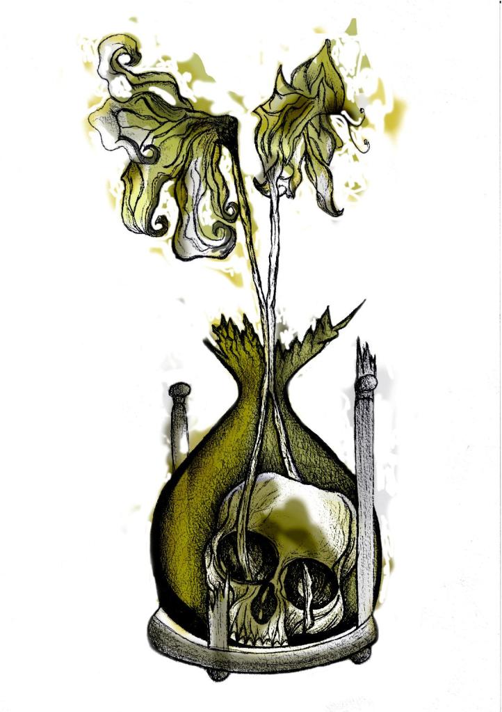
In this version I made the colours more deep and murky. I feel the colours are the strongest in this version. Overall I am happy with the progress I have made with it and the new skills I have learned, however It still needs improvement… I now need to find ways of how to make it work on a book cover with the typography element etc.. I think though that I shall draw the other 2 book designs and then take all 3 of them together and then look into layout and typography etc..

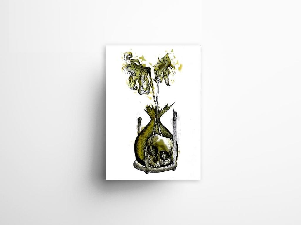
I also looked at mockups for displaying work more professionally on my Instagram account. I downloaded a simple poster mockup document and then added a drop shadow around the edge of my image.

The Time Machine: Drawing development (cont.)

Last night I finished the second attempt at my drawing! – The new and improved version with the “time” element. I feel that when you look at this image you can get more of a feel about what it is relating to rather than the version with just the bottle. it works better as an overall design for the book as it gives away more of what the story could be about.

I think I shall develop this a little bit by importing it into Photoshop and adding different colours. I think I shall also experiment with different media; watercolours, pencil crayons etc… I have also bid on an old 1950s edition of Time Machine that is falling apart specifically so I can tear the pages out and collage them into my design (That’s if I win it!). I want to experiment a little bit more!

The Time Machine: Drawing Development (Cont.)

I finished off my first design drawing of the skull inside the botanical bottle and the 2 white dead flowers out of the top.

I am very pleased with how it looks! (and it looks quite nice on my insta feed! ;p)

However!…… I feel like I am diverting away from the purpose of the book (with my pure shock at how decent this actually looks after so long not drawing!!) – I feel like it is lacking the “time” element… The whole purpose of the image on the cover is to give a snippet of what the book is about, at the moment it could be about anything! The bottle could be seen as a normal vase so it’s not as though the science part I am trying to portray gives it away!

I thought back to the hourglass timer idea I had in my sketchbook and began to think about how I could bring that back into my designs..

I scoured Pinterest (see below!) I wanted an hourglass timer but a broken one; I wanted the flowers to protrude out of the broken glass. The Middle tattoo on the link below is the one that gave me the idea for my next drawing.. I could turn the bottle on my present drawing into the bottom broken half of an hourglass timer.

The drawing would then have the “time” element, the cannibalism story of the Morlochs with the skull and the 2 white flowers which symbolise that the time travel happened and represents the love from Weena.

This is what I have so far!…

The Time Machine: Drawing Development

“That’s very macabre but very good!” – Mum, 21/11/2019

I worked some more on the development of my final idea, I had another go sketching out what I would like on my final cover to see how it would work! When I have completed the drawing it is my plan to copy it several times and experiment with different looks and techniques (I want to try the tea staining and watercolour again)

I feel that even in one night since I drew the first rough drawing that I have improved massively! I kept quite light on the shading with this one so far and it does look much better. I also felt like I was trying to compare how good my drawing skills are with everyone else I was looking at online. Obviously I was looking at examples of ink drawn pieces and I felt myself trying to make mine look similar.. it was only when I stepped back and looked at a really good ink drawing I did back in October that I realised to myself that I am good at ink drawing but that I just have a different style! I shouldn’t try and sway away from this to be like everyone else because mine is just as good but in different ways!

It is nice to sit back and do some drawing though and improve my skills so I shall give it a few more attempts before hopefully I shall feel I can settle for one final one to take forward and be happy with!