The Brief

I had a read through this brief and it seemed fairly straight forward and not intimidating or overwhelming, however! by the time I had finished this brief I was so fed up of it! I did not realise that having a black and white restriction in place would actually prove quite challenging! There is also a lot of text to fit into a small space which was also a challenging aspect to this brief.
I decided I would start off and design the A3 poster first and then when I have a design and layout for that I would take that forward into the A6 flyer.
I started off as I usually do by researching what is already out there in the wide world. I searched Pinterest for singing posters and noticed that practically every single one was the same style and format.
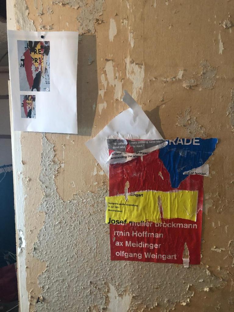
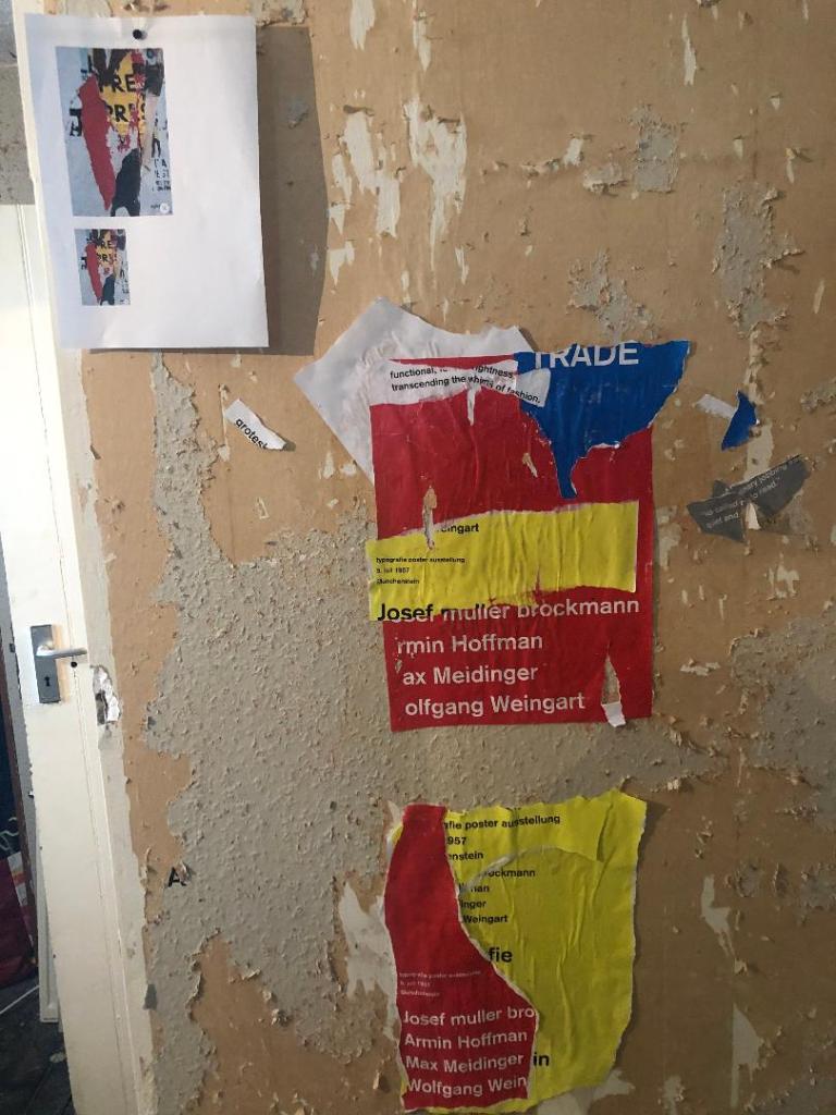
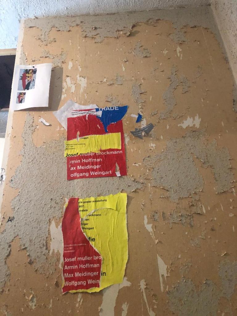
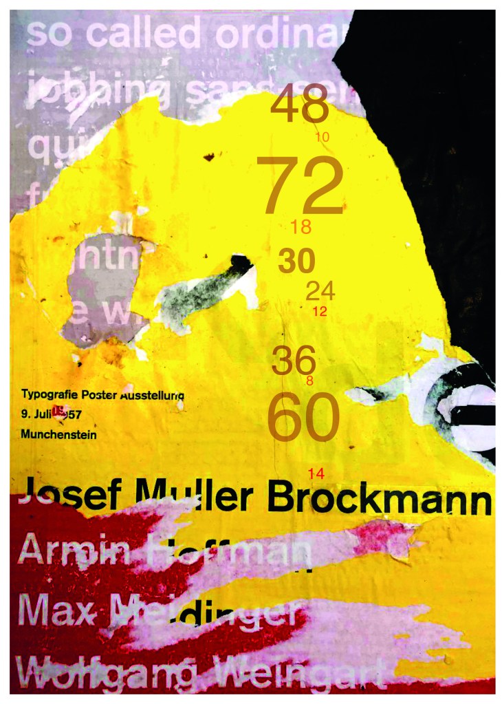
All the posters I found featured images of microphones, people singing, musical notes… I wanted to do something slightly different though. With such a small space and the limited colour palette, whatever design I decided to go with needed to be simple and clever. I instantly had the idea to try and do something similar to a poster that I know by Josef Muller Brockmann. It was a poster for Beethoven and it cleverly uses negative space and simple shapes.

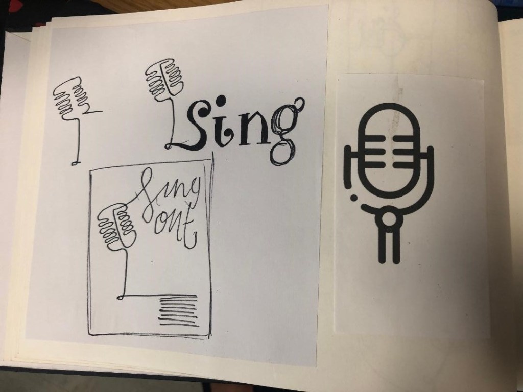
There were some images that I found that gave me ideas or inspiration the most. They are these:

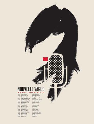
I liked the layout of this design, the text coming out of the microphone 
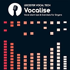
Vintage Retro Microphone Device For Singing Vector Icon Thin Line. Microphone And Headphones, Concert And Theater, Opera And Karaoke Concept Linear Pictogram. Black And White Contour Illustration 
I started to sketch up ideas very similar to this poster in my sketchbook. I used a microphone as the main image and tried to simplify it down to its basic form to create a similar effect to what is seen in Josef Muller Brockmann’s posters. I was trying to find clever ways of making negative space the main design instead of using actual images, illustrations or photographs.
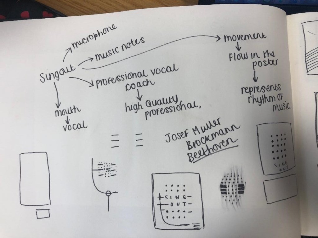
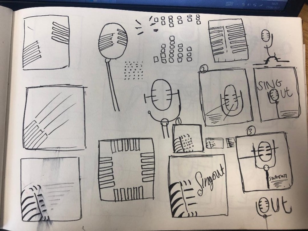


Trying to create it proved too difficult though, I was only using a section of the microphone and because of this I struggled to get the design to still look like a microphone. I also struggled to make the text a part of the design because it would have looked too small and not stood out at all. I went back to the drawing board and started with new ideas…
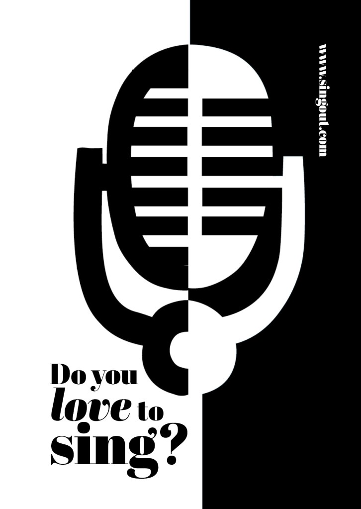
I started to feel frustrated that I couldn’t crack this brief in the way I originally wanted.. My thought process now was “Right! What is black and white, how can I make it negative space?!” BOOM! A 90s throwback of the Ying and Yang symbol appeared in my brain! What if I created half of the microphone in the white and half in the black….
I started to draw ideas:
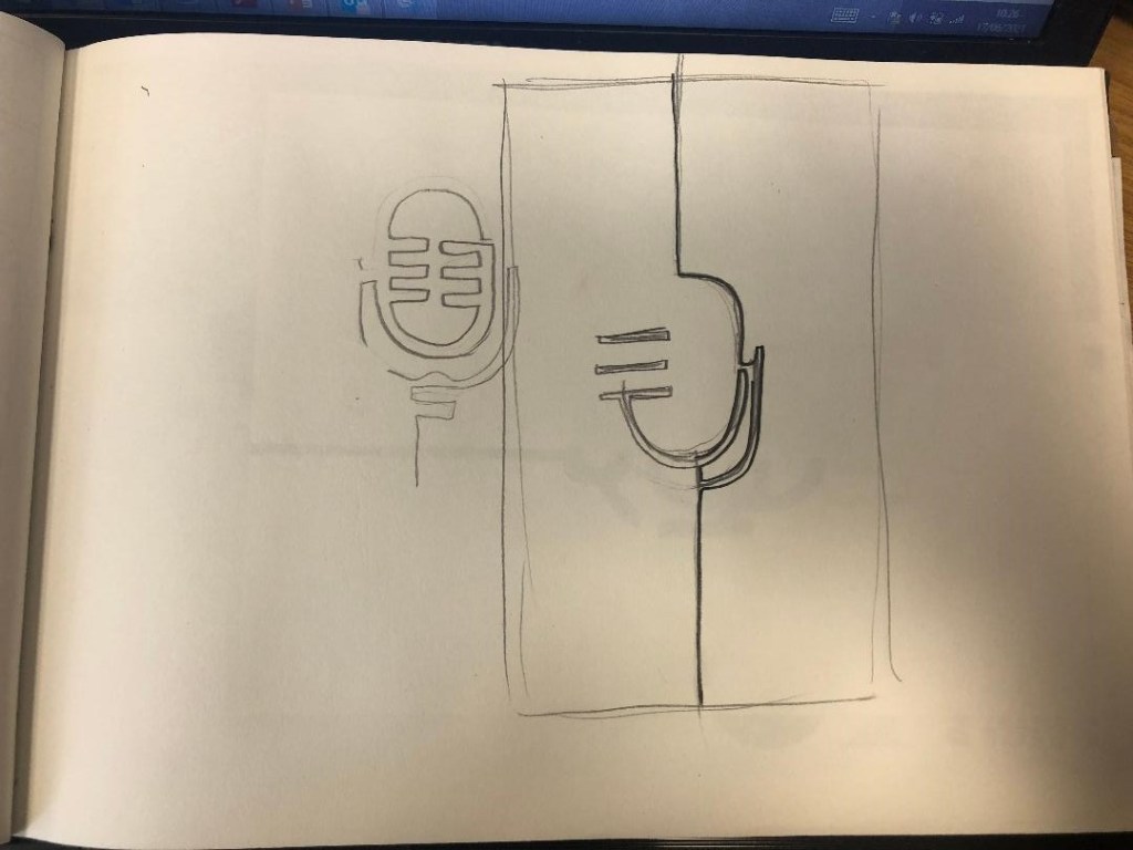
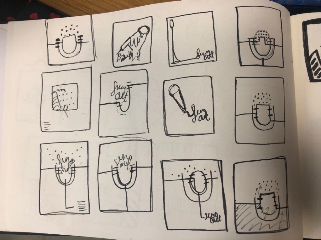
This could work! It looked like a microphone and it played on its negative space as part of the design!
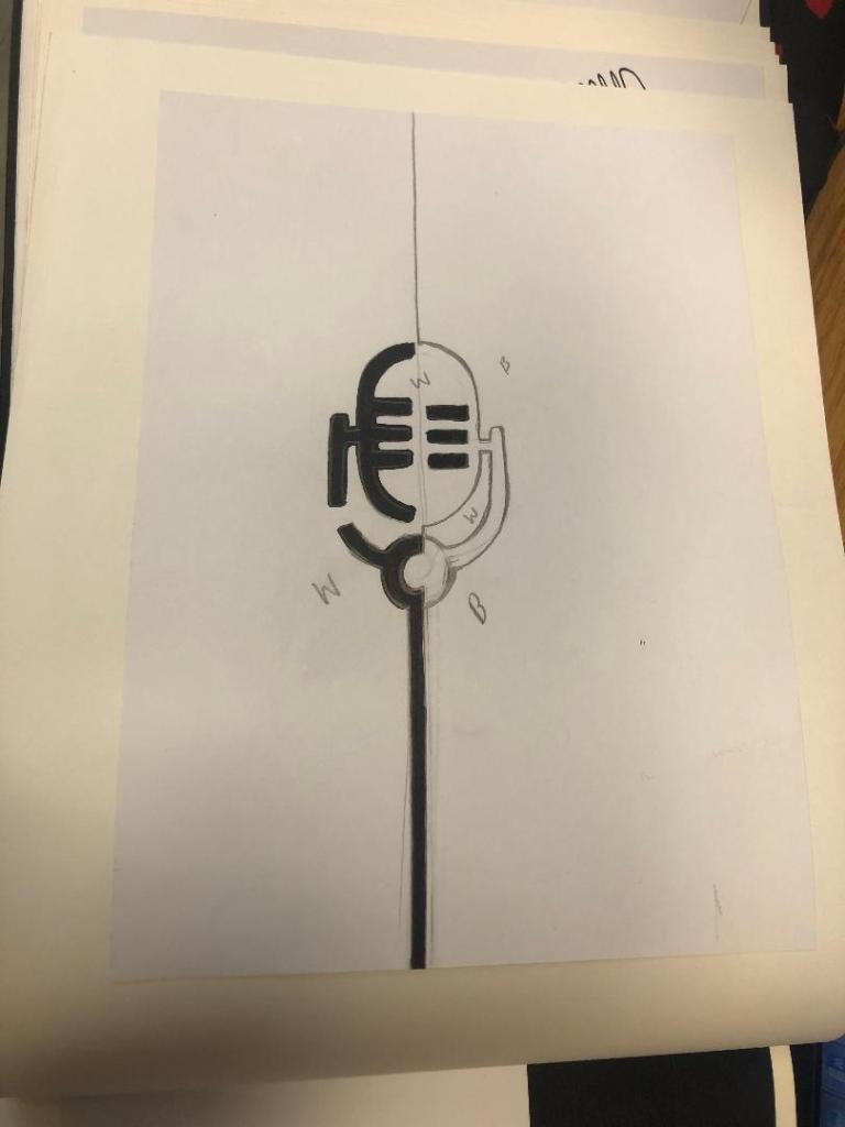
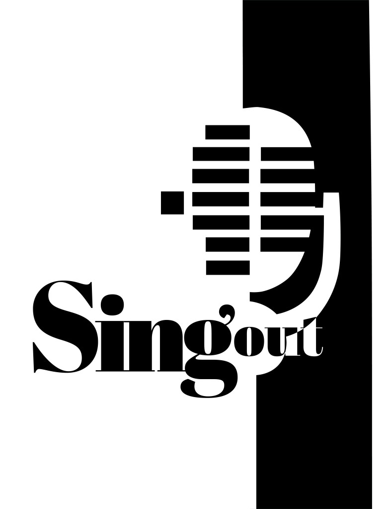
I imported my drawing into Illustrator and started the process of drawing around it. This is what I ended up with:
It stood out, it still looked like a microphone and it used negative space in the design! I decided to move forward and develop it further!
The next step as to figure out what typeface I wanted to use in my design, the one I chose to go with was Abril Display. I like it because the Black display is very bold and it stands out but also looks very ornamental and decorative too. The serifs look like the ends of music notes.

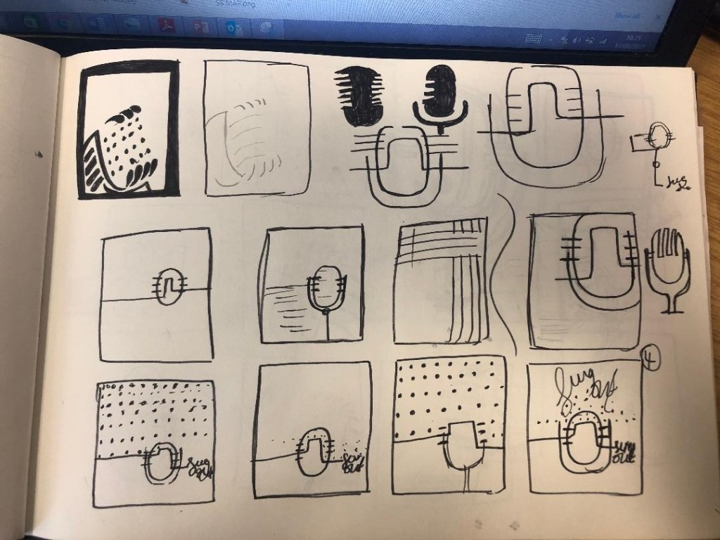
I then played around with the layout of my poster:
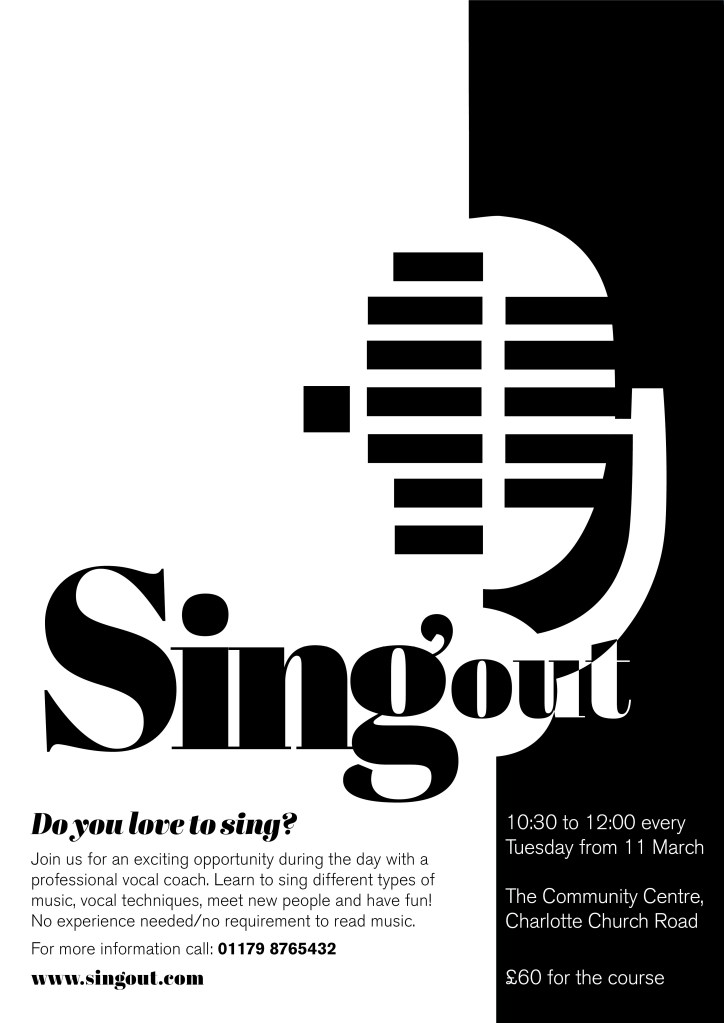


I messed around the most with how to display “Singout” – all one word! This was a challenge also! I decided to make”Singout” 2 different sizes but still one word for 2 reasons; 1) for contrast 2) to separate the word up but still keep it as one word. I placed the “o” in “out” in the centre of the microphone on some of the layouts as I felt it would make it look part of the design, however it changing the colours in “out” looked too confusing and was not legible at all.

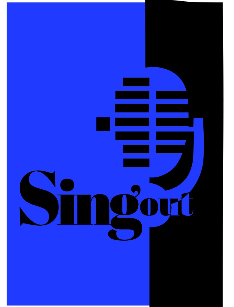
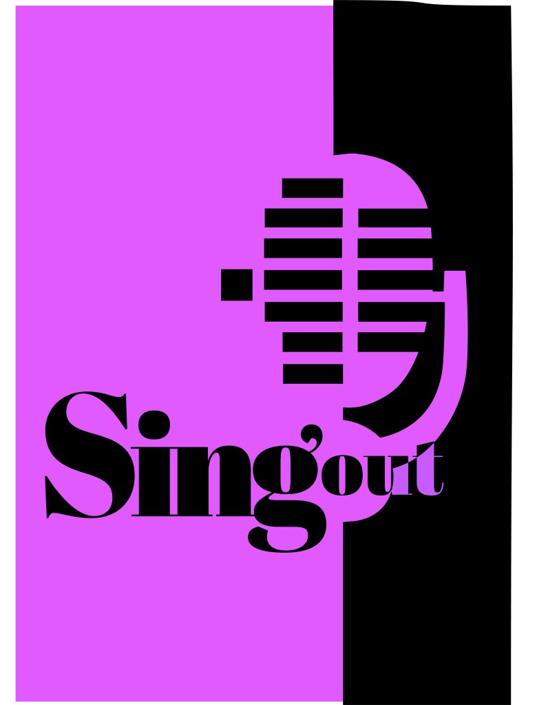
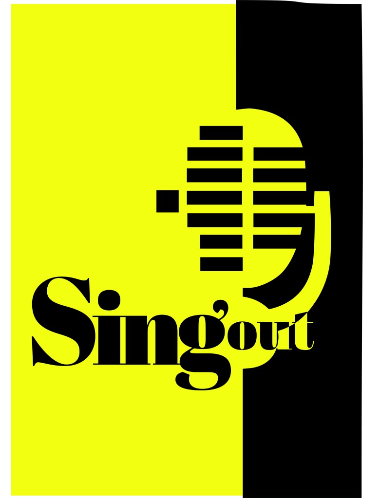
At this stage I did also experiment with different coloured backgrounds just to see how it might look if the design was printed or photocopied onto coloured paper.

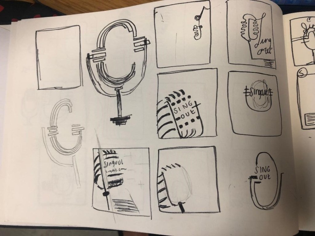
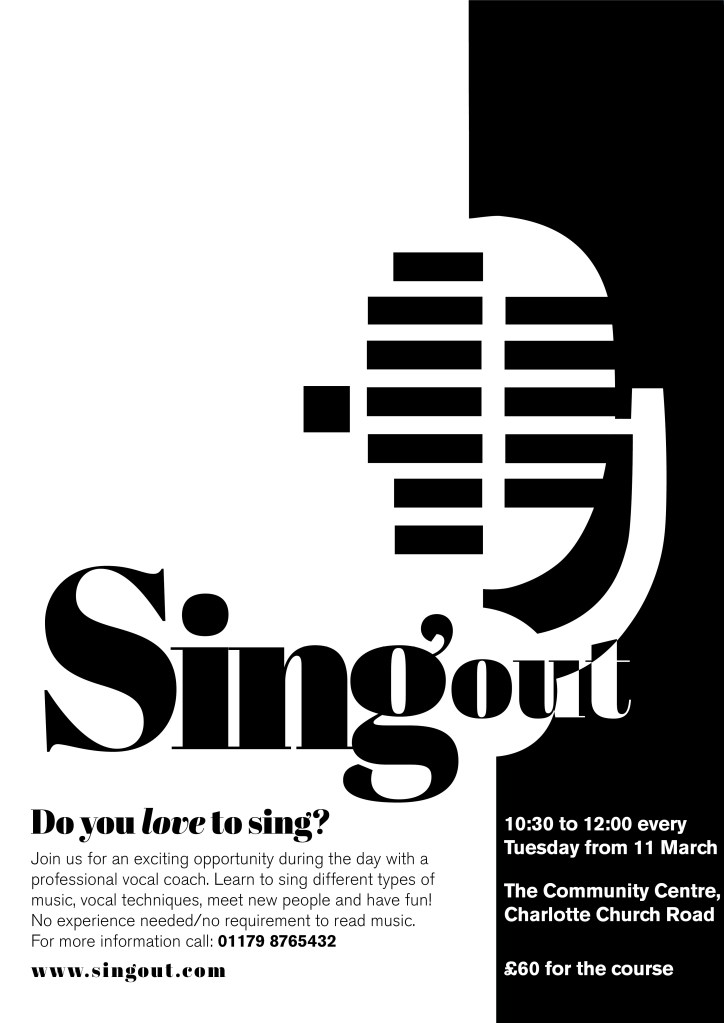
I decided to go with this poster design below in the end:

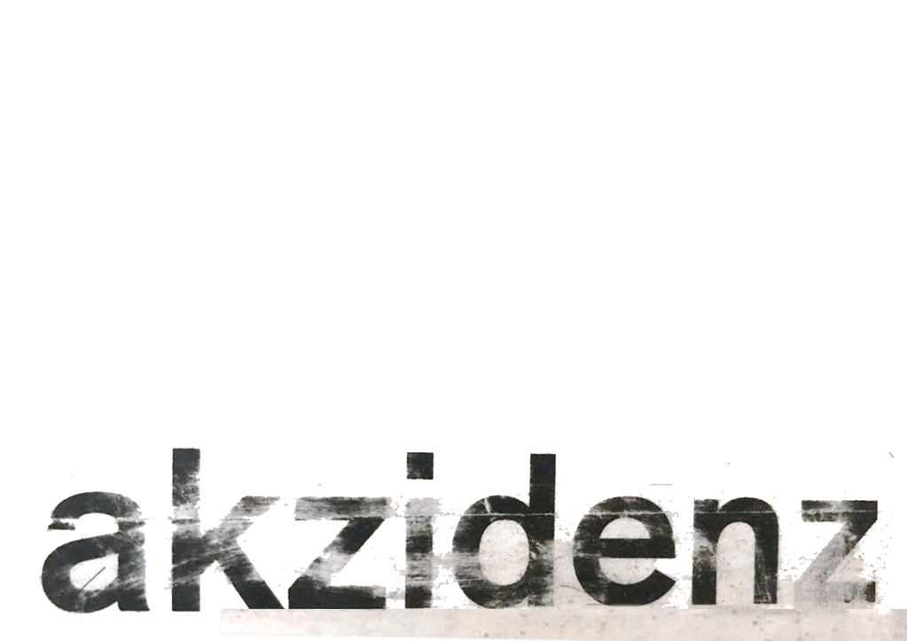
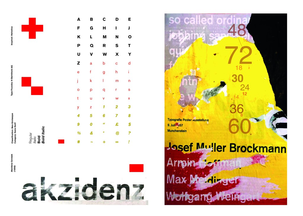
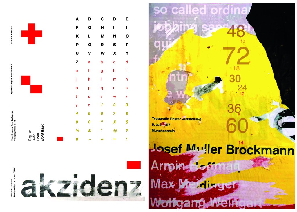
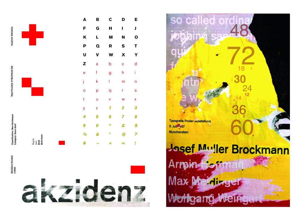
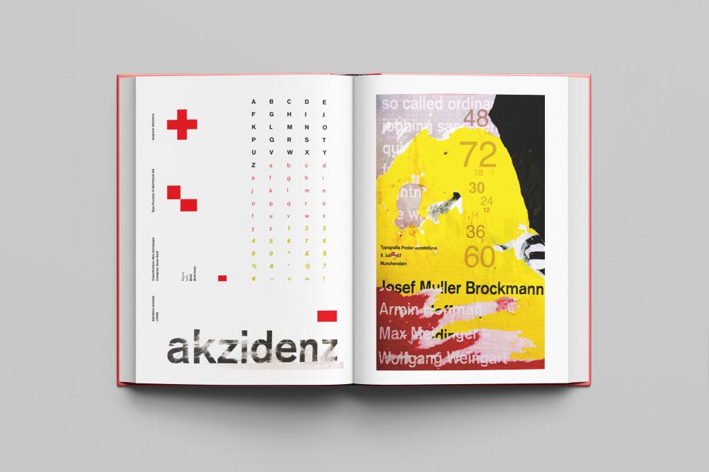
Singout as 2 different sizes for contrast an legibility. “Sing” is seen first as the vital information and then “out”. It could also represent being smaller for being “on its way out”. I used the same typeface for the sub heading of the poster and also for the website. This typeface is a serif which does not make it an ideal typeface for body text. The rest of the information I used Berthold Akzidenz Grotesk. It is a Sans-Serif typeface which makes it ideal for important information that needs to be read as it is clear and legible.
The final poster mockup
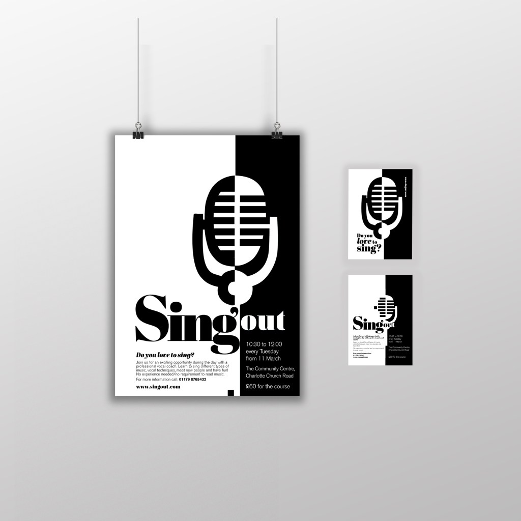
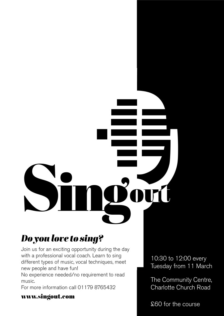
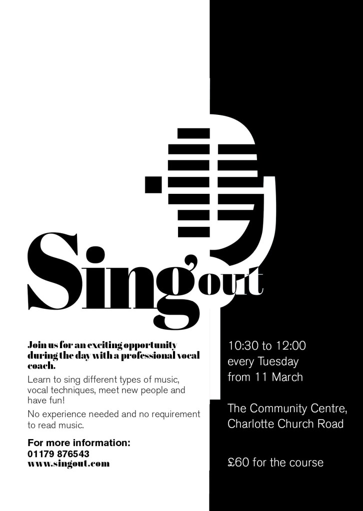
The A6 flyer
I used exactly the same format and layout for the flyer except that for the back of the flyer I used one of the ideas for the microphone that I did not use for the poster (I did not want to repeat the exact same image over 2 sides) Working in a small space was a challenge but I chose to use the first side of the flyer to draw people in first; the first thing people would see is the catch line “Do you love to sing” and the website. If someone who was a singer saw the front of this flyer they would be interested in finding out more information and turn the flyer over, some people might just see the flyer and remember the website to browse later on or some people would see the front and know it’s not of any interest and instantly discard it. Either way, the first side of the flyer is to get the attention of the reader.
The second side of the flyer is for the information that is wanted to be read. I have kept it in the sae layout as the poster so that it is easily understood and read. This side does not have to fight for attention as it is information that the person as been willing to read after being drawn in by the first side.
I think these designs work well. I am pleased with the outcome of this brief, I have met what was required of me and have produced material that can be cheaply distributed and photocopied to a high quality. The design stands out and grabs the attention of the client.