Part 1: Exercise 3 – Alternative Publications

The Brief –

Using your research into artists’ books and fanzines as a starting point, think about their physical or design qualities and creatively apply some of these approaches to your own designs.
For example, there’s a distinctive visual quality to many fanzines which comes from a ‘cut and paste’ approach to designing and through the use of cheap photocopying and printing. Punk fanzines in particular make a virtue out of having limited resources, no computers and little, or no, formal training as
graphic designers. Use your sketchbooks to experiment with a similar ‘cut and paste’ approach by cutting and collaging magazines and other material. What does this approach offer you as a book designer?
Alternatively, you can find other ideas you would like to test out in your sketchbook. You don’t need to make any finished designs, just give yourself room to experiment and try things out.

Starting out…

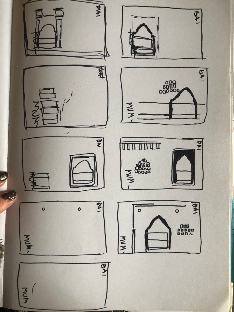
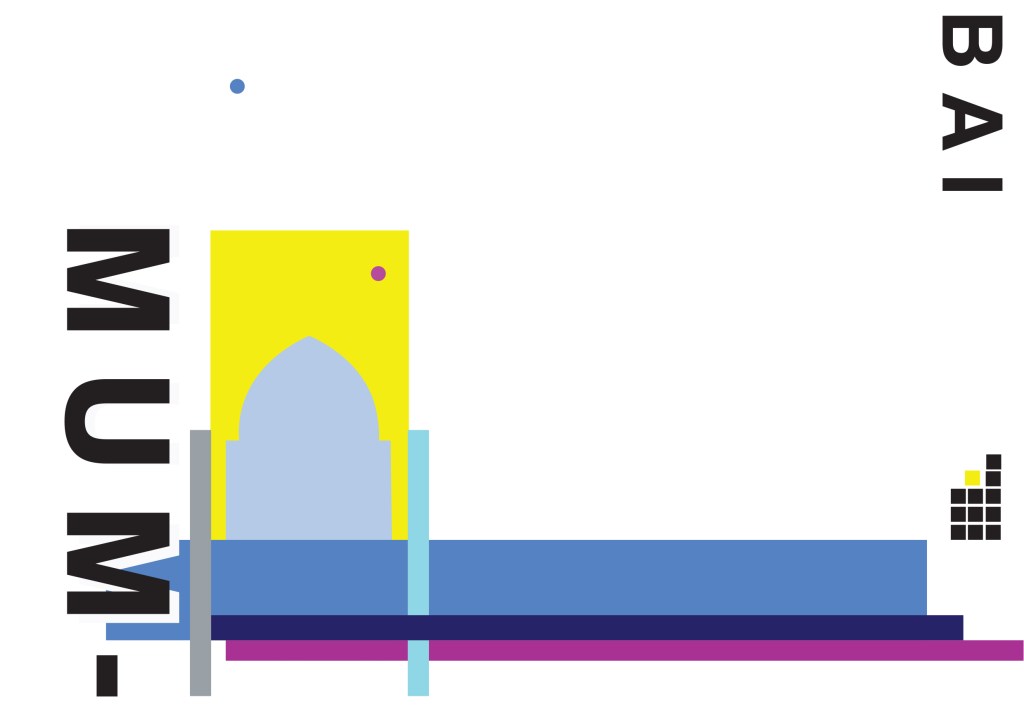
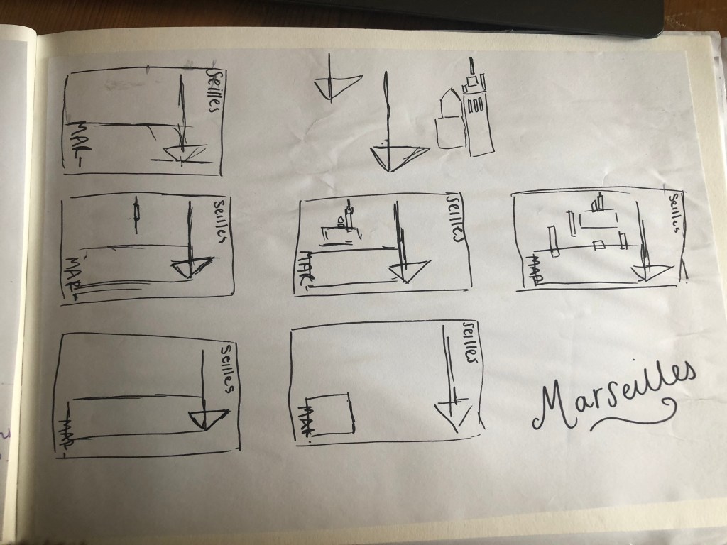
This is a very open brief!- there are no restrictions in what I can do with this! The brief is to start some experimentational work in my sketchbook which I am guessing I could potentially use or refer back to for Assignment 1.

When I think of experimental work in design, I automatically think of experimental typography with the likes of David Carson, Chris Ashworth and Roy Cranston. Sophia Clausse could be another contender for this too; I stumbled across her work when I was researching fanzines and artists books. I really like this style of work and I have used it in quite a few of my past exercises and assignments in Core Concepts.

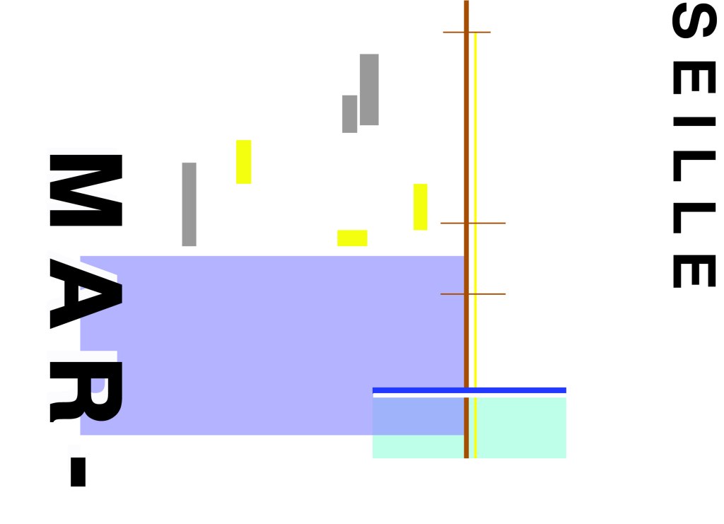
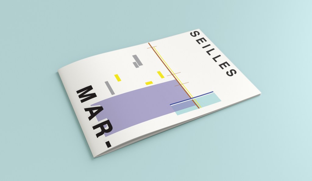
It also reminded me of an experimental piece I did in Core Concepts which I was really pleased with at the time. Again, this was inspired by David Carson and Chris Ashworth:

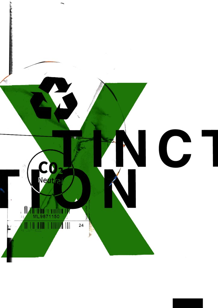
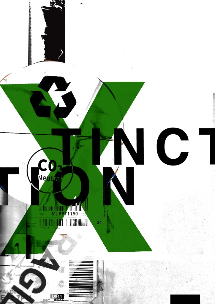
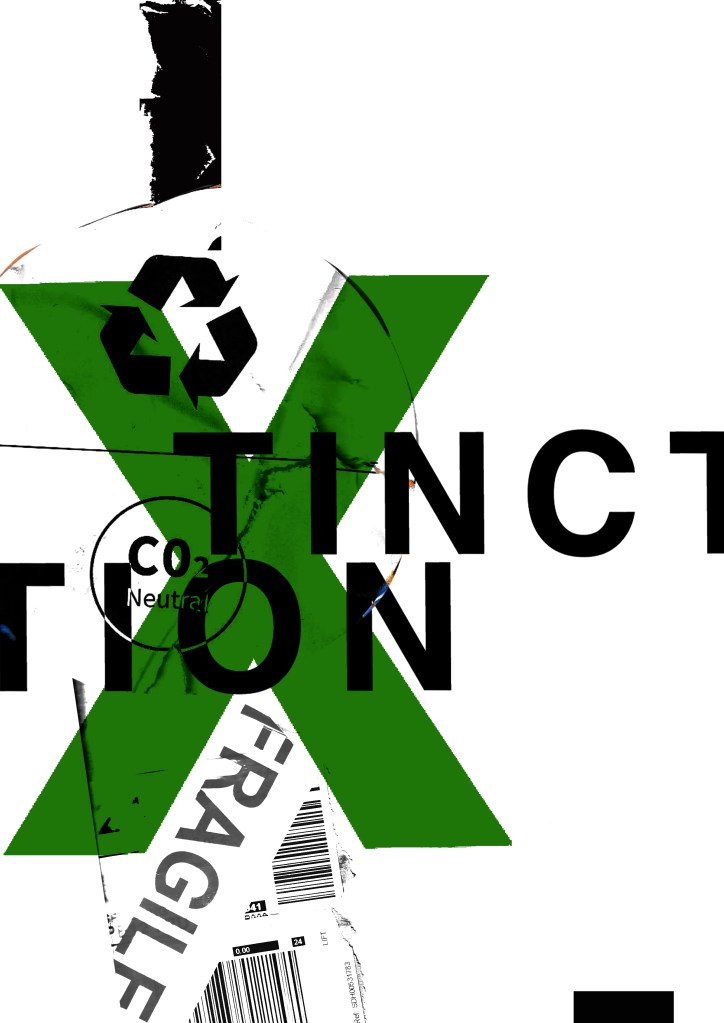
How I made these was by using old packaging and printed barcodes and turning them into a composition to then import in digitally to add typography:

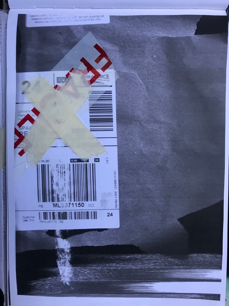
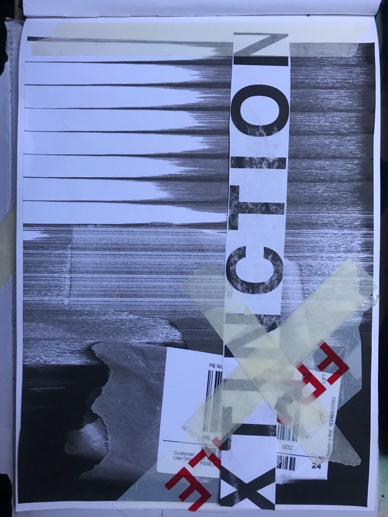
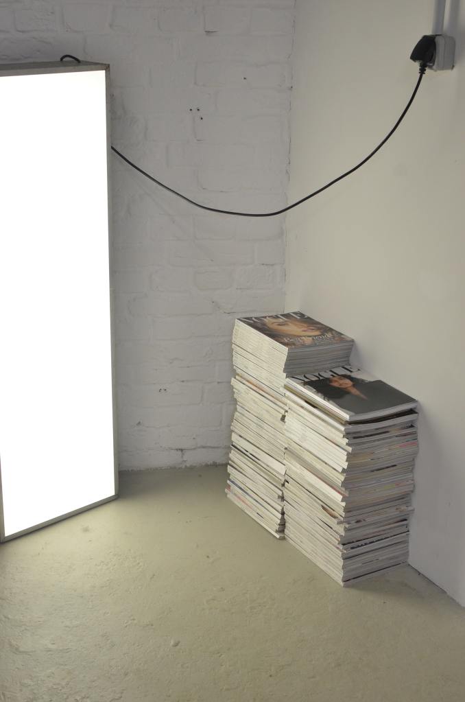
I keep a bag of packaging and random materials ever since I completed that exercise because I just never know when I might need to use them again for something similar!

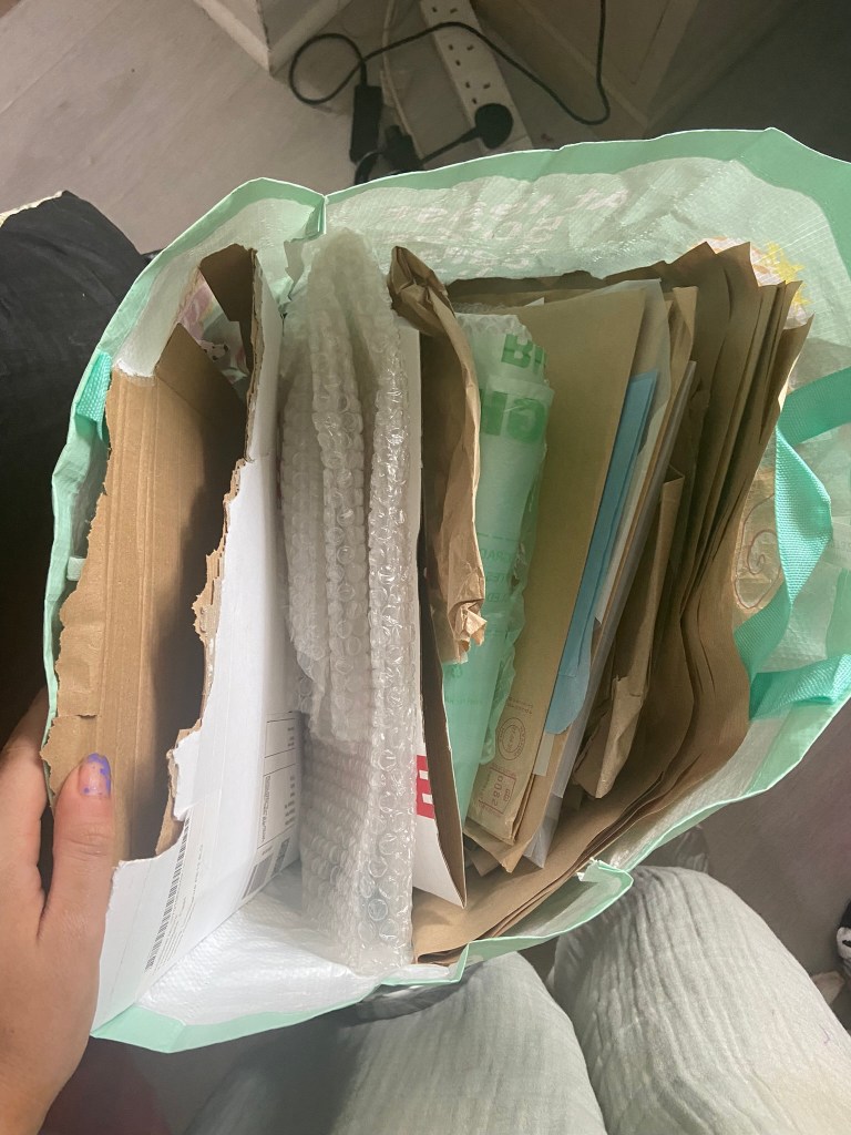
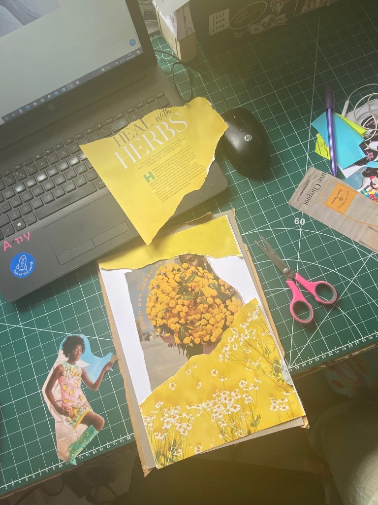
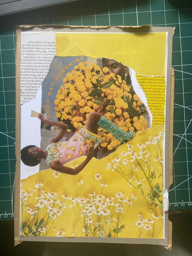
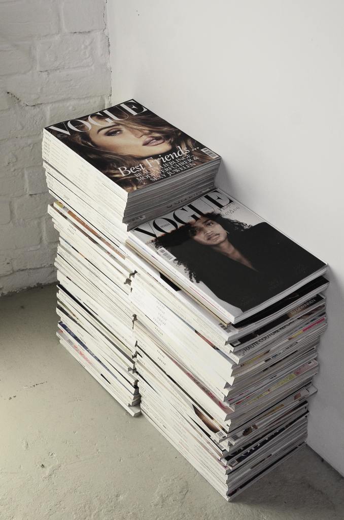
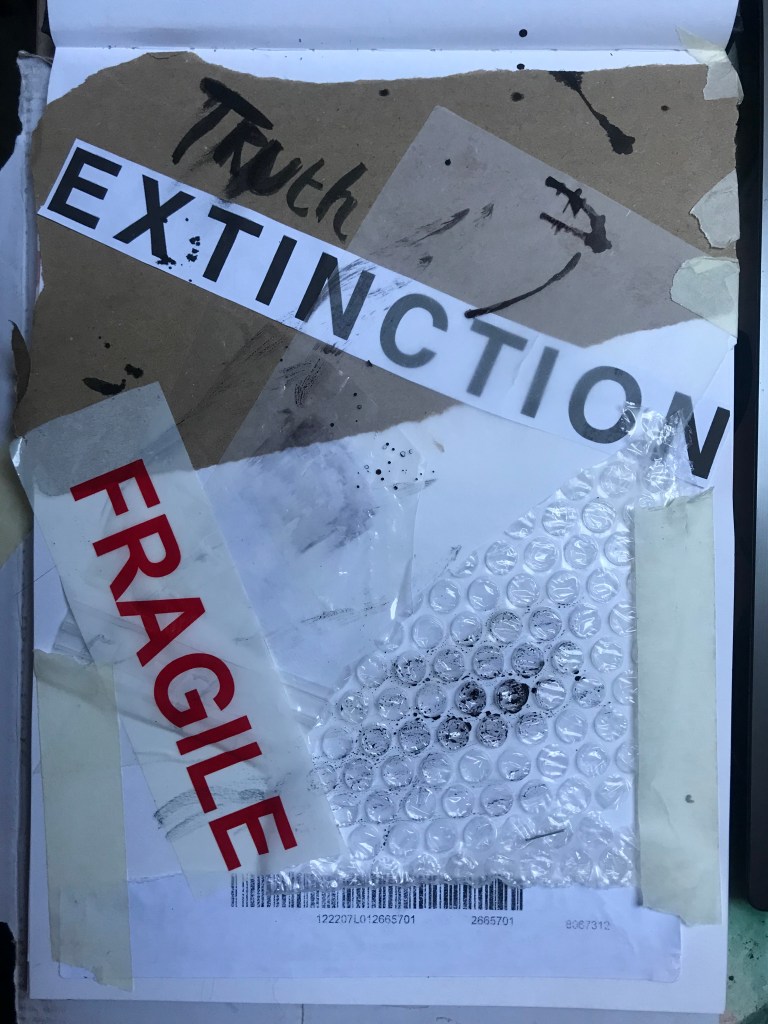
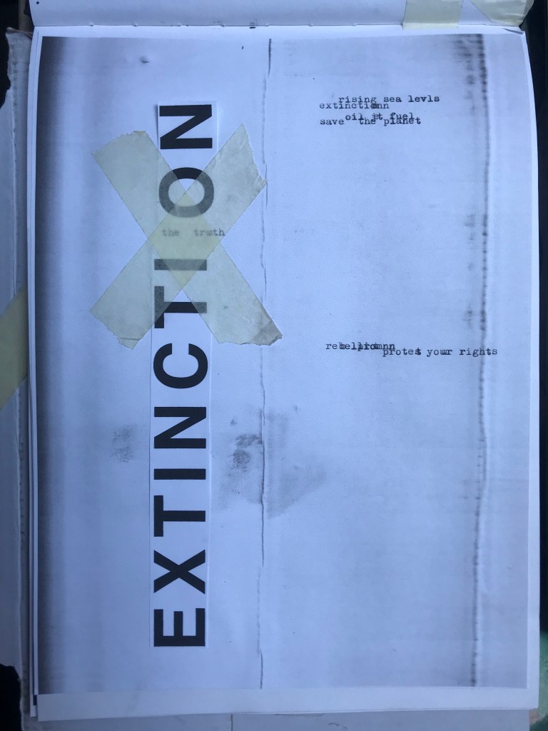
I got this bag out again to see what I could come up with for some experimental collages for this exercise. I also had some old fashion magazines that I used. I found some bright yellow summery layouts in the fashion magazines – a lot of material based around lemons! With the cuttings I found I decided to make some sort of story out of them…

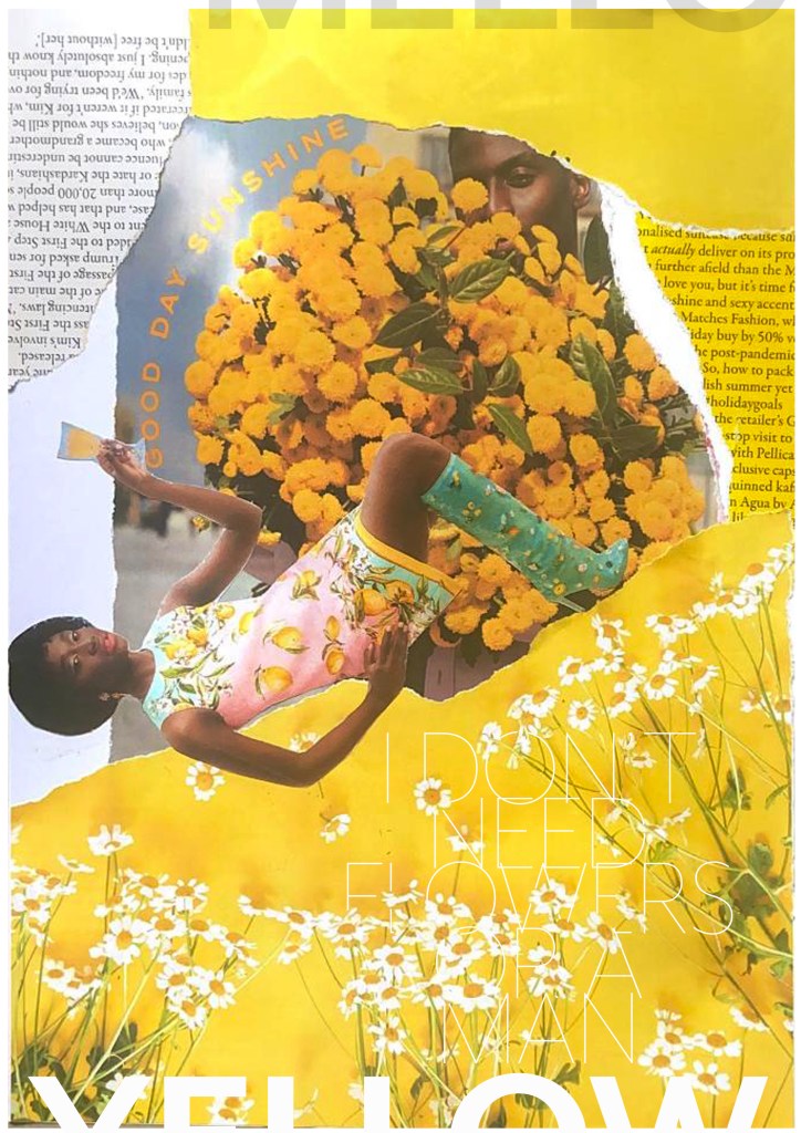
There was an advert of a man holding some flowers and looking all shy behind the bouquet and then I found a clipping of a woman all dressed in lemons and yellow and looking very chilled out and relaxed drinking a glass of something alcoholic! The woman looks way too self involved to want the man or his flowers and I played on that in the text I use “I don’t need flowers or a man”. I wanted some kind of balance to the piece and that is where I used the bottom clipping of the flowers but also used another part of that to go along the top. I did the same with the clippings of text I found.. I placed them across from each other on the layout, it just made the hierarchy look much more balanced out. To add some contrast to the piece I added the larger text for the main title “mellow yellow” but changed the opacity at the top so that yellow stood out much more.

This exercise shows you how much you can create some pretty cool, meaningful layouts using just some magazine clippings and typography!

If the face fits (part 1: Type specimen book) Baskerville

I started off my Serif typefaces with Baskerville. Baskerville was designed in the 1750s by John Baskerville in Birmingham, UK. Baskerville typeface showed contrast between thick and thin strokes and making serifs sharper and more tapered. Baskerville was inspired by Calligraphy and the typeface was and still is very popular in book design. John Baskerville wanted to create books of the greatest possible quality and his typeface certainly made this happen.

My idea for this design was to create a layout representing book design. My original idea was to create an old book and then incorporate Baskerville typeface and the characters into it.

I feel like I spent ages doing this design because I messed around with one idea trying to perfect it all day and then decided in the evening that the simplified version would be much better! I wanted to keep the old fashioned style but still try and bring in a modern vibe!

At home I have some old sketchbooks from 1905.. inside are all clothing patterns that have been drawn, there are blank pages that appear in the book though which are quite yellow and mottled with age and my initial idea was to scan these pages in to use as textures for my design. However, when I was scanning them in, the cover of one of the sketchbooks fell apart (they had been covered in brown paper) and underneath the brown paper was an old Edwardian/Victorian Cherub image with the words “Drawing book” I thought that would be a good idea to bring into my design but change the words “Drawing book” to “Baskerville”

**INSERT IMAGES OF DRAWING BOOK

I changed the colour of the Cherub image to try and make it look more modern.. I wasn’t convinced though. I also changed the name “Drawing book” to “Baskerville” in Photoshop. When I did my research on Baskerville, it is well known for its glamourous looking ampersand which I instantly recognised from the V&A logo. I decided to use that in the design as it adds that old traditional feel but with a modern twist.

“Bridging the gap between old style and modern type” was a quote I found that summarises Baskerville and that was the same feel that I wanted to carry through my design. I also used the quote to show off the different weights, variations and pt. sizes of Baskerville.

Digital Development

After doing much digital design development I realised (many hours later!) that the layout looked far better with just the ampersand. Let that ampersand do the talking!

The final mockup

The final design and layout is very simplistic and minimalist but I think it keeps an old fashioned traditional feel with a much more modern look.

If the face fits (Part 1: Type specimen book) Lust

Script Typeface called “Lust”

When it comes to decorative/ fun or “gimmicky” typefaces I am not very knowledgeable! In my work I mostly use Sans-Serif which is why I have made my specimen book “Sans heavy”! For this section of my specimen book I had to do my research and look into different typefaces that I could use for Script fonts. I started by looking at Adobe fonts on Typekit. I found one called Lust which attracted me the most and the name of the typeface gave me scope to use that in my design.

Lust was designed by Neil Summerour in the USA. There is limited information on this typeface other than letting the look and name of it do the talking!

The typeface is very modern and looks very feminine to me, just like its name though it manages to lure you in with its swirls and curls and fancy serifs. I wanted to design around “lust” and my first thoughts were of a seductive image or an intimate couple. To help give me a better idea I searched Pexels.com for any relevant images I could use on my layout. I actually searched for the image I used on my final piece in my work time on my work laptop.. the image download was called “Erotic shower” (**shocked face!! – just hope my workplace does not check internet history!!) LOL!

The original “Lust” (Erotica shower.. **embarrased face!) photograph! Downloaded from Pexels.com courtesy of Tim Samuel

This design surprisingly was the most developed piece I have done; I seemed to trial many versions of this before I got to the final piece! The piece was originally in Black and White until I realised it looked very cold considering it should be about love and lust and all things warm and fuzzy! – I took the original photograph and put a reddy- pink filter on it and that improved it greatly!

I also had the idea again to use a phrase or quote instead of “The Quick Brown Fox….” for some reason when I see this image and read “Lust” it reminds me of a Lana Del Rey song called Burning Desire, I used the chorus from that song in my early development to replace “The Quick Brown Fox” but it looked too busy, eventually I settled on having it in small inside the photograph. It seems like a little thought bubble or moment between the 2 people now with the location I have put it. It adds just another little bit of interest to the piece.

Digital Design Development

The Final design

The Final Mockup

If the face fits (Part 1: Type specimen book) Mrs Eaves

The last Serif typeface I chose was Mrs Eaves. I like the story behind this typeface and it also ties in nicely with Baskerville.

Mrs Eaves was designed in 2006 by Zuzana Licko in 1996. It is a variant of Baskerville. Baskerville is known for being absolutely perfect, stark and sometimes hard to read and Licko went out to create a version that was softer and more feminine in approach.

Mrs Eaves was named after Sarah Eaves; Baskervilles live in housekeeper who would later become his mistress and eventual wife. It was the story that drew me in to this typeface.. Sarah Eaves was John Baskervilles live in house keeper whose husband went on to leave her and her 5 children. Sarah in time became Baskervilles creative assistant and mistress and then when Sarah’s estranged husband died, they were married. Sarah Eaves was very much the woman forgotten in typography.

I wanted to bring an element of this story into the design; again, similar to Baskerville I had the idea to create a book design for the layout and tell the story of Mrs Eaves but then I saw that Mrs Eaves has the most beautiful ligatures and I wanted to do something with this. At college when I was 17 we had a project (similarly worded to this exercise actually!) called “create a type-FACE” or something similar where I had to create an actual face out of typefaces. I thought about creating a similar thing on my layout using just ligatures. I had the idea of a very feminine pattern and then possibly repeat printing it across the page. What I ended up with though was slightly different; I am a little bit disappointed because this is one of my least favourites looking back on it and it seemed to have so much more potential at the beginning but time was very much against me in this exercise.

I created a very similar layout to Baskerville as the 2 are related back to each other and then started messing around with the ligatures to make a feminine looking pattern. The pattern I created looks a bit like a Celtic cross, it reminds me of something that would appear in a stained glass window. It has a traditional yet modern feel to it. I tried to turn the opacity down on the design as I still think it looks a bit harsh but tuning it down just made it disappear into the backdrop.

Digital Development

The final layout

The final mockup

If the face fits (part 1: Type specimen book) Didot

This was the typeface I was quite looking forward to designing for! Didot typeface is very elegant looking and is used in glossy, expensive fashion magazines such as Vogue and Harpers Bazaar. Didot is named after the Didot family who were artists and printers. Didot was inspired by Baskerville which is another reason why I have used it as part of my type specimen book.

Didot is most famous for being on the cover of Vogue as “Vogue”, because of this I wanted to create a layout that represents high fashion magazines. Vogue magazine always has a celebrity or a fashion model on their cover so I wanted to include a similar thing in my layout. I went onto Pexels website and typed in “Vogue” and it came up with an image of a woman in fashionable clothing holding a Vogue magazine close to her chest. It seemed like the perfect image to use for this design!

There were a few more variations of this photograph as well which I downloaded in case I wanted to use different images on my layout:

The next step was to import the photograph into Photoshop and then adjust the colours. I wanted it to have a Sepia filter to it; Black and White photography suits High quality fashion magazines more and looks good on a layout for contrast. I wanted to put the “Didot” heading on my layout but didn’t just want to place it on the page with no creativity.. I decided to make the D part of the photograph by using layer masks again to mask part of the D out to look like she is carrying the D as an accessory in the photograph. I think it works well! I decided to do the rest of the layout in a similar style to a fashion magazine with the text in 3 columns and one column talking about the history of Didot.

Digital Development

The final mockup

Design 10/10: Mumbai

Hello and thank you for joining me on the last of my 10 city guidebook designs! 10 of 10 – Mumbai!

This is it! The end of the infamously difficult Abstract Cities exercise! I won’t lie to you and say I am not happy to see the back of this exercise! BUT! moving on to the write up of my last design!

Again, my lack of geographical skills led me to question whether Mumbai was in Africa or India… India! (*eyeroll!) so I felt it best to do the normal and to search Pinterest for inspiration and ideas!

The most popular image that appeared was The Gateway to India. It reminded me a lot of the design that I had done for Marrakech, in my head I was conscious that I had to try and make this design look different.

Again, I tried to pick out important features from the building which I could include in an abstract way on my design. I didn’t want to draw the building as it is on the cover because that would not be portraying it in an abstract light. If I picked out key features and then simplified the design I could place key elements of the building on my cover.

The colours of Mumbai are very similar to that of Marrakech, India is very rich in colour. Purple is the best colour to represent wealth, richness and luxury. On the photo of The Gateway of India that I found on Pinterest, it showed water in the background inside the gateway. I had a look on an aerial photograph of this and it showed that the gateway is almost on water. I included this on the design going through the gateway as it appears on the photo but then travelling it across the cover to take the eye on a journey across the design. The yellow block represents the warm sun but also acts as the actual door or gateway. The 2 circles in my design appear on the photograph in the doorway, they are decorative on the actual gateway. I have taken them and split them up over the design to keep the eye interested in all areas of the design. There is a lot of negative space in this design which I like. The design is not constrained to the edges and it has plenty of room to breathe. The black squares which bleed out over the right hand side edge are windows that appear in one of the arched windows on the photograph. I have used them to add contrast and to give a level of interest to the design. The blue is the dominant colour in this design with the yellow following closely behind as a subordinate. The accent colour is the rich purple. The layout is the same as the other 9 designs I have done in this series. They are all in keeping with each other, the repetition is there.

This is the final mock up of Mumbai!

Design 9/10: Montreal

Welcome to guidebook design 9 of 10 – Montreal!

When I think of Montreal I think of Canada and Canadian moose’s, Mounty’s and all things stereotypical!

Brushing my naive knowledge of Canada to one side I decided to do the usual search on Pinterest to get ideas and inspiration for this one!

What appeared and grabbed my attention more than most was the Habitat 67 development. This housing complex is abstract in itself! It met the brief and it seemed like the perfect choice to feature on my cover!

In March 2012, Habitat 67 won an online Lego Architecture poll and is a candidate to be added to the list of famous buildings that inspire a special replica Lego set. Lego bricks were actually used in the initial planning. Initial models of the project were built using Lego bricks and subsequent iterations were also built with Lego bricks.

I didn’t actually do a lot of sketching for this one because I knew I just wanted it to be comprised of blocks of colour to represent Habitat 67. I knew that I could develop it as I went along in Illustrator.

I started from the bottom of the design and added a pop of green for the accent colour which represents the tree at the bottom of the complex. I then wanted to work my way from the bottom left to the top right so that the eye flows naturally ad comfortably up and across the design. I wanted negative space so kept the bottom right free for this. I created several blocks of squares and rectangles with overlapping colours to best represent Habitat 67. I think this is the most abstract design in the 10 that I have done, it works put quite nicely because this is the city in my eyes with the most abstract landscape. I used different weights in the blocks and line to create a contrast. There is repetition in my design, I tried to replicate the appearance of each apartment of Habitat 67 as they appear in reality.

This is the final mock up!

Design 8/10: Melbourne

Hello and thanks for meeting me here at city guidebook number 8 of 10- Melbourne!

When you imagine Melbourne you see sun, sea and surf! I found myself getting confused between Sydney and Melbourne though! :s Again, I did a search on Pinterest for ideas and inspiration.

What I noticed was a lot of photos with Pink hue skies. Pink is a colour I know I haven’t used much in my designs so far, so I decided to use Pink and make it a dominant colour in this design. Pink is modern, confident and warm so it would make it an ideal colour for this popular city. An iconic structure in Melbourne is the Princes bridge, it appeared in a lot of the photos on my search. Melbourne is a coastal city with a lot of landscape and structures but there is also a lot of green around the city. This is something else I would include!

Similar to my design that I did for Manchester, I didn’t want to draw the bridge looking exactly like a bridge.. I wanted to leave it open to interpretation and make sure that the abstract was present with it. I took a photo of the bridge and sketched it out above using only its simplest form. The bridge uses triangles as part of the design so I used this as the main frame for it.

This is the final mock up. I feel like this design is very balanced. The design has a centre point where everything comes together and then there is a lot of negative space and room for the design to breathe. This design allows the eye to travel from the bottom left to the top right. It flows naturally ad comfortably. As I said, I wanted to use Pink as the dominant colour. It is bright and modern and confidently portrays the atmosphere of Melbourne. To break the pink up I used a cool blue, this brings contrast between the 2 colours. A pop of green was used to represent the natural environment which does appear within the city itself. This I feel fights with the blue for attention but it is definitely the attention seeking accent colour of the design. The bridge itself is built from the triangles which appear on the real thing. It is seen to appear in the distance and then come closer to finish at the forefront of the design. It is the bridge in this design which perfectly balances this design. The eye flows comfortably across the design.

Design 7/10: Marseilles

Welcome along to city guidebook number 7! – Marseilles or Marseille ?……..

Marseilles or Marseille was the first question that I asked myself! I pondered at the fact that there might b a typo in the Core Concepts design book because everywhere I looked online it was saying “Marseille” however there is a French and an English version! Marseilles it is!

In my head Marseilles is one of them luxuriously warm places that celebs and people likewise might go and sunbathe their perfectly tanned and toned bodies on the front of a yacht! CORRECT! 😀 but in all seriousness I pictured a lot of blue skies and blue sea, yellow sunshine and boats and yachts everywhere. As usual I started looking for ideas and inspiration on Pinterest.

A lot of blue! The other thing I noticed was the port with the church on the hill in the background. I felt I could incorporate this into my design somewhere along the way.

When I look at my design I feel a warm and happy feeling which is perfect for the weather and general feel of Marseilles. The blue represents the blue sky and sea. I have used a block of blue on the bottom left again as with all the other design guidebooks. It makes sure it is in keeping with the rest of the series but it also represents the sea. The rectangular blocks which work their way up to the top of the left hand side represent the hill and the buildings leading up to the 2 grey rectangular blocks at the top which is the church on the hill. On the right side of the design is the yacht or sailing boat with the sail mast. I have used yellow as a warm colour to contrast against the blues and greys. Blue is the dominant colour closely followed by thee subordinates which I believe to be the greys and turquoise. The accent colours in this piece which contrast against the rest of the design is the yellow and the brown of the sail mast.

You might notice the typos between the 2! My confusion with Marseille vs Marseilles! This is the final mock up for Marseilles! I am pleased with how it has turned out – It has kept the abstract brief, is open to interpretation but I think portrays what Marseilles is all about! The colours are accurate and there are contrasting accent colours thrown in there to make the design interesting. The layout is the same as the rest of the guidebooks to keep it as part of a series.

Design 3/10: Managua

Hello! and thanks for dropping by to look at design 3/10 of my abstract city guidebooks- Managua!

I personally had absolutely no idea where this city was! (I am still confused! – but I do know it is on the bit that joins both Americas together!!) with my poor knowledge of geography I attempted to gloss over this and continue with my design ideas. Again, I wanted to keep the design concept and layout etc for this guidebook cover the same as the others so that it continues to form the series.. I was going in again simplistic and minimalist in approach, using architecture and iconic buildings as the basis of my design and taking key elements away to create my design.

I started my initial research using Pinterest again; I looked up iconic landscapes and architecture in Managua and it came up with the cathedral as the main recognisable building of the city.

Managua Cathedral - Nicaragua - designed in, and shipped from Belgium in 1920 - heavy damage in earthquakes of 1931 & 1972 led to condemnation but as of 2013 it's awaiting renovation.

From first glance it looked like a complicated building to try and recreate in abstract! I took the same approach as last time and printed out this image tracing over it again and again simplifying it each time until I was left with the bare bones.

The main key features that stood out to me from the photograph was the intricately detailed stonework of the cathedral, the small cross that features in the middle of the cathedral on top of one of the triangular brickwork and the fact that the cathedral is in beautiful warm weather with 2 palm trees either side of it!

I used my rough sketches to figure out what to include in my final design.

Again, I wanted to try and stick to the rules of thirds for my design and split the design into 3 sections on the cover. I wanted again to let the eye flow naturally across the whole page. Negative space once again played a big factor into the design, I actually base the design around the negative space each time. I placed a lot of the design to the edge of the page which can sometimes constrain the design to a “box” and restrict the design to be able to “breathe”; however, I still allowed for the design to “breathe” by not constraining the design all of the way around the cover. I added a tiny accent of green at the top left side just to give the eye somewhere else to hop to. The idea was for the eye to flow naturally all the way around the design. The bottom green blocks were representative of the 2 palm trees which I have obviously exaggerated and under exaggerated in size – representative of abstract also. The design is not accurate in scale, size or orientation to the building; the grey ovals on the right edge are representative of the arched windows in the centre of the cathedral and the bottom bar and grey small rectangles are a snippet of the pillars that hold the cathedral to the ground and the steps at the bottom. The cross I have kept small, it is always good to have contrast between elements on a design; the eye is drawn more to the cross and its location in the negative space on the cover- it is representative really to how small it is within the great vastness of the cathedral.

The dominant colours on this design accidentally are the black and grey of the text and the arched windows.. I know black and grey are tints but to me they draw me to the design before any of the other colours. The subordinate colour needs to be the green, although to be honest the blue stands out just as much as the green. It probably doesn’t help that these 2 colours are both cool and don’t particularly contrast each other well. As for accent colours… I would say I have designed something that doesn’t have a accent colour as such. In hindsight now looking back I could have added a contrasting colour as a tiny accent to the piece but I honestly just liked the use of these 3 minimalistic colours.

This is the final mock up of Managua! Overall, (apart from I mentioned that I could have used a warmer colour as an accent) I am happy with this design. I think I have met the abstract needs of the brief.