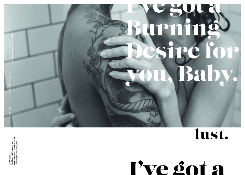
Exercise: Writing a Brief

The Brief

The hardest part about this exercise was actually trying to find an illustration that I was interested in using for the Brief. I did think about this exercise long before I started to write it up as I visited Manchester in August and while I was there I decided to see if there were any Art and Design events on locally that might help me with my course or any of my exercises and assignments. After doing a Google search, I found that there was an exhibition on at The Lowry in Salford for Julia Donaldson and Axel Scheffler who wrote and illustrated The Gruffalo and other various Childrens’ books.

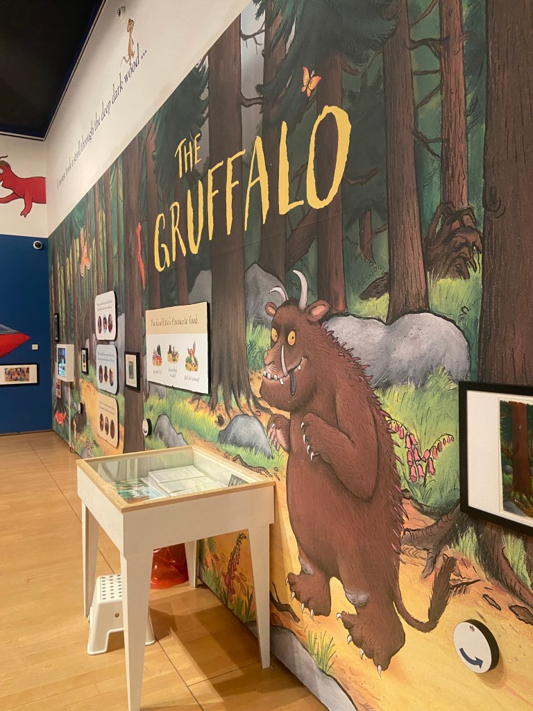
The Gruffalo is a well known Children’s picture book that was first published in 1999 depicting the story of a Mouse taking a walk through the woods and cleverly deceiving and avoiding predators – the main predator being The Gruffalo that the Mouse made up to protect himself against the other predators bt then realised actually exists! He then had to deceive The Gruffalo into believing he is the scariest animal in the woods.

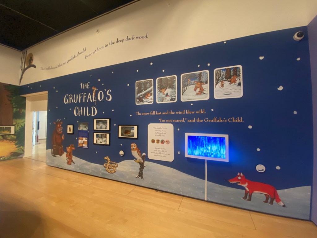
The story is 700 words long and is written in rhyming couplets featuring repetitive verse. The story has been adapted into plays and an animated film for TV which is hugely popular on Christmas Day! There is also a ride dedicated to the story at Chessington World of Adventures and a series of Woodland Trails. The Gruffalo has also expanded to merchandise such as soft toys. In 2004, the story continued with the sequel The Gruffalo’s Child.

The Gruffalo is such a fun character – he looks very dopey and innocent in appearance despite his menacing demure to the small mouse! The Mouse manages to deceive him and escape from him I believe because of this! Scheffler altered the look of the original Gruffalo to make him less scary for young readers as he had sharp eyes and teeth and a more scary appearance and this is how he came about the cute, friendly, dopey character he is today.

The Lowry, Salford

After my Google search to try and find local Design exhibitions in Manchester, me and my Husband quickly realised that we only had an hour to make it to The Lowry and to quickly look around the “Julia and Axel” exhibition. I knew it would be a really good exhibition to go and see and that it could be helpful in my current Illustration unit.

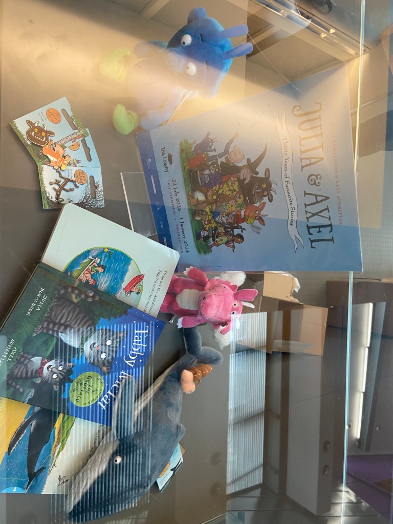
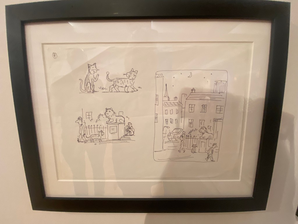
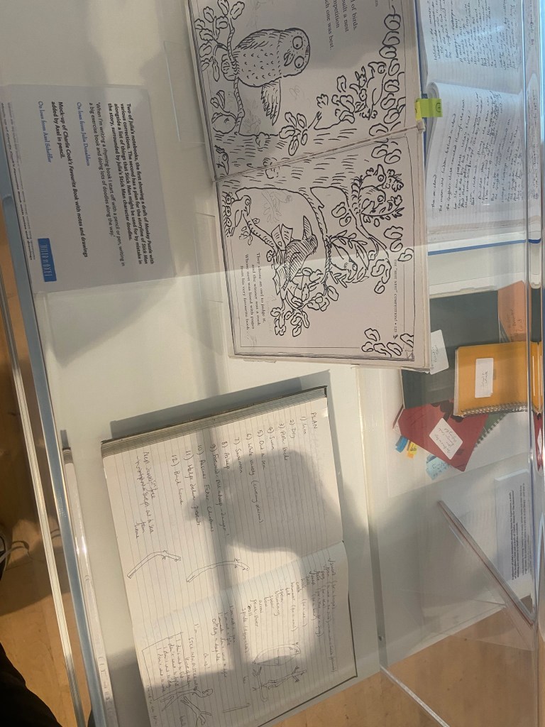
We needed a time slot to be allowed into the exhibition so when we got there with 45 mins to spare we quickly filled in the entry form and showed email confirmation at the door to which we was told they had already let the last group in of the day.. I explained that we were not local and would not be venturing that way anytime soon and that I was a student studying Illustration and that I only needed a few minutes to take some photos to evidence the trip and for me to refer back to In the future – they let us in to look around! This probably worked out well as they told us that it had been heaving with parents, families and children all day and at the time we walked through the door it was practically empty! The exhibition looked into the lives, work and careers of the author and illustrator but it was also an interactive playful exhibition for children to explore the characters from the books. I particularly liked seeing the original notes and sketches – the sketches were bright, bold and vivid Pro Marker drawings on a layout pad and sketchbook pages.

What questions need to be asked/what needs to be instructed in a brief?

I decided to write some rough notes to help me remember what I would need to include in a brief.

I then managed to bullet point the basics of what I think makes up a design Brief:

Overview

  • What is the story about?
  • Who is the author?
  • Who is the reader? Where is it to be read and when?
  • Supporting information for the Designer.

Client

  • Who is the client?

Concept

  • What is required to be produced/represented/communicated?
  • Any visions/missions/morals/values/life-lessons it needs to represent?
  • Educational?

Target Audience

  • Who is the Target Audience?
  • What is it communicating?
  • Are there any problems to overcome when communicating?
  • How does the target audience need to feel? Is there an emotional response that is needed?
  • Is there a call to action required for the audience?

Inspiration

  • Any stylistic aspects to be included/researched?

Design

  • How many concepts are needed for final critique/presentation? What are the requirements for final presentation?
  • Technical requirements – sizes, dimensions, large/small scale, print or digital? What file formats does it need to be saved as? PDF? PNG? High res?…
  • What medium is to be used? (hand-drawn, pen, paint, mixed media, digital etc..)
  • Does any text need to be put on the illustration? What content needs to be included?
  • Key themes for visuals?
  • What is the end use? Further advertising/publications/Merch etc…

Timescale

  • What are the timescales for the design/s and any final deadlines/presentation dates?

Budget

  • What is the budget for the campaign?

Contact

  • Who should be contacted during the design process?

Requirements

  • Accessibility – fonts and any information must be clearly legible and accessible.
  • Inclusivity – Celebrating everyone as an individual and being inclusive to all faiths, religions, cultures, race, backgrounds, beliefs, colour etc…
  • Be age appropriate for the target audience given – nothing to cause offensive/sexualise.

Competitors

  • Any competitors to be made aware of?

I bought this above poster from the gift shop after we had looked around the exhibition – it is the artwork that they used to advertise the exhibition; it has been used in posters, adverts, banners, social media and now as merchandise to be sold in the gift shop. The illustration depicts all of the characters that feature in the books but also in the exhibition – it gives the target audience an idea of what Is being shown and what to expect. The Gruffalo being the main character is centred in the middle. The artwork appeals to all ages but primarily targets young children and their families, (maybe illustration students like myself too!).

The illustration Is fun, bright, happy, innocent, friendly and inviting.

The hierarchy of the poster is simple – top to bottom informing the viewer of the most crucial information. It lures you in with the featured names and then once it has your attention it gives you the crucial dates and information at the bottom. The illustration supports the posters content and further adds appeal and the need to go and see the exhibition. I did want to use this illustration for the brief but it had to be taken into account whether the Illustrator drew the illustration and also designed the poster or whether an independent designer was brought in to do that.

As my brief for this exercise purely concentrates on the illustration alone, I shall write my brief an illustration alone.

I therefore decided to write my brief for this illustration that was in the exhibition and also features in the book itself:

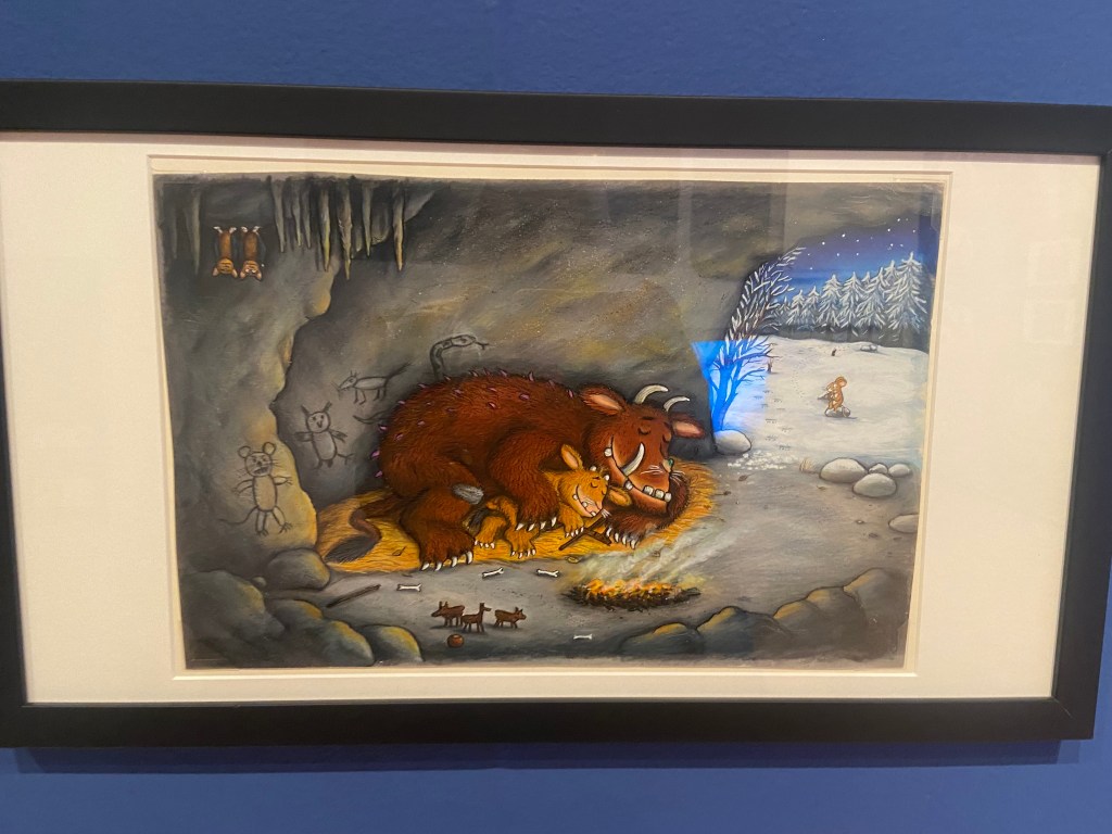
The illustration depicts the moment when the mouse has come to the realisation that the Gruffalo does exist and he is trying to cleverly persuade him that he as the mouse is the most scariest animal in the woods to prevent himself from being eaten on a slice of bread! The look of confusion and complexity on the Gruffalo’s face as he struggles to understand how this tiny little mouse is the most feared animal in the woods, the look of terror on the face of the snake who is visibly terrified of the Gruffalo and oblivious of the mouse and the look of confidence, strength and cunning mischievous playfulness of the mouse who is deceiving all of the predators!

The illustration is very bold, bright and vibrant – it has been drawn by hand using what I believe to be pro-markers and then it has been manipulated digitally for use in the books/film etc…

The primary focus is the characters and what is happening – the theme of the illustration is based in the woods with the snakes home (the logpile), there is a fast moving river or stream in the back of the illustration which could be a metaphor to suggest the flow of the pages and the storyline or show the journey of the characters moving along on each page within the story.

The characters expressions are key to the feel of the story on this illustration – the characters are also drawn to the target audience in mind – they appear cuddly, friendly, fun, innocent, playful and engaging. The colours used are very earthy and down with nature and have the theme of the woods in mind – Browns, Greys, Yellows, Greens, Blues…

Here is my brief for this illustration!….

The Brief

The Gruffalo by Julia DonaldsonIllustration Brief for page 6 of the book

Overview

Julia Donaldson is the author of a new children’s book titled “The Gruffalo” that is predicted to be one of the best-selling children’s books of our time.  The story will be aimed at young readers between the ages of three to eight years. Three to five year olds will appreciate the elements of surprise and repetition in the story whilst the six to eight year olds will enjoy the rhyme and rhythm of the text. The story is aimed primarily to be read at nighttime as a bedtime story or to be used as a picture book for younger readers to engage with the characters, colours, theme and emotions of the characters before learning to read.

The Gruffalo is a story which uses repetitive words and rhyme. The storyline starts with a mouse who walks through a wood and encounters three predators – A Fox, an owl and finally a snake. Each of these animals invites the mouse into their home for a meal, the implication being that they intend to eat the mouse. The mouse declines each offer, telling the predators that it plans to dine with a “Gruffalo”. The mouse then describes the Gruffalo’s frightening features, such as “terrible tusks, terrible claws, and terrible teeth in his terrible jaws”

The mouse tells each predator that they are the Gruffalo’s favourite food. Frightened that the Gruffalo might eat them, each animal flees. Convinced the Gruffalo is fictional, the mouse says:

Silly old fox/owl/snake, doesn’t he know? There’s no such thing as a Gruffalo

After getting rid of the last animal, the mouse is shocked to encounter a real Gruffalo which has all the features the mouse thought that it was inventing. The Gruffalo threatens to eat the mouse. Instead, the mouse insists that they themselves are the scariest animal in the wood. Laughing, the Gruffalo agrees to follow the mouse. The two walk through the wood, encountering each of the three predators again. Each predator is terrified by the sight of the Gruffalo and escapes to their home, but the Gruffalo believes that they are actually scared of the mouse. Exploiting this, the mouse threatens to eat the Gruffalo in a “Gruffalo Crumble”. The Gruffalo flees, leaving the mouse to eat a nut in peace.

The Design Concept

Our client Julia Donaldson would like you to create an illustration for one of the pages of her book. The page of the story that she would like you to illustrate is the moment the Gruffalo and the Mouse meet the snake. The mouse at this point has realised the Gruffalo actually exists and in a last attempt to try and not be eaten by him, he tricks the Gruffalo into believing he is the scariest creature that lives and exists in the woods by making him follow and see for himself how scary he is to the other animals. At this point in the story they meet the snake who is visibly petrified of the Gruffalo not the Mouse, however the Gruffalo has been convincingly tricked and believes that the snake is afraid of the Mouse and not by him. He is very confused and complexed. The Mouse with a newfound confidence and strength is happy that he is deceiving his predators. The illustration must be bright, bold, colourful and engaging and depict the Gruffalo and the Mouse walking through the wood to meet the snake at his home by the logpile. The colours that need to be used on this illustration need to reflect the theme of the story, (the woods) and reflect nature. The client would like to see a range of Brown, Grey, Yellow, Green and Blue colours as well as texture and an eye for detail with intricate detailing of the characteristics and appearance of the characters particularly the appearance of the Gruffalo –

  • He has terrible tusks, and terrible claws.
  • And terrible teeth in his terrible jaws.
  • He has knobbly knees, and turned-out toes.
  • And a poisonous wart at the end of his nose.
  • His eyes are orange, his tongue is black.
  • He has purple prickles all over his back.

The younger readers will mostly be engaging through the illustrations alone. The illustration must depict the characters emotions and body language. The story has flow and rhythm throughout the book with the rhyming text and the journey that the characters walk in the story – a metaphor would be optional to include in this illustration to show flow, movement and a journey that is being walked throughout the pages by the characters – this could be shown by something in the woods or something that reflects nature.

Target Audience

The target audience for the book is children aged three to eight years old. The story aims to be educational whilst also being engaging for creativity and imagination. Three to five year olds will enjoy the bright, bold, colourful illustrations and appreciate the elements of surprise and repetition in the story whilst the six to eight year olds will enjoy the rhyme and rhythm of the text. The book can be used during younger years as a picture book to promote creativity and imagination, read alone or be read with family members and the child.

The story is communicating a playful, cunning plan to try and survive. Although the Gruffalo is portrayed in the story as being the scary monster he is, he must be illustrated in a playful, cute, funny, dopey and innocent way so as to not scare the young readers. The young children who read the story and look at the illustrations on the pages need to feel safe, engaged, inspired, curious and excited to see the characters and read the story over and over again. There is a possible opportunity for potential new ventures leading on from the success of the book; there might be room for advertising, film/TV production and merchandise to accompany the book and the story in the form of soft toys, therefore the characters need to have strong characteristics and be soft, cuddly and loveable.

The client would like to see three concepts presented for critique/presentation for discussion and feedback. A concept shall be chosen and then time to finalise, changes to be made for final presentation at a later date for the publishing house.

The client initially prefers a hand drawn approach and would like to see drawn concepts specifically using Pro markers as this allows for bright, bold and vivid illustrations. There is then chance to manipulate the illustration digitally for publication also. The client would like the illustration to be no larger than A5. There is no text content needed on the illustration itself.

Timescale and Deadlines

The client would like to finalise plans with the publishing house for a book release date in May 2024. The concepts need to be presented to the client on the 20th December 2023 with hopes that the final illustration can be finalised and completed by February 2024.

For any queries/resources/assetts that you might need and find necessary to help with the illustration process you should contact the client at Julia.d@thisisntreal.co.uk who will be able to provide these for you and assist you further in the design process.

Requirements

The client wishes the book to be inclusive to children of all backgrounds, beliefs and race and would like the illustrations to feel like a “safe place” to spend a few minutes of their day absorbed in the fun, and engaging pages. The illustration must be age appropriate for the target audience with nothing that promotes an offensive or sexual nature.

If the face fits (part 1: Type specimen book) Baskerville

I started off my Serif typefaces with Baskerville. Baskerville was designed in the 1750s by John Baskerville in Birmingham, UK. Baskerville typeface showed contrast between thick and thin strokes and making serifs sharper and more tapered. Baskerville was inspired by Calligraphy and the typeface was and still is very popular in book design. John Baskerville wanted to create books of the greatest possible quality and his typeface certainly made this happen.

My idea for this design was to create a layout representing book design. My original idea was to create an old book and then incorporate Baskerville typeface and the characters into it.

I feel like I spent ages doing this design because I messed around with one idea trying to perfect it all day and then decided in the evening that the simplified version would be much better! I wanted to keep the old fashioned style but still try and bring in a modern vibe!

At home I have some old sketchbooks from 1905.. inside are all clothing patterns that have been drawn, there are blank pages that appear in the book though which are quite yellow and mottled with age and my initial idea was to scan these pages in to use as textures for my design. However, when I was scanning them in, the cover of one of the sketchbooks fell apart (they had been covered in brown paper) and underneath the brown paper was an old Edwardian/Victorian Cherub image with the words “Drawing book” I thought that would be a good idea to bring into my design but change the words “Drawing book” to “Baskerville”

**INSERT IMAGES OF DRAWING BOOK

I changed the colour of the Cherub image to try and make it look more modern.. I wasn’t convinced though. I also changed the name “Drawing book” to “Baskerville” in Photoshop. When I did my research on Baskerville, it is well known for its glamourous looking ampersand which I instantly recognised from the V&A logo. I decided to use that in the design as it adds that old traditional feel but with a modern twist.

“Bridging the gap between old style and modern type” was a quote I found that summarises Baskerville and that was the same feel that I wanted to carry through my design. I also used the quote to show off the different weights, variations and pt. sizes of Baskerville.

Digital Development

After doing much digital design development I realised (many hours later!) that the layout looked far better with just the ampersand. Let that ampersand do the talking!

The final mockup

The final design and layout is very simplistic and minimalist but I think it keeps an old fashioned traditional feel with a much more modern look.

If the face fits (Part 1: Type specimen book) Lust

Script Typeface called “Lust”

When it comes to decorative/ fun or “gimmicky” typefaces I am not very knowledgeable! In my work I mostly use Sans-Serif which is why I have made my specimen book “Sans heavy”! For this section of my specimen book I had to do my research and look into different typefaces that I could use for Script fonts. I started by looking at Adobe fonts on Typekit. I found one called Lust which attracted me the most and the name of the typeface gave me scope to use that in my design.

Lust was designed by Neil Summerour in the USA. There is limited information on this typeface other than letting the look and name of it do the talking!

The typeface is very modern and looks very feminine to me, just like its name though it manages to lure you in with its swirls and curls and fancy serifs. I wanted to design around “lust” and my first thoughts were of a seductive image or an intimate couple. To help give me a better idea I searched Pexels.com for any relevant images I could use on my layout. I actually searched for the image I used on my final piece in my work time on my work laptop.. the image download was called “Erotic shower” (**shocked face!! – just hope my workplace does not check internet history!!) LOL!

The original “Lust” (Erotica shower.. **embarrased face!) photograph! Downloaded from Pexels.com courtesy of Tim Samuel

This design surprisingly was the most developed piece I have done; I seemed to trial many versions of this before I got to the final piece! The piece was originally in Black and White until I realised it looked very cold considering it should be about love and lust and all things warm and fuzzy! – I took the original photograph and put a reddy- pink filter on it and that improved it greatly!

I also had the idea again to use a phrase or quote instead of “The Quick Brown Fox….” for some reason when I see this image and read “Lust” it reminds me of a Lana Del Rey song called Burning Desire, I used the chorus from that song in my early development to replace “The Quick Brown Fox” but it looked too busy, eventually I settled on having it in small inside the photograph. It seems like a little thought bubble or moment between the 2 people now with the location I have put it. It adds just another little bit of interest to the piece.

Digital Design Development

The Final design

The Final Mockup

If the face fits (part 1: Type specimen book) Didot

This was the typeface I was quite looking forward to designing for! Didot typeface is very elegant looking and is used in glossy, expensive fashion magazines such as Vogue and Harpers Bazaar. Didot is named after the Didot family who were artists and printers. Didot was inspired by Baskerville which is another reason why I have used it as part of my type specimen book.

Didot is most famous for being on the cover of Vogue as “Vogue”, because of this I wanted to create a layout that represents high fashion magazines. Vogue magazine always has a celebrity or a fashion model on their cover so I wanted to include a similar thing in my layout. I went onto Pexels website and typed in “Vogue” and it came up with an image of a woman in fashionable clothing holding a Vogue magazine close to her chest. It seemed like the perfect image to use for this design!

There were a few more variations of this photograph as well which I downloaded in case I wanted to use different images on my layout:

The next step was to import the photograph into Photoshop and then adjust the colours. I wanted it to have a Sepia filter to it; Black and White photography suits High quality fashion magazines more and looks good on a layout for contrast. I wanted to put the “Didot” heading on my layout but didn’t just want to place it on the page with no creativity.. I decided to make the D part of the photograph by using layer masks again to mask part of the D out to look like she is carrying the D as an accessory in the photograph. I think it works well! I decided to do the rest of the layout in a similar style to a fashion magazine with the text in 3 columns and one column talking about the history of Didot.

Digital Development

The final mockup

If the face fits(Part 1: Type Specimen book) Frutiger

Following on from Univers, I chose to do another famous typeface by Adrian Frutiger.

Frutiger is a Sans-Serif and was designed to be legible at any size. It was originally commissioned by Roissy Airport in Paris, (Charles De Gaulle) when it was first built to design all the signage in the airport. The airport wanted a new directional sign system. It was going to be named “Roissy” in 1972 after its success but was then Frutiger was approached to make the typeface suitable for print and it was then named after the designer himself.

The way forward for this layout design seemed quite obvious; to base it around signage and CDG airport. The first idea I had was to make the layout look like a baggage tag or boarding pass with the barcodes and airport names etc.. taking a little bit of inspiration from my Casetify Pangram phone case… My idea was to scan some barcodes in and then create another “swiss grit” style design.

CASETiFY iPhone 12 Case - Pangram Custom by Pangram Pangram

I did ask my boyfriend if he had any boarding passes kicking around from his visit to Dubai a few years back (I haven’t travelled abroad in a few years now!) and he did have one boarding pass that I managed to take a QR code from and import into my design;

I also keep a bag full of different cardboard and paper textures and barcodes and anything interesting I could potentially use in my designs; I found a relevant barcode that I could use.

I felt like I needed some images of airport signage next. I did not want to take images from the internet because they would be very low resolution and would ruin my clean, legible design. The only way I could use airport images in my work was to import a web image of a sign and then trace around it in Illustrator to produce a high quality vector image. I did this for a plane and an arrow.

After I had collected these bits I decided to just take it straight into Adobe to try and make into a layout for the typeface. As you can see from the design development, It took me several attempts to get to the final piece! I had a lot of design elements to cram onto one page and I wanted to keep it as clean and as minimal as I could so it was a case of moving elements around the page to see what worked the best. I wanted the design to flow and to not be “too busy”. I think the version I decided on works the best.

Design Development – stages to the final design!

The final design and mock up.

If the face fits(Part 1: Type Specimen book) Univers

Another typeface I chose for my Sans-Serif collection was Univers. I have already used Helvetica and Akzidenz Grotesk and this is the third typeface that relates to all those; they are all based upon Akzidenz Grotesk. Univers again played a crucial role in Swiss style. I did worry that by doing all three of these typefaces that they would be too similar as they are often mistaken for each other but if I am creating a specimen book for my own personal use I would use all 3 of the typefaces in my work.

I tried to make the design for this slightly different to the others that I completed to date; Univers referenced the periodic table and Adrian Frutiger took a different approach to designing it then anyone ever had before. He wanted a table system that showed the different typeface weights and variations as numbers instead of names. Frutiger has since used this method in more of his type designs.

55 was crucial in the design of Univers; how Frutiger designed the whole typeface was to design “55 Roman” first and then base the other variations and weights around that. I decided to use this as the main design in my typeface book. I tried to be more experimental with this layout, using the 55 as part of the negative space in my design. I did want to bring in the periodic table element but struggled to keep it looking clean and simplistic. In the end I used blocks of colour to represent the periodic table influence on the typeface and I think this worked well.

Design Development – The stages of reaching my final design and layout!

The final design pages and final mock up

If the face fits(Part 1: Type Specimen book) Akzidenz Grotesk

Pages 2-3: Akzidenz Grotesk (Sans-Serif)

I wanted to carry on down a similar path for my next typeface, Akzidenz Grotesk was the next best Sans-Serif to choose. Akzidenz Grotesk’s history goes back further than Helvetica’s but despite this, they are still closely related. Akzidenz Grotesk was the inspiration behind the design of Helvetica.

Akzidenz Grotesk was known as the “jobbing” typeface; what this means is that it was heavily used in trade printing, advertising and forms that were made at the time. The typeface was designed to be seen from a distance. “Akzidenz” comes from the German language and means trade printing for an occasion or event. The latin term refers to it as “that which happens, a casual event, a chance”. I liked this saying and used it further in my design (I will come to that later!)

Keeping in mind that Akzidenz Grotesk was used predominantly in advertising and posters I decided to base my design around this, researching further I also found that Josef Muller Brockmann heavily used Akzidenz Grotesk in his poster designs.

Josef Muller Brockmann

Brockmann was a Swiss Graphic Designer but also the pioneer of the International Typographic Style which tied in brilliantly with this typeface. He was recognised for his clean use of typography, shapes and colours in his designs. His work mainly consisted of poster design. I bought a book about him and studied his posters to see how I could get a similar style for my own design. I also did some in depth research on Pinterest again to get some ideas and a feel for his style.

I found an image on Pinterest which caught my attention and gave me an idea for my design:

Composition 5 by Eduardo Seco

I liked the way the colours pop and contrast each other and the different styles/weights and sizes of the text also work together to create contrast. I felt I could create something like this using Akzidenz Grotesk, the Bauhaus colours and make it look like “trade printing or advertising with the modern influence of “Swiss Grit”.

I wanted to create the poster layout for my type specimen pages but just didn’t know how to do it…yet.

Using the image from Pinterest to vaguely copy, I knew I had to layer up and collage different posters to recreate that torn and ripped look. I decided to create a poster with a made up event (A typography exhibition in honour of Josef Muller Brockmann) then layer up behind it contrasting colours and different type relating to Akzidenz Grotesk. The only implication was that I wanted to actually create my poster on a real wall and photograph it and then import it into Photoshop to do any adjustments etc.. The issue was where would I find an urban wall when I live in the country? and how would I even get out to photograph one during lockdown?.. I then looked no further than home because we are currently renovating our house and the upstairs second bedroom wall is being ripped out and is covered in plaster, paint ripped off.. ideal for the urban look! I created a few A3 pages with different colours and pages filled with Akzidenz Grotesk type and then printed them off to later PVA glue onto the wall with a roller which I hoped would give a wrinkled, worn feel.

The next day in my lunchbreak at work I decided to trial a test piece on some card I ripped off a cardboard box; it was rough in texture so I thought it would have the same similar feel to a wall. It turned out to be perfect! I scrapped the wall idea totally and used this as my final piece for my design.

I then imported it into Photoshop and made some minor adjustments like changing the brightness/contrast etc. I also added the type point sizes onto the side of it to show what the type looks like at different sizes. I created 2 more pages on my Indesign document below my Helvetica pages and imported my collage poster into Indesign to start my final layout!

Digital Development

Again, I wanted a layout that was minimalistic and clean with lots of negative space. I decided to place the poster on the right hand side page and place the character alphabet of Akzidenz Grotesk on the left side.

I wanted to use Red as a predominant colour again as it represents Swiss design and also the Bauhaus influence. I wanted to be in keeping with the “Swiss Grit” style of the poster though with the “Akzidenz Grotesk” heading and decided to try something experimental and different… I watched an interview with Chris Ashworth about a year ago where he explained what sort of experimental “grit” typography he does such as sticking type to the bottom of his twin girls school shoes so that when they return back from school in the evening the type is all ragged to give that worn down texture. He then uses this in his pieces rather than using digital textures. I wanted to do something similar for the type on my page. I decided though to try the cellotape method… I made friends with a Graphic Design student on Instagram who is also into Swiss Grit and he did a demo on his page of how he created his “gritty” type. He printed his type out using a laser/inkjet printer and then covered the text with cellotape and gradually pulled away at it to rip the ink off the page onto the cellotape. It worked! It gave a great gritty texture to my type which I then imported in and tweaked to become part of my layout.

Design Development – The stages of reaching my final design and layout!

The final layouts were received VERY well when I uploaded them onto Instagram. It got the most likes my page has ever got and everyone seemed to love it! I felt very proud of this piece when it was done!

The final design pages and final mock up

The final mock up!

Responding to Tutor feedback…

The sketchbooks evidence in between stages, idea development and layout/mark
making: do you have any evidence of the planning for the laying for the Aksidenz
poster?
Is this a place where you could experiment with textures and layering with
surfaces and drawing media?

I have sketches in my sketchbook and images that I found on Pinterest that inspire the collage that I did for the Akzidenz Grotesk poster:

Work by Eduardo Seco

I agree with the feedback that I didn’t document the Akzidenz Grotesk collage all too well… but it was created entirely how it is pronounced!.. a complete happy AKZIDENT!

I had no idea really how to put the collage together for Akzidenz Grotesk. I tried first on the wall of my house PVA glueing different sheets of coloured paper that I printed out from my printer at work and this just did not work. I tried rubbing Letraset on the walls too, My plan originally was to create the poster on the wall using Letraset letters or printed type on sheets of paper that I would dampen and then rub off onto the wall!

Another thing that inspired me was a few photographs I took of the side of my old cooker… When I moved house in October 2020 I rented my house and inside it I had an awful, old cooker (possibly from the 1970s!!) when I moved it out to clean it I noticed some markings on the side of it. It was quite cool and I took the photos to bank in my resources for any future projects:

I knew I wanted to create this kind of effect but I was struggling as to know how…I then had the idea of photographing some different textures and then importing them into Photoshop to play around with for my poster. These were some of the textures I found, (again, they were all from the upstairs of my house which is currently now only starting to be renovated!)

The textures idea just wasn’t gritty enough for me though… This is where I went to work the next day feeling really frustrated at the fact that I didn’t know how best to create the idea I had in my head!!

I have a very rigid “Neat” approach to my work, everything I do is very structured and organised and I couldn’t quite get myself to create something “messy” enough!- I needed to switch off and just become careless and wreckless to see what I could create!! I had another go on my lunch break when I had the classroom to myself; I filled a paint palette up with PVA, found a screen printing roller to layer it on smooth and what I ended up with was the unexpected, perfect finished piece! I have photos that I have found in my design archive of me creating this final piece but other than me being really inspired by some collage work I found on Pinterest it happened without any prior planning or any planned sketchbook experimental work.. it was completely by accident! A really happy accident! I literally just created pages in Microsoft Word (my work laptop did not have Adobe at the time!) of block coloured pages and pages with some type using Akzidenz Grotesk, I printed them out using the laser printer and then layered them up on top of each other using PVA glue. Carelessly I just ripped sections away to reveal layers underneath. The idea was to create the feel of a really old billboard that has had hundreds of posters ripped off and layered on in its time in a really rural area of a city..

The final piece was perfect for me! In fact it seems such a shame to pack it away with all my Core Concepts work that I have thought about framing it as a showpiece!