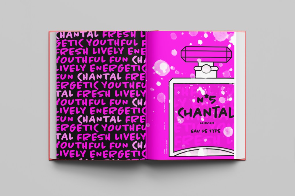
When it comes to decorative/ fun or “gimmicky” typefaces I am not very knowledgeable! In my work I mostly use Sans-Serif which is why I have made my specimen book “Sans heavy”! For this section of my specimen book I had to do my research and look into different typefaces that I could use for pixelated/fixed width fonts. I started by looking at Adobe fonts on Typekit. I found one called Lo-Res which gave me the most ideas for my design. It is also designed by Zuzana Licko which is interesting because she very successfully designed Mrs Eaves but this typeface in my opinion seems a far cry from that! I cannot say I am a fan of this typeface at all; in fact, I am not a fan of this category at all and I shall probably never use this typeface or any in this particular category ever again unless the brief directly states it! It did however still give me good ideas for my design…
I follow an Instagram account called “Designer humour” and it is full of funny memes relating to the design industry and stupid things clients ask or say, this typeface made me instantly think of one of those memes that I read;
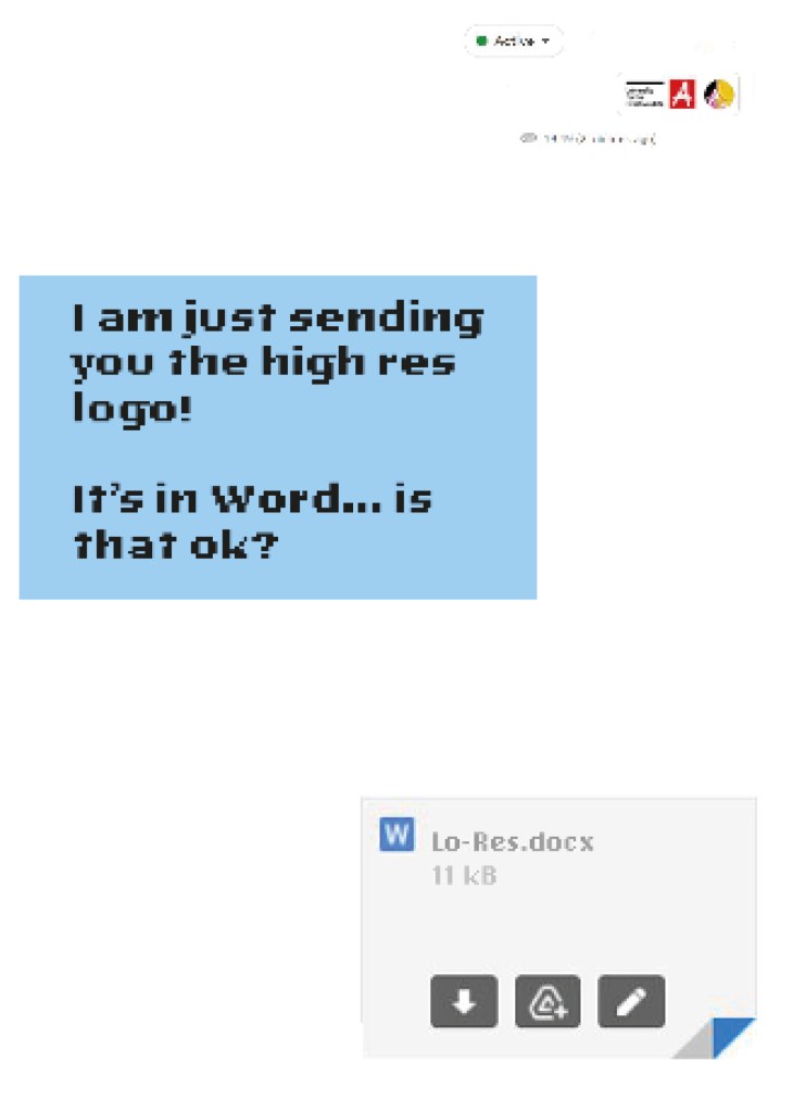
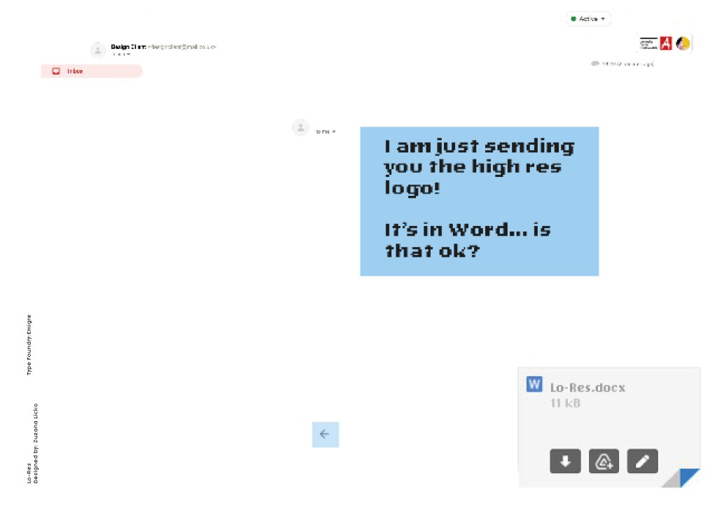
“I am just sending you the Hi- res logo… It’s in Word is that OK?“
Lo-Res is a very pixelated, hard to read typeface and it lends itself well to the quote above! I decided to create the whole layout in the style of an email from a non-designer sending a designer their “high res” files!
Digital Development
I had the idea in my head of making the whole double page spread look like the screen of a computer with the emails open and for there to be an email on there from the “non-designer” with a Microsoft Word attachment which I would then link back to Lo-Res.
I firstly needed an email with a fake Word document to then edit in Photoshop. I got my boyfriend to send me a fake email with a word attachment on it so that I could use this as a base for my design.

I deleted Chris’s name and information and replaced it with a fake name. I then started designing different layouts around this. I found that using the whole screen on my layout was too much to look at. I needed to strip it down to its bare minimum. I started to delete elements down to it’s essential to see if it made the overall design better.
Once I deleted elements it did make the overall design better.. I then decided to move around what was left on my page for better hierarchy. The eye needed to flow and skim over the content better. What I ended up with was a lot of negative space with elements thoughtfully placed across the spread. I added there are 2 main focal points on the design and that is the Word attachment and the Lo-Res quote. It needs to be clear almost straight away what the pages are all about.

The Final Mockup