When I think of Montreal I think of Canada and Canadian moose’s, Mounty’s and all things stereotypical!
Brushing my naive knowledge of Canada to one side I decided to do the usual search on Pinterest to get ideas and inspiration for this one!
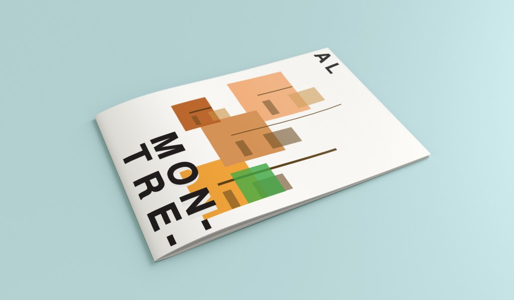
What appeared and grabbed my attention more than most was the Habitat 67 development. This housing complex is abstract in itself! It met the brief and it seemed like the perfect choice to feature on my cover!
In March 2012, Habitat 67 won an online Lego Architecture poll and is a candidate to be added to the list of famous buildings that inspire a special replica Lego set. Lego bricks were actually used in the initial planning. Initial models of the project were built using Lego bricks and subsequent iterations were also built with Lego bricks.
I didn’t actually do a lot of sketching for this one because I knew I just wanted it to be comprised of blocks of colour to represent Habitat 67. I knew that I could develop it as I went along in Illustrator.
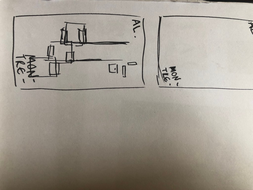
I started from the bottom of the design and added a pop of green for the accent colour which represents the tree at the bottom of the complex. I then wanted to work my way from the bottom left to the top right so that the eye flows naturally ad comfortably up and across the design. I wanted negative space so kept the bottom right free for this. I created several blocks of squares and rectangles with overlapping colours to best represent Habitat 67. I think this is the most abstract design in the 10 that I have done, it works put quite nicely because this is the city in my eyes with the most abstract landscape. I used different weights in the blocks and line to create a contrast. There is repetition in my design, I tried to replicate the appearance of each apartment of Habitat 67 as they appear in reality.
Welcome along to city guidebook number 7! – Marseilles or Marseille ?……..
Marseilles or Marseille was the first question that I asked myself! I pondered at the fact that there might b a typo in the Core Concepts design book because everywhere I looked online it was saying “Marseille” however there is a French and an English version! Marseilles it is!
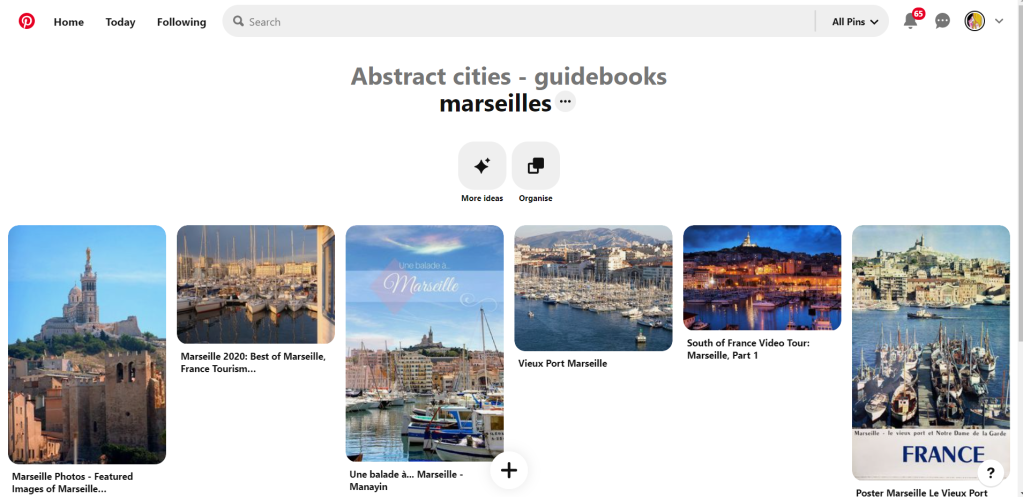
In my head Marseilles is one of them luxuriously warm places that celebs and people likewise might go and sunbathe their perfectly tanned and toned bodies on the front of a yacht! CORRECT! 😀 but in all seriousness I pictured a lot of blue skies and blue sea, yellow sunshine and boats and yachts everywhere. As usual I started looking for ideas and inspiration on Pinterest.
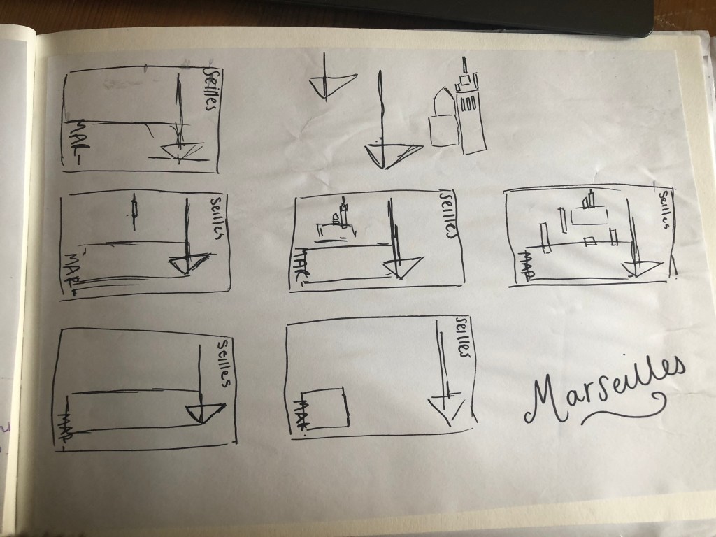
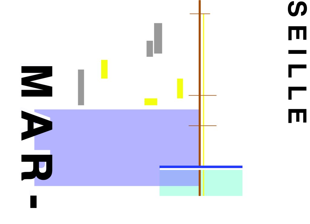
A lot of blue! The other thing I noticed was the port with the church on the hill in the background. I felt I could incorporate this into my design somewhere along the way.
When I look at my design I feel a warm and happy feeling which is perfect for the weather and general feel of Marseilles. The blue represents the blue sky and sea. I have used a block of blue on the bottom left again as with all the other design guidebooks. It makes sure it is in keeping with the rest of the series but it also represents the sea. The rectangular blocks which work their way up to the top of the left hand side represent the hill and the buildings leading up to the 2 grey rectangular blocks at the top which is the church on the hill. On the right side of the design is the yacht or sailing boat with the sail mast. I have used yellow as a warm colour to contrast against the blues and greys. Blue is the dominant colour closely followed by thee subordinates which I believe to be the greys and turquoise. The accent colours in this piece which contrast against the rest of the design is the yellow and the brown of the sail mast.
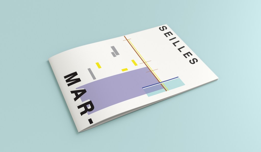
You might notice the typos between the 2! My confusion with Marseille vs Marseilles! This is the final mock up for Marseilles! I am pleased with how it has turned out – It has kept the abstract brief, is open to interpretation but I think portrays what Marseilles is all about! The colours are accurate and there are contrasting accent colours thrown in there to make the design interesting. The layout is the same as the rest of the guidebooks to keep it as part of a series.
Welcome to the concrete jungle! – Design 5 of 10 – Manhattan!
Manhattan was one of the easiest cities to think of and find ideas for. It is a place full of buildings and architecture so tying this one in with the rest of the designs was easy. I began thinking of famous and iconic buildings in Manhattan; the Empire State Building being one of them. I then went to Pinterest to see what other images came up. There was a lot of images of the hustle and bustle of the city… skyscrapers, shops, people, yellow taxis, cars and pedestrian crossings.
I knew I wanted to play with the idea of the Empire state building and the fact that Manhattan and New York is like a concrete jungle. Central park played a part in my thoughts and ideas; I wanted to include a bit of nature in my design – this also allows the opportunity to bring some green into my design which would be a great contrast against the skyline of Manhattan.
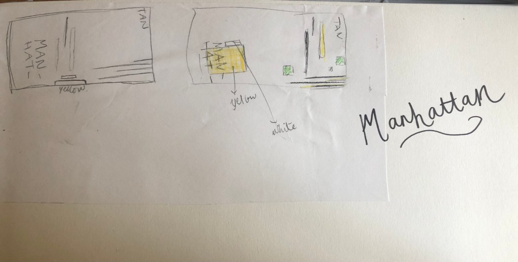
I used a block of yellow on the bottom left, once again this ties in with the rest of my designs so far. This yellow block represents a yellow New York taxi. The grey blocks that feature on it are the wheels and the top of the taxi. I placed a tiny block of colour at the top left also to add some interest and to draw the eye up to the top to work its way around the design. Yellow and black contrast each other brilliantly and they also represent the yellow cabs and the pedestrian crossings. The Empire state building I portrayed on the right side of the cover. I used blocks of black rectangles to represent this. It is abstract and can be portrayed in any way you want to; it could be the black lines on a pedestrian crossing or it could be the towers of the Empire State building.
In this design I feel the black and yellow equally fight with each other for attention, they are both very dominant in the design. The grey adds a little accent of colour to break it up.
This is the final mock up for Manhattan. I am pleased with this design, the colours work and contrast each other fantastic! It is modern and stands out and it maintains an abstract approach but it is still obvious as to what is being portrayed. The layout stays in keeping with the rest of the designs.
Hello! and thanks for dropping by to look at design 3/10 of my abstract city guidebooks- Managua!
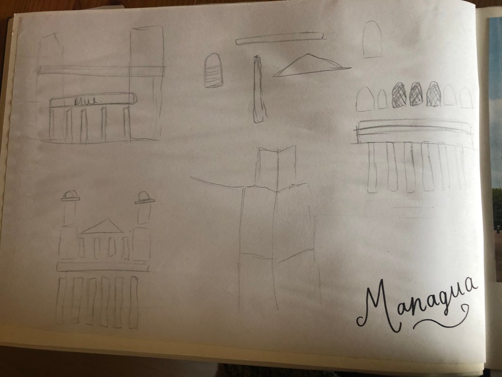
I personally had absolutely no idea where this city was! (I am still confused! – but I do know it is on the bit that joins both Americas together!!) with my poor knowledge of geography I attempted to gloss over this and continue with my design ideas. Again, I wanted to keep the design concept and layout etc for this guidebook cover the same as the others so that it continues to form the series.. I was going in again simplistic and minimalist in approach, using architecture and iconic buildings as the basis of my design and taking key elements away to create my design.
I started my initial research using Pinterest again; I looked up iconic landscapes and architecture in Managua and it came up with the cathedral as the main recognisable building of the city.
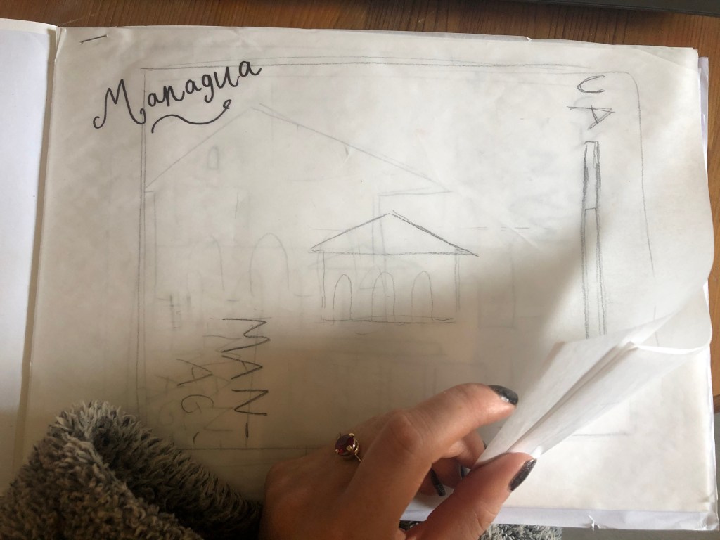
From first glance it looked like a complicated building to try and recreate in abstract! I took the same approach as last time and printed out this image tracing over it again and again simplifying it each time until I was left with the bare bones.
The main key features that stood out to me from the photograph was the intricately detailed stonework of the cathedral, the small cross that features in the middle of the cathedral on top of one of the triangular brickwork and the fact that the cathedral is in beautiful warm weather with 2 palm trees either side of it!
I used my rough sketches to figure out what to include in my final design.
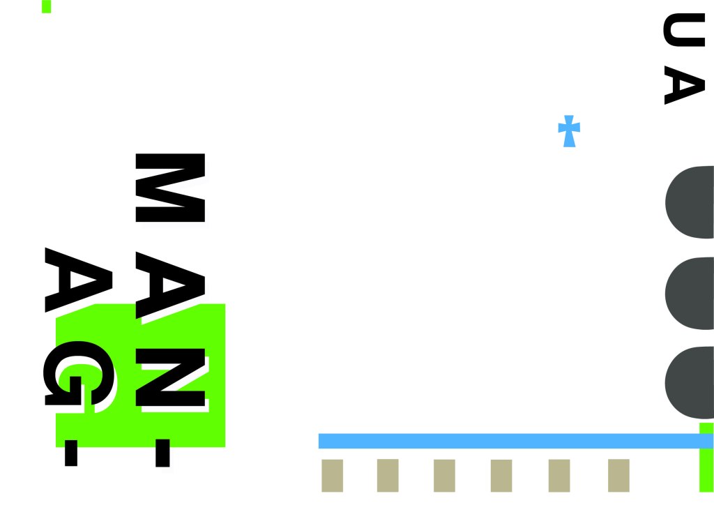
Again, I wanted to try and stick to the rules of thirds for my design and split the design into 3 sections on the cover. I wanted again to let the eye flow naturally across the whole page. Negative space once again played a big factor into the design, I actually base the design around the negative space each time. I placed a lot of the design to the edge of the page which can sometimes constrain the design to a “box” and restrict the design to be able to “breathe”; however, I still allowed for the design to “breathe” by not constraining the design all of the way around the cover. I added a tiny accent of green at the top left side just to give the eye somewhere else to hop to. The idea was for the eye to flow naturally all the way around the design. The bottom green blocks were representative of the 2 palm trees which I have obviously exaggerated and under exaggerated in size – representative of abstract also. The design is not accurate in scale, size or orientation to the building; the grey ovals on the right edge are representative of the arched windows in the centre of the cathedral and the bottom bar and grey small rectangles are a snippet of the pillars that hold the cathedral to the ground and the steps at the bottom. The cross I have kept small, it is always good to have contrast between elements on a design; the eye is drawn more to the cross and its location in the negative space on the cover- it is representative really to how small it is within the great vastness of the cathedral.
The dominant colours on this design accidentally are the black and grey of the text and the arched windows.. I know black and grey are tints but to me they draw me to the design before any of the other colours. The subordinate colour needs to be the green, although to be honest the blue stands out just as much as the green. It probably doesn’t help that these 2 colours are both cool and don’t particularly contrast each other well. As for accent colours… I would say I have designed something that doesn’t have a accent colour as such. In hindsight now looking back I could have added a contrasting colour as a tiny accent to the piece but I honestly just liked the use of these 3 minimalistic colours.
This is the final mock up of Managua! Overall, (apart from I mentioned that I could have used a warmer colour as an accent) I am happy with this design. I think I have met the abstract needs of the brief.