Exercise 4: Designing a Cover

The Brief:

“A rat in a maze is free to go anywhere, as long as it stays inside the maze.”

Margaret Atwood, The Handmaid’s Tale, 1985

Following on from the discussion of George Orwell’s novel 1984, look at the covers for Margaret Atwood’s equally dystopian novel The Handmaid’s Tale (1985), in which a woman finds herself surviving inside a harsh American fundamentalist society that sees women’s roles as subservient cooks, matrons, and mothers. Alternatively, you can pick a different book to respond to but it needs to be one with more than one cover design so avoid recently published books.

Are there key conceptual motifs being used over and over again within different cover treatments?

Can you identify more expressive versions of the covers? Check the date of each version and try to speculate about the historical, political or social context for each one. (Don’t spend long on this but it’s important to realise that creative design doesn’t happen in a vacuum.)

Using one of the main motifs you have identified (such as the uniforms that feature in the book), the title of the book, author’s name, and no more than three colours (including black and white) generate as many different layouts of the cover design as you can. Think about how you can dynamically layer, organise, frame, clash, or balance these elements. Work quickly and come up with lots of different visual possibilities.

This is a similar exercise to the Lightbulb Project in Graphic Design 1, which aims to generate quick design possibilities by arranging your typography, motif and colours in as many, and as varied, ways as possible.

Use thumbnail drawings or DTP layouts to achieve at least ten fundamentally different layouts. This is a warm-up exercise that will help you with your approach to designing a cover for assignment two.

I really liked this exercise even though I had never heard of the book before I started this brief! As always I started off by doing some research into previous covers and reading a summary of the book to get a feel for what the storyline was about. I then found out that there is a series (4 seasons) that is streaming on Amazon Prime (which now I am HOOKED on!) so I also started watching that initially for some inspiration and to try and set the mood for my designs. It is a hard hitting, scary watch!- some scenes take your breath away and make your heart and stomach leap out of your mouth!

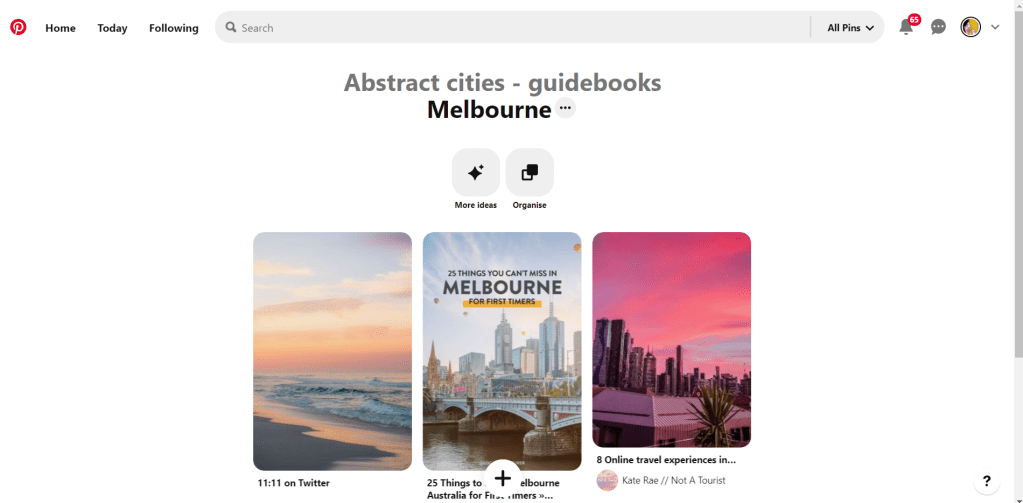
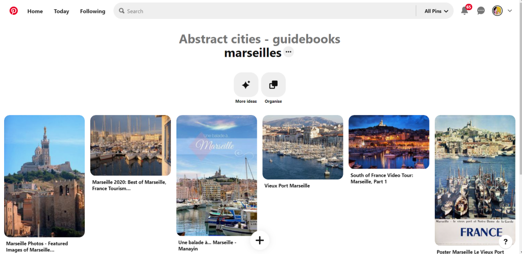
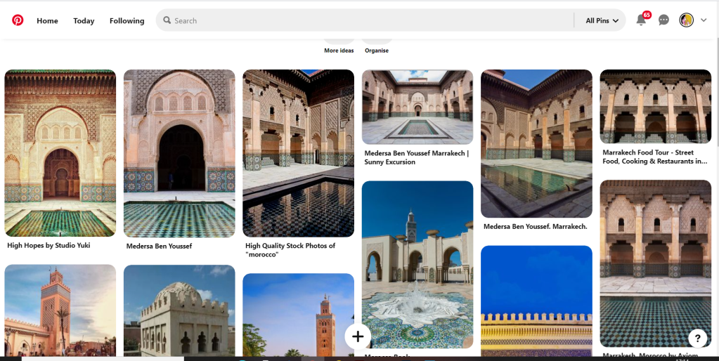
I started to research into existing covers on Pinterest which is always one of the best sources for visual references:

I also referenced anything I saw that gave me further ideas or that I thought I could use as inspiration in my designs.

There are lots of covers that have been designed for this book; most of them reference the Handmaid with her red dress and bonnet. This was the main motif that was used but I wanted to try and come up with more expressive designs that people had not yet explored.

One of the images that gave me inspiration was this one that I found on Pinterest:

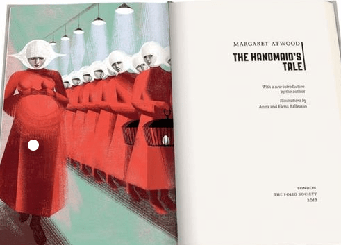
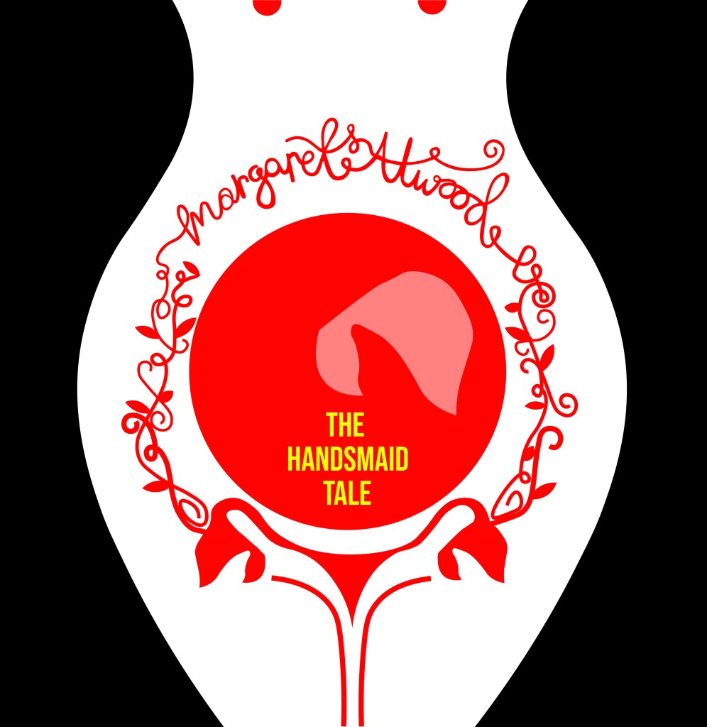
This illustration is from a 2012 copy of The Handmaid’s Tale although it reminds me of something that has come out of a Sci-fi book from the 1960’s/70’s as it feels like it has a futuristic feel to it! The illustration shows a pregnant Handmaid who is looking down at her tummy. When I saw this illustration and looked at her belly, in my head I saw a round, Red circle and I knew this is what I needed to try and use in my designs. I knew I wanted to try and depict the red Handmaid but bring in the fertility element of the storyline.

After doing research on different books in the previous exercise, I had an idea of what I liked and didn’t like and knew that I wanted a very sharp, clean, minimalist cover. The brief also asked that we used limited colours so I knew that an intricate design was out of the question. From doing the previous exercise and researching Suzanne Dean and her award winning minimalistic cover of The Handmaid’s Tale I knew I wanted to take inspiration and draw ideas from this.

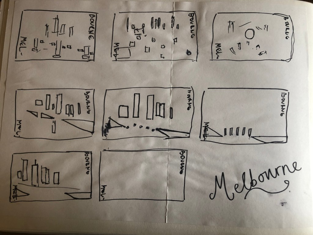
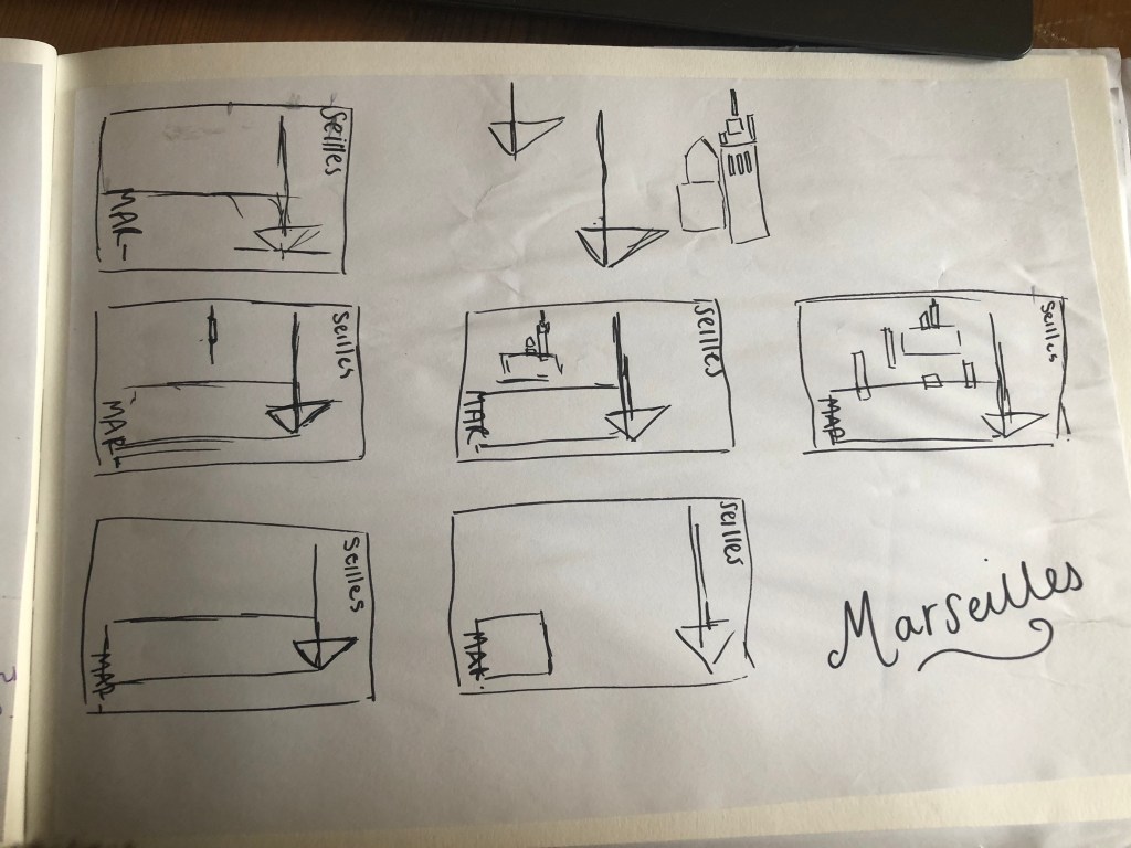
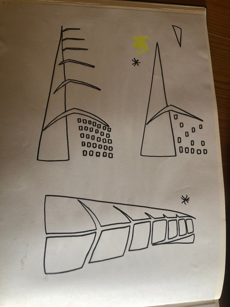
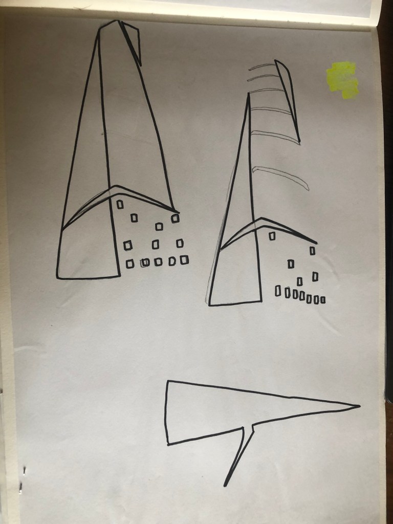
I started to sketch some initial ideas in my sketchbook. I was trying to make the designs as minimal as possible- stripping them right down to their bare essentials- the basic shapes and layout.

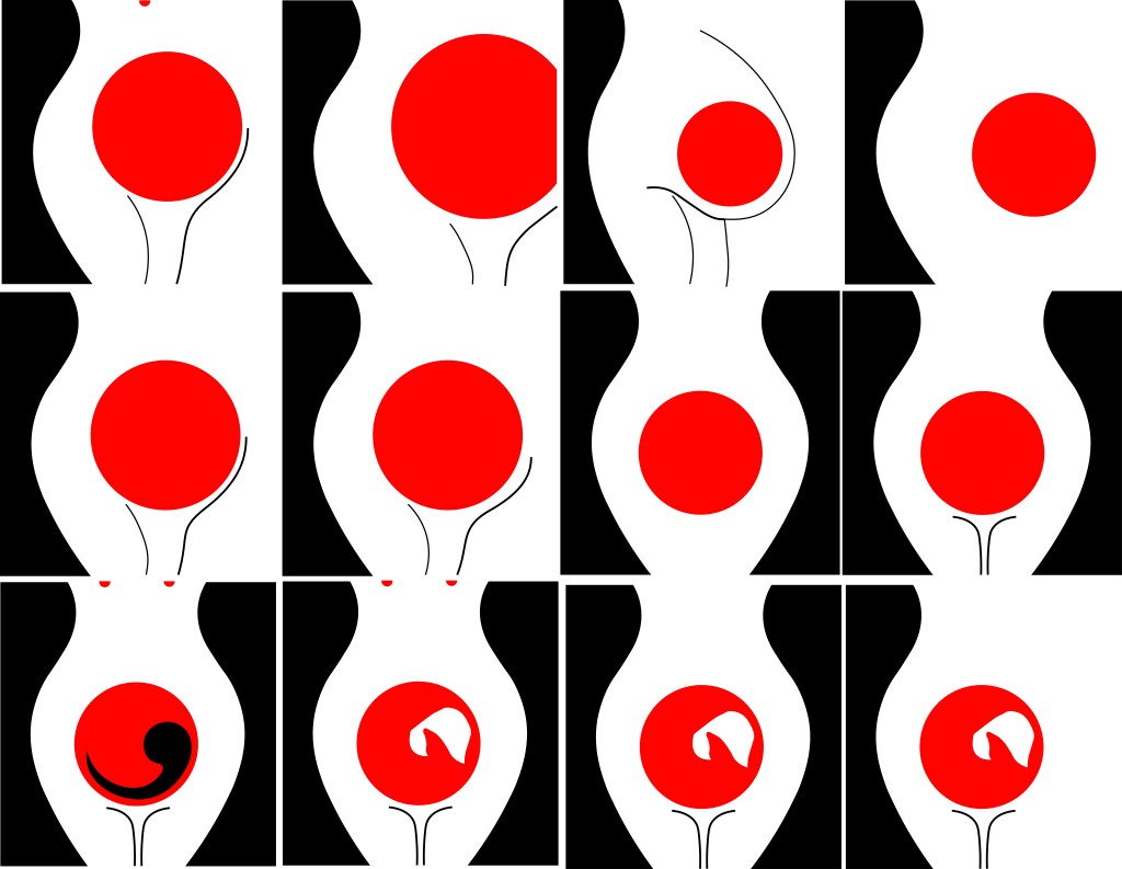
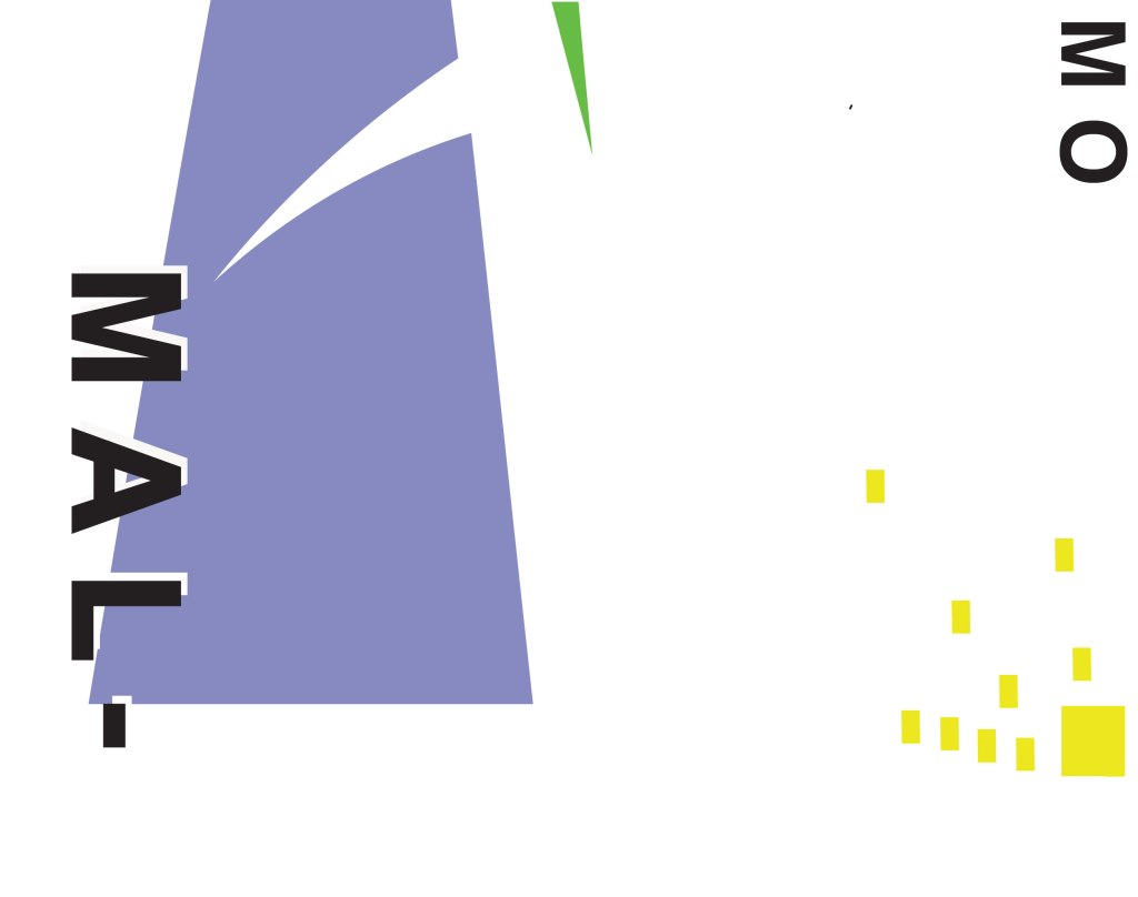
Some of the ideas I came up with were winners and helped me to go forward and develop the ideas but a lot of them just didn’t work! The third along at the top was supposed to symbolize a pregnant tummy but just ended up looking like a droopy boob!! The ones that worked the best are the most simple. I liked the black that I used as the outline silhouette of a woman’s body. I was playing around with the idea of negative space within a design at this point. I then had the idea to depict the unborn child (first in foetus stage) and then just using the bonnet to depict the unborn female in the womb. I also used small red circles on the earlier designs to depict nipples; I wanted to push boundaries and design outside of my comfort zone. The book is all about exploiting women and stripping women of their freedom and their rights and I know that in todays society “free the nipple” is quite a controversial movement! I wanted to advocate this in my design and do more or less the opposite what the book storyline doesn’t do! However, I did reframe in the end from using them in my final design 1) because when I removed them it allowed for negative space at the top of the design and didn’t distract the attention from what I actually want the readers to see and 2) because I felt it would be too much and sexualise the book; I didn’t want the cover to imply “sex” at all – I just wanted the cover to show the womanly, strong, female body and for it to represent the pregnancy storyline.

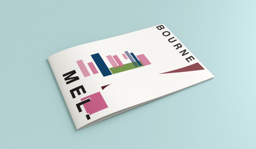
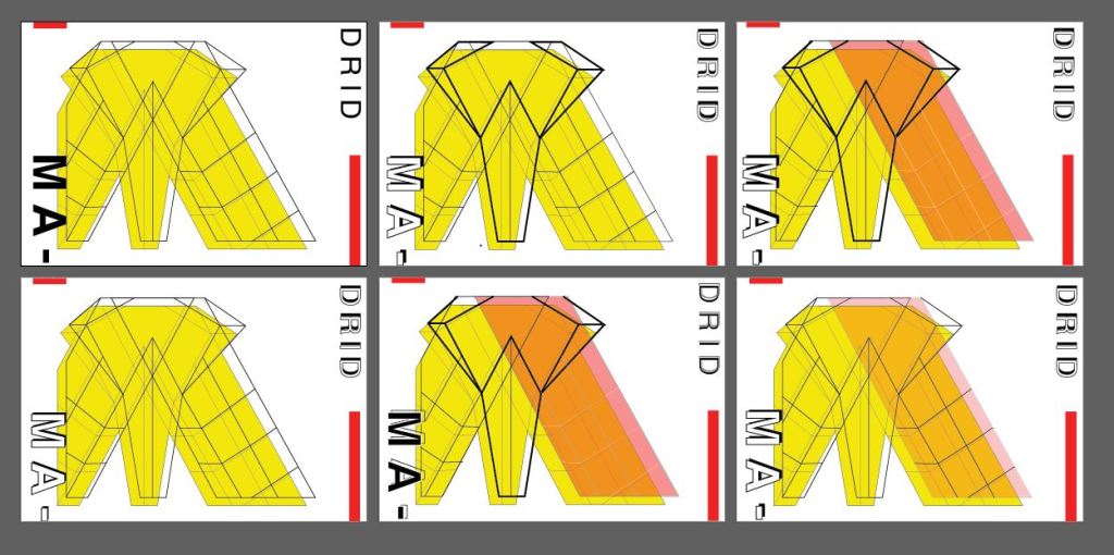
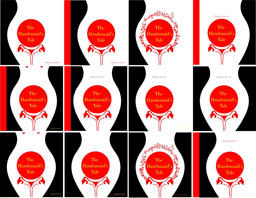
When I had more further ideas of what I was doing I then took the designs forward and developed them into more artboards- eliminating designs at each stage until I finally came up with a handful that I could choose and further develop and improve.

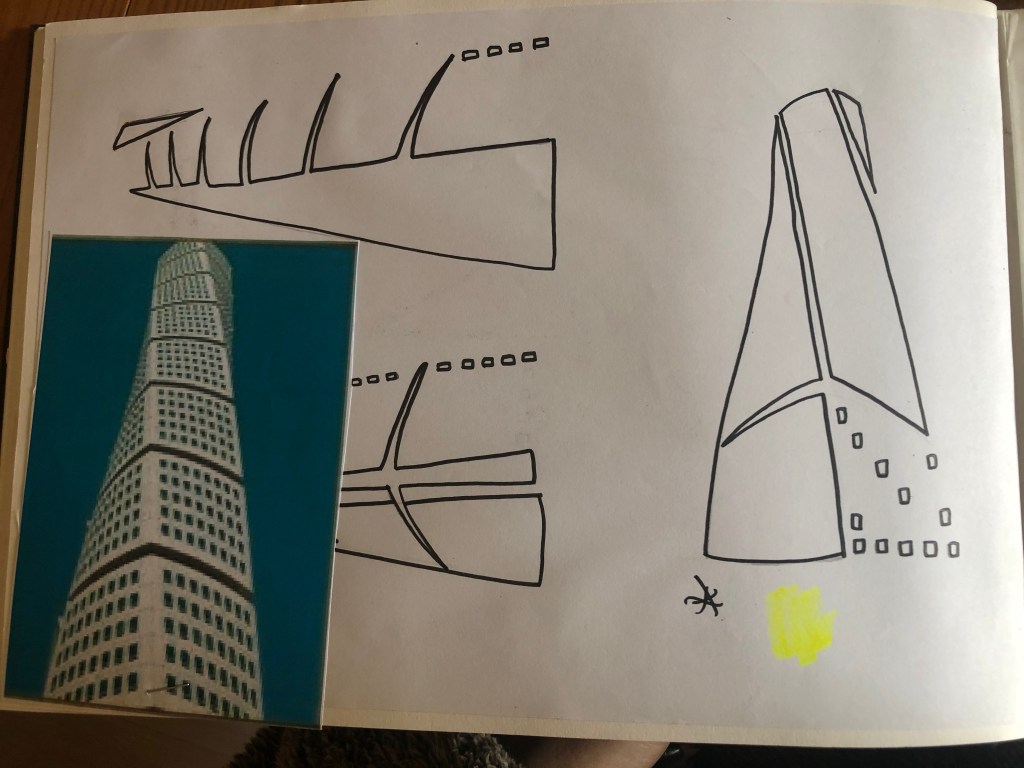
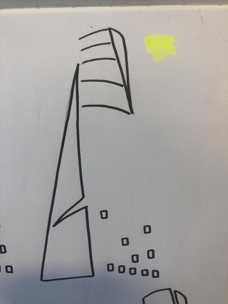
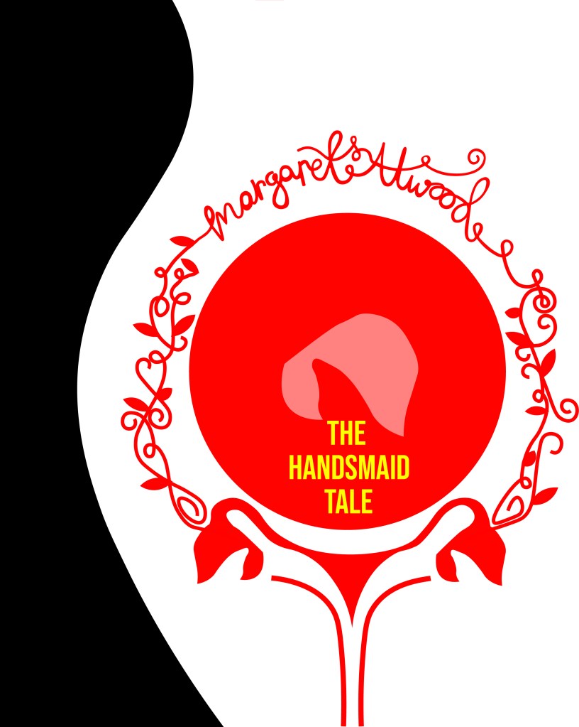
I also experimented with hand lettering because my original idea was to have floral branches and twigs coming out of the pregnant tummy and then evolving into the authors name at the top. I wanted the design to be very feminine and hand lettering just allows a more softer approach that by using typography.

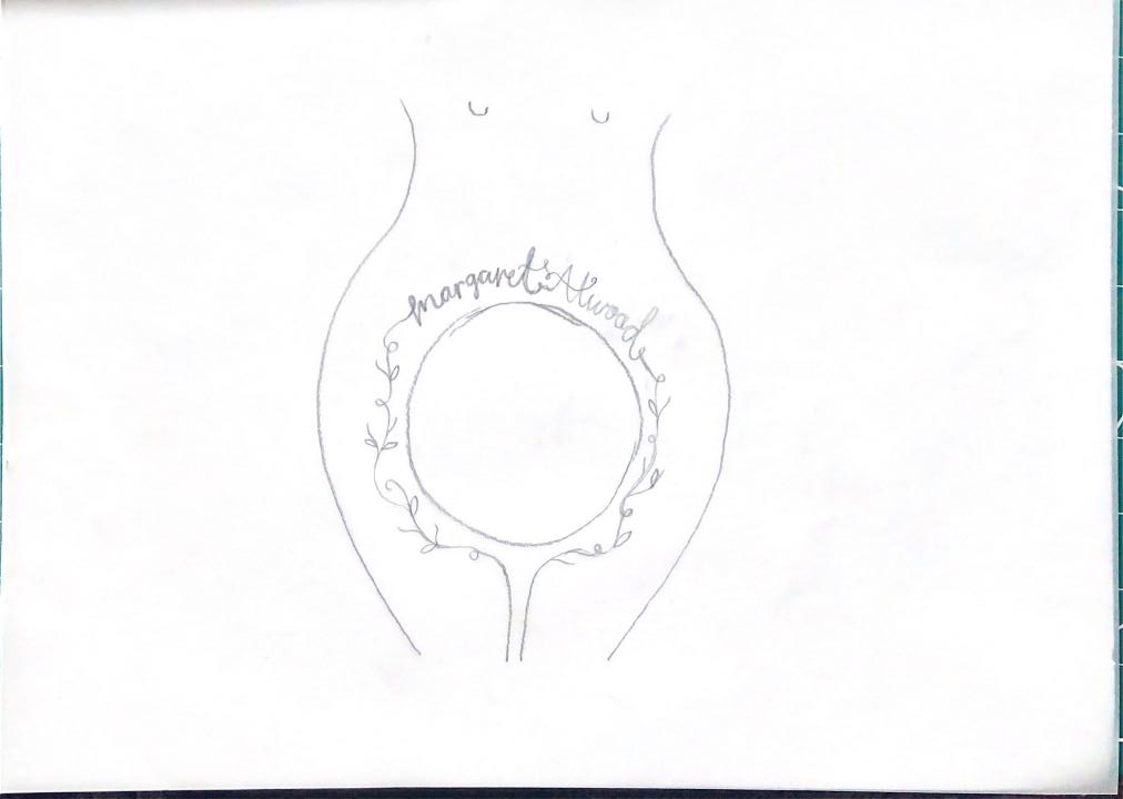
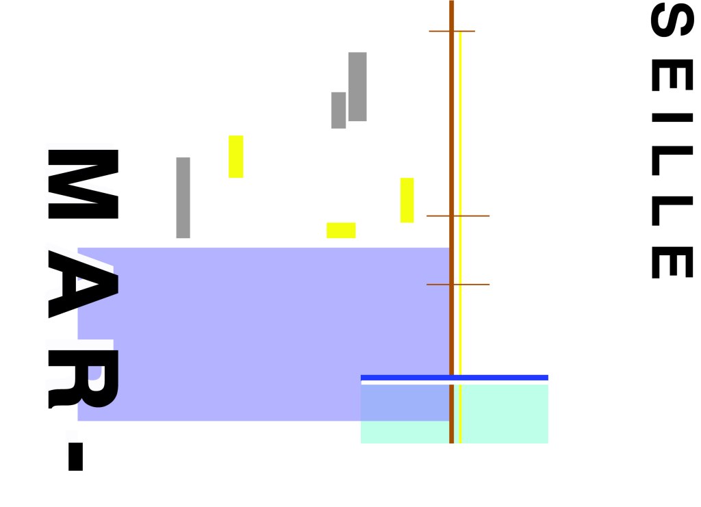
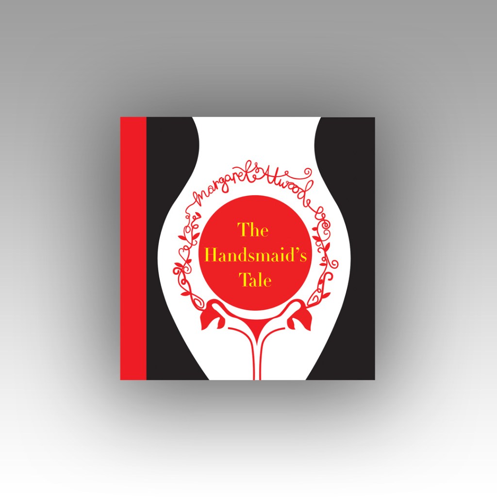
I did change the design from that which I drew above though; instead of having the branches and twigs coming out of the thigh and pregnant belly I had the idea to include the ovaries and make the twigs and branches come out of them instead! I took a key motif (the bonnet) and changed the context of it slightly by making it form the 2 ovaries. I really like this idea because it is using one of the obvious key motifs but using it in such a way that is more expressive and different.

This is a screenshot of the hand lettering I drew from my design above using Illustrator.
This is a screenshot of my artboards in Illustrator.

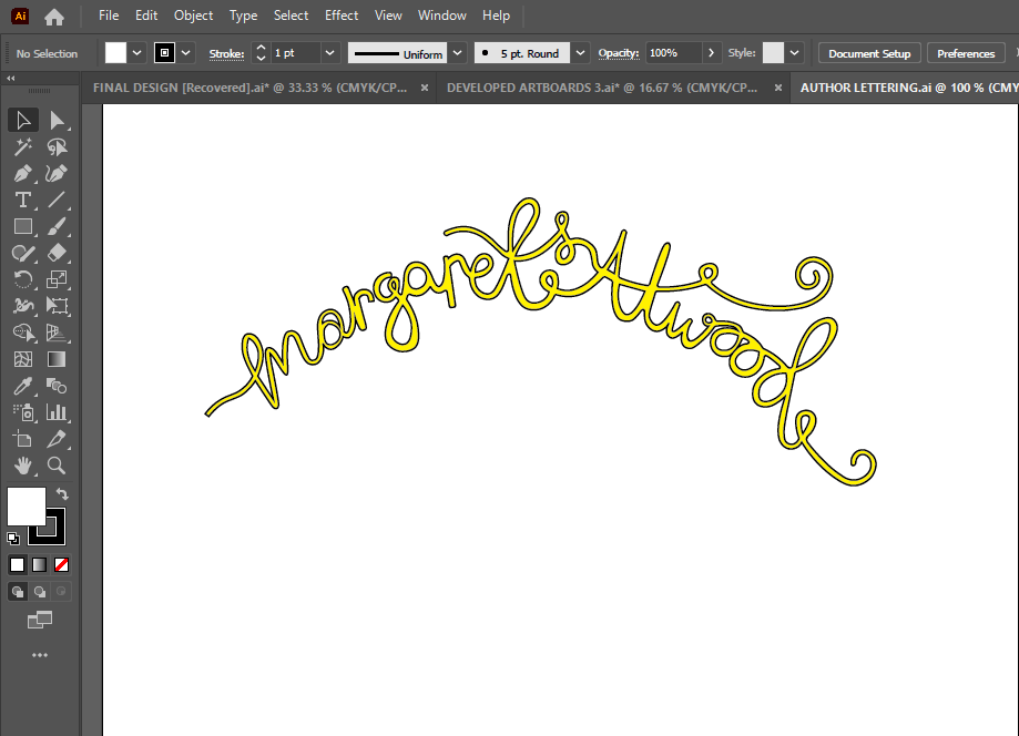
I experimented with hand lettering but also with typography; I wanted to do some design ideas that used typefaces. I was torn between two; Bebas Neue and Didot. Bebas Neue is a Sans-Serif and is very condensed. I initially thought I wanted a sans-serif font that comes across non-expressive, Bold and abrupt but then I thought about the womanly cover and decided that a much softer, feminine typeface would be needed. Didot was the perfect choice! It is a serif font and appears soft and feminine but it is also a lovely, attractive typeface to be able to read (It is popular in glossy fashion magazines!). I then experimented with the leading of the text; I like the tight, condensed look of Bebas Neue but I did think that from a distance it would make it difficult to read if the leading was too tight. I opted for Didot and gave it a much more relaxed, spacious feel.

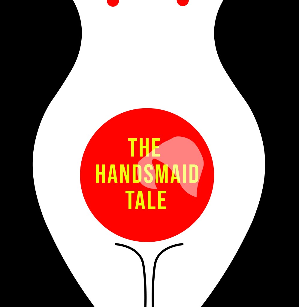
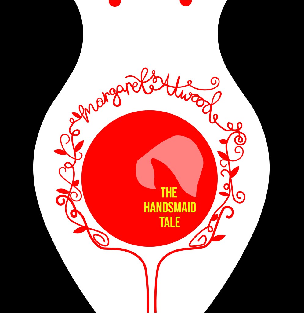
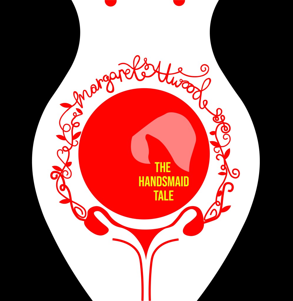
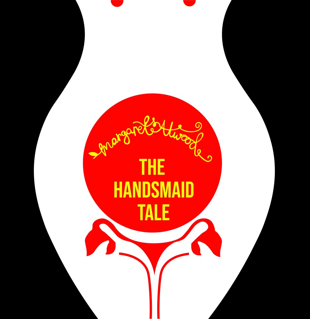
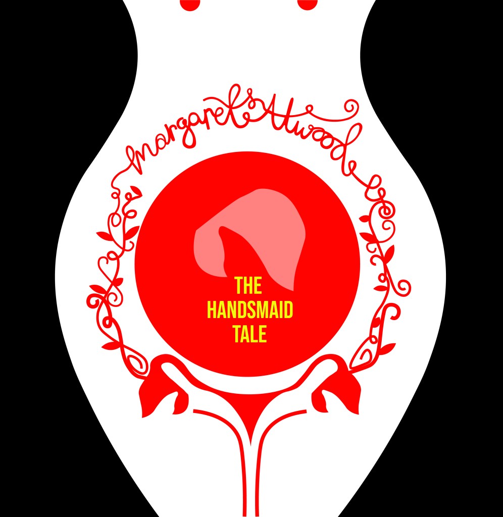
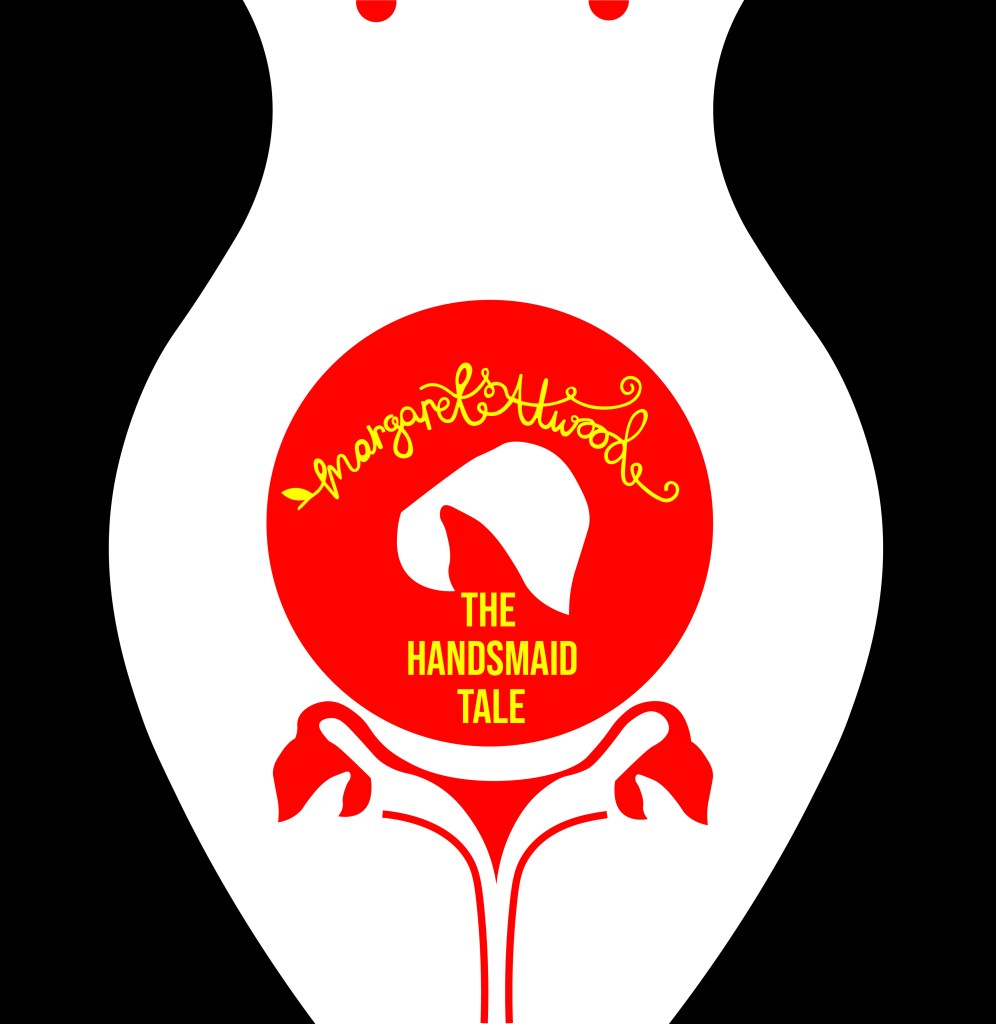
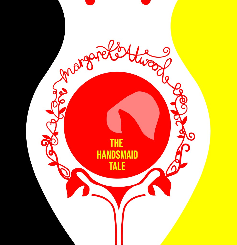
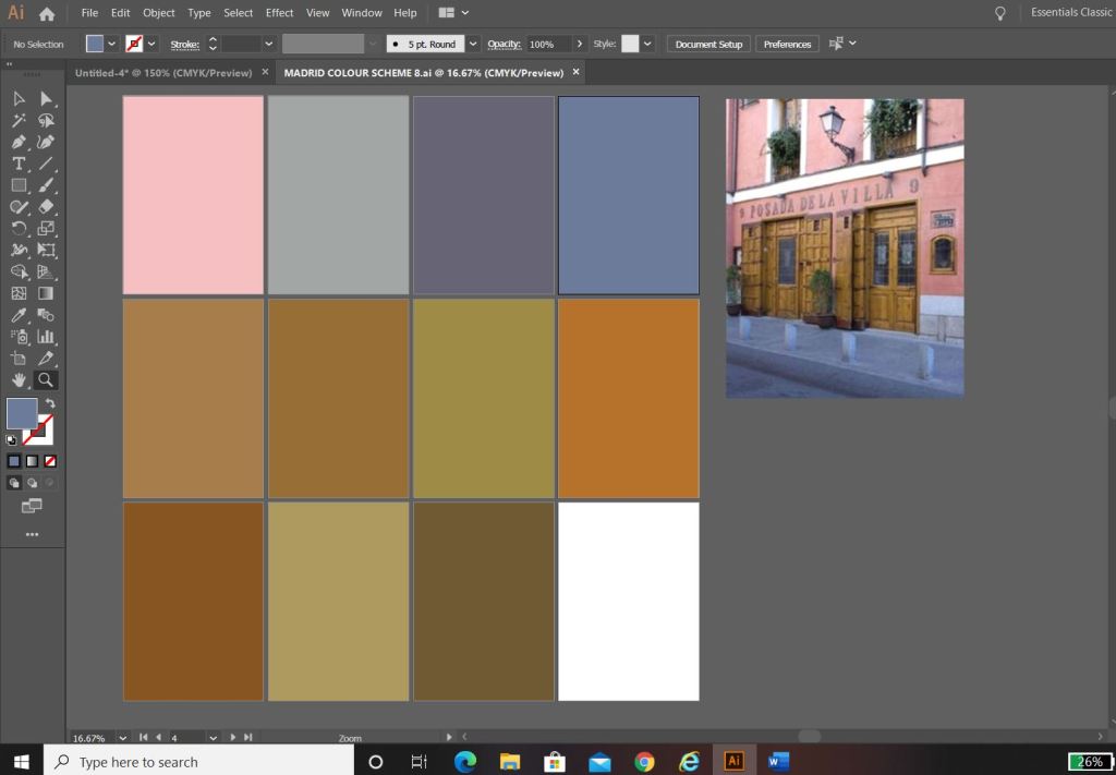
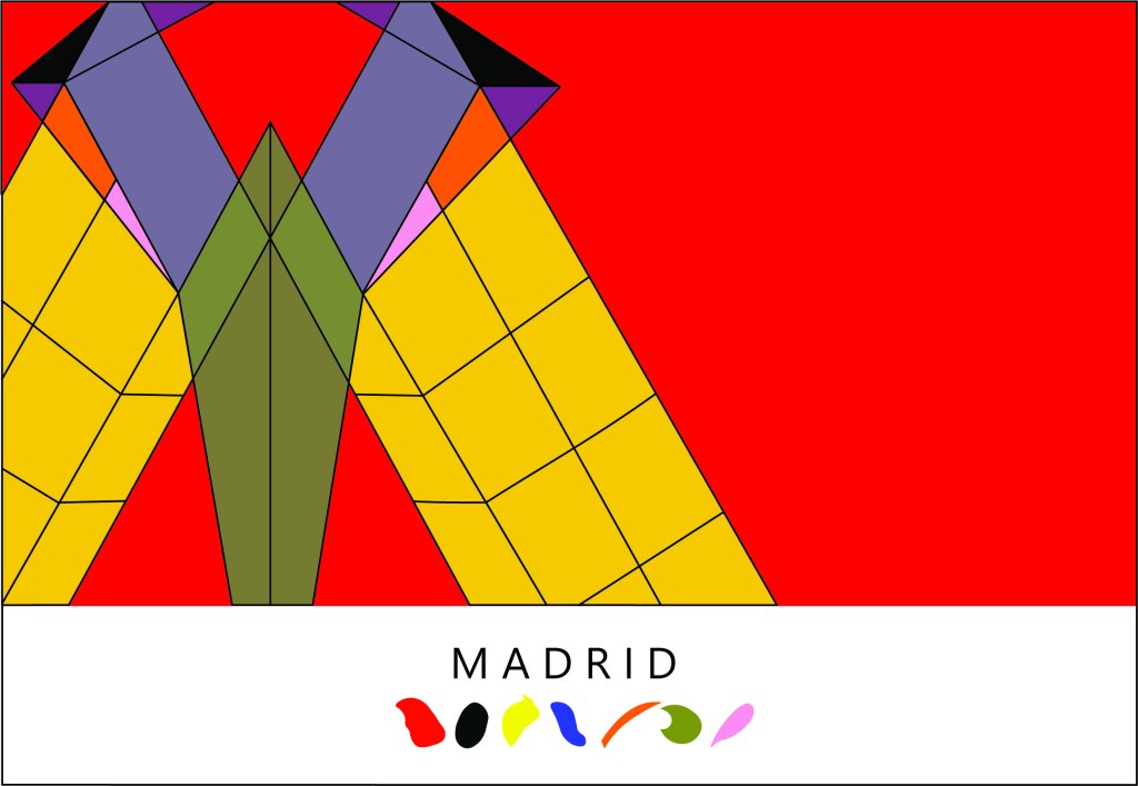
I then developed on the artboard ideas further and experimented with different variations of the typography etc.. I eventually realised that I liked the versions I had done using Didot and with the authors name above in small. I experimented also with colour; the brief specified we were to use no more than 3 colours and the ones I originally experimented with were Red, Yellow and Black. The yellow worked perfectly for the typography as a clash of colour against the rest of the design. It allowed the title to stand out on its own. The red represents the book and the Handmaid and I felt gave it a very communist feel (which actually wouldn’t be too far from the storyline in the book!) Having such simple use of colour really allowed my designs to be striking, clean and really stand out. The colours also contrast each other beautifully.

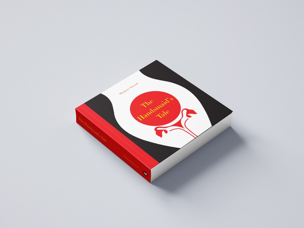
Just for further feedback and reassurance I printed the artboard pages out and asked my colleagues which ones stood out the best to them. They all agreed with the ones I had chosen as my favourites and these were the ones I took forward. I know that I did not have to produce a final design or cover for this assignment but I enjoyed the exercise so much and really liked my design outcome that I wanted to make it into a final piece for my portfolio and my Instagram account. When I was mocking the designs up, I decided that I liked both versions and wanted both to appear in my portfolio and on my Instagram for comparison so I included both. I do however prefer the version without hand lettering and this would be my choice of final design.

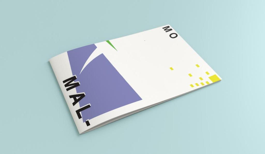
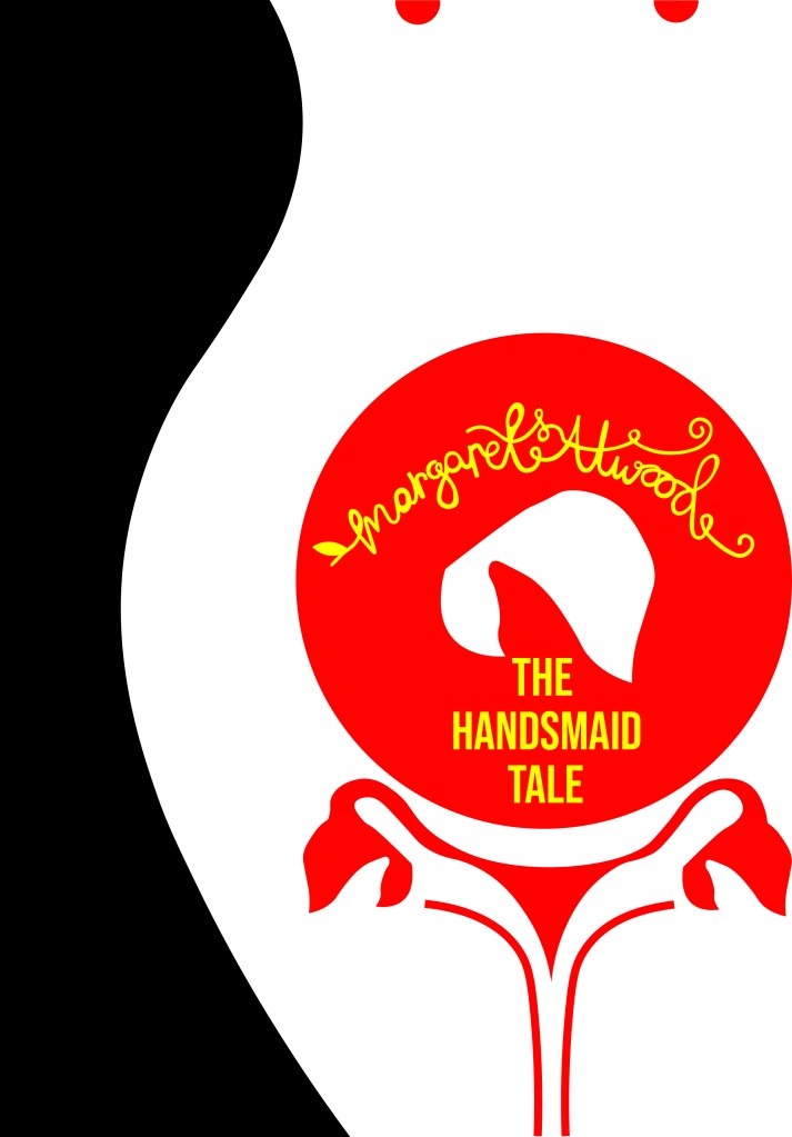
I mocked them up onto a square hardbook book – I had the idea in my head of making a square book as this would allow for more space on the cover:

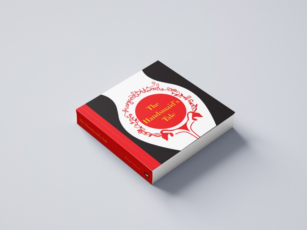
I then mocked them both up onto a paperback edition:

However, because I had designed my design to fit a squared cover I did lose some of the negative space from my original design. I still like it though!

The final designs:

Responding to tutor feedback

My overall feedback for this exercise was really good! One of the things that my tutor mentioned in her feedback though which really let me down was that she thought I hadn’t done any first initial sketches before I took it through to digital – it was so frustrating because I did! (*massive crying face right now!) I just totally forgot to import the photo of my sketches onto my original post!!!

So, here they are! (better late than never!)

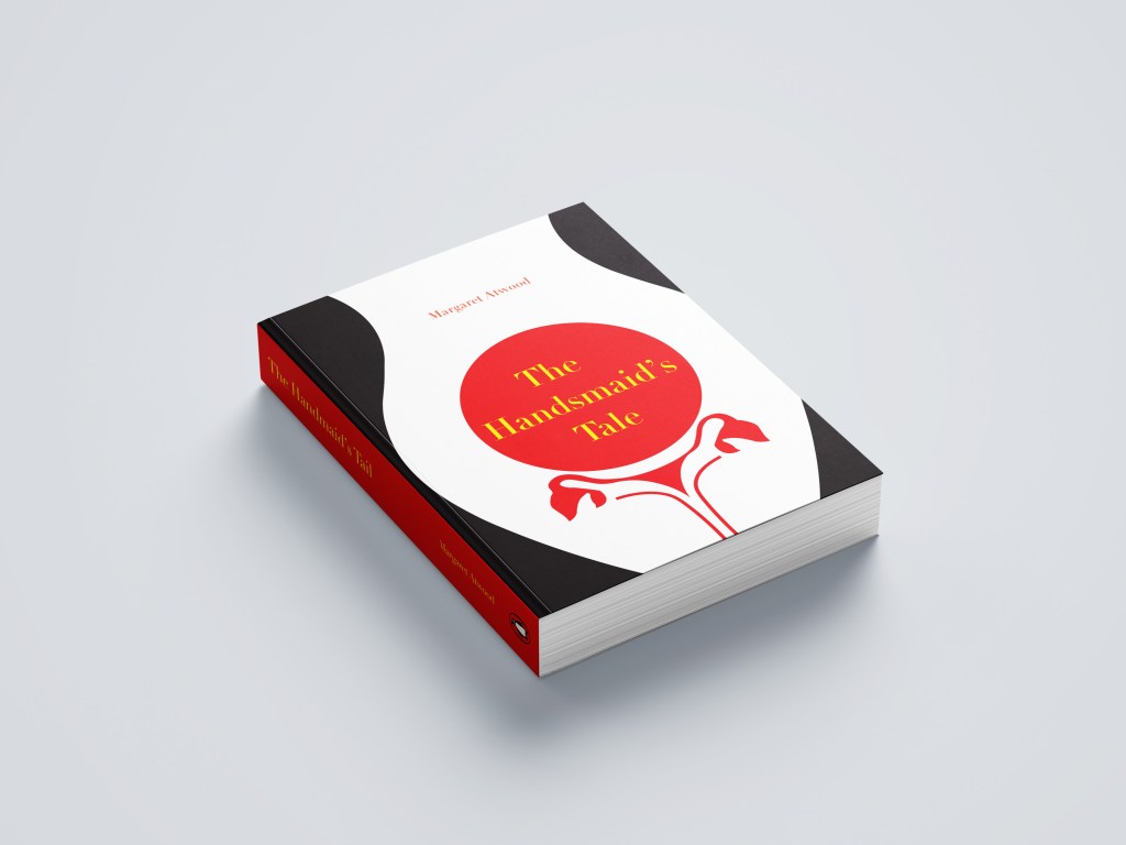
My tutor also commented on my questionable choice of a square book.. which actually now looking back from a few months ago when I completed this exercise I actually completely agree with her. It is unusual to find a squared book unless it is a children’s softback or hardback. I think at the time I massively struggled to find a free A5 decent paperback and hardback mockup online so ended up with the square version!- poor design choice!

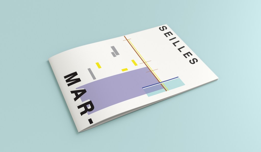
Therefore I rethought my decision and mocked my book up nicely onto an A5 mockup:

My tutor then let me know in her opinion she preferred the version of my design where I used hand lettering as it made the book come across more feminine. I totally agree!- I think I just doubt my decisions sometimes and struggle to make final decisions! I could rectify this in the future by doing surveys or something similar where people vote on the final design.. either that or by asking people to critique my work more! The best place to do this would be my workplace as they all have DT experience!

Another question that was highlighted was why did I make the decision to choose yellow as the colour for the type? – simply, I just wanted a contrast from the Red! Yellow and Red both work great next to black but contrast against each other!

Design 8/10: Melbourne

Hello and thanks for meeting me here at city guidebook number 8 of 10- Melbourne!

When you imagine Melbourne you see sun, sea and surf! I found myself getting confused between Sydney and Melbourne though! :s Again, I did a search on Pinterest for ideas and inspiration.

What I noticed was a lot of photos with Pink hue skies. Pink is a colour I know I haven’t used much in my designs so far, so I decided to use Pink and make it a dominant colour in this design. Pink is modern, confident and warm so it would make it an ideal colour for this popular city. An iconic structure in Melbourne is the Princes bridge, it appeared in a lot of the photos on my search. Melbourne is a coastal city with a lot of landscape and structures but there is also a lot of green around the city. This is something else I would include!

Similar to my design that I did for Manchester, I didn’t want to draw the bridge looking exactly like a bridge.. I wanted to leave it open to interpretation and make sure that the abstract was present with it. I took a photo of the bridge and sketched it out above using only its simplest form. The bridge uses triangles as part of the design so I used this as the main frame for it.

This is the final mock up. I feel like this design is very balanced. The design has a centre point where everything comes together and then there is a lot of negative space and room for the design to breathe. This design allows the eye to travel from the bottom left to the top right. It flows naturally ad comfortably. As I said, I wanted to use Pink as the dominant colour. It is bright and modern and confidently portrays the atmosphere of Melbourne. To break the pink up I used a cool blue, this brings contrast between the 2 colours. A pop of green was used to represent the natural environment which does appear within the city itself. This I feel fights with the blue for attention but it is definitely the attention seeking accent colour of the design. The bridge itself is built from the triangles which appear on the real thing. It is seen to appear in the distance and then come closer to finish at the forefront of the design. It is the bridge in this design which perfectly balances this design. The eye flows comfortably across the design.

Design 7/10: Marseilles

Welcome along to city guidebook number 7! – Marseilles or Marseille ?……..

Marseilles or Marseille was the first question that I asked myself! I pondered at the fact that there might b a typo in the Core Concepts design book because everywhere I looked online it was saying “Marseille” however there is a French and an English version! Marseilles it is!

In my head Marseilles is one of them luxuriously warm places that celebs and people likewise might go and sunbathe their perfectly tanned and toned bodies on the front of a yacht! CORRECT! 😀 but in all seriousness I pictured a lot of blue skies and blue sea, yellow sunshine and boats and yachts everywhere. As usual I started looking for ideas and inspiration on Pinterest.

A lot of blue! The other thing I noticed was the port with the church on the hill in the background. I felt I could incorporate this into my design somewhere along the way.

When I look at my design I feel a warm and happy feeling which is perfect for the weather and general feel of Marseilles. The blue represents the blue sky and sea. I have used a block of blue on the bottom left again as with all the other design guidebooks. It makes sure it is in keeping with the rest of the series but it also represents the sea. The rectangular blocks which work their way up to the top of the left hand side represent the hill and the buildings leading up to the 2 grey rectangular blocks at the top which is the church on the hill. On the right side of the design is the yacht or sailing boat with the sail mast. I have used yellow as a warm colour to contrast against the blues and greys. Blue is the dominant colour closely followed by thee subordinates which I believe to be the greys and turquoise. The accent colours in this piece which contrast against the rest of the design is the yellow and the brown of the sail mast.

You might notice the typos between the 2! My confusion with Marseille vs Marseilles! This is the final mock up for Marseilles! I am pleased with how it has turned out – It has kept the abstract brief, is open to interpretation but I think portrays what Marseilles is all about! The colours are accurate and there are contrasting accent colours thrown in there to make the design interesting. The layout is the same as the rest of the guidebooks to keep it as part of a series.

Design 6/10: Marrakech

Hello and thank you for joining me here at guidebook design 6 of 10: Marrakech!

When I think of Marrakech I think of warm sunshine, a lot of warm colours – oranges, reds, yellows, terracotta… I think of souk markets and rich spices and rich, bright colours; purples, pinks..

I started off the same as usual by searching Pinterest for some inspiration. What I found matched the idea I had in my head. The colours were very warm. A lot of terracotta orange appears on the stonework of the buildings. The buildings all look like temples with the arched shapes doors and windows and the intricate patterned tiles and designs that feature on the buildings. I knew I wanted to include the arch designs and some of the intricate tile patterns. The buildings all look luxurious and rich. The ideal colour to represent this is purple.

The building that appeared the most was the above: Medersa Ben Youssef. This was a college but now acts as a historical site. I liked the symmetrical design, the arches and the intricately detailed tiles that appear on the walls. I knew that I would try and replicate this in an abstract style for my cover. I had the idea to include the arch into the design, a diamond pattern to represent the tiles and maybe some blocks to represent the water at the front of the building.

I overlapped 2 arch shapes with a different tint of terracotta. I chose a terracotta colour for the building to match what I found in my research findings. The arch designs also overlap the type on the left side which matches the rest of the designs for the other guidebooks I have done so far. Following the rule of 3 or thirds, I tried to split my cover into 3 again to get different design elements in each third. The 2 lines at the bottom represent the water at the front of the building and they also add some contrast against the warm colours. The diamond tile pattern I drew and split up across the negative space on the right side. I did not want to overwhelm the design and wanted to maintain as much negative space as I could. I have used purple to highlight wealth and luxury and a bright accent of yellow to again bring contrast but to also represent the bright colours that might appear on the buildings, the tiles, in the souk markets or in the spices. I think the eye flows naturally throughout this design with the diamond shapes adding a level of interest and also bringing the design to a close.

This is the final mock up for Marrakech. I am happy with it! It has kept the same layout as all the other guidebook designs I have done so far, it is keeping with the others and looks a part of the series. I have kept the abstract approach but again, it is open to interpretation but is obvious what it is portraying. The colours match what you would find in Marrakech but also contrast and work well together for the purpose of this brief. The terracotta is the dominant, the blue is the subordinate and the yellow adds a contrasting accent colour trying to fight with the blue for attention.

Design 2/10: Malmo

Welcome back to design 2/10 city guidebooks! – Malmo!

I was more aware of time (or lack of!) after completing design 1: Madrid, these guidebooks are time consuming! I decided I needed to try and cut down the research part of things although this first stage is crucial to achieving winning over a brilliant design outcome . I always start my research by searching Pinterest, it is the best place to find and record inspiration I find.

I had never heard of Malmo but after looking at some photos of the place and reading about it online, it now seems like a nice place to visit! I learned that Malmo is a modern coastal city in Sweden. I wanted to follow in the footsteps of Madrid by basing it around architecture and landscapes so I searched Pinterest to see what landmarks stand out in Malmo.

Turning Torso

The most intriguing building that I found in Malmo was “The Turning Torso” it is regarded as the first “twisted skyscraper” in the world. It was designed by spanish architect, structural engineer, sculptor and painter Santiago Calatrava. It officially opened on the 27th August 2005 and reaches a height of 190 metres with 54 storeys and 147 apartments within it. In August 2015 the Turning Torso was the winner of the 10 year award from the Council on Tall buildings and urban Habitat. It also won the 2005 Gold Emporis Skyscraper Award.

With the brief in mind I knew that I had to keep my design abstract, I was conscious that I didn’t want to make the design too pictorial and obvious as to what it was. I didn’t want to draw the Turning Torso onto my design and it be obvious what it was! The way I went about designing was to take a photograph of the Turning Torso and trace around it several times, each time taking something away so that I was finally left with the bare bones of the building. I then took the whole drawing apart and found clever ways to piece it back together but in an abstract way!

Sketchbook pages: First sketches and ideas

This is the photograph I found on Pinterest, I printed it out and I based my sketches off it:

What I ended up with was a simplified sketch – the minimalistic “bones” of the building:

From this drawing it is still obvious what the building is, I took key parts of the building and simplified it down to its simplest recognisable form. This formed the basis of my final design.

In my final design I kept the same layout as I did with Madrid as I felt that this would make the guidebooks become part of a series and be obvious that they all belonged together. I wanted to use quite “earthy” “beachy” natural colours because Malmo is a coastal town. I used blue for the Turning Torso which reflects the sky and sea and the fact that this tall building is between the two! I used a natural pop of green and yellow which would reflect sun and sand… Yellow being nice and warm also contrasts against the cool blue and green. I wanted to keep the design simple – I decided to split my design into thirds (rule of 1/3s!) and split the design up into each section. This lets the eye flow naturally and easily across the whole design. The yellow boxes allow for a pop of colour, add interest to draw the eye right to the end of the design but also represent the windows of the Turning Torso. The only flaw in my design is that I enlarged the Turning Torso to only show the lower half and a segment of the top… you can’t actually see the “turning” aspect. However, going down the route of keeping it very much abstract and not too obvious, I still really like this design and I think that you would still be able to recognise what the structure is from the key elements I’ve picked out even though they have been moved around and enlarged slightly. Negative space to me is just as much part of the design as everything else so I was adamant I wanted to keep a lot of space around the design but also to not restrict the design too much to its edges. I wanted it as a whole to remain “breathable”.

The location and how I designed the typography of “Malmo” was just as important as the rest of the design. I really toyed with the type layout again and kept questioning myself as to whether it was the right decision to make; I wanted to do something different and for it to look quite modern and edgy. Splitting Malmo into syllables also forces the eye to follow over to the other side of the design to see what the rest of the design is about.

This is the final mock-up of my Malmo guidebook! I am pleased with how it has turned out, I met my own expectations of how I wanted it to be and look like. The dominant colour used on this design is definitely the blue followed by the yellow being next in line as the subordinate colour. The green is fighting against the blue for attention which is exactly what the accent colour should be doing.

Design 1/10: Madrid

  • Mind mapping
  • First Ideas
  • Colour palettes
  • Research points
  • Development of ideas
  • Digital Development
  • Final artwork
  • Final Mock up

I started off feeling really overwhelmed by this exercise. As I mentioned in my introductory post, this exercise is notoriously difficult and challenging for many students and with this in the back of my mind I subconsciously was a little bit apprehensive about it! I started off with the first city on the list which was Madrid; A nice little start to the exercise as I am familiar with Spain even though I have never visited Madrid itself. I decided to mind map Madrid and see where my trail of thoughts led me…

Mind Mapping

I have to admit I did have a stalk on google of what some other students had done for this assignment.. the general outcome for this exercise was based around architectural buildings of the cities or famous landmarks which is completely understandable as the obvious outcome for “coloured blocks” would be buildings. I wanted however to try a different approach and see where that took me.

First Ideas

When I think of Spain in general I think of warmth and warm Reds, Yellows, Oranges, Black, busy, colourful, music, wine drinking, Tapas eating and a chilled way of life. Red, Yellow and Black features in the Spanish flag so I knew I had to use these colours within the design. Socialising, eating and drinking out is a big part of Spanish culture, especially having a drink and tapas in the afternoons or evenings so I wanted to convey this feeling throughout my design. I started to research on Google and Pinterest the different hotspots of places to eat in Madrid. The place which kept coming up the most was Caja Bava which is a brightly coloured street filled with Tapas bars. I collected several images of this street which I documented within my sketchbook and also pinned on Pinterest. I even watched a video of a short tour of the street just to get a feel for what it look like and the vibes it gives out.

These were also a few of the images which inspired me the most:

Colour Palettes

I had no idea what design I might create but I knew I would have to work out some kind of colour scheme, this is what I worked on next.

I used the photos that inspired me the most and in Photoshop using the eyedropper tool I picked out the colours that were most prominent in the photos. These would form a base for my colour palette.

The above screenshots were the palettes that I created from these colours. I then decided to print all of the palettes out and arrange them all onto one sheet to pick out the main colours that could be used; I wanted to organise them into dominant, subordinate and accent colours. I had a little bit of help from my boyfriends cat Bridgette with this!…

The above colours were the ones that I narrowed down. I feel that they reflect the vibes, buildings, warmth and atmosphere of Spain and Madrid. After organising them in an order where I could see what colours worked with each other I then went on to think about the first design and how I would feature the abstract blocks of colour into my design…

Research points

I looked at a wide range of research points for this first design, I was really unsure of where to turn with the “abstract coloured blocks” I did an extensive browse on Pinterest (link below) where I created several folders filled with different images and I also looked up various abstract art and artists. As I said in my previous post I had help from one of my art teacher friends who directed me to a few artists to look into.

I found that researching into Henry Matisse was the most beneficial. Matisse towards the end of his life created art form cut out shapes which he then made into collages and blocks of colour. I did not think originally that these could be classed as blocks of colour but the more I researched into the artist I realised that he was quite renowned for his work related to colour.

Matisse cut out a lot of leaf shapes from paper and used them to create abstract pieces – These were still considered as blocks of colour and it inspired me to think about creating simplistic shapes from objects that exist of one block colour and then make them abstract.

Development of Ideas

I started firstly to design and develop ideas down the food route; As I wrote further up my post, I wanted to explore around Spanish food as it is a big part of Spanish culture. I wanted to convey the bright colours, the exciting food itself, the social aspect and the busy yet laid back Mediterranean lifestyle.

In my sketchbook I drew some initial sketches of some Tapas food just to give me a feel for what I could potentially include on a design.. I ended up really liking these little sketches and went on to create digital versions of them to try out on my digital designs;

Digital Development

Development Idea 1

I started to rearrange the digital drawings of my food in different ways to try and form an abstract design with coloured blocks.. It was tricky! – I concentrated mostly around the calamari illustration; Calamari sandwiches are a delicacy in Madrid! They are a pretty big deal! I situated the Calamari illustrations between coloured blocks to try and get an abstract representation of Calamari in bread or a bread roll/bap. All in all I just felt that it was too “busy” and not quite abstract enough for my liking. I really struggled to interpret food as coloured blocks.. I hated to admit defeat as I really wanted to take a different direction from everyone else, however, landscapes and buildings are best interpreted as coloured blocks. I did a few more experimental layouts for my food idea and then swiftly moved on to try and rework the whole exercise out again.

Back to the drawing board!

Development Idea 2

What I created next was completely accidental and out of sheer boredom and frustration with the exercise at the time! – I sat at my laptop screen on Illustrator and just drew random lines all over the place in a complete daydream and loss at what I was doing! By the time I had finished I could see a resemblance to the Kio Towers (leaning towers of Madrid) and then I gradually started to bring other influences in to it…

I liked the geometric, modern feel of the abstract architectural illustration.

What I ended up designing was this above; I still really liked my little drawings of the food and was trying to find ways still to incorporate them into the design. I decided to use them below “Madrid” as a colour key for the piece; The colour of each food is a colour that featured on my original colour chart and which I have also used on the above abstract design. I did think that the food icons could also technically be classed as the blocks of colour. The colours are very “Spanish” in feel with the Red and Yellow but I have added contrasting colours in there with the Pink and Blue.

I wanted the typeface for “Madrid” to be simplistic. I knew I wanted it to be a sans-serif font as these are always the best for legibility, readability and best suited for titles and headings. I don’t really like using fonts or typefaces that are gimmicky or that are not well established, therefore I did question myself about choosing a typeface that I was unfamiliar with.. however, the one I chose (Leelawadee) did seem quite appealing and attractive for the piece. The only issue I had with the whole design was that the typography did not match the “abstract” feel; in fact I still felt that the whole piece wasn’t edgy or abstract enough. The blocks of colour that I used seemed flat, it seemed as if I was just colouring in blocks for the sake of making them a colour. I think I had too many colours, my thought process moving on from this stage was to potentially limit the amount of colours to possibly 3. I could pick 3 colours that have strong relations to the country (e.g. the country’s flag colours). For Madrid it would be yellow, red and Black.

Development Idea 3

I tried the design again but this time around tried not to play “too safe”. I wanted to experiment more with the typography and the layout (although not too much!.. I chose good ol Helvetica again for the font!) I had the idea to break Madrid up into its syllables and rearrange them coming slightly off the page.

The above screenshots show how the development progressed.. I much prefer this idea. I messed around with the orientation of “Madrid” at the end of my experimenting I found that Madrid should be written facing the spine and not the pages. It has more impact when you look at it, it stands out and it looks more abstract in design even though there is still a strong geometric influence to it. I have added the red bars in the design because they help to frame the overall design and give it structure. The red boxes are focal points that draw your attention to the design. I made one much smaller and thicker than the other for contrast. I feel in general the design is comfortable to look at; the eye flows comfortably throughout it. I then had to develop it further to get the coloured blocks into the design.

I developed it further (above) experimenting with outlines on the text and contrast of the typography with line weight and thickness. I started to add colour to the blocks. I also outlined the shape of the abstract bull which ties in nicely to Madrid and Spain as a country. The colours I have used are Red and yellow with Black and white added in. The Red and yellow I overlapped and lowered the opacity to mix the colours to create an orange hue. The middle bottom design stands out the most for me.. it has contrast with the typography (Bold vs. regular, black vs. white, big vs. small), the overall layout is more abstract, the bull line work ties in nicely to the city and country and the colours all contrast and compliment each other and are blocks. (yellow=dominant, orange= subordinate and the light pinky red and bold red are accents)…

….

However, I still felt like it was “too busy” the line work took away the “block” aspect of the brief. I wanted to keep the design as simplistic as possible, so I went about developing it even further.

This is what my final design looks like! I simplified it right down to the basic shapes which I think helps you to recognise the landmarks in the design better. I added accent colours in each corner to draw the eye and attention over the whole design.

“Once I get the first one designed and finished, the others should flow quite easily”

Amy Holmes – This was said to her boyfriend after almost ripping her hair out from trying to find an outcome for 1/10 guidebooks! 😀

Exactly what I said above! I knew that this exercise was notoriously difficult and that after I had the first one designed the other 9 should flow and follow the same design thought process and layout etc.. This was true, the others flowed along quite nicely afterwards with the exception of hitting a few “brick walls” along the way.

Take a look at my other 9 posts to see the final designs for each city!