
Hello again for design 4/10 of my abstract city guidebooks!- Manchester!
I love visiting Manchester whenever I can so I wanted to do this one a little justice! Manchester was the heart of the Industrial Revolution in England and is still known for its community spirit and hard work ethic.
For all of the designs so far I have been quite modern in approach by designing for iconic buildings that are quite modern and new.. I knew that this would not be the case for Manchester. Manchester is renowned for its red brick buildings, the stonework, factories, chimneys, railways, railways viaducts, canals and the cotton industry. The colour scheme for Manchester would be reds, greys, stone and browns. With all this mind I went to Pinterest again for some inspiration, my initial thoughts were to go with the chimney idea but then when I found an image of a canal and a viaduct bridge I knew that this was the route I wanted to go down. When I drive to Manchester I drive under loads of them viaduct bridges; that is how you know you are getting closer to Manchester! In my head this seemed the right choice to choose.
This is the photograph I found:
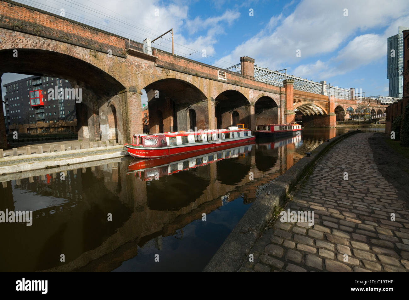
I started doing the same as I had done for all the others; printed a copy of this out and then started to sketch the from it, simplifying it each time I drew it.
This photograph reminded me of the image the OCA used in our Core Concepts unit book to explain to us this brief:
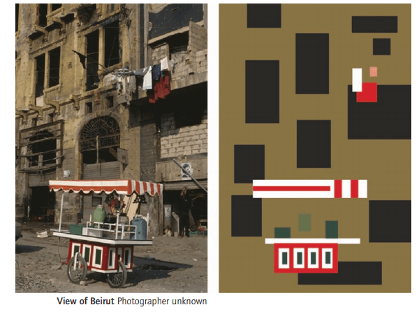
The canal boat on the Manchester viaduct photograph is very similar to this image. I realised I could replicate the canal boat in a similar way.
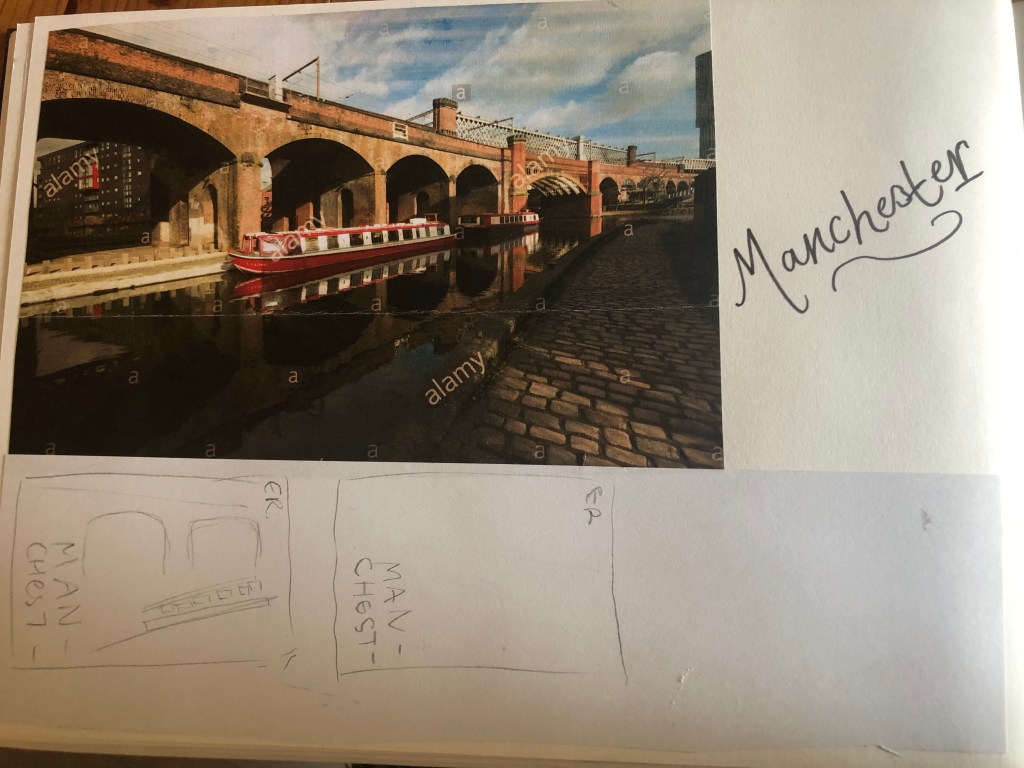
I did do a lot more sketches for this guidebook, however I did them when I was in my full time job at a time when I had a 5 minute window in-between jobs.. for whatever reason they got mislaid!
However, I developed a few ideas in Illustrator and eventually arrived at this one!
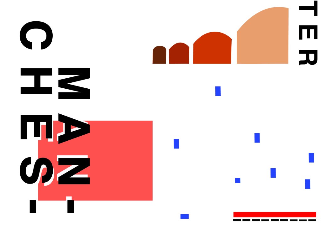
I have kept the same layout again as all of the others to keep them as part of a series. Again, breaking Manchester up into its syllables and using Helvetica. The idea of this was to use a main block of red on the bottom left, again in keeping with the other designs so far. This red block represents the infamous red brick in Manchester. Instead of drawing the viaduct bridge to look like a bridge I have in an abstract form used only the arches of the bridge to create the illusion of it. I have used different hues of brown from dark to light to represent the dark brick and industrial stonework. The blue squares add contrast and also help draw your eye across the whole piece. These blue squares represent the water; they represent when the sun sparkles on water and creates sparkling ripples. I have used different sized blocks again for contrast, to represent abstract and to add interest to the design. I wanted the eye to travel from left to right to the bottom with this design; that is why I have placed the abstract block canal boat along the bottom right. The red is the paintwork and the top of the boat with the black blocks being the windows. I was conscious again of placing objects along the edges of the design; the design needed to be able to breathe and to not be constrained to a box. In this design the red is definitely the dominant colour with the browns following as subordinate colours. They are warm so needed a cool colour to contrast against them. The blue is the accent colour, it is fighting for attention with the dominant.
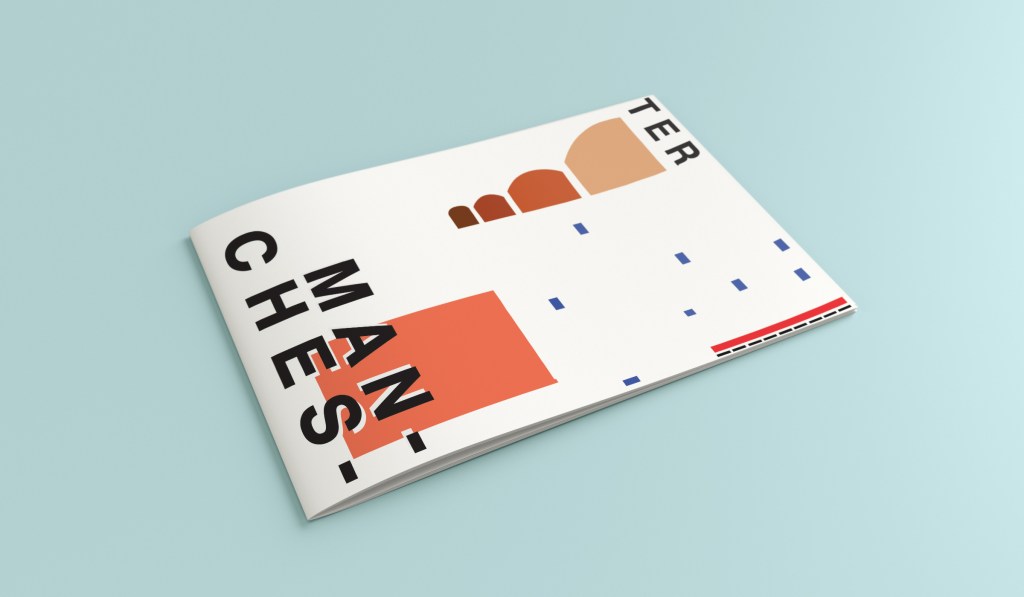
This is the final mock up for Manchester. I am pleased with how it has turned out, I think it is abstract and open to interpretation as to what is being showed but still obvious what is trying to be portrayed.
