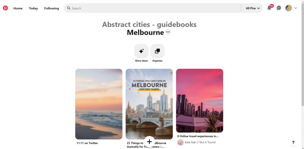
Hello and thanks for meeting me here at city guidebook number 8 of 10- Melbourne!
When you imagine Melbourne you see sun, sea and surf! I found myself getting confused between Sydney and Melbourne though! :s Again, I did a search on Pinterest for ideas and inspiration.
What I noticed was a lot of photos with Pink hue skies. Pink is a colour I know I haven’t used much in my designs so far, so I decided to use Pink and make it a dominant colour in this design. Pink is modern, confident and warm so it would make it an ideal colour for this popular city. An iconic structure in Melbourne is the Princes bridge, it appeared in a lot of the photos on my search. Melbourne is a coastal city with a lot of landscape and structures but there is also a lot of green around the city. This is something else I would include!
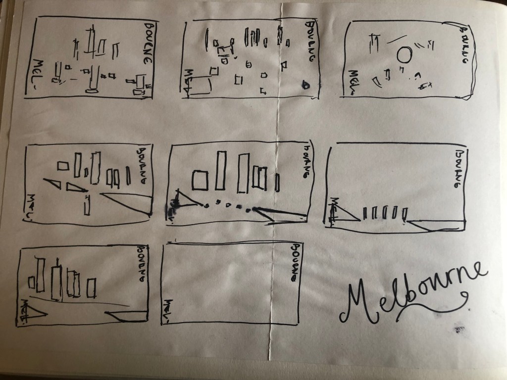
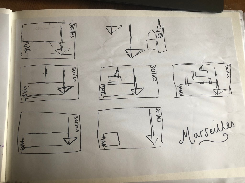
Similar to my design that I did for Manchester, I didn’t want to draw the bridge looking exactly like a bridge.. I wanted to leave it open to interpretation and make sure that the abstract was present with it. I took a photo of the bridge and sketched it out above using only its simplest form. The bridge uses triangles as part of the design so I used this as the main frame for it.
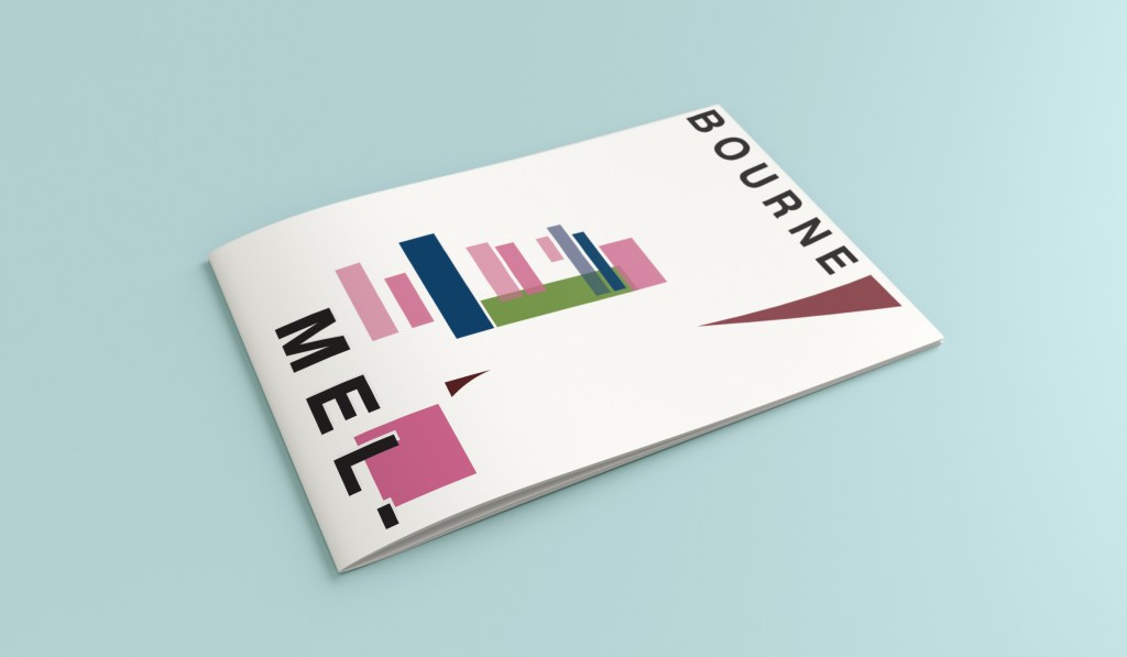
This is the final mock up. I feel like this design is very balanced. The design has a centre point where everything comes together and then there is a lot of negative space and room for the design to breathe. This design allows the eye to travel from the bottom left to the top right. It flows naturally ad comfortably. As I said, I wanted to use Pink as the dominant colour. It is bright and modern and confidently portrays the atmosphere of Melbourne. To break the pink up I used a cool blue, this brings contrast between the 2 colours. A pop of green was used to represent the natural environment which does appear within the city itself. This I feel fights with the blue for attention but it is definitely the attention seeking accent colour of the design. The bridge itself is built from the triangles which appear on the real thing. It is seen to appear in the distance and then come closer to finish at the forefront of the design. It is the bridge in this design which perfectly balances this design. The eye flows comfortably across the design.
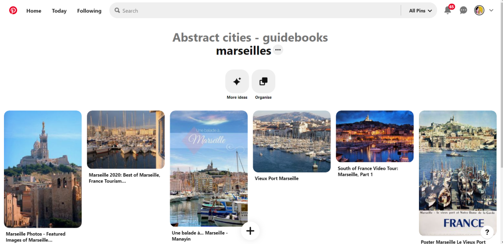
Welcome along to city guidebook number 7! – Marseilles or Marseille ?……..
Marseilles or Marseille was the first question that I asked myself! I pondered at the fact that there might b a typo in the Core Concepts design book because everywhere I looked online it was saying “Marseille” however there is a French and an English version! Marseilles it is!
In my head Marseilles is one of them luxuriously warm places that celebs and people likewise might go and sunbathe their perfectly tanned and toned bodies on the front of a yacht! CORRECT! 😀 but in all seriousness I pictured a lot of blue skies and blue sea, yellow sunshine and boats and yachts everywhere. As usual I started looking for ideas and inspiration on Pinterest.
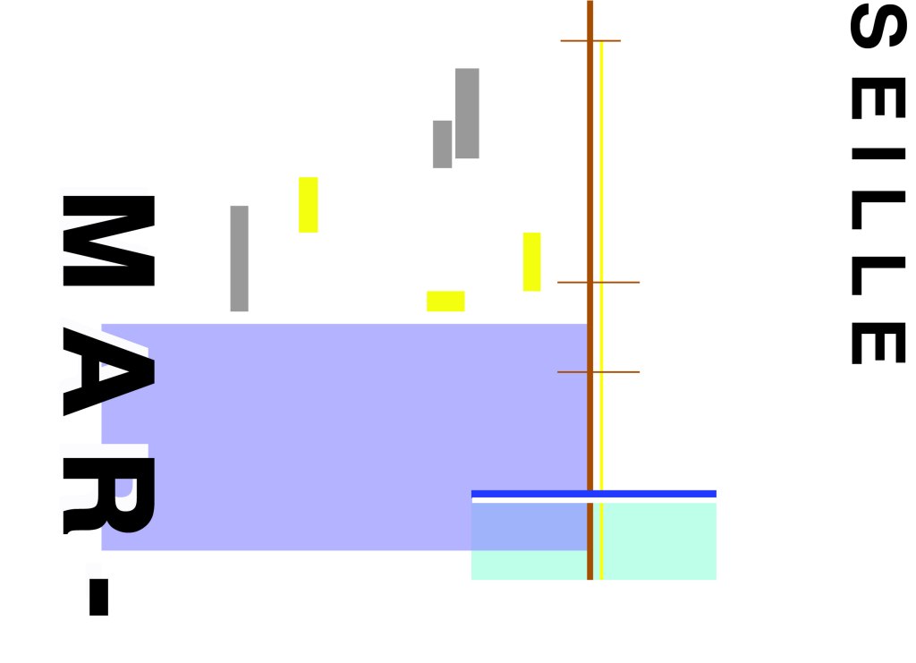
A lot of blue! The other thing I noticed was the port with the church on the hill in the background. I felt I could incorporate this into my design somewhere along the way.
When I look at my design I feel a warm and happy feeling which is perfect for the weather and general feel of Marseilles. The blue represents the blue sky and sea. I have used a block of blue on the bottom left again as with all the other design guidebooks. It makes sure it is in keeping with the rest of the series but it also represents the sea. The rectangular blocks which work their way up to the top of the left hand side represent the hill and the buildings leading up to the 2 grey rectangular blocks at the top which is the church on the hill. On the right side of the design is the yacht or sailing boat with the sail mast. I have used yellow as a warm colour to contrast against the blues and greys. Blue is the dominant colour closely followed by thee subordinates which I believe to be the greys and turquoise. The accent colours in this piece which contrast against the rest of the design is the yellow and the brown of the sail mast.
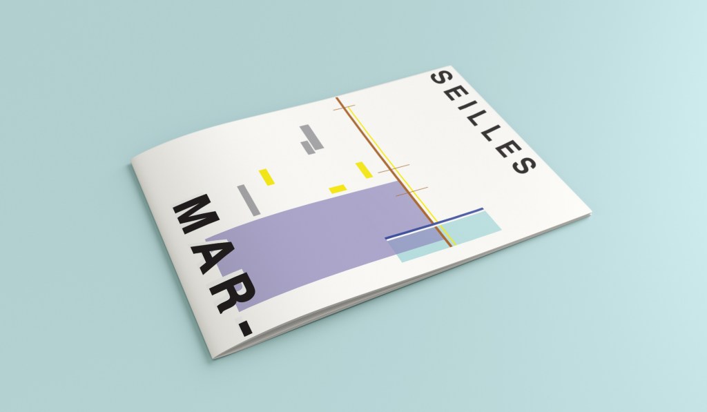
You might notice the typos between the 2! My confusion with Marseille vs Marseilles! This is the final mock up for Marseilles! I am pleased with how it has turned out – It has kept the abstract brief, is open to interpretation but I think portrays what Marseilles is all about! The colours are accurate and there are contrasting accent colours thrown in there to make the design interesting. The layout is the same as the rest of the guidebooks to keep it as part of a series.
Hello and thank you for joining me here at guidebook design 6 of 10: Marrakech!
When I think of Marrakech I think of warm sunshine, a lot of warm colours – oranges, reds, yellows, terracotta… I think of souk markets and rich spices and rich, bright colours; purples, pinks..
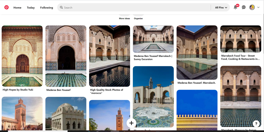
I started off the same as usual by searching Pinterest for some inspiration. What I found matched the idea I had in my head. The colours were very warm. A lot of terracotta orange appears on the stonework of the buildings. The buildings all look like temples with the arched shapes doors and windows and the intricate patterned tiles and designs that feature on the buildings. I knew I wanted to include the arch designs and some of the intricate tile patterns. The buildings all look luxurious and rich. The ideal colour to represent this is purple.
The building that appeared the most was the above: Medersa Ben Youssef. This was a college but now acts as a historical site. I liked the symmetrical design, the arches and the intricately detailed tiles that appear on the walls. I knew that I would try and replicate this in an abstract style for my cover. I had the idea to include the arch into the design, a diamond pattern to represent the tiles and maybe some blocks to represent the water at the front of the building.
I overlapped 2 arch shapes with a different tint of terracotta. I chose a terracotta colour for the building to match what I found in my research findings. The arch designs also overlap the type on the left side which matches the rest of the designs for the other guidebooks I have done so far. Following the rule of 3 or thirds, I tried to split my cover into 3 again to get different design elements in each third. The 2 lines at the bottom represent the water at the front of the building and they also add some contrast against the warm colours. The diamond tile pattern I drew and split up across the negative space on the right side. I did not want to overwhelm the design and wanted to maintain as much negative space as I could. I have used purple to highlight wealth and luxury and a bright accent of yellow to again bring contrast but to also represent the bright colours that might appear on the buildings, the tiles, in the souk markets or in the spices. I think the eye flows naturally throughout this design with the diamond shapes adding a level of interest and also bringing the design to a close.
This is the final mock up for Marrakech. I am happy with it! It has kept the same layout as all the other guidebook designs I have done so far, it is keeping with the others and looks a part of the series. I have kept the abstract approach but again, it is open to interpretation but is obvious what it is portraying. The colours match what you would find in Marrakech but also contrast and work well together for the purpose of this brief. The terracotta is the dominant, the blue is the subordinate and the yellow adds a contrasting accent colour trying to fight with the blue for attention.
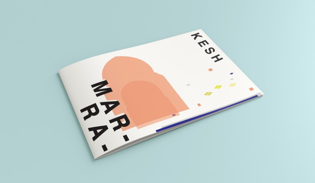
Hello! and thanks for dropping by to look at design 3/10 of my abstract city guidebooks- Managua!
I personally had absolutely no idea where this city was! (I am still confused! – but I do know it is on the bit that joins both Americas together!!) with my poor knowledge of geography I attempted to gloss over this and continue with my design ideas. Again, I wanted to keep the design concept and layout etc for this guidebook cover the same as the others so that it continues to form the series.. I was going in again simplistic and minimalist in approach, using architecture and iconic buildings as the basis of my design and taking key elements away to create my design.
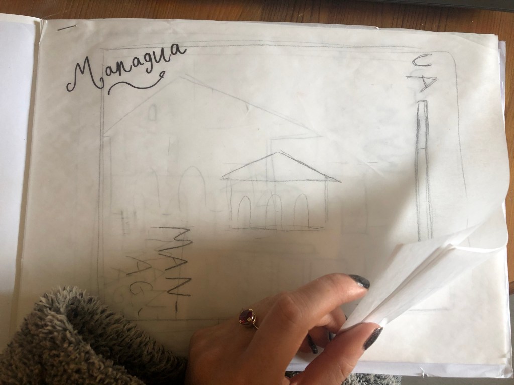
I started my initial research using Pinterest again; I looked up iconic landscapes and architecture in Managua and it came up with the cathedral as the main recognisable building of the city.
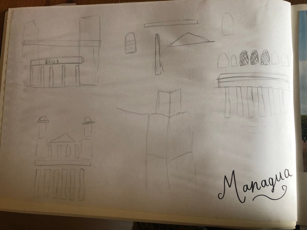
From first glance it looked like a complicated building to try and recreate in abstract! I took the same approach as last time and printed out this image tracing over it again and again simplifying it each time until I was left with the bare bones.
The main key features that stood out to me from the photograph was the intricately detailed stonework of the cathedral, the small cross that features in the middle of the cathedral on top of one of the triangular brickwork and the fact that the cathedral is in beautiful warm weather with 2 palm trees either side of it!
I used my rough sketches to figure out what to include in my final design.
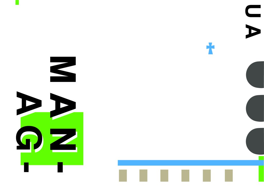
Again, I wanted to try and stick to the rules of thirds for my design and split the design into 3 sections on the cover. I wanted again to let the eye flow naturally across the whole page. Negative space once again played a big factor into the design, I actually base the design around the negative space each time. I placed a lot of the design to the edge of the page which can sometimes constrain the design to a “box” and restrict the design to be able to “breathe”; however, I still allowed for the design to “breathe” by not constraining the design all of the way around the cover. I added a tiny accent of green at the top left side just to give the eye somewhere else to hop to. The idea was for the eye to flow naturally all the way around the design. The bottom green blocks were representative of the 2 palm trees which I have obviously exaggerated and under exaggerated in size – representative of abstract also. The design is not accurate in scale, size or orientation to the building; the grey ovals on the right edge are representative of the arched windows in the centre of the cathedral and the bottom bar and grey small rectangles are a snippet of the pillars that hold the cathedral to the ground and the steps at the bottom. The cross I have kept small, it is always good to have contrast between elements on a design; the eye is drawn more to the cross and its location in the negative space on the cover- it is representative really to how small it is within the great vastness of the cathedral.
The dominant colours on this design accidentally are the black and grey of the text and the arched windows.. I know black and grey are tints but to me they draw me to the design before any of the other colours. The subordinate colour needs to be the green, although to be honest the blue stands out just as much as the green. It probably doesn’t help that these 2 colours are both cool and don’t particularly contrast each other well. As for accent colours… I would say I have designed something that doesn’t have a accent colour as such. In hindsight now looking back I could have added a contrasting colour as a tiny accent to the piece but I honestly just liked the use of these 3 minimalistic colours.
This is the final mock up of Managua! Overall, (apart from I mentioned that I could have used a warmer colour as an accent) I am happy with this design. I think I have met the abstract needs of the brief.
This post is dedicated to my initial ideas and thought process through to the final art development of the text that appears on the front and inside my greetings cards.
This post consists of:
Ideas
Research
Text artwork development
Ideas
The hardest part of this assignment was knowing how to display the messages of the cards and getting the typography right.
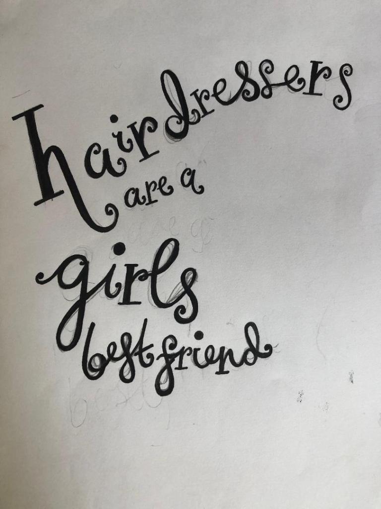
I did not want to use simplistic text – I did not want to choose a font and type the message out onto the card and that be that! To choose a typeface or a font and use it effectively would require me to choose an appropriate font to match the feel of my cards which I knew would have to be fun, vibrant and humorous. I knew this would possibly turn out to be a disaster because I definitely did not want “fun” “gimmicky” fonts on my cards! – (think Comic Sans!) The only way forward was to create my own vector lettering using Illustrator – although this could also be a challenge!
Research
I started to look around to find inspiration. I found it in several places.. random Instagram posts, quotes I had seen online, products I found in shops.. These are some of the images which helped to inspire the text on my cards;
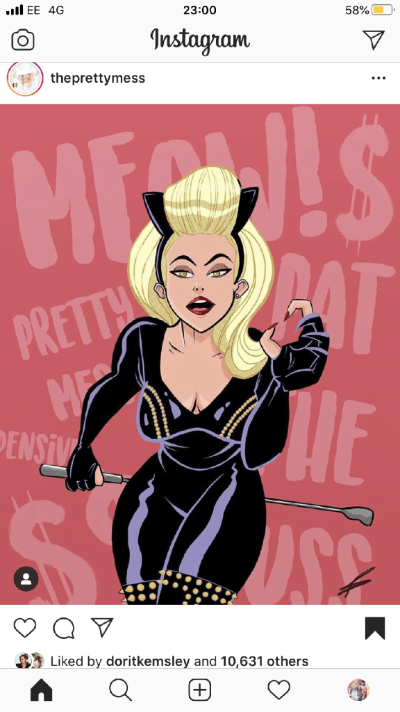
This was a post on Instagram that I stumbled upon. The style of illustration is very similar to my own. I like the appearance of the text in the background. This is the sort of thing I had in mind for my own design. It looks like a brush effect has even created this style of text.
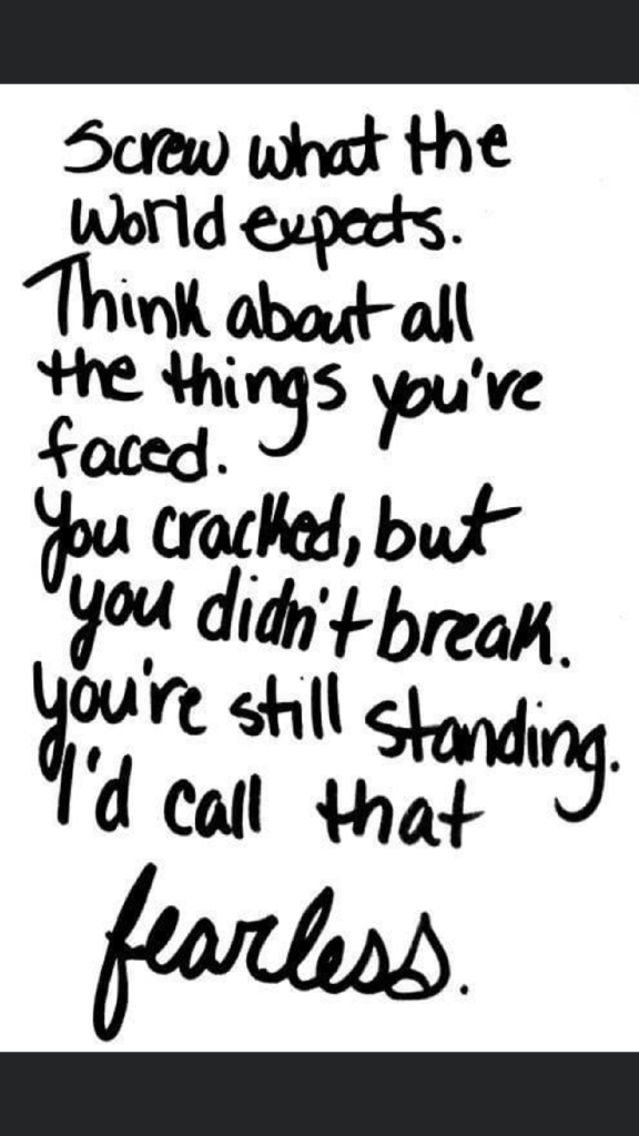
This is a quote that again I stumbled across, I was not even interested by the quote but the style of lettering on it. It looks like someone handwriting, which gave me the idea that I could too hand write the message and then import it into Illustrator and trace around it to create some vector type.
This image above again I found on Instagram; what is relevant about this post is that they have used Dolly Parton as the main focus on some postcards who is one of the blonde icons I had in mind for using on my own designs.
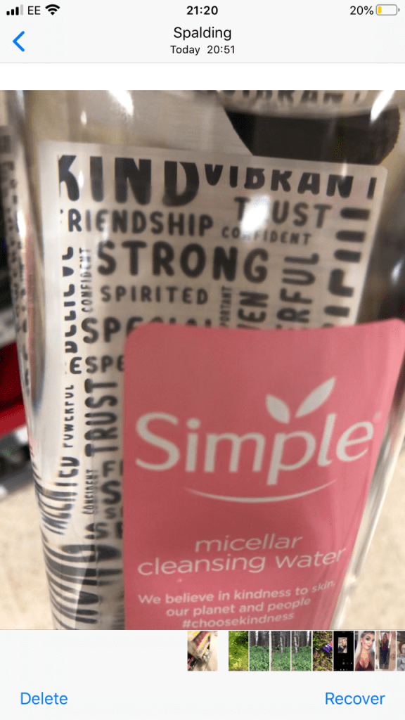
The above image I took a photo of whilst I was at work. My “double life” or my second job is within the retail sector (I work toiletries!) I saw this Simple bottle and the black background text on it gave me an idea as to what sort of style I could do in my own designs. The text is very much like bubble writing – at a guess it is vector lettering.
This image above is the image that inspired me the most for my card designs. It is the cover of Debut magazine that I own and I liked the style of writing and how it looks. Out of all the images I have found I shall try and replicate this image within my own designs more.
Development of vector lettering
As I stated at the beginning of this post, I did not want to use an existing font because I thought I would struggle with finding a suitable one to match the feel of my cards and to also give a professional appearance. I decided to create my own vector lettering from my own style of hand lettering…
I created 2 pieces of text for each card:
The main card title
The background text of the card
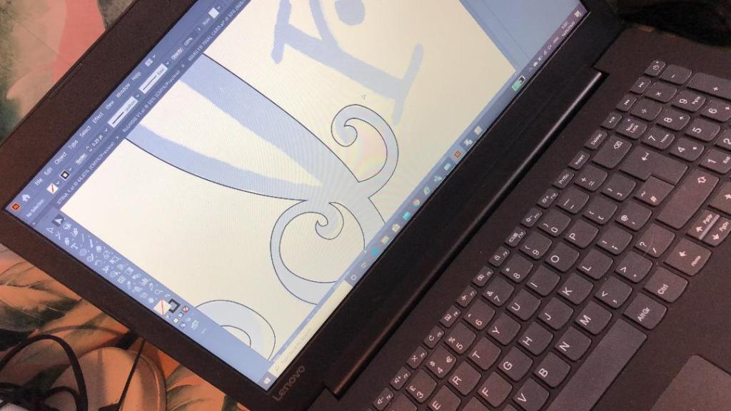
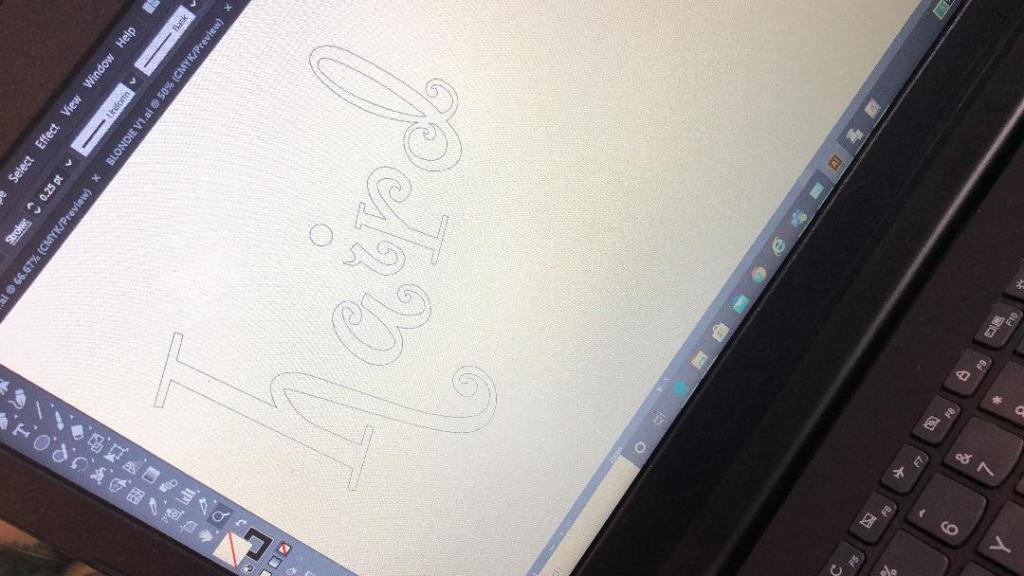
I started off by drawing out on paper the original text I planned to use for my main card title. I drew out my text using my papermate flair pen (these are ideal for ink drawings and lettering!) and then imported them into Illustrator via my scanner to trace around using the pen tool to make into vector lettering.
These are my hand drawn original lettering drawings that I then imported into illustrator to trace around:
These are the beginning stages of the main titles of each card:
The last thing to do was to create the background text for the cards.
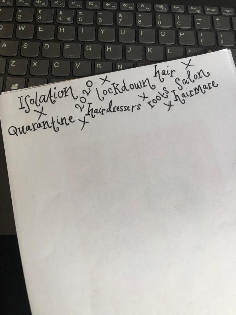
Most of the inspiration for the background lettering that I used on my designs came from the Debut magazine cover; the cover is full of words that relate to that particular magazine which I decided I could bring forward into my own design (apart from I have used words that relate to hair, roots and lockdown)
Again, just like I did for the main text of the cards I drew out by hand the lettering for the background text and then imported it into illustrator to trace around. I chose to use the words: lockdown, Quarantine, roots, salon, hairdresser, 2020, hairmare, isolation and hair. I felt that these words best summed up the lockdown hair nightmare best!
I then imported it into Illustrator.
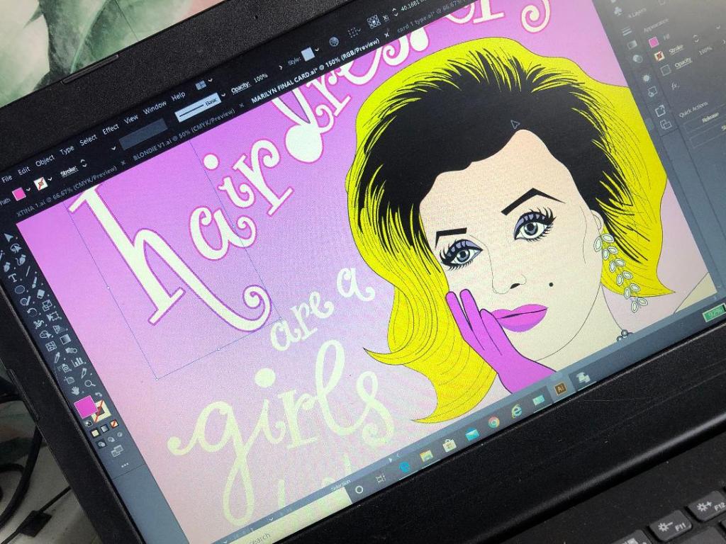
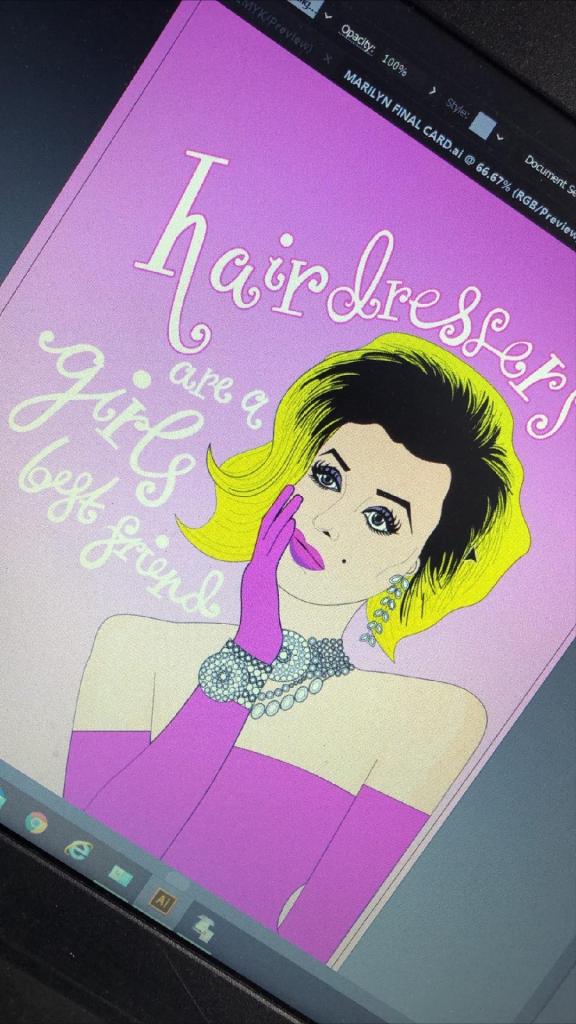
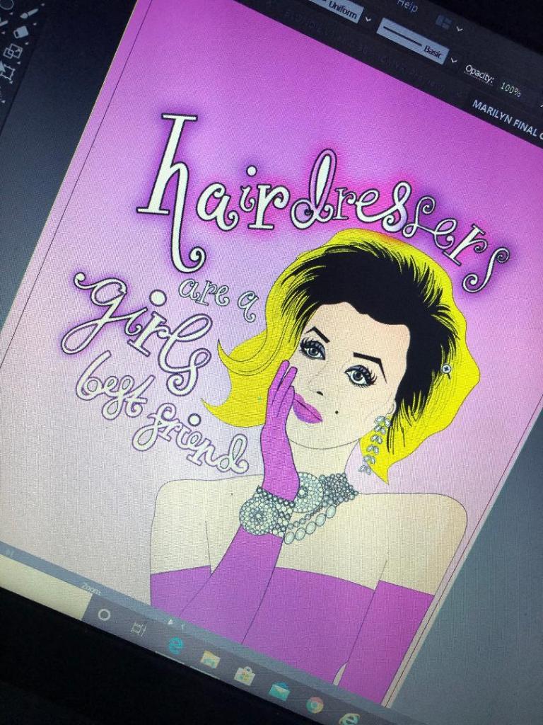
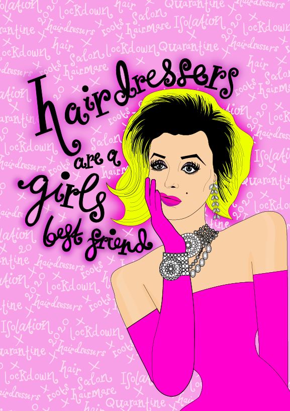
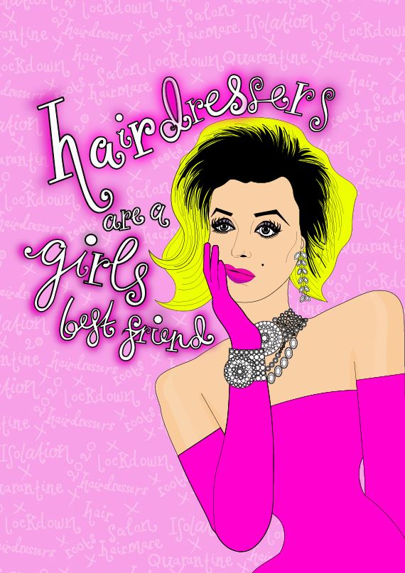
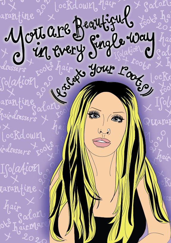
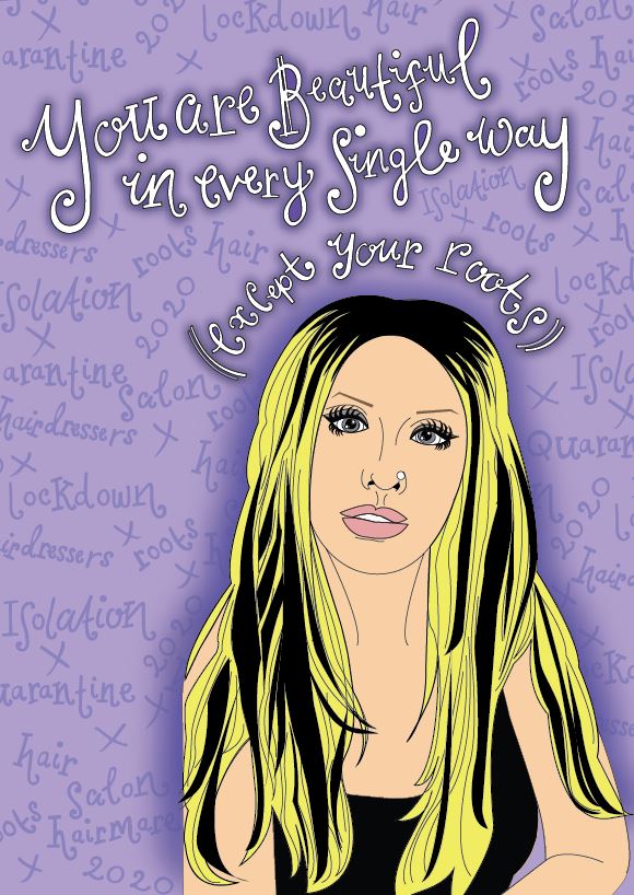
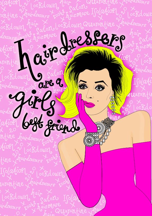
I then changed the colours of the text to match the cards and changed the stroke of the lettering and copied it over to the card documents to place behind the “blonde icons” (Marilyn, Debbie Harry and Christina Aguilera). I then cropped out any words that I did not need or that were out of the print border.
I then saw an inconsistency within my series of cards with the colours that I used for the text. On the Marilyn card I used white as the main text colour whereas on the rest I used black, black works a lot better. The black stands out much more and it also shows a pattern within my designs; they all follow the same colour scheme. The following images will show my development in this stage:
I then finally reached the stage where I was relatively happy with the front of my 3 designs!
Here they are in all their glory! 🙂
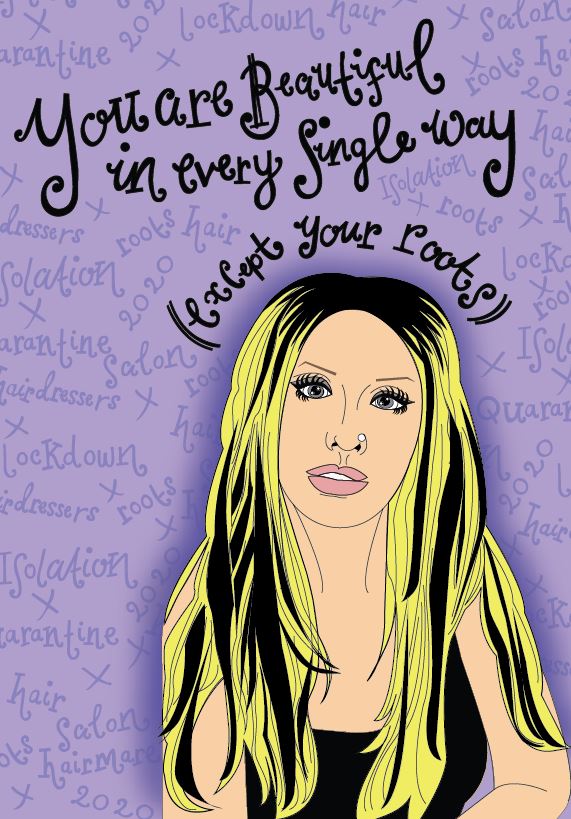
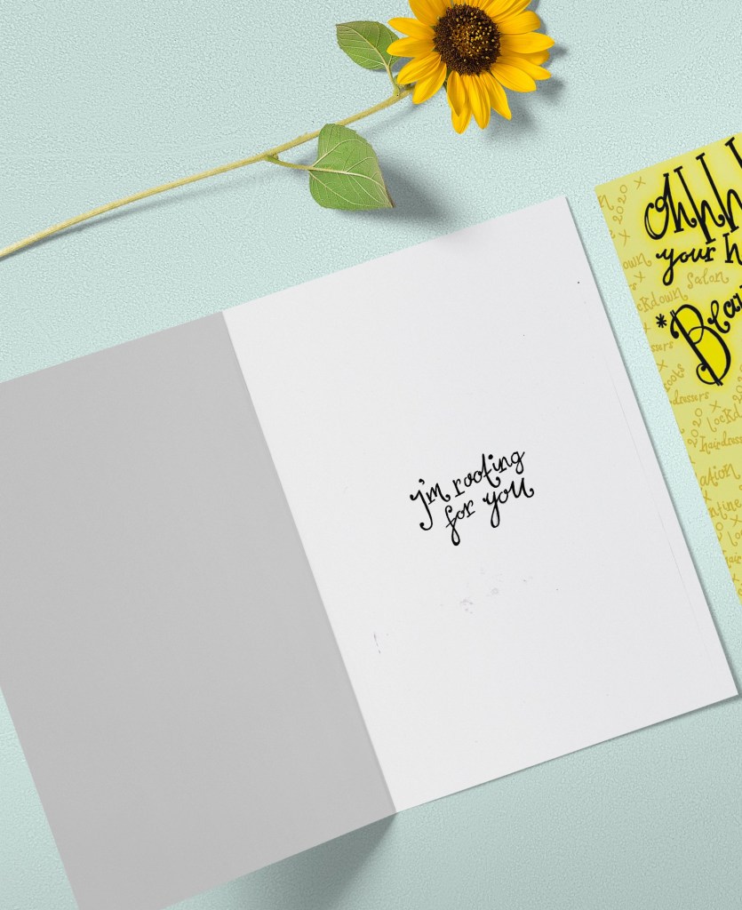
The next stage was to write the inside messages of the cards. I was unsure as to whether I wanted to use the same style of hand lettering that I had used on the front of all my designs or whether I wanted to use a more simplistic approach. Most greetings cards that are on the market use simple sans-serif fonts to feature inside the cards. I tried this out for mine using Helvetica. I also toyed with different messages for each of the cards; “Atomic (blonde)” for inside Blondies, “Don’t look at me” for Christina (the starting famous lyrics to Beautiful) and finally “I’m rooting for you” was the message I originally thought of with Marilyn’s.
This is what I ended up with. When I put it next to the designs it just didn’t look right. It looked like it did not belong with the cards. I decided to use the same hand lettering that I used in the rest of my designs with the same message –
“I’m rooting for you”
Again, I drew it out and traced around it in Illustrator to place on the inside of the cards.
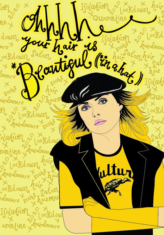
The second card that I designed in my series was based around Debbie Harry (Blondie).
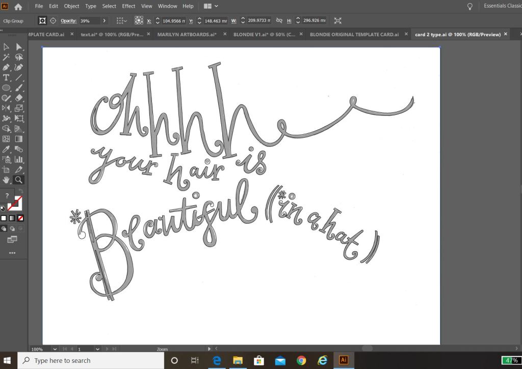
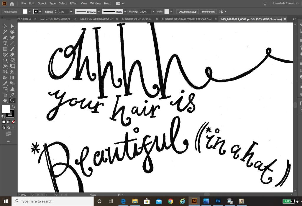
Debbie Harry is another iconic blonde of our time, she seemed suitable to use for one of the illustrations in my range of cards. One of Blondies most iconic songs is “Atomic” where the lyrics are: “Oh, your hair is beautiful” I decided to put a twist on this and use the lyrics as the message on my card but change it to “Oh, your hair is beautiful.. (in a hat)”. Debbie Harry was well known for wearing baker boy style hats and hats are ideal right now for covering dodgy isolation hair and roots!
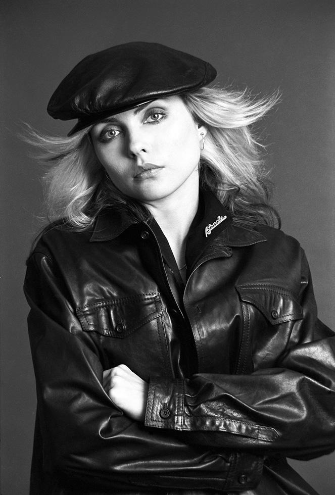
All I needed to do at this point was to find a photograph online of Debbie Harry wearing a hat to be able to draw inspiration from and trace around.
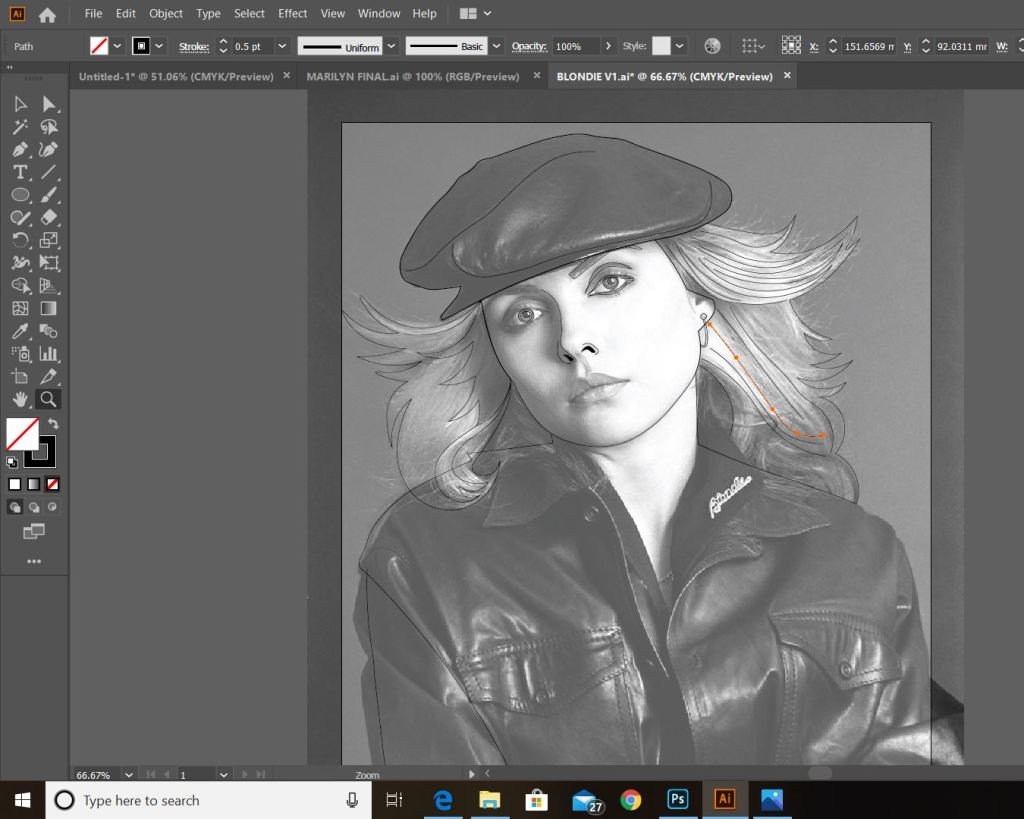
This was the image that I found on Google and the beginnings of tracing around it using the pen tool in Illustrator!
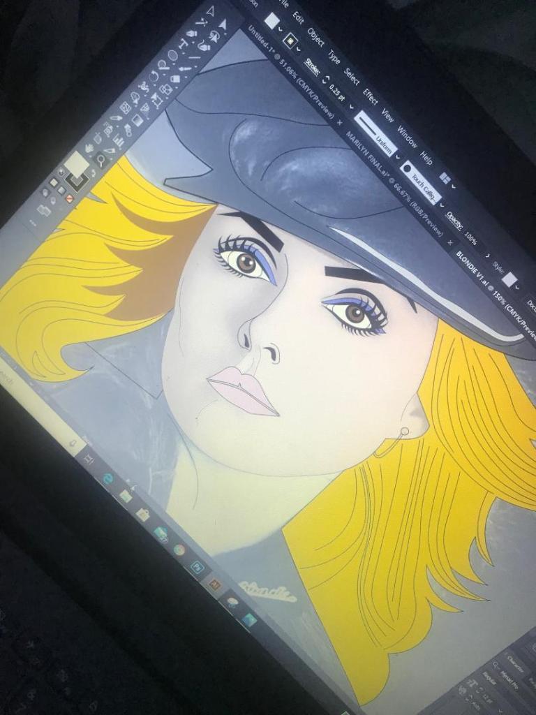
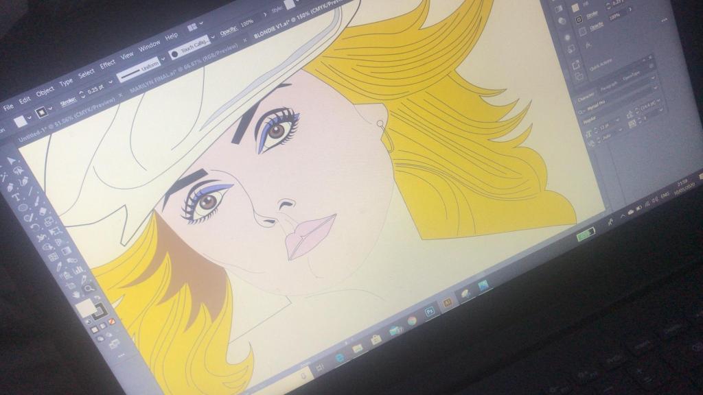
This is exactly the same process as what I did with Marilyn. I traced around the image completely in Illustrator with the pen tool and just added colour, texture, tone etc! I wanted to represent Debbie Harry as true as possible from the “Atomic” music video and this image that I have found of her is not from that video.. therefore I had to find several separate images of her outfits to draw from. I did try and play the music video and screengrab from that but the resolution was too poor. In the music video she wears an iconic “Vulture” t-shirt, I searched online to find this logo to draw from.
These images below show the progress at this tracing out stage;
dark black roots worked best
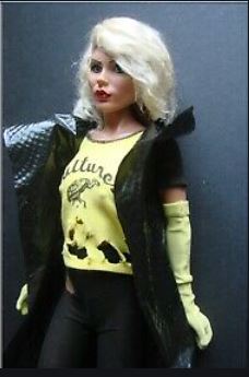
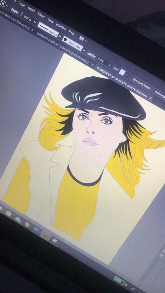
I actually found Blondie a lot more easier to draw out than what I did Marilyn. I don’t know whether that is because I was a little rusty from not illustrating for so long and now I have got back into the swing of things I have picked up pace?.. However, I am pleased with how she turned out!
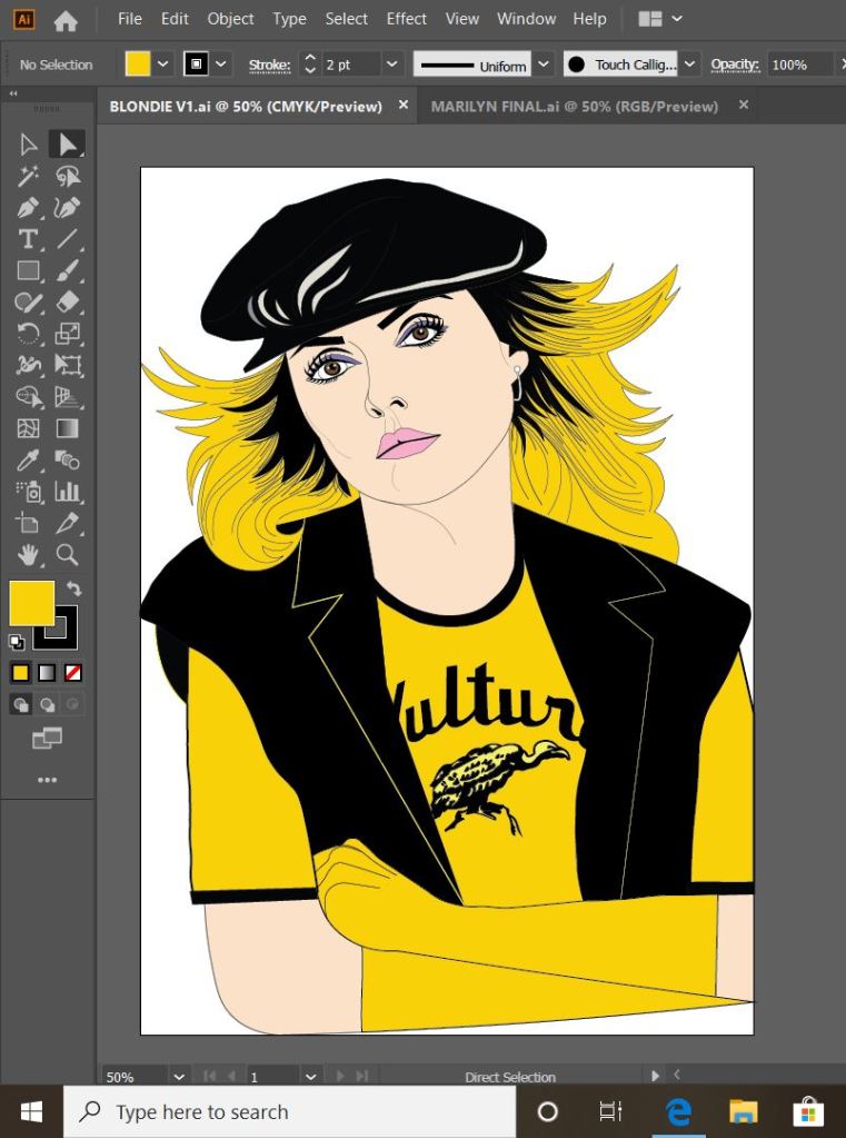
This is my final finished drawing of Blondie;
Again, the same goes as with Marilyn – I need to research and come up with ways of how I am going to portray the message. As I explained in my previous post I want the text on the card to be in the same similar illustrative approach to the drawings… I am going to do a separate post to research my findings and document the design development around the rest of the cards.
Responding to Tutor feedback…
“Be sure to use photographic reference with care: for example, the image used as reference for Debbie Harry doesn’t give you the clear information you need in relation to the folded hand and visual info for the little finger. Identifying this type of issue means you just need to reference the position, getting someone to model the position so that the fingers are not distorted in their translation”.
I completely agree with the feedback that Bee gave me for this piece of work. Even though I have a qualification in Life Drawing, over the years my drawing skills have become a bit rusty!
I found a random image online at the time and I traced the fingers on the hand from that onto my drawing of Debbie Harry as the original photo of Debbie Harry I used as reference did not include her fingers. I tried to go back and find the image I did use to reference the hands and fingers from in my archive of photographs but sadly I did not keep it!
I have however taken this advice and used it in future exercises and assignments… for Assignment 5 I drew illustrations for a children’s book – in this me and my boyfriend modelled in photographs to use as reference and to give me an idea of scale for my own drawings! (I am so sorry Chris for including the photo of you topless ;D…I needed a reference for someone clutching something in their arm… the Pokemon toy got the short straw!)