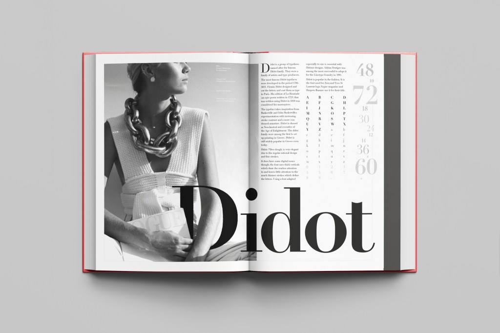
This was the typeface I was quite looking forward to designing for! Didot typeface is very elegant looking and is used in glossy, expensive fashion magazines such as Vogue and Harpers Bazaar. Didot is named after the Didot family who were artists and printers. Didot was inspired by Baskerville which is another reason why I have used it as part of my type specimen book.
Didot is most famous for being on the cover of Vogue as “Vogue”, because of this I wanted to create a layout that represents high fashion magazines. Vogue magazine always has a celebrity or a fashion model on their cover so I wanted to include a similar thing in my layout. I went onto Pexels website and typed in “Vogue” and it came up with an image of a woman in fashionable clothing holding a Vogue magazine close to her chest. It seemed like the perfect image to use for this design!

There were a few more variations of this photograph as well which I downloaded in case I wanted to use different images on my layout:


The next step was to import the photograph into Photoshop and then adjust the colours. I wanted it to have a Sepia filter to it; Black and White photography suits High quality fashion magazines more and looks good on a layout for contrast. I wanted to put the “Didot” heading on my layout but didn’t just want to place it on the page with no creativity.. I decided to make the D part of the photograph by using layer masks again to mask part of the D out to look like she is carrying the D as an accessory in the photograph. I think it works well! I decided to do the rest of the layout in a similar style to a fashion magazine with the text in 3 columns and one column talking about the history of Didot.
Digital Development


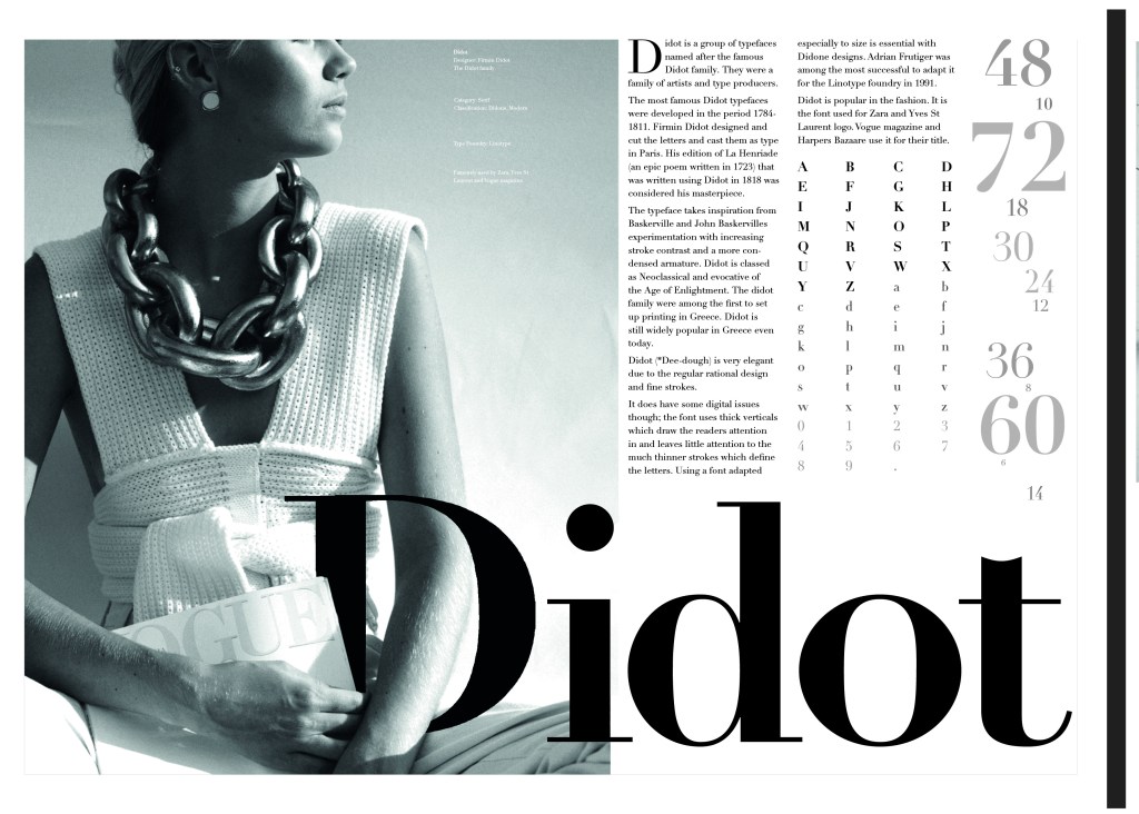
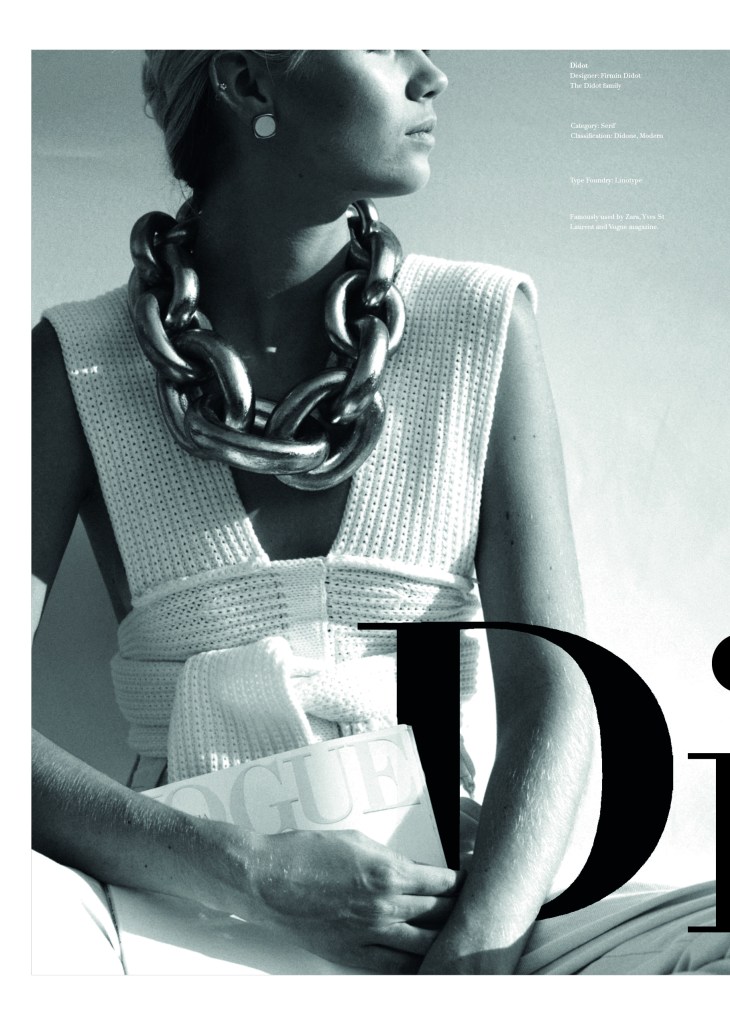


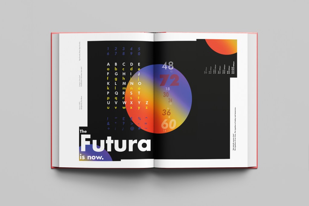
The final mockup