That’s a wrap! :D Book cover design exercise DONE!

Following on from my last post I have now finished the Book design exercise!! (well!… almost! I wrote this post a few days ago and have been keeping it in my drafts! – I have relooked over my designs and seen one potential flaw!… I have written about it at the bottom of this post!)

As I said in my previous post I was feeling very apprehensive about starting this exercise. I didn’t know anything about the author and did not know anything about any of the books he had written. Book design is something that I had never looked into or done before and I was completely overwhelmed with where to start with it. Finishing this exercise I feel that I have learned a lot from researching into the author and his books, watching TED talks by Chipp Kidd about successful book design and looking into existing designs out there. I feel I have achieved successful final design outcomes. I really enjoyed this exercise and as I said in my previous post book design is something that I would potentially like to go into.

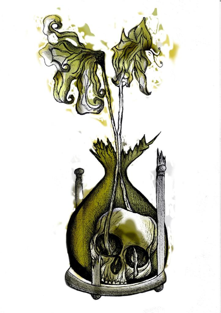
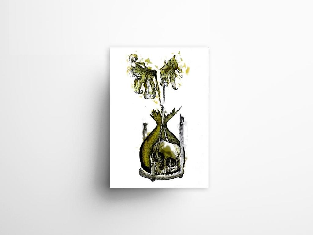
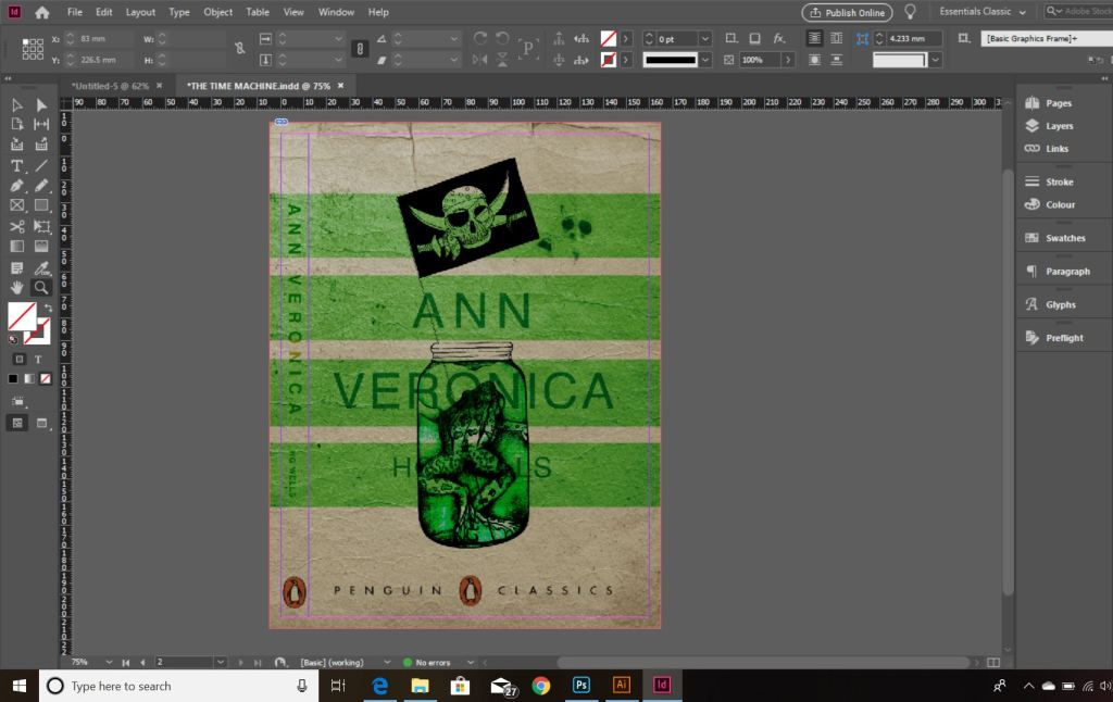
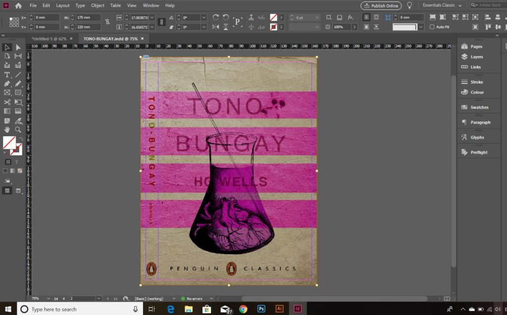
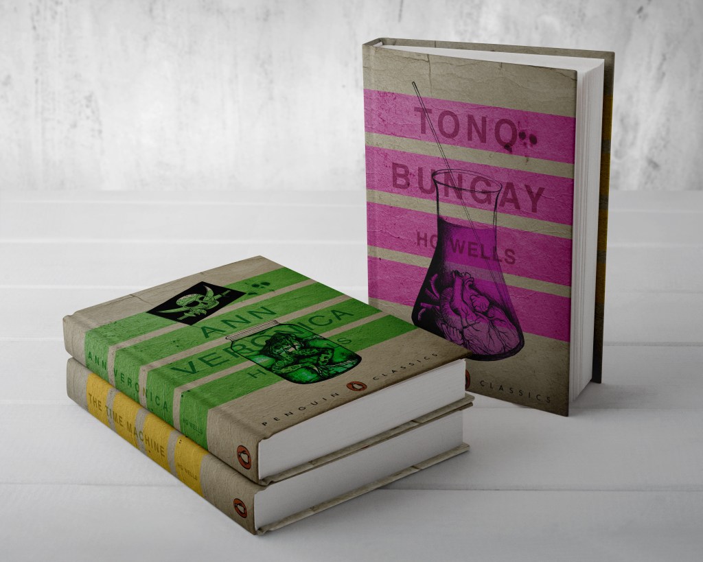
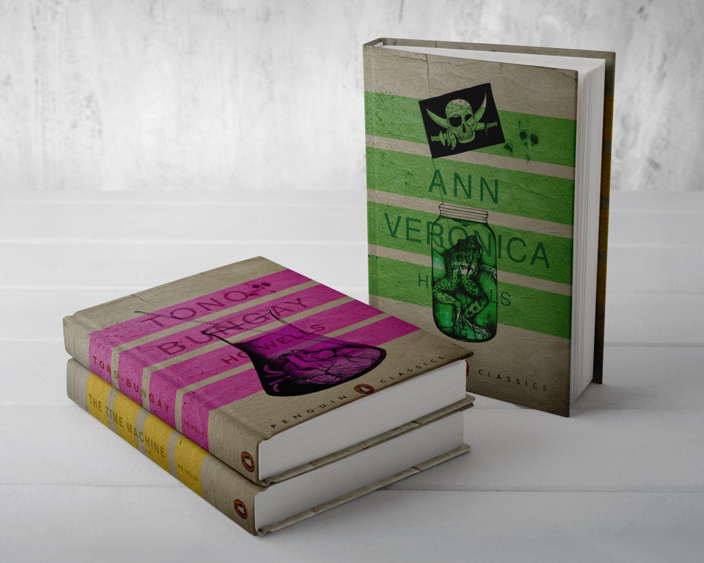
From my last post I adjusted the typography on the books; although some parts of the text are still hard to read, I actually quite like this effect. I also designed the spines. Once I saved the designs as PDFs I then imported them into InDesign. I set up the document in InDesign and worked out how big to make the spine by calculating the number of pages by the weight size of the paper used in paperback books (usually 80gsm). The calculations came up to about 4mm but I decided to work larger than that so that I would have more spine to work with in the design. I then created PDFs and mockups for my final designs. The mockups that I did for my Instagram posts I mocked up on hardback books. There are lots of free downloads online for free book mockups but most of them are for hardback books. I specifically wanted one to feature all 3 books at the same time. The mockups below show this.

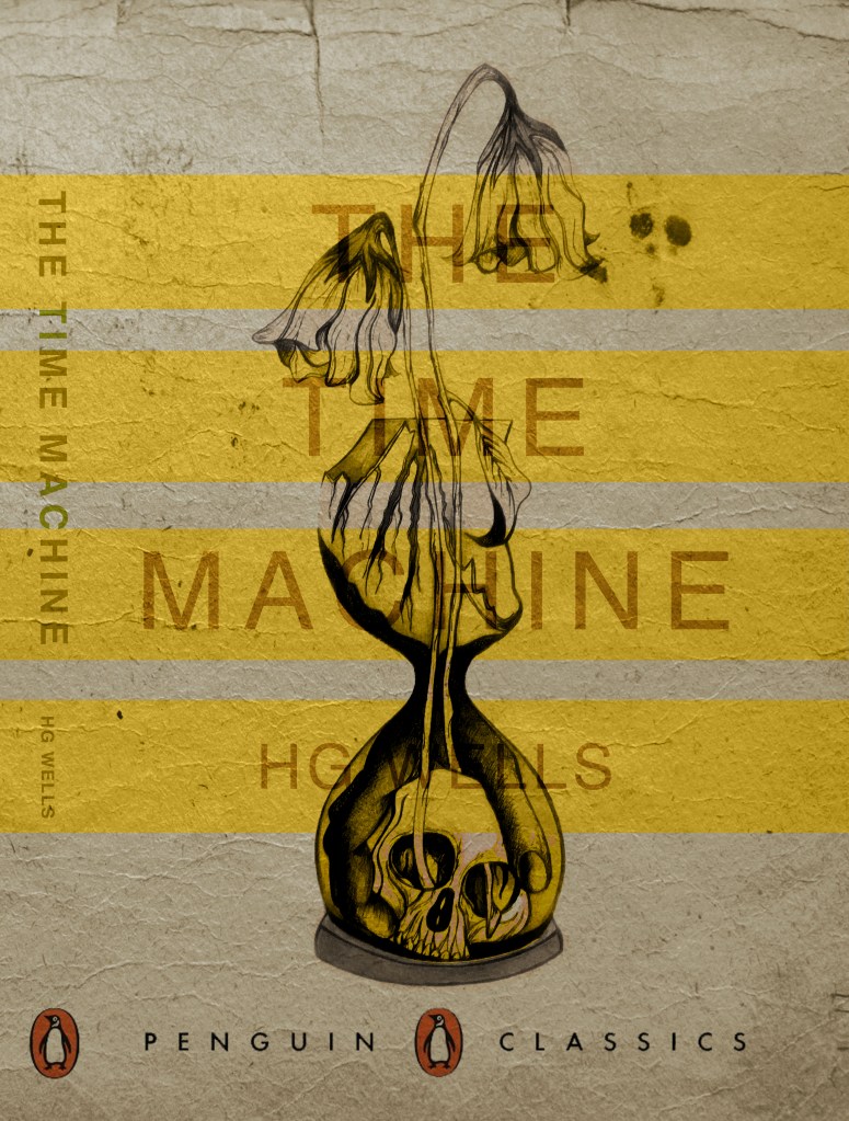
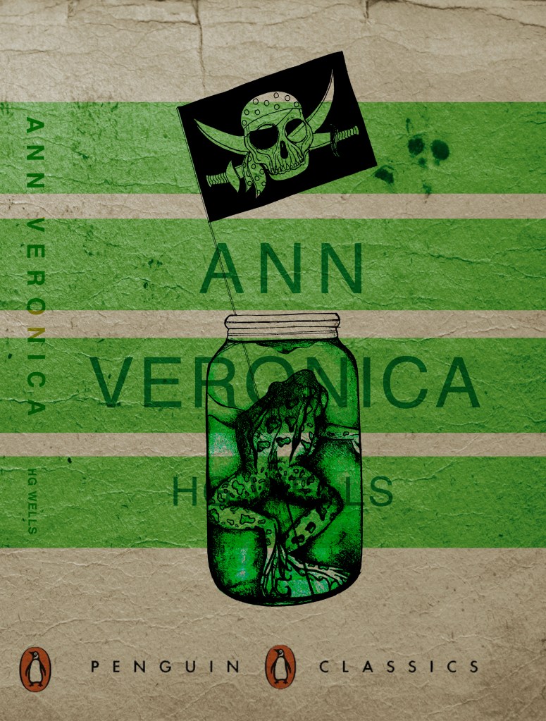
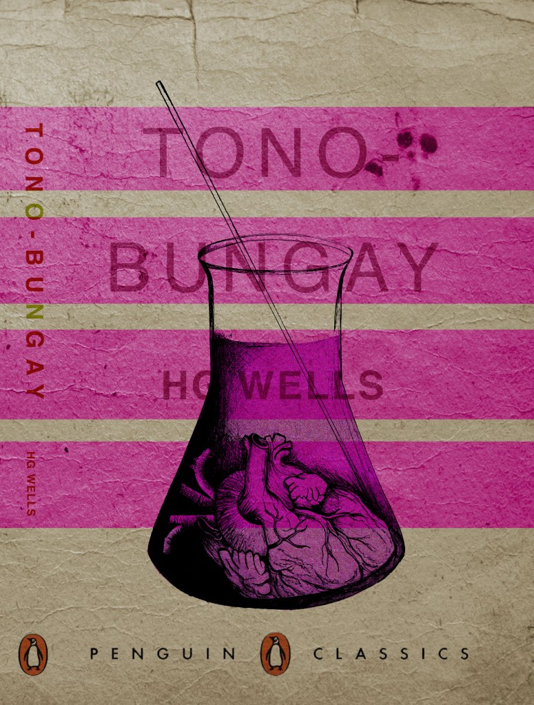
The images above are the PDFS of my final designs with the spines. The screenshots below are the makings of them in InDesign.

*** Since writing this post as a draft a few days ago, I watched a poster critique by @thechrisdo. I know that this is book design and not poster design but the same rules still apply. It was so obvious that I don’t know why I did not spot my mistake earlier!… I haven’t made the titles of the books bold. I need to make the titles bold and the authors name in regular. This will show contrast between the 2 and also make the title stand out more. I may even adjust the tracking of the titles also.

The Time Machine: Drawing Development (cont.)

I have back tracked slightly from my last post!….

Sat on my break at work and I was asked how my uni work is going, I reached for my phone and passed it around the table to show what I have been working on… The feedback was good! – everyone thought my drawing was good!… however, there was some slight confusion as to whether the flowers were coming out of an hourglass timer (sand timer) or a regular broken vase… Having another look after a few days apart from it I could see where this could be confused. Although I was pleased with my drawing I felt like it was still missing elements.. I decided to redraw it… AGAIN! but this time make sure it is obvious that the flowers are coming out of a sand timer and not a “vase”!

I changed the flowers slightly also.. I was unsure of doing this but I think it could work…

My flowers before looked quite wilted and withered and were a generic flower.. What I have drawn now are 2 white roses. I debated on using roses as the book states “2 white flowers” but when I looked up the symbolism behind white roses, to give someone white roses represents purity, inncocence, kindness and love. All of these traits are what Weena gave to the time traveller.

The sand timer (hour glass) has sand in the top half coming down to the bottom of the timer, before the sand hits the bottom of the timer it forms into a hand which holds the skull. The hand shows authority and dominance and represents the Morloch people. The skull represents the cannibalism aspect in the story; “killing the Eloi like cattle.”

This is what I sketched up last night:

It took me forever to get the hand right, I am hoping it will look even better once it is inked.

I was not happy with the broken glass on my last drawing. I accidentally at home smashed a circular wine glass, I decided to keep it and use it to draw from for the broken glass aspect of my drawing.

So far I feel like this design works better than the previous one, I shall get it inked out and then see some more!

The Time Machine: Digital Development

Yesterday I decided to have a go importing my hand drawn ink design into Photoshop and have a play around!

I am not a pro at Photoshop to say the least, so the tutorial I watched on Skillshare a while back that I wrote in my blog about really helped me!..

I decided to change the colours, I want each of the 3 books I design to use 3 different colours and work as a series in that the designs are the same and also the colours tie them together. The flowers in the Time Machine are white but dead, brown and withered at the ends so I decided to alter the colours to match this… I went with a white/murky yellow/black colour scheme.

To get me familiar with changing the colours and doing certain things in Photoshop I had a play around first, this was the trial starter piece..

Using the pen tool to draw around areas and making them a selection so that I could add colour to the area and then multiply to blend it in with my line drawing. I then created a clipping mask on a duplicate layer to further blend more colour in.

When I felt more confident I then started on a proper version;

This one I kept the colours quite subtle… I coloured in all of the flower shapes with a murky yellowish colour and carried this on into the hourglass. I liked it but it didn’t shout out at me..

With this version I messed around more with the colours and blending them to create 2 tone effects. I accidentally moved the flowers layer but actually quite liked it being out of the shape slightly.. It gave a mix of the 2 colours; white and yellow. I also created like a water colour/watermark effect at the top of the petals.

In this version I made the colours more deep and murky. I feel the colours are the strongest in this version. Overall I am happy with the progress I have made with it and the new skills I have learned, however It still needs improvement… I now need to find ways of how to make it work on a book cover with the typography element etc.. I think though that I shall draw the other 2 book designs and then take all 3 of them together and then look into layout and typography etc..

I also looked at mockups for displaying work more professionally on my Instagram account. I downloaded a simple poster mockup document and then added a drop shadow around the edge of my image.