Design 10/10: Mumbai

Hello and thank you for joining me on the last of my 10 city guidebook designs! 10 of 10 – Mumbai!

This is it! The end of the infamously difficult Abstract Cities exercise! I won’t lie to you and say I am not happy to see the back of this exercise! BUT! moving on to the write up of my last design!

Again, my lack of geographical skills led me to question whether Mumbai was in Africa or India… India! (*eyeroll!) so I felt it best to do the normal and to search Pinterest for inspiration and ideas!

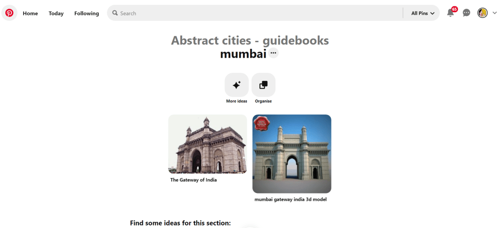
The most popular image that appeared was The Gateway to India. It reminded me a lot of the design that I had done for Marrakech, in my head I was conscious that I had to try and make this design look different.

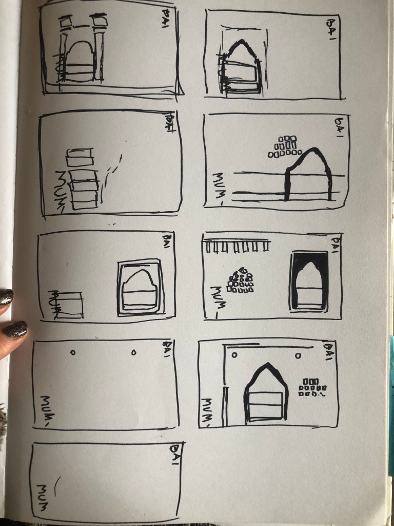
Again, I tried to pick out important features from the building which I could include in an abstract way on my design. I didn’t want to draw the building as it is on the cover because that would not be portraying it in an abstract light. If I picked out key features and then simplified the design I could place key elements of the building on my cover.

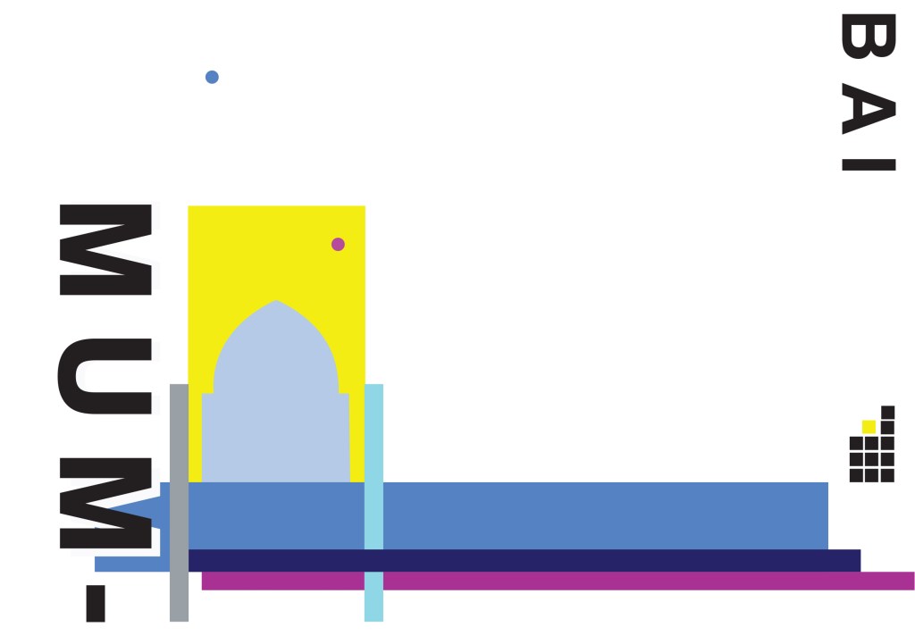
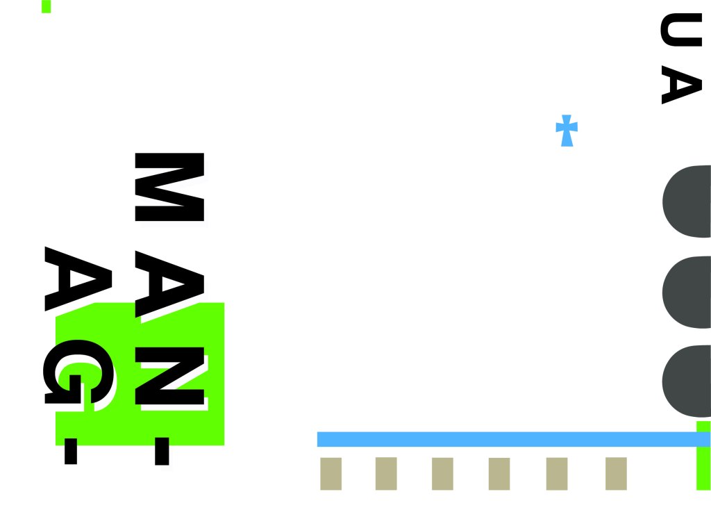
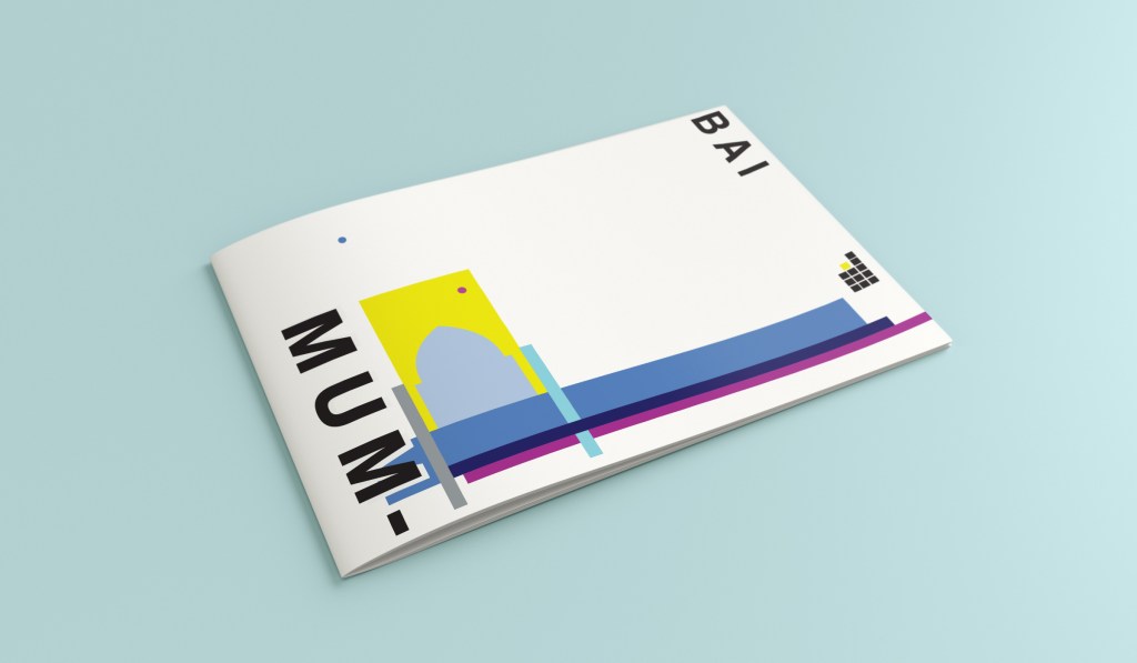
The colours of Mumbai are very similar to that of Marrakech, India is very rich in colour. Purple is the best colour to represent wealth, richness and luxury. On the photo of The Gateway of India that I found on Pinterest, it showed water in the background inside the gateway. I had a look on an aerial photograph of this and it showed that the gateway is almost on water. I included this on the design going through the gateway as it appears on the photo but then travelling it across the cover to take the eye on a journey across the design. The yellow block represents the warm sun but also acts as the actual door or gateway. The 2 circles in my design appear on the photograph in the doorway, they are decorative on the actual gateway. I have taken them and split them up over the design to keep the eye interested in all areas of the design. There is a lot of negative space in this design which I like. The design is not constrained to the edges and it has plenty of room to breathe. The black squares which bleed out over the right hand side edge are windows that appear in one of the arched windows on the photograph. I have used them to add contrast and to give a level of interest to the design. The blue is the dominant colour in this design with the yellow following closely behind as a subordinate. The accent colour is the rich purple. The layout is the same as the other 9 designs I have done in this series. They are all in keeping with each other, the repetition is there.

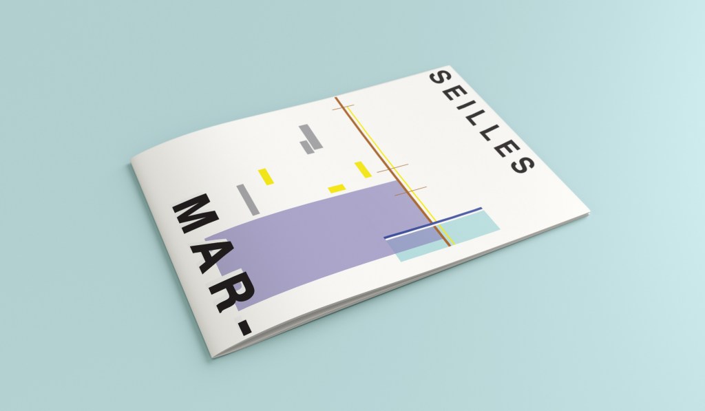
This is the final mock up of Mumbai!

Design 9/10: Montreal

Welcome to guidebook design 9 of 10 – Montreal!

When I think of Montreal I think of Canada and Canadian moose’s, Mounty’s and all things stereotypical!

Brushing my naive knowledge of Canada to one side I decided to do the usual search on Pinterest to get ideas and inspiration for this one!

What appeared and grabbed my attention more than most was the Habitat 67 development. This housing complex is abstract in itself! It met the brief and it seemed like the perfect choice to feature on my cover!

In March 2012, Habitat 67 won an online Lego Architecture poll and is a candidate to be added to the list of famous buildings that inspire a special replica Lego set. Lego bricks were actually used in the initial planning. Initial models of the project were built using Lego bricks and subsequent iterations were also built with Lego bricks.

I didn’t actually do a lot of sketching for this one because I knew I just wanted it to be comprised of blocks of colour to represent Habitat 67. I knew that I could develop it as I went along in Illustrator.

I started from the bottom of the design and added a pop of green for the accent colour which represents the tree at the bottom of the complex. I then wanted to work my way from the bottom left to the top right so that the eye flows naturally ad comfortably up and across the design. I wanted negative space so kept the bottom right free for this. I created several blocks of squares and rectangles with overlapping colours to best represent Habitat 67. I think this is the most abstract design in the 10 that I have done, it works put quite nicely because this is the city in my eyes with the most abstract landscape. I used different weights in the blocks and line to create a contrast. There is repetition in my design, I tried to replicate the appearance of each apartment of Habitat 67 as they appear in reality.

This is the final mock up!

Design 8/10: Melbourne

Hello and thanks for meeting me here at city guidebook number 8 of 10- Melbourne!

When you imagine Melbourne you see sun, sea and surf! I found myself getting confused between Sydney and Melbourne though! :s Again, I did a search on Pinterest for ideas and inspiration.

What I noticed was a lot of photos with Pink hue skies. Pink is a colour I know I haven’t used much in my designs so far, so I decided to use Pink and make it a dominant colour in this design. Pink is modern, confident and warm so it would make it an ideal colour for this popular city. An iconic structure in Melbourne is the Princes bridge, it appeared in a lot of the photos on my search. Melbourne is a coastal city with a lot of landscape and structures but there is also a lot of green around the city. This is something else I would include!

Similar to my design that I did for Manchester, I didn’t want to draw the bridge looking exactly like a bridge.. I wanted to leave it open to interpretation and make sure that the abstract was present with it. I took a photo of the bridge and sketched it out above using only its simplest form. The bridge uses triangles as part of the design so I used this as the main frame for it.

This is the final mock up. I feel like this design is very balanced. The design has a centre point where everything comes together and then there is a lot of negative space and room for the design to breathe. This design allows the eye to travel from the bottom left to the top right. It flows naturally ad comfortably. As I said, I wanted to use Pink as the dominant colour. It is bright and modern and confidently portrays the atmosphere of Melbourne. To break the pink up I used a cool blue, this brings contrast between the 2 colours. A pop of green was used to represent the natural environment which does appear within the city itself. This I feel fights with the blue for attention but it is definitely the attention seeking accent colour of the design. The bridge itself is built from the triangles which appear on the real thing. It is seen to appear in the distance and then come closer to finish at the forefront of the design. It is the bridge in this design which perfectly balances this design. The eye flows comfortably across the design.

Design 7/10: Marseilles

Welcome along to city guidebook number 7! – Marseilles or Marseille ?……..

Marseilles or Marseille was the first question that I asked myself! I pondered at the fact that there might b a typo in the Core Concepts design book because everywhere I looked online it was saying “Marseille” however there is a French and an English version! Marseilles it is!

In my head Marseilles is one of them luxuriously warm places that celebs and people likewise might go and sunbathe their perfectly tanned and toned bodies on the front of a yacht! CORRECT! 😀 but in all seriousness I pictured a lot of blue skies and blue sea, yellow sunshine and boats and yachts everywhere. As usual I started looking for ideas and inspiration on Pinterest.

A lot of blue! The other thing I noticed was the port with the church on the hill in the background. I felt I could incorporate this into my design somewhere along the way.

When I look at my design I feel a warm and happy feeling which is perfect for the weather and general feel of Marseilles. The blue represents the blue sky and sea. I have used a block of blue on the bottom left again as with all the other design guidebooks. It makes sure it is in keeping with the rest of the series but it also represents the sea. The rectangular blocks which work their way up to the top of the left hand side represent the hill and the buildings leading up to the 2 grey rectangular blocks at the top which is the church on the hill. On the right side of the design is the yacht or sailing boat with the sail mast. I have used yellow as a warm colour to contrast against the blues and greys. Blue is the dominant colour closely followed by thee subordinates which I believe to be the greys and turquoise. The accent colours in this piece which contrast against the rest of the design is the yellow and the brown of the sail mast.

You might notice the typos between the 2! My confusion with Marseille vs Marseilles! This is the final mock up for Marseilles! I am pleased with how it has turned out – It has kept the abstract brief, is open to interpretation but I think portrays what Marseilles is all about! The colours are accurate and there are contrasting accent colours thrown in there to make the design interesting. The layout is the same as the rest of the guidebooks to keep it as part of a series.

Design 4/10: Manchester

Hello again for design 4/10 of my abstract city guidebooks!- Manchester!

I love visiting Manchester whenever I can so I wanted to do this one a little justice! Manchester was the heart of the Industrial Revolution in England and is still known for its community spirit and hard work ethic.

For all of the designs so far I have been quite modern in approach by designing for iconic buildings that are quite modern and new.. I knew that this would not be the case for Manchester. Manchester is renowned for its red brick buildings, the stonework, factories, chimneys, railways, railways viaducts, canals and the cotton industry. The colour scheme for Manchester would be reds, greys, stone and browns. With all this mind I went to Pinterest again for some inspiration, my initial thoughts were to go with the chimney idea but then when I found an image of a canal and a viaduct bridge I knew that this was the route I wanted to go down. When I drive to Manchester I drive under loads of them viaduct bridges; that is how you know you are getting closer to Manchester! In my head this seemed the right choice to choose.

This is the photograph I found:

I started doing the same as I had done for all the others; printed a copy of this out and then started to sketch the from it, simplifying it each time I drew it.

This photograph reminded me of the image the OCA used in our Core Concepts unit book to explain to us this brief:

The canal boat on the Manchester viaduct photograph is very similar to this image. I realised I could replicate the canal boat in a similar way.

I did do a lot more sketches for this guidebook, however I did them when I was in my full time job at a time when I had a 5 minute window in-between jobs.. for whatever reason they got mislaid!

However, I developed a few ideas in Illustrator and eventually arrived at this one!

I have kept the same layout again as all of the others to keep them as part of a series. Again, breaking Manchester up into its syllables and using Helvetica. The idea of this was to use a main block of red on the bottom left, again in keeping with the other designs so far. This red block represents the infamous red brick in Manchester. Instead of drawing the viaduct bridge to look like a bridge I have in an abstract form used only the arches of the bridge to create the illusion of it. I have used different hues of brown from dark to light to represent the dark brick and industrial stonework. The blue squares add contrast and also help draw your eye across the whole piece. These blue squares represent the water; they represent when the sun sparkles on water and creates sparkling ripples. I have used different sized blocks again for contrast, to represent abstract and to add interest to the design. I wanted the eye to travel from left to right to the bottom with this design; that is why I have placed the abstract block canal boat along the bottom right. The red is the paintwork and the top of the boat with the black blocks being the windows. I was conscious again of placing objects along the edges of the design; the design needed to be able to breathe and to not be constrained to a box. In this design the red is definitely the dominant colour with the browns following as subordinate colours. They are warm so needed a cool colour to contrast against them. The blue is the accent colour, it is fighting for attention with the dominant.

This is the final mock up for Manchester. I am pleased with how it has turned out, I think it is abstract and open to interpretation as to what is being showed but still obvious what is trying to be portrayed.

Design 3/10: Managua

Hello! and thanks for dropping by to look at design 3/10 of my abstract city guidebooks- Managua!

I personally had absolutely no idea where this city was! (I am still confused! – but I do know it is on the bit that joins both Americas together!!) with my poor knowledge of geography I attempted to gloss over this and continue with my design ideas. Again, I wanted to keep the design concept and layout etc for this guidebook cover the same as the others so that it continues to form the series.. I was going in again simplistic and minimalist in approach, using architecture and iconic buildings as the basis of my design and taking key elements away to create my design.

I started my initial research using Pinterest again; I looked up iconic landscapes and architecture in Managua and it came up with the cathedral as the main recognisable building of the city.

Managua Cathedral - Nicaragua - designed in, and shipped from Belgium in 1920 - heavy damage in earthquakes of 1931 & 1972 led to condemnation but as of 2013 it's awaiting renovation.

From first glance it looked like a complicated building to try and recreate in abstract! I took the same approach as last time and printed out this image tracing over it again and again simplifying it each time until I was left with the bare bones.

The main key features that stood out to me from the photograph was the intricately detailed stonework of the cathedral, the small cross that features in the middle of the cathedral on top of one of the triangular brickwork and the fact that the cathedral is in beautiful warm weather with 2 palm trees either side of it!

I used my rough sketches to figure out what to include in my final design.

Again, I wanted to try and stick to the rules of thirds for my design and split the design into 3 sections on the cover. I wanted again to let the eye flow naturally across the whole page. Negative space once again played a big factor into the design, I actually base the design around the negative space each time. I placed a lot of the design to the edge of the page which can sometimes constrain the design to a “box” and restrict the design to be able to “breathe”; however, I still allowed for the design to “breathe” by not constraining the design all of the way around the cover. I added a tiny accent of green at the top left side just to give the eye somewhere else to hop to. The idea was for the eye to flow naturally all the way around the design. The bottom green blocks were representative of the 2 palm trees which I have obviously exaggerated and under exaggerated in size – representative of abstract also. The design is not accurate in scale, size or orientation to the building; the grey ovals on the right edge are representative of the arched windows in the centre of the cathedral and the bottom bar and grey small rectangles are a snippet of the pillars that hold the cathedral to the ground and the steps at the bottom. The cross I have kept small, it is always good to have contrast between elements on a design; the eye is drawn more to the cross and its location in the negative space on the cover- it is representative really to how small it is within the great vastness of the cathedral.

The dominant colours on this design accidentally are the black and grey of the text and the arched windows.. I know black and grey are tints but to me they draw me to the design before any of the other colours. The subordinate colour needs to be the green, although to be honest the blue stands out just as much as the green. It probably doesn’t help that these 2 colours are both cool and don’t particularly contrast each other well. As for accent colours… I would say I have designed something that doesn’t have a accent colour as such. In hindsight now looking back I could have added a contrasting colour as a tiny accent to the piece but I honestly just liked the use of these 3 minimalistic colours.

This is the final mock up of Managua! Overall, (apart from I mentioned that I could have used a warmer colour as an accent) I am happy with this design. I think I have met the abstract needs of the brief.