This next brief is based around Occam’s Razor and the principal that you strip design down to its simplest form.. the bare basics and essentials. I watched a TED talk with Chip Kidd where he basically explained that when you see a picture of an apple you do not need the word “apple” to appear with it as you already know what it is. This is the same principle. It is taking all the information and then seeing what you can strip back whilst still making the message clear.
Below is the brief that has been given me for this exercise:

I have decided to follow on from the last exercise; I studied an organisation called Extinction Rebellion and I shall continue to base this exercise around them and one of their upcoming events.
I am a big fan of poster design, I have spent many hours watching tutorials by the @chrisdo on Youtube where he critiques his students (and viewers) posters. I have learned a lot of the theory behind good poster design so I am looking forward to this exercise.
I want to however try something different… slightly out of my comfort zone.
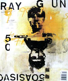
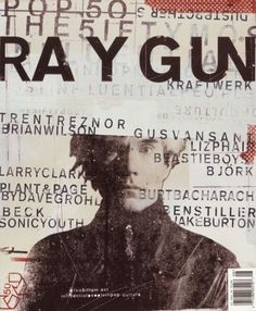
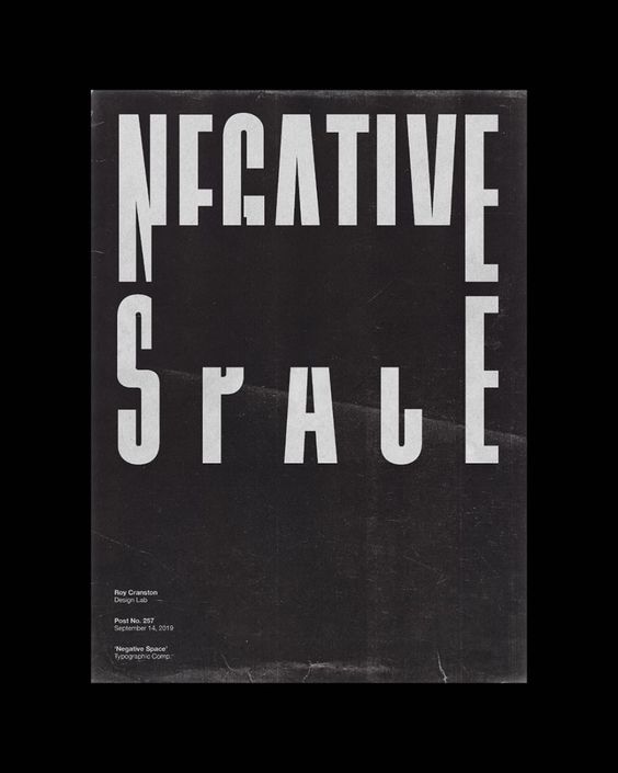
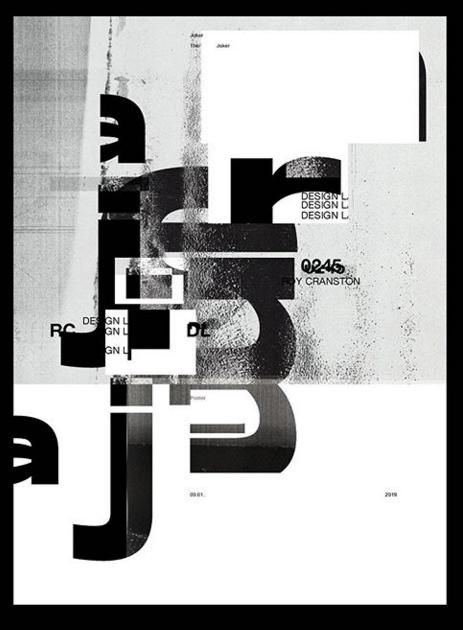
I am a big fan of “swiss grit”; Swiss typography, grunge typography and experimental layouts and collage. I particularly like the works of David Carson, Chris Ashworth and most recently Roy Cranston. “Swiss grit” is a term coined by Chris Ashworth to describe design style. David Carson and Chris Ashworth worked together on Raygun and they both have a very experimental design style; experimental typography and layouts and they are very old school in approach with hand drawn elements, old letraset typography, collage and mixed media. Roy Cranston is the new cool kid on the block. He started his design career by posting a poster a day on his instagram and now he has developed a big fan base for his designs. He has a very similar style to Carson and Ashworth in that his work is very experimental finding inspiration from everyday objects and from all kinds of different textures. The style of his work is very “swiss grit”.
Chris Ashworth
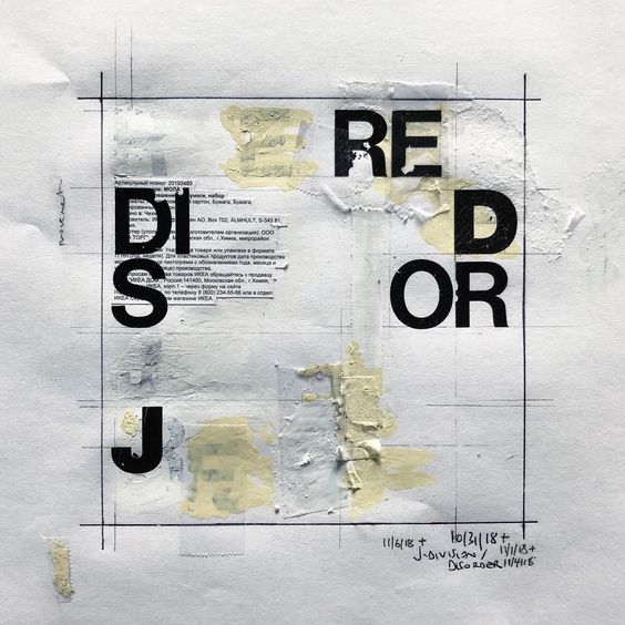
David Carson


Roy Cranston
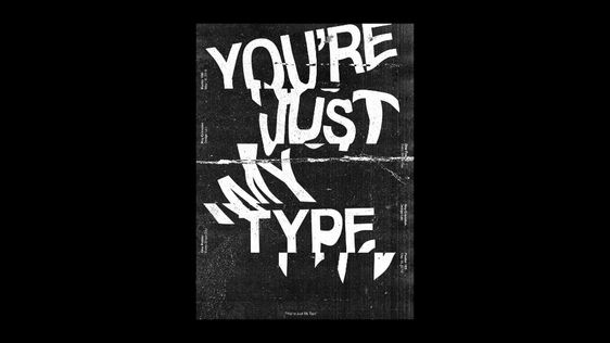
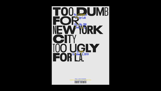

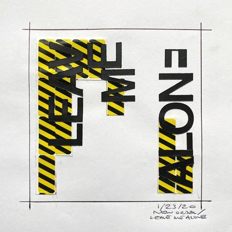
So I have decided to try and do these 2 posters in the style of “swiss grit” taking inspiration from these designers! I am not sure I am cool enough to pull it off as it is not my usual style but I really want to give it a go!..
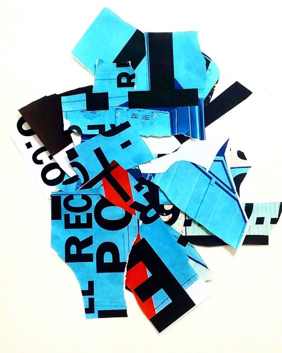
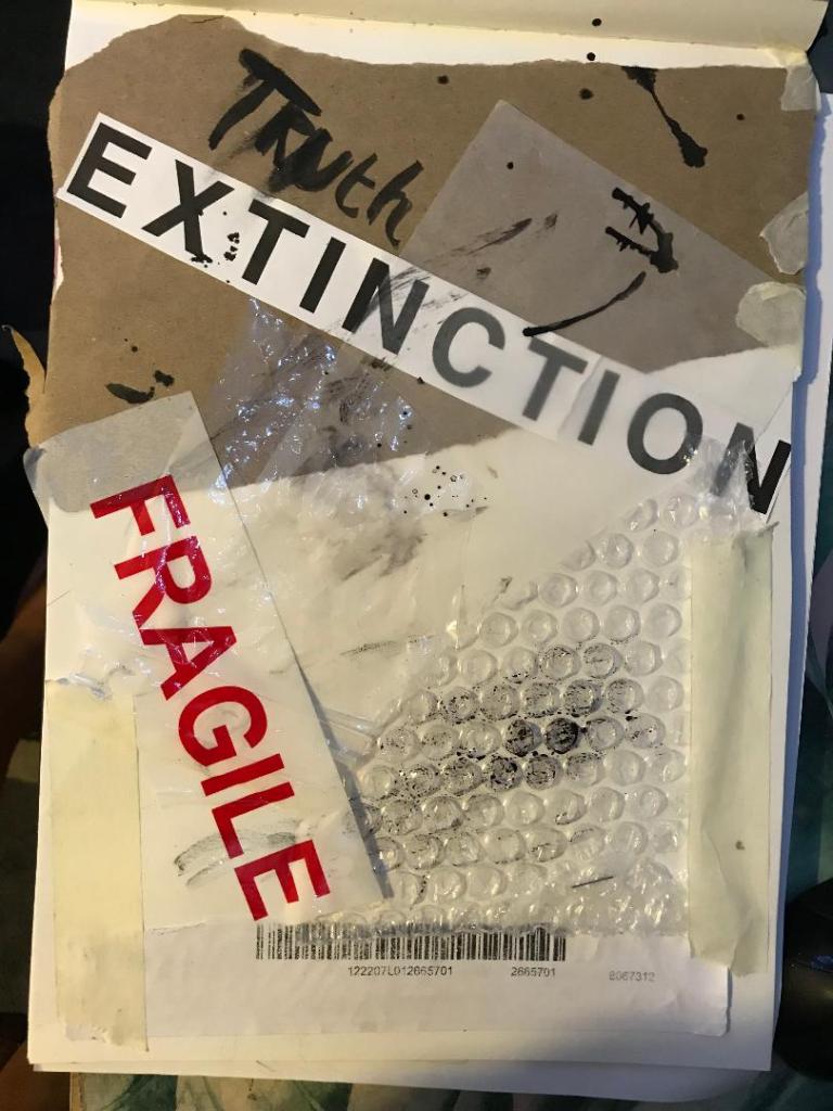
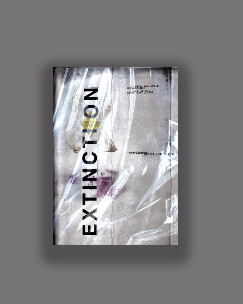
I have a bag at home filled with random things I have collected; parcel wrap, bubble wrap, plastic sheets, tracing paper, postage labels, cardboard, textured paper, fragile tape, masking tape and I also ordered some vintage Helvetica Letraset carbon sheets! I feel like this style would really go well with the organisation I have chosen; The organisation is an environmental group and the materials that I have chosen all contribute towards climate change and the carbon footprint so it would be interesting to see what I can do with the poster from these.
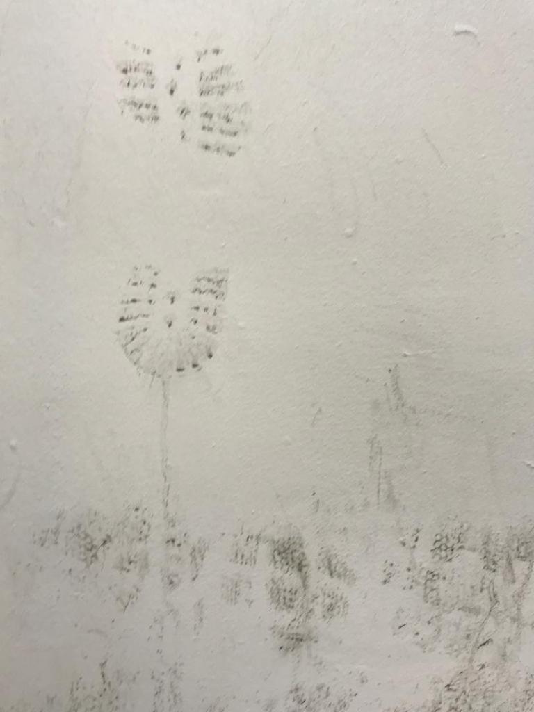
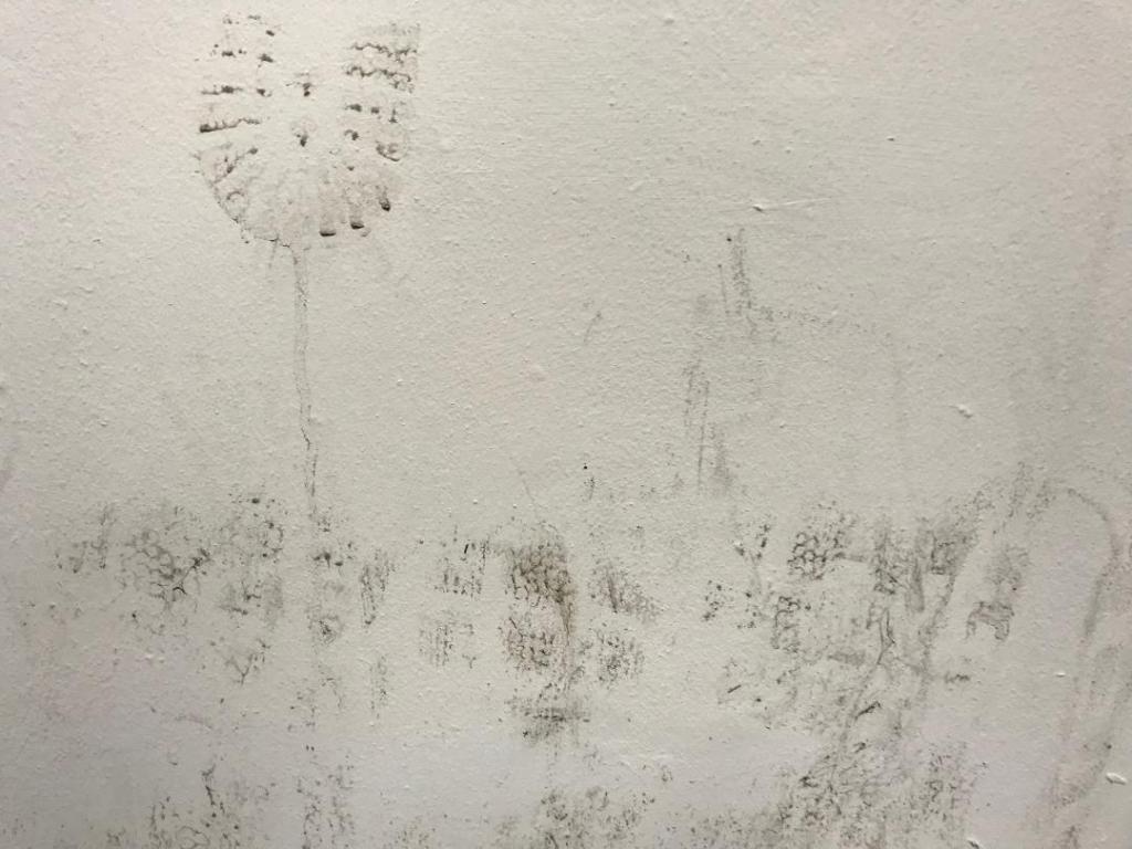
I also went for a visit to Nottingham recently and as I was walking through the car park I spotted a muddy wall with shoe prints on it. I instantly thought that this would be good as a texture for carbon footprint. I have used this on one of my trial pieces.

I had a bit of a mess around.. I did some experimental pieces in my sketchbook (below) and then imported them into Photoshop to see how they would turn out. I like the bottom 2 however, when you zoom out one of them does not work well as a poster as there is not enough contrast between the image and the text. The text should be in white maybe to contrast against the dark background.


This one is my favourite but I would have to make it have more contrast.. change the text to white maybe. 
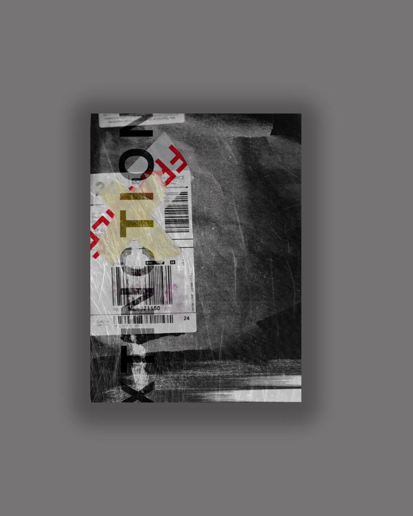
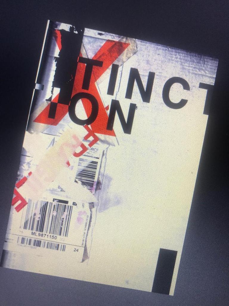
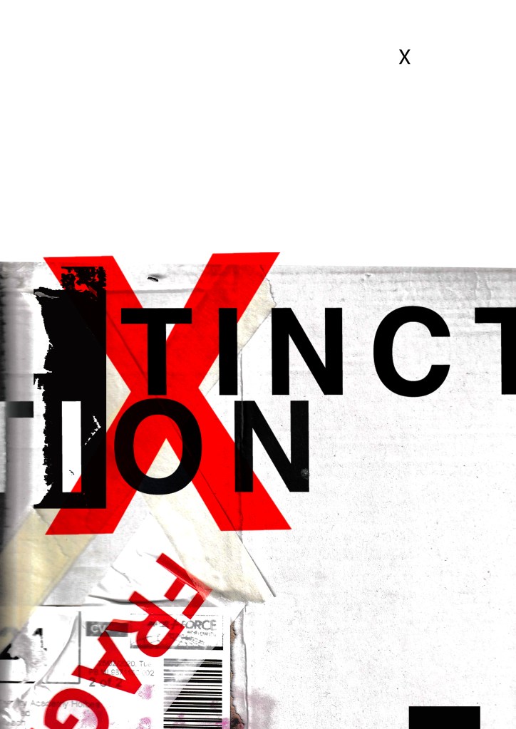
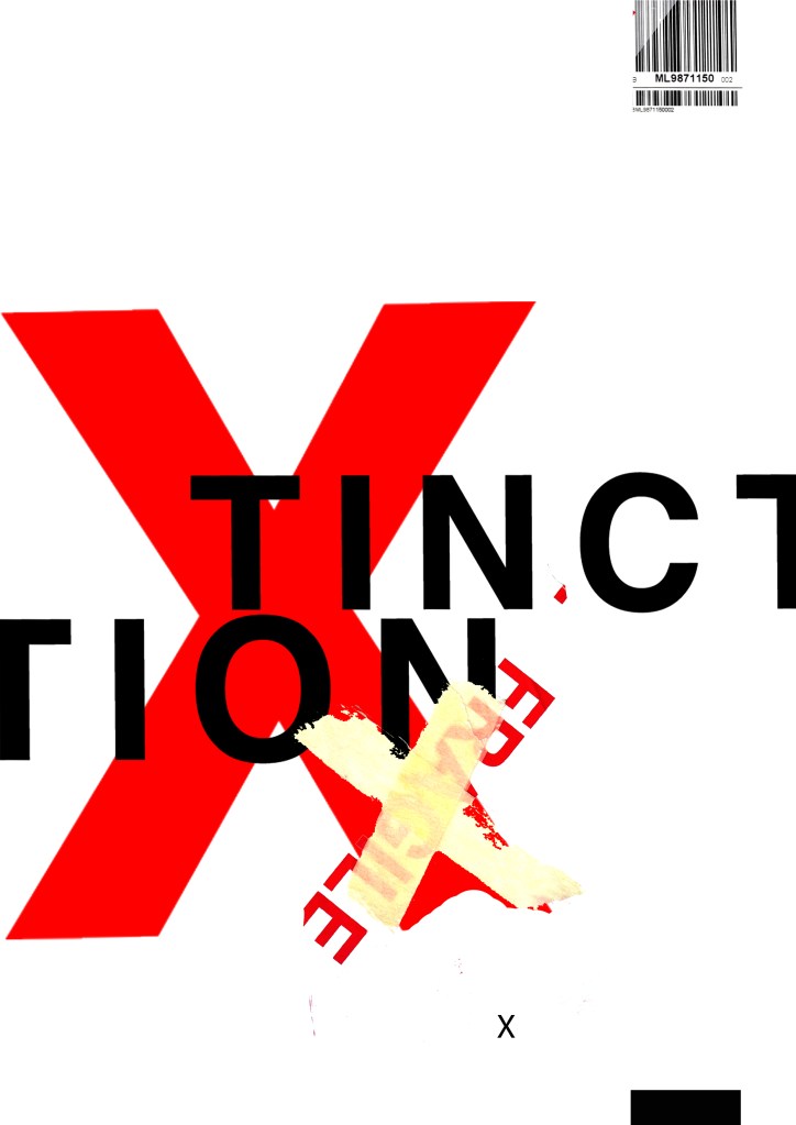
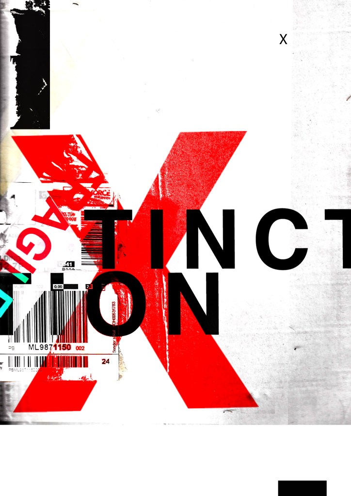
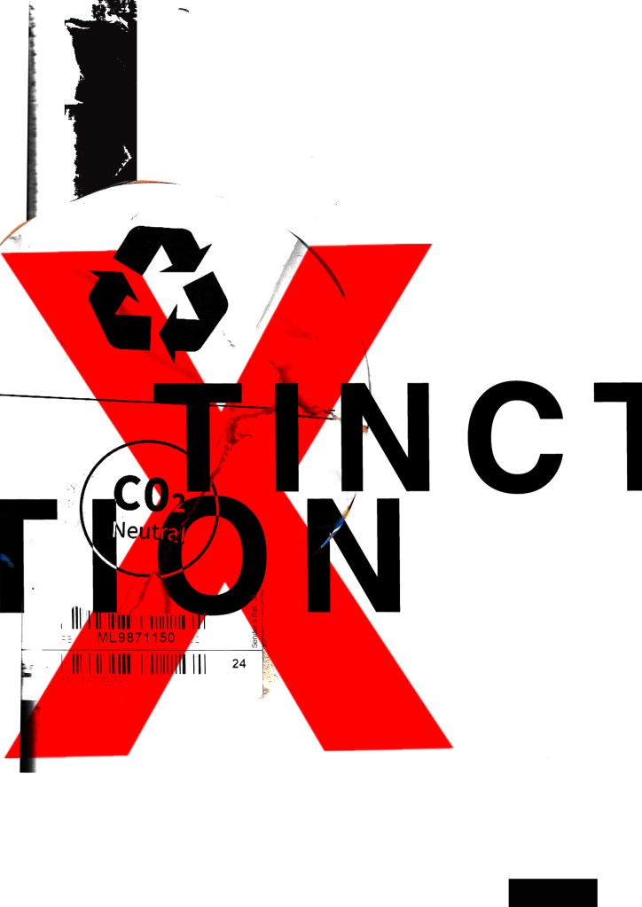
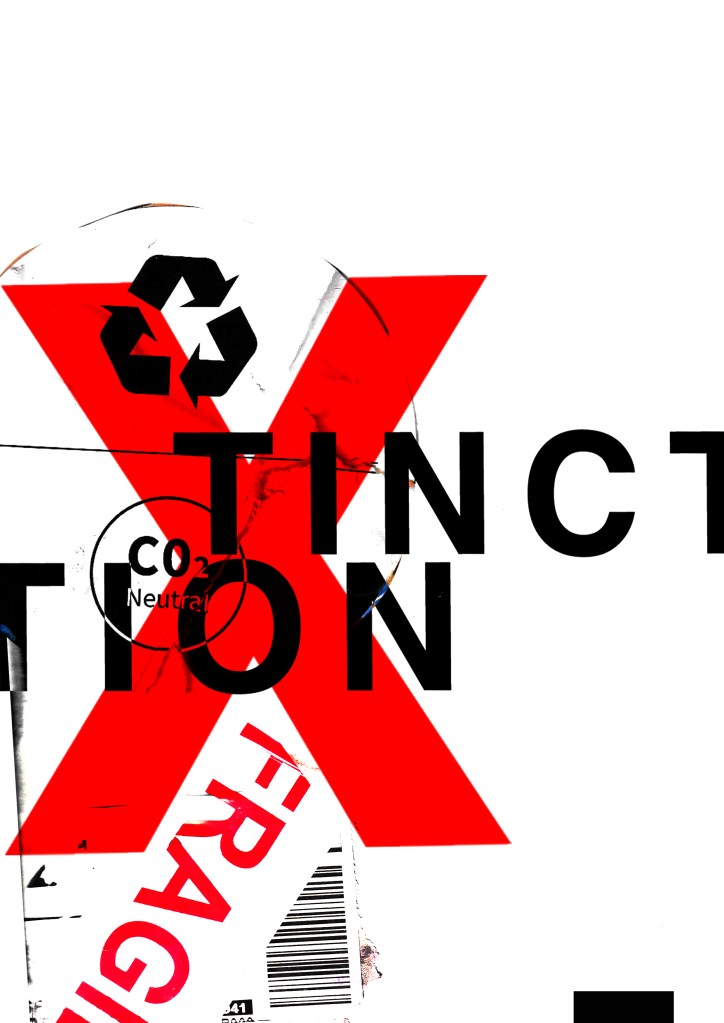
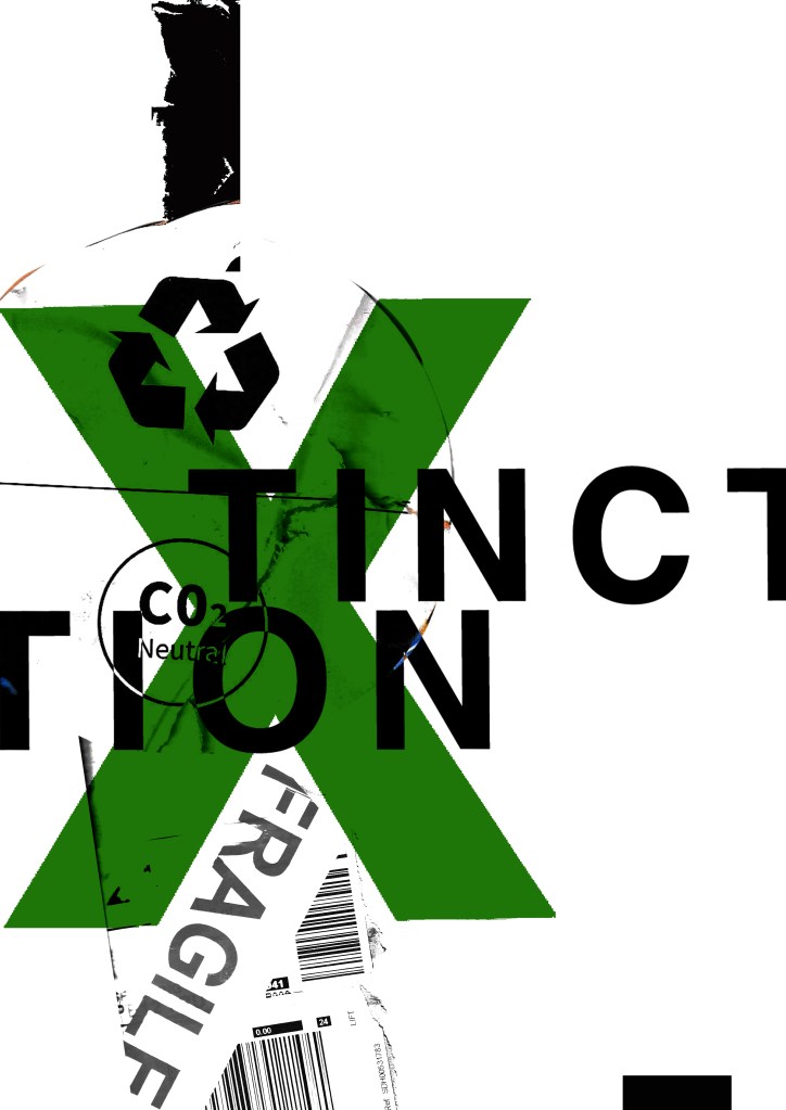
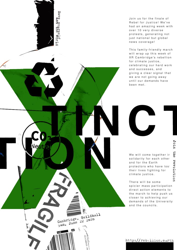
These have all been created by hand and from the resources that I have collected. I then scanned them in and added a texture in the background just to see what they would look like. I decided to trial these designs with the lettering “extinction” to match the organisations name but then I had a “happy accident” and accidentally shortened it by not sizing it correctly on one of the pieces and I actually quite liked the outcome; “XTINCTION. I think I would keep this! – (using the Occars Razor theory – why do I need the silent E? :D)
I like the idea of the FRAGILE tape and the masking tape to form the X. I had the idea to wrap something natural up using the parcel wrap and tape to show how the natural world is being affected by mankind, pollution and rubbish. I had the idea to find something natural that has been broken that I could stick back together on my collage piece to represent mankind’s input on the natural world.Something simplistic though to not take the attention away from the rest of the poster.
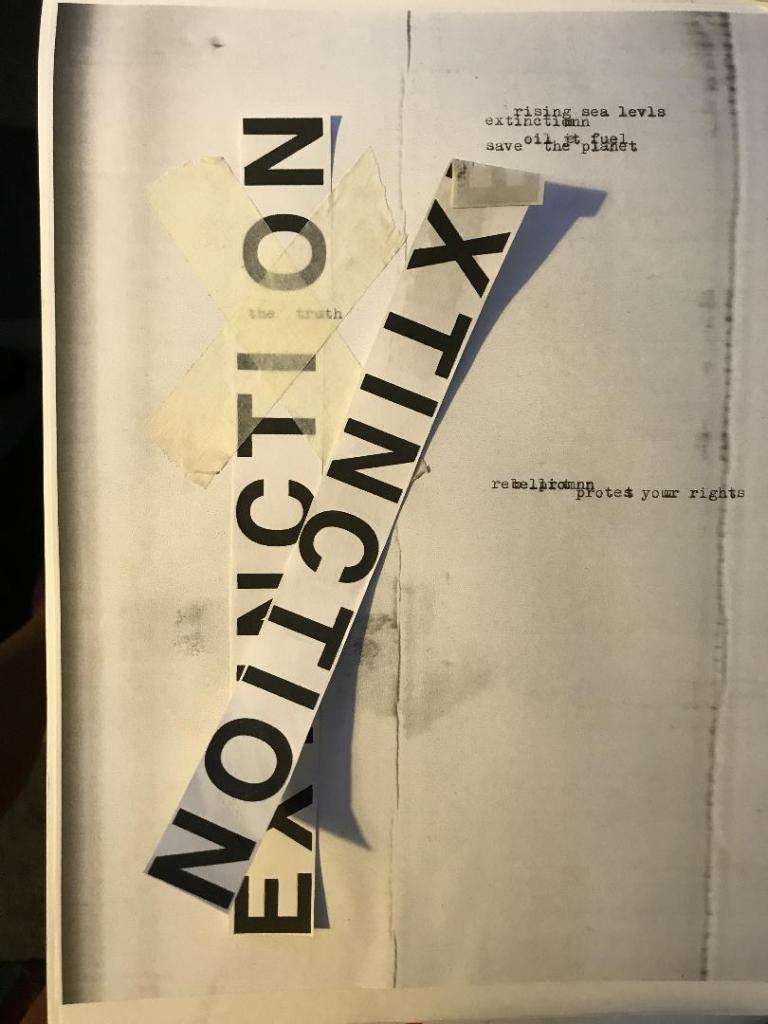
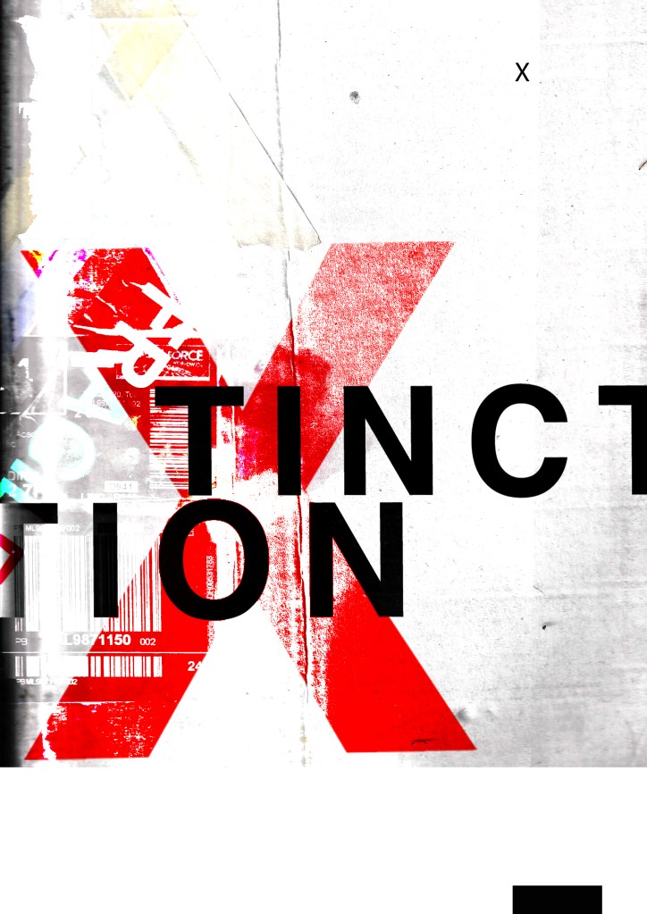
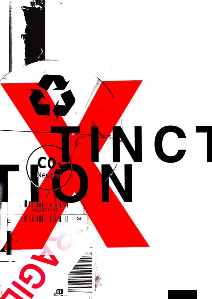
These are 2 more that I messed around with.. I like the simplistic approach of the first one but I also like the typography on the 2nd one. The like the way that I have separated xtinction and made the x bold and in red. At the moment though although I like the textures I don’t think that overall it conveys a message of what potentially the poster could be about. I think also that it needs more negative space.. at the moment there is a lot going on… too much happening all at once that the eye does not know what to look at first. I prefer the 2nd design but it needs more negative space and potentially everything to be sized down inside it. The bottom rectangle helps to draw your eye in but I think it needs to be shortened so it only just only shows at the bottom of the poster.

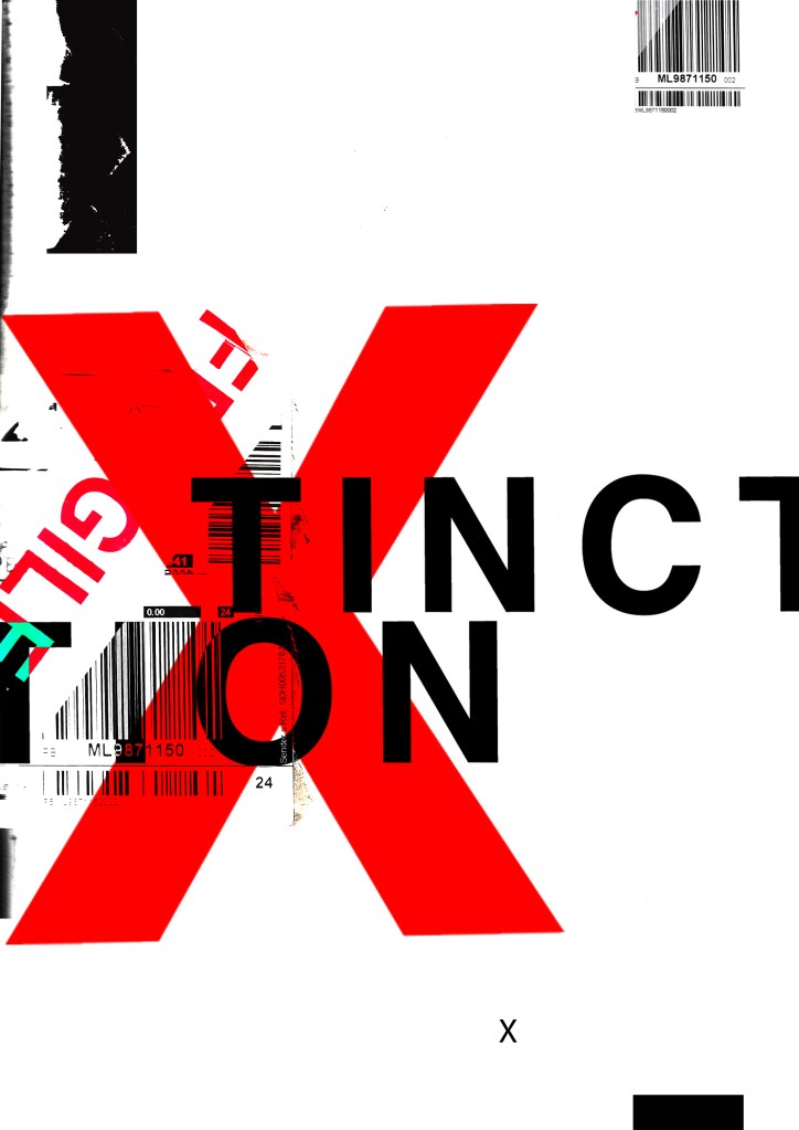
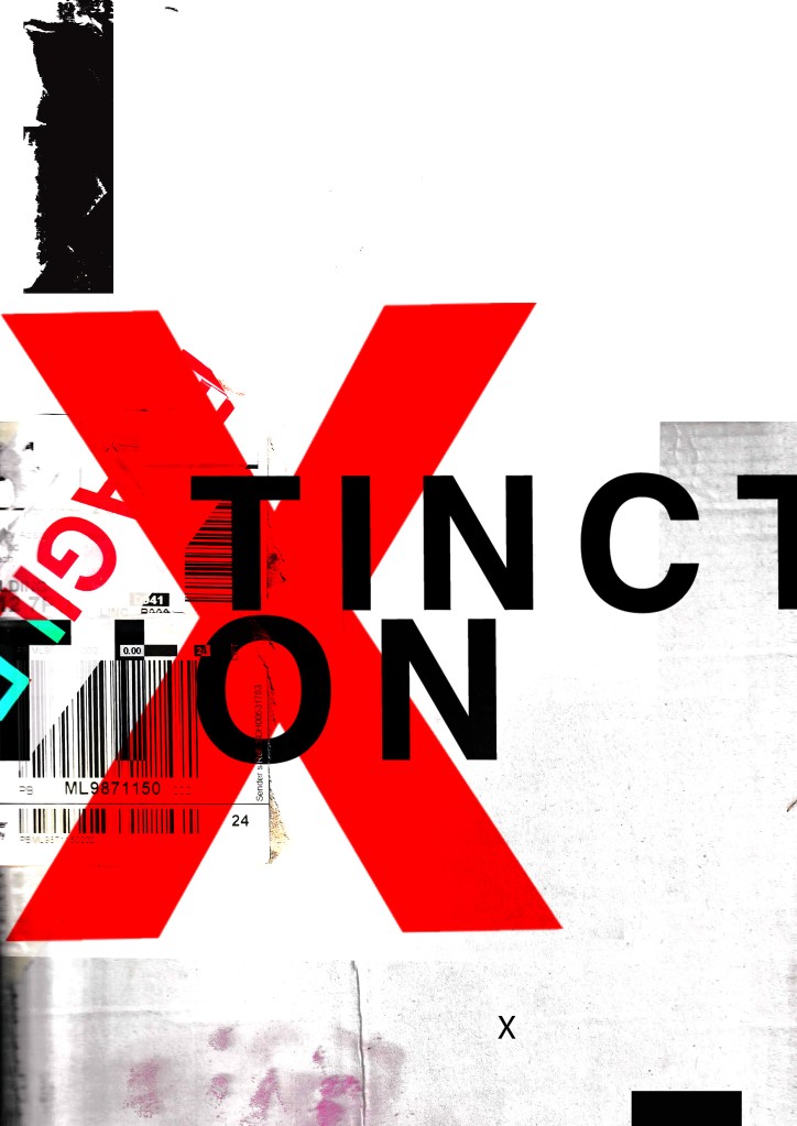
I then went and changed them some more.. This time I did not use a lot of texture in the designs. I kept them quite plain and simple. I think the colours “pop” more this way.

1. 
2. 
3. 
4.
5. 
6. 
7. 
8. 
9.


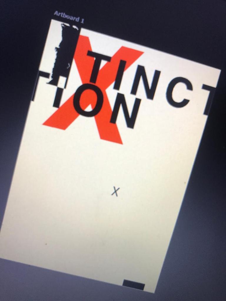
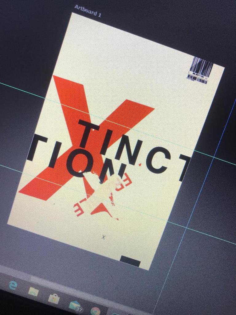
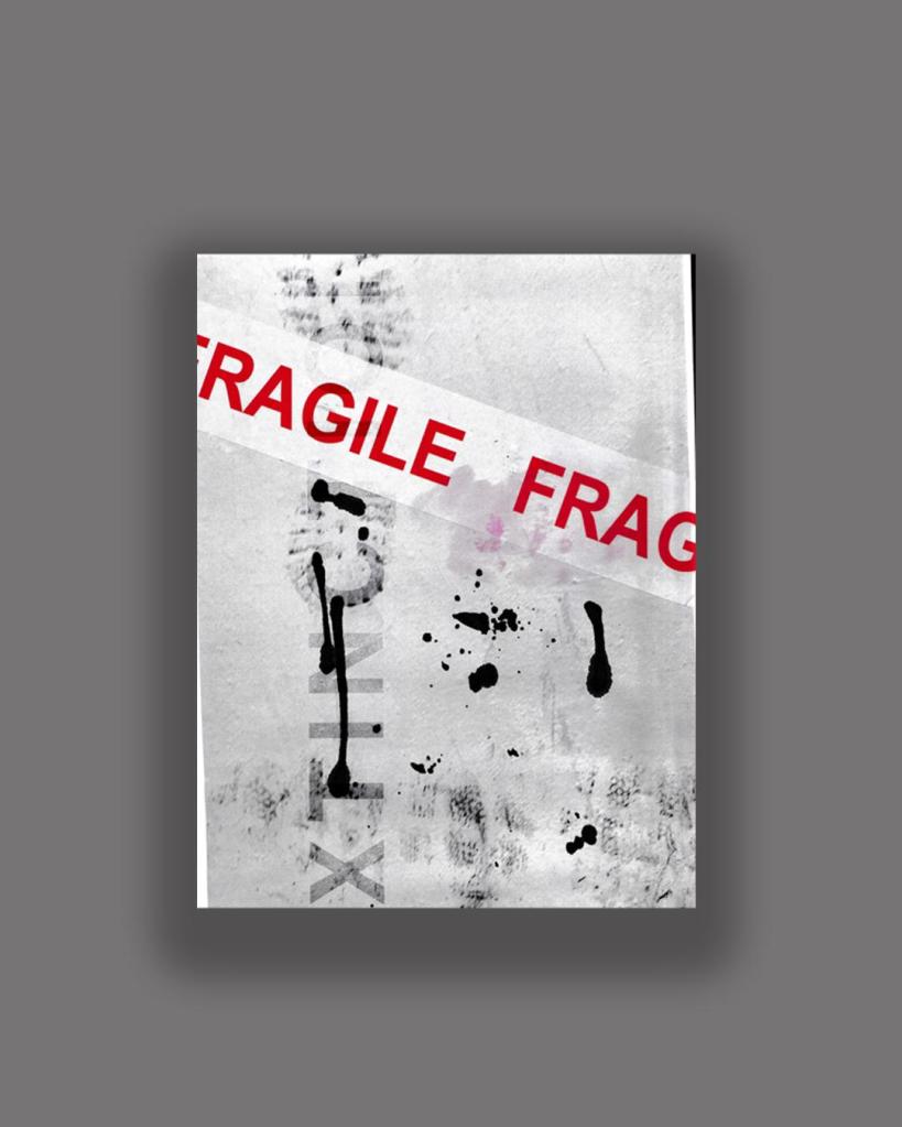
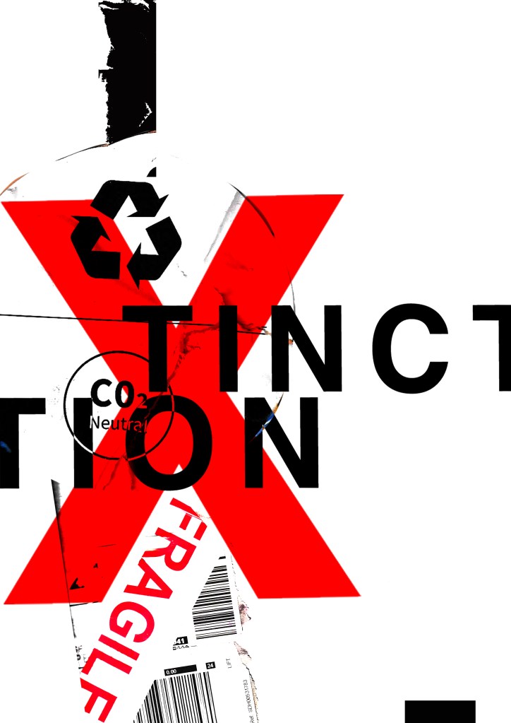
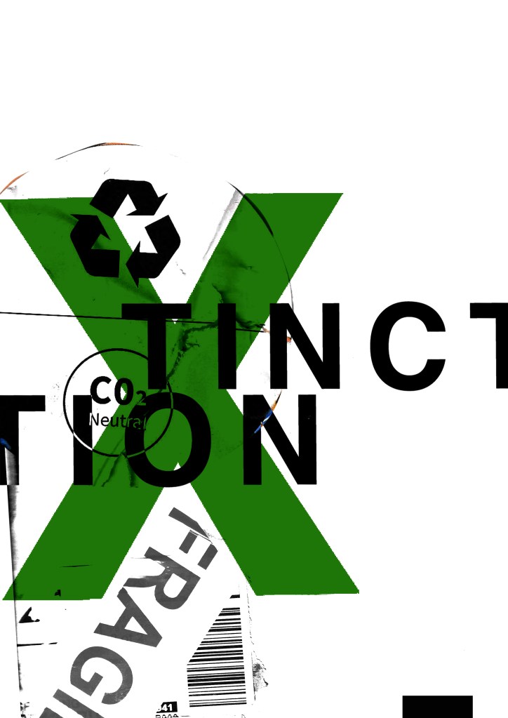
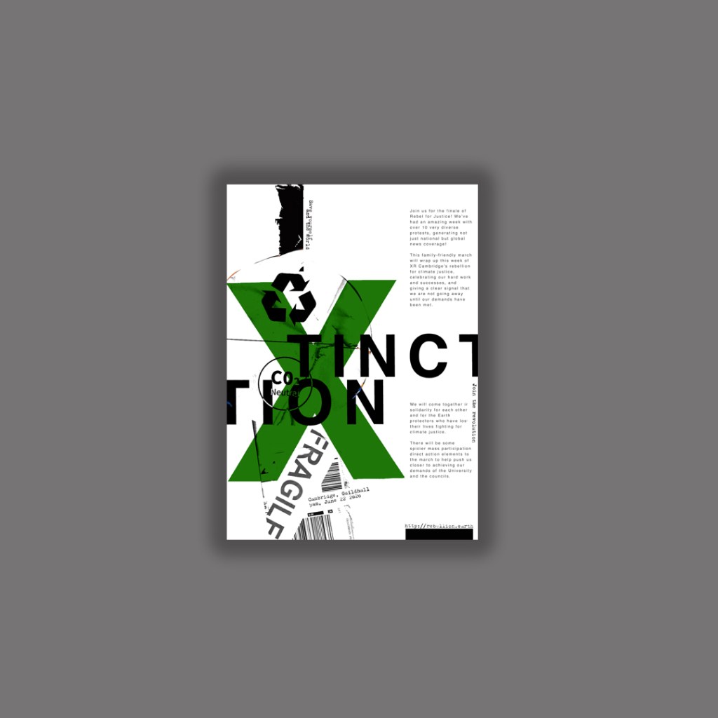
I resized elements on the poster. I also took the texture background away and I quite liked the contrast and clean look of the pure white and red. I tried to add more negative space to these and to also try and make the design flow better. Using the rule of thirds I have tried to separate elements into thirds. I have split the poster grid and layout into 3rds and placed each section of text within each 1/3 of the grid. I also tested out different layouts and placement of the text to see what flows best and what works better. It is still missing the environmental/climate change element though… You would not really know what this poster represented without the image.
…………
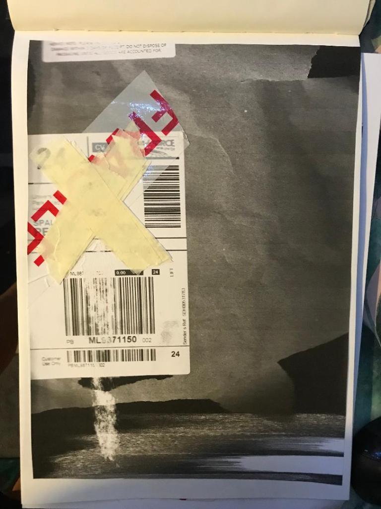
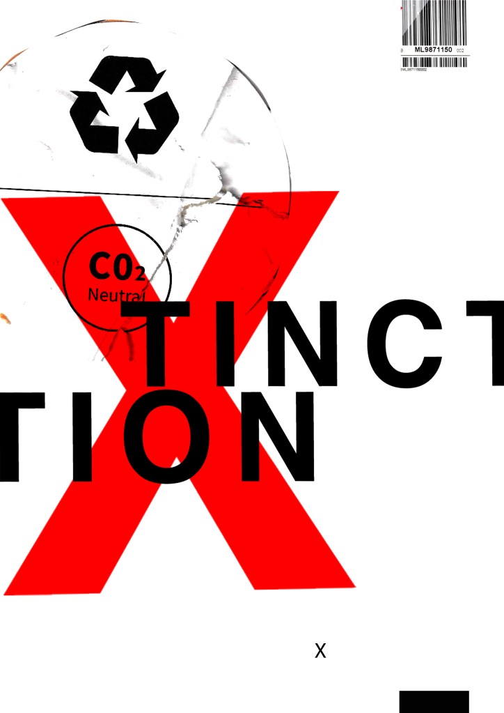
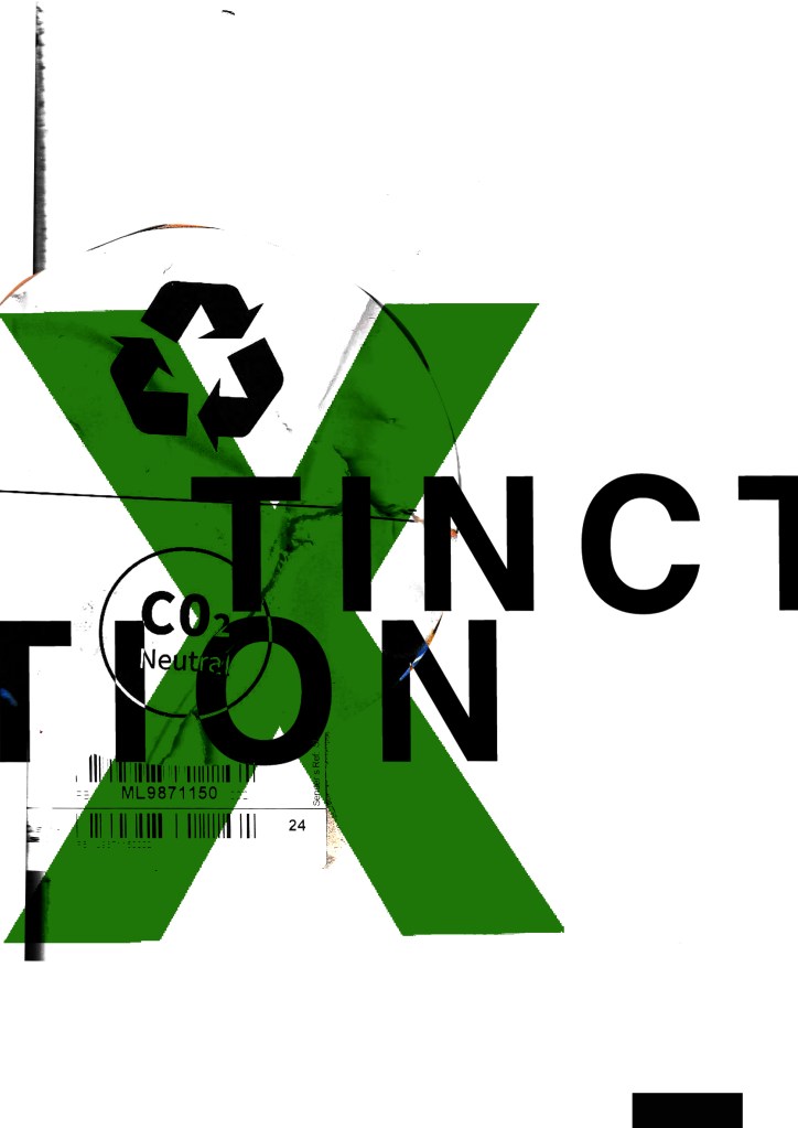
I then found this!
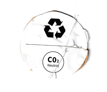
This was on the back of some packaging from a book that I ordered and received in the post. I thought it might be perfect to scan in and use on my posters because it is environmental and you know instantly what it is about. I thought maybe that this could be one of my main images. I then did some more trial pieces…

I much prefer the green colour. The green is not so threatening in appearance and it relates more to the environment. When you look at this poster it is more clear with the green to what it might represent.
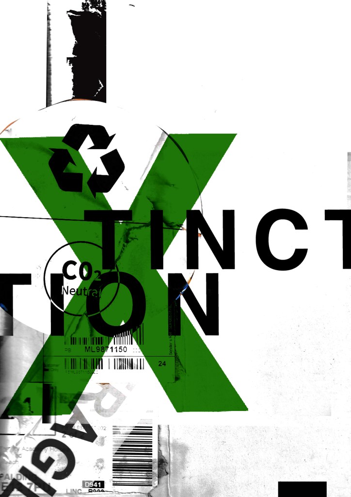


I was then torn between 2 designs..


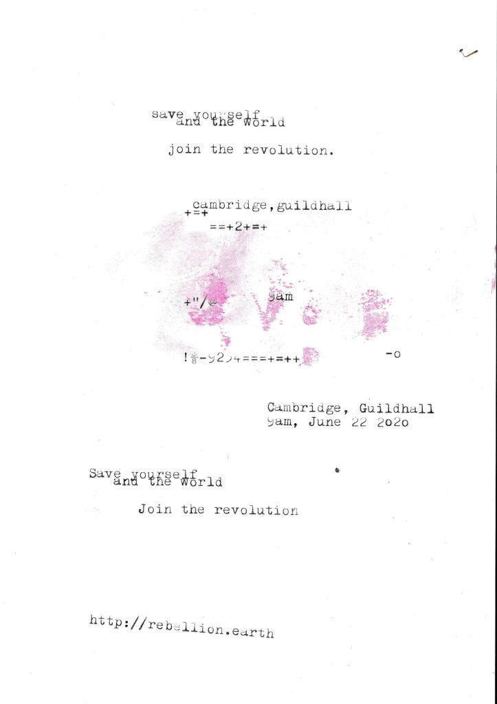
I needed to add the text into the designs also… I took the designs from above that I have made minimalist and applied Occars Razor to. I wanted to place as little text as possible to make it really minimal and to let the design deliver the message and entice the viewer in. I wanted to use a different form of media for the type instead of just typing it into Photoshop… I decided to use my typewriter to write out the text I wanted for the posters and then scan them in to alter and adjust in Photoshop.
The text that I typed out was “save the world and yourself”, “Join the revolution”, the time and date for the event followed by the organisations website. I did not want to describe the event in great detail at all in this stripped back Occars Razor poster because the nature of this version is to have as little information as possible and to let the image and the design do the talking. The snippets of information that I have put on there allow the viewer to know what the poster is about as well as a time and place and then letting them seek out more information if they want to by looking at the website.

I also had the seal of approval from the man and legend himself David Carson!…

I then went back to the second design and reworked it to jam pack it full of all the information that is needed.

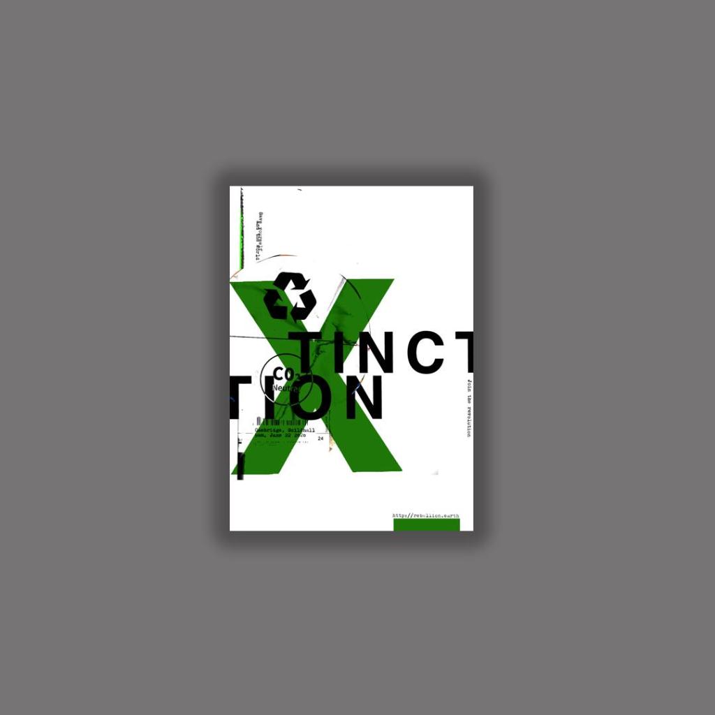
The Finals!


The next step was to ask for some feedback…
I emailed my fellow students in our OCA email group… (if reading this years in advance from now, the crazy times I talk about are the corona virus… )
I shall now wait for some feedback! 🙂