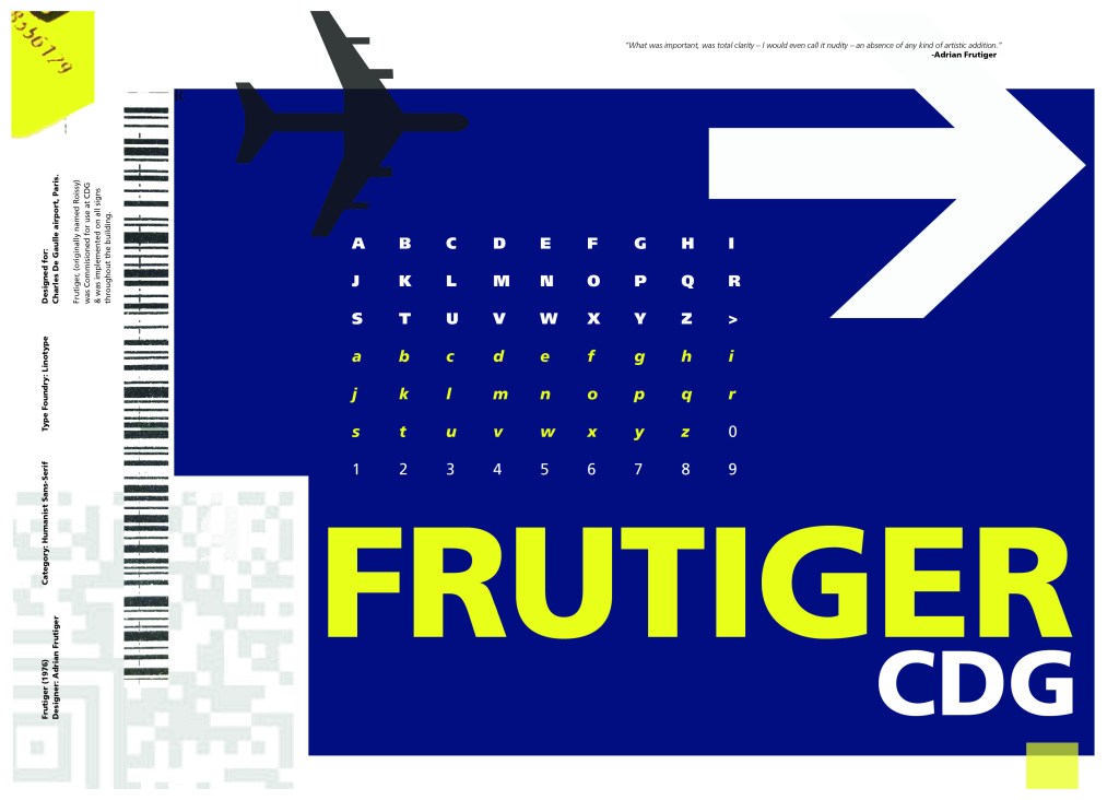
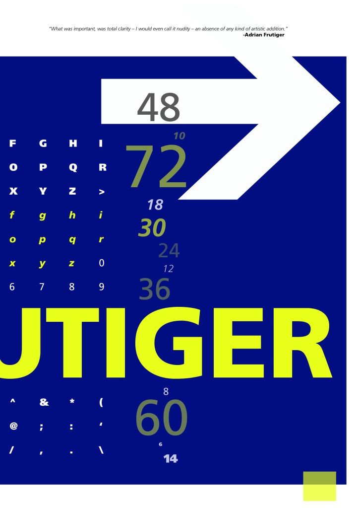
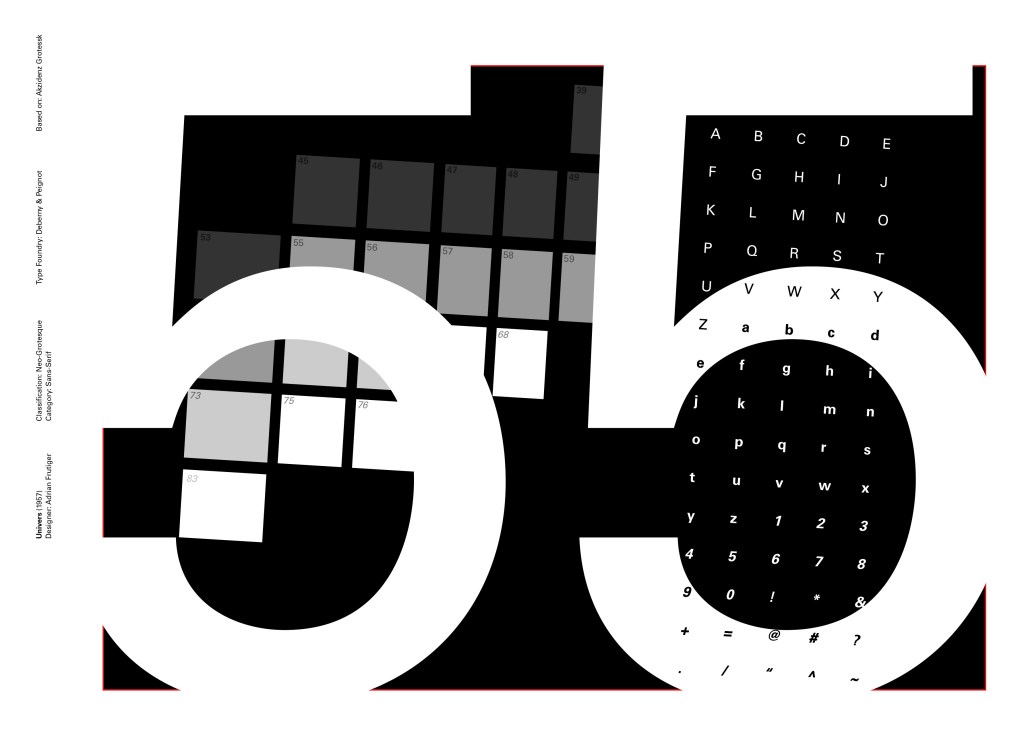
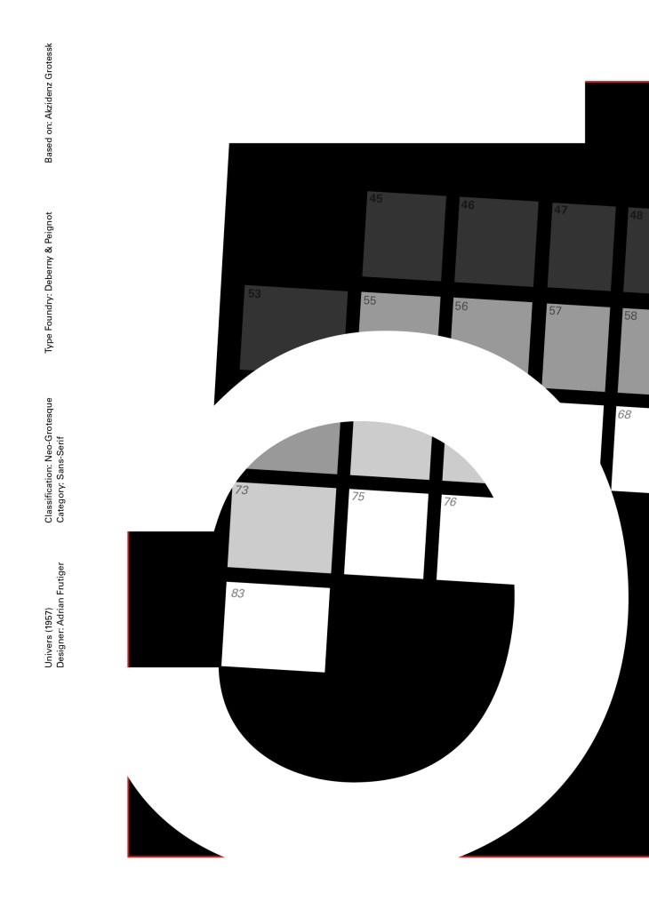
Following on from Univers, I chose to do another famous typeface by Adrian Frutiger.
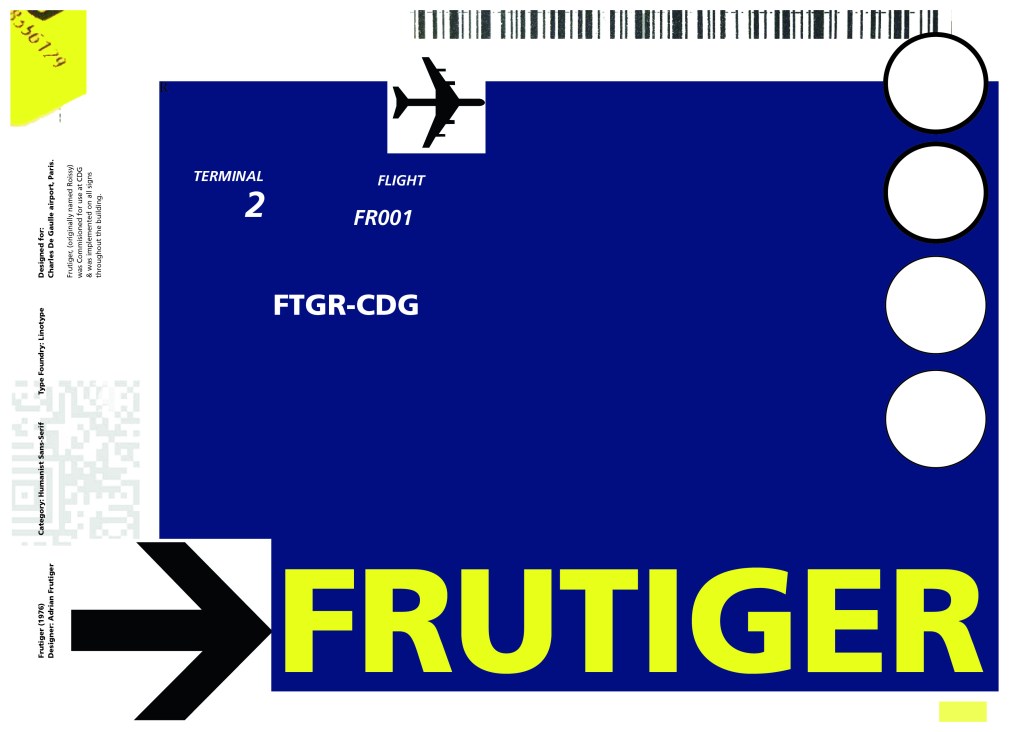
Frutiger is a Sans-Serif and was designed to be legible at any size. It was originally commissioned by Roissy Airport in Paris, (Charles De Gaulle) when it was first built to design all the signage in the airport. The airport wanted a new directional sign system. It was going to be named “Roissy” in 1972 after its success but was then Frutiger was approached to make the typeface suitable for print and it was then named after the designer himself.
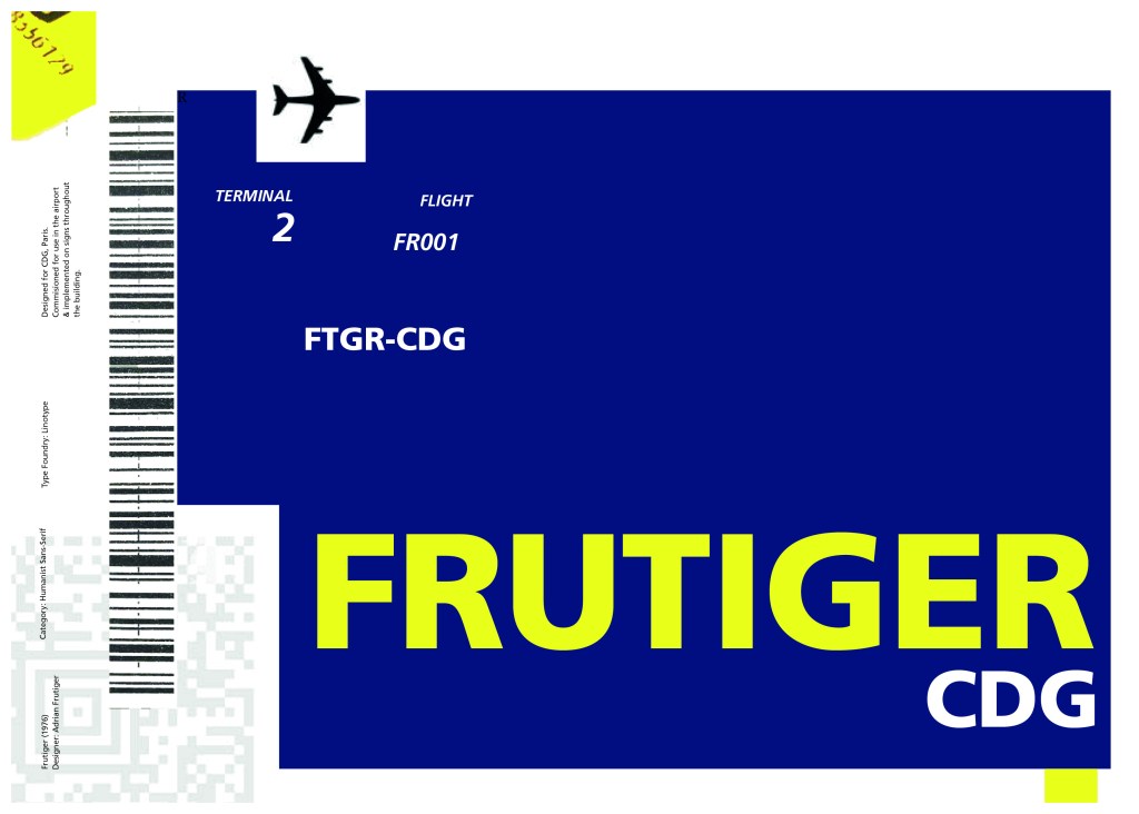
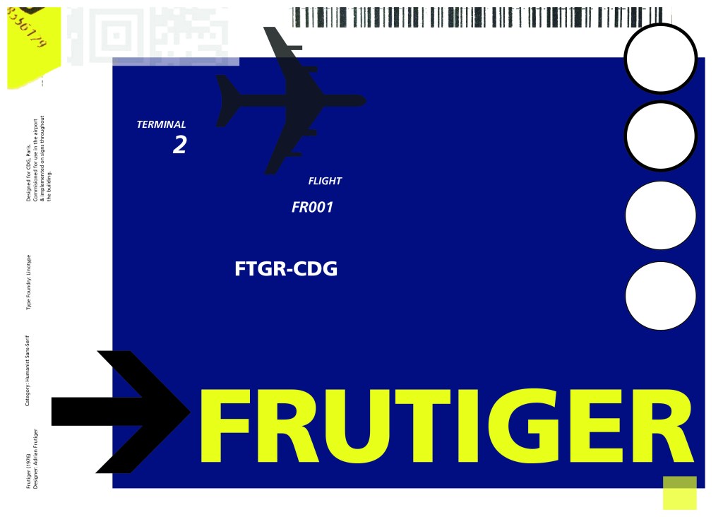
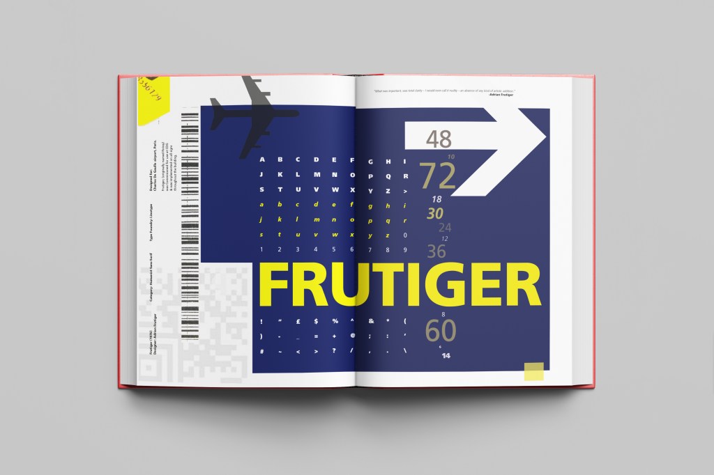
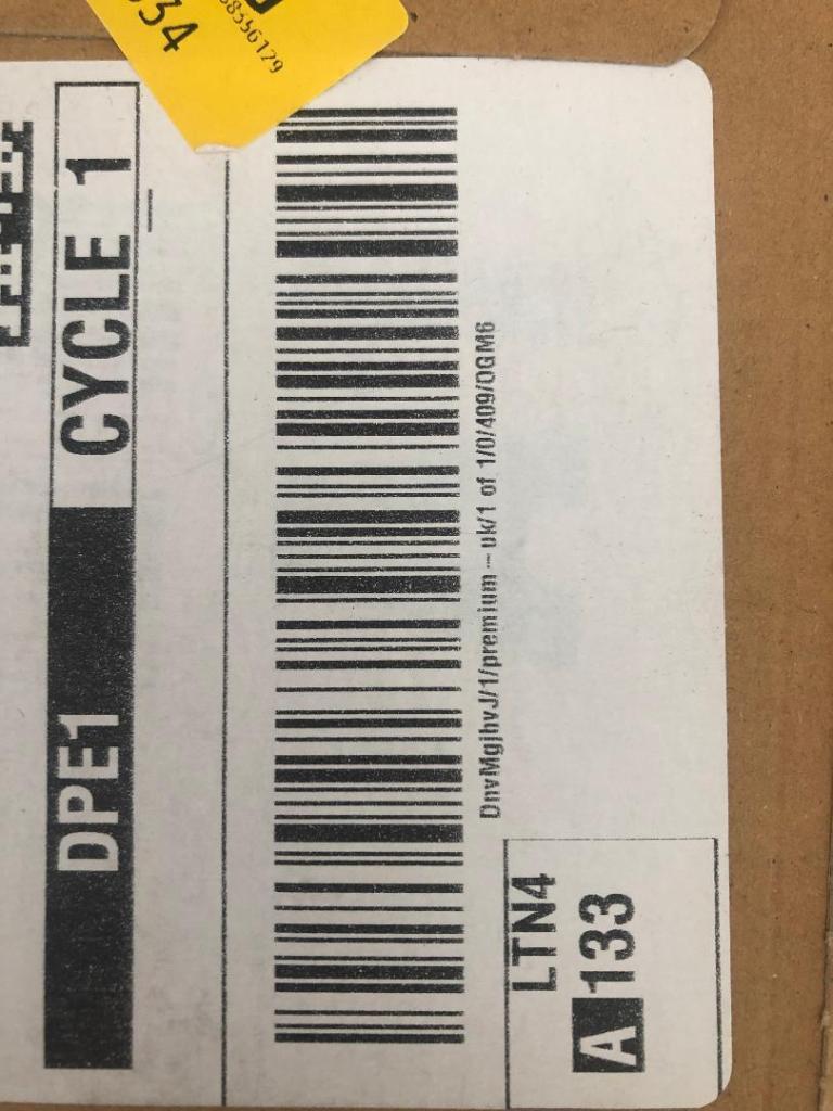
The way forward for this layout design seemed quite obvious; to base it around signage and CDG airport. The first idea I had was to make the layout look like a baggage tag or boarding pass with the barcodes and airport names etc.. taking a little bit of inspiration from my Casetify Pangram phone case… My idea was to scan some barcodes in and then create another “swiss grit” style design.
I did ask my boyfriend if he had any boarding passes kicking around from his visit to Dubai a few years back (I haven’t travelled abroad in a few years now!) and he did have one boarding pass that I managed to take a QR code from and import into my design;

I also keep a bag full of different cardboard and paper textures and barcodes and anything interesting I could potentially use in my designs; I found a relevant barcode that I could use.
I felt like I needed some images of airport signage next. I did not want to take images from the internet because they would be very low resolution and would ruin my clean, legible design. The only way I could use airport images in my work was to import a web image of a sign and then trace around it in Illustrator to produce a high quality vector image. I did this for a plane and an arrow.

After I had collected these bits I decided to just take it straight into Adobe to try and make into a layout for the typeface. As you can see from the design development, It took me several attempts to get to the final piece! I had a lot of design elements to cram onto one page and I wanted to keep it as clean and as minimal as I could so it was a case of moving elements around the page to see what worked the best. I wanted the design to flow and to not be “too busy”. I think the version I decided on works the best.
Design Development – stages to the final design!