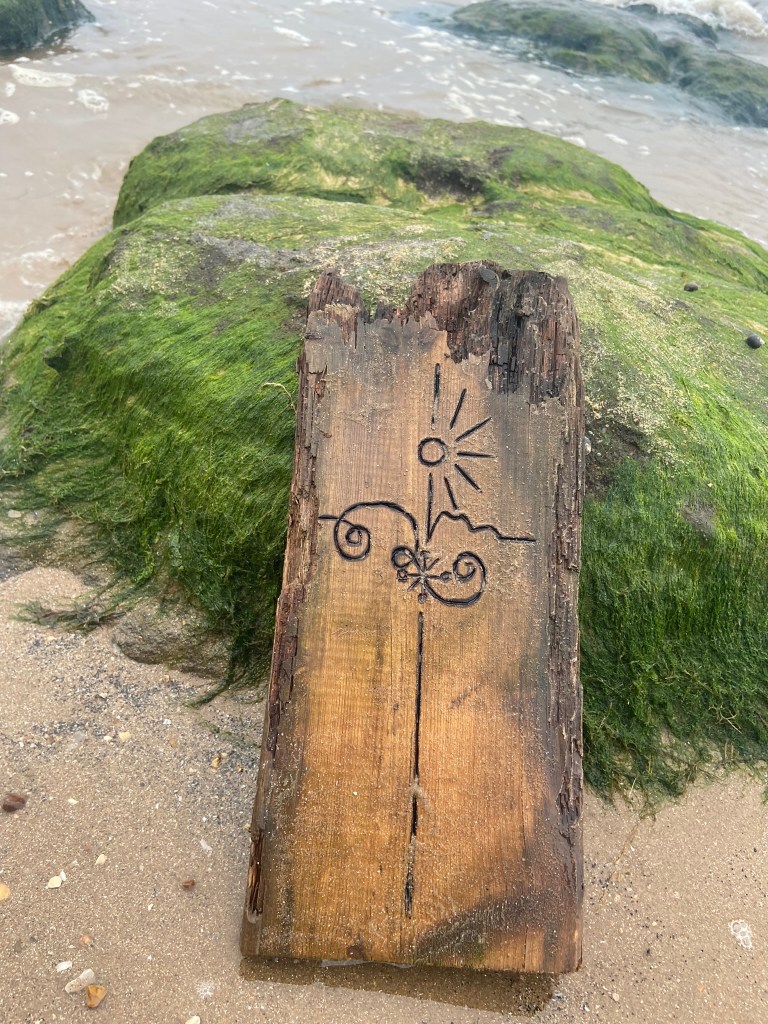
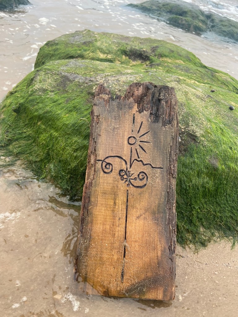
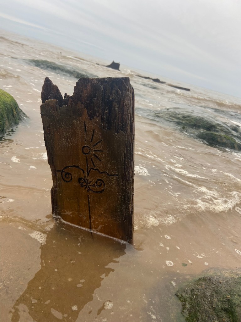
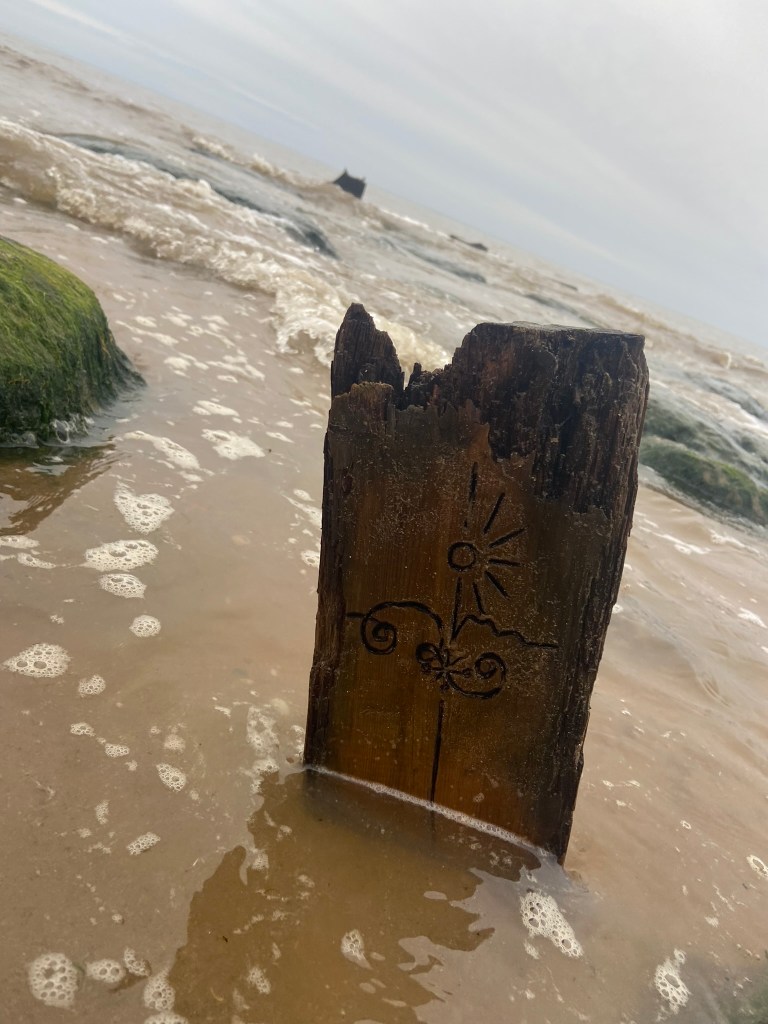
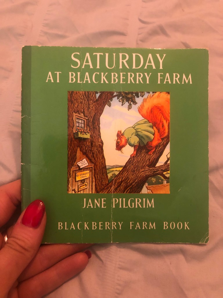
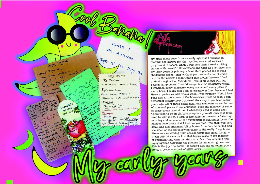
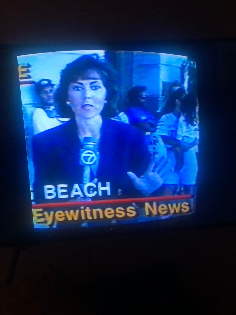
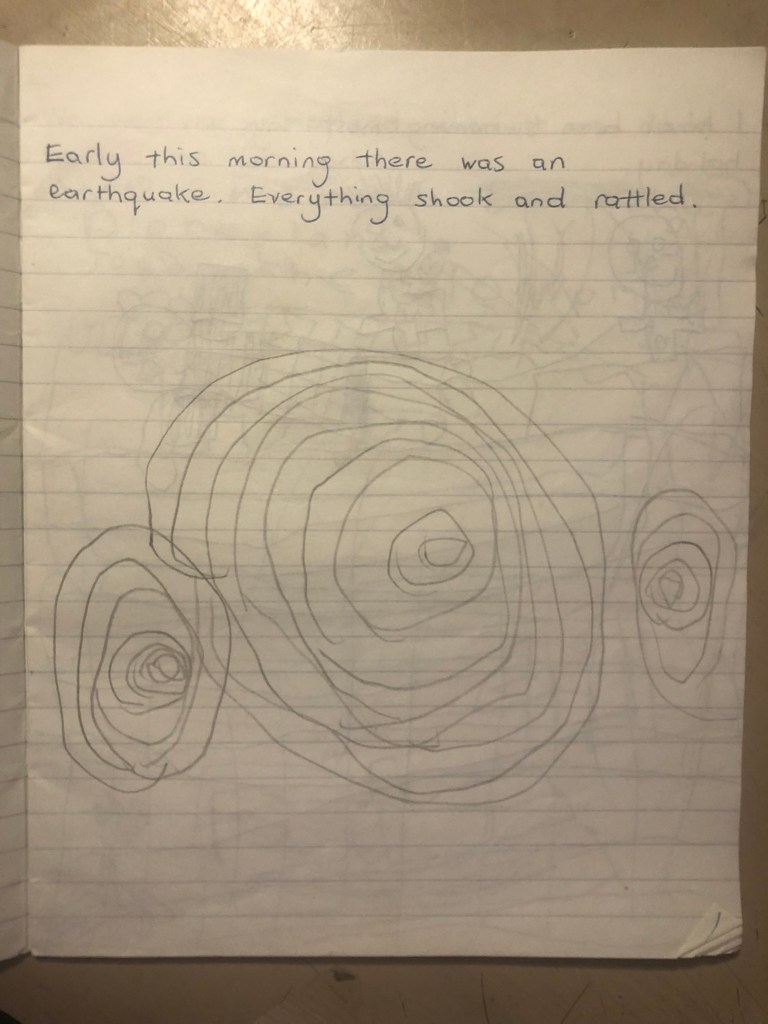
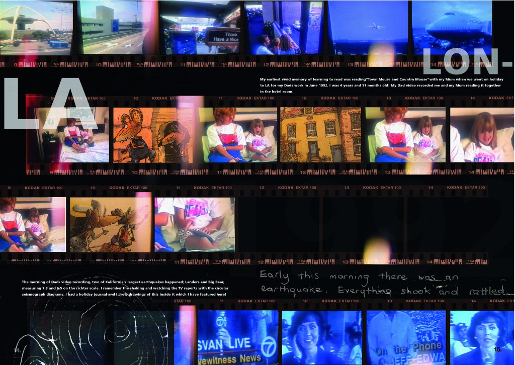
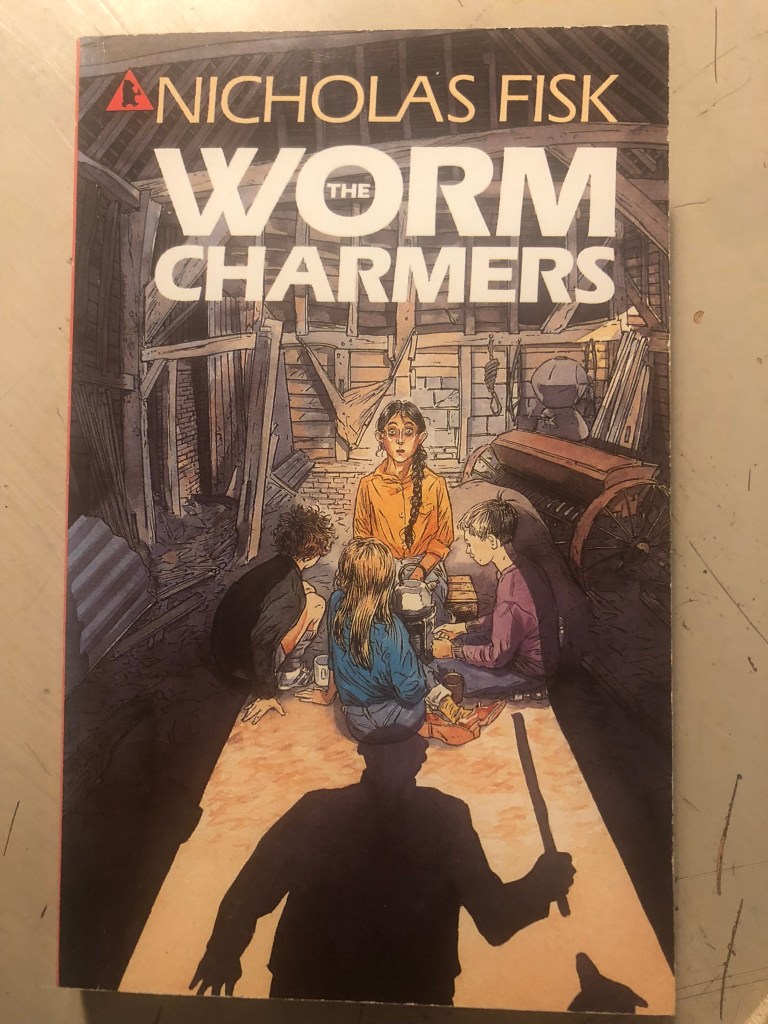
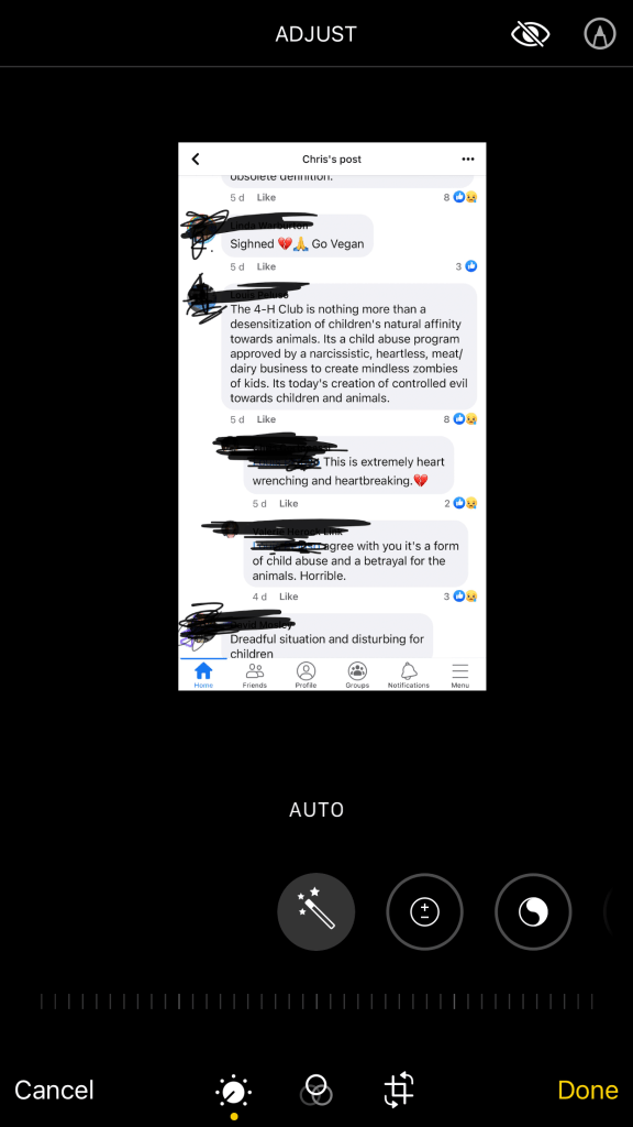
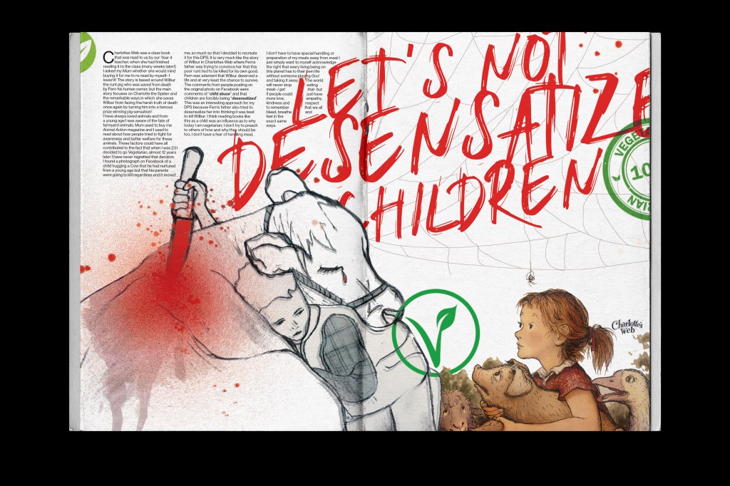
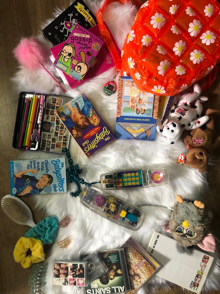
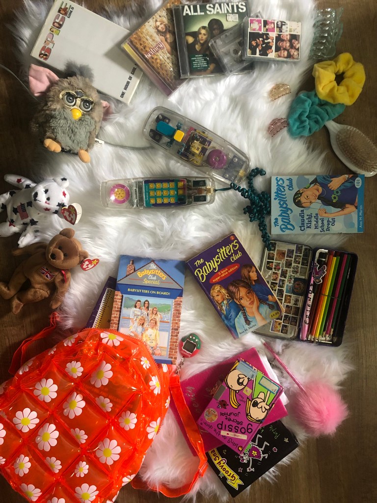
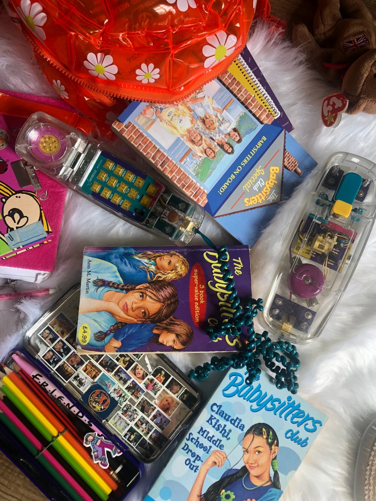
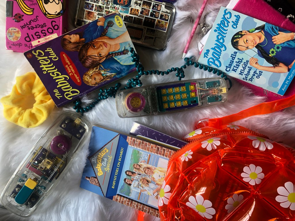
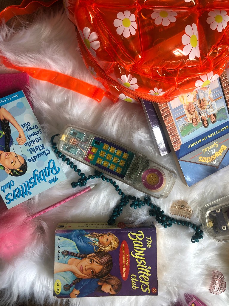
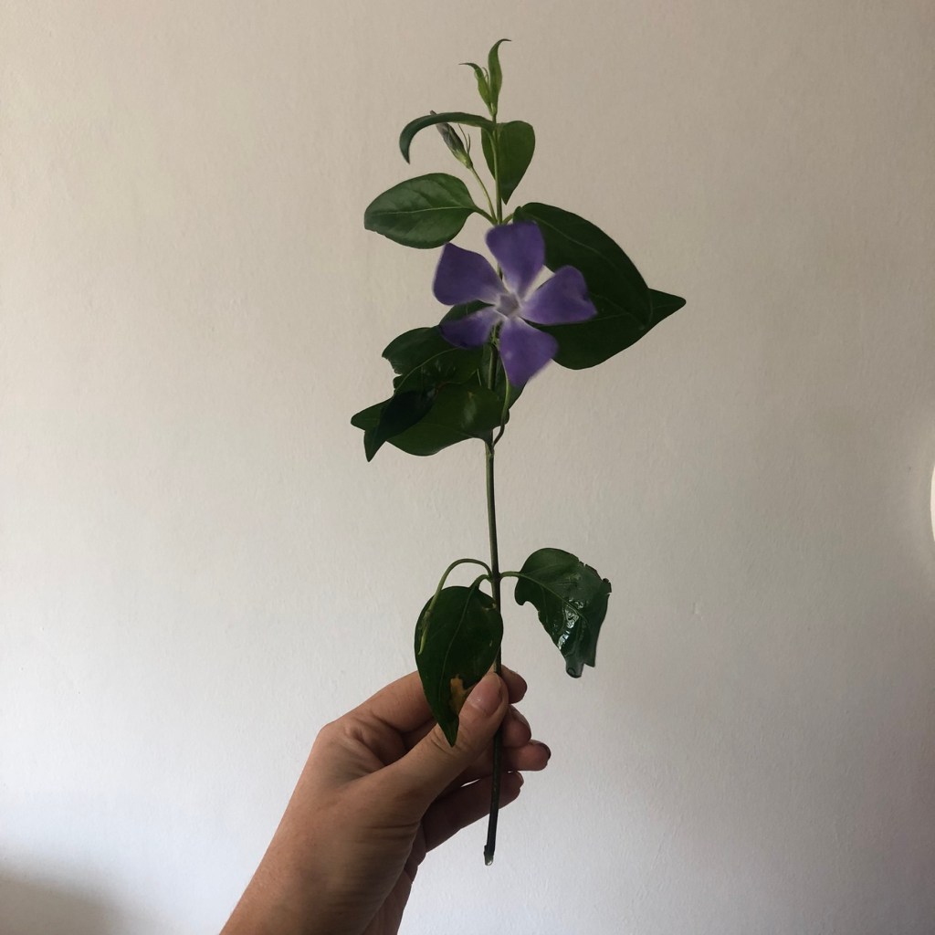
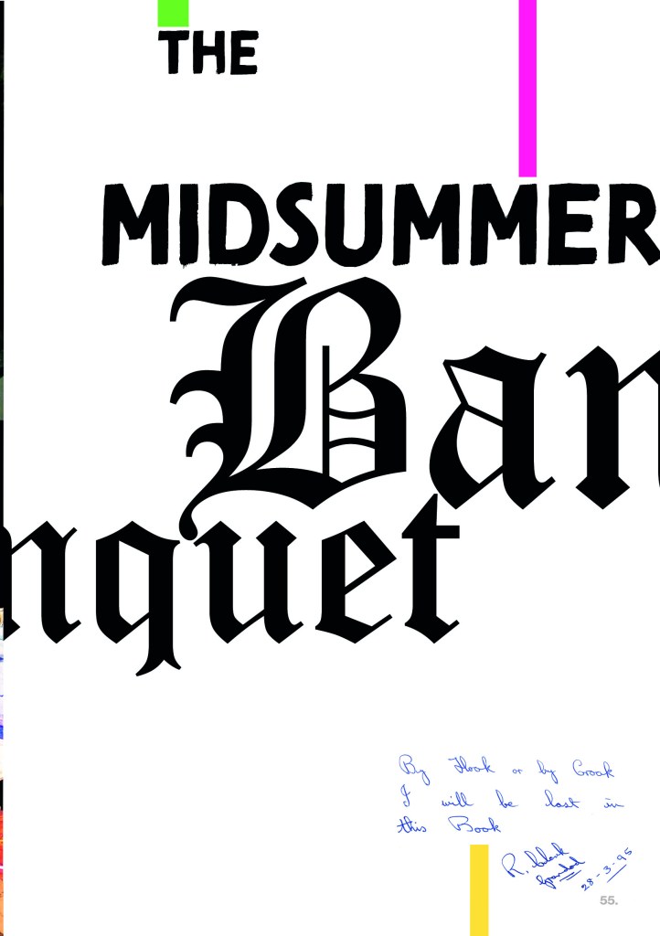
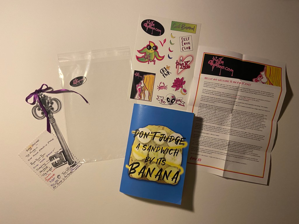
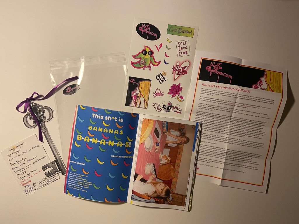
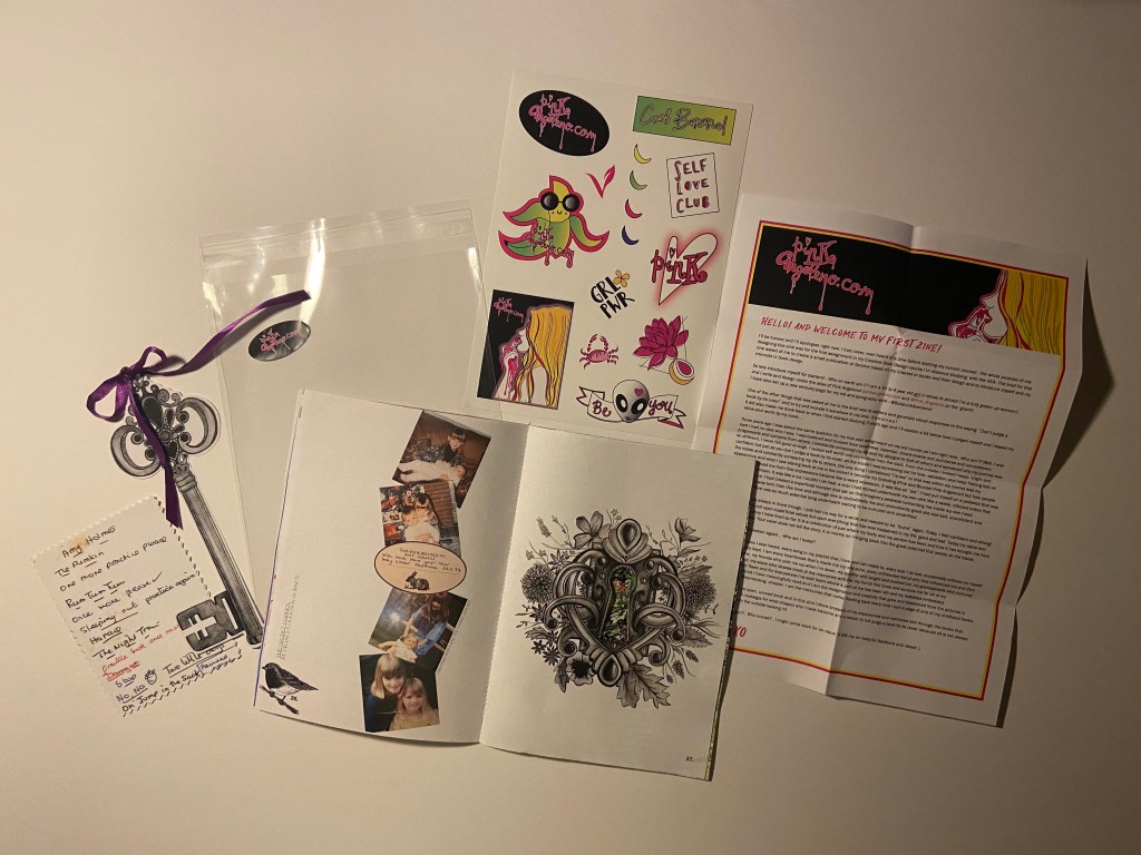
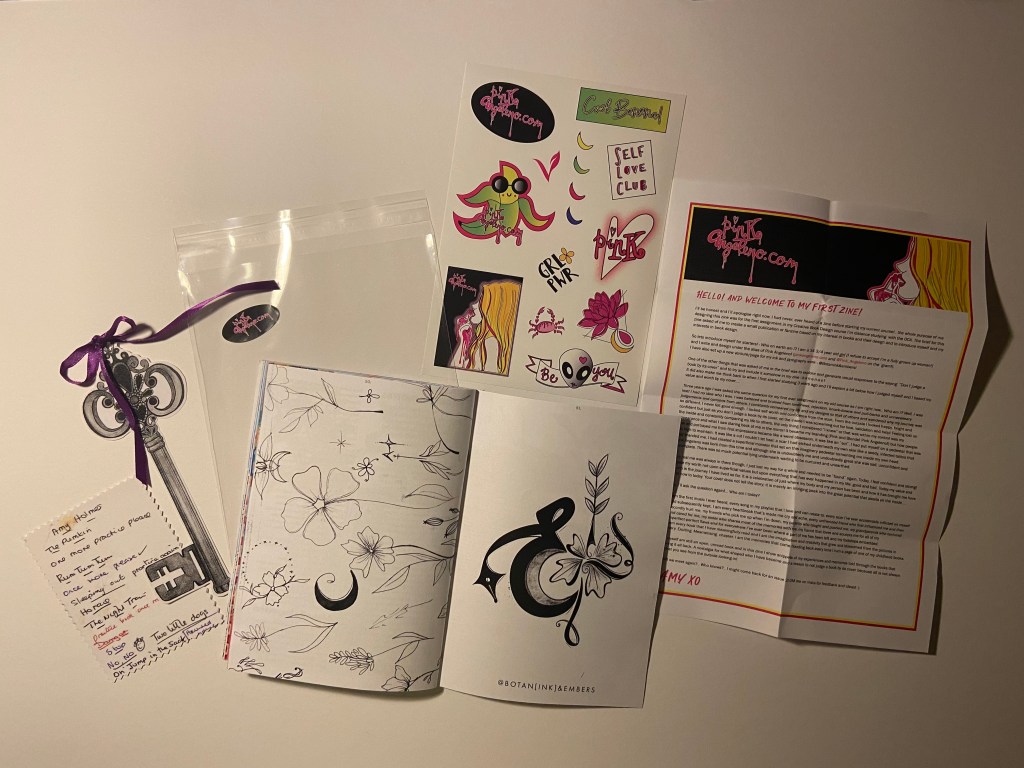
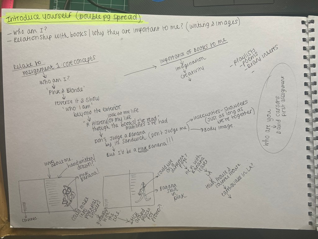
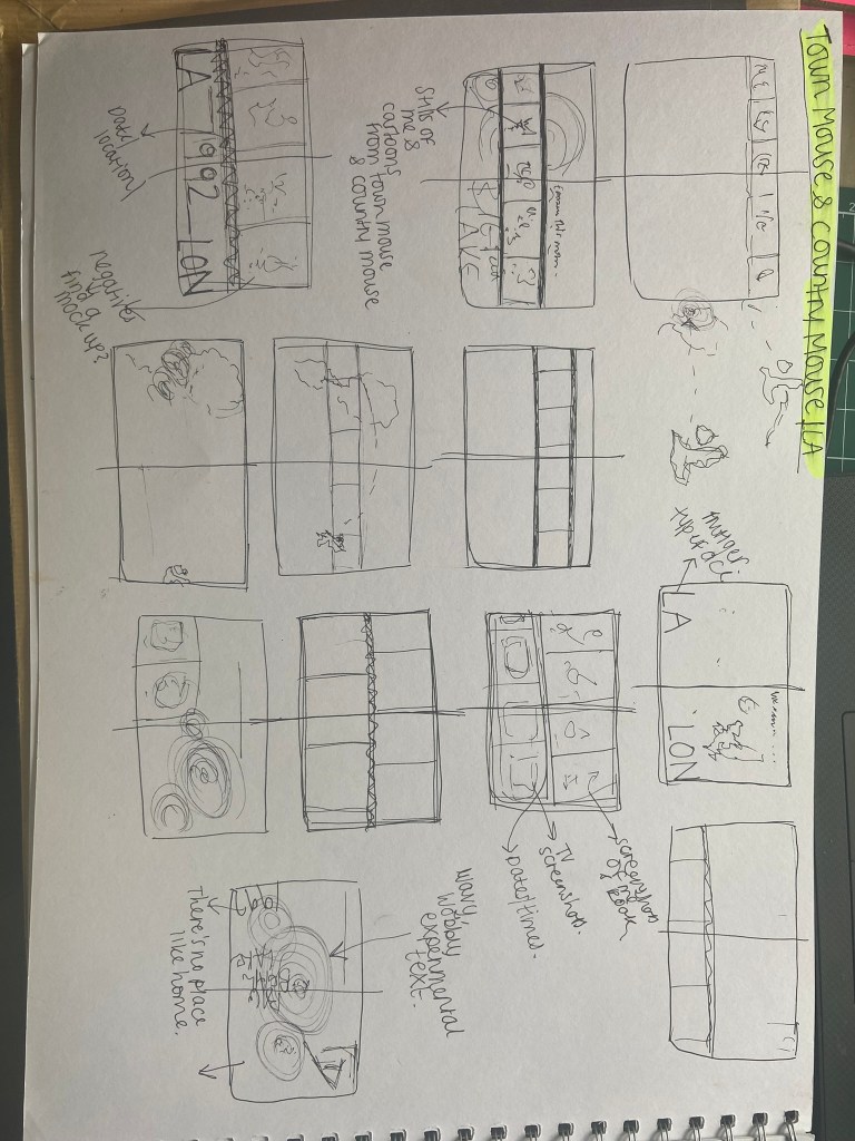
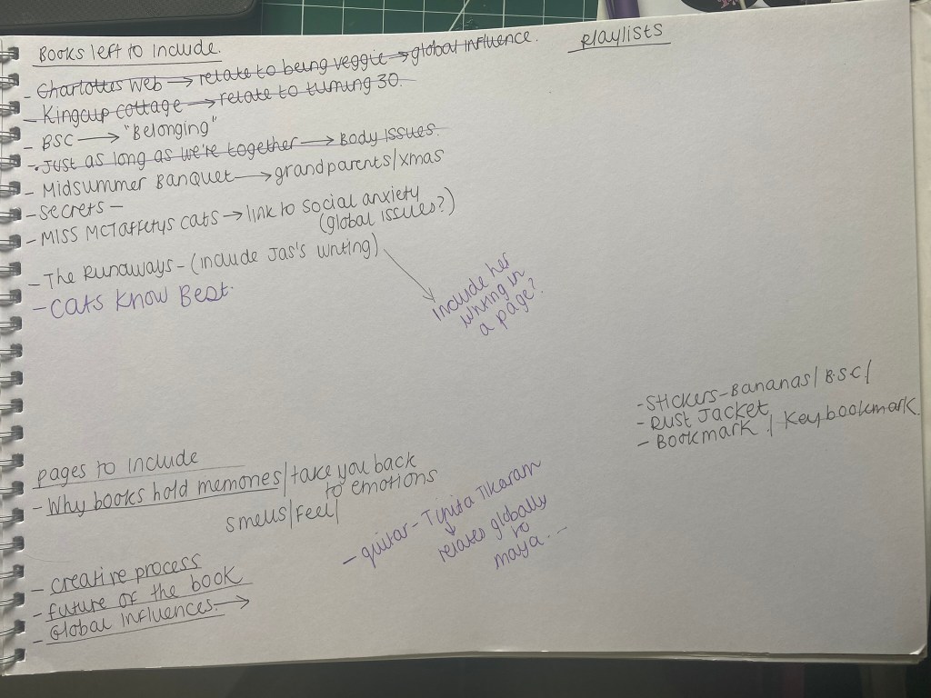
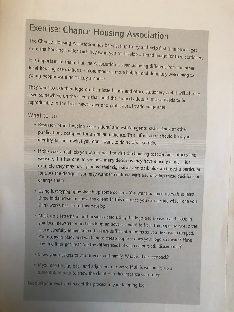
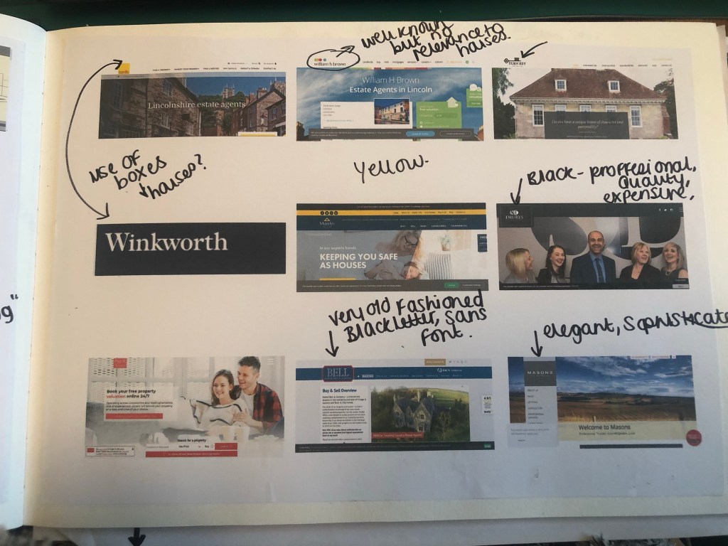
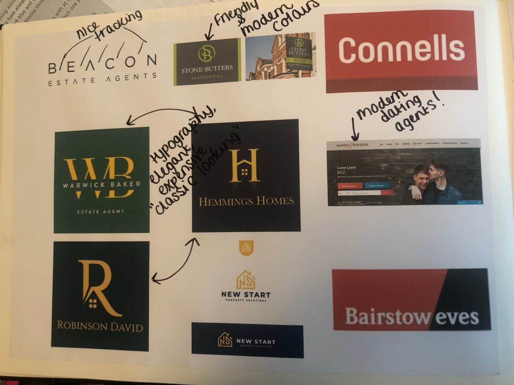
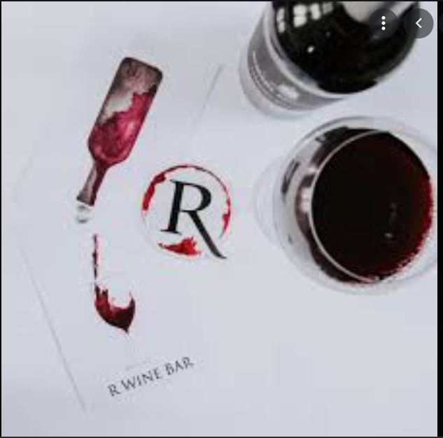
For this assignment I wanted to introduce myself through Pink Angeleno as this is how I brand my work on social media and on this blog and I know that my tutor already knows who I am and what my work is like, but many people always ask me why Pink Angeleno is Pink Angeleno.
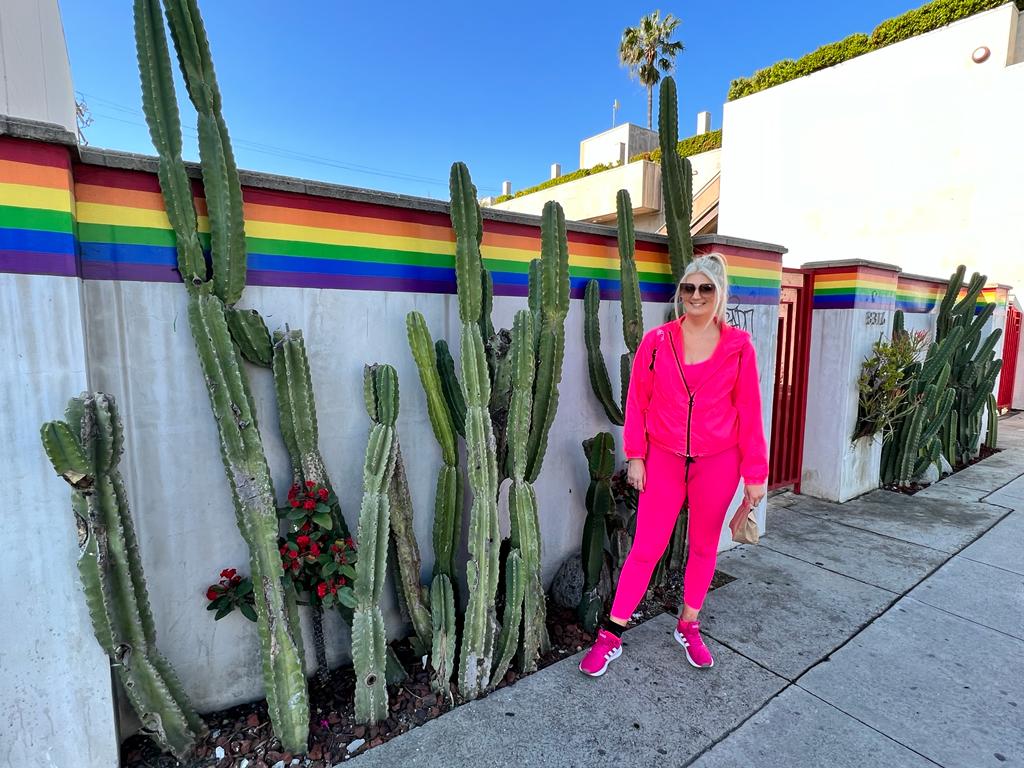
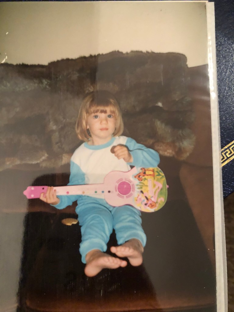
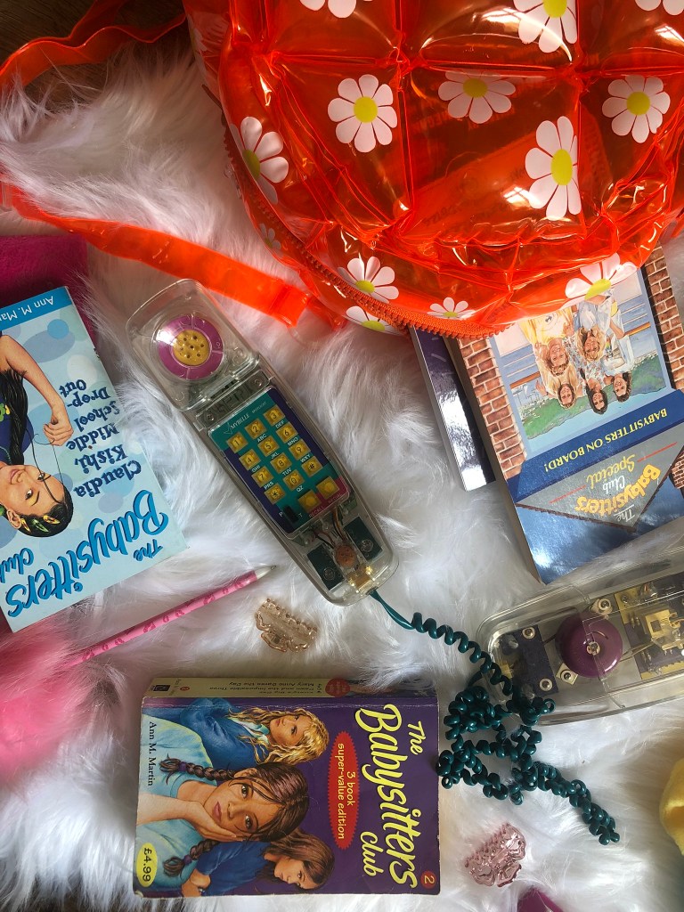
Pink Angeleno was born in 2019 when I first started my course, I needed a brand name that represented me and my work and I was really struggling because I had no idea if I was actually good at Design or whether it was just a pipe dream. I had no idea who I was at that point, where I was going, what I was doing or whether what I was producing was any good. I felt absolutely lost and just dreamed of running away to live a happy, sunshine-unicorn-rainbow life in LA! I do love LA and California and held on to the dream that I might make it back there one day.. I was like an Angeleno that was just lost and living elsewhere! I also loved the colour Pink and this is the colour that everyone associated me and my designs with. it only seemed appropriate that the original name I chose – “Graphically Pink” morphed into Pink Angeleno. I wanted the energy, the fast pace, the colours, the vibes, the excitement and adventure, the street art, the hidden places and the glamour of that lifestyle. I wanted Pink Angeleno to showcase my OCA work but I also wanted it to represent this “pipe dream”. As it turned out though, Pink Angeleno has served me well as I have returned to LA and I know where I am going as a Graphic Designer.
I wanted to come up with a design that would be suitable for this assignment but something that I could also use moving forwards to represent my brand.
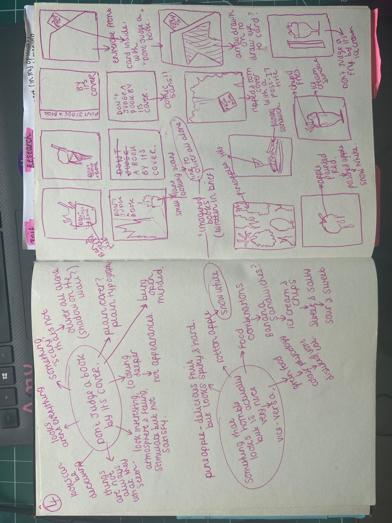
I explored in my mind the boundaries of the brief… The brief stated “greetings card” but I wondered whether a post card could class as a greetings card. After doing some research and searching Google for some one sided “post card style” greetings cards, I realised that they are two very separate things and that I should stick to what the original brief wanted.
The brief allowed any type of media but I decided to do this assignment digitally using Illustrator.
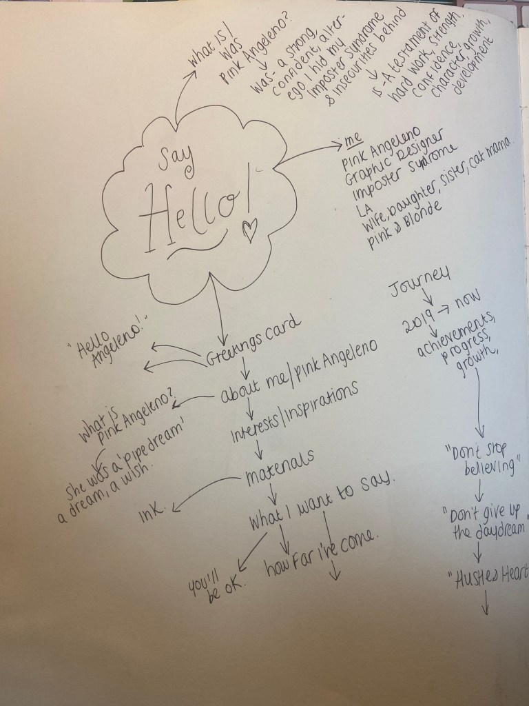
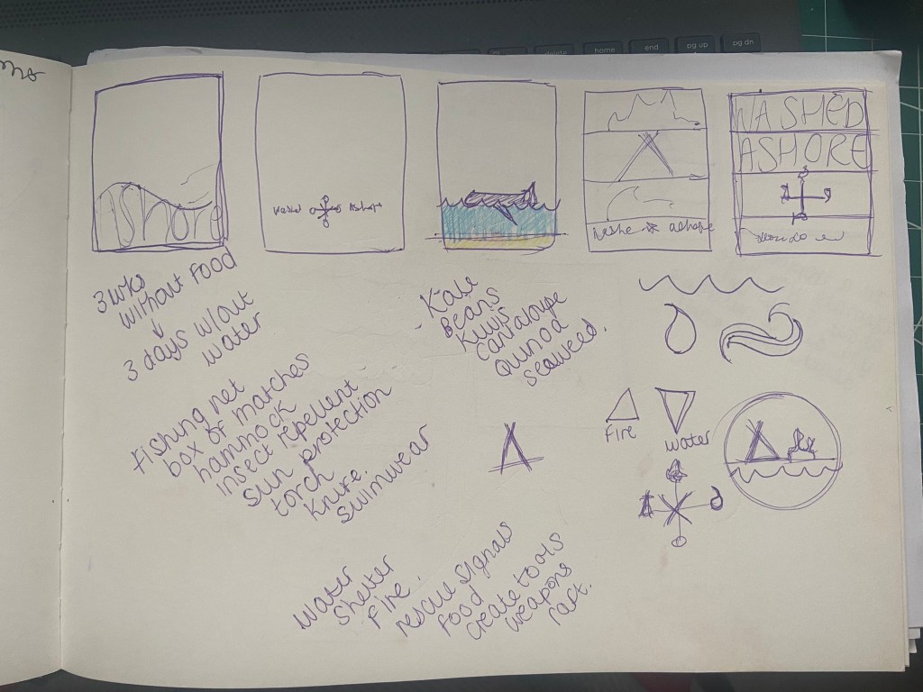
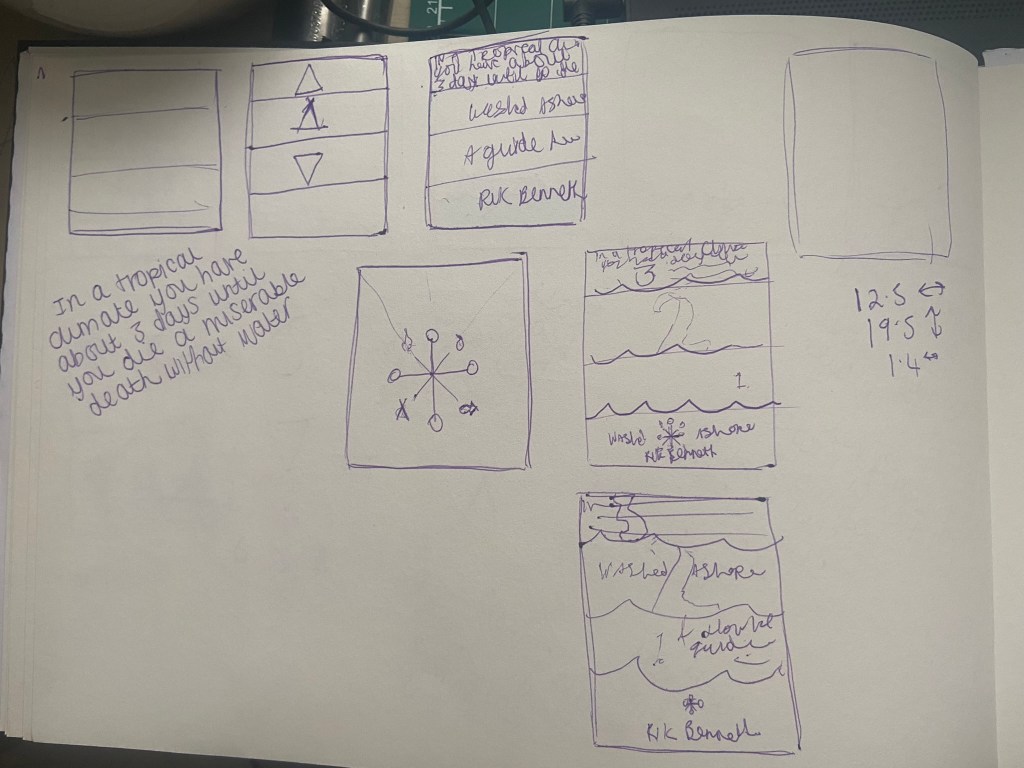
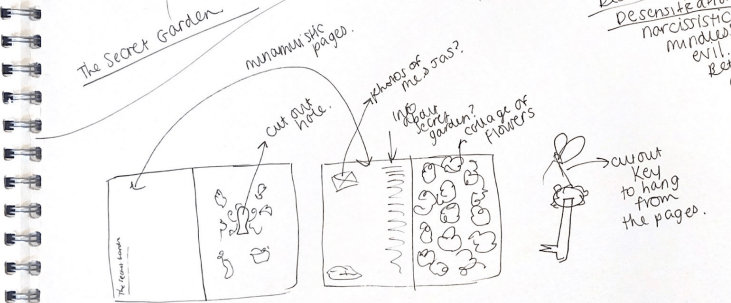
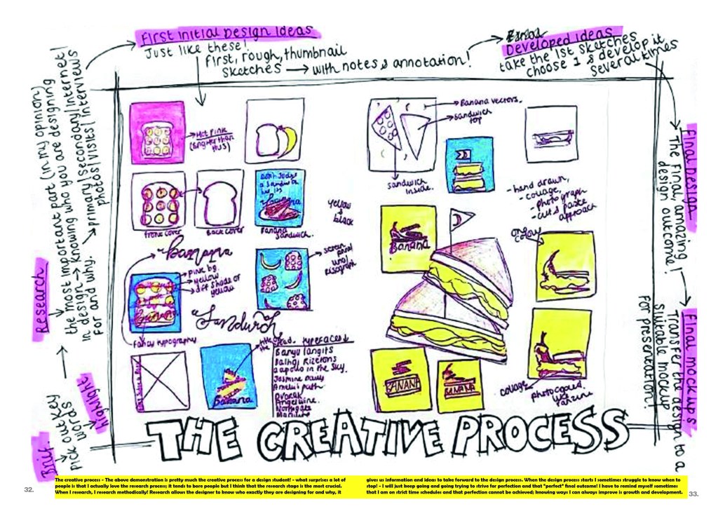
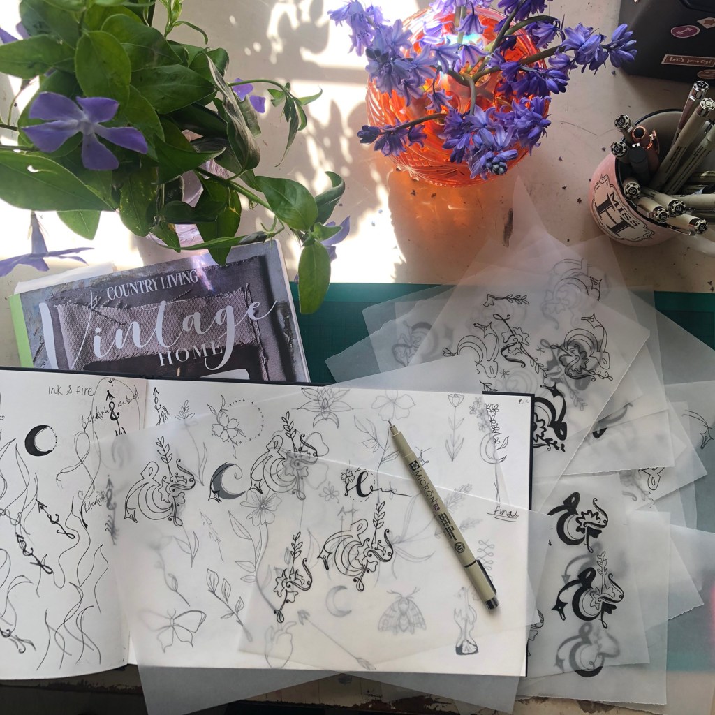
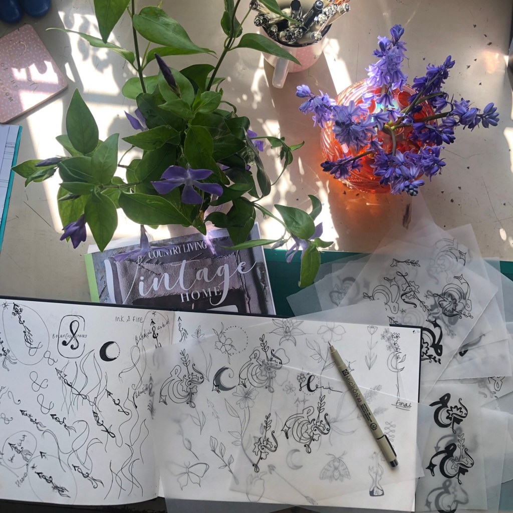
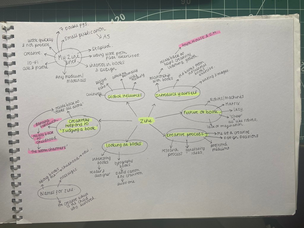
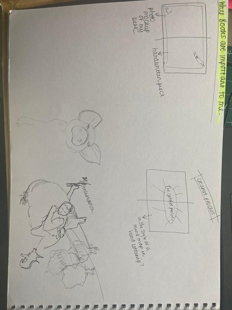
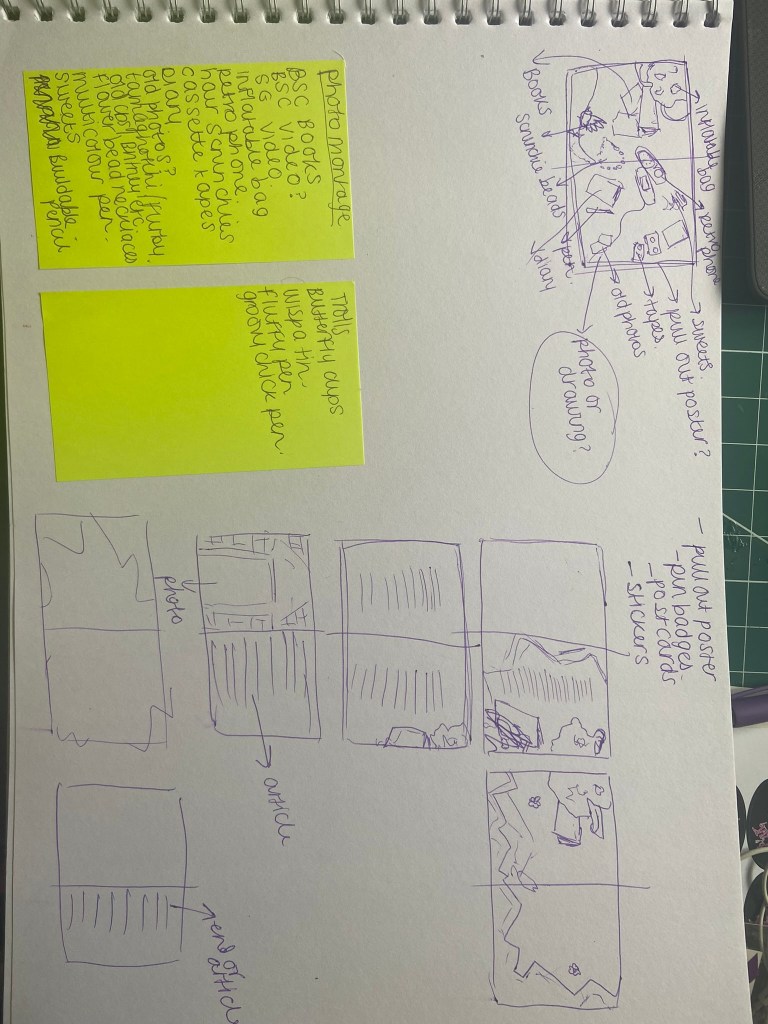
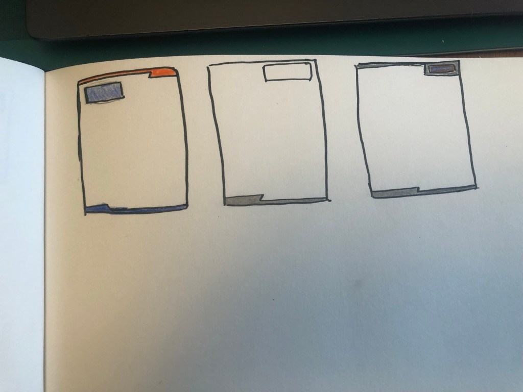
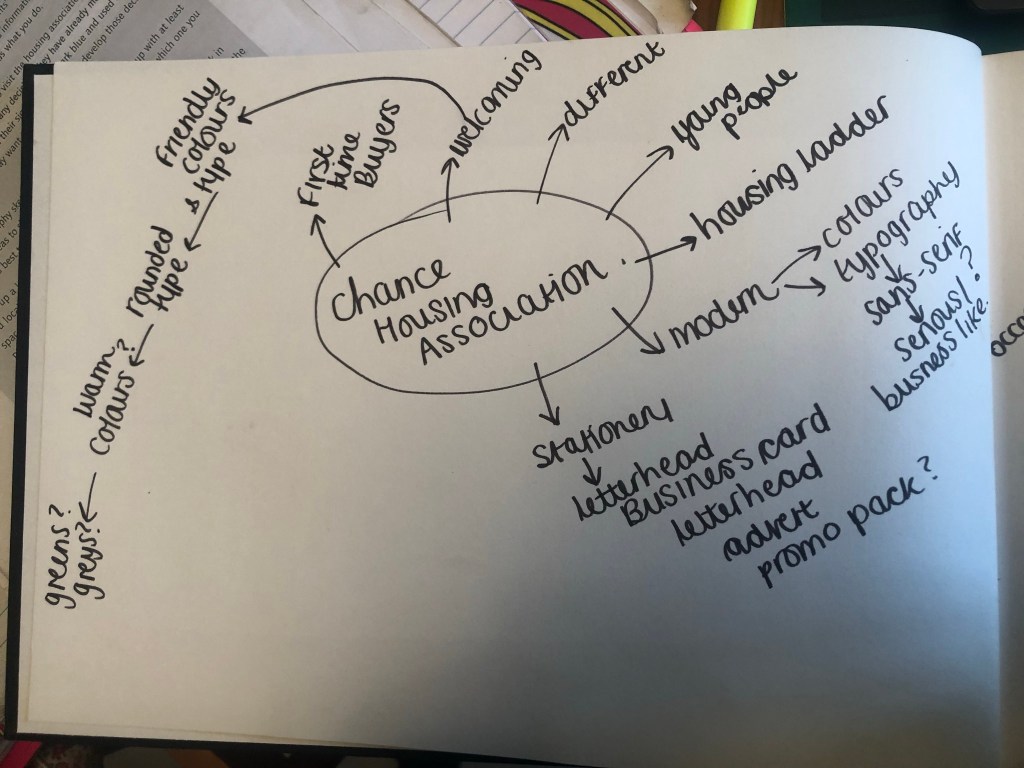
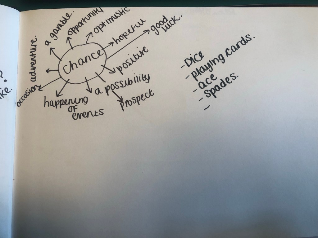
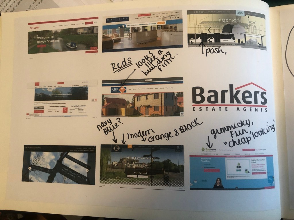
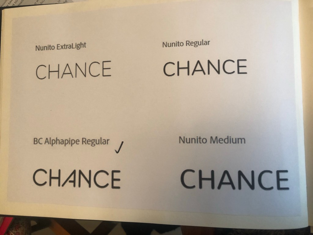
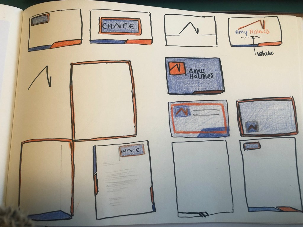
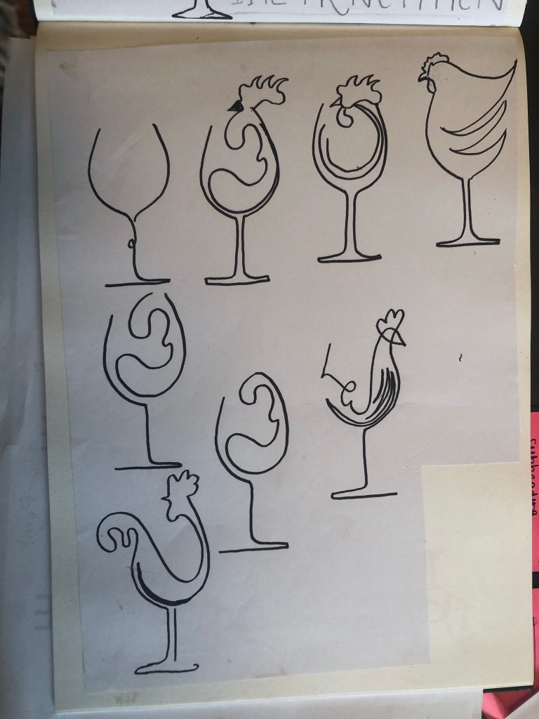
I started off with brainstorming some ideas in my sketchbook about what I might want to include on my design:
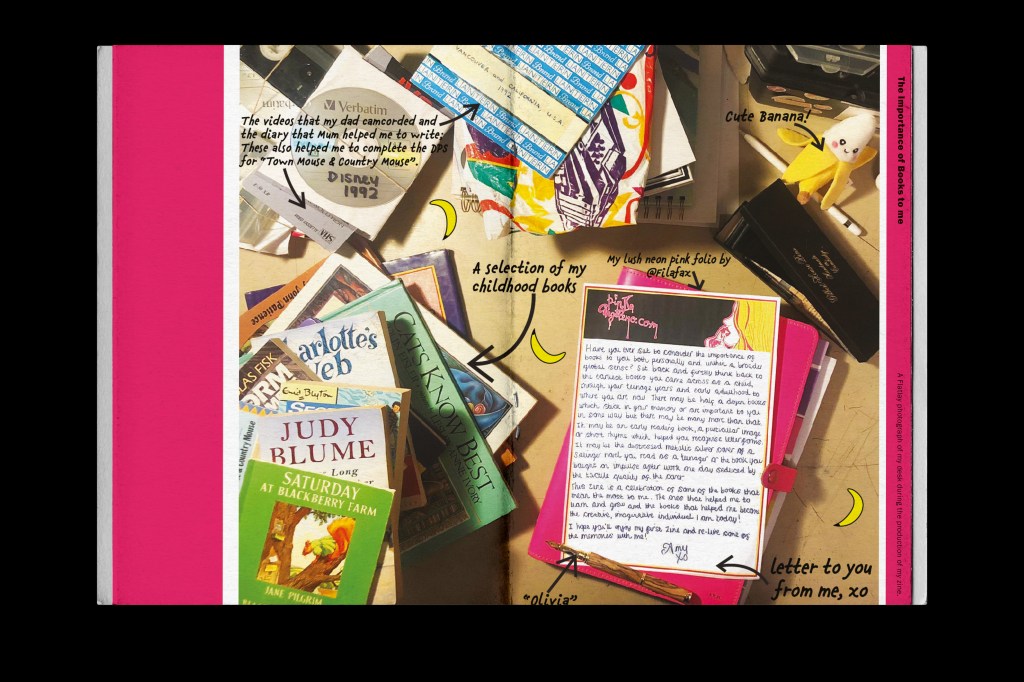
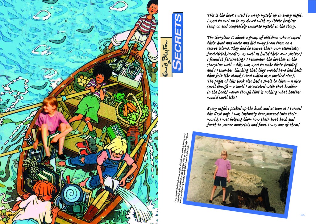
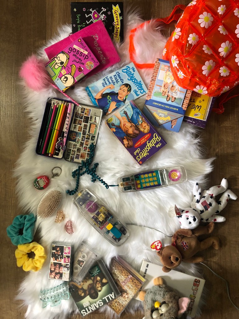
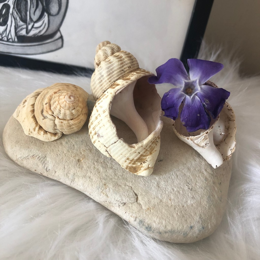
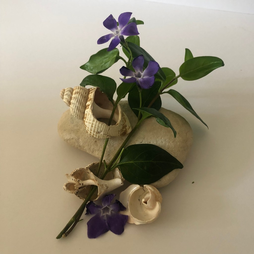
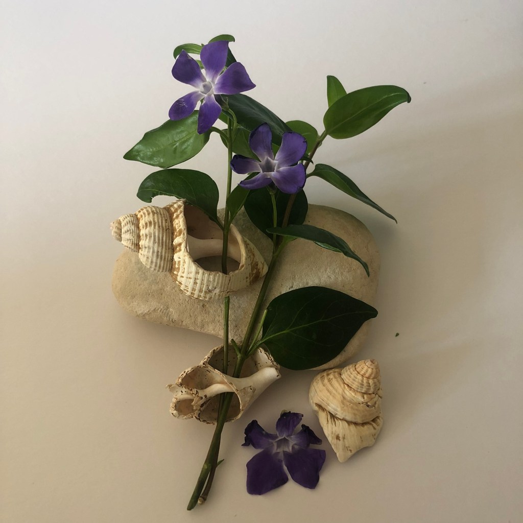
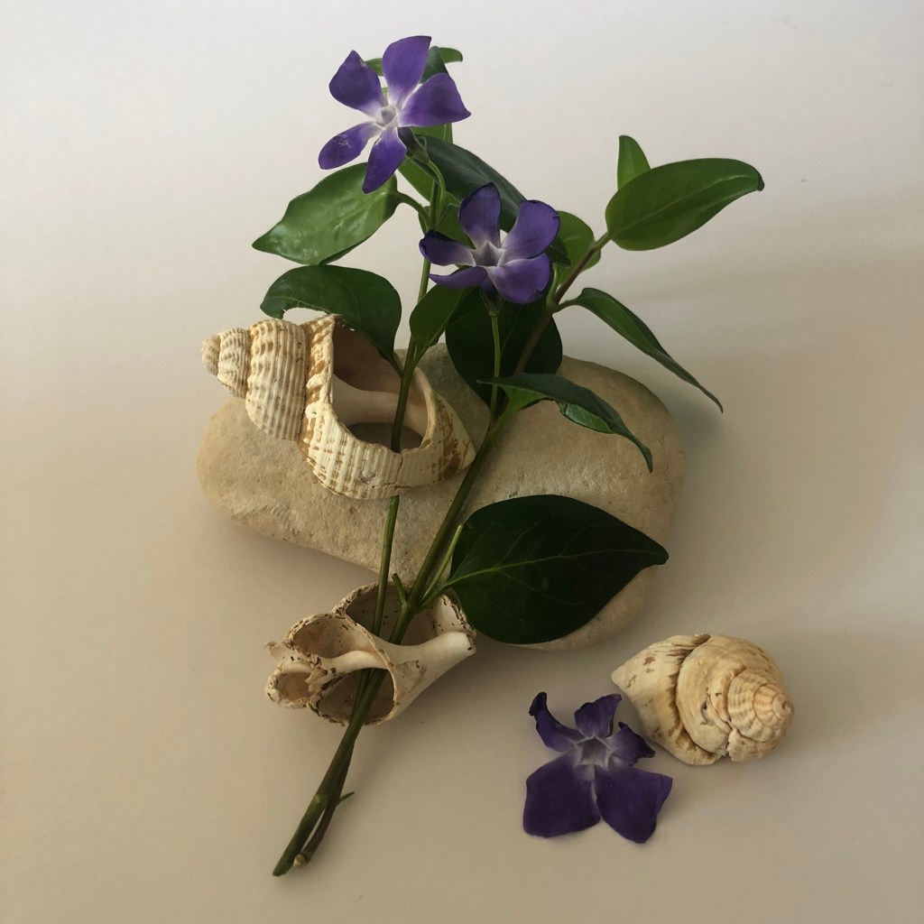
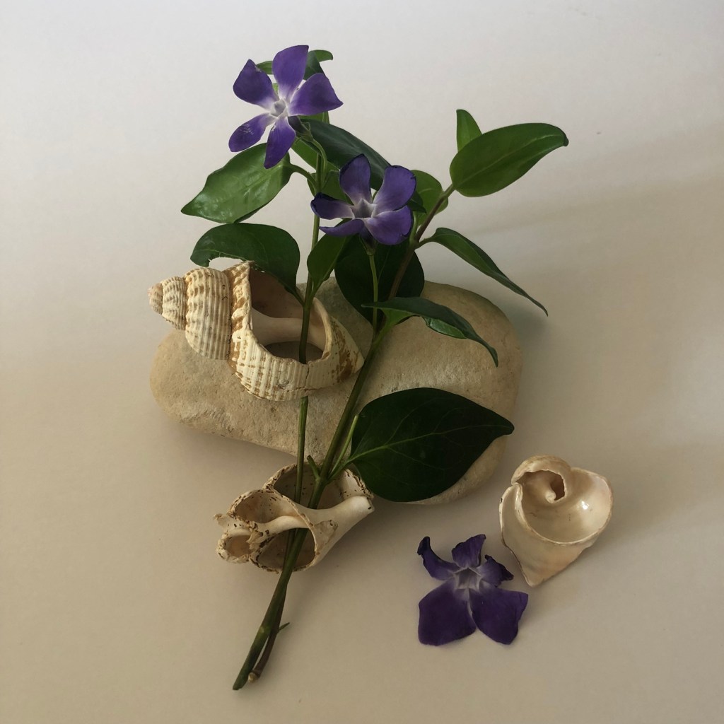
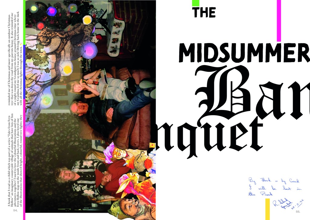
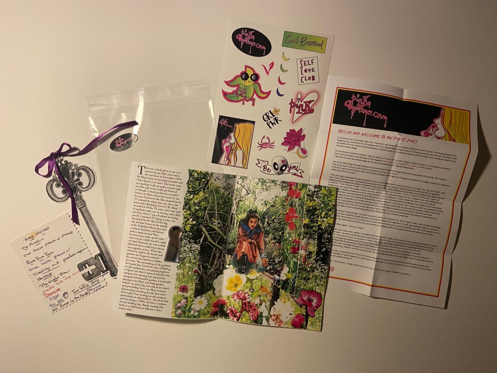
*The photos of the Roses on the page are nothing to do with this assignment but I am trying to document as much as I can in my sketchbooks – I had a lovely evening of dog sitting my Dads dogs and he lives in a countryside 1600s house with a big garden full of amazing flowers and I sat down on this night with a glass of wine, cut a rose from the garden, lit the fire and sat down to sketch. It was bliss.. so I decided to document the moment!
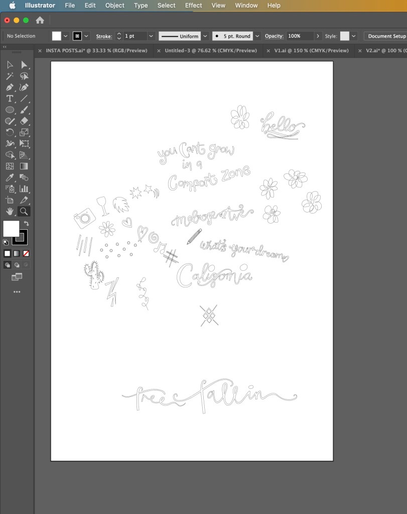
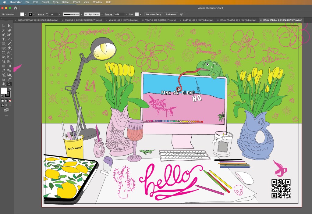
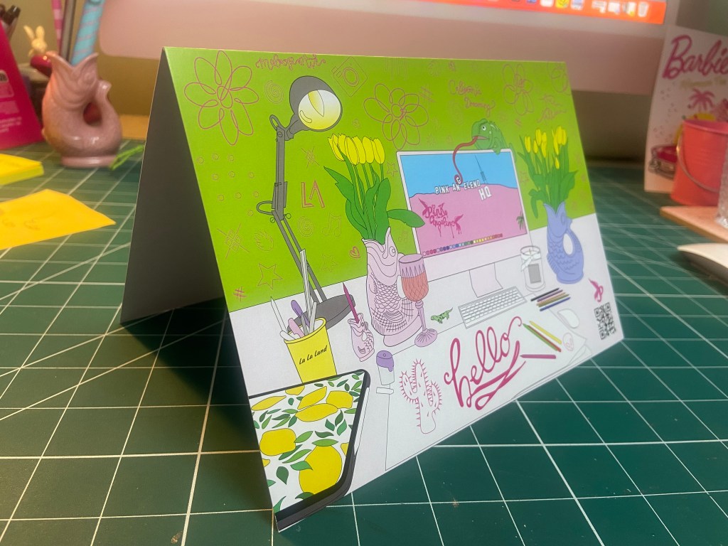
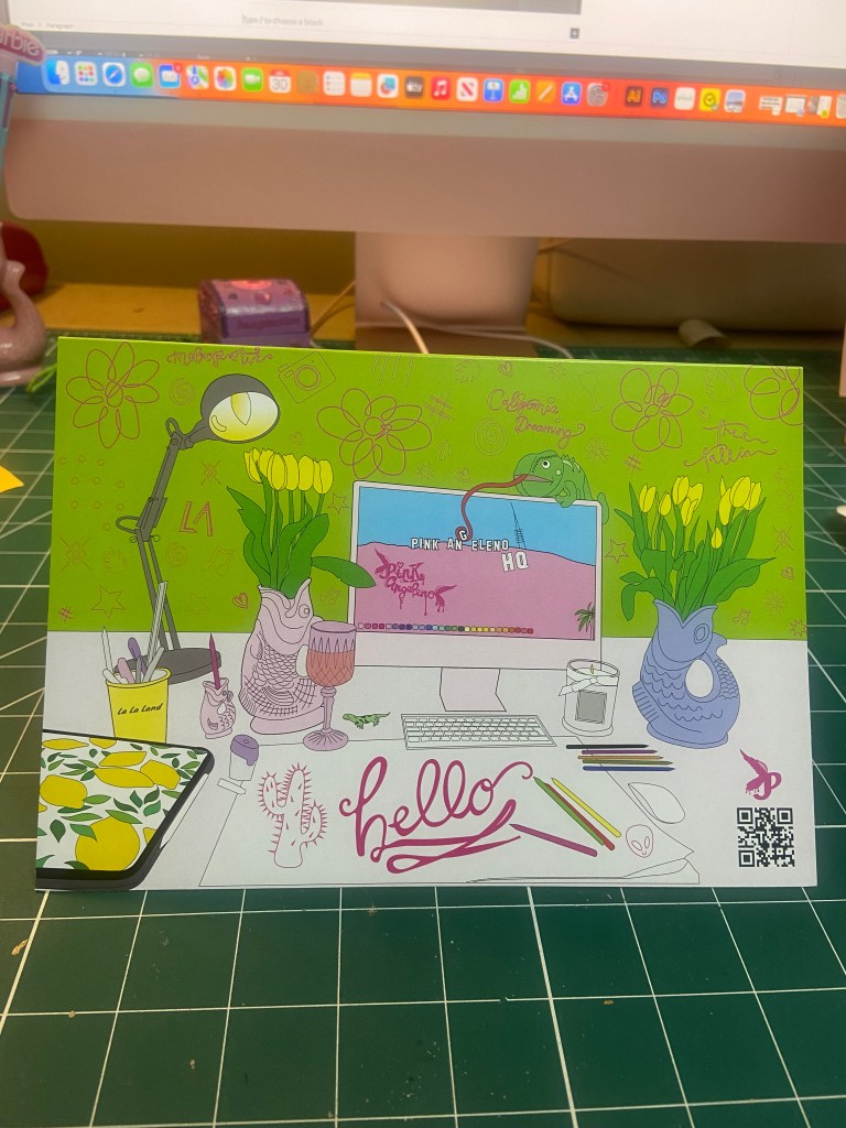
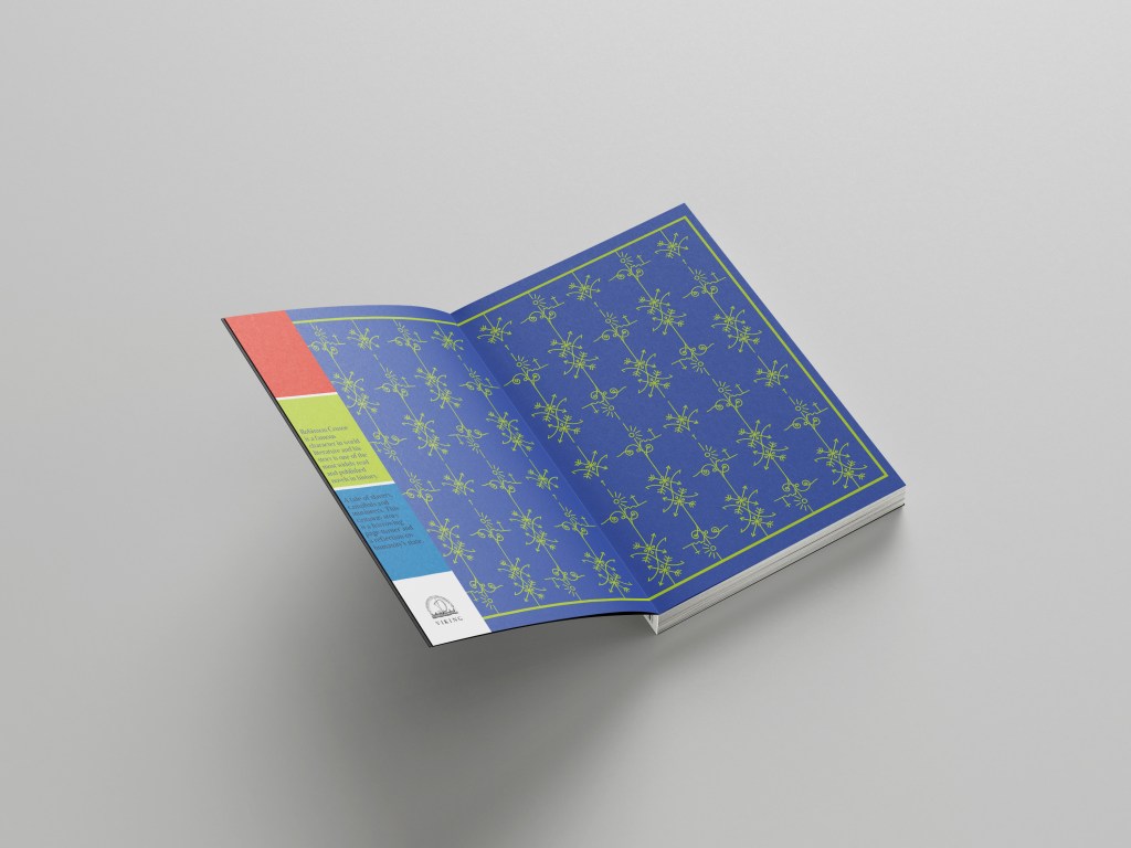
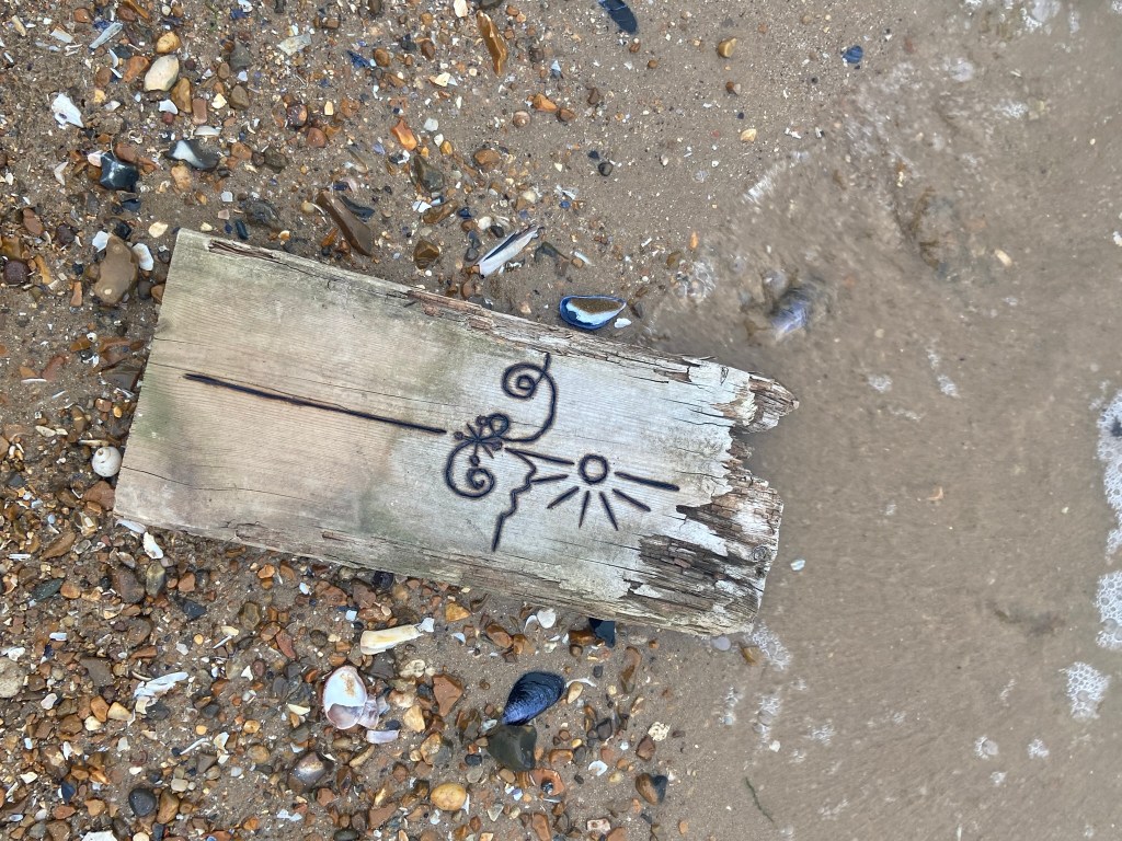
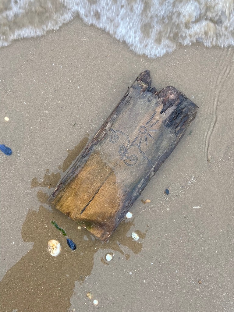
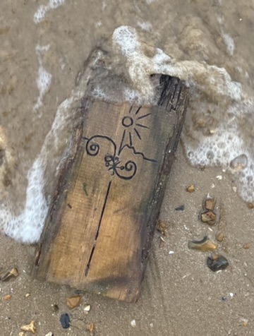
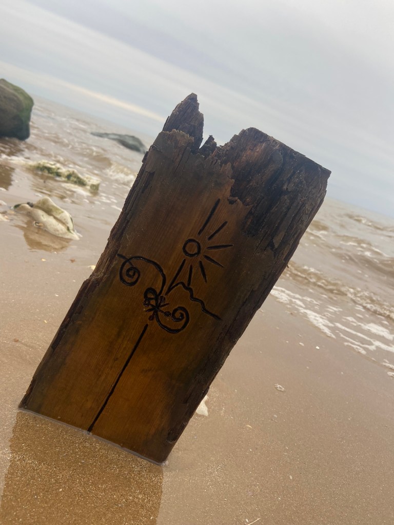
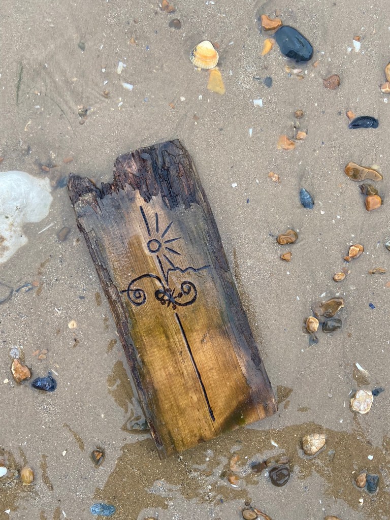
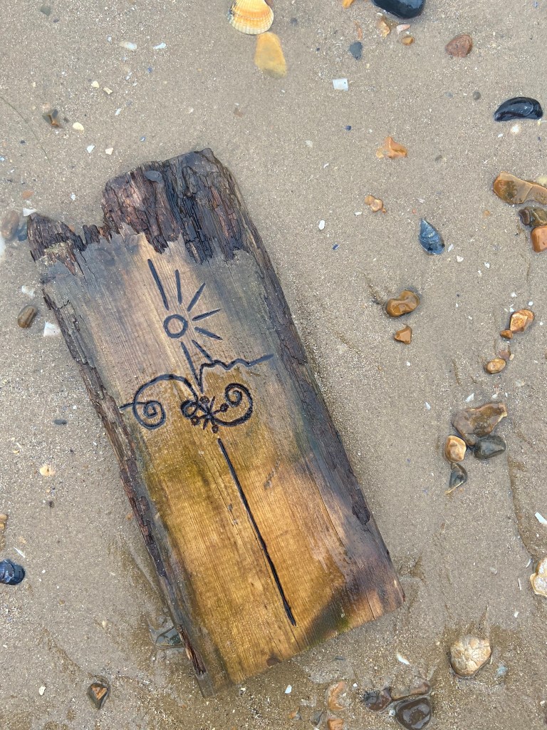
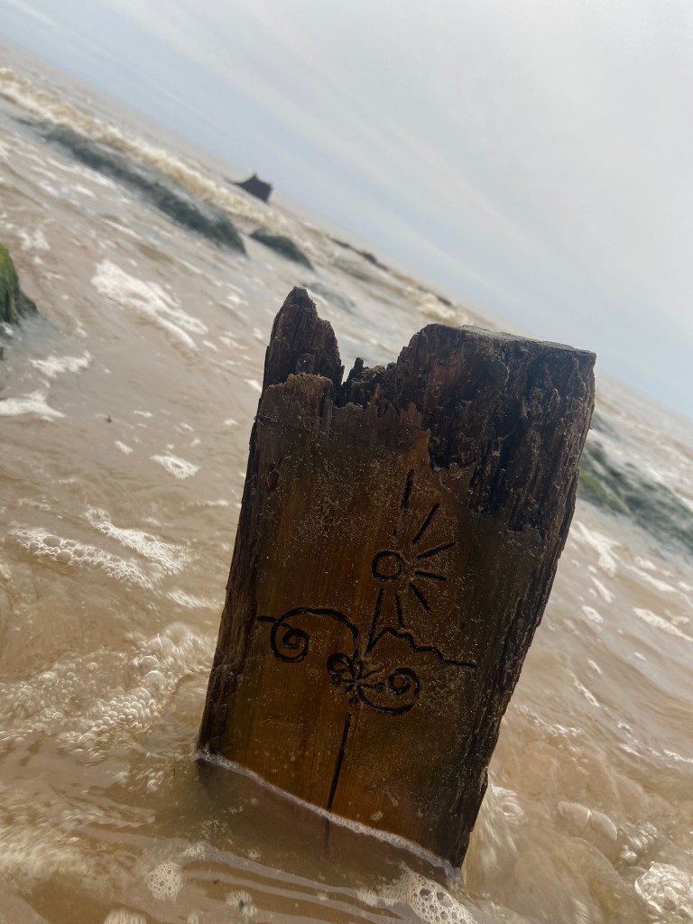
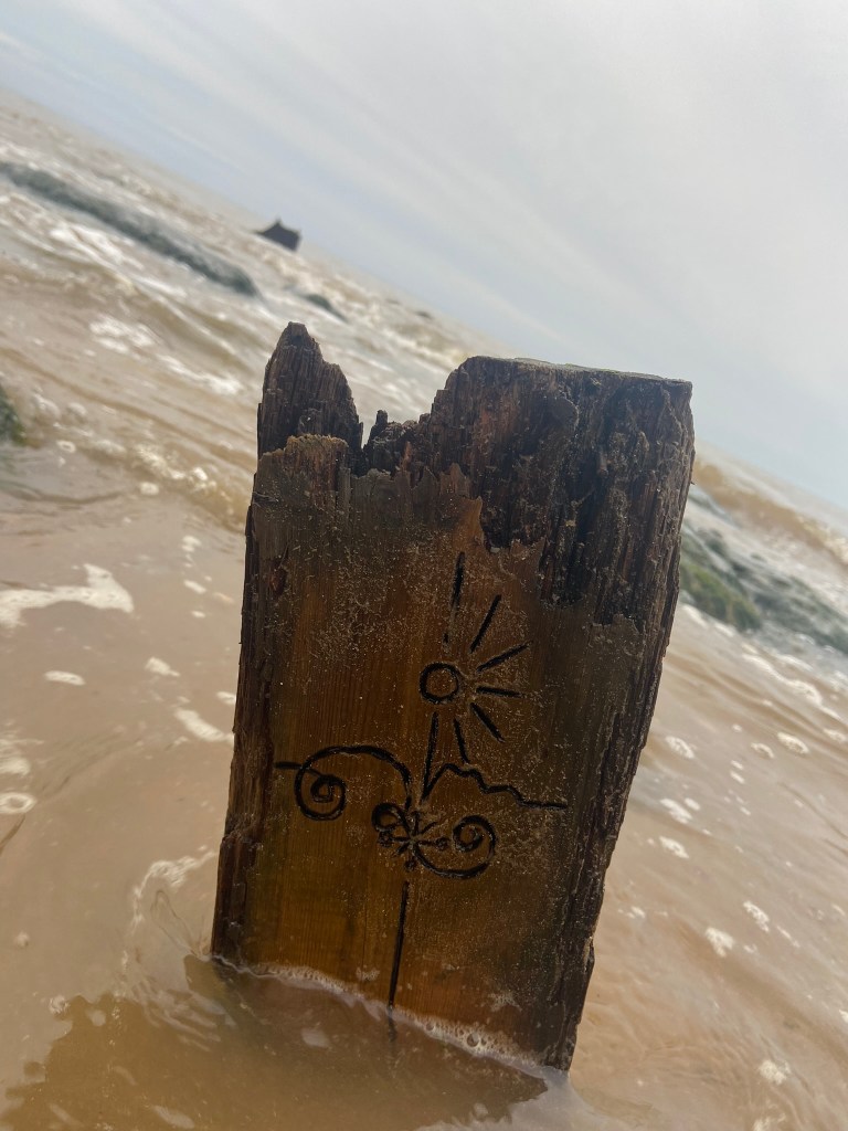
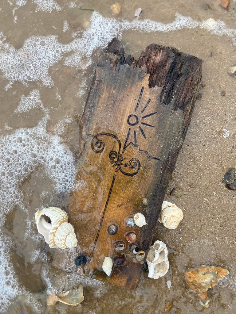
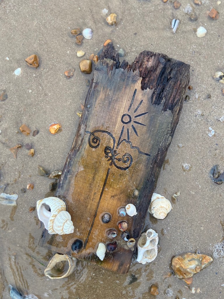
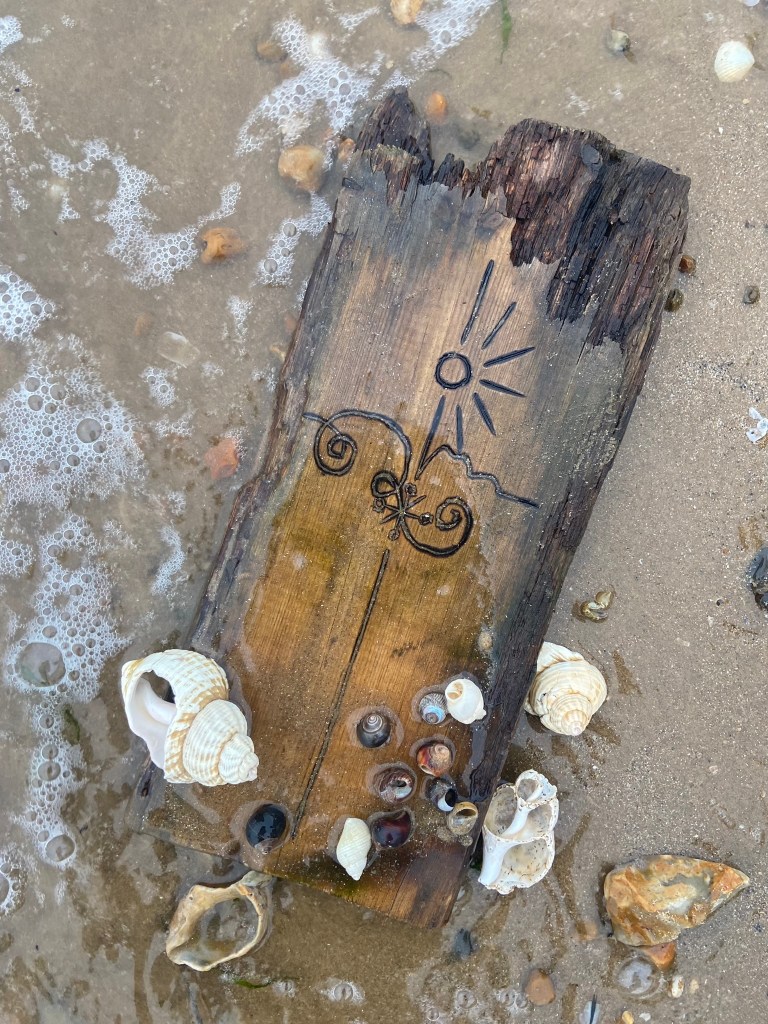
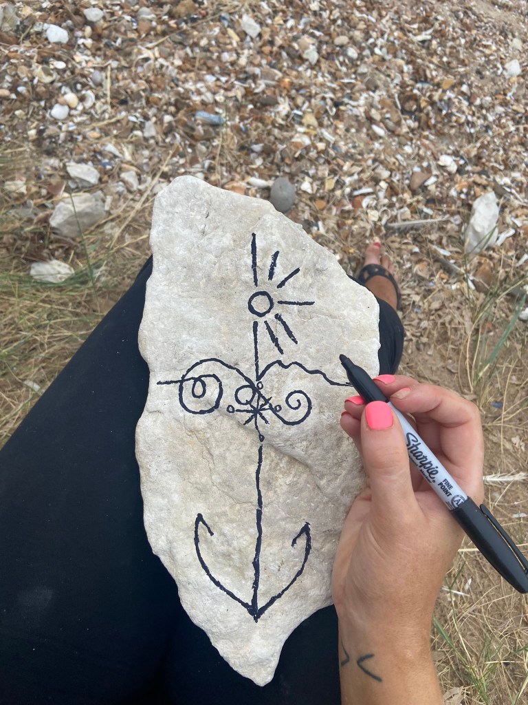
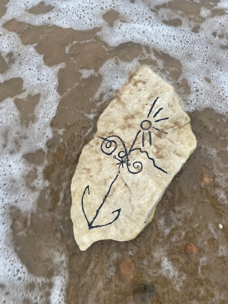
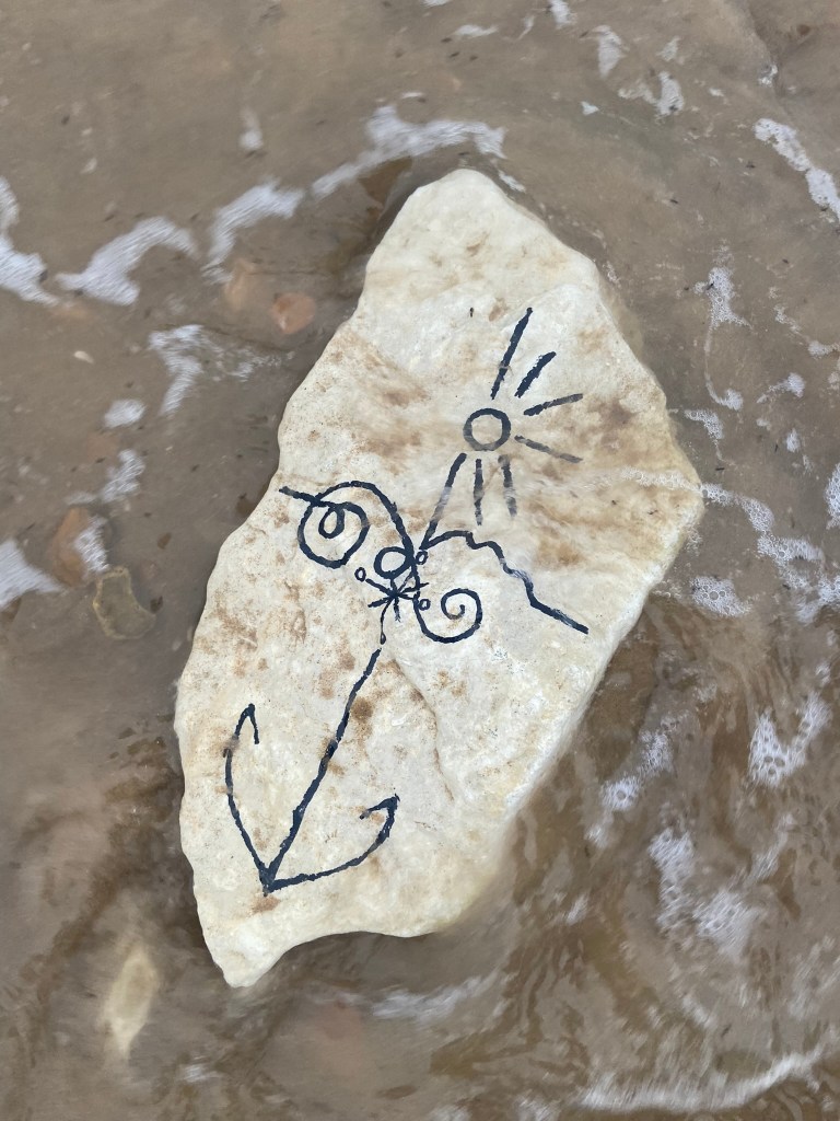
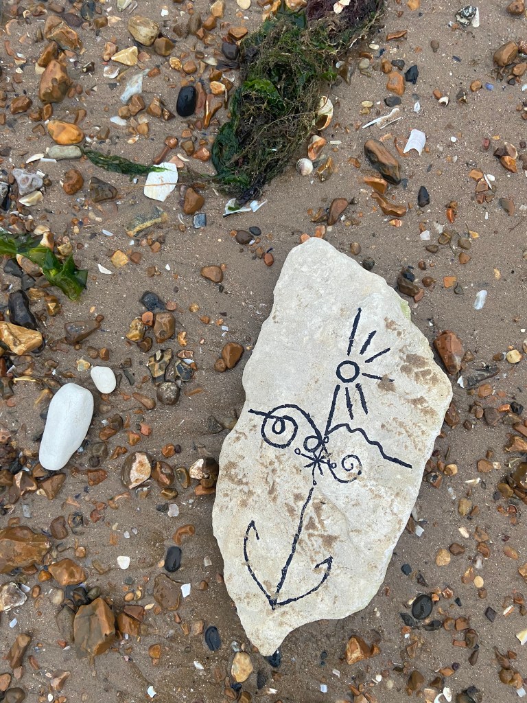
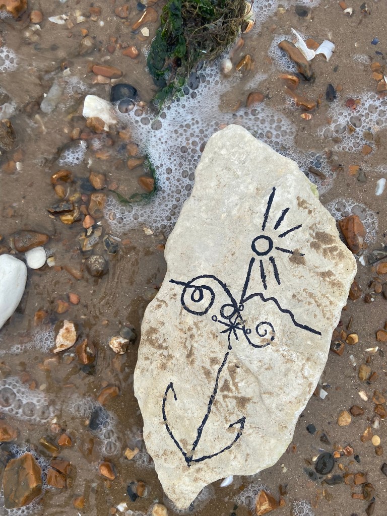
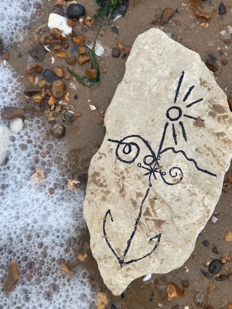
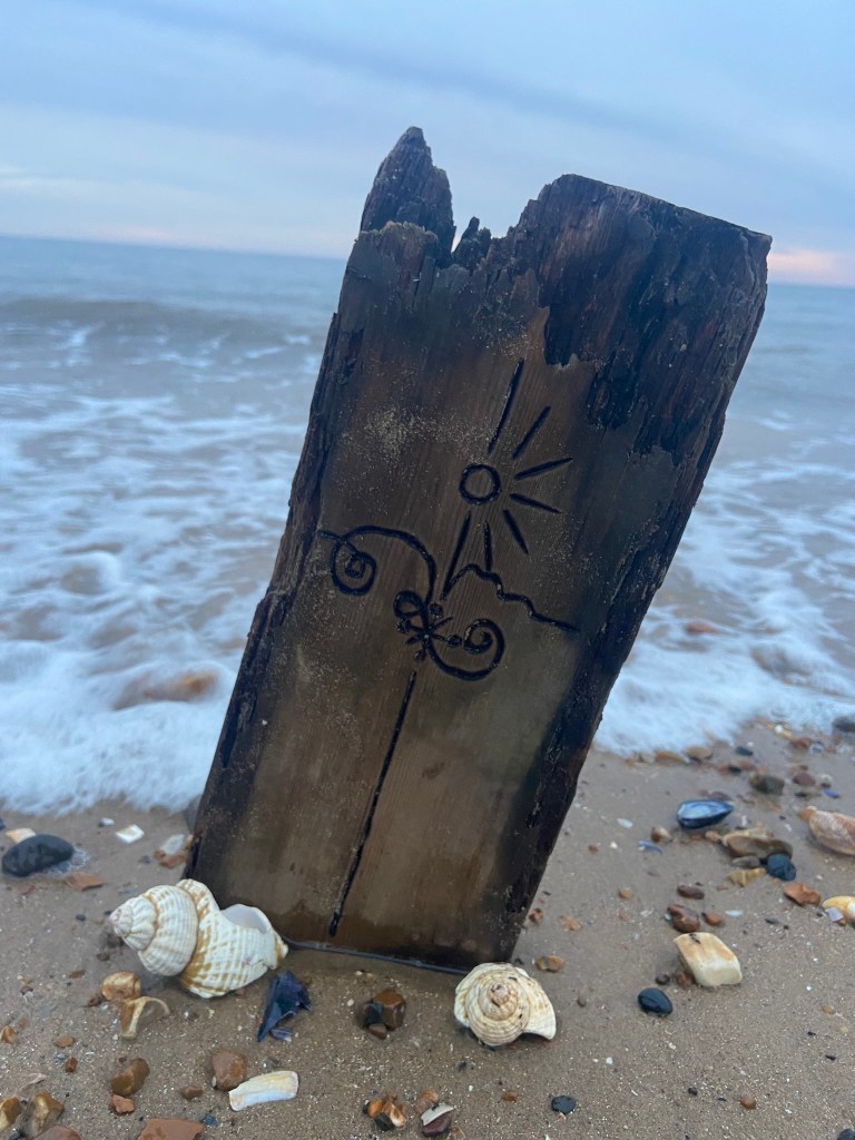
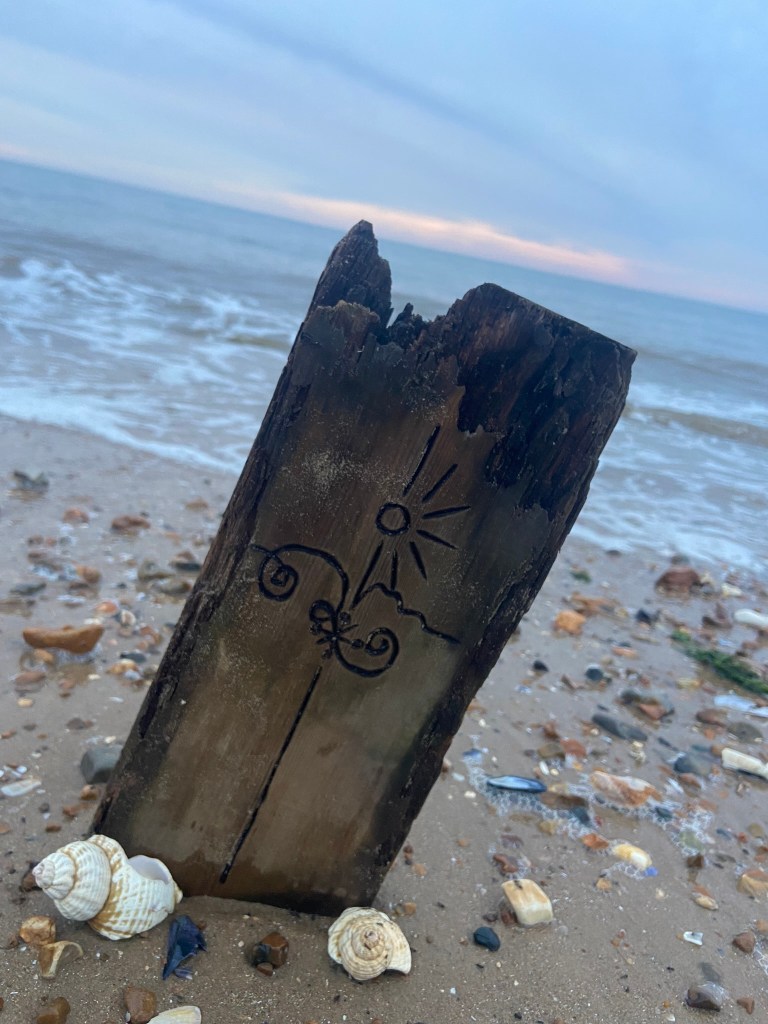
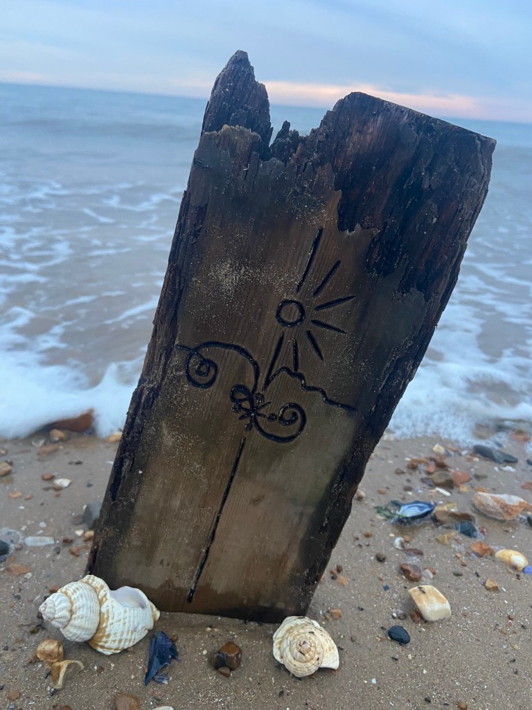
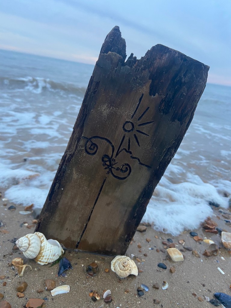
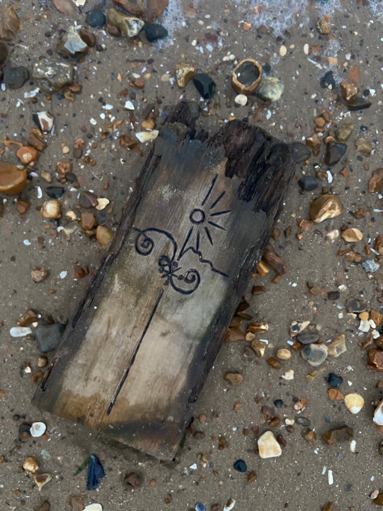
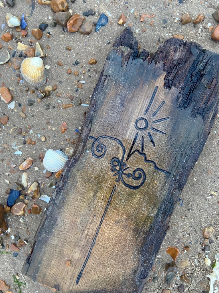
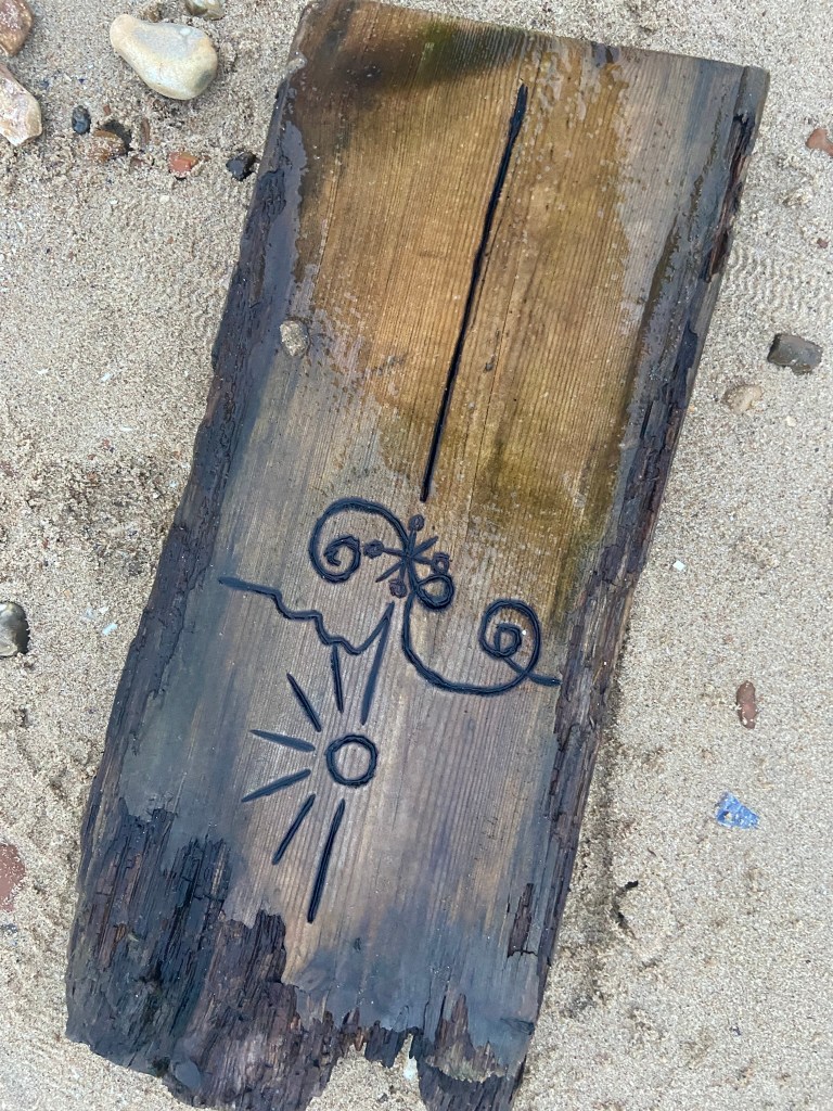
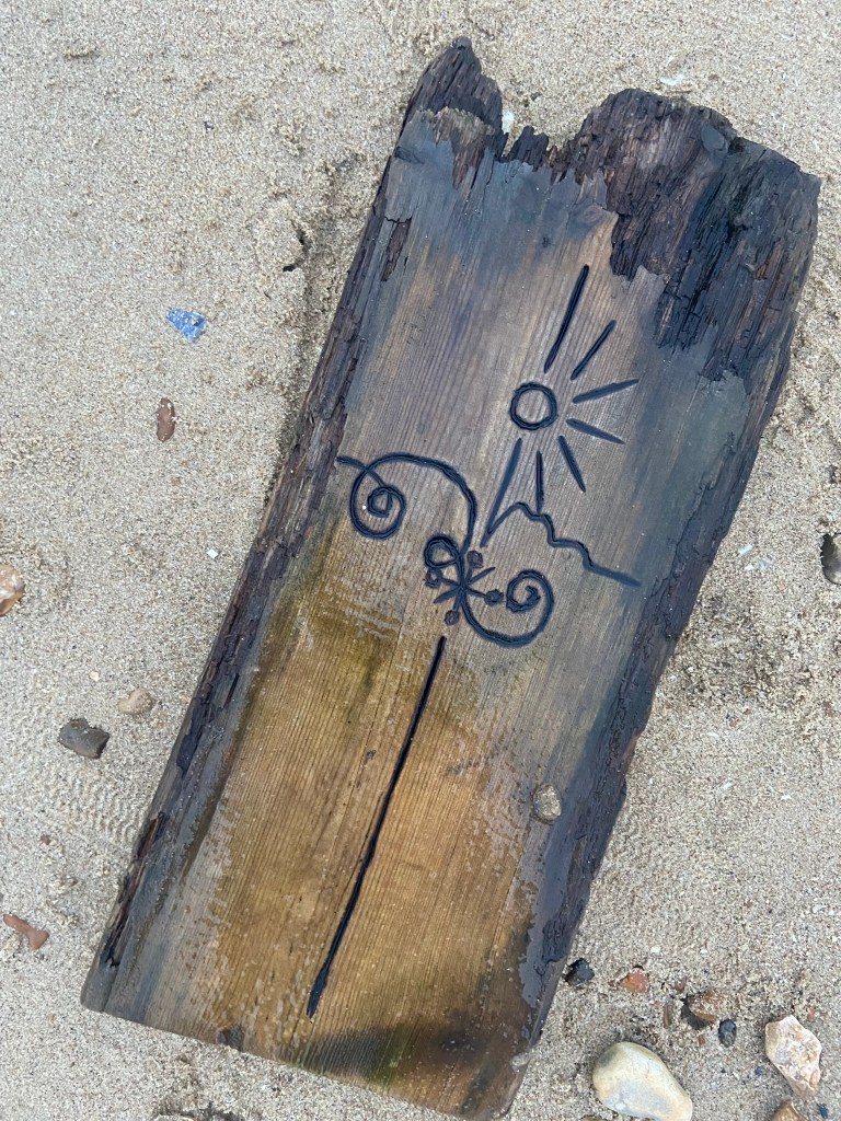
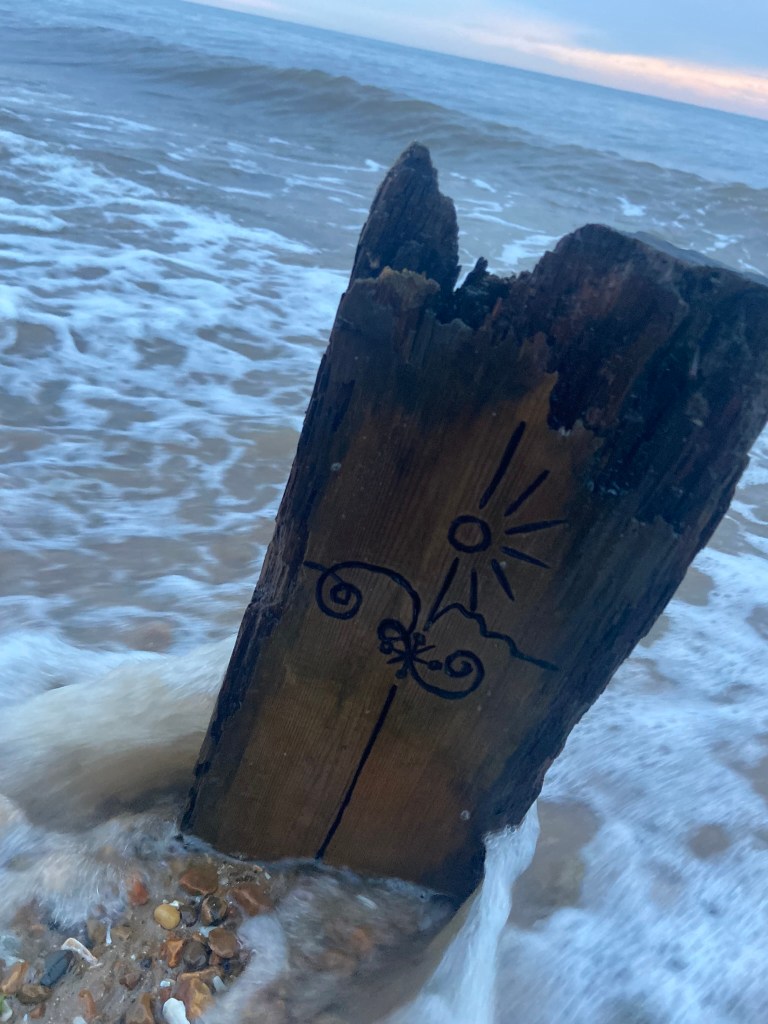
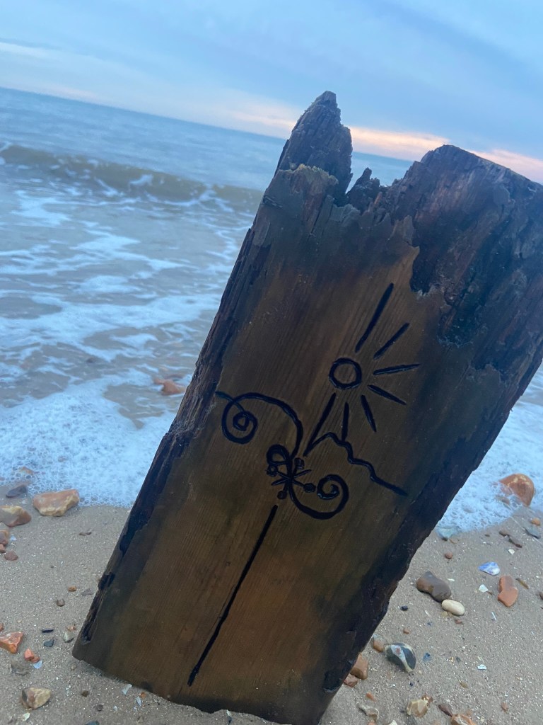
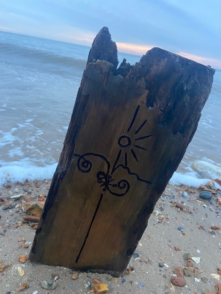
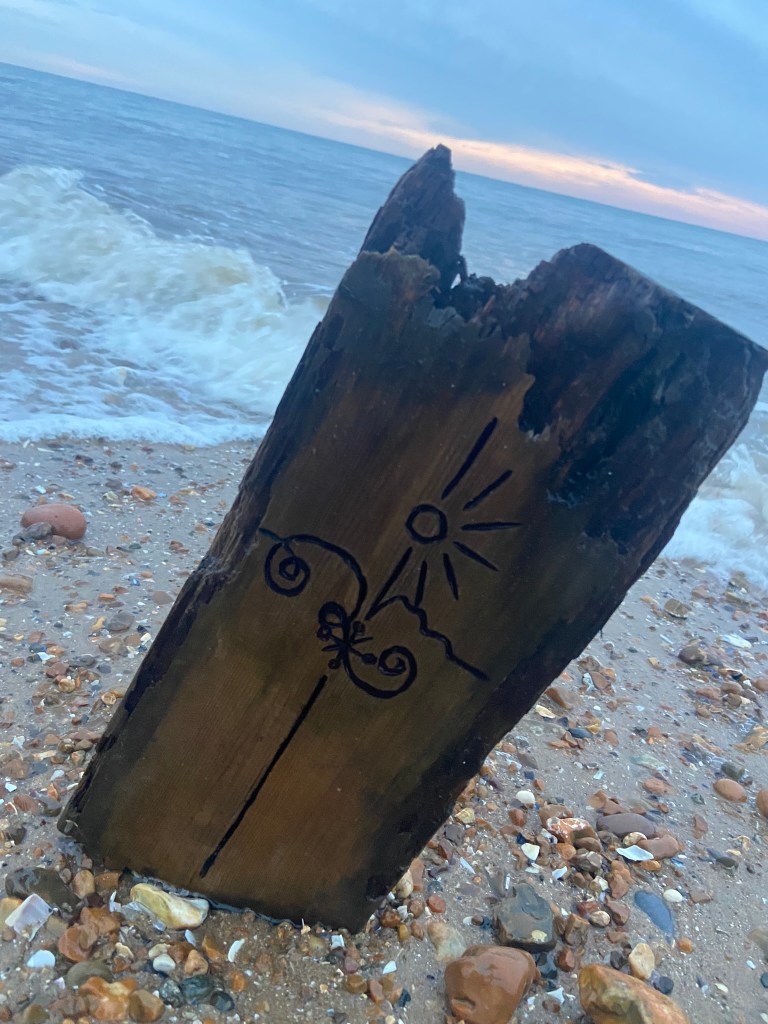
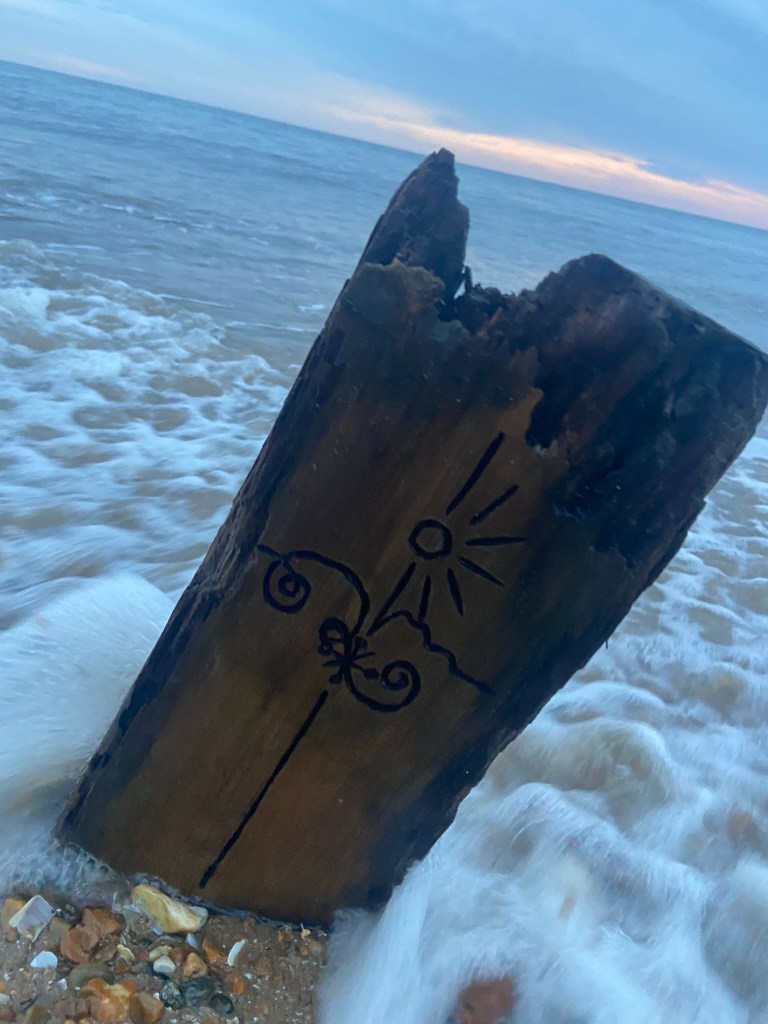
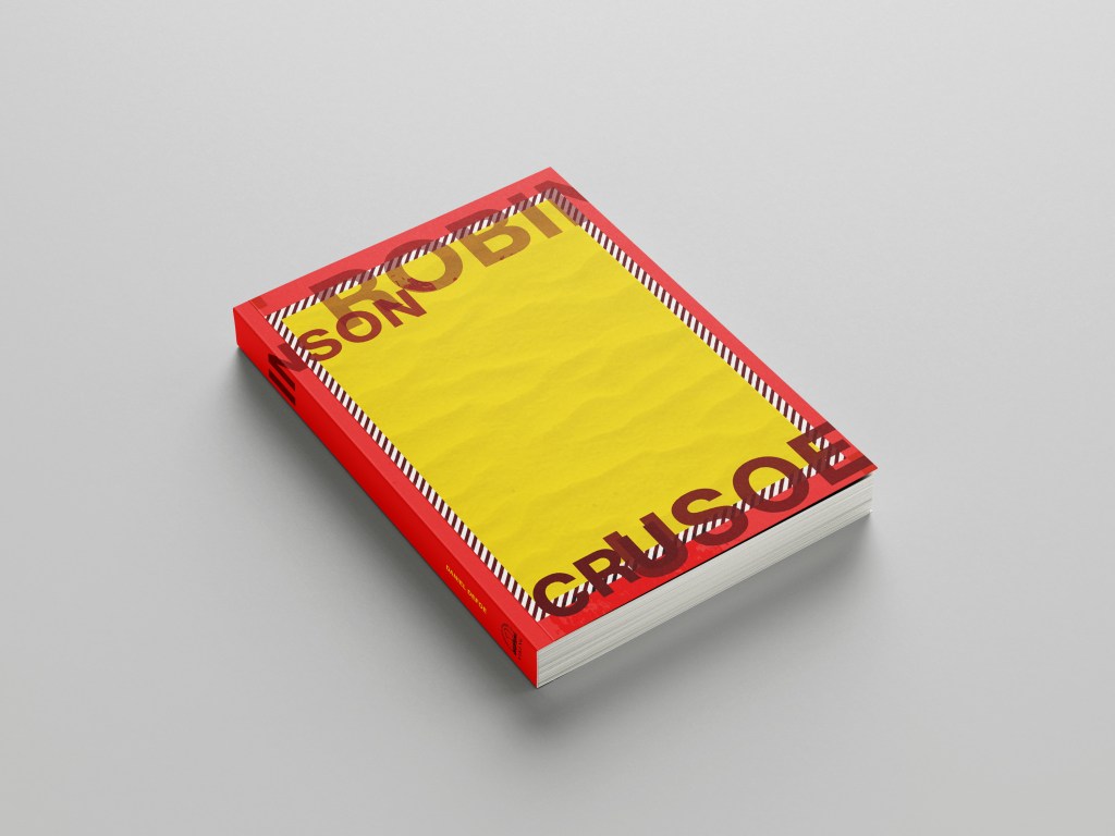
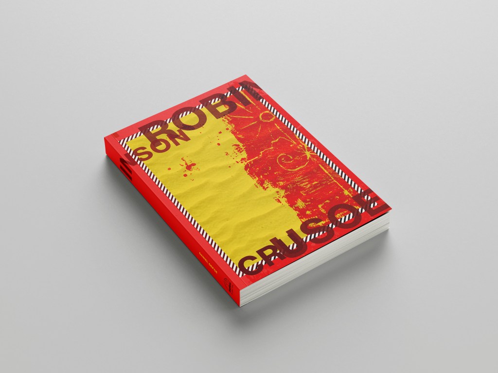
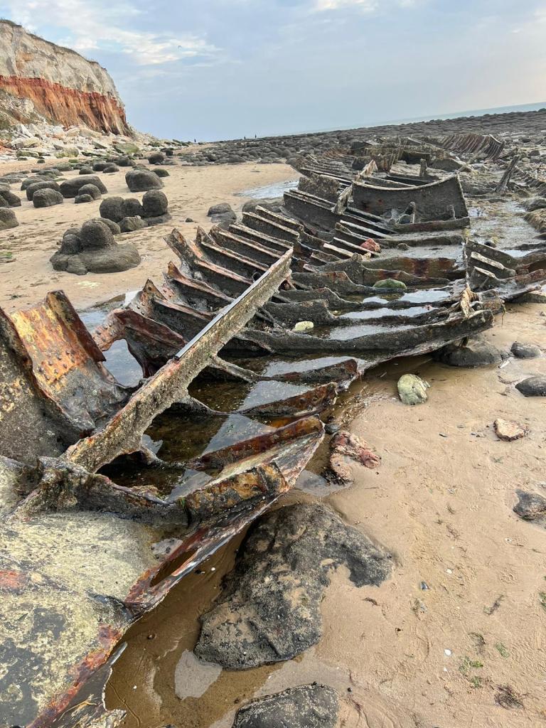
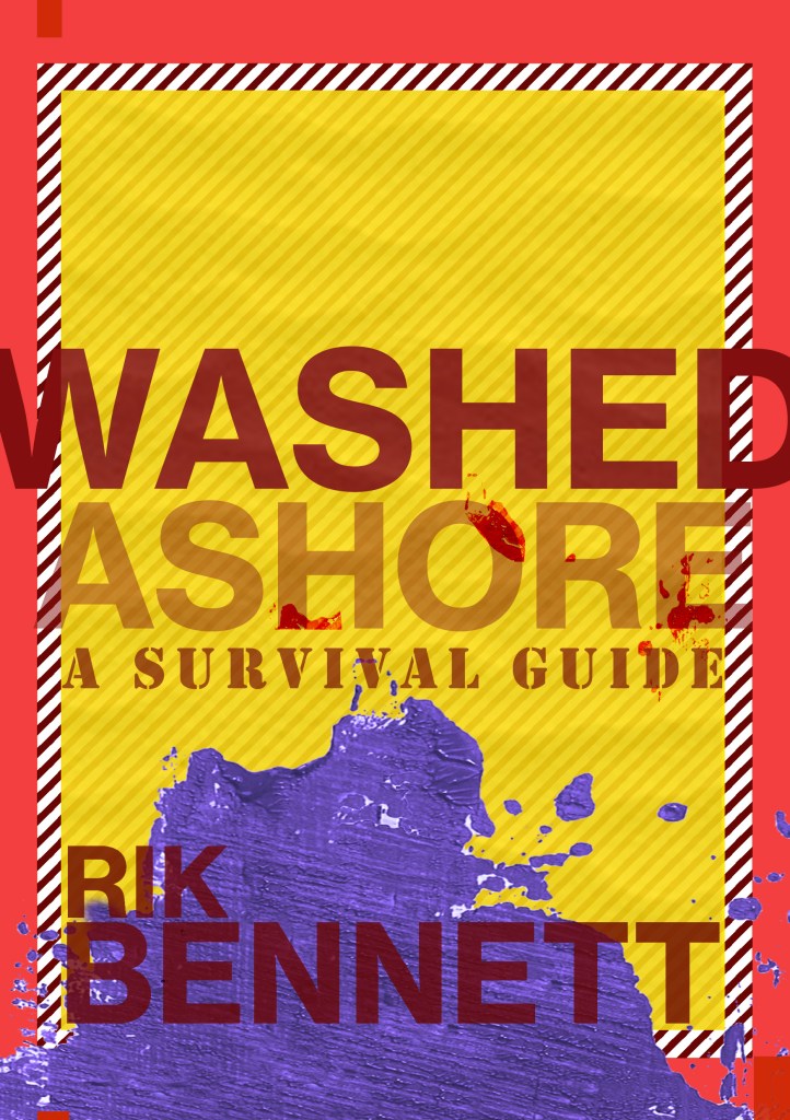
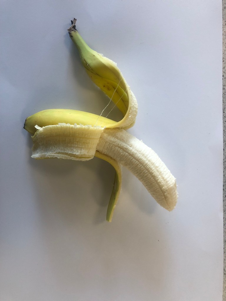
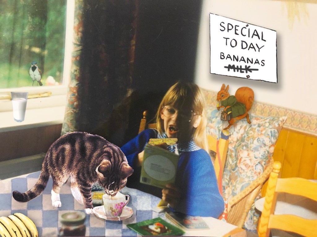
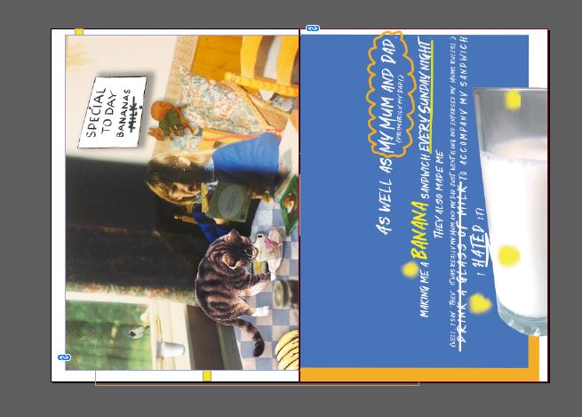
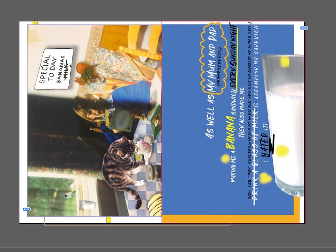
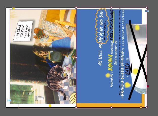
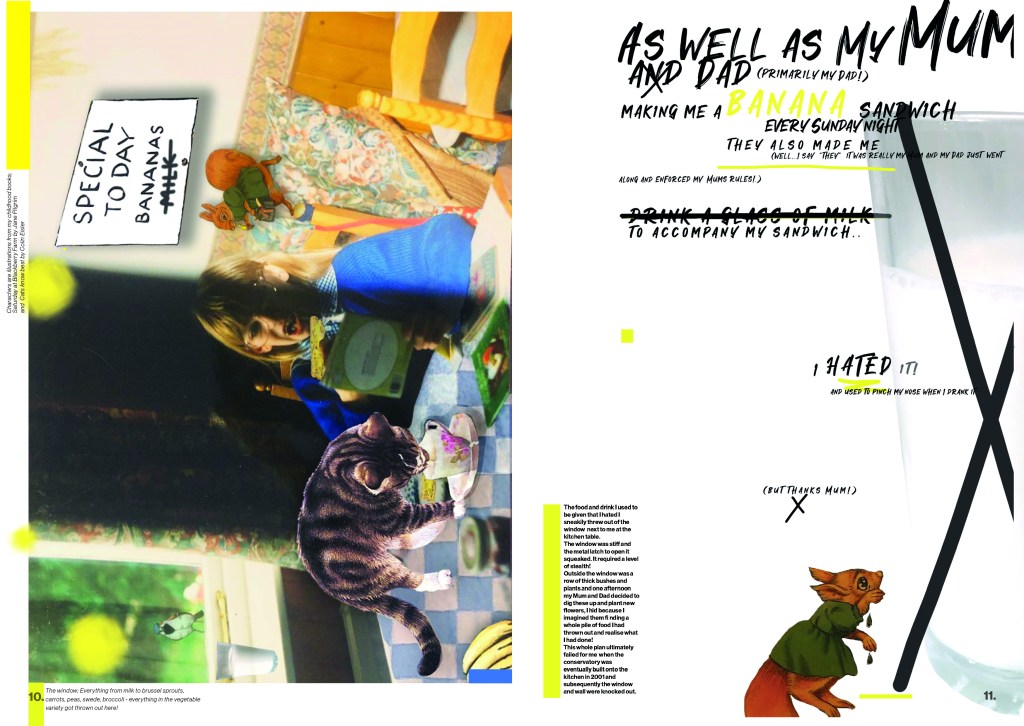
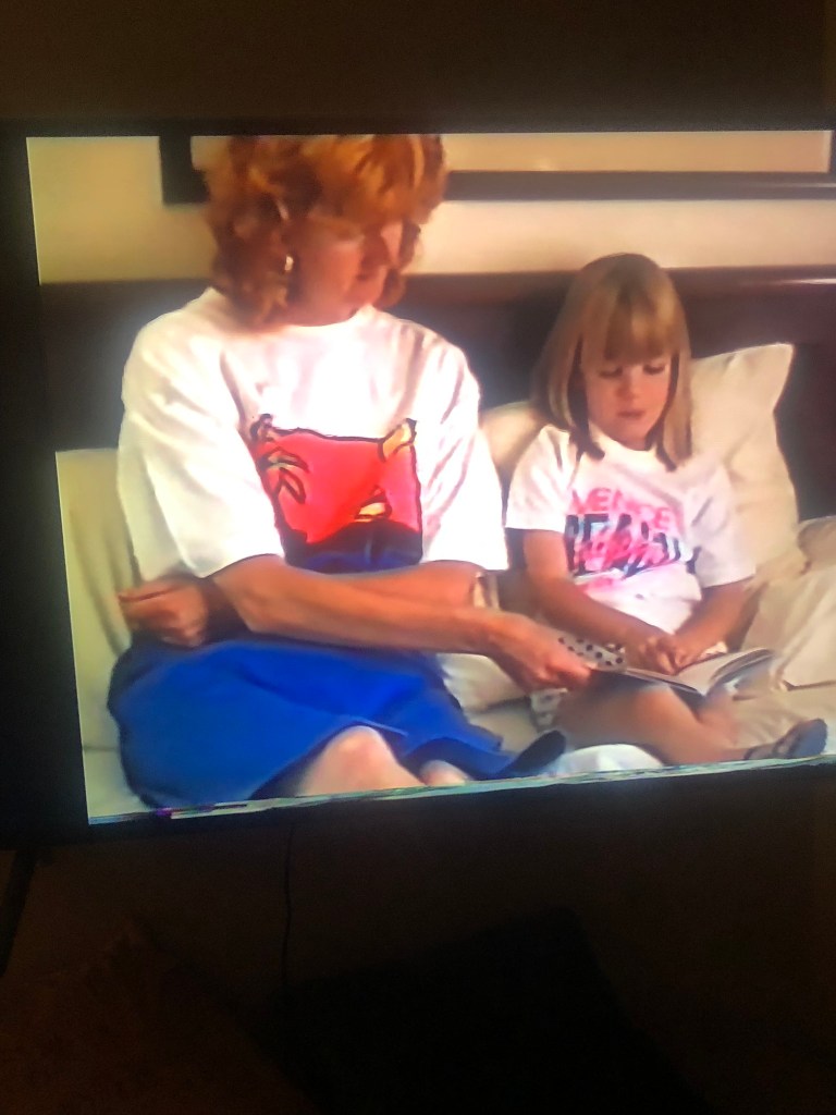
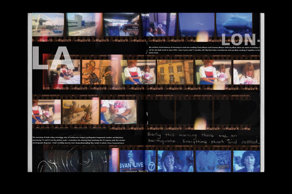
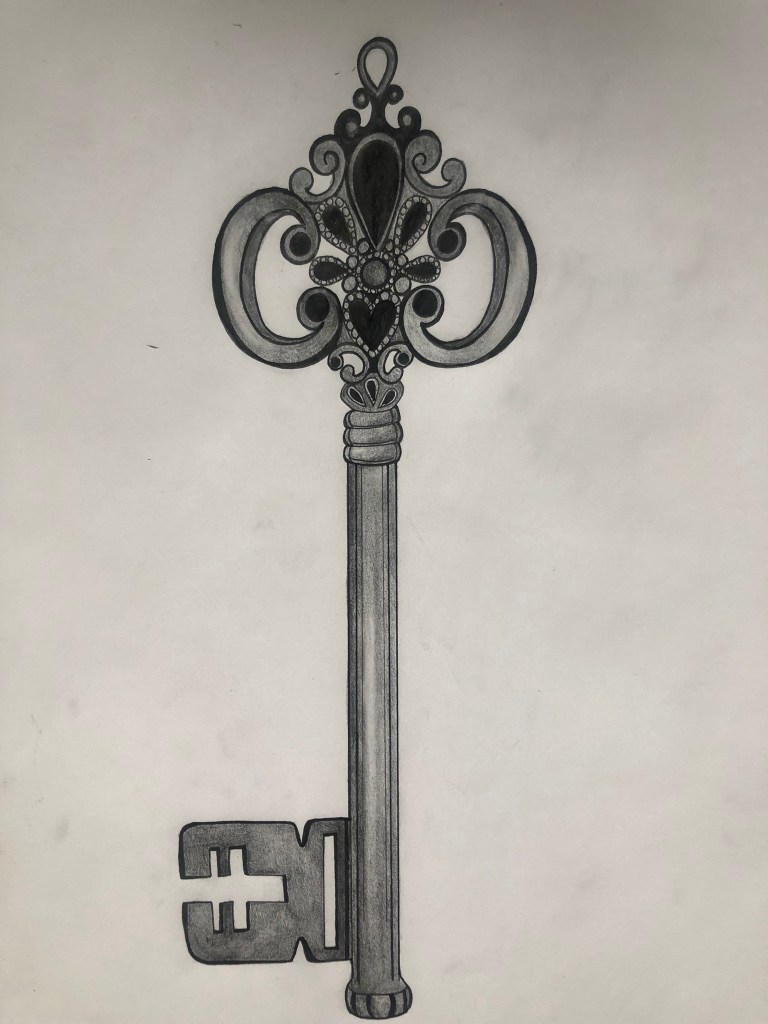
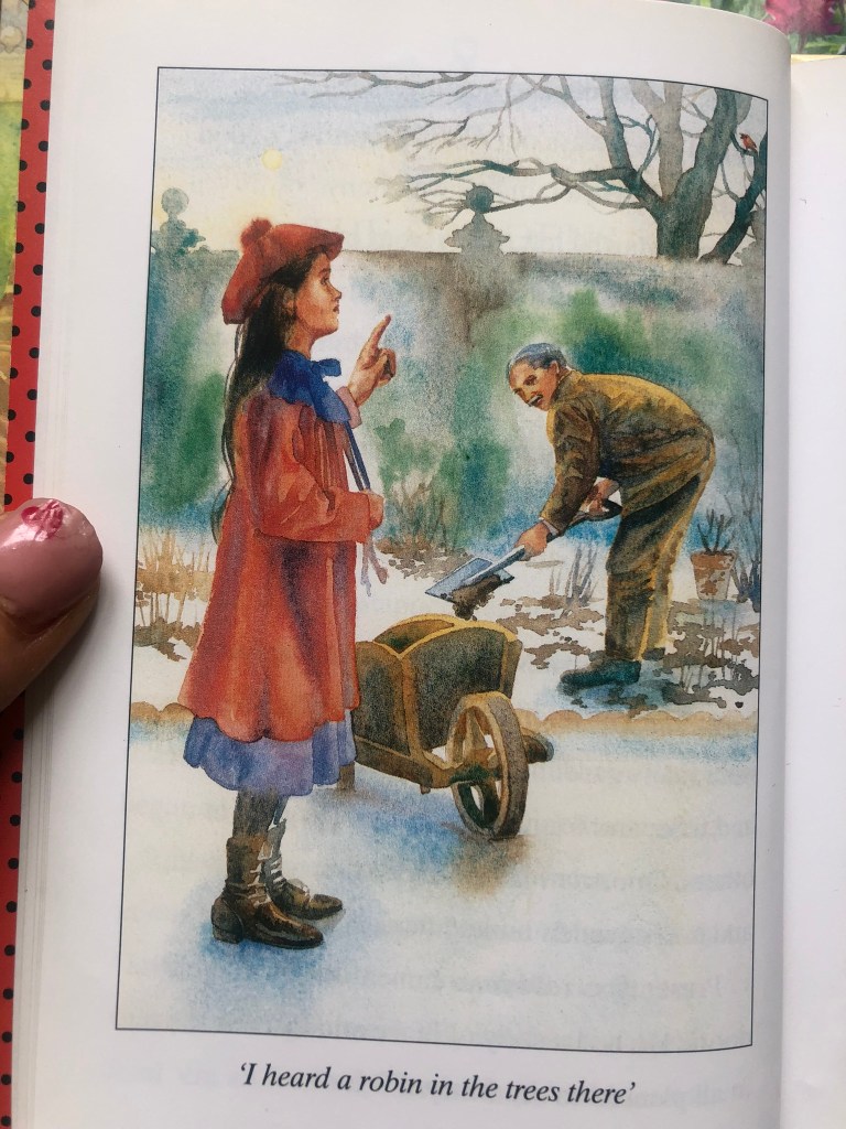
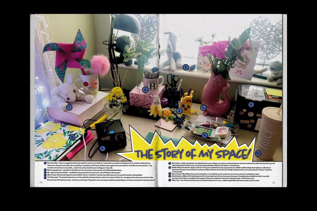
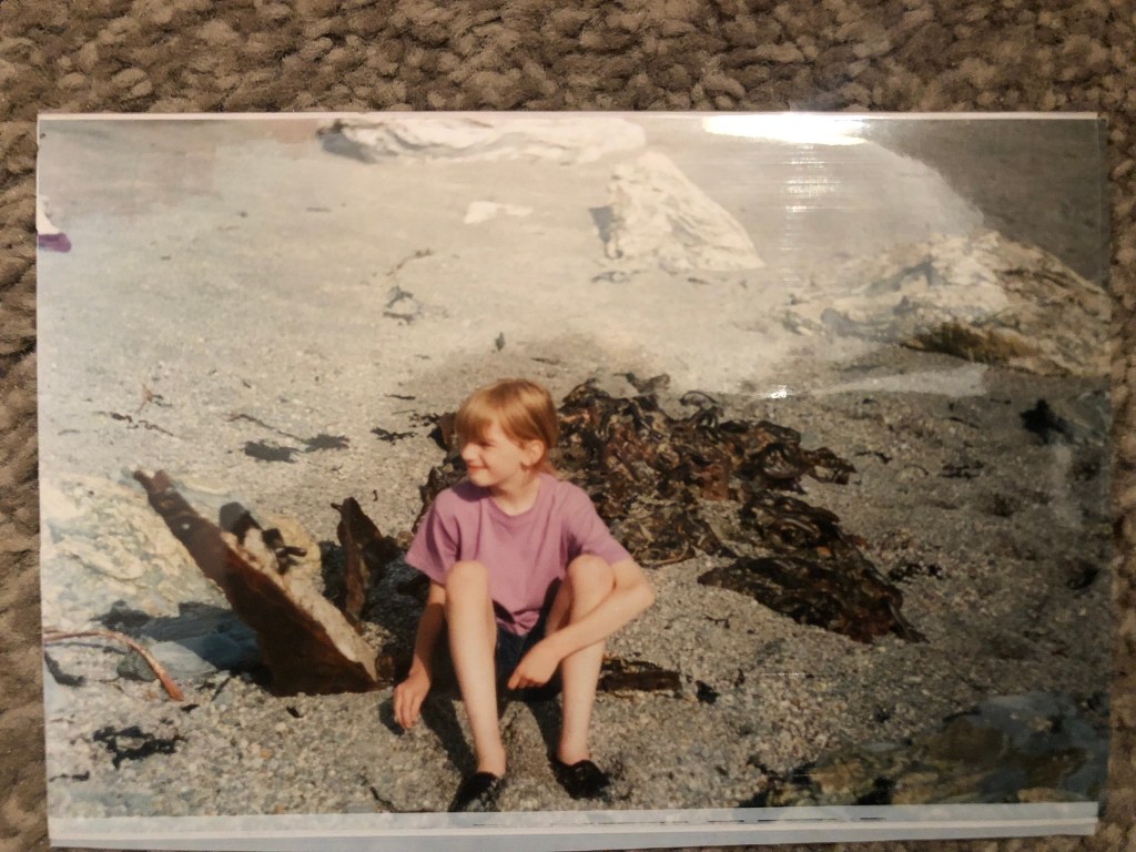
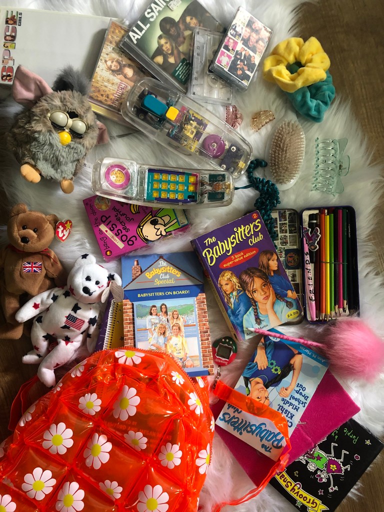
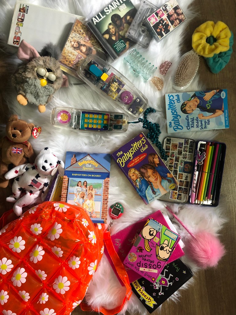
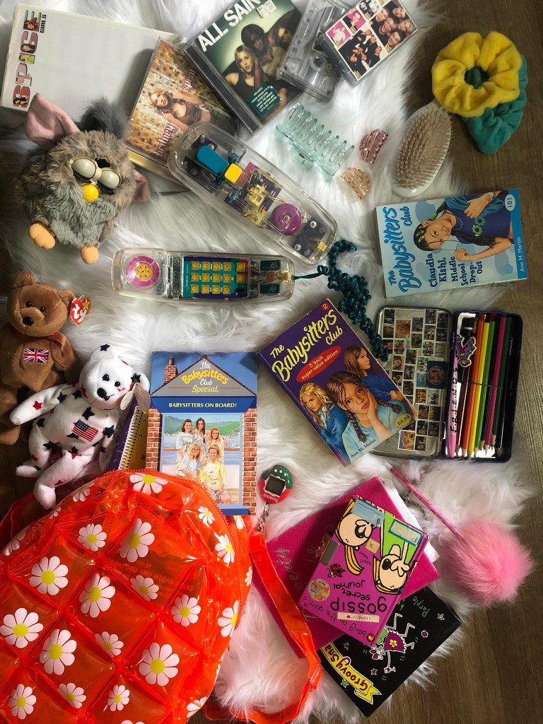
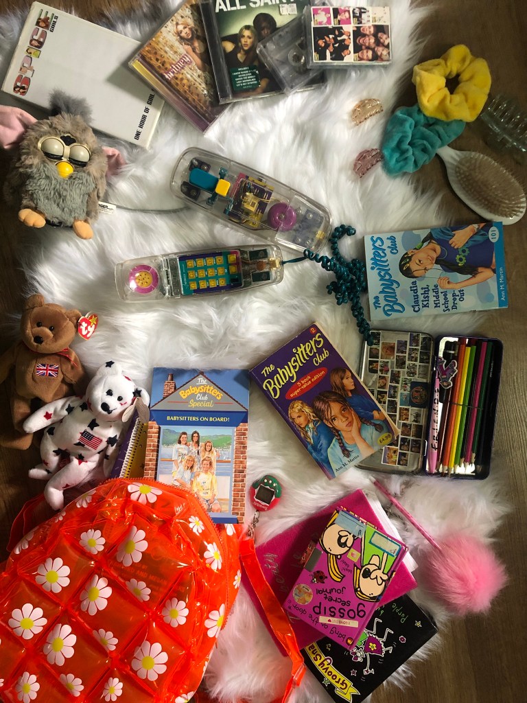
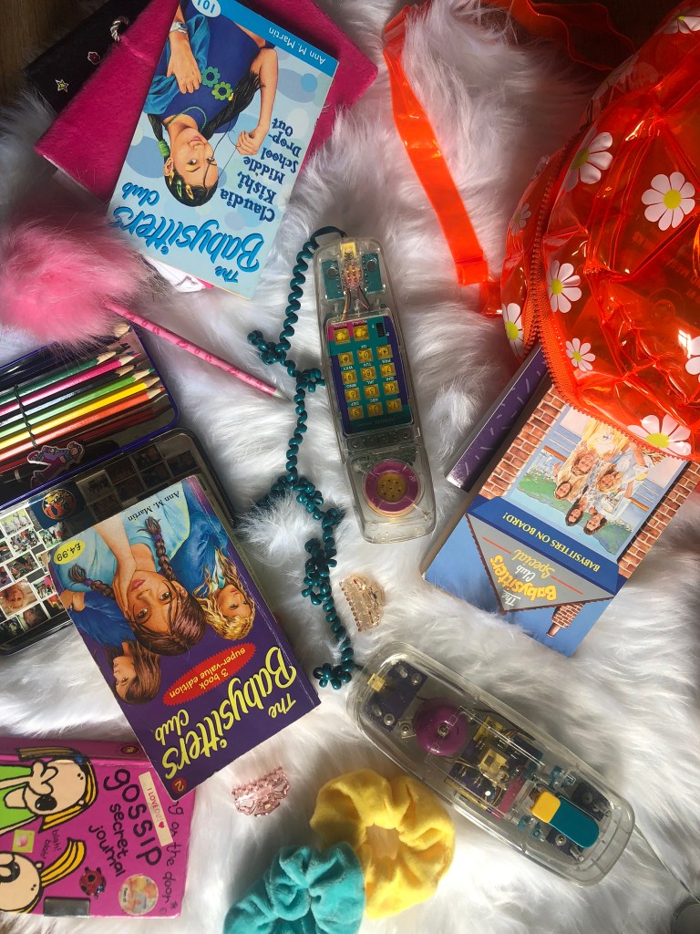
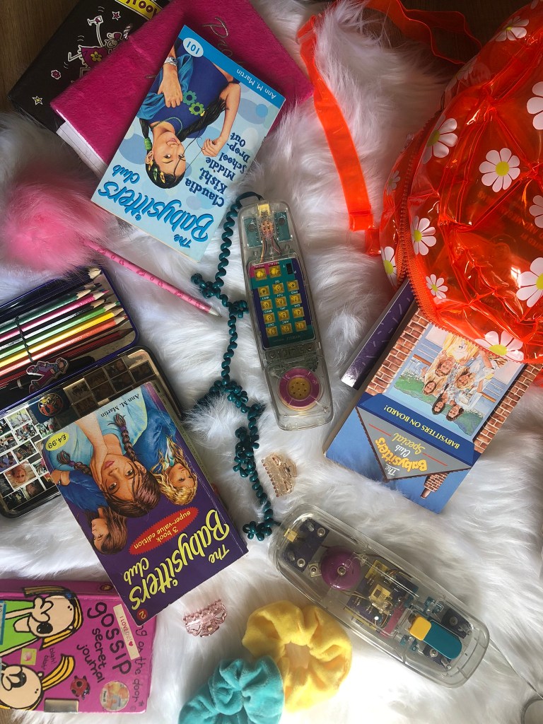
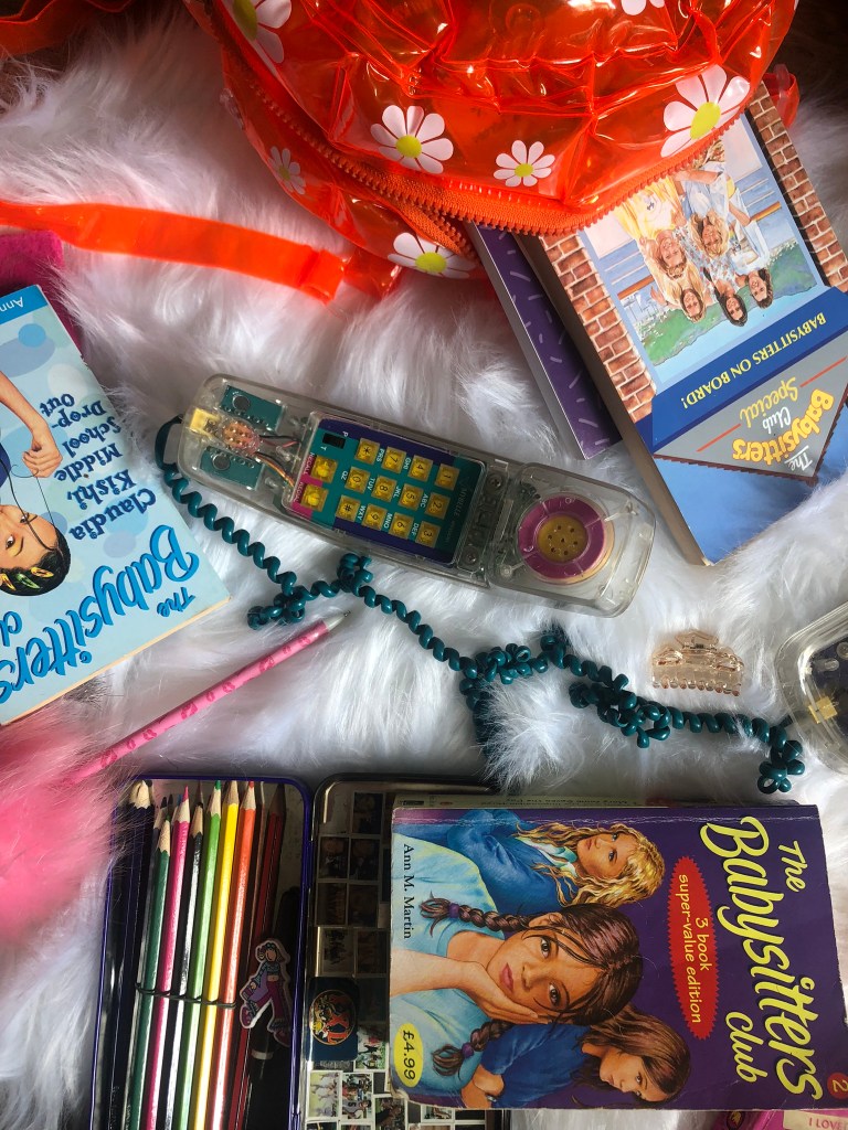
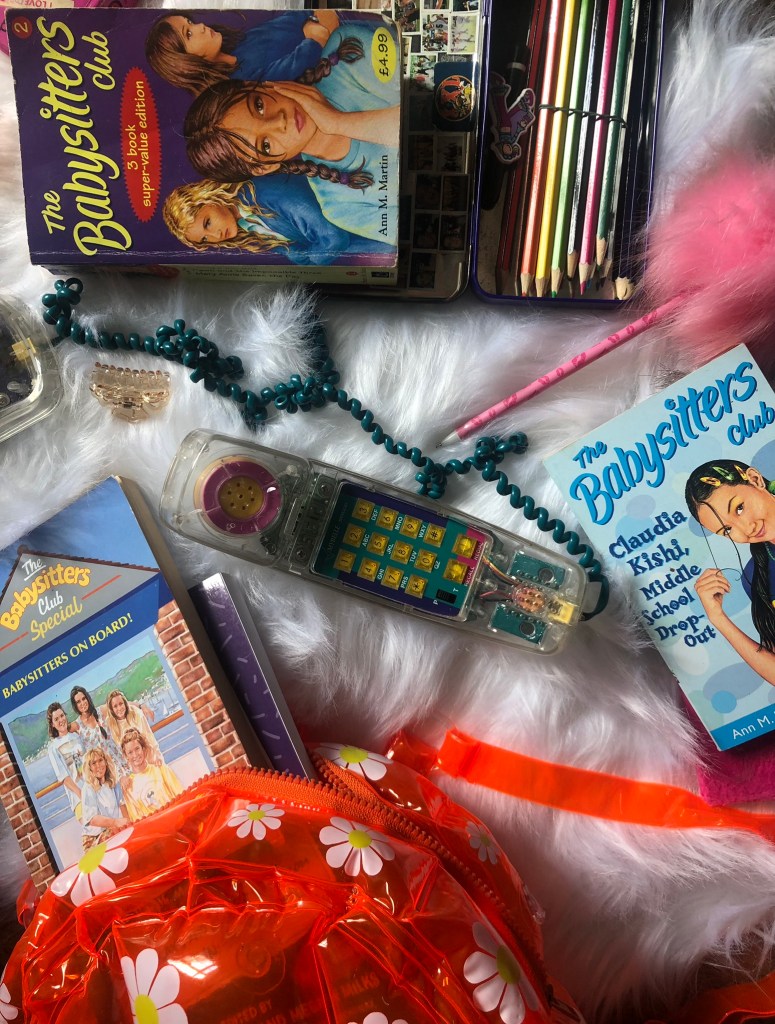
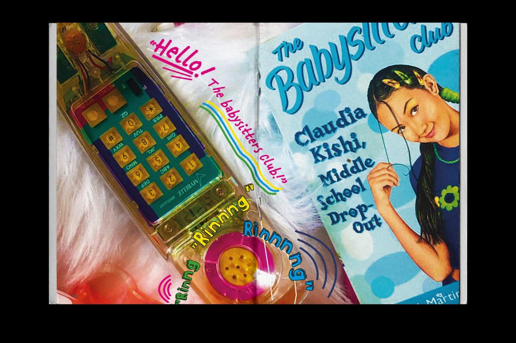
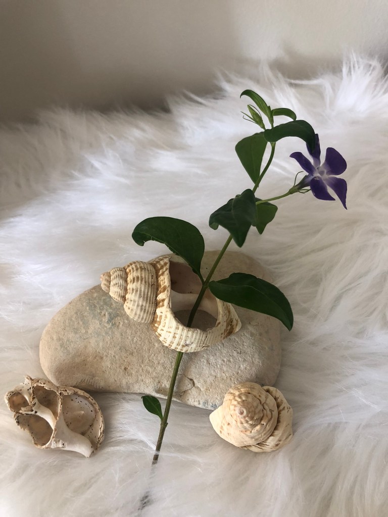
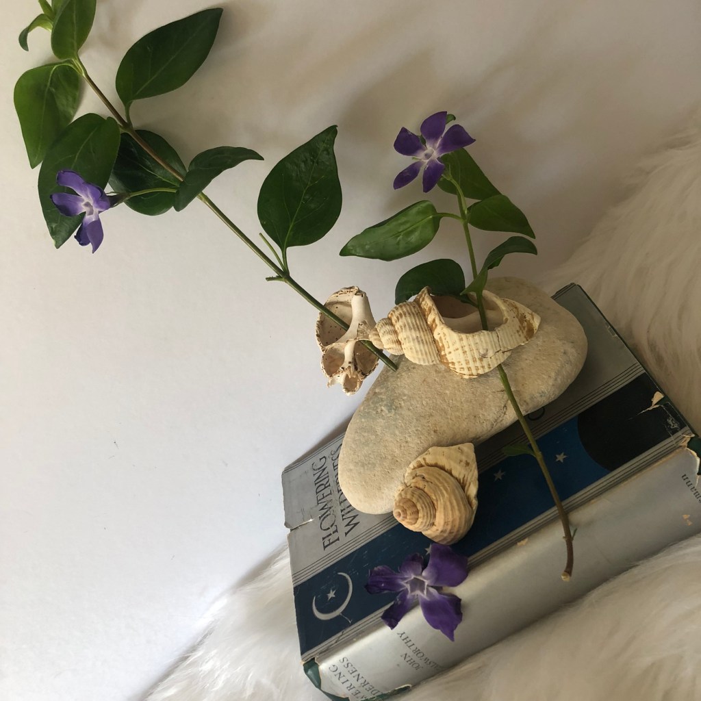
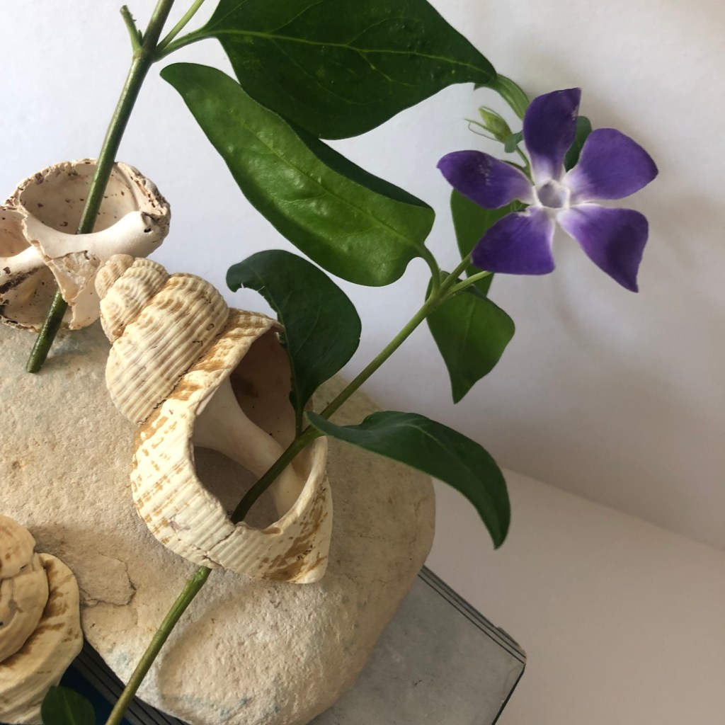
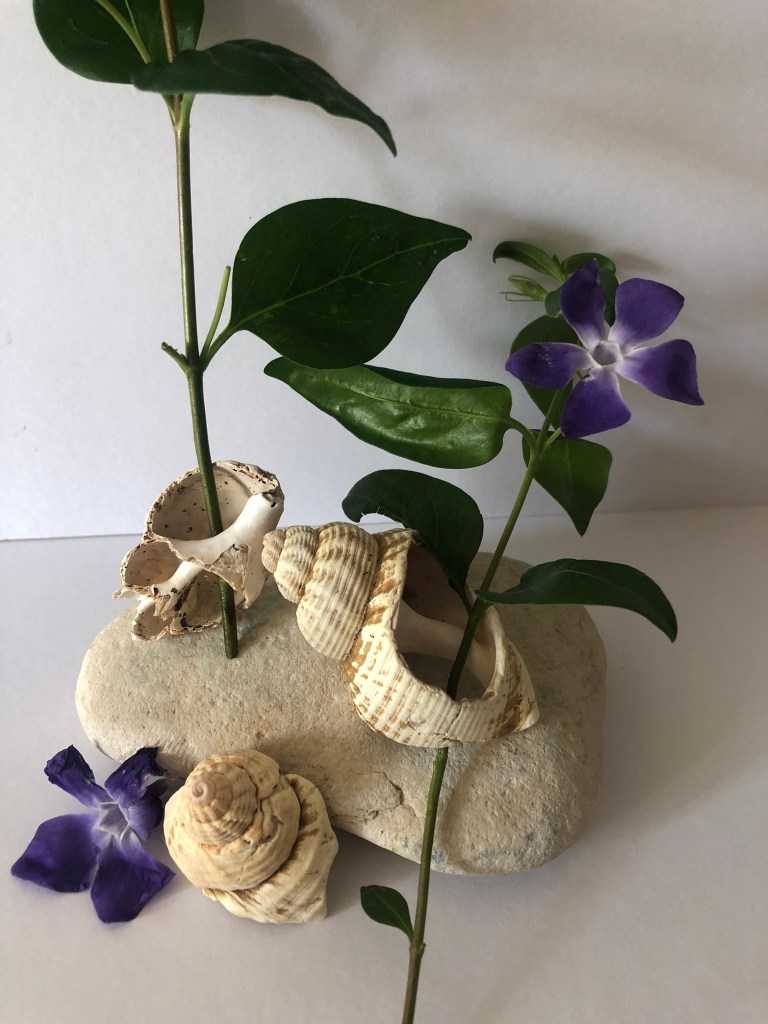
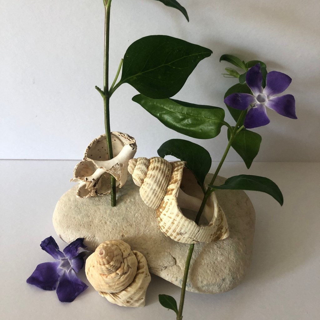
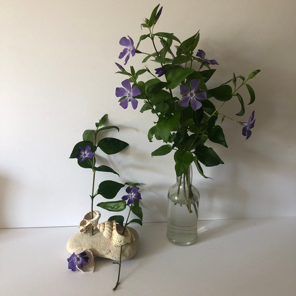
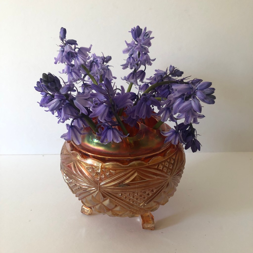
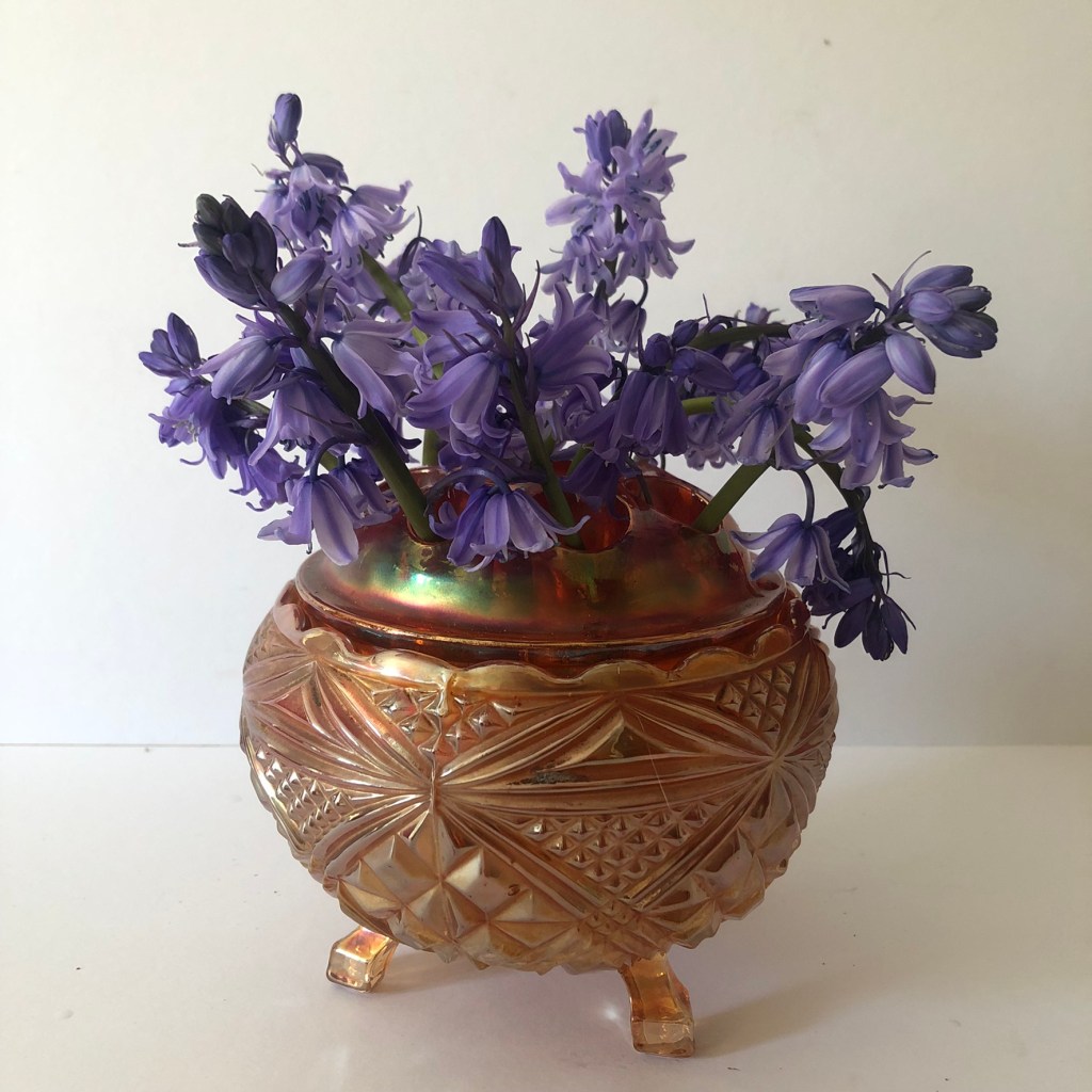
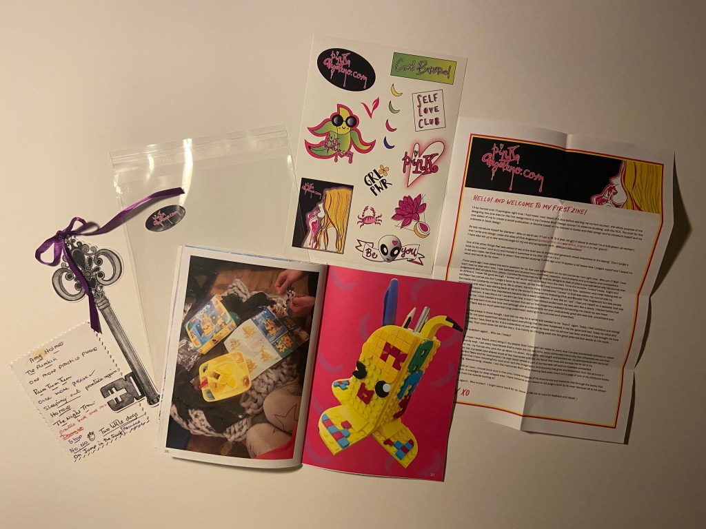
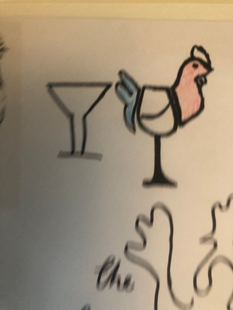
I sometimes on my social media post a photo of my desk space with the caption “Greetings from Pink Angeleno HQ” SO I decided to move forwards with this idea. I had the idea to illustrate my working space on the front of the card. I then had the idea to make the card have a design on the front and the inside and allow the design from the front to flow on the inside of the card. How I imagined this was to have my Mac on my desk space have a wallpaper which would then continue onto the inside. The wallpaper I had in mind was the Hollywood sign and then on the inside of the card I would illustrate more of the Hollywood Hills from a photograph I actually took whilst I was hiking the Hollywood Hills and include some little illustrations around the outside of other things in LA that I liked which would sum up my interests and why I called Pink Angeleno “Pink Angeleno”.
I also explored the idea of pop up cards and more complex designs – I later decided to keep it simple though as this is an introductory, simple brief and I felt it didn’t require the complexity. It would also be easier for the print process being one sided and a simple A5 tent-fold card.
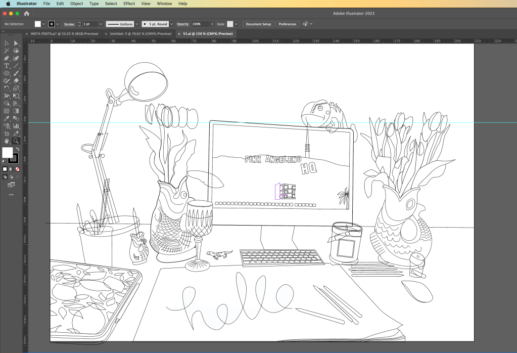
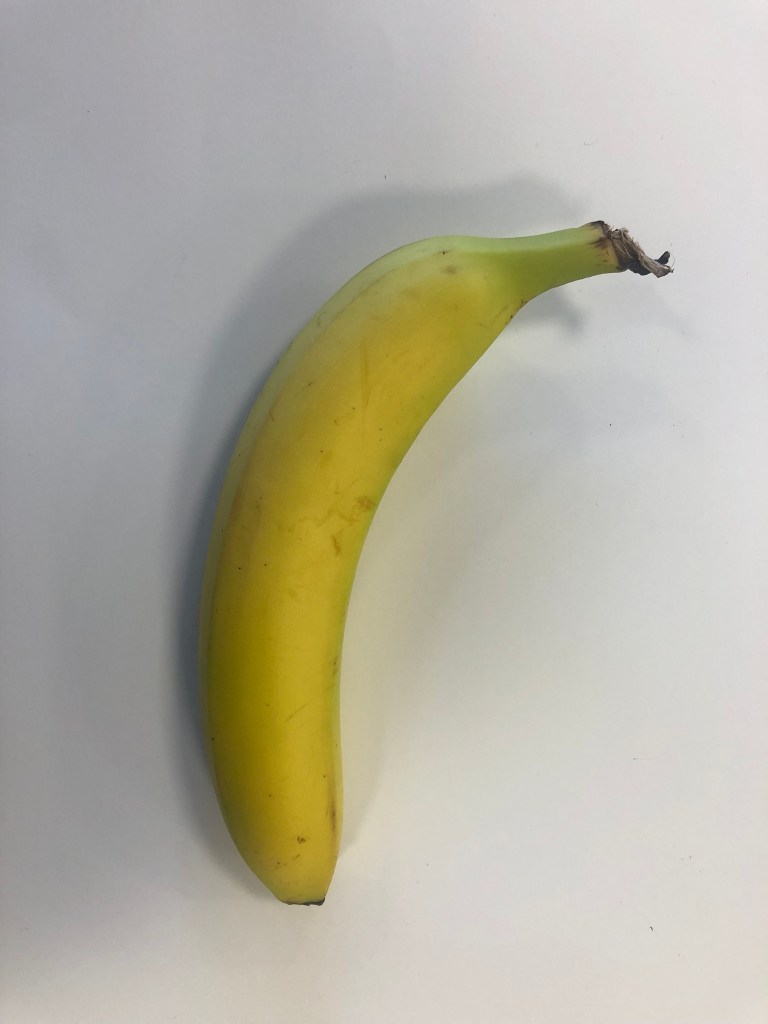
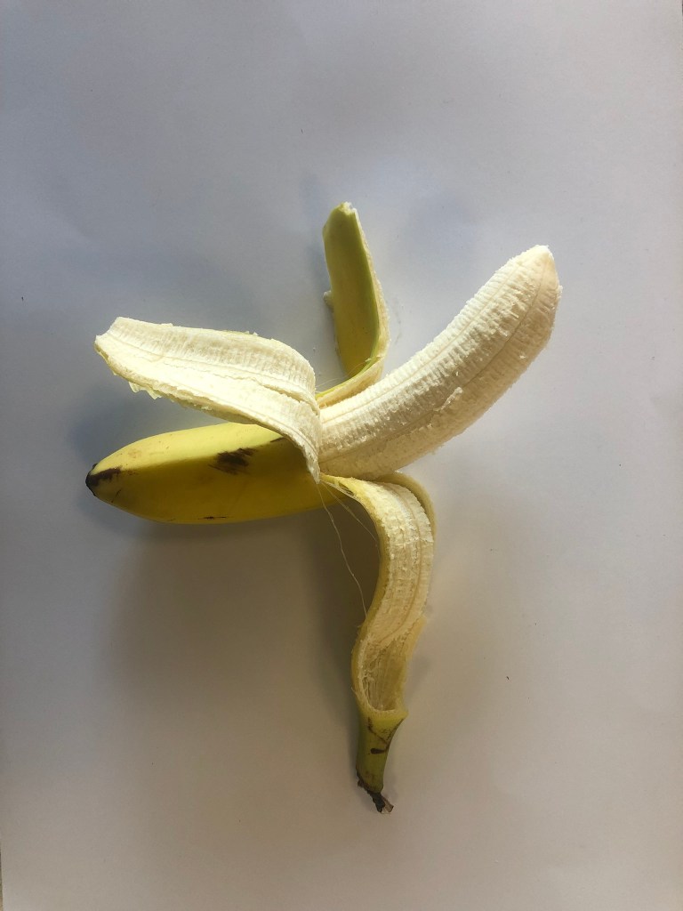
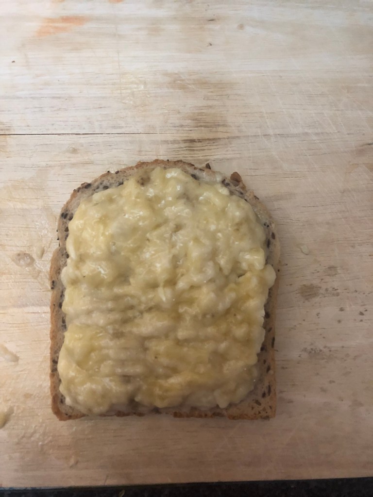
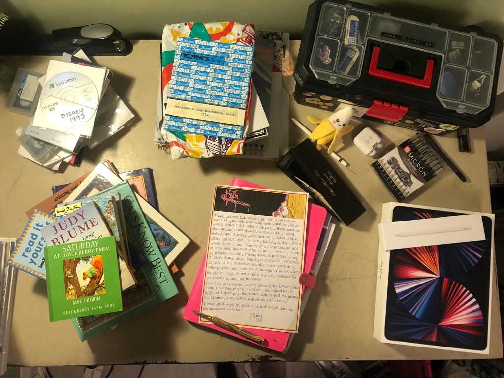
I took a photograph of my desk space:
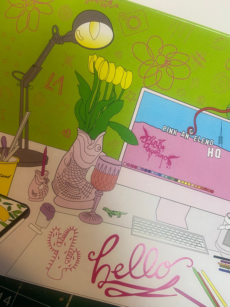
From the photograph I then drew out the first initial drawing of my desk space in Illustrator. I missed out the non important “clutter” and kept the essential items from my desk space. Once I had the basic drawing I could then go about adding colour:
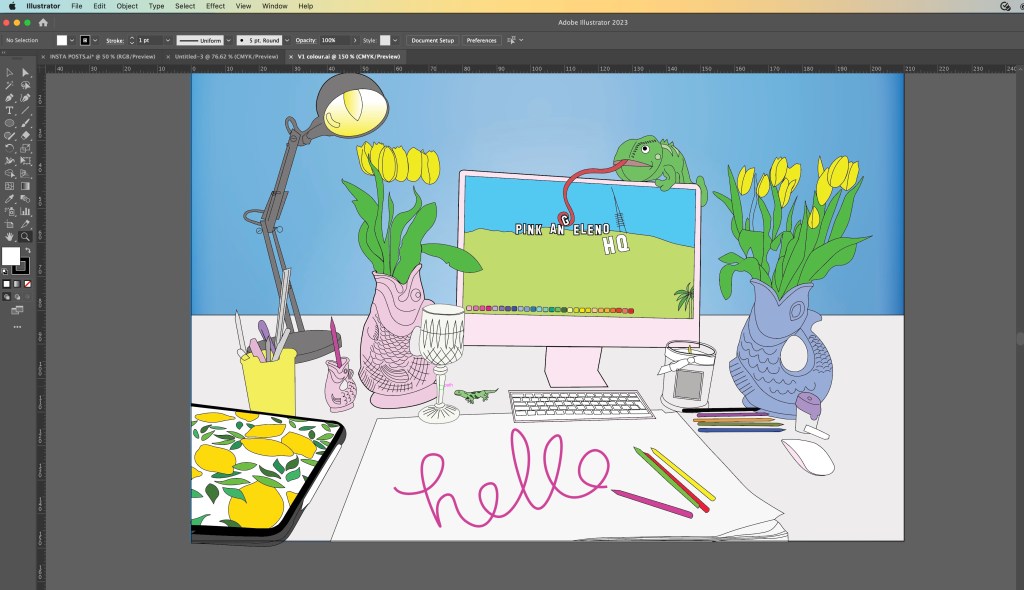
I added colour and I just didn’t think much of it. It had everything in the illustration from my desk space but it didn’t show Pink Angeleno… there was nothing pink truly about it and the only element that hinted on LA was the wallpaper on the Mac. I have my cuddly toy chameleon (George!) sitting on top of my Mac and thought it would be fun to make him interact with the screen in the illustration!
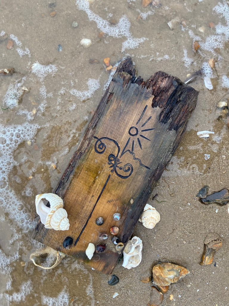
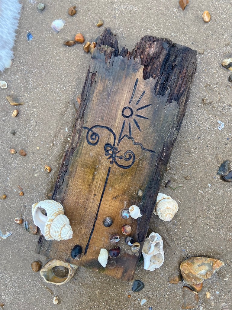
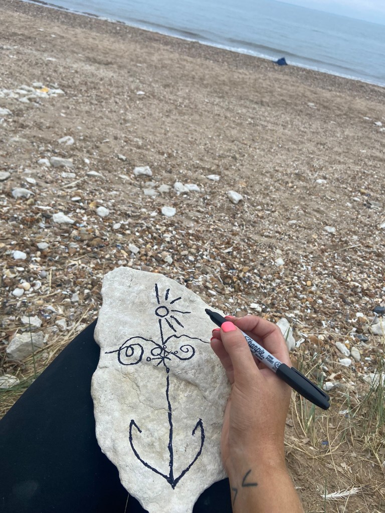
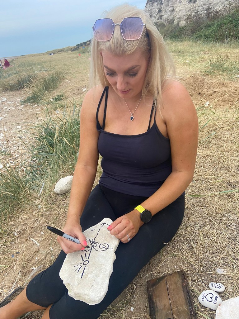
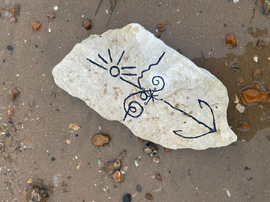
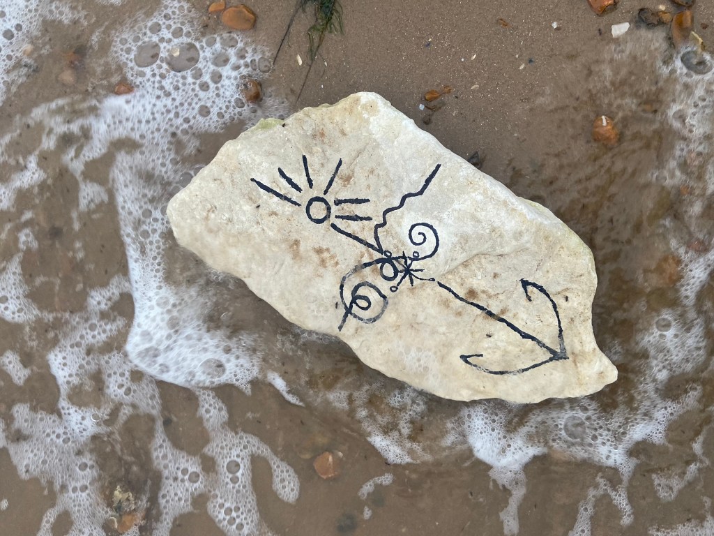
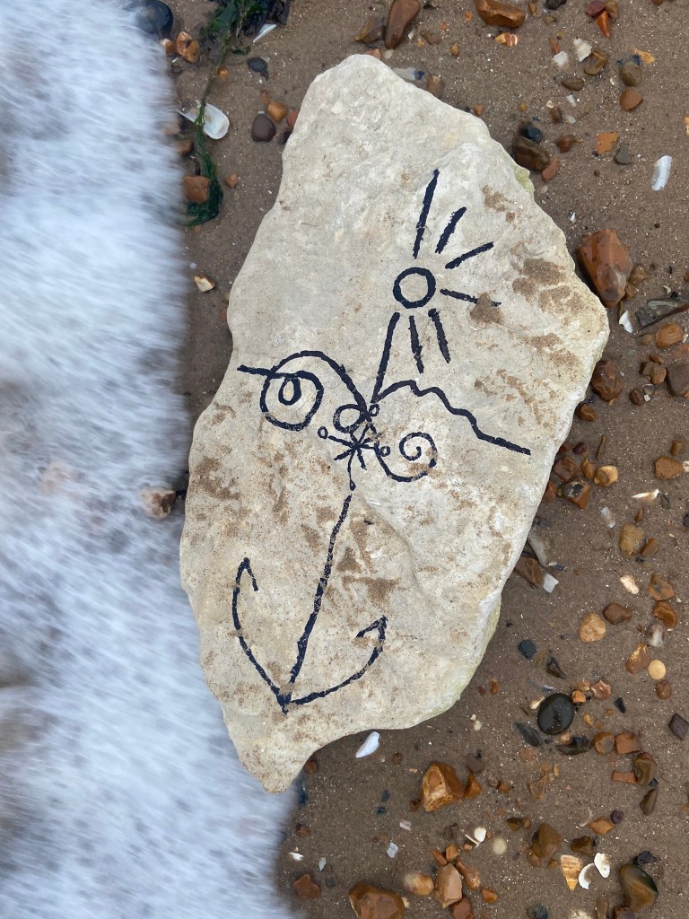
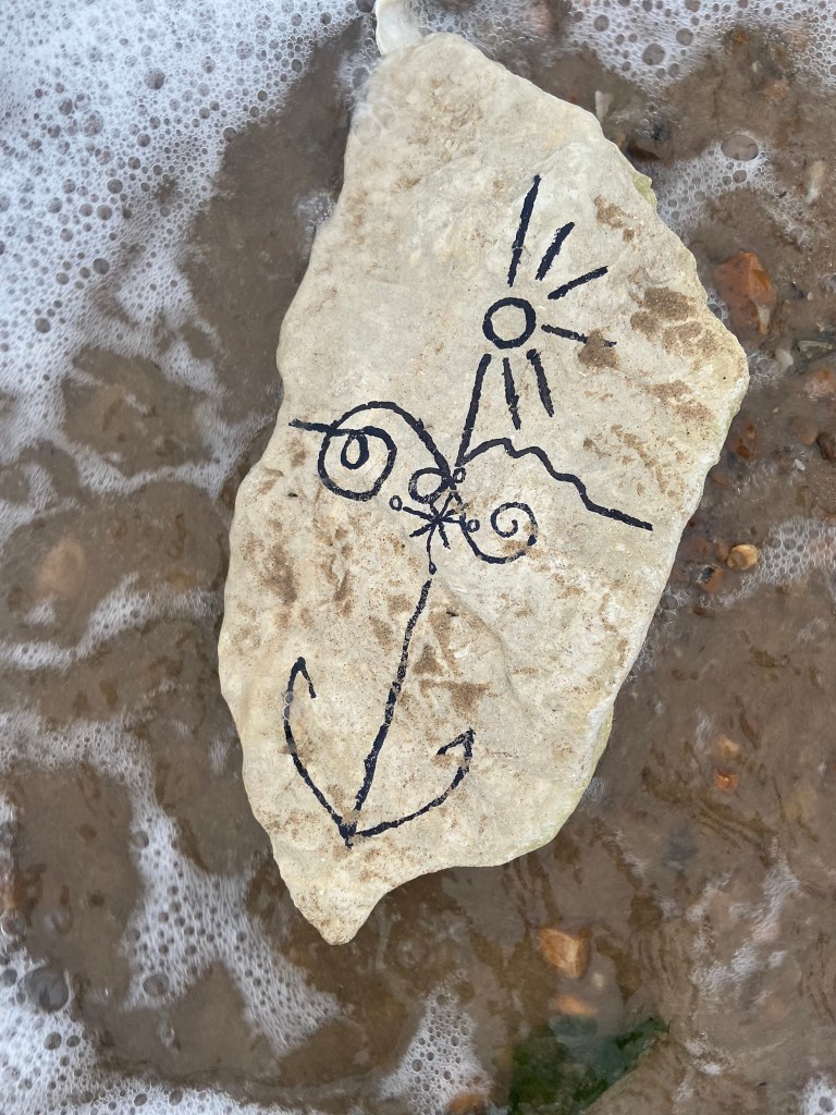
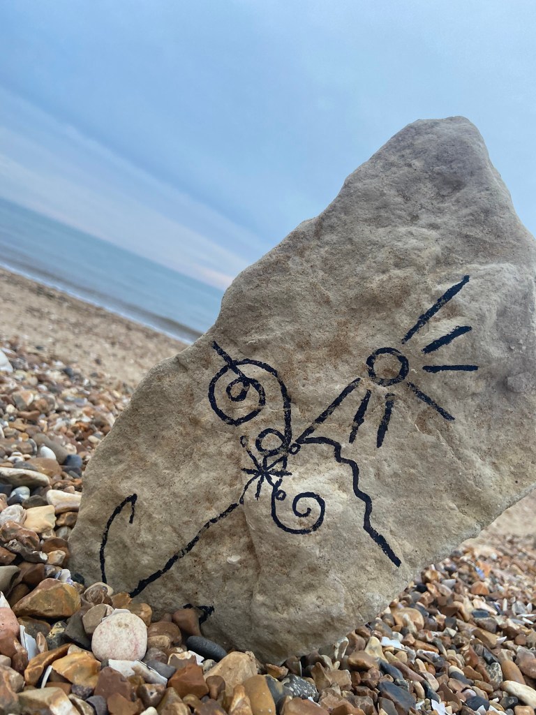
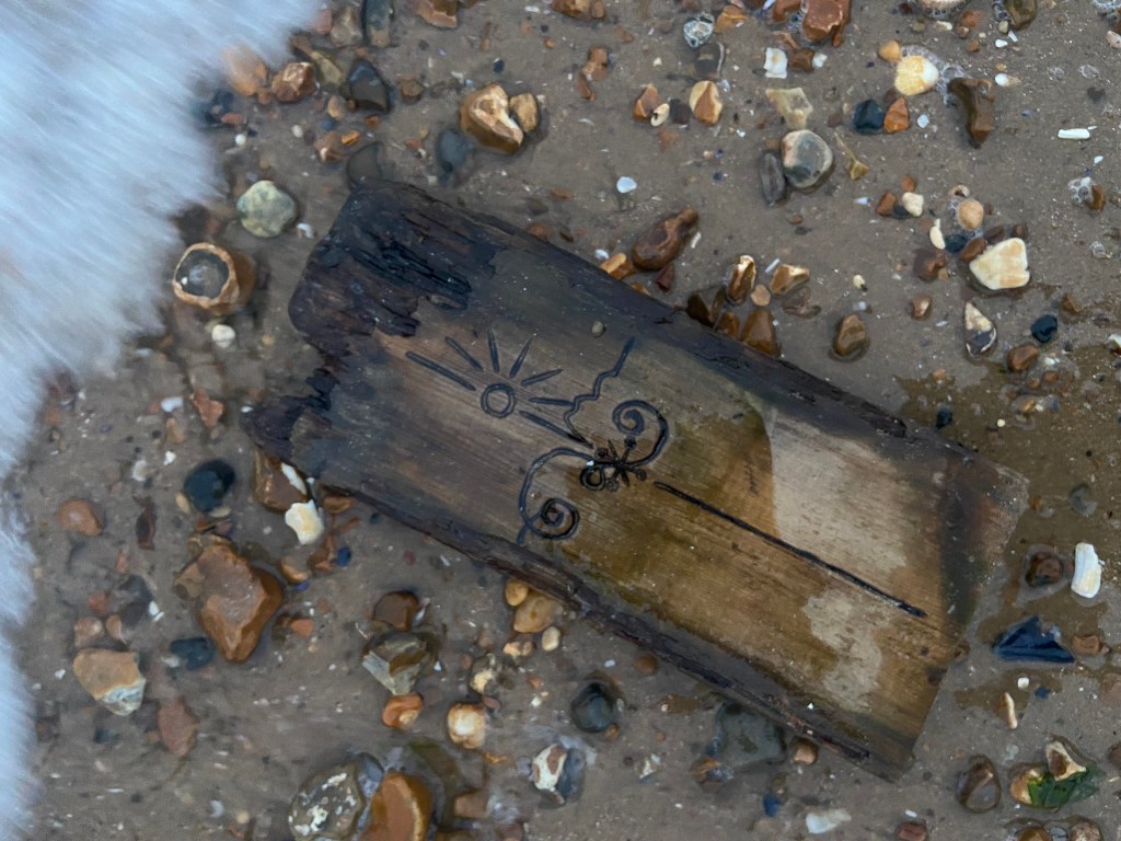
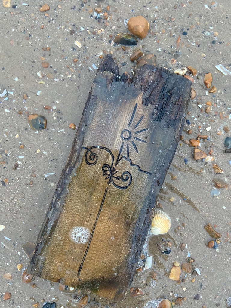
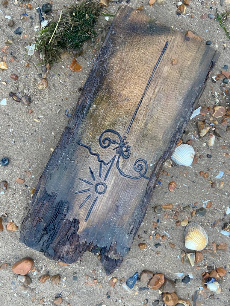
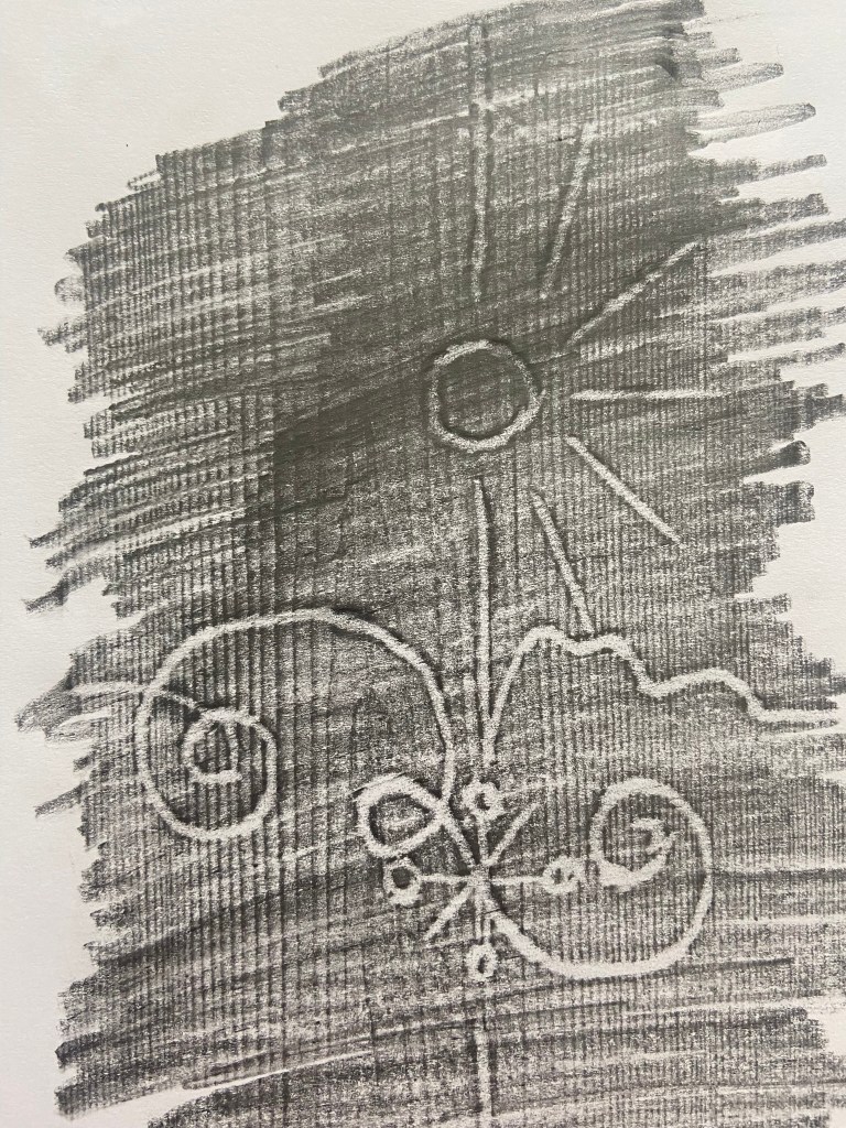
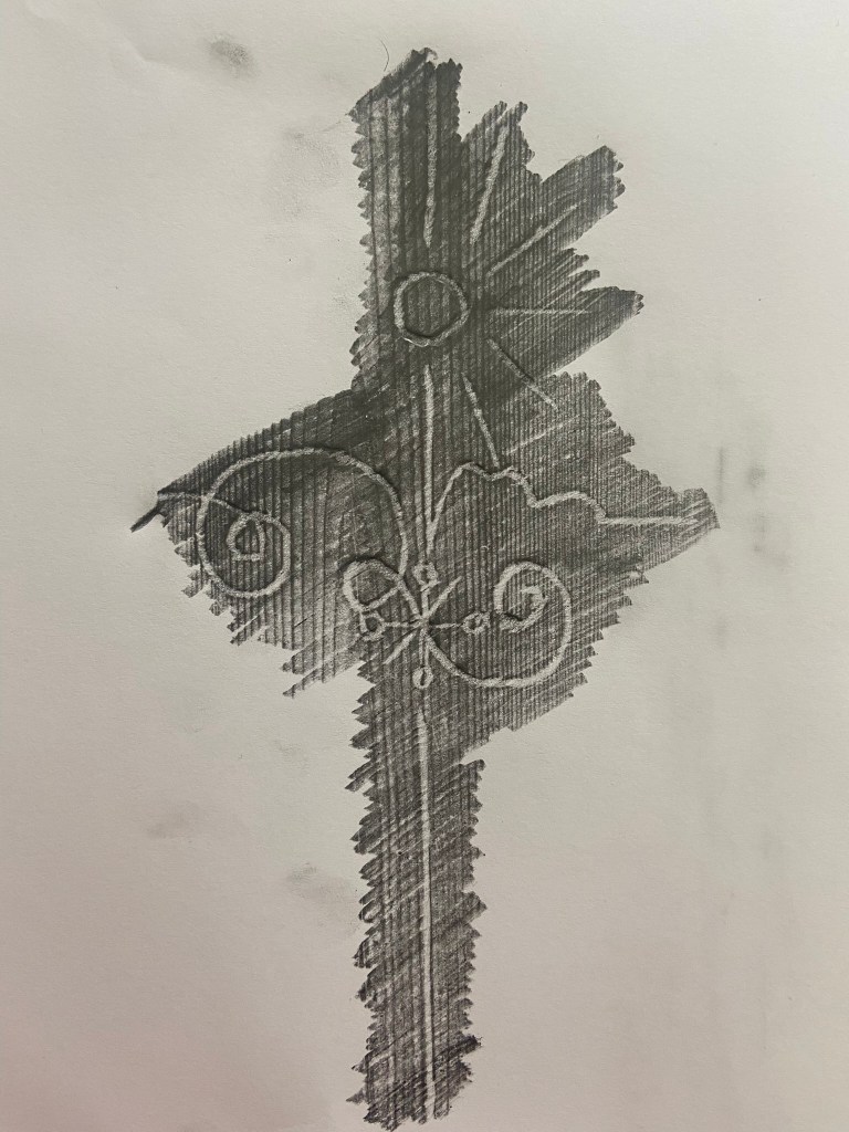
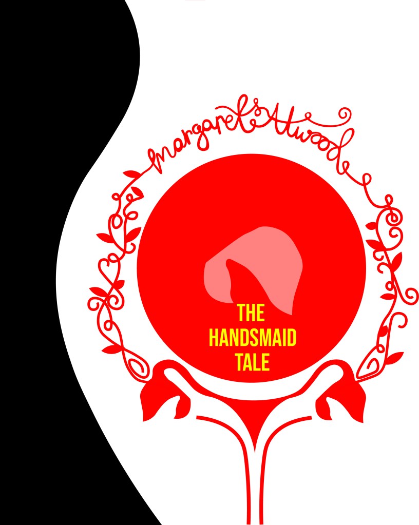
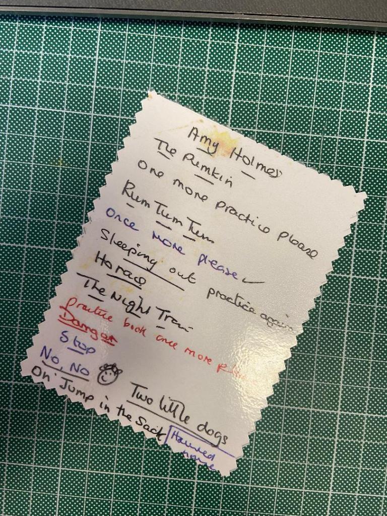
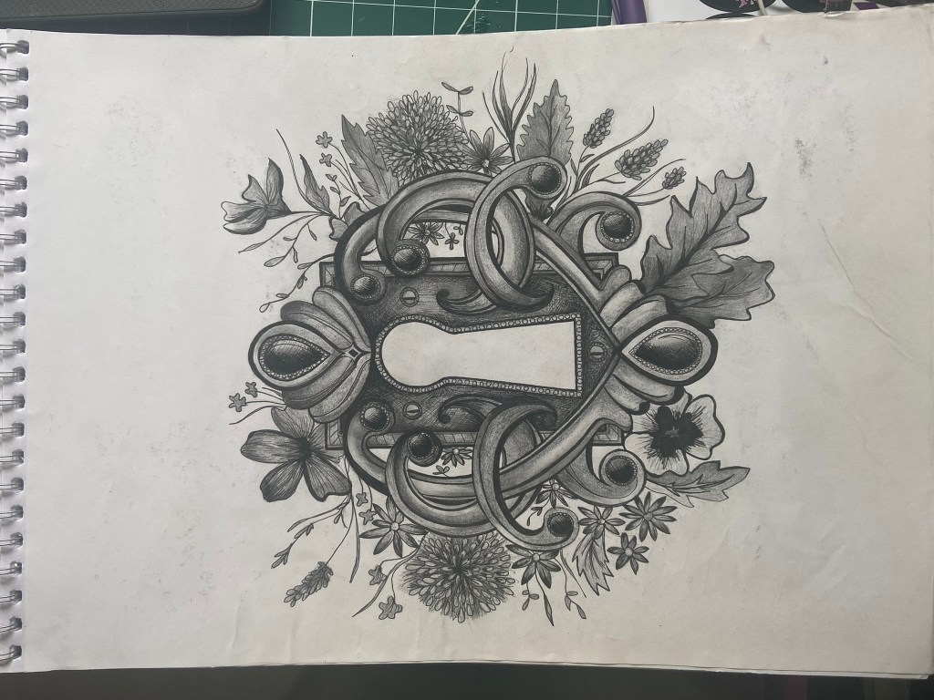
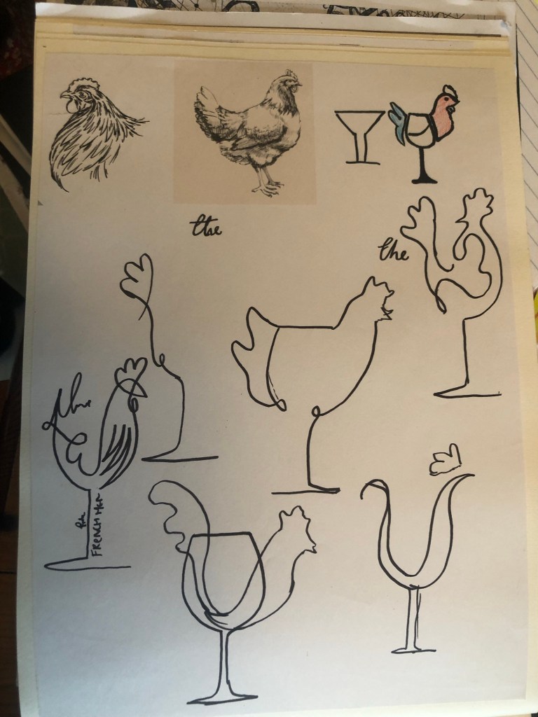
I then sat and thought more about Pink Angeleno and how to best illustrate this on my greetings card. My current Pink Angeleno brand was neither here nor there.. I had a drawing I drew for my first ever OCA assignment which was a similar one to this… Create a postcard sharing who you are and the illustration I created for this I have kept as part of pink Angelenos identity all the way through. it is significant as this is how people identify my design and work and it is how It all came about:
I knew that I cannot reuse old work, but I then wondered if I could update Pink Angeleno which would help with my assignment and also create more of a solid brand for my work moving forwards.
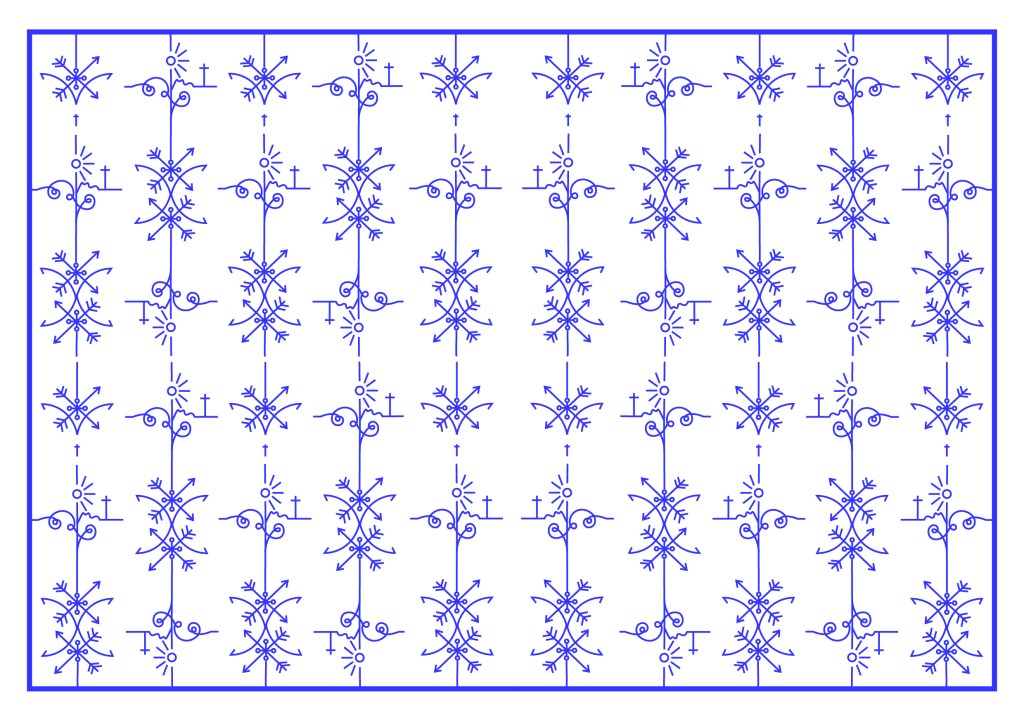
Pink Angeleno is very vector based, a lot of my work are illustrations that I have drawn and then created into Vector art using Illustrator so I knew that my work for this assignment would be the same.
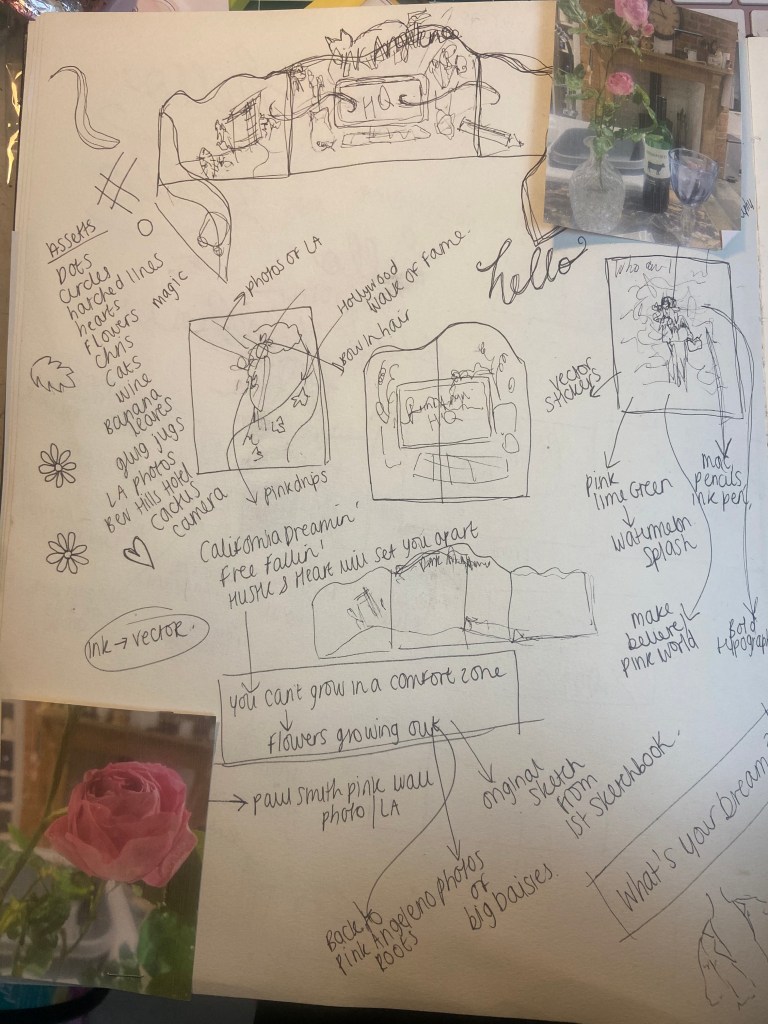
Once again, I turned to my sketchbook and started to sketch out little ideas that I feel sum up what Pink Angeleno stands for.
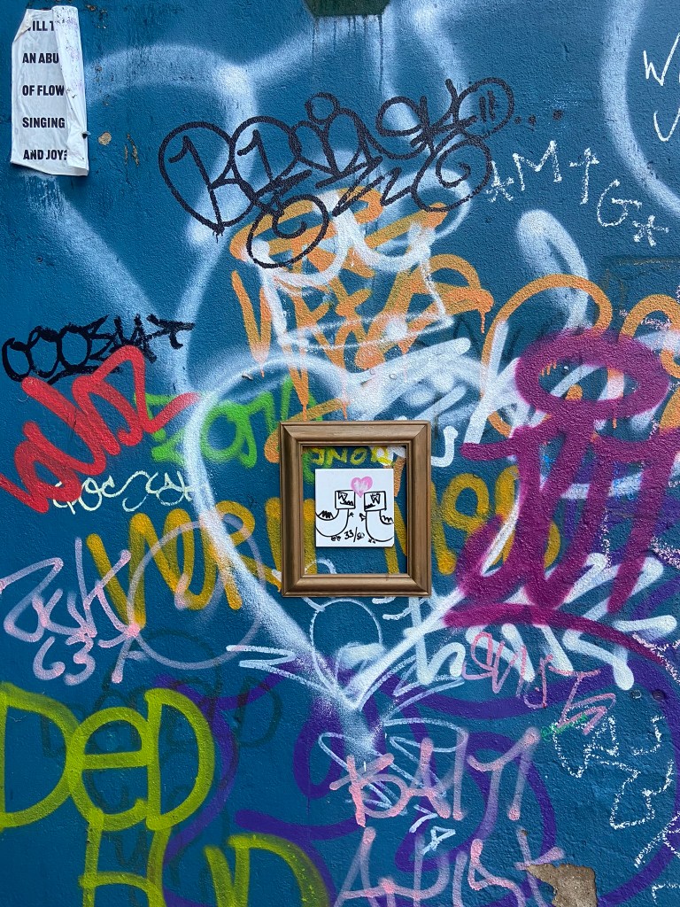
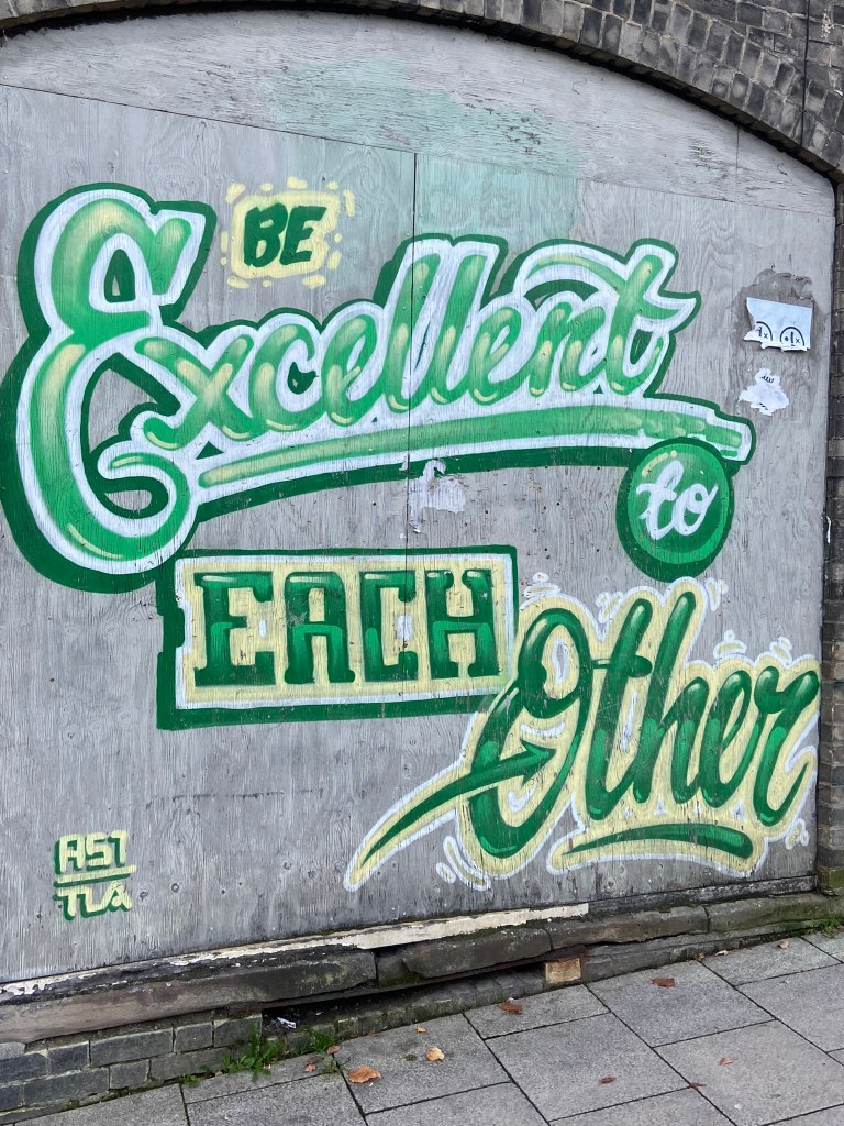
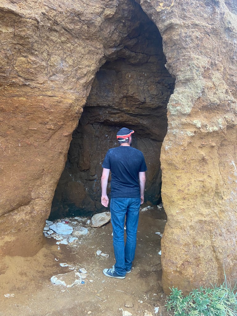
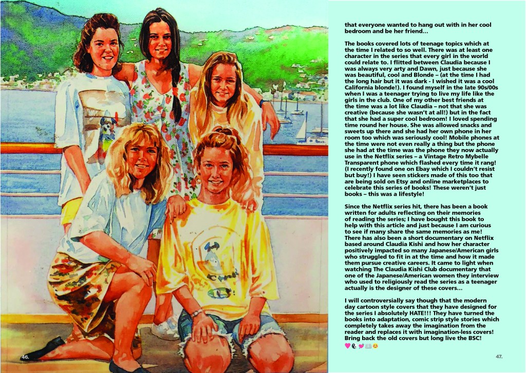
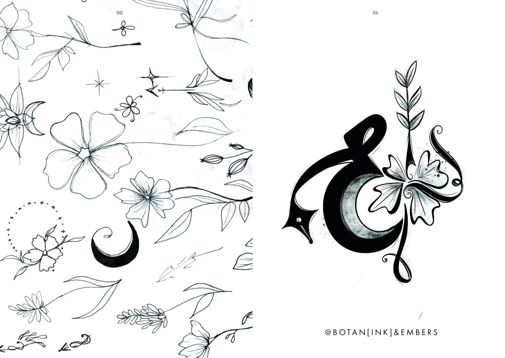
“You can’t grow in a comfort zone” is pivotal to me – it is what made me jump out of my seat and go for it in the first place. in my first ever sketchbook I drew a random doodle of this so it was only relevant to use it as part of this. Free Falling, a song by Tom Petty describes the emotion of wanting to fall off the top of the Hollywood Hills – it is I believe a song about getting out of a relationship but I associate it more with a feeling of escaping reality – that is very much the basis of the origins of Pink Angeleno. Melrose Avenue is just a cool place – shady in some areas I guess- but just a cool place! It is full of street art, graffiti, bright colours, thrift shops, unique bars and everything quintessentially LA!
Here are a few snaps I took of Melrose:
Cool right?… oh… also, here is my husband enjoying it too! – (with my Barbie bag!) 😛
“What’s your dream?” is an iconic line from Pretty Woman the film that I just had to include.
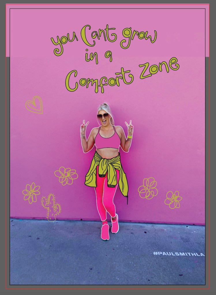
From drawing all of these I then had the idea to scrap the original idea and use the photograph of me in front of the Paul Smith Pink wall as a basis for a completely new idea..
I thought about using the photograph to create something like this:
I put both ideas on the back burner until I had drawn out my illustrations:
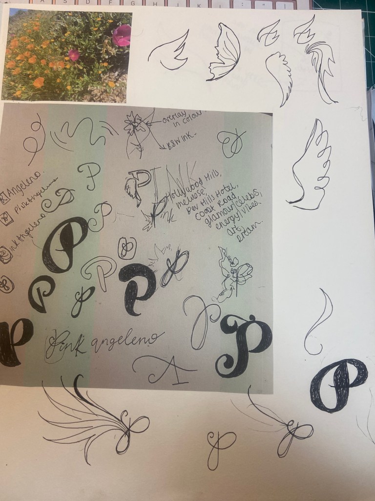
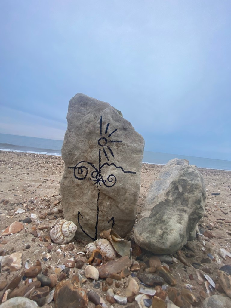
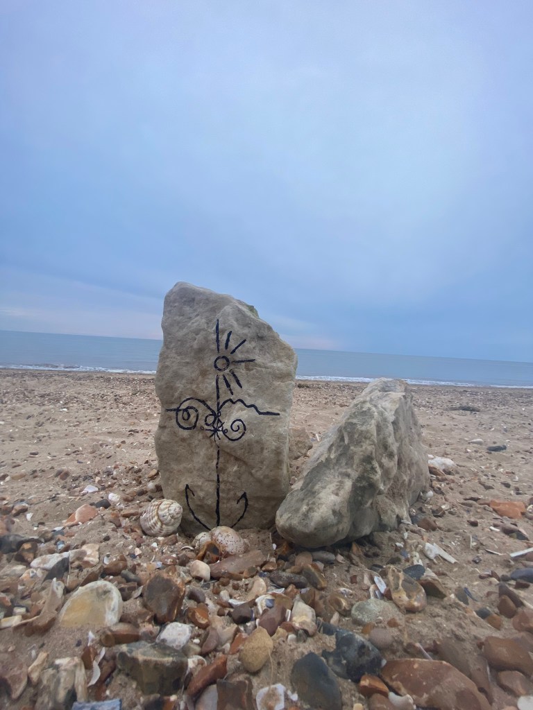
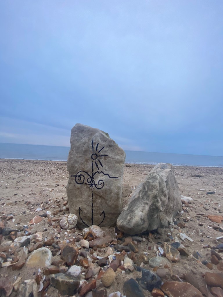
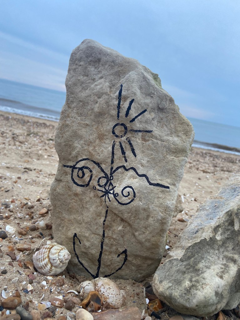
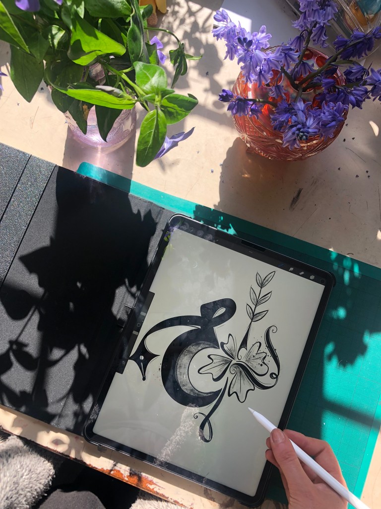
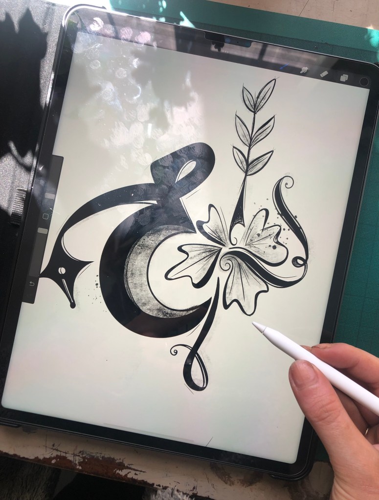
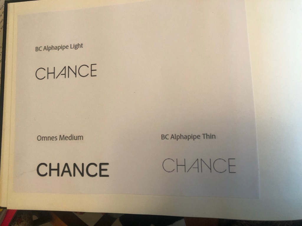
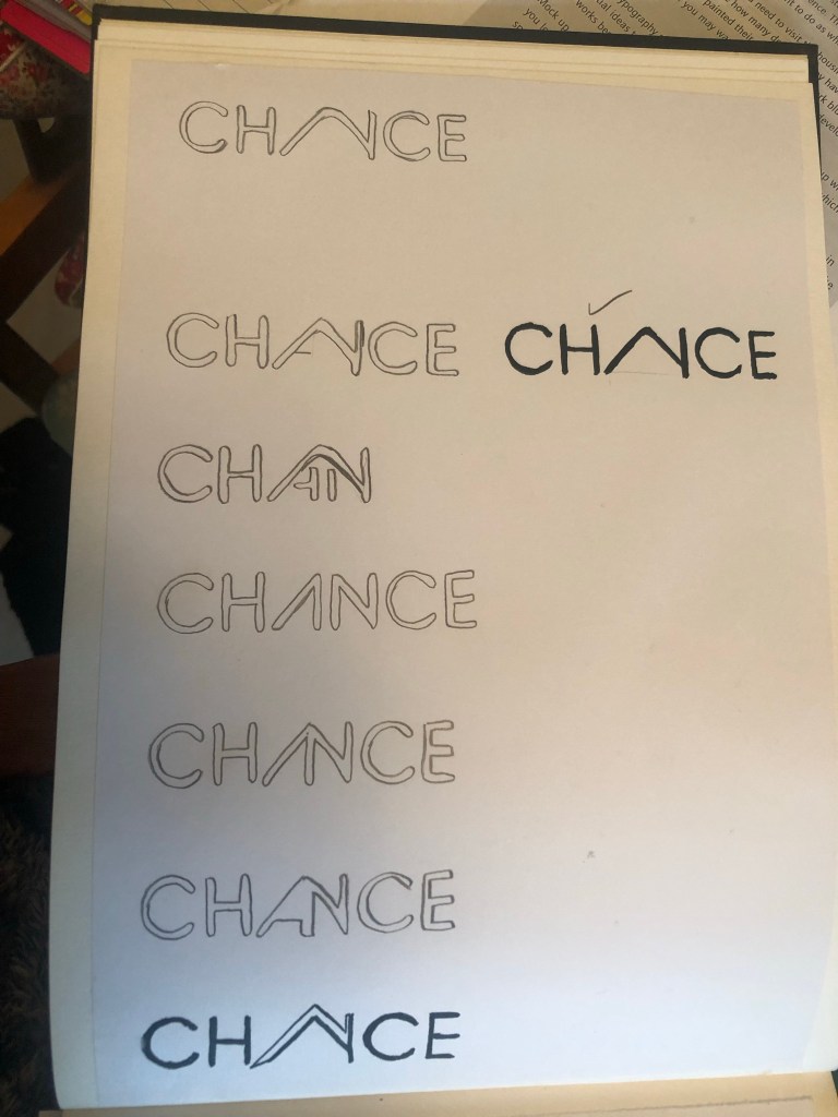
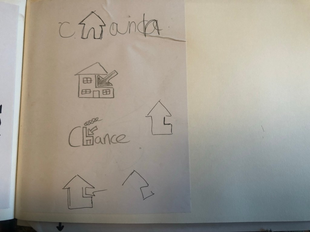
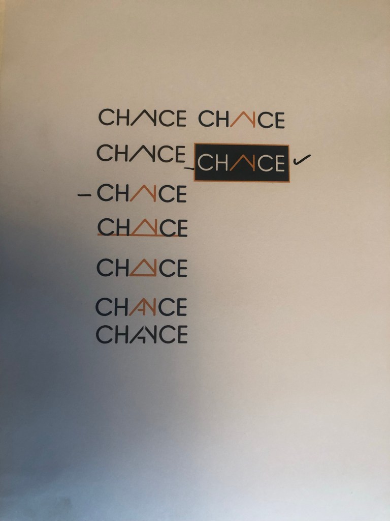
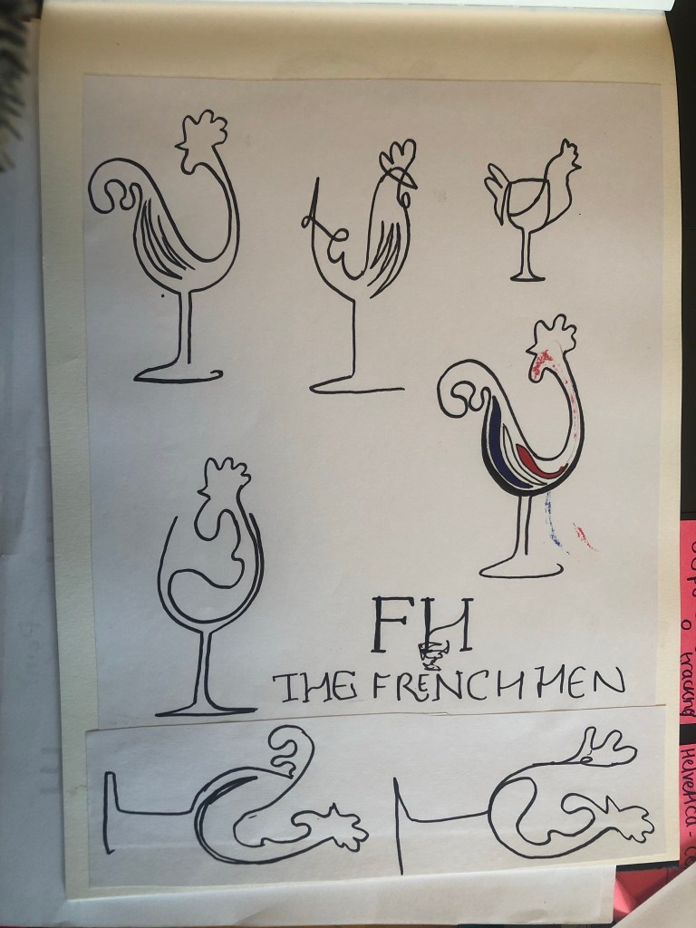
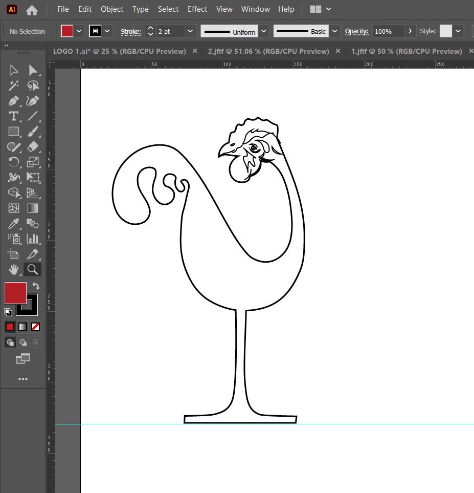
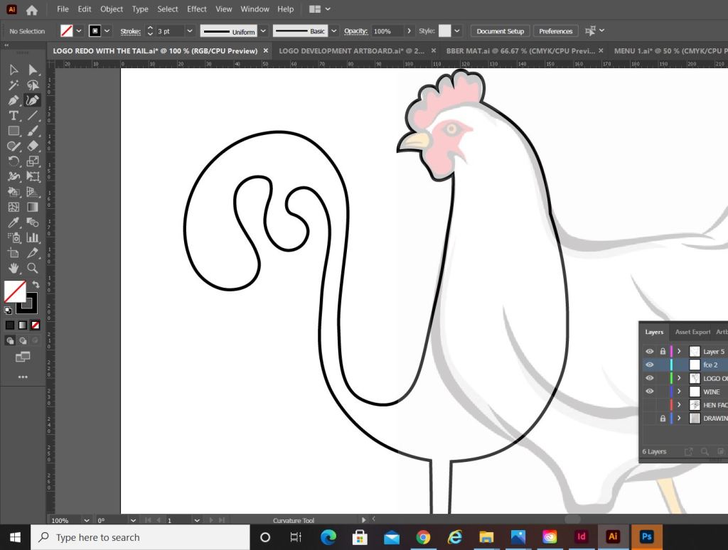
I then figured I needed to rebrand my Pink Angeleno logo ever so slightly.. the first ever original drawing I did for it was back in 2019 and I didn’t know or take into consideration then the readability and size of it when making it as part of a logo..
After a lot of thought though I didn’t want to lose the original identity of it as it means a lot to me so I went to work adapting it and making it as part of a basic logo.
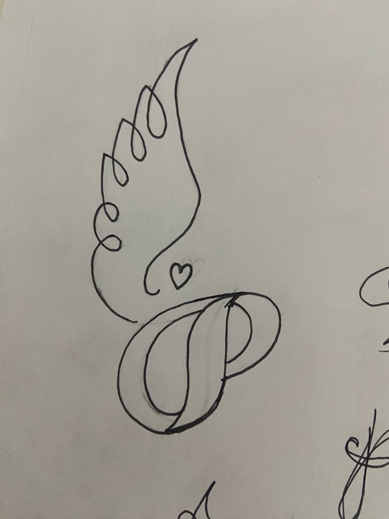
I sketched up some more ideas for a logo – these manifested as a simple letter P with angel (or Angeleno) wings:
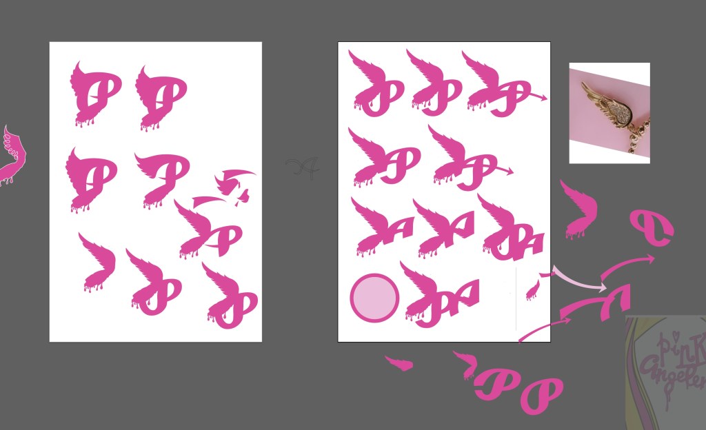
This was the final logo that I settled on and I quickly made it as part of my social media!
I also gave my original drawings a “glow up” and adapted them with my illustrations from my sketch book.
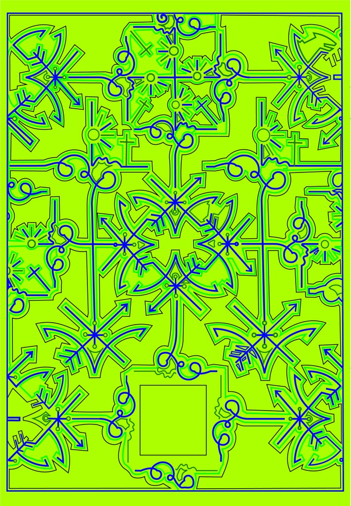
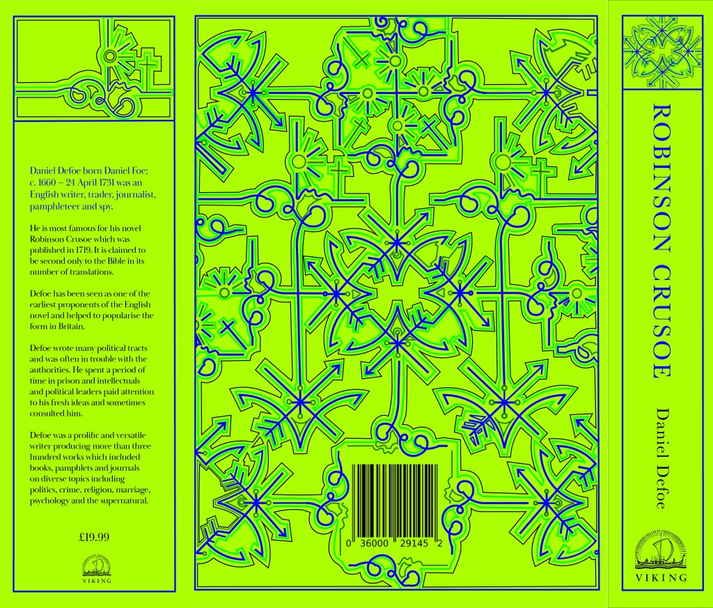
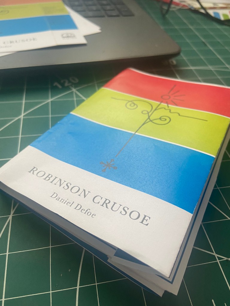
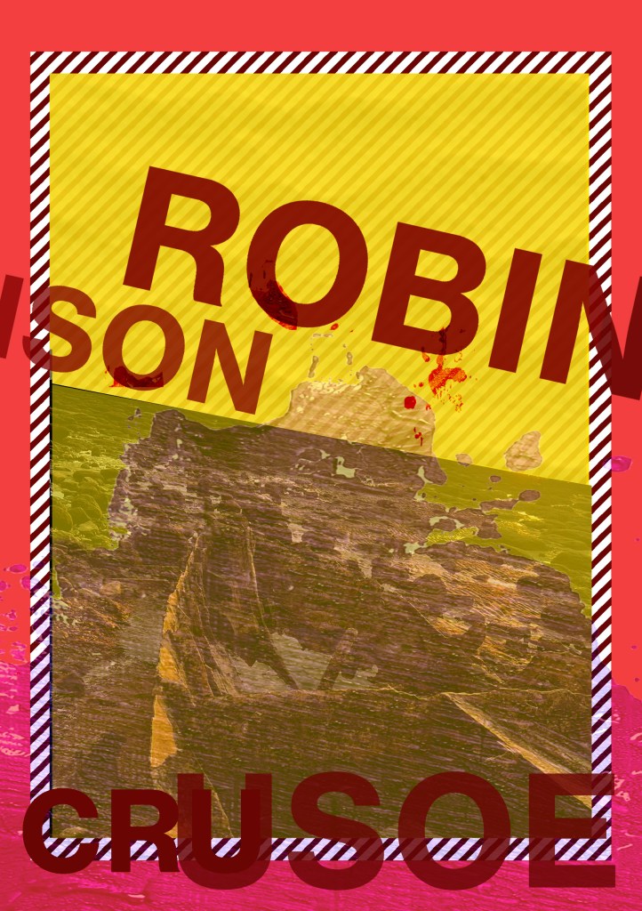
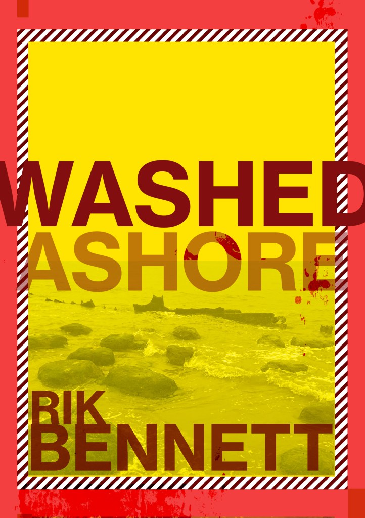
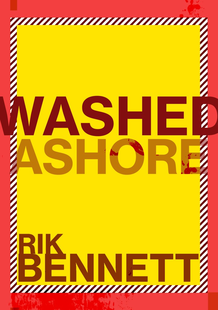
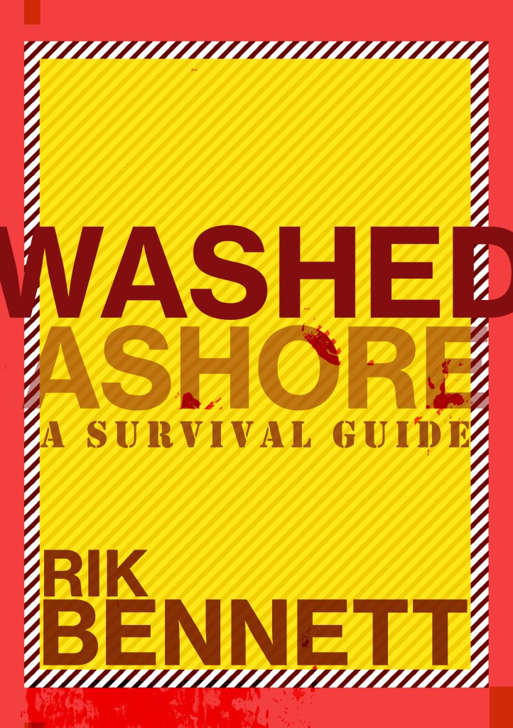
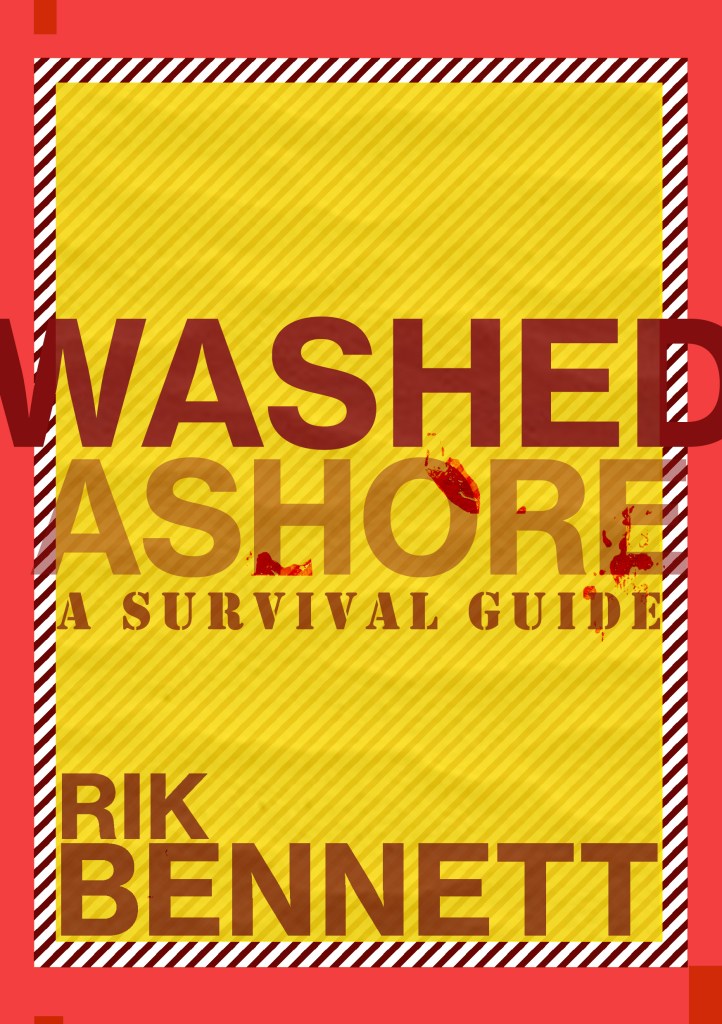
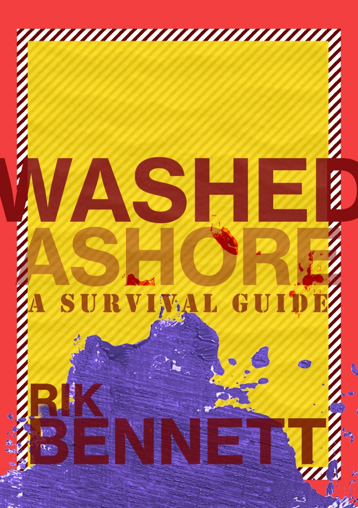
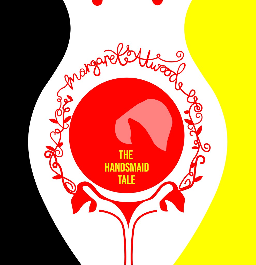
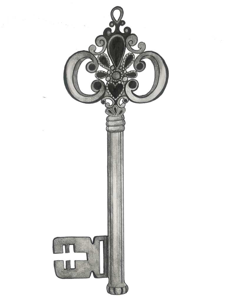
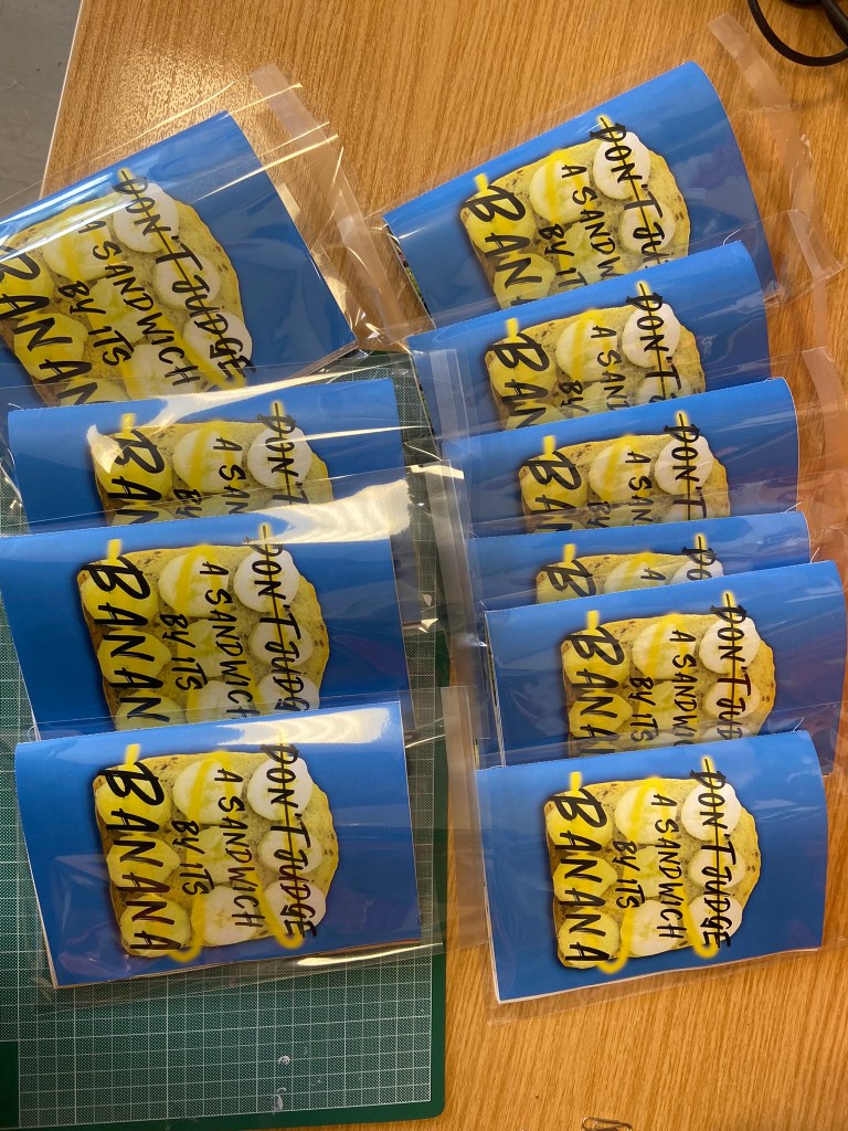
I then went back to both of my ideas for my greetings card and decided to go back to the first original drawing and idea but just to include the recent illustrations I had drawn. I used the colour combo of Pink and Green just because I love the colour pop and the colours remind me of a Watermelon, summer splash combo!
The colours of it here are extremely bright and vivd because I have saved it as a RGB PNG suitable for screens; however the file format I saved for print was a PDF format:
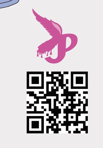
I also added a QR code onto it.. What better way to show who I am than a card with a direct link to my website? Instant promo and info on who I am.
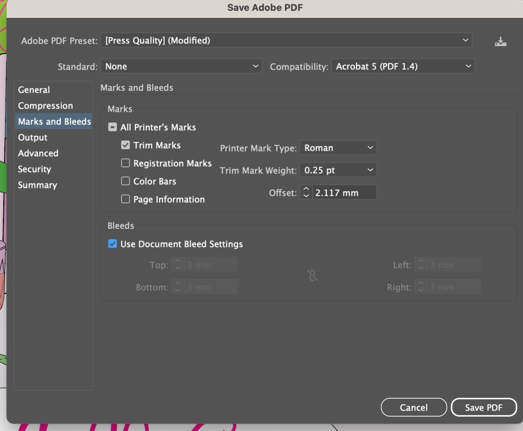
My document was set up in Illustrator to an A5 size with a 3mm bleed.
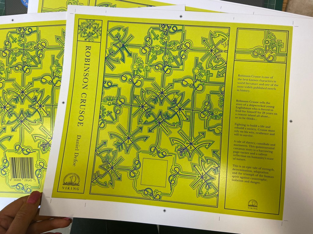
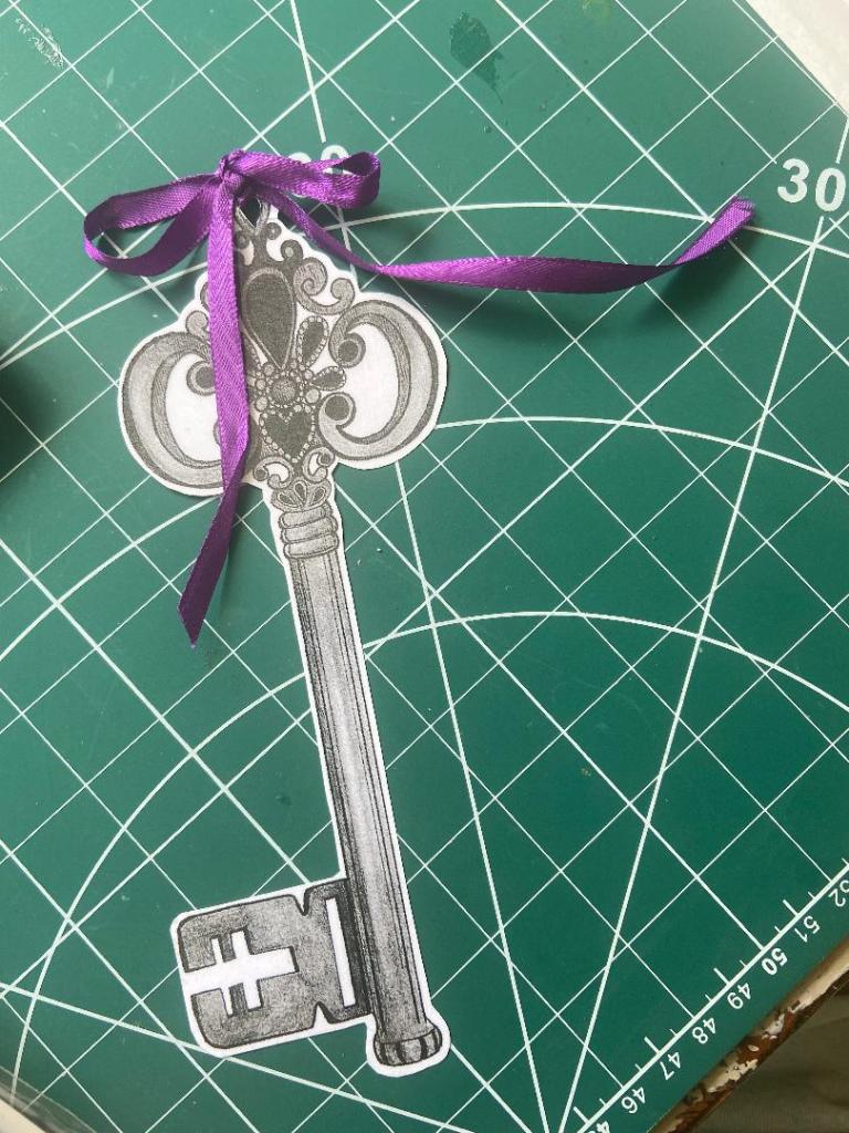
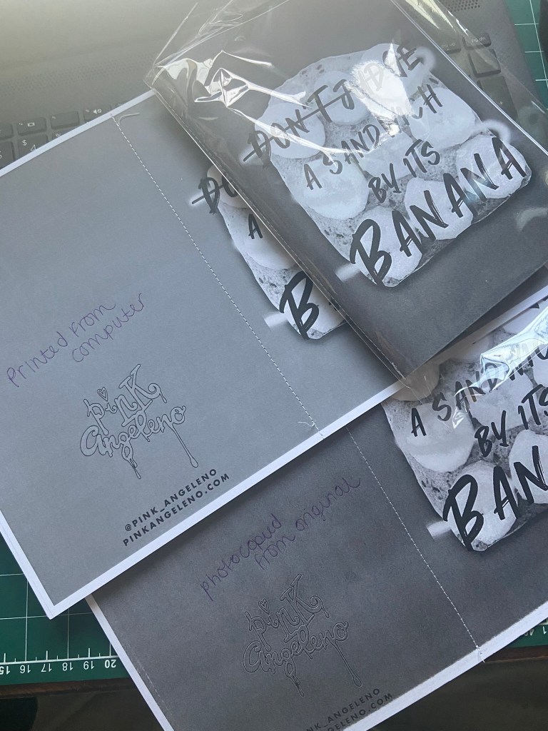
I have never sent anything off for professional print before, but as I now work as a Graphic Designer in my new job, I have experience of sending artwork off to print with various print companies. One of the companies we use is printed.com. I only wanted 1 printed card which not many companies can do without a minimum of 10 prints but printed.com were able to print just 1 of my cards which was ideal and saved me unnecessary, added expense.
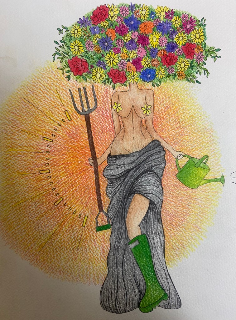
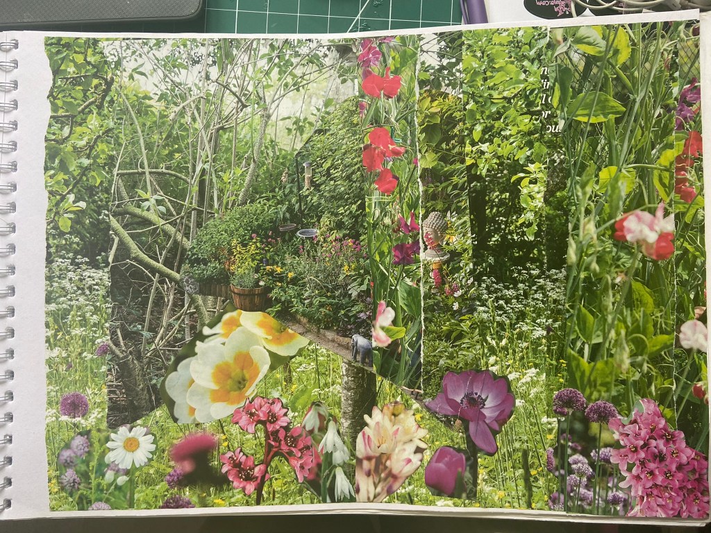
For this exercise the article that I chose to draw my illustration from was an article I found in Psychologies Magazine titled – “How Nature calms the mind”. It focussed on how doing little things daily outdoors can help reduce anxiety and spiralling behaviour. What I found from completing the exercise was that the main focus of the article was that spending 20 minutes in the garden daily can work wonders for the mind and soul.
I went through the article and highlighted the key words that I found to be important helping me move forwards with my illustration:
For some reason whilst I was reading this, all I could see in my head was a free, chilled out, easy-going woman gardening in the sunshine in the style of one of the Grecian goddess style garden ornaments. I thought this would be very fitting for my illustration – The Grecian Goddesses wear very minimal clothing and this could reflect being in touch with nature and going back to nature. Thee statues are very feminine and this article is very much aimed for the female target audience. The Grecian Goddesses also belong in the garden which is the whole message of this article.
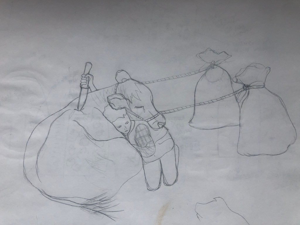
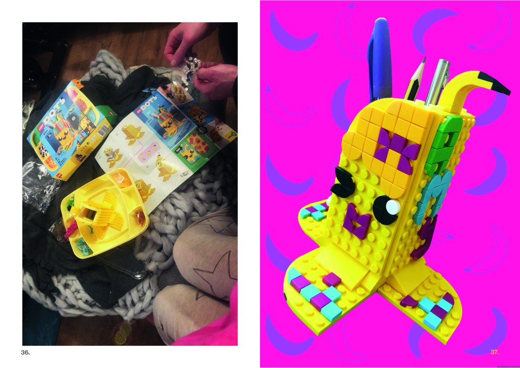
I sketched a rough idea in my sketchbook of what the idea was in my head – even though it was only really sketchy, I really liked it! I drew squiggly hair which reminded me of an Afro hairstyle – I then wondered if I should make my figure dark skinned but I then decided that my figure should just have a dark sun tan from being outside in the garden each day. I then had the idea that the squiggly hair could be flowers blossoming – this would represent the garden in the article but it would also represent self development, growth and the fact that the mind is now clear enough for life to grow.
I drew this sketchy illustration with a large trowel balancing in her arms and a watering can in her hand and I contemplated making the illustration look modern and relatable by letting her wear garden Wellies.
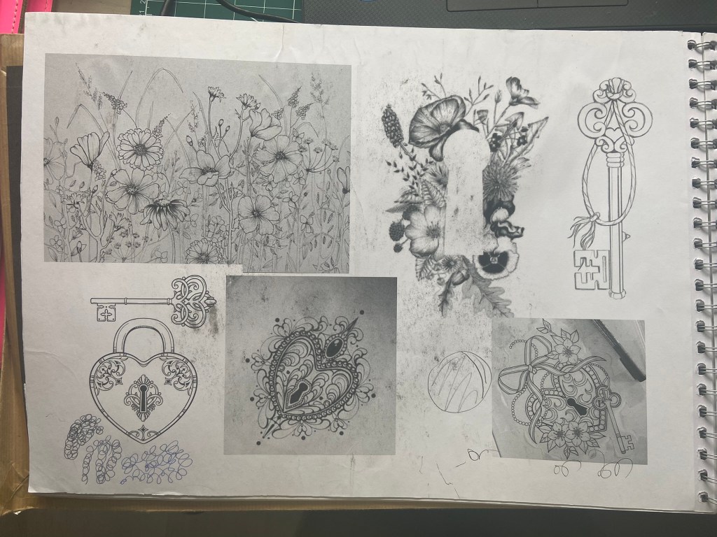
I looked on Pinterest for some further ideas; I needed a photo of a Grecian Goddess statue rework my sketchy illustration around and I needed ideas for the 20 minute aspect of the article.
I wondered how to get the 20 minutes into the illustration and I instantly thought of a Sun Dial in a garden. Whilst I was searching Pinterest for ideas for this, I also came across a pop up advert for B&Q which had an image that seemed perfect for my illustrations hair. I could copy these flowers and draw them onto my illustration:
I then started to draw out a few variations of my garden Goddess to decide which one would work better for my illustration:
I also took photographs of me holding items in the way that I wanted my illustration to, so that I could accurately draw from the photographs and make my illustration as realistic to a human pose as possible:
When I think of 20 minutes I think of a clock face and how 20 minutes looks on it. I drew this out and then realised that I could turn the clock drawing into sun rays to represent nature and the warmth and happiness of being outside. I drew out my chosen design for the Goddess and drew the 20 minutes into it and I liked how they worked together.
I then drew my final illustration out onto mixed media paper and decided to use ink, Pencil and colouring pencils to create the final piece.
This is the final piece. I am pleased with the tonal value and shading on the piece to give it some depth. The flowers are very simplistic and I feel with more time and practise I could have made them more realistic.
I then digitally manipulated it to put on my social media and changed the colours to brighten them up slightly for screen.
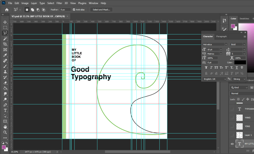
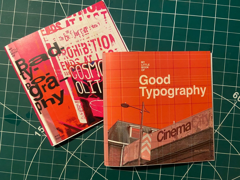
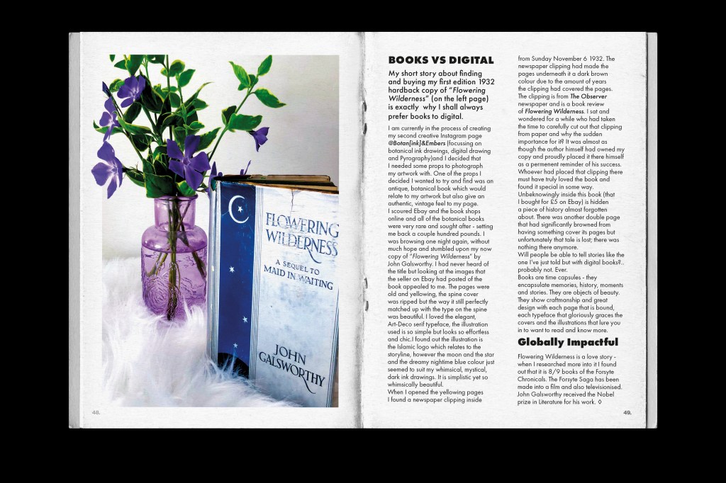
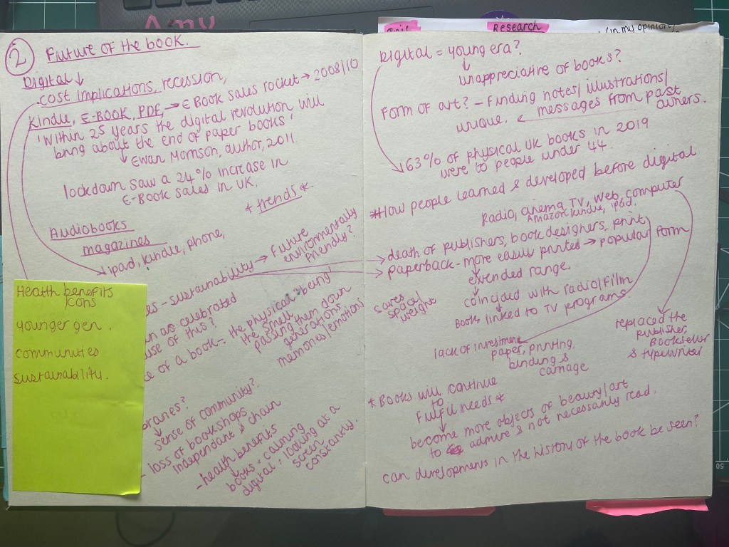
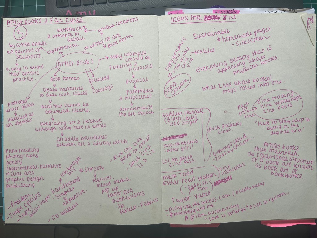
I had a look at this assignment in my book a couple of months back so that I could plan ahead and know what I was doing in advance for my assignment! I was torn between Influential book designers and Typography. I knew that I was way out of my depth doing my altered book and this was something I didn’t want to delve back into for a little while at least! I decided that I would want to do typography because that is the area I knew and enjoyed the best but I also knew that I didn’t want it to become another version of “My little book of Good typography” because I had covered a lot of the basics and the rules of typography in that. I knew that naturally my head would try and create another more or less identical version of that book because I liked the finished outcome so much! I needed to find another typography subject that would head in a new direction from the last book of typography I designed.
Something slightly different…
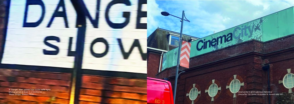
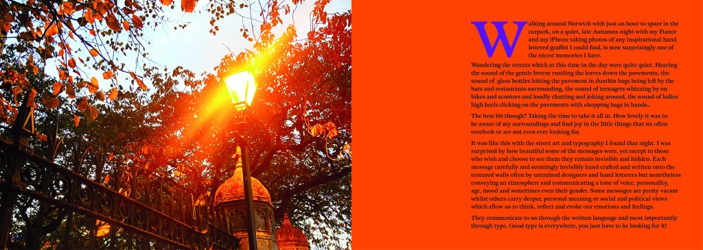
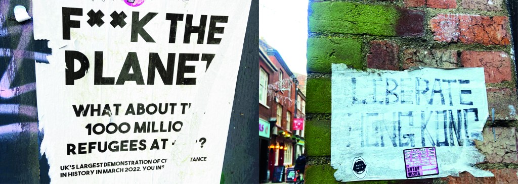
The idea came to me when I went to Norwich to try on my wedding dress after it came back from being made. I took my best friend with me and by the time we got back out onto the streets of Norwich out of the bridal shop it was getting dark and the streets were emptying. I had never really noticed the typography in the streets before, the graffiti struck me and I was just inclined to take cool photos of some of it (to the bewilderment of my friend!) I told her that I bank photos of cool arty stuff to use in future projects as textures or stock photos etc.. When I got home it got me to wondering whether I could make a book about the typography that is found in the streets?.. I had to really research this one, making sure that there were no holes in it. Could urban typography be classed as typography?.. I mean, I class anything that’s written as typography? Anything that communicates a message and conveys an emotion to us through type is typography, right? I just found the lettering I was finding on the streets really beautiful and I wanted to explore it further. I researched Vernacular typography and this is the lost art of sign painting and traditional methods of advertising on the streets before commercial printing came about. I found a lot of articles online by a designer called Molly Woodward who takes photographs of a lot of signs from the lost art of vernacular typography. Her kickstarter project is to try and map, document and preserve some of these fantastic hand lettered signs.
A lot of the articles that I found online relating to vernacular typography study buildings and signs in Brazil and American states. I found a few learning blogs from OCA students on vernacular typography too which also made me a bit anxious.. was I jumping the gun, would there be a project in the future exploring this?…
I didn’t find much of the old style of vernacular typography on my travels sadly, but then I researched further online and found a University lecturer who taught a project on vernacular typography looking at the signs above hotels and B&Bs in Blackpool:
Sarah Horn the designer of En Suites looked for standout typography, intricate letterforms, funny names and bold colour palettes. I quite liked the idea of how she was documenting type but also capturing time and age through her photographs; these are photos that people will be able to look back on in years to come and see what the town looked like at this point. That is another thing I found with vernacular typography; it very much shows the culture of the place and the people who live there. I also liked the fact that in the Creative Review article she states that she wanted to do a simple book in a size that reflects a souvenir guide; she is really designing for the culture of Blackpool. Blackpool is very leisure and tourism so a souvenir guide matches its aesthetics perfectly! I like how she has pretty much made a flip book of inspiring photography- it is not a sit down and read from front to back book, it is not particularly informative but its aim is to dip in and out and use as a research book. A book to flit in and out of whenever inspiration calls for it. I wanted to create something similar!..
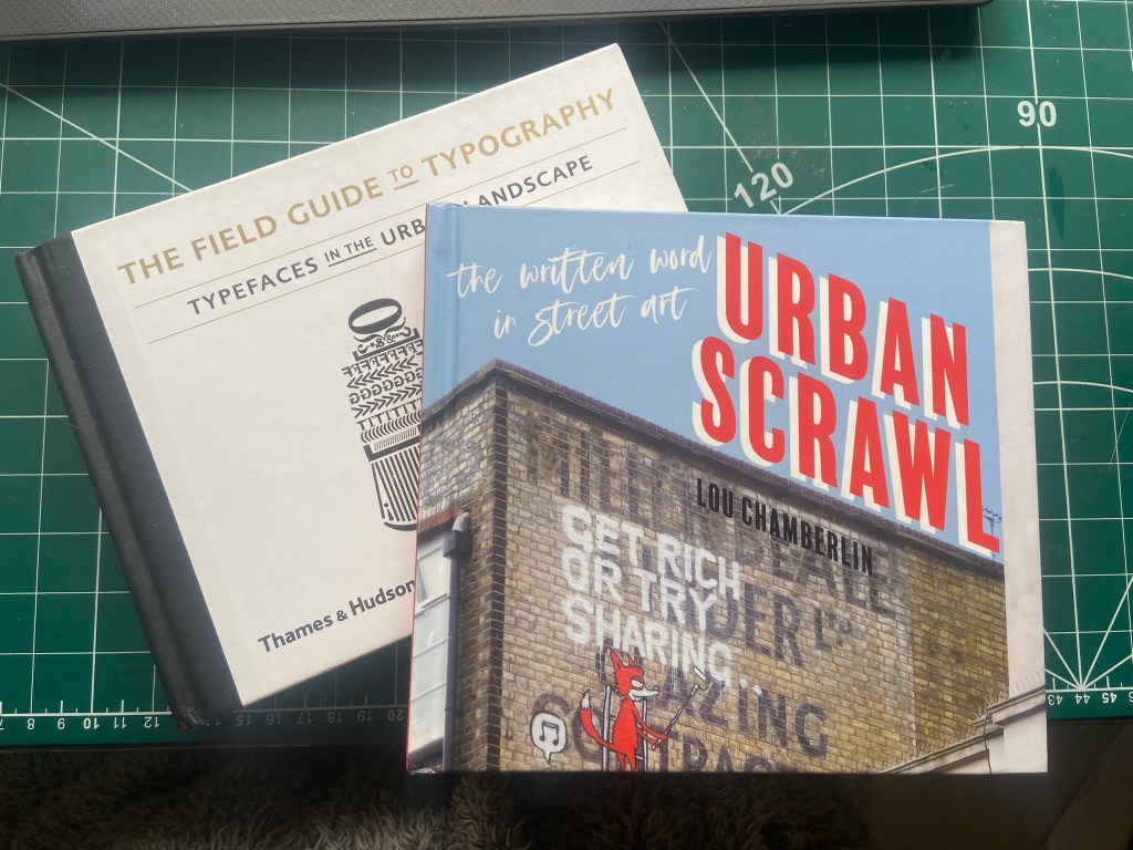
I also bought 2 books from Amazon which are very similar to that of which I wanted to create. One book is called “Urban scrawl” and concentrates more on showcasing graffiti hand lettered styles and the other book is called “The field guide to typography, typefaces in the urban landscape” which is like a bird spotting book of Graphic Design!- it shows examples of typefaces in the wild and then classifies them into what typefaces and era they are. I liked this idea and thought that I could potentially classify any typefaces that I found in the wild!
I was very anxious though as to whether I was meeting the brief of the assignment. The brief did say “alternatively identify your own project”… this was a different kind of project but typography nonetheless?.. I wanted to think outside of the box and go exploring down different avenues.. I didn’t want to play too safe but also I had crippling anxiety of my assignment being rejected for not meeting the criteria!
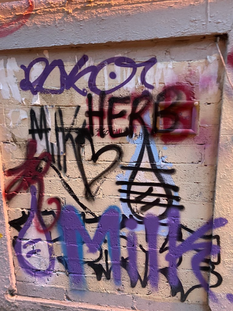
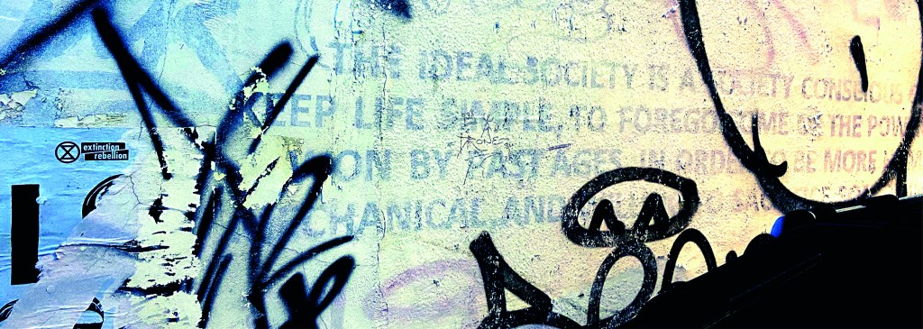
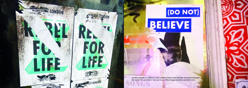
I wanted to include graffiti and street art in my book too as although these are not using typefaces, they are still a personal style and they are still hand lettered words with personal handwriting. There were many conflicting articles online that state that graffiti is not typography, I can see both arguments.. it is definitely not a traditional practice of typography but I wanted to concentrate on how insignificant ramblings or graffiti scriptures hand written on a wall can inspire a future digital typeface or fresh new designs.
I felt like I could have sit by myself for hours and days trying to justify to myself how I could or could not class this as typography.. I just had to be brave and go with my instincts…
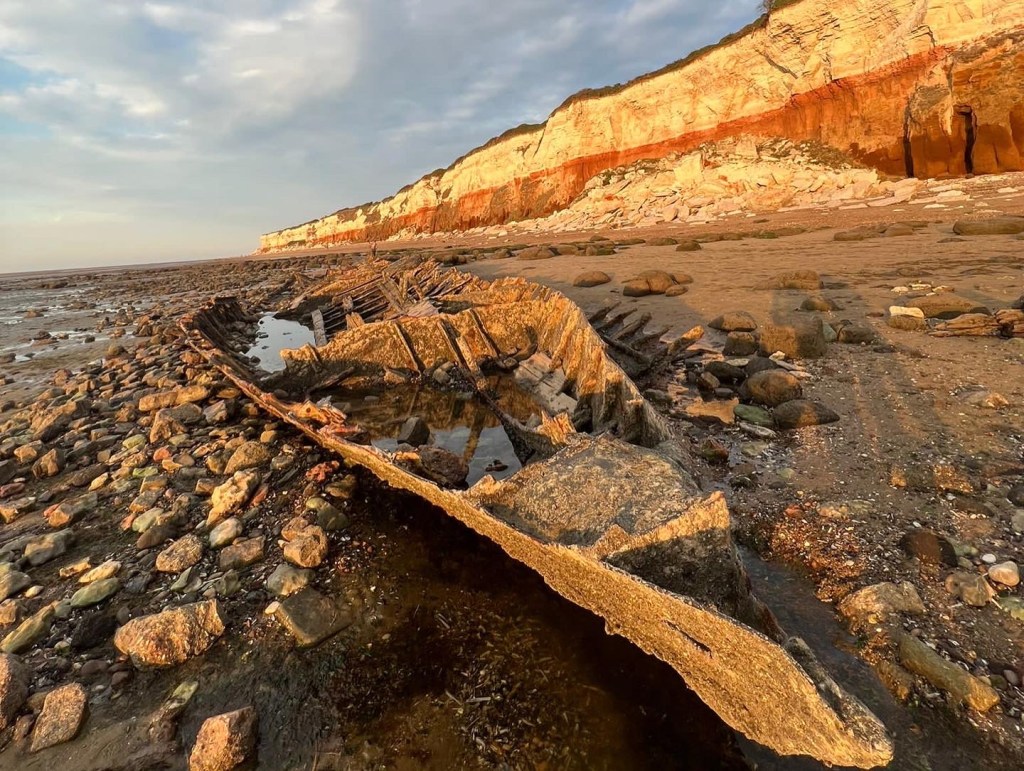
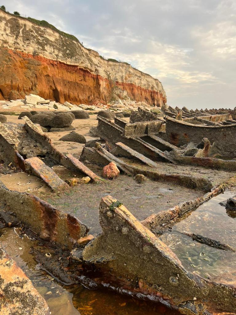
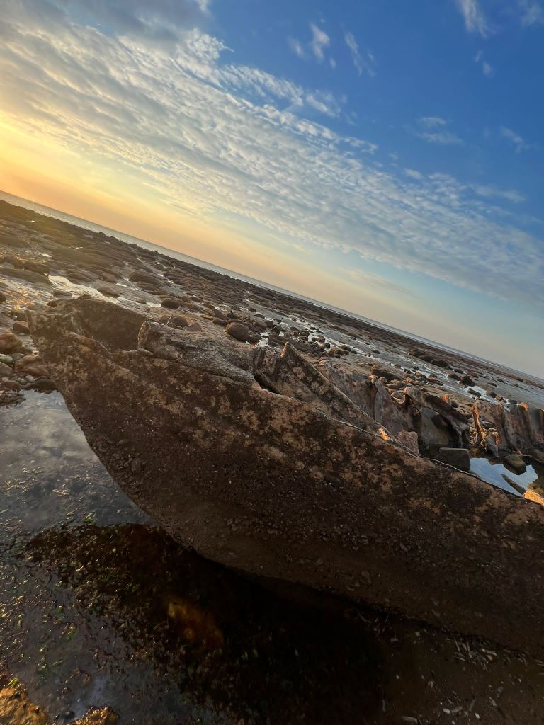
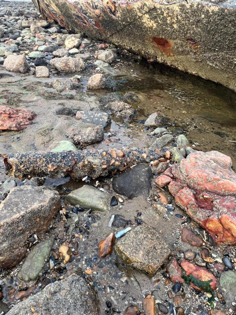
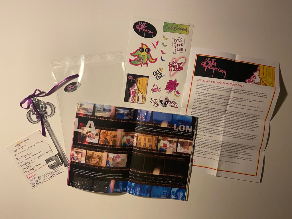
The photographs
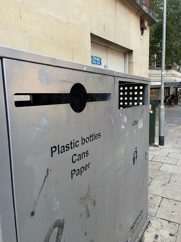
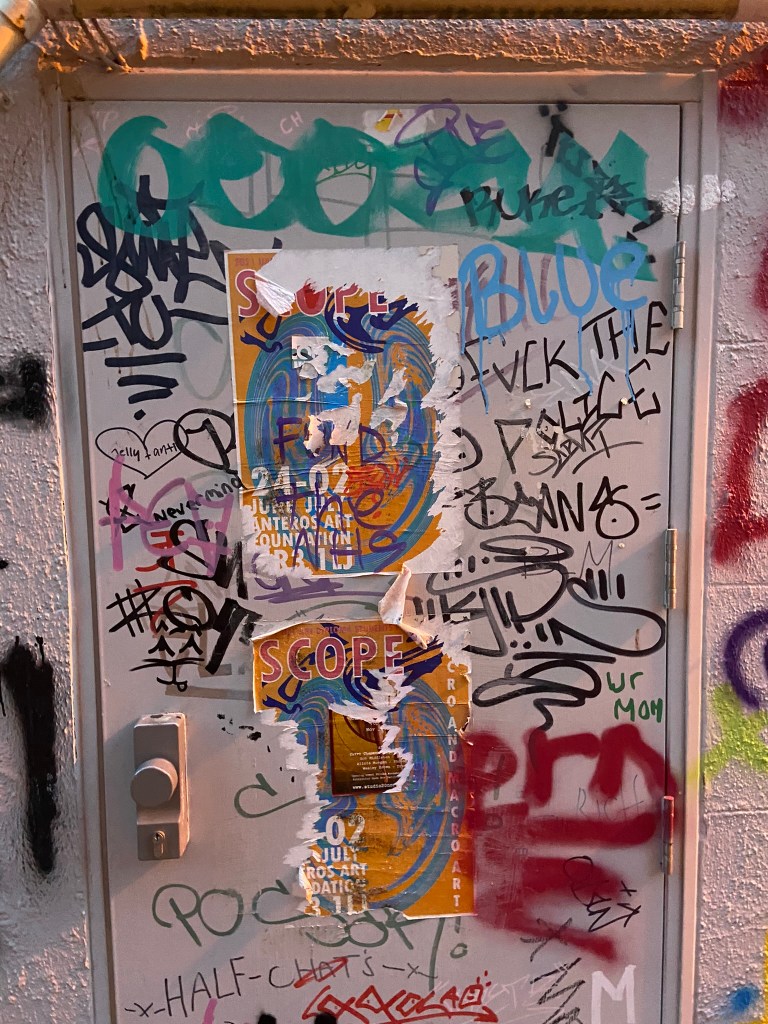
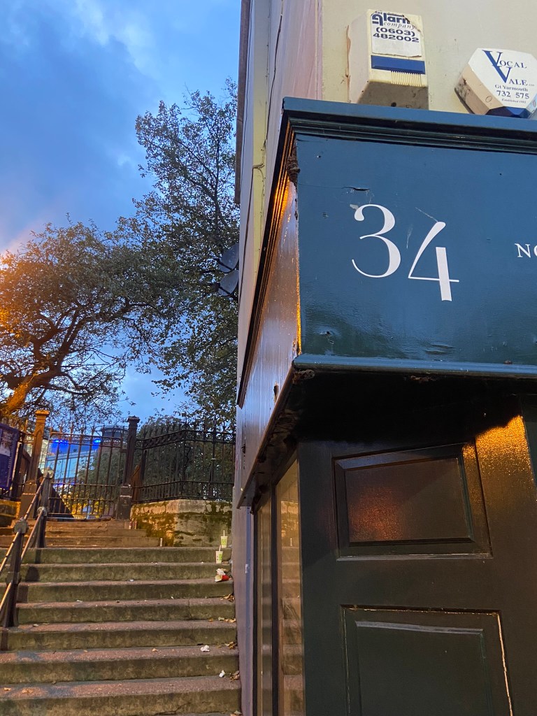
I had already got a small bank of photos from different towns and cities but I knew that for what I wanted for my book Norwich was by far the best place I had seen for urban street typography and art! Norwich is a 2 hour drive from our house and me and Chris left at 3pm on a Monday afternoon. Chris stuck an hour on the car in the carpark and told me to fill my boots! Off we set off down every nook and cranny looking for any sort of inspiration for my book. A lot of people stared wondering at me as I photographed graffiti that spelled out “boobies” among many! I didn’t care if it was relevant or not right now!- I just needed a hefty bank of photos to choose from! We literally photographed everything! Chris turned around to me at one point and said “I didn’t even know we would find this much to be honest… when you said about coming all this way to Norwich I thought it would be a waste of time! Actually though when you look, you can find a lot!” EXACTLY! This was what I wanted the purpose of my book to be! Inspiration is everywhere, you just have to be looking!! A lot of this vernacular typography is hidden, it is there is full view of us daily but we overlook it and take it for granted. Even the graffiti has sentiment, there are messages there to be taken into account.. we just choose not to see it as we associate graffiti with bad and not good. Chris said “graffiti is vandalism though, you are just celebrating vandals ruining things..” I replied that beauty is in the beholder, we did find some lovely examples of sentimental graffiti in nice hand lettering that I could imagine being traced around in design software and being developed into a new typeface!
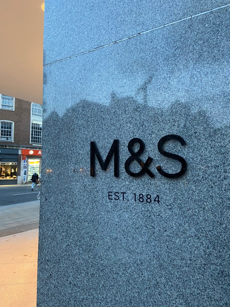
Chris was asking if I wanted to photograph shop fronts such as M&S that have the really nice ampersand and classic typeface; whilst this is lovely, M&S is too commercialized now. M&S in Norwich is the same as M&S in Brighton which is the same as M&S in London which is the same as M&S in Bristol!…These signs as elegant as they look with their typefaces are rather quite samey.. we have seen it before. I was looking for non-commercial beautiful typefaces. A lovely example of one I found was of an 84 in the ground of the church yard in the middle of town in Norwich:
It is a busy walk way and cut through to town but there was this beautiful 84 trodden into the ground. As I was photographing it a man hurried past me right in the way of my photograph and then looked behind him to question what on earth was I doing?.. What was I doing? What is HE doing… he is oblivious to what was beneath him! Another example of how type is everywhere but you need to choose to see it!
I really enjoyed that afternoon.. as weird as that might sound to some people. I was in no rush,..(well, the carpark I guess..) I wasn’t shopping, I wasn’t eating out, I wasn’t spending any money.. I was just walking round with my Fiancé and my iPhone being aware of my surroundings, being aware of the here and now and letting the creative vibes in.
Here are all the unedited photos that I took that night, including some that were already in the folder on my phone entitled “Urban typography”:
We definitely had fun walking around and looking at the random writings on the wall!
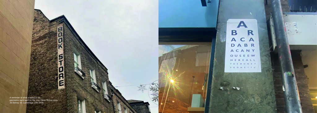
Some of them I was genuinely surprised by! Usually with graffiti it is just mindless ramblings and unintelligent one word scrawls.. Some of these were actual philosophical meanings that were carefully hand lettered and written onto there! I also found a lot of nice looking typefaces on our travels; there were a few with numbers and lovely looking ampersands which were rather very nice! The old pharmacy in Ely had lovely serif typeface inscribed into the building.
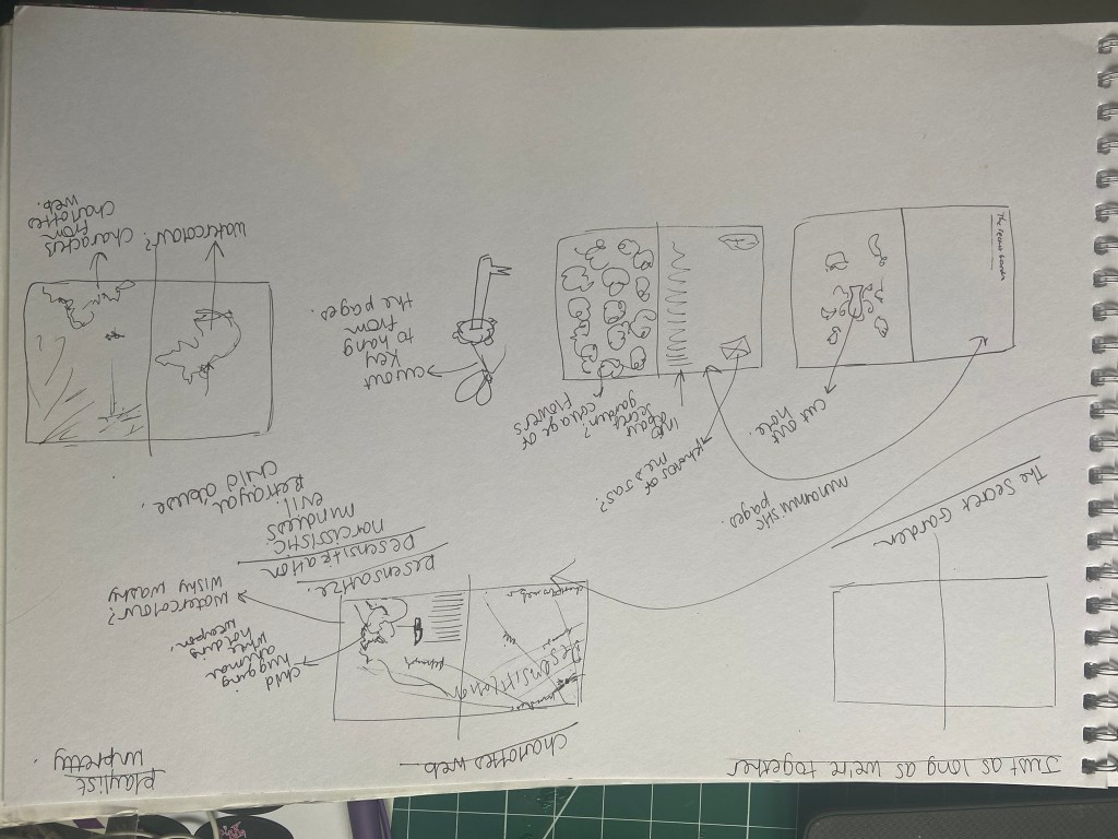
Now that I had banked a lot of good photos, it was time to go home and research further into what content I was going to include in my book which would decide what photos I needed to import into Photoshop to edit to include in my book.
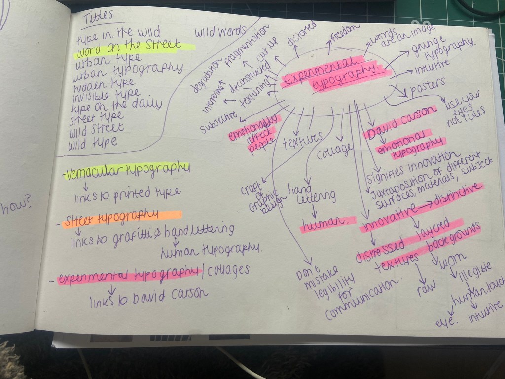
I started off by producing a rough flatplan of my book. I didn’t know yet how many pages I would be having in my book but I could start by planning out the beginning of the book with intro pages, contents etc.. I also needed to plan out how I was going to get vernacular typography, street art and collages into one book and split it accordingly. I had the thought at this beginning stage to colour code each section of the book which is why there are colours following some of the pages.
I also printed out contact sheets of all of the photos I took and highlighted them against their category; Vernacular, graffiti, experimental.
I also mind mapped some research around vernacular typography, street typography and experimental typography:
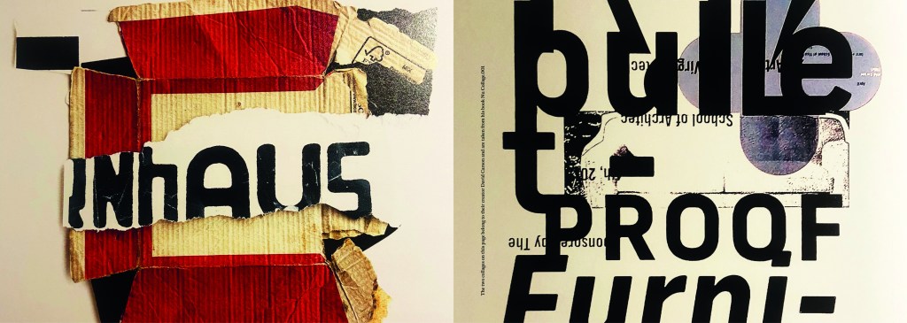
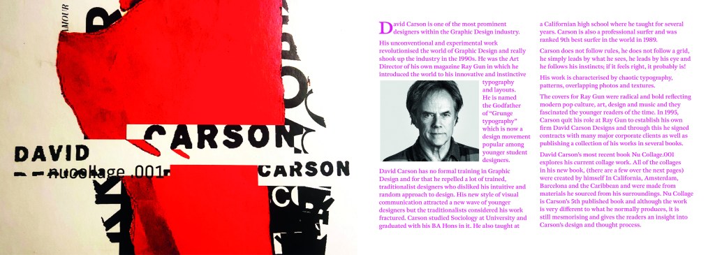
I figured out that my book would have three chapters: Chapter 1 on vernacular typography which would feature the shop fronts, signs and any interesting typefaces I found on my travels. Chapter 2 would focus around the street art; Graffiti and more humanist typography done by hand lettering and handwriting. Chapter 3 would focus around posters and collages that feature interesting type which would then lead into a little bit of information about David Carson whose recent experimental typography work involves collage.
It was difficult to sketch ideas around my layouts as a lot of what I am using are photographs, instead I sketched out ideas for the style of layout that my book might have.
I whittled my photographs down and organized them into their groups ready to edit and bring into my book later.
Timings for my book
The photographs that I took for my book were taken late October whilst I was on half term from school, I started this assignment on Monday 7th November and it was complete by Wednesday 9th. This is not something I am particularly proud of- but I did work my socks off for 14 hours straight on both days whilst being off sick from work, (I have been ill for 3 weeks now!). I had to really organize myself and know exactly what content was going in the book. I am so fortunate to have pre planned ahead and taken all of the photographs I took for the book! In industry I know there are fast turn arounds but nothing possibly as quick as this for a published book! In an ideal situation I would have liked to allow myself more time to add more content- more creative outcomes from the examples that I found (the end, hidden chapter in the book!). Although the turn around for my book has been quick, there hasn’t been any corner cutting. I have successfully included everything I wanted to from my initial idea and I have checked it numerous times for typos. I have just been really unfortunate this year of studying in that I have had so much personally happening.. house renovations, our wedding in 3 months which has been full on organizing!, hen parties, (one of my own, that I organised.. *eyeroll) full time work, fitness and numerous of silly little health incidences this year that have hindered my study time quite significantly! I do like the fact that I had full creative control over my book, in industry I would have been the artist, author and designer and it would have been my content and vision which would drive the book forwards.
The size of my book
I now needed to figure out the size of my book. From doing previous exercises in this unit I have a Solopress paper sample book that I quite like to keep handy for reference and I really like the size of it. I measured it up and it was 21cm x15cm landscape. This is also very similar to the En Suite book that Sarah Horn designed. It is also a very similar size to the 2 books I bought on Amazon.
I decided to go with this size and created my document in InDesign. In my last assignment I made the silly mistake (I didn’t even know what I had done until my tutor pointed it out!) of designing everything in Photoshop (including text!) and then importing it into InDesign. I have no idea why I did that because I have never done that before! I know that images are edited into Photoshop to be imported into InDesign and any text is always done in InDesign and any vector illustrations in Illustrator! I was not going to make that mistake this time! I started editing my photographs in each folder one at a time increasing the vibrance and lightening up wherever was needed. I wanted really bold, striking, bright and colourful photographs for my book!
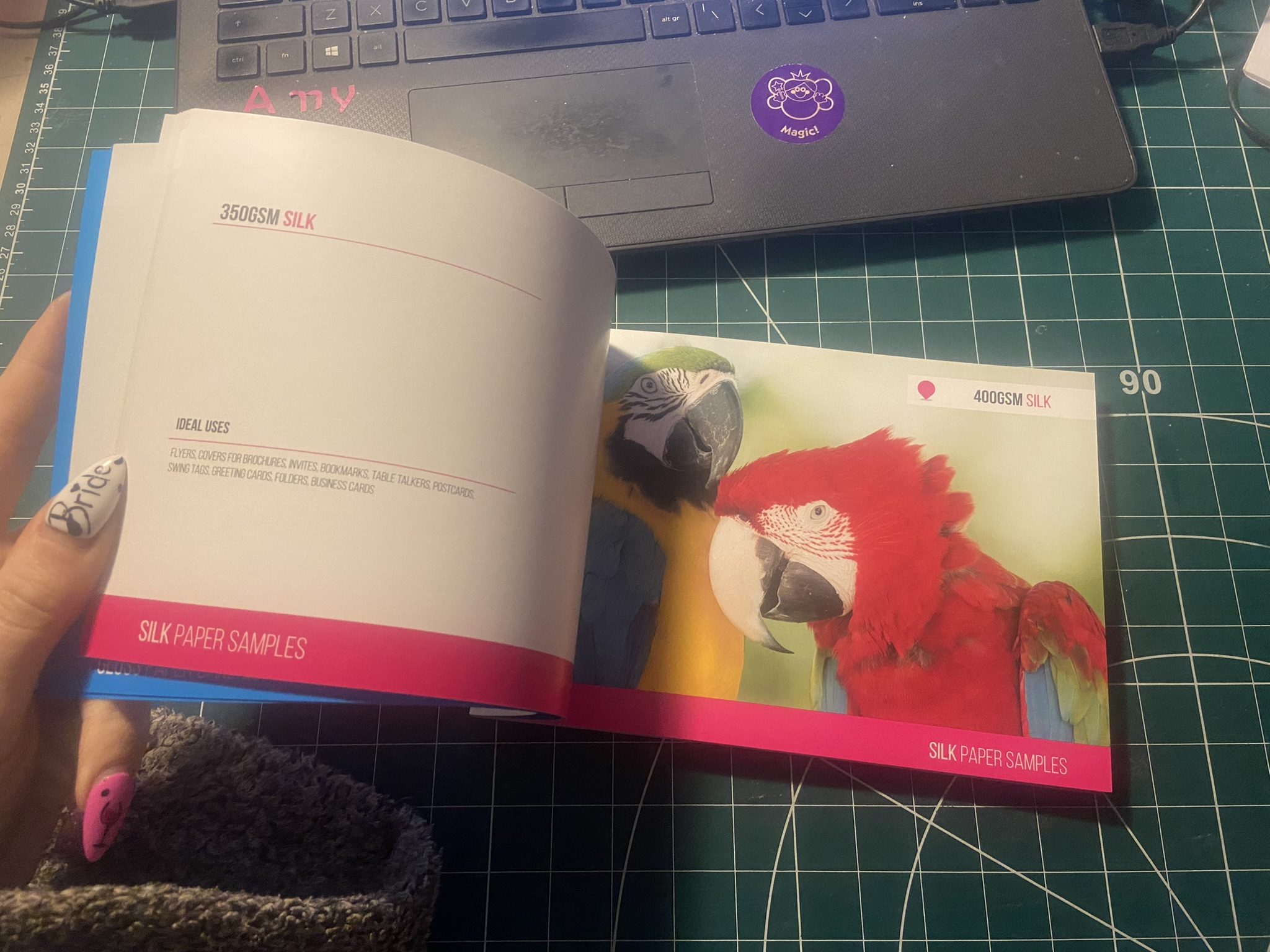
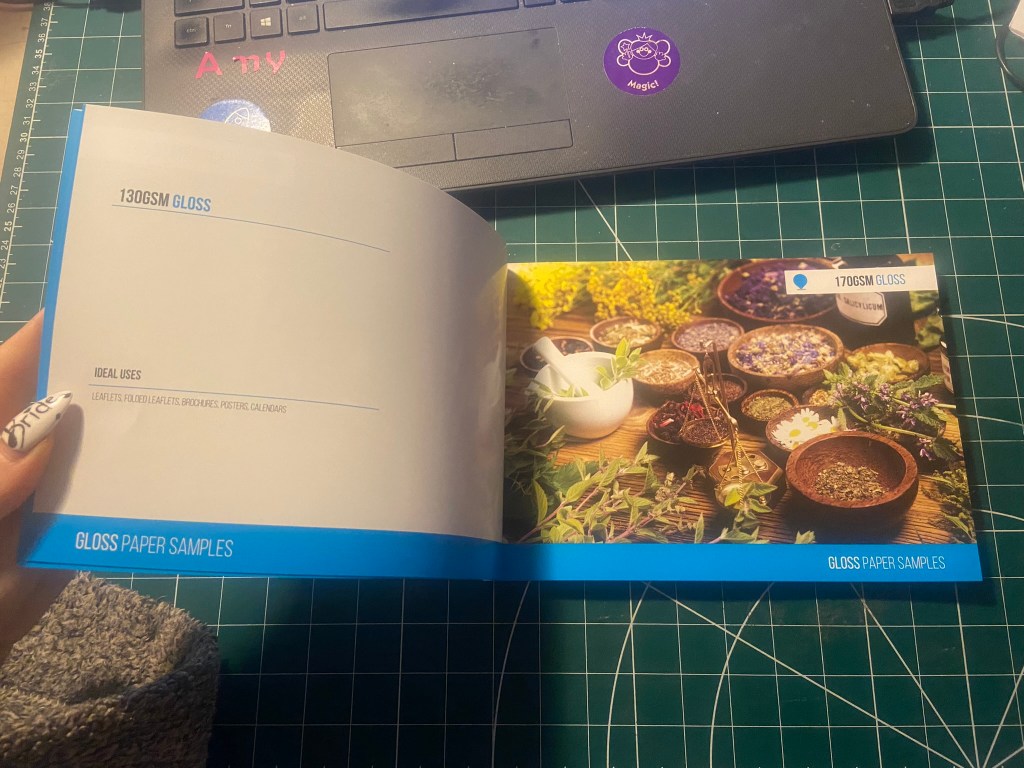
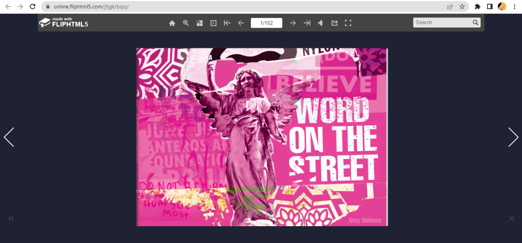
Referring back to Solopress printing book I keep as a reference, I had a look to get my book professionally printed from there. Although I had such a short time designing my book and I couldn’t possibly have a physical copy in my hand for my final course deadline, I plan to have some copies printed so that I can present these for assessment when that date rolls around. The cost of the print depends on how big the book is. My book with all the photographs actually turned out to be a proper book! I only envisioned 40 pages maybe for my book as I have had a nosy at a few fellow OCA students blogs and seen that their work consisted of about that mark.. Mine ended up being 102!! I just had so much good photographic content for it that I didn’t want to miss any out! I also really enjoyed putting it all together.
I inputted some details on Solopress website to see how much my book would cost to have printed:
From looking at their book I flicked through the pages to see what options would be best for my book. I wanted an A5 perfect bound brochure as these were suited for a lot of pages. I like the 170gsm gloss paper for the insides; I needed a glossy paper to show the beauty of the photographs. I also wanted a chunky, glossy front cover so went for the heaviest stock option they had in glossy for the cover. There was paper stock in silk available at 400 gsm but glossy suits the nature of my photo book more.
The costs were not cheap… but then for a full colour, big book like the one I have produced I would imagine that this would be the typical price. It is better to order more copies than less at this point! I would probably try and order 10/15… give some out as promo for my work.
For the time being the best option for my book when I had completed it, was to find an online digital place where I could house it for the time being! I refer back to part 1 of this unit where I state I am not a fan of digital books, I am still not.. but desperate times called for desperate measures and at least this way I had a fully functioning book that could be read in a digital state for the time being!
I found this website, which is actually quite good for importing in your PDFs and it creates a flipbook of your work!
I edited all of the photographs for the book in Photoshop and then created all of the content using InDesign.
My book would be primarily a photo source book to flick through for inspiration so I knew that when It came to laying it out, it needed to have a photograph a page. The front and back covers I designed last because I wanted to finish the whole of the book to see if any inspiration or cool images would be made by the end of the book to include on the cover.
This is page 2 and 3 of the book. I wanted contrasting pages so that they were bright and vivid and stood out. A lot of the photographs in the vernacular typography first chapter were blue in colour or had a blue/grey tint so I decided that Blue was the appropriate colour to start this chapter off!
I wanted a bit of an introductory to the book and a chance to self promo my work. In InDesign I worked to a 6 column grid and positioned my text over 4 of the columns.
For the squiggly graffiti page I cropped a section of the photograph below and then put a filter over the top to give a cool effect!
When I was in Bristol over the summer I took a cool photograph (and a video!) of people “jumping the fire” as the lad told me in the video I took, this is tradition in Bristol.. a right of passage and means that you belong to the city of Bristol. It might be complete Saturday night drunken bollocks but I really liked the photo I took on this random night! It is very urban with the lights and the graffiti and the people in the groups and walking by. It has atmosphere and a vibe if nothing else! I had to use it for the opening page of the book! I edited the photo in Photoshop to increase the vibrancy and added a little bit of a posterise effect.
I opened the book also with a short piece I wrote on the importance of type everywhere. I used Red for this page to mirror the dominant red colour in the Bristol photo.
For the contents I created a page very similar to the opening pages where I took a section of a photograph from my collection and overlaid a filter on the top to create a new feel. I used a contrasting colour to the yellow- red which again ties in to the previous pages and also pops out against the yellow and helps the headings stand out. The typefaces that I am using are Helvetica compressed for the main headings and title – it looks quite “street” and stencil like and then for the body text I have gone for a contrasting and complimentary typeface called Meno Text Semi Bold. This sans-serif is ideal for body copy and really compliments Helvetica.
For the Chapter 1 opening pages I have done similar again, cropped a section of a photo and then laid a filter over the top to create a cool effect and tried to choose contrasting colours. The red is very dominant in my book and the blue is the colour I chose to colour code the first chapter of my book as most of the photos have a cool, blue/grey tinge to them.
The photograph I chose to use first for vernacular typography is below; I really like this one as I’ve explained in the info I have written explaining in my own words what vernacular typography is. For each page of writing I have done I have tried to keep the background white to allow for better readability and I have either aligned the text over 4/6 of the columns or distributed the text over the 2 halves of the page depending on how much text there is as to how much room I needed to take up.
Before I started showing different typefaces from my locations in my photographs, I needed to give some information on how to tell them all apart and how to classify them to readers who might not already know.
I also did the same for serif typefaces and their classifications… This will help the reader identify which typefaces belong to which classification and better help them when they go out into their own urban environment and find some of their own!
Again, I did the same technique with the left hand page by taking a section of a photo and putting a filter over the top and then I chose contrasting colours for the facing page to make the pages pop and really stand out.
These 2 pages were a personal introductory to street art, I documented how important it is to be aware of your surroundings, live in the now and really take in everything around you because you never know what you might find! I used a photograph I took of a street light near a church yard in the middle of Norwich, I just remember thinking how pretty the orange leaves looked against the brightness of the lamp.
The same as every opening chapter I have done up until now, another left hand page created from a cropped section of a photo and then with a filter put over the top. I have used contrasting colours again to make the pages pop.
For the double pages below, I used another photo that I randomly took of the street in Norwich at dusk. It just gives an urban feeling for the opening of Chapter 3.
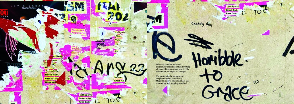
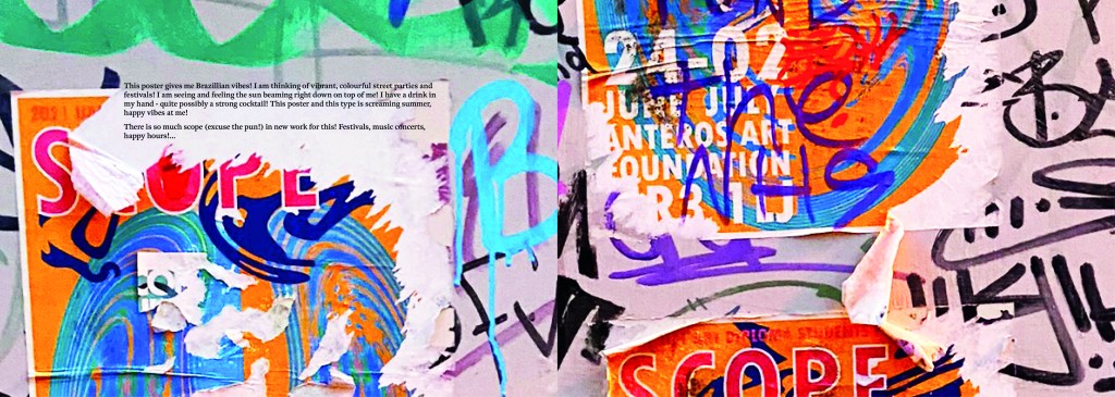
This is where I introduced David Carson to chapter 3. I felt like it was relevant to include him in this chapter as a lot of his new recent work is very similar to that what I found in urban posters and collages in the street. Carson takes a lot of inspiration off the street for his own designs and collages. He rips interesting letterforms off posters or packaging that he finds and incorporates them into his own work. I wanted to show in this chapter how you can take inspiration from these posters, collages and type on the street and import them into your own work to create new, fresh work.
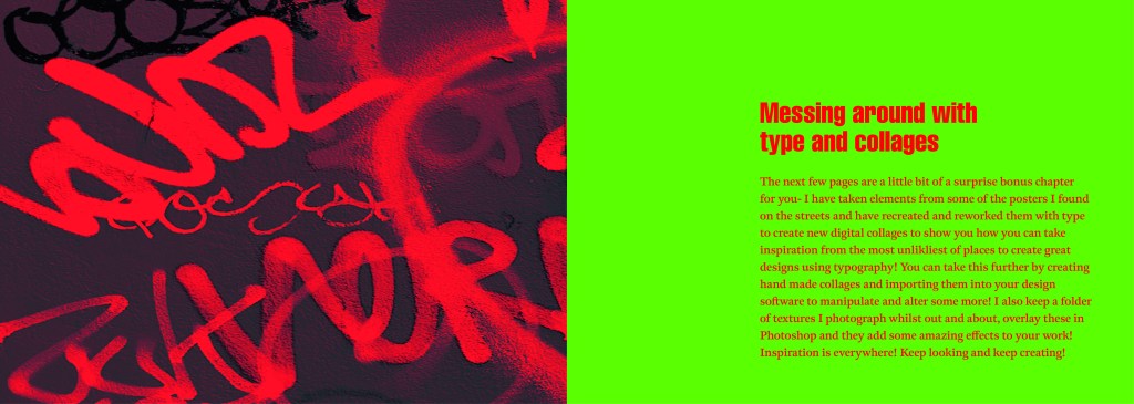
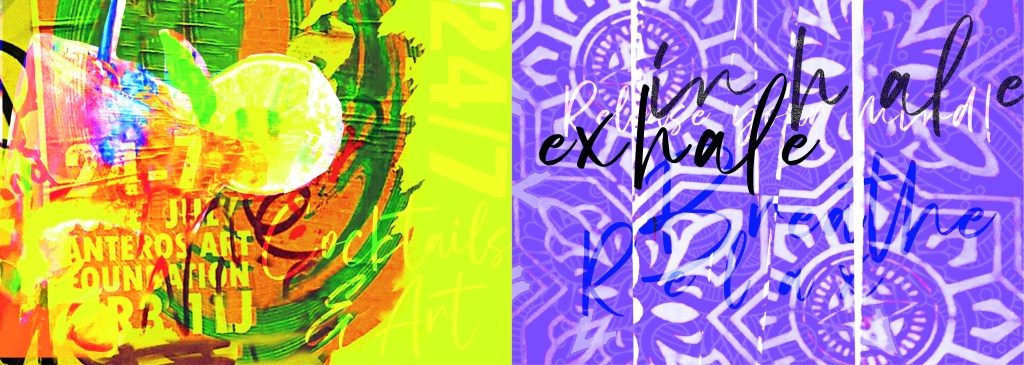
These are the opening pages to the last section of my book which is where I try to bring some inspiration by showing how you can rip text, images, textures, patterns etc off materials you find in the urban environment and bring them into your own work to create some cool art, designs and type.
I created a few examples, I would have liked more time to spend on this hidden chapter as this is really what inspired me to create this book! I would take photos and then use them as textures or as backgrounds or inspiration for any future work! It would be quite cool in the future (even just for fun!) to create a book full of these new, fresh designs made from existing type and work.
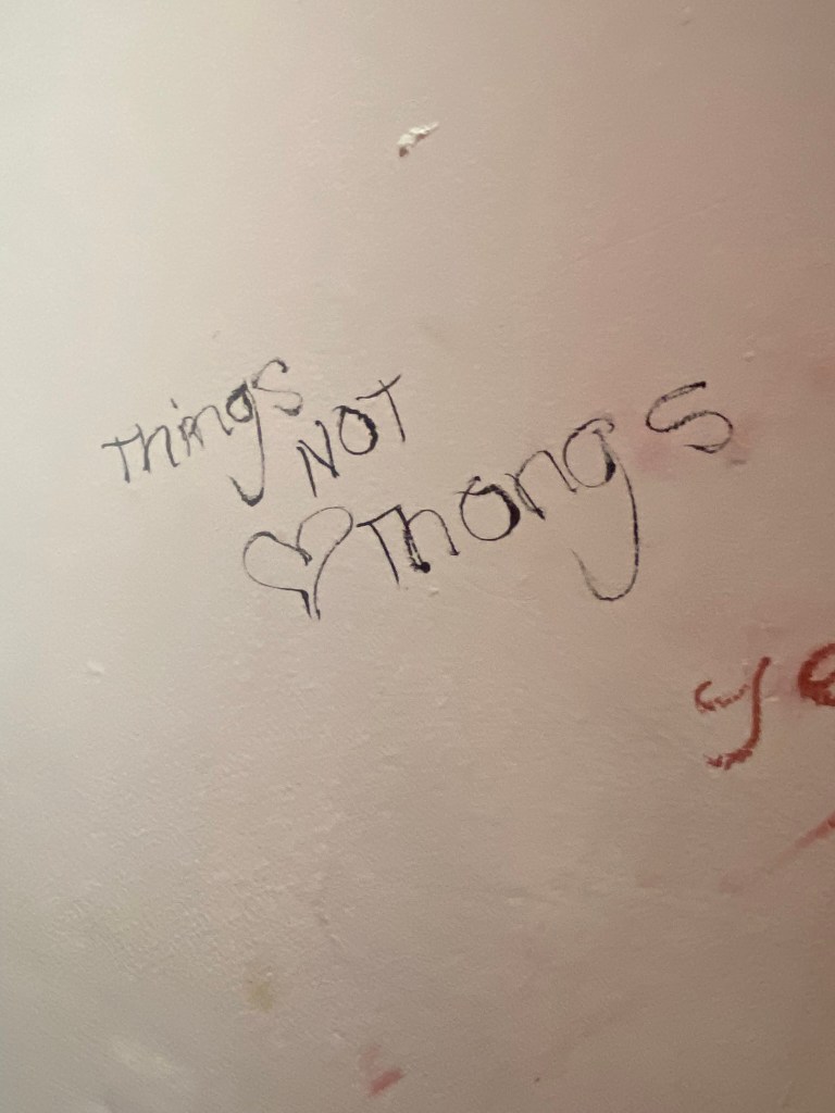
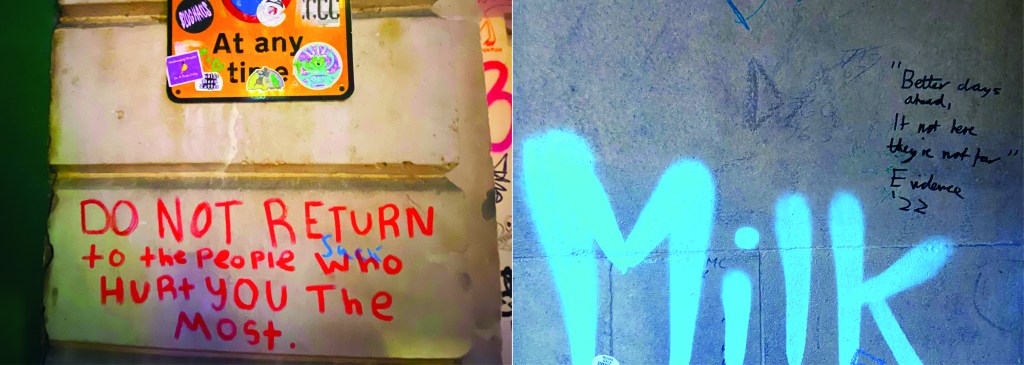
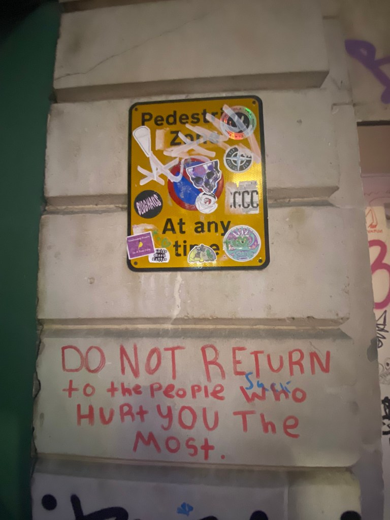
I closed my book off in a similar way to how I opened each chapter. I used the same pattern for the inside back cover as I did for the inside front cover. There was one piece of writing I found on a wall in Norwich where someone had scrawled out a nice sentiment. I don’t know if it is religious, I would guess that is is a song lyric.. nonetheless it had an obvious effect on the person who chose to carefully write it out on a random wall! For someone struggling with a hard time and looking for a sign or something to tell them things will be ok, this is it! I’m not sure if we can class it as typography?… its humanist, its hand writing, we could take the hand writing and create a typeface from it… what a nice little quote though if nothing else and it is a nice way to close the book.
I designed the front and back cover last of all and I’ll be honest I almost totally forgot to!..
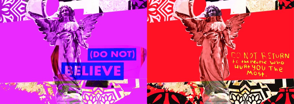
I created these using one of the collages I put together for chapter 3 using snippets of type, snippets of mandala/floral inspired paper and clips of posters. The head of the angel was actually on one of the posters I took a photo of, I have no idea what it might have been, it was just a head! I then went onto Google and found a body to try and best match up to this angel! It is eccentric and weird but I kinda liked it! It is like the word of God! I couldn’t help resist balancing a capital A on his/her finger either!
It is not a typical cover for a Graphic Design typography book and after I designed it I was a bit unsure whether it would actually work… I started to design a back up cover which had a photo of the vernacular typography on that building in my hometown (the first photo in my book!) but then I reminded myself that I wanted to do something I hadn’t previously done.. I found myself moving closer to “My little book of Good Typography “again with how I used a photo for the cover of that. Nope, I would carry on with this cover.. if nothing else it intrigues you as to what it is all about! It almost looks very Punk!
Another one of the quotes I found on a wall I included on this cover and in the book “Do not return to the ones who hurt you the most”, who would have thought you would read these little messages on a wall? Coming from someone who was once in a violent relationship I cannot relate more. It is hauntingly beautiful. The handwriting also had potential to be imported in and turned into a typeface..
I mean, it would be a very childlike typeface but I can see it! I really like the curved shapes of the rounded letterform.
In Fact!.. Let’s just create a page for it! Writing this blog made me decide to create 2 extra pages for it because it shows how you can take inspiration and then create new designs and type and potential typefaces with it!
I really enjoyed designing and making this book, it was a shame I couldn’t see it professionally printed before I submitted this assignment but for my formal assessment I shall have a copy to photograph and include in my portfolio. I am pleased I managed to find somewhere to upload it as a digital flipbook though, it gives a sense of what it will look like when it is professionally printed. I am disappointed with how little time I have had for this assignment, although I am pleased with how hard I have worked to achieve the final outcome that I have. At the beginning of my journey with the OCA and even at the beginning of Creative Book Design, I was very much a perfectionist and just couldn’t leave my work alone. I would reach a final outcome and then have to constantly perfect it. This short assignment has taught me to create designs very quickly and to be content with the outcome I reach just so that I stick to deadlines. I am pleased that I used photographs that I personally took in this book, it makes it more personal to me and knowing that I put the hard work in to source the photos. I really like the photos I took as well, there is a broad range of different styles and typefaces to keep the reader enthusiastic throughout the book. My only worry is that I will be graded down for not using traditional typography, especially as I haven’t even studied vernacular typography in this course at all! I just wanted to show how typography can exist outside of the design studio and is available 24/7 for everybody at any level of training regardless of whether you have design knowledge and experience. How inspiration can be found from the unlikeliest places and how very often we overlook graphic design that is around us daily. I gave my mother in law the link to my book and she said she forgot that there was so much design around her daily and that next time she was out and about she would pay attention more often… Chris even sent me photos whilst on his Stag do of unusual typefaces he found on his travels! It’s contagious! everyone soon shall be observing type out and about in the wild!
My First thoughts about the brief and reflecting back…
Completing this 3rd part of this course has actually taught me a lot more about the grid system and layouts than what I already knew and it has helped me to develop my knowledge more which made this assignment much more enjoyable and I am very pleased with the finished designs and finished books!
I started to brainstorm ideas for what content to put inside of my books one late night whilst I had to sit in my car ALL night and wait patiently for my fiance in A&E! (minor accident, few tetanus jabs later!..) It worked out quite well though because I watched a few videos (until about 4am!) on LinkedIn by a really quirky dressed American Graphic Design teacher about typography which really helped me to create the written content for my pages:
The main topics that I was considering were:
Contrast
Grid
Kerning/Tracking
Skipping a weight
no more than 3 fonts
Justified left, ragged right
Readability-clarity-legibility
negative space
Hierarchy
Bad typefaces – Comic Sans, Papyrus
Not distorting type
Typos
Widows/orphans/rivers
Fonts matter
There was a lot of rules that I could use in my books! I was worried though that my books were only 8 pages! This meant that I could only be allowed 3 double pages in each book and I knew that I would be writing and designing for one rule per each double page spread which meant I had to choose wisely! I didn’t want to cram loads of information over single pages. This would mean that I would have to choose a few rules that are similar and could be classified under the same subject: E.g – I decided that skipping a weight, choosing 1 typeface but different fonts within the same typeface and using contrasting colours would all come under the rule and the “creative umbrella” that is Contrast. Skipping a weight creates contrast as does choosing different fonts within the same family and using contrasting colours.
I had designed similar in Core Concepts for “If the Face fits” – a typeface sample book and I really loved that exercise! I was really pleased with the layouts that I produced for it and I knew that I had a lot to compete with for this assignment! I wanted to at the minimum achieve the same results as last time if not excel and design and create something that has developed and grown since then! The layouts for my type specimen book were very clean, minimal and spacious.
I have to admit I felt threatened by the title “My little Book of Good typography”, I felt frozen by the fear to get started for fear of attempting to create a book on Good typography but it ending up being bad! I was worried that what I have learned so far would be good enough to create a title of this nature! At the same time I was also worried about creating a book on bad typography because I am such a perfectionist that I really struggle to do things bad!! There was a lot of growth and development within this assignment; as my Fiance said – “It has travelled far”.
Let’s see where it went…
Research
As I mentioned above I did a lot of researching into potential topics to use within my books in the early morning of a night sat in my car at A&E! Watching them videos though was helpful and I did pick things up that I didn’t already know! – Type classification and how to choose typefaces that contrast and work with each other. I also did a search on good and bad typography books and stumbled upon a book from Craig Ward, (which looking back now I have only just realised that I used his quote on the back of my Good typography book!) his book called “Popular lies* about Graphic Design” intrigued me as I liked the look of the clean, minimalist layouts and it was also a small, pocket sized book which closely matched the brief of this assignment.
When I first saw the brief for this assignment I was hell bent on creating ugly pages using Comic Sans as this is one of the most hated typefaces but It was after reading one of the articles in his book that I decided against it; it made me rethink that is it actually hated or is it just massively used and overused in the wrong context that just winds people up?… A victim of misuse! It was a debate that I actually couldn’t justify using in my books in the end plus it seemed too cliched; I imagine everyone would have that appear in bad typography.
Craig Wards book basically highlights popular Graphic Design rules and pulls apart whether they are actually tried, tested and they work or whether they are just “lies”.
These experimental layouts then lead me to remember about another book that graces my bookshelf:
“Show your work” by Austin Kleon, it is another little book full of simple layouts aiming to boost creativity and confidence.
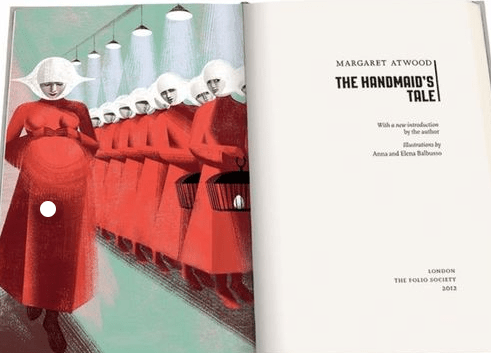
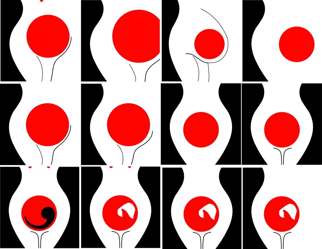
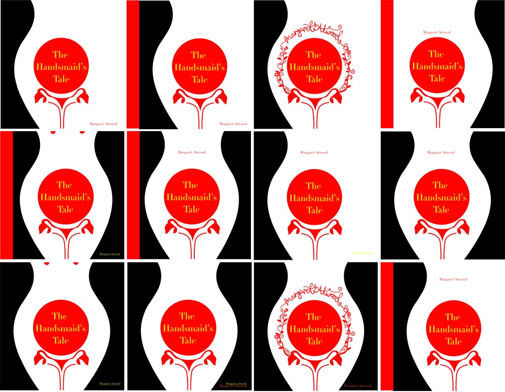
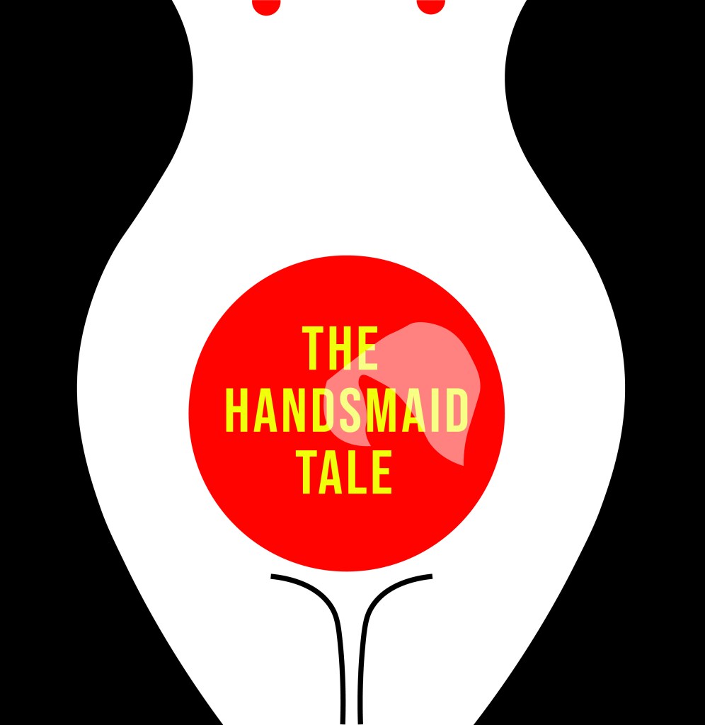
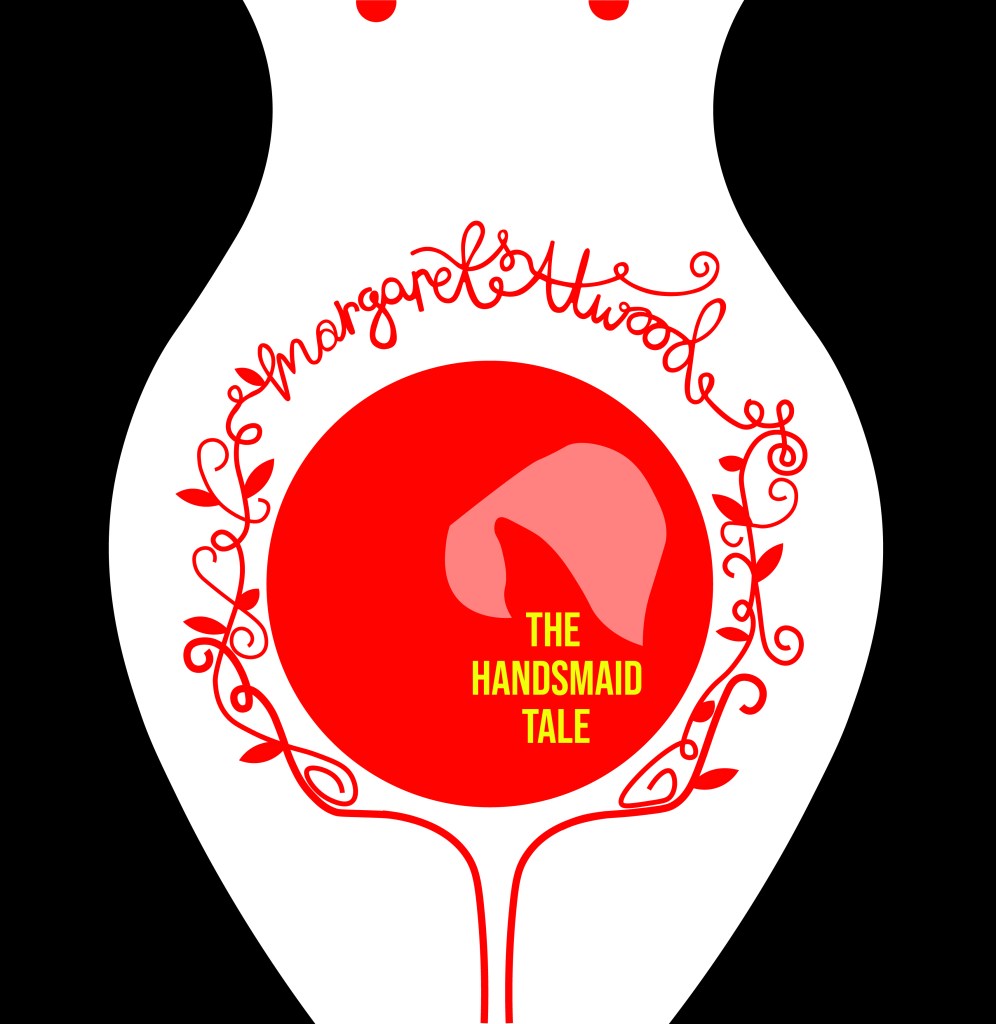
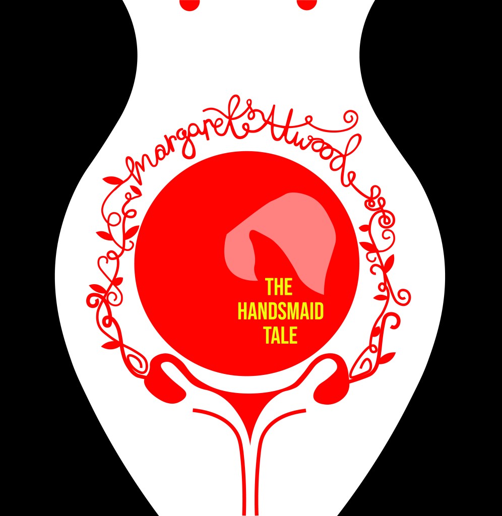
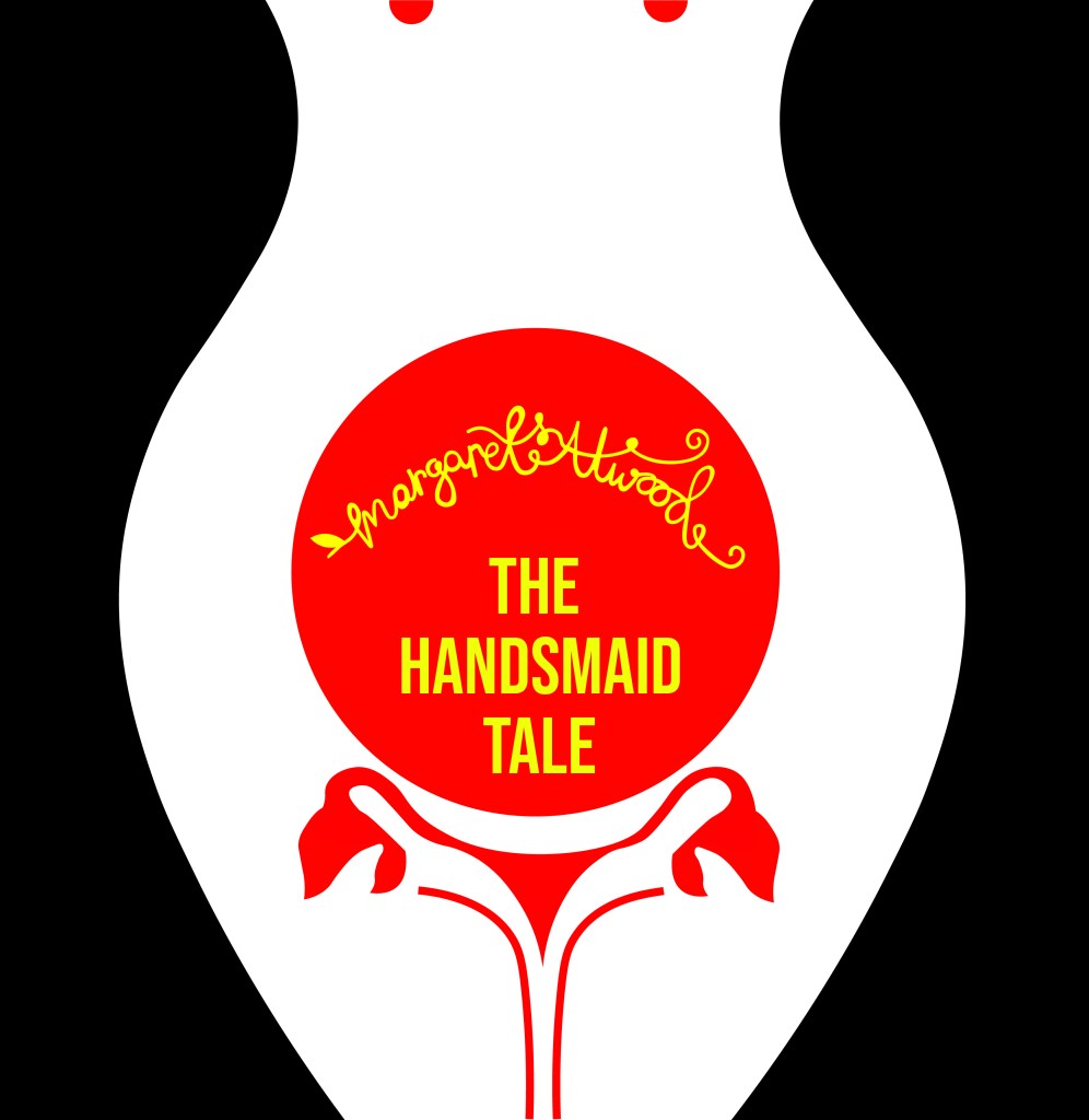
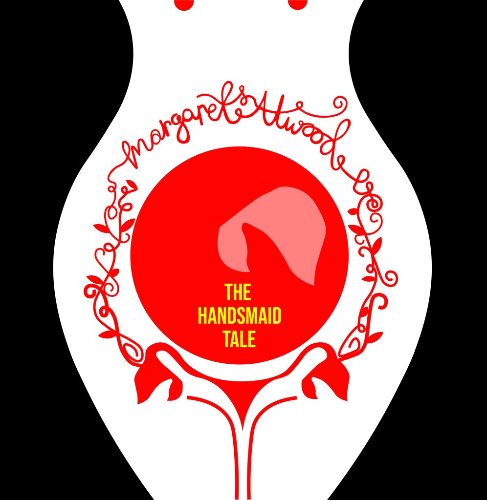
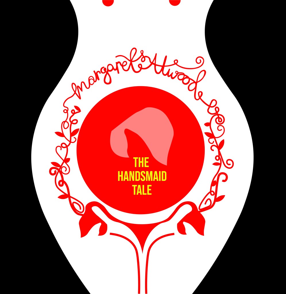
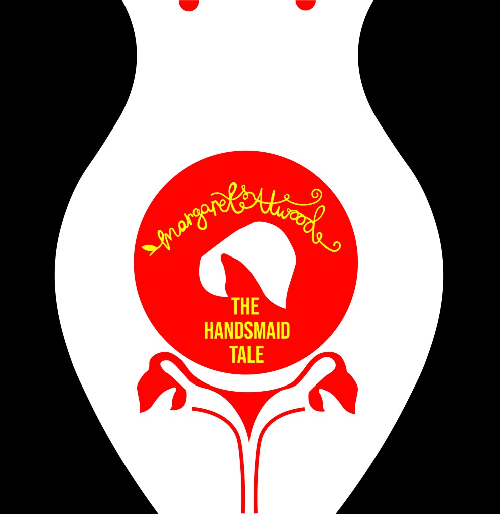
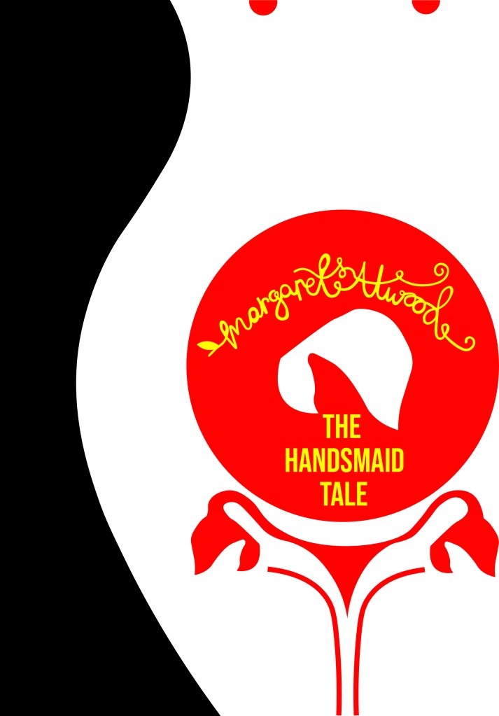
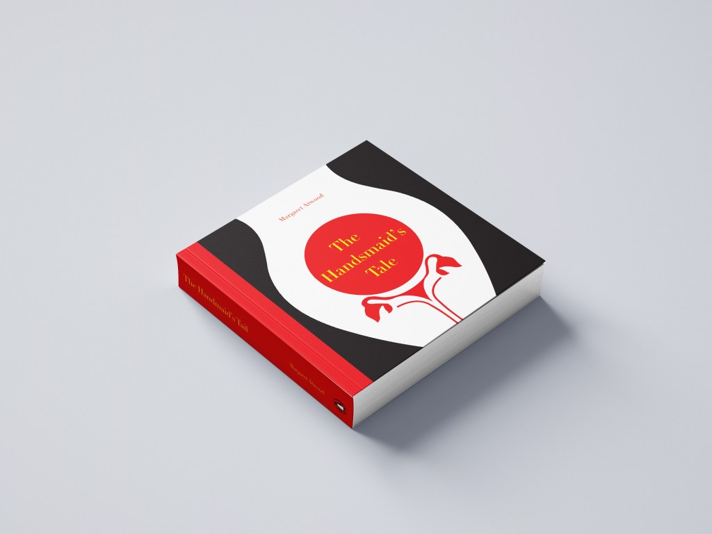
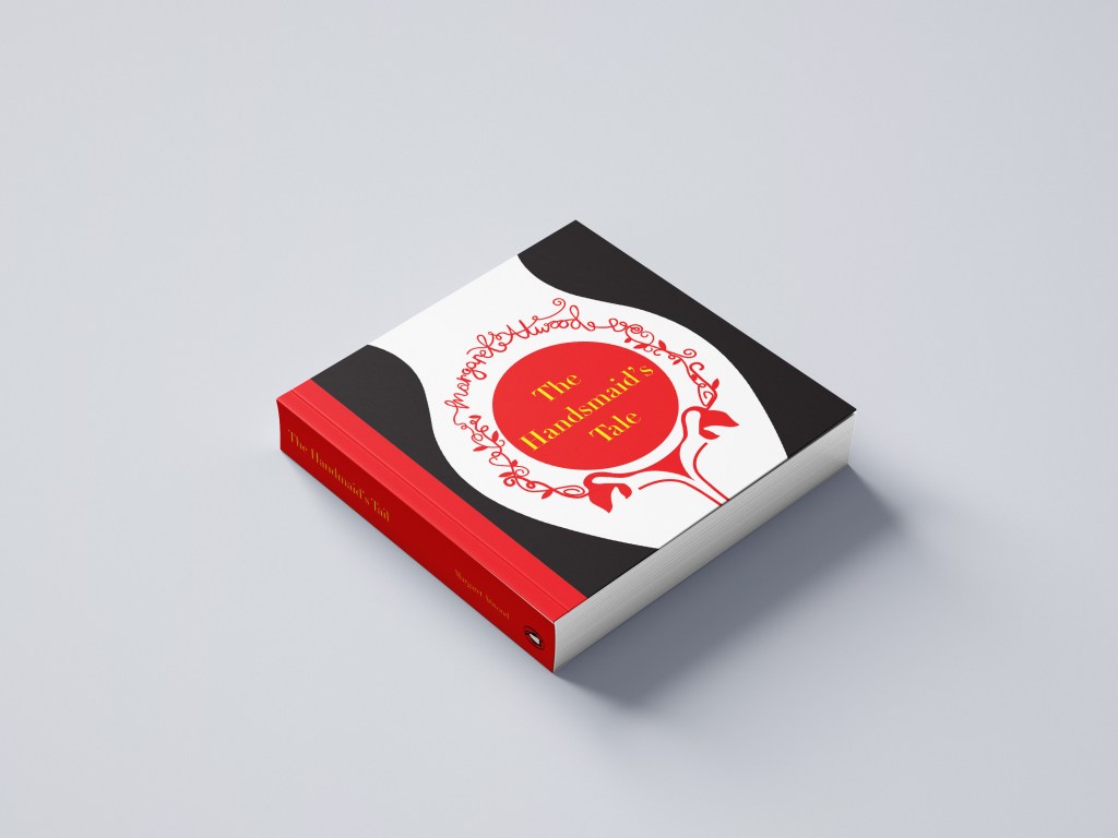
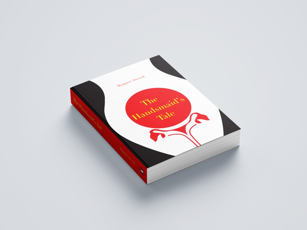
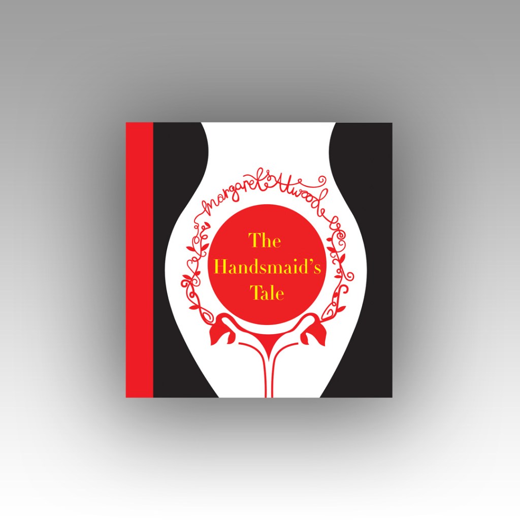
Taking into account the feedback I received from my tutor on my Handsmaids Tale book (where I created a mockup of my design on a square book) where my tutor suggested that not many books are squared and I may wish to rethink my decisions for future books – I looked at this little book which is squared and figured that this assignment might be an exception to the rule – I actually took a risk and using the same measurements as Austin Kleons book I used the same measurements to create mine further on into the assignment.
It started with 2 photographs…
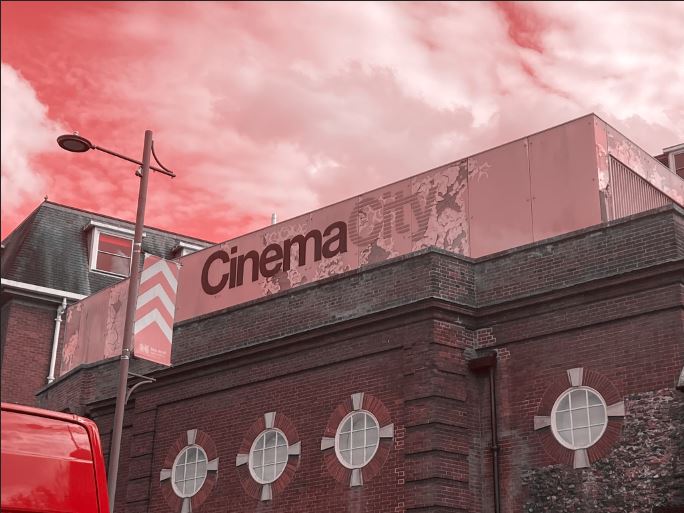
Late August I had a lot of trips out to various places; one of them places was Norwich (My wedding dress is there!) and as I was randomly walking around – I have only been there a handful of times now – I spotted some great typography on an old building that I loved the look of. Beautiful Swiss type on a classic old, industrial feeling building in a really urban, gritty, dirty environment. Good typography really is invisible! The typography that sits there completely overlooked on a daily! I had never even heard of the company CinemaCity before I took the photograph of it – I just assumed it was an old company that had gone under over time! However, I took the photograph and put it on my @Pink_Angeleno instagram page as a story about great typography that is completely overlooked.. I stored it on my phone and it was only weeks later that I decided that this would be a great photograph to use in my book! The typeface used was Helvetica and that is one (if not the one!) of the most loved typefaces of all time. I could do a piece on how great Helvetica is and how it is perfect because of its legibility.
I’ll be honest I didn’t even sketch any initial ideas for this! The ideas flowed from the photograph and as soon as I took it into digital to mess around with it, it got developed and changed until I reached the best design outcome! The rest of the Good typography book flowed from this one photograph – the feel, the colours, the vibe!…
I then needed my bad typography book to follow in the same footsteps and again, it’s only out of pure chance that I ended up taking a photograph on one of my other trips out in late August to Bristol that ended up being stored on my phone and then brought out for my book!
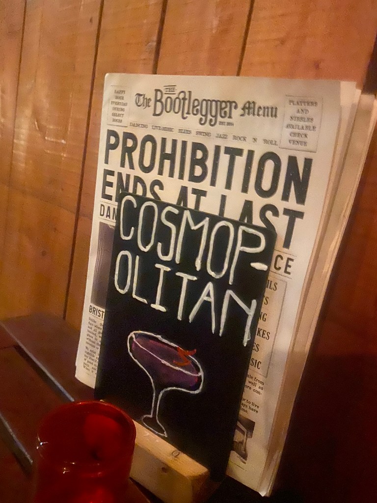
Late night in Bootlegger in Bristol with my Dads girlfriend after drinking my bodyweight in Sauvignon Blanc, cocktails and Jack Daniels doubles my drunken, incoherent self decided that sat next to me was a really bad sign! I was possibly babbling on about Graphic Design to my Dads girlfriend at that point.. who knows? All I know is that in that drunken moment I had to photograph this sign.. because? I just did!
Cosmops!!! All I could picture was an inexperienced young member of staff, (bad I know!) who had been told to create some chalkboards to advertise cocktails, they started off great but then realised they had run out of room and decided to just hyphenate it because that was the best thing that they could do in that situation other than having to wash it off and start again and take the time again to carefully arch each letter and make each one the same size…! It made me chuckle at the good effort and attempt but at the fact that it just wasn’t right!
I didn’t realise at the time I took this drunk photograph that it would be the idea and basis behind the bad book of typography for this assignment!
Looking back there are also examples of bad typography I only wished I had photographed! – What I learned from this assignment is that if I see anything I feel like I need to photograph I don’t need to think about it – I just should! I am creating a folder on my phone of random images that could later be used in future work! – Another example I wish I photographed was a sign that was placed on a tree opposite our house by one of our ridiculously interfering neighbours!.. She had placed some herbal plant in a big recycling bag at the base of a tree and wrote a sign saying – “please help yourself, put it in your house, its GOOD for you!” I made myself chuckle by reading it out in a hideous, monstrous voice because the way she had written it looked and read so aggressive and unhealthy!! I could have used that as a photograph to accompany why fonts matter!!
Good Typography page 1 &2! Hel to the yes with Helvetica and legibility.
Starting off with my photograph as what was then a really rough idea!- I imported it into Photoshop and had a mess around to see what I could do to change the colours, vibe etc.. I wanted to keep it very much in keeping with Swiss typography by keeping Red as the main dominant colour. The corner of the Red Royal Mail van set the tone for the red too!
I messed around with firstly putting a photo filter over the top of it, it added a mood to the sky but other than that the image just wasn’t striking or “modern” enough to use as a main image in a book!
The same week as I also started messing around with this, I also had my first Graphic Design interview for a job that I wouldn’t have really minded having a chance with! (I never actually heard back from them after the interview though!… *eyeroll) but during my process of prepping for it like an absolute mad woman (thanks again! like!… really appreciated!) I had to study their website to find out a little bit about them! -I noticed that their branding was also Red and I also noticed that they used a nice striped background on a lot of their images which gave me the idea for my photograph…
I did like this and decided to try and recreate it in the background for my CinemaCity!
I am still learning Photoshop, so googled how to create a diagonal striped pattern and then placed it behind my photograph. I then used the polygonal tool to cut out the sky on the photograph so that the striped background was visible but didn’t cover the main image.
I then changed the colour of the stripes near the lamppost which made it look like streaks of light were coming out of it which I thought looked quite cool! This layout felt more striking and modern which I was much more happier with!
I didn’t want the image to cover the whole layout, (I decided to make the size of my book 12.5 x12.5 which meant that this layout was 25 x 12.5) I wanted to have a spacious feel to the layout and make negative space very much a part of the design.
I then needed to concentrate further on the hierarchy and content for the layout:
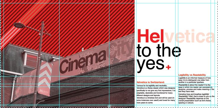
I decided to move the photograph to the left but then I decided that I needed to put some of the knowledge I had learned in part 3 to some use and create a grid to work my layout around; I created a golden section/ spiral grid and worked the rest of the layout around it. The “eye” of the layout as I call it!- or the point of the spiral is where the main focal point is on the layout; it is eye level and it is where the eye travels to first. This is the spot where I have put the Swiss cross. I then found that my eye is led to the text below to read what the layout is about and then the photograph is the nice visual imagery that accompanies the whole layout!
I wanted something catchy for the heading of the piece!- a pun! something cheesy but which catches your attention and makes you want to read further! I did start off with just writing Helvetica but then decided that was far too boring! – How do I convey how good this typeface is? Hell yes! I kept Helvetica but then toned down the opacity on part of it so that the main heading reads “HEL to the yes” I liked it!
I wrote about how Helvetica is a very neutral typeface – it gives no impressions, it is what it is. I then thought about the saying that goes “he/she is Switzerland” meaning sat on the fence and not taking sides.. it also helped that Helvetica is Swiss so this made perfect sense! The sub heading to the piece was “Helvetica is Switzerland”. I then accompanied this with a piece of writing about legibility vs readability – 2 important topics within typography.
I wanted to keep it minimal and clean looking and wanted negative space to play a big part within the layout; I split the right hand side page into thirds and kept the content very much to 2/3, allowing the top of the spread to breathe and remain spacious!
I did then print a test page out just to see whether the content was readable! – the last thing I want is to lecture about readability and then the reader can’t actually read what I’ve created because the type is too small! I decided to change the layout slightly and make the text larger just to see if it was more easily read. It worked, but it didn’t work as well as the smaller text. I felt it lost a bit of its strong structure.
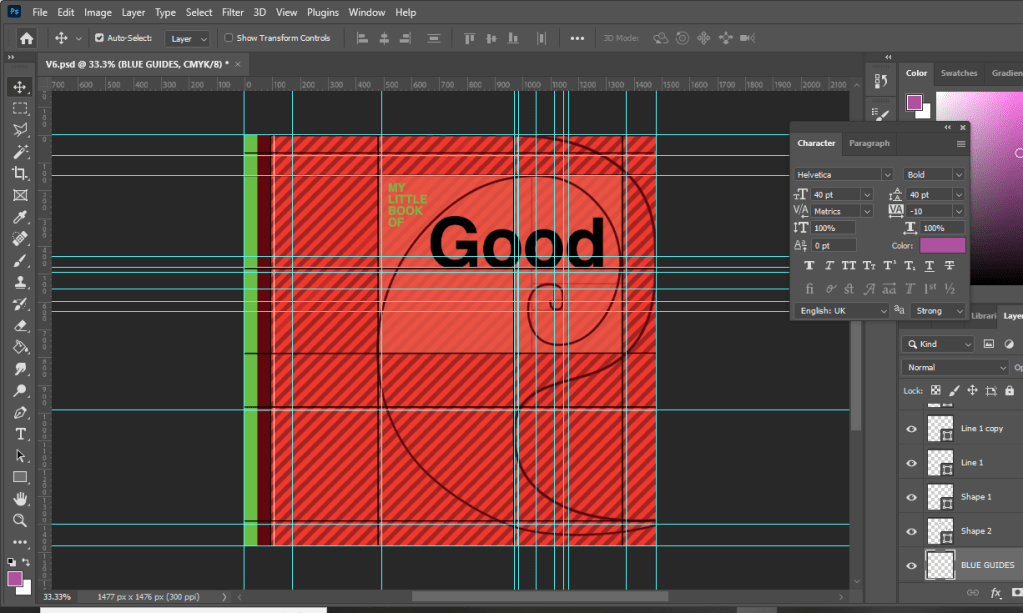
It then got me on to thinking about what a potential front cover might look like for this book and how I might create the other pages to mirror this layout… I was thinking about how I could potentially tie both books together – the only idea I had was like Yin and Yang! – Good, bad, light and dark, hot and cold, sweet and savoury! That was what these books were! one was Yin and the other was Yang! I started to explore possibilities around this idea and how the pages and layouts might work around it…
I sketched a few ideas… I had the idea of the books joining like the Yin Yang symbol; It would involve a section out of the books being cut out though, this would make the layouts smaller, busier and tighter. It would also make one of the books back to front which would be Ok because that could be the bad typography book!- one thing we don’t do in the Western world is read from back to front – consider it another rule broken!
With this in mind I started to create some ideas for a potential front cover..
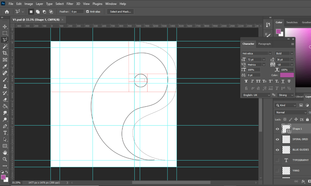
Using the Golden spiral grid I created my first Yin Yang shape… the circle of the symbol is in the main focal point of the spiral. The book and the pages would be cut to the symbol.
I then added further and started to try and build in the typography to the design…
I absolutely hated it but carried on! – it reminded me of a really dull, 1980s textbook I was probably made to read when I was a teenager!
It looked slightly better with larger text…
I then tried to bring in the Red…. It then looked like a Constructivist, aggressive book!
Brought in a bit of Green to try and contrast against the Red and also to soften it… Green is more of a natural colour.
I then decided to try and highlight the grid and the golden section more… I highlighted the rectangle which formed the golden spiral of my Yin symbol.
I then added the lower part of the symbol.. hated it, it looked like a foetus!
I hated the covers I had produced… but going back, I looked at how I would have to potentially change the layout to work with the cut out book and pages. I drew out the outline of the Yin symbol and worked out which part of the page and layout I would lose on both sides. It seemed a good idea… but I hated it. I felt that it would have to be cut by hand when I had printed the finals out and it would look shoddy and unprofessional. The phrase “keep it simple” resonated with me and I went back to the drawing board.
I then had the idea to tie in the Helvetica double page spread with the front cover. This could work… it would all lead nicely into each other then.
I then went back and tried a few designs for front covers using the Cinema City photograph:
I wanted to highlight “good” by making it larger but it just blended in with the Cinema City which is not what I wanted it to do! I wanted the title and the image to stand out each by themselves and not blend in together!
I felt that this worked better.. but I just didn’t love it. I didn’t want to go with it and regret my decision later when I decided that I hate it!
This was heading in the right direction! There was just something not quite right yet! – I felt like it was the stripes taking the attention away and smothering the rest of the design!
When I removed the stripes it worked so much better!!! It was clean, spacious, minimal.. the colours worked together and it just felt like Swiss typography! I loved it!
Loved it!!
Loved it a little bit more when I added in the grid element!!
I really wanted the stripe design to follow all the way throughout the book;, I had to take them off the front cover because it stifled the rest of the design but I decided that I would create inner inside covers with just the stripes to then lead into the rest of the book!
With the front cover, inside pages and the Helvetica layout smashed I was on to a good start! I then looked into what else I could do for the other pages…
Good Typography pages 3&4, Contrast!
For the next good typography pages I thought that I would do contrast – purely because like what I mentioned earlier there are several rules that come under the contrast umbrella.
Contrast using contrasting colours
Contrast using harmonious complimentary fonts within the same typeface family
Contrast by using different font sizes and skipping weights, using different line weight thicknesses
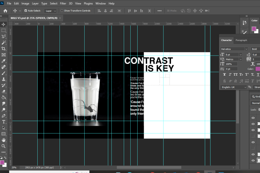
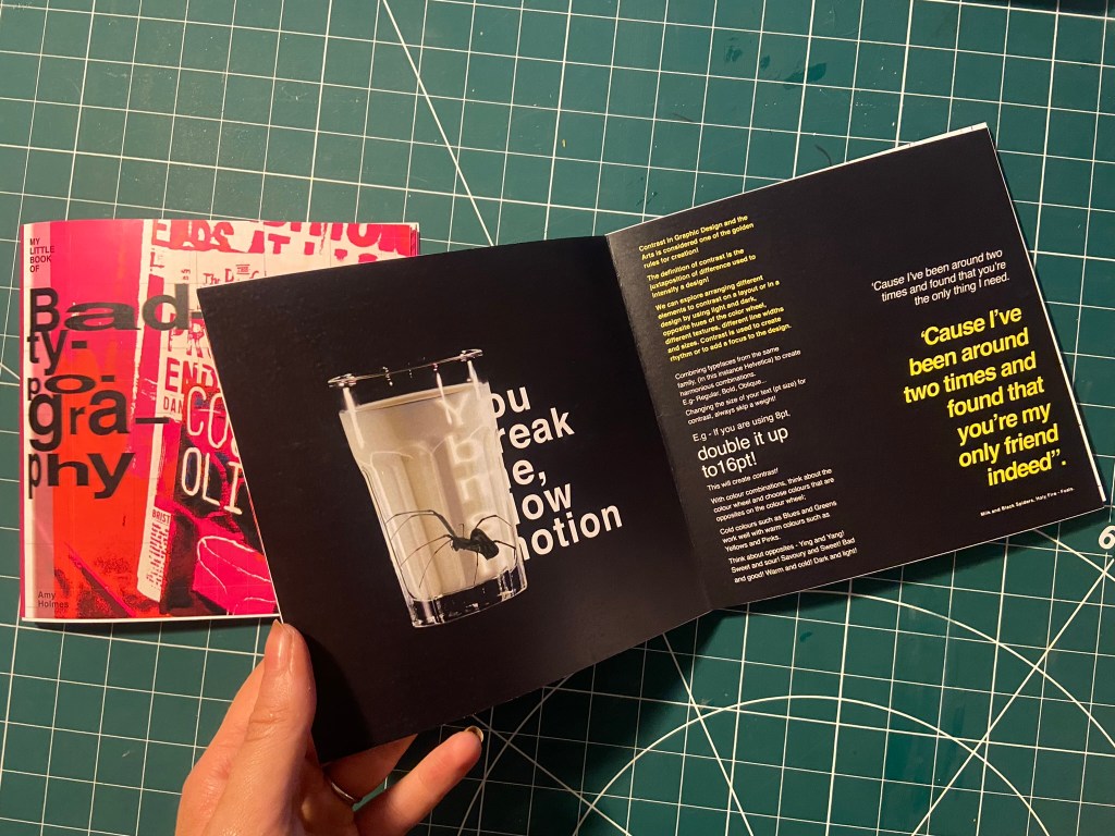
One of my favourite songs is Milk and Black Spiders by Foals and a few days before I started designing for this layout it was playing in my car on the way to Tesco and my fiancé was asking what the song was about, he was like “I guess its about contrast really isn’t it” this got me thinking about including the song and the metaphor of the black spider and the white milk as the subject for my contrast spread!
As a starting point I needed stock photography of a Spider and milk! I was going to take my own photograph of a glass of milk but felt that a free stock photo that I found on Pexels.com was perfect:
I then found one of a Spider which was also perfect! I could cut around the spider using the lasso:
I started off by creating a similar layout to the one I did for Helvetica. I wanted to keep the imagery very simple – I was undecided whether I wanted the Spider walking near the glass of milk or the spider (cruelly!) submerged in the glass. Submerged in the glass seemed a bit more dark and edgy for the feel of the piece! I also knew I wanted to use some of the verse of the song on my layout “You break me, slow motion” is a very haunting verse to use for an edgy looking layout!
Messing around with the dark/light, black/white on the layout…. it just didn’t seem to work though
I much preferred the milk and spider to be alone on the left hand page. It was clean, spacious and it felt like it gave an isolated, lonely, daunting, edgy feel to match the mood of the colours and the layout.
Using the saying “contrast is key” I tried to mess around with the layout again, there just was no contrast at all in this though – the text is all too big, it all blends in together and looks too harsh!
I tried to mute the “contrast is key” and have it bleeding off the page but it just wasn’t right…
I created contrast with the song lyrics by alternating between white and yellow text. I used yellow because it contrasts well against black and also because it is like a warning colour- this layout is about Spiders which brings warning to most people who have a fear of them!
It was important for me to achieve contrast in the written content; I had a large body of text and I had to try and keep it readable in such a small publication but I also needed it to contrast against the rest of the layout.
The end result of the Milk and Black spider was promising though!- I decided to distort some of the text behind the glass and reflect it to look larger as though its in liquid. I manipulated some of the spiders legs in Photoshop to make them bend to look as though it is pressed up inside the glass.
I think the final layout for this works well!
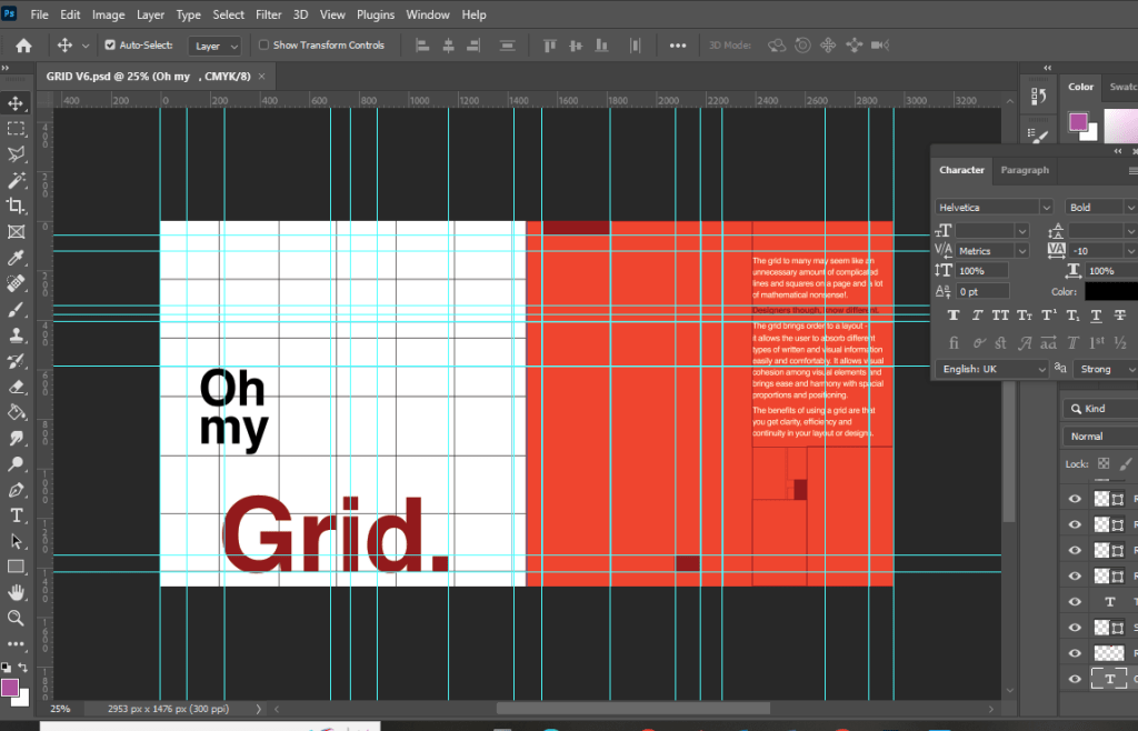
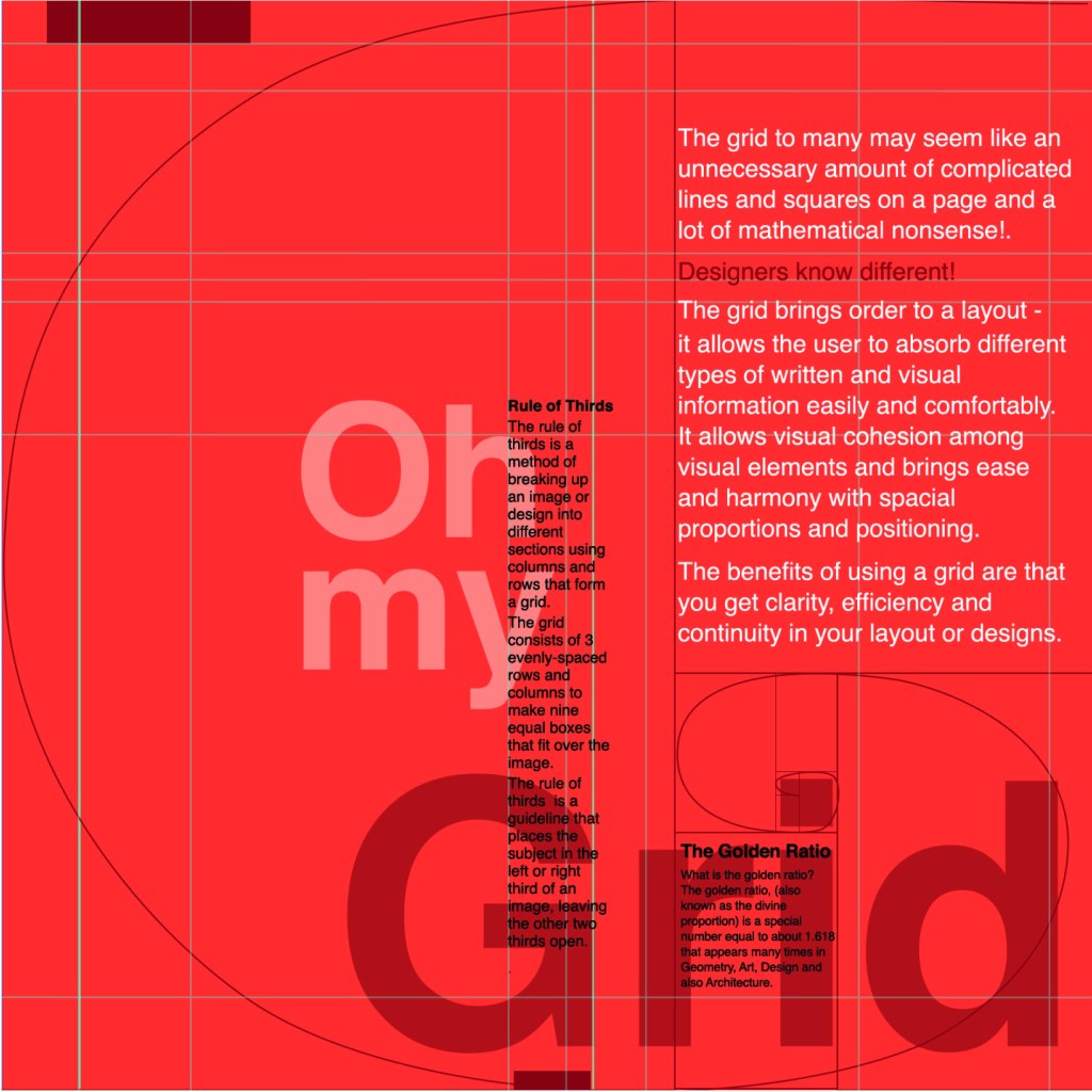
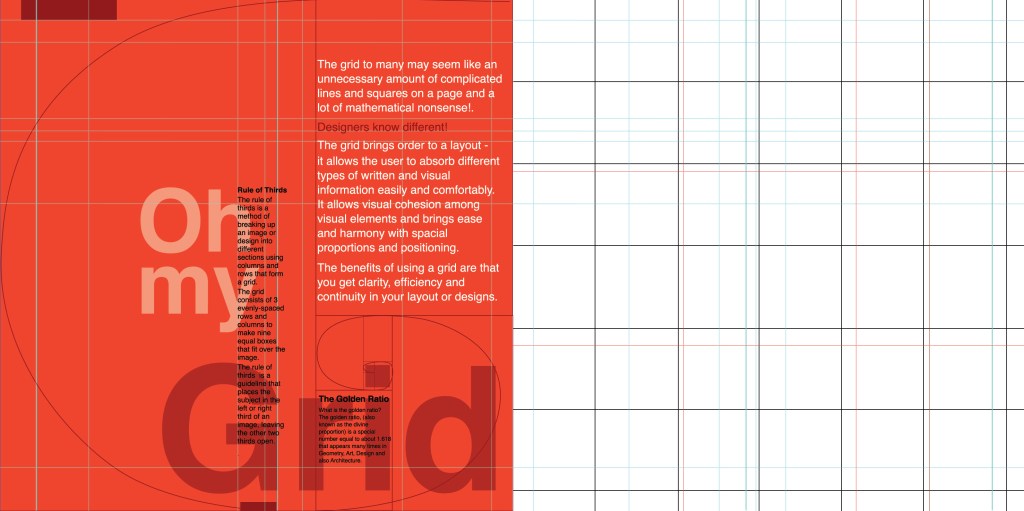
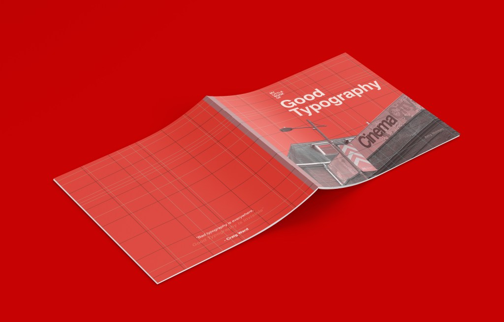
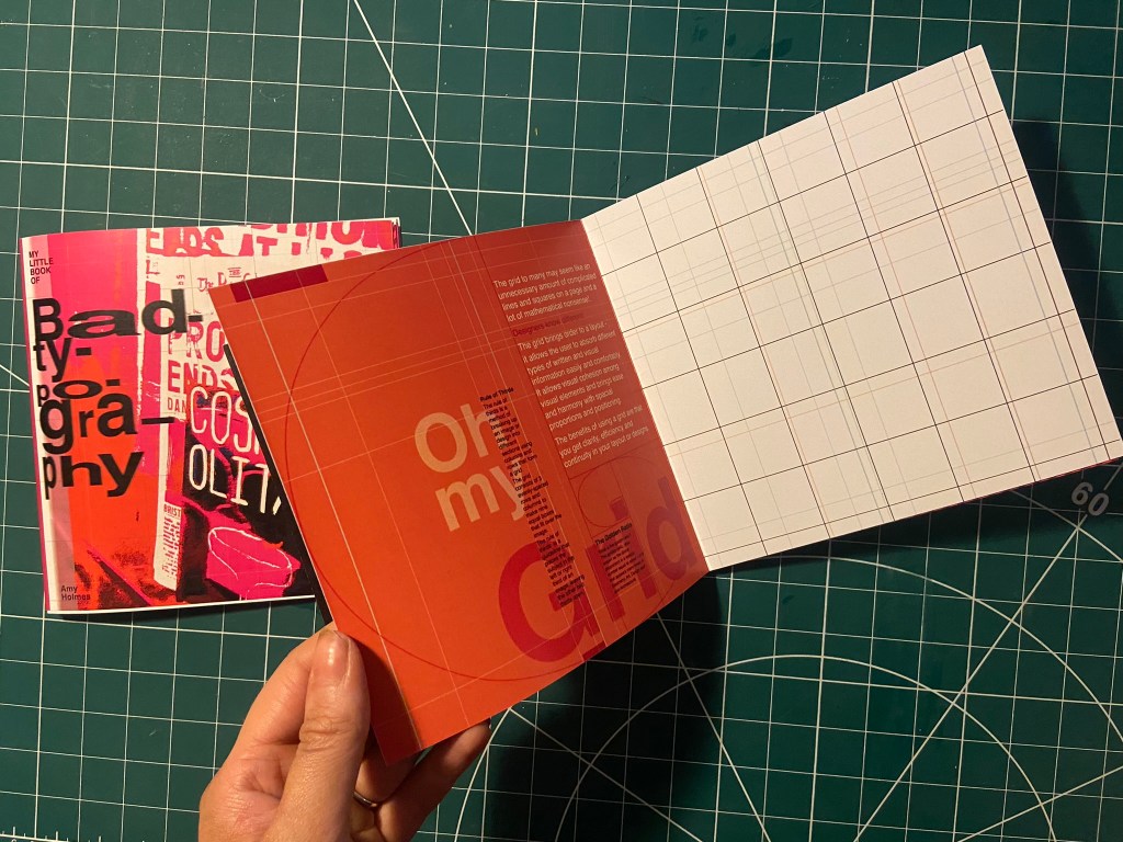
Good Typography pages 4&5, Oh my Grid!
I felt like the next best subject for my book was the grid system as the majority of this third unit has been based around the importance of it! I have also learned a lot in this unit from doing the grid exercises and research so I decided to try and include it and show off what I have learned the best I could in my layout!
I started off by drawing out my grid!
The pun “Oh my Grid” immediately came to me! It might have been because I wrote about how a lot of people might see the grid system as a lot of complicated and unnecessary lines all grouped together on a page and immediately panic and think OMG!! I did think to change it to “oh my good grid” to try and highlight that grids are indeed good! There was not enough contrast here though, the main heading needed to be bolder and stronger than this!..
This was indeed heading in the right direction! The red married in with the main theme of the entire book but also worked in this layout considering that grid layout was popularized by iconic designers such as Josef Muller Brockmann who originated from the International Typographic Style (Swiss typography!).
I then included the Golden Section into my layout and the rule of thirds.
I decided that Oh my Grid worked better; it slips off the tongue and it is immediately obvious.
I then included the golden spiral into the layout which ties in with a little bit of text which tells you about it. This is a strong layout but I think it got better!
This layout happened completely accidentally! I accidentally moved the text so that it overlapped the other text and I actually really liked it! I switched the pages around and decided to keep the right hand page completely free apart from the grid outlines.
I also changed the colour of the small text to black because I felt that in Red it blended into the Red background more which made it more difficult to read!
I just needed a back cover!
I wanted the back cover to be pretty much the same as the front cover but minus the photograph.. I wanted it to be very simple, I didn’t want to put a massive blurb about what the book was about – the book and the images should do the talking for itself! That is where I found the quote from Craig Ward – Bad typography is everywhere, good typography is invisible”.
I also lowered the opacity on “Good typography is invisible” to make it look more invisible!
I was very pleased with all 3 layouts! I just now wanted to go back to the inside front pages and add a photo credit for the photograph on the front cover!
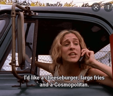
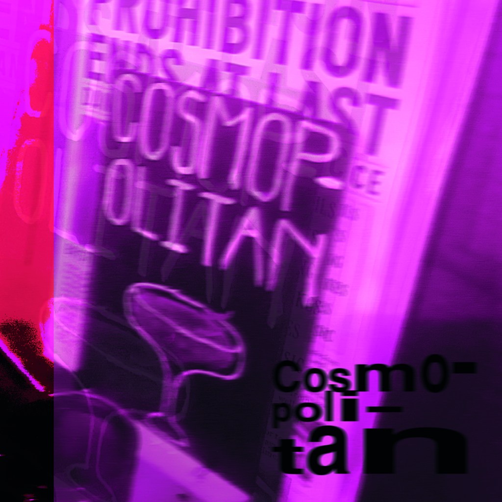
My little book of Bad typography, Cosmops and Hyphenation!
As I mentioned further up this post, I already had my main photograph (Cosmops!) that had set the tone and was inspiring the rest of my book; although I liked this photograph and thought it was a classic example of typography gone wrong, I was also worried that the hyphenation topic wouldn’t be a strong enough one to warrant being in this book – the more I looked into it though, hyphens are seen as a no no to a lot of designers so I decided to take the risk and go along with it and to see what I could come up with!
This layout also travelled the distance! It went from being too “safe” to me being brave and experimenting more with it!
Similar to what I did for Cinema City, I changed the colour of the photograph by adding a filter to it.. when I think of cocktails, I think of girls drinking them and I think of the colours pink or purple. I decided to go with Purple. I didn’t want to be too girly, I wanted a deep purple colour to be a bit more edgy and atmospheric.
I refer back to my comment about girls drinking cocktails; the most famous example I can think of is Sex and the City!-
I decided to use this as the main quote on the page, further on though I turned against this idea; my fiancé said “I have no idea what that means…” it dawned on me that this book is for everyone not just Sex and the City fans!
As you can see above I played around with the layout a lot! Creating contrast, taking into account negative space and trying to create a harmonious hierarchy! It just seemed “too safe” for a book about bad typography though… I needed to get more experimental.
All I could hear though in my head was MOP MOP MOP! Mopping up those Cosmops on a night out! Drink some Cosmops! I got silly and used this as the main heading for the pages:
This was more experimental.. it was far more David Carson and Raygun.. What if though I could try and reflect the place I was in (drunk!) when I photographed this sign?.. it would also tie in with mopping up (soaking up!) the Cosmops! I used a blur filter to blur the text and the photo ever so slightly… just enough to disorientate the reader ever so slightly!…
Nailed it! It feels very Punk and Acid house! It feels like a drunk Saturday night out!
I also played it unsafe by hyphenating all of the text to make it really uncomfortable and hard to read!
My little book of Bad typography, Too many (type) faces!
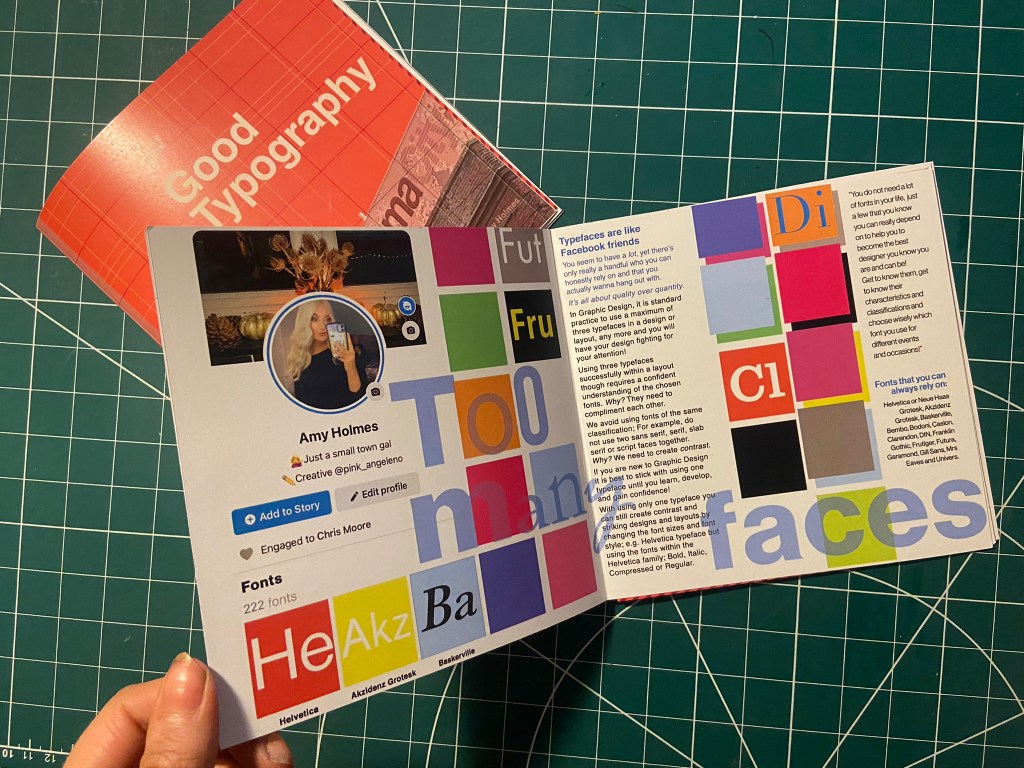
I decided that the next topic to appear in my book should be “too many typefaces”, Two pages about how using too many fonts can be bad for a design. I had the idea in my head of typefaces being like people- friends on Facebook more specifically. People boast about how many friends they have on Facebook when actually they are more acquaintances and people that you keep on there just to nosy at! A lot of people have complete randoms on their Facebook just to keep their friends number up! I am talking quality over quantity; rather having a handful of friends than loads that are crappy! It is exactly the same with typefaces, I have loads on my computer but I always go back to the ones I love and use frequently!
This is also a layout that travelled far! Again, I felt it was “too safe” and too “magazine” for my liking. It felt like a glossy spread in “Pick me up” magazine than it did belonging in a chic little book about bad typography!..
Using my Facebook for inspiration, I only have 222 friends… (probably 220 acquaintances!!) I screenshotted my Facebook app and imported it into Photoshop to manipulate and include in my design layout!
It was easy to match the typeface to Facebooks app – Helvetica! Duh! 😉
I just cut out friends and replaced with fonts.
I wanted to keep the feel of the layout like something that would be on Facebook – I used the same blue as the Facebook logo. I used the “what’s on your mind?” section of Facebook to use as a speech bubble type thing to talk about how using a maximum of only 3 typefaces at one time is crucial in Design.
“Too many fake mates” didn’t really highlight what the piece was about… It gives out mixed messages and meanings.
I took out the photos of my “mates” and replaced them with a coloured square featuring the beginning of the name of a typeface to represent my font friends.
The spread below reminded me of a page out of Pick me up magazine… It just wasn’t right for a book.
It then went back to this… which I thought I was going to go with…
It then went to this which I was certain I would go with!… (plus my profile photo changed by this point!)
But! It just wasn’t “bad” enough… it all felt too regimented, clean and like it belonged in the book about good typography!
I then went along with this one!- It was busy, bright and too much going on for too many typefaces!
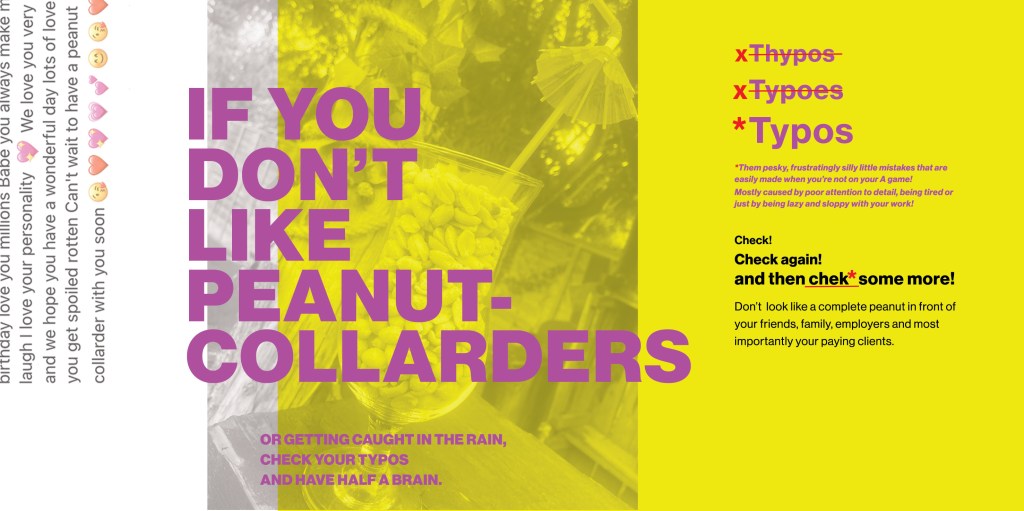
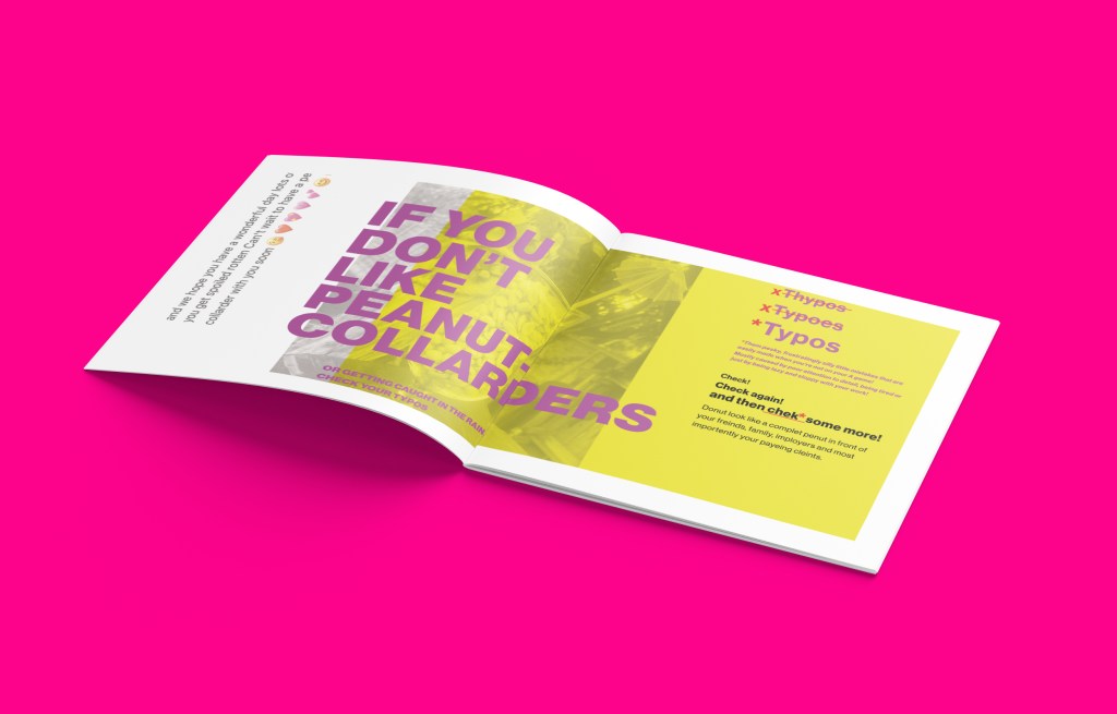
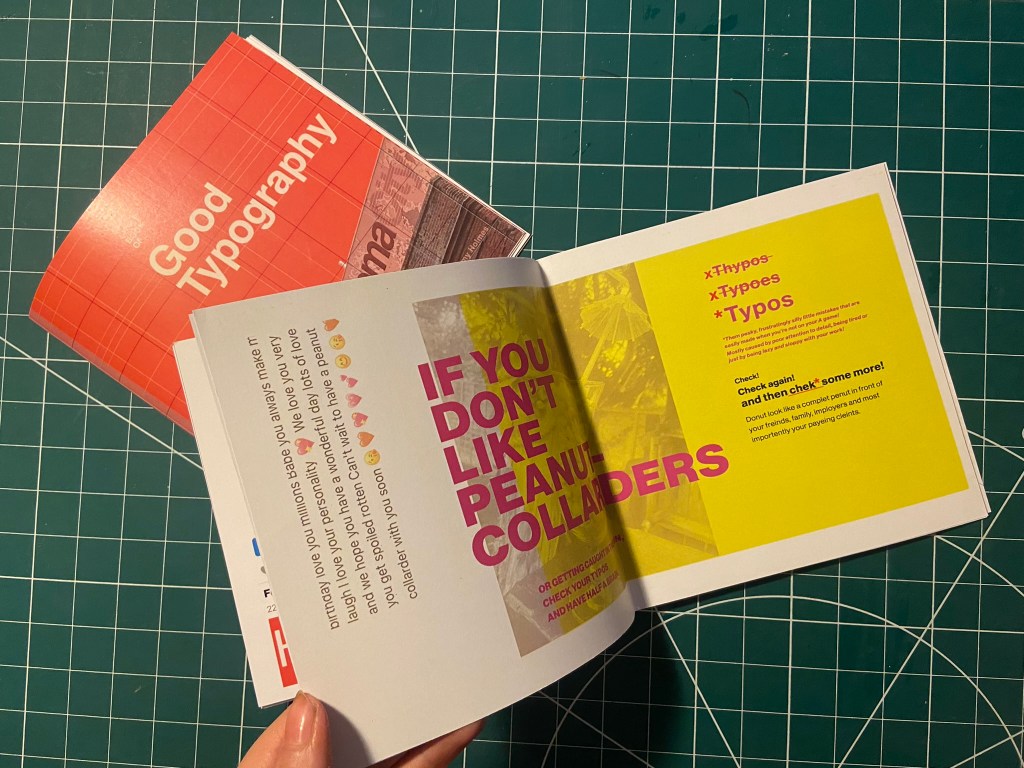
My Little Book of Bad Typography, Peanut Collarders! – Typos!
This next part of My little book of bad typography was inspired by a Facebook post that one of my distant friends wrote to one of her best friends.. I read it and (cruelly!) might have laughed a bit and instantly screenshotted it to use as material for Typos!! – the topic of my next pages!
Ok!.. so the infamous message was this!
Possibly a little bit mean…. ;s but c’mon!… it was too perfect to not use! Do you like Peanut Collarders?… ;p
Firstly I needed to know what a Peanut Collarder might look like! – cue our outdoor bar, a pink umbrella straw, a large bag of peanuts and a Pina colada glass!..
Like I have for all the other layouts, I imported a photo of my Peanut Collarder into Photoshop and placed a yellow filter over the top.
I then also altered and imported in the Facebook message (obviously protecting the identity of who wrote it and who it was intended for!) Obviously I had to use the Pina Colada song as the main heading for the layout! – It started off with “Do you like Peanut Collarders?” but then evolved to “If you don’t”.. then don’t create typos!!
Once again though the layout seemed too “safe”, I really liked the look and feel of the layout but it needed to be made more “bad”.
I then spelt “Typos” three times making sure that the first 2 were definite typos!
This then evolved into a host of typos in the main body of text – it related more to the nature of the book and it reflected typos perfectly!
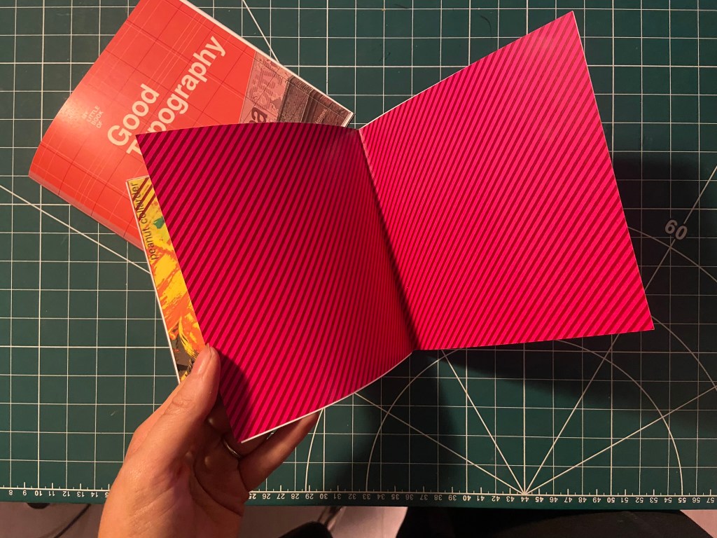
I then had a think about the inside pages; on my Good typography book I had the striped red inside pages… I wanted similar for this book too but in keeping with the Pink, Punk colour!
I also included another photo credit for the photograph taken in Bootlegger!
I then had to work on the front cover for the bad typography book! I had big shoes to fill from the first cover! I did like the David Carson inspired pages I did for Cosmop so I wanted to follow in the same footsteps!
I had loosened up a lot from starting this assignment so for this cover I just went for it!
It only took 2 attempts and I knew I had cracked it! The response I got on my Instagram when I uploaded them was proof enough! –
I have noticed that as the time goes on and I gain more and more confidence I am able to stop second guessing myself and put out a design after only a shirt while working on it and know that it was the right decision!
They did look good on my Insta feed though I do have to say!… They got a lot of love from my fellow OCA peers too!
It was then time for the back cover.. I pretty much wanted the front cover to roll over to the back because I loved it so much!
Bad typography is everywhere so that is all I literally wrote on the back!… it did change ever so slightly though because when I imported the jpeg into InDesign I actually liked how it looked when I zoomed in on a certain part of it!
Perfect!
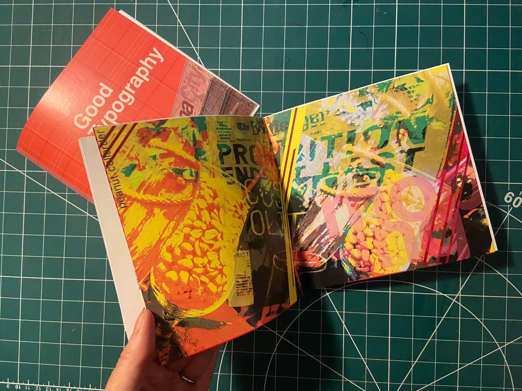
I also wanted to do a similar thing for some inside back pages for this book, in the style of David Carson and collages and like what I have done for the front cover and the Cosmop layout!
It looks like absolute mayhem! Peanut Collarders, Cosmops… wild night out!
Making the final books
As always when creating a final book I always set up a document in InDesign and then import any images I create in Photoshop in to then add text etc… this time I worked differently, I created everything in Photoshop and exported the jpegs and then imported them all in!
My methods of printing the books are not ideal; I did not take this one to professional print I just did as I did with my zine and printed it out at my workplace using their laser colour printer. I really struggled to correctly paginate my pages when I printed my zine to my work laser printer last time because the printer flips the pages weirdly! I found that I had to lay pages put upside down and at different sizes to print correctly last time! – it was a nightmare! I tried the same this time, I paginated all the pages but because there was only a certain number of pages there was a double page spread on each book that printed out blank! I did not want blank pages in my books so instead I went back and printed each spread off individually and bound my book together in a different way!
The paginated versions that I printed for my first trials!
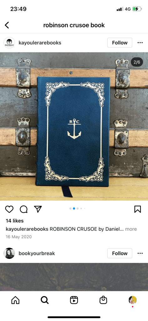
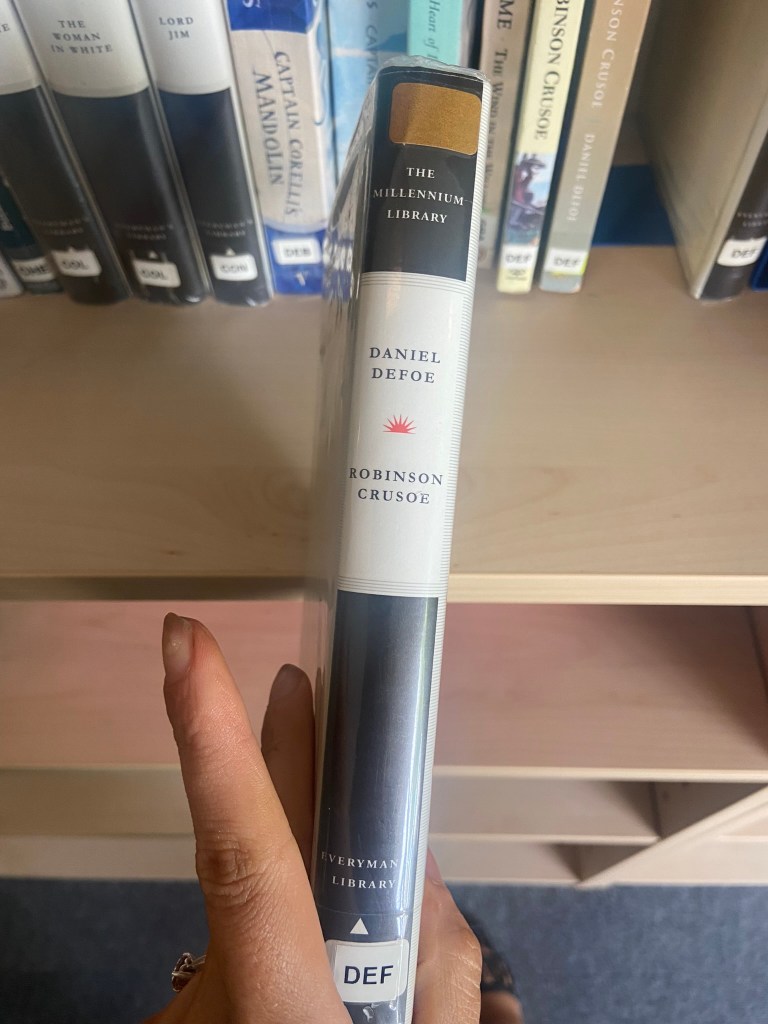
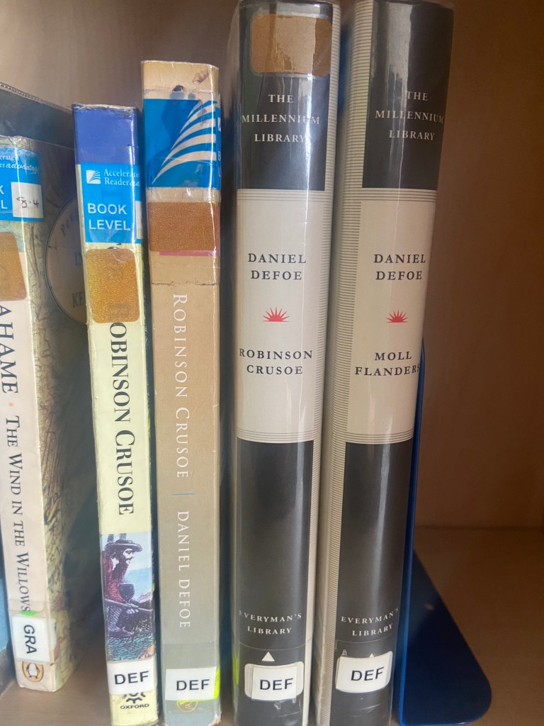
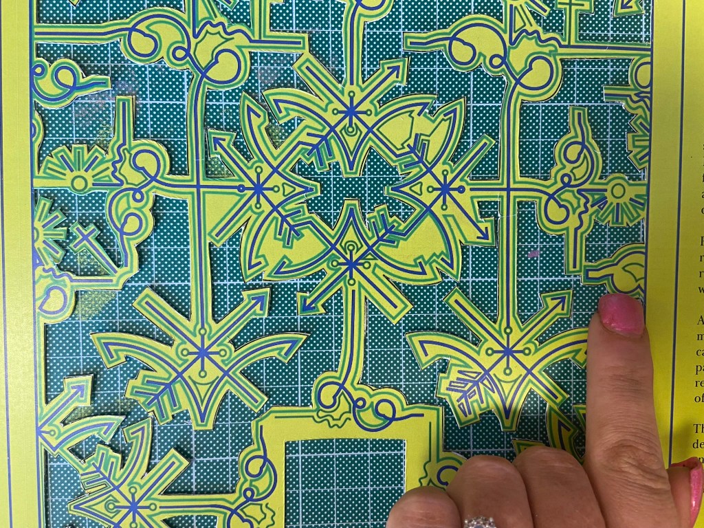
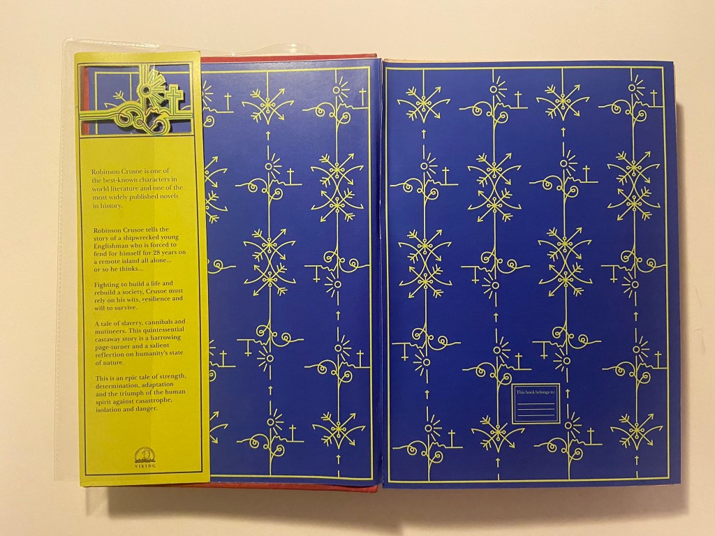
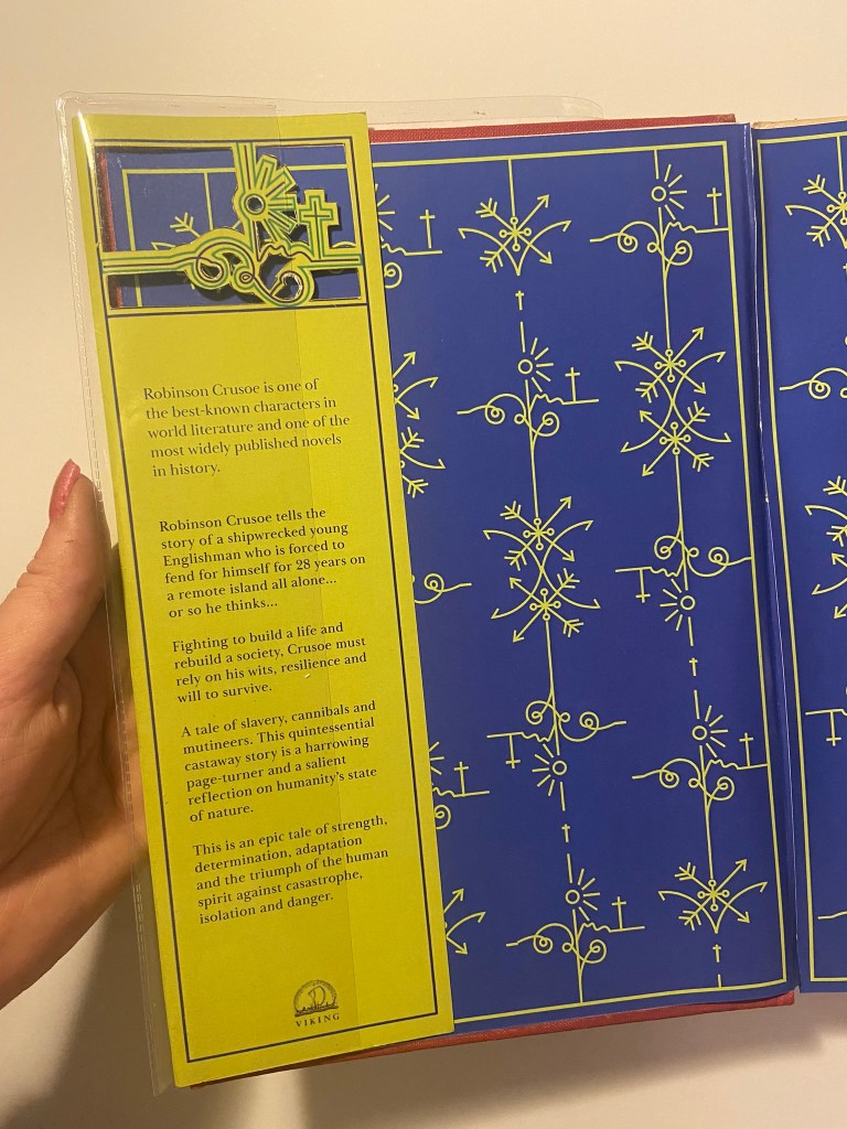
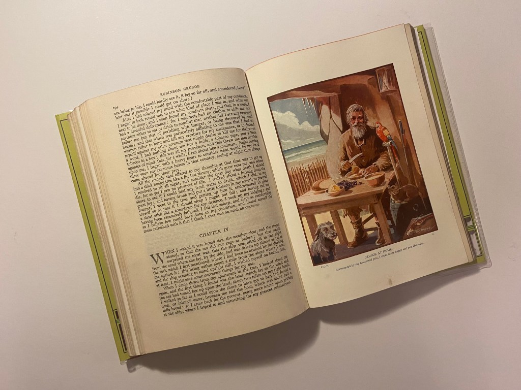
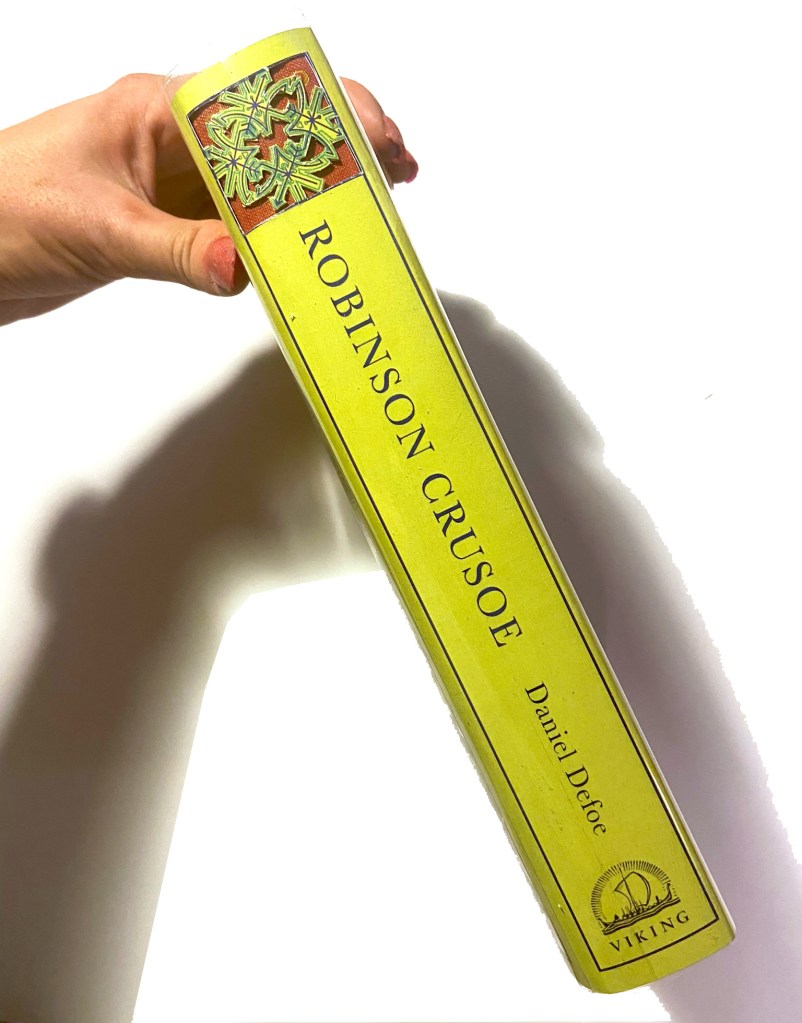
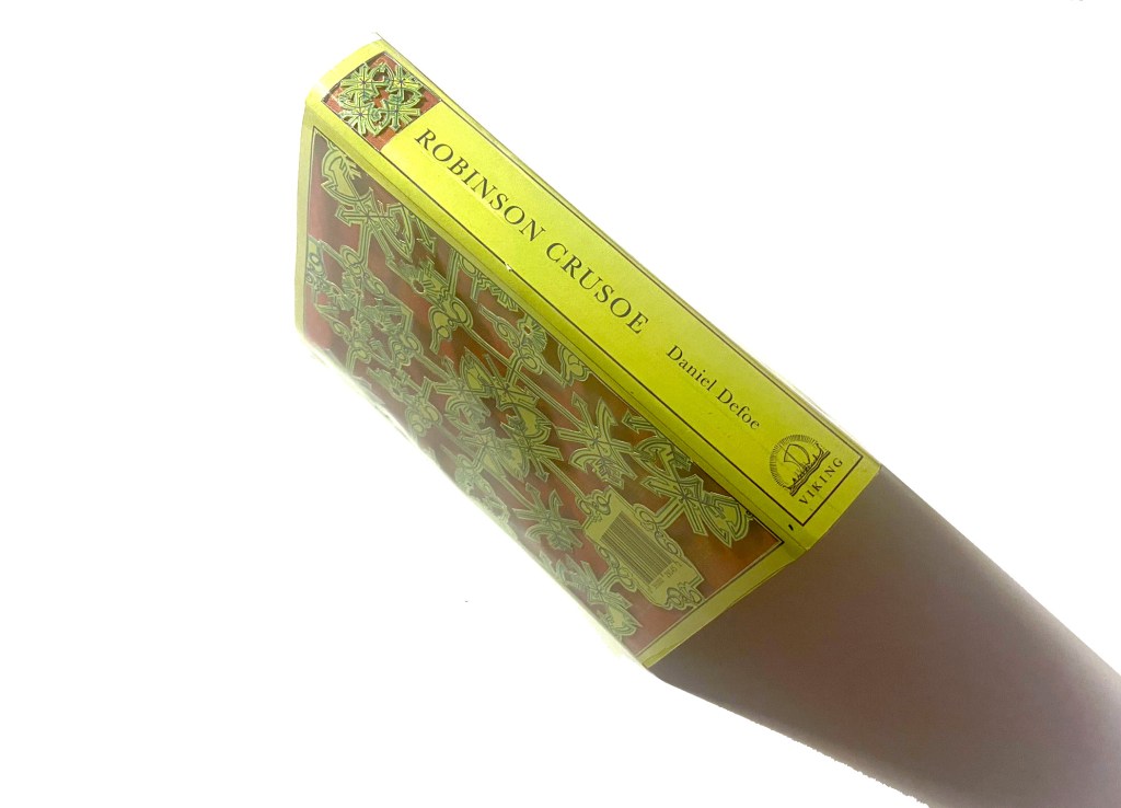
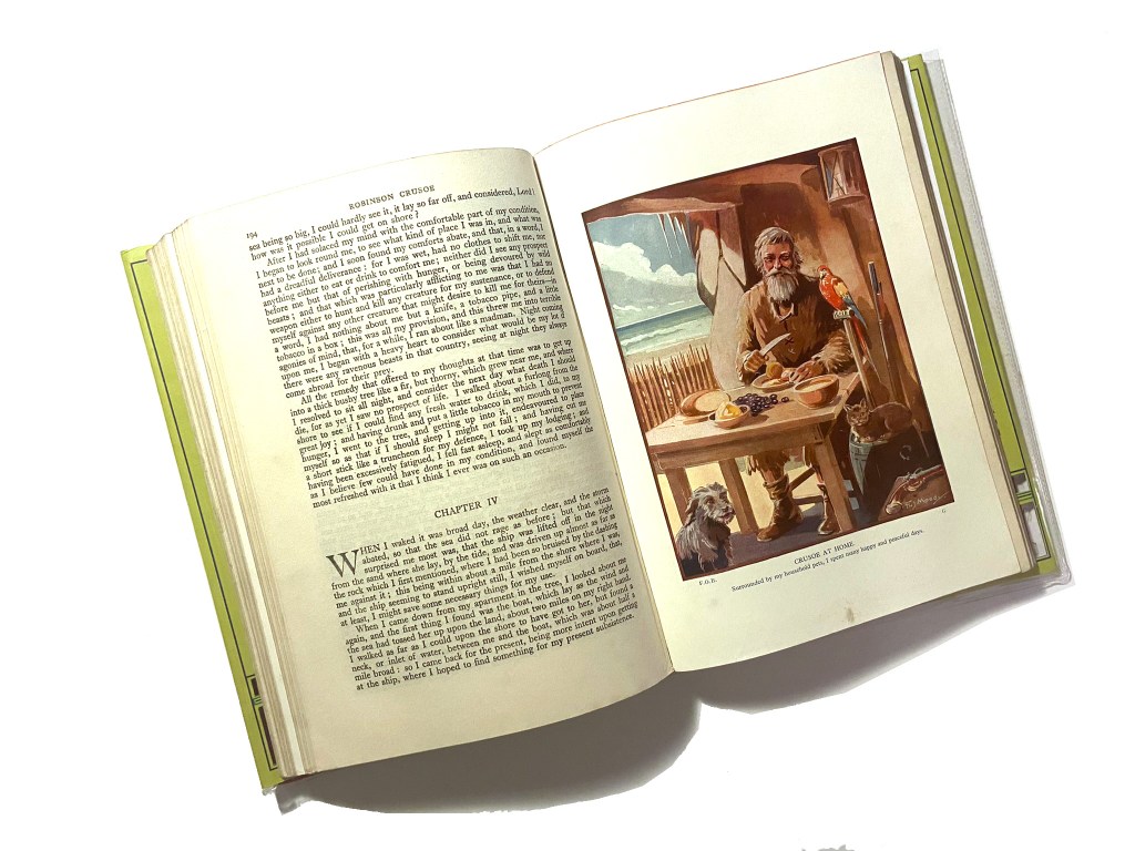
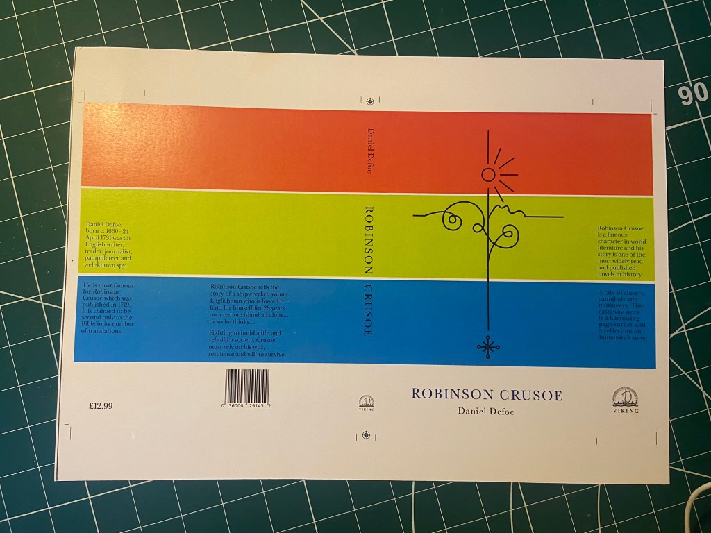
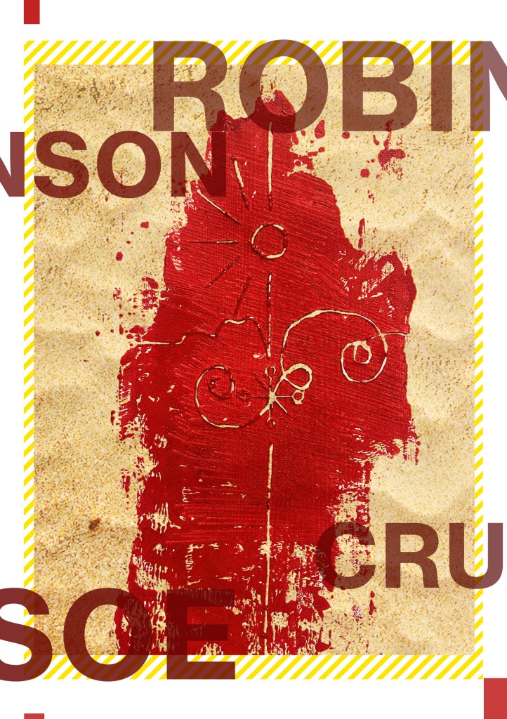
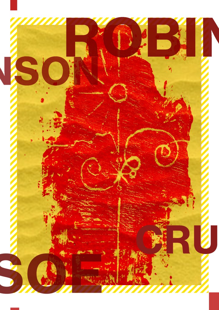
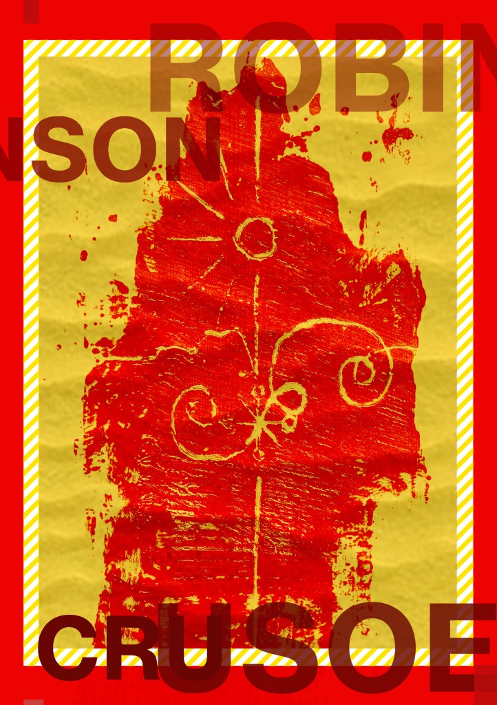
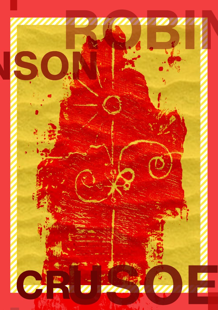
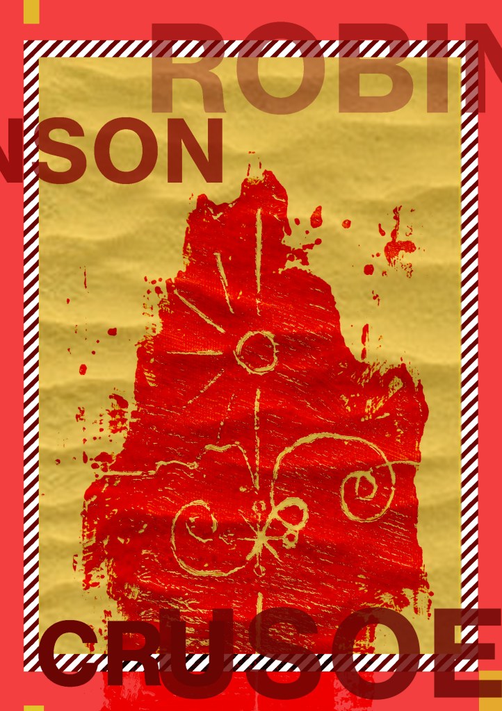
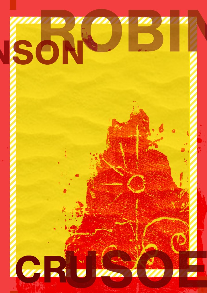
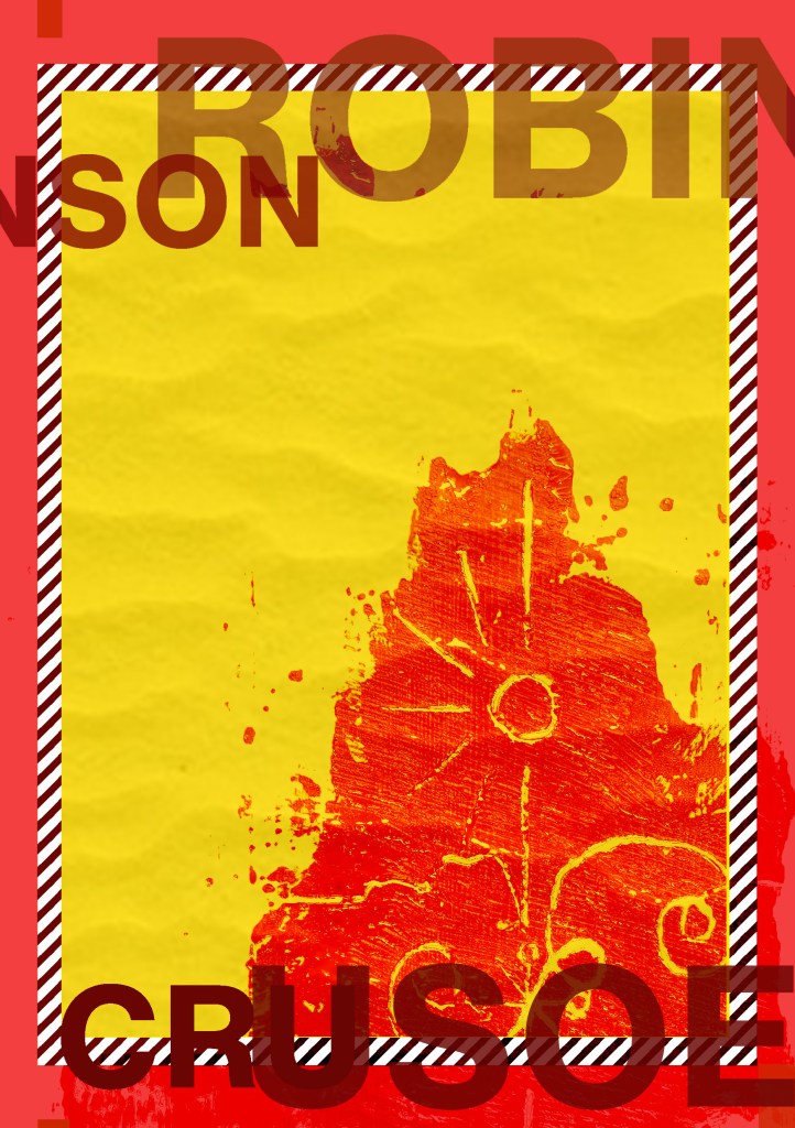
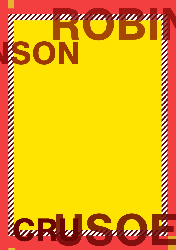
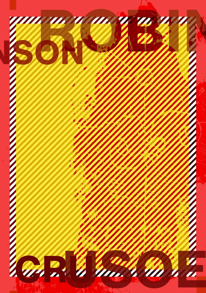
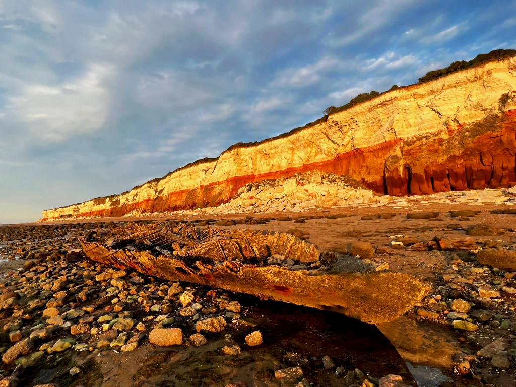
I printed my books out using the same paper stock as I used for Robinson Crusoe; a lightweight glossy card stock – (it is somewhere between paper and a really thin card!)
I then used photo mount and glued the pages back to back, the way I bound my book actually made this the perfect paper stock to use because by the time I had finished I had really sturdy glossy little books! The spine was quite prominent too and sturdy!
Conclusion
The one thing I will note that I have done differently this time is that I have very little initial sketches!- Usually I have handfuls of little doodles which help inspire my designs; this time however I was working from my instinct and digital development! The 2 photographs inspired my thought process and then digitally from there everything just flowed! My confidence has increased since the start of this assignment, I am really pleased with how my books have turned out. The response on Instagram and from friends and family has been positive too! The verdict has mostly been that they look very striking and professional! In my next assignments I wouldn’t make the same exception and have such limited drawings but I took a risk with this assignment to work digitally and it paid off! I am so much more confident with grid systems too which is something a few years back I never thought I would say! I used to hate the grid and be one of the people I wrote about!- just a page full of unnecessary, complicated lines! I really enjoyed this assignment and I think my skills and layout design has come on leaps and bounds from “If the face fits” in Core Concepts. Next time though I shall probably look into having them professionally printed; it will also give me the experience in dealing with industrial printers and outside professionals!
I am learning to like Typography and to become more comfortable using it because ever since the experience I am about to detail below, I always get worried, doubt my choices, wonder if I’m making the right choices! and basically just stare at a blank canvas for a while frozen in self doubt and lack of confidence!..
I had a bad experience at University in 2007, A fresh faced 20 year old (my first time around doing my degree before they very nicely “kicked” me out.. *eyeroll) when I had to “show and tell” or “critique” my work to my tutor and peers; the work I had to present was a poster about the sound of type? (I did it like The Sound of Music style) using shapes and typography to illustrate it.. Now I know it was by far from a work of art back in the day.. even I am looking and cringing but HEY look! Even today I’m still learning ok! Seriously though, was there really any need for my tutor to absolutely humiliate me in front of everyone, make everyone laugh at my work and by making me sob down the phone in my old little KA (called Biddy, RIP bless her…) to my mum in Iceland carpark telling her my work was shit by his comment of “ER… SOMEONE CALL THE TYPOGRAPHY POLICEEEE!”- what happened to constructive criticism? I mean I can’t even remember his name, all I remember is he looked like Shaggy from Scooby Doo and he was a complete smug, 30 something arsehole! (basically me now.. ish! ;p) All the way through this exercise though I had HIM and that stupid horrendous memory in the back of my mind as the designs I have created for this exercise are very similar to that which I created in 2007. I mean, hadn’t he ever heard of David Carson, RayGun?…
So! Mr. Shaggy, (from a certain university that was mentioned by Mr. Gilbert in The Inbetweeners!!) Get calling the typography police once again because this one is for you! Enjoy it! 🙂
In all seriousness.. If I was Mr. Shaggy I would be more worried about the letters hanging out of the figure of Julie Andrews than of the actual typography itself!… at least it wasn’t comic sans huh! In this one I was experimenting with contrast right?… without even realising I was doing it! (*shoulder shrug)
Back to the Brief…
Back to the Brief…
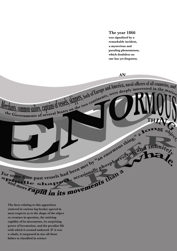
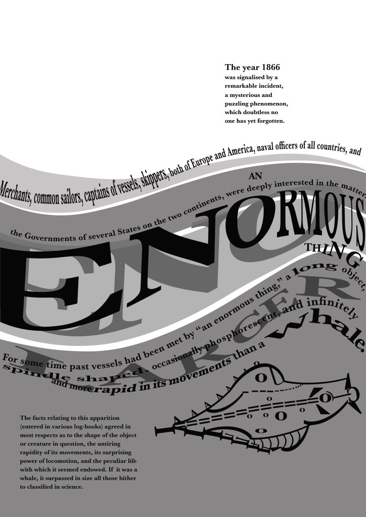
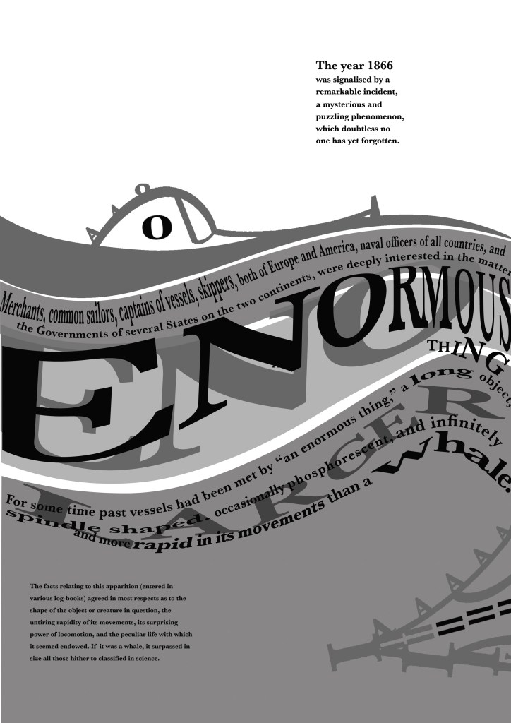
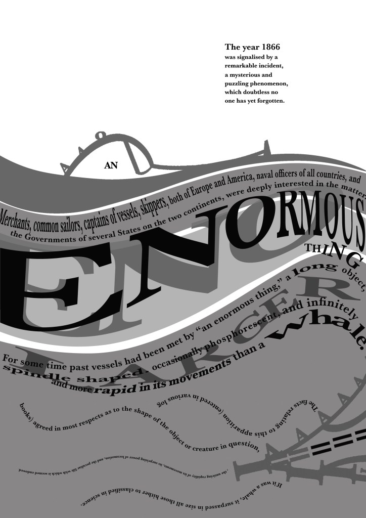
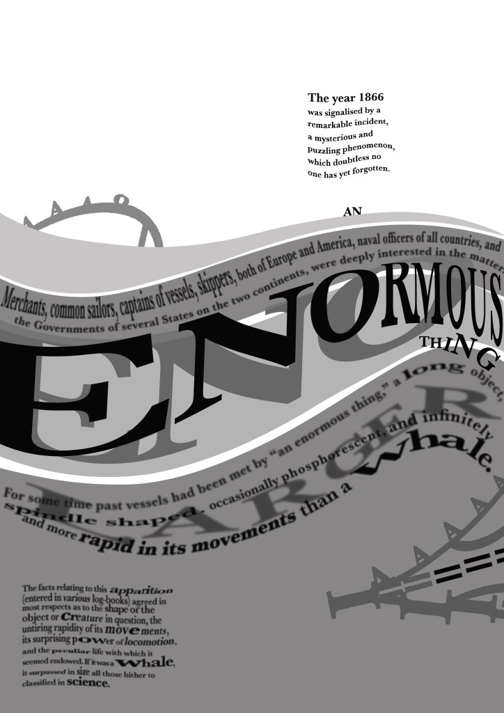
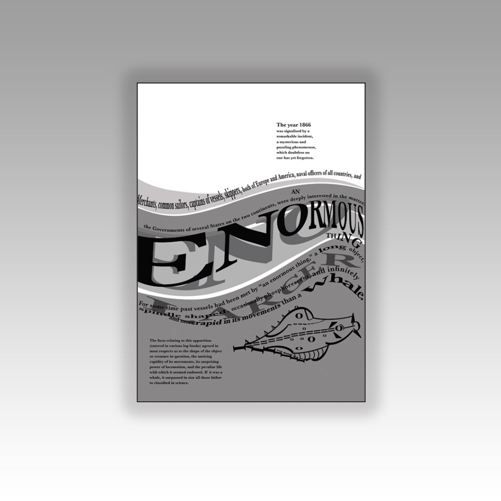
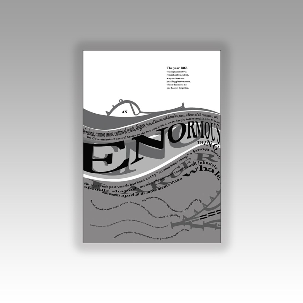
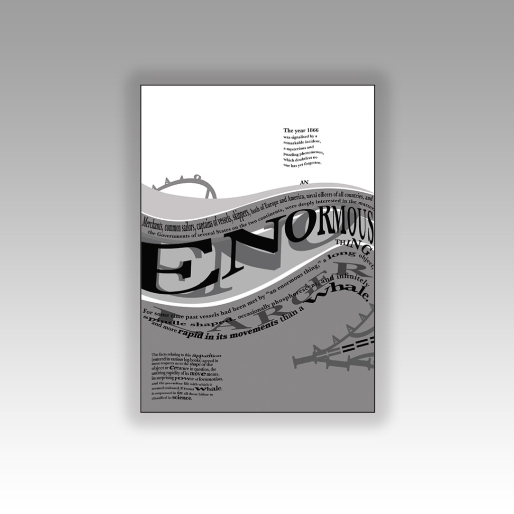
I had heard of the book title but had no idea what the storyline to “20,000 Leagues under the sea” was all about. From doing a bit of research I found that it revolves around this mystery “whale-like-object” that sailors and merchants had seen in the sea and were intrigued to track and find out what it was. They then realise that this mystery creature is actually a modern submarine with people on board. When they go aboard the sub they come under attack by squid and goodness knows what and so the story goes!…
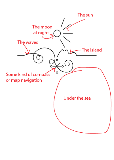
I wanted to concentrate on the 3 important elements from that storyline which is the “whale-like creature” the sea and the squid.
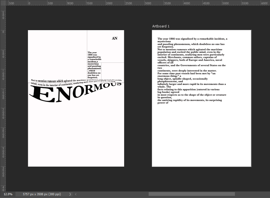
I started off by messing around with some type to look like waves before I properly thought about the layout etc…
I then started off by creating myself an A4 document and then creating myself a Golden Ratio grid which I then also included The Golden Spiral to know where my main focal point was on the layout:
I wanted a nice spacious layout – minimalist and clean. The legibility and readability is important but I wasn’t too bothered about making legibility and readability my main objective because it is pure experimental work! David Carson in his experimental typography always said – “Don’t mistake legibility for communication“, just because something is legible doesn’t always mean it communicates anyway so I might as well be experimental and just see what happens!
I spent HOURS messing around with different layouts for this! I moved type around all over the place to try and best communicate the story!I decided to use Baskerville typeface as this is a typeface that was popular in book design, it is a Serif typeface so is more ornate and decorative than a Sans-Serif to add more interest and was also from the same time period as the story.
I like the space at the top of this design. I placed the very beginning piece of text in the eye of the Golden Spiral to make it the main focal point and first place the eye goes to when looking at this layout. This is the first piece of information that needs to be absorbed by the reader to know the main subject of the story and also the feelings and vibes that it gives.
“An enormous thing” is an important part of the extract and story because this is what people called this mysterious “whale-like object”. I needed to emphasize “enormous” and show that it belonged in the sea. I used the wave tool in Photoshop to adjust the word so that it looked like it was in the sea and then adjusted the point size of some of the letters and also the horizontal and vertical scale to (controversially!- sorry typo police!) stretch the letters out! I also adjusted the tracking and kerning to make the letters look more interesting and to add some contrast to the piece!
I duplicated “Enormous” and made the copy the shadow underneath; again, to highlight how big the thing is and also to add some light and shade to the piece. I used 4 wavey chunks of colour to represent the waves and placed the type over the top appropriately.
Could I create an image from letters?…
I then decided that I wanted to create a picture out of type… This was also one of my first ever assignments when I did my BTEC in Graphic Design at college when I was 16! I created a type”face”, a face out of letters! (I wish I kept that because it WAS good!)
I did though a few years back create a very similar one (I nicknamed Brian May because it looked like his curly hair!) for a display board in our Graphics room at work :
I had the idea to portray the “enormous thing” using letters and characters but I needed to research first what the “enormous thing” looked like according to previous artists/illustrators who designed the previous book covers for this story. I had a look on Google and found this illustration which seemed a good place to start!
I imported the image into Photoshop and reduced the opacity so that I could layer letters over the top of it to try and recreate the shape of it using letters and characters. I ended up with this which was mostly made up of A’s, O’s, ), C, I, =, and a ‘.
I then had a go at positioning it on my layout… I didn’t like it on there much!
I just felt that the layout looked too crowded and full with the image placed on it. It also didn’t emphasize the “enormous” size of the mysterious thing as it looked so small on the page…
I then designed this version below:
For this version I cut the drawing in half and placed half above the sea (which is where and how people would have seen it in the storyline!) and half below the sea. The way it forms with the wave makes it look like it is circling the sea creating the waves as it moves. The extract is all about the movement and speed of the mysterious being and I feel that this shows this. I haven’t suggested whether the enormous being is a creature or is man-made technology – it is open to the viewer what they interpret it to be! The O on the monster could be an eye or it could be a window… the A’s on the monster could be natural spikes or they could be man-made weapons on the side of a submarine… I also feel that it allowed for more space on the design and it balanced out the layout.
There was still room for development though… time to try and get some squid involved…
In this version I used “AN” as the eye or window of the monster. I wanted “An enormous thing” to stand out to the reader. I used the text in the bottom corner on the previous layouts to create octopus/squid legs which are trying to attack the mysterious being… I have text upside down and then the text below the right way around to ensure that the eye ends one sentence and starts the new one directly below instead of having to drag the eye all the way to the end of the sentences to read. Again, I wasn’t too much of a fan because there was not much space left on the layout – it all looked too crowded and displeasing to the eye.
I then moved on to create this new layout below… experimenting more with the blocks of text.
I had created movement in the waves and for the “enormous thing” but the block of text underneath the sea (bottom left side) was very much still and lacked movement which would very much be questionable considering it is supposed to be submerged under water!
I decided to make the text look as though it was floating in the depths of the water; making some wavey, making some stretch and move with the waters push and pull motions and making some text seem larger and smaller to look as though they are reflected in the water. This is more creative and interesting than just being a block of “still” text. I felt like there was still enough space and that the hierarchy of the layout was balanced.
I then went one final step further to create the same layout but blurring the text ever so slightly to look as though it is under murky water:
My first thoughts about this assignment was that it is a big assignment and a lot to design for! I was also nervous about figuring out what papers to choose for the publications; there is so much choice and trying to work out the different weights and figuring out which papers do the best job for each part of the book seemed like a foreign language to me even though I did the previous exercise studying the different paper samples etc.. I just figured that I would go off using my GF Smith paper samples; after all I can physically see and feel all of them to know what would be best!
Research
I started to research first, obviously I knew who Robinson Crusoe was and I knew vaguely what the story is about but I didn’t know enough to be able to design two books. About a week before I started this exercise my Mum had some old books that belonged to my Grandma and Grandad when they were children which she no longer wanted and didn’t have room for. For the purpose of this course and because I didn’t really want to lose them, (there’s that sentimental feeling that books give you! – trying to keep hold of them as they are heirlooms and hold their own story and history within their own right!) I took them off my Mums hands. One of the books was a thick, red, cloth bound omnibus of adventure stories of which included Robinson Crusoe which was a bonus! From first glance at the brief it states I needed to mock up my covers; I usually do this in a digital form by finding a book mockup online and placing my designs onto it. I thought this time though it would be a good idea to mock up my design onto this actual book! – it would then hold even more stories and history; firstly that it was gifted to my Grandma for being a good student at school and secondly it would have a new cover designed and made by her granddaughter 70 years later – my grandchildren might hold onto this copy and try and figure out why I designed a new cover for it so many years later! You never know, they might be artistic and add their mark onto it too!
Also, a hardback collectors edition does not need to be lightweight – they are made to purely keep at home on a bookshelf with no need to carry around so this was a perfect book to model it from.
I now had a copy of Robinson Crusoe in my hands; I didn’t have the time though to sit and read it all. I decided to cheat a little bit and find a pdf version online which I skimmed through; I also read a few summaries of the book. Reading these were interesting! There were so many takes on the story- bad and good! Some people were saying it is a marvelous tale of bravery and adventure whilst some other reviews were that it is a seriously outdated story of slavery and racism (They also used the image to accompany their review of Desmond out of Lost which confused me because I couldn’t see the link between the two!! *shoulder shrug) I could see both sides of the argument but also understand that is it an incredibly old story and times progress and evolve!
The key points that I picked out from the story were:
Friday – the slave boy that Crusoe rescues from the island and brings back home.
The cross that Crusoe builds on his arrival to the island – to use as a religious artefact but also to use as a calendar to tally and scratch the days off onto.
The Parrot, Goat and Dog that he owned on the island
The Cannibals and mutineers that he had to avoid
The footstep in the sand that he found which petrified him and reminded him that he was not alone on the island.
Having had a quick glance at covers they all seemed to be based around the same ideas; the island, sun, sea, sand, parrots, illustrations of Crusoe in raggy clothing on the beach… I did not want to create another cliched cover. I wanted to try and venture outside of the box and design something that wasn’t completely obvious.
I went onto Pinterest to start off with and researched more into the different covers and even just shipwrecks, sea and being a castaway in general just to come up with some ideas, colours and moods.
As I was on a tight timeframe I didn’t want to waste any time I had in trying to research into covers as I knew that this assignment wouldn’t be a quick process! – therefore even sitting in bed at nights I was looking at Amazon, Ebay and Instagram to see their copies of Robinson Crusoe!
I liked the cover above with the anchor and the simple RC. This gave me sailing vibes and the anchor definitely relates back to the sea. The ornate border around the outside gives it a classic feel but also relates back to the era of the book.
I even found myself looking at the book section in Tesco every time we went for a shop just to see what cover designs there were for similar books or any book actually! I wanted to see what different covers existed that I could steal some inspiration from! I found a few:
These intrigued me because I was under the impression that for paperback books you didn’t generally have coloured tipped pages.
The book below was interesting becasue the inside box was cut out to reveal the page underneath. The cover also ran short on the right hand side – it gives the impression of the sun moving across the sky at certain times of the day. The cover is very simplistic as well. It is bold and catches your attention.
I also found the Goddess Guides on my sisters bookshelf; I totally forgot these existed given the fact that the white copy used to be mine and I bought her the pink copy as a birthday present! These are beautiful covers! The covers have a fuzzy felt feeling! – really soft and luxurious to touch. They also feature a repeat pattern which is where my ideas were leading…
I also went into our LRC at work and had a look at a few copies in there to see what designs already existed:
These were very basic, uninspiring copies. They also seemed very dated and not very contemporary in feeling.
One cover that I found that really intrigued me was the cover for Robinson Crusoe that Coralie Bickford-Smith designed. It was quite coincidental as well considering she was one of the designers from the previous exercise that we had to research into and also considering that before I started this unit I had no idea who she even was.
This wasn’t an obvious cover design for the story – not any of this design represents being shipwrecked, sea, sand, island.. parrots! – it shows stages of the moons using hatched lines. Why the stages of the moon? it shows time – time spent and lost on the island. It is a very clever approach and really makes the cover more intriguing. It would definitely makes me pick up a copy and question and try and work out how the cover relates back to the story and what the story could be about. This is the sort of design outcome I wanted to achieve. I also liked the simplicity of it. There is beauty in simplicity – good design doesn’t need to be complicated.
Coralie Bickford Smiths cloth bound covers also interested me in the previous exercise and I wrote about how I would use the influence and inspiration from these to use in my own.
Image from Penguin Books
The other books I wrote about in the previous exercise that influenced me were the seasons editions designed by Kate Armstrong:
Initial ideas for Hardback collectors edition of Robinson Crusoe
I decided that for the hardcover version of Robinson Crusoe I would like to create something similar.
I wanted to take inspiration from both the above designers but for my design to not be too similar. I decided that the original book I was going to use of my Grandmas to mock the design onto was already cloth so I could have a paper cover and try and laser cut a design so that the cloth book showed from underneath the design. This would give a classic, contemporary look. I also have a laser cutter at work so felt that this wouldn’t be too much to achieve! I just had to figure out the design and then try and create a path around it in which it would be cut.
Knowing what to do for the design that wasn’t cliché and like everything else I had seen was challenging at first. I knew I wanted simple and an old exercise from many years ago when I was at college reminded me of how to go about it – take a complicated image and strip it down to its bare essentials. A bit like this assignment about form and function – take something down to its simplest.
The cross kept coming back into my mind because it had 2 significant meanings – 1) for the calendar it was used for and 2) for its religious impact on Robinson Crusoe and how it helped keep his faith throughout his time of being stranded. The religious aspect would have also been more meaningful in the 1700s when the book was written – it shows the history of the story.
I didn’t want to just show a cross on the design though because this would indicate it is a religious book to the unsuspecting reader. From researching Bickford- Smiths covers and Kate Armstrong’s I wanted to mirror something similar in the way they used a repeat pattern to cover the cover. I started sketching ideas around the cross and other elements of the story to see what I could come up with. In the back of my head remembering to strip everything down to its simplest form.
I was trying to from a cross as part of an anchor (remembering the cover above I talked about that gave me inspiration with the anchor and the RC) Could I form the rest of the story in with this simple illustration? Could I add some waves and the island and it become a symbol yet an image that is easily understood what it is?…
I took a photograph of one of the sketches and imported it in to trace around in Illustrator and create some artboards of different ideas to compare and develop.
I started by measuring my Grandmas book; width, length, width of spine… to give me the dimensions for my document. Once I had the correct size document I then traced around my sketch.
The simple outline I ended up with was this:
Here it is explained!
I played around with putting an anchor at the bottom of the design but I felt it trapped and constrained the design – it felt like it had more space to breathe and more negative space being empty at the bottom.
I felt it had potential… I messed around with it as a single image on a cover and by accident ended up unknowingly at that point with the design for the paperback edition! However… for this version I did change my mind and make the design into a anchor at the bottom, I felt it just explained the image more.
At this point though I had to figure out a way to repeat the design to make a repeat pattern and then work out a way in which I could laser cut it out to make the final cover!
I played around with the design below and felt it was moving in the right direction but it wasn’t quite there!..
I played around a lot more until I came up with this:
This looked classy and contemporary. I liked it. All the design is was the simple line drawing repeated and rotated at different angles to form a repeat pattern. Now I had the basis for my design I needed to create a path around the design so that I could laser cut it out eventually…
I did need to decide what colours to use for my design though. The original book of my Grandmas is Red so I needed colours that would compliment this. The colours I was thinking were contrasting, cool colours like blues or greens – these also tied in with island and sea theme.
I like the top middle design below because the green and the pink outlines really worked together but then I realised that Pink and Red would not be a good combination! The middle bottom version worked perfectly – I know the old wives tale of “Blue and Green should never be seen” but I made an exception in this case because they worked a treat together!- plus this saying comes from mariners and sea goers from the fact you should never paint your boat blue and green because it is bad luck and would not be seen out at sea.. I guess this ties in well with the fact that Crusoe was shipwrecked!!
Using the influence from the book cover I researched with the anchor and the simple RC, I decided to use this influence on my own cover and that is where I have left the space free at the bottom. I wanted R.C to be embossed onto the actual book. I had no idea how I was going to do this yet especially as the book is one that belonged to my Grandma. All I did know was that I would have to use the back of the book as the front was emblazoned with “The Favourite Omnibus”.
The next step was to create the book cover layout in InDesign.
I measured the Red book again to make sure that I had the exact measurements I needed.
I measured the front of the book and then created an InDesign document to that exact size. I then turned off the option in InDesign to allow pages to shuffle which meant that I could place pages next to each other on a layout. I then moved 5 pages alongside each other before changing the size of 3 of them to allow for the spine and the 2 inside cover flaps.
I used Baskerville typeface for this whole piece; it is such an elegant, classic typeface and it ties in with the era of the book itself. The modern repeated design and the modern, bright colours mixed in with Baskerville typeface really gives the whole design and book cover a classic contemporary look. I might be biased but I think it looks beautiful! 😉 I included the use of laser cut elements on the inside flaps too.. I planned to design inside cover pages and this would allow that pop of colour to show through!
I used the use of the grid to align my text up across the whole layout and to make sure that the hierarchy and design was balanced all the way throughout. On the inside front cover I wrote a short blurb on Robinson Crusoe and what the story was about, on the inside back flap I wrote about Daniel Defoe – this allows for the reader to know the history and historical references behind the author and the story.
I tried to use contrast throughout the design with different size text (large next to small) and by highlighting certain areas of text using the Royal Blue colour. I wanted repetition throughout the whole design.
I also used the Viking Press logo as this was the publisher that the brief stated I needed to use.
Even creating the layout of the whole complete book cover was challenging because the biggest printer I have at work is A3 to print out on. My book layout slightly overlapped A3. I had to create the layout as a whole but then also create 2 more documents to split the layout into 2 halves and then when I printed them out join the 2 together seamlessly at the spine with some photo mount! It worked easier than I expected to be honest!
From doing my research I always knew I liked cloth bound books but in this case I had the cloth bound book in the form of my Grandmas book, I then knew that my laser cut design and the book layout as a whole needed to be printed onto some kind of strong paper or card. Card wouldn’t allow me to have a luxurious feeling and normal 80gsm paper would be too thin for the job and easily rip as well as not giving that professional, luxurious feel.
What I managed to source was this:
It is a thin, glossy card. It is very smooth to touch and gives a lovely shine and shimmer. I printed my book cover layout onto it using a laser printer so the quality was very high! It is also thick enough to be able to be cut into but not weak enough to rip. It is the right weight to be folded neatly around the actual book too.
In regards to designing the rest of the pages for the book I was restricted. I didn’t want to ruin the pages of my Grandmas original book that I was mocking my cover onto. The book itself has hard board plain insides that had started to yellow and I felt that I could design some inside cover pages and cover these using the same card from above into the existing book.
This was the design that I went with:
It ties in with the design on the front. It uses the same colours as the front and the use of the block Blue colour really adds a pop of rich colour against the Green front cover when you turn the page over. Again, it gives a classic contemporary feeling. The repeated pattern seems quite luxurious and regal in appearance but the bright colours really modernise it and make it stand out.
Although I can’t include any pages in this book because the book is whole as it is and I didn’t want to ruin any original pages from the book, I did create some pages just for an example that could be used within this book if it were to printed into a new cloth bound book just like my Grandmas.
If I was to professionally publish my own version of this book I would have a Red, clothbound hardback book like my Grandmas and include my laser cut designed cover on its 160gsm glossy card and then have a plastic cover over the top to protect the book and the cover from the elements. It is a hardback collectors edition so it needs to be kept clean, protected and dust free. It also makes it feel and look more luxurious and expensive compared to its paperback friends! The inside pages would be from the GF Smith book of paper samples – I have chosen 115gsm Glacier White paper for the pages of the book because it is thin enough to be able to turn the pages easily but it is also a luxurious, smooth finish (as I attempt to show in my video!) I wanted to use a more luxurious feeling paper for my hardback collectors edition to what I would use in my paperback edition.
Attempting to laser cut…
The majority of my time spent on this assignment was trying to problem solve ways around trying to cut it out on the laser cutter! (*spoiler alert* I still ended up doing it by hand with a scalpel!)
The problem is that although I love the little, old antiquated laser cutter at work it is not compatible with Adobe or modern programs! To get my design from Illustrator over to the laser cutter I had to use the laser cutters software which is 2D Design.. (that is another b*tch!!) and manually draw around my design again so that it is readable for the laser cutter. That was great! – 2 solid work days later (whilst the rest of the school were on activity days!) I had perfected the stencil in 2D Design… I had also completed the whole book cover layout in InDesign which I was really pleased with. The plan was to print out the layout from InDesign of the whole book cover – including the original front cover and then place this onto the laser bed in the laser cutter… using the 2D Design document with the second stencil of the design I drew, use the laser cutter to go over my original drawing on the printed copy on the laser bed.. sounds complicated right?.. It actually really was… trying then to communicate to the laser cutter the exact, precise location to cut.. nope… 2 days completely wasted on this!
Below shows me drawing out my original design in 2D Design to create the stencil!
I took my printed copy of the layout I produced in InDesign and cut it out using a scalpel knife – it didn’t give the same professional appearance but it was the best I could offer at this point! For another solid work day I spent cutting out the front and back covers of the book!
The mockup
Once I had finished cutting out my cover I then went about mocking it up onto the original book. I was overall pleased with how it turned out. If I was to redo it I would possibly make the border area of the front and back covers wider because I found that I lost some of the border when it was placed onto the book (have a look at my video!).
I did mess up though (as I also explained in my video) because I was trying to find a way to emboss the R.C onto the cover; I had a letraset sheet in 84pt Helvetica and I knew before I even transferred it that this would be the wrong choice! – Helvetica is a very emotionless, strong, bold sans-serif typeface and the cover I have made is very soft and feminine in its appearance especially with using Baskerville (a very delicate and classic serif typeface) throughout the design. I instantly regretted my impulse decision. I then realised that I couldn’t scratch the letters off the cover so I knew I would have to take photographs of the final product and then Photoshop the letters out and Photoshop some Baskerville on to it!
I also added my own inscription into the book cover so that my future generations of relatives can see that the book has been handed down and things have been added to it. This book has its own story now!
I took these photographs and imported them through iCloud and then went about the process of tweaking them in Photoshop so that they were fit to upload to my social media design account @PinkAngeleno and so that they could be used as the final mockups for my design!
The Mockups
The paperback pocket sized, travel friendly edition
Designing for the paperback edition was a lot easier – it turned out that I created the cover for my paperback edition completely out of experimentation and it turned out that it just worked!
The Hardback edition and the paperback edition are very different publications in the fact that the hardback edition is a heavyweight, luxurious collectible work of literature and art whereas the paperback is purely a travel sized book that would get stuffed into a backpack or a pocket, the spine would get creased, the pages would get creased and it would be a much cheaper publication to produce in general.
Although they are both very different in publication, I needed the design to be very similar though; I needed them both to be seen as though they were part of the same series. If you was to put them alongside each other I needed them to be seen as though they related to each other in some way. I needed repetition in design. I decided to use the same colours, the same motif and the same typeface.
This was the accidental experimental design that I was messing around with for the hardback edition but then I ended up using for my paperback edition:
It uses the same motif or line drawing that is used in my hardback edition – which I repeated to make the pattern on my front and back covers. I used the same 3 main colours and placed them into 3 blocks. This is a very simple, bold and an attention seeking cover.
The Red also ties in with the hot sun, the Green ties in with the island and the Blue ties in with the sea – they are all in order according to the design too.
I have a tiny travel guide book to LA which I modelled this cover from. I measured up the LA guidebook and it was 110mm x160mm and as I did before with my hardback edition I created an InDesign document and then added 5 pages to create the front, back, spine and 2 inside flaps. I chose to do the book this size as it is a book to be taken places and to travel with, it is a book to take with you on your own adventures!
I then created a very similar layout to that of my hardback edition. I didn’t need to split the design over 2 sheets this time as the size of the book cover fitted on an A3 sheet and was easily printed onto 1 sheet. Again, I used the same 160gsm glossy, card paper stock that I used for my hardback cover – just because it prints a dream and because it gives a nice glossy appearance and is strong to keep a book protected.
I also created the pages that I would mock up inside the paperback edition; again, very similar to those that I designed for the hardback edition but different in the fact that I used less colours and they are not as ornate. The inside front cover uses the same design as the hardback edition but isn’t in the striking Blue – it uses Blue as the main colour but on a white plain background. These pages in this paperback are to be printed on basic 80gsm printer paper and for it to be a basic, cheap and lightweight as possible. I have done a little video below to show my choice of paper:
As my video above shows, I then decided to print the cover out and attempt to see how it would be put together properly in industry. I started reading “Making Books” by London Centre for Book Arts and also watched “The Art of the Book” tutorials on YouTube by Shepherds of London:
This gave me an understanding of how I would need to print and collate the pages and back boards etc to bind and make into a book. With my printed version of Robinson Crusoe though, there wasn’t enough pages to make up a book and my spine was too thick for the limited pages I had. I did however paginate my pages correctly in InDesign so that when they printed out they were all in order, (It wasn’t such a long drawn out process since I already had experience in doing the pages for my zine!) I then could see how I would sew the pages and bind them together and then my front and back cover would be printed onto a hard board and the inside front cover adhered onto the inside with the pages of the book glued to the spine.
The Mockups
Washed Ashore by Rik Bennett: A survival guide
In the brief it stated that this book must “piggyback” off the success of the other 2 books Robinson Crusoe books I have designed. Therefore it didn’t need to be the same but it needed to relate back to the other 2 and be seen as part of the series.
The book would be a survival guide and all I could picture in my head were the same things that appeared when I did a Google search of survival guides… big stencil fonts and warning colours (yellow, black, red…), symbols and bold, attention seeking covers. I didn’t want cliche again, I didn’t want to recreate yet another stencil font symbol riddled cover!..
I wanted this title to be similar to the paperback edition I did for Robinson Crusoe. As with the hardback design and the paperback design using the same colours and typeface I wanted this one to use the same colours to keep the repetition but I knew that Baskerville on a Survival guide possibly wouldn’t be the way!- I needed a strong Sans-Serif font to do the job! I chose Neue Haas Unica – Some nice Swiss type on there! I did however still use Baskerville for the authors name.. I thought this would add contrast and repetition from the last 2 covers!
I started brainstorming ideas around what I could do for the survival guide… I even watched Castaway to try and get some ideas for what I could use on the cover! Chris kept telling me to use Wilson as the main design… *eyeroll! ;D
I looked at symbols but knew that I didn’t want to use what everybody else had done.. i.e. tents, fire… I even researched plane safety cards to see what illustrations and simple diagrams they used to symbolize warning and survival!
I then googled “How long could you survive on a desert island” and the piece of writing that I read in reply to that question gave me the idea for the rest of it!..
It seemed a bit gruesome really and morbid.. but the fact that the first things people think you will need when you crash onto a desert island are shelter, fire and food etc… no-one actually thinks that without fresh water you could have everything else you need but still die! I wanted to bring this shock tactic and fact onto the front cover of the book.. I’ve not seen another survival guide use this approach.. it gives a snippet of what the book could be about, presents the reader with a gruesome fact and then would leave you intrigued as to what else lies in the book or what else the book is about.
I decided to use the same block of colour approach as I used in the paperback Robinson Crusoe, they would then both look similar together.
The 3 blocks of Blue running down the design also represent the sea and the 3 days it takes until you die from lack of water. I wanted to use typography in this piece and using the numbers which follow down the blocks this is like a countdown.. 3, 2, 1…. are you dead from lack of water and knowledge or have you read the book and you have survived? It also uses the rule of 3. When you reach the bottom of the layout and the design you are greeted by a block of yellow which is the sand, washed ashore! The 3 blocks on the sand keep repetition within the layout and also represent sand grains and the rule of 3.
The numbers are also placed so that your eye has to follow them down and across to the end of the layout. Number 2 is bigger than the others to add contrast and number 1 is cleverly placed floating at the top of the last blue block.. this could symbolize that it has survived and swam to safety or died and is floating at the top! – that is down to the readers discretion as to whether they are going to allow themselves to be educated by the book on survival techniques!!
The cover is very bright and bold and grabs the attention of the reader by the text at the top and by what is happening with the numbers going down the page. It is a balanced composition and hierarchy.
Just like the last 2 book covers I have designed I designed this one in the same way. This book is slightly bigger than the travel, pocket sized paperback I designed for Robinson Crusoe; that was a bit bigger than A6 and this book cover is a normal paperback size of a bit bigger than A5 – 125mm X 195mm.
As with the last two layouts I have designed I did exactly the same for this one and created a document in InDesign and created 3 pages, 1 of which I altered to make the correct size for a spine. For this design I didn’t include inside front and back cover flaps.
I relied on the grid again to line up my text and so that I correctly positioned elements on the design.
I wanted my survival guide to have an element of humour to it… I don’t think that a survival guide on being a castaway on a desert island is a really serious topic considering it doesn’t happen all too often and is quite an impossible thing to occur! – I picture this book as a light hearted, entertaining, funny holiday read!
I really like the added reviews at the top of the book! – me and Chris came up with some creative, clever reviews!!
For this book I would want to go somewhere in-between the other 2 books.. Robinson Crusoe hardback edition was luxurious and used luxury paper, Robinson Crusoe the paperback edition was more basic as a travel, pocket sized book that would be folded and creased inside a backpack or pocket whereas this copy would be somewhere in-between – possibly a book you would take on holiday with you but not carry around in a bag.. maybe just a coffee table/bedside table read. It wouldn’t need to be super light weight because of the fact it is not being carried around. I envision a glossy mid-weight cover and glossy lightweight pages inside…
What I found from using my GF Smith paper sample book was the Max range which is suitable for magazines, books and advertising. The 100gsm weight glossy paper in Natural Matt would be ideal for the pages of the book as the paper is still lightweight but adds a bit more of a luxurious feel compared to the lightweight 80gsm pages of the paperback Robinson Crusoe. I then decided on the 250gsm natural matt glossy card for the cover as this is thick enough to support the rest of the book and be able to not be creased and bent easily.
The Mockups
What have I learned from doing this assignment?
I feel like I have learned a great deal that I didn’t have much knowledge about until I started this assignment or unit!
My GF Smith paper sample resource book has been a blessing! – this allows me to have every kind of paper sample literally at my fingertips with useful information to accompany it on what the best uses for the papers are! I would have struggled a great deal without it by having to rely on my my free samples sent out by individual printing companies which are ok.. but they are not as informative or organised into categories like the GF Smith paper samples.
I also went out and bought some books to read up on and research and “Making Books” was one of them that was helpful… I was hoping to have made one of my book cover designs into a proper book using the help of this book and “The Art of the Book” tutorials on YouTube which are particularly helpful in getting started with bookbinding… The only thing that hindered this was my deadline for this assignment. I spent a lot of time trying to perfect the laser cutting aspect and for the hardback edition that I lost a lot of time because of that. I shall definitely be trying out book binding though and attempting to make some of my own sketchbooks and notebooks to use as gifts etc!
I now know a lot more than I did about Robinson Crusoe!.. and it definitely pushed me out of my comfort zone because Robinson Crusoe is definitely not a cover I would have chosen to design for myself!
Overall, I am pleased with my design outcomes; other than regretting not making one of the covers into an actual bound book I feel like I have learned a lot more about how books are professionally printed and bound and how that as a designer my job just isn’t to design the cover but also to design and figure out what papers are used and how it will be printed etc…
Working on my Tutor Feedback
“The symbolism captured in your line illustration for the deluxe version is great. Why did you use just one line weight; could you have experimented with different weights or drawing by hand or drawing in the sand or painting with a fine brush or etching into wood etc? Developing your illustration into a pattern is visually pleasing but how does the illustration style and laser-cut technique reflect the narrative?“
In my spare time I actually do a bit of Pyrography so it seemed appropriate that I could try this out! – I guess that in my head at the beginning of this brief I had looked at so many modern covers that I had the vision in my head to go with a similar idea! I like grungy and gritty mixed media designs so it would be a good idea to give a few experimental designs a go! Pyrography onto driftwood would work well with the narrative too because it could have been carved by hand out of sheer boredom by Crusoe as he was stranded for hours, days, weeks, years on the deserted island.
My in-laws have a plot of land with some old glasshouses on and let me tell you there is nothing you couldn’t find in there! – after searching for a short while I came across the perfect piece of flat wood which would work well enough to etch onto. I etched my fine line illustration onto it, (thicker lines just did not work with this illustration as the lines got lost and blended in together).
I then couldn’t think of a way to make a piece of wood look attractive on a book cover so I decided to take it for an outing out to the beach and see if I could take some scenic photographs of it!
It wasn’t the most sunny, scenic day in Old Hunstanton on this day, even though it was July!- It was a little cloudy and we very almost got cut off by the sea trying to photograph the old ship wreck! I was gutted the sea was coming in quite quickly and we couldn’t have had some photographs with the piece of wood right near it! – fits the narrative right?
I started off with these photographs and none of them thrilled me! – how I could turn these around into an interesting, engaging book cover I never knew!
I then decided to photograph from a different view point… taking a sharpie and drawing onto some rocks for effect to see how that might look!
I was just put massively off by the fact that my freehand illustration on the rock looked like a face! All I could see staring back at me was a smiling rock!
I then took a few more photos and whilst I got a few nice action shots of the sea kicking in – the rest weren’t much good!
I then decided to try and use the wood to create some different mixed media techniques:
I used a pencil originally to etch over the top of the wood but then decided to just try an embossing pen over the top which worked really nicely. I then decided to try and block print with it by using lino paint and a roller to roll the paint over the top and then press down onto the paper. I liked this technique because it looks like the illustration has been drawn into blood; Robinson Crusoe does have a darker side to its story with the Cannabilism and murders so this could tie in with the narrative!..
I decided to explore around this idea first! I imported the photograph into Photoshop and developed a few ideas! I also got some photographs of some sand textures and imported them in and overlaid them with my photograph to make it look as thought he blood has been dragged across the sand and then drawn into. I also created a diagonal striped line pattern in Photoshop as this represents danger and is also used in warning signs – I also like the minimalist/Constructivist look of it. I have experimented with Typography by breaking the text up and by changing
My favourites are these ones:
I then developed these a bit more:
I decided on these two in the end; one slightly more minimal than the other
I decided to also go back to the shipwreck at Hunstanton Beach that I was previously unsuccessful at reaching before high tide! – I wanted to see if I could get any good photographs of the ship wreck to include on one of the covers so that it would tie in more with the narrative. I went on a beautiful afternoon at low tide and I was lucky enough to get great photographs this time!
I then took my favourite photos and edited them in Photoshop; there was a couple in the way of my epic sunset and front of the boat snap and I really wanted to edit them out!
I then started to mess around with ideas in Photoshop of different layouts which included the photograph of the front of the boat; I did have the idea to include the original illustration that I used in all my previous covers (the one I etched into the wood!) but instead I decided to use the paint effect that I created using the block of wood, change the colour and use it to represent the choppy, dangerous waters.
These covers give me Bauhaus vibes. It also reminds me of Constructivism:
Constuctivism was an early twentieth century art movement founded in 1915. Constructivist art was abstract and aimed to reflect modern, industrial society and urban space. The movement rejected decorative styles in favour of an industrial look. Constructivists used their art in favour of propaganda and social purposes and were associated with Soviet socialism and the Russian Avante-Garde.
Although Robinson Crusoe is in no means related to this art form, I liked the minimalist, bold look. The colours contrast each other well and represent the sea, sand and danger! Even the text at an angle represents a ship going down which does tie in nicely with the narrative of Crusoe. The overall look of the cover gives sea sick, dangerous choppy waters, rough sea vibes.
I then went back to look at the cover for the survival guide – “Washed Ashore” my tutor liked the potential in my original design but just did not see that it worked as a survival guide or to tie in with the two Crusoe novels. I can see her point of view from reading through her feedback; although she liked my humorous approach for my original cover for it, she said there was trouble distinguishing whether it is a novel or a guide.
I decided again to use the same layout that I have used in the other two designs as this would work on a survival guide; the warning colours, the diagonal warning stripes… I started to mess around in Photoshop with some layouts and some ideas:
I ended up liking 2 designs;
The one on the left is just pure experimental typography and I actually like the most but the one on the right is possibly more appropriate for the type of book it is supposed to be. I have been defeated by cliché by using the stencil font for “A survival guide”; it is not something I wanted to do but other than doing what most existing covers do by using symbols this seemed the less cliché of the two evils!!
“A rat in a maze is free to go anywhere, as long as it stays inside the maze.”
Margaret Atwood, The Handmaid’s Tale, 1985
Following on from the discussion of George Orwell’s novel 1984, look at the covers for Margaret Atwood’s equally dystopian novel The Handmaid’s Tale (1985), in which a woman finds herself surviving inside a harsh American fundamentalist society that sees women’s roles as subservient cooks, matrons, and mothers. Alternatively, you can pick a different book to respond to but it needs to be one with more than one cover design so avoid recently published books.
Are there key conceptual motifs being used over and over again within different cover treatments?
Can you identify more expressive versions of the covers? Check the date of each version and try to speculate about the historical, political or social context for each one. (Don’t spend long on this but it’s important to realise that creative design doesn’t happen in a vacuum.)
Using one of the main motifs you have identified (such as the uniforms that feature in the book), the title of the book, author’s name, and no more than three colours (including black and white) generate as many different layouts of the cover design as you can. Think about how you can dynamically layer, organise, frame, clash, or balance these elements. Work quickly and come up with lots of different visual possibilities.
This is a similar exercise to the Lightbulb Project in Graphic Design 1, which aims to generate quick design possibilities by arranging your typography, motif and colours in as many, and as varied, ways as possible.
Use thumbnail drawings or DTP layouts to achieve at least ten fundamentally different layouts. This is a warm-up exercise that will help you with your approach to designing a cover for assignment two.
I really liked this exercise even though I had never heard of the book before I started this brief! As always I started off by doing some research into previous covers and reading a summary of the book to get a feel for what the storyline was about. I then found out that there is a series (4 seasons) that is streaming on Amazon Prime (which now I am HOOKED on!) so I also started watching that initially for some inspiration and to try and set the mood for my designs. It is a hard hitting, scary watch!- some scenes take your breath away and make your heart and stomach leap out of your mouth!
I started to research into existing covers on Pinterest which is always one of the best sources for visual references:
I also referenced anything I saw that gave me further ideas or that I thought I could use as inspiration in my designs.
There are lots of covers that have been designed for this book; most of them reference the Handmaid with her red dress and bonnet. This was the main motif that was used but I wanted to try and come up with more expressive designs that people had not yet explored.
One of the images that gave me inspiration was this one that I found on Pinterest:
This illustration is from a 2012 copy of The Handmaid’s Tale although it reminds me of something that has come out of a Sci-fi book from the 1960’s/70’s as it feels like it has a futuristic feel to it! The illustration shows a pregnant Handmaid who is looking down at her tummy. When I saw this illustration and looked at her belly, in my head I saw a round, Red circle and I knew this is what I needed to try and use in my designs. I knew I wanted to try and depict the red Handmaid but bring in the fertility element of the storyline.
After doing research on different books in the previous exercise, I had an idea of what I liked and didn’t like and knew that I wanted a very sharp, clean, minimalist cover. The brief also asked that we used limited colours so I knew that an intricate design was out of the question. From doing the previous exercise and researching Suzanne Dean and her award winning minimalistic cover of The Handmaid’s Tale I knew I wanted to take inspiration and draw ideas from this.
I started to sketch some initial ideas in my sketchbook. I was trying to make the designs as minimal as possible- stripping them right down to their bare essentials- the basic shapes and layout.
Some of the ideas I came up with were winners and helped me to go forward and develop the ideas but a lot of them just didn’t work! The third along at the top was supposed to symbolize a pregnant tummy but just ended up looking like a droopy boob!! The ones that worked the best are the most simple. I liked the black that I used as the outline silhouette of a woman’s body. I was playing around with the idea of negative space within a design at this point. I then had the idea to depict the unborn child (first in foetus stage) and then just using the bonnet to depict the unborn female in the womb. I also used small red circles on the earlier designs to depict nipples; I wanted to push boundaries and design outside of my comfort zone. The book is all about exploiting women and stripping women of their freedom and their rights and I know that in todays society “free the nipple” is quite a controversial movement! I wanted to advocate this in my design and do more or less the opposite what the book storyline doesn’t do! However, I did reframe in the end from using them in my final design 1) because when I removed them it allowed for negative space at the top of the design and didn’t distract the attention from what I actually want the readers to see and 2) because I felt it would be too much and sexualise the book; I didn’t want the cover to imply “sex” at all – I just wanted the cover to show the womanly, strong, female body and for it to represent the pregnancy storyline.
When I had more further ideas of what I was doing I then took the designs forward and developed them into more artboards- eliminating designs at each stage until I finally came up with a handful that I could choose and further develop and improve.
I also experimented with hand lettering because my original idea was to have floral branches and twigs coming out of the pregnant tummy and then evolving into the authors name at the top. I wanted the design to be very feminine and hand lettering just allows a more softer approach that by using typography.
I did change the design from that which I drew above though; instead of having the branches and twigs coming out of the thigh and pregnant belly I had the idea to include the ovaries and make the twigs and branches come out of them instead! I took a key motif (the bonnet) and changed the context of it slightly by making it form the 2 ovaries. I really like this idea because it is using one of the obvious key motifs but using it in such a way that is more expressive and different.
This is a screenshot of the hand lettering I drew from my design above using Illustrator. This is a screenshot of my artboards in Illustrator.
I experimented with hand lettering but also with typography; I wanted to do some design ideas that used typefaces. I was torn between two; Bebas Neue and Didot. Bebas Neue is a Sans-Serif and is very condensed. I initially thought I wanted a sans-serif font that comes across non-expressive, Bold and abrupt but then I thought about the womanly cover and decided that a much softer, feminine typeface would be needed. Didot was the perfect choice! It is a serif font and appears soft and feminine but it is also a lovely, attractive typeface to be able to read (It is popular in glossy fashion magazines!). I then experimented with the leading of the text; I like the tight, condensed look of Bebas Neue but I did think that from a distance it would make it difficult to read if the leading was too tight. I opted for Didot and gave it a much more relaxed, spacious feel.
I then developed on the artboard ideas further and experimented with different variations of the typography etc.. I eventually realised that I liked the versions I had done using Didot and with the authors name above in small. I experimented also with colour; the brief specified we were to use no more than 3 colours and the ones I originally experimented with were Red, Yellow and Black. The yellow worked perfectly for the typography as a clash of colour against the rest of the design. It allowed the title to stand out on its own. The red represents the book and the Handmaid and I felt gave it a very communist feel (which actually wouldn’t be too far from the storyline in the book!) Having such simple use of colour really allowed my designs to be striking, clean and really stand out. The colours also contrast each other beautifully.
Just for further feedback and reassurance I printed the artboard pages out and asked my colleagues which ones stood out the best to them. They all agreed with the ones I had chosen as my favourites and these were the ones I took forward. I know that I did not have to produce a final design or cover for this assignment but I enjoyed the exercise so much and really liked my design outcome that I wanted to make it into a final piece for my portfolio and my Instagram account. When I was mocking the designs up, I decided that I liked both versions and wanted both to appear in my portfolio and on my Instagram for comparison so I included both. I do however prefer the version without hand lettering and this would be my choice of final design.
I mocked them up onto a square hardbook book – I had the idea in my head of making a square book as this would allow for more space on the cover:
I then mocked them both up onto a paperback edition:
However, because I had designed my design to fit a squared cover I did lose some of the negative space from my original design. I still like it though!
The final designs:
Responding to tutor feedback
My overall feedback for this exercise was really good! One of the things that my tutor mentioned in her feedback though which really let me down was that she thought I hadn’t done any first initial sketches before I took it through to digital – it was so frustrating because I did! (*massive crying face right now!) I just totally forgot to import the photo of my sketches onto my original post!!!
So, here they are! (better late than never!)
My tutor also commented on my questionable choice of a square book.. which actually now looking back from a few months ago when I completed this exercise I actually completely agree with her. It is unusual to find a squared book unless it is a children’s softback or hardback. I think at the time I massively struggled to find a free A5 decent paperback and hardback mockup online so ended up with the square version!- poor design choice!
Therefore I rethought my decision and mocked my book up nicely onto an A5 mockup:
My tutor then let me know in her opinion she preferred the version of my design where I used hand lettering as it made the book come across more feminine. I totally agree!- I think I just doubt my decisions sometimes and struggle to make final decisions! I could rectify this in the future by doing surveys or something similar where people vote on the final design.. either that or by asking people to critique my work more! The best place to do this would be my workplace as they all have DT experience!
Another question that was highlighted was why did I make the decision to choose yellow as the colour for the type? – simply, I just wanted a contrast from the Red! Yellow and Red both work great next to black but contrast against each other!
When I first read through this brief I really liked the idea of producing my own publication and I started having lots of initial ideas for it; I also thought though that the brief was jam packed full of pointers that I had to meet. The brief was asking for a lot to be met in such a short publication, I knew that there was no way that I would be sticking to a 16 page fanzine but this was OK because the brief stated I could add more if I wished.
At the point of starting this brief I had absolutely no idea what a zine was. It took me a further few weeks to even realise I was pronouncing it was wrong! – z-eye-n instead of z-een. I knew that a lot of researching would need to be done first for me to be heading in the right direction of this brief. To be able to design and make a zine I first needed to disect everything about a zine! What one is – where they come from – what zines exist now – is there a zine community? – what content goes in a zine? – how are they presented? – etc, etc…
Research
I started off by reading the OCA recommended book – Fanzines by Teal Trigg. This gave me a visual of the Punk influence of the early zines – it gave me knowledge of the “cut and paste” style that has clearly been adopted and further adapted through the years for modern day zines.
I then did some research online to see what kind of zines exist around the world – and also local to me! There are zine fairs worldwide where people meet up and set up stalls with their merchandise and zines for people to buy. There are zine book clubs. There is a zine group who meet up in Lincoln which is about 50 miles from me! They have a discord group and also before Covid they used to meet up at a coffee bar near the Strait to share ideas and the zines that they have made. I found some information about zines also on Lincoln University’s website – it seems that their Graphic Design students also study it! The more I was reading about zines the more I realised that this was like a secret underground movement that I had been missing out on!
Pinterest is always a good source of visual research for me and this is where I started – I wanted to look into the “cut and paste” style as this is emphasized a lot in the brief. I like how this brief has no emphasis on just being digital and that I was able to bring in all different elements of media. I have always been quite hands on arty and I was excited at the prospect of being able to incorporate some more skills.
The “cut and paste” style reminded me a lot of my own sketchbooks – full of random doodles, sketches, written notes, lists, things stuck in… I was getting more of an idea of what I could include in a zine.
Once I read about the history of zines and their origins I then felt like I needed to go out and source some zines for myself. I didn’t want to just rely on the internet for inspiration – I couldn’t see the finished product in real. I wanted to feel the texture of the pages – even smell the pages! – see how they were packaged, how they were displayed and sold in a shop but also to help inspiring artists like myself! – I know I would love it if someone liked my zine enough to purchase it!
My fiance Chris at the weekends is very much a “Lets stay home” kinda guy!… especially when F1 is on the TV… However on this occasion I managed to drag him out the house to take me to Rushden Lakes Shopping Centre to go and raid Magazine Heaven for their zines. I absolutely love Magazine Heaven! It is well known with friends and family that I have a love for looking at and buying magazines! I could spend hours in there looking at all the different ones! I did my homework prior and found that Magazine Heaven sold quite a few of zines – there was even photographs of them online so I knew exactly what I was looking for when I went in there! I think it took 45 minutes in total of looking for the zines -Chris loved me sending him around the whole shop floor armed with screenshots of several zines I was looking for!
The zines that I found were all published publications by independent artists or small businesses; there was none in there that had been handmade or placed there by local artists.
I wrote a post about what we found previously though! This is the link:
I also bought a couple from Etsy which helped; one was written about body image by a 14 year old girl.. it was beautifully written, composed and put together. With more of an idea of what I was expected to achieve I then had to start sketching up some ideas and dissecting that brief a little bit more!
When I first have a brief in front of me I like to go through it and highlight key pointers and make notes of what is expected of me. I usually do this in my sketchbook so that all my findings, ideas, sketches and notes are altogether in one place.
Highlighting key points that need to be met in the brief:
Above – Expanding on the key points with mind mapping ideas around them.
The brief specified that I needed to produce a stapled, simple folded 16 page (or more in my case!) zine; it then goes on to contradict itself by asking me to “extend to challenging some of the assumptions about what a fanzine should look like or how it is made“. The ideas I thought of when mind mapping this was 3D, posters, pop-out elements, envelopes with hidden notes in there and other 2D or 3D elements to interact with. This would be tricky though when the brief wants a simple, stapled publication. I thought about a 16 sided concertina style zine with pop-out elements and somehow still bind it together with staples.. I also looked at past students work online it seemed that everyone had stuck to the brief and not been too adventurous. I wanted to push the boundaries but still meet the brief. I then had the idea of sticking to a simple zine booklet but including hidden little features in the zine.
My final zine is all digitally put together. It includes aspects of different media that I have drawn, collaged, photographed or written but then imported in to take into Photoshop and make digital. For years I did everything by hand – I absolutely hated digital simply because I couldn’t do it! Starting Core Concepts really pushed me out of my comfort zone and forced me to learn. I now love working in digital! If I produce anything by hand I almost always will import it in and manipulate it digitally. Being digital also allows for easier mass reproduction. I printed 10 copies of my final finished zine to distribute out but I could have done many more with it being digital! It still has traditional handmade roots that zines are renowned for but produced digitally for a much more professional finish!
Going back to the brief – What I also found interesting was that the brief asked me to use some of the work I had produced so far in Unit 1 – this meant bringing some of my findings and ideas and research from the exercises into my final assignment. The last pointer of the brief was:
“How can you creatively respond to one or more of the following book sayings – bookworms, a closed/open book, the oldest trick in the book, you can’t judge a book by its cover, in someones good/bad books or by the book. Can any of your images, text or ideas also feed into your cover designs?”
I really liked the design outcome I achieved in one of the previous exercises for this; I chose “Don’t judge a book by its cover” but put my own spin on it in my design with the Banana sandwich and “Don’t judge a sandwich by its banana!”, basically meaning that yes, it is a weird combination but don’t knock it until you’ve tried it! The story of the banana sandwich also goes back to my childhood on a Sunday night where that was my tea that my dad made me and my Mum trying to force a glass of milk down me alongside it! I knew that I could make that the cover of my zine and link the meaning behind my design and the story behind the design into my zine.
Pages 8-11: “Don’t judge a sandwich by its banana!”
I knew that I wanted my zine to reflect me and to not only meet the key points of the brief but also to tell MY story. Afterall this is an introductory piece! I have since referred to my finished zine like a bands first album where they are telling the stories through their songs! -It has been a labour of love and I have told my stories through the books I read as a child! The brief stated that my zine must introduce myself and my interests in book design – I like to think that in my finished zine I have shown how my interest of books was born, grew and developed and how the things I learned from these books and the memories made linked on to further growth and development into my adult life. These memories also tell a story in themselves!
I knew that the Banana sandwich story was the first of many for this zine! I already had my cover designed from the previous exercise (below is a reminder!) now I just needed to make that cover into a story for my zine and then I knew the rest would flow from there!
I decided to go digital with this article just so that it matched the theme of the front cover. I was going to tell the story of how as a child I used to have them banana sandwiches every Sunday night and that dreaded glass of milk! I was going to link it in with how nice they actually taste and just how you “don’t judge a book by its cover” you don’t judge a sandwich by its banana because it actually tastes alright!
That would be one key point of the brief met! *thumbs up!
I knew I needed to make this first layout look like the front cover so that the 2 would be easily associated with each other. I decided that I would use the same fonts, colours etc.. First things first though, I couldn’t do a piece about banana sandwiches without actually showing a banana sandwich! This is where I got snappy happy and practical in the kitchen in my previous exercise! I used a photo from the montage of photos that I took and used that for my piece!
The layout InDesign!
I set a new document up in InDesign and using a grid system I worked out where I wanted everything to go. I wanted there to be an element of white “negative” space and for my design to not be constrained to a box and to be able to breathe which is why there is white space around the outside! The layout is quirky and fun, it doesn’t take itself too seriously! I like it!
The exported jpeg of my DPS!
I then bought a zine mockup from an independent designer on Behance so that I could mock up my layouts on a zine mockup which would then be suitable for presenting my work on social media and for presenting in my portfolio.
I hadn’t finished telling my story though! – I hadn’t explained the glass of milk! I had met the brief in making sure that I included “Don’t judge a book by its cover” but I hadn’t so far included anything relating to the books I once read.. I then remembered that I had a photo of me when I was 7 years old sitting at the kitchen table eating a banana sandwich reading a book! This was ideal to include in my zine! What better way to make it more personal than to add photographs of me in there?!
Even though my layout digital I wanted to experiment further…. I wanted to create more of that “cut and paste” style. How could I achieve that digitally though?.. I took one of my favourite books from the era of that photograph “Saturday at Blackberry Farm” and photographed a few pages with the main characters and decided I would have them running about on my photograph. In the photo of me I am concentrating and absorbed by the pages in my book and this was perfect! It would be like the characters were a figment of my imagination but I am making them real by reading and bringing them to life! It is also a digital montage- I have taken snippets of another publication and used them on my work – just as I would if I was cutting and pasting physical papers.
The original photo! Circa 1994!- I had new glasses I was trying out! The version I changed in Photoshop! The cat, Sparrow, Squirrel and the sign all appear in “Saturday at Blackberry farm”!
I then added the yellow paint blobs to represent mashed banana and included the text that I wanted on my page. Again, I tried to use a similar layout to the previous one I designed and keep an element of negative white space.
I then went on to design the right hand page. This would be the page that explained my dislike for the milk that accompanied my banana sandwich! As I have wrote in many previous posts, I love the experimental typography that David Carson produces and after watching his Masterclass I decided to give it a go for my page!
This is the image that inspired the typography on my page! I like how the text is very contrasting; all different sizes/widths/Bold/thick/thin.
I am designing in digital for this layout but the experimental, rough looking typography could have been scribbled or written on the page and that is the effect I wanted. I wanted something that looked like it hadn’t tried too hard and that wasn’t well put together. Carson always tows the fine line between legibility and readability and I wanted to experiment with that in my own work.
Again for this I needed to get snappy happy and photograph that dreaded glass of milk! Who drank the milk after I had poured it and photographed it? – Chris. Yuck!!
I photographed the milk at several different angles which would help me to manipulate it better in Photoshop!
There were several variations of this page that I produced before I was happy with the final outcome:
Originally I wanted this page Blue again to tie in with the cover and the previous double page spread but I decided that white tied in well with milk and also it allowed the design to breathe! I like space in a design and this just seemed to have a calmer feel to it!
I used the sad illustration of Hazel the Squirrel to highlight my distaste for the milk! I liked it! I then added the story at the bottom to reflect the imagery.
This was the whole double page spread:
I really liked it! It was a strong start! It then got me mind mapping about further childhood books that were important to me or that have played a part in my adult life which I could possibly include in my zine.
After designing 2 really nostalgic, fun double page spreads for my zine I couldn’t wait to see what else I could come up with!
Some of the zines that I had researched had freebies hidden inside them when I opened them and one artist of a zine sent me a sticker free with theirs in the post – this gave me a further idea to maybe produce some stickers to place inside the zine relating to my brand (Pink Angeleno) and also Bananas as this is the theme of the zine! I drew some silly sketches (below!) for ideas for this!
For the “Who am I?” introductory section that needed to be included in my zine I also had the idea to place an envelope inside with a little letter from myself to the reader (again, sketches show this below!) – it just makes it a bit more personal and unique! If I was selling my zine in a shop this could also be signed with my signature and the number of the edition they have; e.g. a limited run of 50 and someone could have 3/50 in their hands. Zines are printed in limited numbers generally which makes them more unique and special.
I made a list of books that had an influence on me growing up or that I just loved and I began to think about the stories I could tell as to why they were so influential to me as a child or now an adult and how reading helped shape me as a person.
I had already listed a lot in the previous exercise “Influential books”:
I then began mind mapping ideas around not only stickers as an additional extra but also dust jackets for the finished zine to keep it protected and to make it look more professional to give away or to sell in a shop or a stall. I thought that free bookmarks would also be a nice added touch.
The books I chose to feature in my zine were:
Saturday at Blackberry Farm
Town Mouse and Country Mouse
The Worm Charmers
Just as Long as we’re together
Charlottes Web
Kingcup Cottage
The Secret Garden
Secrets
The Babysitters Club
Flowering Wilderness
The Midsummers Banquet
I shall start from the beginning of my zine to explain the rest of the process!
Pages 2-3: Contents and Who am I
The idea for my contents page came again from David Carson. I watched his Masterclass and one of the lessons he taught explained the process of him designing a contents page for a surfing magazine; in the lesson he was explaining that why would you just do a boring list of numbers followed by the pages, why do what is expected from a contents page? Why not make it more creative and make some elements bigger than others and be more experimental with the layout. I decided to take this approach for my contents page. The general rule of thumb is to not use any more than 3 typefaces in a piece.. I used loads! A zine isn’t supposed to be a perfect piece of design or literature. It is meant to be experimental, fun and creative. I defied the rules and went with what I thought worked! My zine is compiled of a story per every double page spread. I chose a typeface that I thought represented the story and theme behind every double page spread. I kept it in theme with the front cover and with the “contents” title I split the word up and changed the point size ever so slightly to add some contrast in the design.
On the right hand side page featured “Who am I?”. This is the quickest page I have completed in my life! I just wanted a lot of negative space and some bold text with the title. I knew I was going to go with the envelope stuck on this page with my introductory letter so not much thought would be needed! I love the contrast between the 2 pages – the cool blue and the bright, warm yellow!
I made the letter inside by designing a simple letterhead with my Pink Angeleno logo and colour scheme and then by just writing the content on there! The content of the letter explains who I am and the journey of self discovery and confidence I have been on the last 2/3 years since joining and studying with OCA. It explains how I judged myself wrongly (again relating back to not judging a book by its cover!) and I have written it as though my zine is going to be published and passed around welcoming feedback and comments from fellow ziners!
Pages 4-5: The Importance of Books
This double page layout is very similar to the layout I designed for “Story of my space“. I really liked the introduction on the brief for one of the previous exercises -“Influential books”. I wanted to include it in my zine as a nice introduction leading on to what I had to say about why books are so important and to what my zine is all about! Again, in a personal way I decided this time to hand write it as a personal letter – using again a printed version of my letterhead! I did a little bit of flatlay photography and I took a photograph to use as the background arranging my work in an interesting way that relates back to the content of my zine.
I then imported the photograph into Photoshop to adjust the brightness/contrast/levels etc and then imported it into Illustrator so that I could draw on top of the photograph and add text. It then got imported as a jpeg into InDesign for the rest of the layout to be completed.
Pink was the main colour of this layout and I feel it really worked well! – the contrast between the pale yellow background against the strong pink works well! As always keeping the layout similar to the previous ones I designed and including negative space on there!
The final mockup!
Page 6-7: My early years
This double page spread was inspired by some of my old primary school reading cards that I found in some boxes in my garage. The cards used to be old Christmas cards ripped in half to write on the backs of them. I remember at the time when the teacher used to get me to choose a card for my parents and her to write notes on about my reading; I used to want to find the prettiest one but sometimes ended up with crappy ones like the one I have reproduced for my zine!- I decided to reproduce and laminate one of my reading cards as a bookmark for my zine; it has an old Victorian, creepy Christmas scene on the back of it and was obviously picked at a time when there were no other pretty ones!! Some of the comments and names of the books make me laugh!
I wanted to include these as an article in my zine because they seemed too good not to!! I decided to create a double page spread about my early childhood and learning to read and how much books were so important to my learning, development and imagination! – how having such a positive relationship with books has helped make me the creative individual I am today!
Similar to the last layouts I used the letterhead paper to write my piece about how from an early age I engaged with reading… I wanted the layout to be quite childlike; bright, illustrative, fun, happy… Earlier on I mentioned I was playing around sketching ideas for potential stickers for my zine of cartoon bananas; I made one come to life by drawing it out in Illustrator and turning him into vector art!
I then chose the font for the article which is called Angelwine; it is a very chilled out looking typeface and suited the cool appearance of the banana – so much so that I wrote Cool banana on the piece! The banana ties in to the childlike vibes of the piece but also to the main zine itself being banana themed!
The colour scheme I love! The cool blue and lime green clashing with the bright yellow set against the vibrant fuschia pink background! Again, the pink ties in to my branding and represents me whilst the cool colours represent the banana and cool.
Pages 12-13: Bananas playlist
From researching the zines that I bought from Magazine Heaven and Etsy, one of the things that I noticed was that a few of them had playlists for the reader to listen to while they connected with the stories, articles, poems in the zine. I decided that this was a nice touch and went out to try and find some songs that related to bananas! I found a few; Hollaback girl and this shit is bananas.. being some of the lyrics I knew! I made this one the title piece for the page! I just wanted to make a fun double page spread to slot in between my stories. I went onto Illustrator and also made some vector art of some bananas to use as the background for this piece.
On the right page I found another classic photograph of me, my sister and our old cat Sandy circa 2001 on a Sunday evening once again having a banana sandwich and with my sister and Sandy having a Ham one! I liked including old photographs in my zine because it felt more personal to me and it allows the reader to identify and relate to the stories more. The photographs themselves tell a story!- that is what this zine is all about! Stories!!
Pages 14-15: Town Mouse and Country Mouse
This double page spread is dedicated to Town Mouse and Country Mouse; this is an important book in the history of me and the books that have influenced and inspired me. This is the first book that I can remember reading along to when I was learning to read. My first memory of this book was in a hotel room in LA when I was 4 years old in 1992. I remember reading along with my Mum when an earthquake hit! It was the Landers and Big Bear earthquake and it was a biggy measuring 6.4. My dad had a Camcorder at the time and loved filming EVERYTHING! (which is actually pretty amazing now when I rewatch all the videos back!) he filmed me and my Mum reading along to the pages of Town Mouse and Country Mouse and I decided that I needed to use this in my zine to show how an interest in reading at such a young age helped me to grow and develop – the importance of books and reading!
To design this double page spread I had the idea of photographing stills from the video footage and imposing it onto negatives which would go across the page. I went to work by playing the old footage back and pausing frames and photographing them:
I photographed a range of video frames so that I had a wide variety to choose from. I wanted some also that showed being on holiday and which showed the TV news report from the earthquake because that is also a part of the story and memory! I also photographed snippets from the Town mouse and Country mouse book to mix in with the photographs in the negatives.
I also have a sketchbook from the holiday that my Mum made into a holiday diary, she also used it to help me learn to write. She would write a sentence and then I would repeat the same sentence below hers. In this sketchbook she wrote a sentence about the earthquake and I drew the seismic waves below it, I decided to use these in my zine!
I then had the task of importing all the photos I wanted to use into Photoshop and tweak the brightness/contrast/levels/vibrance etc… I then found a negative mockup online that I bought from a designer which made the process of placing the photographs into the photo spaces on the negatives much easier! I wanted some negative space once again so I left a space in the middle of the right page.
I used Frutiger typeface which ties in nicely to the airport/holiday feels!
The mock up!
Pages 16-17: The Worm Charmers
The typography I used on this layout was again inspired by David Carsons Masterclass:
My quick photograph that I took of the screen as I was watching it doesn’t so it much justice as the “o” has text to fit the inside of it. I really liked this idea for the title of my piece!
I didn’t know what images to use for my layout; I knew I needed to use the cover of the book but wanted to make it a little more interesting… I have personal memories of this book and where I used to read it in my Mum and Dads house that I wanted to include but to start with I struggled to know how to do it. I used to read this book propped up against my Mum and Dads old comfy brown sofa chair right next to the warm radiator and finding a photo of this in my Mums photo album helped to give me the idea what I went with for these pages…
It is just my Mums house now and it has massively changed since these days!!
I decided to take the original cover of The Worm Charmers and alter the cover to place Mum and Dads old chair on it. One of the little girls on the cover of the original book looked like me as a child and I thought about using her to represent me!
This is the original cover:
The little girl in blue could have easily been me as a child!
My photoshop manipulation skills aren’t all too great but I tried my best to blend the photograph into the original image. I also added a book on the floor to represent The Worm Charmers. I think the image overall works quite good!
The final mockup!The mockup!
I quite like how this layout turned out! The spacing between the letters and the contrast between the light/dark/small/big text.
Pages 18-19: Just as long as we’re together
This was one of my most memorable books growing up. I read this in the summer holidays between leaving primary school and starting secondary school. I was bullied badly in the last year of primary school for not being “cool” and not fitting in with a clique. When I bought this book I bought it on the basis it was about a strong friendship group and that is what I craved back then. I wanted to have a group of girl mates who wouldn’t be nice to me one day and ignore me the next! When I read the story I hoped that I could possibly have what the main character Steph had. I resonated with the front cover so much too which showed an illustration of Steph in denim dungarees and her normal frame.
This is the original cover:
I was painfully skinny as a child and used to get bullied for this, I used to hate my bony shoulders – I used to look at the illustration of Steph and wish I had perfect rounded shoulders like she did…
For this design I decided to try my hand at photo manipulation again in Photoshop and use a photograph of me from that era and impose it onto the illustration of Steph! I wanted it to look childlike and like it had been doodled onto the cover so I added a thick black line around the outside of her. Around the outside of the design I wanted to write words that represented the cruel comments I used to get and how I was feeling. As mentioned earlier some of the zines I researched had playlists in.. the only song that comes to mind when I think of body image is Unpretty by TLC. I included this on there.
Pages 20-21: Global influences
This double page spread is about one of my earliest memories from my childhood to a song that my Dad used to play a lot of at the time – Tanita Tikaram, Twist in my sobriety. I have this song and album on my phone playlist and when it came on random when I was designing my zine I listened carefully to one line of the lyrics “All good people read good books” and I wondered to myself if I could use that lyric to create something arty in my zine. I didn’t really know what the lyrics meant to this song so I actually googled it and found out that the lyrics are actually a title to an influential book by poet/author Maya Angelou; she was African/American and wrote a lot about her struggles as a black woman to fit in to society. Her work has been widely read globally and has influenced and inspired a lot of African/American people. This was perfect! I could tell the story of my memory and continue to make my zine personal to me as well as link it to something globally impactful.
I wanted to continue making my zine digital but knew I needed to use different mediums and media throughout. My memory involves me dancing around my Mum and Dads old living room in our old bungalow age 3 with my plastic guitar to Tanita Tikaram and my Dad doing the same but with a wooden ukulele until I fell on the hot fire and injured my arm and ended up in A&E. I googled an old photo of what the fire looked like and then decided to draw it and colour it in really fiery colours. Again, I found a photograph of myself aged 3 with the guitar that I thought would be personal and relatable to include:
Again, with influence from David Carson I tried to do some more experimental typography – experimenting with text bleeding off the edges.
The left hand side page is very busy and bright and I wanted the right hand page to be much more calming than that. I love negative space and wanted a lot of it for this design. The only images I used relate back to Maya Angelous subject in her book – her homeland South Africa. I wanted the colours of this to match the warm Oranges, Reds and Yellows of the fire on the previous page. I also followed the rule of 3 by adding a subtle orange square at the bottom of the page. Design psychology is that design elements work better in 3’s and also it allows the eye to be drawn all the way down the layout. I carried on the lyrics from the left page to the right page “now your conscience is clear“… clear can also relate to the negative white space on the page.
Pages 22-23: Charlottes Web
This was another influential book for me growing up. It was one that was read as a classroom read by my year 4 teacher and then I loved it so much that I asked my Mum to buy me it to read by myself. I think this book influenced me to be vegetarian as an adult.
There was a post that I saw on Facebook which helped inspire the layout for this. The post showed a little boy at a cattle market where his parents were selling off his cow for meat, he was hugging the cow goodbye. It really made my heart ache and pulled at my feels. This is a similar story to that of Wilbur the pig and Fern in Charlottes Web and that is why I associated the 2 together. Being read this story as a young child made me aware of the importance of feeling empathy and compassion towards other living beings. It allowed me to show and feel love between humans and animals. The comments on the Facebook post were “child abuse” and “desensitization” and these really struck out to me. I had to use them in my piece. I wanted to use the photograph of the child and his cow but figured that would be a copyright issue, so I decided to draw the photograph and use my drawing instead:
I then took my drawing and needed to gore it up ever so slightly to get the point across that I was trying to make. I wanted the innocent little boy to be holding a knife and to back stab the cow; this shows how nice humans can be but also shows the sly, back handed greed stabbing the knife in the back.
I decided to use a runny water colour in a deep red to create the appearance of blood on the cow…
I then imported my drawing into Photoshop to work my magic on the rest of the layout.
I wanted a striking, bold title for this piece and the comments from the original Facebook post kept ringing in my head, I decided to go with “let’s not desensitize children“. The typeface I used also resembled smeared on, painted blood.
The cover of Charlottes Web that I have and that I read as a child has illustrations of Fern and some of the other farmyard animals on it. The illustration isn’t particularly cheerful and I thought I could use this to my advantage on my piece. I have this sad drawing of a cow being killed by his human friend and then I have the sad illustration of Fern and friends from Charlottes Web… what if I used these as an audience witnessing the murder of the cow?… I set to work putting the images together in Photoshop. I also drew a spiders web and had Charlotte (the spider) dangling down watching it all happen before her spidery eyes! I included some Vegetarian logos on there too to show how it has influenced me as an adult able to make my own decisions, my decision to be a Vegetarian out of love for the animals.
The mock up!
Pages 24-25: Kingcup Cottage
This is another book that pulled at my heart strings as a child. Again, it taught me empathy and how important it is to acknowledge and care for others feelings. Francesca the Frog lives in a damp. watery house and wants to organize a birthday party for herself and invite all of her friends.. she spends ages making lovely food and making her house look decorative but when the other animals receive her invites they are cruel and selfish and do not want to go because her house is cold, wet and damp.. instead of letting her know they rip her invites up or one animal using it as a sail for his toy boat. When the day of the party comes Francesca is left all alone crying at her party. I remember as a young child seeing the illustration of Francesca crying and feeling really sad for her (my heart still hurts when I see the illustration now!!). This book reminds me of when I turned 30.. I went to a lot of trouble to organise a party at my old house, i made food, brought drink… balloons.. banners and I said to my Mum that I was worried that people would not turn up for mine and I would end up sad and lonely like Francesca!- Luckily that did not happen but I thought I would make that the memory to accompany this book!
For my 30th I made my own dress.. (ish…) I took a really old vintage red dress and adapted it to make it look more modern and suit me on the day. I spent ages beforehand drawing out designs and ideas for this outfit and what kind of jewellery I would wear and how I would style my hair etc… I have used one of them drawings on my layout! My birthstone is Ruby as I am born in July so the theme was Red. Red is a strong colour on this layout! I then used the sad illustration of Francesca and a photograph of me in my red dress which I collaged together to create a cut and paste, collage effect.
The text on this layout is a little on the smaller side.. but again, zines do not have to be perfect publications and have particular layouts and it is readable so I allowed myself a free pass for it! I made the text wrap around the outside of my first image.
This layout is very full on.. there is very little negative space and a lot for the eyes to take on! I like the bright colours from the original illustrations mixed in with my own drawings and photographs.
Pages 26-29: The Secret Garden
The Secret Garden was a book that was given to me by my Mum and Dad as a present from my then newborn sister Jasmine. It was a book and cassette duo but I barely listened to the cassette I just wanted to read the book! As I mentioned in my previous post, my Mum tape recorded the film off TV for me and I loved it so I guess her idea was for me to enjoy the book too!
I remember watching the film and reading the book as a child and being fascinated by finding hidden objects and hidden gardens. My Mum used to take me to a garden centre in our village at the time and I found what I thought back then was a hidden garden. In my head no-one else but me had discovered this gem.. It was a tiny little track leading behind the garden centre and it was adorned with flowers and overgrown bushes and trees, it has hidden ornaments that had eroded away over the years and I was genuinely fascinated by it – quite possibly because of this book! About 7 years ago when I lived with my ex partner in a big, old, Edwardian house I was digging one day and found a hidden sign like something out of Alice in Wonderland which also fascinated me.. when I eventually moved out and got the next house on my own I had a patio area which was covered in ivy and I placed this sign there and that was like my secret garden! Even many years later this book had an impact!
For this layout I wanted to try and bring the same intrigue!- I wanted there to be like hidden, surprise elements and little details for the reader to find! I wanted to bring in different medias for this one so I decided upon an ink drawing (which I loved doing!) and a collage!
When I think of The Secret Garden I always think of a lock on a really old heavy wooden door covered in flowers and ivy and hidden! I wanted to try and achieve that in my drawing! The key is also a massive part of the story so I had the idea of again, an ink drawing of a key and maybe using it as a bookmark separate to the zine as if it were a real lock and key, placing some ribbon through it too to make it really decorative! I also thought it would be a really cool idea to cut the hole out of the lock in my zine so that you can see through to the other page!
In the original book I have there are black and white drawings which tied in well with mine, I used some of these drawings to place in the corners of my layout. I also once again found some photographs of me and my sister through the years growing up as this book really was a celebration of her being born.
I also included the original “This book belongs to” where my Mum wrote in it!
The first double page spread for The Secret Garden was very minimalistic and clean:
The mockup!
I then went about designing the second double page spread for this book which would have the story behind why I have chosen this book to be featured in my zine etc!…
I decided to try out a collage and for this I went to Tesco on my lunch break and grabbed a copy of Gardeners World!- it seemed like the only gardening magazine with a lot of photographs in it! I then went about cutting out flowers, trees, bushes… anything that would make a good collage and look like an old abandoned garden!!
I then decided to try my Photoshop manipulation again by taking original drawings from the book and merging it into my collage!
These were the illustrations in the book that I could choose from!
I then cut around the illustrations in Photoshop and went ahead placing them on my collage!
Pages 30-31: The story of my space
This page was to show part of my creative process which was asked of me in the brief! I thought if I showed something personal like the space I work in that it would give the reader an insight into who I am and what I like! I decided to photograph my desk in my house and use it as the double page spread! I thought back to Core Concepts where one of the exercises I had to do was information graphics by creating a map or layout of something and showing a key to what’s what. I decided to do similar for this piece! Show my desk and use a key to label and annotate important things on it!
Pages 32-33: The Creative Process
This was another double page spread that is designed to show the creative process that I go through when being given a brief to work to. I decided to use a page out of my sketchbook to illustrate this; it was a page I did while sketching ideas for the “Don’t judge a book by it’s cover” exercise which resulted in the “Don’t judge a sandwich by its banana” design outcome. I then wrote annotations around the outside of it explaining each step (in order!) of the creative process that I go through when designing for a brief.
In keeping with a handmade DIY zine I have been very doodly for this layout to try and include other media apart from just digital (even though it is digitally put together).
The mock up!
Pages 34-35: Secrets by Enid Blyton
This was one of my favourite books growing up! It was full of adventure and intrigue and I loved it!
The cover illustration for the book is already a really nice cover and insight into the book so I thought I would keep that and just manipulate in Photoshop once again a photograph of me onto it.
There are photographs of me taken around the time I first read this book at the Jurassic Coast down south where me and my Dad were looking at old ship wrecks and finding cool shells and old treasure! This book inspired the adventurer in me and was possibly the main reason that in them photographs I was loving life so much exploring! I decided to use them photographs in this layout to pretend that I was one of them! When I used to read the book I used to be swept away into their world and my imagination made me one of them. I think me making myself one of the characters on the book show how imagination can transport you anywhere. I also made me have a book which again I manipulated in to show that I am reading pages from it and imagining myself to be in the story.
I tried to add a posterise filter effect to my photograph to try and make myself look a little less real and a little more illustrated! I am still yet to learn a lot in Photoshop!
For the second page I wrote about my memories surrounding the book and a little about the storyline and once again added a personal photograph of me with a bit of writing explaining it!
Pages 36-37: Playing with Lego
This layout was purely just something fun to add into the zine! For Mothers day my fiance bought me the Lego Dots Banana pen holder set from our 2 cats! He got me the Banana purely because I wanted to build it and include it in my zine considering it is banana themed!
I took a photo of us sat building it and then took a photo of the finished pen holder! I took the final photograph and then cut around it with the lasso tool in Photoshop and put a nice vibrant pink background behind it! The contrast between the Pink and Yellow is spot on!
The mock up!
Pages 38-47: The Babysitters Club
This was a big section of my zine!- but it was the series of books that I loved the most! It was probably one of the last times I read properly again too! When I hit my late teens I hardly read at all; only biography’s and books relating to Design!
The Babysitters Club was a HUGE part of my childhood and early teens; as I wrote about in one of my previous posts! (influential books) and I really wanted to do it justice in my blog!
The write up I did on this series was quite lengthy so I knew it would have to go over a few pages! I wanted to set up some photo props for this article too! I have quite a lot of stuff from the 90s when I was a teenager and thought it would be cool to use them as I read these books around the same time. These books also sum up the lives of teenagers from the 80s/’90s so it seemed perfect! My original idea was to also create stickers and a pull out poster but time constraints held me back from that!
Instead when I was off work for 12 days with Covid I decided to rearrange my living room (with the energy I absolutely didn’t have!) to lay out my props and do some flatlay photography to use for this article:
I had to go and repurchase a few of the items such as the books, the phone and the inflatable bag. The books I bought were exactly the same ones I read as a child except for when I reached my late teens I gave them away to charity shops because I felt like I was too old for them and would never want to read them again! The phone was a massive influence in my teen years because my friend Liz owned it and we spent so many nights round hers phoning boys and friends and having a laugh! I was never allowed one because I ran up the phone bill! This phone is also iconic in the Babysitter Club series because it features in them! Claudia owns it and they use it as the Babysitter Club hotline!
I also know that I took a lot of photos because I wanted to get the right shots for my piece!
I chose the final photographs that I wanted to use and then took them into Photoshop to alter and adjust:
I wanted to make them look fun and something that I would have enjoyed looking at or blu tacking to my wall when I was a teenager! I added some animated text onto the photographs to make them more fun and childlike.
I wanted to make one of these spreads into a full size poster to come free with the zine but with time constraints and also the cost restraints with having it printed large it just wasn’t feasible.
The other 2 double page spreads are for my lengthy write up about the series! I ran the text over the 2 spreads and I kept a similar colour scheme and layout so that it is obvious that they relate with each other.
The theme of the covers of the books is universal throughout (except for the limited editions and summer series) and I wanted to bring that same theme into my zine:
The Mock ups!
Pages 48-53: Books vs Digital
The brief stated that I needed to find global influences and links back to the books that I talk about in my zine. From doing the exercise influential books I had already made a list of books that could link back or have connections to more global subjects.
However, when creating new content for a potential creative sideline I came across a first edition copy of Flowering Wilderness and when I researched into the title (just out of curiosity) I found that it linked to further global influences that I could use to feature in my zine.
I bought the book off Ebay for £5 because I liked the simplistic looking design of the cover and also the typeface on the cover. I was really looking for an old Botanical book to use as a photo prop for my new Instagram page Botan(ink) and Embers which will be a mix of my botanical ink drawings and some pyrography. Instead I came across this cover and just loved it! It looked whimsical and boho and it has the flowers link into the title. I even liked how the book cover was torn down the spine. It is a truly beautiful book! This also argued my case that books are better than digital because you can’t find beauty in digital. You cannot find beauty in a worn down digital book!
I explain in this piece how books are time capsules; they encapsulate memories, history, stories and are objects of beauty! They show craftmanship and great design with each page that is bound and each typeface that gloriously graces the covers and the illustrations that lure you in. I explained that how in this book I found a newspaper clipping from the time the book was published (1932). The clipping had been produly placed in the book as a keepsake as the article was a beaming review of the book. Whoever owned the book must have been so proud of the work that had gone into it. There is a story behind the clipping; who put it there? did they know the author? was it the author?.. you just won’t ever get that with digital. Argument settled and won!
Once again I took loads of photos but purely for my Instagram page because I had no idea that I would be featuring this book in my zine at the point! I am a little bit obsessed with Periwinkles and when I had Covid and I couldn’t go anywhere I dragged my other half around to different countryside spots to find some wild ones to pick for decoration around the house, to photograph and I also tried to press some inside my books.
I found the ones above in a little roadside village on the Norfolk coast road! I was quick picking them and taking the photos because it was on a blind bend! The brickwork of the houses though was so lovely and the views so picturesque!
My favourite ink drawing above from Core Concepts!
I added in a little bit of self promo here! (above!) with the logo I created for my Instagram page Botan(ink) and Embers… I’m yet to add content so watch this space!
The photographs above were just too beautiful to not use! – one also shows the clipping of the newspaper that was carefully and proudly kept inside the book.
Pages 54-55: The Midsummers Banquet
This page I dedicated to my grandparents; (my Grandma is no longer here sadly) I never read the book with them ever and they probably would have no recollection of it but the illustrations inside trigger a memory that involves them and that to me is as important as the book itself. This is what books are about! They evoke and awaken memories and feelings!
I always loved the bright lights in one of the illustrations in this book – it reminded me of a Christmas when I had a MASSIVE meal at my grandparents (my grandma loved to feed us treats and make sure we had enough to eat!!) My Dad was driving us home through town and they had just turned on our towns christmas lights which were twinkling through the dark car windows at us. I remember I felt so sick from all the food! I had an old antique bell in my hand that I think I had rescued from a stash my Grandma and Grandad had randomly found and were showing us that night! The bright Christmas lights reminded me of the lights in this story and ever since then whenever I see this book that memory surfaces!
I knew this layout would have to surround this memory! Memories tell the story as much as the book!
I found a photograph of me with my grandparents at Christmas time which tied in well with this memory! I am reading a book (not The Midsummers Banquet) and eating a tube of Fruit Pastilles or something sat next to the mini Christmas Tree..
I then had the idea to merge the Christmas lights from the book into the photograph of the tree… I then had the idea to merge in some of the characters from the book in there too! I started to work my magic in Photoshop again! – although I really do need to take a lesson in photo manipulation because I have attempted a lot of it in this zine!
I took influence from David Carson again for the typography. I wanted to use contrast in the type – serif and sans-serif- big and small. Banquet very much portrays a medieval feeling with its serif font, whilst the rest of the type contrasts against that with their sans-serif font.
I also used a quote my Grandad wrote in my Disney autograph book way back in 1995 which I thought would be ideal for the last page of my zine!
Below I used the “rule of 3” again where I created 3 blocks of colour which relate to the colours of the Christmas lights and help with hierarchy to help your eyes travel down the design.
The mock up!
The Back cover!
Not much to say about this page really! – The colour matches the front cover and I have added some self promo for my website and Instagram page by including my logo and Instagram handle!
The stickers!
I ordered some clear plastic A5 wallets from Amazon to put my finished zine in: (zines actually- because I printed quite a few of them to try and distribute around!- I’ll come back to that later!..)
I then decided I would quite like to print some of my past and present vector work into stickers as a freebie with my zine! It was a nice and easy process! I went through stickershopuk and they arrived within days!
I decided I wanted the sticker pack sets that they can print for you. This allowed me to have up to 20 stickers on a sheet of all my different designs.
All I needed to do was create my A5 sheet in Illustrator with all my artwork on and provide them with cut lines around the artwork so they knew where to cut! It is my first time sending off for professional print so I was a bit apprehensive as to whether I had sent the correct files etc.. I should have more faith in myself because the files I sent were perfect and turned out really good! I sent a PDF version which allows much better quality than just a jpeg itself.
I also wanted some pages of the same sticker with just my website name on so I created a single image for them too:
I wanted the sticker above to stick on the back of the cellophane cover when you go to open the zine.
The stickers were not cheap! – but hopefully they were worth it!
Before they began printing I had to approve the proofs they sent.. all was fine!
When they arrived I was very pleased!
They also looked amazing when I put some on my work toolbox!
Paginating pages
When I had finished designing my zine in InDesign I had a file full of double page spreads that were not correctly paginated (see below)
I exported each single page and each double page spread into separate folders so that I could import them easily into a new document (see below!)
I then created a new document to import the jpegs onto their correct pages. This was simple because whenever I altered and changed anything on the original document it linked to the new document:
Paginating pages should have been easy because InDesign has a built in feature that allows you to print books. InDesign automatically paginates the pages for you! – Also as well as this I completed the exercise previously which shows you how to arrange pages! Which I did once again:
In my case though the process was an absolute nightmare! I was printing (sneakily!) to the really nice quality laser colour printer at work and for some reason when you print 2 sided to it it flips the pages upside down! *eyeroll* this meant that I had to paginate the pages and then flip some upside down too so that when they were printed they would print the correct way! I am sure there must be a much simpler solution to this!- this is something perhaps I need to study into more depth when I have more time but I must have spent about 3 days sweating like a crazy woman stood at the printer trying to get it right!
Upside down!
Proofing
After all the hard work, sweat and almost tears (from the paginating!) that had gone into my zine I wanted to make sure that when I printed it out there were minimal mistakes in it. I proof printed it in completely the wrong (and costly!!) way to be honest, I should have printed it out in black and white but I wanted to see what the colour quality was like and I felt like I could properly see what needed changing by printing it out as it should be. I printed a few proofs with alterations before the final finished version!
I changed page numbers, typos, changed print borders, moved things away from the bleed areas.. changed the size of type so it was legible and readable, changed the quality of jpegs and images.. I found a lot of changes that I then had to go back and correct!
Printing and binding my zine
When my zine was proof read and all correct I then printed a few copies out! This is where I defied the brief slightly; I totally forgot that the brief asked of me to simple staple my zine together.. I guess this is where I haven’t met the brief! However, the way I bound my publication together is still acceptable and professional and is still one of the ways I researched in my previous exercises. I work in DT within education and have access to sewing machines so I machine straight line stitched down the spine of my zines. It is a very secure method and it looks professional!
The machine stitched spines
I then also experimented with printing vs photocopying. I found that printing in colour and black and white directly from the file on the computer was fine. The quality was not compromised in any way. However, when I photocopied a printed colour copy the quality was definitely not as good!- this would be the way that the zine would be cheaply made and distributed too.
Below you can see the difference between the two by looking at the logo quality on the back:
The way I have digitally made my zine so high quality would be ideal for being professionally printed and for being sold in a bookshop. For anything that needs to be made cheaply and distributed quickly in black and white would need to be much more hand made.
Final zine mock ups and photographs!
The video of my zine!
The video of my zine took me a while to accomplish as well! I knew I wanted to do a video to show it properly in real life! I got Chris to film me leafing through the pages on my desk and then the idea was to take it into Instagram on my @Pink_Angeleno account and try to add audio and turn it into a reel!
This didn’t work as the music I wanted use (Ealot-“It’s time”) wasn’t one of the songs that I could choose on Instagram. I would need to import my video elsewhere and then import the audio in separate. However, I was able to speed up the video a lot using Instagram and then resave the video back to my phone to import elsewhere. Working with video is something I have never had any experience in; I would like to improve in this area!
I then found in Creative cloud Adobe Premiere Rush and this worked a treat! I bought the music off Amazon for 79p and was able to then save it to my computer and import it over to place over the top of my video. Chris calls the music I have chosen “elevator music” but I just love the happy vibes it gives off! It is perfect music for time lapses etc!..
A photograph of the final finished zine!
Distributing my zine (or at least attempting to!)
As I mentioned above, my zine is quite high quality so would be better to be professionally printed and distributed in bookshops and magazine shops (such as Magazine Heaven).
I did think I would contact a zine group in Lincoln which is one of my nearest cities and see if they could direct me as to where to send my zines! I was thinking it would be great publicity for my Instagram page to just get my zine out there and get feedback and public attention!
The zine group I contacted consisted of 27 members, which to be honest I don’t know what I was expecting from such a small group at all but I was hoping they would be helpful than what they were!!
They all seem to be happy to stay a small group and happy to communicate about meeting up down forums and discord but not particularly helpful in advising me – a newbie ziner who actually wanted some help! *eyeroll…*
This is what I posted in their group and no-one actually responded to me:
There was then a lad who basically copied what I had done and advertised his cool, punk, music, underground zine and asked again for people to go and download a copy from his webpage… (this is where I need to become more geeky and learn how to use websites more!!)
Not being bitter or anything (obviously! ;p), I then deleted my post and left their group.
All I can conclude is that I don’t like beans and that they obviously don’t like banana sandwiches?! ;p
So with much thanks to Beans and Zines, I am still looking for other places and people to help me promote my work!
I might just take some of my stickers and stick them around towns and cities to bring traffic to my Instagram page!
Also, we are renovating our house at the moment and adding a wall into a bedroom to make 2 bedrooms. It is an old 1600s cottage so it already has a lot of history but Chris came up with the idea to bury one of our wedding invites with a photograph of us into the plasterboard wall and then maybe one day when we are long gone someone will find it and know who lived here and the date! I might bury one of my zines in there too! Can you imagine in 100 years when someone knocks the wall down and finds my zine and gets to read all of my stories?! Amazing!! – Stories will live on always!
Conclusion
I really enjoyed this assignment! Having come into this with absolutely no idea whatsoever of what a zine was I can now honestly say that if I had free time on my hands I would go and design some more and join some zine fests! The only thing I found difficult was the paginating of the pages! This took a lot of my time trying to get my head around and sort out!
I would like to think I have most of the points in the brief and met them in creative ways. I have created a much lengthier zine than the 16 pages that was asked of me; but I really enjoyed this assignment and I really wanted to get as many childhood books that inspired me in there as possible to give a better understanding about my interests and my history with literature so far! I have tried to use designs and research from the previous exercises too to include in my zine; such as the main front cover and the “Don’t judge a sandwich by its Banana” article which coincide with the Don’t judge a book by its cover exercise. I have global influences in there, musical influences from book titles and my whole zine is basically a journey from my childhood to now through the books that have influenced, inspired and helped me to grow and develop into the creative adult I am today. I have introduced myself in there through the form of personal letters, memories, photographs and through my designs themselves.
Although my zine is entirely digital, I have tried to add elements of other different mixed media such as Ink drawing, collage, paints, photo manipulation, handwriting, photographs, flat lay photography and by using physical items such as the bookmarks and the letter inside to open. I have used the traditional cut and paste style but modernized it by bringing it into digital.
I have looked into the future of the book and presented an argument across about how I feel books are so much more than just reading books.. they are objects of craftmanship, beauty, information.. they hold memories, they are heirlooms and artefacts to pass through the generations and in their own rights tell their own stories about their owners and previous owners.
Overall I am very proud of my work that I have completed and that of my finished zine and shall now continue to go on a search for where to leave a few copies for some feedback and to hopefully achieve what I strongly argued in my zine; sharing information through the form of physical pages but not only that, sharing photographs and memories for many more years to come!
My first thoughts on this brief were that it didn’t excite me very much! This was possibly one of my least favourite exercises of this whole unit. However, it still is an important exercise because branding plays a massive part in Graphic Design.
From what I know of logo design – simple is better! Logos have to be reproduced on absolutely every kind of media: from Web design, emails, social media, advertisements, phones, TV, billboards, stationery, signage.. the list is endless! All of these media are different sizes and the quality would vary for each. For web design the logos would need to be very small in size to be uploaded.. this means that the logo must be easily legible and brilliant quality at a really tiny size!
I started off by mind mapping some ideas:
Mind mapping gave me a feel for what I needed to design and where I needed to go next to move forward within the design process.
I needed to create a logo that appealed to young people and was modern in its approach. It needed to have a friendly feel but still remain professional.
The next step was to see what is already out there; I started to search Google for existing estate agents and what their branding looks like:
What I took from this research was that most of the logos had red in them! The popular colours were Red, Yellow and green followed closely by Blue. Blue and yellow reminded me of a building company though so I wanted to stay away from that! I decided to move away what I had seen, especially as the brief stated it wanted its logo to be “different”.
I decided that I wanted to go with Navy blue and orange! Orange is modern, fun and it stands out. Navy Blue -although it is used in other estate agents logos- is still modern but it also remains professional in appearance. They also contrast.
The next step was to search for a typeface that I could use in my logo. I knew that I wanted a rounded Sans-serif; rounded type appears more friendly and a Sans-Serif is legible-easy to see and read. I decided to search Adobe fonts to see what there was. I started off by finding a few that I liked:
but then I struck GOLD!…
I saw this typeface and instantly saw a house in the middle of it, formed by the A and N being joined together. Excitedly I went into Illustrator and mocked some designs out.
It actually worked! It was simple, used great typography.. the only thing I was worried about was would people be able to tell it says “Chance” but I myself took a chance on that because I really think it works!
I then needed to work on the stationery for the company, I sketched up some ideas:
I created the logo and the illustrations in Photoshop and then imported everything into InDesign to create the stationery.
What I ended up with are these:
The top and bottom angled borders are supposed to mirror the angle of the A (or the house) in the logo.
The Advert
I also created the advert in InDesign, I used the same layout as the letterhead but added the extra information that would be needed in an advert. I searched Pexels for an image of first time home buyers and I found these that I thought could be suitable for my advert:
I then imported my chosen image into InDesign and started working on the typography. I used the same typeface as the logo (BC Alphapipe) for the main heading of the advert. I then chose to use a lighter, more legible typeface for the main body text – I chose to use Acumin Variable. It is still rounded, which still gives a friendly feel to the advert but it just works better to read. I think overall the advert looks modern, bright, happy and professional. It is clear that it is aimed at young people and in particular first time buyers. It also carried through the branding from the other stationery. I feel like the stationery and advert work well in colour and also in black and white for when it needs to be cheaply reproduced.
When I started this brief I was actually quite worried! I have tried before to create logos for myself and have always failed miserably! My first thoughts were how on earth was I going to get a chicken on a logo and still make it look legible and understandable!
From what I know of logo design – simple is better! logos have to be reproduced on absolutely every kind of media: from Web design, emails, social media, advertisements, phones, TV, billboards, stationery, signage.. the list is endless! All of these medias are different sizes and the quality would vary for each. For web design the logos would need to be very small in size to be uploaded.. this means that the logo must be easily legible and brilliant quality at a really tiny size! Logos need to be reproduced for any size basically!
I started research by looking up existing logos for wine bars – some that I already knew of and some that I had ever heard of. The brief asked for sophisticated and classy. In my head I imagined a city bar in the UK but with strong French roots; taking inspiration from French typography rather than having something French actually in the logo. In Paris all of the little cafes and boutiques have fancy serif typefaces and it all looks very romantic and beautiful. This is what I imagined for my logo.
I started to mind map ideas:
From looking at examples of Wine bar logos I came to my own conclusion that the classiest and most beautiful logs were in Black and white, were kept simple and used beautiful typography to do all the talking.
The next step for me was to research into French looking typefaces. I searched Adobe Fonts but to be honest it didn’t bring much back in the way of results. I took my search to Google and fell in love with the most beautiful typeface called La Luxe.
It also has beautiful ligatures, I thought that the “re” ligature would look really good in “French”.
I did purchase it for £20 but it was well worth the money for the results it gave my final logo!
I decided to use La Luxe Serif for the main logo “The French Hen” and to use La Luxe Script for something a little more fancy inside the menus.
I then wanted to look into Hen designs to see what I could do for my own logo. The black and white illustrations of Hens that I found looked like they would belong in a homely “kitchen” style restaurant. There is a restaurant called “The Kitchen” near me in town which is very shabby chic and country inside – I used their menu as part of my research in my sketchbook. I really like the watercolour hens but they are what would have to appear in the menus or on place mats and the decor of the wine bar because they would not make a very good logo.
black and white engrave ink draw isolated vector chicken illustration
Using these as inspiration I went on to draw some sketches in my sketchbook:
Even Chris got in on the act and drew this little beauty! – (to be honest it’s not a bad idea!)
I narrowed my sketches down to some final ideas; using Chris’s idea with the French colours, I put my own take on it!
The idea of my drawing is that the French Hen morphs as part of the wine glass. The hens tail also represents wine spilling out of the glass
Once I had the drawing I was happy with, I was able to import my drawings into Illustrator and draw them out.
I mean.. She’s with flaws.. but I think she’s cute!
The Hens face was questionable however ! She also looked more like a Turkey! – I later did my research and realised that Hens do not have a big waddle like the one I have drawn… she was more like wine drinking Rooster-Turkey at the moment!
I found a vector drawing on Google and decided to trace around the face so that I had an accurate Hen drawing. She looked much better! I also fattened her up and made her tail look better. I originally drew her tail (or the spills out of the glass) with 3 droplets but I noticed when I zoomed right out on screen, it looked a little blurry and lost and you could not work out what it was. I deleted that out and kept to the 2. (see the image below that I have circled!)
She had some improvements and she looks much better and healthier!
The idea for my logo was the sketch that I drew out below:
I took it into Illustrator to mess around with different styles and to see what looks best. I really liked the ones with the black background – they stood out better, they looked elegant and classy. The contrast between the Black and White really worked.
This was the logo I decided to go with and develop further:
It just didn’t feel complete yet.. I didn’t know why at the time but the “est” and the “cafe and wine bar” just did not sit together right.
I then had the idea to arch the “Est” and this worked a lot better!
I also tried the logo in Black and gold but this looked too much like a Marston’s pub – which does not scream classy and elegant! It also looked like the colour of beer, whereas it is a wine bar.
I then had 2 options for logos:
1) Black box and white text
2) White box and black text
The Black box logo is ideal for on menus and printed material whereas the white box logo is better suited for window cut outs and vinyls.
The Menus and beer mats
I had the perfect logo at this point for The French Hen and now I needed to create some menus to go in the establishment. I had the idea of quite a plain and simple black and white menu using the La Luxe script typeface to make it look fancy.
These were what I created. I created these in Photoshop and then exported them as a JPEG to take into InDesign to create the text for the rest of the menus.
I decided to do the pages an off-white colour, in my head I had an idea of it being like the fancy, high quality cartridge paper menus that some restaurants use. Another reason is that it is easier to read. I used Baskerville for the typeface for the main body copy because it is more legible than La Luxe. Baskerville was designed to make printed books look beautiful so it would work well in my menu.
The beer mats I had a lot of fun with! I really played on words with Chickens and the French Hen! The brief stated it wanted responsible drinking advice on one side of the beer mats, I decided to do this in a playful but effective way:
I created 5 different styles so that in the bar there could be lots of the different versions on each of the tables to compare. They feature a joke or a witty slogan all relating to chickens but with a serious drink driving message on them. I have kept them all to look like The French Hen branding.
Signage
The only issues with my logo that I had were that the hen appeared quite small. I rectified this when I decided to do a slightly different logo for signs. I created the hen slightly bigger.
My sketchbook pages
The Mockups
I then had the task of browsing the internet for the best, sophisticated mock-ups for my logo. It took me FOREVER to find decent one! – and also thank you to anti virus because I had 4 hackers try and get into my system when I was trying to download some of them!
These are what I ended up with!
Final Thoughts
I really enjoyed this brief! If I had more time to complete it I could have taken it a lot further and mocked up wine bottles and more décor for the bar! I surprised myself with the logo design because I actually think it works really well. I uploaded it to my social media too and it was received well; the response was that it looks very classy and elegant! The typeface really made this design though, it was worth sourcing out a more special typeface because it really gives the feel of “french chic”.