The Time Machine: Design Development (cont)

I have been a bit slow on development the last week or so… I have also been trying to work on something I want to start in the new year. (I’ll do a separate post for that!)

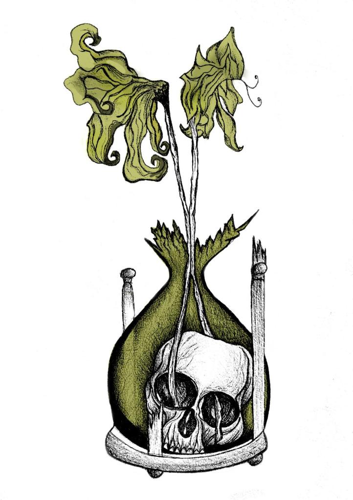
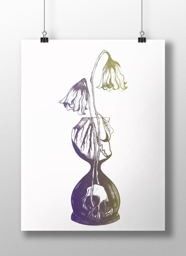
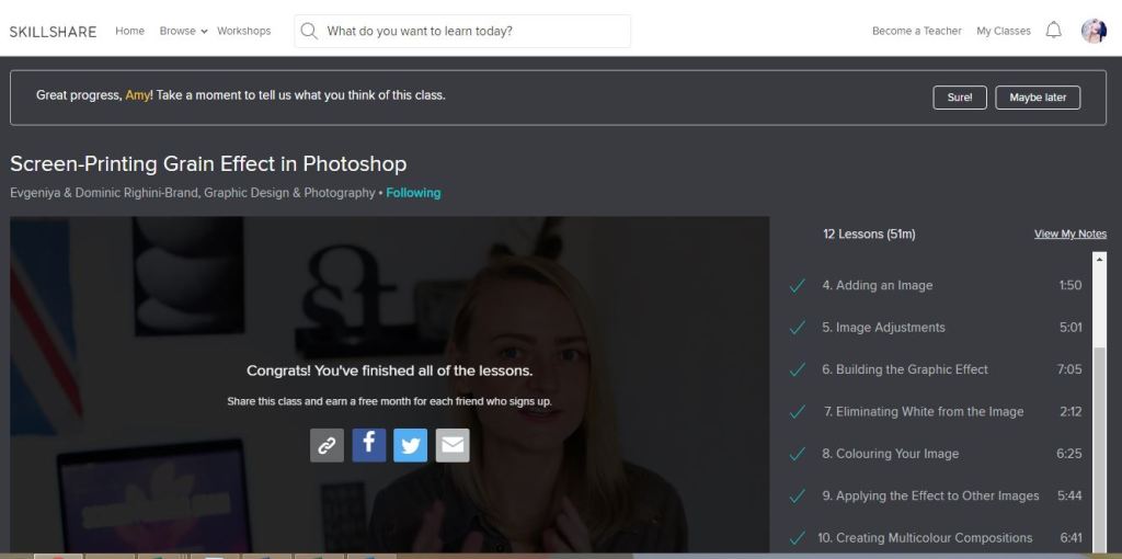
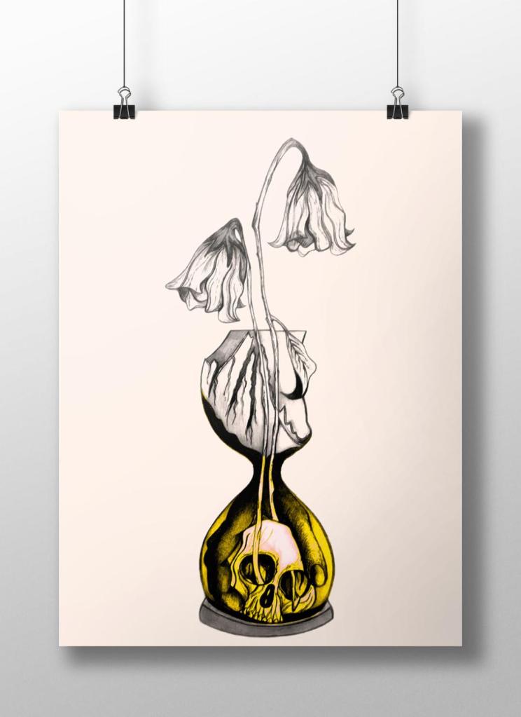
I watch a lot of SkillShare tutorials to learn different effects and skills to further improve my design work digitally. My last post mentioned how I studied a Duotones class by teachers called Evgeniya & Dominic Righini-Brand, Graphic Design & Photography  well I also studied another one of their classes for creating a screen printed effect. I thought this might add an “older” more vintage feel to the piece.

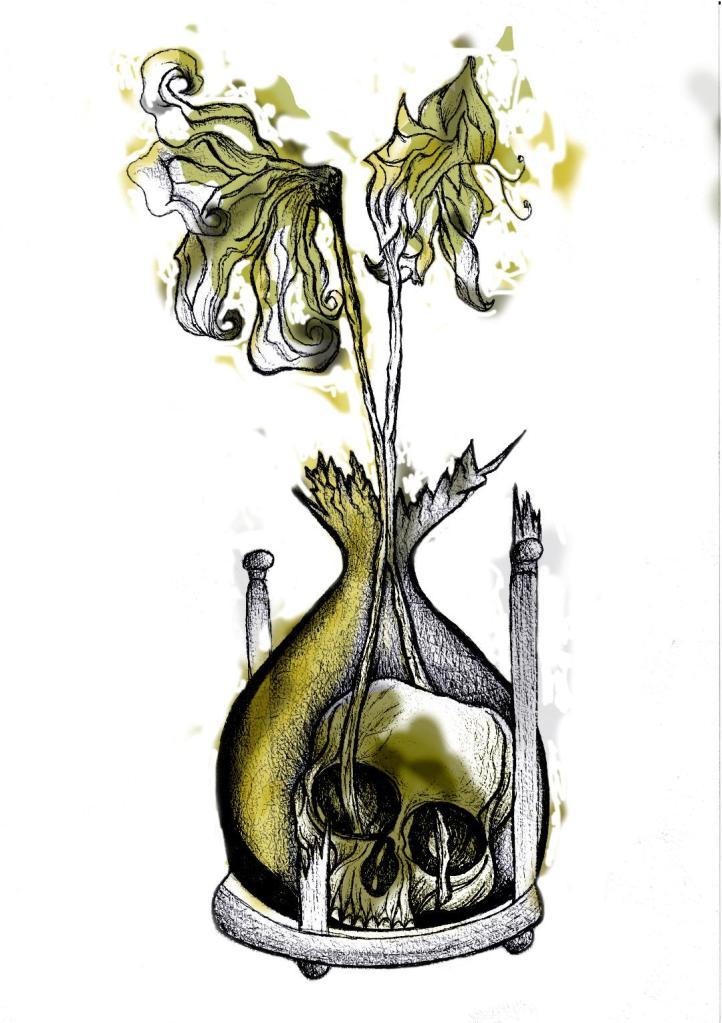
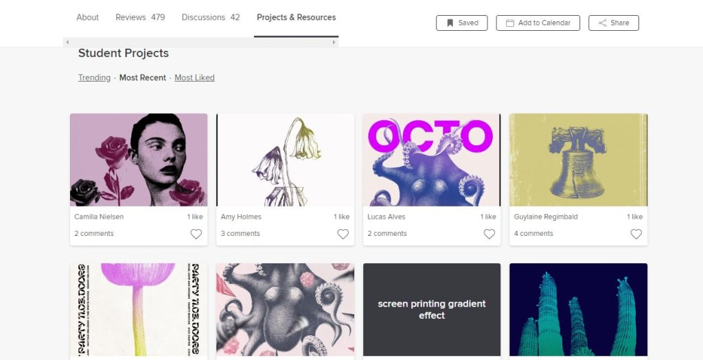
After I had finished the tutorial I also uploaded the finished piece to the Skillshare page for others to see (which is unknown for me!!- stepping out my comfort zone!) Here is the link below to what the tutor had to say to my piece!

https://www.skillshare.com/projects/224662

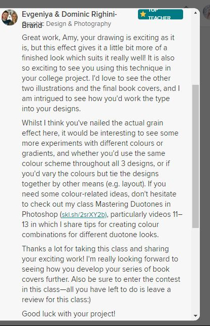
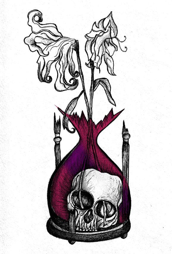
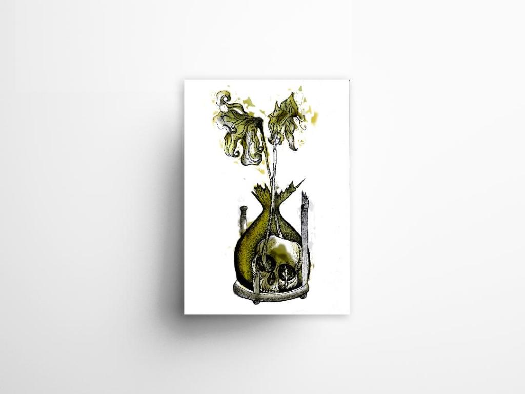
Out of all the trials I have done so far though I have to say I like the first one pictured above! I also posted it to my Facebook for the opinion of everyone else and they all agreed that this one stands out the most and the contrast between the black and yellow works the best. I am now going to draw the other 2 designs and then bring them into Photoshop and do the same digitally as this one. I will change the colours on each though so that they each have their own colour scheme.

The Time Machine: Digital Development

Yesterday I decided to have a go importing my hand drawn ink design into Photoshop and have a play around!

I am not a pro at Photoshop to say the least, so the tutorial I watched on Skillshare a while back that I wrote in my blog about really helped me!..

I decided to change the colours, I want each of the 3 books I design to use 3 different colours and work as a series in that the designs are the same and also the colours tie them together. The flowers in the Time Machine are white but dead, brown and withered at the ends so I decided to alter the colours to match this… I went with a white/murky yellow/black colour scheme.

To get me familiar with changing the colours and doing certain things in Photoshop I had a play around first, this was the trial starter piece..

Using the pen tool to draw around areas and making them a selection so that I could add colour to the area and then multiply to blend it in with my line drawing. I then created a clipping mask on a duplicate layer to further blend more colour in.

When I felt more confident I then started on a proper version;

This one I kept the colours quite subtle… I coloured in all of the flower shapes with a murky yellowish colour and carried this on into the hourglass. I liked it but it didn’t shout out at me..

With this version I messed around more with the colours and blending them to create 2 tone effects. I accidentally moved the flowers layer but actually quite liked it being out of the shape slightly.. It gave a mix of the 2 colours; white and yellow. I also created like a water colour/watermark effect at the top of the petals.

In this version I made the colours more deep and murky. I feel the colours are the strongest in this version. Overall I am happy with the progress I have made with it and the new skills I have learned, however It still needs improvement… I now need to find ways of how to make it work on a book cover with the typography element etc.. I think though that I shall draw the other 2 book designs and then take all 3 of them together and then look into layout and typography etc..

I also looked at mockups for displaying work more professionally on my Instagram account. I downloaded a simple poster mockup document and then added a drop shadow around the edge of my image.