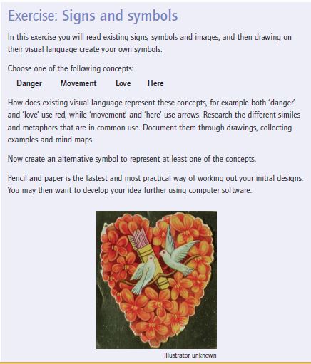
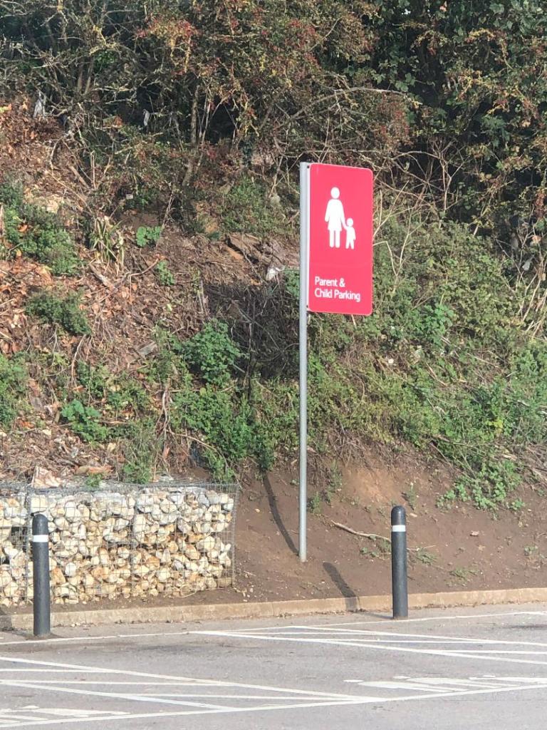
- The Brief
- First thoughts
- Research – Mood boards
- Research – Mind mapping
- First Ideas/ sketches
- Development
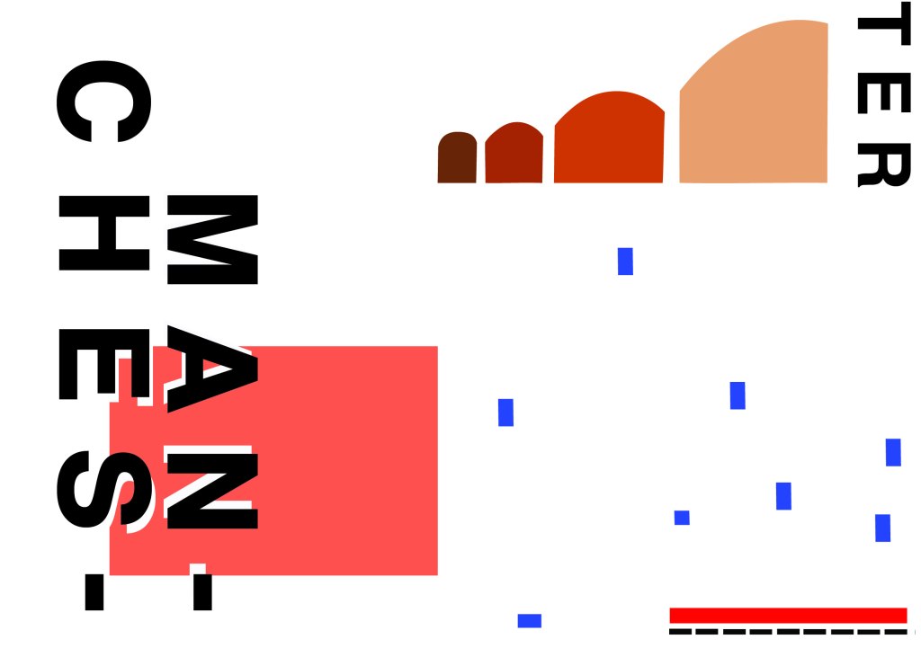
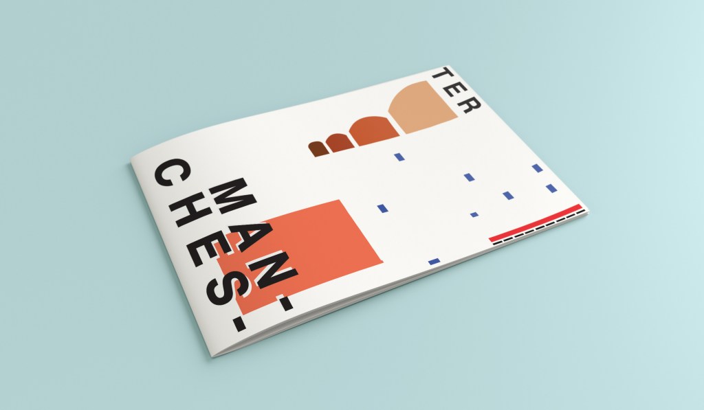
- Final Artwork
- Poster 2
- Poster 3
- Poster 4
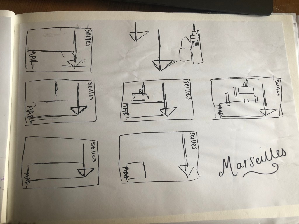
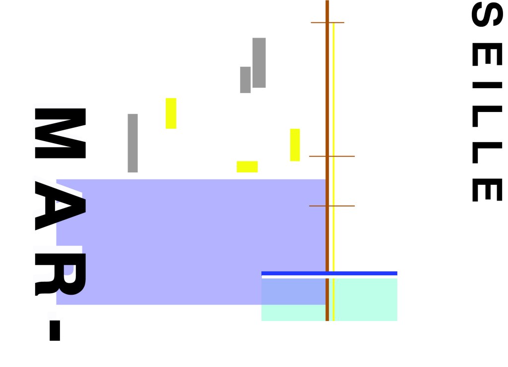
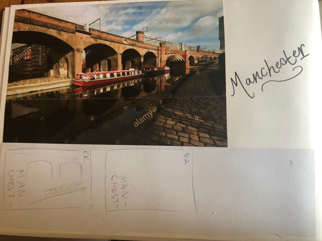
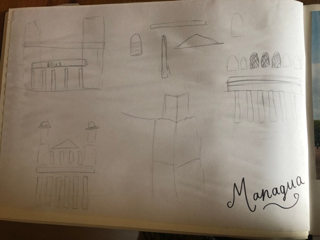
- Sketchbook pages
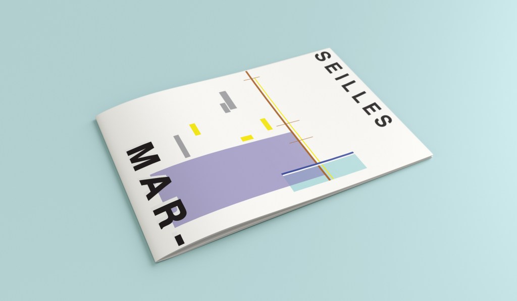
- Poster mockups
The Brief
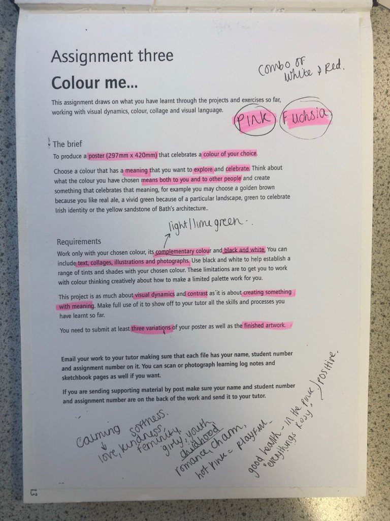
First Thoughts
I approached this brief feeling fairly confident! I knew exactly what colour I would choose… PINK! In particular though, a more grown up Magenta Pink; It is not “pink pink” it’s not Fuchsia but it’s somewhere between the 2! I thought that the most difficult thing would be to convey what the colour means! I have never really thought about what the colour Pink does to me! 😀 All I know is that I am drawn to anything Pink and it just makes me feel happy and girly! I am familiar with colours on the colour wheel so knew what the complementary colour would be – lime green! I knew that I would have to research further to come up with some good ideas!
Research – Mood Boards
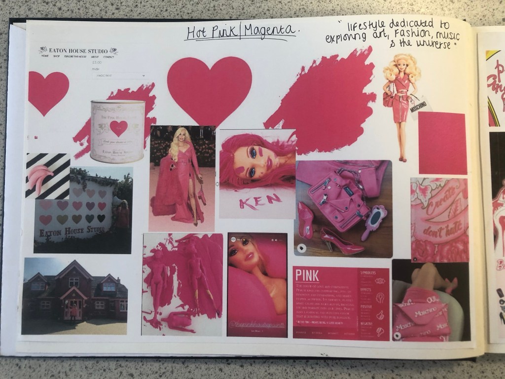
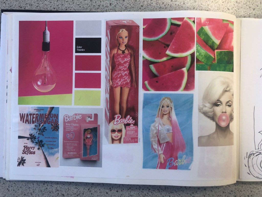
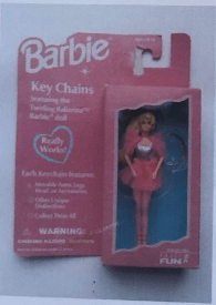
Whenever I begin with the research process I always start off with moodboards and mind maps. I started a brand new sketchbook for this assignment and began with some moodboards that I filled with images which I find appealing and that make me think of Magenta Pink the most. When I think of Pink I automatically think of Barbie and the hours of fun I had as a child playing with their long blonde hair, dressing them in bright funky outfits and collecting lots of hot pink accessories for them! My first 2 pages of my moodboards were inspired completely by this. A big source of inspiration also came from Eaton House (The pink House) in Essex which I had the joy of visiting almost 2 years ago now! (I have a post and some photos abut it in my “places to go people to see” menu at the top of site!) Eaton House now have a line of interior wall and magic (fabric) paints and I felt compelled to include this on my moodboard also, one of the paints is called “Ken” and it is a bright hot Magenta Pink. I found myself ordering a tester pot to see what the fuss was about and to see if I could use it as mixed media for this assignment. One of the images that stood out to me from Eaton House was one of their photographs they took for their Instagram page advertising “Ken”.
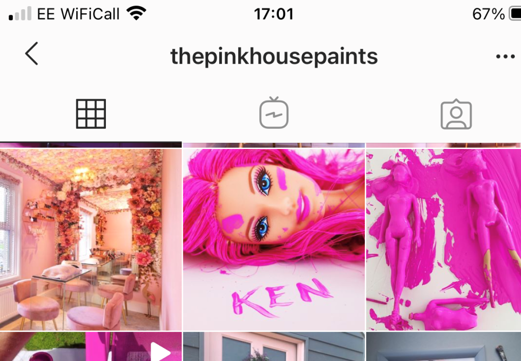
The photograph shows a Barbie completely covered and dripping in the pink paint, I liked the look of this and it gave me ideas; it was basically them messing around to see how consistent and bright the paint actually was before they sold any – basically grown ups playing around with Barbie’s but in a different way- Experimenting with paint colour! That is exactly what this colour is; It is like it was made for having fun! It is bold, attention seeking and experimental! It is the grown ups answer of a colour to mean play time!
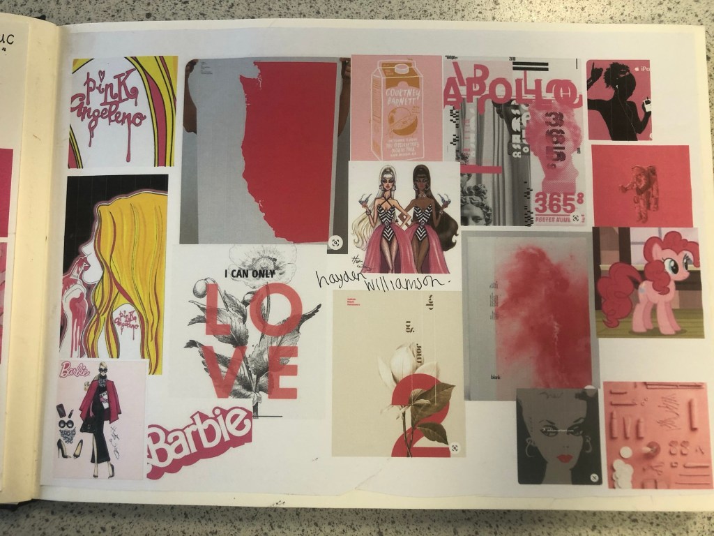
I also looked at the Moschino Barbie range from Spring/Summer 2014. I am lucky to own a few pieces from this collection (I only wish I had them all!) for whatever reason, every time I see this collection I am inspired!- I absolutely love it! It was only right that I included the images onto my mood board. I also included on my moodboard illustrations that I did for my Assignment 1 and from where I got my blog name “Pink Angeleno” from, my Assignment 1 very much emphasised the fact that I love the colour pink! I looked into fashion illustrations by Hayden Williamson (He did a Barbie illustration series) and I looked into pink branding, pink films (Legally Blonde!) and pink poster art. I wanted to get as many images as possible to sum up what this colour means (colour theory), who the target audience is and what the colour means to others (emotionally).
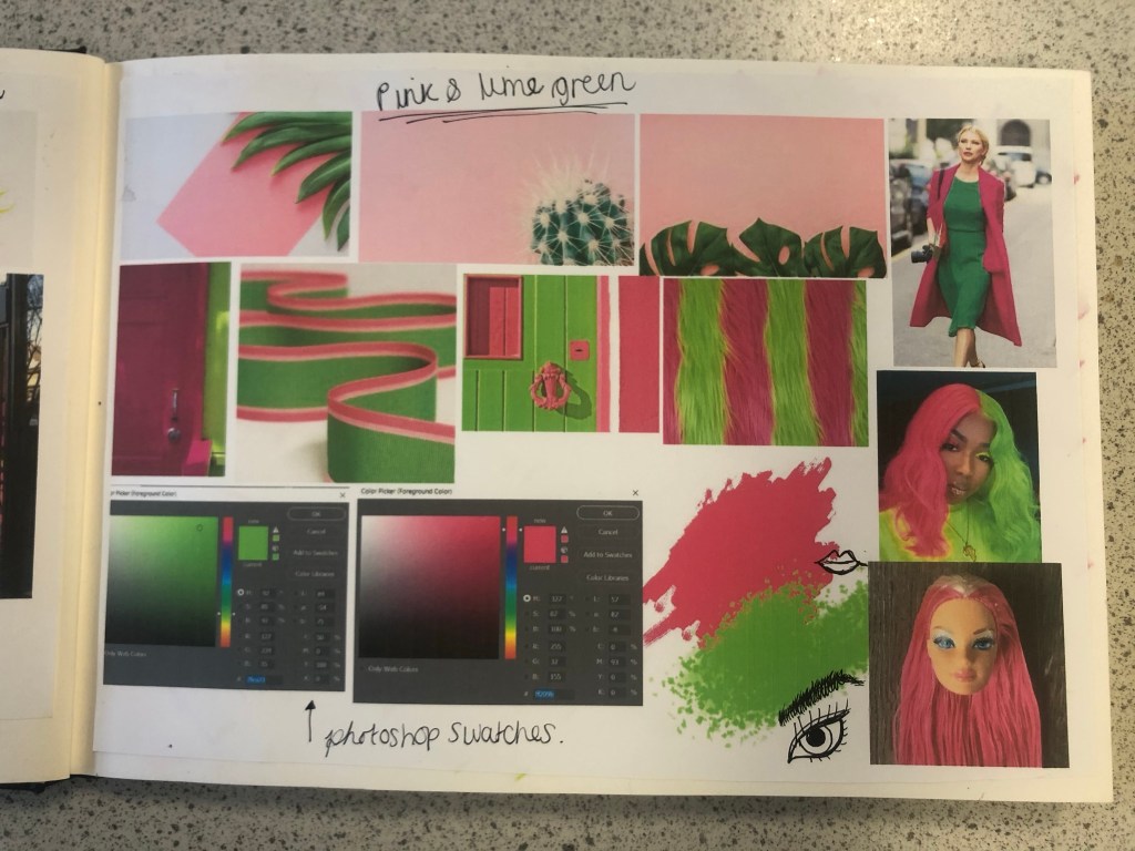
My last page of my mood boards was based around the complementary colour. I wanted to see how well Lime Green and Magenta worked together side by side and I also wanted to research into the uses of those colours. The images that appeared the most in my search were pink backgrounds with palm trees in front or banana leaves (think of the Beverly Hills Hotel!) It was very clear from the images that these colours represented summer!


Having visual references on my pages helped inspire me more in my ideas. I then moved on to mind mapping.
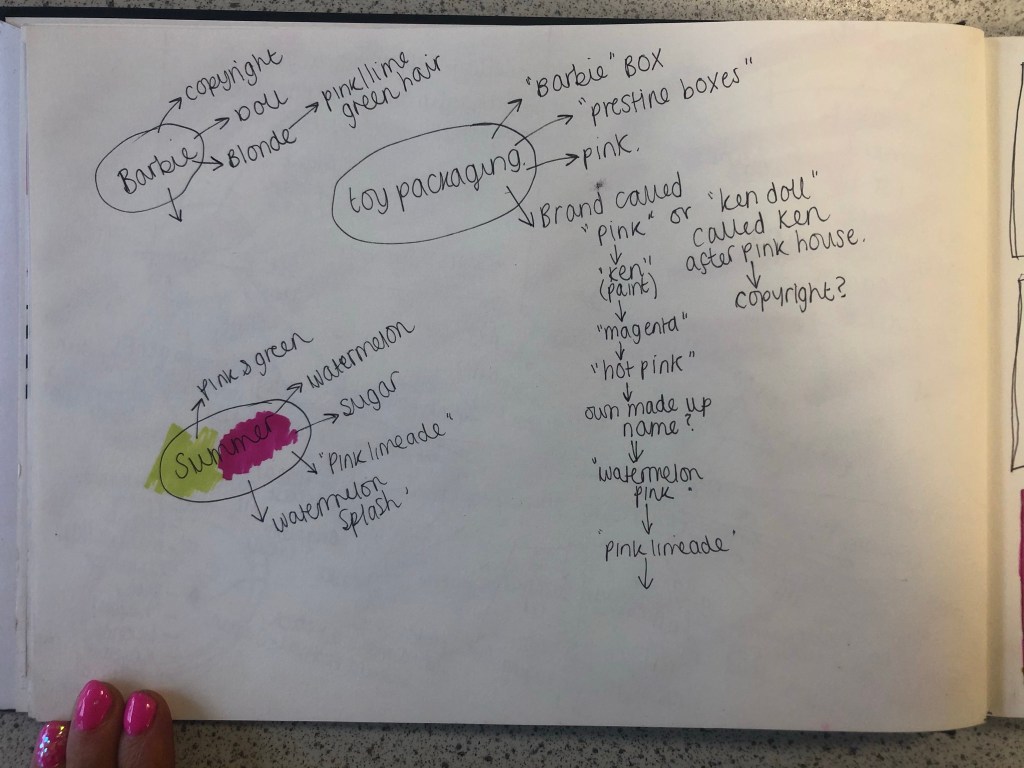
Research – Mind Mapping
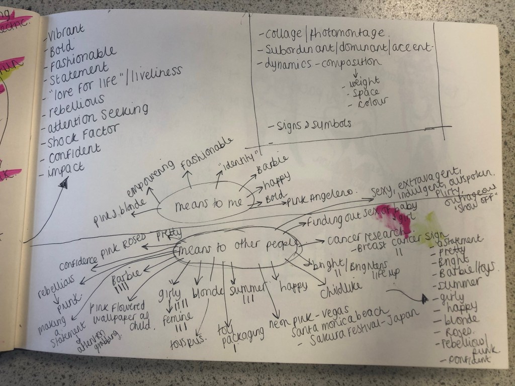
The first page of mind mapping was me exploring the meanings/emotions behind all 3 colours; Pink, Magenta Pink and Lime Green. I then looked at all the answers I had mind mapped and underlined the ones that both colours (Magenta and Lime Green) had in common:
- Confident
- Vibrant and bold
- fashionable
- fun
- statement
- “love for life”
- rebellious
- liveliness
- impactful
- attention seeking
- shock factor
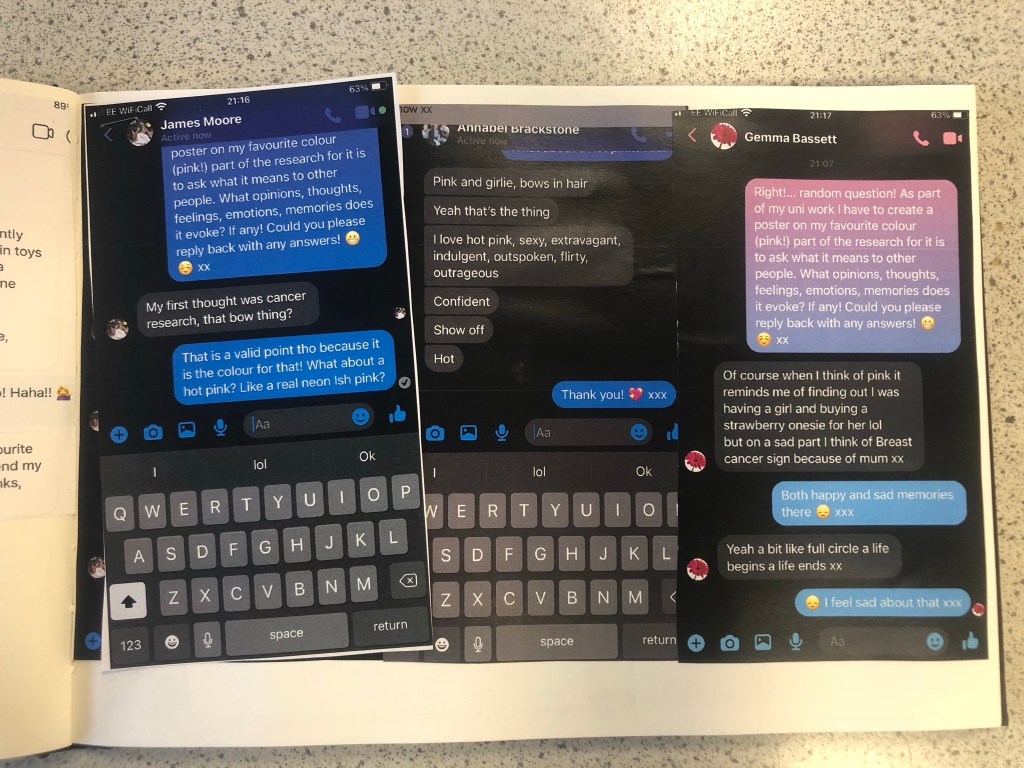
I knew that these were the factors that I would have to take forward into my first ideas and designs. My second page of mind mapping I concentrated on what the colour means to me and to others. I decided to ask some close friends and family what Pink means to them, what it reminds them of and what they think of when they hear the word PINK! I sent a message out through social media to ask people their thoughts on the colour; Luckily I had some good replies back! Almost every answer I received back from females mentioned Barbie and remembering the bright pink packaging from their childhood! It is very stereotypical also that Pink automatically reminds people of “Barbie girls” .I wanted to play on this in my designs as this is how most people see pink! The other answers were:
- a statement
- pretty
- bright
- Barbie and “pristine pink packaging!”
- Toy packaging
- Summer
- Girly
- Happy
- Blonde
- Roses
- Rebellious/ punk
- Confident
- Vegas neon lights
- Japanese Cherry Blossom trees
I knew from these answers that I definitely wanted to focus on how the colour reminds people of their childhoods with Barbie’s and the pristine pink toy packaging. The first idea I had was to make the poster into toy packaging.. instead of making the poster the colour Magenta pink, using some images to represent Magenta and writing about that colour I wanted to create something on the poster that represents the colour without the need for explanation but which is also playful and different in approach. Another answer that regularly came up was that people saw Magenta as attention seeking, bold and very confident. I wanted to show how Magenta is seen as the “grown up pink”. I could do a poster based around how Magenta is girly, pink, playful and brings out your childish side but is also a grown up striking pink, bold in appearance, rebellious and very confident! How could I bring the Lime Green into this idea though?…
First Ideas/Sketches
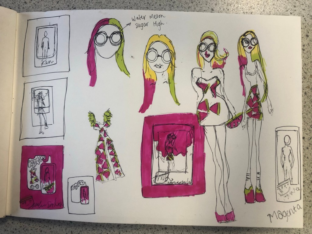
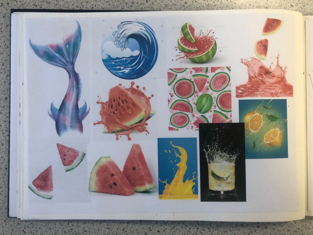
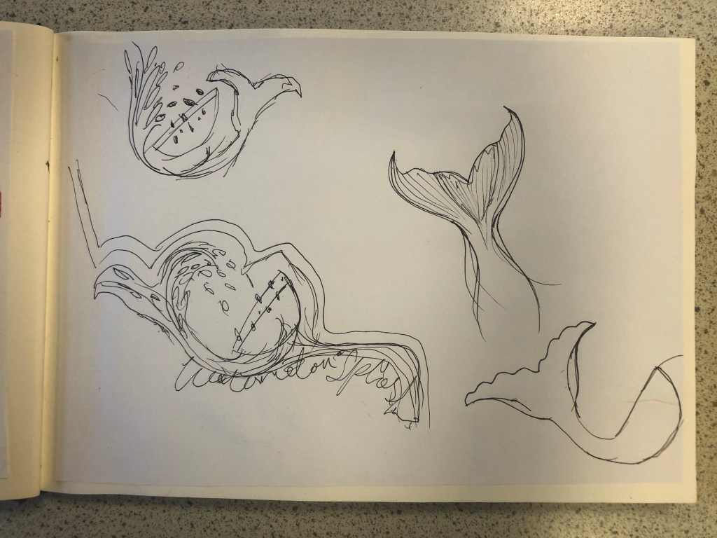
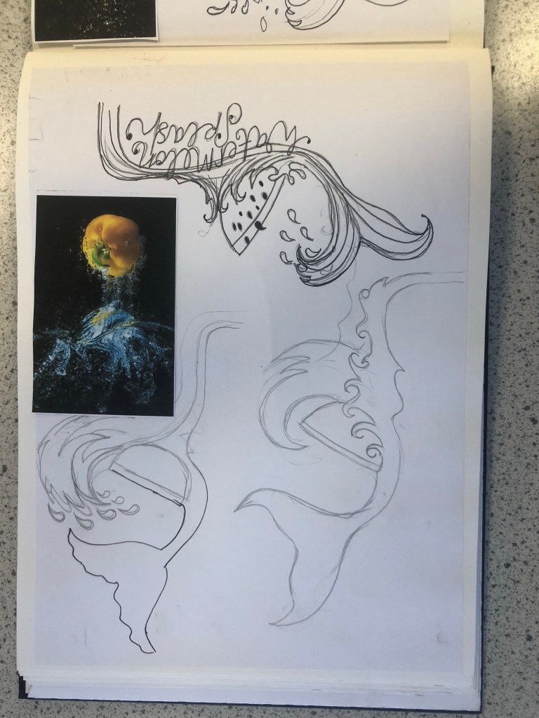
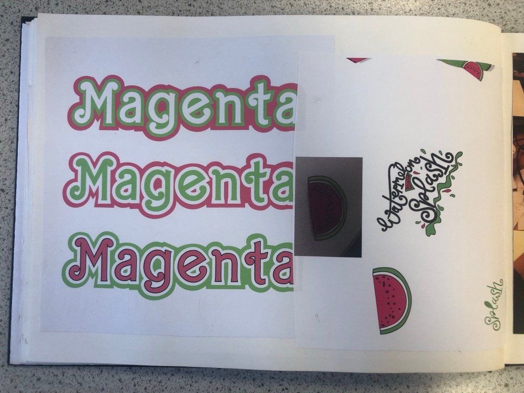
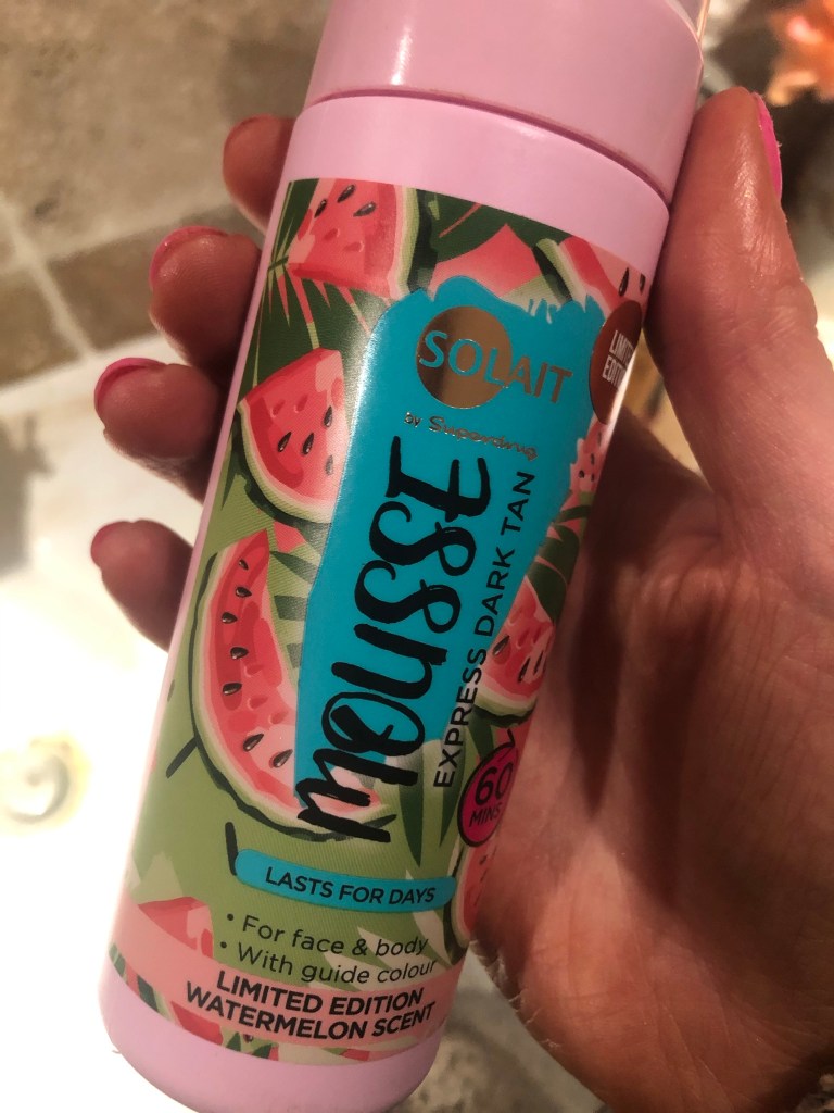
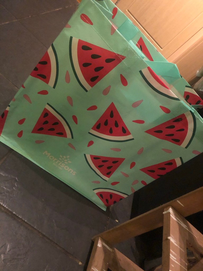
When I think of Lime Green and Magenta together I instantly think of Watermelons. I know Watermelons are usually Red and Green but in my mind I had the idea of brightly coloured vector art resembling a Lime Green and Magenta Watermelon. How would I bring a watermelon and toy packaging together to create a design though?.. In the back of my head I still had the Barbie doll that Eaton House poured into the paint playfully; If I could recreate my own version of this and bring it into my toy packaging design? I mind mapped around how I could bring the Watermelon into the design. Watermelons also represent summer so I knew I had also met one of the emotions that people feel when they think of Pink. The idea I had was to create limited edition doll packaging; make the doll a watermelon special doll but I needed a clever name for this. I mind mapped names that I could use for the limited edition packaging. I came up with “Pink limeade”, “Watermelon Pink” and my favourite “Watermelon splash”. The splash would symbolise the clash of the 2 colours coming together (Magenta and Lime Green). It also gave me the idea to use a mermaid doll which would further represent the “splash”. Since designing my posters I have looked around the high street and retail shops and seen a few designs that feature Watermelons:
If I was designing toy packaging for my poster I knew I had to be clever and not use the name “Barbie” because of copyright purposes. I needed another name. I did ponder the thought of designing a packaging for a Ken doll and using the Eaton House “Ken” paint as the colour I was designing the poster for but I decided to keep it for a female target audience as the colour is mainly seen as feminine. I needed a name for a female doll that would be representative of Barbie but not be Barbie… I simply thought of – “MAGENTA”.
I started to sketch some ideas based around this idea in my sketchbook. I drew out some toy packaging and some illustrations of dolls wearing brightly coloured Watermelon clothing and accessories. I was not sure whether I wanted to use the “painted Barbie” idea or whether I wanted to create a vector art illustration doll.

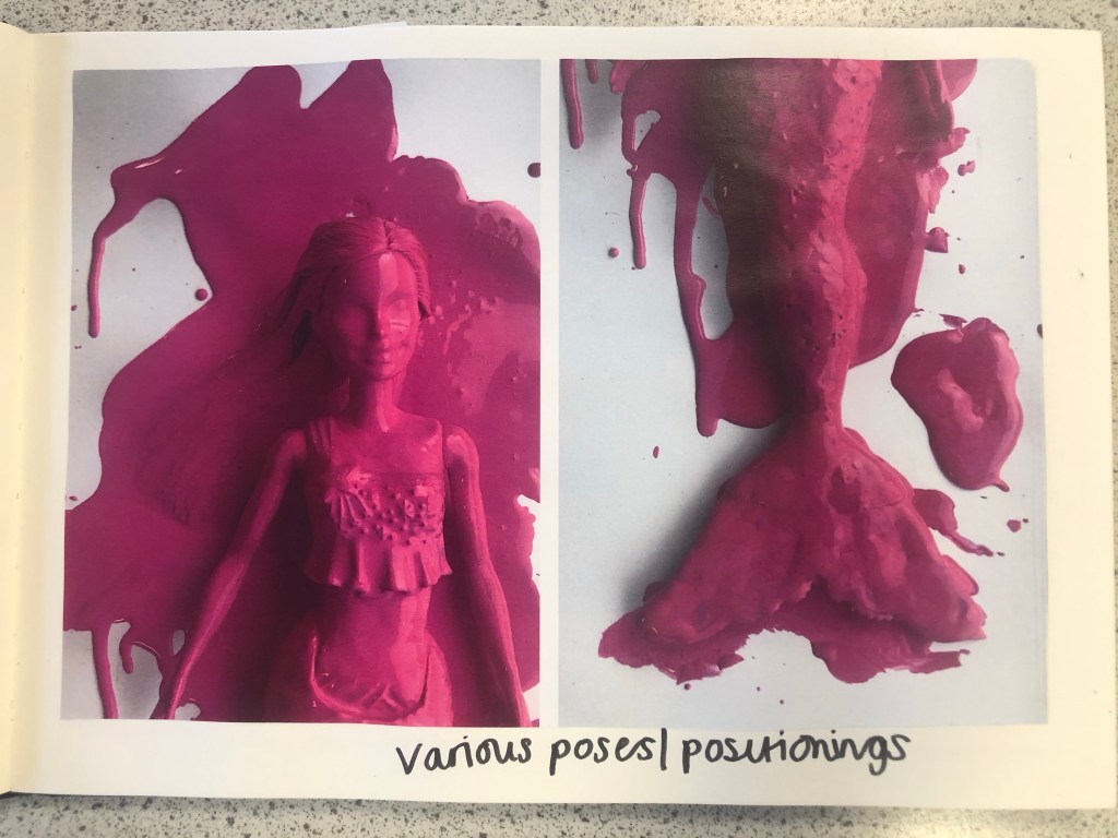
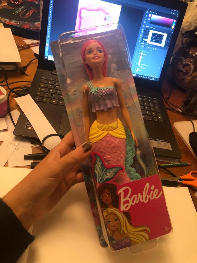
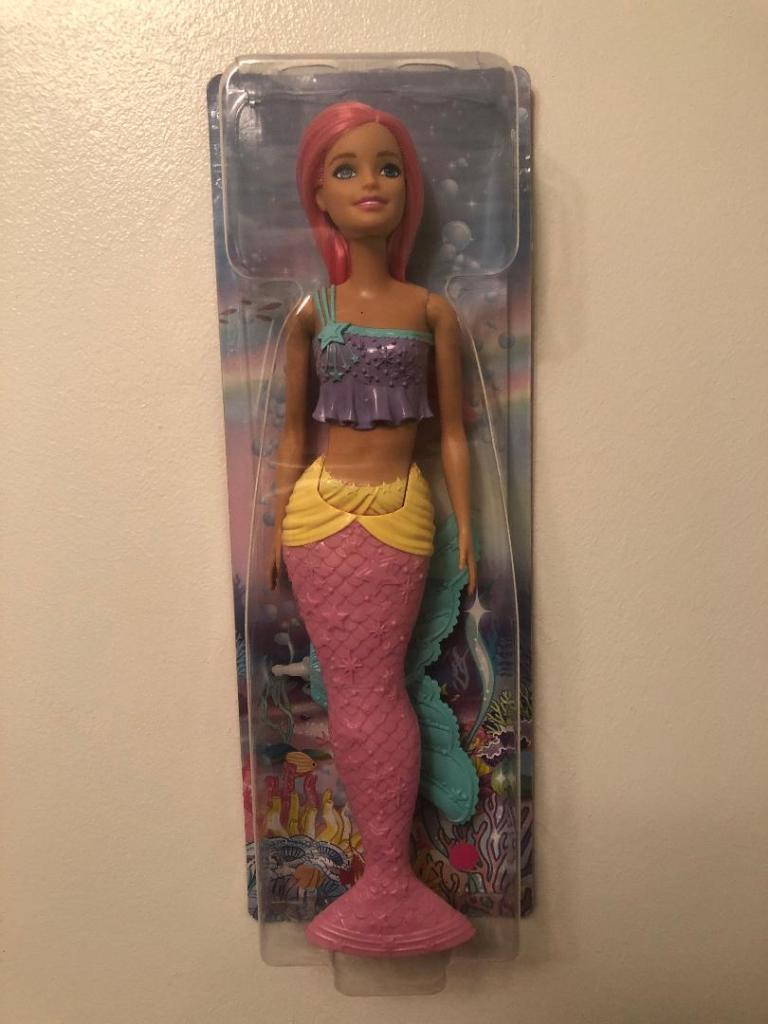
I drew some ideas for a mermaid doll with a Watermelon tail but then came back to the idea of the Eaton House painted doll and searched Amazon to see if there were any mermaid Barbie dolls I could buy and use. I found one on Amazon for £13. She had already pink hair and a removable mermaid tail. I could use this to experiment with the “Ken” paint just how Eaton House did.
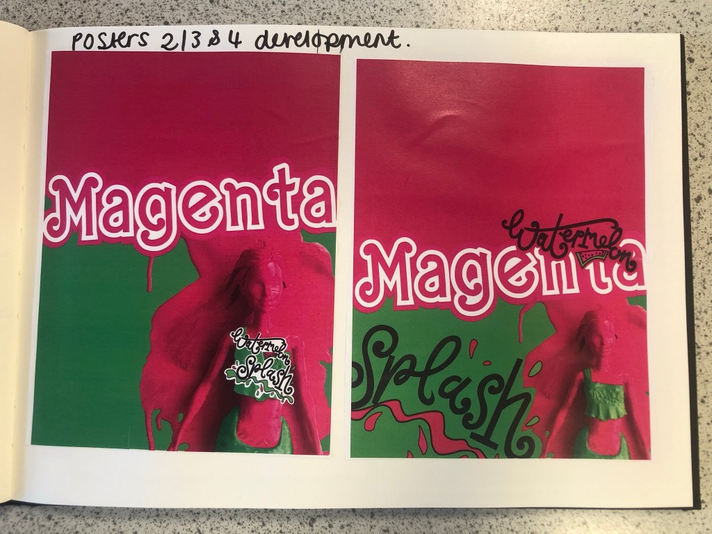
Development
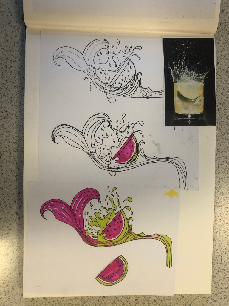
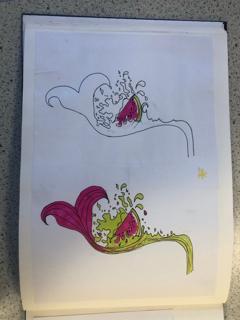
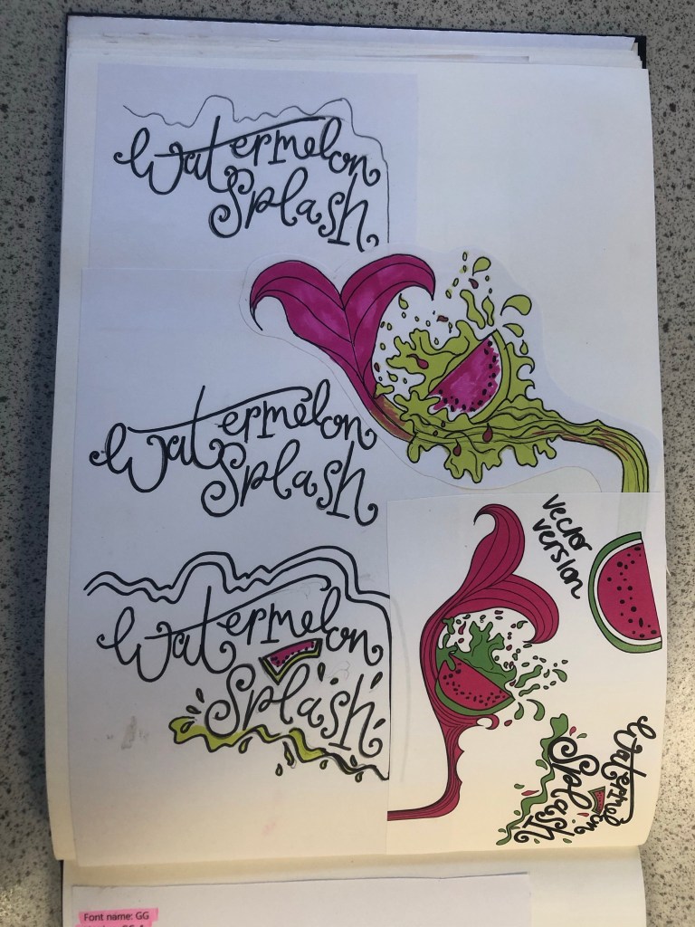
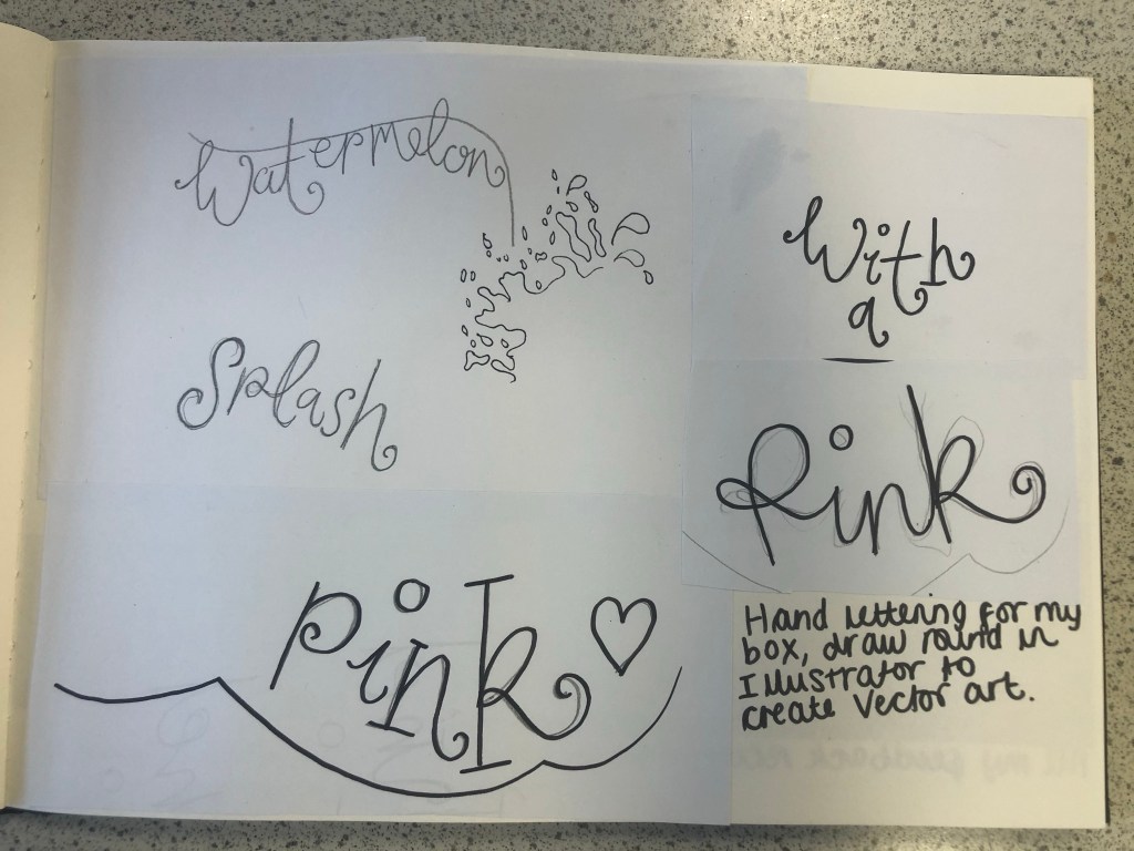
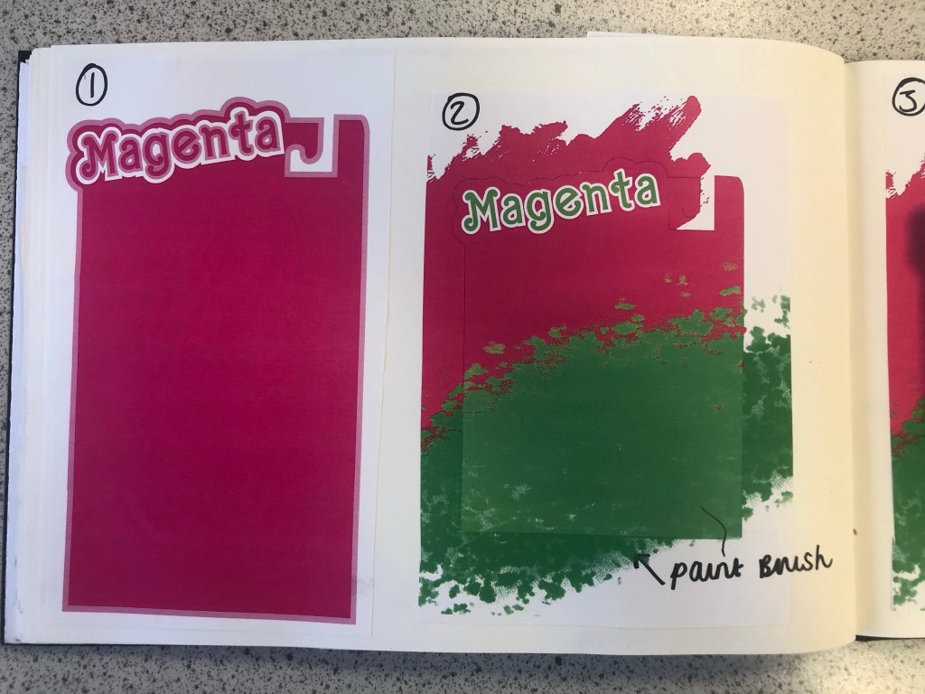
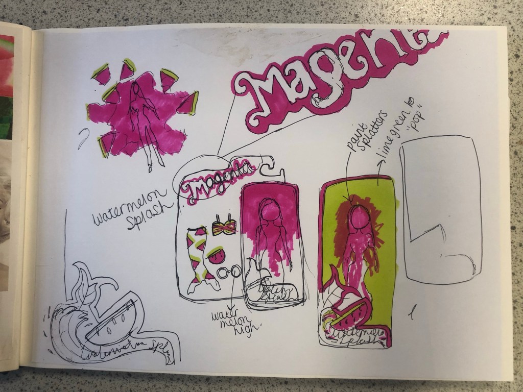
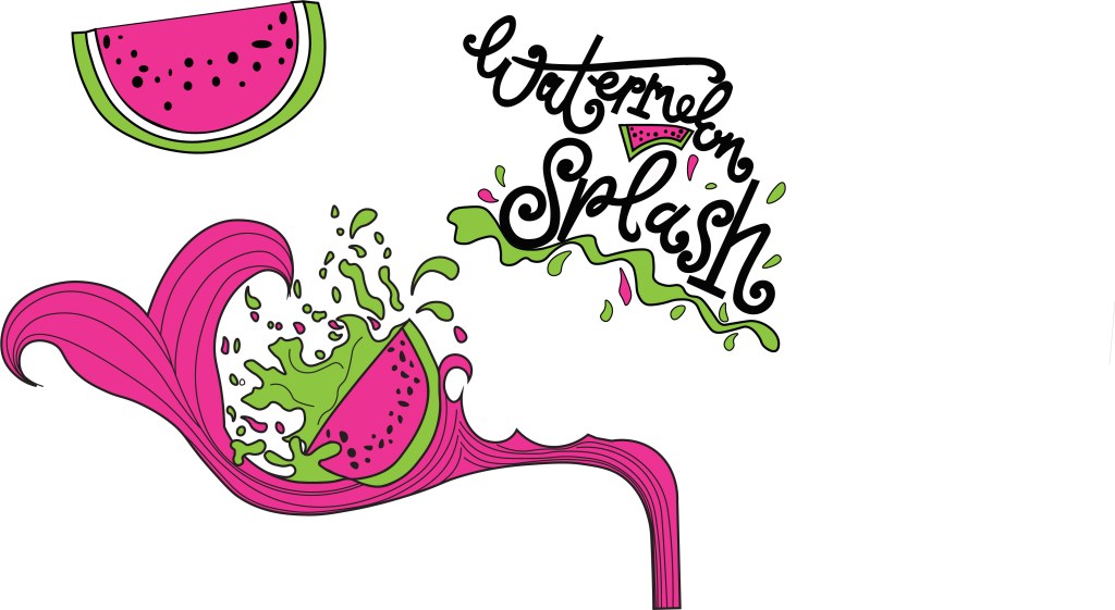
I then started to develop ideas around Watermelon Splash. I made another mood board filled with watermelons of all shapes and sizes, mermaid tails and splashes of water to see how I could represent the “splash”. I then started to draw up ideas based around this. I knew I wanted to include my hand lettering in this assignment as I like to turn my own writing into vector art whenever I can, so I started to sketch up “Watermelon Splash” in a style of writing that might be appropriate for the design. I came up with a strong design that I really liked and then decided to develop it further by drawing several versions of it with different splashes, different shaped watermelons and different positioning of the text.


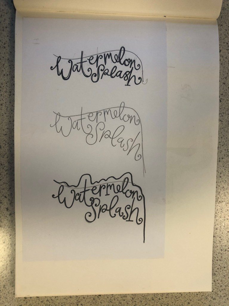

My final drawing for “Watermelon Splash” I was very pleased with. I scanned it into my laptop and drew around it all in Illustrator. I was left with my final vector art which I could edit to my hearts content around my final design.
Which Typeface?
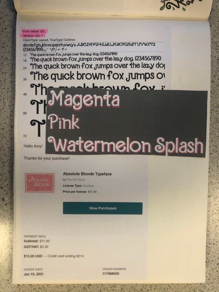
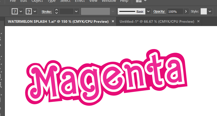
The next stage in my design process was to find a suitable font for “Magenta”. I wanted to use a similar typeface in my design to the “Barbie” font so I started to sketch with the idea that I would use my hand lettering to turn into vector art in Illustrator, however it seemed like such a long process that I decided to have a look online and search for any similar that I could download and use. I found one on Creative Market website that I had to purchase for $11. The typeface appears as GG when I install it onto my computer but it is called “Absolute Blonde”. The owner of the typeface created it when she was trying to desperately search everywhere for a “Barbie like” font to use in some invitations. This appealed to me! I could type what I need and then convert the type into editable shapes to turn into vector art!


I created my vector art from the font and then messed around with various colour schemes for Magenta. I wanted it to stand out against the Magenta background that I had planned for my design. I was conscious also that I needed to make sure that there was contrast and visual dynamics with the type and design.
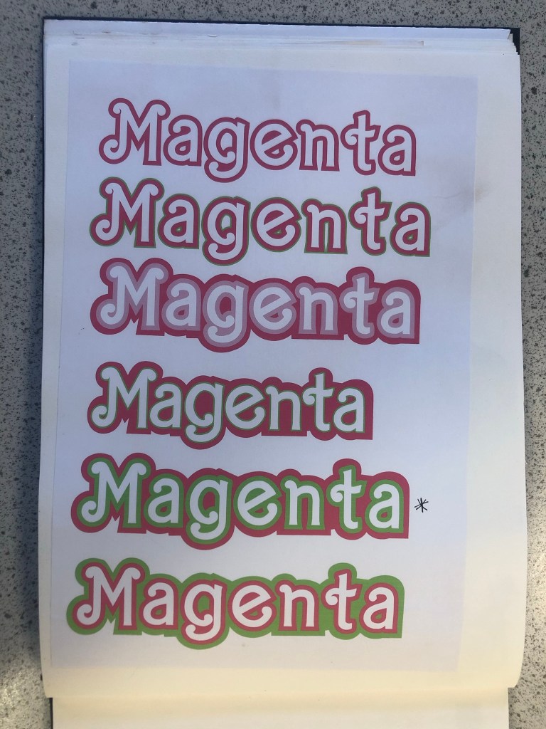
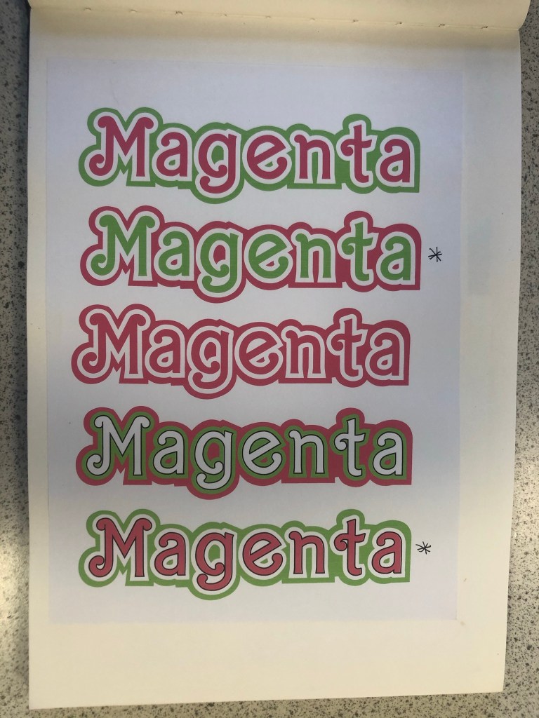

This is the version that I eventually decided on for my design:
Designing the packaging
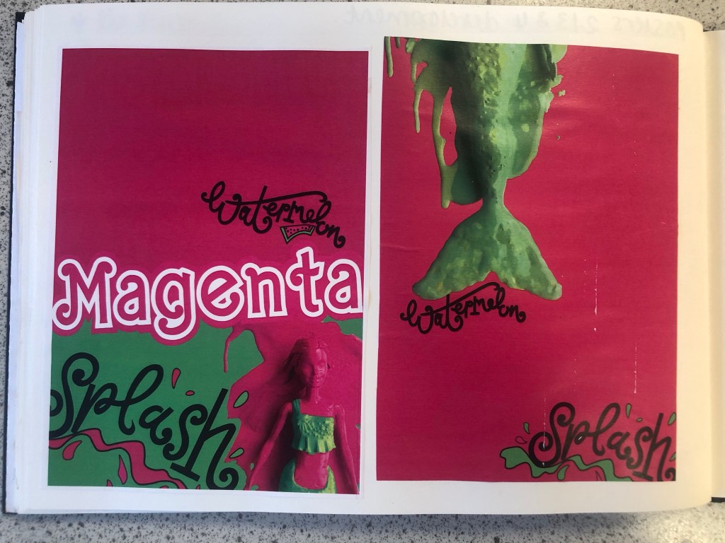
There is an image on one of my mood boards which shows doll figurine packaging with a hook at the top of the box to hang off pegs in the shop. I decided originally to go down this route of designing similar packaging. My idea was to have Watermelon inspired clothing and accessories in the packaging and then have the painted doll outside of the packaging covered in pink to match the rest of the poster.
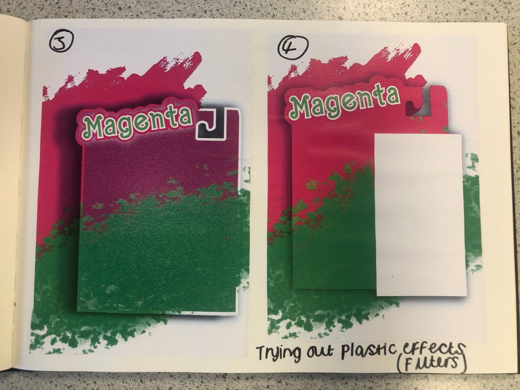
I am still an amateur at Photoshop so I struggled a bit at the start to try and learn how to try and do different things that I wanted to do. My main struggle was how to make the packaging look realistic and plastic-shiny. I drew out my packaging in Illustrator and then imported it over to Photoshop to edit further with filters and effects. It took several attempts for me to try and make the packaging look half realistic with drop shadows and the plastic film filter effect and even after all these attempts it still looked rubbish! I imported plastic film photographs over and lowered the opacity and laid it over the top of my design to see even if that would work but it still looked bad! The Magenta and Lime brush strokes in the background were taken as inspiration from one of my mood boards. I created this by using the brush tool in Photoshop.


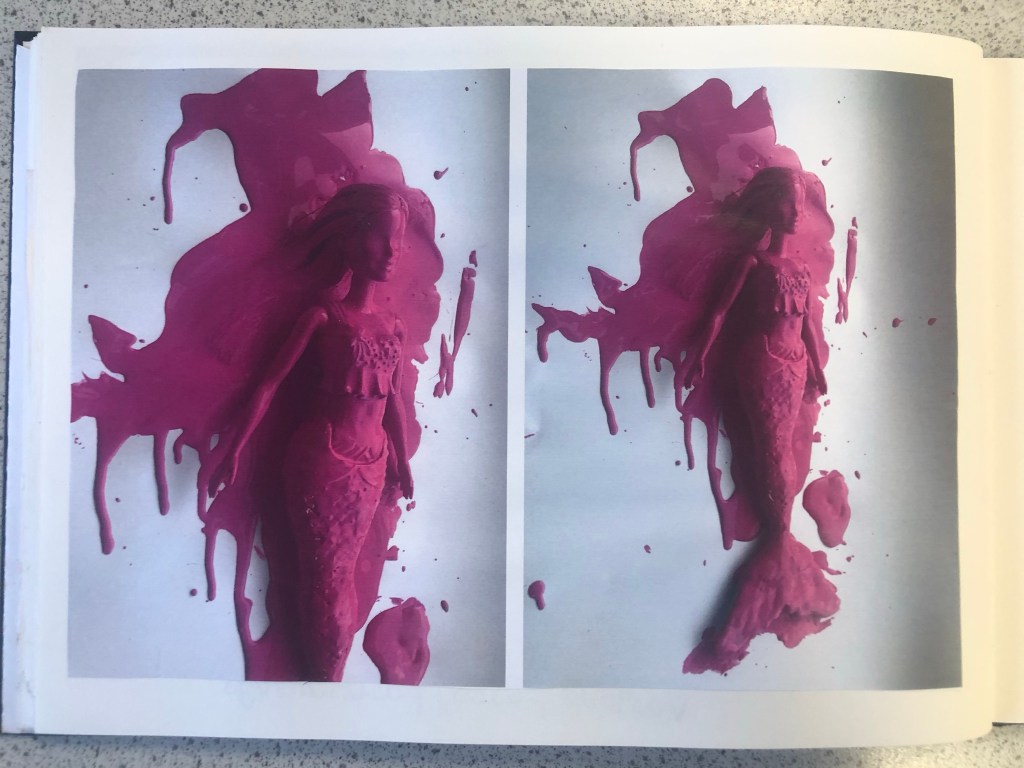
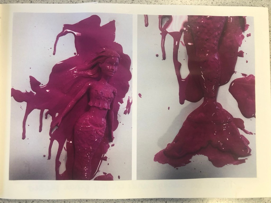
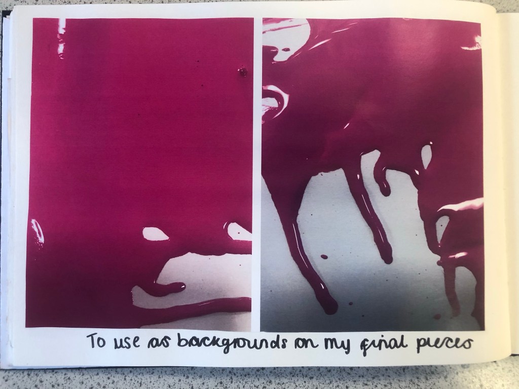
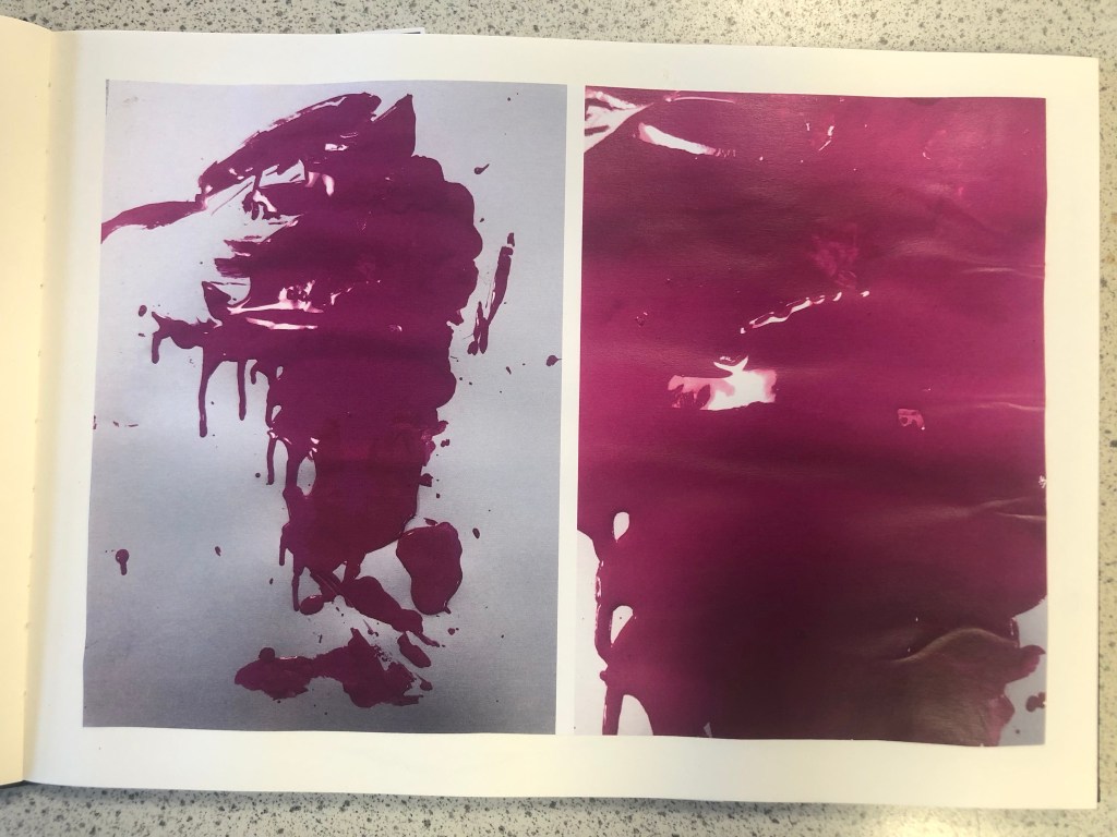
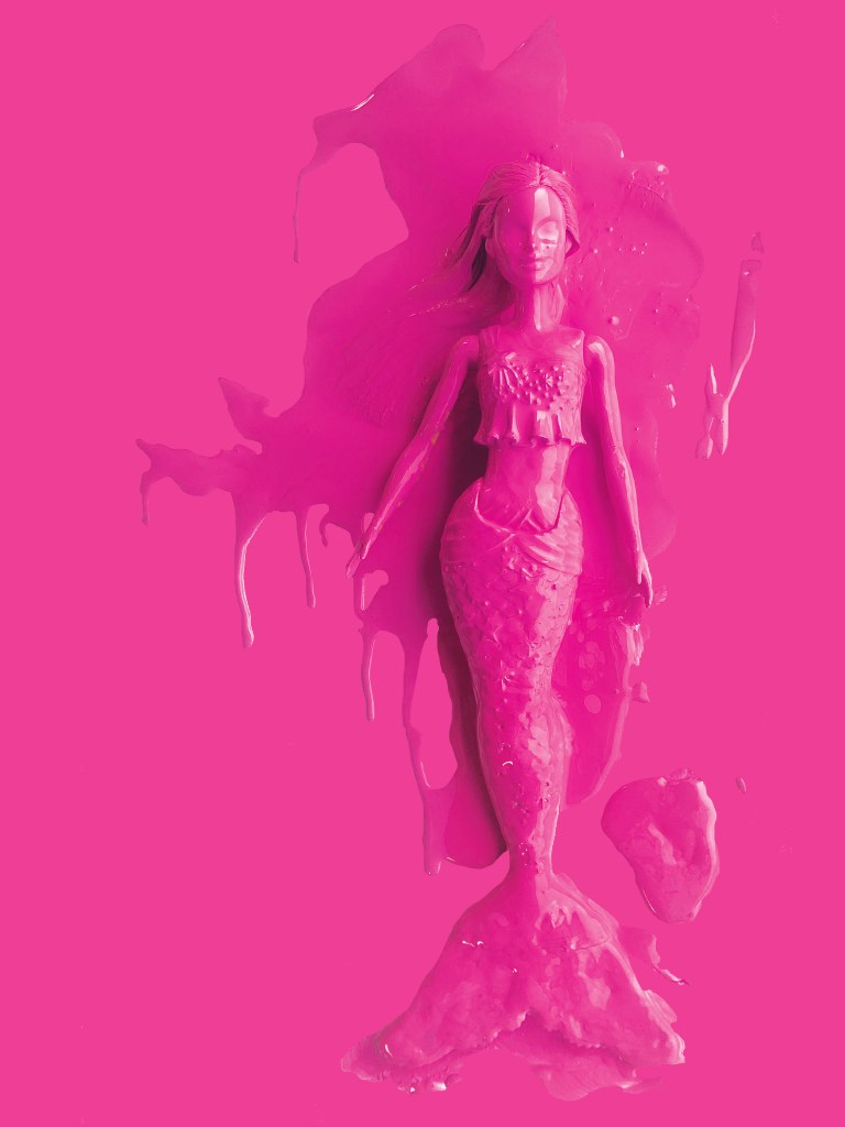
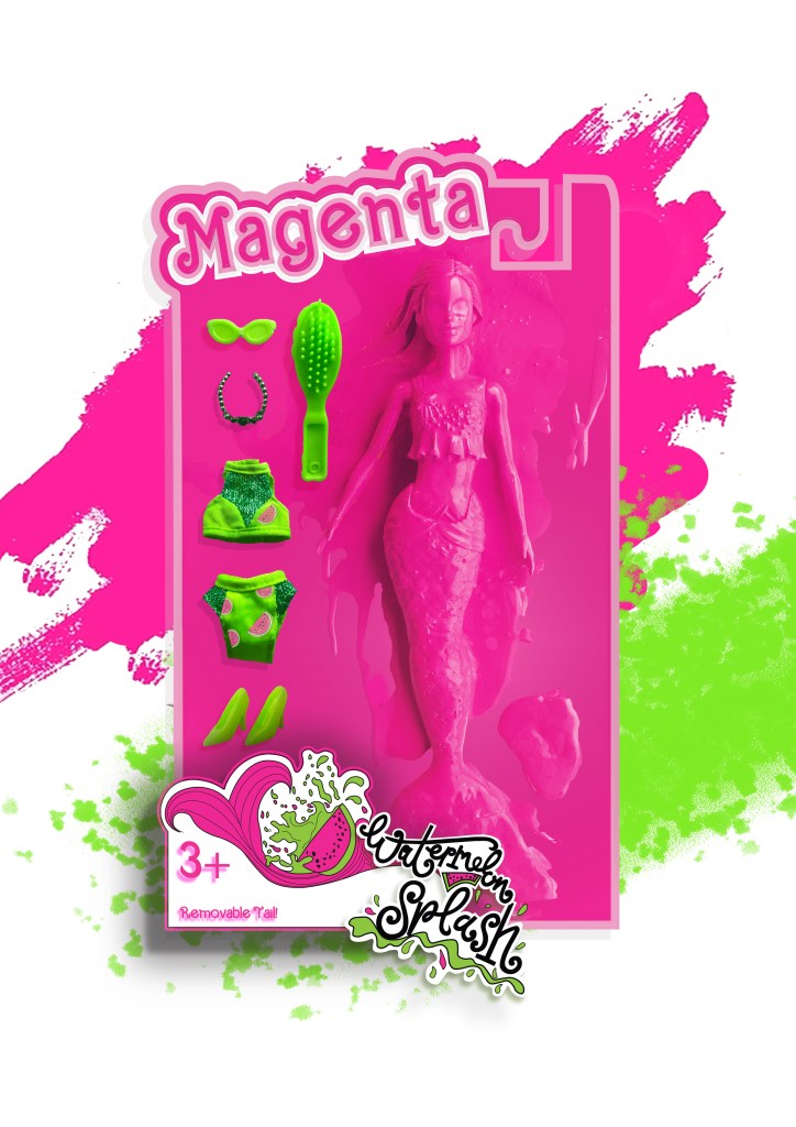
The next step before I continued trying to make my packaging look realistic was to take the doll and pour the paint over it to take photographs to see if any could be used as part of my design.
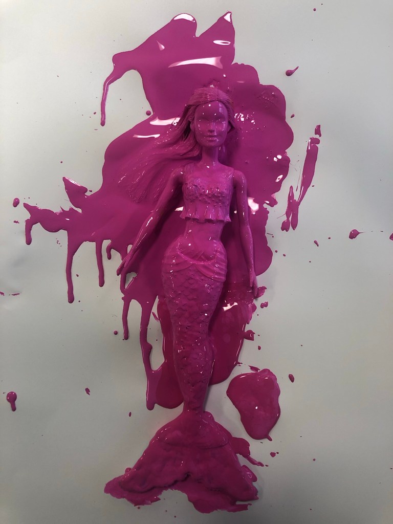
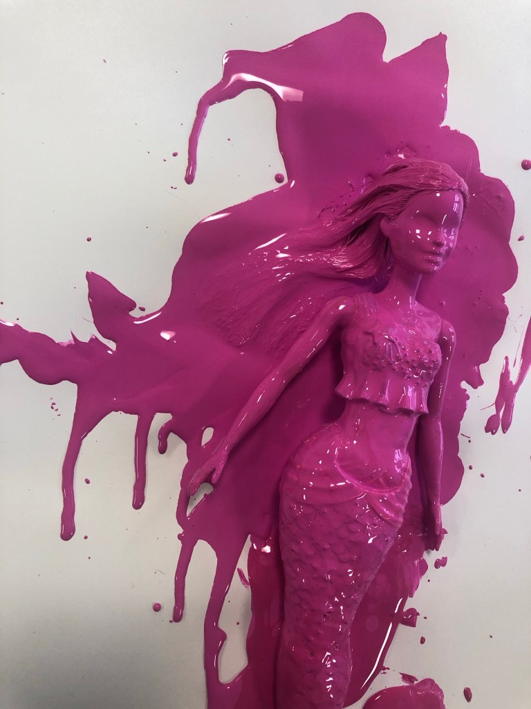
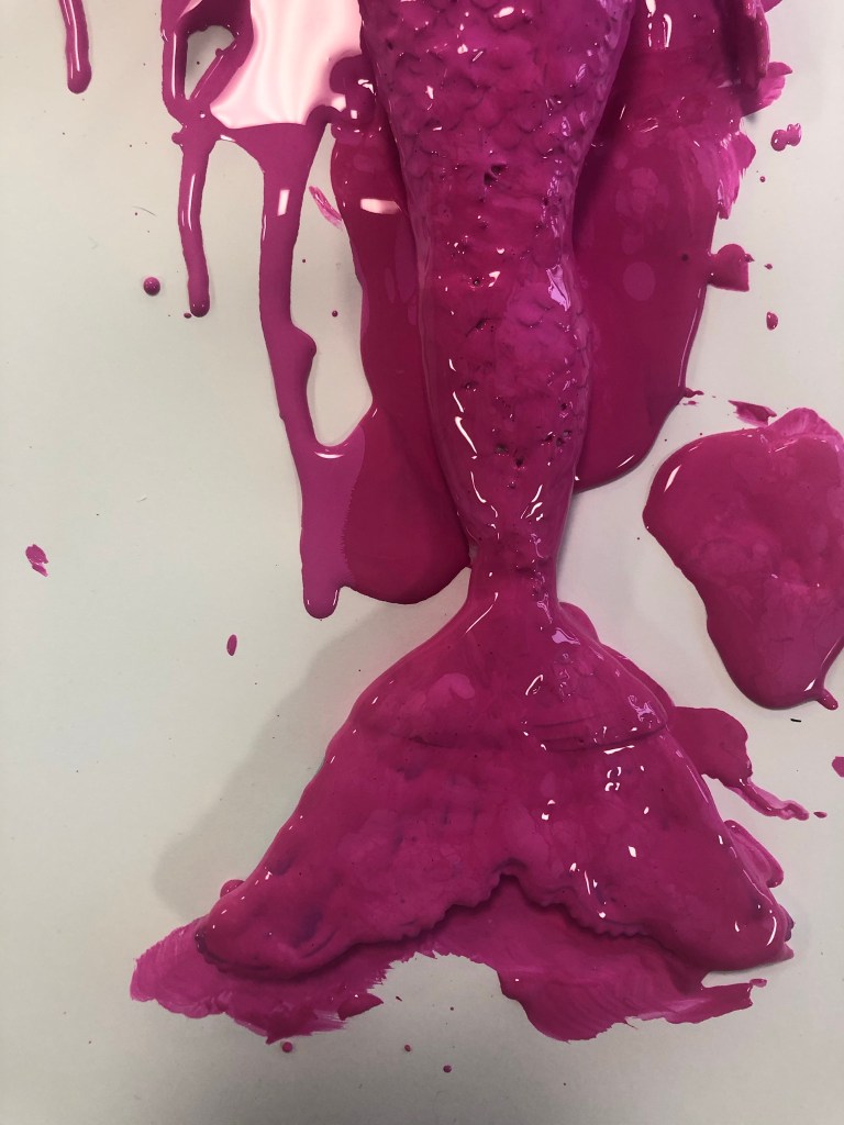
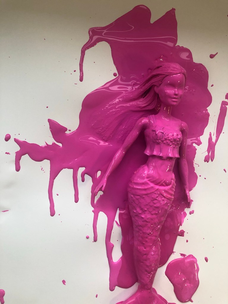


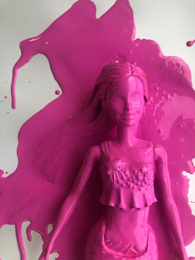
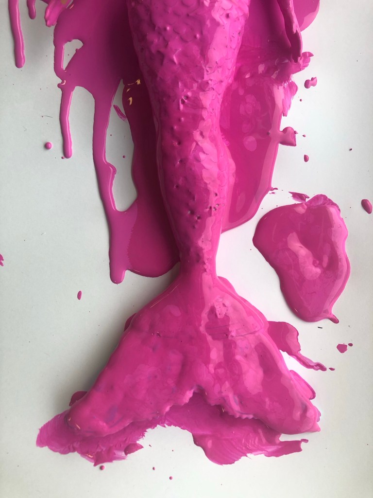
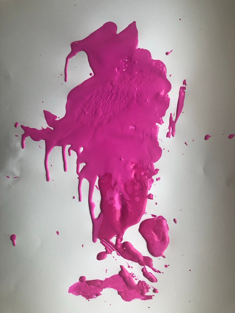
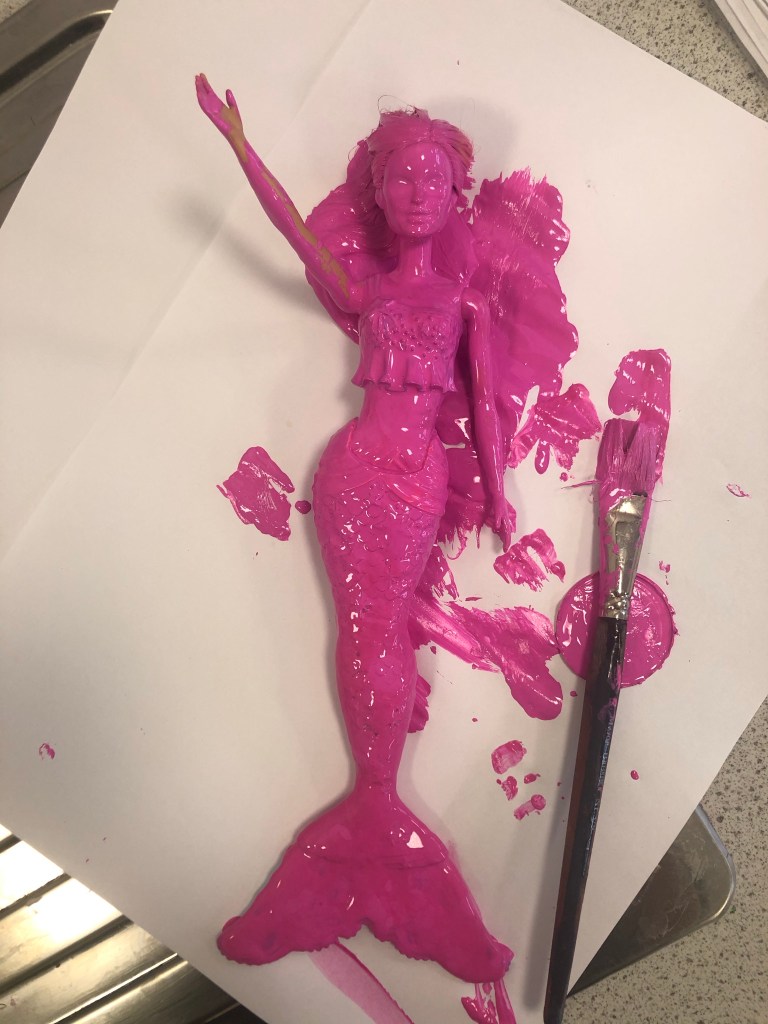
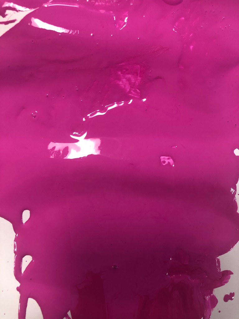
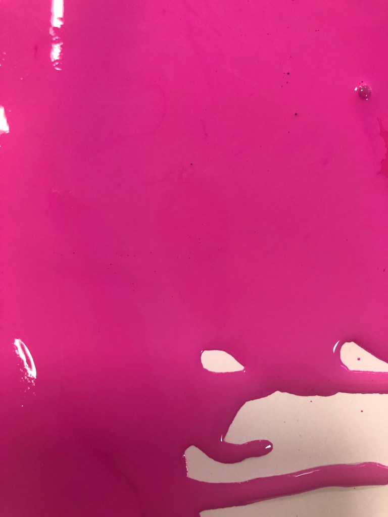

These were the photographs that I took at different angles. I then took my chosen photograph into Photoshop and adjusted it, gave it a Magenta background and took away the background noise.
It was then time to work on the packaging some more!
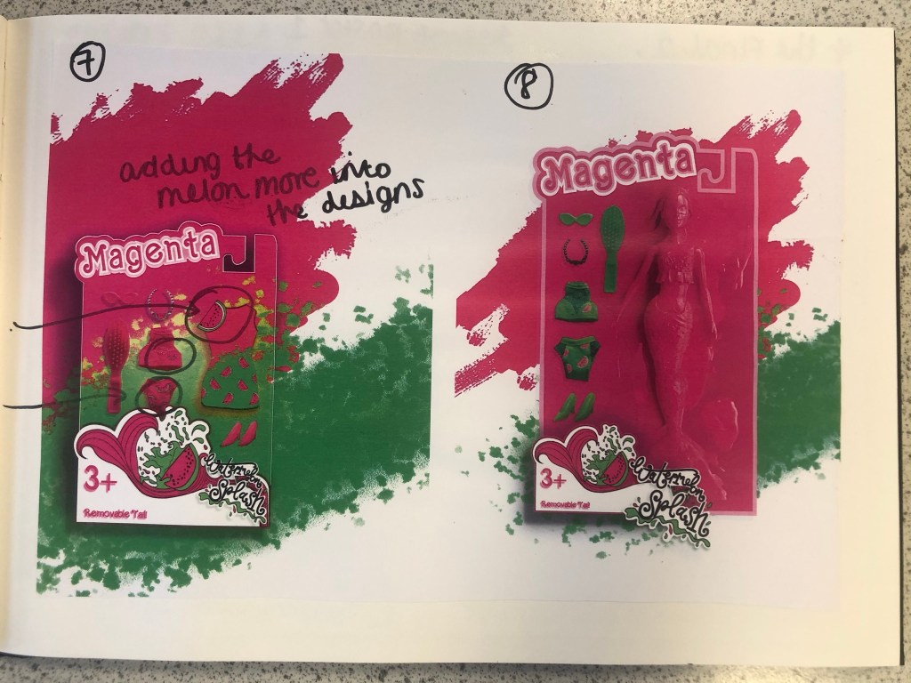
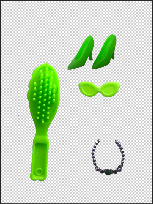
I still have a collection of Barbies and Barbie accessories in a storage container, so one day I decided to go through them and see if I could find any accessories that might be relevant to my design which I could alter to represent Watermelon Splash. I found a few which would:

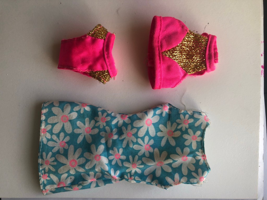

I then altered them in Photoshop to make them match my Watermelon Splash theme and to place onto the packaging.


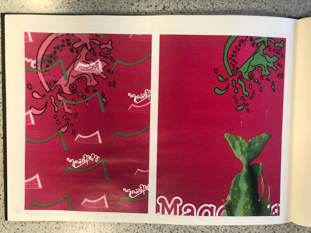
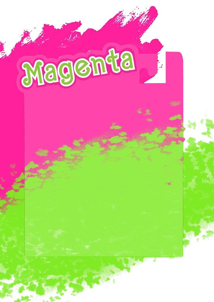
I started to like more and more of what I was creating. It was only when I had finished the 3rd development image below that I realised I needed to change the packaging again.. I included the doll into the packaging for this last development image but it still had the hook at the top of the box to hang it off a peg in the shop, realistically a heavy full sized doll would not be placed on a peg hook. I went back to Illustrator to create another packaging design. The colours however on these designs were working for me. I made Magenta the doll completely Magenta and then the Watermelon Splash around her was the bright, vivid Lime Green clothing and accessories.
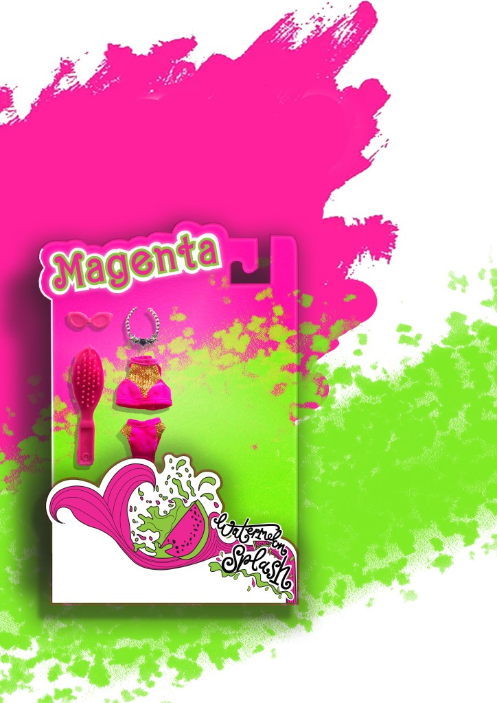
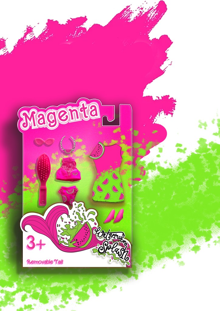
The 3rd development where I decided the packaging needed to change once again.
Final Artwork
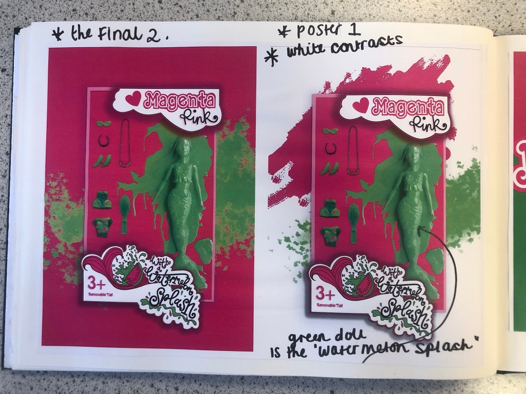
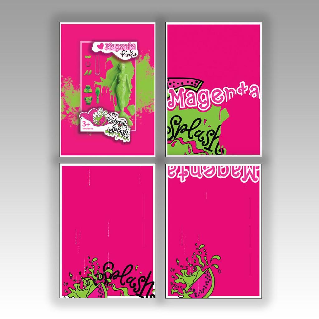
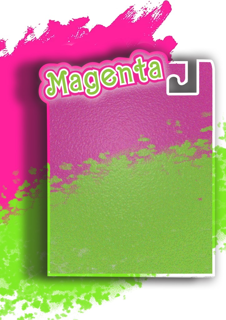
I then relooked at designing the box packaging to get rid of the hook at the top and make it look like an actual box. I ended up with 2 outcomes which I really struggled to choose the final artwork from:
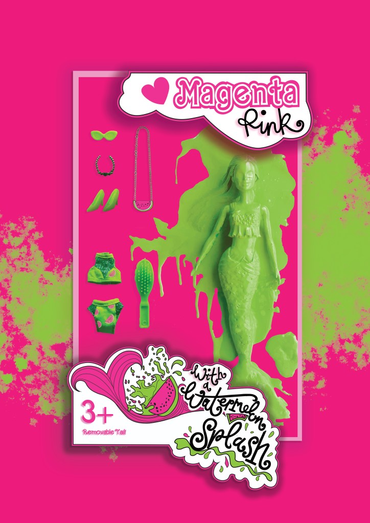
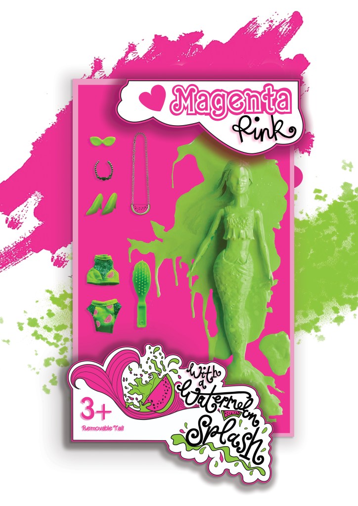
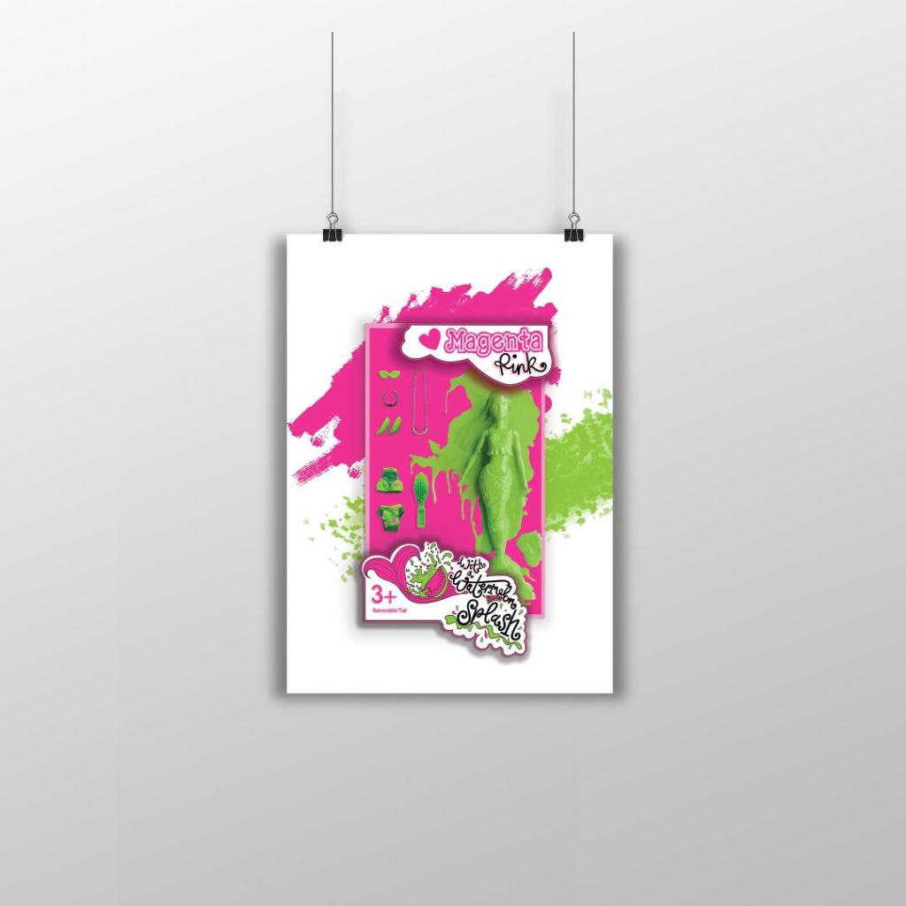
I changed the colour of the Magenta doll on these final versions; I just felt there was more of a contrast making her green, also I wanted this to represent the Watermelon Splash! I then really debated which background to have – did I want the poster mostly filled with Magenta Pink or did I want the white background with the colour popping out? I decided to go with the all Pink version, the reasons behind this are so it is definitely understood which colour I am designing for. The Magenta is the dominant colour and the Lime green contrasts and accents the pink. I think I have created a different approach to designing and celebrating a colour, I have created a quirky outcome. I think I have met the brief of celebrating a colour and what it means to myself and others. I did extensive research to see how others felt about the colour and then I designed based around the answers for this final design. I think it is obvious that the colour I am celebrating and designing for is Magenta Pink and the contrasting complementary colour is Lime Green. How I have brought the 2 colours together with the doll packaging and the limited edition Watermelon Splash idea is quirky in its approach. I am pleased with how it has turned out.
Poster 2

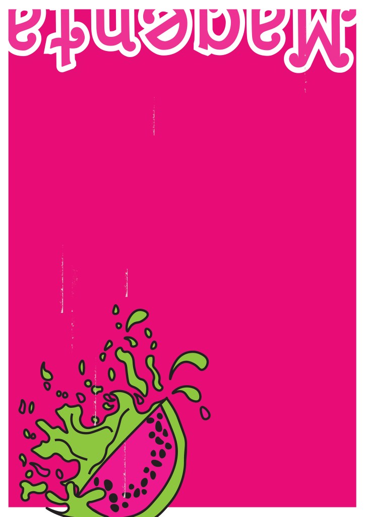
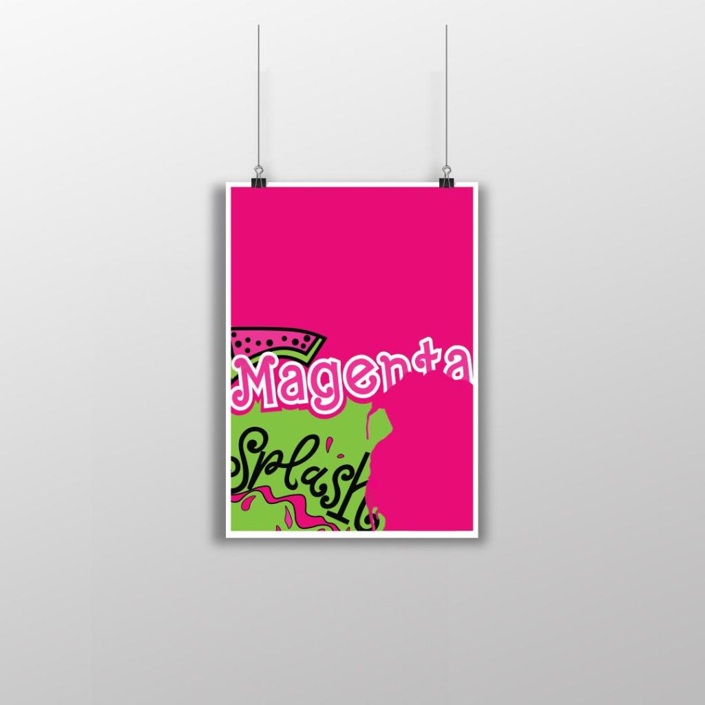
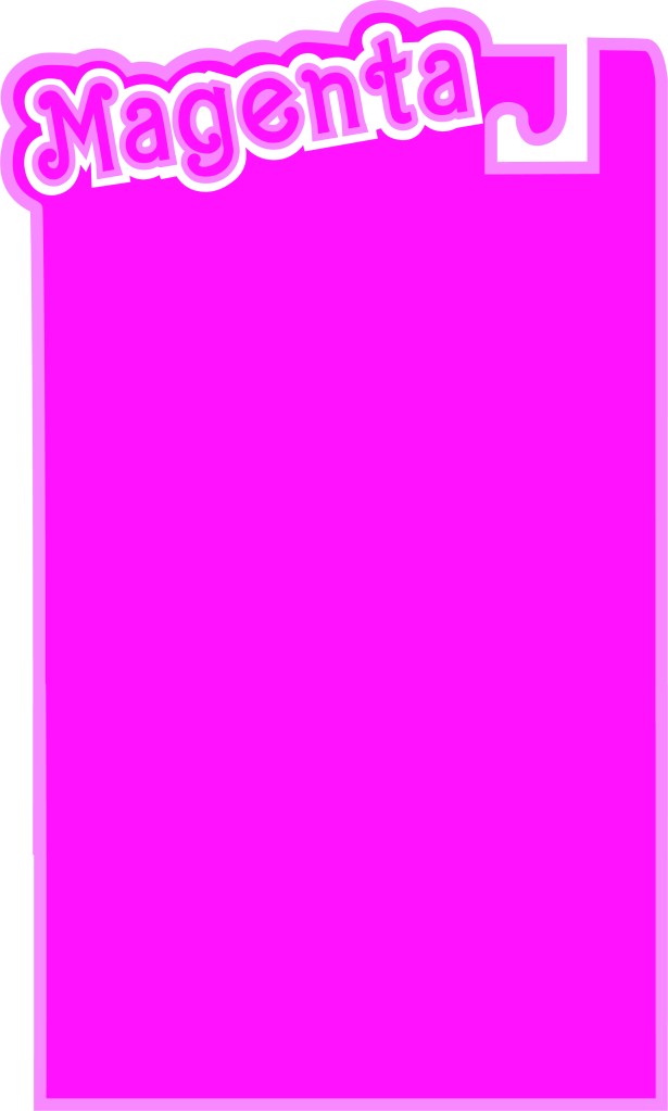
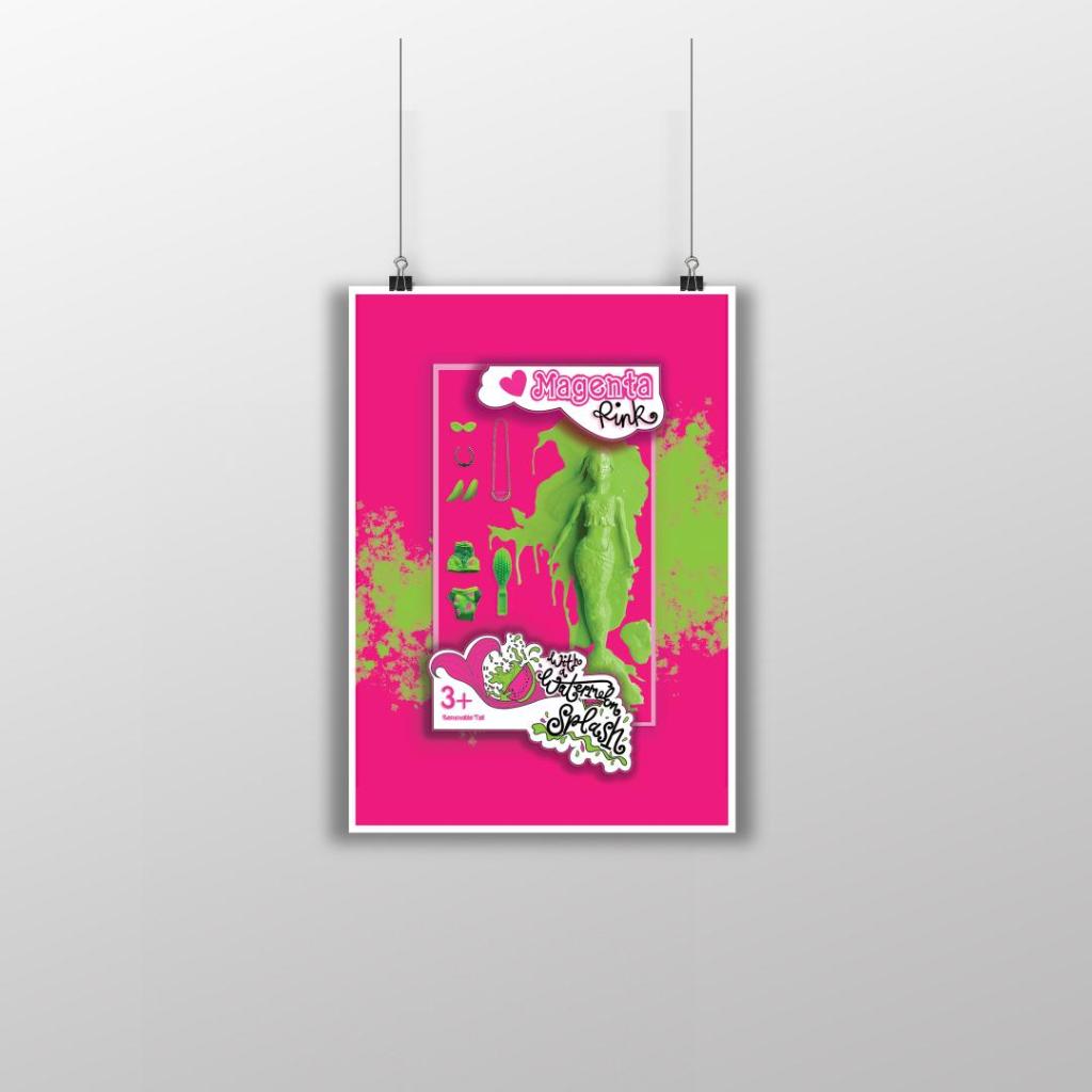
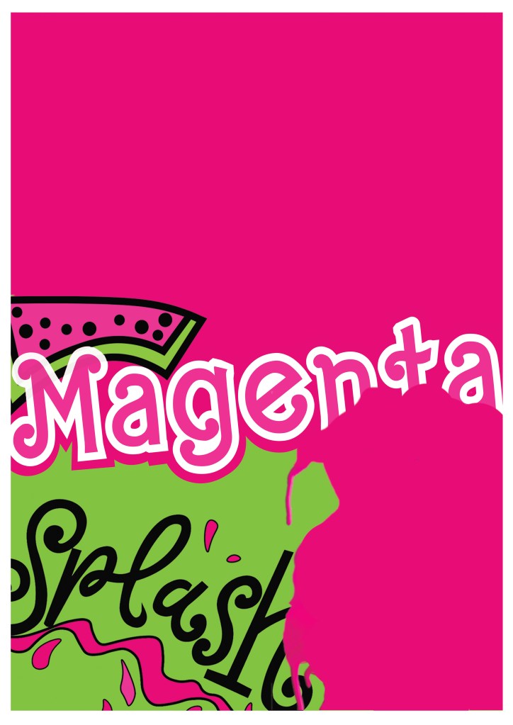
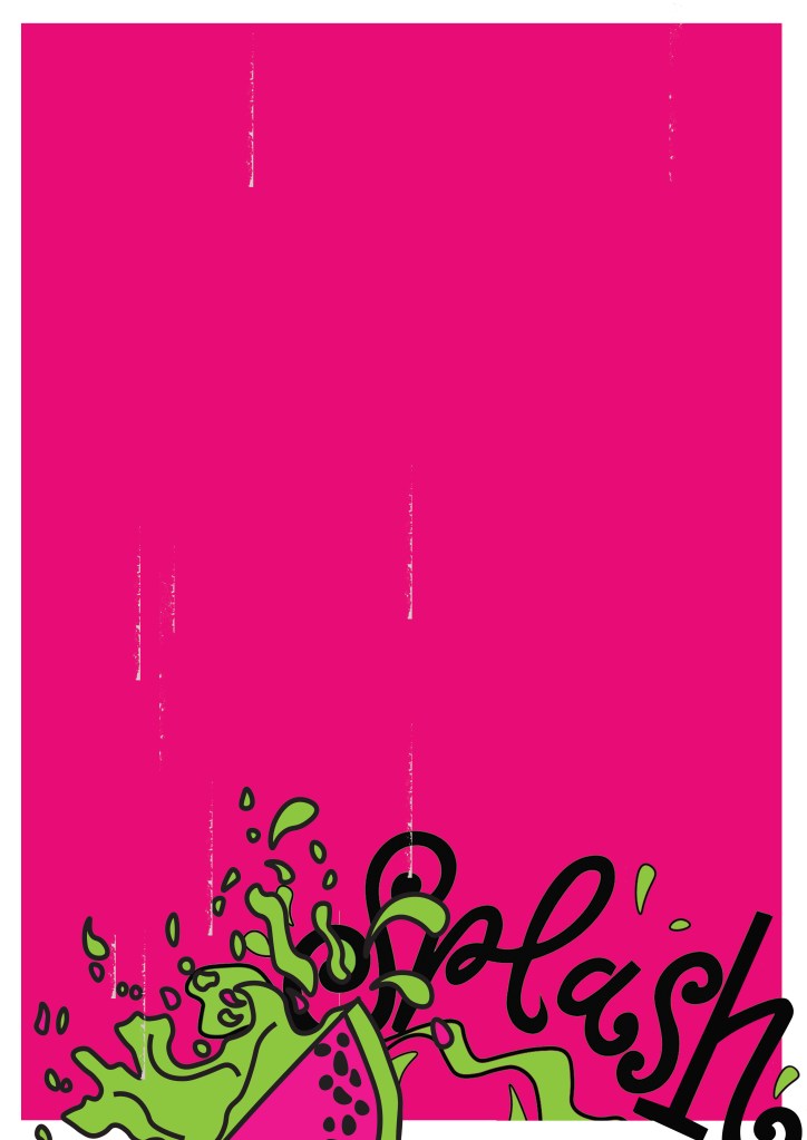
This is my final design for poster 2, (one of the variations of my final posters). I like how strong this design looks, the colours really work well together and makes everything pop! I created a white border around the design as this adds contrast against the Pink, it helps to break the colours up and make it more interesting. I took elements from my final artwork and used them to create this version. I wanted all of the posters to work well as a series and to make sure that they clearly represented Magenta as the celebrated colour so I filled the whole space with Magenta Pink. I wanted to make sure that negative space was a massive part of the design so I split the design into thirds and kept the top completely empty. I used the paint splash from when I painted the Barbie in this design. The paint covers part of the “Magenta” text. I like how this has done that, it looks like a chunk has been bitten out of it – more or less like how you would eat a Watermelon! I have used part of my Watermelon Splash vector art too and that works well with the paint splat. I used an illustration of the Watermelon rather than using the wording itself. It brings together images and type to convey a message.
Poster 3
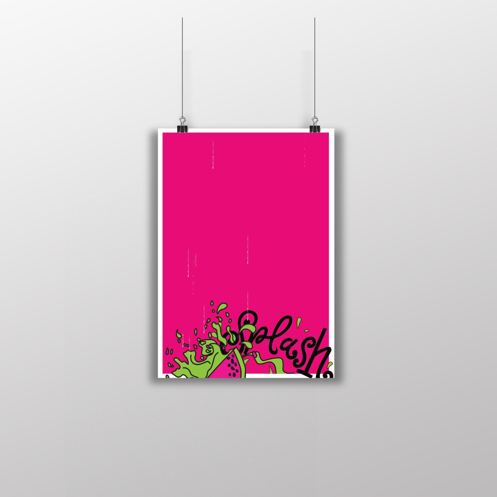
This is my final design for Poster 3, another variation of my final artwork. I have kept this one very similar to poster 3. I have made negative space a massive part of the design by keeping the top part of the poster completely free. To keep it in keeping with the other designs, I once again placed the white border all the way around it to again break the pink up and let it contrast against the white. There are tiny scratches of white on the left hand side and centre of the poster; these were completely accidental from where I imported the vectors over from Illustrator to Photoshop and accidentally left some of the noise on the jpegs. I moved these “scratchings” in Photoshop and made them drop down the page to look like refreshing water droplets. Again, with this design I took elements from the final artwork – on this one I took part of the Watermelon Splash vector design and placed it at the bottom of the design like it is falling into water to create that “splash”. I like how this design is quite simple but effective. The poster really stands out with the colours and once again I think it is clear what colours are being celebrated.
Poster 4
This is my final design for poster 4 (another variation to my final artwork). I really debated this design; I debated the type at the top of the poster and the fact that it is cut in half, upside down and not very legible. There was just something about how this poster looks though that made me change my mind and keep it! I kept the poster in keeping with the others again with the white border, negative space and making Magenta the main colour throughout the whole piece. I think that if you place all of the posters together it is obvious that they all belong together, they celebrate Magenta and that they are all variations of each other.