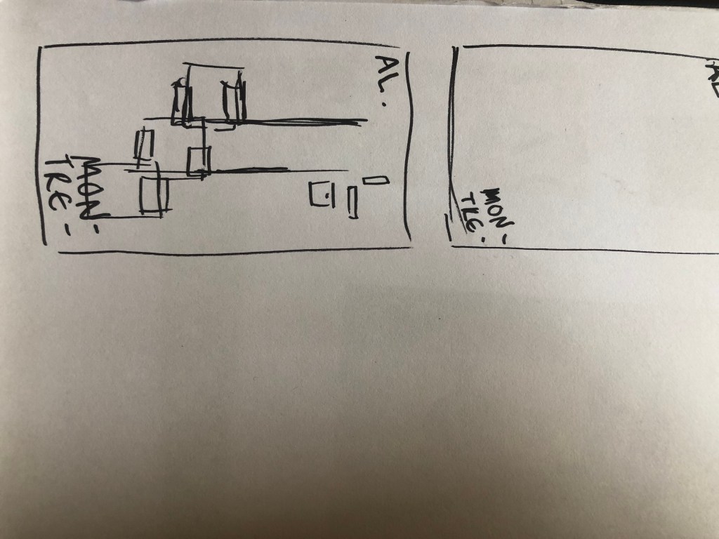
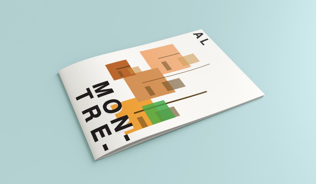
Hello and thank you for joining me on the last of my 10 city guidebook designs! 10 of 10 – Mumbai!
This is it! The end of the infamously difficult Abstract Cities exercise! I won’t lie to you and say I am not happy to see the back of this exercise! BUT! moving on to the write up of my last design!
Again, my lack of geographical skills led me to question whether Mumbai was in Africa or India… India! (*eyeroll!) so I felt it best to do the normal and to search Pinterest for inspiration and ideas!
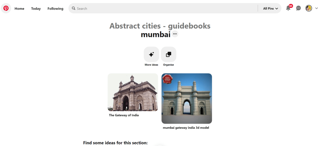
The most popular image that appeared was The Gateway to India. It reminded me a lot of the design that I had done for Marrakech, in my head I was conscious that I had to try and make this design look different.
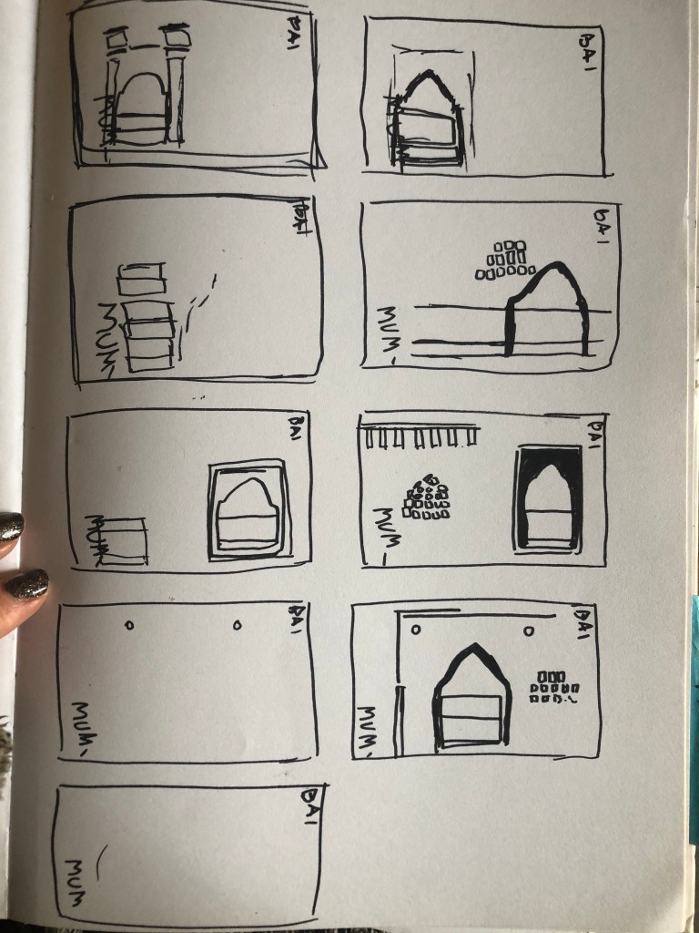
Again, I tried to pick out important features from the building which I could include in an abstract way on my design. I didn’t want to draw the building as it is on the cover because that would not be portraying it in an abstract light. If I picked out key features and then simplified the design I could place key elements of the building on my cover.
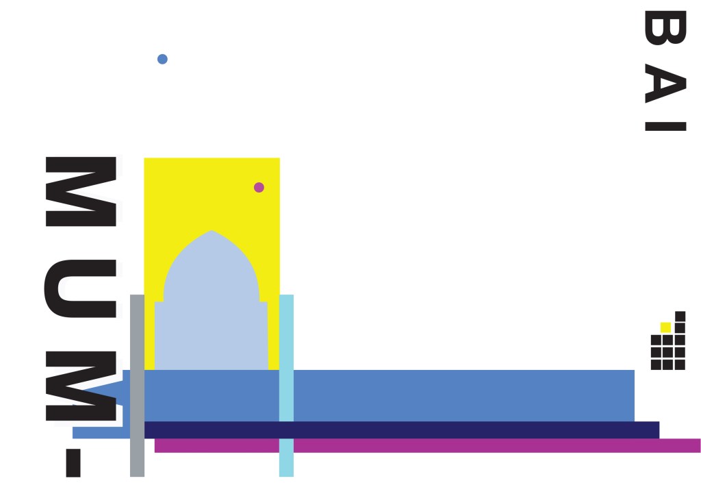
The colours of Mumbai are very similar to that of Marrakech, India is very rich in colour. Purple is the best colour to represent wealth, richness and luxury. On the photo of The Gateway of India that I found on Pinterest, it showed water in the background inside the gateway. I had a look on an aerial photograph of this and it showed that the gateway is almost on water. I included this on the design going through the gateway as it appears on the photo but then travelling it across the cover to take the eye on a journey across the design. The yellow block represents the warm sun but also acts as the actual door or gateway. The 2 circles in my design appear on the photograph in the doorway, they are decorative on the actual gateway. I have taken them and split them up over the design to keep the eye interested in all areas of the design. There is a lot of negative space in this design which I like. The design is not constrained to the edges and it has plenty of room to breathe. The black squares which bleed out over the right hand side edge are windows that appear in one of the arched windows on the photograph. I have used them to add contrast and to give a level of interest to the design. The blue is the dominant colour in this design with the yellow following closely behind as a subordinate. The accent colour is the rich purple. The layout is the same as the other 9 designs I have done in this series. They are all in keeping with each other, the repetition is there.
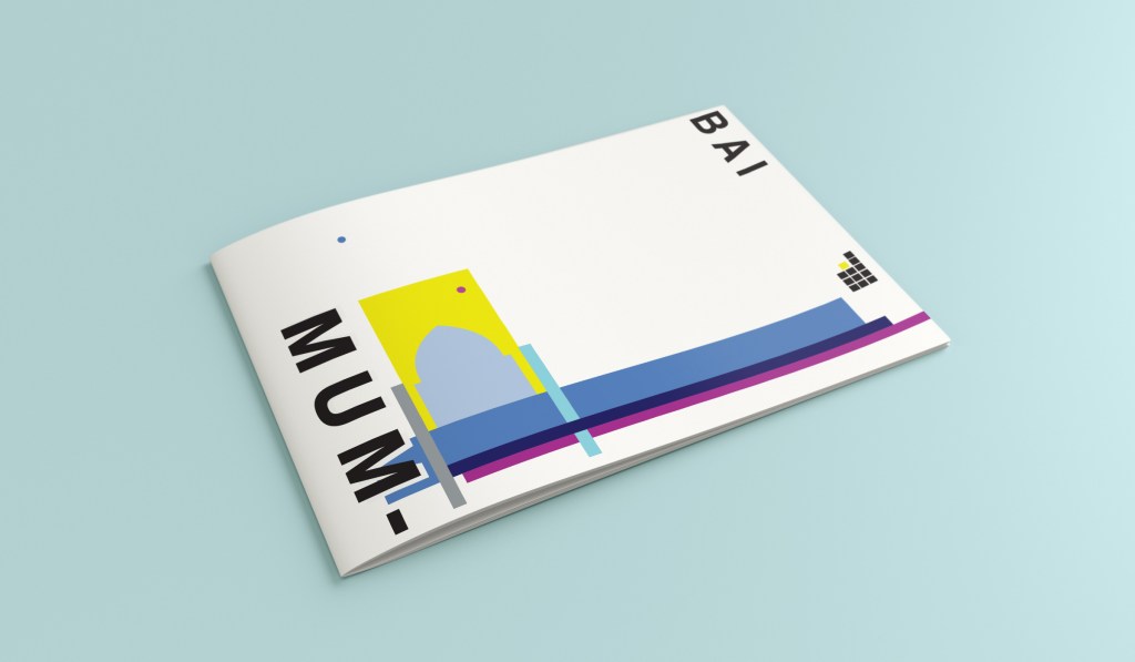
This is the final mock up of Mumbai!


