Skip to content

  • Welcome to Pink Angeleno!
  • ABOUT ME
  • GD1: CORE CONCEPTS
    • PART 1
      • PICTURE CHARADES
      • ASSIGNMENT 1: INTRODUCING YOURSELF
        • Postcard Research
        • LNFP Design personality research
        • POSTCARD RESEARCH
        • LMU Pentagram magazine inspiration
        • GRUNGE TYPOGRAPHY RESEARCH
        • ASSIGNMENT 1: DESIGN DEVELOPMENT
        • ASSIGNMENT 1: LEARNING LOG PAGES
        • ASSIGNMENT 1: SKETCHBOOK PAGES
        • POSTCARD 1 (FRONT)
        • POSTCARD 1 (BACK)
        • POSTCARD 2 (FRONT)
        • POSTCARD 2 (BACK)
        • POSTCARD 3 (FRONT)
        • POSTCARD 3 (BACK)
        • POSTCARD 4 (FRONT)
        • POSTCARD 4 (BACK)
        • FINAL MOCKUPS
        • POSTCARD PDFS
    • PART 2
      • WORKING TO A BRIEF
      • RESEARCHING AND DEVELOPING IDEAS
      • BOOK COVER DESIGN
        • RESEARCH
        • INSPIRATION & INFLUENCES
        • THE TIME MACHINE DESIGN DEVELOPMENT
        • ANN VERONICA DESIGN DEVELOPMENT
        • TONO BUNGAY DESIGN DEVELOPMENT
        • DIGITAL COMPUTER DESIGN DEVELOPMENT
        • THE SKETCHBOOK PAGES
        • THE LEARNING LOG PAGES
      • VISUALISING YOUR IDEAS
        • LEARNING LOG SKETCHES
        • SKETCHBOOK PAGES
      • TOO MUCH OR NOT ENOUGH INFORMATION
        • LEARNING LOG SKETCHES
        • SKETCHBOOK PAGES
      • ASSIGNMENT 2: THINKING OF YOU
        • ASSIGNMENT 2 – THE BRIEF & DESIGN PROCESS
        • GREETINGS CARD 1: DESIGN DEVELOPMENT
        • GREETINGS CARD 2: DESIGN DEVELOPMENT
        • GREETINGS CARD 3: DESIGN DEVELOPMENT
        • TYPOGRAPHY DEVELOPMENT
        • THE FINAL FINISHED CARDS
      • POINT OF SALE DISPLAY
        • POS DISPLAY SKETCHBOOK PAGES
    • PART 3
      • SIGNS AND SYMBOLS
      • SEEING THE LIGHT
      • UNDERSTANDING COLOUR
      • ABSTRACT CITIES
        • BOOK 1: MADRID
        • BOOK 2: MALMO
        • BOOK 3: MANAGUA
        • BOOK 4: MANCHESTER
        • BOOK 5: MANHATTAN
        • BOOK 6: MARRAKECH
        • BOOK 7: MARSEILLES
        • BOOK 8: MELBOURNE
        • BOOK 9: MONTREAL
        • BOOK 10: MUMBAI
      • PHOTOMONTAGE
      • ASSIGNMENT 3: COLOUR ME
    • PART 4
      • PLAYING WITH WORDS
      • A TYPOGRAPHIC JIGSAW PUZZLE
      • IF THE FACE FITS
        • SPECIMEN PAGE 1: HELVETICA
        • SPECIMEN PAGE 2: AKZIDENZ GROTESK
        • SPECIMEN PAGE 3: UNIVERS
        • SPECIMEN PAGE 4: FRUTIGER
        • SPECIMEN PAGE 5: FUTURA
        • SPECIMEN PAGE 6: DIDOT
        • SPECIMEN PAGE 7: BASKERVILLE
        • SPECIMEN PAGE 8: MRS EAVES
        • SPECIMEN PAGE 9: LUST
        • SPECIMEN PAGE 10: CHANTAL
        • SPECIMEN PAGE 11: LO-RES
        • THE SKETCHBOOK PAGES
      • IF THE FACE FITS (PART 2)
        • I THOUGHT I LOVED HIM NOW I’M NOT SO SURE
        • ADVERTISEMENT IN PARISH MAGAZINE
        • AFTER SCHOOL BOYS CLUB
        • MANDY & JOSH ENGAGEMENT
      • LORUM IPSUM
      • HIERARCHY
        • WILL SHEILA TELL THE NAKED TRUTH
        • MAGAZINE REVIEW OF SOFTWARE
        • A BOOK REVIEW IN A NEWSPAPER WEEKEND EDITION
      • ASSIGNMENT 4: SHOW ME
        • ASSIGNMENT 4: THE SKETCHBOOK PAGES
    • Part 5
      • MAGAZINE PAGES
      • JUDGING A BOOK BY ITS COVER
      • GIVING INFORMATION
      • BIRTHDAY LIST
      • SINGOUT POSTER & FLYER
      • CHANCE HOUSING ASSOCIATION
      • THE FRENCH HEN
      • ASSIGNMENT 5: YOUR CHOICE
    • REFLECTING ON CORE CONCEPTS
  • BD1: CREATIVE BOOK DESIGN
    • PART 1
      • Part 1: Exercise 1- Influential Books
      • Part 1: Exercise 2- The Future of Books
      • Part 1: Research Task: Artists books and fanzines
      • Part 1: Exercise 3 – Alternative Publications
      • Part 1: Exercise 4 – Generating Ideas
      • Part 1: Exercise 5 – Research and Development
      • Part 1: Exercise 6 – Folding and mocking up your book
      • Part 1: Exercise 7 – Visualising, editing and critiquing
      • Part 1: Assignment 1 – My Zine
    • PART 2
      • Exercise 1: The Function of Books
      • Exercise 2: Paper and Binding choices
      • Exercise 3: Book Designers
      • Exercise 4: Designing a Cover
      • Part 2: Assignment 2 – Form and Function
    • PART 3
      • Exercise 1 – Type Samples
      • Research Task 1: The Golden Section
      • Exercise 2: Double page spread
      • Exercise 3: Experimental Typography
      • Assignment 3: My little book of Good and Bad Typography
    • PART 4
      • Research Task 1: Exploring Artists books
      • Exercise 1-Paper/ephemera
      • Exercise 2- Concrete Poetry
      • Exercise 3: Sequencing Images
      • Exercise 4: Collating and Binding
      • Assignment 4: Altered Book
    • PART 5
      • Research Task 1: Book Fairs
      • Exercise 1: What is your role?
      • Exercise 2: Planning your workflow
      • Exercise 3: On Press
      • Exercise 4: Printing
      • Exercise 5: Reflective Practice
      • Assignment 5: Your choice
  • Key steps in Illustration
    • PART 1
      • Exercise: The History of Illustration
      • Exercise: getting the gist
      • Assignment 1 – Say Hello
    • PART 2
      • Exercise: Writing a Brief
      • Exercise: Spider Diagrams
      • Exercise: Turning words into pictures
      • Exercise: Making a Moodboard
  • BEHANCE
  • INSTAGRAM
  • PORTFOLIO
  • GD1: ASSESSMENT PORTFOLIO
  • BD1: ASSESSMENT PORTFOLIO

Tag: chance housing

Exercise: Chance Housing Association

20th Jun 202120th Jun 2021Leave a comment

The Brief

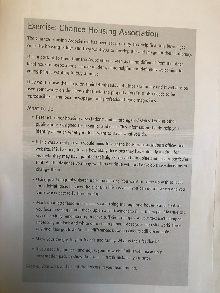
My first thoughts on this brief were that it didn’t excite me very much! This was possibly one of my least favourite exercises of this whole unit. However, it still is an important exercise because branding plays a massive part in Graphic Design.

From what I know of logo design – simple is better! Logos have to be reproduced on absolutely every kind of media: from Web design, emails, social media, advertisements, phones, TV, billboards, stationery, signage.. the list is endless! All of these media are different sizes and the quality would vary for each. For web design the logos would need to be very small in size to be uploaded.. this means that the logo must be easily legible and brilliant quality at a really tiny size!

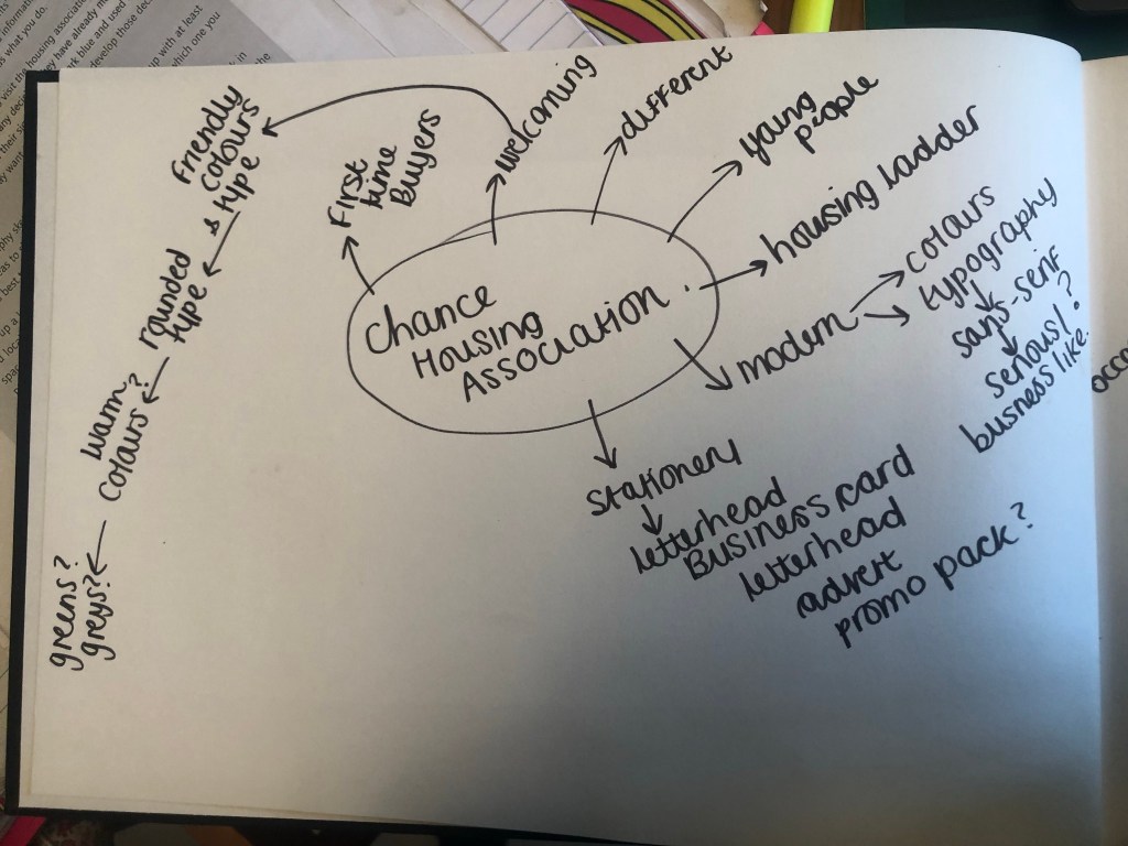
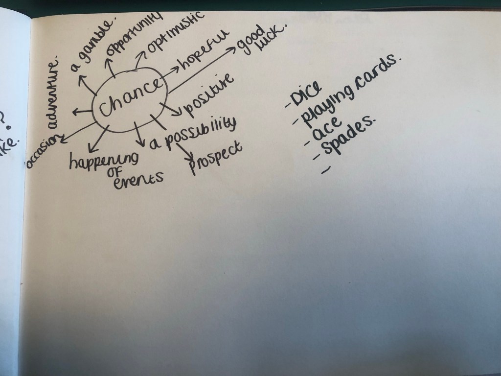
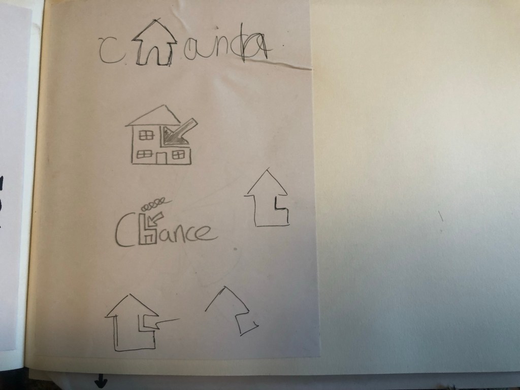
I started off by mind mapping some ideas:

Mind mapping gave me a feel for what I needed to design and where I needed to go next to move forward within the design process.

I needed to create a logo that appealed to young people and was modern in its approach. It needed to have a friendly feel but still remain professional.

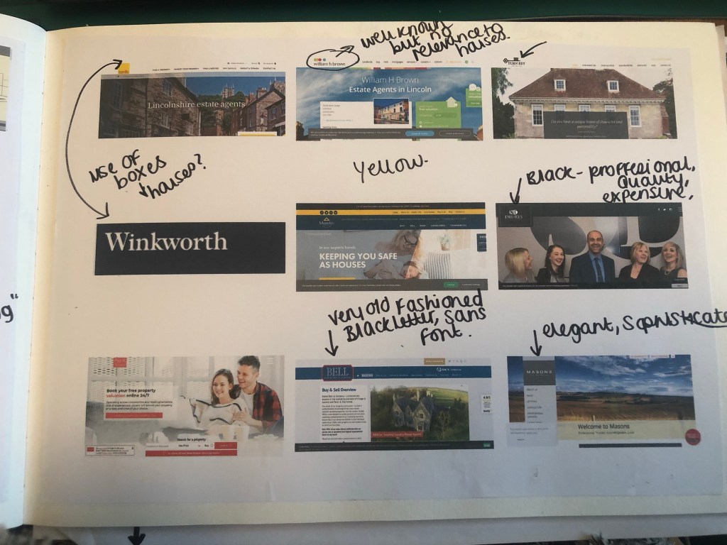
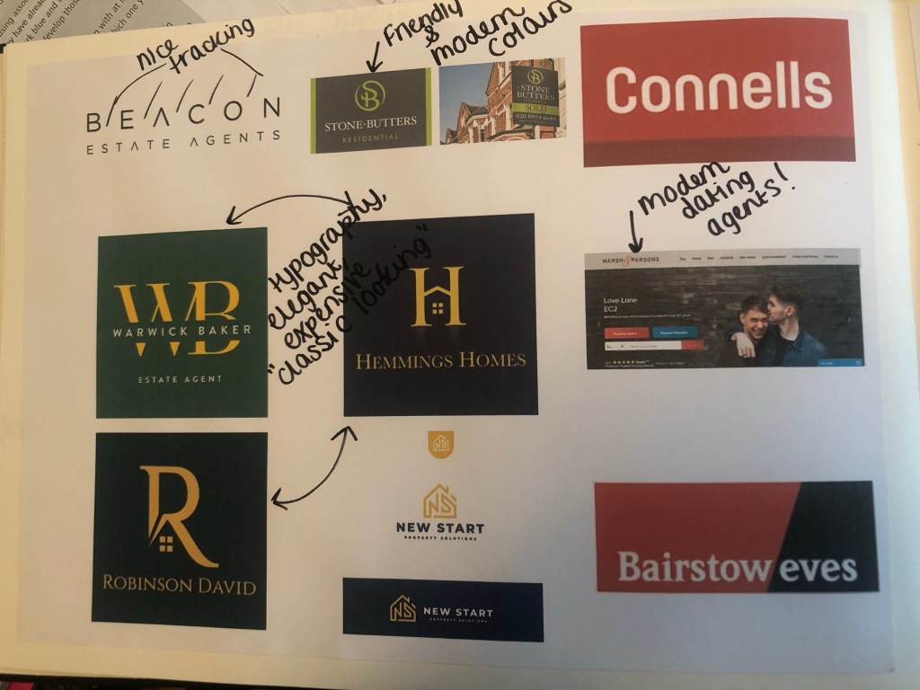
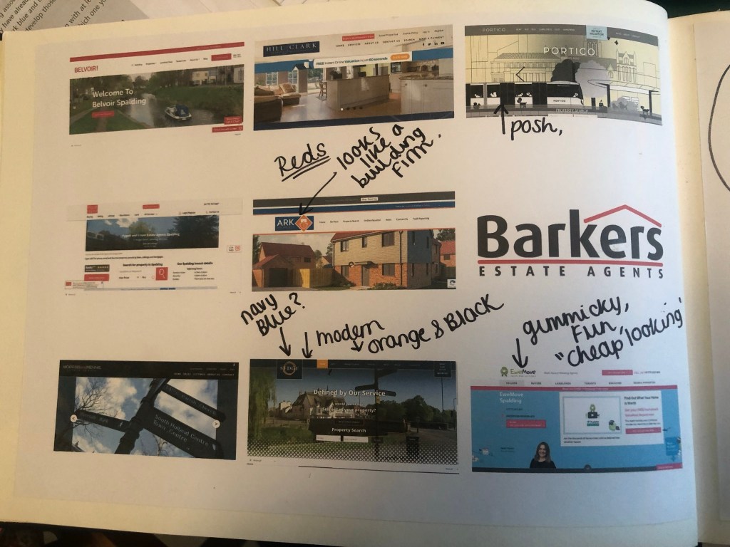
The next step was to see what is already out there; I started to search Google for existing estate agents and what their branding looks like:

What I took from this research was that most of the logos had red in them! The popular colours were Red, Yellow and green followed closely by Blue. Blue and yellow reminded me of a building company though so I wanted to stay away from that! I decided to move away what I had seen, especially as the brief stated it wanted its logo to be “different”.

I decided that I wanted to go with Navy blue and orange! Orange is modern, fun and it stands out. Navy Blue -although it is used in other estate agents logos- is still modern but it also remains professional in appearance. They also contrast.

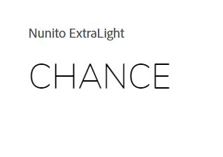
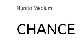
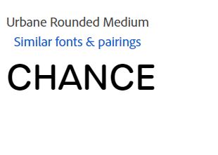
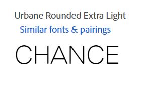
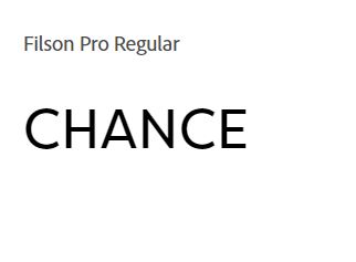
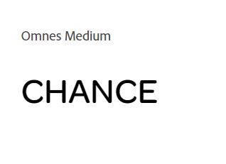
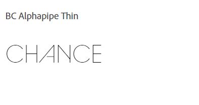
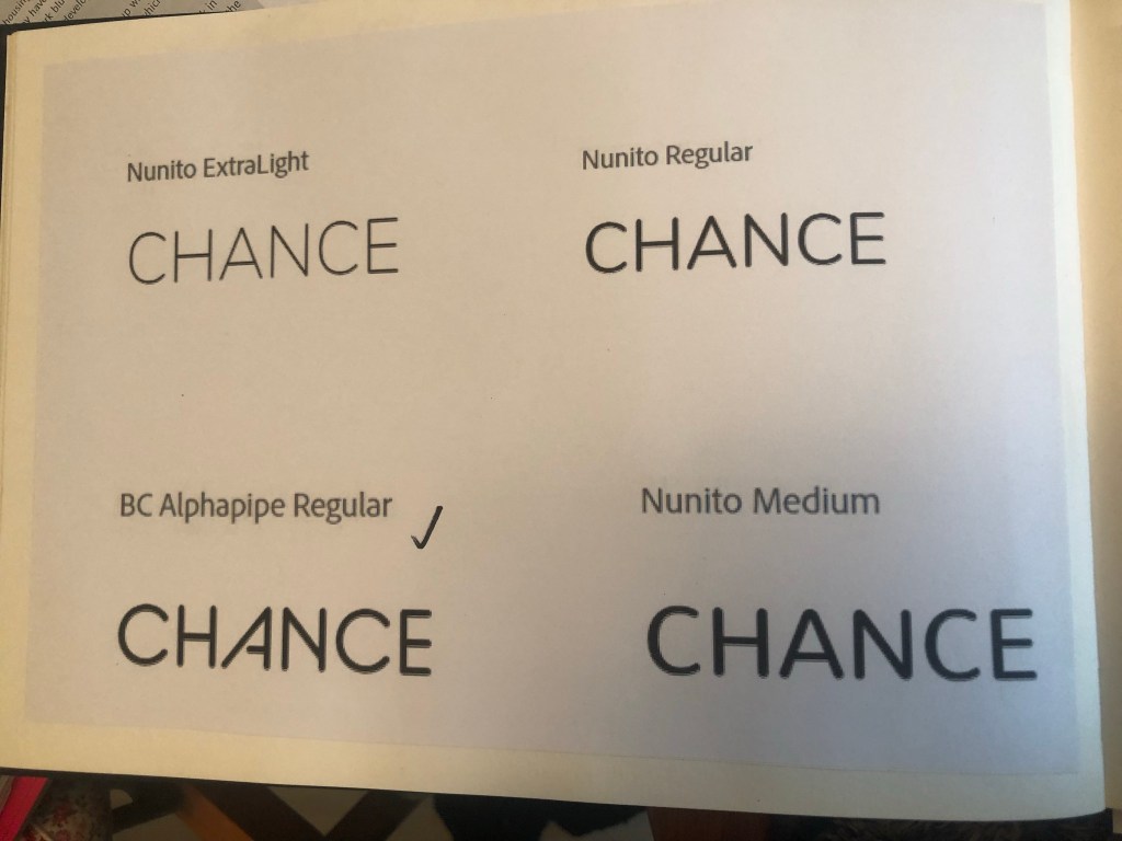
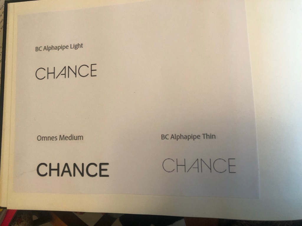
The next step was to search for a typeface that I could use in my logo. I knew that I wanted a rounded Sans-serif; rounded type appears more friendly and a Sans-Serif is legible-easy to see and read. I decided to search Adobe fonts to see what there was. I started off by finding a few that I liked:

but then I struck GOLD!…

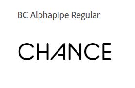
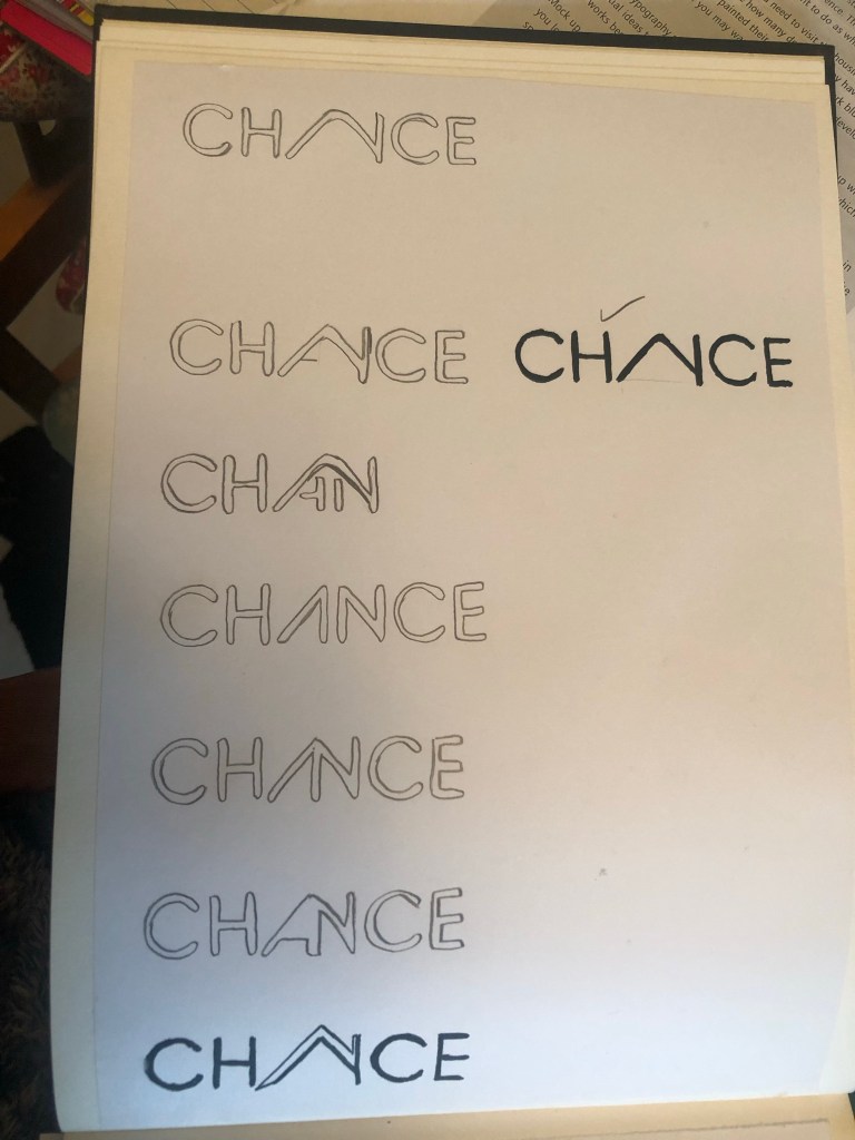
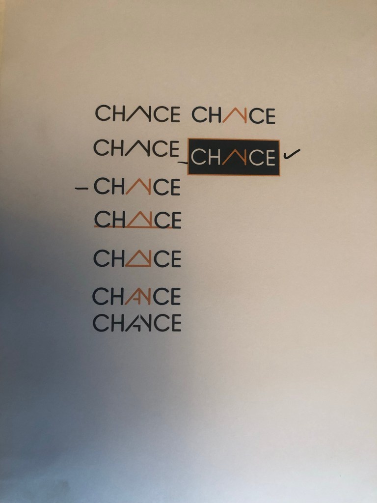
I saw this typeface and instantly saw a house in the middle of it, formed by the A and N being joined together. Excitedly I went into Illustrator and mocked some designs out.

It actually worked! It was simple, used great typography.. the only thing I was worried about was would people be able to tell it says “Chance” but I myself took a chance on that because I really think it works!

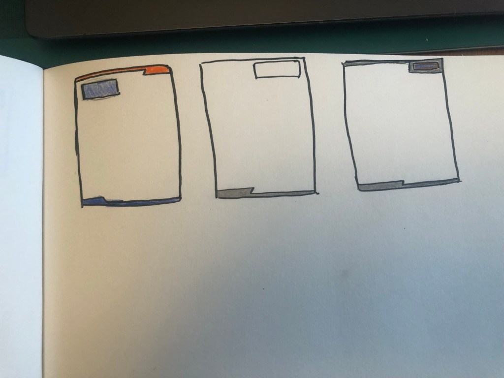
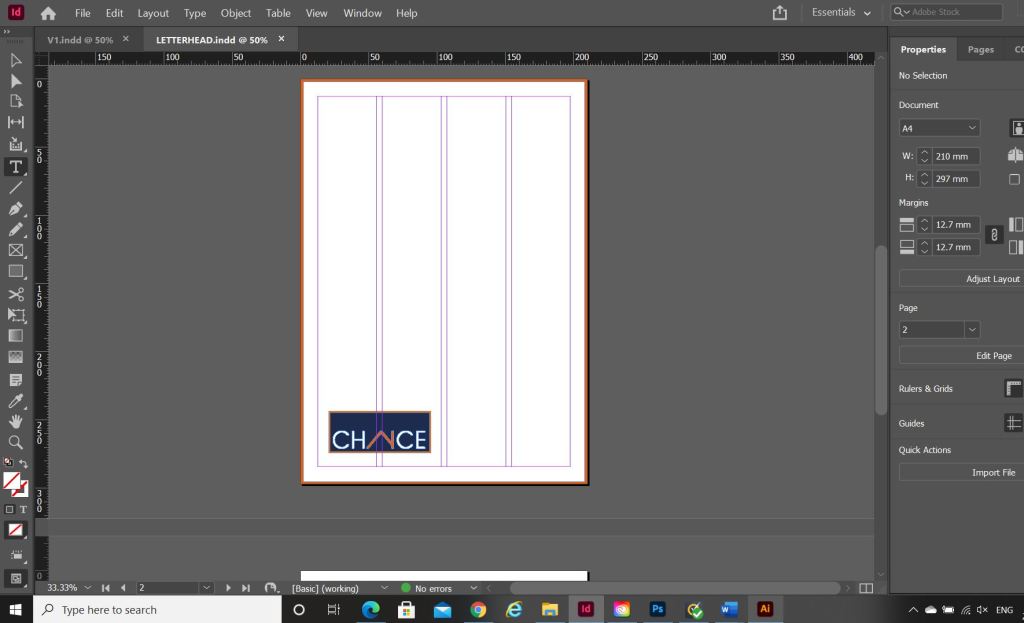
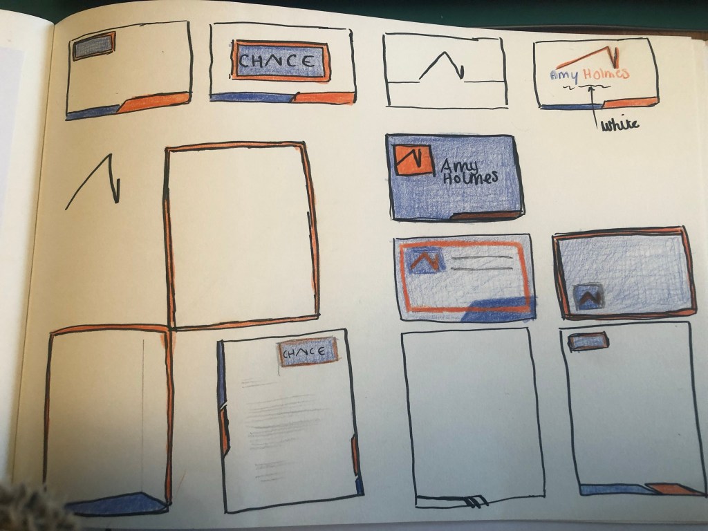
I then needed to work on the stationery for the company, I sketched up some ideas:

I created the logo and the illustrations in Photoshop and then imported everything into InDesign to create the stationery.

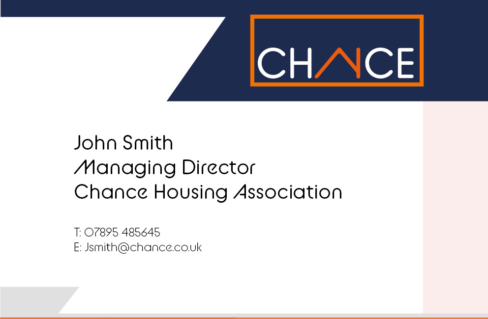
What I ended up with are these:

The top and bottom angled borders are supposed to mirror the angle of the A (or the house) in the logo.

The Advert

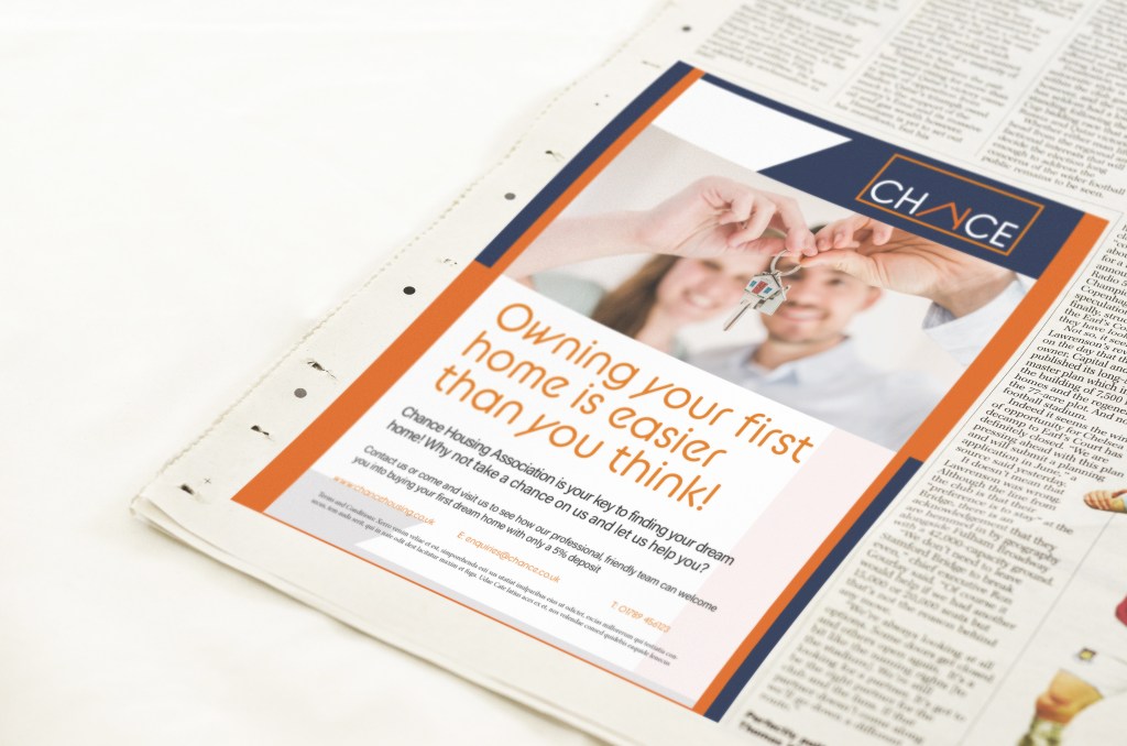
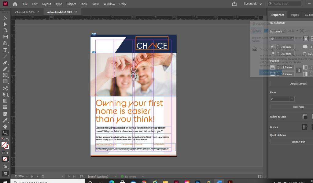
I also created the advert in InDesign, I used the same layout as the letterhead but added the extra information that would be needed in an advert. I searched Pexels for an image of first time home buyers and I found these that I thought could be suitable for my advert:

I then imported my chosen image into InDesign and started working on the typography. I used the same typeface as the logo (BC Alphapipe) for the main heading of the advert. I then chose to use a lighter, more legible typeface for the main body text – I chose to use Acumin Variable. It is still rounded, which still gives a friendly feel to the advert but it just works better to read. I think overall the advert looks modern, bright, happy and professional. It is clear that it is aimed at young people and in particular first time buyers. It also carried through the branding from the other stationery. I feel like the stationery and advert work well in colour and also in black and white for when it needs to be cheaply reproduced.

My Sketchbook pages

The Mockups

A WordPress.com Website.
  • Subscribe Subscribed
    • pinkangeleno.com
    • Join 43 other subscribers.
    • Already have a WordPress.com account? Log in now.
    • pinkangeleno.com
    • Subscribe Subscribed
    • Sign up
    • Log in
    • Report this content
    • View site in Reader
    • Manage subscriptions
    • Collapse this bar
 

Loading Comments...