Hello! and thanks for dropping by to look at design 3/10 of my abstract city guidebooks- Managua!
I personally had absolutely no idea where this city was! (I am still confused! – but I do know it is on the bit that joins both Americas together!!) with my poor knowledge of geography I attempted to gloss over this and continue with my design ideas. Again, I wanted to keep the design concept and layout etc for this guidebook cover the same as the others so that it continues to form the series.. I was going in again simplistic and minimalist in approach, using architecture and iconic buildings as the basis of my design and taking key elements away to create my design.
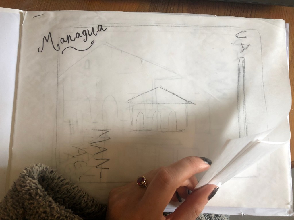
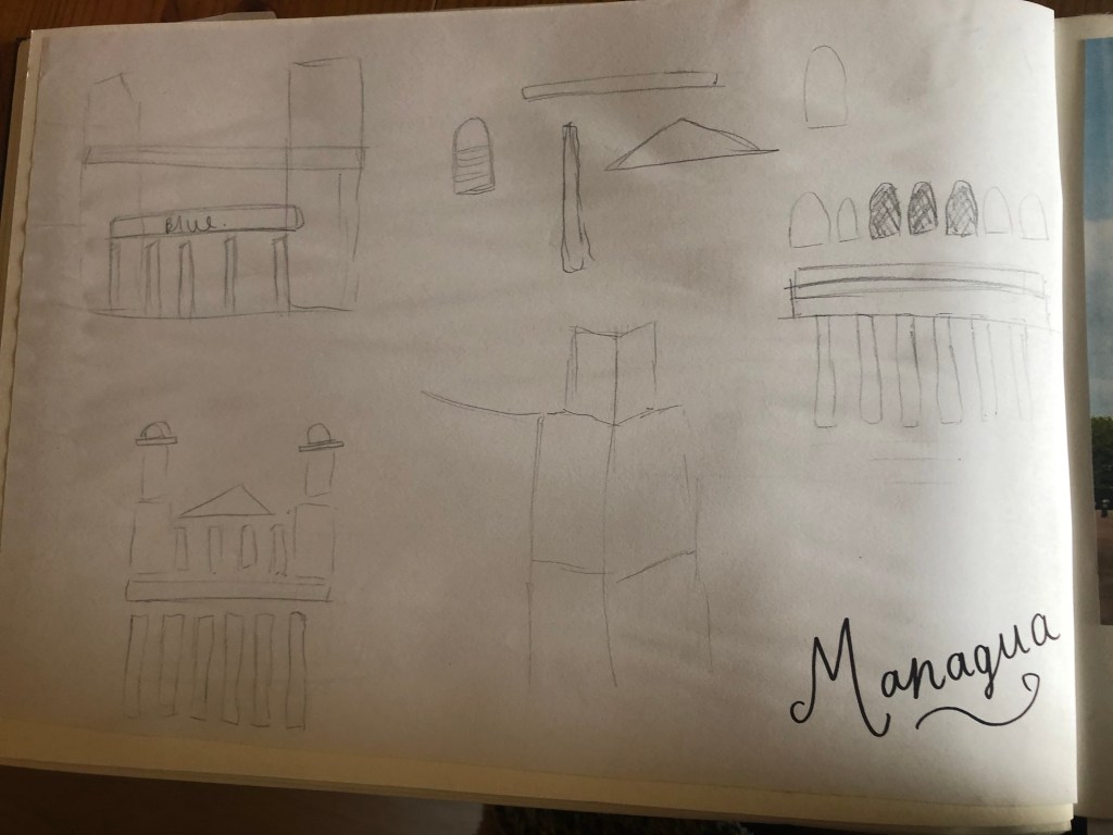
I started my initial research using Pinterest again; I looked up iconic landscapes and architecture in Managua and it came up with the cathedral as the main recognisable building of the city.
From first glance it looked like a complicated building to try and recreate in abstract! I took the same approach as last time and printed out this image tracing over it again and again simplifying it each time until I was left with the bare bones.
The main key features that stood out to me from the photograph was the intricately detailed stonework of the cathedral, the small cross that features in the middle of the cathedral on top of one of the triangular brickwork and the fact that the cathedral is in beautiful warm weather with 2 palm trees either side of it!
I used my rough sketches to figure out what to include in my final design.
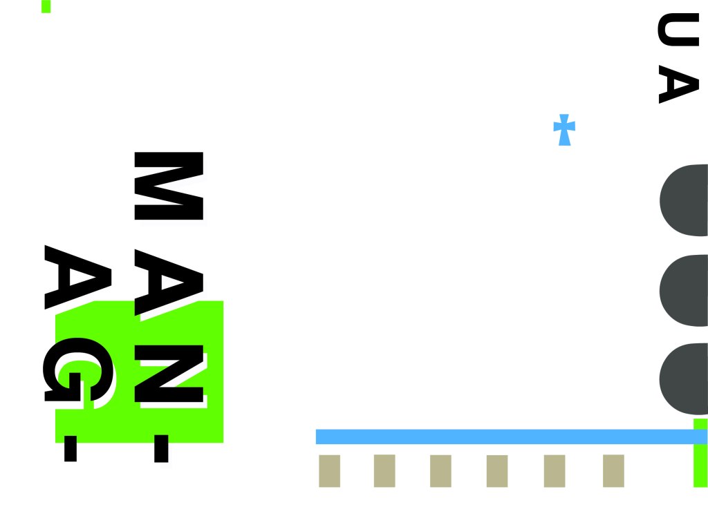
Again, I wanted to try and stick to the rules of thirds for my design and split the design into 3 sections on the cover. I wanted again to let the eye flow naturally across the whole page. Negative space once again played a big factor into the design, I actually base the design around the negative space each time. I placed a lot of the design to the edge of the page which can sometimes constrain the design to a “box” and restrict the design to be able to “breathe”; however, I still allowed for the design to “breathe” by not constraining the design all of the way around the cover. I added a tiny accent of green at the top left side just to give the eye somewhere else to hop to. The idea was for the eye to flow naturally all the way around the design. The bottom green blocks were representative of the 2 palm trees which I have obviously exaggerated and under exaggerated in size – representative of abstract also. The design is not accurate in scale, size or orientation to the building; the grey ovals on the right edge are representative of the arched windows in the centre of the cathedral and the bottom bar and grey small rectangles are a snippet of the pillars that hold the cathedral to the ground and the steps at the bottom. The cross I have kept small, it is always good to have contrast between elements on a design; the eye is drawn more to the cross and its location in the negative space on the cover- it is representative really to how small it is within the great vastness of the cathedral.
The dominant colours on this design accidentally are the black and grey of the text and the arched windows.. I know black and grey are tints but to me they draw me to the design before any of the other colours. The subordinate colour needs to be the green, although to be honest the blue stands out just as much as the green. It probably doesn’t help that these 2 colours are both cool and don’t particularly contrast each other well. As for accent colours… I would say I have designed something that doesn’t have a accent colour as such. In hindsight now looking back I could have added a contrasting colour as a tiny accent to the piece but I honestly just liked the use of these 3 minimalistic colours.
This is the final mock up of Managua! Overall, (apart from I mentioned that I could have used a warmer colour as an accent) I am happy with this design. I think I have met the abstract needs of the brief.
Welcome back to design 2/10 city guidebooks! – Malmo!
I was more aware of time (or lack of!) after completing design 1: Madrid, these guidebooks are time consuming! I decided I needed to try and cut down the research part of things although this first stage is crucial to achieving winning over a brilliant design outcome . I always start my research by searching Pinterest, it is the best place to find and record inspiration I find.
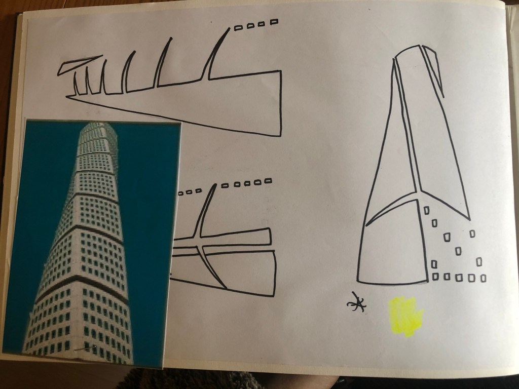
I had never heard of Malmo but after looking at some photos of the place and reading about it online, it now seems like a nice place to visit! I learned that Malmo is a modern coastal city in Sweden. I wanted to follow in the footsteps of Madrid by basing it around architecture and landscapes so I searched Pinterest to see what landmarks stand out in Malmo.
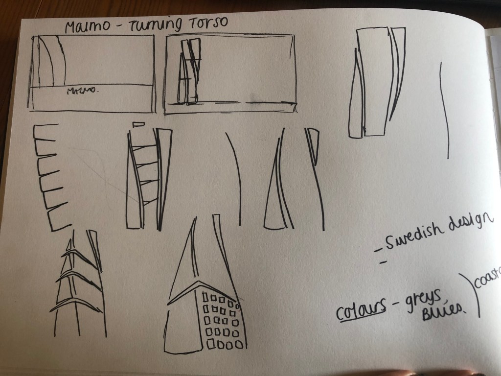
The most intriguing building that I found in Malmo was “The Turning Torso” it is regarded as the first “twisted skyscraper” in the world. It was designed by spanish architect, structural engineer, sculptor and painter Santiago Calatrava. It officially opened on the 27th August 2005 and reaches a height of 190 metres with 54 storeys and 147 apartments within it. In August 2015 the Turning Torso was the winner of the 10 year award from the Council on Tall buildings and urban Habitat. It also won the 2005 Gold Emporis Skyscraper Award.
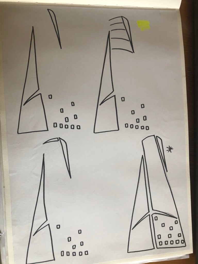
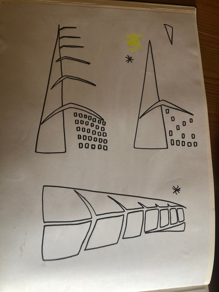
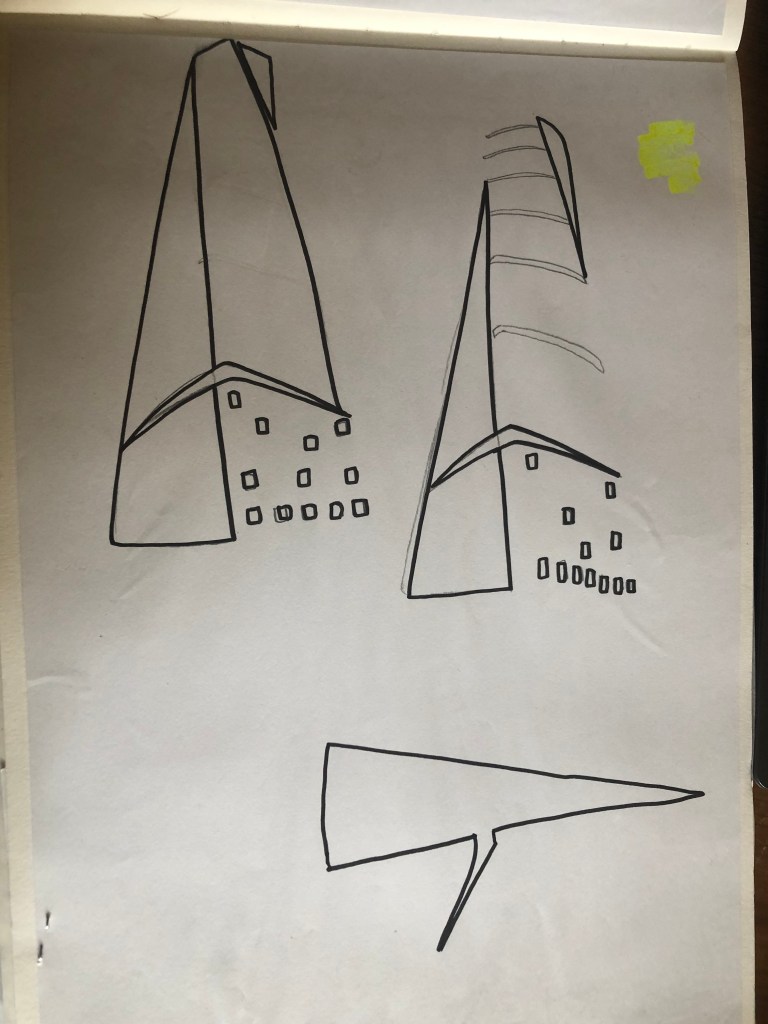
With the brief in mind I knew that I had to keep my design abstract, I was conscious that I didn’t want to make the design too pictorial and obvious as to what it was. I didn’t want to draw the Turning Torso onto my design and it be obvious what it was! The way I went about designing was to take a photograph of the Turning Torso and trace around it several times, each time taking something away so that I was finally left with the bare bones of the building. I then took the whole drawing apart and found clever ways to piece it back together but in an abstract way!
Sketchbook pages: First sketches and ideas
This is the photograph I found on Pinterest, I printed it out and I based my sketches off it:
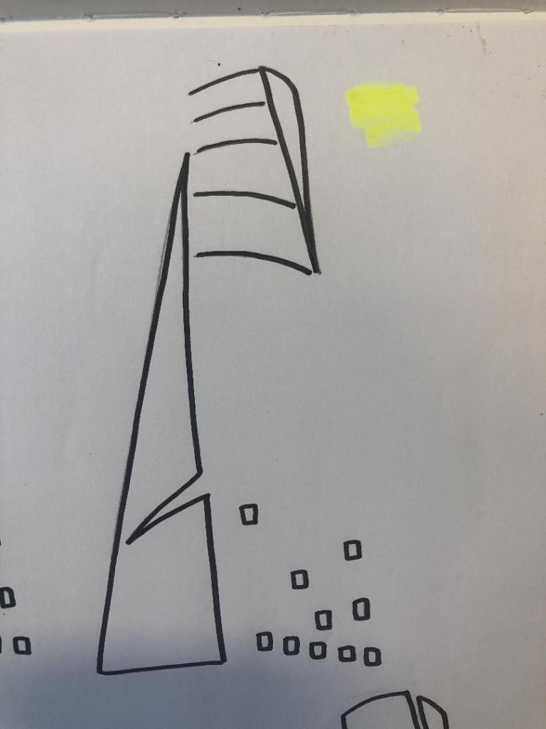
What I ended up with was a simplified sketch – the minimalistic “bones” of the building:
From this drawing it is still obvious what the building is, I took key parts of the building and simplified it down to its simplest recognisable form. This formed the basis of my final design.
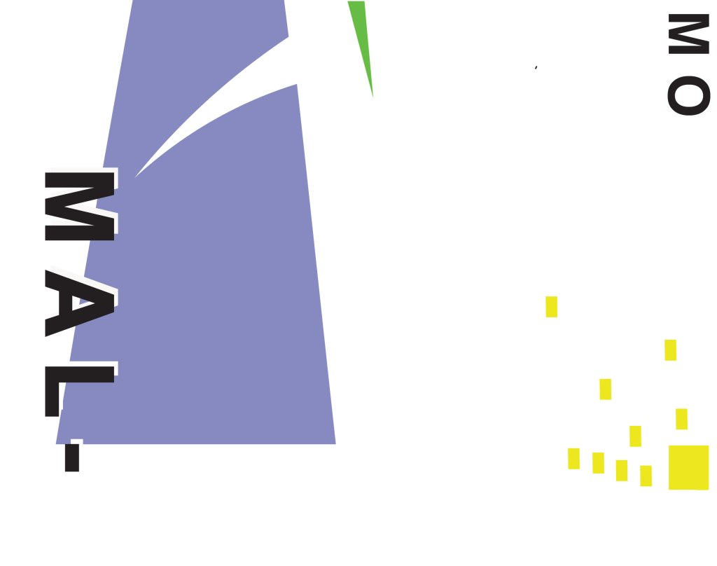
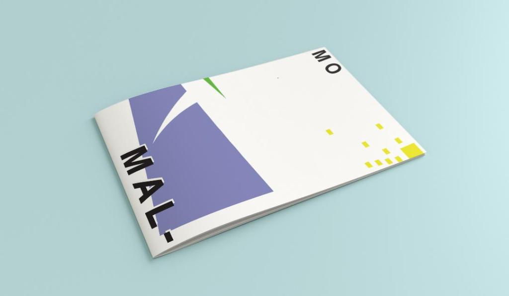
In my final design I kept the same layout as I did with Madrid as I felt that this would make the guidebooks become part of a series and be obvious that they all belonged together. I wanted to use quite “earthy” “beachy” natural colours because Malmo is a coastal town. I used blue for the Turning Torso which reflects the sky and sea and the fact that this tall building is between the two! I used a natural pop of green and yellow which would reflect sun and sand… Yellow being nice and warm also contrasts against the cool blue and green. I wanted to keep the design simple – I decided to split my design into thirds (rule of 1/3s!) and split the design up into each section. This lets the eye flow naturally and easily across the whole design. The yellow boxes allow for a pop of colour, add interest to draw the eye right to the end of the design but also represent the windows of the Turning Torso. The only flaw in my design is that I enlarged the Turning Torso to only show the lower half and a segment of the top… you can’t actually see the “turning” aspect. However, going down the route of keeping it very much abstract and not too obvious, I still really like this design and I think that you would still be able to recognise what the structure is from the key elements I’ve picked out even though they have been moved around and enlarged slightly. Negative space to me is just as much part of the design as everything else so I was adamant I wanted to keep a lot of space around the design but also to not restrict the design too much to its edges. I wanted it as a whole to remain “breathable”.
The location and how I designed the typography of “Malmo” was just as important as the rest of the design. I really toyed with the type layout again and kept questioning myself as to whether it was the right decision to make; I wanted to do something different and for it to look quite modern and edgy. Splitting Malmo into syllables also forces the eye to follow over to the other side of the design to see what the rest of the design is about.
This is the final mock-up of my Malmo guidebook! I am pleased with how it has turned out, I met my own expectations of how I wanted it to be and look like. The dominant colour used on this design is definitely the blue followed by the yellow being next in line as the subordinate colour. The green is fighting against the blue for attention which is exactly what the accent colour should be doing.
I started off feeling really overwhelmed by this exercise. As I mentioned in my introductory post, this exercise is notoriously difficult and challenging for many students and with this in the back of my mind I subconsciously was a little bit apprehensive about it! I started off with the first city on the list which was Madrid; A nice little start to the exercise as I am familiar with Spain even though I have never visited Madrid itself. I decided to mind map Madrid and see where my trail of thoughts led me…
Mind Mapping
I have to admit I did have a stalk on google of what some other students had done for this assignment.. the general outcome for this exercise was based around architectural buildings of the cities or famous landmarks which is completely understandable as the obvious outcome for “coloured blocks” would be buildings. I wanted however to try a different approach and see where that took me.
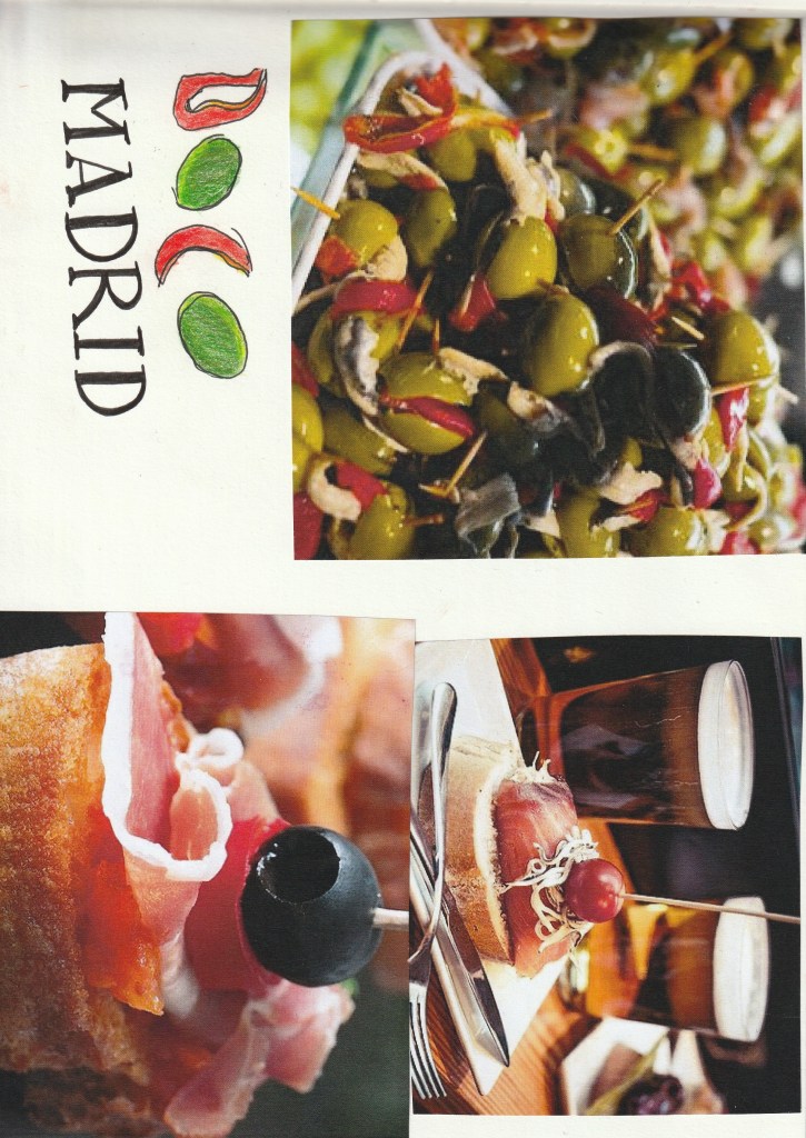
First Ideas
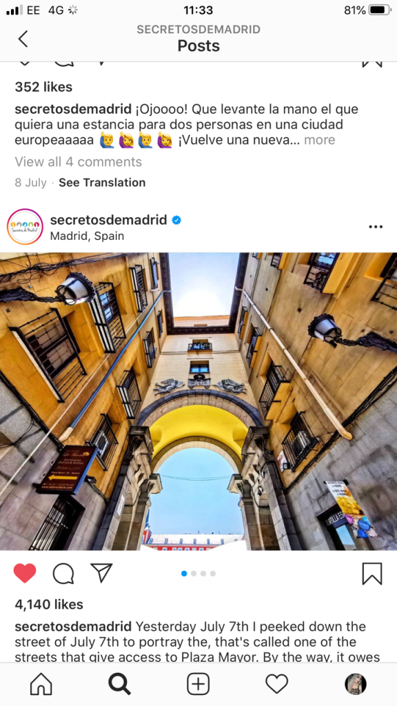
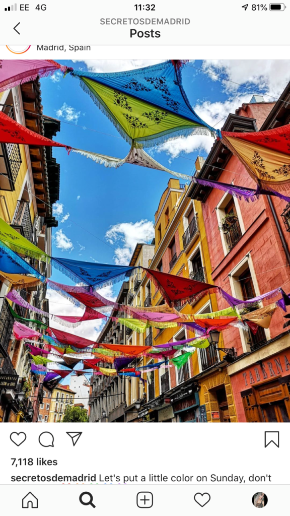
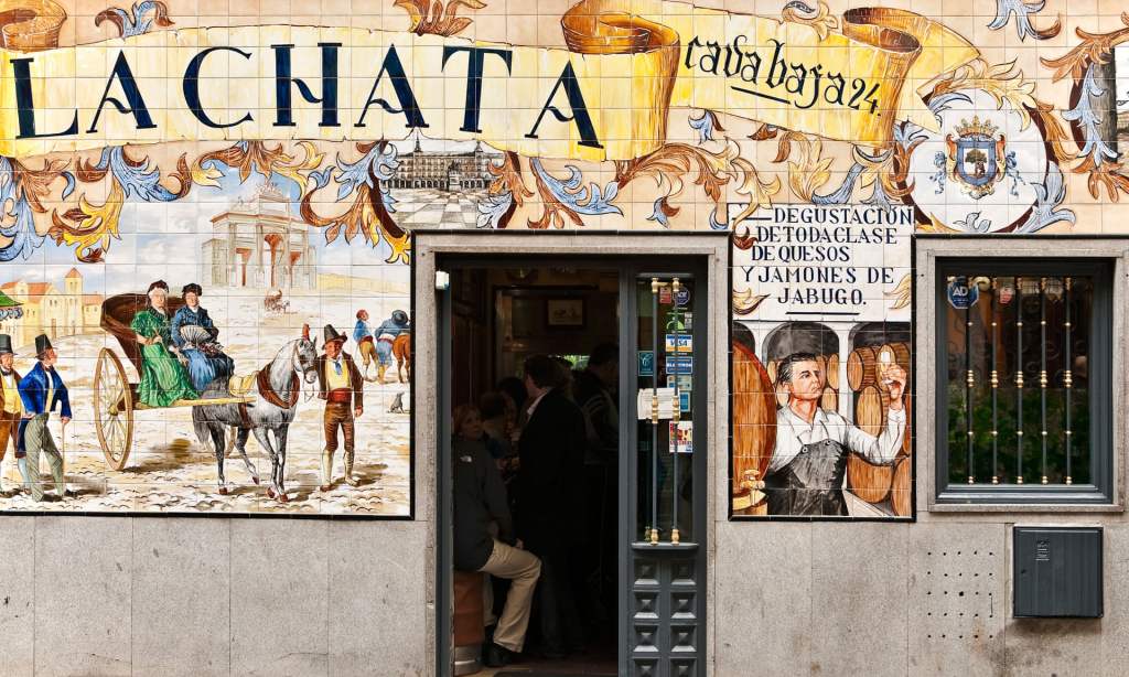
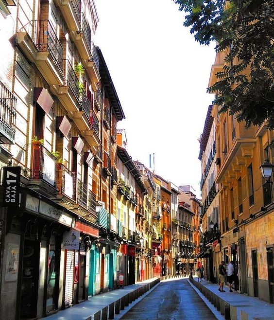
When I think of Spain in general I think of warmth and warm Reds, Yellows, Oranges, Black, busy, colourful, music, wine drinking, Tapas eating and a chilled way of life. Red, Yellow and Black features in the Spanish flag so I knew I had to use these colours within the design. Socialising, eating and drinking out is a big part of Spanish culture, especially having a drink and tapas in the afternoons or evenings so I wanted to convey this feeling throughout my design. I started to research on Google and Pinterest the different hotspots of places to eat in Madrid. The place which kept coming up the most was Caja Bava which is a brightly coloured street filled with Tapas bars. I collected several images of this street which I documented within my sketchbook and also pinned on Pinterest. I even watched a video of a short tour of the street just to get a feel for what it look like and the vibes it gives out.
These were also a few of the images which inspired me the most:
Colour Palettes
I had no idea what design I might create but I knew I would have to work out some kind of colour scheme, this is what I worked on next.
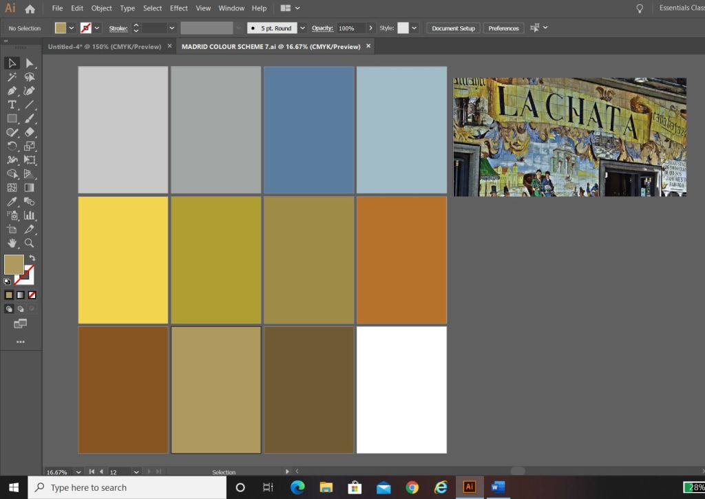
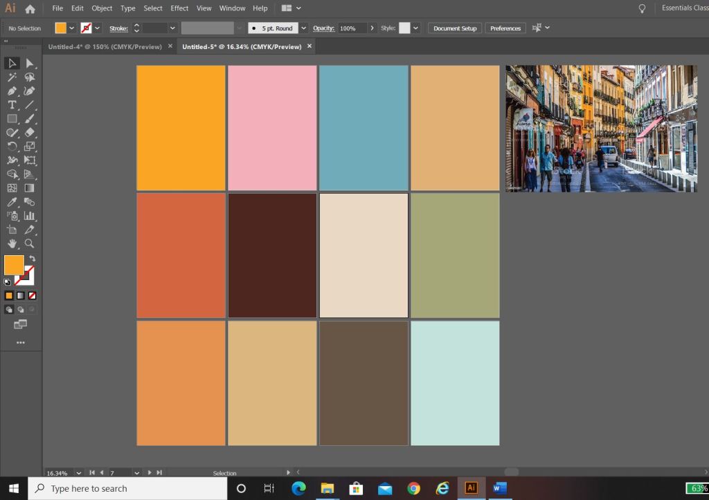
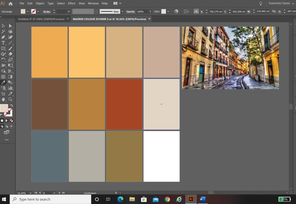
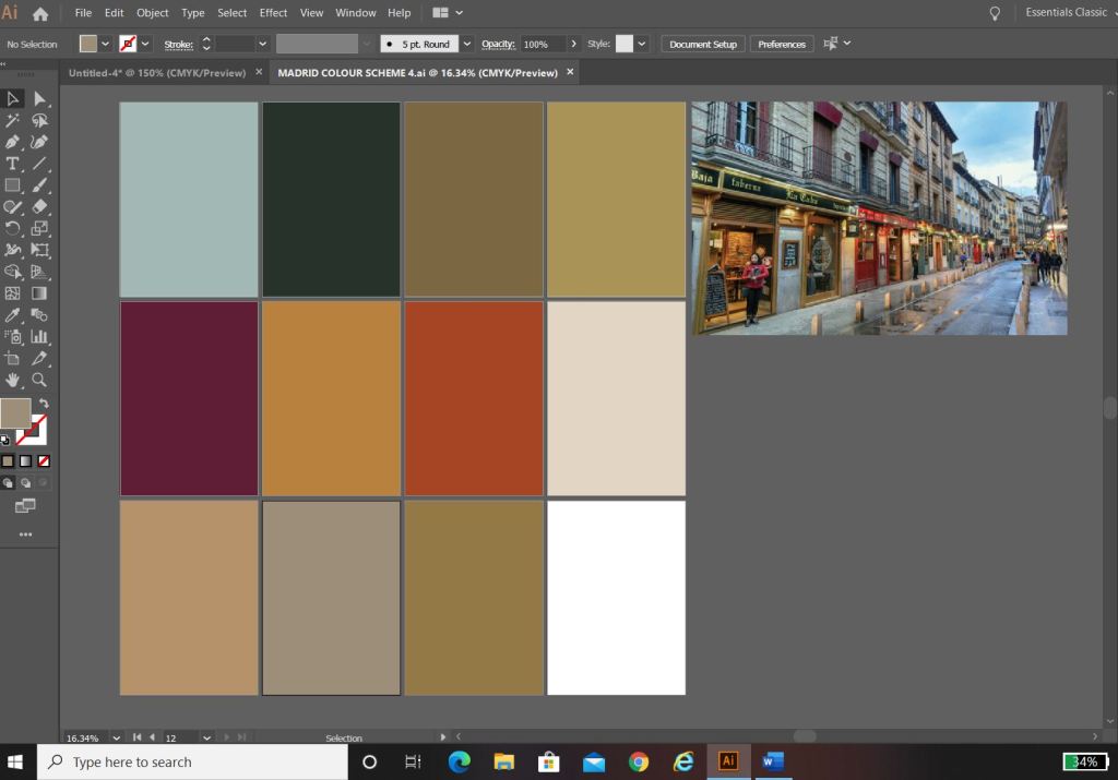
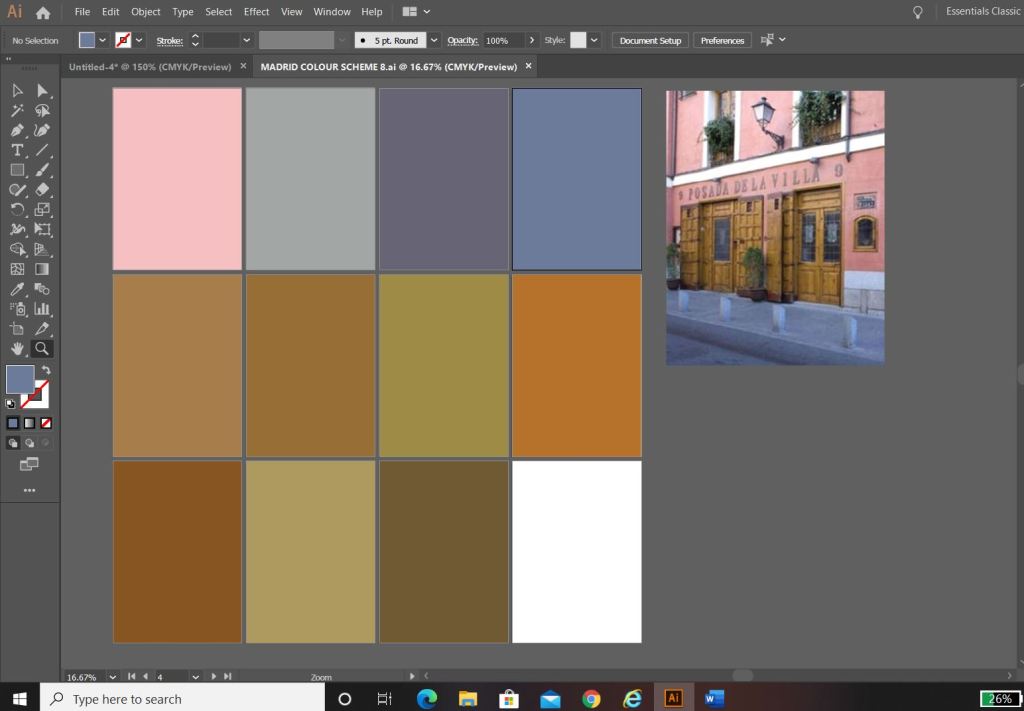
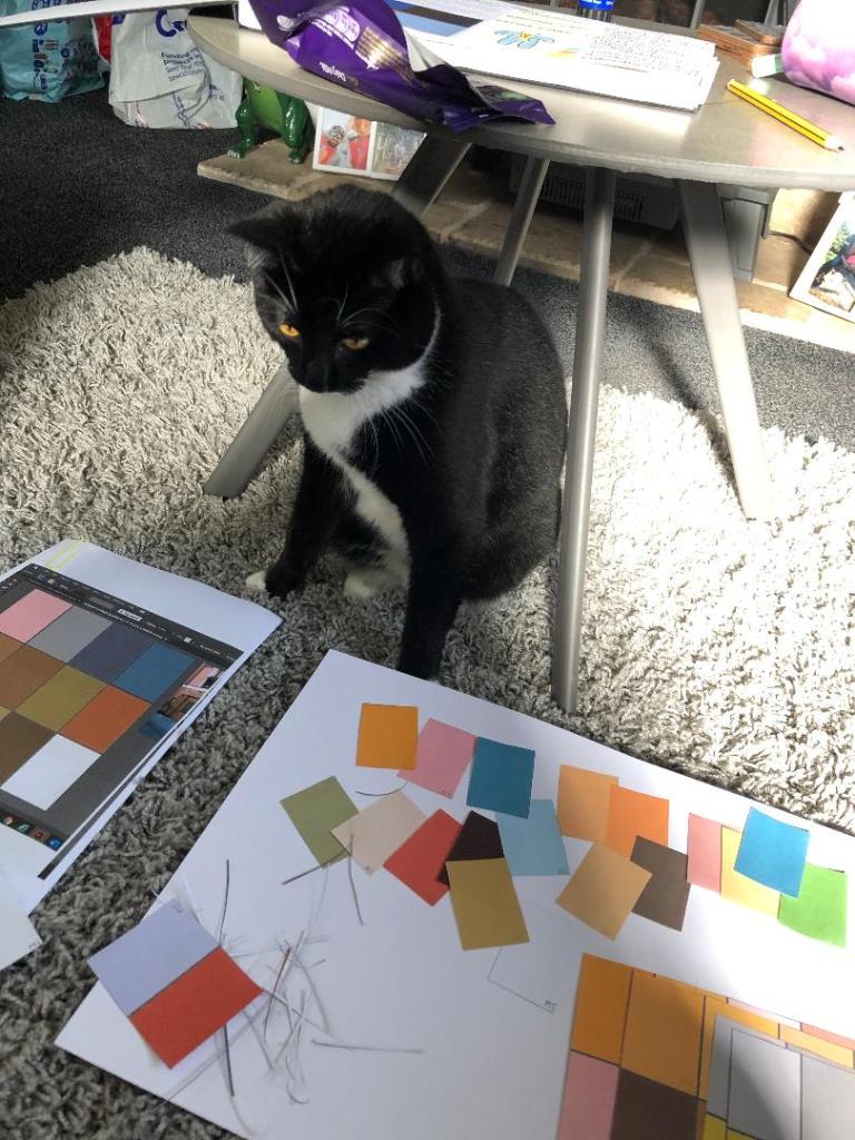
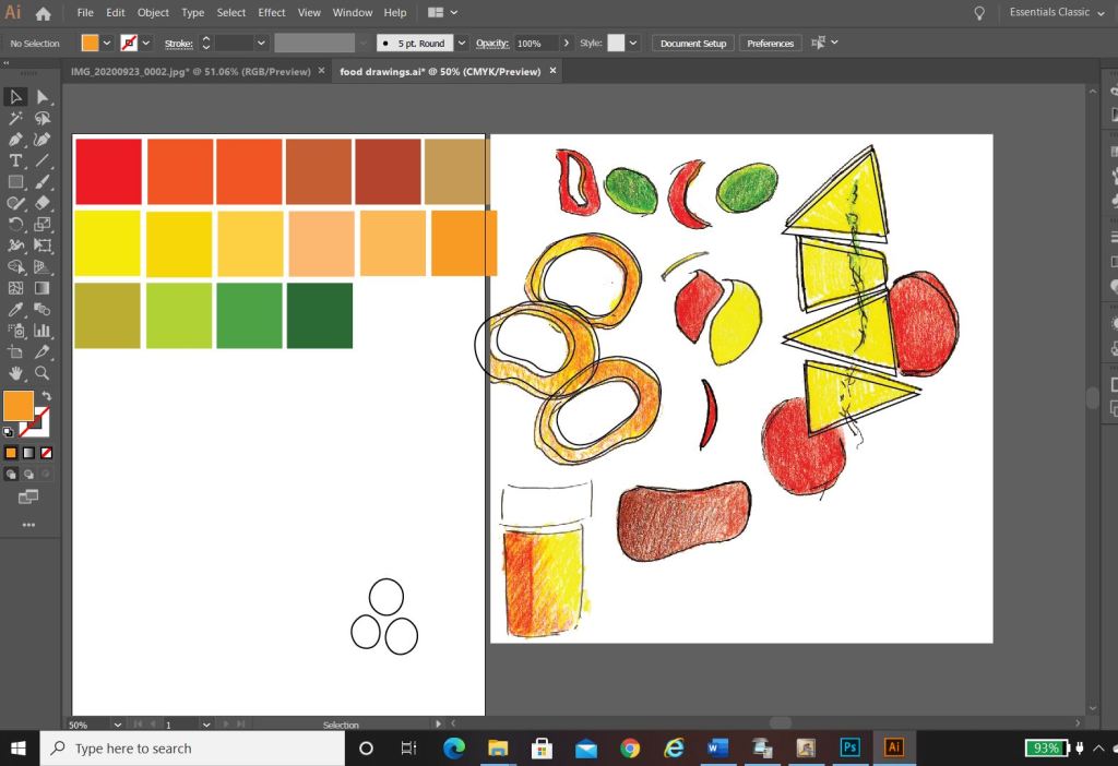
I used the photos that inspired me the most and in Photoshop using the eyedropper tool I picked out the colours that were most prominent in the photos. These would form a base for my colour palette.
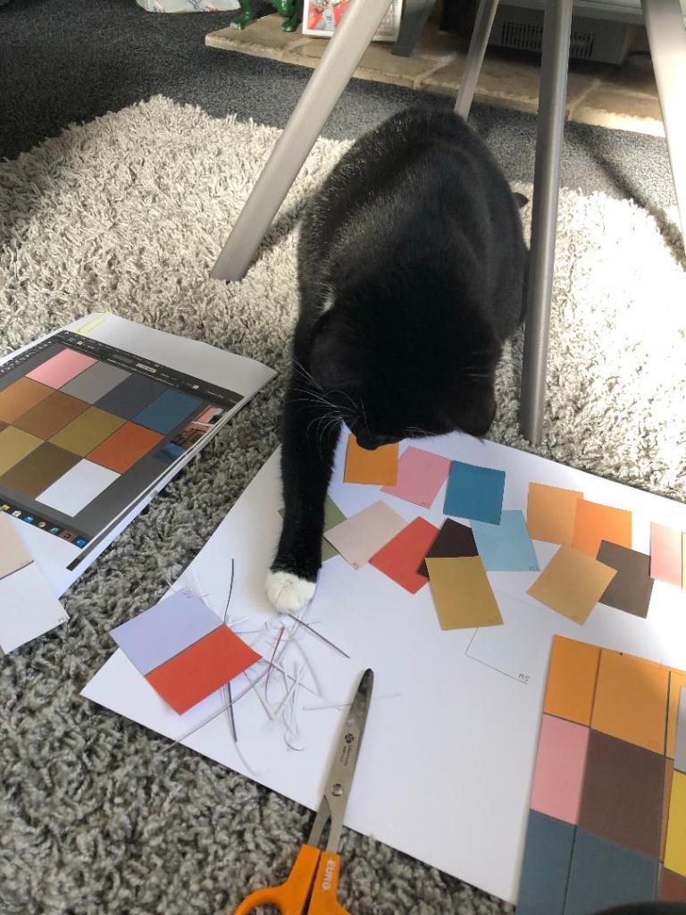
The above screenshots were the palettes that I created from these colours. I then decided to print all of the palettes out and arrange them all onto one sheet to pick out the main colours that could be used; I wanted to organise them into dominant, subordinate and accent colours. I had a little bit of help from my boyfriends cat Bridgette with this!…
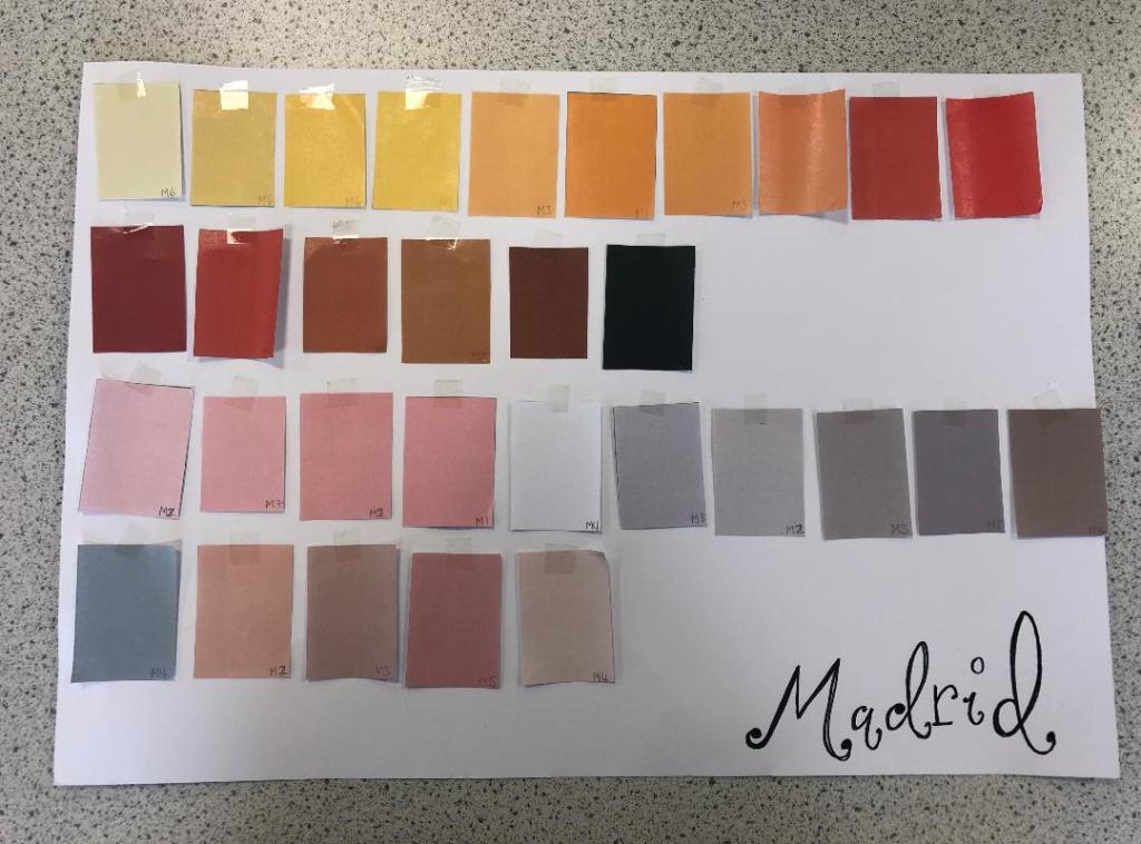
The above colours were the ones that I narrowed down. I feel that they reflect the vibes, buildings, warmth and atmosphere of Spain and Madrid. After organising them in an order where I could see what colours worked with each other I then went on to think about the first design and how I would feature the abstract blocks of colour into my design…
Research points
I looked at a wide range of research points for this first design, I was really unsure of where to turn with the “abstract coloured blocks” I did an extensive browse on Pinterest (link below) where I created several folders filled with different images and I also looked up various abstract art and artists. As I said in my previous post I had help from one of my art teacher friends who directed me to a few artists to look into.
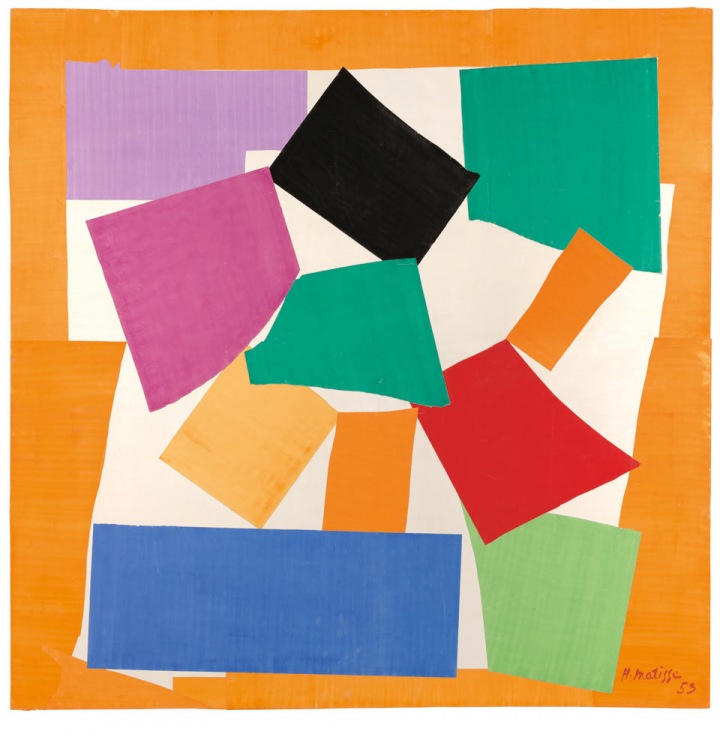
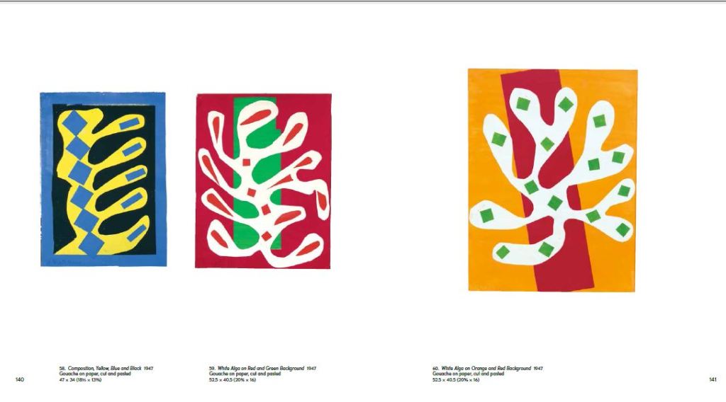
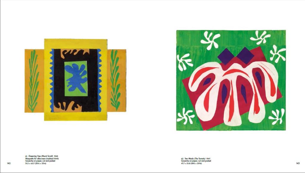
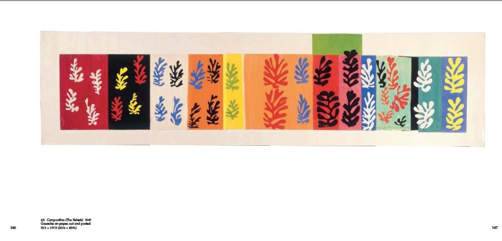
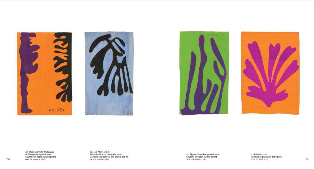
I found that researching into Henry Matisse was the most beneficial. Matisse towards the end of his life created art form cut out shapes which he then made into collages and blocks of colour. I did not think originally that these could be classed as blocks of colour but the more I researched into the artist I realised that he was quite renowned for his work related to colour.
The paper cut outs by Henry Matisse.
Matisse cut out a lot of leaf shapes from paper and used them to create abstract pieces – These were still considered as blocks of colour and it inspired me to think about creating simplistic shapes from objects that exist of one block colour and then make them abstract.
Development of Ideas
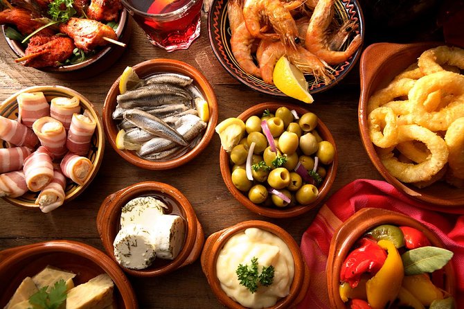
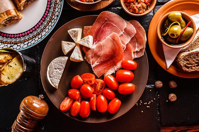
I started firstly to design and develop ideas down the food route; As I wrote further up my post, I wanted to explore around Spanish food as it is a big part of Spanish culture. I wanted to convey the bright colours, the exciting food itself, the social aspect and the busy yet laid back Mediterranean lifestyle.
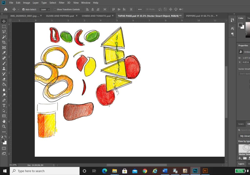
In my sketchbook I drew some initial sketches of some Tapas food just to give me a feel for what I could potentially include on a design.. I ended up really liking these little sketches and went on to create digital versions of them to try out on my digital designs;
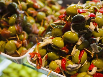
I created coloured sketches of Tapas food – Olives, Cheese, Tomatoes, Ham, Peppers, Chillis and Calamari. Calamari sandwiches are a massive deal in Madrid.
Digital Development
Development Idea 1
I started to rearrange the digital drawings of my food in different ways to try and form an abstract design with coloured blocks.. It was tricky! – I concentrated mostly around the calamari illustration; Calamari sandwiches are a delicacy in Madrid! They are a pretty big deal! I situated the Calamari illustrations between coloured blocks to try and get an abstract representation of Calamari in bread or a bread roll/bap. All in all I just felt that it was too “busy” and not quite abstract enough for my liking. I really struggled to interpret food as coloured blocks.. I hated to admit defeat as I really wanted to take a different direction from everyone else, however, landscapes and buildings are best interpreted as coloured blocks. I did a few more experimental layouts for my food idea and then swiftly moved on to try and rework the whole exercise out again.
Back to the drawing board!
Development Idea 2
What I created next was completely accidental and out of sheer boredom and frustration with the exercise at the time! – I sat at my laptop screen on Illustrator and just drew random lines all over the place in a complete daydream and loss at what I was doing! By the time I had finished I could see a resemblance to the Kio Towers (leaning towers of Madrid) and then I gradually started to bring other influences in to it…
This started to look like the Kio Towers (the leaning towers of Madrid!)
I then added in the statue of Calvo Sotelo which is situated between the Kio Towers!
The towers together also look like an “M” for Madrid
The 3 elements all joined together!
I then added in the last feature… it looks like a Spanish bull with its horns coming out the top of the design.
All of the elements together to create this abstract piece!
I liked the geometric, modern feel of the abstract architectural illustration.
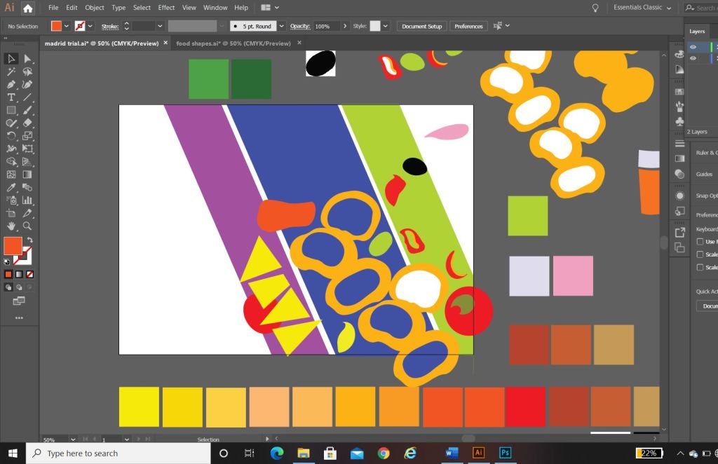
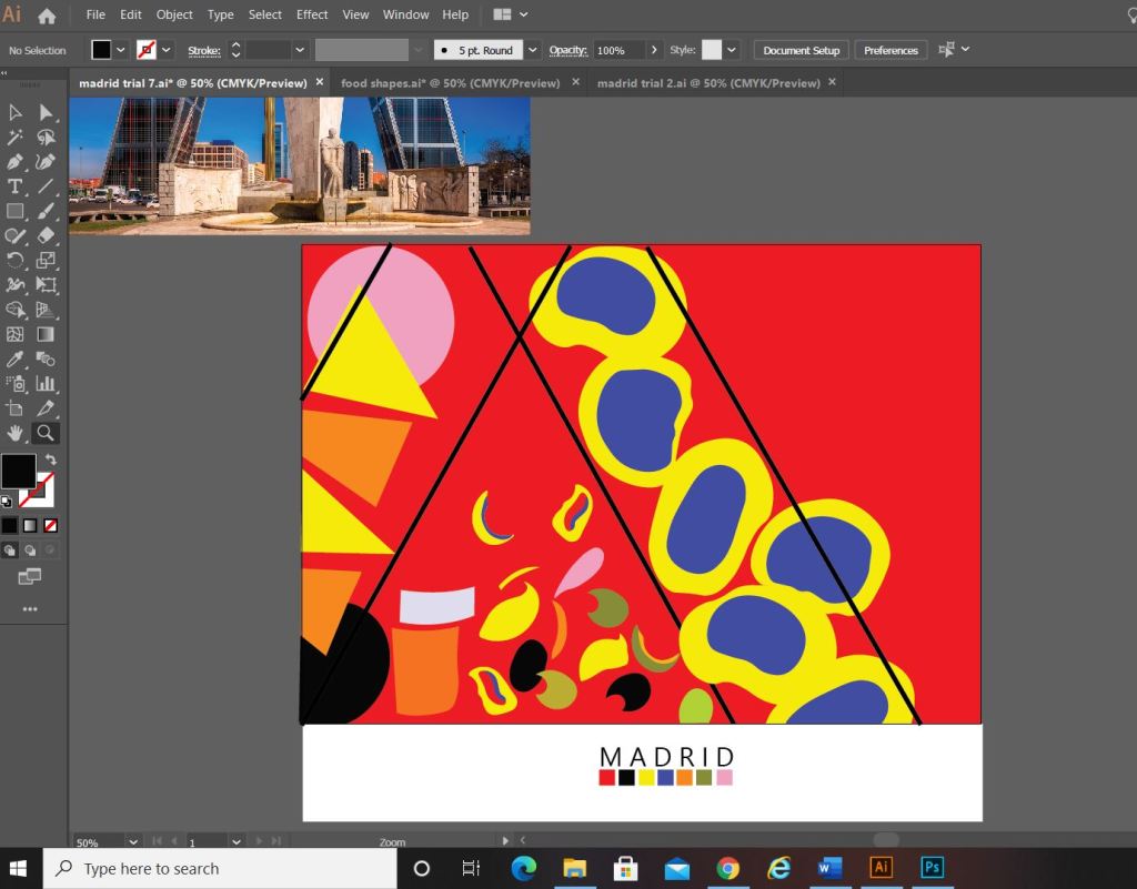
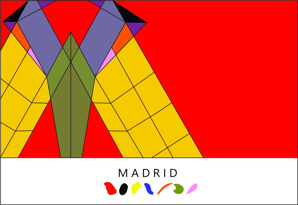
What I ended up designing was this above; I still really liked my little drawings of the food and was trying to find ways still to incorporate them into the design. I decided to use them below “Madrid” as a colour key for the piece; The colour of each food is a colour that featured on my original colour chart and which I have also used on the above abstract design. I did think that the food icons could also technically be classed as the blocks of colour. The colours are very “Spanish” in feel with the Red and Yellow but I have added contrasting colours in there with the Pink and Blue.
I wanted the typeface for “Madrid” to be simplistic. I knew I wanted it to be a sans-serif font as these are always the best for legibility, readability and best suited for titles and headings. I don’t really like using fonts or typefaces that are gimmicky or that are not well established, therefore I did question myself about choosing a typeface that I was unfamiliar with.. however, the one I chose (Leelawadee) did seem quite appealing and attractive for the piece. The only issue I had with the whole design was that the typography did not match the “abstract” feel; in fact I still felt that the whole piece wasn’t edgy or abstract enough. The blocks of colour that I used seemed flat, it seemed as if I was just colouring in blocks for the sake of making them a colour. I think I had too many colours, my thought process moving on from this stage was to potentially limit the amount of colours to possibly 3. I could pick 3 colours that have strong relations to the country (e.g. the country’s flag colours). For Madrid it would be yellow, red and Black.
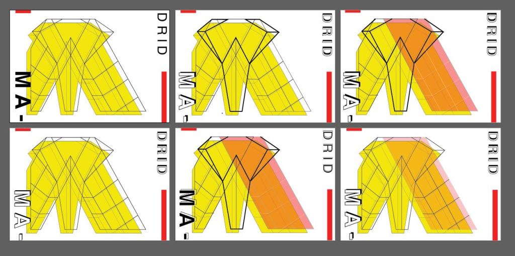
Development Idea 3
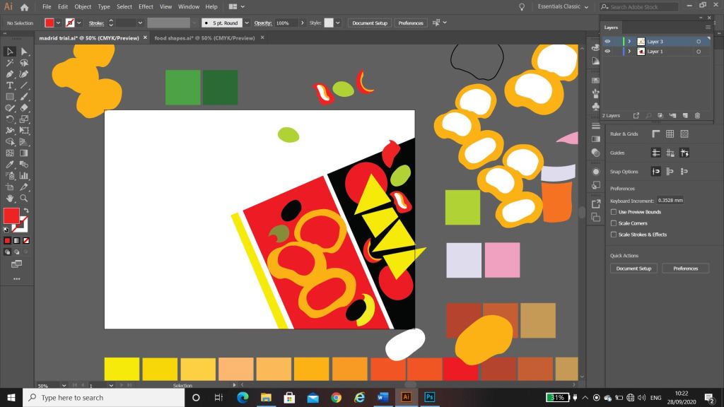
I tried the design again but this time around tried not to play “too safe”. I wanted to experiment more with the typography and the layout (although not too much!.. I chose good ol Helvetica again for the font!) I had the idea to break Madrid up into its syllables and rearrange them coming slightly off the page.
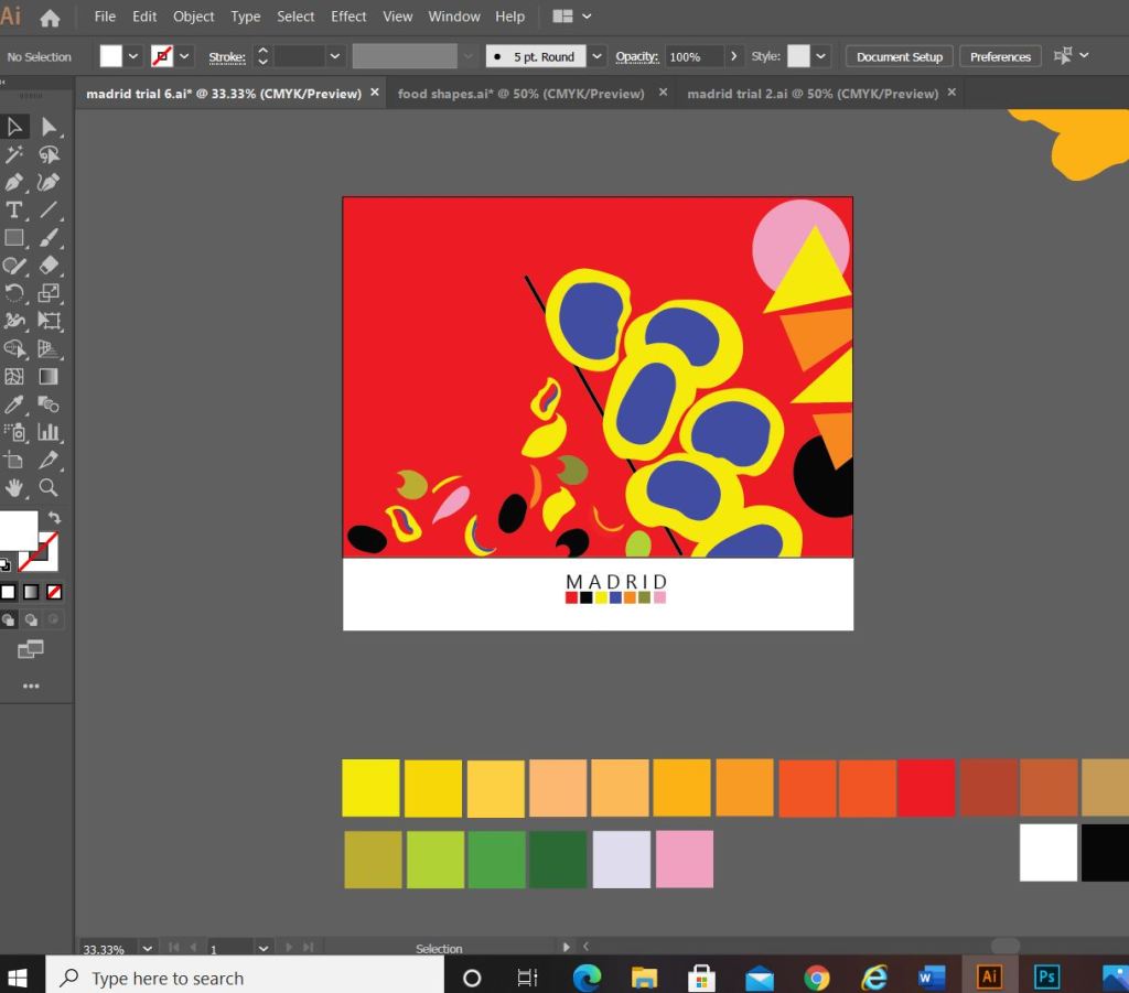
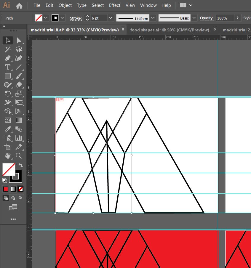
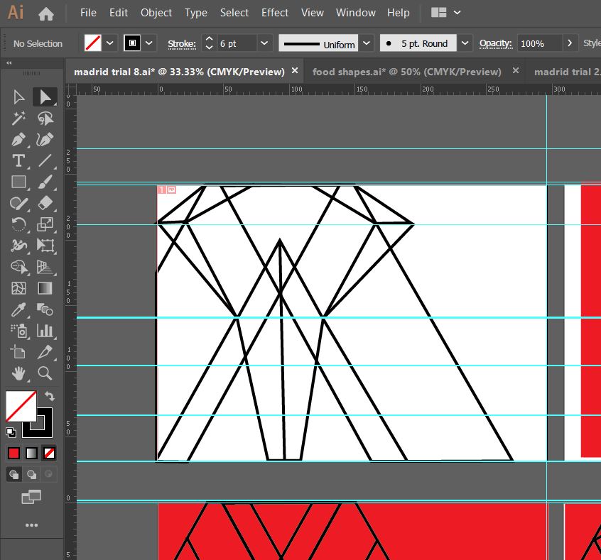
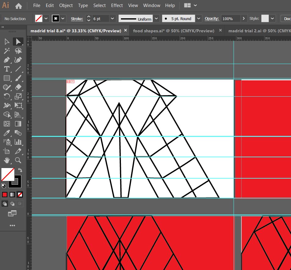
The above screenshots show how the development progressed.. I much prefer this idea. I messed around with the orientation of “Madrid” at the end of my experimenting I found that Madrid should be written facing the spine and not the pages. It has more impact when you look at it, it stands out and it looks more abstract in design even though there is still a strong geometric influence to it. I have added the red bars in the design because they help to frame the overall design and give it structure. The red boxes are focal points that draw your attention to the design. I made one much smaller and thicker than the other for contrast. I feel in general the design is comfortable to look at; the eye flows comfortably throughout it. I then had to develop it further to get the coloured blocks into the design.
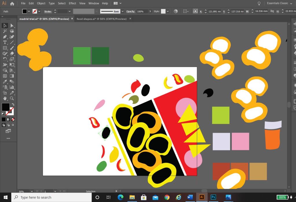
I developed it further (above) experimenting with outlines on the text and contrast of the typography with line weight and thickness. I started to add colour to the blocks. I also outlined the shape of the abstract bull which ties in nicely to Madrid and Spain as a country. The colours I have used are Red and yellow with Black and white added in. The Red and yellow I overlapped and lowered the opacity to mix the colours to create an orange hue. The middle bottom design stands out the most for me.. it has contrast with the typography (Bold vs. regular, black vs. white, big vs. small), the overall layout is more abstract, the bull line work ties in nicely to the city and country and the colours all contrast and compliment each other and are blocks. (yellow=dominant, orange= subordinate and the light pinky red and bold red are accents)…
….
However, I still felt like it was “too busy” the line work took away the “block” aspect of the brief. I wanted to keep the design as simplistic as possible, so I went about developing it even further.
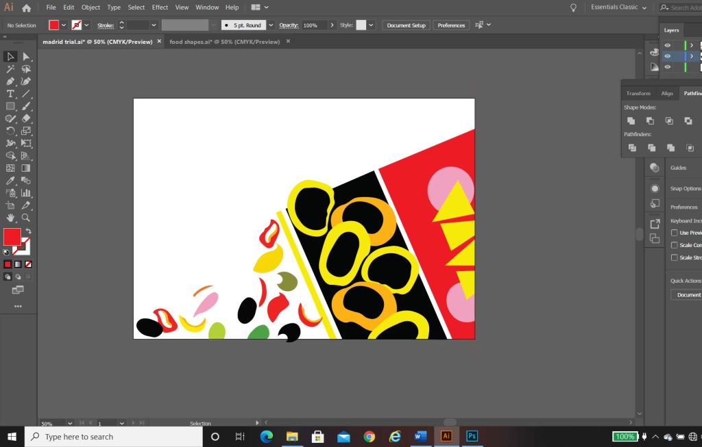
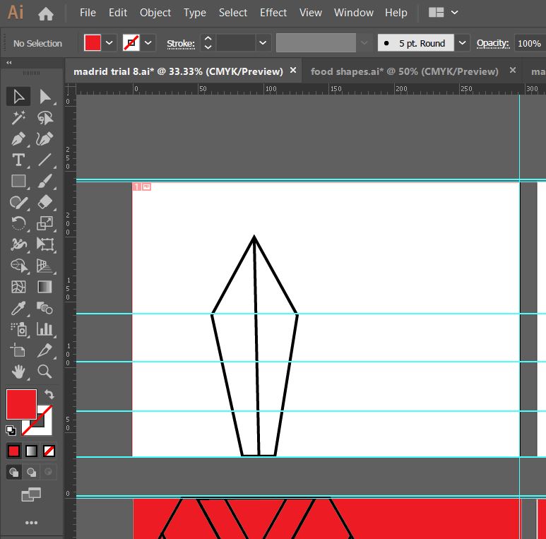
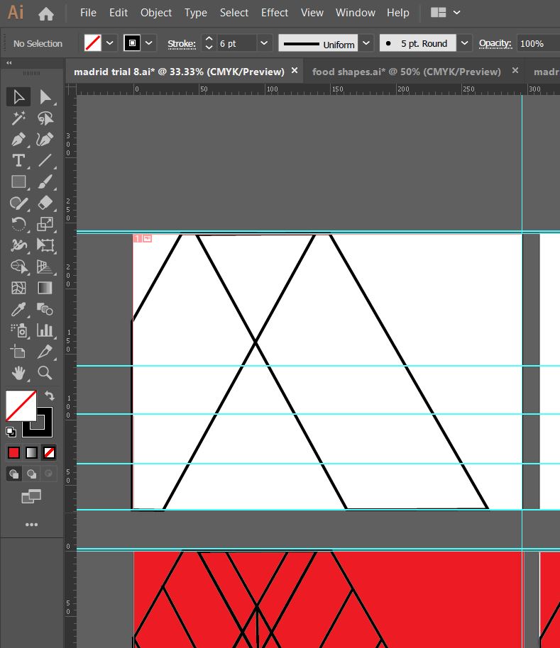
This is what my final design looks like! I simplified it right down to the basic shapes which I think helps you to recognise the landmarks in the design better. I added accent colours in each corner to draw the eye and attention over the whole design.
“Once I get the first one designed and finished, the others should flow quite easily”
Amy Holmes – This was said to her boyfriend after almost ripping her hair out from trying to find an outcome for 1/10 guidebooks! 😀
Exactly what I said above! I knew that this exercise was notoriously difficult and that after I had the first one designed the other 9 should flow and follow the same design thought process and layout etc.. This was true, the others flowed along quite nicely afterwards with the exception of hitting a few “brick walls” along the way.
Take a look at my other 9 posts to see the final designs for each city!
Following on from my last post I have now finished the Book design exercise!! (well!… almost! I wrote this post a few days ago and have been keeping it in my drafts! – I have relooked over my designs and seen one potential flaw!… I have written about it at the bottom of this post!)
As I said in my previous post I was feeling very apprehensive about starting this exercise. I didn’t know anything about the author and did not know anything about any of the books he had written. Book design is something that I had never looked into or done before and I was completely overwhelmed with where to start with it. Finishing this exercise I feel that I have learned a lot from researching into the author and his books, watching TED talks by Chipp Kidd about successful book design and looking into existing designs out there. I feel I have achieved successful final design outcomes. I really enjoyed this exercise and as I said in my previous post book design is something that I would potentially like to go into.
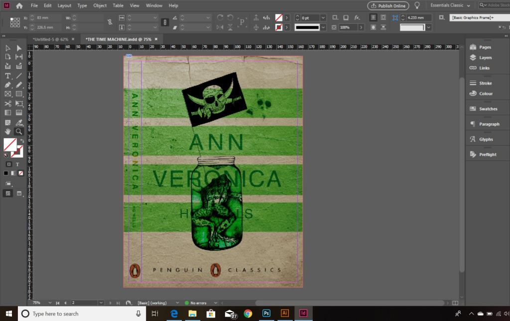
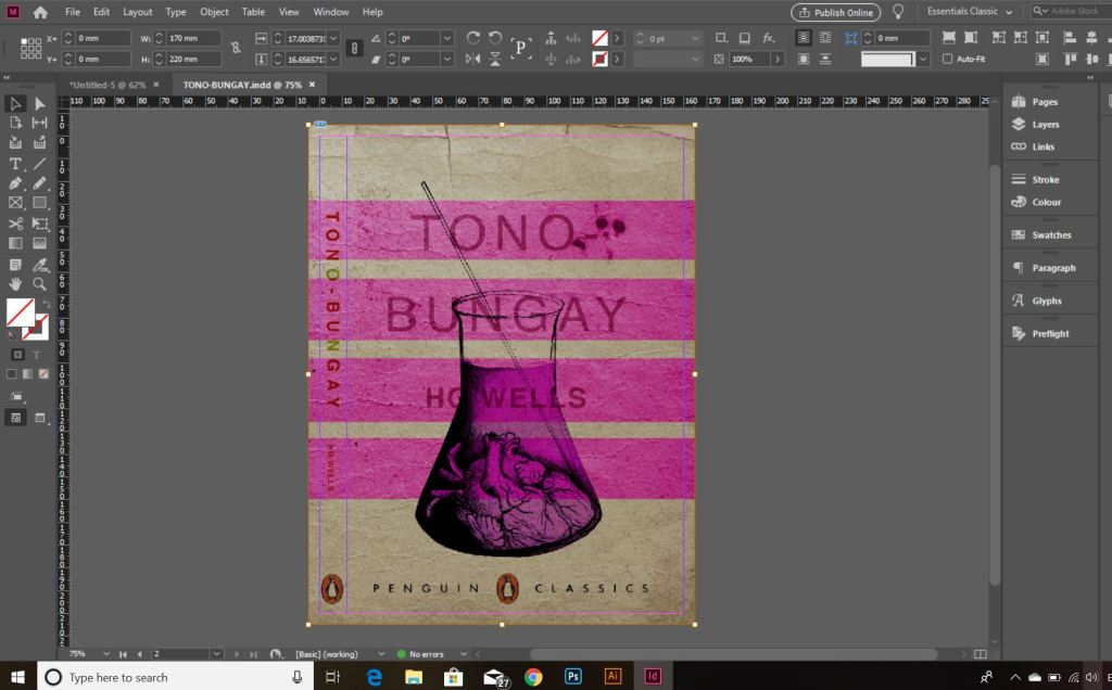
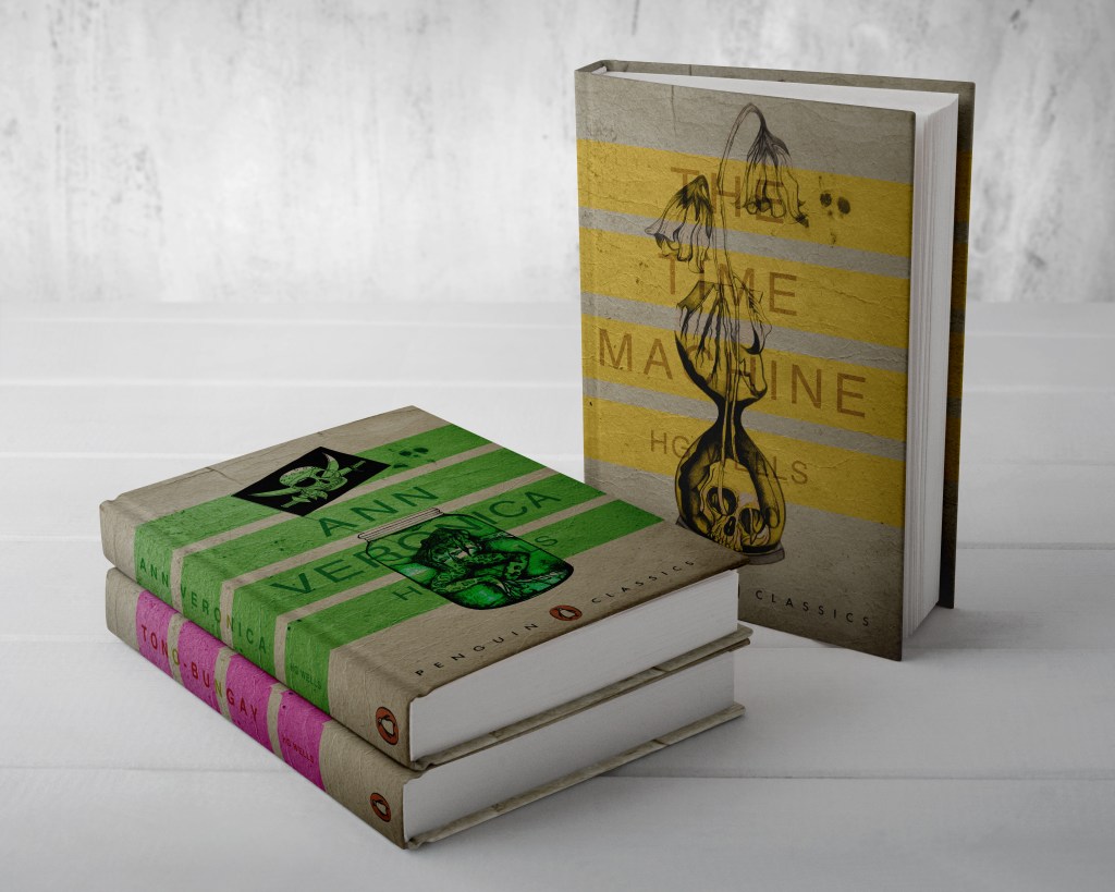
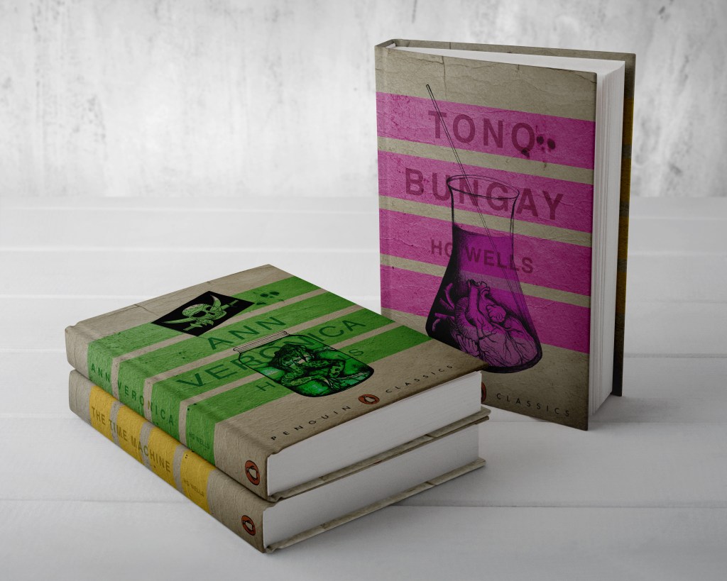
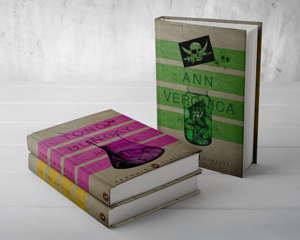
From my last post I adjusted the typography on the books; although some parts of the text are still hard to read, I actually quite like this effect. I also designed the spines. Once I saved the designs as PDFs I then imported them into InDesign. I set up the document in InDesign and worked out how big to make the spine by calculating the number of pages by the weight size of the paper used in paperback books (usually 80gsm). The calculations came up to about 4mm but I decided to work larger than that so that I would have more spine to work with in the design. I then created PDFs and mockups for my final designs. The mockups that I did for my Instagram posts I mocked up on hardback books. There are lots of free downloads online for free book mockups but most of them are for hardback books. I specifically wanted one to feature all 3 books at the same time. The mockups below show this.
The images above are the PDFS of my final designs with the spines. The screenshots below are the makings of them in InDesign.
*** Since writing this post as a draft a few days ago, I watched a poster critique by @thechrisdo. I know that this is book design and not poster design but the same rules still apply. It was so obvious that I don’t know why I did not spot my mistake earlier!… I haven’t made the titles of the books bold. I need to make the titles bold and the authors name in regular. This will show contrast between the 2 and also make the title stand out more. I may even adjust the tracking of the titles also.
I have FINALLY reached the final steps to this exercise! I have really enjoyed the design process though even though it has been a long and overdrawn one! – I always said I didn’t want to half ass it and I wanted to make sure that when it was complete that I had done the very best that I could have done with it! Putting the typography onto it and making them into book covers was a really daunting prospect! – However, I can go to bed tonight knowing that I am one step closer to making them look like the real deal! Doing this exercise has really made me also think that going into book design is something that I would want to do. I find now that whenever I go into bookshops I am scanning the shelves for the covers and not necessarily the books! Researching into Chipp Kidd and purchasing some of his books as well really interested me and made me think deeper into what really goes into the design of a good book cover!
“Never judge a book by its cover….. Unless you’re a designer!”
I started off with the 3 designs I tweaked on Photoshop (below):
I have a current obsession with textures… which is a good thing seeing as one of the suggestions in my last feedback was to add texture to my work! I watched a video by Roy Cranston on Chris Do’s @thefutur where he spoke about where and how he sourced his textures for his poster work, it was funny because I already collect random photos of interesting textures and findings but just never use them! He also mentioned how you have to scour the internet for the free ones. I thought it might be interesting to add a texture to the covers.. maybe like an old vintage paper feel? This is what I went out to try and do.
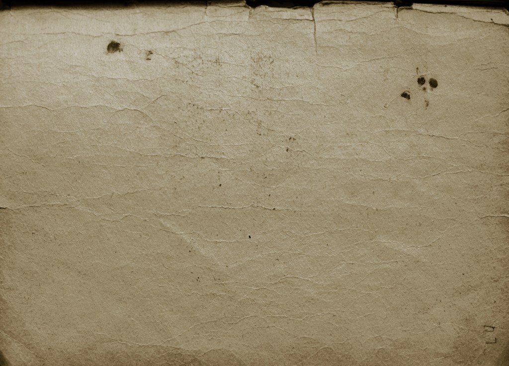
I found a texture online which resembled ripped, discoloured old vintage paper (below) I imported this into Photoshop and did an overlay of it with my designs.
The texture I found online to add an effect to my covers
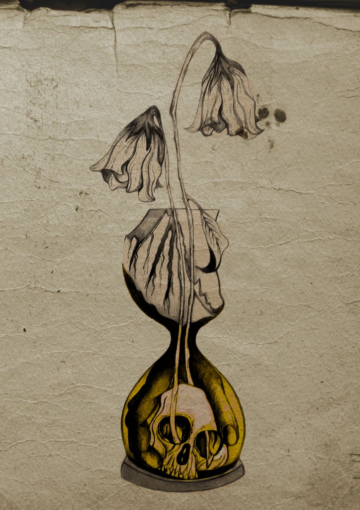
I think the texture worked extremely well! (below) This is what the first cover that I designed looked like with the texture included:
I then had the problem of successfully adding text onto the cover without making it look too drab, boring and old fashioned. Although I wanted the covers to have a vintage feel I also wanted a modern feel to the design to bring the book into the 21st century and to make sure that it is still relevant for many more years.
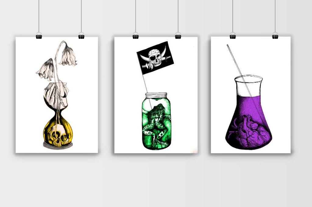
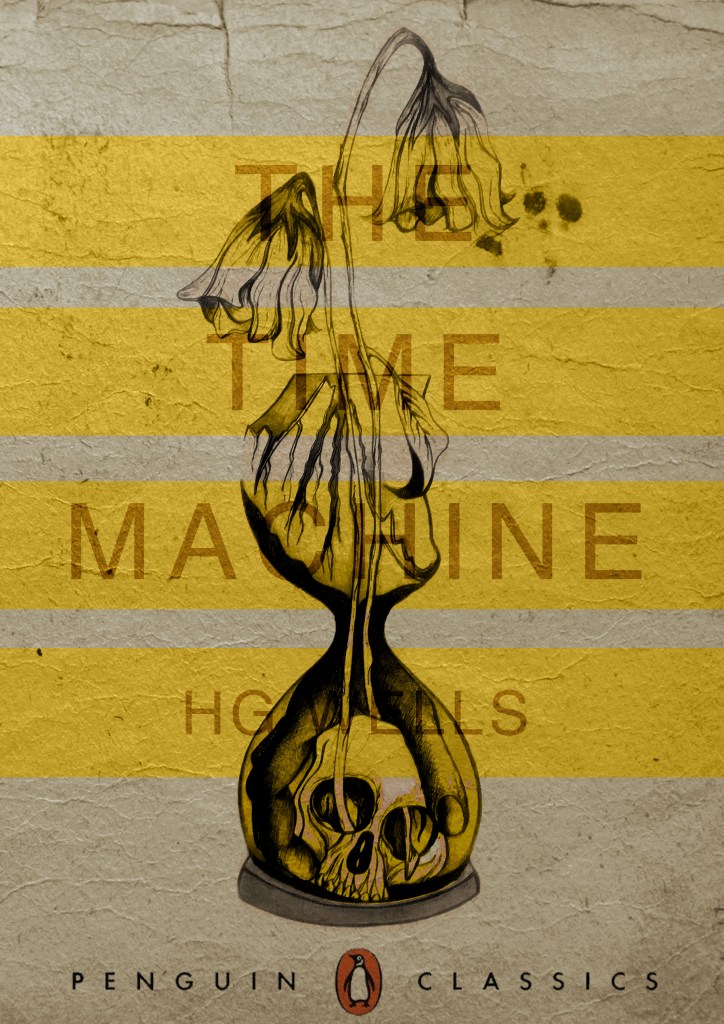
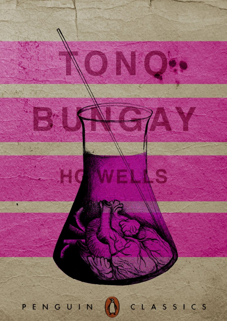
This above is the design I toyed with; I liked the idea of Franklin Gothic as a font at first glance.. it was literally the first trial typeface I used and tried it with. In my head I knew I wanted the text to be quite prominent across the whole cover. I had the idea of turning the opacity down to make it partially see through. I thought as well I could match the colours of the type to the yellow in the hour glass (see below)
I liked this idea, the yellow worked well but it was still missing something… This is when I thought of the idea of using coloured bands across it (one for each line of the title)
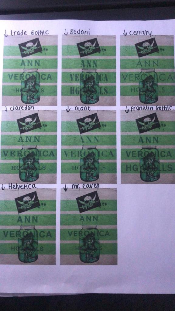
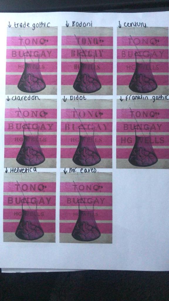
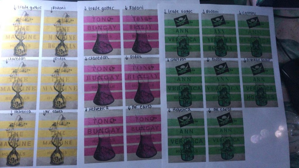
I really liked this idea! The only thing I needed to work on was the typography! I spent a while (a fair time!) picking out some of the best fonts and using them on all the designs to print out and compare! I sent photos also to my Mum who using her expert opinion and eye ;p picked out Helvetica! I also shared captions on my Instagram and people replied also with Helvetica. The reasons?.. obviously with it being the font of choice for most designers and also for the fact it is strong and stands out on a cover.
These are the sheets I shared with all the different fonts! (below)
So! Helvetica was the popular opinion!… and you know what?!… There is a reason why Helvetica rules all!.. I actually really like the look of them! The type is still illegible in places but I can work on that!
I then wanted to give it a go adding the publishers name and logo. I decided to go for Penguin – The classics! I found a logo online (not the best way to do it for pixelization and plagarim… BUT the brief states to use one so!…)
This one is perfect!… I then added it to each of the designs and adjusted the layouts accordingly and this is what they look like so far! 😀 really, really chuffed with them so far!
I still have adjustments to make; the illegible type, the hyphen in Tono – Bungay, the bars so that they all line up, the spine to design, bring everything together to create the final cover and then make mockups on actual books but at the moment I am pleased!
I have been a bit slow on development the last week or so… I have also been trying to work on something I want to start in the new year. (I’ll do a separate post for that!)
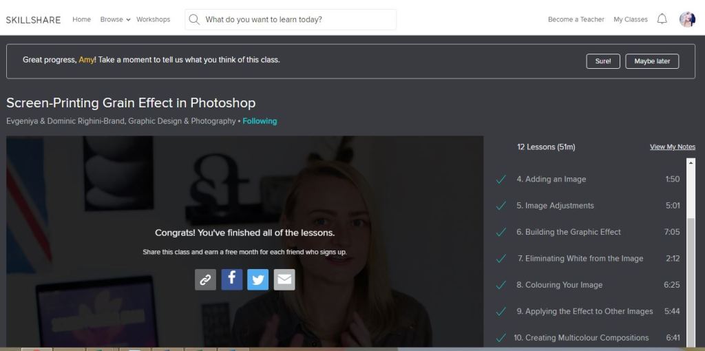
I watch a lot of SkillShare tutorials to learn different effects and skills to further improve my design work digitally. My last post mentioned how I studied a Duotones class by teachers called Evgeniya & Dominic Righini-Brand, Graphic Design & Photography well I also studied another one of their classes for creating a screen printed effect. I thought this might add an “older” more vintage feel to the piece.
After I had finished the tutorial I also uploaded the finished piece to the Skillshare page for others to see (which is unknown for me!!- stepping out my comfort zone!) Here is the link below to what the tutor had to say to my piece!
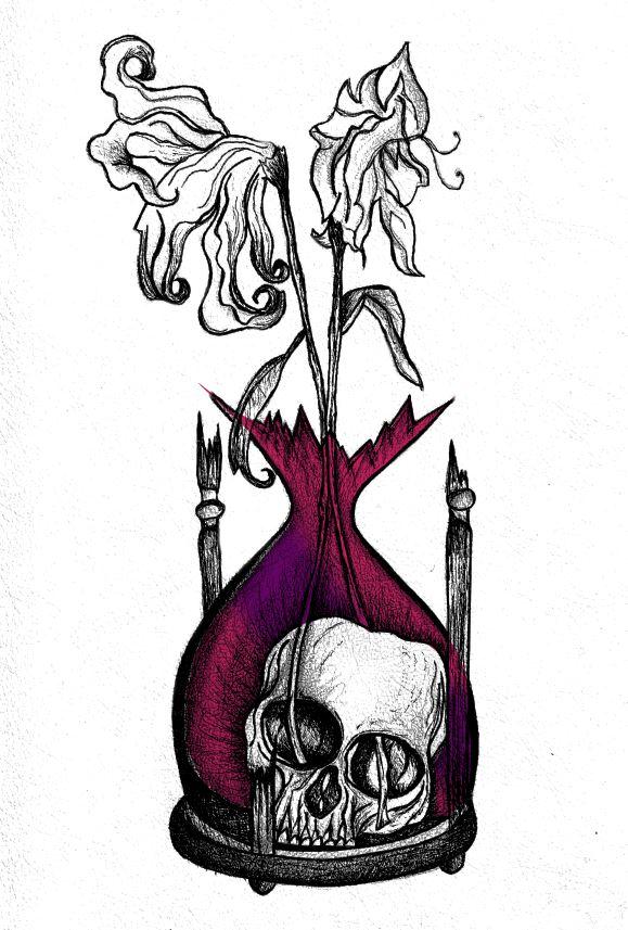
Out of all the trials I have done so far though I have to say I like the first one pictured above! I also posted it to my Facebook for the opinion of everyone else and they all agreed that this one stands out the most and the contrast between the black and yellow works the best. I am now going to draw the other 2 designs and then bring them into Photoshop and do the same digitally as this one. I will change the colours on each though so that they each have their own colour scheme.
Yesterday I decided to have a go importing my hand drawn ink design into Photoshop and have a play around!
I am not a pro at Photoshop to say the least, so the tutorial I watched on Skillshare a while back that I wrote in my blog about really helped me!..
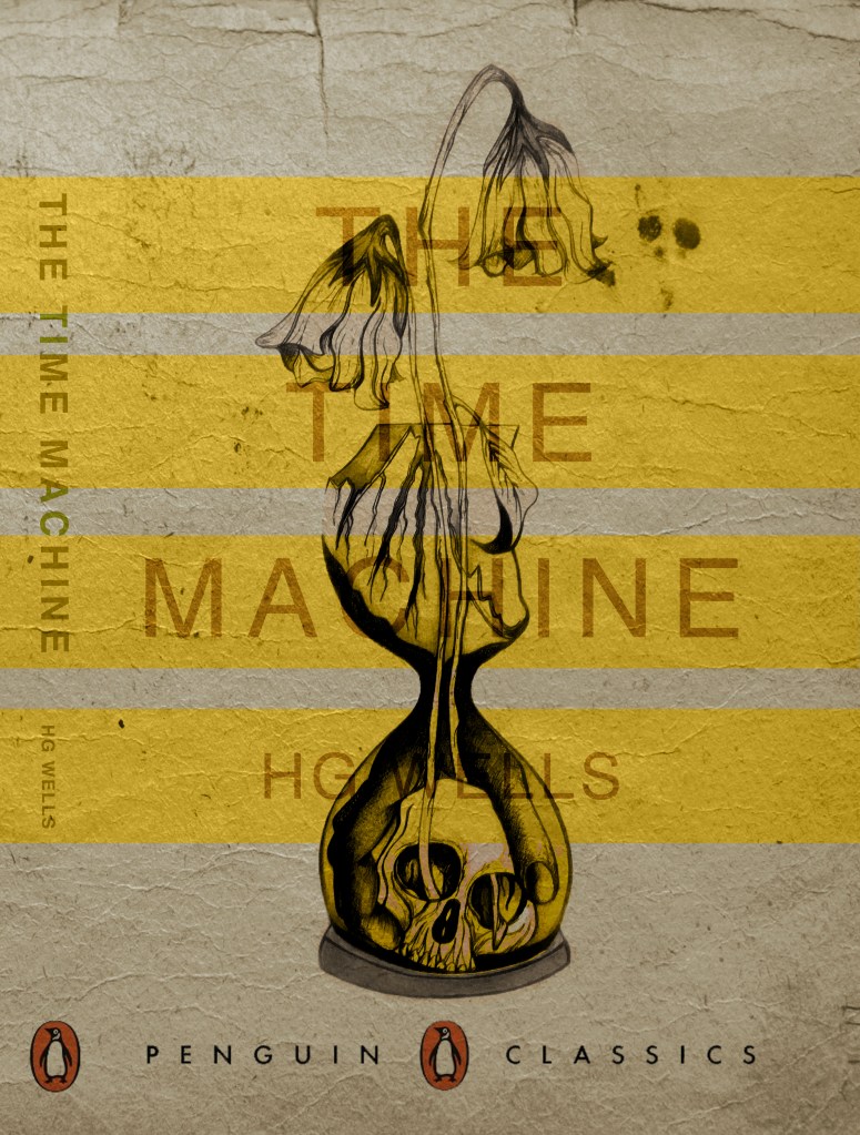
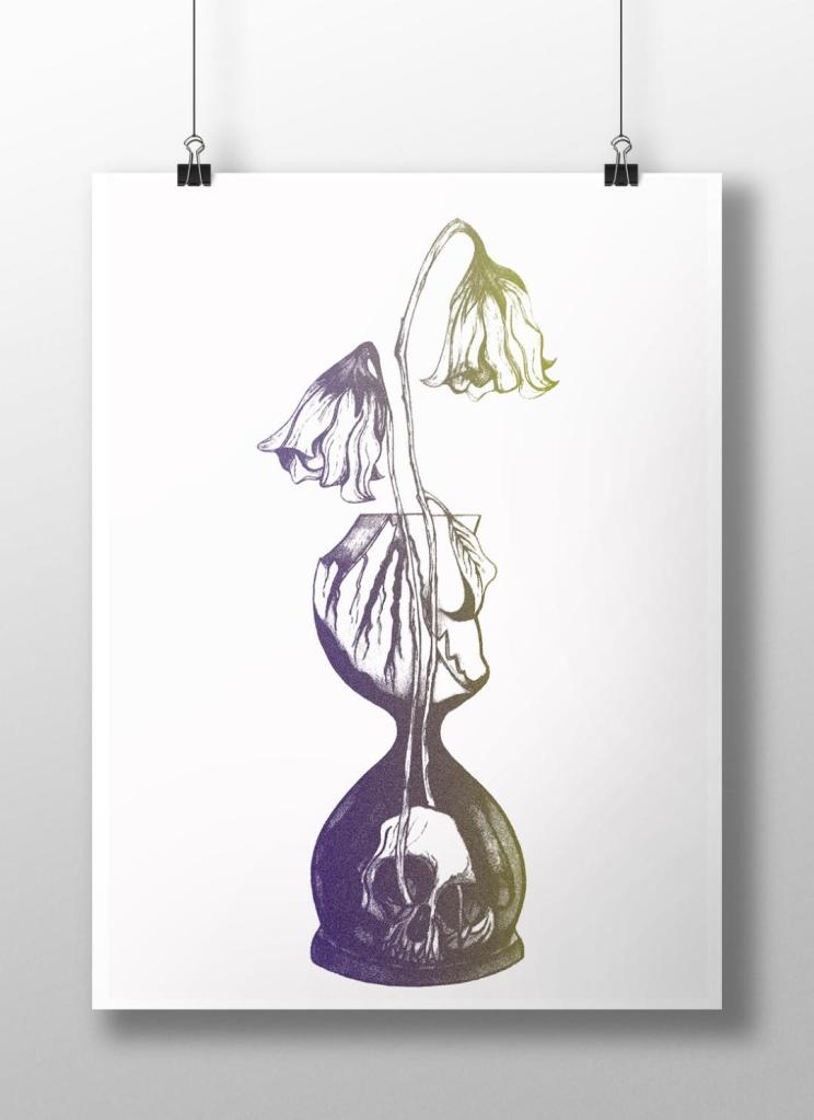
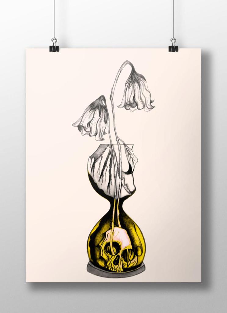
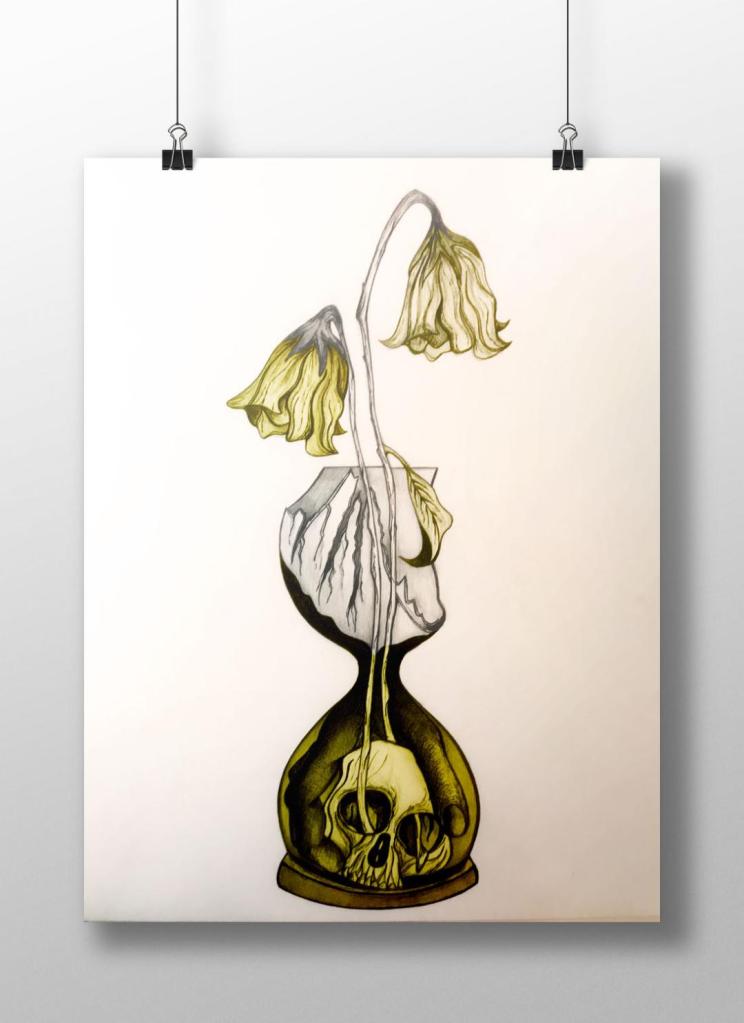
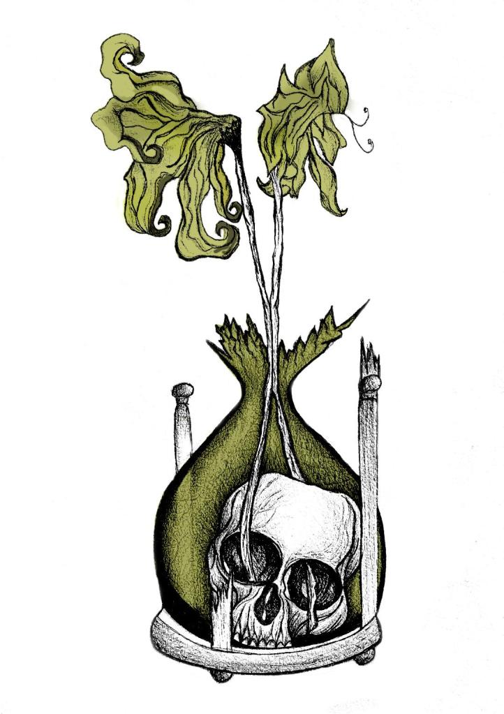
I decided to change the colours, I want each of the 3 books I design to use 3 different colours and work as a series in that the designs are the same and also the colours tie them together. The flowers in the Time Machine are white but dead, brown and withered at the ends so I decided to alter the colours to match this… I went with a white/murky yellow/black colour scheme.
To get me familiar with changing the colours and doing certain things in Photoshop I had a play around first, this was the trial starter piece..
Using the pen tool to draw around areas and making them a selection so that I could add colour to the area and then multiply to blend it in with my line drawing. I then created a clipping mask on a duplicate layer to further blend more colour in.
When I felt more confident I then started on a proper version;
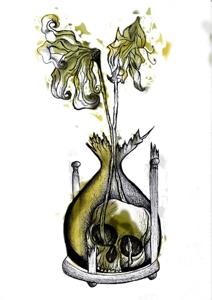
This one I kept the colours quite subtle… I coloured in all of the flower shapes with a murky yellowish colour and carried this on into the hourglass. I liked it but it didn’t shout out at me..
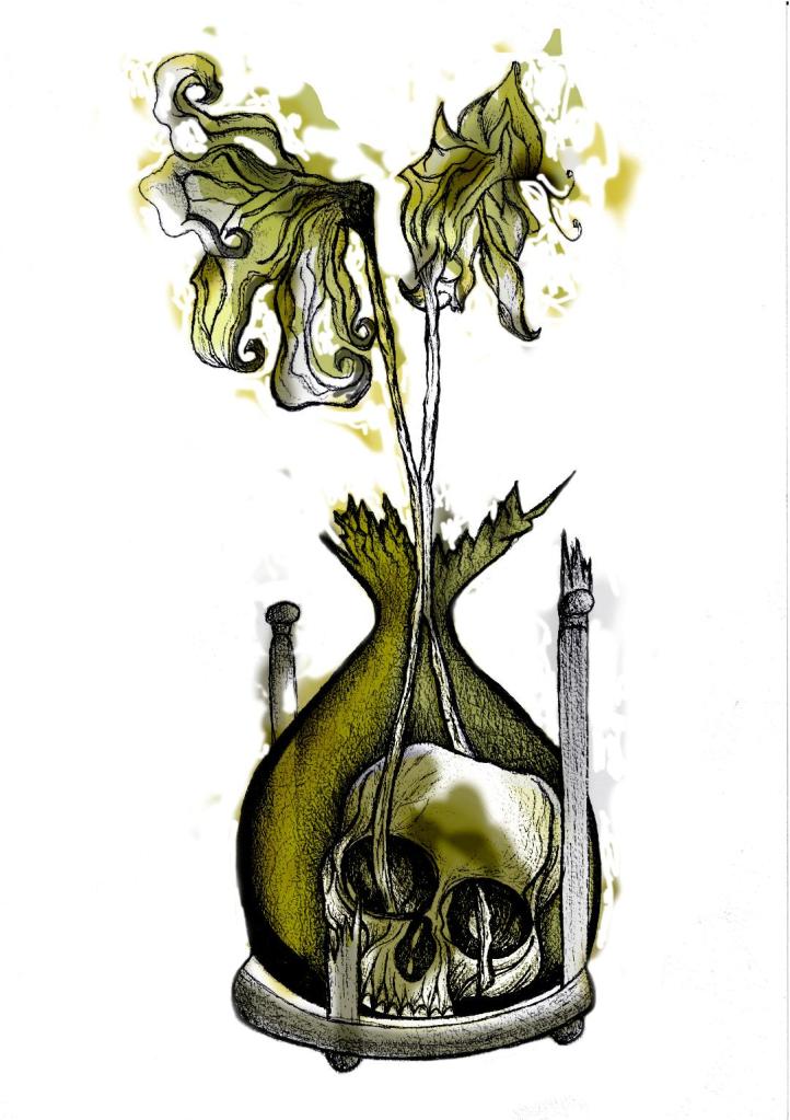
With this version I messed around more with the colours and blending them to create 2 tone effects. I accidentally moved the flowers layer but actually quite liked it being out of the shape slightly.. It gave a mix of the 2 colours; white and yellow. I also created like a water colour/watermark effect at the top of the petals.
In this version I made the colours more deep and murky. I feel the colours are the strongest in this version. Overall I am happy with the progress I have made with it and the new skills I have learned, however It still needs improvement… I now need to find ways of how to make it work on a book cover with the typography element etc.. I think though that I shall draw the other 2 book designs and then take all 3 of them together and then look into layout and typography etc..
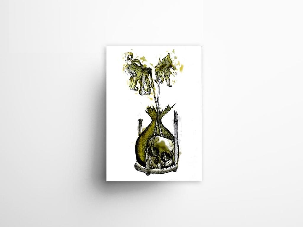
I also looked at mockups for displaying work more professionally on my Instagram account. I downloaded a simple poster mockup document and then added a drop shadow around the edge of my image.