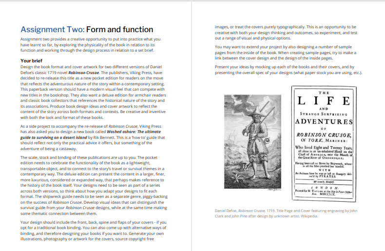
The Brief

First Thoughts
My first thoughts about this assignment was that it is a big assignment and a lot to design for! I was also nervous about figuring out what papers to choose for the publications; there is so much choice and trying to work out the different weights and figuring out which papers do the best job for each part of the book seemed like a foreign language to me even though I did the previous exercise studying the different paper samples etc.. I just figured that I would go off using my GF Smith paper samples; after all I can physically see and feel all of them to know what would be best!
Research
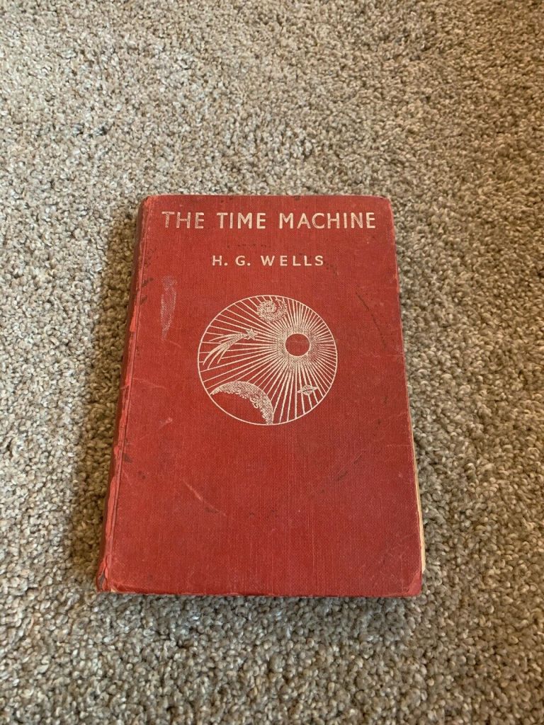
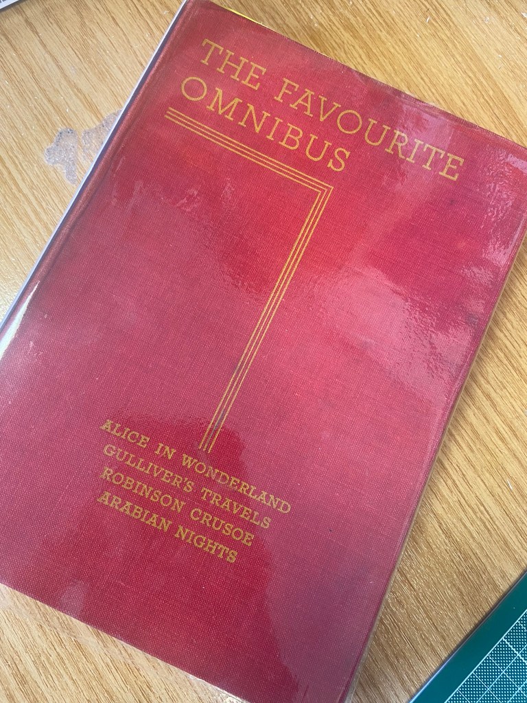
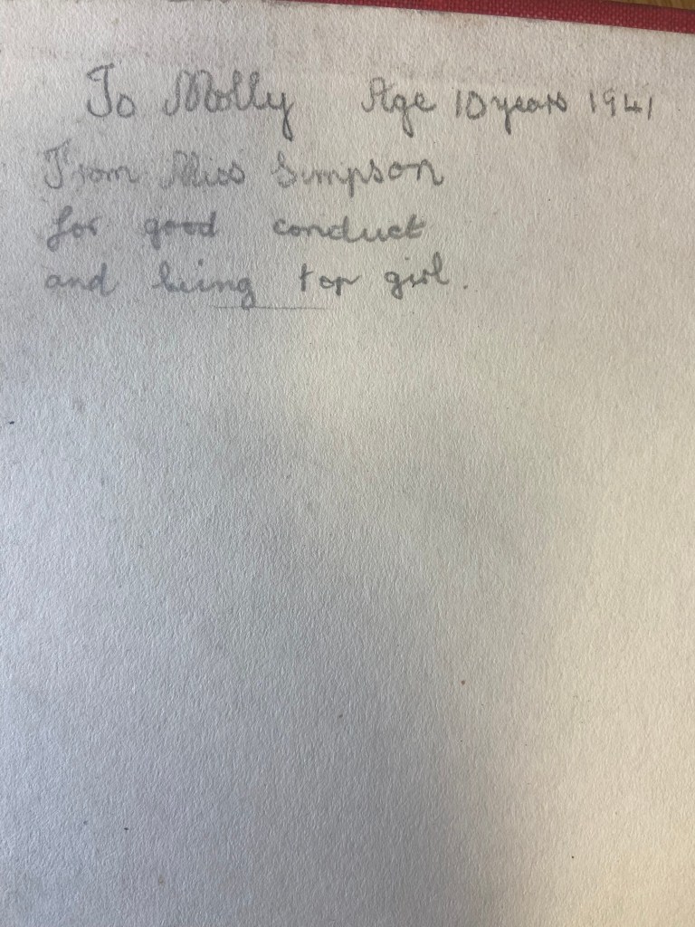
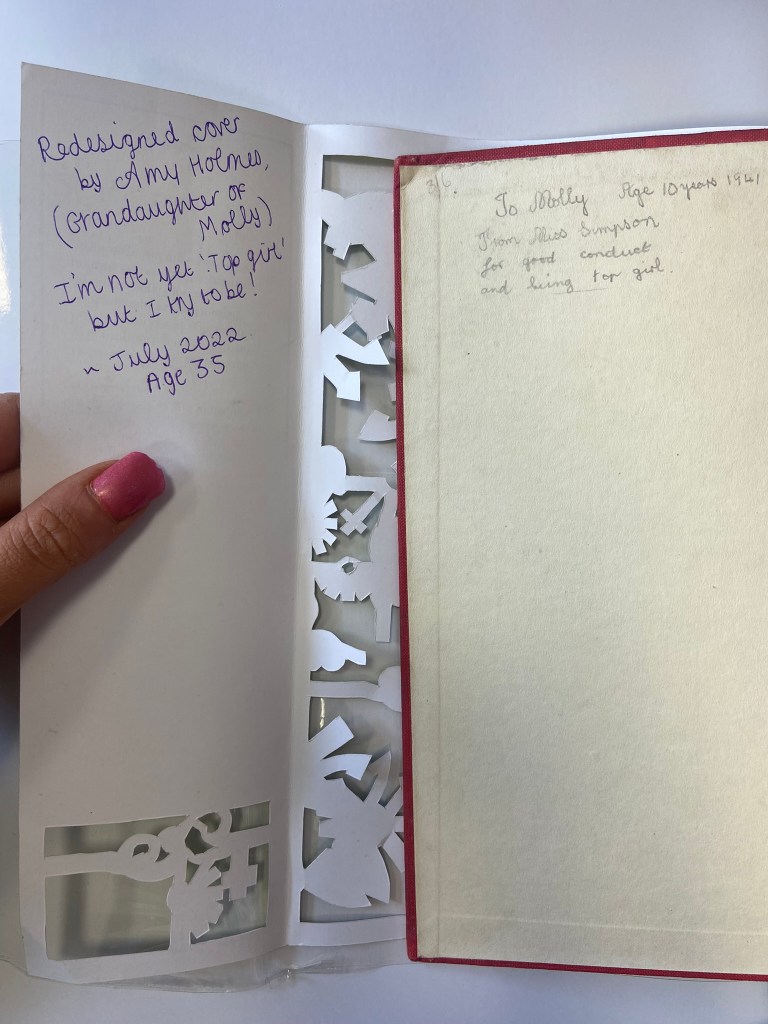
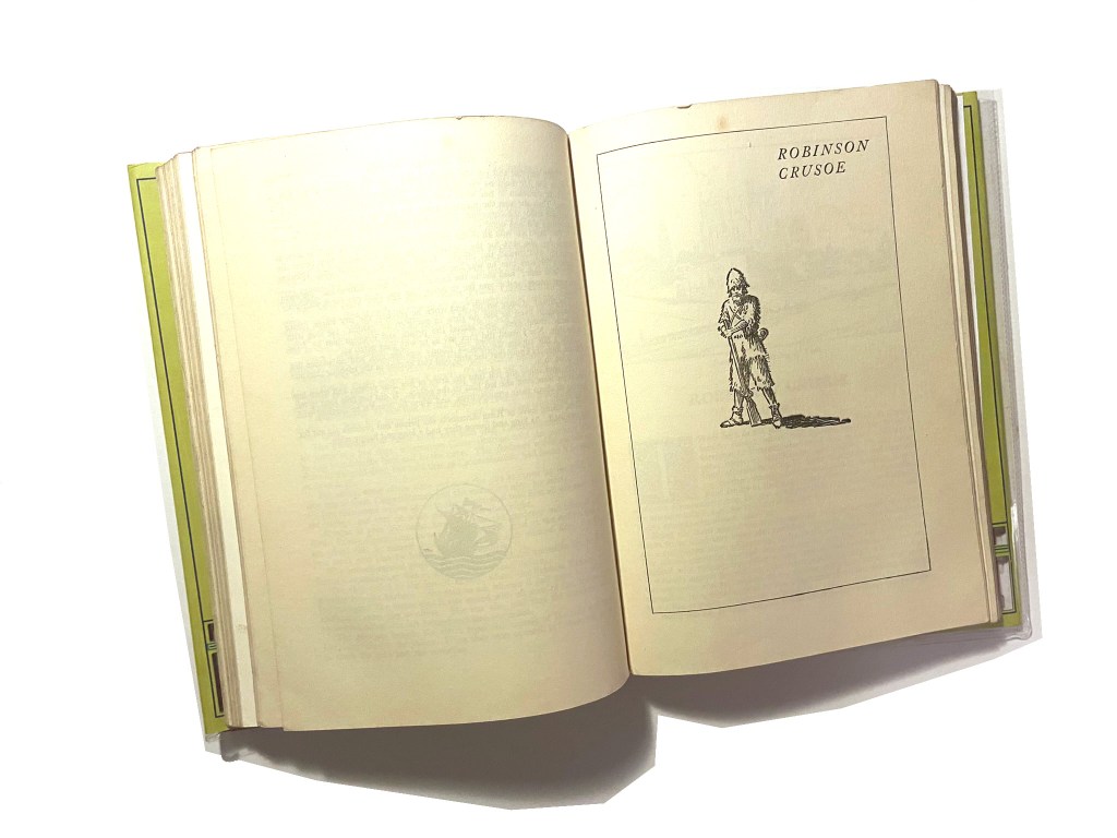
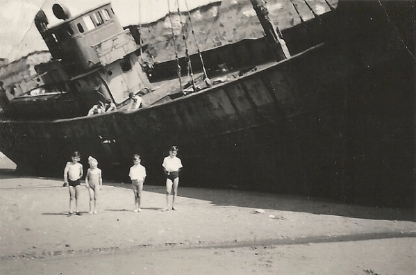
I started to research first, obviously I knew who Robinson Crusoe was and I knew vaguely what the story is about but I didn’t know enough to be able to design two books. About a week before I started this exercise my Mum had some old books that belonged to my Grandma and Grandad when they were children which she no longer wanted and didn’t have room for. For the purpose of this course and because I didn’t really want to lose them, (there’s that sentimental feeling that books give you! – trying to keep hold of them as they are heirlooms and hold their own story and history within their own right!) I took them off my Mums hands. One of the books was a thick, red, cloth bound omnibus of adventure stories of which included Robinson Crusoe which was a bonus! From first glance at the brief it states I needed to mock up my covers; I usually do this in a digital form by finding a book mockup online and placing my designs onto it. I thought this time though it would be a good idea to mock up my design onto this actual book! – it would then hold even more stories and history; firstly that it was gifted to my Grandma for being a good student at school and secondly it would have a new cover designed and made by her granddaughter 70 years later – my grandchildren might hold onto this copy and try and figure out why I designed a new cover for it so many years later! You never know, they might be artistic and add their mark onto it too!
Also, a hardback collectors edition does not need to be lightweight – they are made to purely keep at home on a bookshelf with no need to carry around so this was a perfect book to model it from.
I now had a copy of Robinson Crusoe in my hands; I didn’t have the time though to sit and read it all. I decided to cheat a little bit and find a pdf version online which I skimmed through; I also read a few summaries of the book. Reading these were interesting! There were so many takes on the story- bad and good! Some people were saying it is a marvelous tale of bravery and adventure whilst some other reviews were that it is a seriously outdated story of slavery and racism (They also used the image to accompany their review of Desmond out of Lost which confused me because I couldn’t see the link between the two!! *shoulder shrug) I could see both sides of the argument but also understand that is it an incredibly old story and times progress and evolve!


The key points that I picked out from the story were:
- Friday – the slave boy that Crusoe rescues from the island and brings back home.
- The cross that Crusoe builds on his arrival to the island – to use as a religious artefact but also to use as a calendar to tally and scratch the days off onto.
- The Parrot, Goat and Dog that he owned on the island
- The Cannibals and mutineers that he had to avoid
- The footstep in the sand that he found which petrified him and reminded him that he was not alone on the island.
Having had a quick glance at covers they all seemed to be based around the same ideas; the island, sun, sea, sand, parrots, illustrations of Crusoe in raggy clothing on the beach… I did not want to create another cliched cover. I wanted to try and venture outside of the box and design something that wasn’t completely obvious.
I went onto Pinterest to start off with and researched more into the different covers and even just shipwrecks, sea and being a castaway in general just to come up with some ideas, colours and moods.
As I was on a tight timeframe I didn’t want to waste any time I had in trying to research into covers as I knew that this assignment wouldn’t be a quick process! – therefore even sitting in bed at nights I was looking at Amazon, Ebay and Instagram to see their copies of Robinson Crusoe!
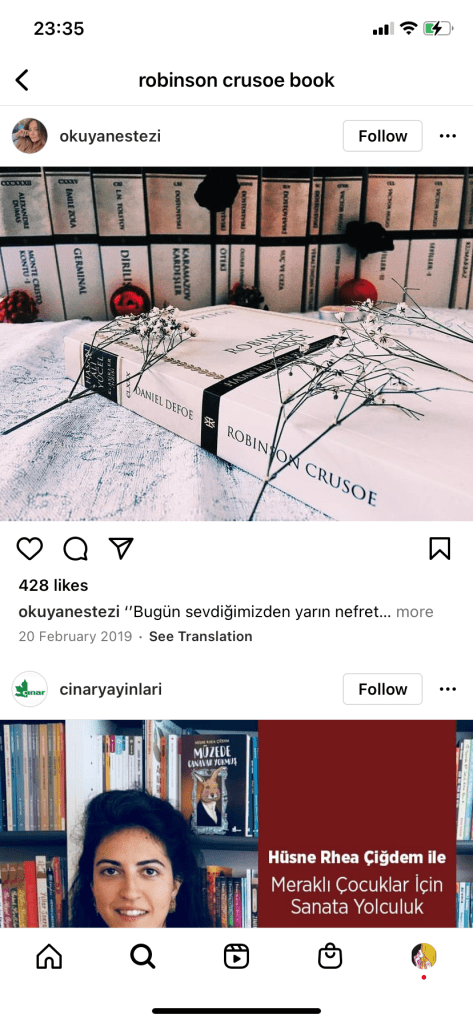


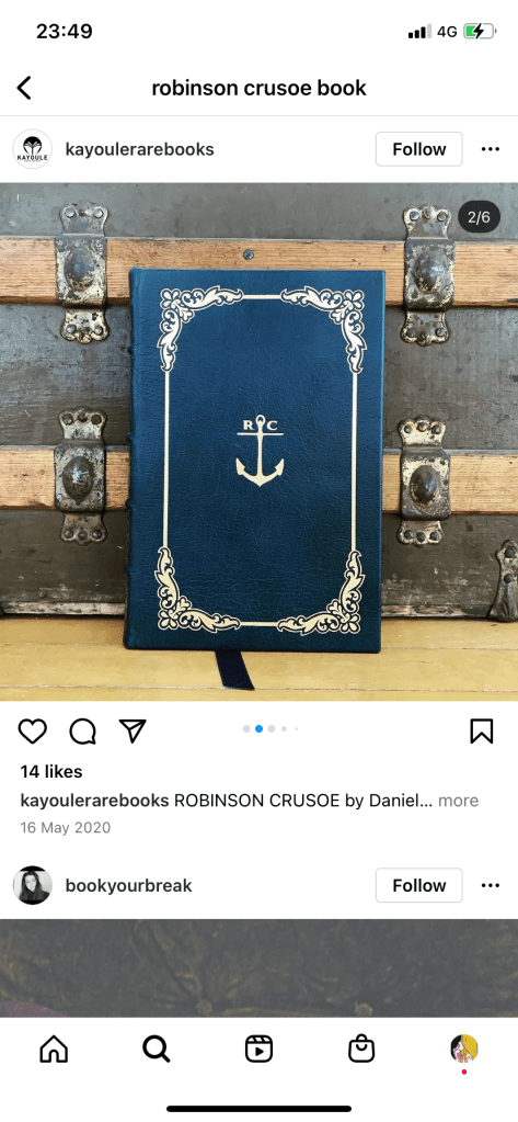
I liked the cover above with the anchor and the simple RC. This gave me sailing vibes and the anchor definitely relates back to the sea. The ornate border around the outside gives it a classic feel but also relates back to the era of the book.
I even found myself looking at the book section in Tesco every time we went for a shop just to see what cover designs there were for similar books or any book actually! I wanted to see what different covers existed that I could steal some inspiration from! I found a few:


These intrigued me because I was under the impression that for paperback books you didn’t generally have coloured tipped pages.
The book below was interesting becasue the inside box was cut out to reveal the page underneath. The cover also ran short on the right hand side – it gives the impression of the sun moving across the sky at certain times of the day. The cover is very simplistic as well. It is bold and catches your attention.

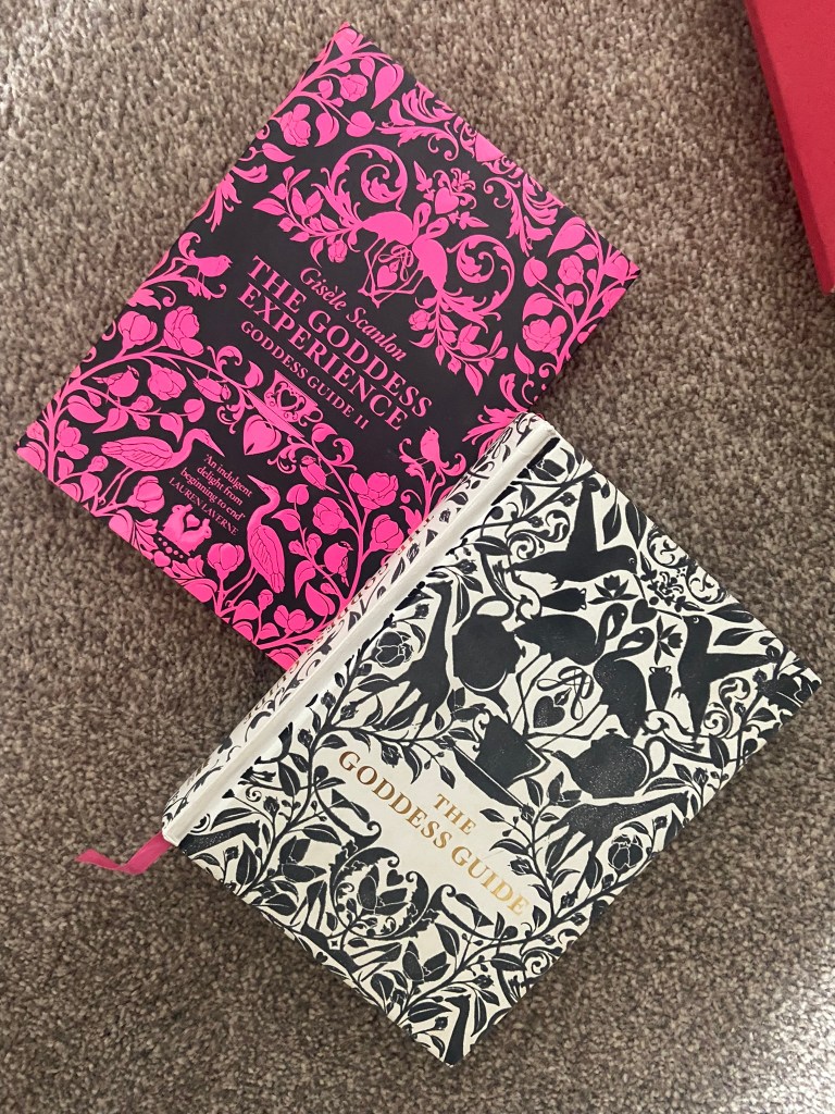
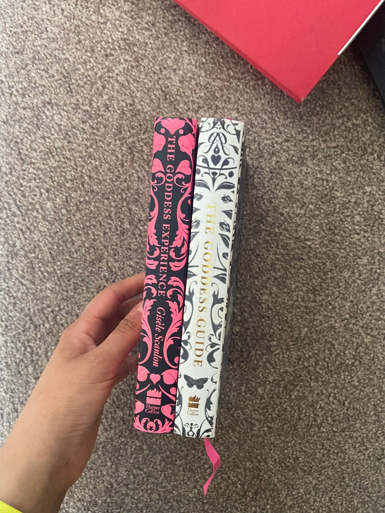
I also found the Goddess Guides on my sisters bookshelf; I totally forgot these existed given the fact that the white copy used to be mine and I bought her the pink copy as a birthday present! These are beautiful covers! The covers have a fuzzy felt feeling! – really soft and luxurious to touch. They also feature a repeat pattern which is where my ideas were leading…
I also went into our LRC at work and had a look at a few copies in there to see what designs already existed:

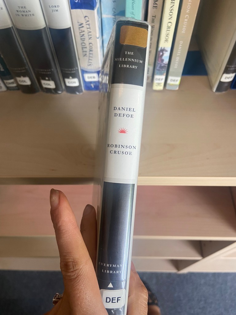
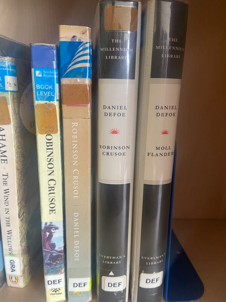
These were very basic, uninspiring copies. They also seemed very dated and not very contemporary in feeling.
One cover that I found that really intrigued me was the cover for Robinson Crusoe that Coralie Bickford-Smith designed. It was quite coincidental as well considering she was one of the designers from the previous exercise that we had to research into and also considering that before I started this unit I had no idea who she even was.
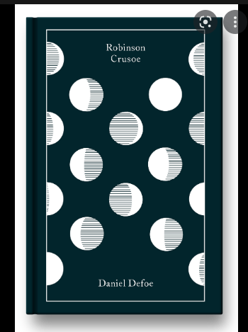
This wasn’t an obvious cover design for the story – not any of this design represents being shipwrecked, sea, sand, island.. parrots! – it shows stages of the moons using hatched lines. Why the stages of the moon? it shows time – time spent and lost on the island. It is a very clever approach and really makes the cover more intriguing. It would definitely makes me pick up a copy and question and try and work out how the cover relates back to the story and what the story could be about. This is the sort of design outcome I wanted to achieve. I also liked the simplicity of it. There is beauty in simplicity – good design doesn’t need to be complicated.
Coralie Bickford Smiths cloth bound covers also interested me in the previous exercise and I wrote about how I would use the influence and inspiration from these to use in my own.
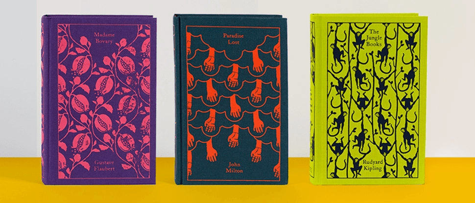
The other books I wrote about in the previous exercise that influenced me were the seasons editions designed by Kate Armstrong:
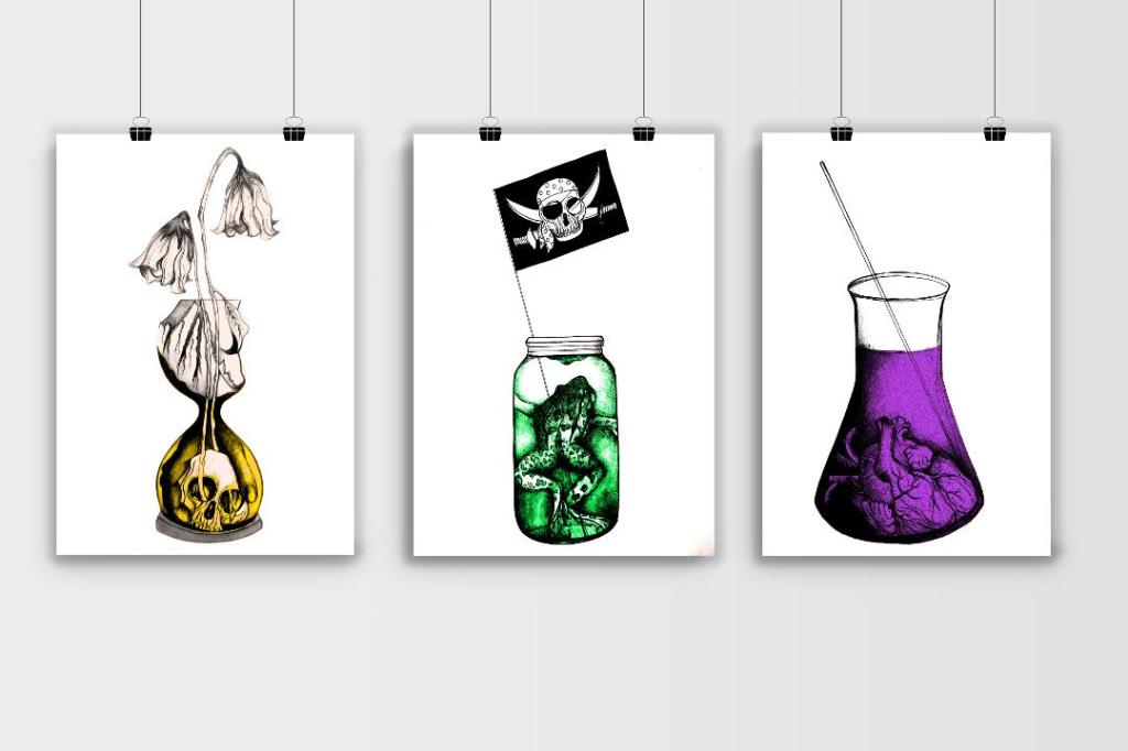
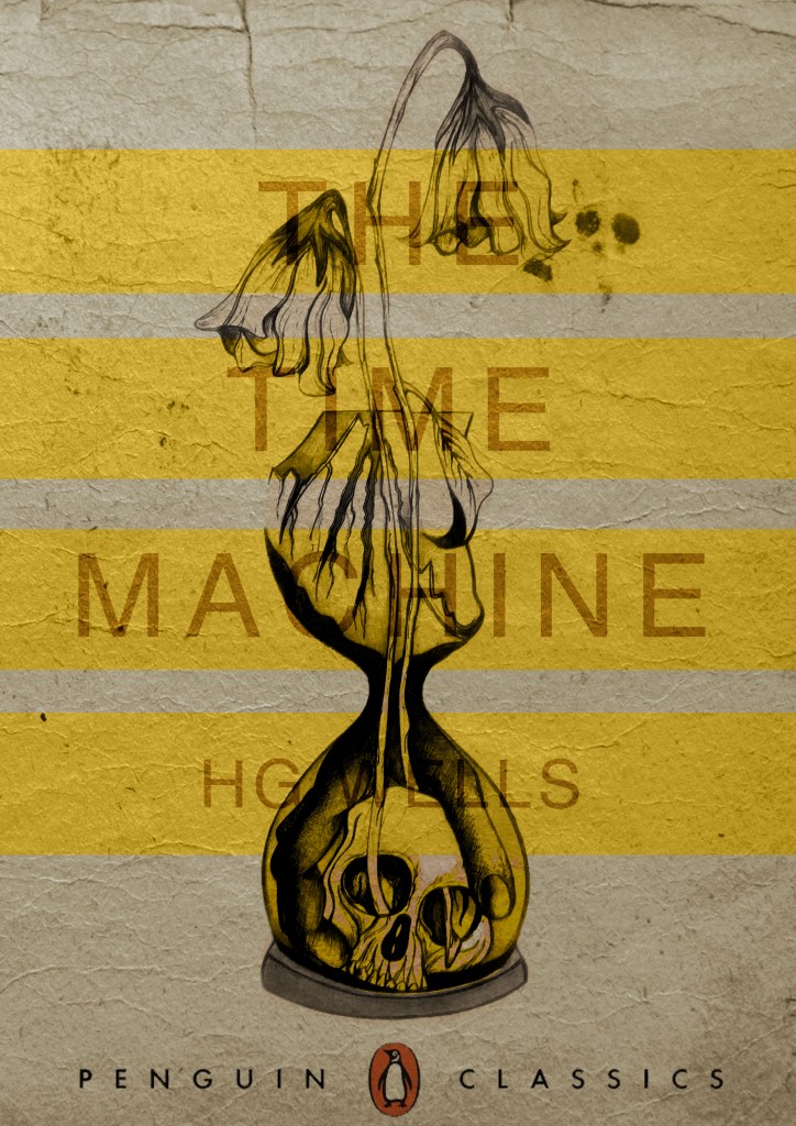
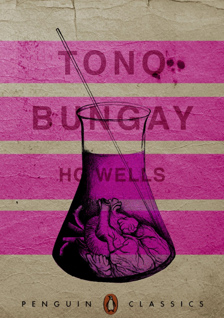
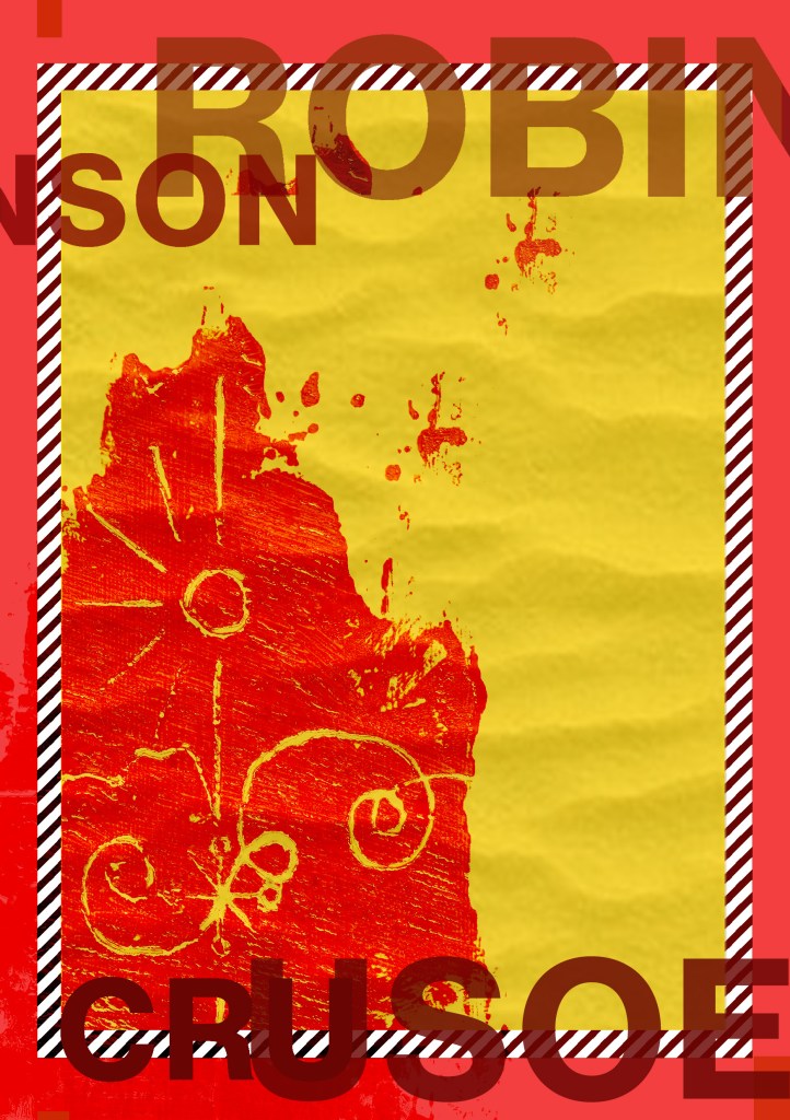
Initial ideas for Hardback collectors edition of Robinson Crusoe
I decided that for the hardcover version of Robinson Crusoe I would like to create something similar.
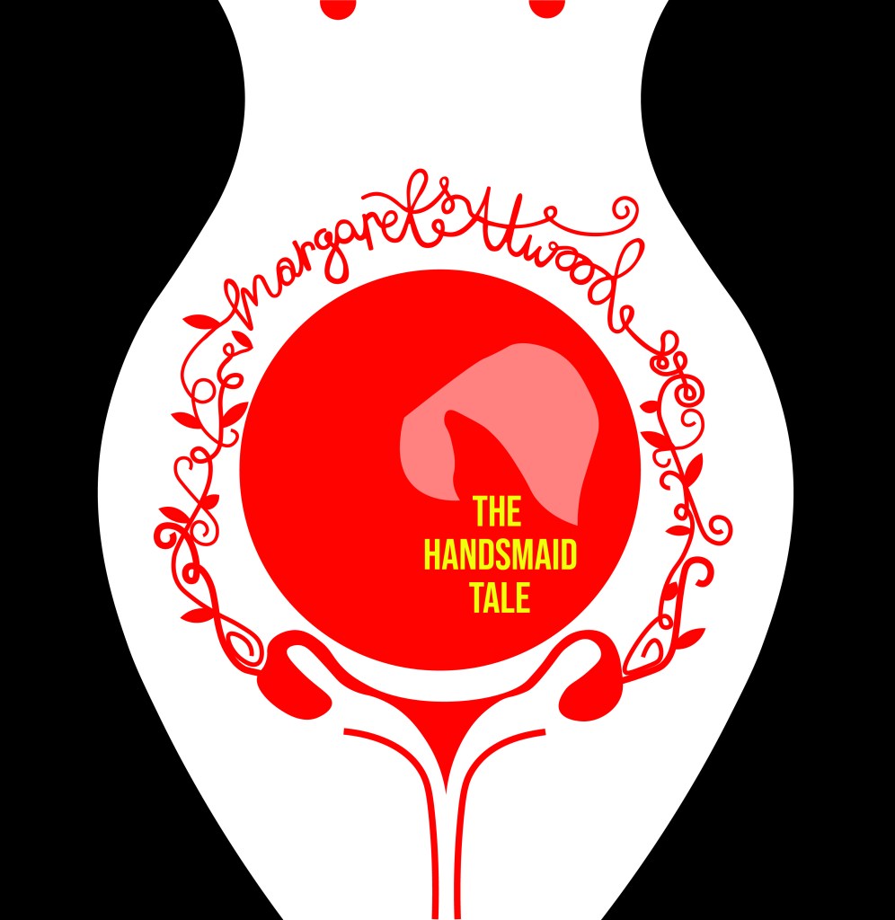
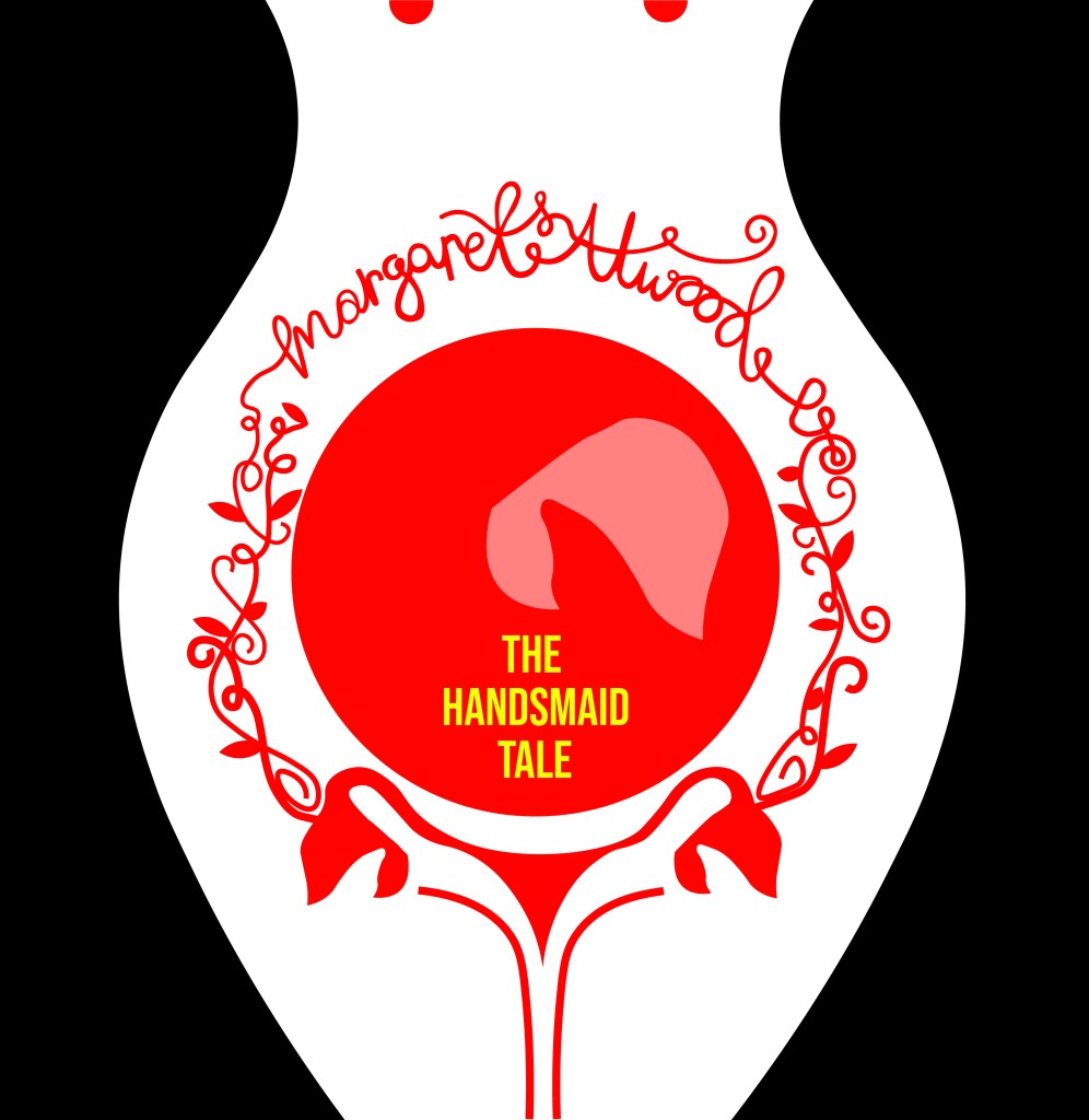
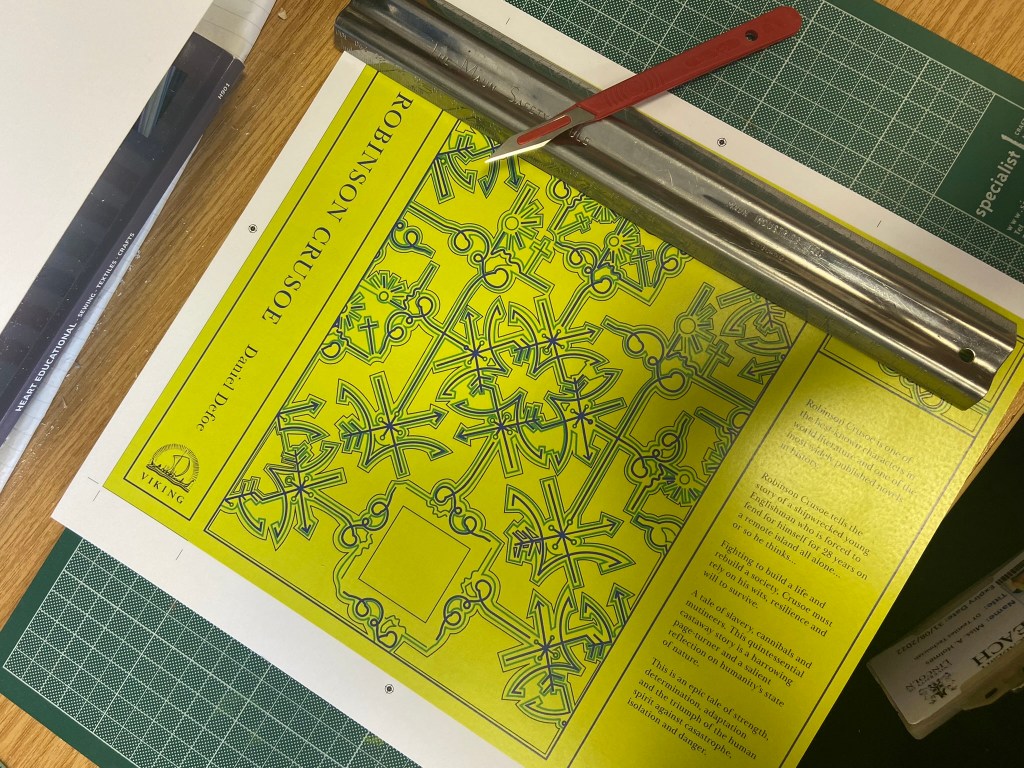
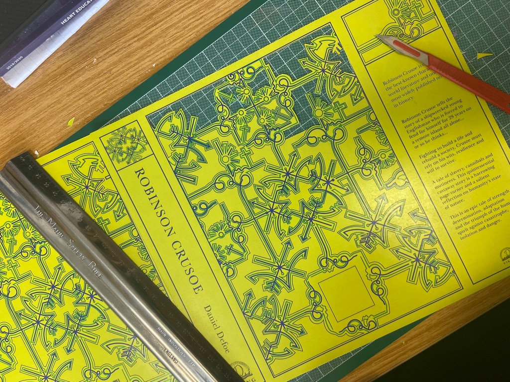
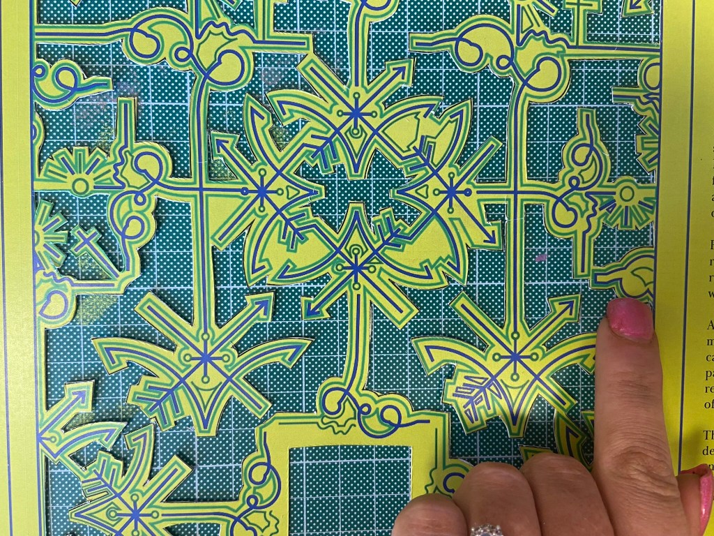
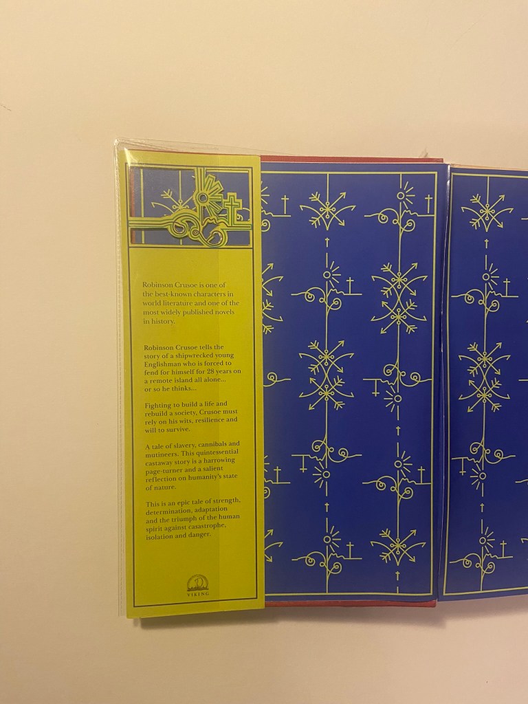
I wanted to take inspiration from both the above designers but for my design to not be too similar. I decided that the original book I was going to use of my Grandmas to mock the design onto was already cloth so I could have a paper cover and try and laser cut a design so that the cloth book showed from underneath the design. This would give a classic, contemporary look. I also have a laser cutter at work so felt that this wouldn’t be too much to achieve! I just had to figure out the design and then try and create a path around it in which it would be cut.
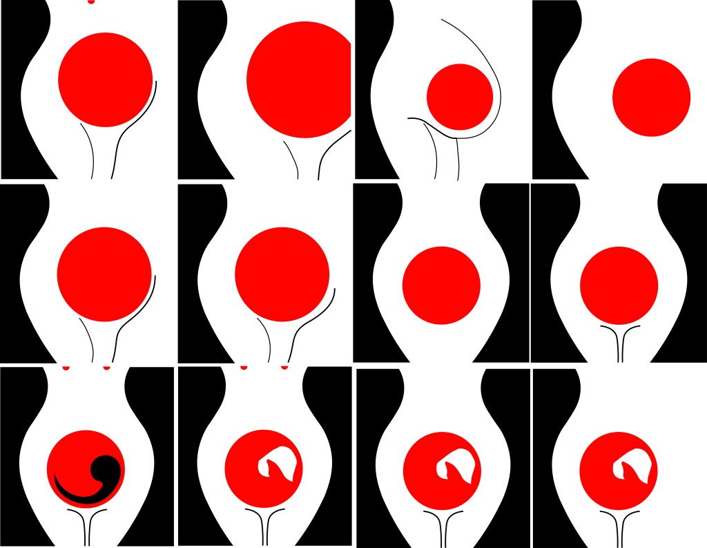
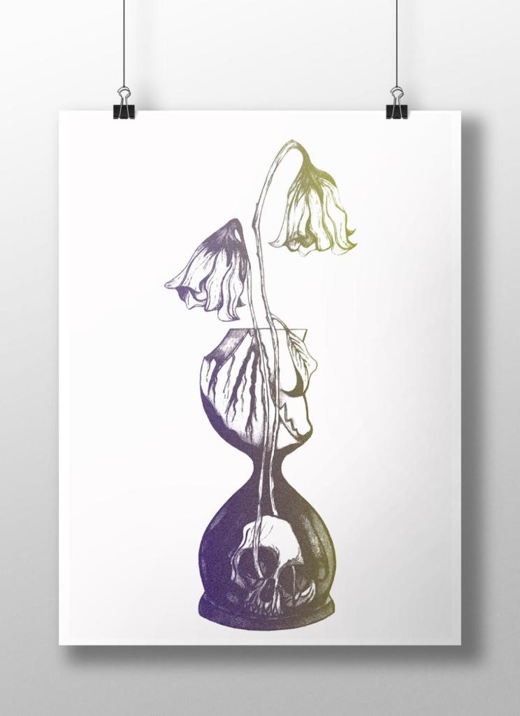
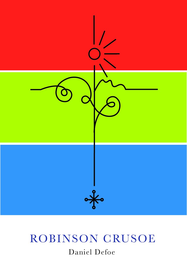
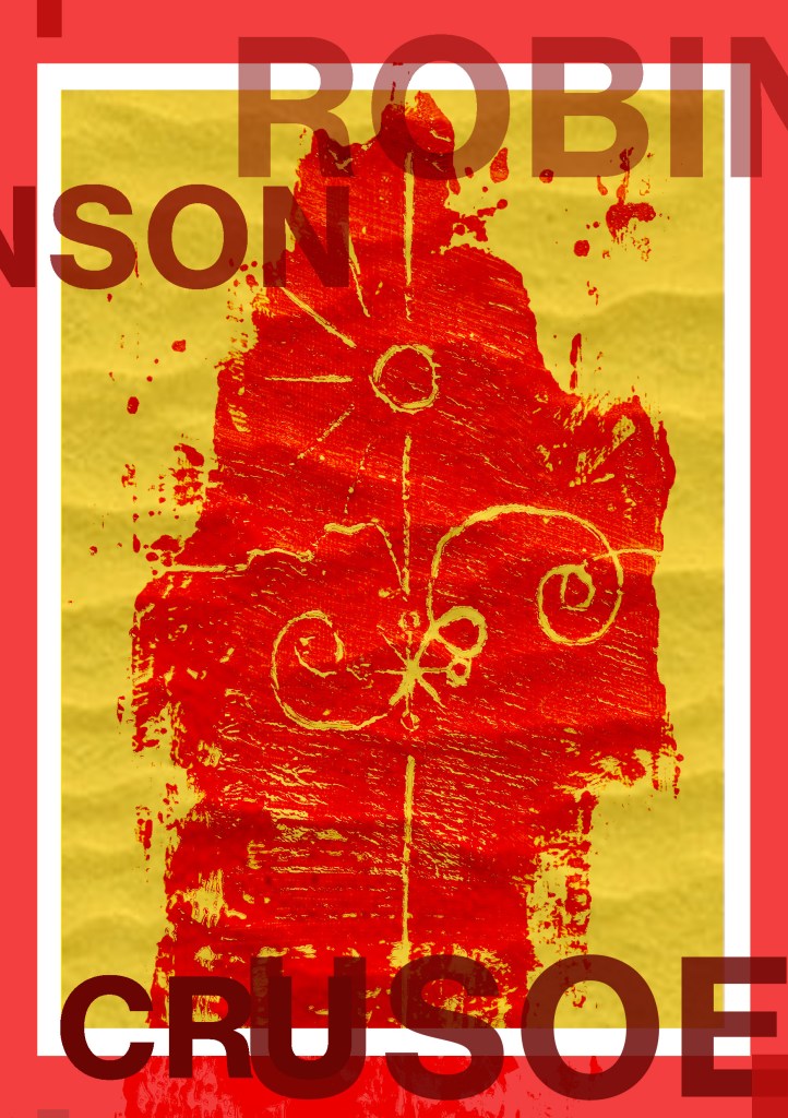
Knowing what to do for the design that wasn’t cliché and like everything else I had seen was challenging at first. I knew I wanted simple and an old exercise from many years ago when I was at college reminded me of how to go about it – take a complicated image and strip it down to its bare essentials. A bit like this assignment about form and function – take something down to its simplest.
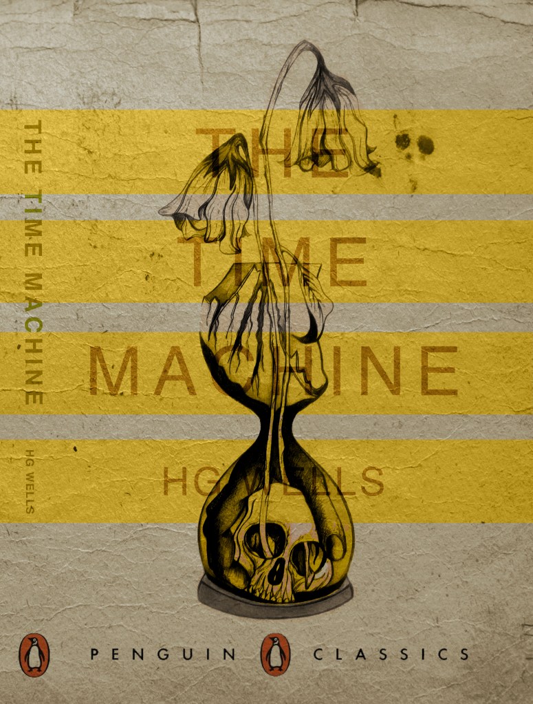
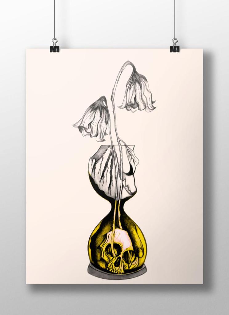
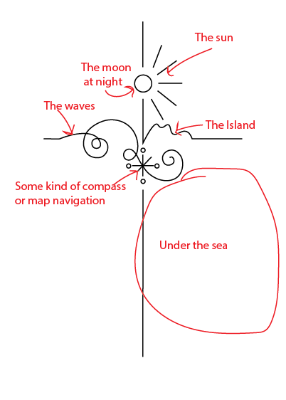
The cross kept coming back into my mind because it had 2 significant meanings – 1) for the calendar it was used for and 2) for its religious impact on Robinson Crusoe and how it helped keep his faith throughout his time of being stranded. The religious aspect would have also been more meaningful in the 1700s when the book was written – it shows the history of the story.
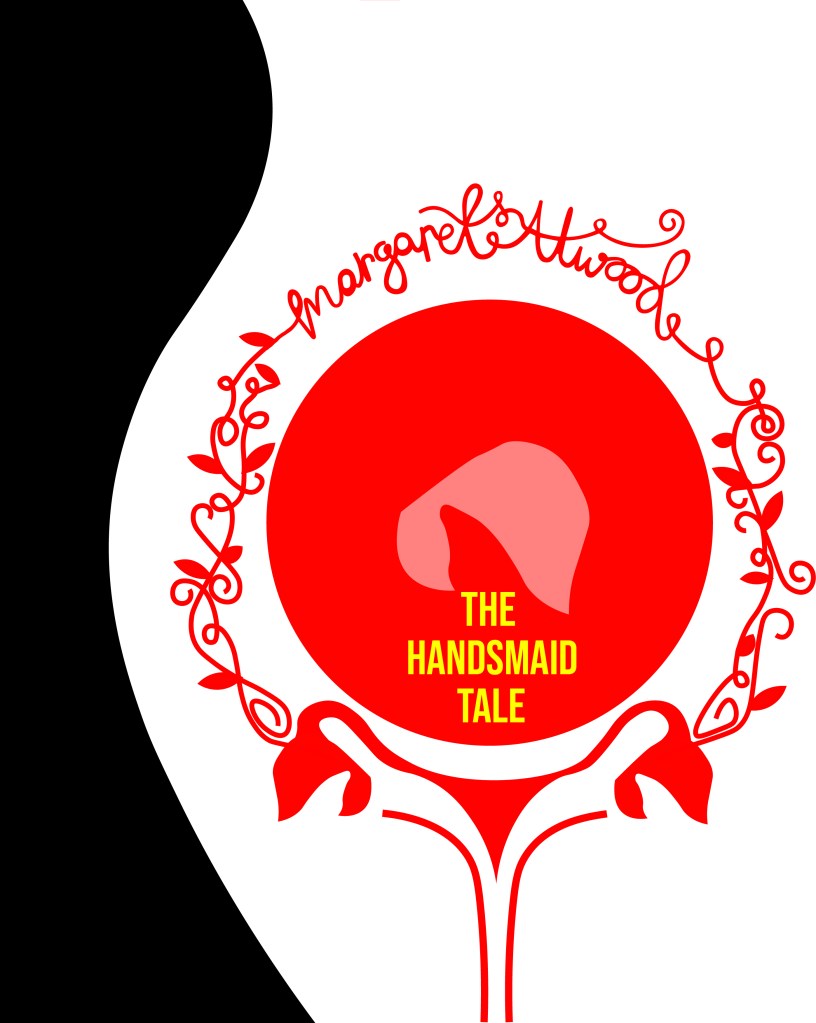
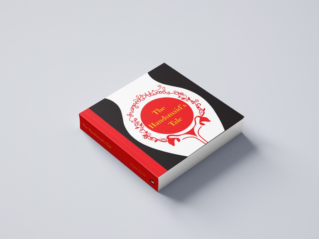
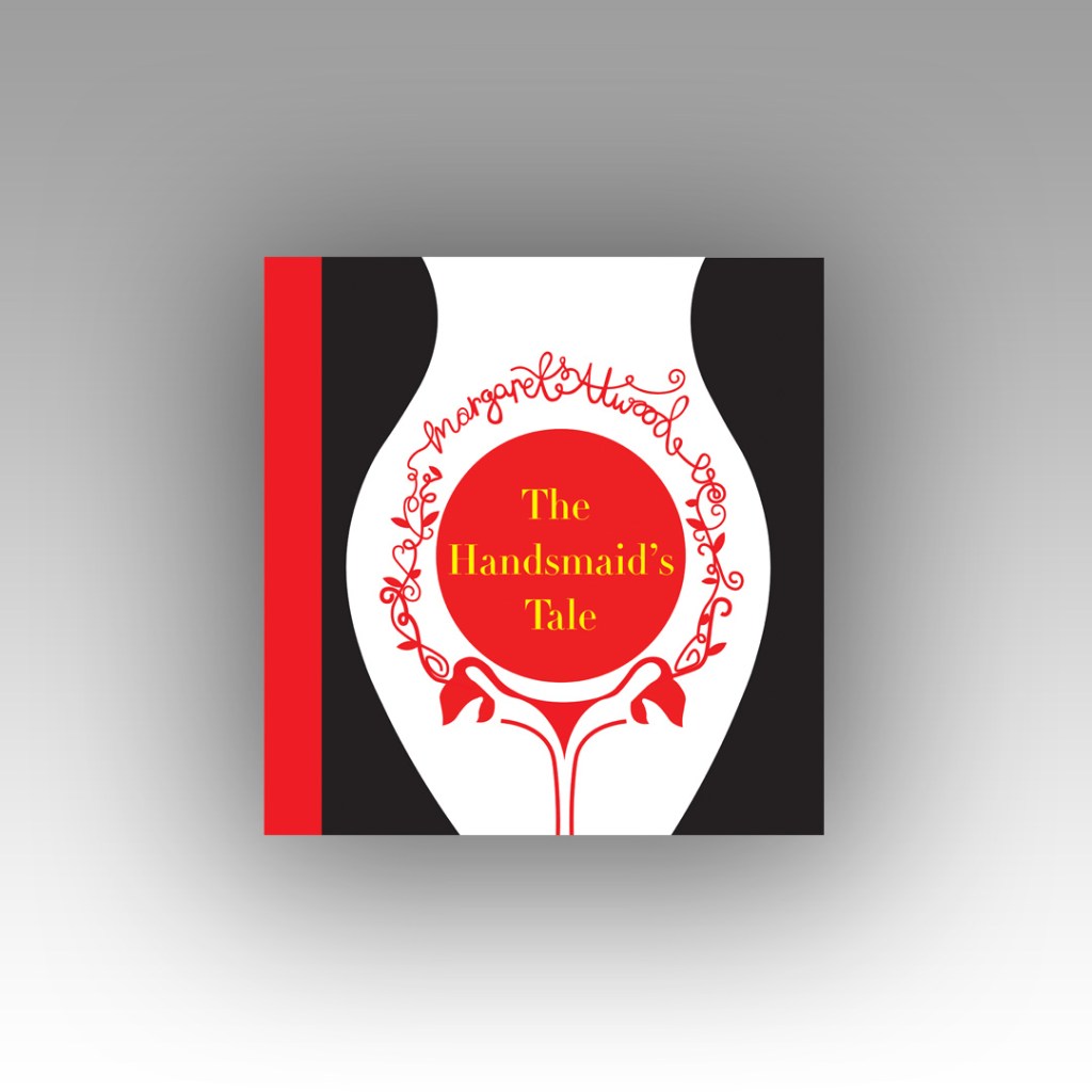
I didn’t want to just show a cross on the design though because this would indicate it is a religious book to the unsuspecting reader. From researching Bickford- Smiths covers and Kate Armstrong’s I wanted to mirror something similar in the way they used a repeat pattern to cover the cover. I started sketching ideas around the cross and other elements of the story to see what I could come up with. In the back of my head remembering to strip everything down to its simplest form.
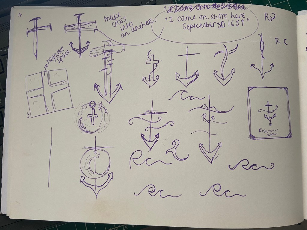

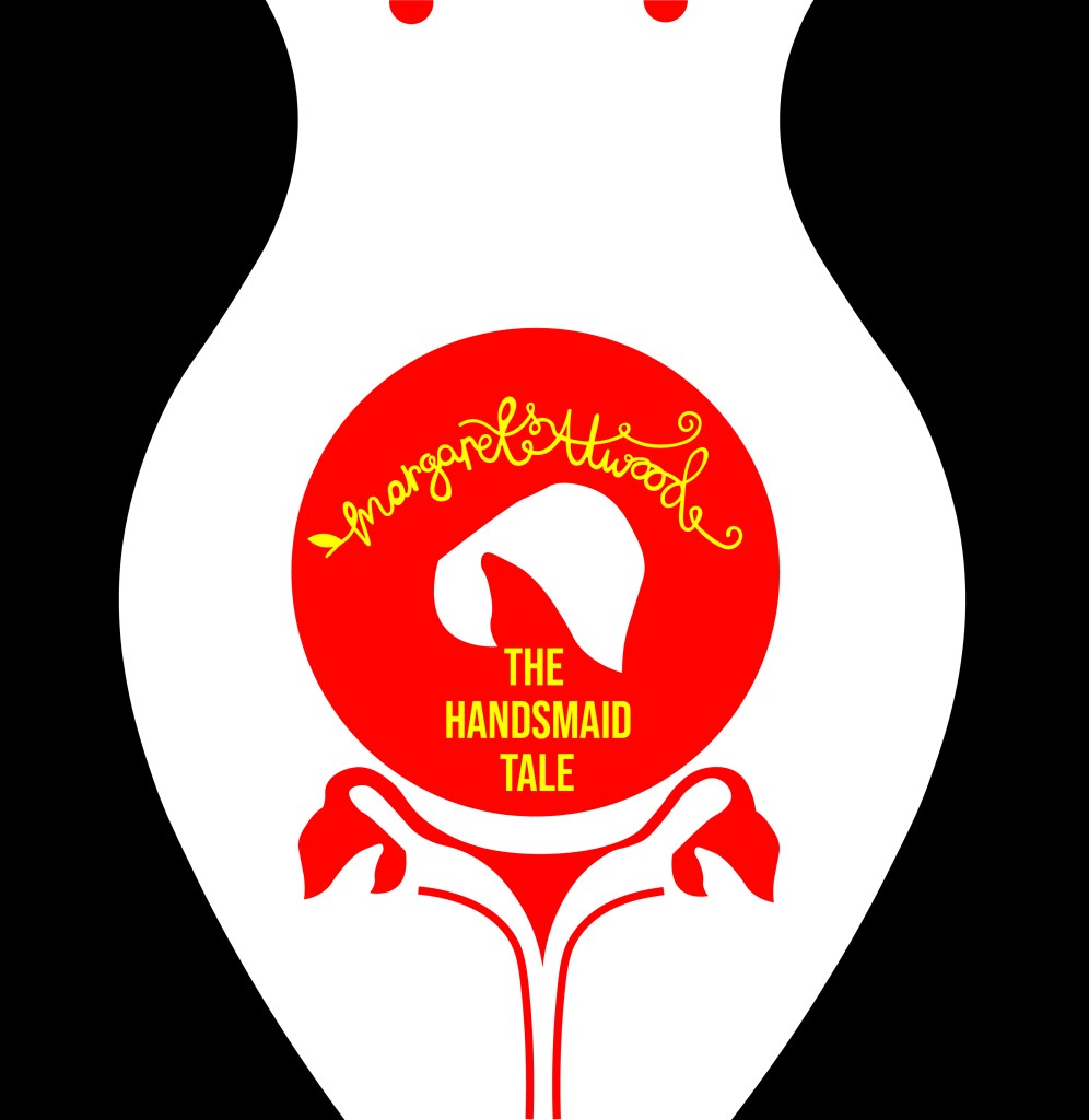
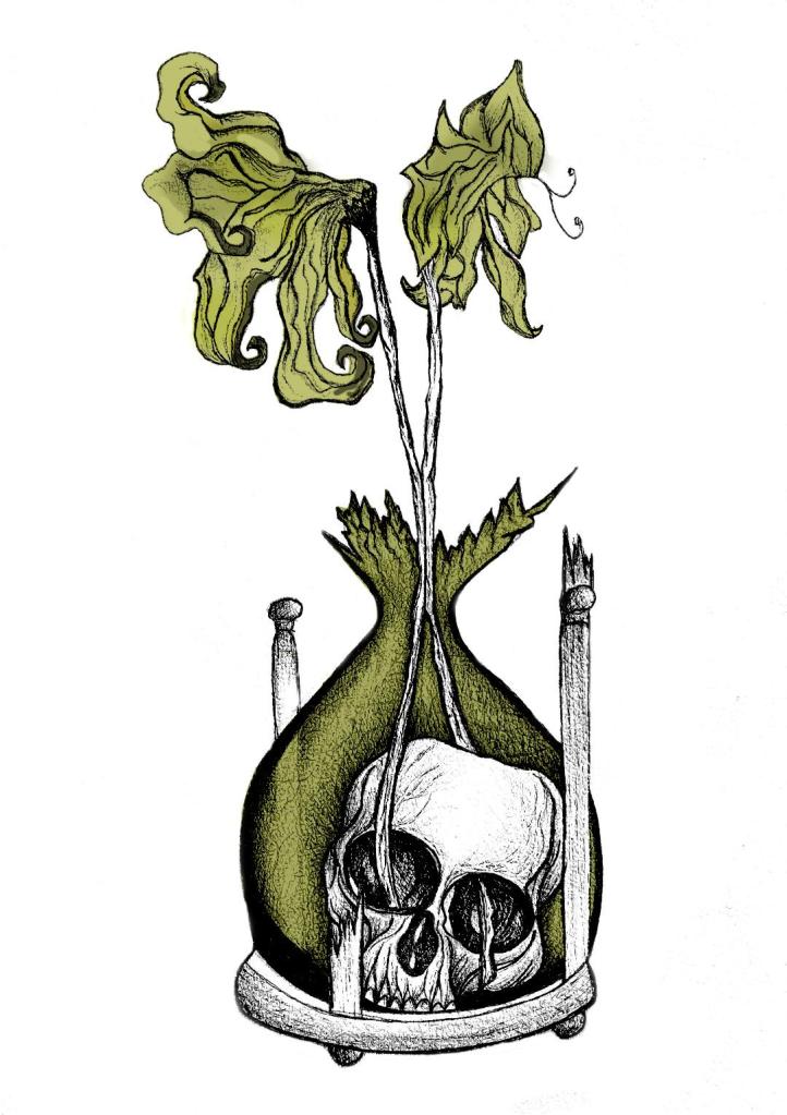
I was trying to from a cross as part of an anchor (remembering the cover above I talked about that gave me inspiration with the anchor and the RC) Could I form the rest of the story in with this simple illustration? Could I add some waves and the island and it become a symbol yet an image that is easily understood what it is?…
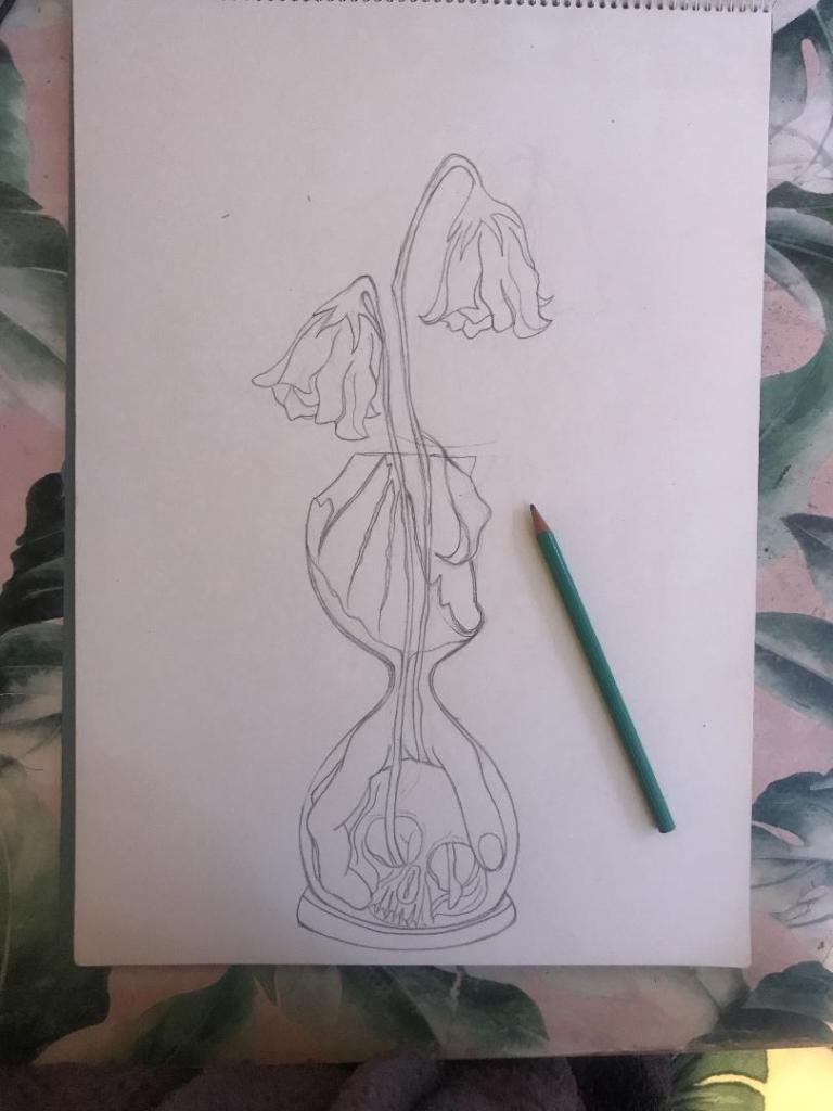
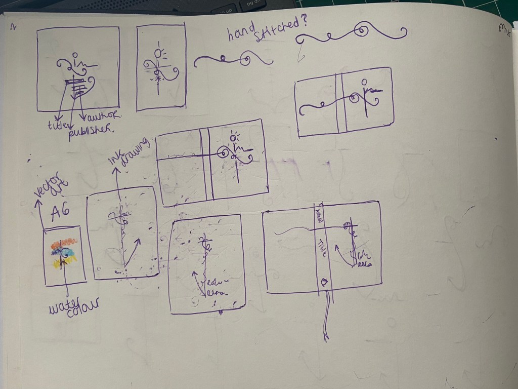
I took a photograph of one of the sketches and imported it in to trace around in Illustrator and create some artboards of different ideas to compare and develop.
I started by measuring my Grandmas book; width, length, width of spine… to give me the dimensions for my document. Once I had the correct size document I then traced around my sketch.
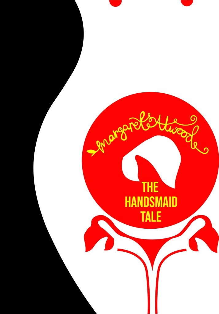
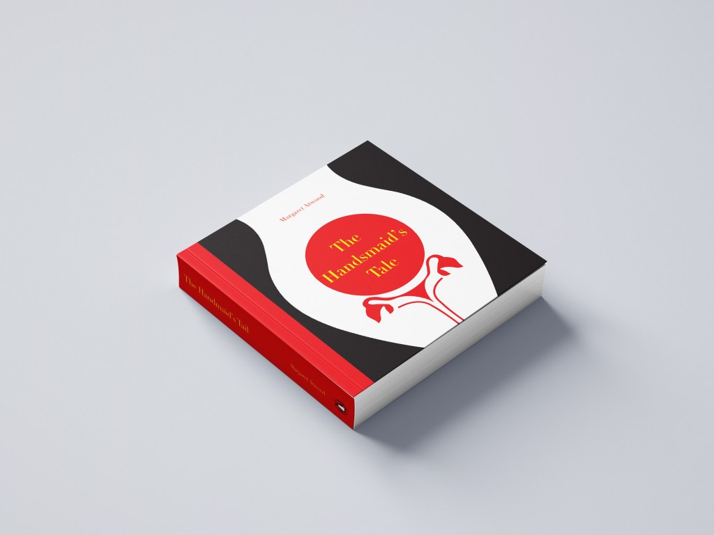
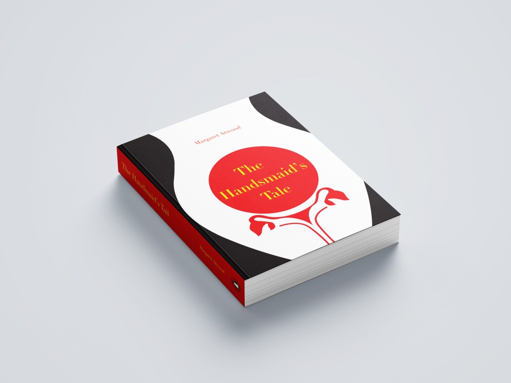
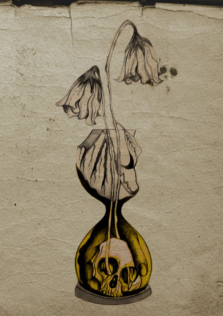
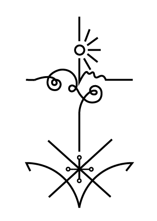
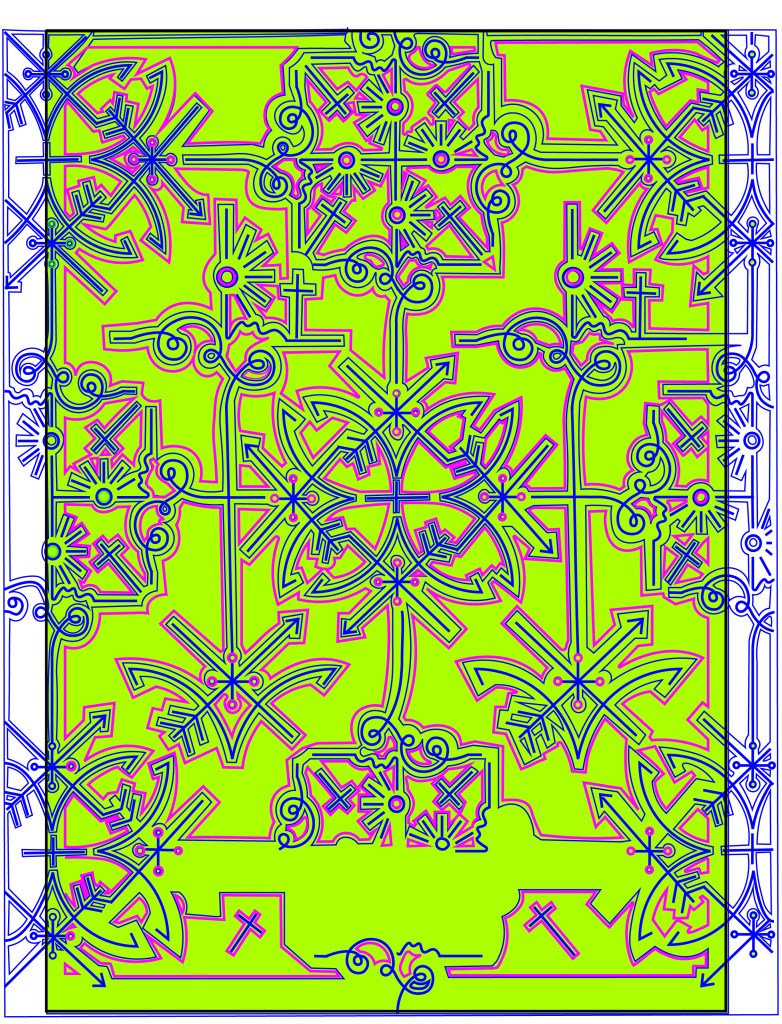
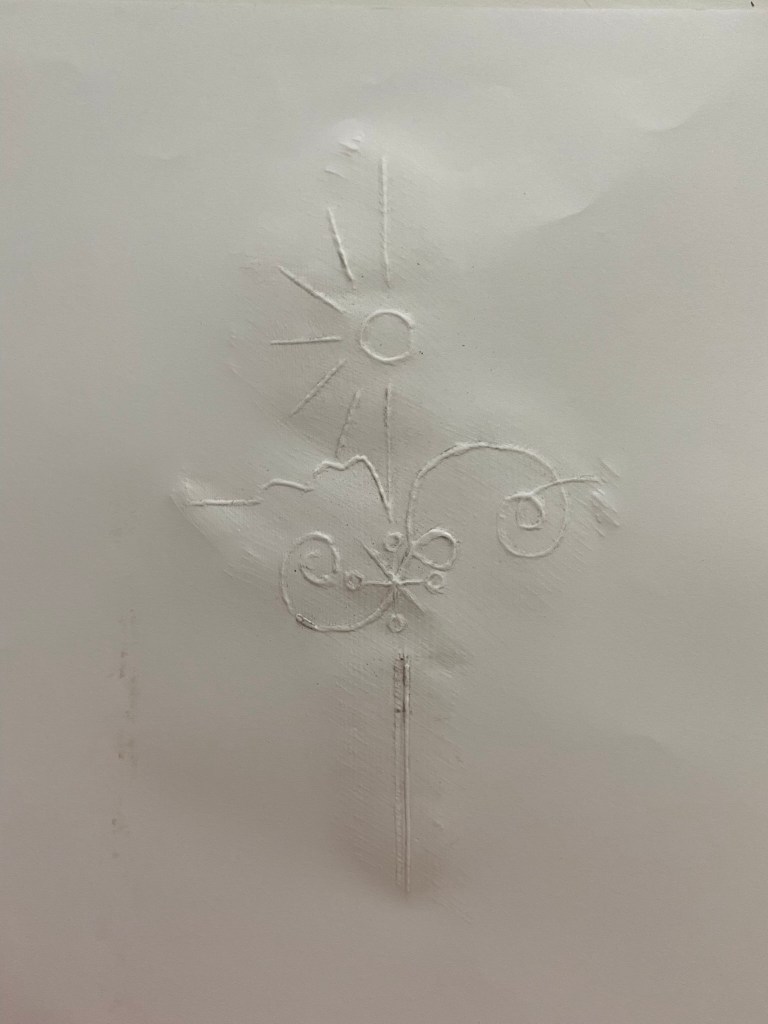
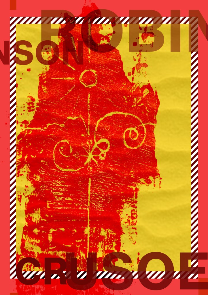
The simple outline I ended up with was this:

Here it is explained!
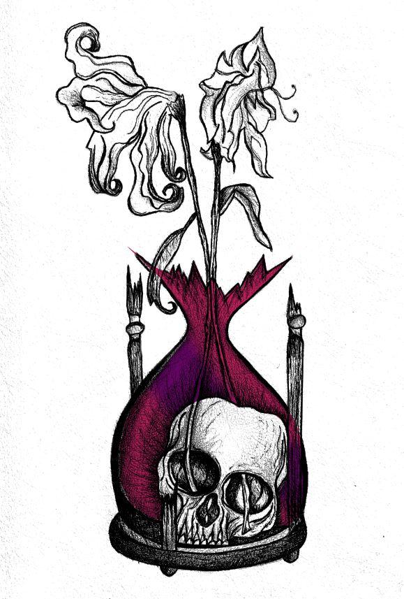
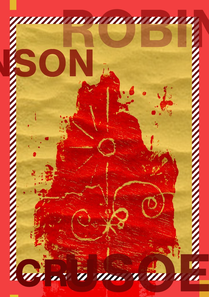
I played around with putting an anchor at the bottom of the design but I felt it trapped and constrained the design – it felt like it had more space to breathe and more negative space being empty at the bottom.
I felt it had potential… I messed around with it as a single image on a cover and by accident ended up unknowingly at that point with the design for the paperback edition! However… for this version I did change my mind and make the design into a anchor at the bottom, I felt it just explained the image more.
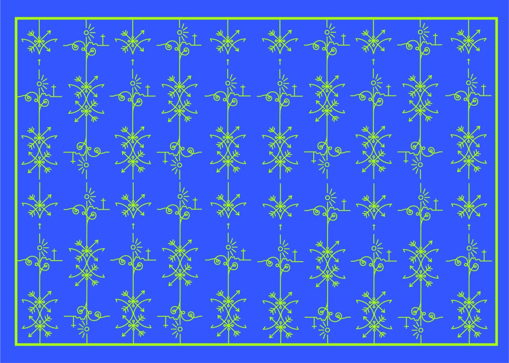
At this point though I had to figure out a way to repeat the design to make a repeat pattern and then work out a way in which I could laser cut it out to make the final cover!
I played around with the design below and felt it was moving in the right direction but it wasn’t quite there!..

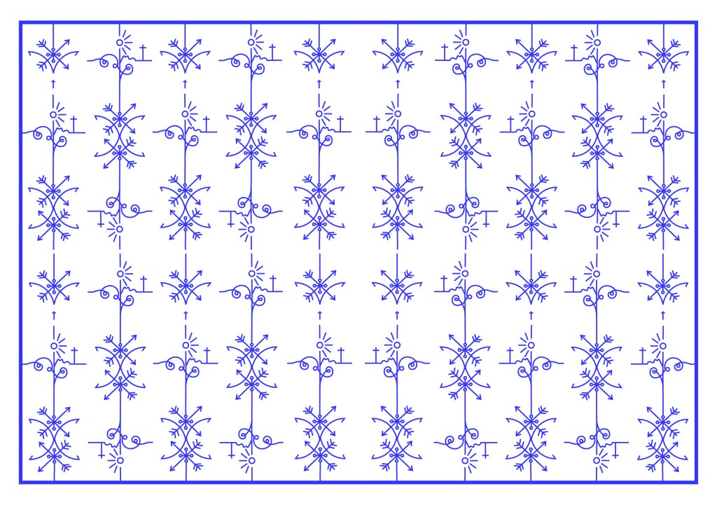
I played around a lot more until I came up with this:
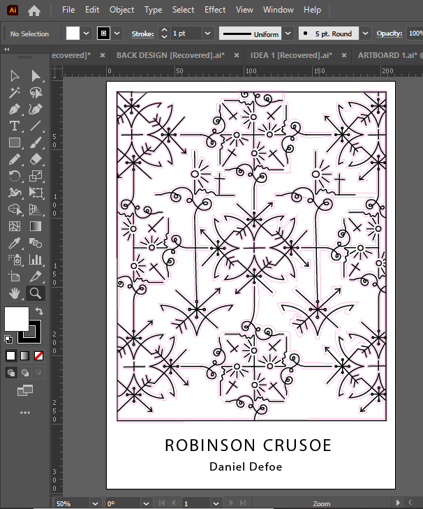
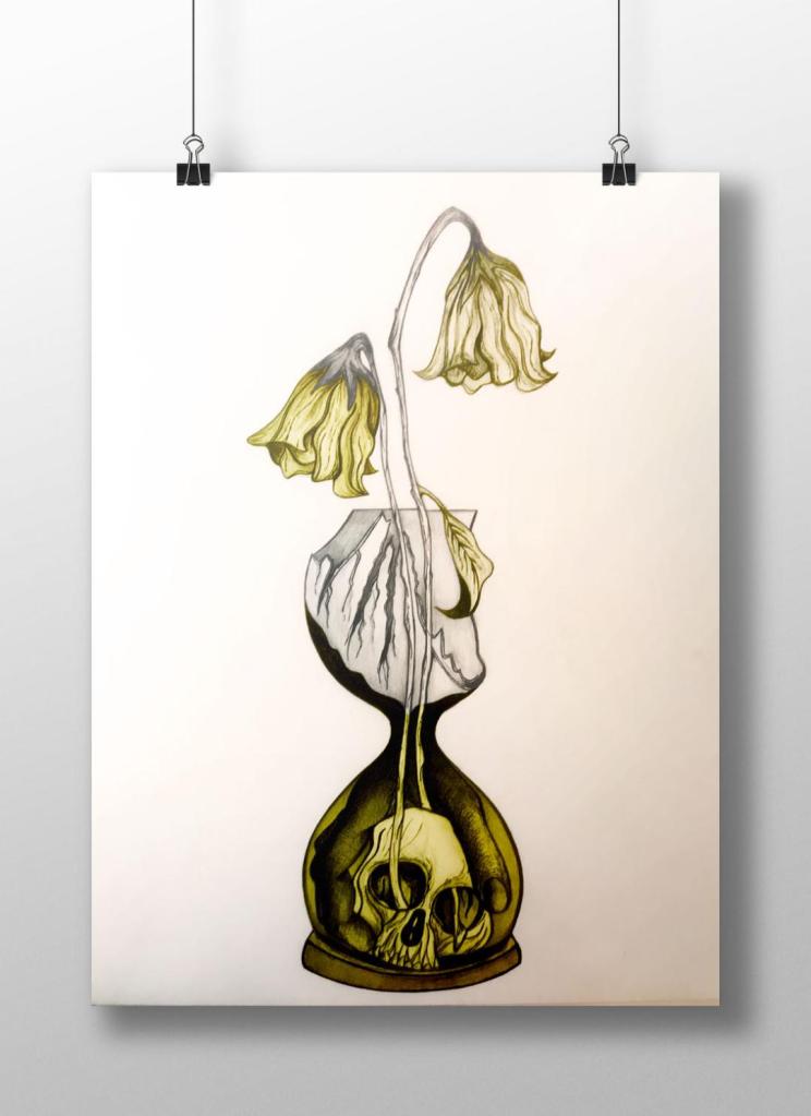
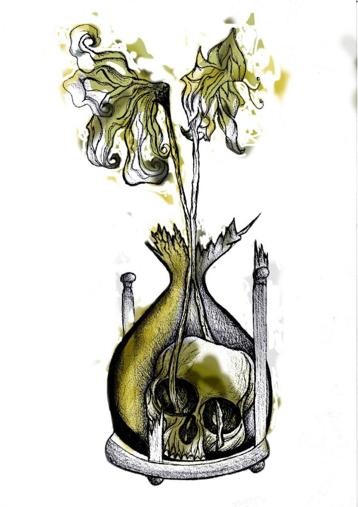
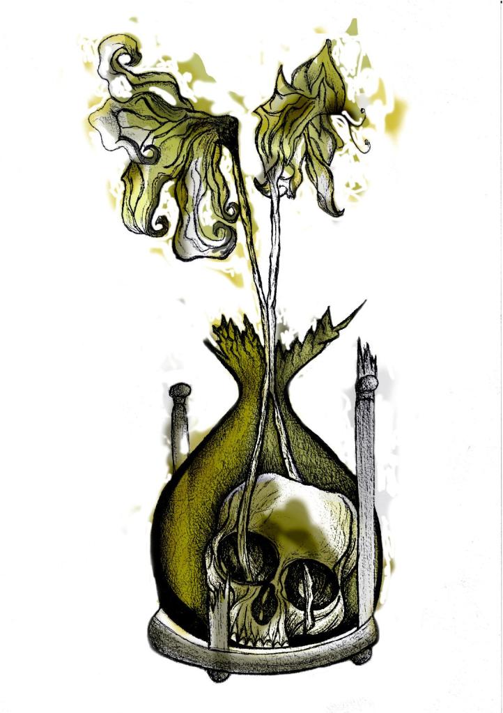
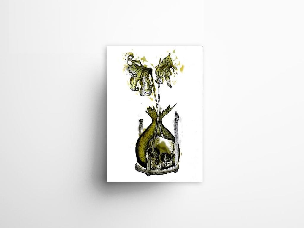
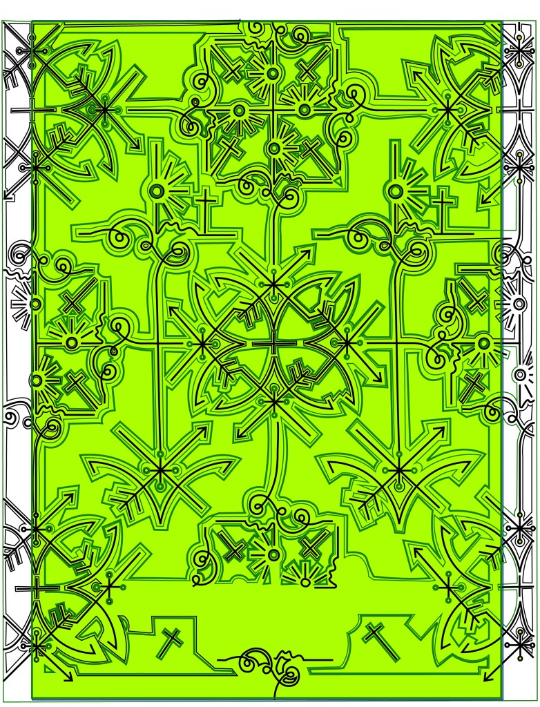
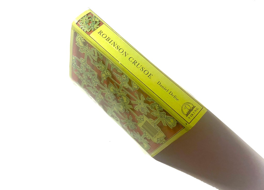
This looked classy and contemporary. I liked it. All the design is was the simple line drawing repeated and rotated at different angles to form a repeat pattern. Now I had the basis for my design I needed to create a path around the design so that I could laser cut it out eventually…
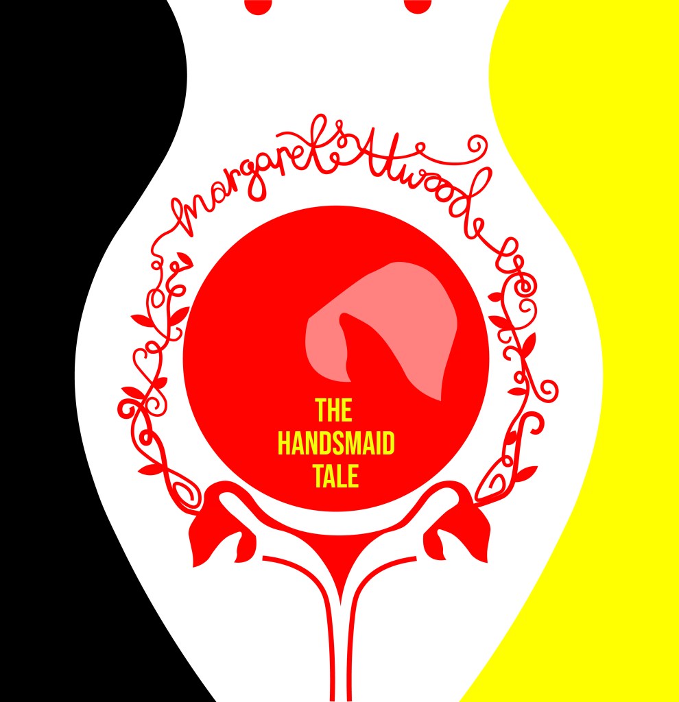
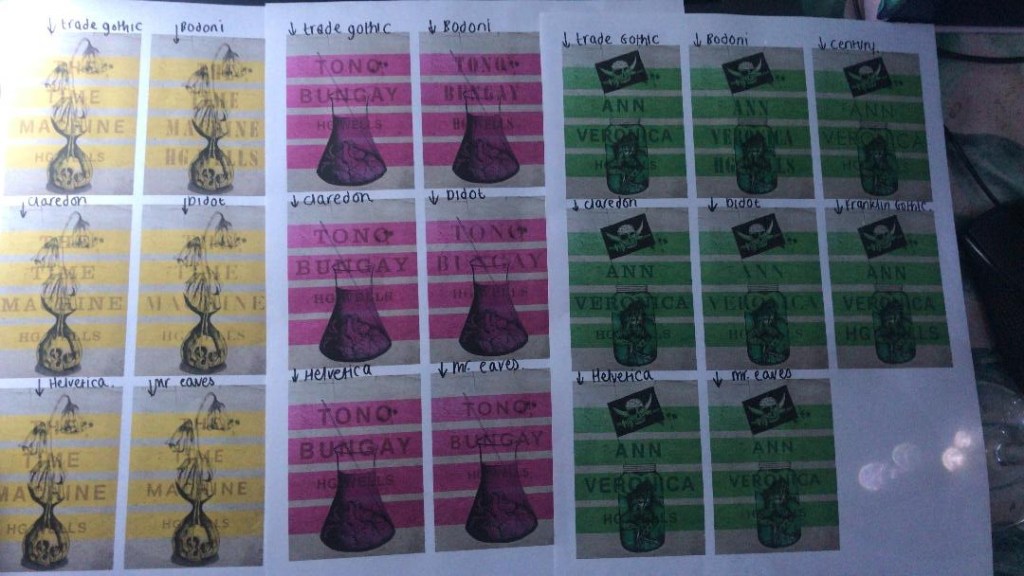
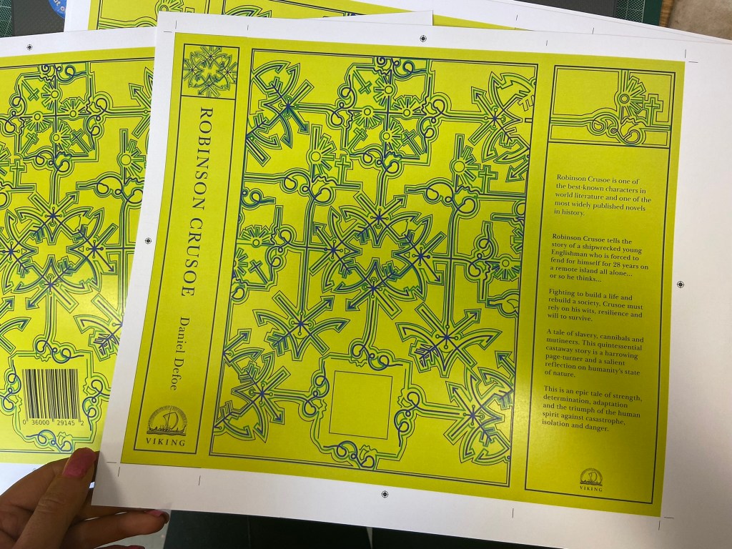
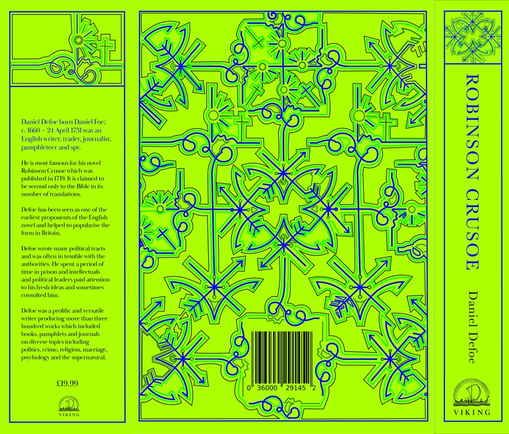
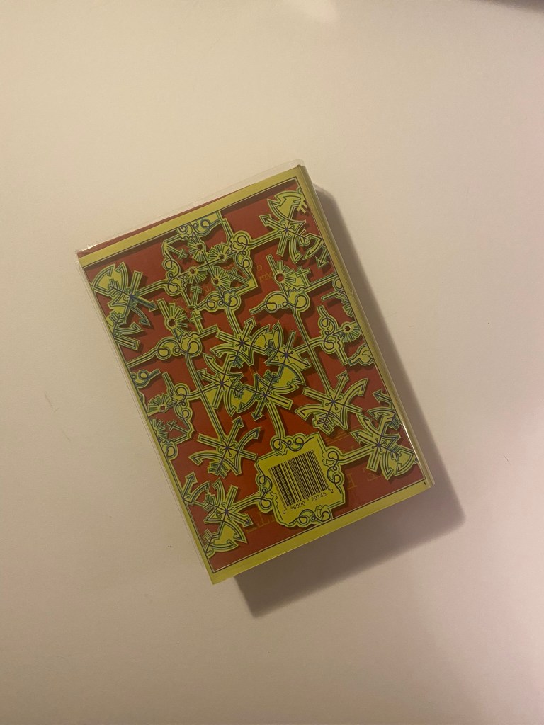
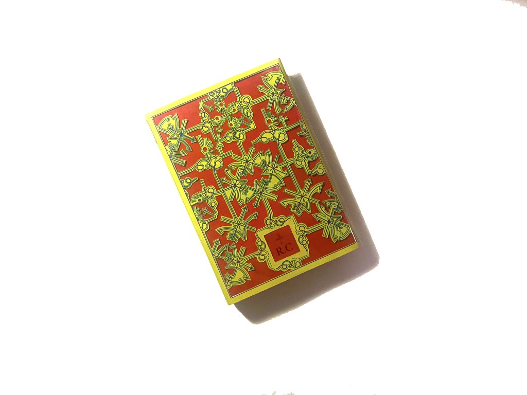
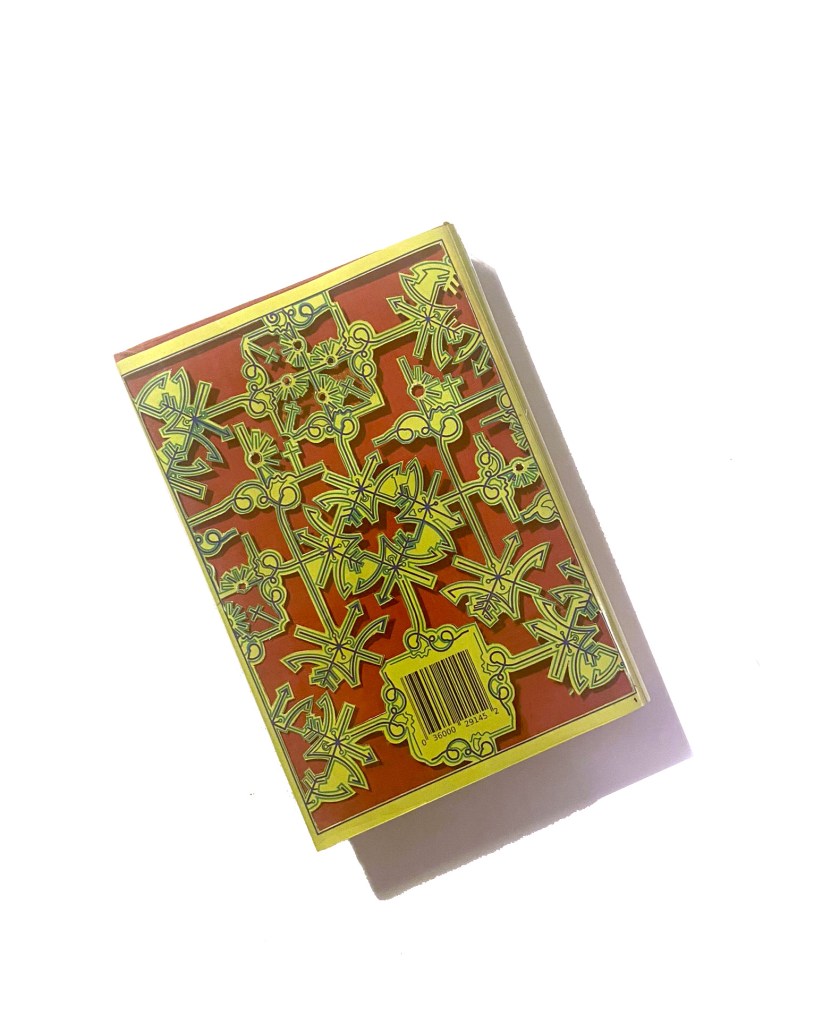
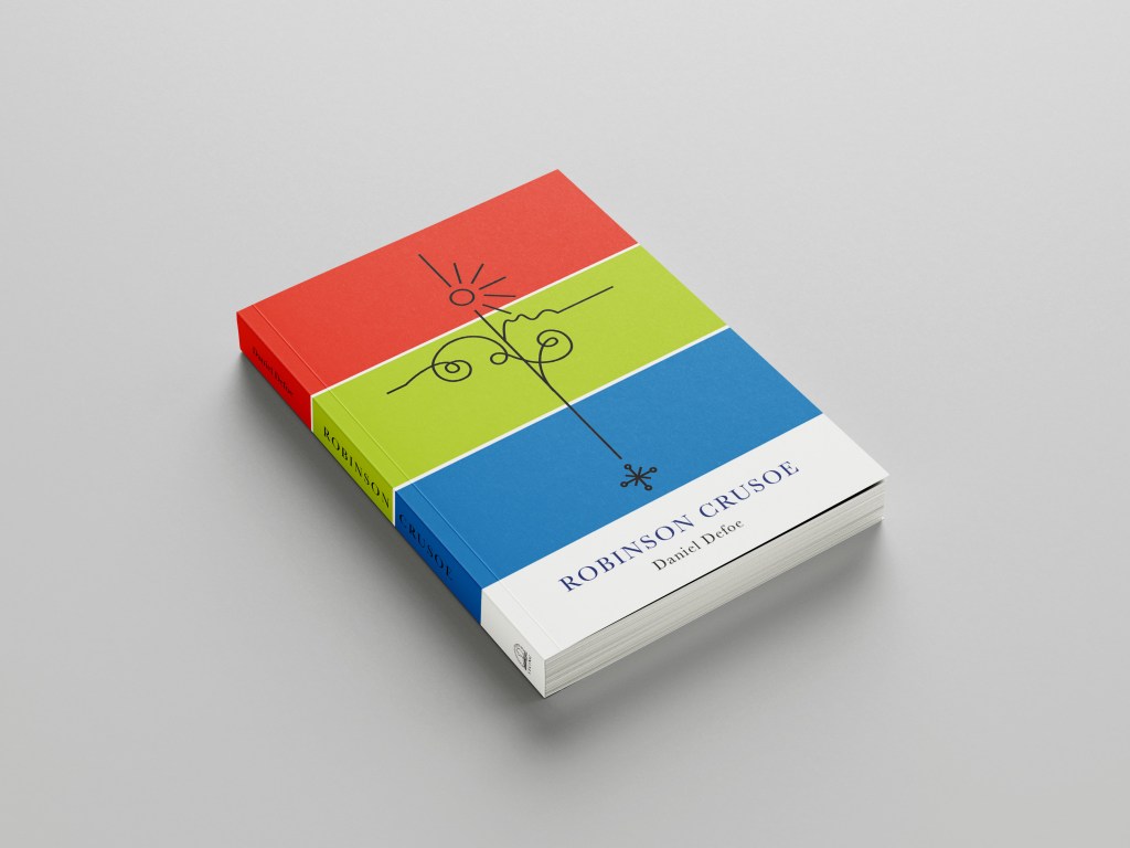
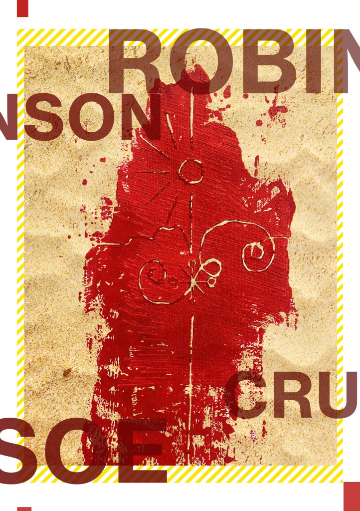
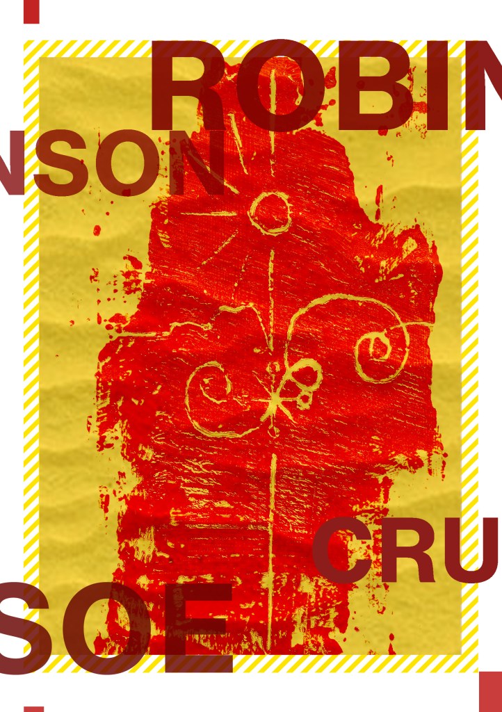
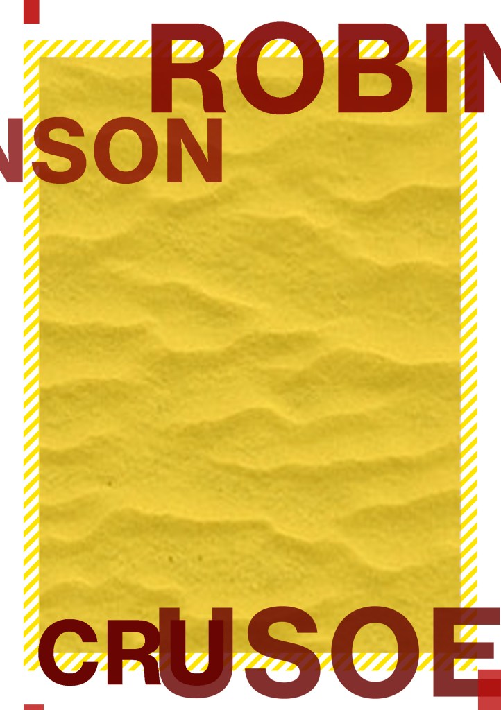
I did need to decide what colours to use for my design though. The original book of my Grandmas is Red so I needed colours that would compliment this. The colours I was thinking were contrasting, cool colours like blues or greens – these also tied in with island and sea theme.
I like the top middle design below because the green and the pink outlines really worked together but then I realised that Pink and Red would not be a good combination! The middle bottom version worked perfectly – I know the old wives tale of “Blue and Green should never be seen” but I made an exception in this case because they worked a treat together!- plus this saying comes from mariners and sea goers from the fact you should never paint your boat blue and green because it is bad luck and would not be seen out at sea.. I guess this ties in well with the fact that Crusoe was shipwrecked!!
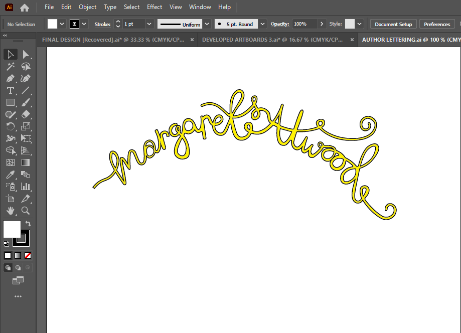
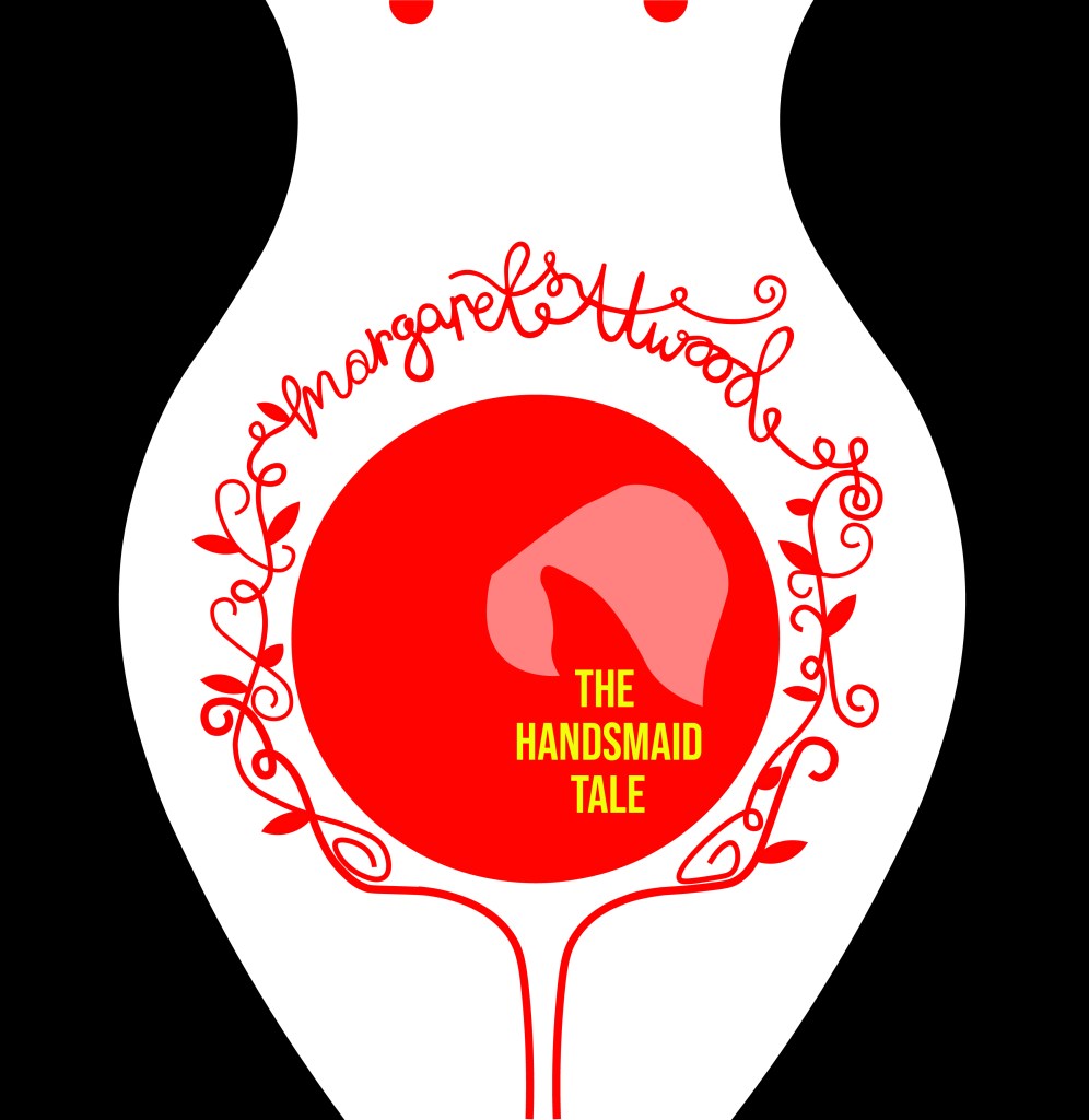
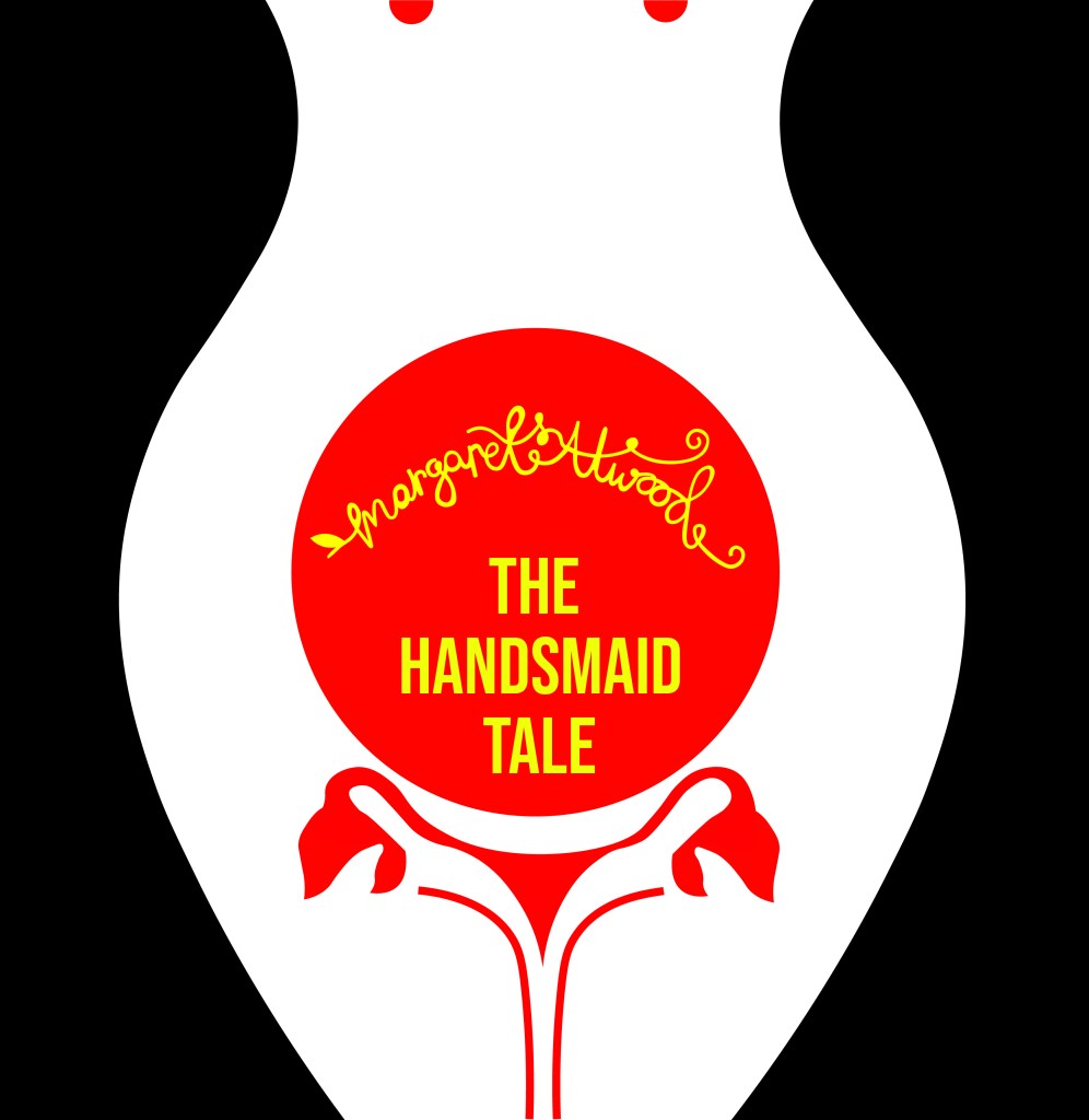
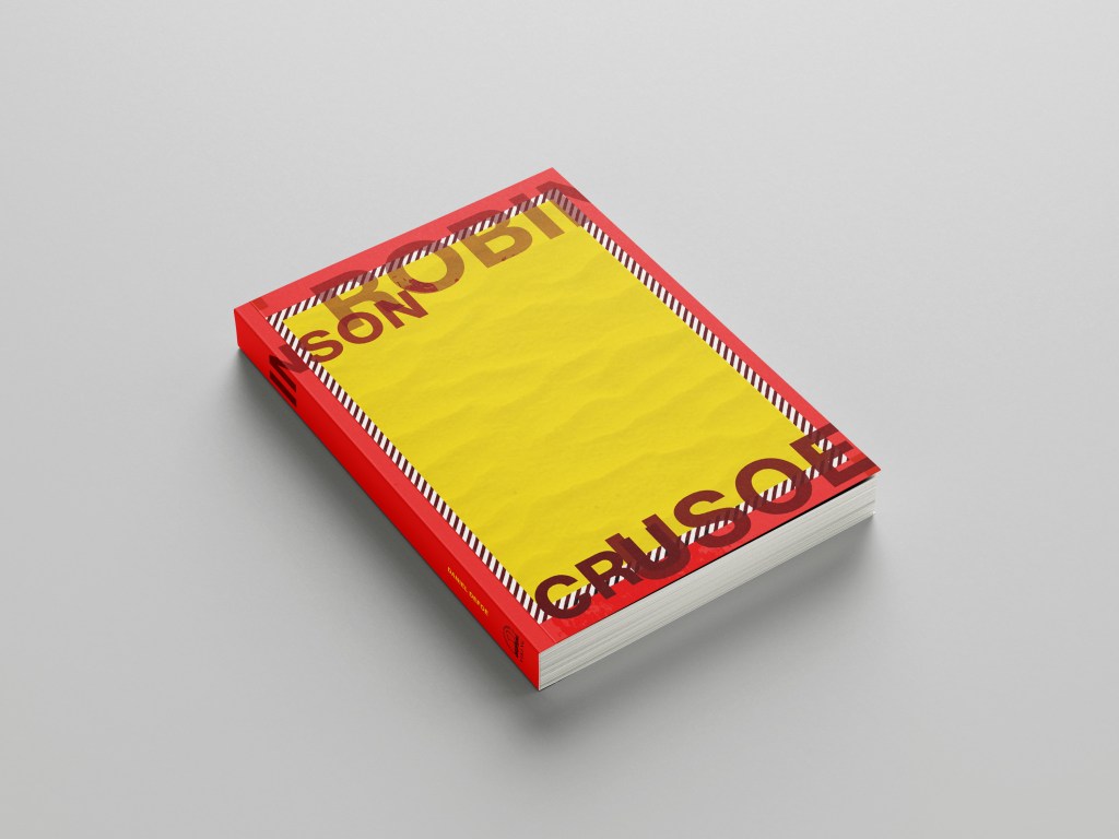
Using the influence from the book cover I researched with the anchor and the simple RC, I decided to use this influence on my own cover and that is where I have left the space free at the bottom. I wanted R.C to be embossed onto the actual book. I had no idea how I was going to do this yet especially as the book is one that belonged to my Grandma. All I did know was that I would have to use the back of the book as the front was emblazoned with “The Favourite Omnibus”.


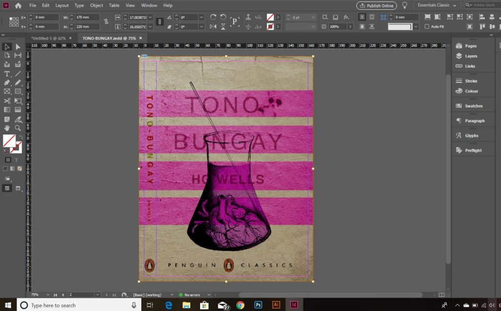
The next step was to create the book cover layout in InDesign.
I measured the Red book again to make sure that I had the exact measurements I needed.
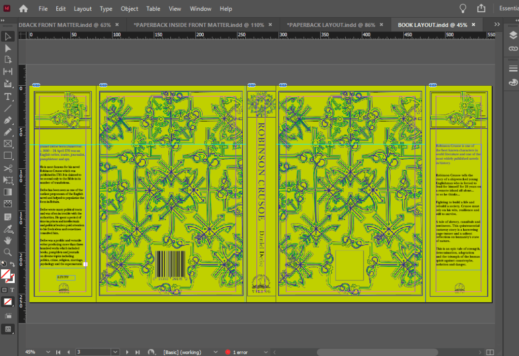
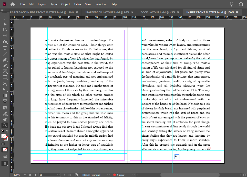
I measured the front of the book and then created an InDesign document to that exact size. I then turned off the option in InDesign to allow pages to shuffle which meant that I could place pages next to each other on a layout. I then moved 5 pages alongside each other before changing the size of 3 of them to allow for the spine and the 2 inside cover flaps.
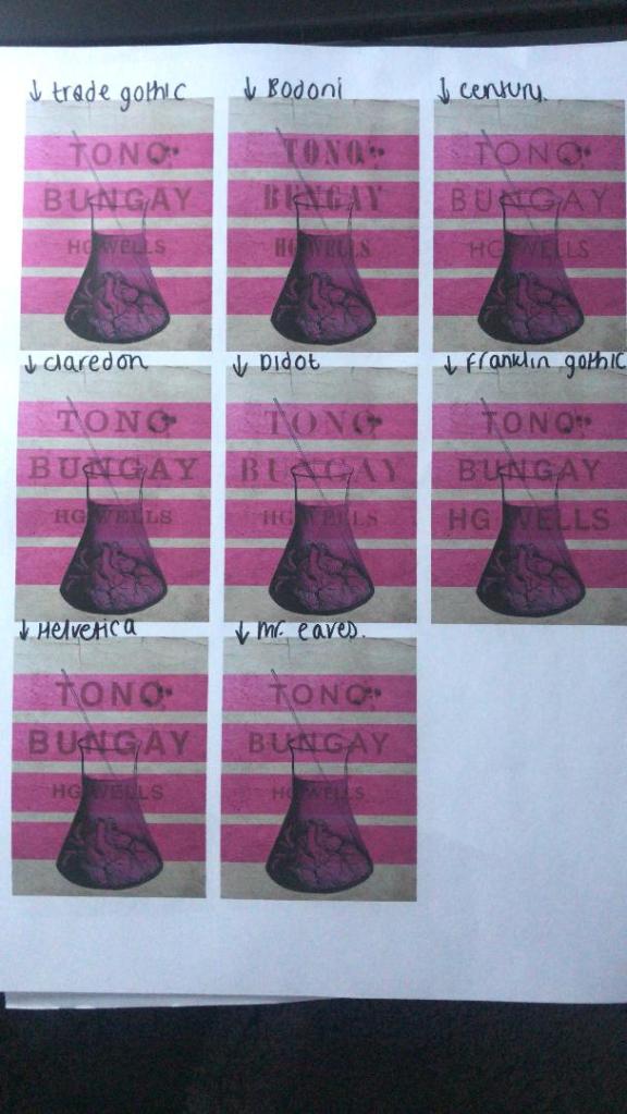
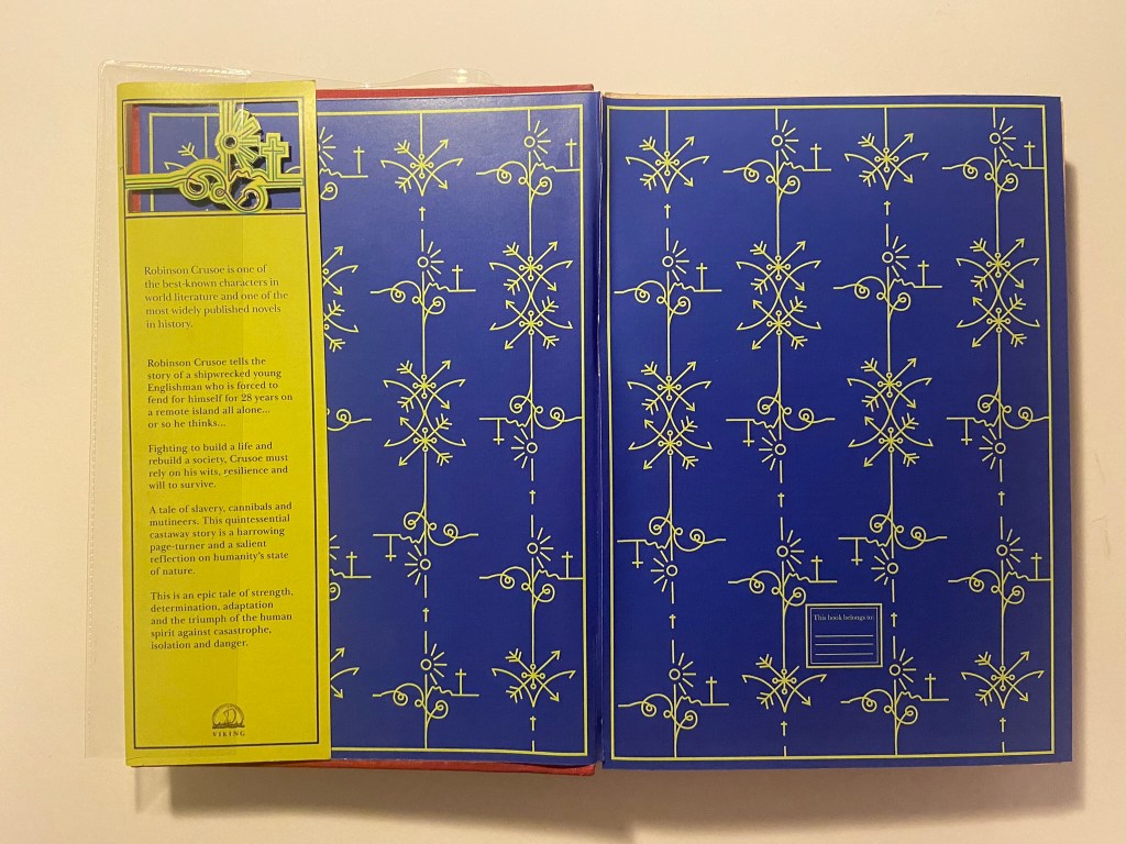
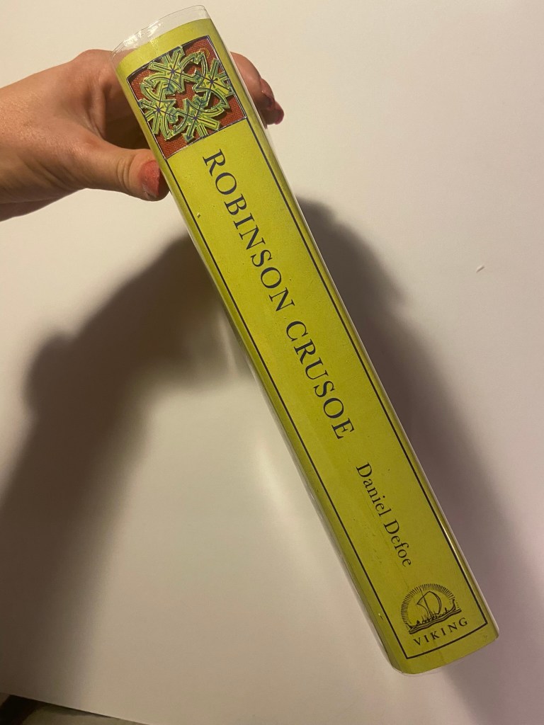
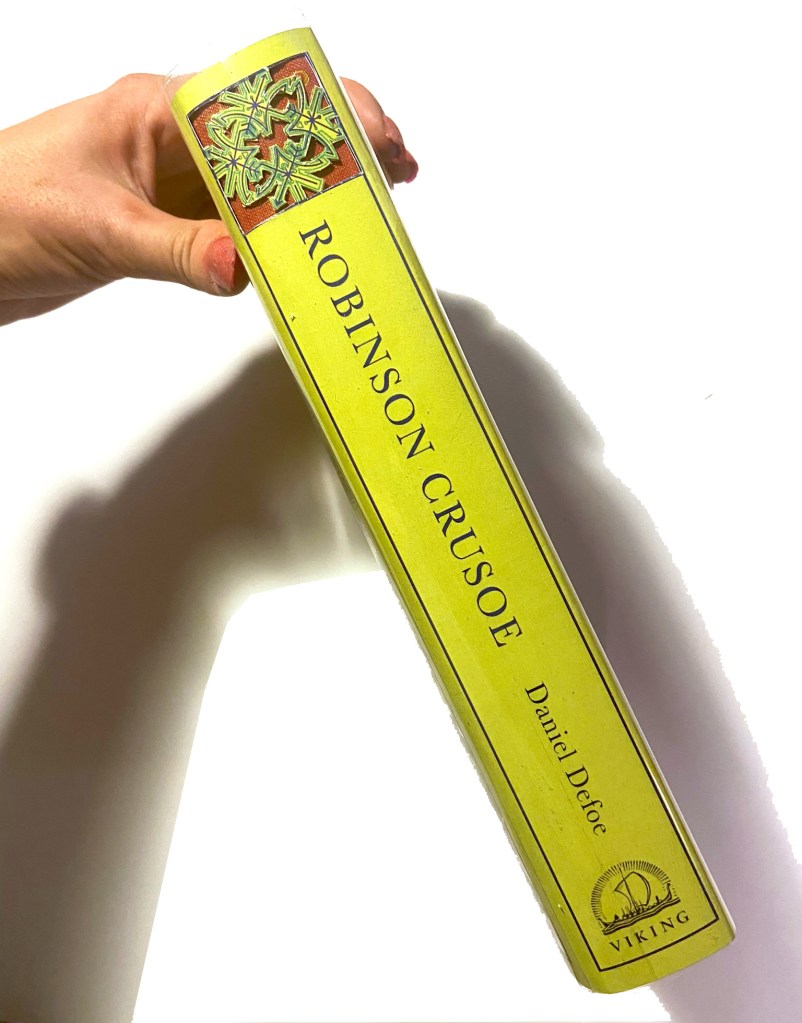
I used Baskerville typeface for this whole piece; it is such an elegant, classic typeface and it ties in with the era of the book itself. The modern repeated design and the modern, bright colours mixed in with Baskerville typeface really gives the whole design and book cover a classic contemporary look. I might be biased but I think it looks beautiful! 😉 I included the use of laser cut elements on the inside flaps too.. I planned to design inside cover pages and this would allow that pop of colour to show through!
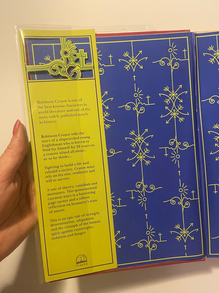
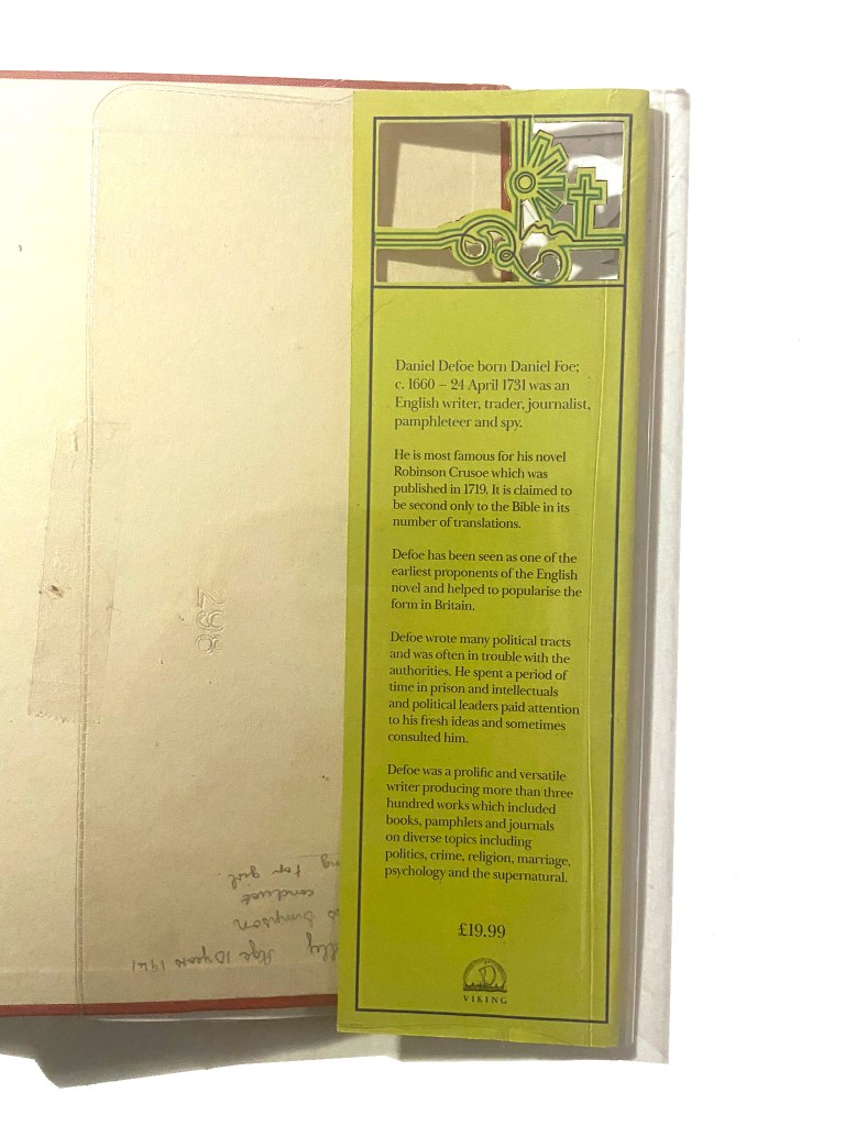
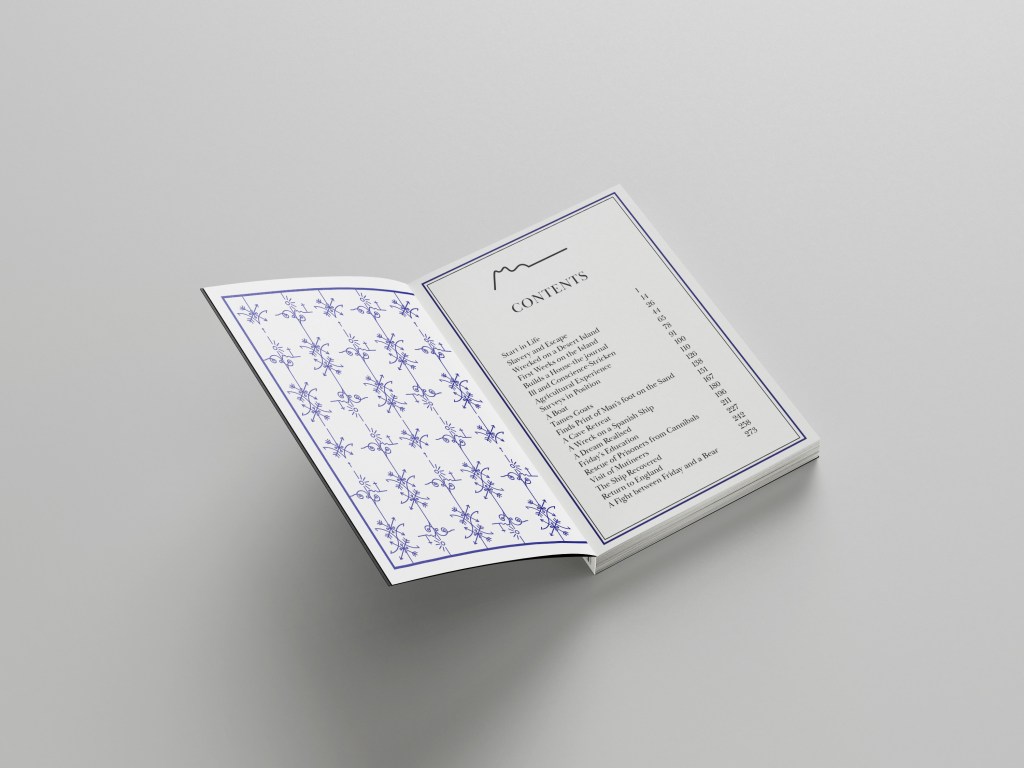
I used the use of the grid to align my text up across the whole layout and to make sure that the hierarchy and design was balanced all the way throughout. On the inside front cover I wrote a short blurb on Robinson Crusoe and what the story was about, on the inside back flap I wrote about Daniel Defoe – this allows for the reader to know the history and historical references behind the author and the story.
I tried to use contrast throughout the design with different size text (large next to small) and by highlighting certain areas of text using the Royal Blue colour. I wanted repetition throughout the whole design.
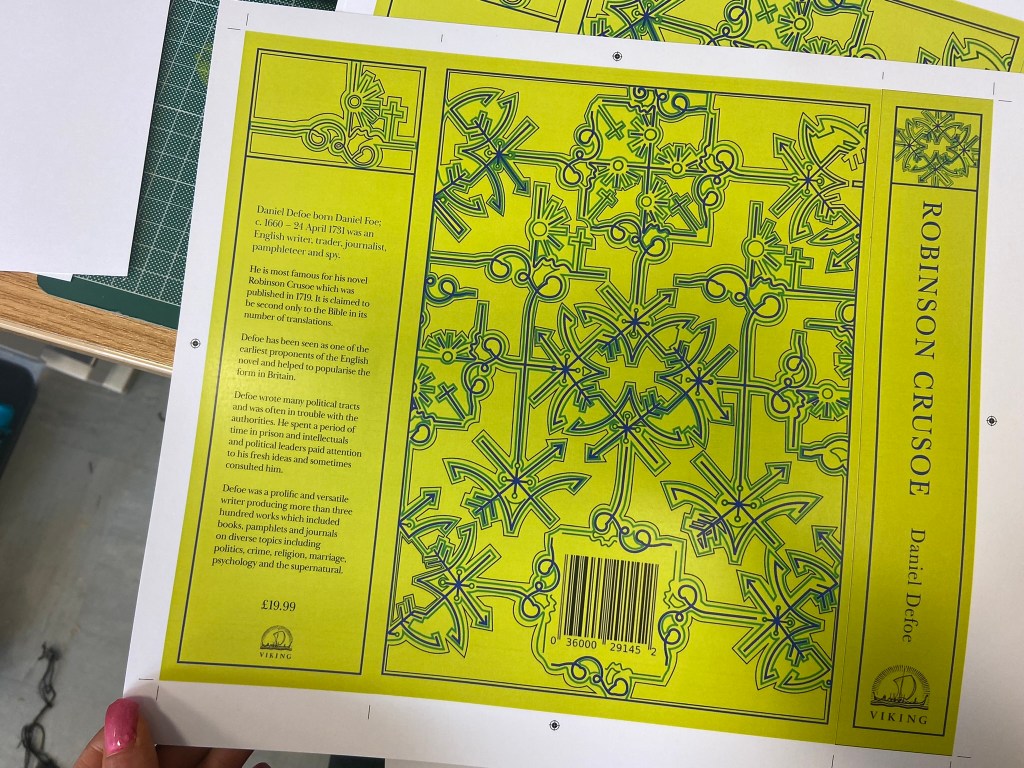
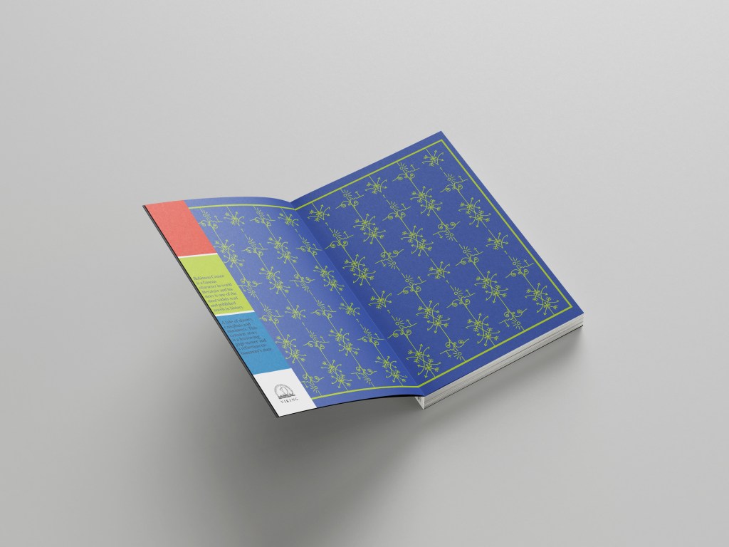
I also used the Viking Press logo as this was the publisher that the brief stated I needed to use.
Even creating the layout of the whole complete book cover was challenging because the biggest printer I have at work is A3 to print out on. My book layout slightly overlapped A3. I had to create the layout as a whole but then also create 2 more documents to split the layout into 2 halves and then when I printed them out join the 2 together seamlessly at the spine with some photo mount! It worked easier than I expected to be honest!
From doing my research I always knew I liked cloth bound books but in this case I had the cloth bound book in the form of my Grandmas book, I then knew that my laser cut design and the book layout as a whole needed to be printed onto some kind of strong paper or card. Card wouldn’t allow me to have a luxurious feeling and normal 80gsm paper would be too thin for the job and easily rip as well as not giving that professional, luxurious feel.
What I managed to source was this:


It is a thin, glossy card. It is very smooth to touch and gives a lovely shine and shimmer. I printed my book cover layout onto it using a laser printer so the quality was very high! It is also thick enough to be able to be cut into but not weak enough to rip. It is the right weight to be folded neatly around the actual book too.


In regards to designing the rest of the pages for the book I was restricted. I didn’t want to ruin the pages of my Grandmas original book that I was mocking my cover onto. The book itself has hard board plain insides that had started to yellow and I felt that I could design some inside cover pages and cover these using the same card from above into the existing book.
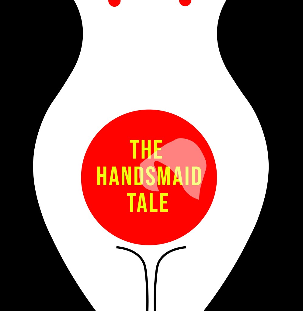
This was the design that I went with:
It ties in with the design on the front. It uses the same colours as the front and the use of the block Blue colour really adds a pop of rich colour against the Green front cover when you turn the page over. Again, it gives a classic contemporary feeling. The repeated pattern seems quite luxurious and regal in appearance but the bright colours really modernise it and make it stand out.
Although I can’t include any pages in this book because the book is whole as it is and I didn’t want to ruin any original pages from the book, I did create some pages just for an example that could be used within this book if it were to printed into a new cloth bound book just like my Grandmas.

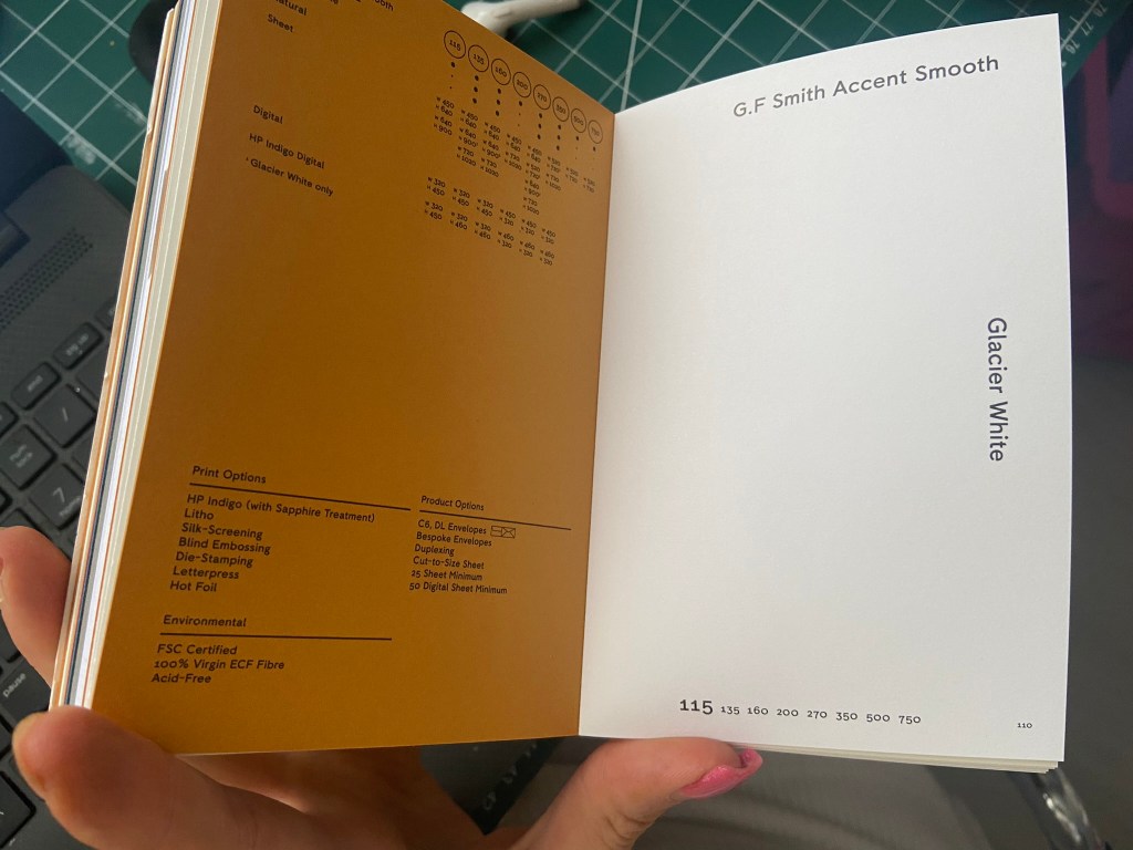
If I was to professionally publish my own version of this book I would have a Red, clothbound hardback book like my Grandmas and include my laser cut designed cover on its 160gsm glossy card and then have a plastic cover over the top to protect the book and the cover from the elements. It is a hardback collectors edition so it needs to be kept clean, protected and dust free. It also makes it feel and look more luxurious and expensive compared to its paperback friends! The inside pages would be from the GF Smith book of paper samples – I have chosen 115gsm Glacier White paper for the pages of the book because it is thin enough to be able to turn the pages easily but it is also a luxurious, smooth finish (as I attempt to show in my video!) I wanted to use a more luxurious feeling paper for my hardback collectors edition to what I would use in my paperback edition.
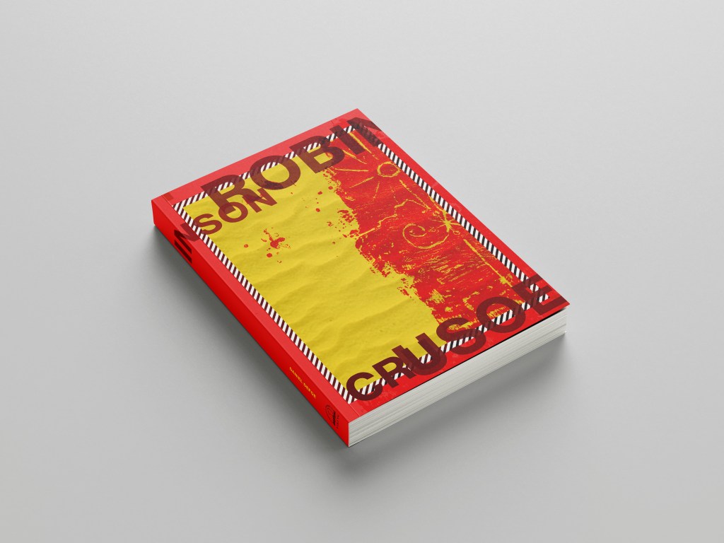
Attempting to laser cut…
The majority of my time spent on this assignment was trying to problem solve ways around trying to cut it out on the laser cutter! (*spoiler alert* I still ended up doing it by hand with a scalpel!)
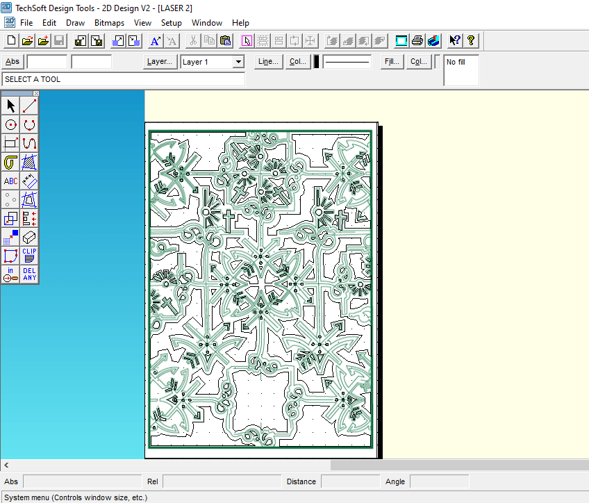
The problem is that although I love the little, old antiquated laser cutter at work it is not compatible with Adobe or modern programs! To get my design from Illustrator over to the laser cutter I had to use the laser cutters software which is 2D Design.. (that is another b*tch!!) and manually draw around my design again so that it is readable for the laser cutter. That was great! – 2 solid work days later (whilst the rest of the school were on activity days!) I had perfected the stencil in 2D Design… I had also completed the whole book cover layout in InDesign which I was really pleased with. The plan was to print out the layout from InDesign of the whole book cover – including the original front cover and then place this onto the laser bed in the laser cutter… using the 2D Design document with the second stencil of the design I drew, use the laser cutter to go over my original drawing on the printed copy on the laser bed.. sounds complicated right?.. It actually really was… trying then to communicate to the laser cutter the exact, precise location to cut.. nope… 2 days completely wasted on this!
Below shows me drawing out my original design in 2D Design to create the stencil!
I took my printed copy of the layout I produced in InDesign and cut it out using a scalpel knife – it didn’t give the same professional appearance but it was the best I could offer at this point! For another solid work day I spent cutting out the front and back covers of the book!


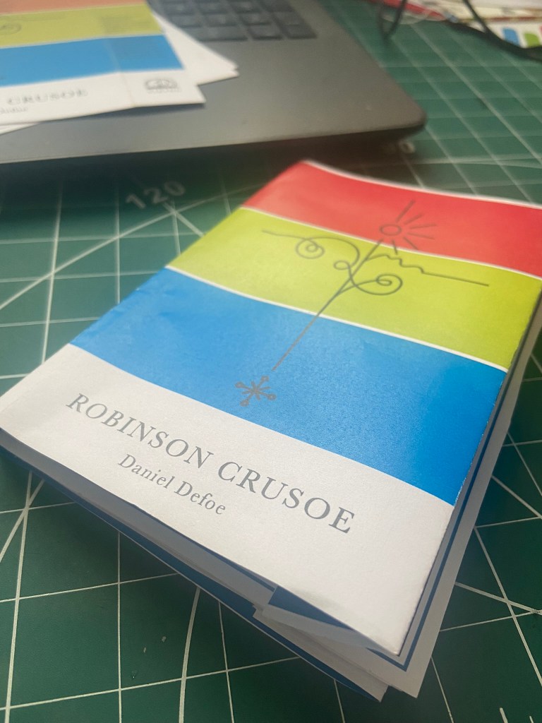
The mockup
Once I had finished cutting out my cover I then went about mocking it up onto the original book. I was overall pleased with how it turned out. If I was to redo it I would possibly make the border area of the front and back covers wider because I found that I lost some of the border when it was placed onto the book (have a look at my video!).
I did mess up though (as I also explained in my video) because I was trying to find a way to emboss the R.C onto the cover; I had a letraset sheet in 84pt Helvetica and I knew before I even transferred it that this would be the wrong choice! – Helvetica is a very emotionless, strong, bold sans-serif typeface and the cover I have made is very soft and feminine in its appearance especially with using Baskerville (a very delicate and classic serif typeface) throughout the design. I instantly regretted my impulse decision. I then realised that I couldn’t scratch the letters off the cover so I knew I would have to take photographs of the final product and then Photoshop the letters out and Photoshop some Baskerville on to it!


I also added my own inscription into the book cover so that my future generations of relatives can see that the book has been handed down and things have been added to it. This book has its own story now!
I took these photographs and imported them through iCloud and then went about the process of tweaking them in Photoshop so that they were fit to upload to my social media design account @PinkAngeleno and so that they could be used as the final mockups for my design!
The Mockups

The paperback pocket sized, travel friendly edition
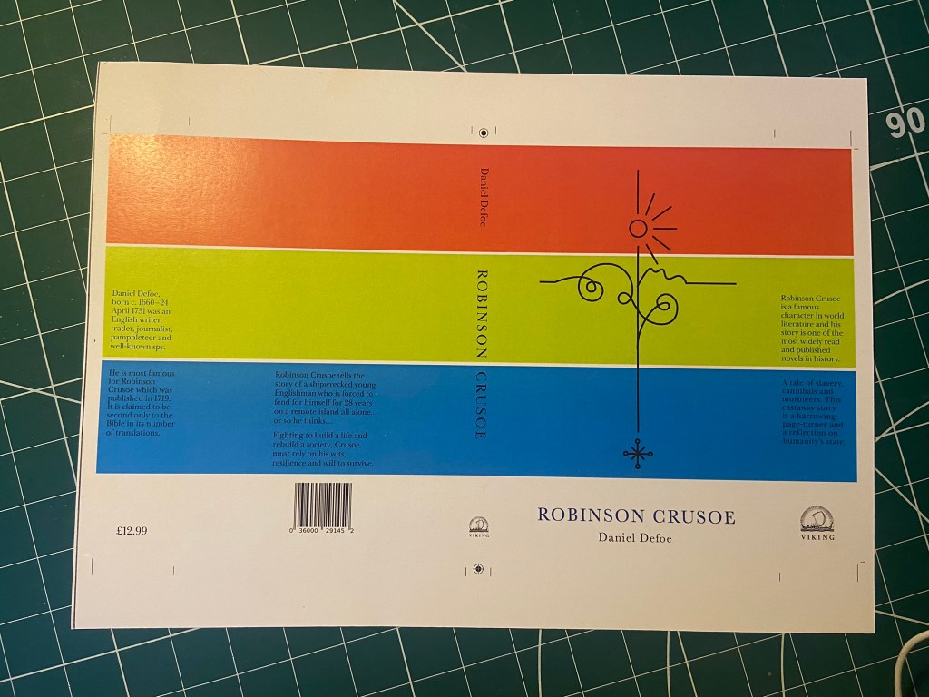
Designing for the paperback edition was a lot easier – it turned out that I created the cover for my paperback edition completely out of experimentation and it turned out that it just worked!
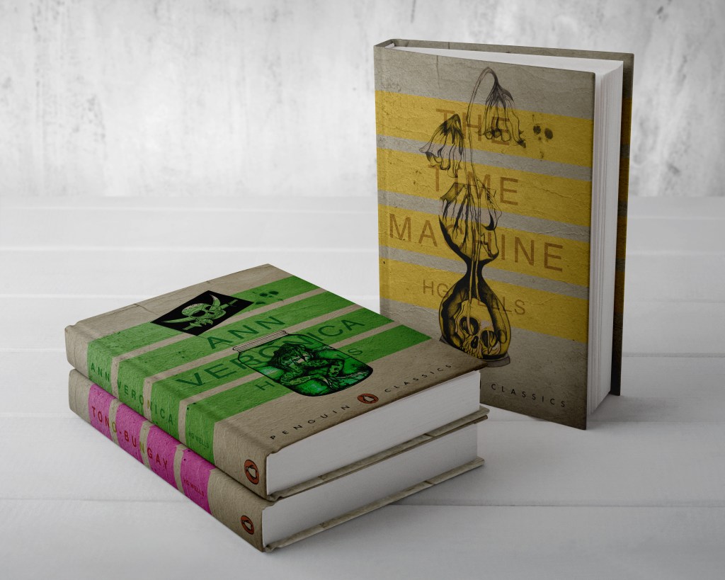
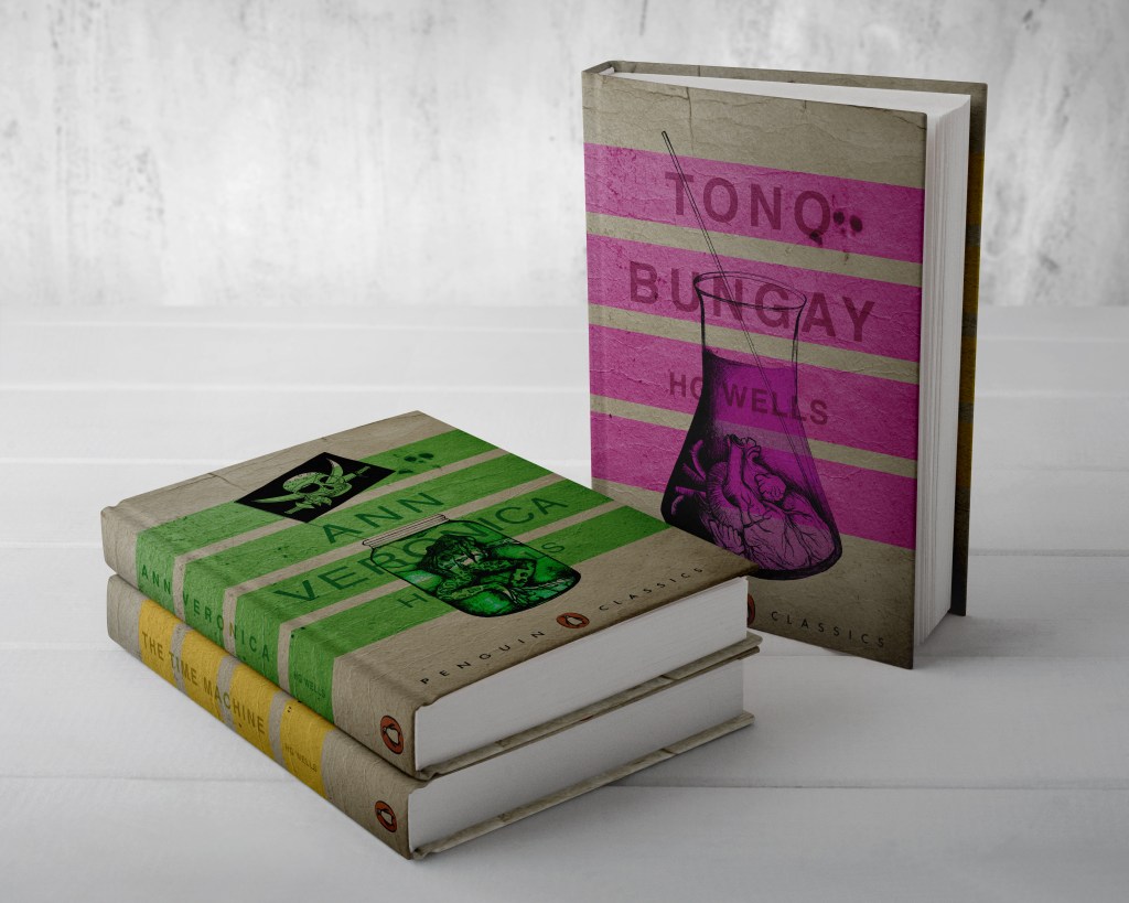
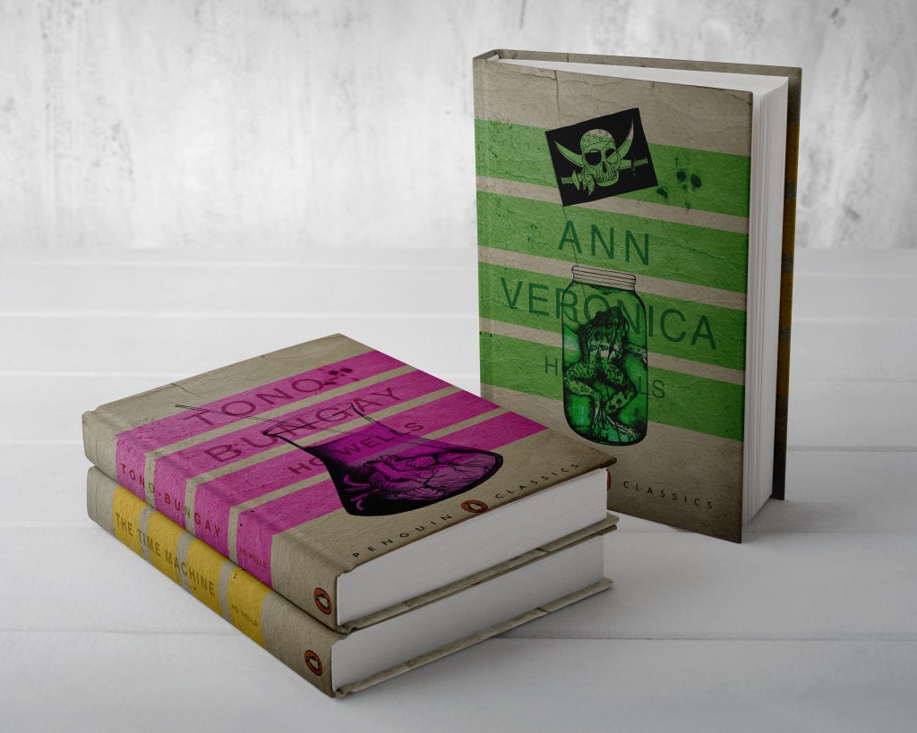
The Hardback edition and the paperback edition are very different publications in the fact that the hardback edition is a heavyweight, luxurious collectible work of literature and art whereas the paperback is purely a travel sized book that would get stuffed into a backpack or a pocket, the spine would get creased, the pages would get creased and it would be a much cheaper publication to produce in general.
Although they are both very different in publication, I needed the design to be very similar though; I needed them both to be seen as though they were part of the same series. If you was to put them alongside each other I needed them to be seen as though they related to each other in some way. I needed repetition in design. I decided to use the same colours, the same motif and the same typeface.
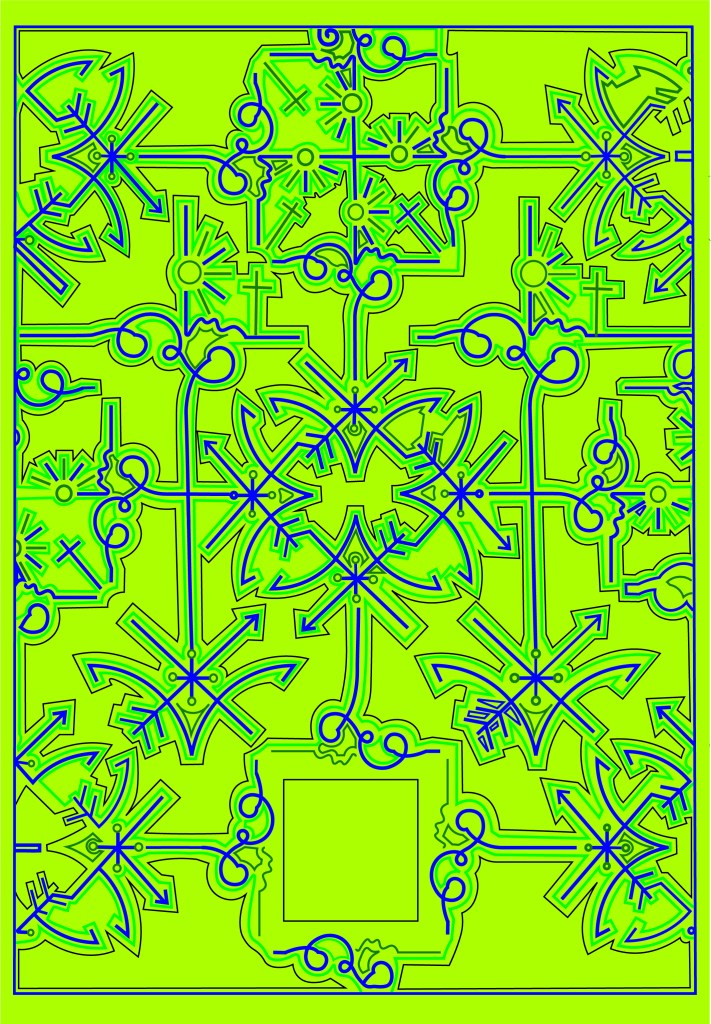
This was the accidental experimental design that I was messing around with for the hardback edition but then I ended up using for my paperback edition:
It uses the same motif or line drawing that is used in my hardback edition – which I repeated to make the pattern on my front and back covers. I used the same 3 main colours and placed them into 3 blocks. This is a very simple, bold and an attention seeking cover.
The Red also ties in with the hot sun, the Green ties in with the island and the Blue ties in with the sea – they are all in order according to the design too.
I have a tiny travel guide book to LA which I modelled this cover from. I measured up the LA guidebook and it was 110mm x160mm and as I did before with my hardback edition I created an InDesign document and then added 5 pages to create the front, back, spine and 2 inside flaps. I chose to do the book this size as it is a book to be taken places and to travel with, it is a book to take with you on your own adventures!
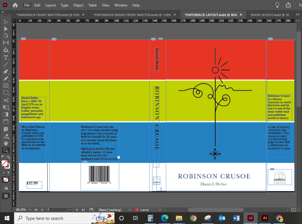
I then created a very similar layout to that of my hardback edition. I didn’t need to split the design over 2 sheets this time as the size of the book cover fitted on an A3 sheet and was easily printed onto 1 sheet. Again, I used the same 160gsm glossy, card paper stock that I used for my hardback cover – just because it prints a dream and because it gives a nice glossy appearance and is strong to keep a book protected.
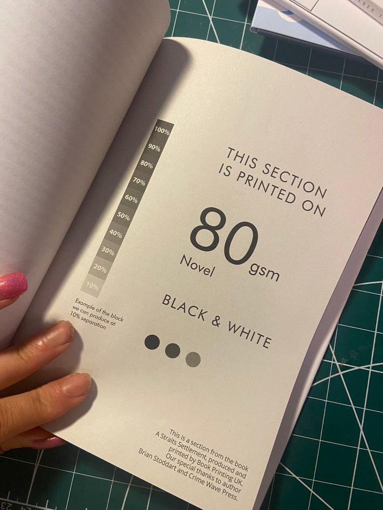
I also created the pages that I would mock up inside the paperback edition; again, very similar to those that I designed for the hardback edition but different in the fact that I used less colours and they are not as ornate. The inside front cover uses the same design as the hardback edition but isn’t in the striking Blue – it uses Blue as the main colour but on a white plain background. These pages in this paperback are to be printed on basic 80gsm printer paper and for it to be a basic, cheap and lightweight as possible. I have done a little video below to show my choice of paper:


As my video above shows, I then decided to print the cover out and attempt to see how it would be put together properly in industry. I started reading “Making Books” by London Centre for Book Arts and also watched “The Art of the Book” tutorials on YouTube by Shepherds of London:
https://store.bookbinding.co.uk/store/department/123/THE-ART-OF-THE-BOOK/
This gave me an understanding of how I would need to print and collate the pages and back boards etc to bind and make into a book. With my printed version of Robinson Crusoe though, there wasn’t enough pages to make up a book and my spine was too thick for the limited pages I had. I did however paginate my pages correctly in InDesign so that when they printed out they were all in order, (It wasn’t such a long drawn out process since I already had experience in doing the pages for my zine!) I then could see how I would sew the pages and bind them together and then my front and back cover would be printed onto a hard board and the inside front cover adhered onto the inside with the pages of the book glued to the spine.

The Mockups


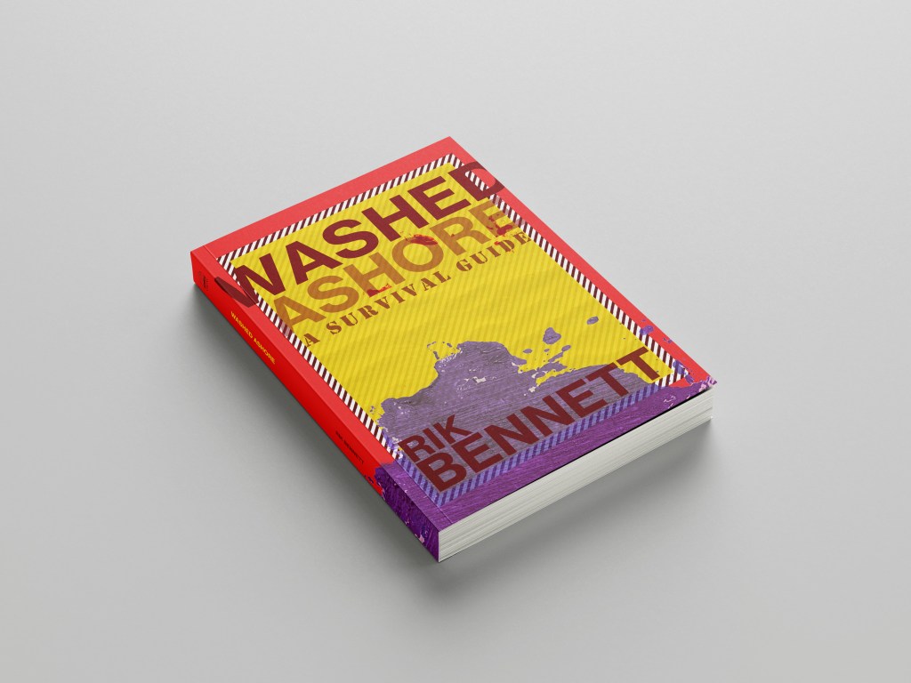
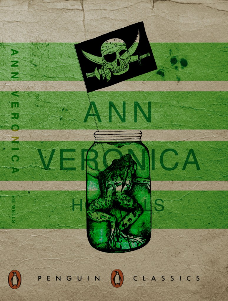
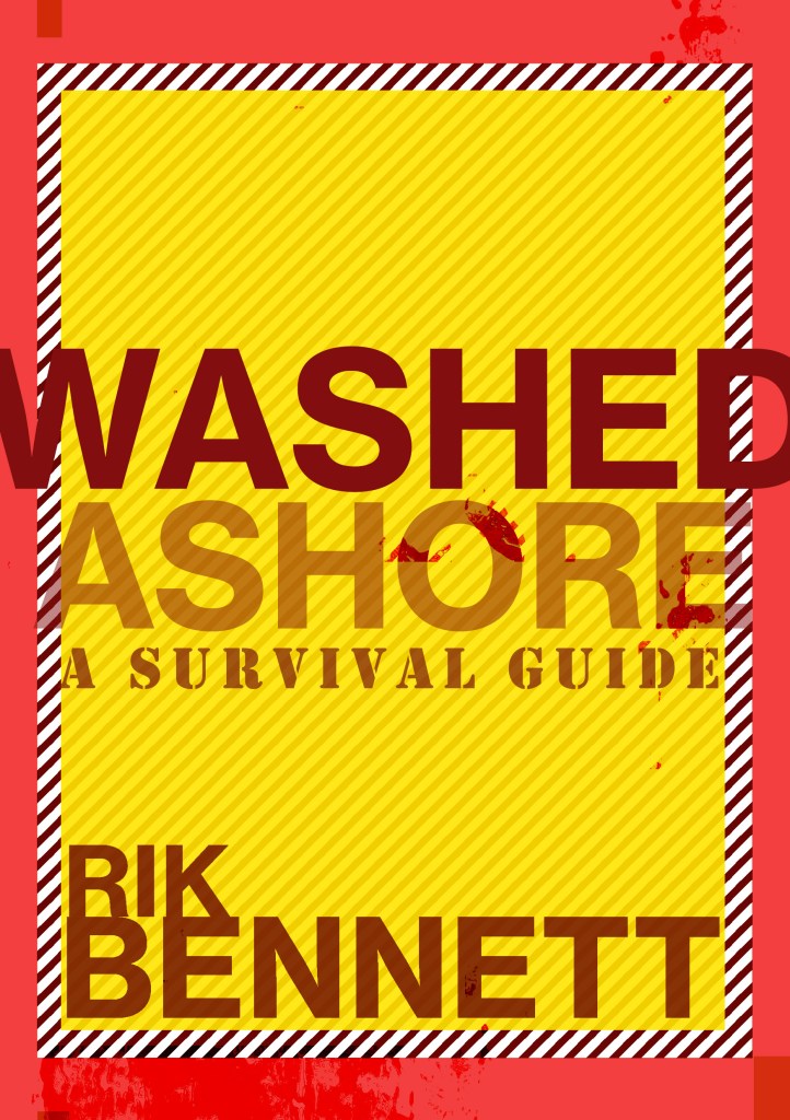
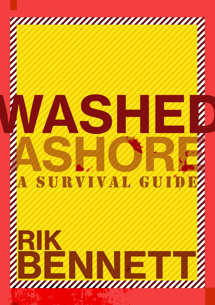
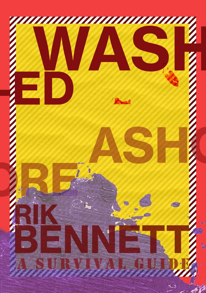
Washed Ashore by Rik Bennett: A survival guide
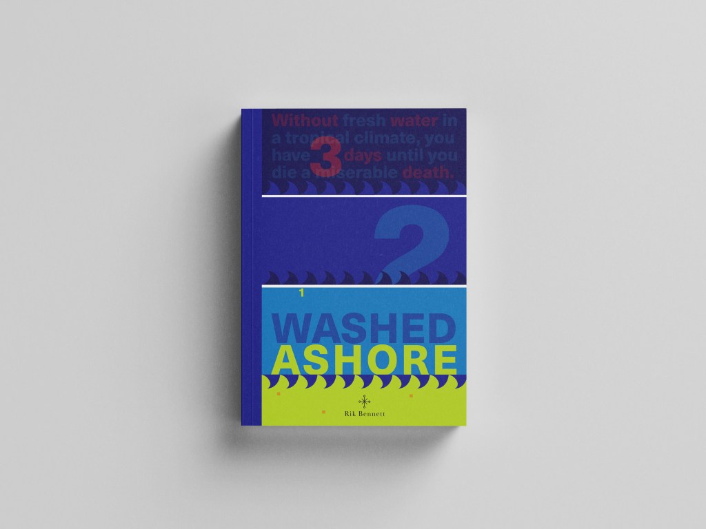
In the brief it stated that this book must “piggyback” off the success of the other 2 books Robinson Crusoe books I have designed. Therefore it didn’t need to be the same but it needed to relate back to the other 2 and be seen as part of the series.
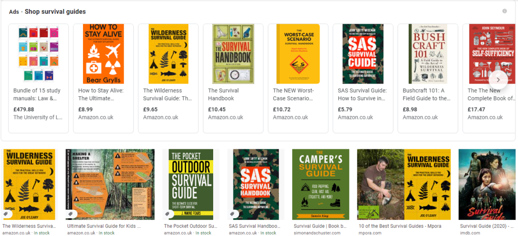
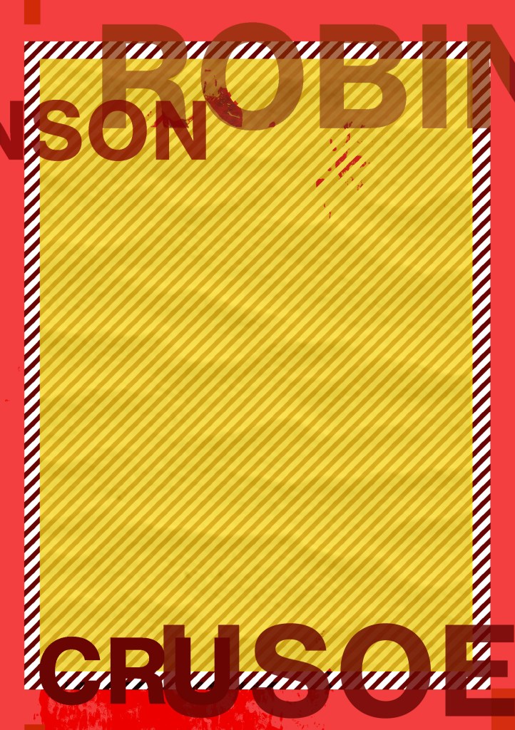
The book would be a survival guide and all I could picture in my head were the same things that appeared when I did a Google search of survival guides… big stencil fonts and warning colours (yellow, black, red…), symbols and bold, attention seeking covers. I didn’t want cliche again, I didn’t want to recreate yet another stencil font symbol riddled cover!..
I wanted this title to be similar to the paperback edition I did for Robinson Crusoe. As with the hardback design and the paperback design using the same colours and typeface I wanted this one to use the same colours to keep the repetition but I knew that Baskerville on a Survival guide possibly wouldn’t be the way!- I needed a strong Sans-Serif font to do the job! I chose Neue Haas Unica – Some nice Swiss type on there! I did however still use Baskerville for the authors name.. I thought this would add contrast and repetition from the last 2 covers!
I started brainstorming ideas around what I could do for the survival guide… I even watched Castaway to try and get some ideas for what I could use on the cover! Chris kept telling me to use Wilson as the main design… *eyeroll! ;D
I looked at symbols but knew that I didn’t want to use what everybody else had done.. i.e. tents, fire… I even researched plane safety cards to see what illustrations and simple diagrams they used to symbolize warning and survival!
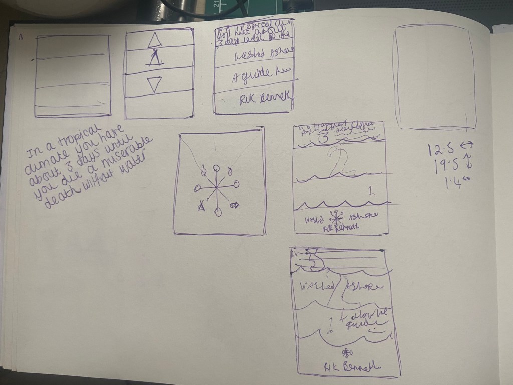
I then googled “How long could you survive on a desert island” and the piece of writing that I read in reply to that question gave me the idea for the rest of it!..
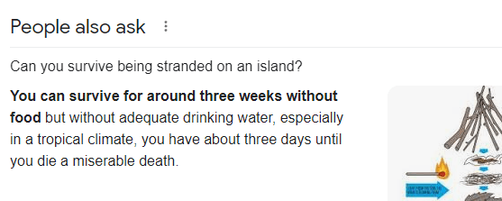
It seemed a bit gruesome really and morbid.. but the fact that the first things people think you will need when you crash onto a desert island are shelter, fire and food etc… no-one actually thinks that without fresh water you could have everything else you need but still die! I wanted to bring this shock tactic and fact onto the front cover of the book.. I’ve not seen another survival guide use this approach.. it gives a snippet of what the book could be about, presents the reader with a gruesome fact and then would leave you intrigued as to what else lies in the book or what else the book is about.
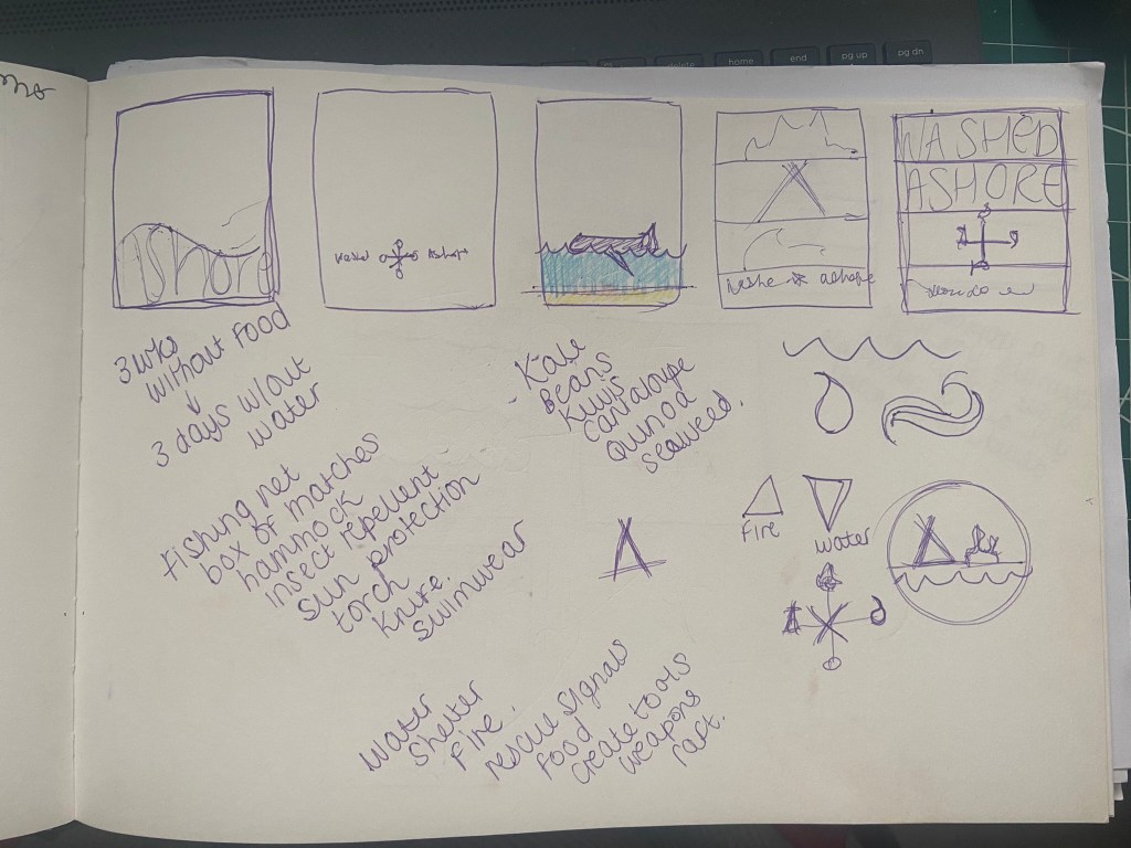
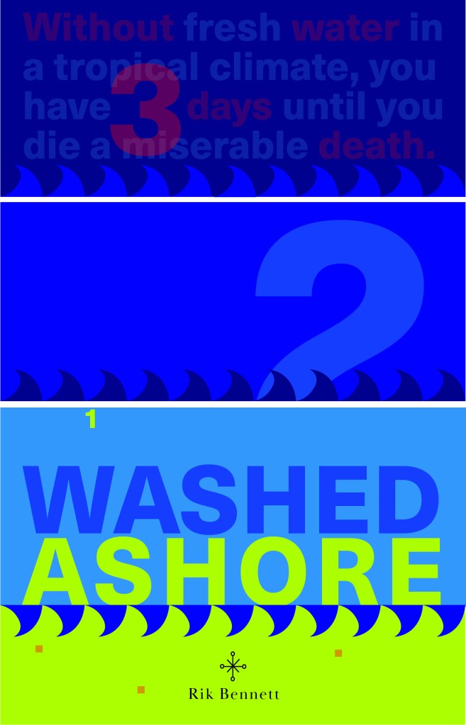
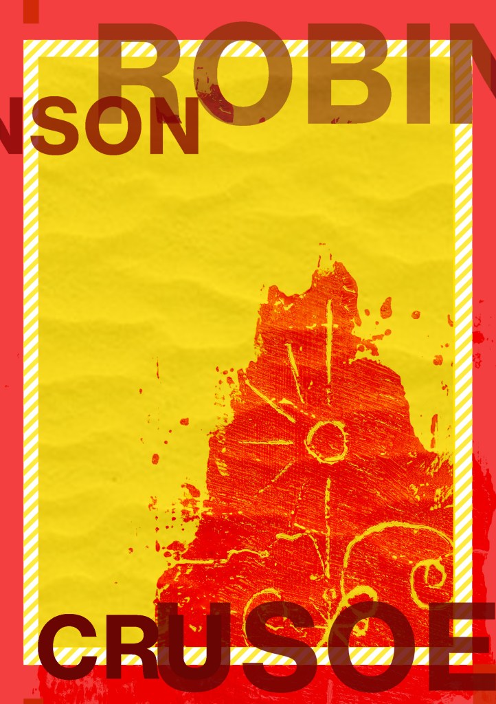
I decided to use the same block of colour approach as I used in the paperback Robinson Crusoe, they would then both look similar together.
The 3 blocks of Blue running down the design also represent the sea and the 3 days it takes until you die from lack of water. I wanted to use typography in this piece and using the numbers which follow down the blocks this is like a countdown.. 3, 2, 1…. are you dead from lack of water and knowledge or have you read the book and you have survived? It also uses the rule of 3. When you reach the bottom of the layout and the design you are greeted by a block of yellow which is the sand, washed ashore! The 3 blocks on the sand keep repetition within the layout and also represent sand grains and the rule of 3.
The numbers are also placed so that your eye has to follow them down and across to the end of the layout. Number 2 is bigger than the others to add contrast and number 1 is cleverly placed floating at the top of the last blue block.. this could symbolize that it has survived and swam to safety or died and is floating at the top! – that is down to the readers discretion as to whether they are going to allow themselves to be educated by the book on survival techniques!!
The cover is very bright and bold and grabs the attention of the reader by the text at the top and by what is happening with the numbers going down the page. It is a balanced composition and hierarchy.
Just like the last 2 book covers I have designed I designed this one in the same way. This book is slightly bigger than the travel, pocket sized paperback I designed for Robinson Crusoe; that was a bit bigger than A6 and this book cover is a normal paperback size of a bit bigger than A5 – 125mm X 195mm.
As with the last two layouts I have designed I did exactly the same for this one and created a document in InDesign and created 3 pages, 1 of which I altered to make the correct size for a spine. For this design I didn’t include inside front and back cover flaps.
I relied on the grid again to line up my text and so that I correctly positioned elements on the design.
I wanted my survival guide to have an element of humour to it… I don’t think that a survival guide on being a castaway on a desert island is a really serious topic considering it doesn’t happen all too often and is quite an impossible thing to occur! – I picture this book as a light hearted, entertaining, funny holiday read!
I really like the added reviews at the top of the book! – me and Chris came up with some creative, clever reviews!!

For this book I would want to go somewhere in-between the other 2 books.. Robinson Crusoe hardback edition was luxurious and used luxury paper, Robinson Crusoe the paperback edition was more basic as a travel, pocket sized book that would be folded and creased inside a backpack or pocket whereas this copy would be somewhere in-between – possibly a book you would take on holiday with you but not carry around in a bag.. maybe just a coffee table/bedside table read. It wouldn’t need to be super light weight because of the fact it is not being carried around. I envision a glossy mid-weight cover and glossy lightweight pages inside…
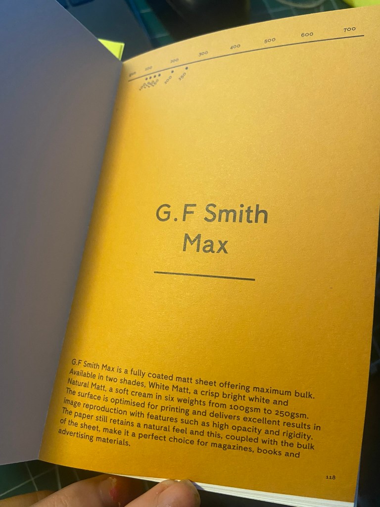
What I found from using my GF Smith paper sample book was the Max range which is suitable for magazines, books and advertising. The 100gsm weight glossy paper in Natural Matt would be ideal for the pages of the book as the paper is still lightweight but adds a bit more of a luxurious feel compared to the lightweight 80gsm pages of the paperback Robinson Crusoe. I then decided on the 250gsm natural matt glossy card for the cover as this is thick enough to support the rest of the book and be able to not be creased and bent easily.


The Mockups

What have I learned from doing this assignment?
I feel like I have learned a great deal that I didn’t have much knowledge about until I started this assignment or unit!
My GF Smith paper sample resource book has been a blessing! – this allows me to have every kind of paper sample literally at my fingertips with useful information to accompany it on what the best uses for the papers are! I would have struggled a great deal without it by having to rely on my my free samples sent out by individual printing companies which are ok.. but they are not as informative or organised into categories like the GF Smith paper samples.
I also went out and bought some books to read up on and research and “Making Books” was one of them that was helpful… I was hoping to have made one of my book cover designs into a proper book using the help of this book and “The Art of the Book” tutorials on YouTube which are particularly helpful in getting started with bookbinding… The only thing that hindered this was my deadline for this assignment. I spent a lot of time trying to perfect the laser cutting aspect and for the hardback edition that I lost a lot of time because of that. I shall definitely be trying out book binding though and attempting to make some of my own sketchbooks and notebooks to use as gifts etc!
I now know a lot more than I did about Robinson Crusoe!.. and it definitely pushed me out of my comfort zone because Robinson Crusoe is definitely not a cover I would have chosen to design for myself!
Overall, I am pleased with my design outcomes; other than regretting not making one of the covers into an actual bound book I feel like I have learned a lot more about how books are professionally printed and bound and how that as a designer my job just isn’t to design the cover but also to design and figure out what papers are used and how it will be printed etc…
Working on my Tutor Feedback
“The symbolism captured in your line illustration for the deluxe version is great. Why did you use just one line weight; could you have experimented with different weights or drawing by hand or drawing in
the sand or painting with a fine brush or etching into wood etc? Developing your illustration
into a pattern is visually pleasing but how does the illustration style and laser-cut technique
reflect the narrative?“
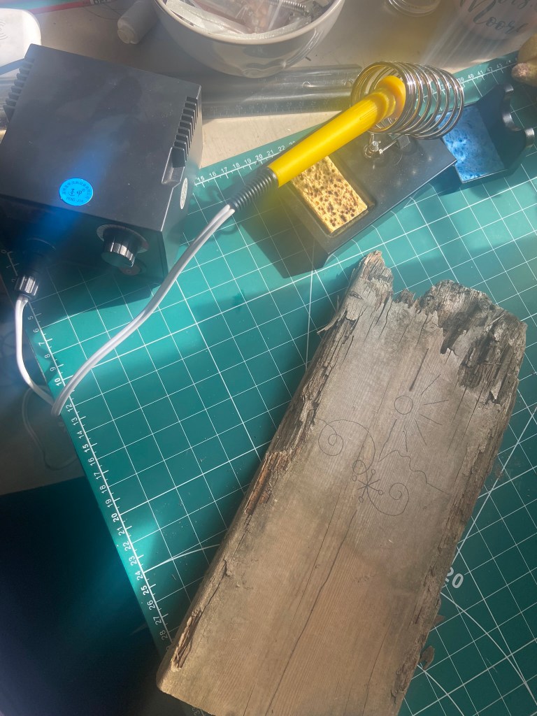
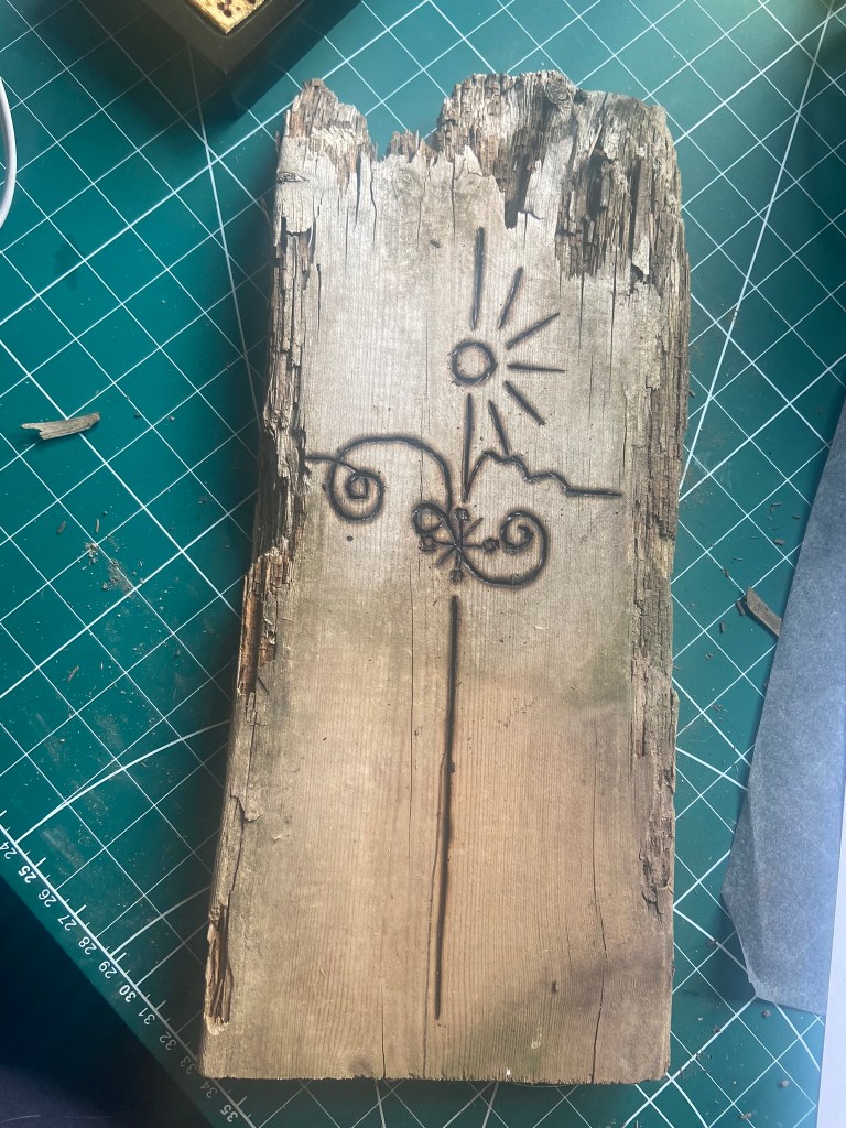
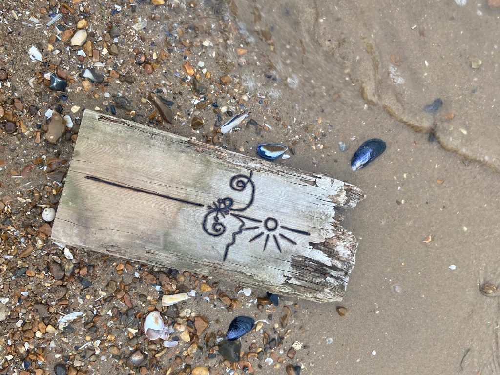
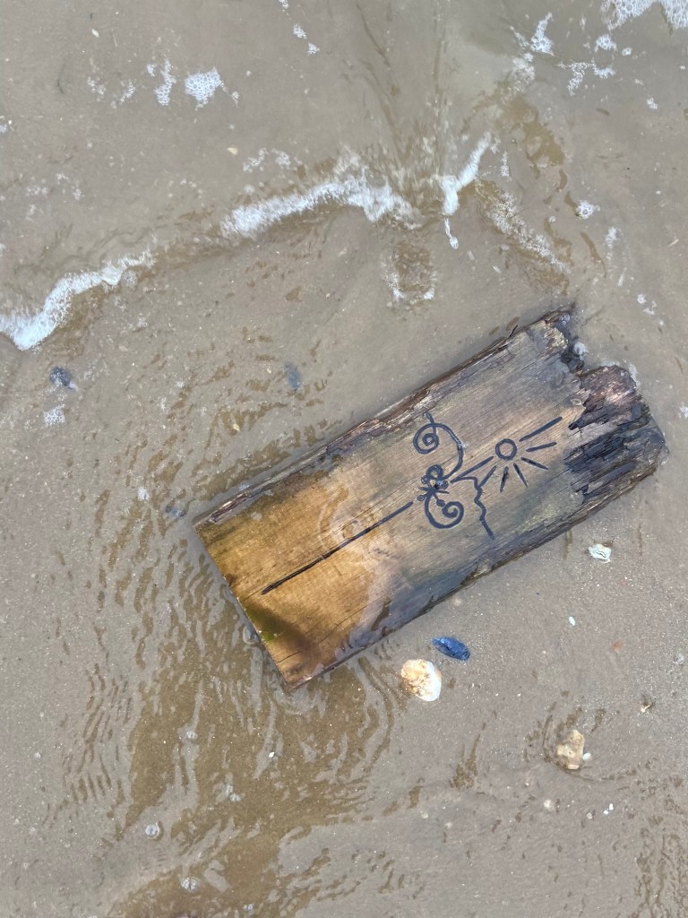
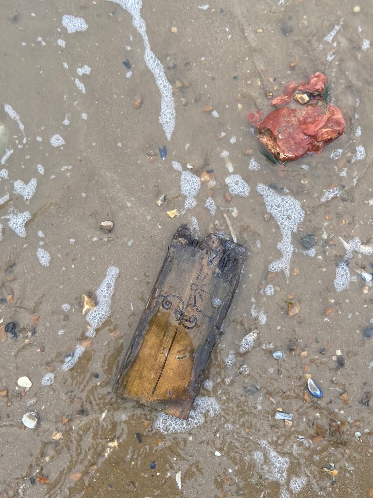
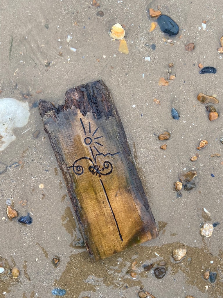
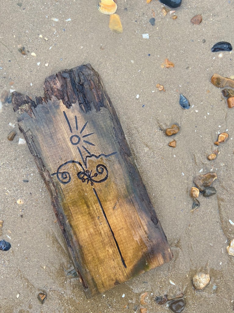
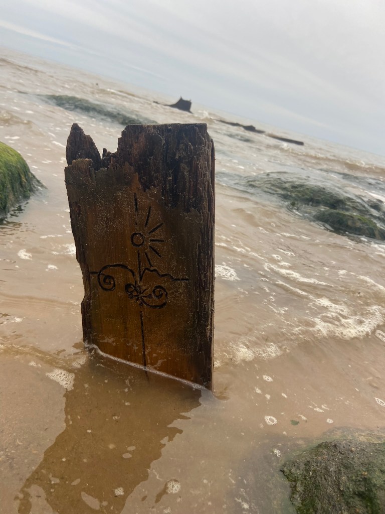
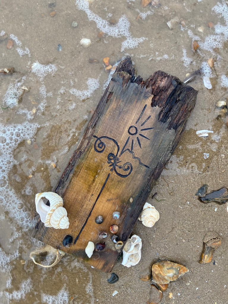
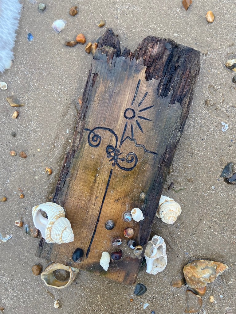
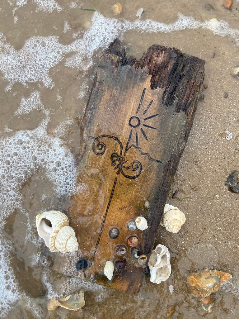
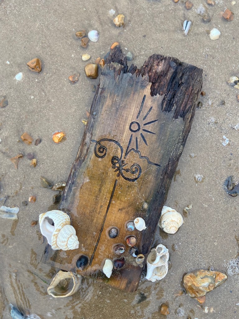
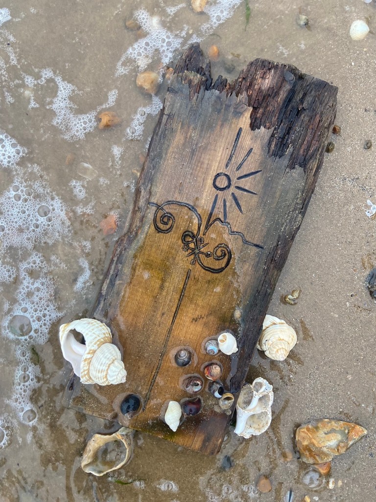
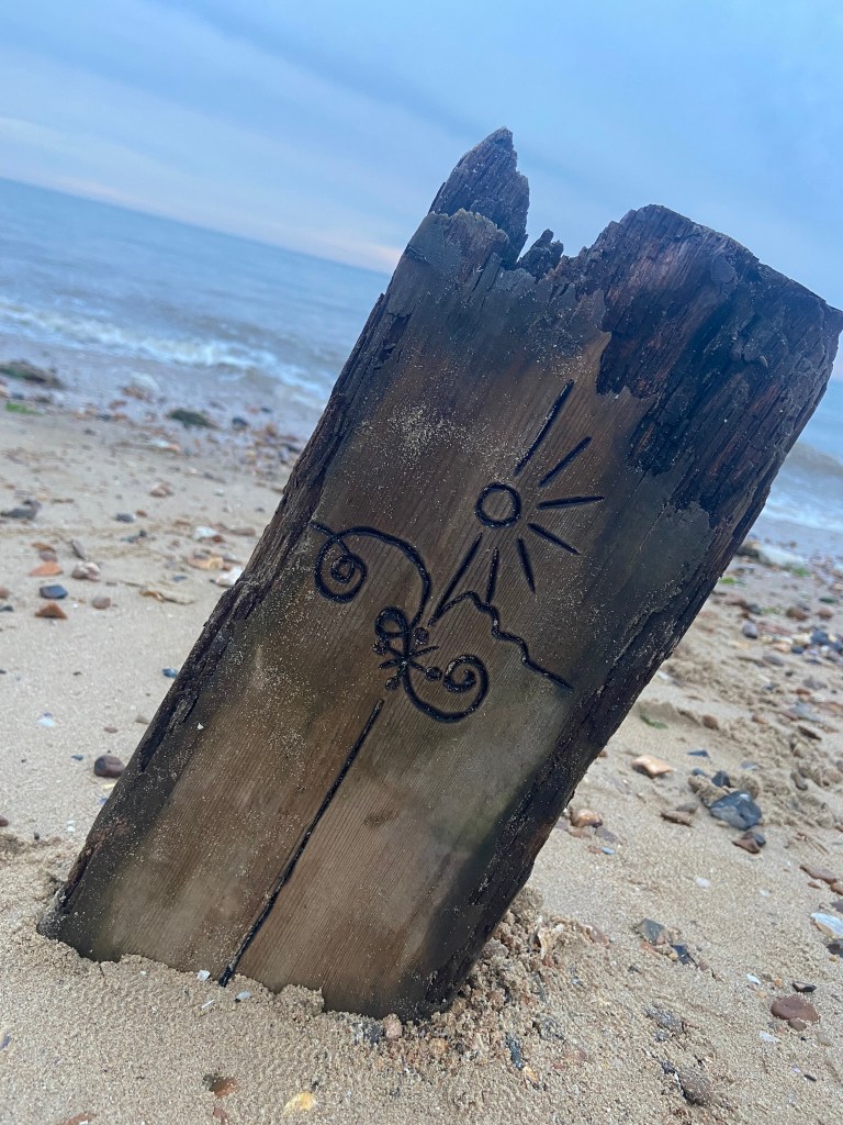
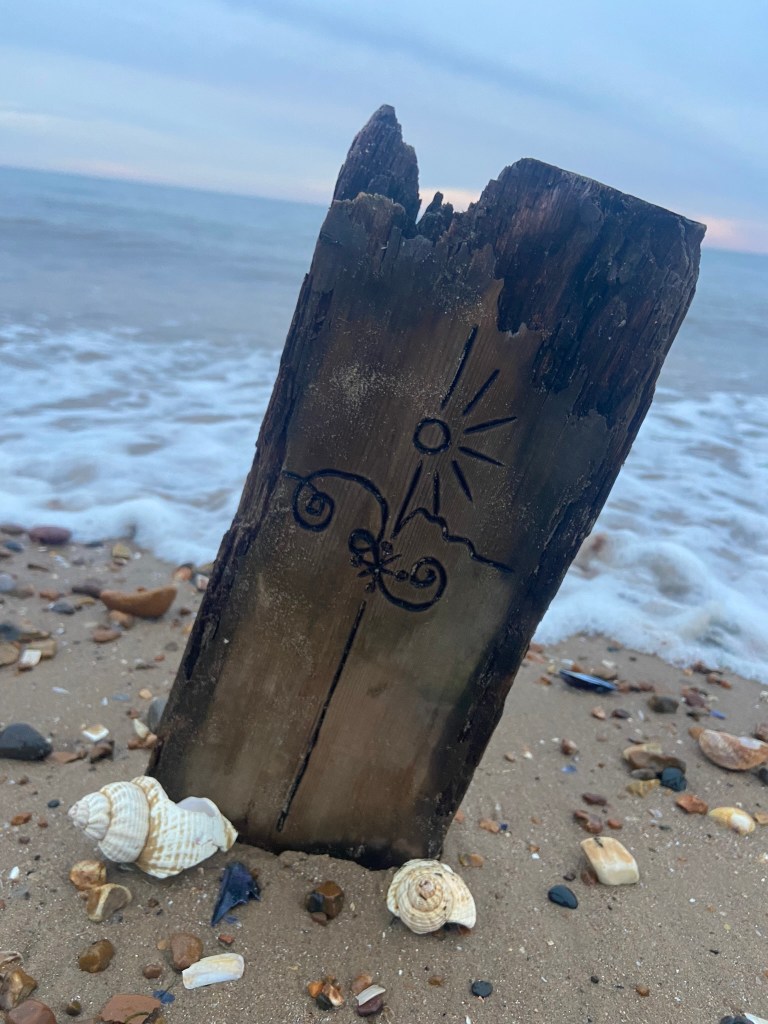
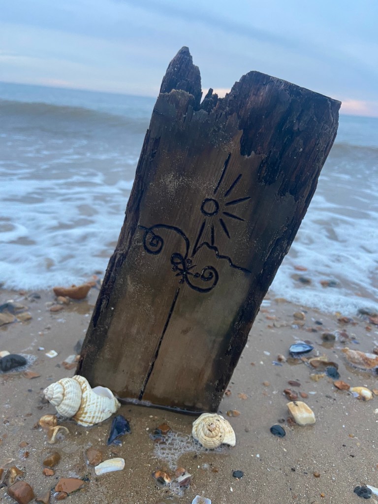
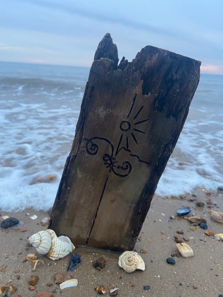
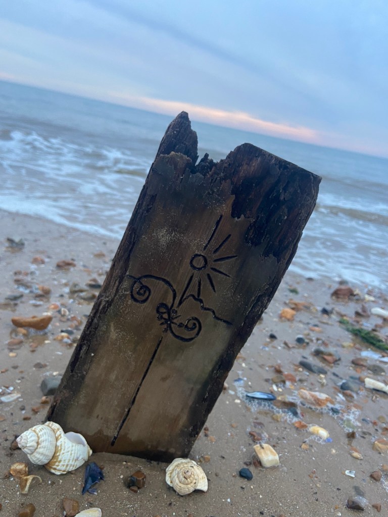
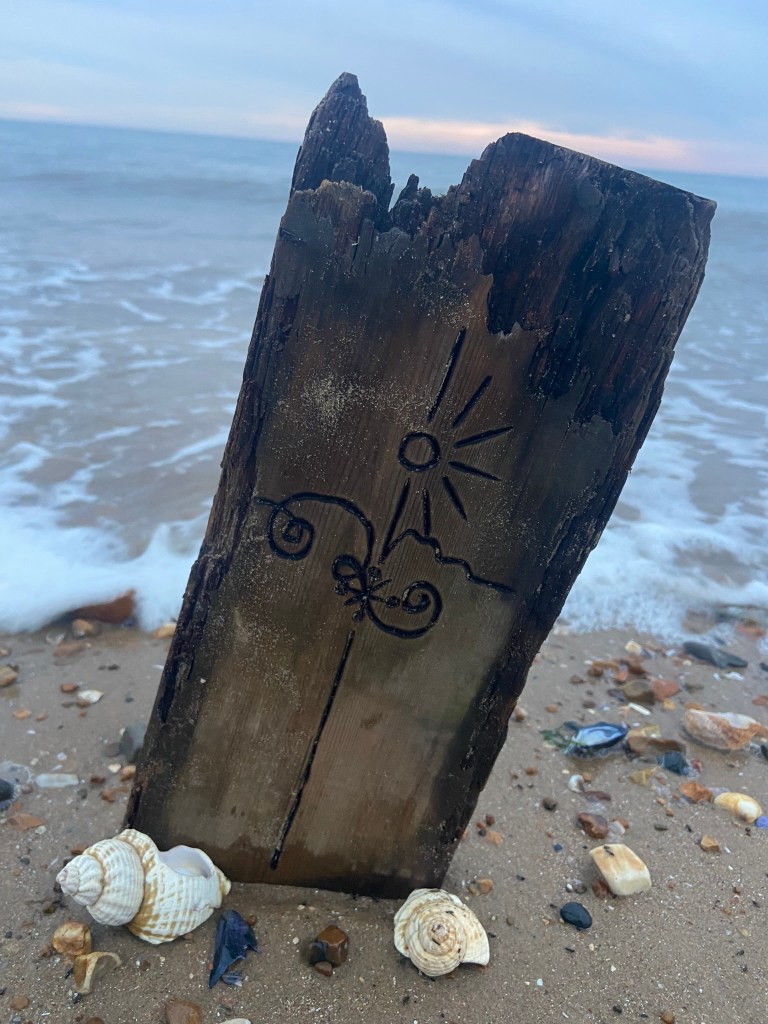
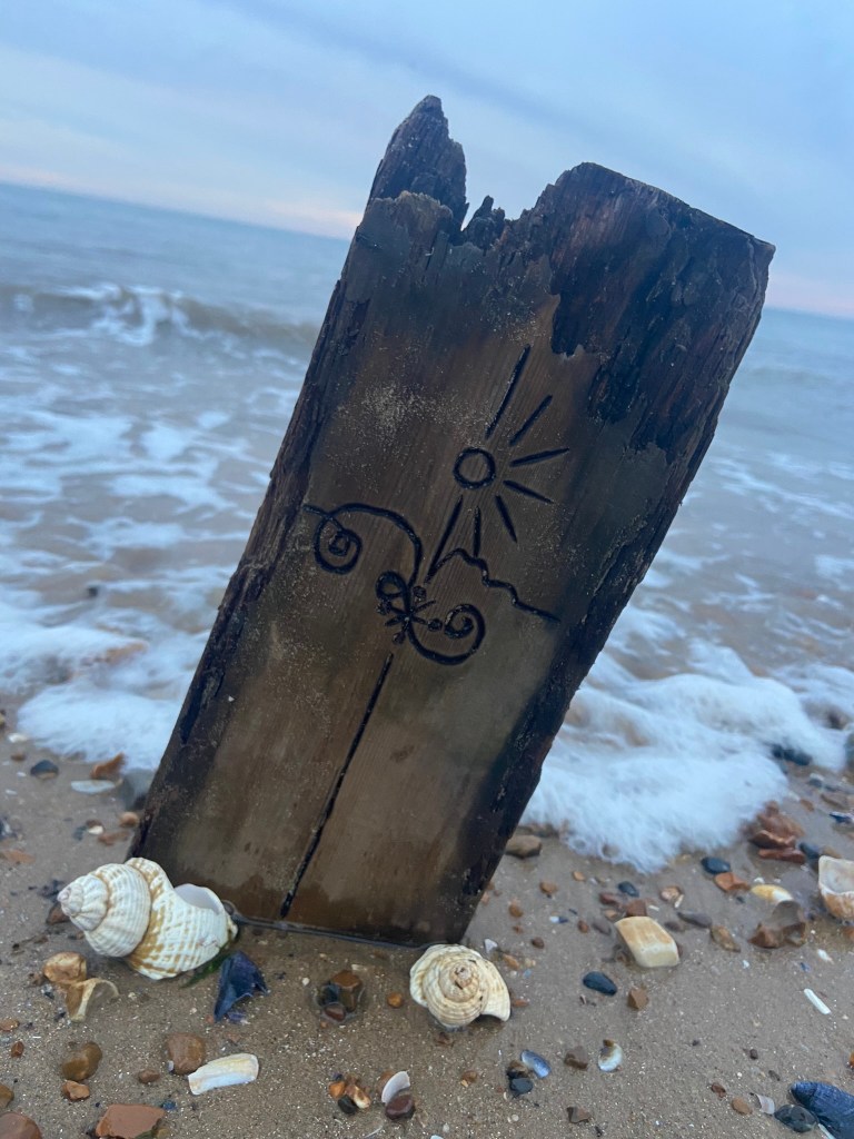
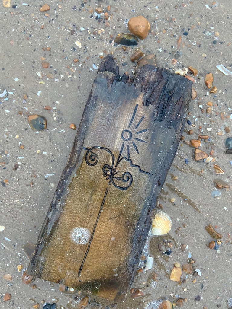
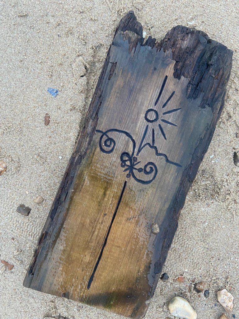
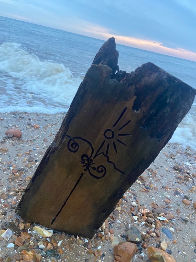
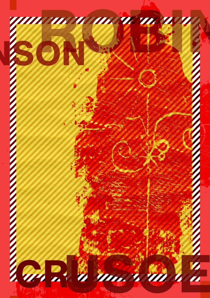
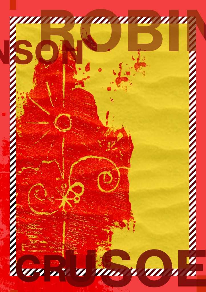
In my spare time I actually do a bit of Pyrography so it seemed appropriate that I could try this out! – I guess that in my head at the beginning of this brief I had looked at so many modern covers that I had the vision in my head to go with a similar idea! I like grungy and gritty mixed media designs so it would be a good idea to give a few experimental designs a go! Pyrography onto driftwood would work well with the narrative too because it could have been carved by hand out of sheer boredom by Crusoe as he was stranded for hours, days, weeks, years on the deserted island.
My in-laws have a plot of land with some old glasshouses on and let me tell you there is nothing you couldn’t find in there! – after searching for a short while I came across the perfect piece of flat wood which would work well enough to etch onto. I etched my fine line illustration onto it, (thicker lines just did not work with this illustration as the lines got lost and blended in together).

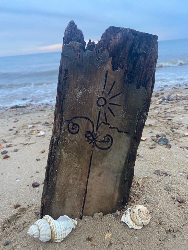
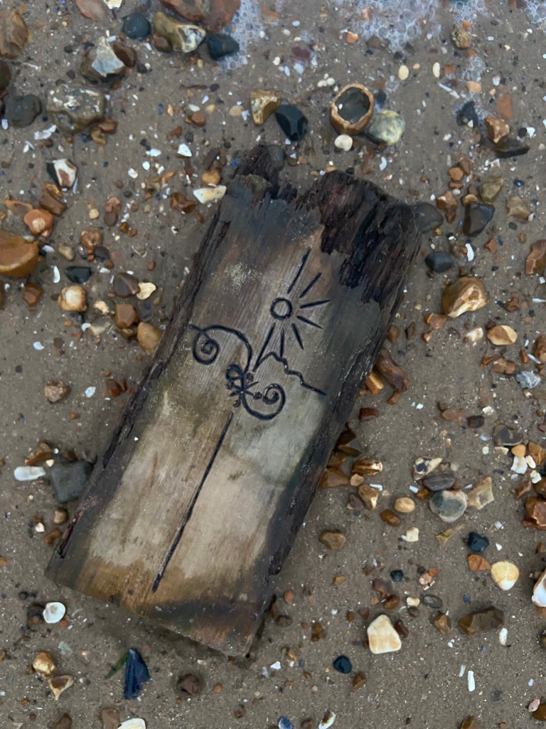
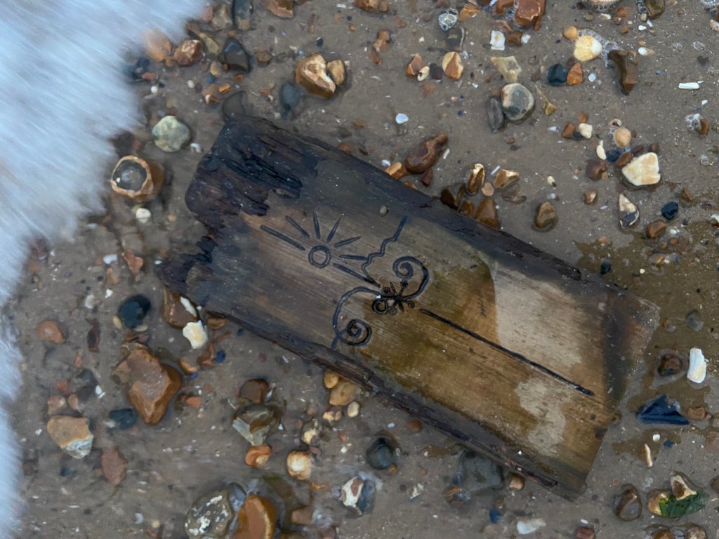
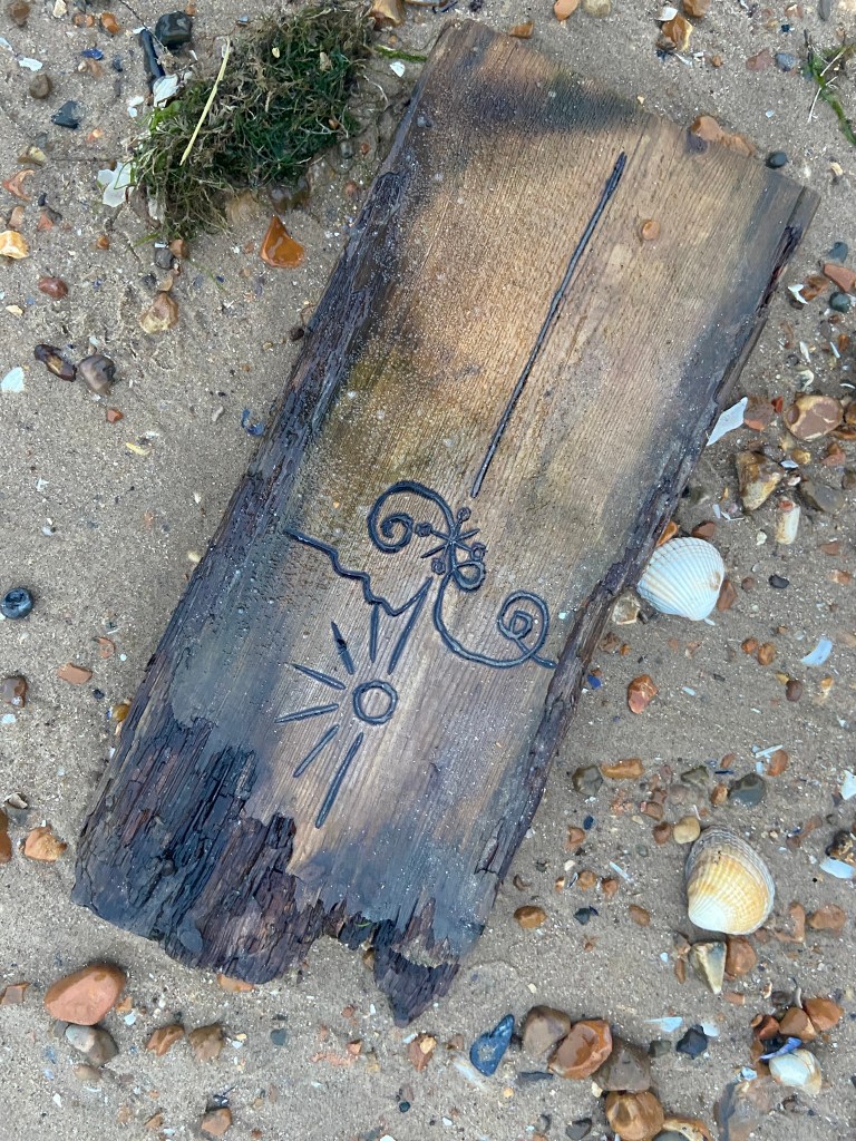
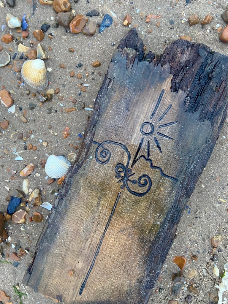
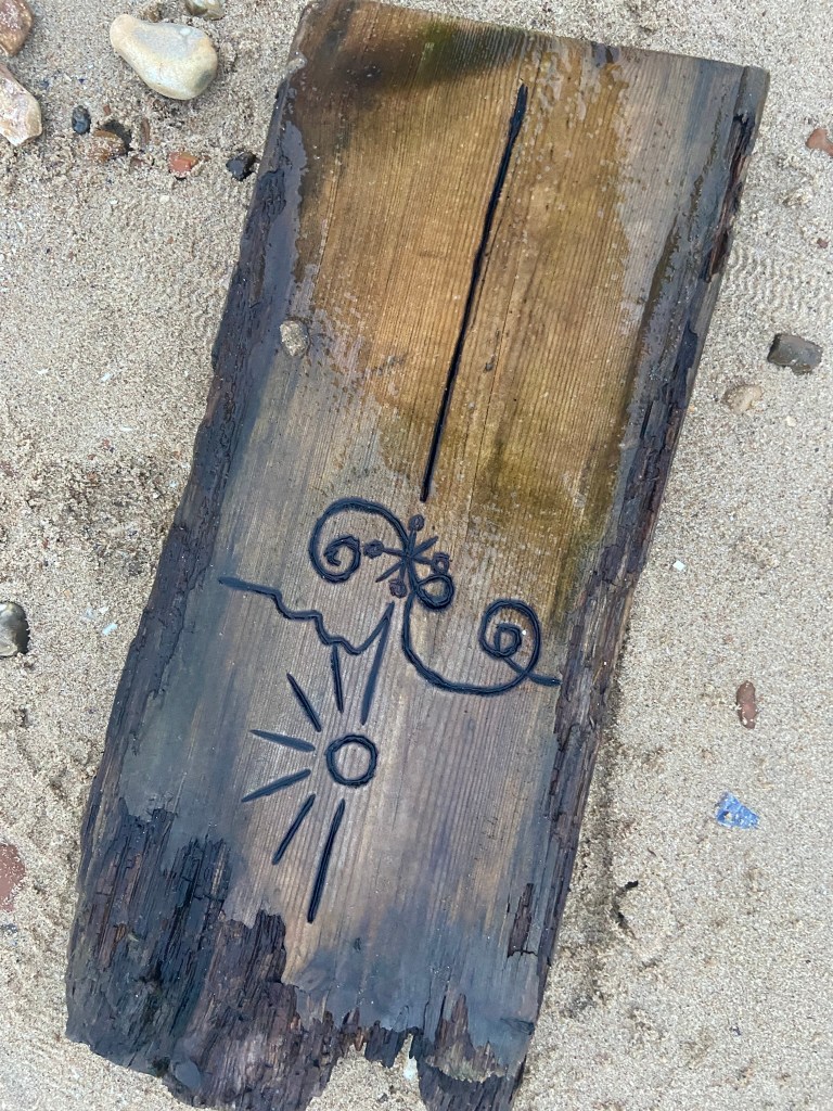
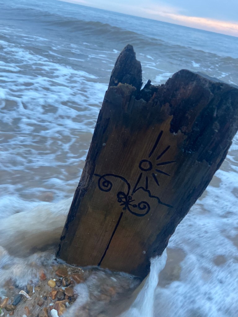
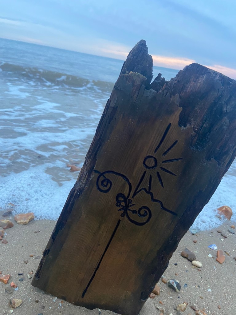
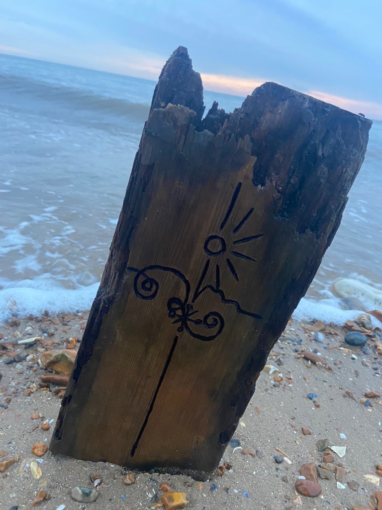
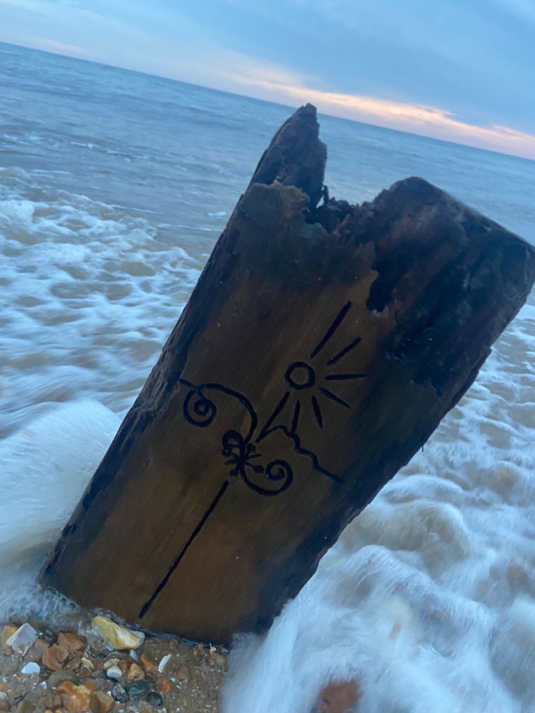
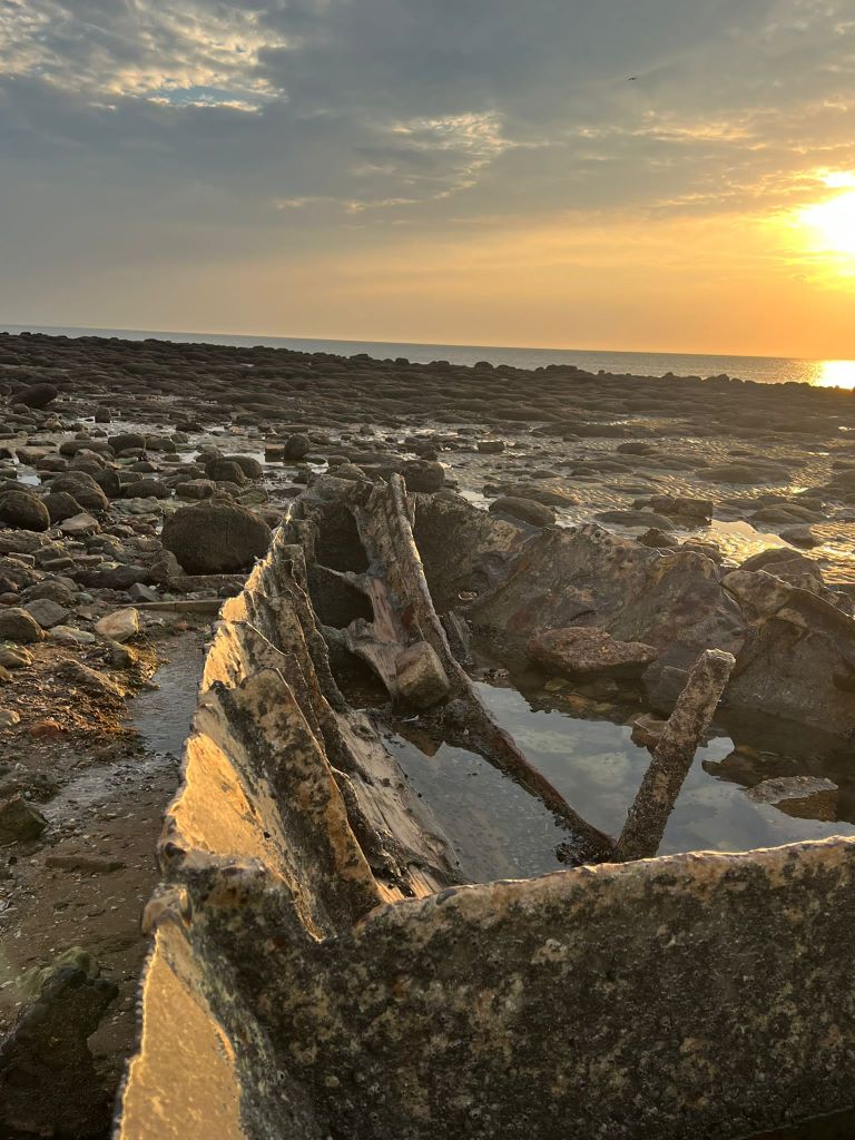
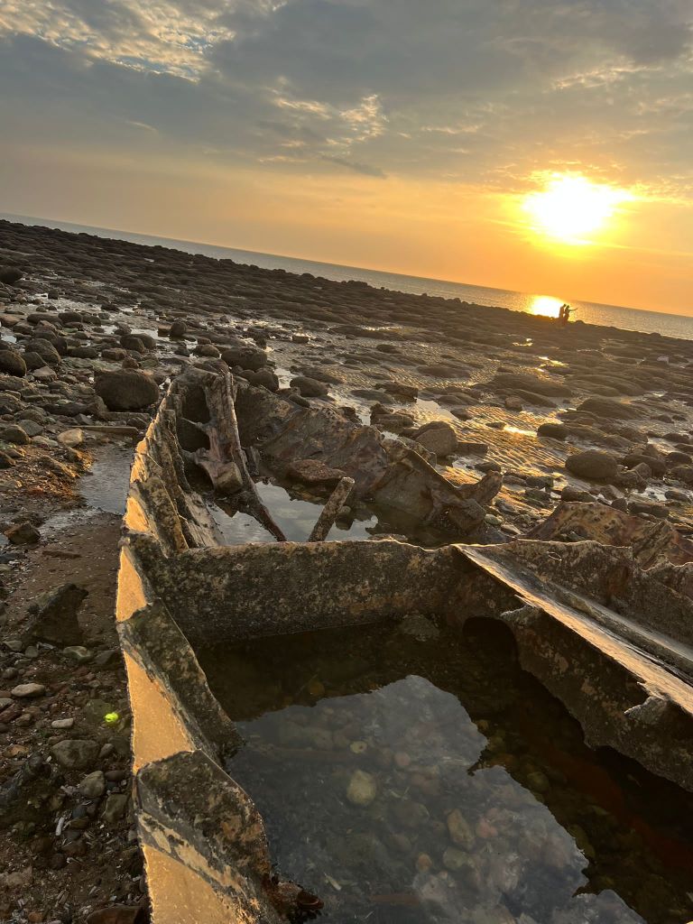
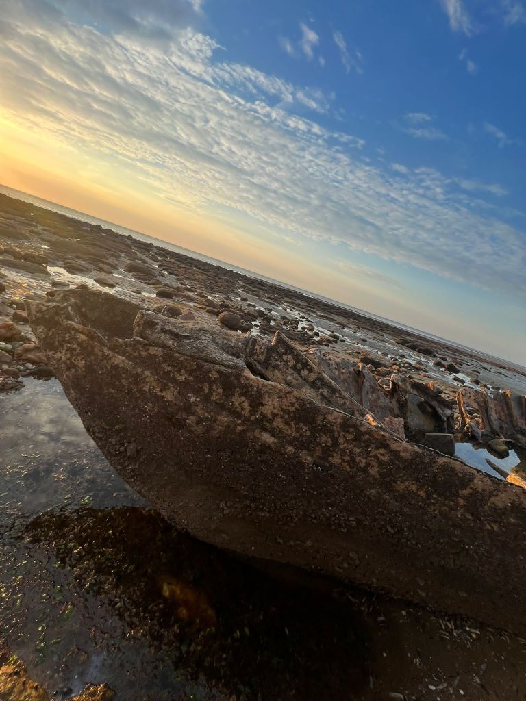
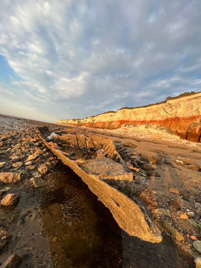
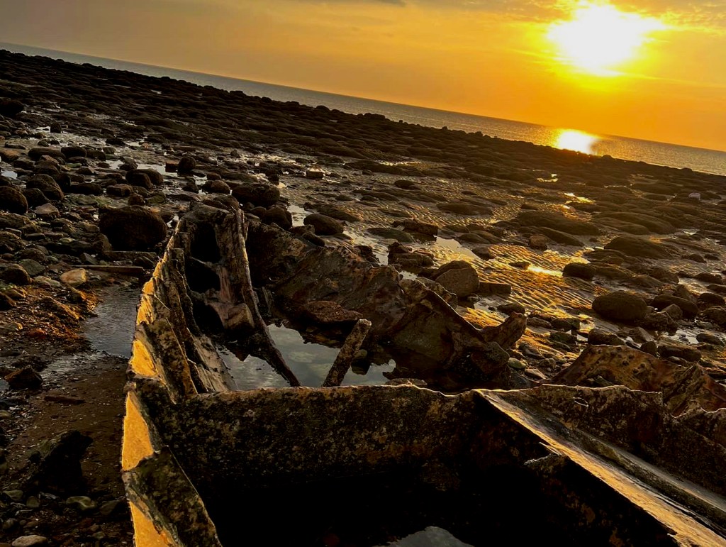
I then couldn’t think of a way to make a piece of wood look attractive on a book cover so I decided to take it for an outing out to the beach and see if I could take some scenic photographs of it!


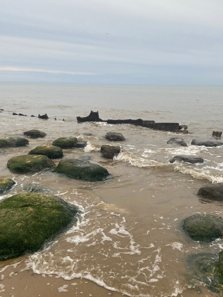
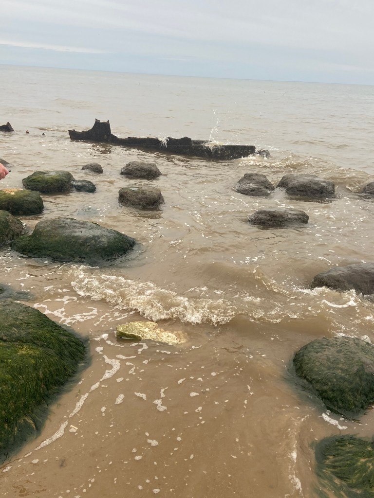
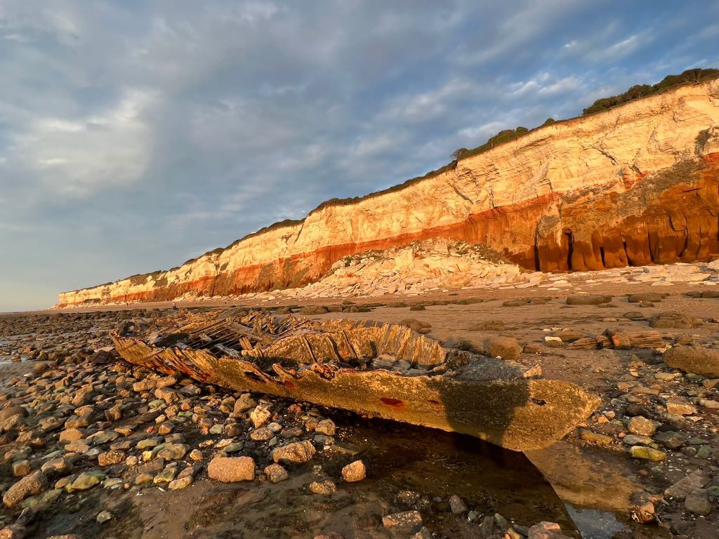
It wasn’t the most sunny, scenic day in Old Hunstanton on this day, even though it was July!- It was a little cloudy and we very almost got cut off by the sea trying to photograph the old ship wreck! I was gutted the sea was coming in quite quickly and we couldn’t have had some photographs with the piece of wood right near it! – fits the narrative right?


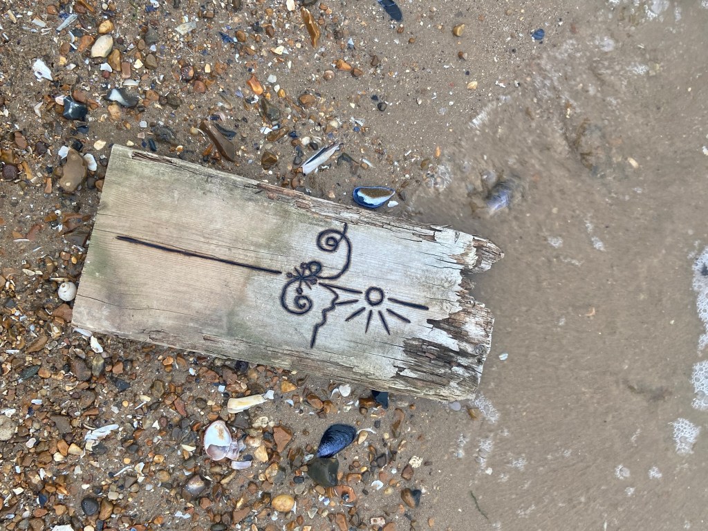
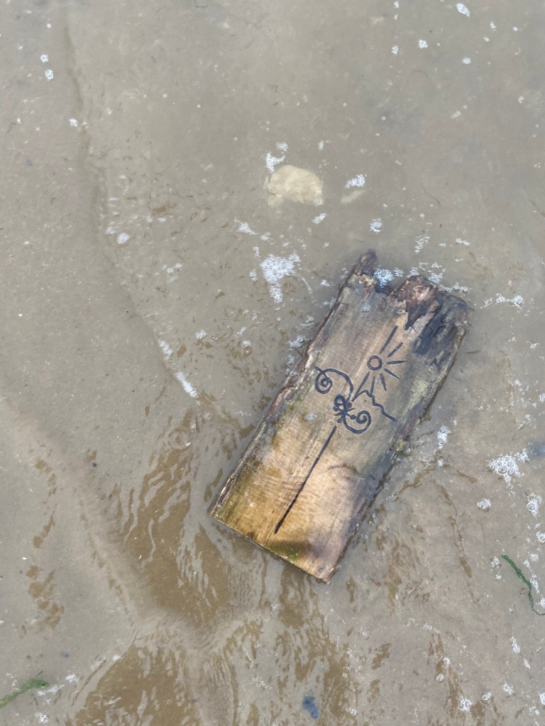
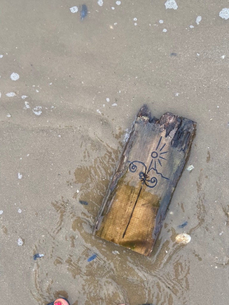


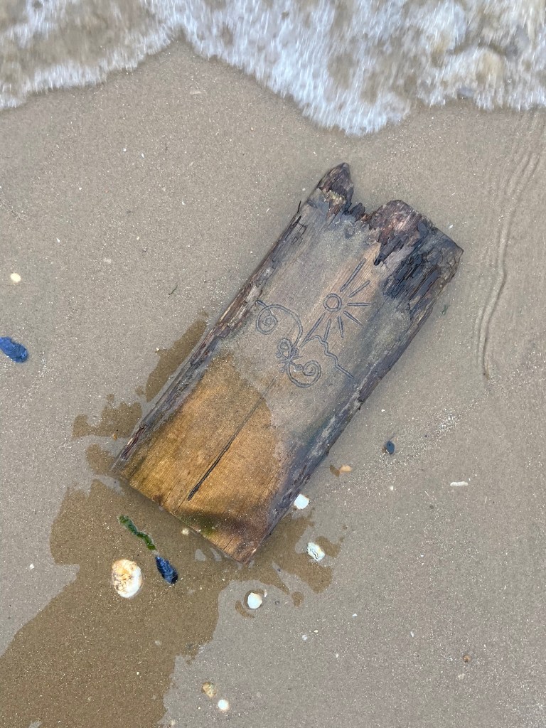


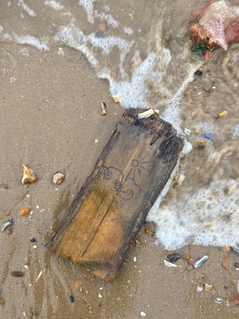


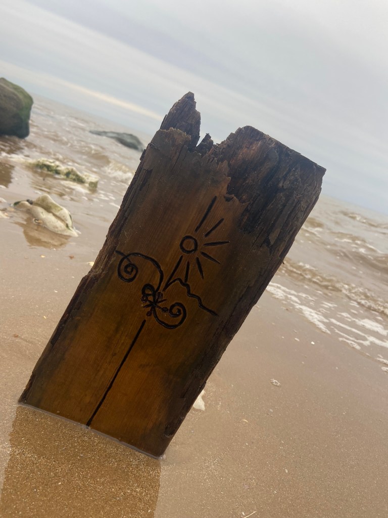


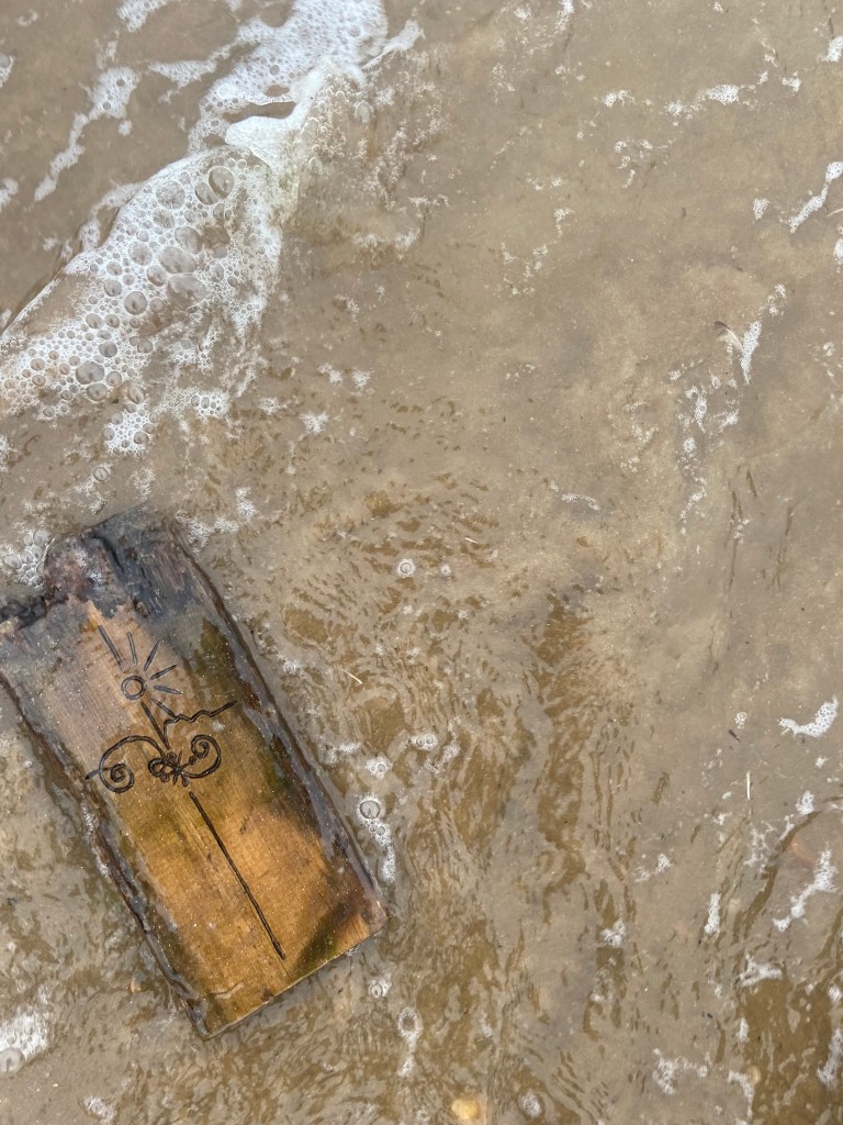

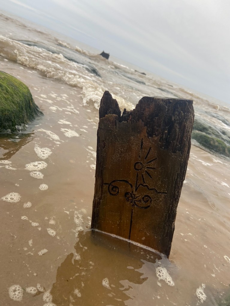
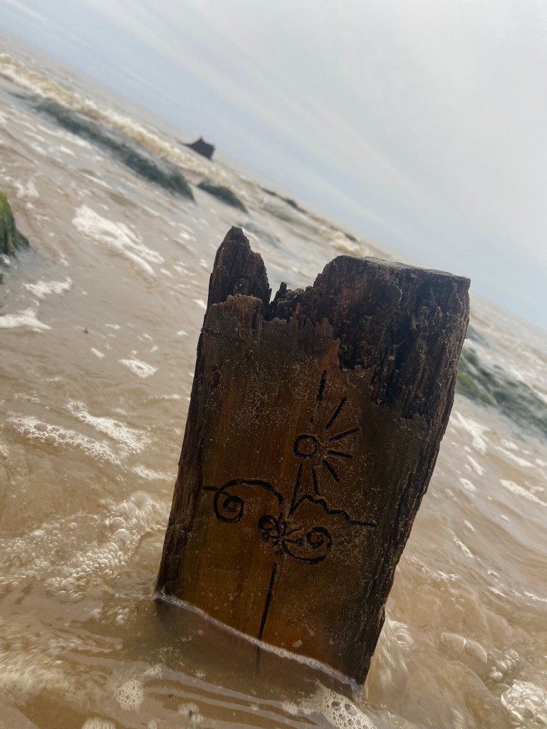
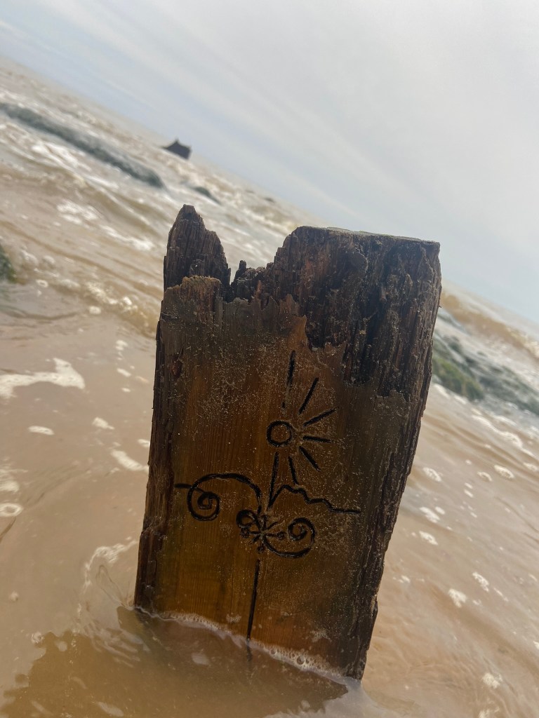


I started off with these photographs and none of them thrilled me! – how I could turn these around into an interesting, engaging book cover I never knew!
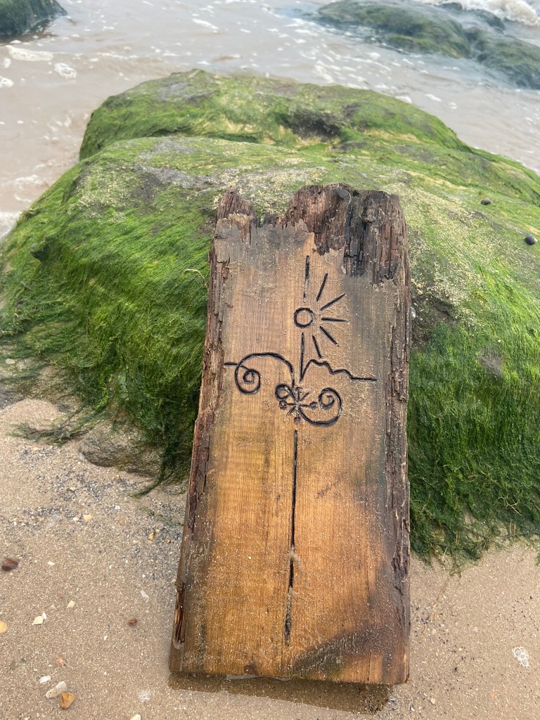
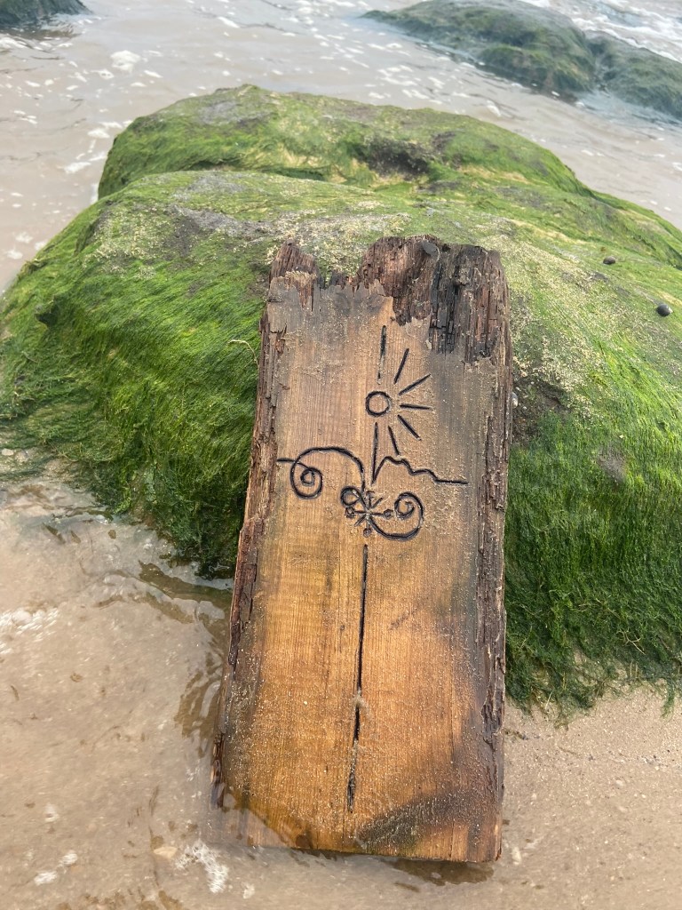
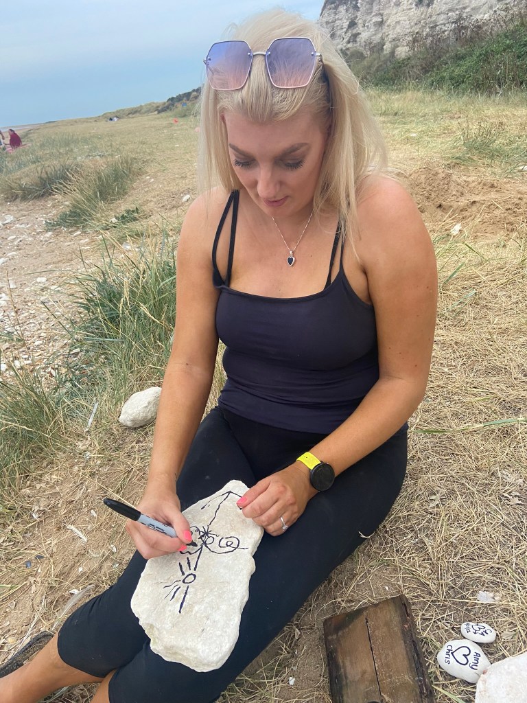
I then decided to photograph from a different view point… taking a sharpie and drawing onto some rocks for effect to see how that might look!
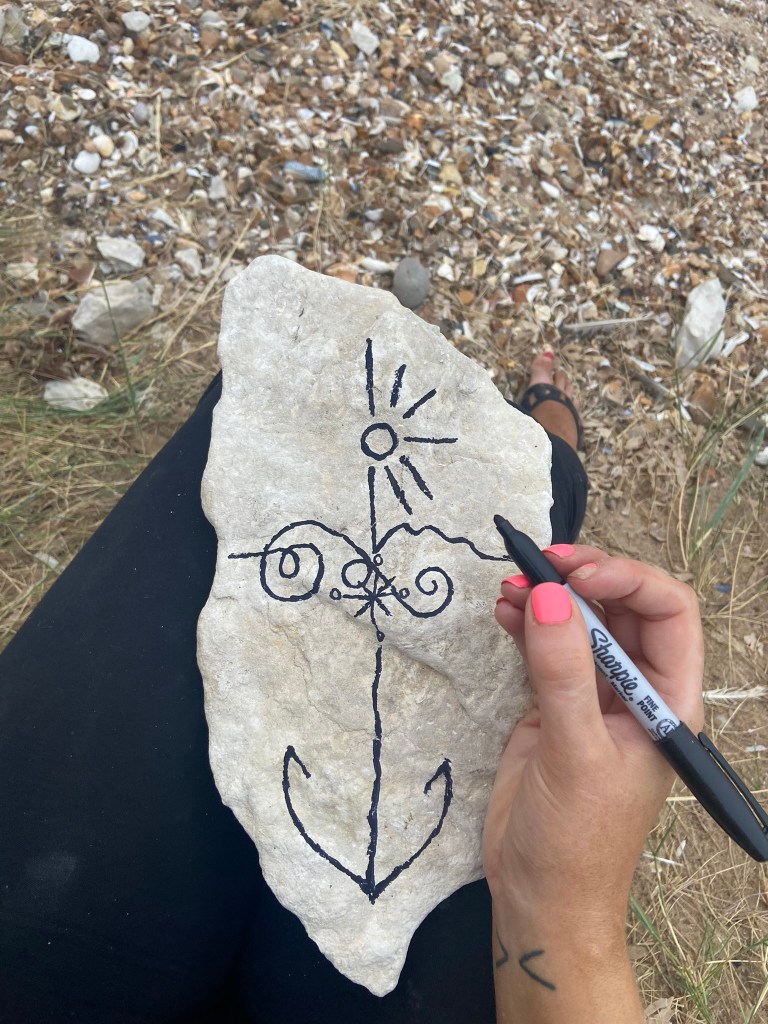
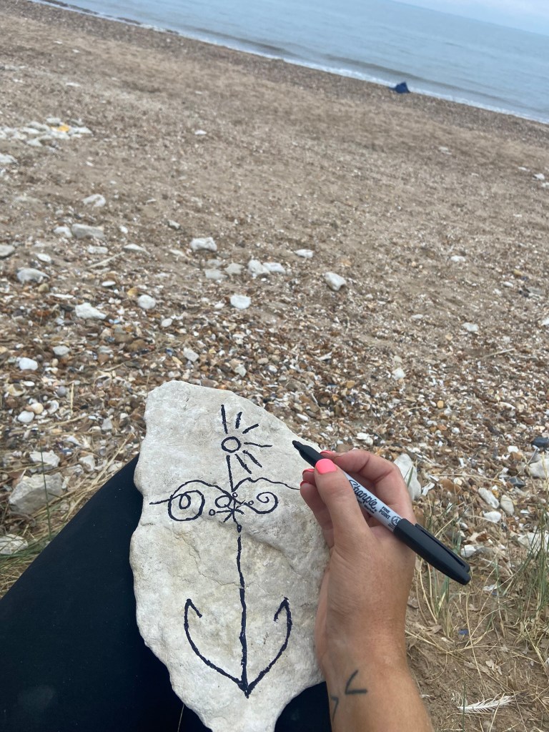


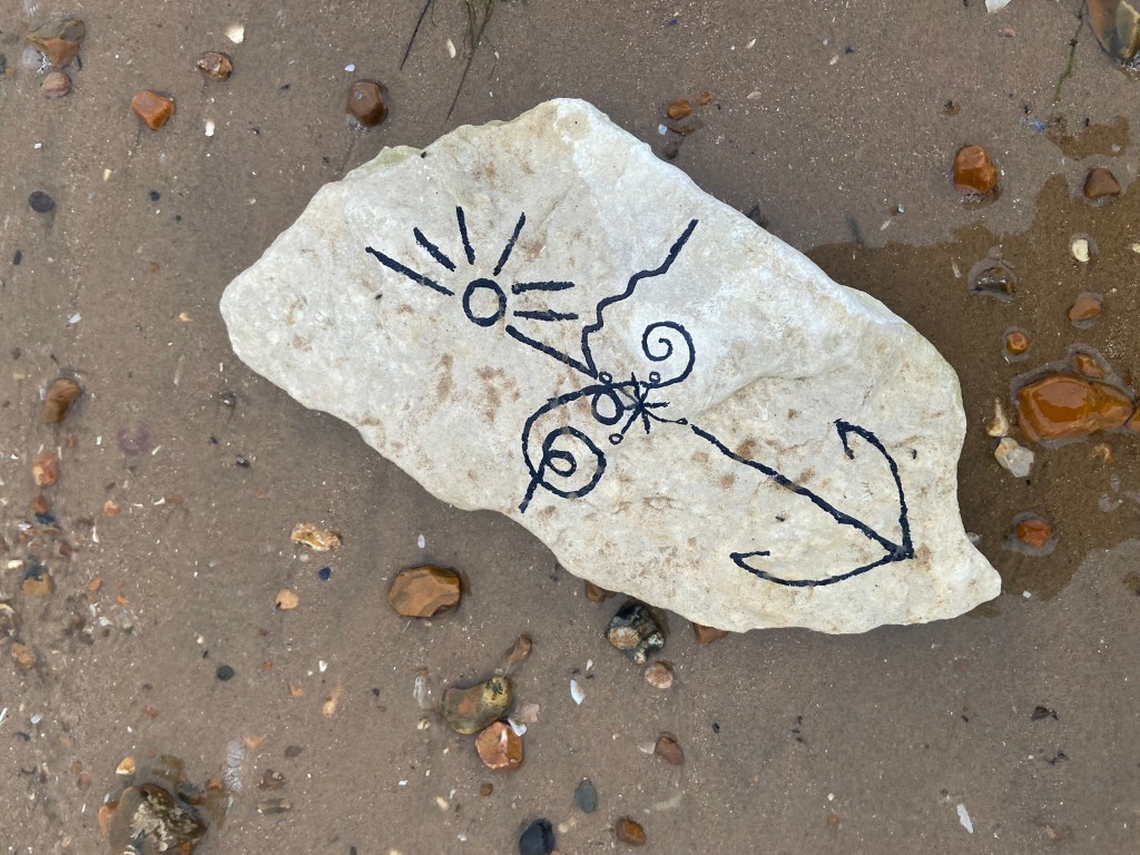
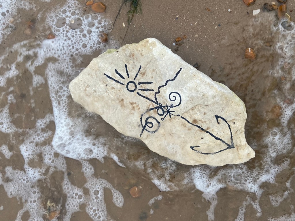
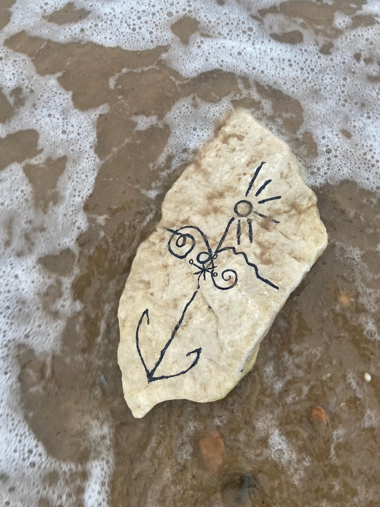

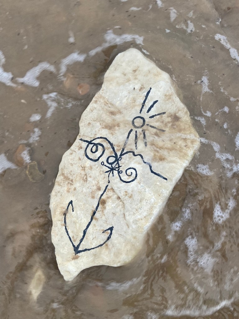
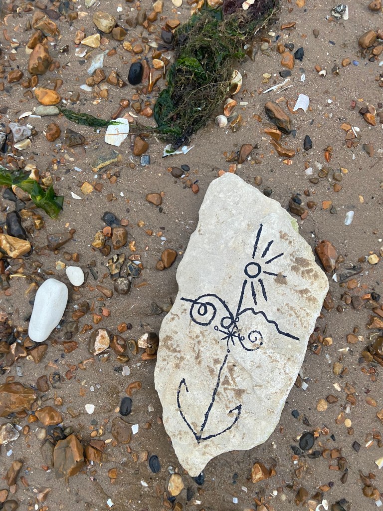
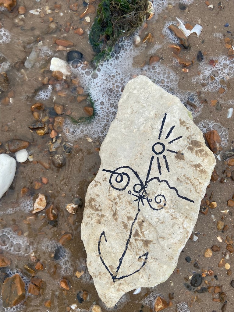
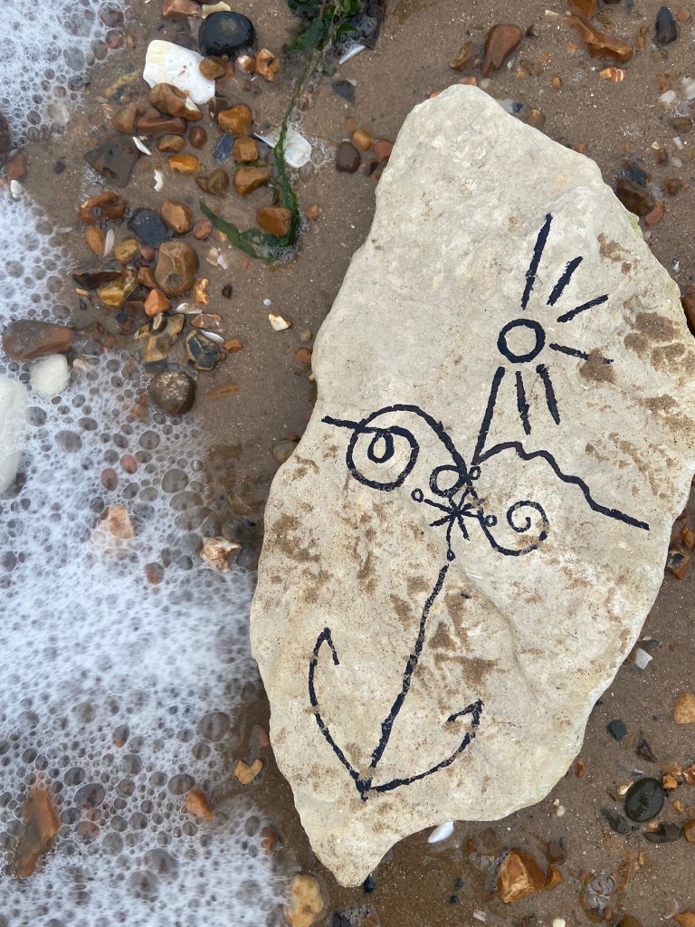
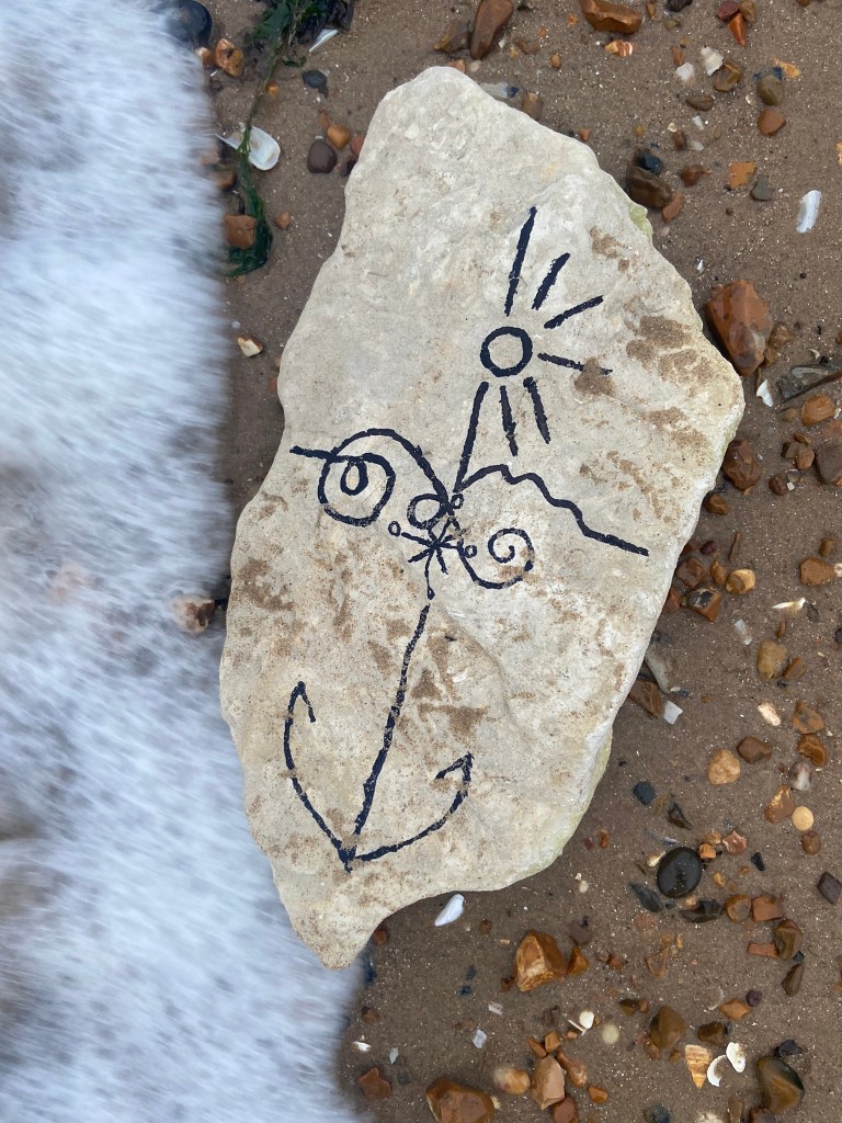
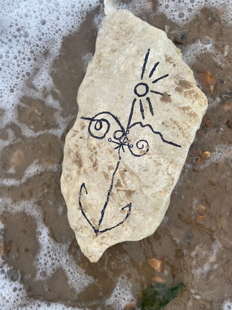


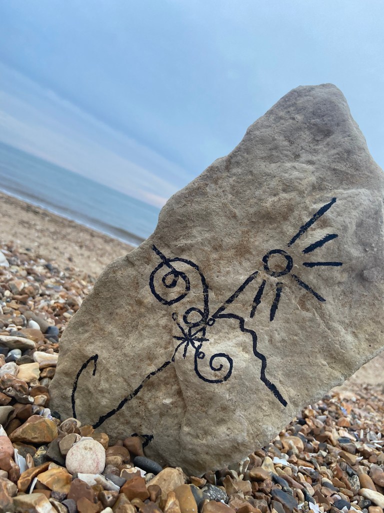
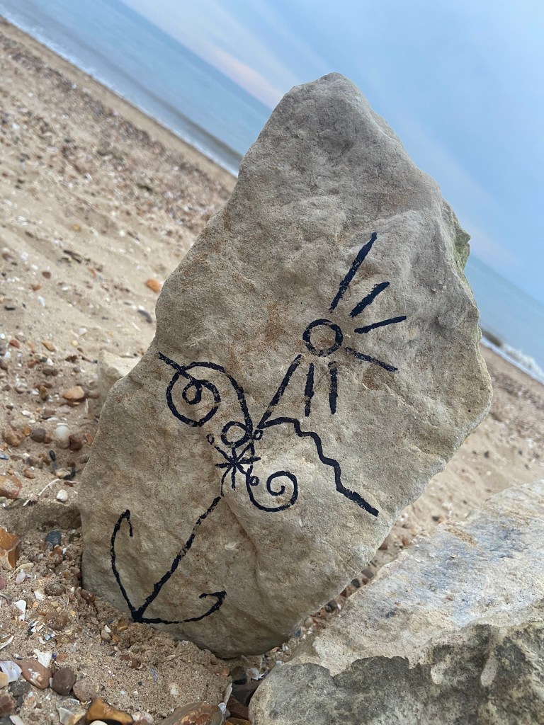
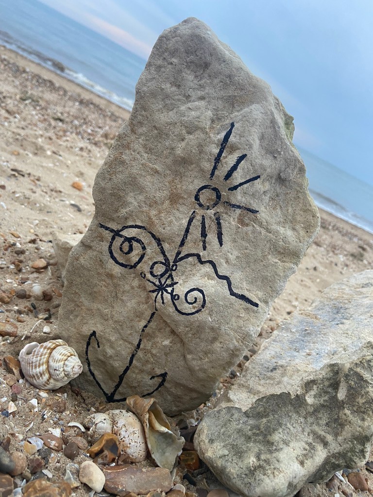
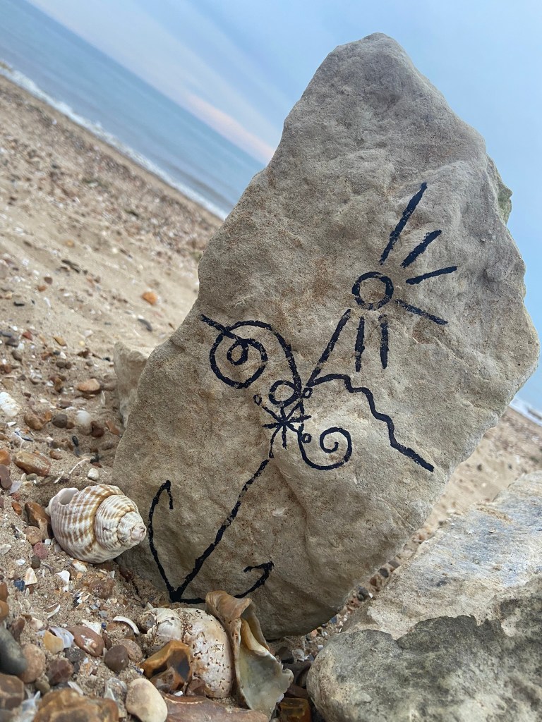

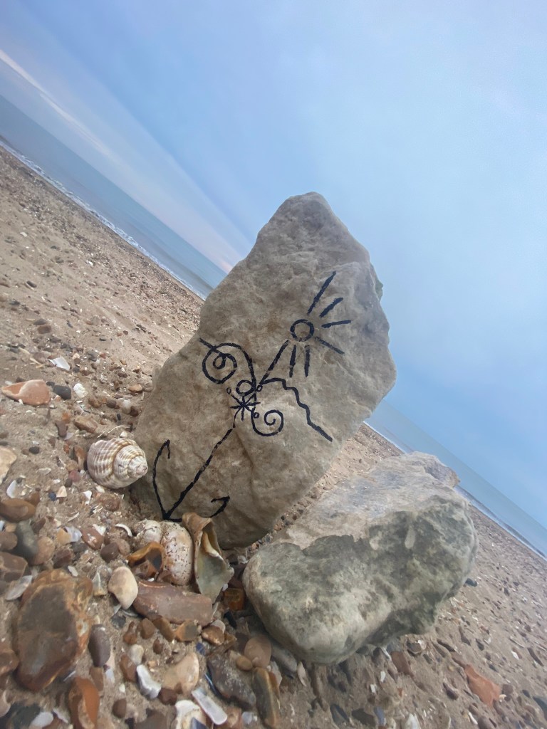
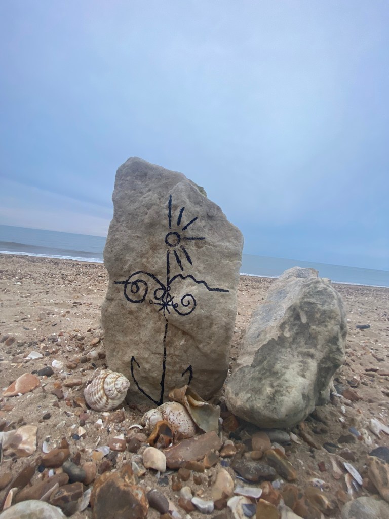
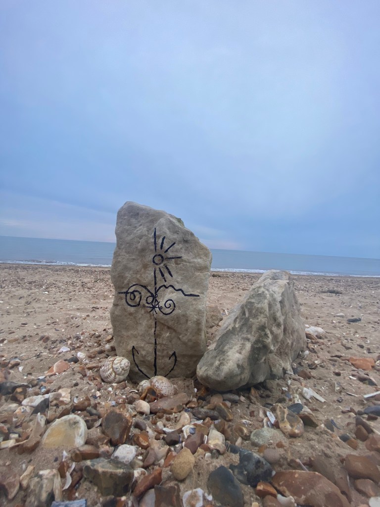
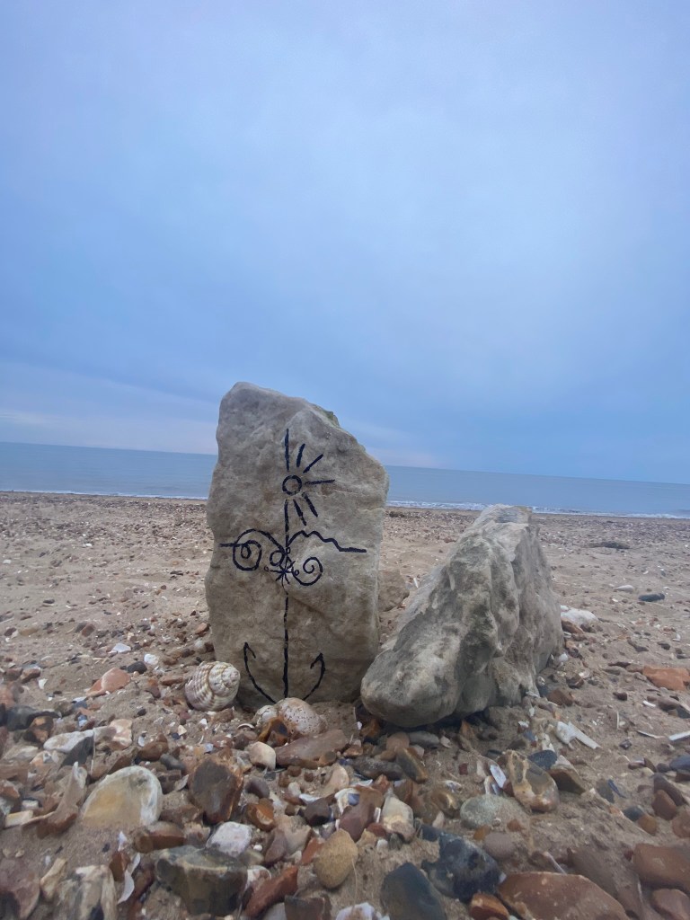
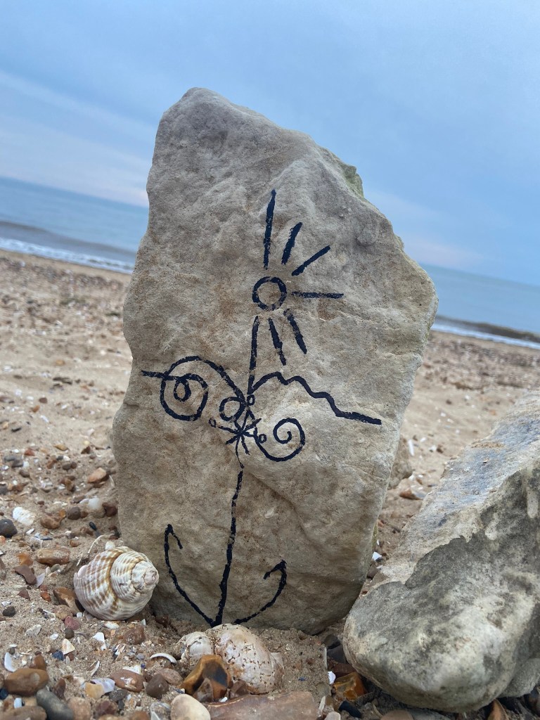


I was just put massively off by the fact that my freehand illustration on the rock looked like a face! All I could see staring back at me was a smiling rock!


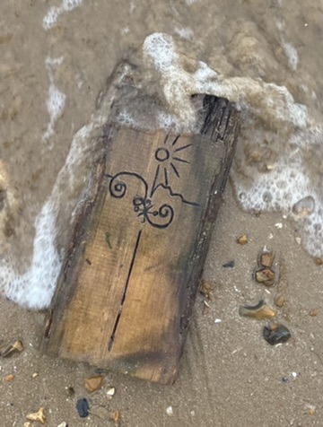
I then took a few more photos and whilst I got a few nice action shots of the sea kicking in – the rest weren’t much good!
I then decided to try and use the wood to create some different mixed media techniques:


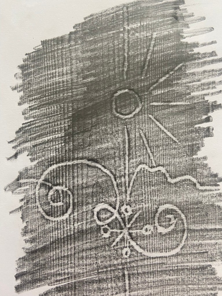
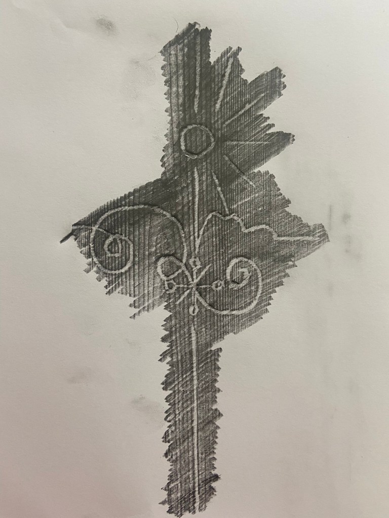

I used a pencil originally to etch over the top of the wood but then decided to just try an embossing pen over the top which worked really nicely. I then decided to try and block print with it by using lino paint and a roller to roll the paint over the top and then press down onto the paper. I liked this technique because it looks like the illustration has been drawn into blood; Robinson Crusoe does have a darker side to its story with the Cannabilism and murders so this could tie in with the narrative!..
I decided to explore around this idea first! I imported the photograph into Photoshop and developed a few ideas! I also got some photographs of some sand textures and imported them in and overlaid them with my photograph to make it look as thought he blood has been dragged across the sand and then drawn into. I also created a diagonal striped line pattern in Photoshop as this represents danger and is also used in warning signs – I also like the minimalist/Constructivist look of it. I have experimented with Typography by breaking the text up and by changing


My favourites are these ones:


I then developed these a bit more:
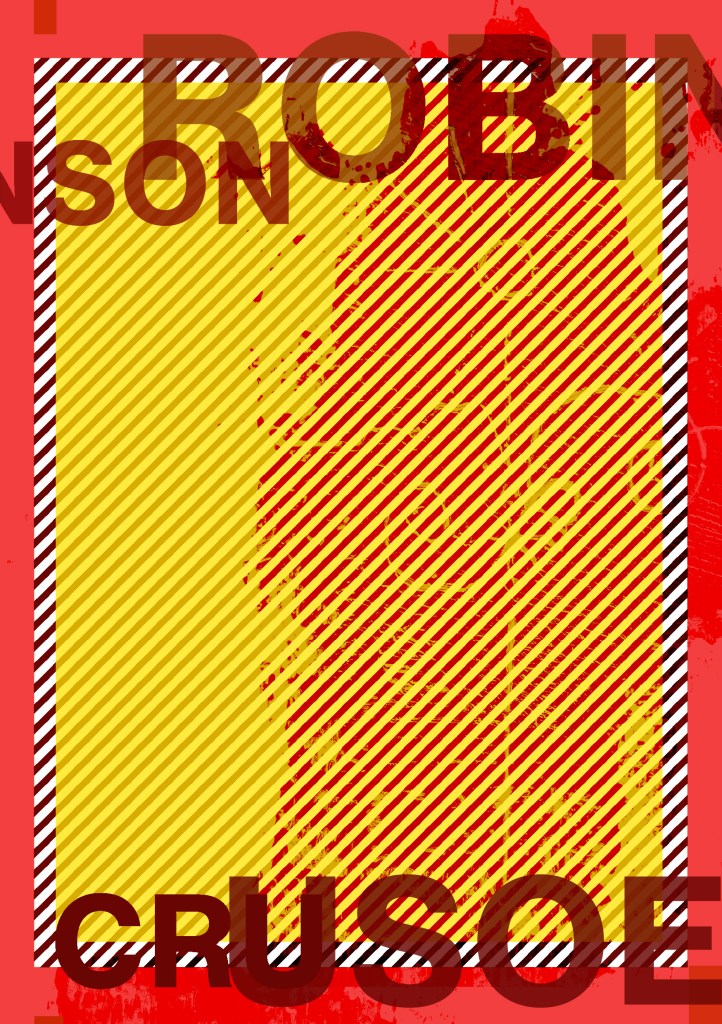
I decided on these two in the end; one slightly more minimal than the other
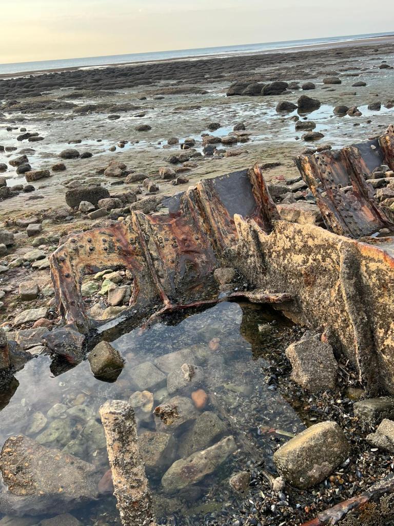
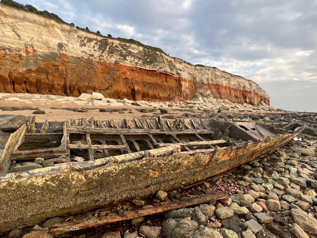
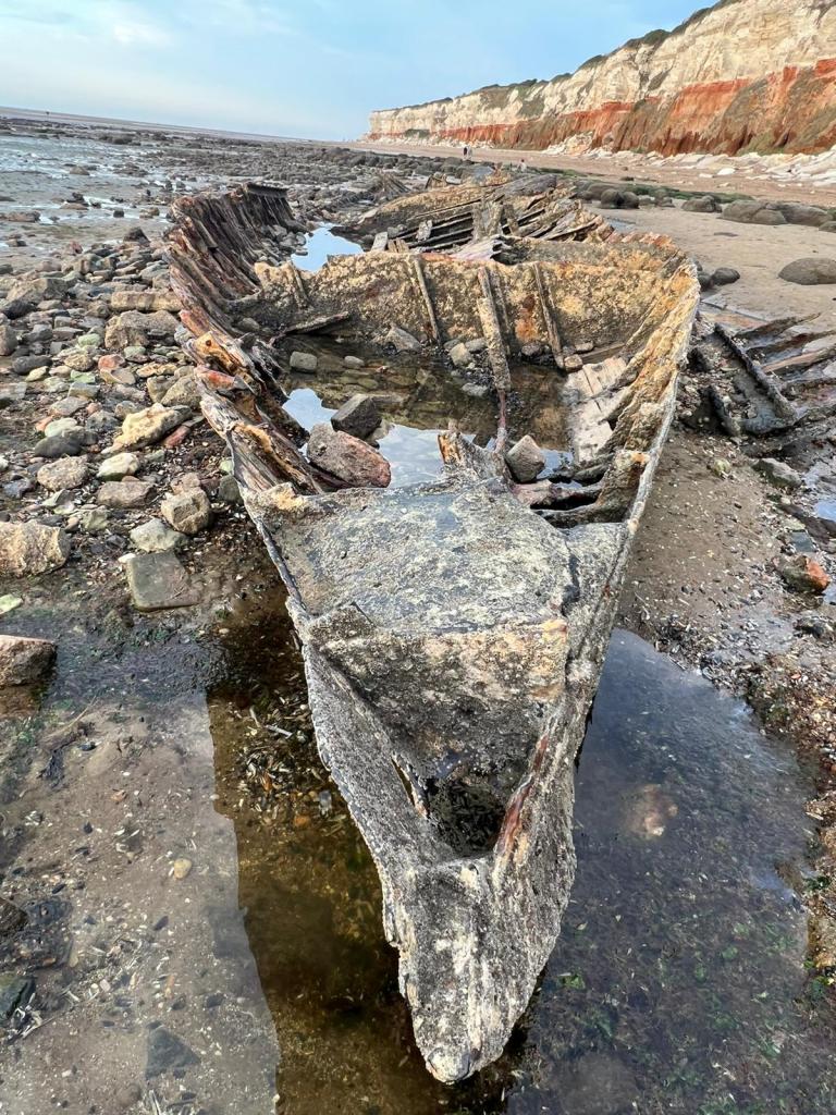
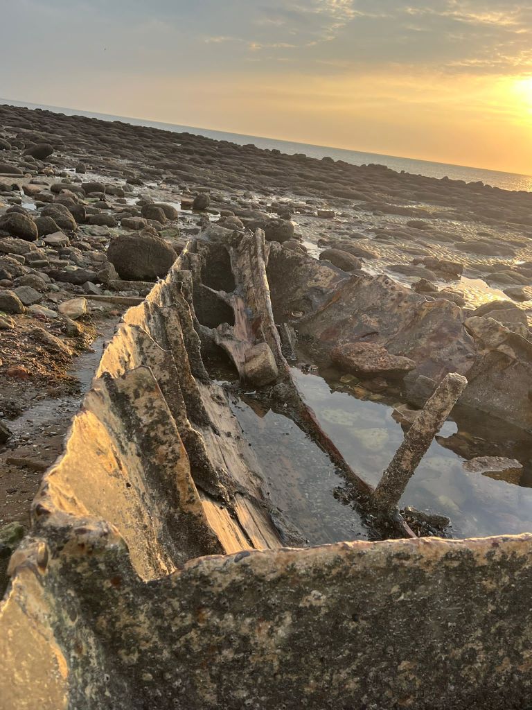
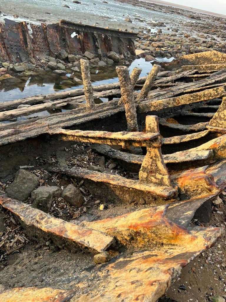
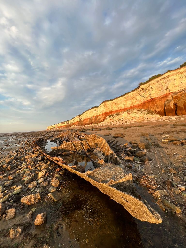
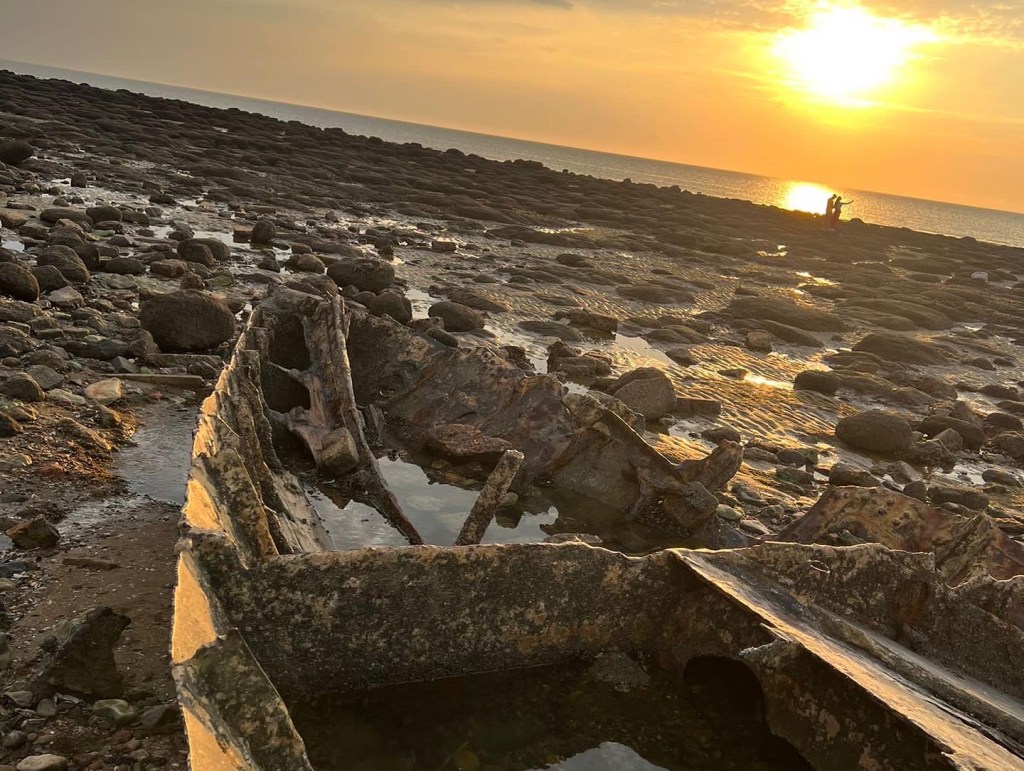
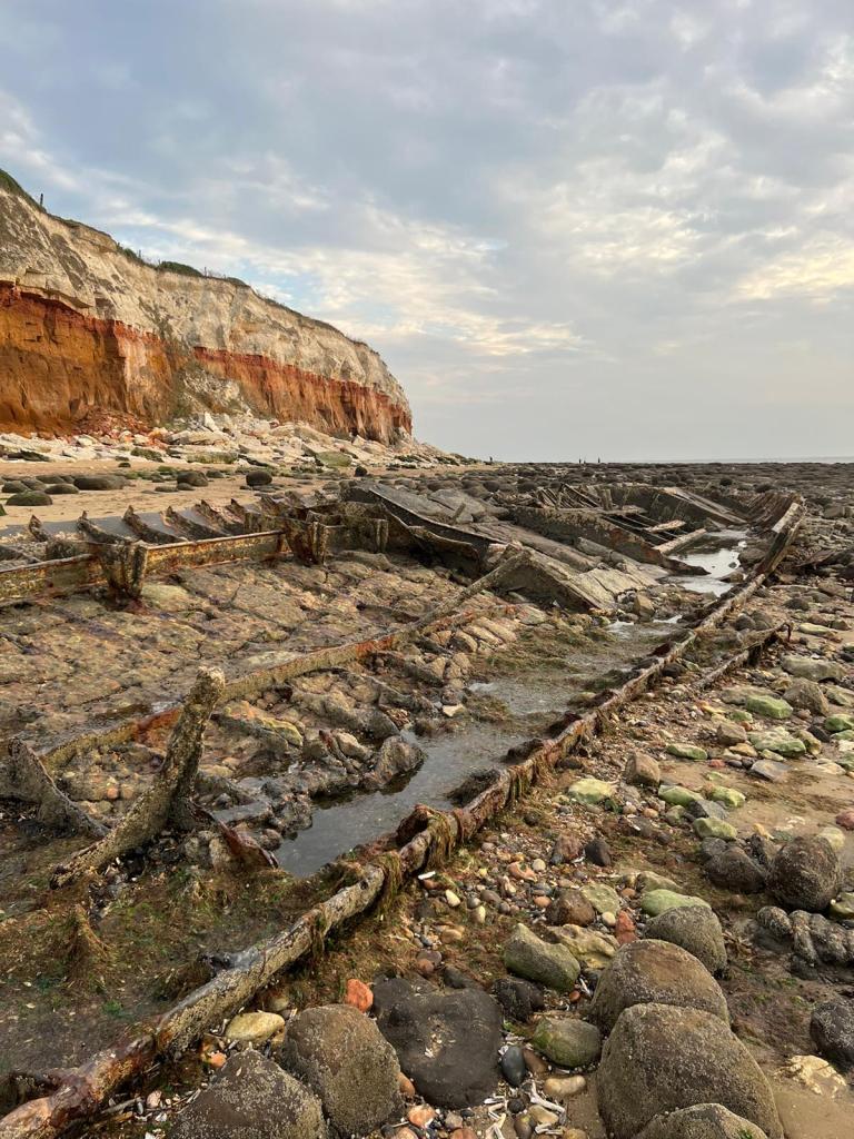
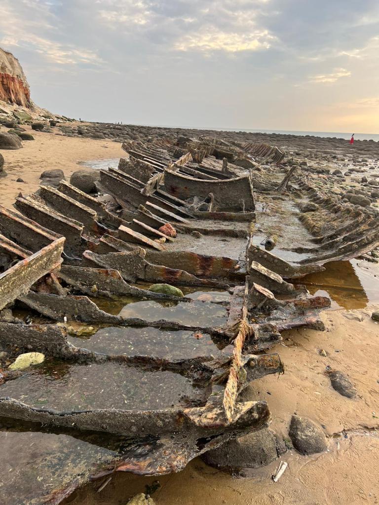
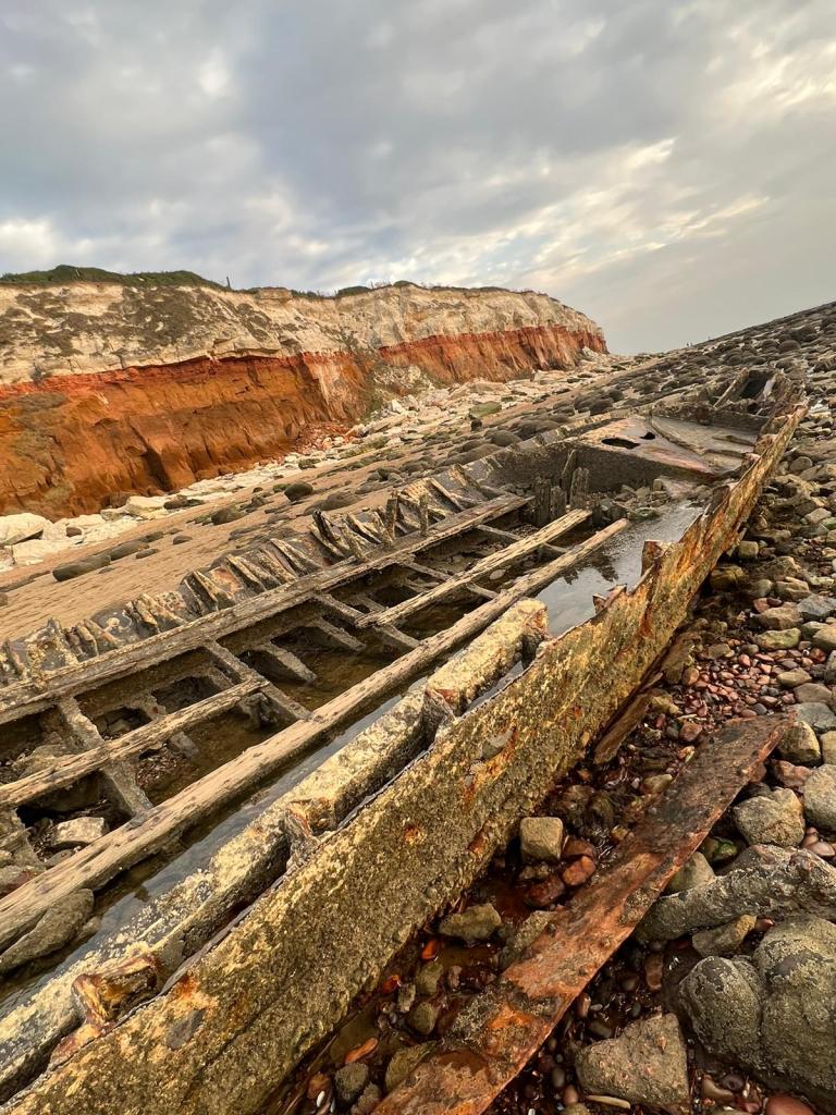
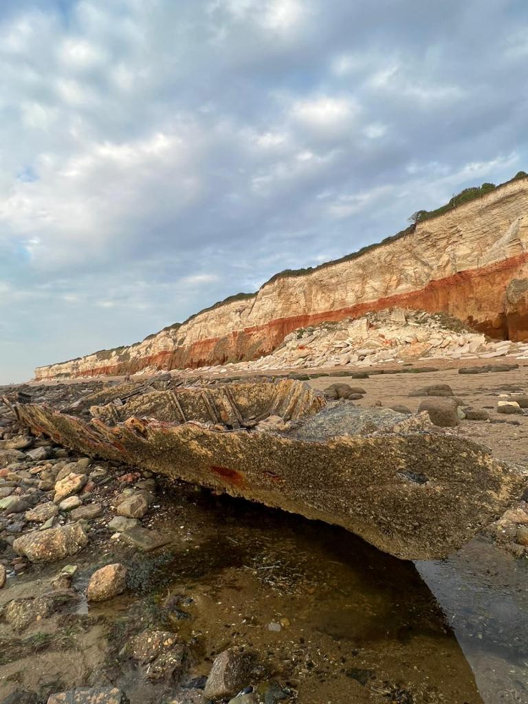
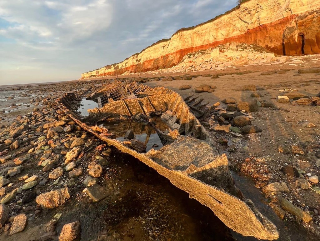
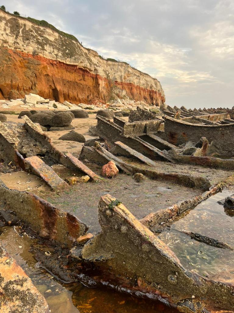
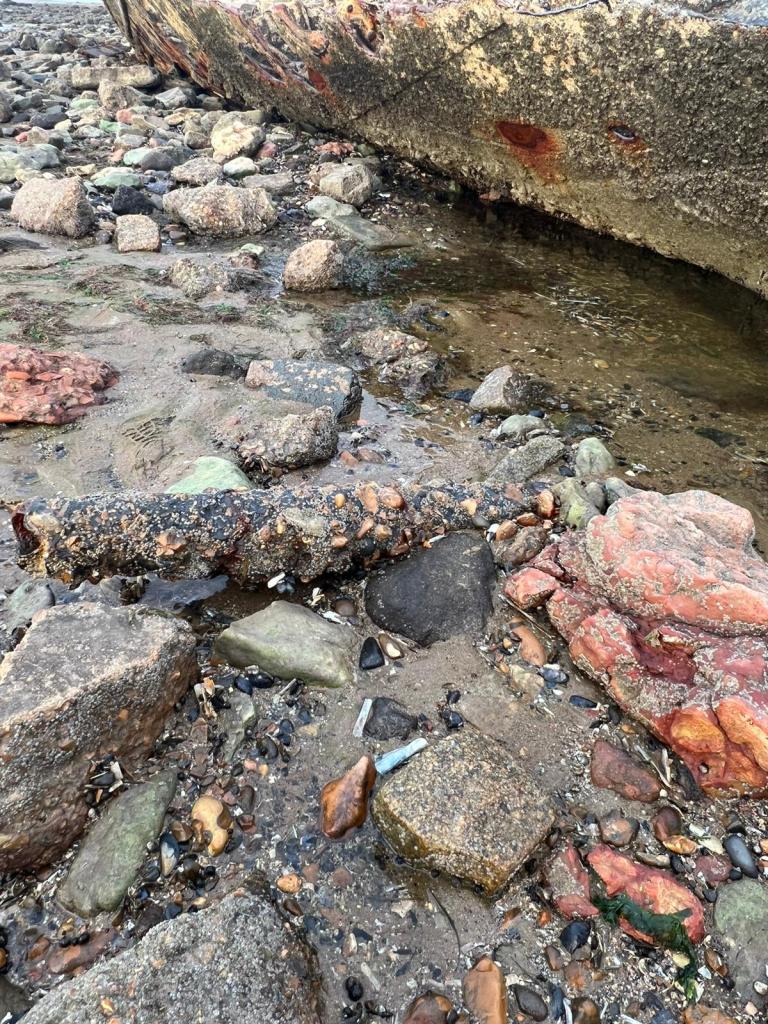
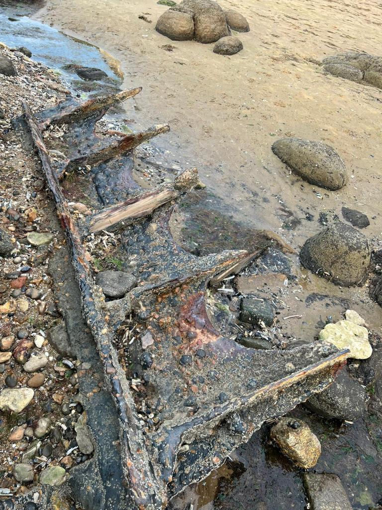
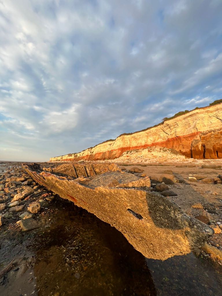
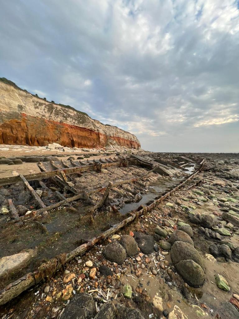
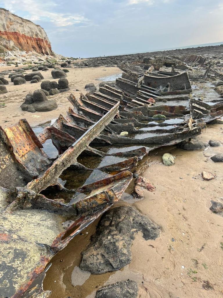
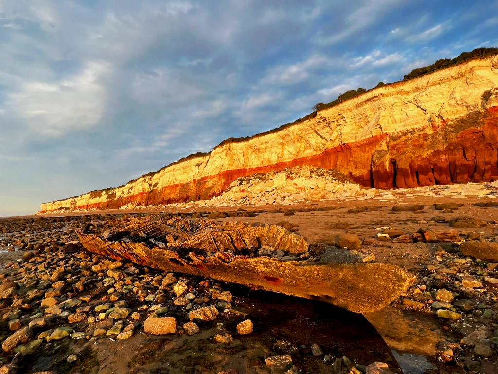
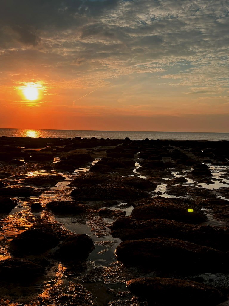
I decided to also go back to the shipwreck at Hunstanton Beach that I was previously unsuccessful at reaching before high tide! – I wanted to see if I could get any good photographs of the ship wreck to include on one of the covers so that it would tie in more with the narrative. I went on a beautiful afternoon at low tide and I was lucky enough to get great photographs this time!


https://www.edp24.co.uk/lifestyle/real-story-behind-the-mystery-wreck-of-hunstanton-sands-935446
https://norfolktalesmyths.com/2019/02/17/hunstanton-the-s-t-sheraton-wreck/
The story behind S.T Sheraton is really very interesting! It is amazing that such a big, iron clad ship can erode so much in half a century.
The Sheraton wreck as it used to be at low tide. Photo taken July 1948 © Copyright William Grindrod
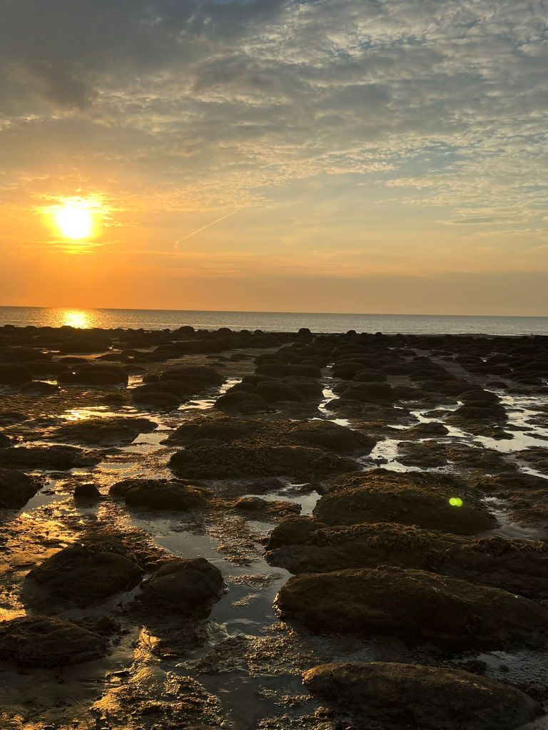
I then took my favourite photos and edited them in Photoshop; there was a couple in the way of my epic sunset and front of the boat snap and I really wanted to edit them out!

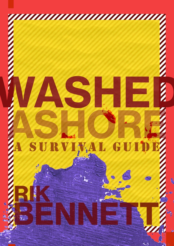
I then started to mess around with ideas in Photoshop of different layouts which included the photograph of the front of the boat; I did have the idea to include the original illustration that I used in all my previous covers (the one I etched into the wood!) but instead I decided to use the paint effect that I created using the block of wood, change the colour and use it to represent the choppy, dangerous waters.

These covers give me Bauhaus vibes. It also reminds me of Constructivism:
Constuctivism was an early twentieth century art movement founded in 1915. Constructivist art was abstract and aimed to reflect modern, industrial society and urban space. The movement rejected decorative styles in favour of an industrial look. Constructivists used their art in favour of propaganda and social purposes and were associated with Soviet socialism and the Russian Avante-Garde.
Although Robinson Crusoe is in no means related to this art form, I liked the minimalist, bold look. The colours contrast each other well and represent the sea, sand and danger! Even the text at an angle represents a ship going down which does tie in nicely with the narrative of Crusoe. The overall look of the cover gives sea sick, dangerous choppy waters, rough sea vibes.
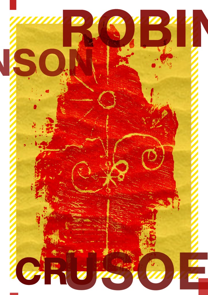
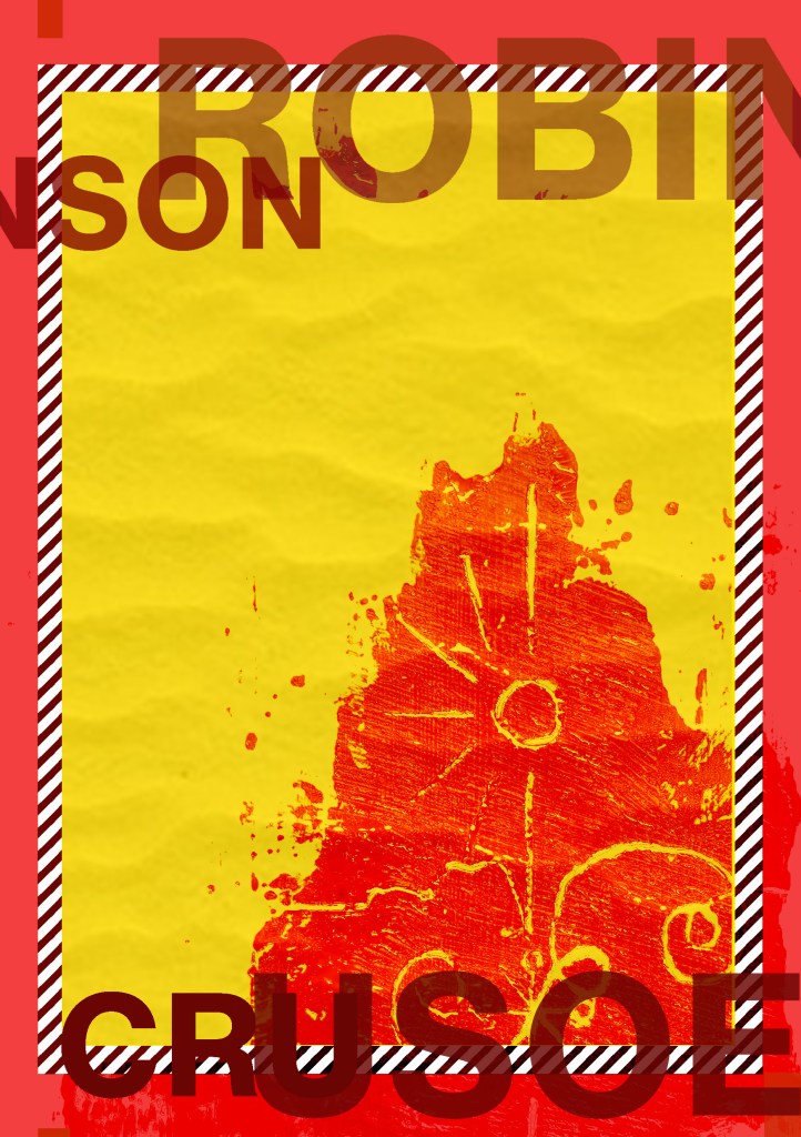
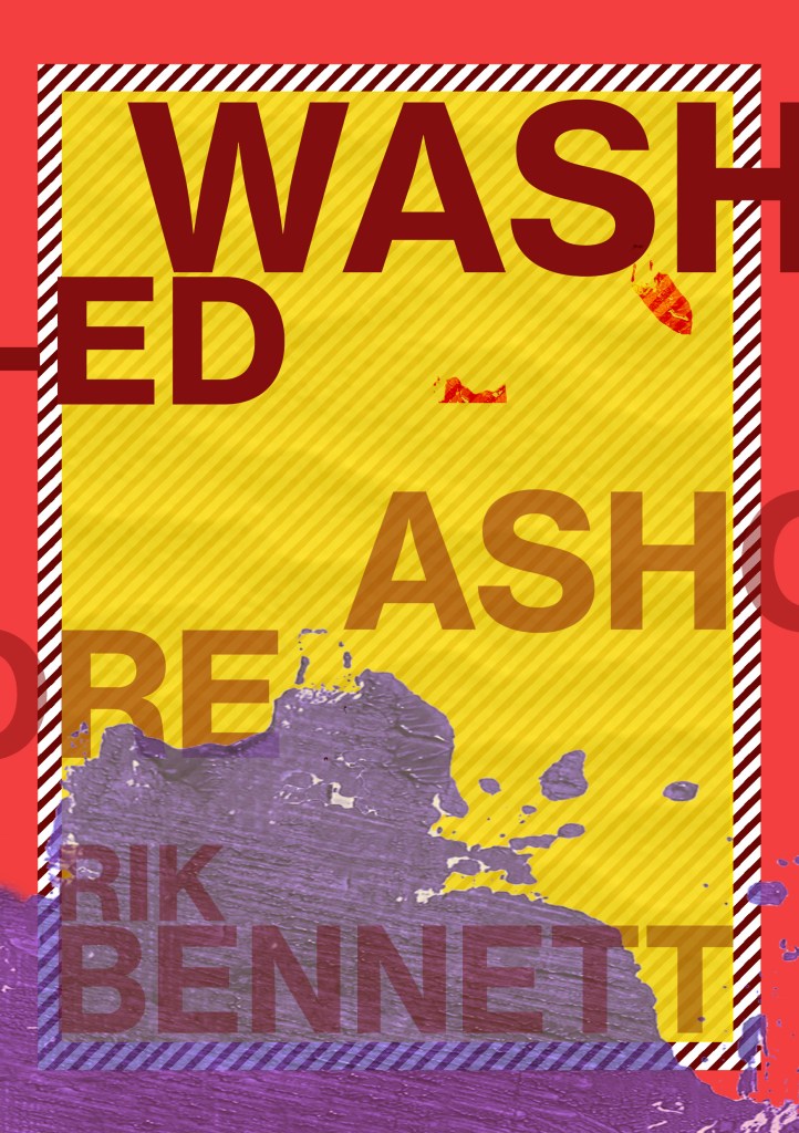
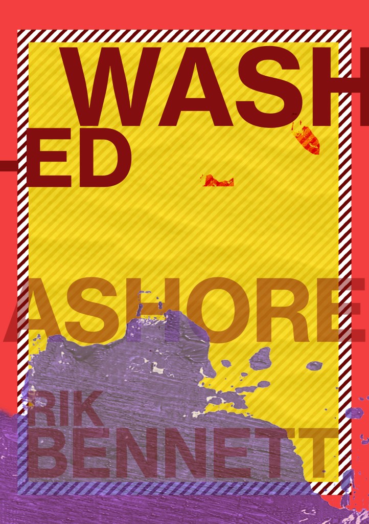
I then went back to look at the cover for the survival guide – “Washed Ashore” my tutor liked the potential in my original design but just did not see that it worked as a survival guide or to tie in with the two Crusoe novels. I can see her point of view from reading through her feedback; although she liked my humorous approach for my original cover for it, she said there was trouble distinguishing whether it is a novel or a guide.
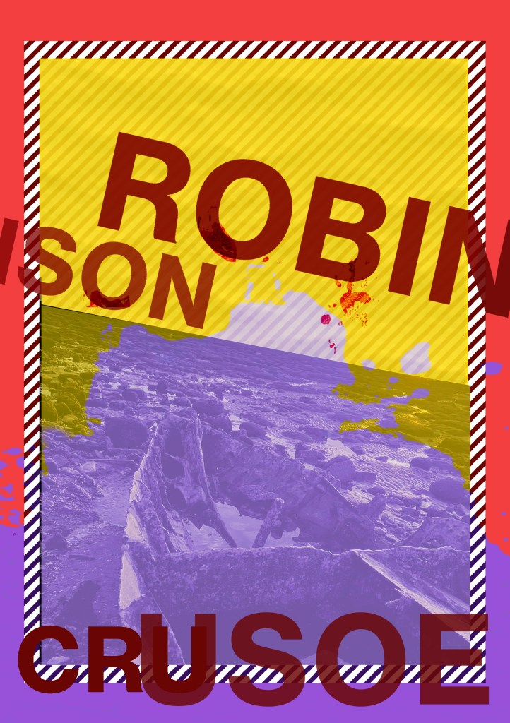
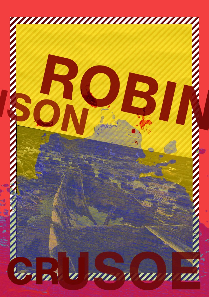
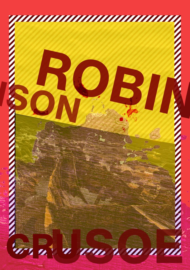
I decided again to use the same layout that I have used in the other two designs as this would work on a survival guide; the warning colours, the diagonal warning stripes… I started to mess around in Photoshop with some layouts and some ideas:


I ended up liking 2 designs;

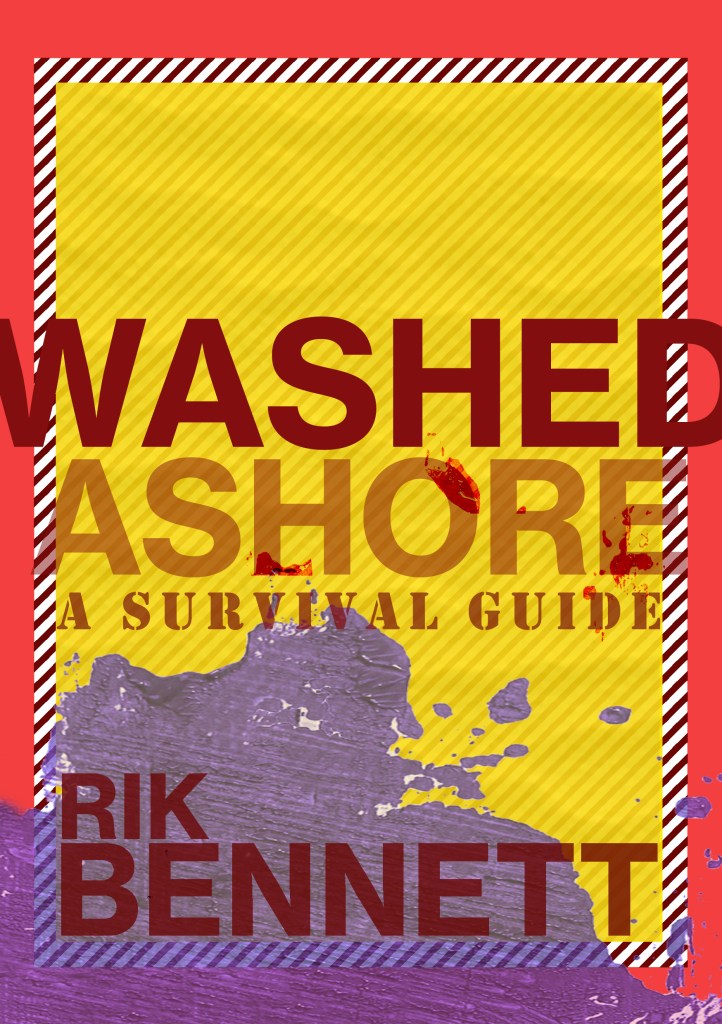
The one on the left is just pure experimental typography and I actually like the most but the one on the right is possibly more appropriate for the type of book it is supposed to be. I have been defeated by cliché by using the stencil font for “A survival guide”; it is not something I wanted to do but other than doing what most existing covers do by using symbols this seemed the less cliché of the two evils!!