The Brief
First Ideas
When I first looked at this brief It is book design which is something I really enjoy doing, but I did worry when the brief stated that once cover had to use Type and images/photographs/illustrations and the other one just type. I wondered how I could use type in an interesting way for the second cover.. surely with just type the cover would be really plain and uninspiring?..
The first step was to research into what book I could design my cover for. It needed to be a book I was familiar with.. I used to read a lot of books when I was younger but I do not read at all now. I decided to choose one of the books from my younger years to design for.
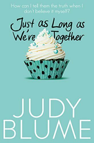
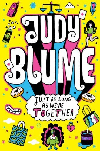
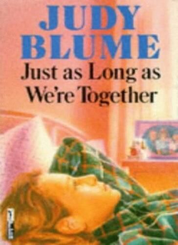
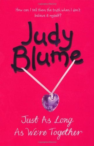
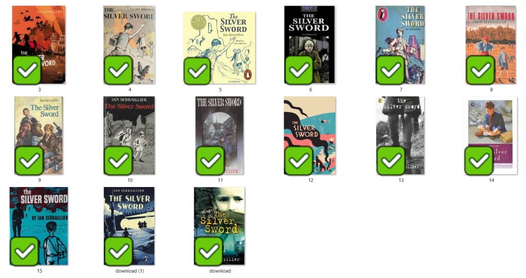
When I was younger my favourite book was “Just as long as we’re together” by Judy Blume. I read this when I was going through tough time in my life and I could relate as an 11 year old to the characters and the storyline. A few years on from that title I started reading “The Babysitters Club” series with my best friend at the time and we LOVED them! I still remember now the stories from most of these books! The characters in the stories were again very relatable and I remember as a young child it made m very much feel like I was a part of this group! It was a sense of belonging. The other book I remember well is “The Silver Sword” a war story about the hope, courage and survival a family holds while trying to find each other and escape to Switzerland during the war. It was a tough call which one to go with. I did research existing covers for each book though:
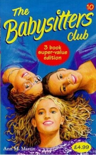

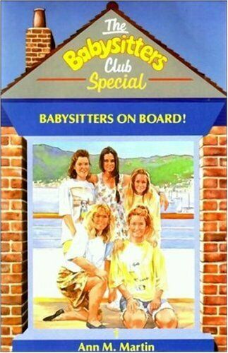
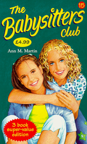
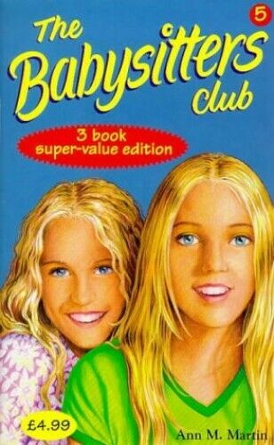
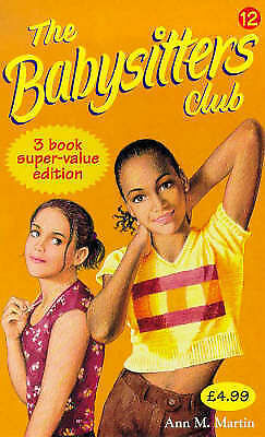
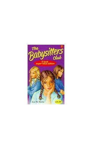


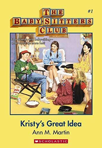

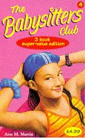
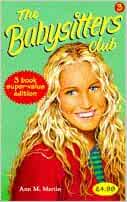


I love the bright colours of The Babysitters Club titles. Looking at these covers brings back so many good memories for me; I feel like that is what good book design should do! The images on the front also helped me to imagine what the characters would look like in real life too. I related the book covers to the storylines very well. This style of cover though is something which I have done a lot of already in my design work.. I felt like I should push yself out of my comfort zone a little..
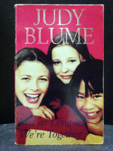
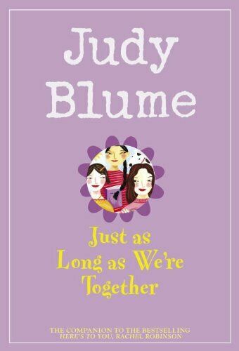
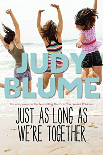
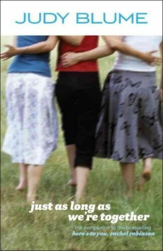
The Judy Blume covers use a lot of photographs; this is a route I did not really want to go down. I much prefer illustrated covers – they feed the imagination more!
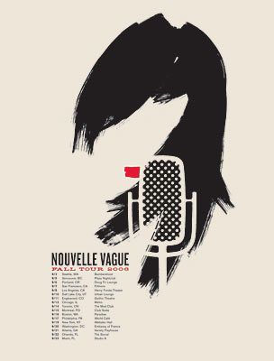
The remaining book was The Silver Sword.. this gave me ideas of using Swiss type in the design as it is a story that uses Switzerland strongly in the plot. I love using Swiss design and Swiss type and started thinking of ways I could bring this into this design…
I also used Pinterest to find ideas for my book covers:
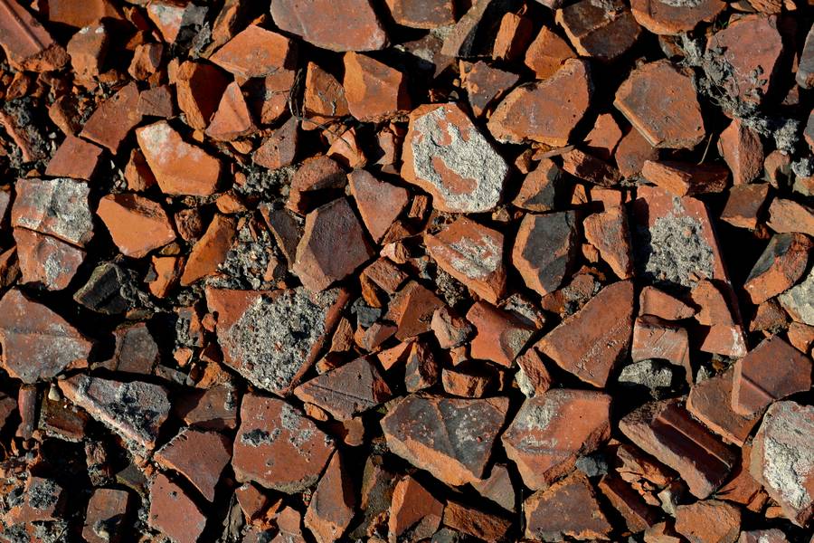
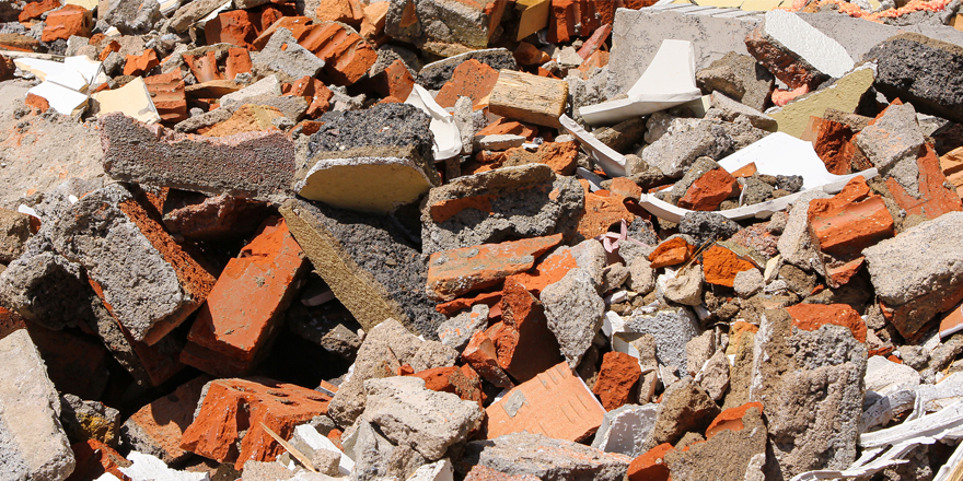
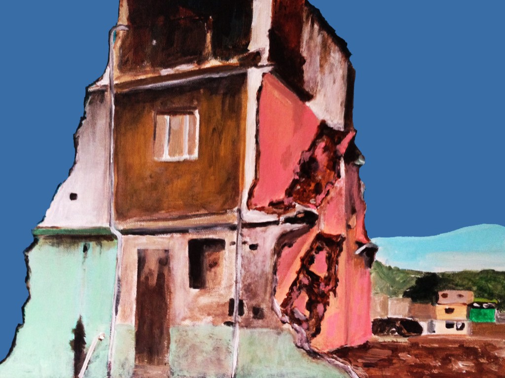
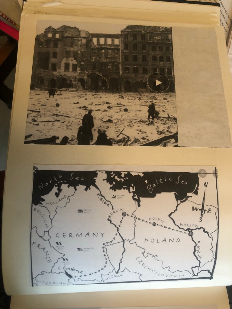
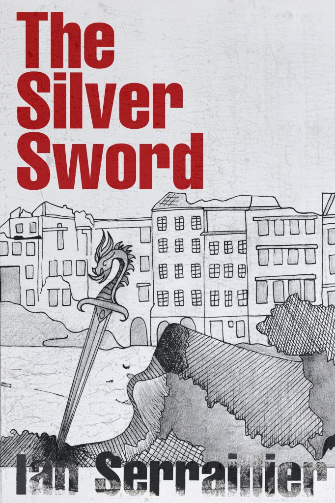
I also did a google search for The Silver Sword to look at photographs from the time of the ruined buildings and relics to give me a better idea of what I could include in my designs.


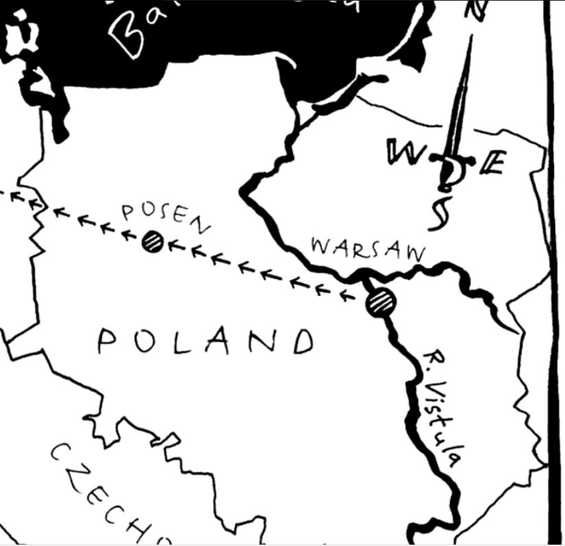
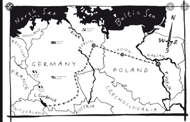

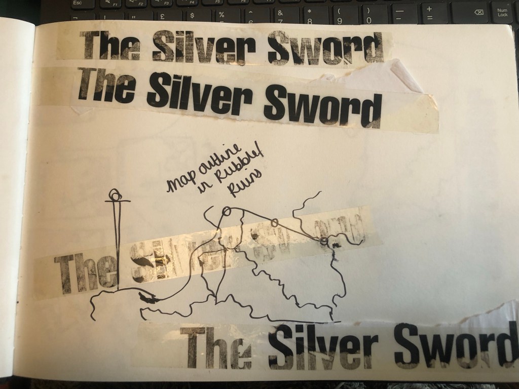
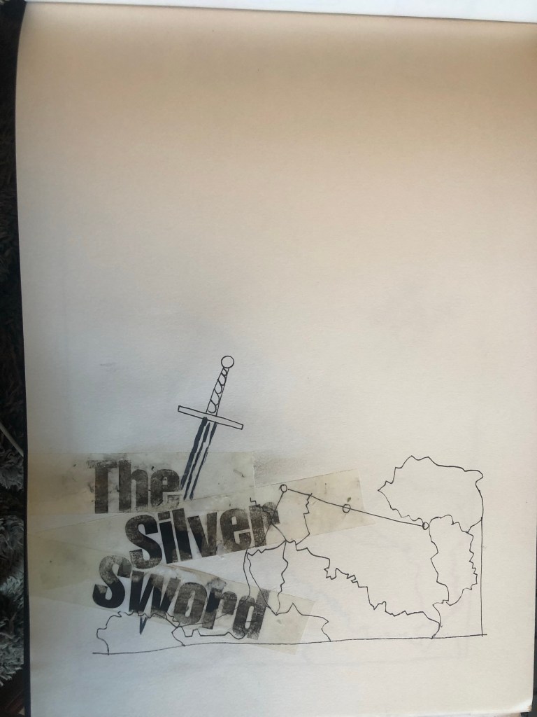
I found map of the route the children had to walk to try and find their mum and dad in Switzerland and it gave me ideas for a design- I could use the outline of the map as the map but also to represent the rubble that the Silver Sword was found in.
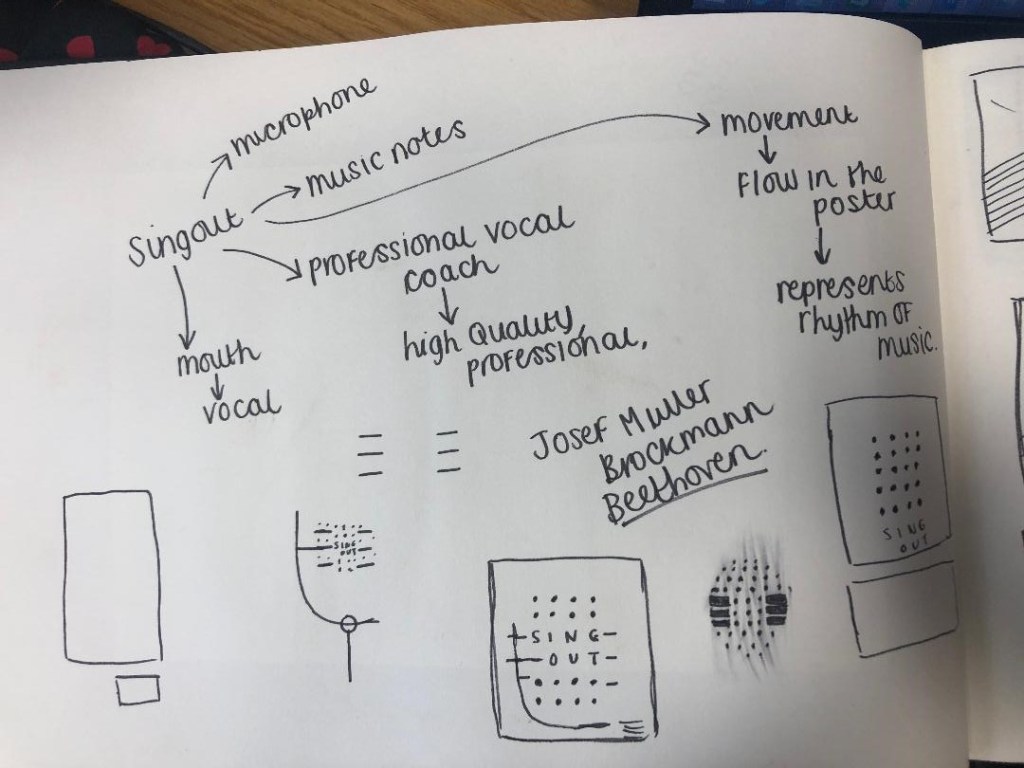
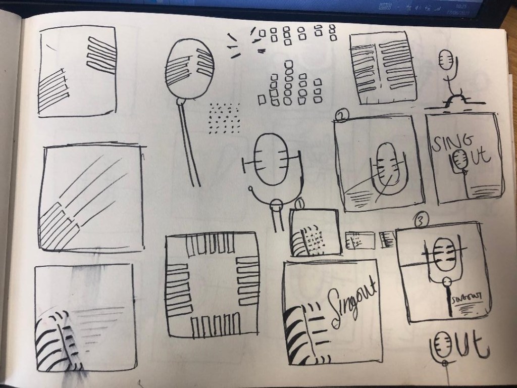
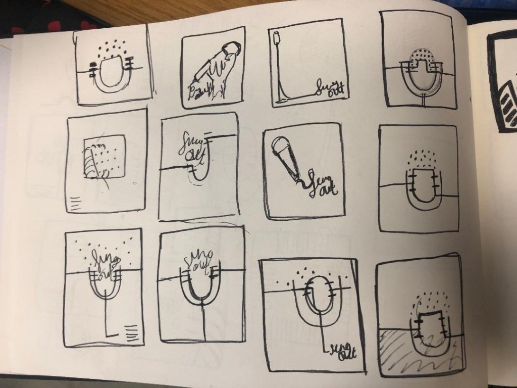
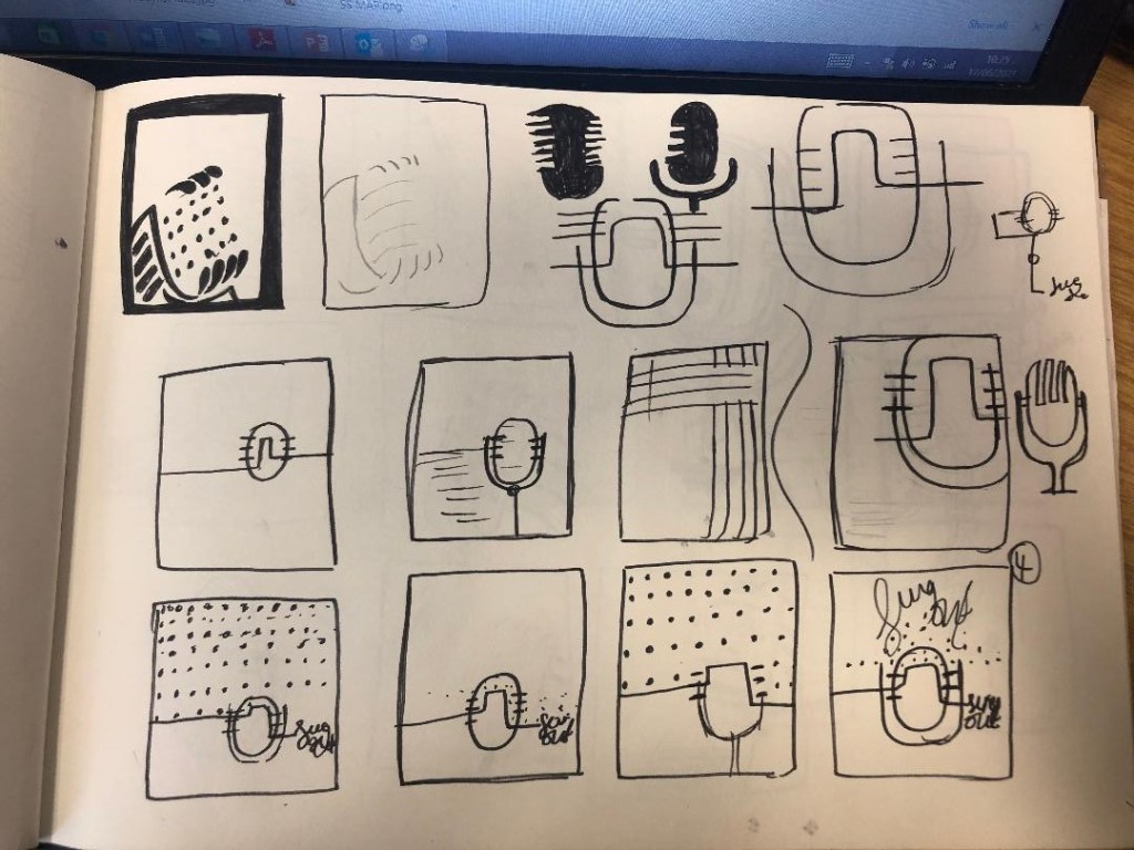
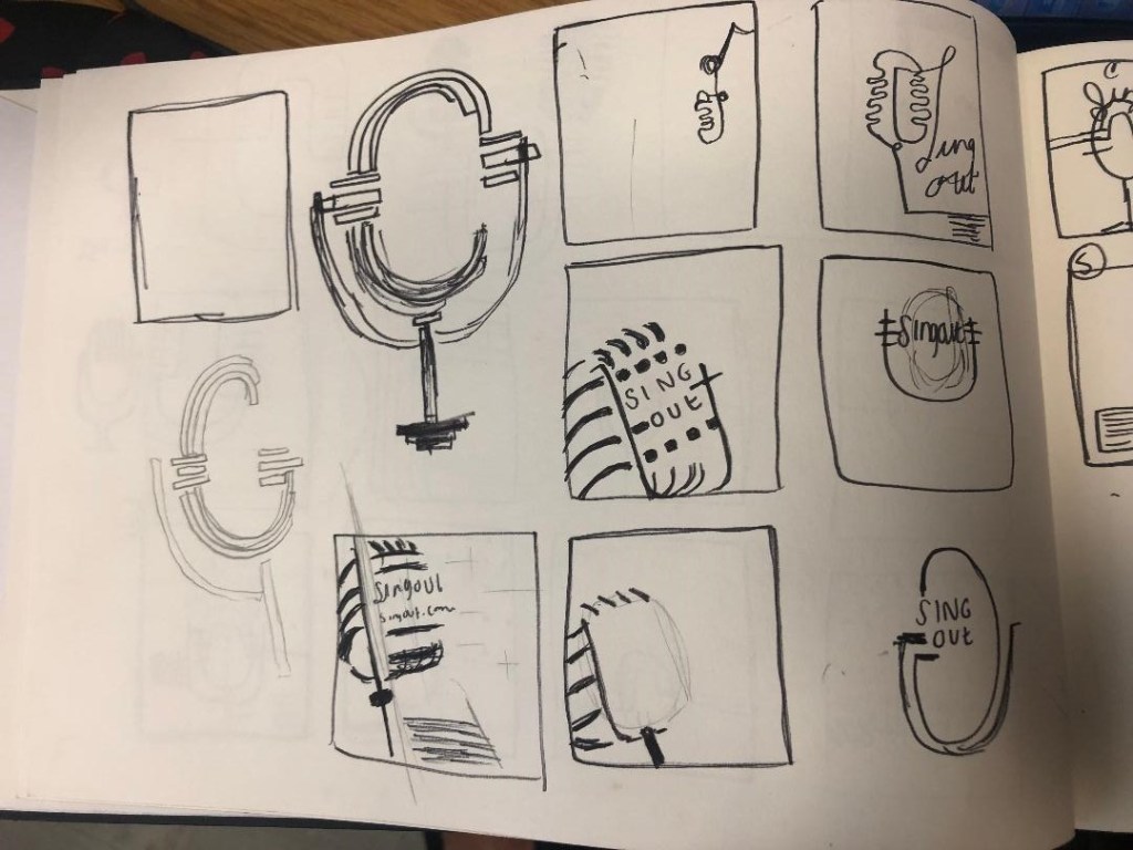
I started mind mapping and sketching ideas:
My sketchbook pages


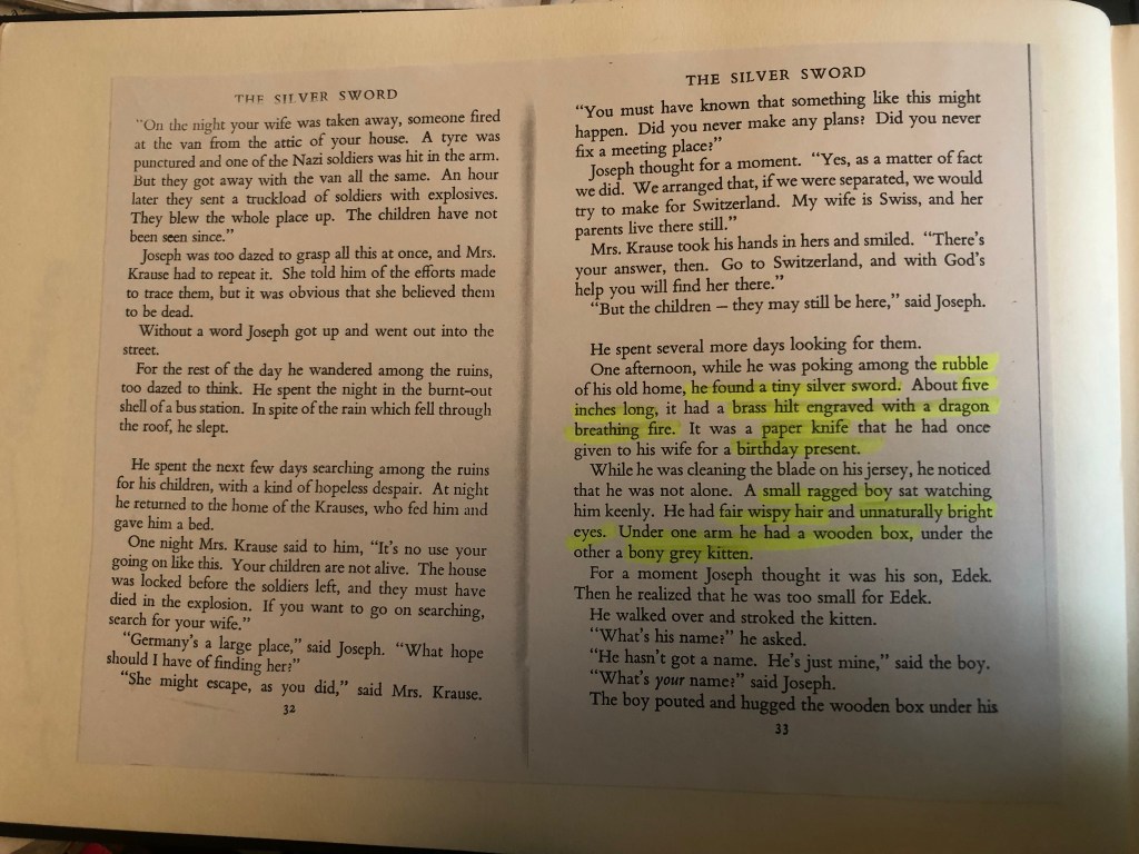

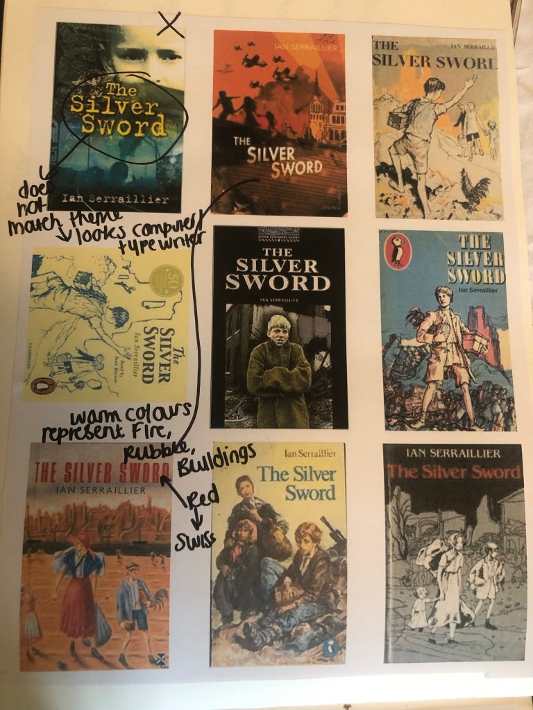
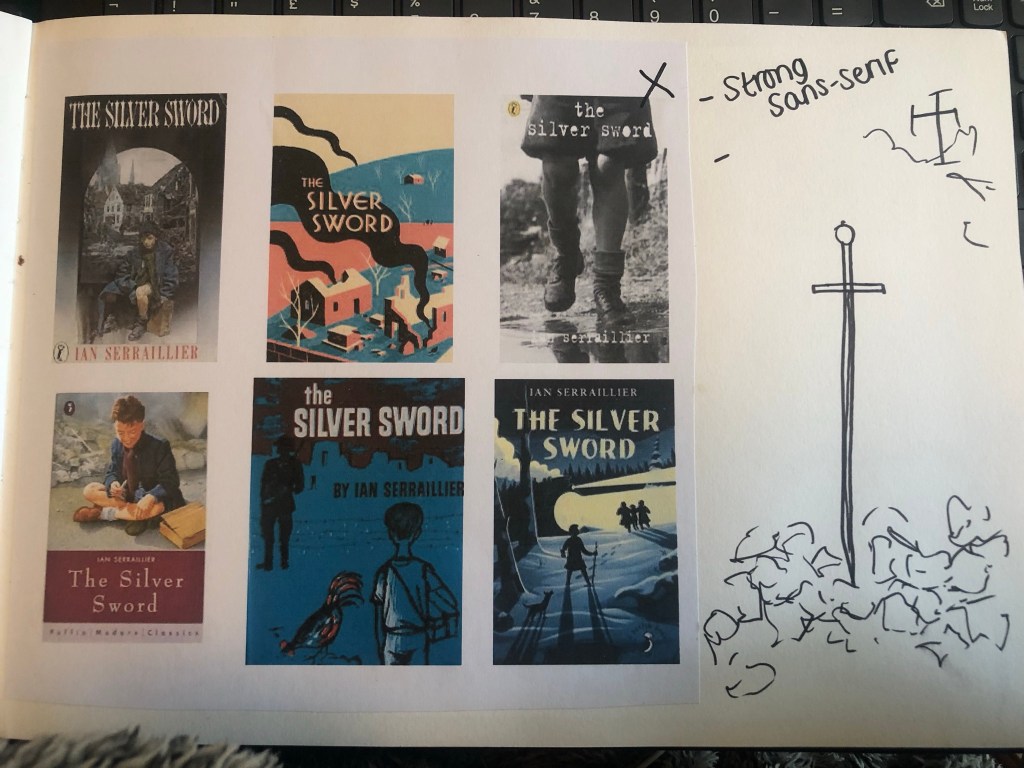


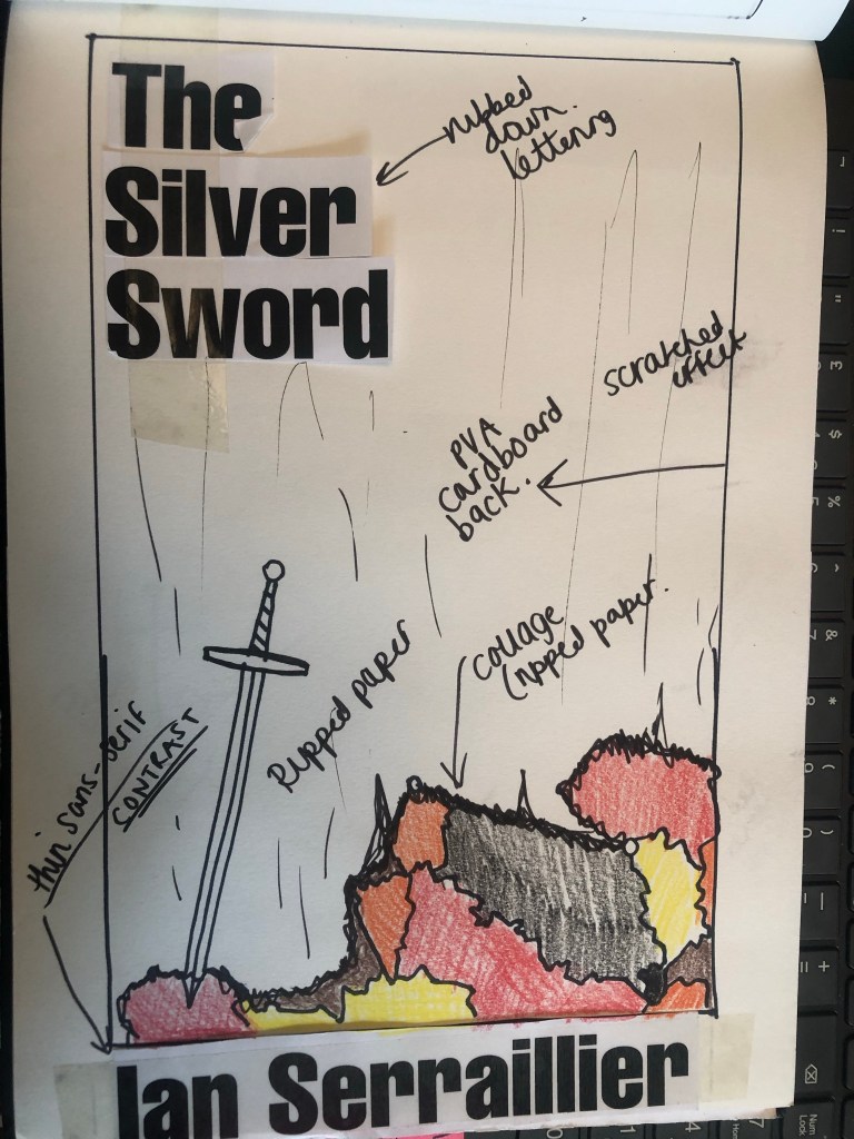

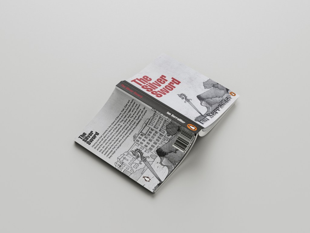
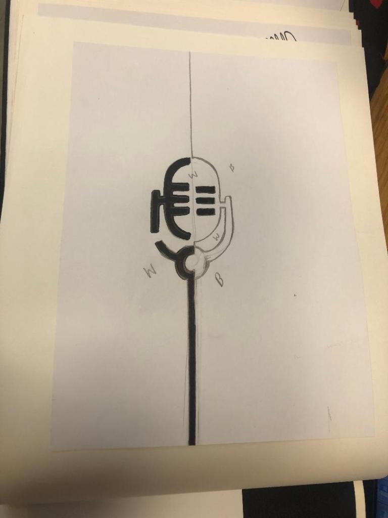
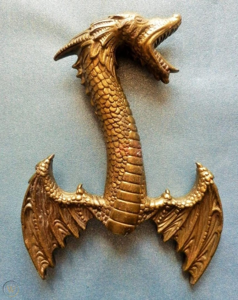
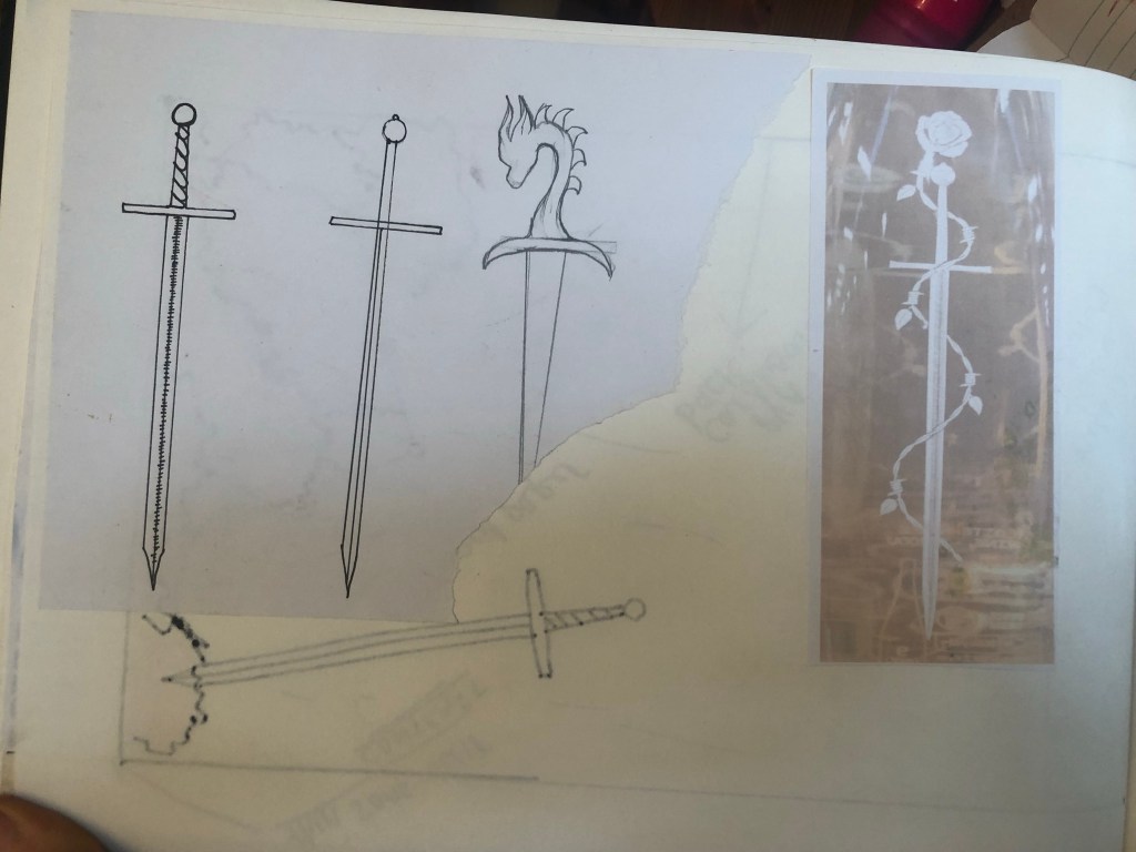
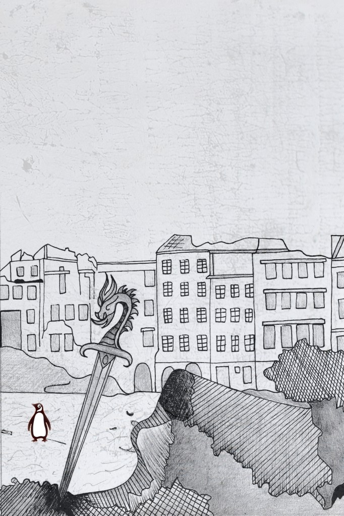
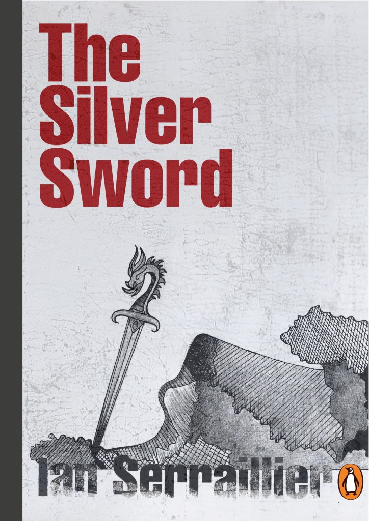
I first mind mapped ideas around what the book was about and the main plot. The story bases around a 5 inch high silver sword envelope opener with a dragon breathing fire on its hilt. This Silver Sword is the main storyline because without it the family would not have been reunited. I decided to use this as the main image. In the story the Silver Sword was found in a pile of rubble.. I had the idea of showing rubble on my design – I just didn’t know how. I wanted to illustrate the book with my drawings but I also wanted to show texture – I wanted texture for the rubble and ruins and to use strong warm colours to represent fire and the buildings and relics.
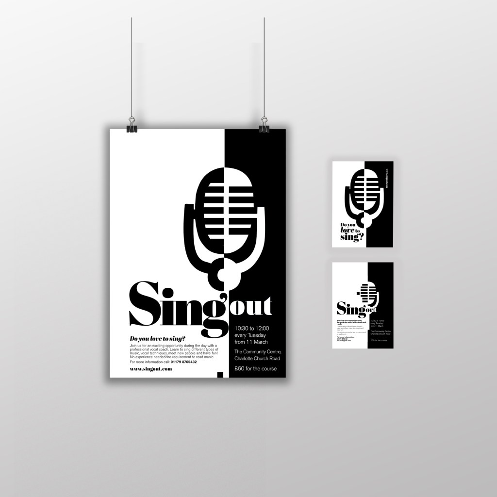
Book 1 – (Type and Illustration)
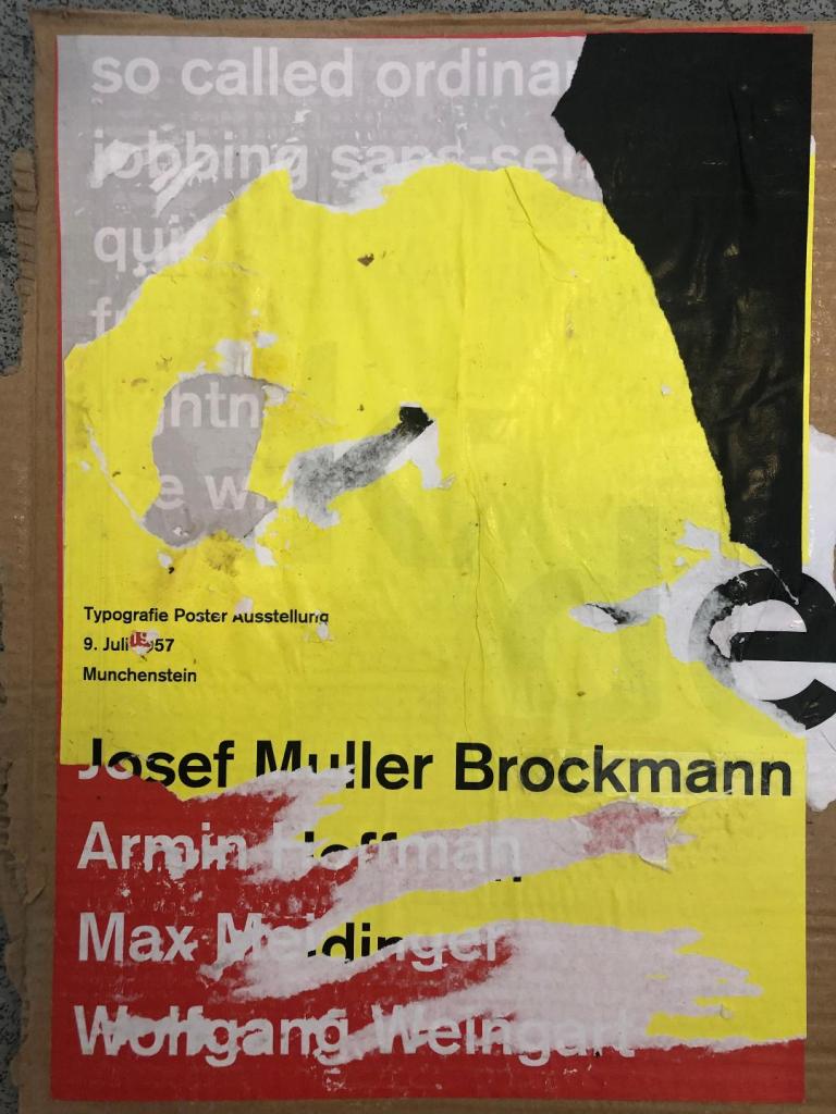
I remembered back to when I created my type specimen books and created a collage for Akzidenz Grotesk. It is one of my favourite pieces and it turned out so well.. It received so much love on social media too and it really related to the typeface and Swiss type…
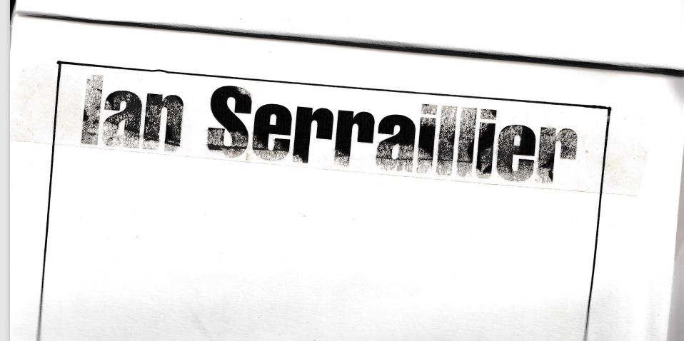
I decided that I could create similar for this design. I also messed around with letter rubbing which is inspired by Chris Ashworth and his “Swiss grit” – I printed out pages of the title and author and then used cellotape and water to peel the ink away from the paper to be able to stick it to my pages – it gives a rubbed, worn effect which looks great!
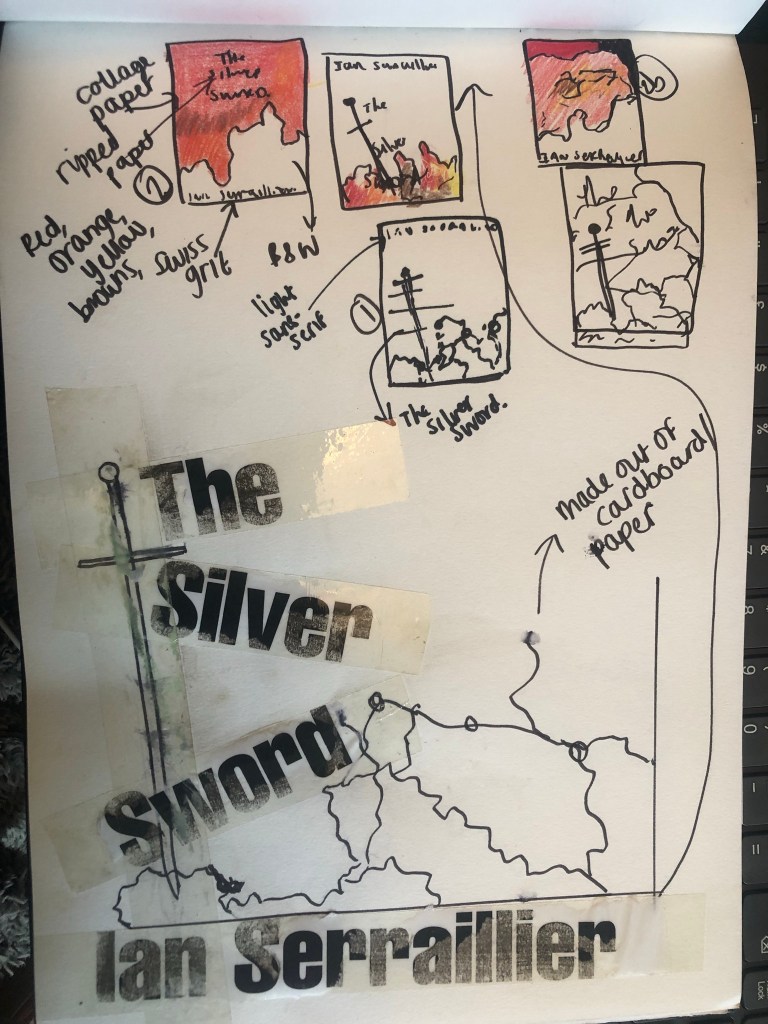
The bottom drawing is the outline of the map with the Silver Sword sticking directly out of it. I quite liked this.. but what if I could do a similar thing as to what I did in my Akzidenz Grotesk collage and create the map and rubble from torn pieces of warm coloured paper (Reds, Oranges, Warm browns) to represent the rubble and the fires.

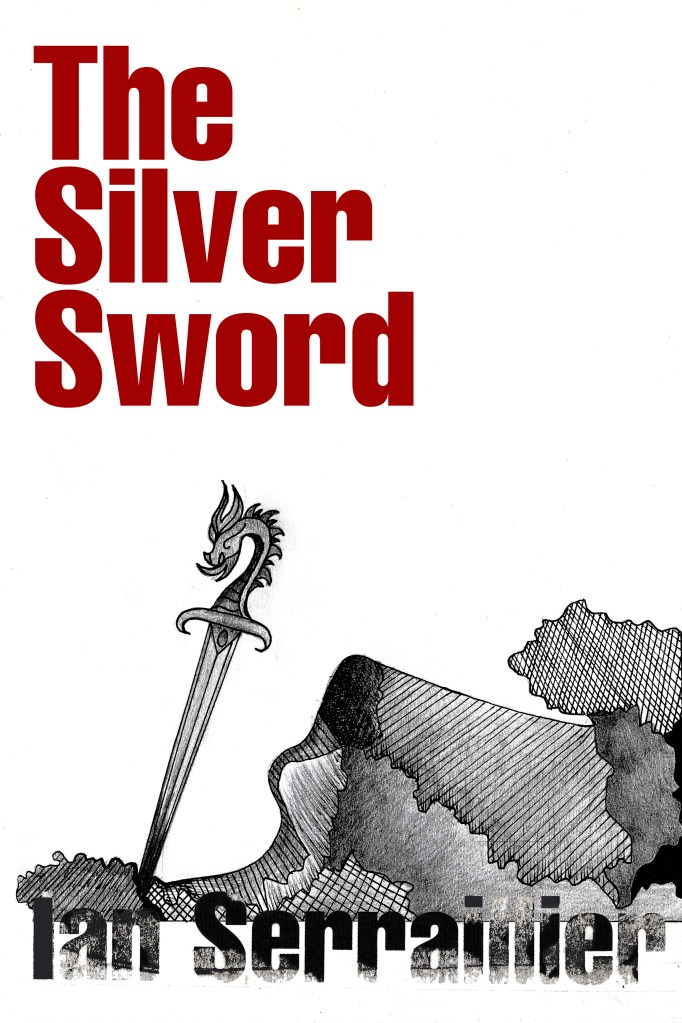
I created a collage to see how it would look.. I did not love it at all but saved it for later just in case..

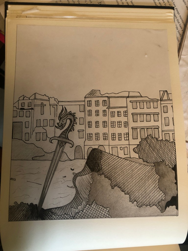
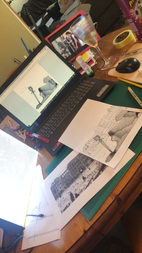
It was back to the drawing board for me! – I decided that because I was trying to stick to a very strict timeframe I would stick with what I knew best and draw my design out. I decided that because I love ink drawing I could use hatching on the rubble to make it look like different textures.
I found an image of a Silver Sword on Google to copy my drawing from and used an image of a dragon that I found earlier in my research to create the dragon on its hilt.
I drew my drawing up and scanned it in before I added detail, just in case I wanted to change it at any point.
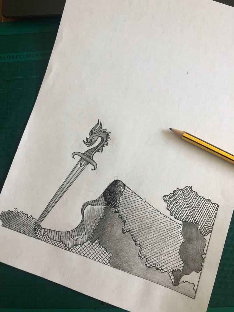

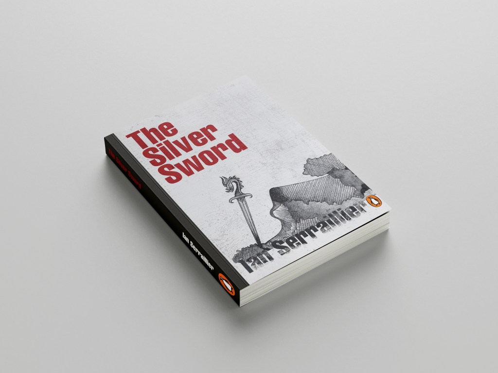
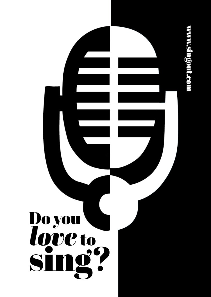
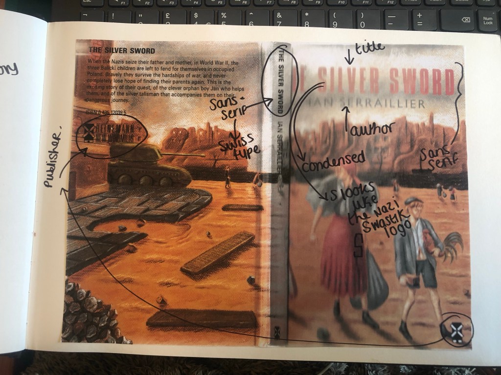
I actually preferred the design without the buildings for the front cover. My vibe and feelings for this cover was “the simpler the better.” following in the style of the International Typographic Style – less is more.
I also started work on the letter rubbing.. I decided to only do this for the author though and to keep the main title strong and bold in appearance. I also wanted the title to be in Red to match the Swiss vibes..
I created the title using printed paper and rubbing the ink onto the cellotape and then transferring it onto my design, scanning it in and altering it in Photoshop.
I took my main drawing over to Photoshop too to do some alterations and to start creating my final first cover. I also imported a scratched metal texture which I lowered the opacity to give a grey, rough textured background to the covers.
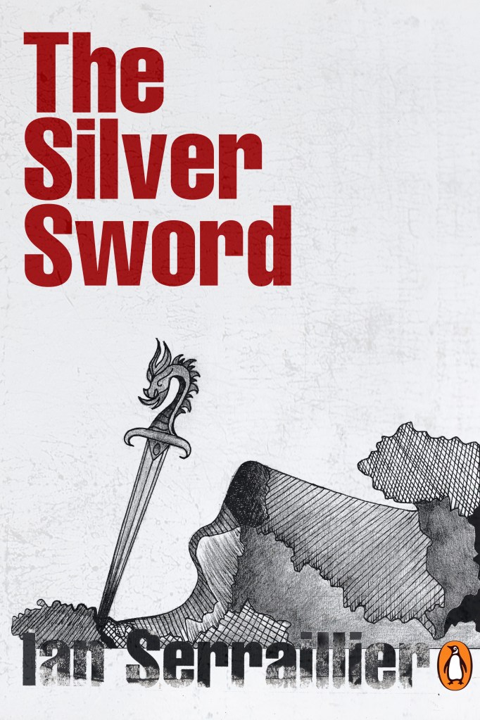


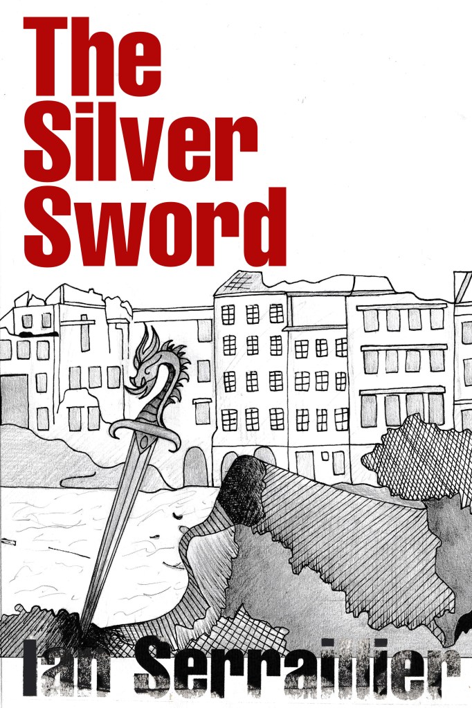
I preferred the simple, toned down cover without the scratched metal effect. The pure white background really contrasted against the black inks. I absolutely love how the rubbed down lettering turned out too!

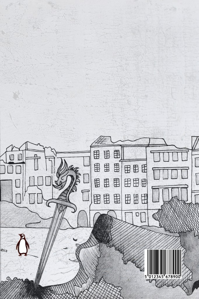
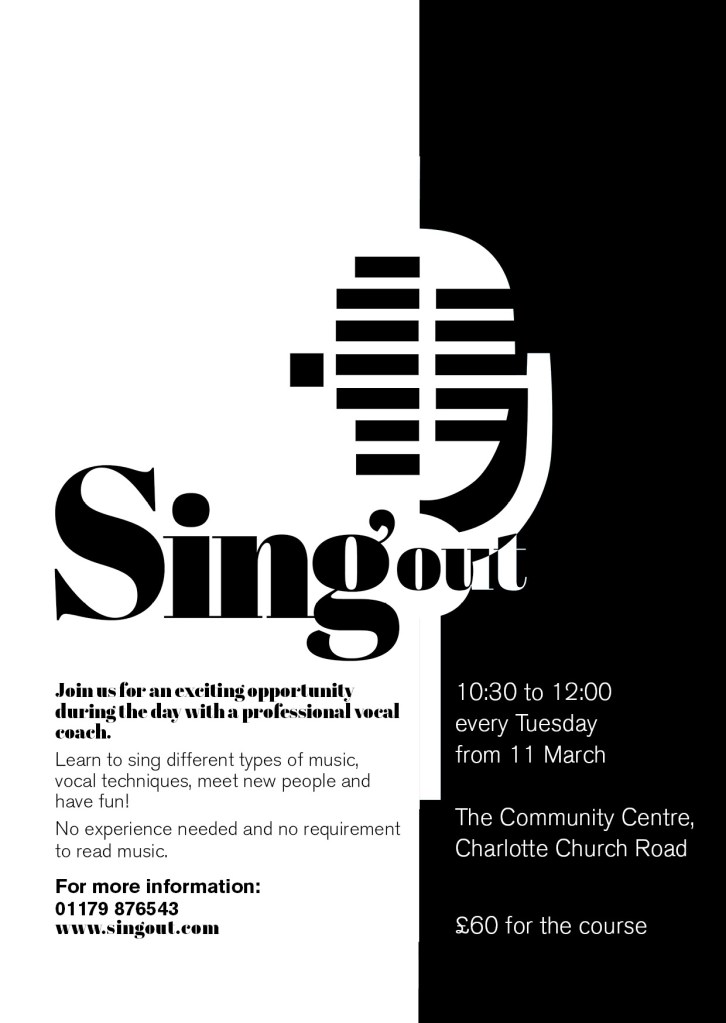
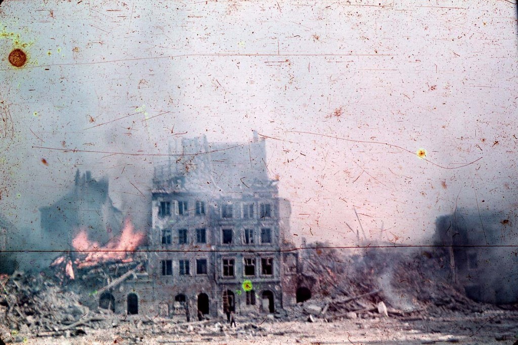
I also edited the Penguin logo a little bit to add more fun to the back cover! (I say fun.. the poor thing is wandering around war torn Warsaw looking absolutely bewildered!!)
I did decide though if I was using the buildings for the back of the book, that image had the scratched metal effect on it which would mean I would have to use the same for the front. I brought back the scratched metal effect for the front cover.
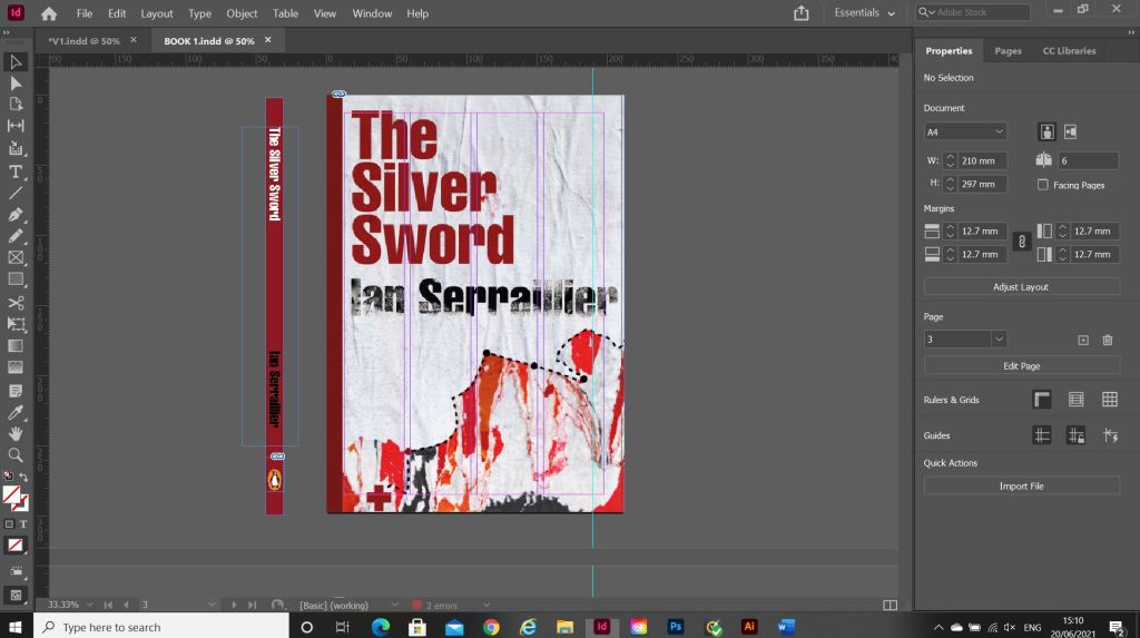
Once I had created my images in Photoshop I then created a document in InDesign to design the text for the covers.

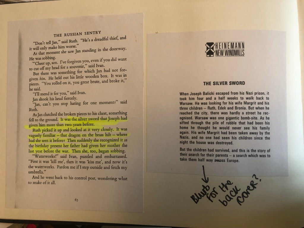
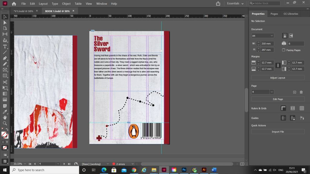
It was Helvetica all the way for my first cover! I used Helvetica Compressed for the title and author on the front and then used Helvetica Regular for the copy text on the back cover. Helvetica ties in to the Switzerland connections in the book. For the text on the back cover I went onto Amazon and copied a description of the book from one of the listings for The Silver Sword.
I used a wrap around spine for the books again as it breaks the design up on the front and also adds contrast.

Book 2 – (just type)
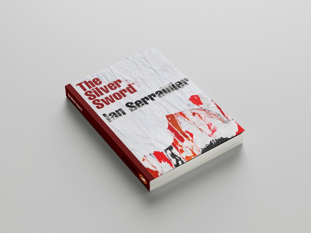
For book number 2 I decided to try and bring back the collage that i decided to write off at the beginning of the design process for Book 1!..
I thought that if I used this for the background on book number 2 it would still represent the map and the colours of the rubble and fire but without actually showing them. I wanted the reader to use their own imagination and come to their own conclusion of what this front cover was all about.
I took the awful collage into Photoshop and worked my magic trying to make it look worthy to be on a front cover of a book.. It actually wasn’t too bad!

This was my cover for “just text” I did though take it a little bit further and add some detail, which to be honest I am unsure if I am breaking the brief by adding? Worse case I have 2 versions; 1 with just type and the 2nd which is just an optional extra!
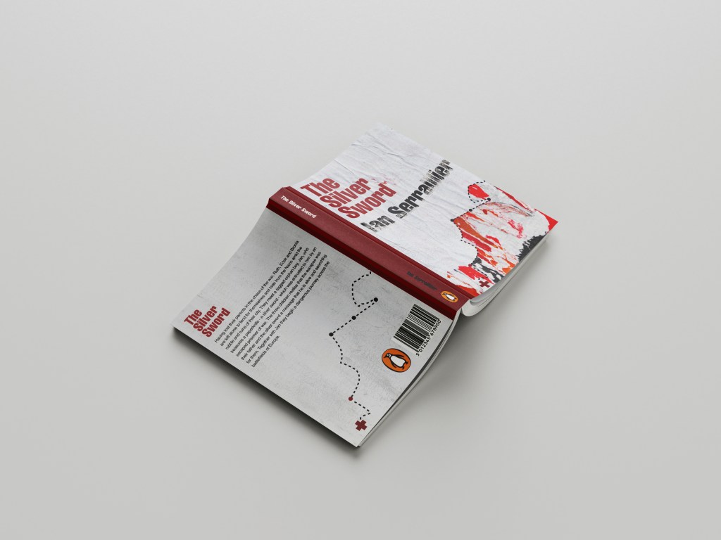
In Illustrator I decided to add points to the map so that it was more obvious that it was an outline of a map. I also added the Swiss cross and circles to mark the places they crossed. Obviously it is a very abstract map.

For the back I did exactly the same layout as book 1 but just used the outline of the map. It is a very simple solution to the brief. The worn paper represents the war torn, worn out state of Warsaw at the time and the warm colours represent the rubble, ruins and the fires that burned because of the bombings. It is also quite a modern cover in that it takes inspiration from Swiss grit.
Considering I HATED that collage when I first created it, it actually didn’t turn out too bad!
Overall I believe I have met the brief for these books, I actually surprised myself with the 2nd just type book – I thought that this would be tricker than it was! – it just goes to show that if you have an idea and it doesn’t quite work out, persevere with it because it might actually work out better than originally thought!