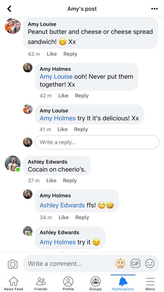
“Using your research into artists’ books and fanzines as a starting point, think about their physical or design qualities and creatively apply some of these approaches to your own designs. For example, there’s a distinctive visual quality to many fanzines which comes from a ‘cut and paste’ approach to designing and through the use of cheap photocopying and printing. Punk fanzines in particular make a virtue out of having limited resources, no computers and little, or no, formal training as graphic designers. Use your sketchbooks to experiment with a similar ‘cut and paste’ approach by cutting and collaging magazines and other material. What does this approach offer you as a book designer? Alternatively, you can find other ideas you would like to test out in your sketchbook. You don’t need to make any finished designs, just give yourself room to experiment and try things out.“
Starting out…
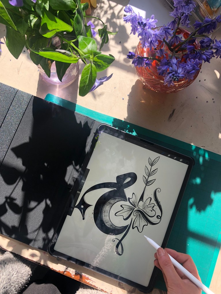
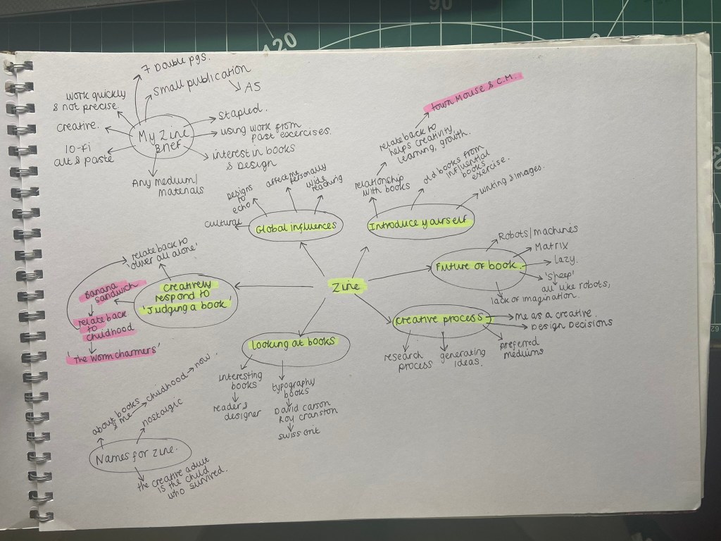
This is a very open brief!- there are no restrictions in what I can do with this! The brief is to start some experimentational work in my sketchbook which I am guessing I could potentially use or refer back to for Assignment 1.
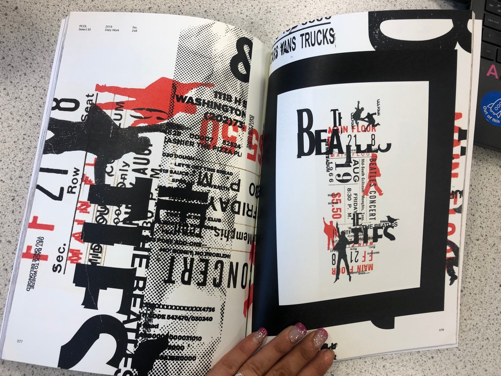
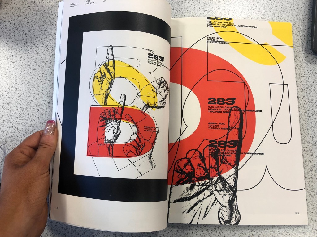
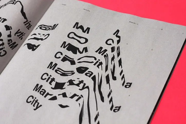
When I think of experimental work in design, I automatically think of experimental typography with the likes of David Carson, Chris Ashworth and Roy Cranston. Sophia Clausse could be another contender for this too; I stumbled across her work when I was researching fanzines and artists books. I really like this style of work and I have used it in quite a few of my past exercises and assignments in Core Concepts.
It also reminded me of an experimental piece I did in Core Concepts which I was really pleased with at the time. Again, this was inspired by David Carson and Chris Ashworth:
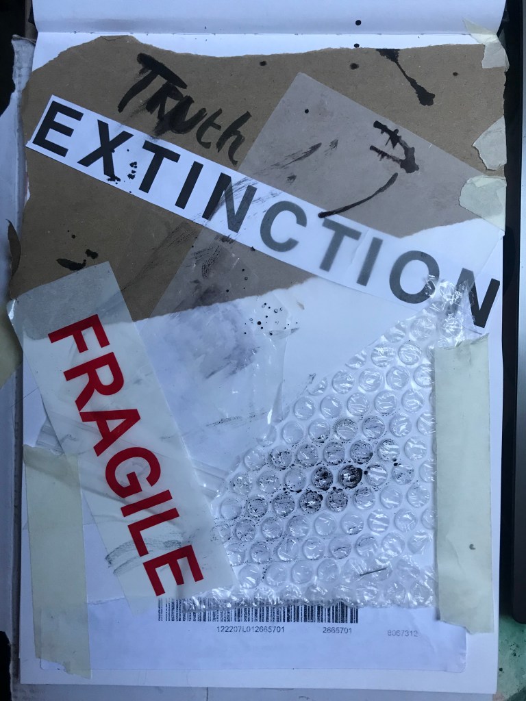
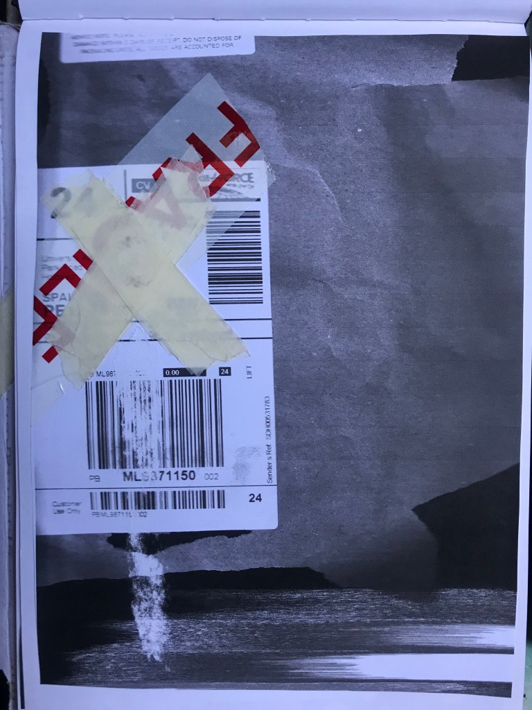
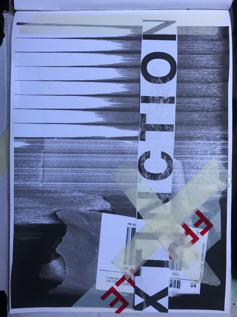
How I made these was by using old packaging and printed barcodes and turning them into a composition to then import in digitally to add typography:
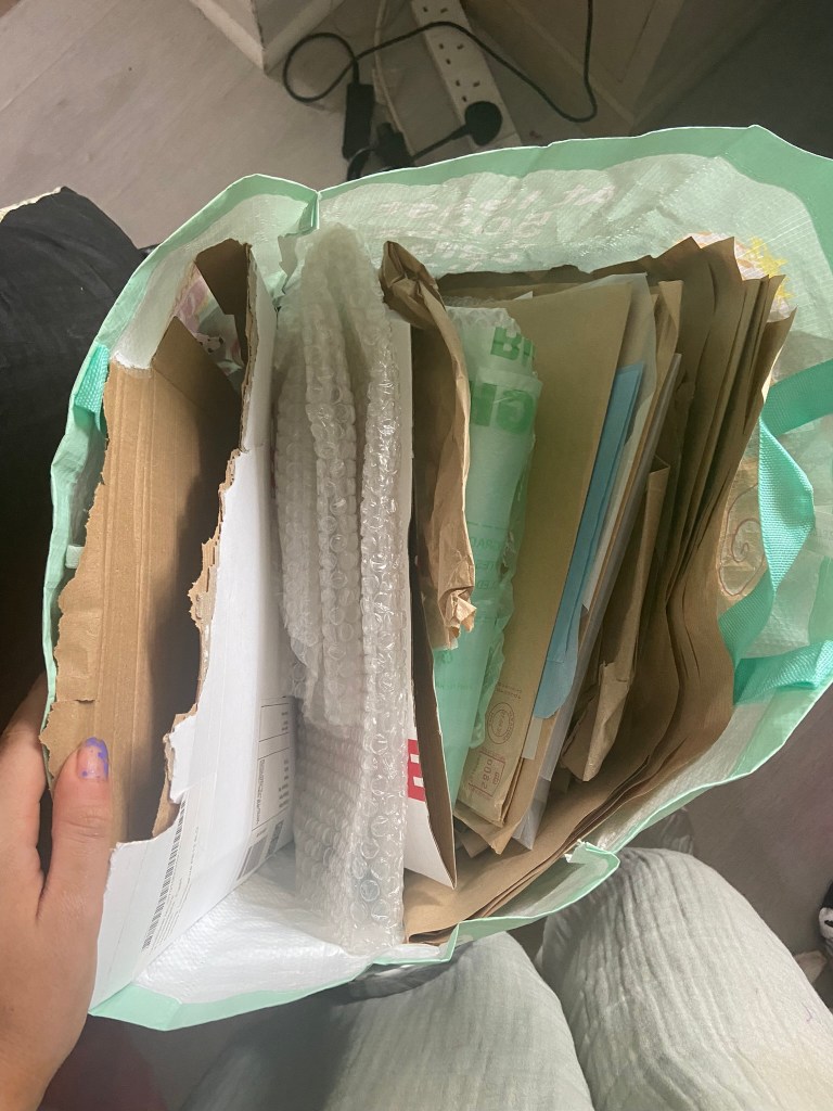
I keep a bag of packaging and random materials ever since I completed that exercise because I just never know when I might need to use them again for something similar!
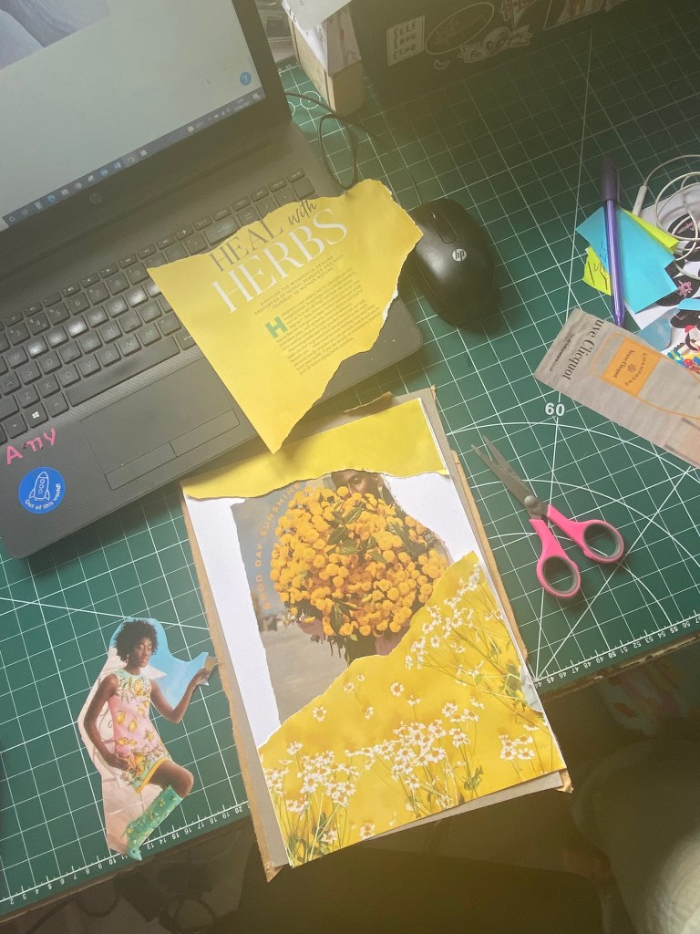
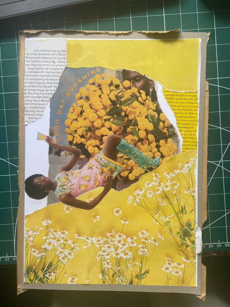
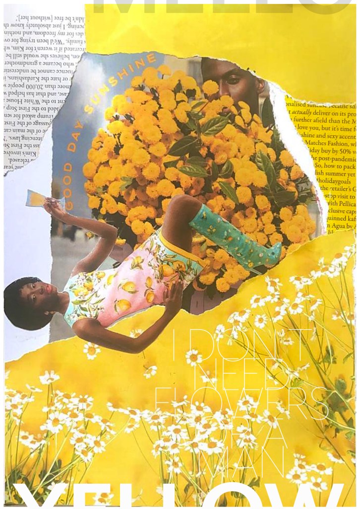
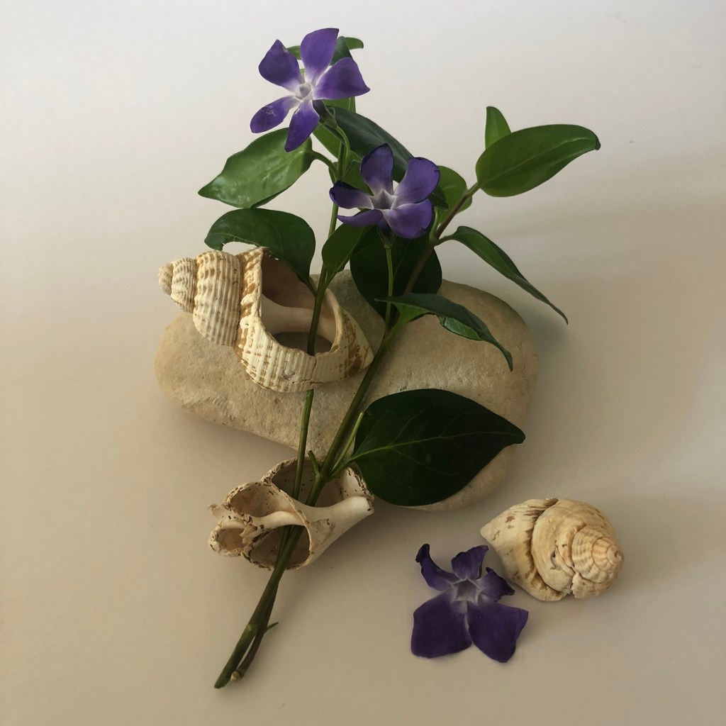
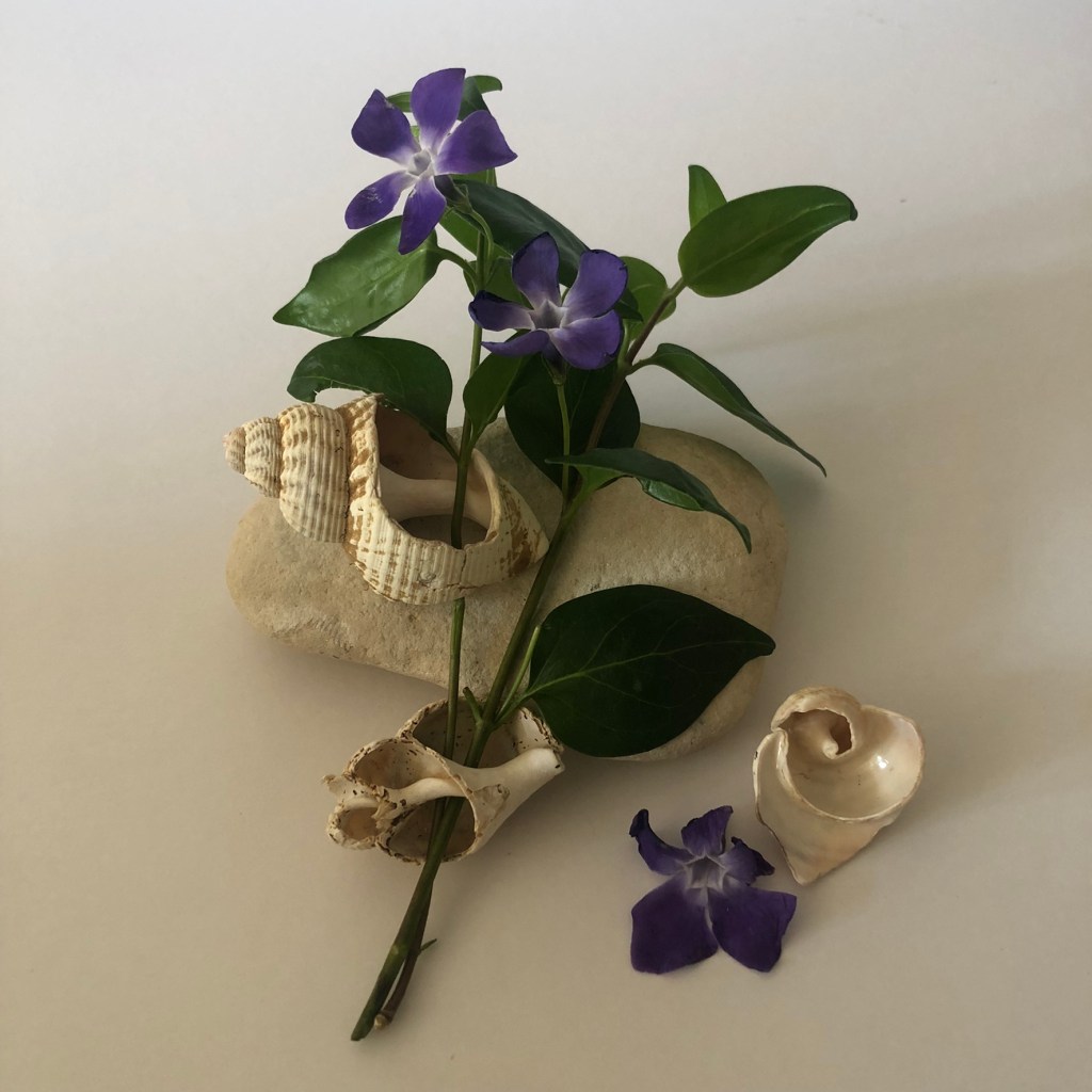
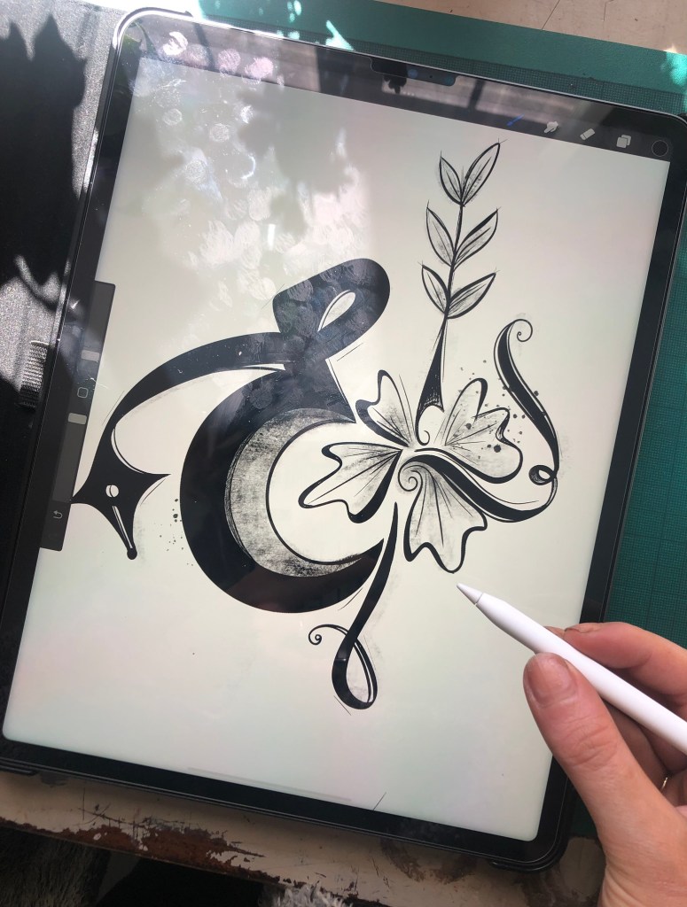
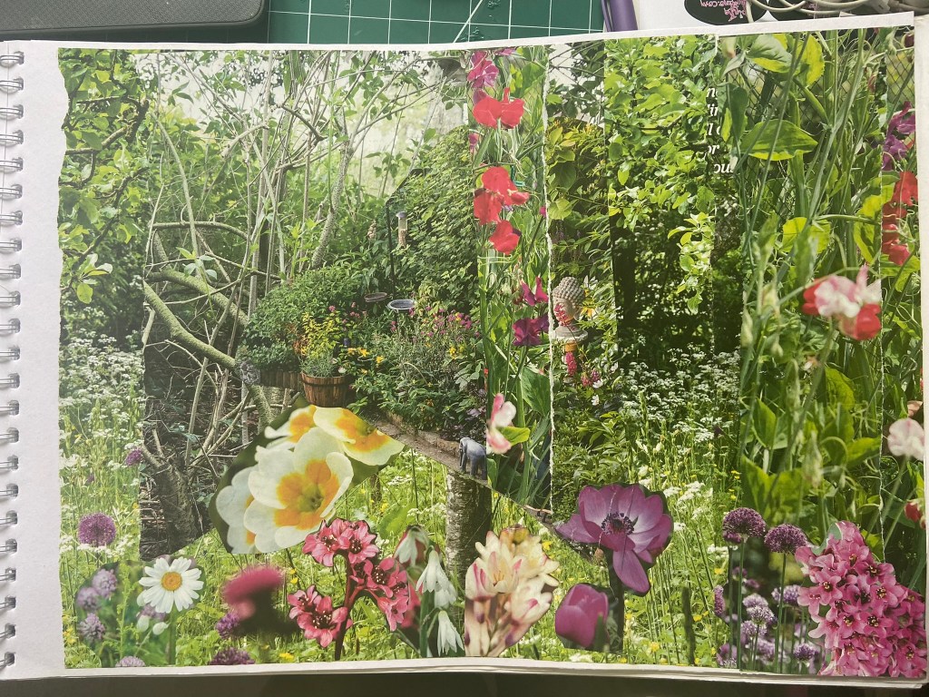
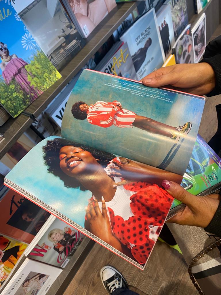
I got this bag out again to see what I could come up with for some experimental collages for this exercise. I also had some old fashion magazines that I used. I found some bright yellow summery layouts in the fashion magazines – a lot of material based around lemons! With the cuttings I found I decided to make some sort of story out of them…
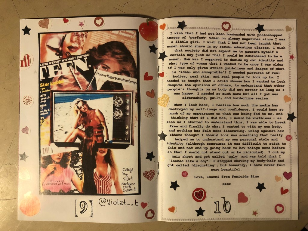
There was an advert of a man holding some flowers and looking all shy behind the bouquet and then I found a clipping of a woman all dressed in lemons and yellow and looking very chilled out and relaxed drinking a glass of something alcoholic! The woman looks way too self involved to want the man or his flowers and I played on that in the text I use “I don’t need flowers or a man”. I wanted some kind of balance to the piece and that is where I used the bottom clipping of the flowers but also used another part of that to go along the top. I did the same with the clippings of text I found.. I placed them across from each other on the layout, it just made the hierarchy look much more balanced out. To add some contrast to the piece I added the larger text for the main title “mellow yellow” but changed the opacity at the top so that yellow stood out much more.
This exercise shows you how much you can create some pretty cool, meaningful layouts using just some magazine clippings and typography!
When I first read through this brief I really liked the idea of producing my own publication and I started having lots of initial ideas for it; I also thought though that the brief was jam packed full of pointers that I had to meet. The brief was asking for a lot to be met in such a short publication, I knew that there was no way that I would be sticking to a 16 page fanzine but this was OK because the brief stated I could add more if I wished.
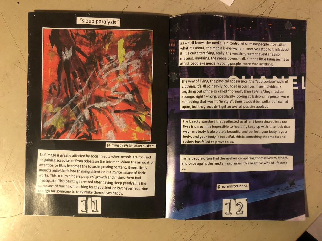
At the point of starting this brief I had absolutely no idea what a zine was. It took me a further few weeks to even realise I was pronouncing it was wrong! – z-eye-n instead of z-een. I knew that a lot of researching would need to be done first for me to be heading in the right direction of this brief. To be able to design and make a zine I first needed to disect everything about a zine! What one is – where they come from – what zines exist now – is there a zine community? – what content goes in a zine? – how are they presented? – etc, etc…
Research
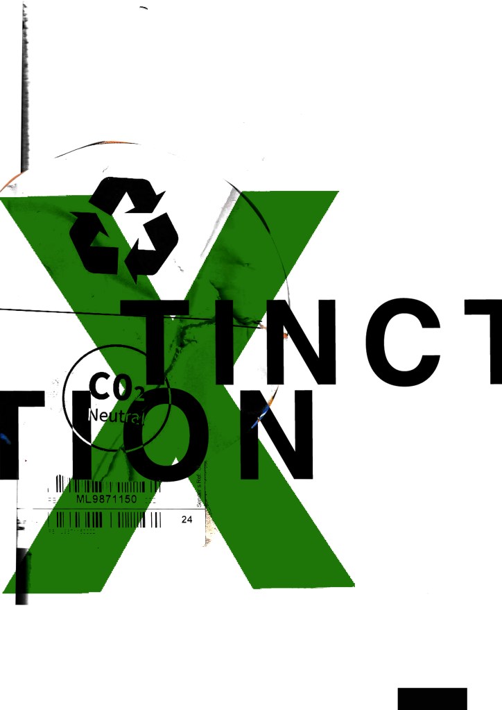
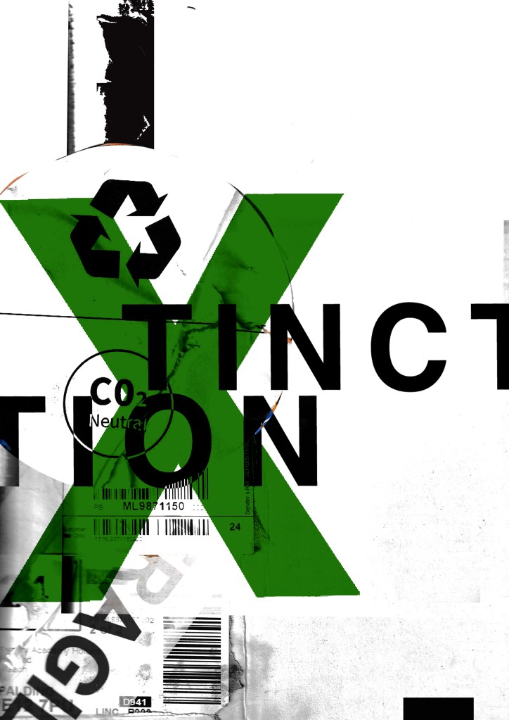
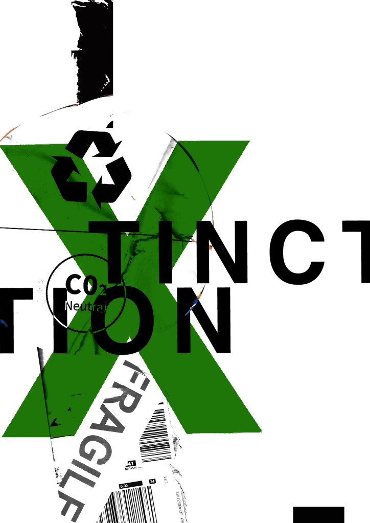
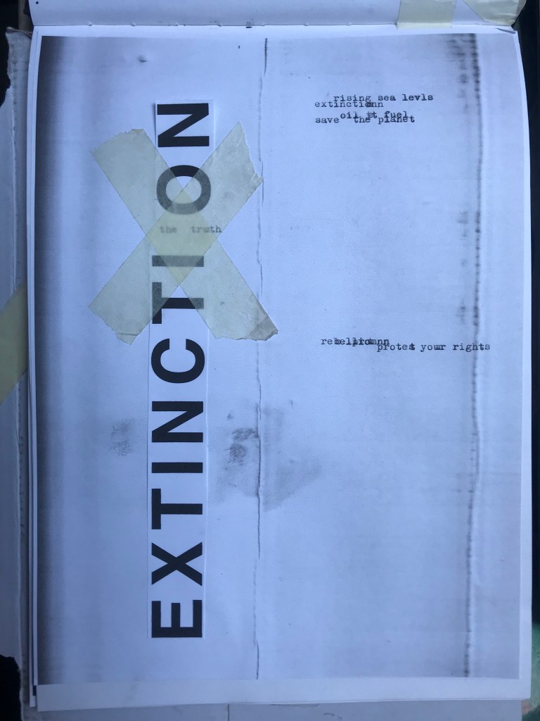
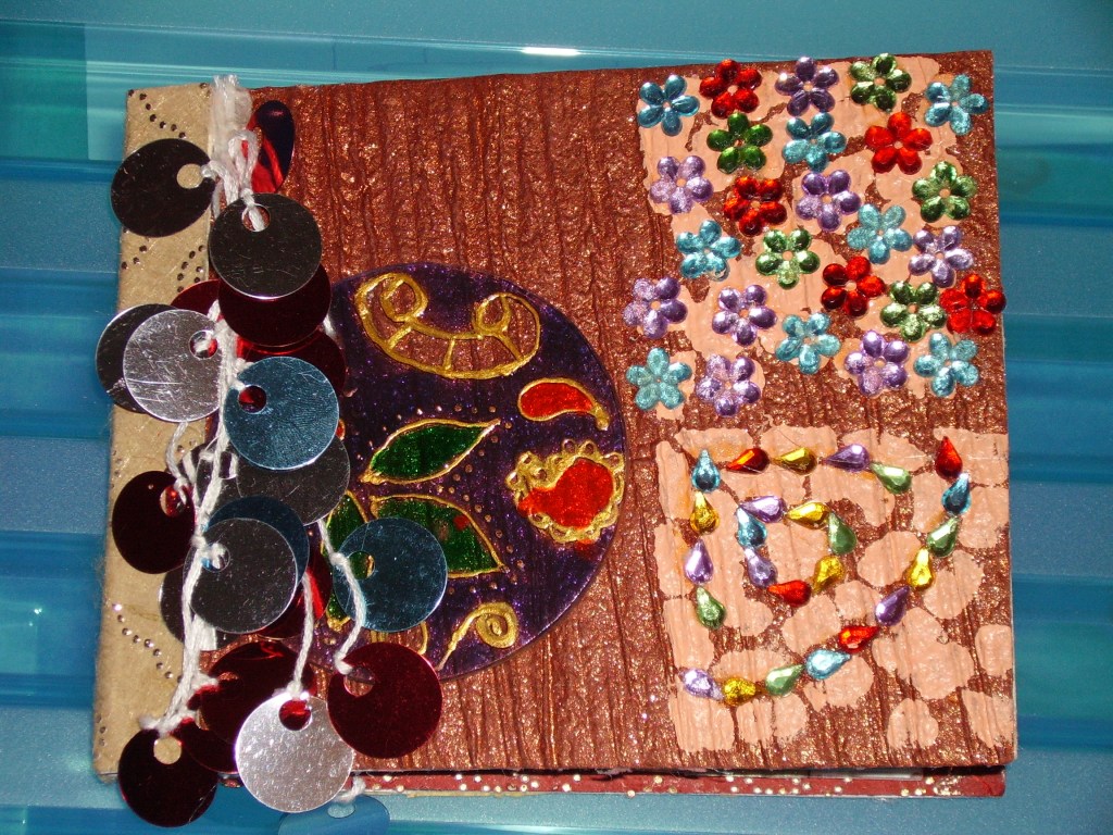
I started off by reading the OCA recommended book – Fanzines by Teal Trigg. This gave me a visual of the Punk influence of the early zines – it gave me knowledge of the “cut and paste” style that has clearly been adopted and further adapted through the years for modern day zines.
I then did some research online to see what kind of zines exist around the world – and also local to me! There are zine fairs worldwide where people meet up and set up stalls with their merchandise and zines for people to buy. There are zine book clubs. There is a zine group who meet up in Lincoln which is about 50 miles from me! They have a discord group and also before Covid they used to meet up at a coffee bar near the Strait to share ideas and the zines that they have made. I found some information about zines also on Lincoln University’s website – it seems that their Graphic Design students also study it! The more I was reading about zines the more I realised that this was like a secret underground movement that I had been missing out on!
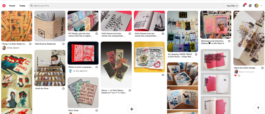
Pinterest is always a good source of visual research for me and this is where I started – I wanted to look into the “cut and paste” style as this is emphasized a lot in the brief. I like how this brief has no emphasis on just being digital and that I was able to bring in all different elements of media. I have always been quite hands on arty and I was excited at the prospect of being able to incorporate some more skills.
The “cut and paste” style reminded me a lot of my own sketchbooks – full of random doodles, sketches, written notes, lists, things stuck in… I was getting more of an idea of what I could include in a zine.
Once I read about the history of zines and their origins I then felt like I needed to go out and source some zines for myself. I didn’t want to just rely on the internet for inspiration – I couldn’t see the finished product in real. I wanted to feel the texture of the pages – even smell the pages! – see how they were packaged, how they were displayed and sold in a shop but also to help inspiring artists like myself! – I know I would love it if someone liked my zine enough to purchase it!
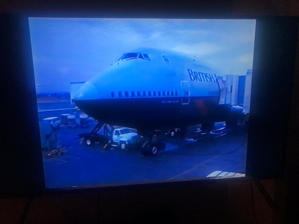
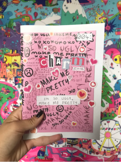
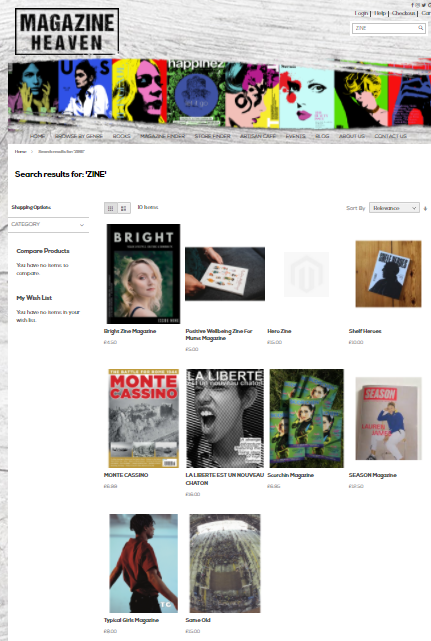
My fiance Chris at the weekends is very much a “Lets stay home” kinda guy!… especially when F1 is on the TV… However on this occasion I managed to drag him out the house to take me to Rushden Lakes Shopping Centre to go and raid Magazine Heaven for their zines. I absolutely love Magazine Heaven! It is well known with friends and family that I have a love for looking at and buying magazines! I could spend hours in there looking at all the different ones! I did my homework prior and found that Magazine Heaven sold quite a few of zines – there was even photographs of them online so I knew exactly what I was looking for when I went in there! I think it took 45 minutes in total of looking for the zines -Chris loved me sending him around the whole shop floor armed with screenshots of several zines I was looking for!
The zines that I found were all published publications by independent artists or small businesses; there was none in there that had been handmade or placed there by local artists.
I wrote a post about what we found previously though! This is the link:
I also bought a couple from Etsy which helped; one was written about body image by a 14 year old girl.. it was beautifully written, composed and put together. With more of an idea of what I was expected to achieve I then had to start sketching up some ideas and dissecting that brief a little bit more!
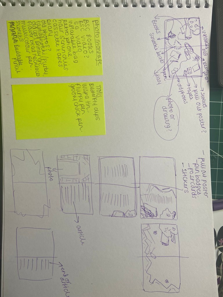
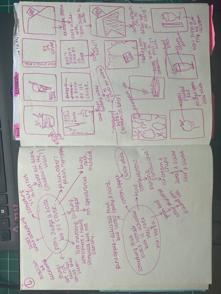
When I first have a brief in front of me I like to go through it and highlight key pointers and make notes of what is expected of me. I usually do this in my sketchbook so that all my findings, ideas, sketches and notes are altogether in one place.
Highlighting key points that need to be met in the brief:
Above – Expanding on the key points with mind mapping ideas around them.
The brief specified that I needed to produce a stapled, simple folded 16 page (or more in my case!) zine; it then goes on to contradict itself by asking me to “extend to challenging some of the assumptions about what a fanzine should look like or how it is made“. The ideas I thought of when mind mapping this was 3D, posters, pop-out elements, envelopes with hidden notes in there and other 2D or 3D elements to interact with. This would be tricky though when the brief wants a simple, stapled publication. I thought about a 16 sided concertina style zine with pop-out elements and somehow still bind it together with staples.. I also looked at past students work online it seemed that everyone had stuck to the brief and not been too adventurous. I wanted to push the boundaries but still meet the brief. I then had the idea of sticking to a simple zine booklet but including hidden little features in the zine.
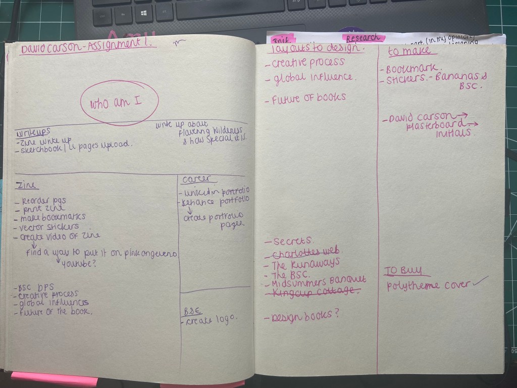
My final zine is all digitally put together. It includes aspects of different media that I have drawn, collaged, photographed or written but then imported in to take into Photoshop and make digital. For years I did everything by hand – I absolutely hated digital simply because I couldn’t do it! Starting Core Concepts really pushed me out of my comfort zone and forced me to learn. I now love working in digital! If I produce anything by hand I almost always will import it in and manipulate it digitally. Being digital also allows for easier mass reproduction. I printed 10 copies of my final finished zine to distribute out but I could have done many more with it being digital! It still has traditional handmade roots that zines are renowned for but produced digitally for a much more professional finish!
Going back to the brief – What I also found interesting was that the brief asked me to use some of the work I had produced so far in Unit 1 – this meant bringing some of my findings and ideas and research from the exercises into my final assignment. The last pointer of the brief was:
“How can you creatively respond to one or more of the following book sayings – bookworms, a closed/open book, the oldest trick in the book, you can’t judge a book by its cover, in someones good/bad books or by the book. Can any of your images, text or ideas also feed into your cover designs?”
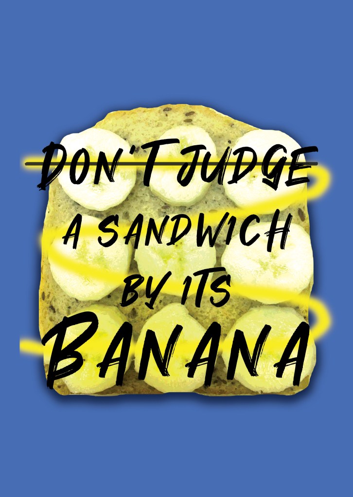
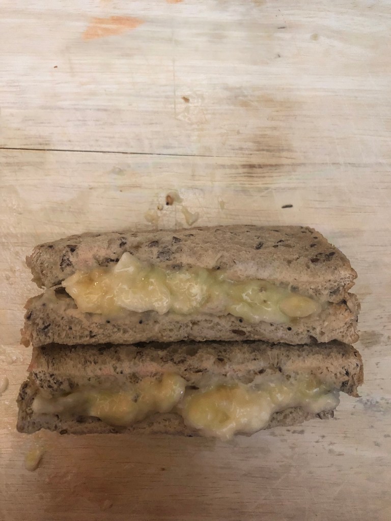
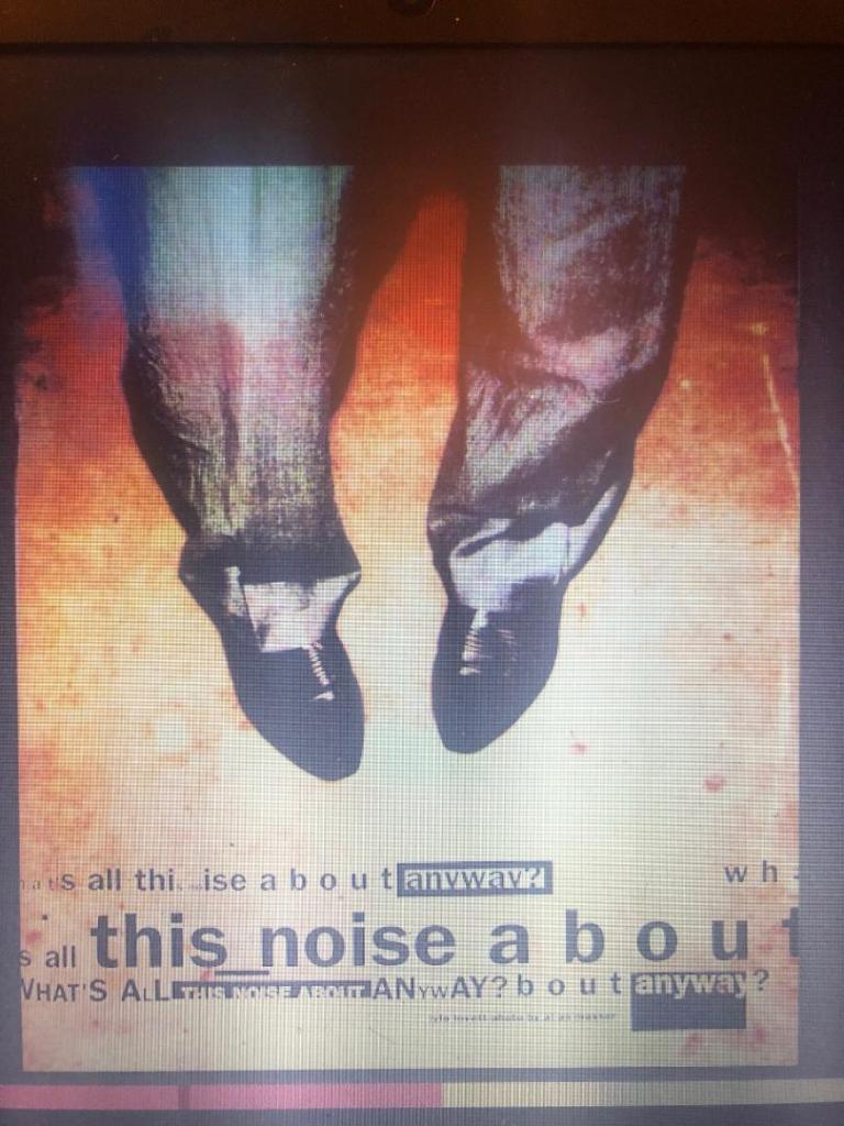
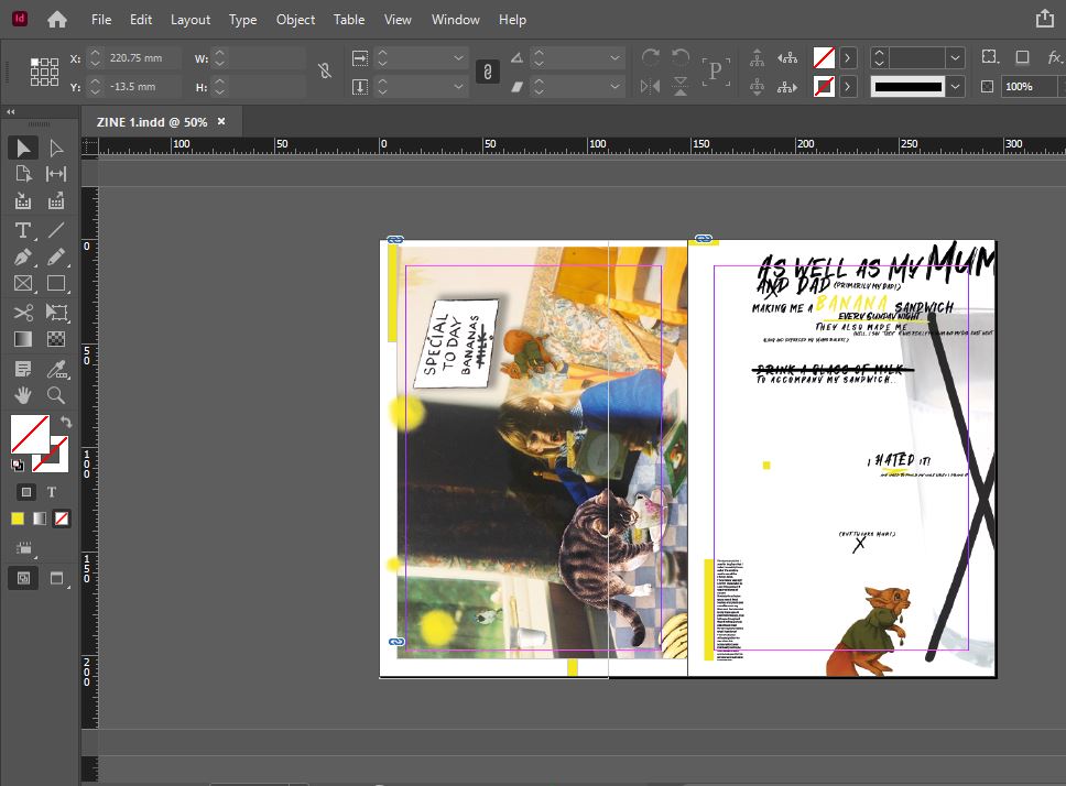
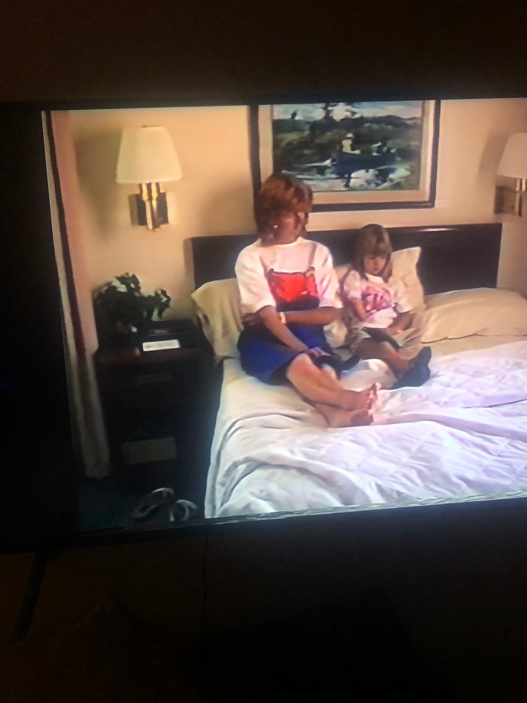
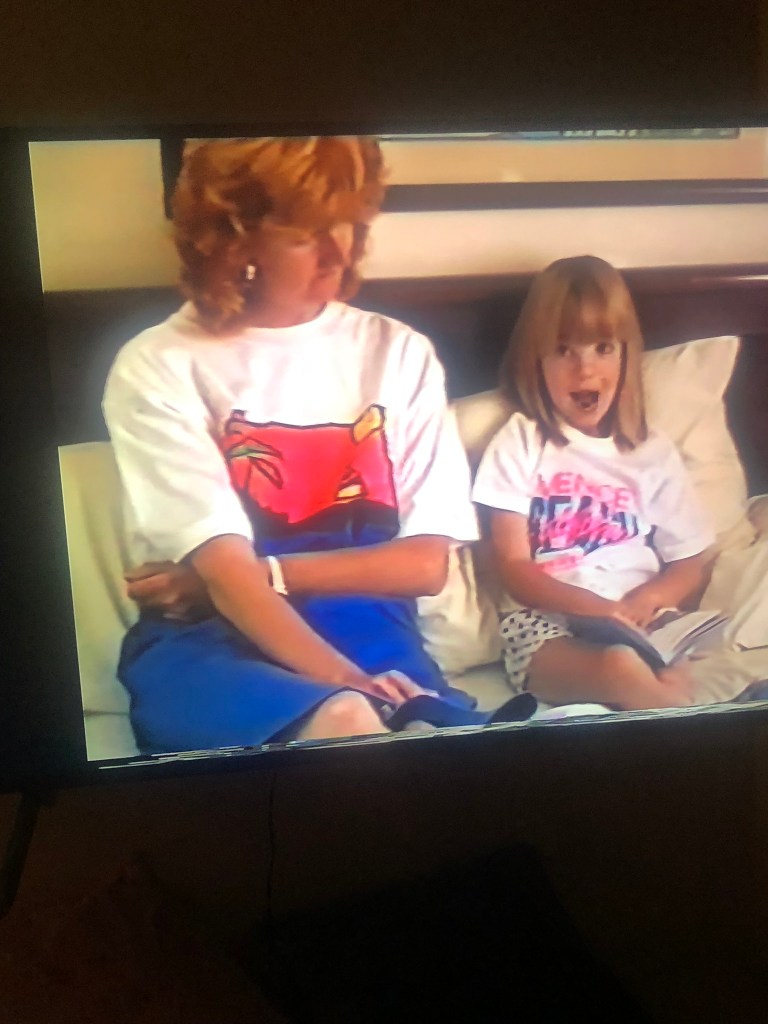
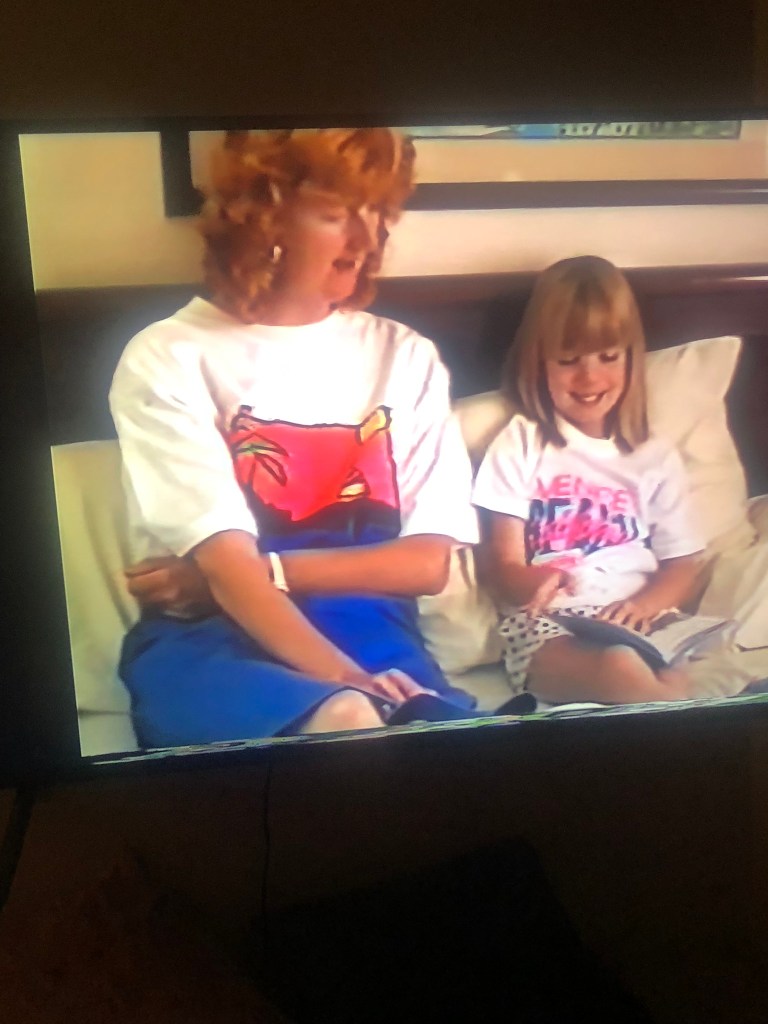
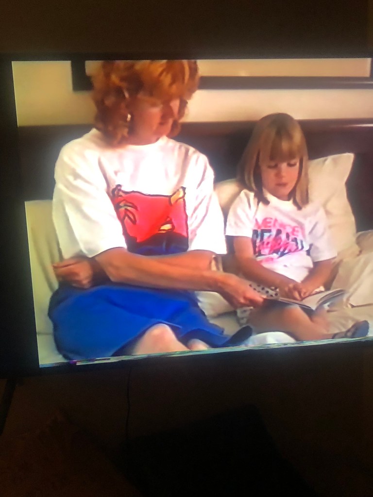
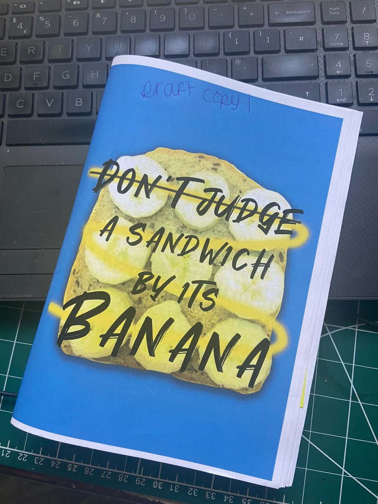
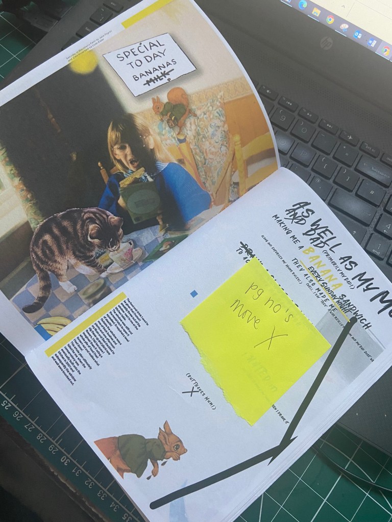
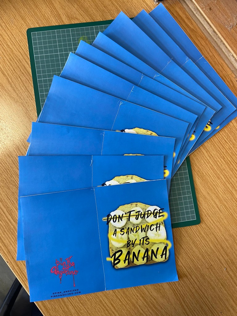
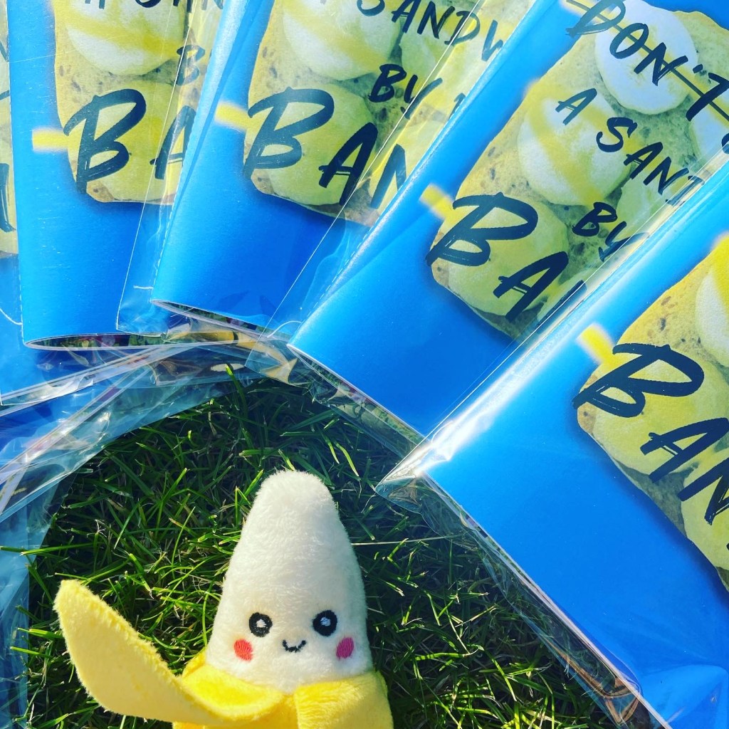
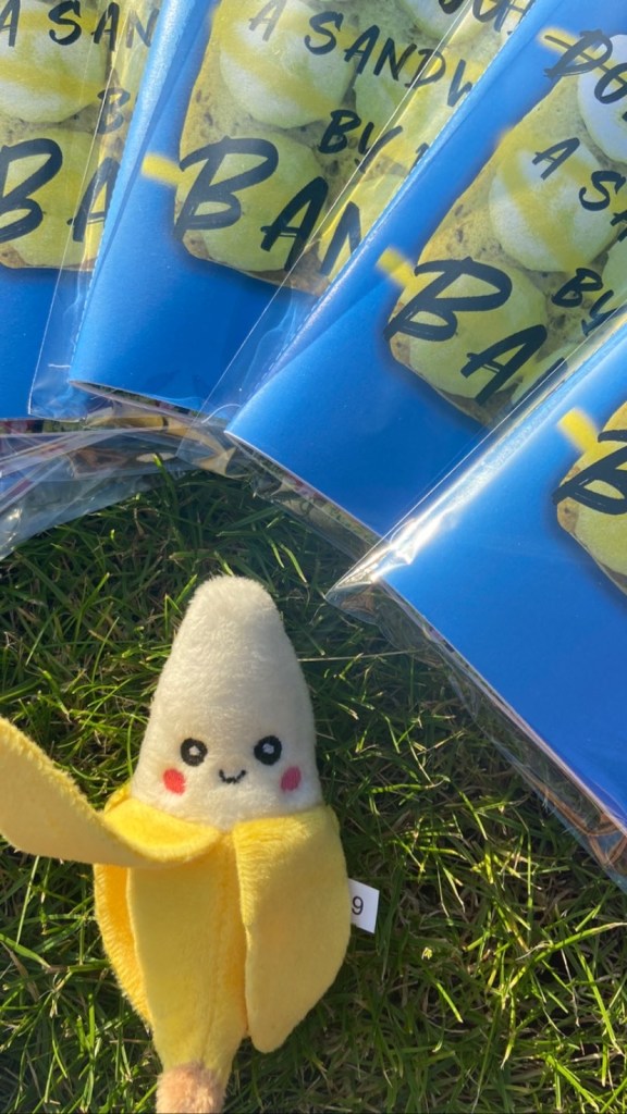
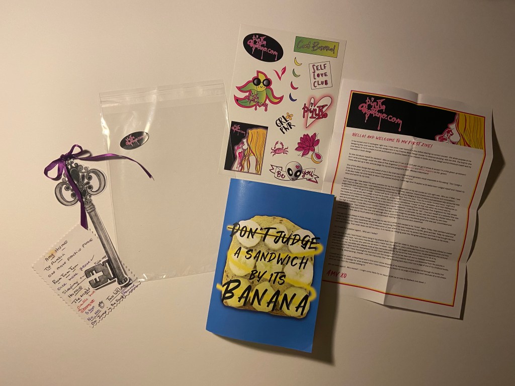
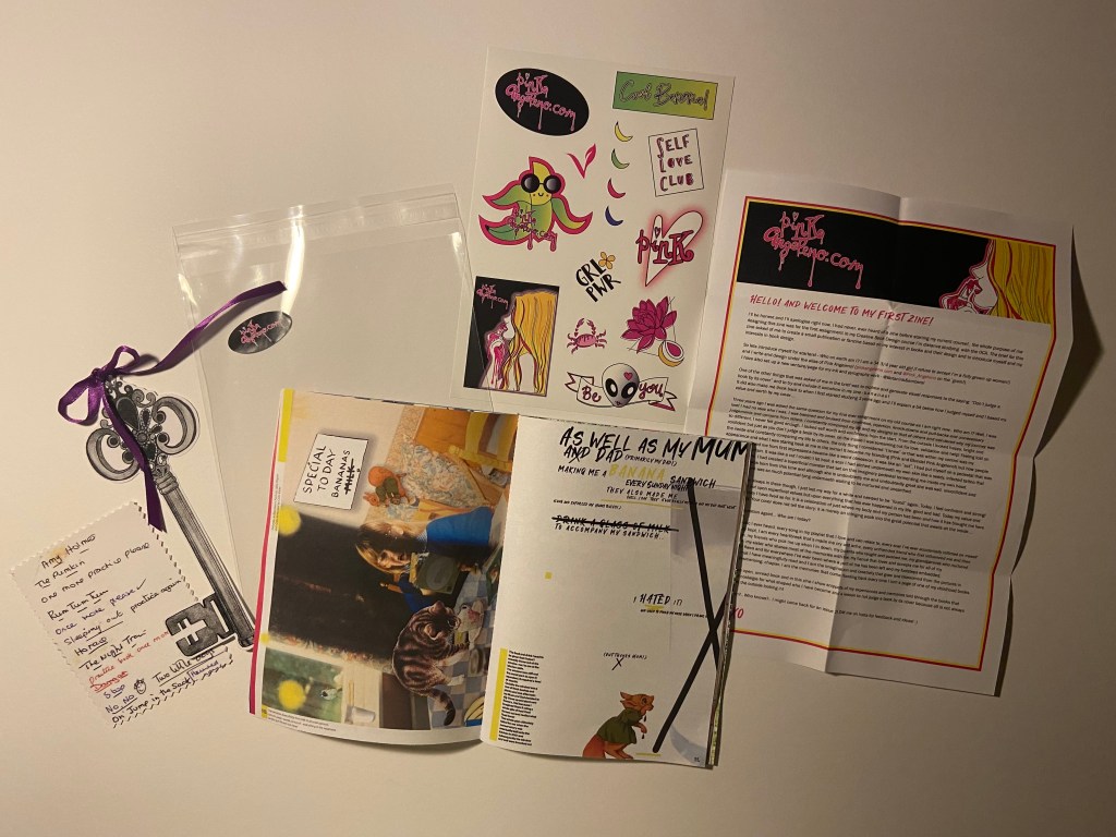
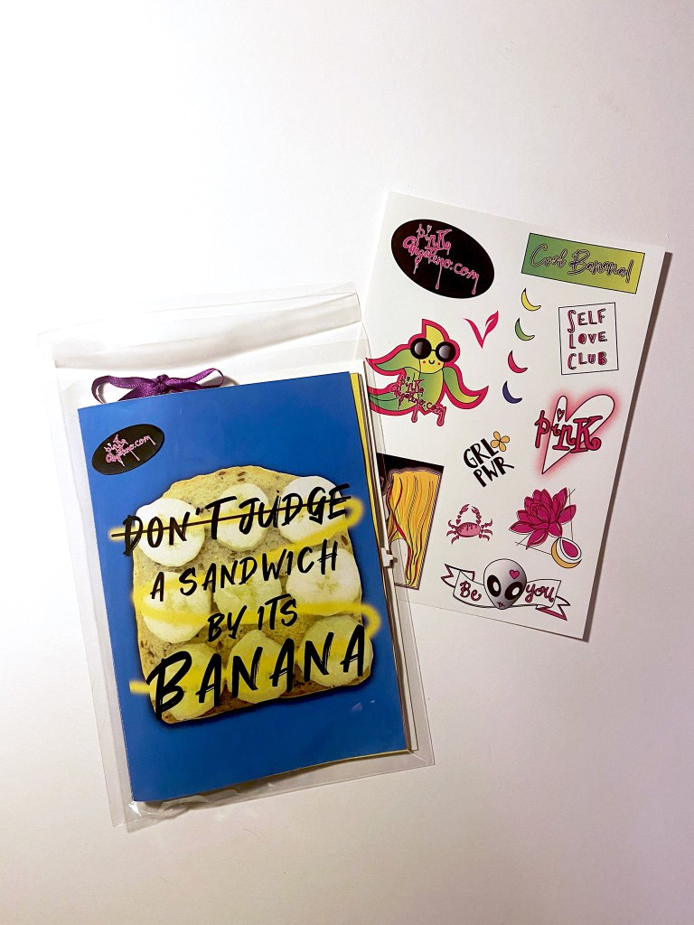
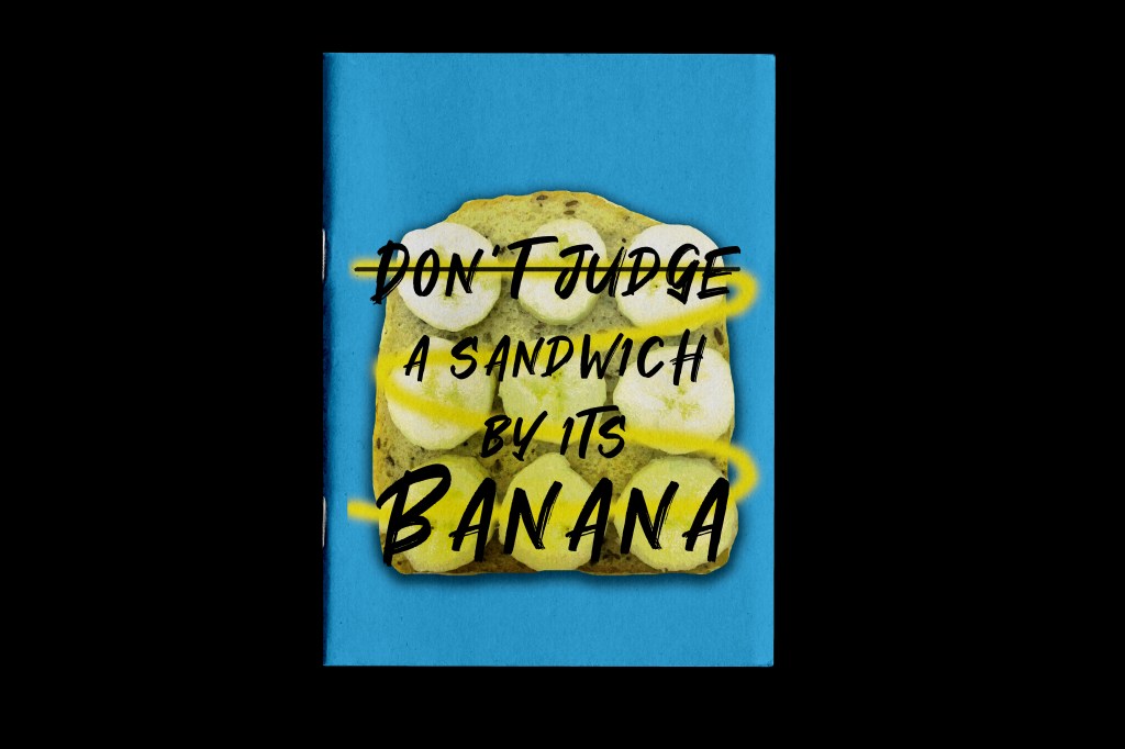
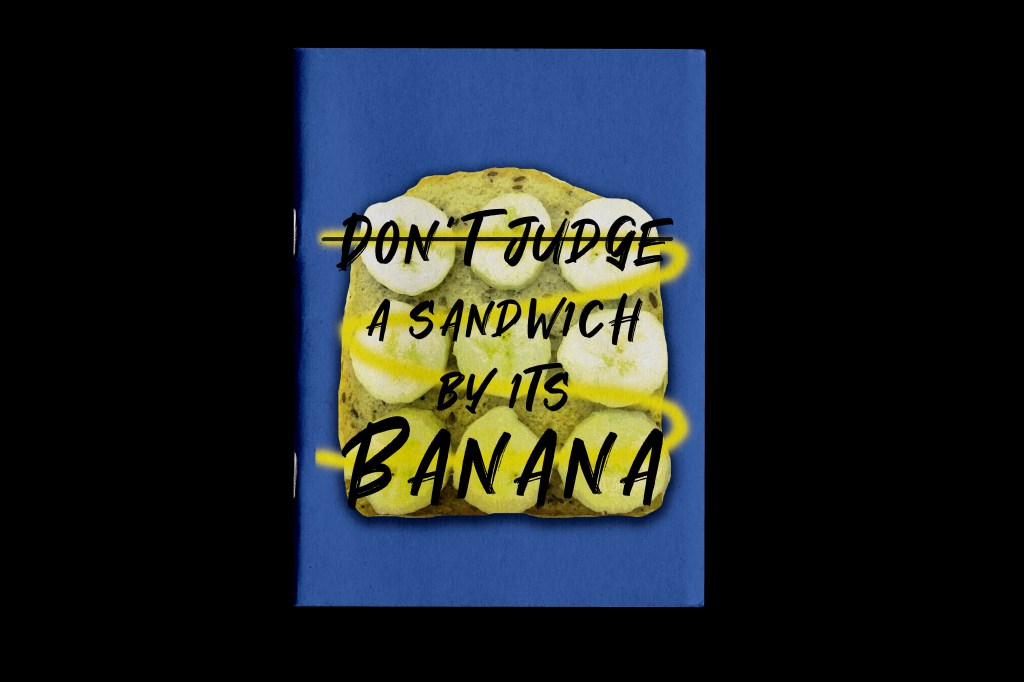
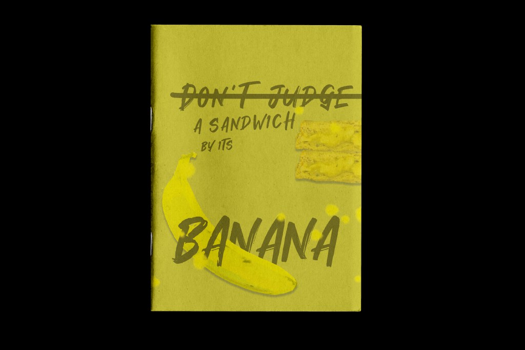
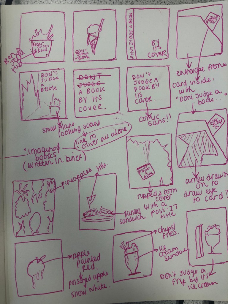
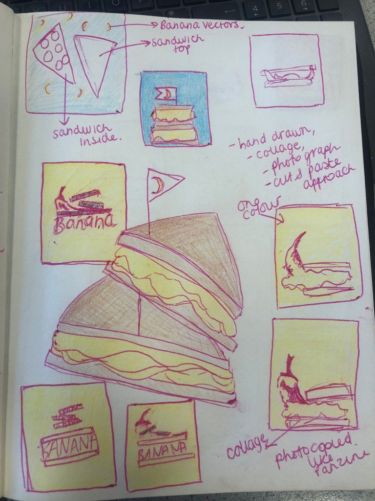
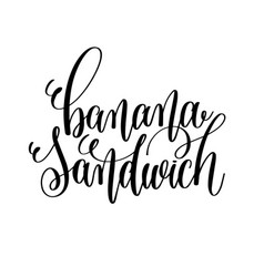
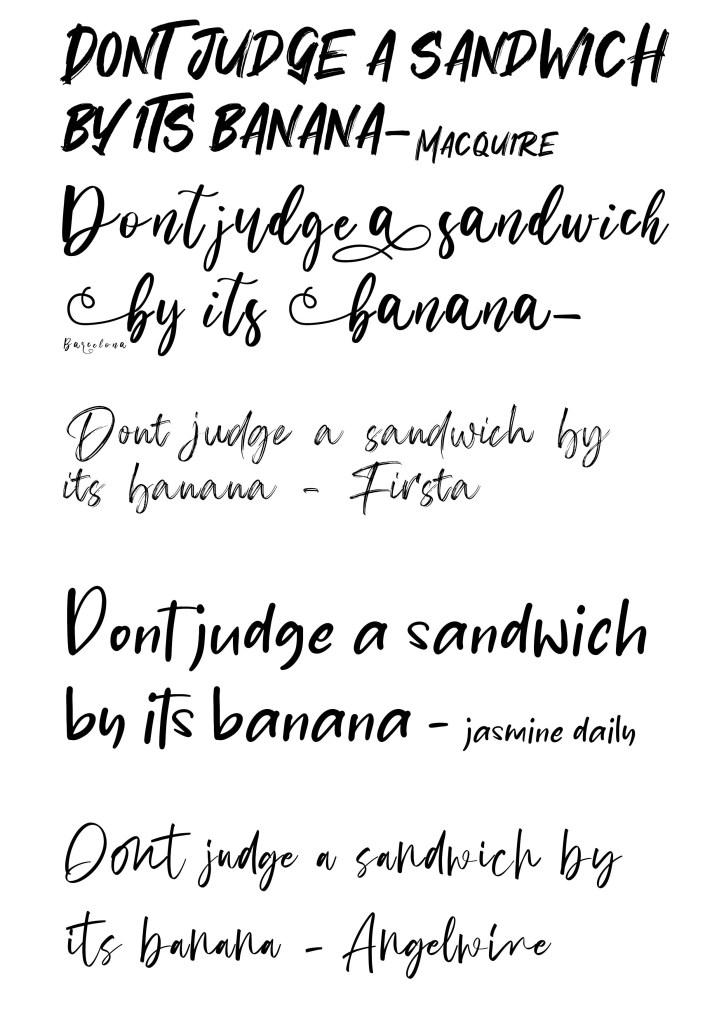
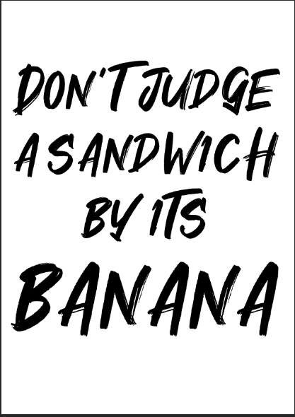
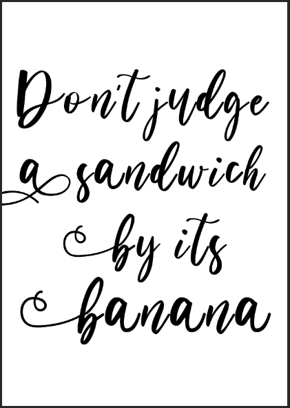
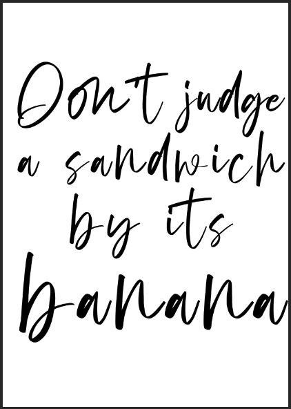
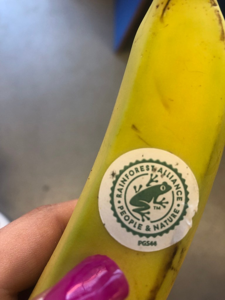
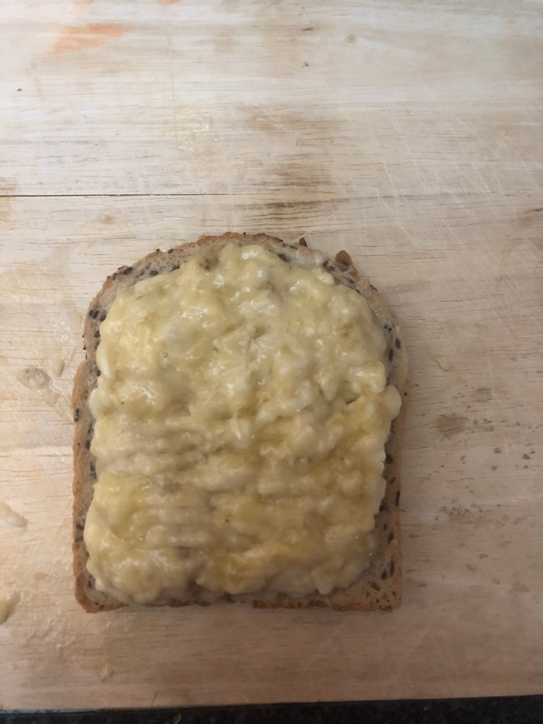
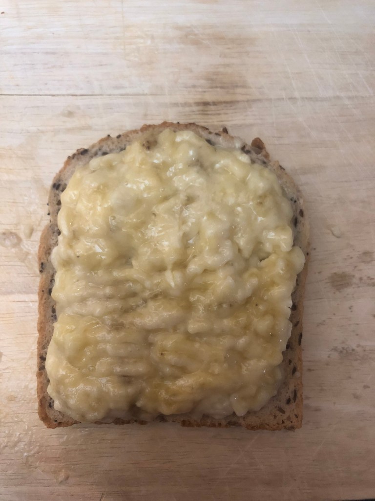
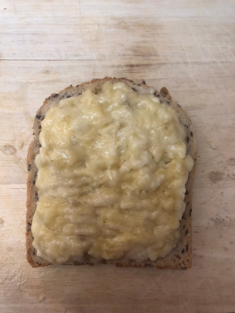
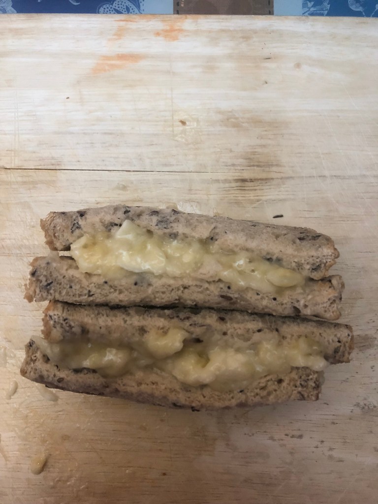
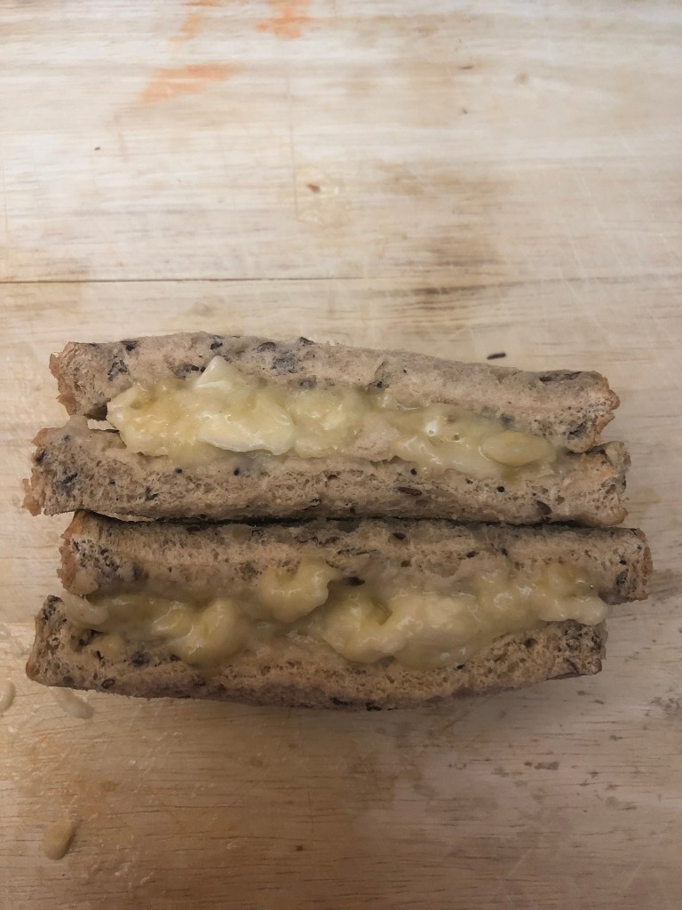
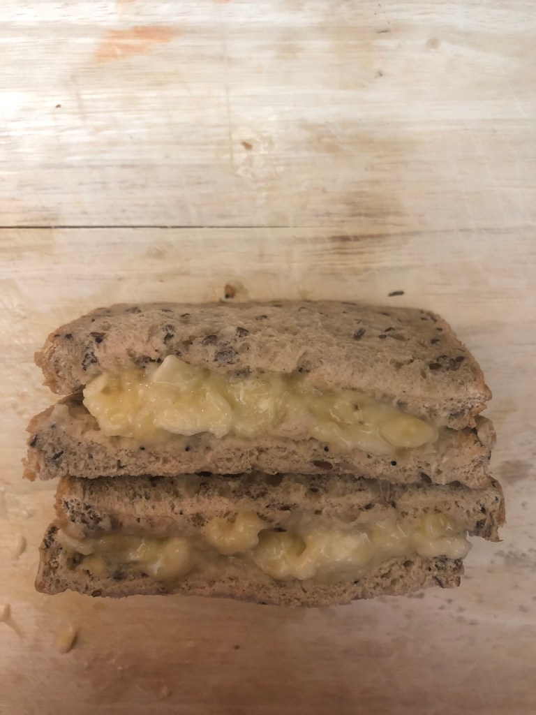
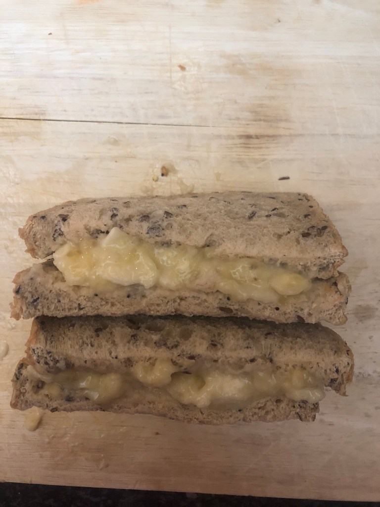
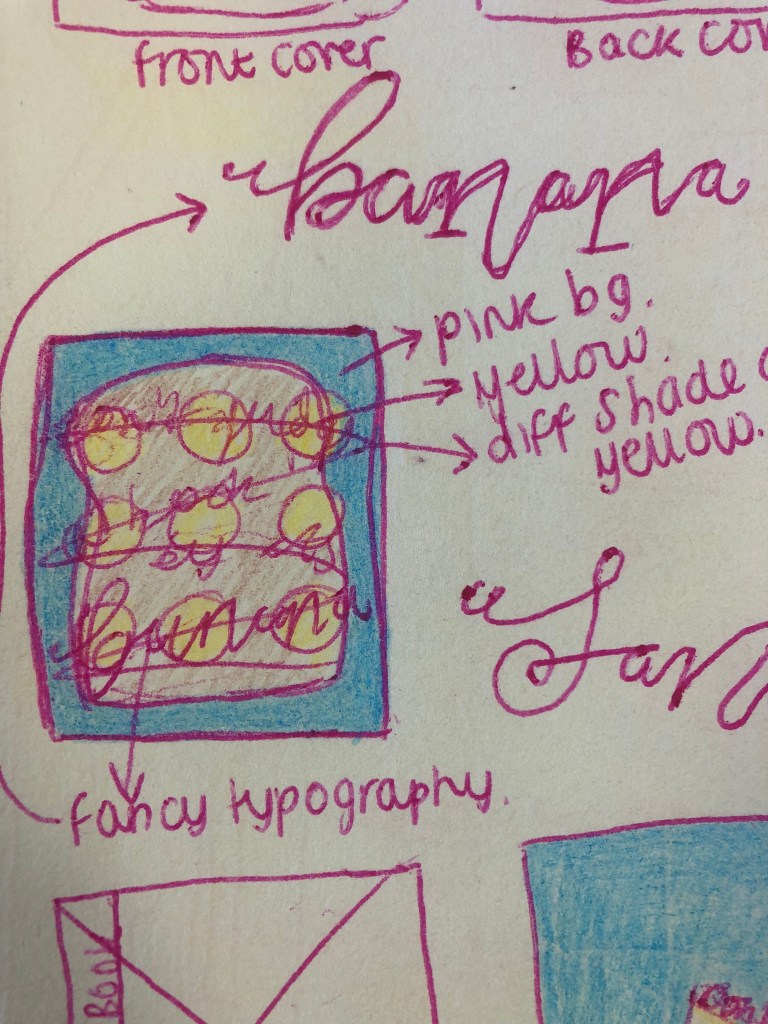
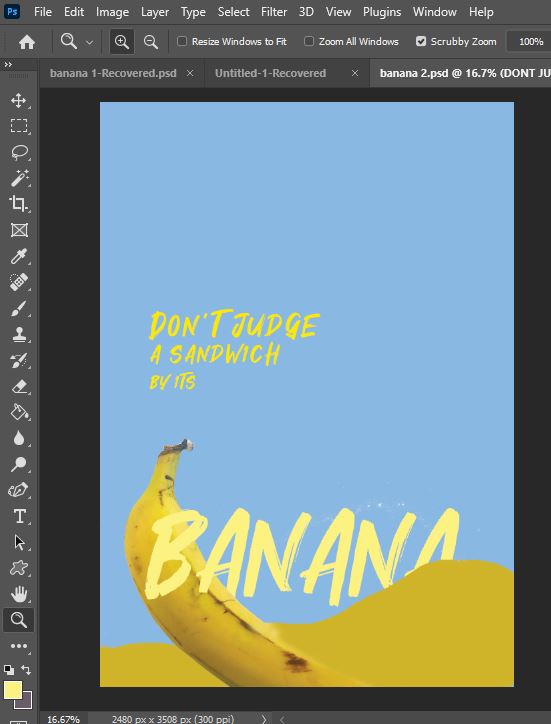
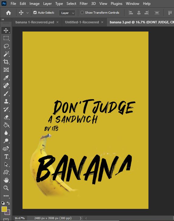
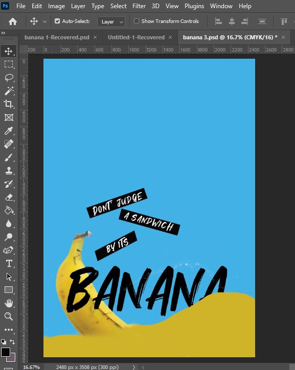
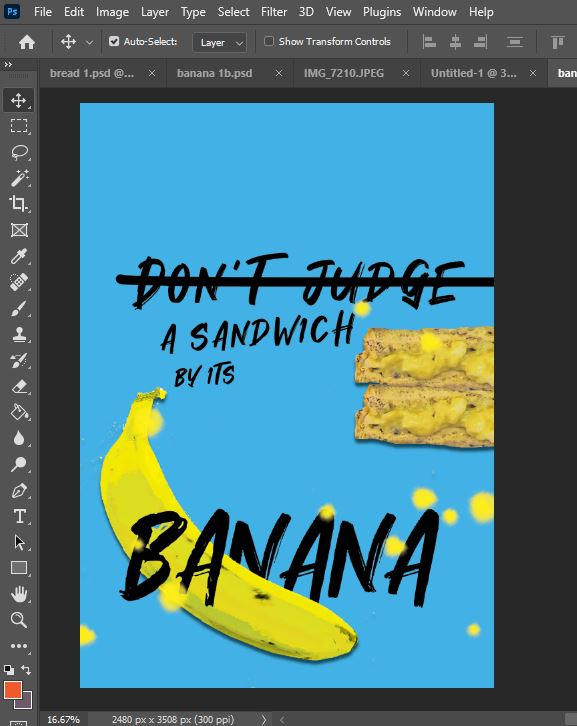
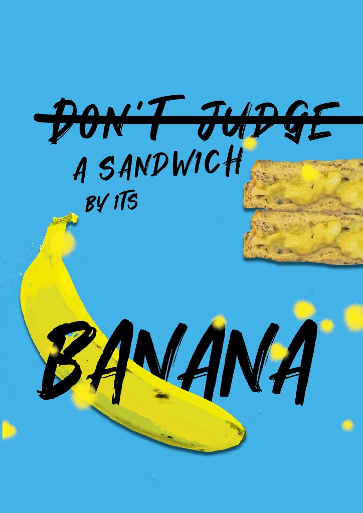
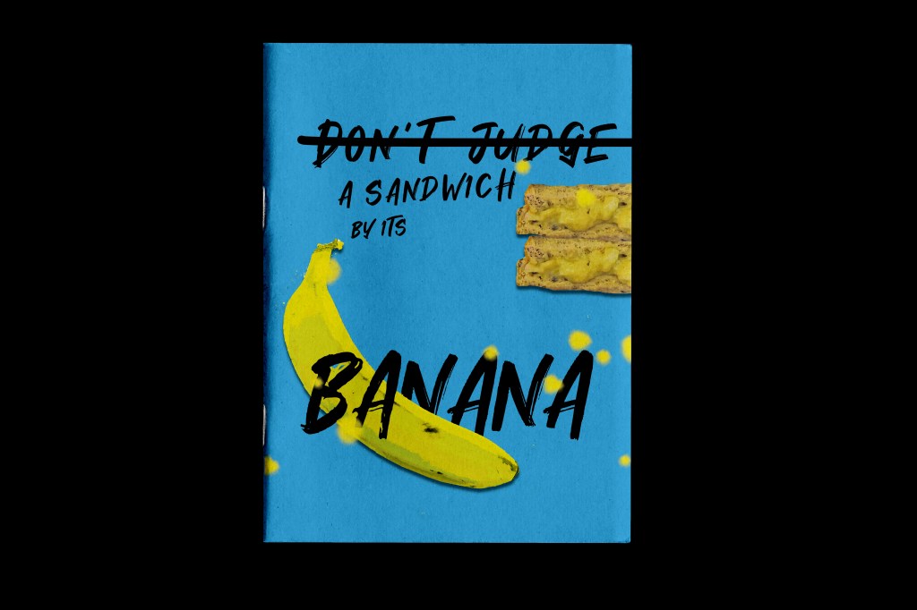
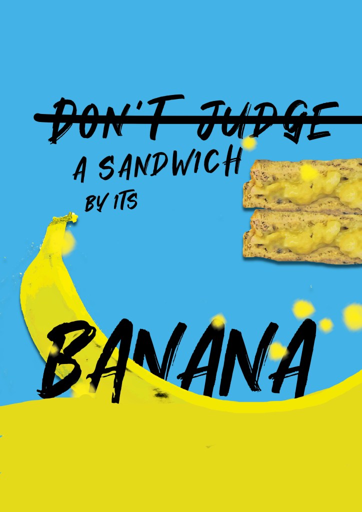
I really liked the design outcome I achieved in one of the previous exercises for this; I chose “Don’t judge a book by its cover” but put my own spin on it in my design with the Banana sandwich and “Don’t judge a sandwich by its banana!”, basically meaning that yes, it is a weird combination but don’t knock it until you’ve tried it! The story of the banana sandwich also goes back to my childhood on a Sunday night where that was my tea that my dad made me and my Mum trying to force a glass of milk down me alongside it! I knew that I could make that the cover of my zine and link the meaning behind my design and the story behind the design into my zine.
Pages 8-11: “Don’t judge a sandwich by its banana!”
I knew that I wanted my zine to reflect me and to not only meet the key points of the brief but also to tell MY story. Afterall this is an introductory piece! I have since referred to my finished zine like a bands first album where they are telling the stories through their songs! -It has been a labour of love and I have told my stories through the books I read as a child! The brief stated that my zine must introduce myself and my interests in book design – I like to think that in my finished zine I have shown how my interest of books was born, grew and developed and how the things I learned from these books and the memories made linked on to further growth and development into my adult life. These memories also tell a story in themselves!
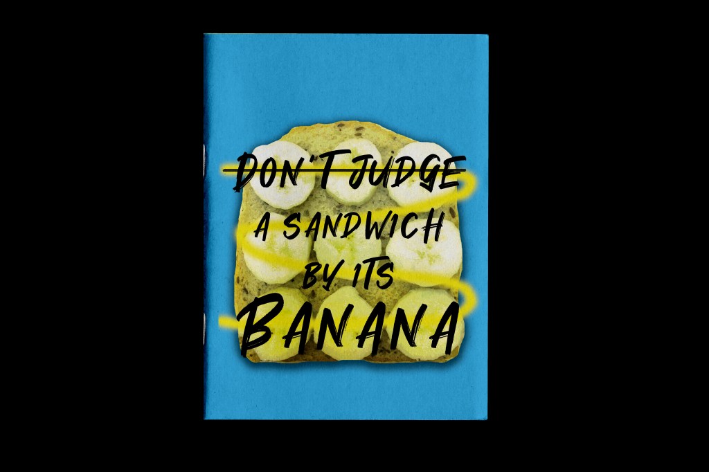
I knew that the Banana sandwich story was the first of many for this zine! I already had my cover designed from the previous exercise (below is a reminder!) now I just needed to make that cover into a story for my zine and then I knew the rest would flow from there!
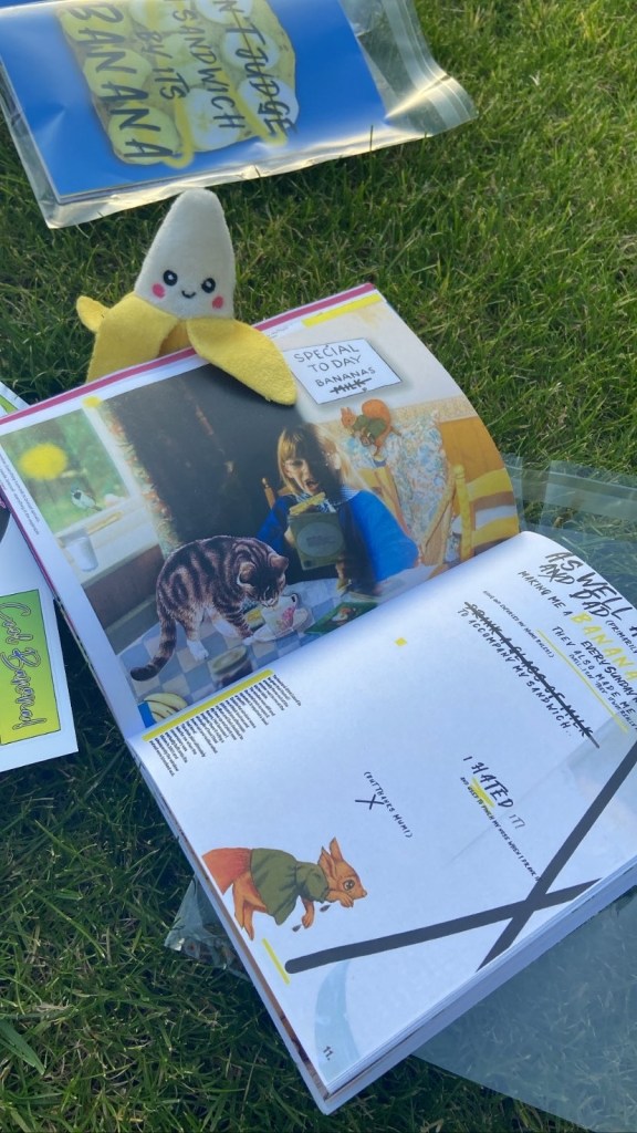
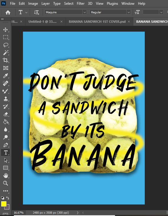
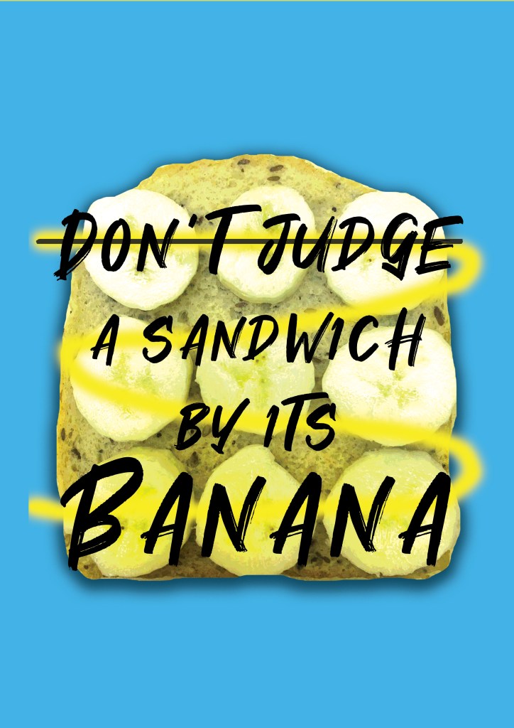
I decided to go digital with this article just so that it matched the theme of the front cover. I was going to tell the story of how as a child I used to have them banana sandwiches every Sunday night and that dreaded glass of milk! I was going to link it in with how nice they actually taste and just how you “don’t judge a book by its cover” you don’t judge a sandwich by its banana because it actually tastes alright!
That would be one key point of the brief met! *thumbs up!
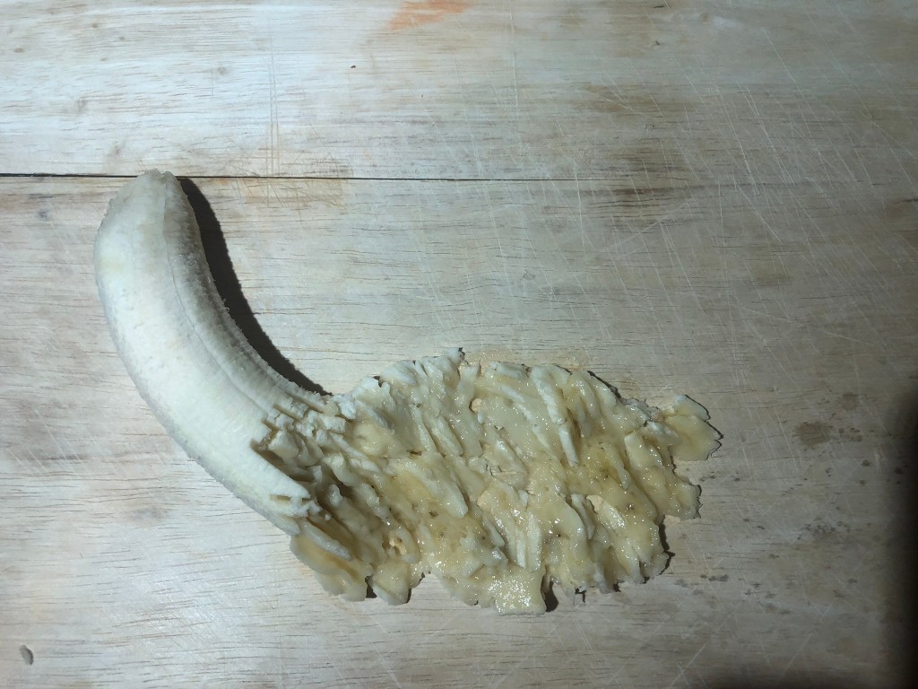
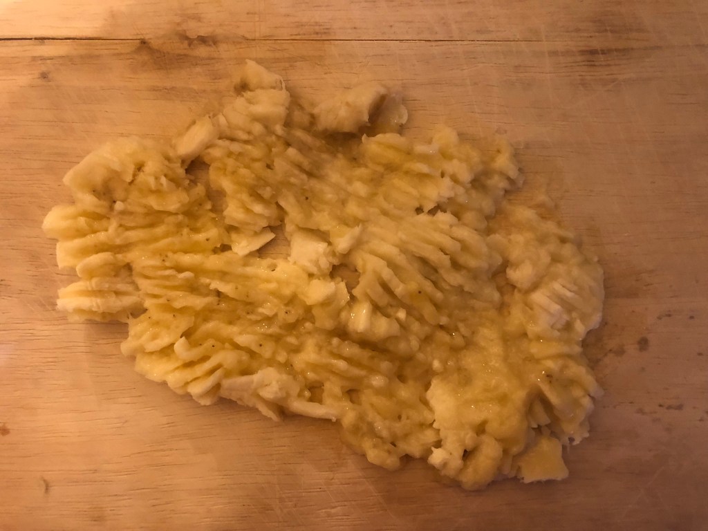
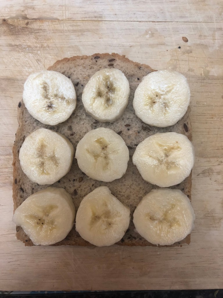
I knew I needed to make this first layout look like the front cover so that the 2 would be easily associated with each other. I decided that I would use the same fonts, colours etc.. First things first though, I couldn’t do a piece about banana sandwiches without actually showing a banana sandwich! This is where I got snappy happy and practical in the kitchen in my previous exercise! I used a photo from the montage of photos that I took and used that for my piece!
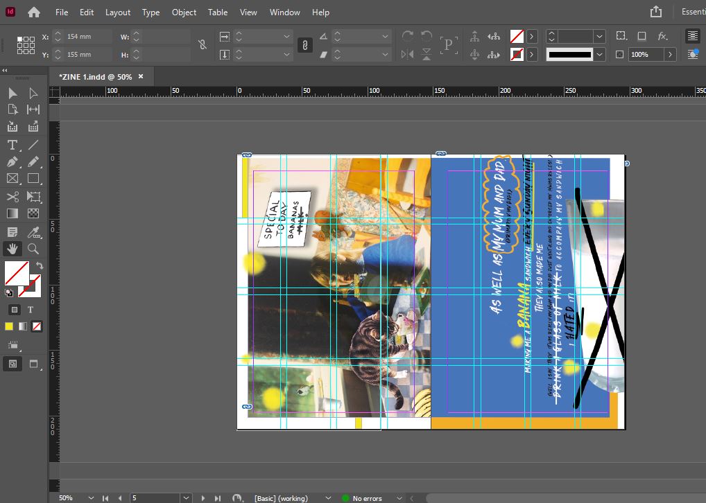
The layout InDesign!
I set a new document up in InDesign and using a grid system I worked out where I wanted everything to go. I wanted there to be an element of white “negative” space and for my design to not be constrained to a box and to be able to breathe which is why there is white space around the outside! The layout is quirky and fun, it doesn’t take itself too seriously! I like it!
The exported jpeg of my DPS!
I then bought a zine mockup from an independent designer on Behance so that I could mock up my layouts on a zine mockup which would then be suitable for presenting my work on social media and for presenting in my portfolio.
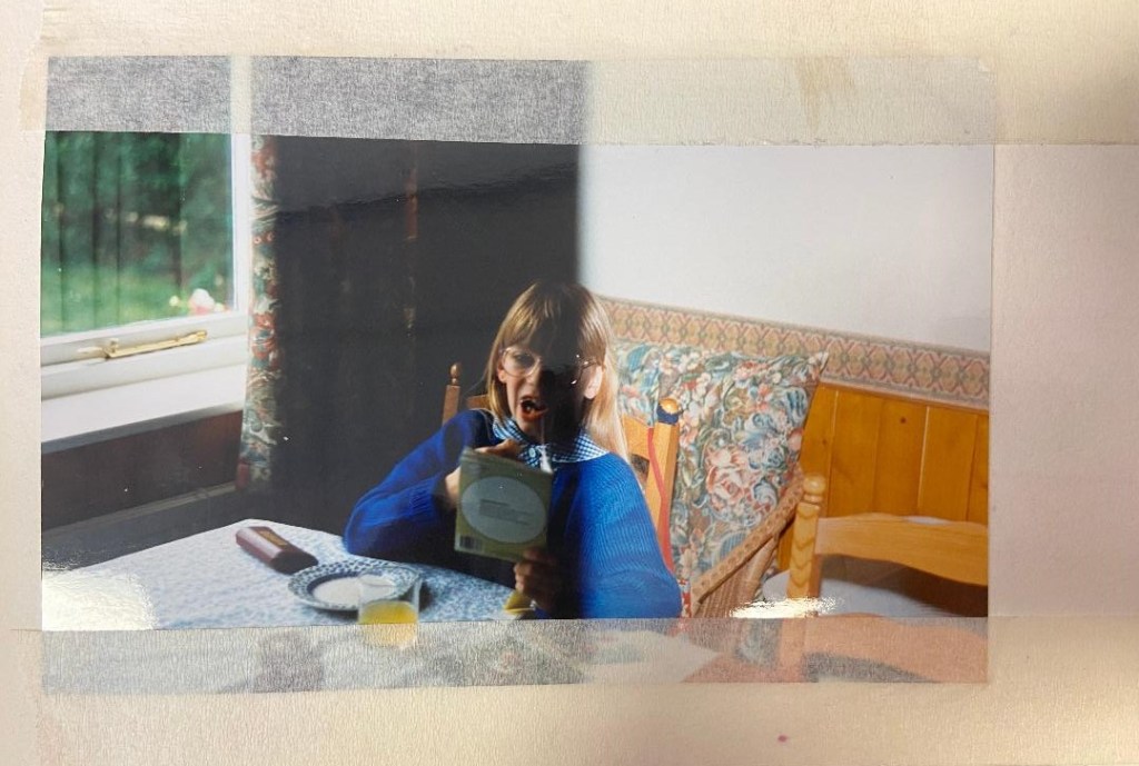
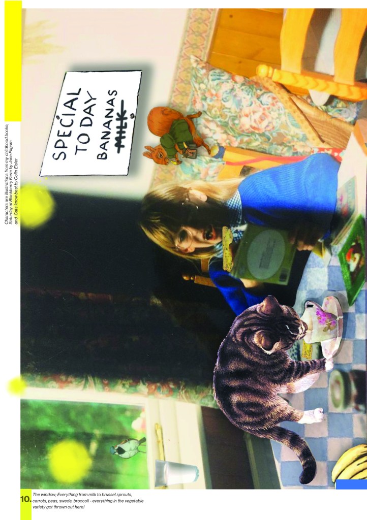
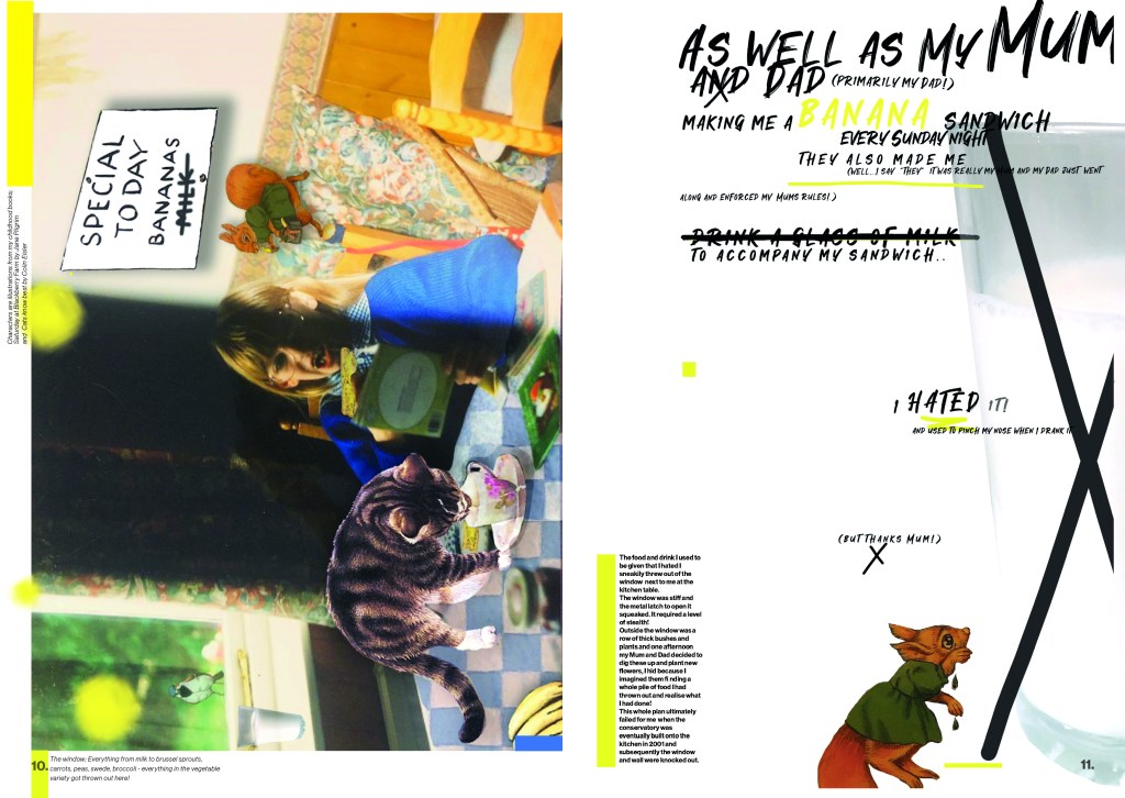
I hadn’t finished telling my story though! – I hadn’t explained the glass of milk! I had met the brief in making sure that I included “Don’t judge a book by its cover” but I hadn’t so far included anything relating to the books I once read.. I then remembered that I had a photo of me when I was 7 years old sitting at the kitchen table eating a banana sandwich reading a book! This was ideal to include in my zine! What better way to make it more personal than to add photographs of me in there?!
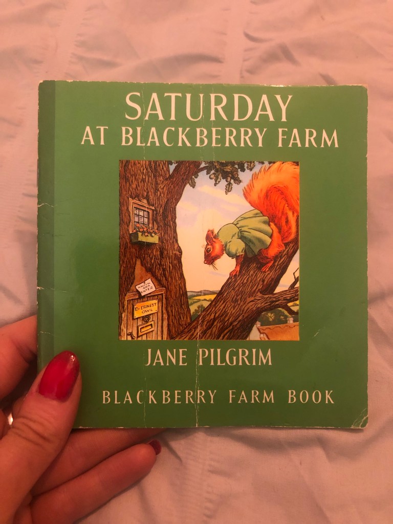
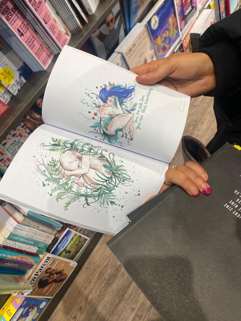
Even though my layout digital I wanted to experiment further…. I wanted to create more of that “cut and paste” style. How could I achieve that digitally though?.. I took one of my favourite books from the era of that photograph “Saturday at Blackberry Farm” and photographed a few pages with the main characters and decided I would have them running about on my photograph. In the photo of me I am concentrating and absorbed by the pages in my book and this was perfect! It would be like the characters were a figment of my imagination but I am making them real by reading and bringing them to life! It is also a digital montage- I have taken snippets of another publication and used them on my work – just as I would if I was cutting and pasting physical papers.
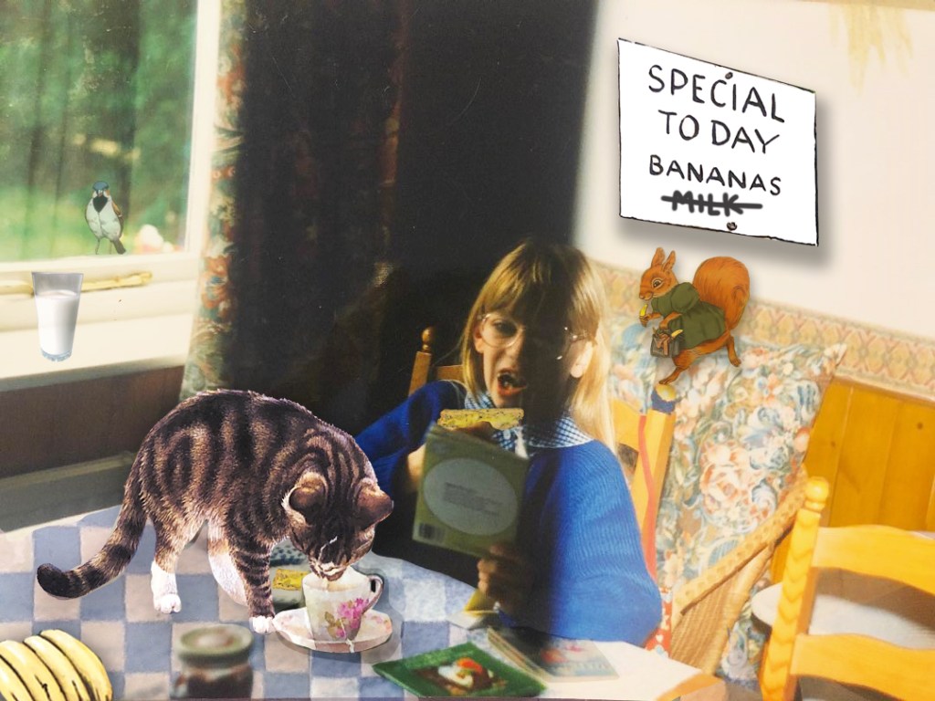
The original photo! Circa 1994!- I had new glasses I was trying out! The version I changed in Photoshop! The cat, Sparrow, Squirrel and the sign all appear in “Saturday at Blackberry farm”!
I then added the yellow paint blobs to represent mashed banana and included the text that I wanted on my page. Again, I tried to use a similar layout to the previous one I designed and keep an element of negative white space.
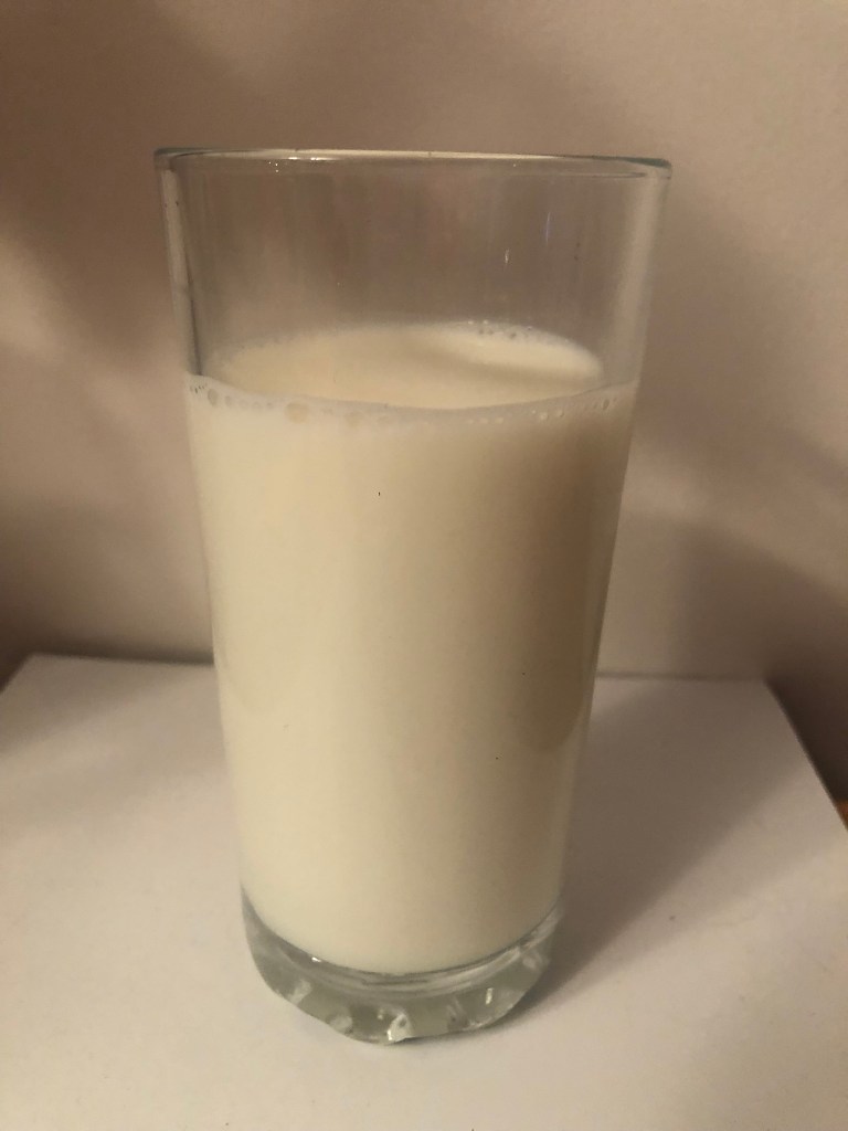
I then went on to design the right hand page. This would be the page that explained my dislike for the milk that accompanied my banana sandwich! As I have wrote in many previous posts, I love the experimental typography that David Carson produces and after watching his Masterclass I decided to give it a go for my page!
This is the image that inspired the typography on my page! I like how the text is very contrasting; all different sizes/widths/Bold/thick/thin.
I am designing in digital for this layout but the experimental, rough looking typography could have been scribbled or written on the page and that is the effect I wanted. I wanted something that looked like it hadn’t tried too hard and that wasn’t well put together. Carson always tows the fine line between legibility and readability and I wanted to experiment with that in my own work.
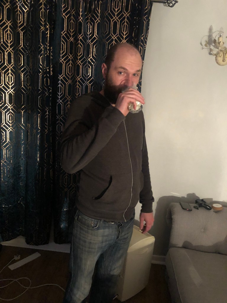
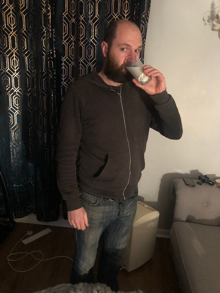
Again for this I needed to get snappy happy and photograph that dreaded glass of milk! Who drank the milk after I had poured it and photographed it? – Chris. Yuck!!
I photographed the milk at several different angles which would help me to manipulate it better in Photoshop!
There were several variations of this page that I produced before I was happy with the final outcome:
Originally I wanted this page Blue again to tie in with the cover and the previous double page spread but I decided that white tied in well with milk and also it allowed the design to breathe! I like space in a design and this just seemed to have a calmer feel to it!
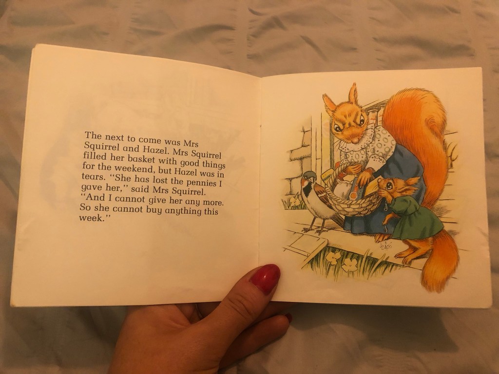
I used the sad illustration of Hazel the Squirrel to highlight my distaste for the milk! I liked it! I then added the story at the bottom to reflect the imagery.
This was the whole double page spread:
I really liked it! It was a strong start! It then got me mind mapping about further childhood books that were important to me or that have played a part in my adult life which I could possibly include in my zine.
After designing 2 really nostalgic, fun double page spreads for my zine I couldn’t wait to see what else I could come up with!
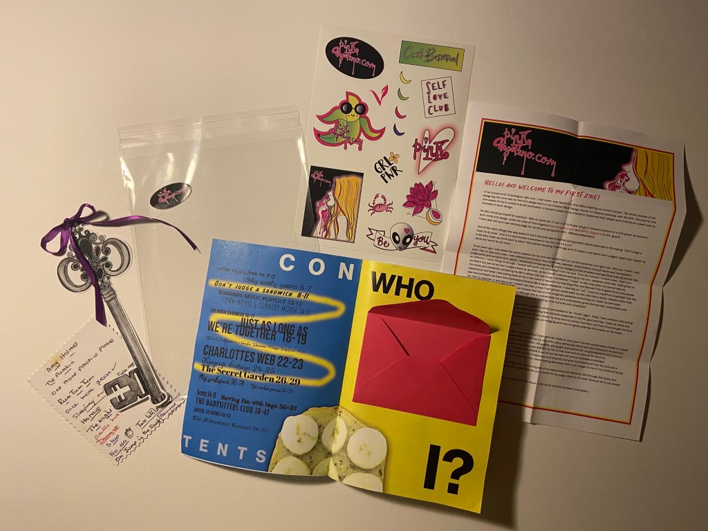
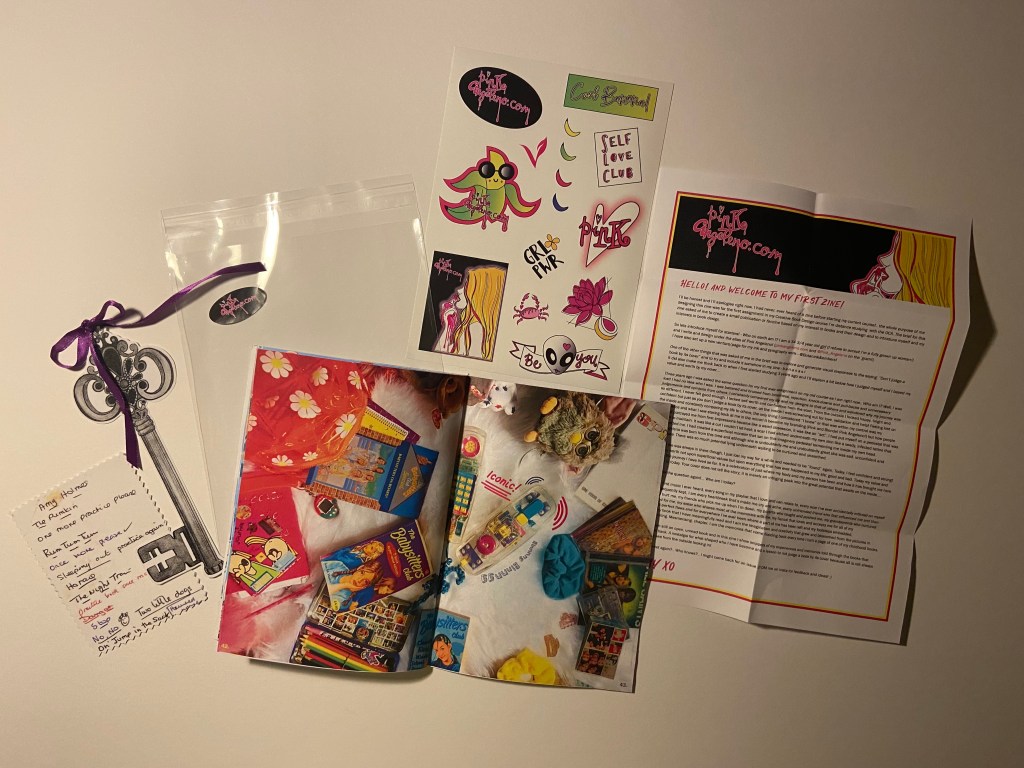
Some of the zines that I had researched had freebies hidden inside them when I opened them and one artist of a zine sent me a sticker free with theirs in the post – this gave me a further idea to maybe produce some stickers to place inside the zine relating to my brand (Pink Angeleno) and also Bananas as this is the theme of the zine! I drew some silly sketches (below!) for ideas for this!
For the “Who am I?” introductory section that needed to be included in my zine I also had the idea to place an envelope inside with a little letter from myself to the reader (again, sketches show this below!) – it just makes it a bit more personal and unique! If I was selling my zine in a shop this could also be signed with my signature and the number of the edition they have; e.g. a limited run of 50 and someone could have 3/50 in their hands. Zines are printed in limited numbers generally which makes them more unique and special.
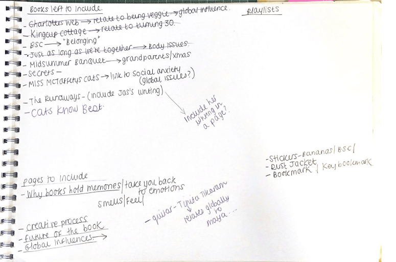
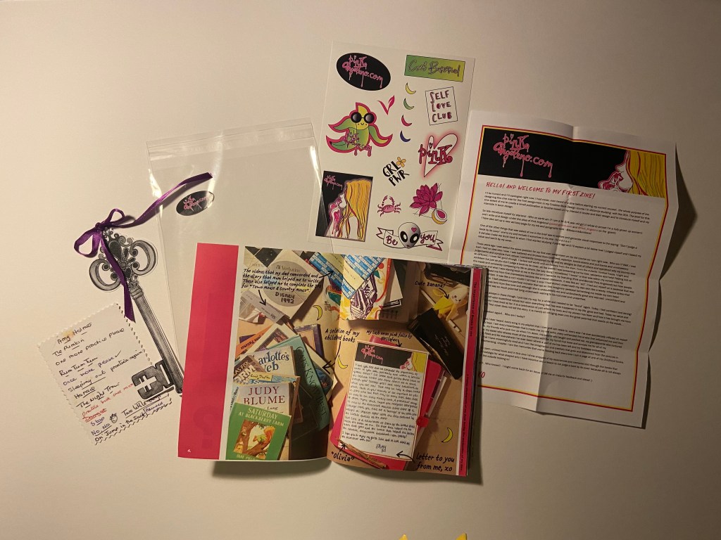
I made a list of books that had an influence on me growing up or that I just loved and I began to think about the stories I could tell as to why they were so influential to me as a child or now an adult and how reading helped shape me as a person.
I had already listed a lot in the previous exercise “Influential books”:
I then began mind mapping ideas around not only stickers as an additional extra but also dust jackets for the finished zine to keep it protected and to make it look more professional to give away or to sell in a shop or a stall. I thought that free bookmarks would also be a nice added touch.
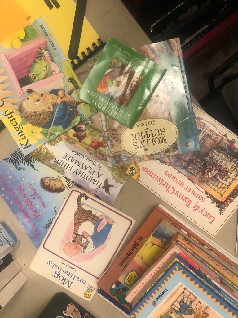
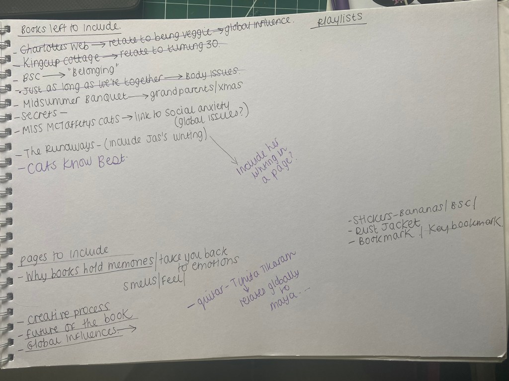
The books I chose to feature in my zine were:
Saturday at Blackberry Farm
Town Mouse and Country Mouse
The Worm Charmers
Just as Long as we’re together
Charlottes Web
Kingcup Cottage
The Secret Garden
Secrets
The Babysitters Club
Flowering Wilderness
The Midsummers Banquet
I shall start from the beginning of my zine to explain the rest of the process!
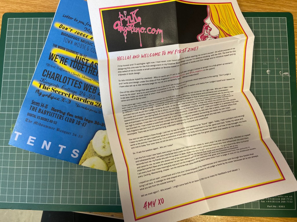
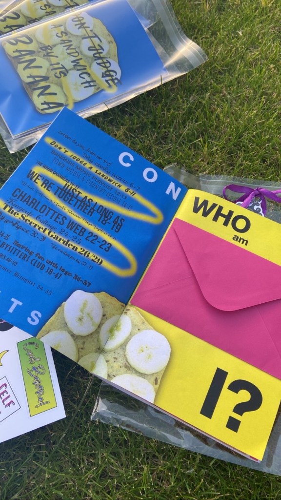
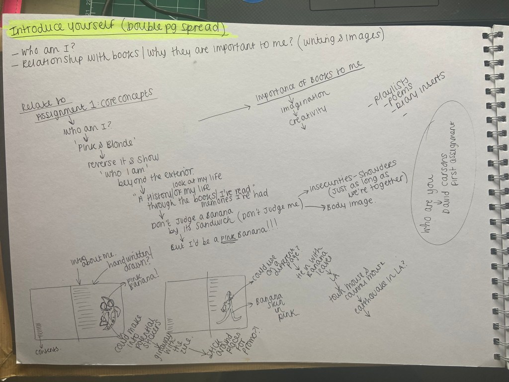
Pages 2-3: Contents and Who am I
The idea for my contents page came again from David Carson. I watched his Masterclass and one of the lessons he taught explained the process of him designing a contents page for a surfing magazine; in the lesson he was explaining that why would you just do a boring list of numbers followed by the pages, why do what is expected from a contents page? Why not make it more creative and make some elements bigger than others and be more experimental with the layout. I decided to take this approach for my contents page. The general rule of thumb is to not use any more than 3 typefaces in a piece.. I used loads! A zine isn’t supposed to be a perfect piece of design or literature. It is meant to be experimental, fun and creative. I defied the rules and went with what I thought worked! My zine is compiled of a story per every double page spread. I chose a typeface that I thought represented the story and theme behind every double page spread. I kept it in theme with the front cover and with the “contents” title I split the word up and changed the point size ever so slightly to add some contrast in the design.
On the right hand side page featured “Who am I?”. This is the quickest page I have completed in my life! I just wanted a lot of negative space and some bold text with the title. I knew I was going to go with the envelope stuck on this page with my introductory letter so not much thought would be needed! I love the contrast between the 2 pages – the cool blue and the bright, warm yellow!
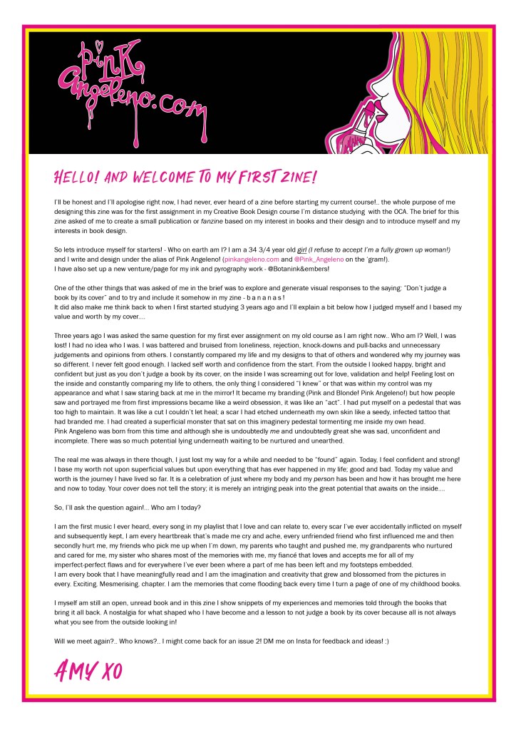
I made the letter inside by designing a simple letterhead with my Pink Angeleno logo and colour scheme and then by just writing the content on there! The content of the letter explains who I am and the journey of self discovery and confidence I have been on the last 2/3 years since joining and studying with OCA. It explains how I judged myself wrongly (again relating back to not judging a book by its cover!) and I have written it as though my zine is going to be published and passed around welcoming feedback and comments from fellow ziners!
Pages 4-5: The Importance of Books
This double page layout is very similar to the layout I designed for “Story of my space“. I really liked the introduction on the brief for one of the previous exercises -“Influential books”. I wanted to include it in my zine as a nice introduction leading on to what I had to say about why books are so important and to what my zine is all about! Again, in a personal way I decided this time to hand write it as a personal letter – using again a printed version of my letterhead! I did a little bit of flatlay photography and I took a photograph to use as the background arranging my work in an interesting way that relates back to the content of my zine.
I then imported the photograph into Photoshop to adjust the brightness/contrast/levels etc and then imported it into Illustrator so that I could draw on top of the photograph and add text. It then got imported as a jpeg into InDesign for the rest of the layout to be completed.
Pink was the main colour of this layout and I feel it really worked well! – the contrast between the pale yellow background against the strong pink works well! As always keeping the layout similar to the previous ones I designed and including negative space on there!
The final mockup!
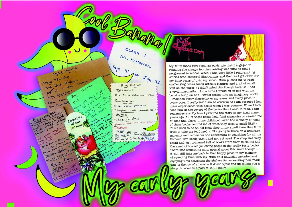
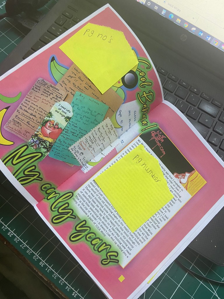
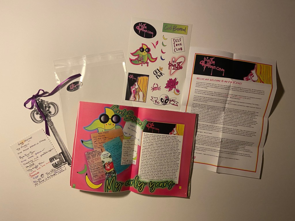
Page 6-7: My early years
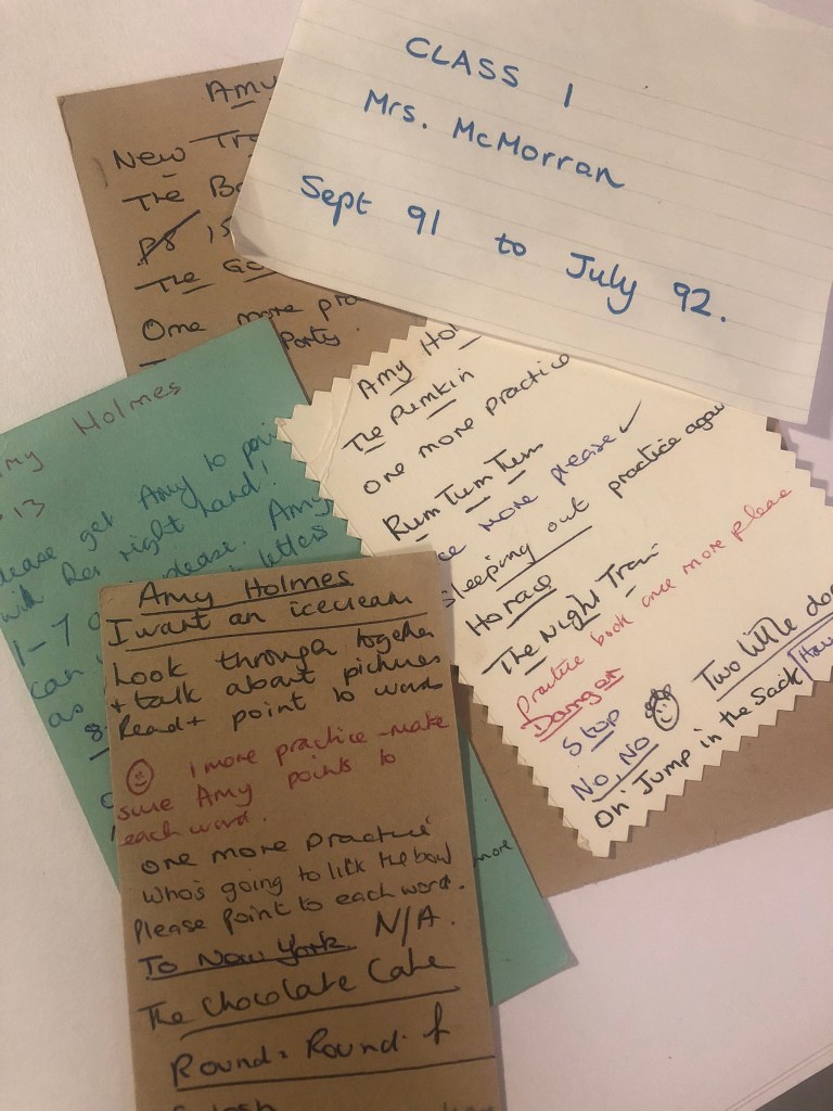
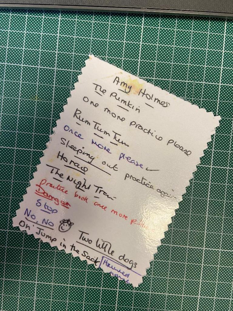
This double page spread was inspired by some of my old primary school reading cards that I found in some boxes in my garage. The cards used to be old Christmas cards ripped in half to write on the backs of them. I remember at the time when the teacher used to get me to choose a card for my parents and her to write notes on about my reading; I used to want to find the prettiest one but sometimes ended up with crappy ones like the one I have reproduced for my zine!- I decided to reproduce and laminate one of my reading cards as a bookmark for my zine; it has an old Victorian, creepy Christmas scene on the back of it and was obviously picked at a time when there were no other pretty ones!! Some of the comments and names of the books make me laugh!
I wanted to include these as an article in my zine because they seemed too good not to!! I decided to create a double page spread about my early childhood and learning to read and how much books were so important to my learning, development and imagination! – how having such a positive relationship with books has helped make me the creative individual I am today!
Similar to the last layouts I used the letterhead paper to write my piece about how from an early age I engaged with reading… I wanted the layout to be quite childlike; bright, illustrative, fun, happy… Earlier on I mentioned I was playing around sketching ideas for potential stickers for my zine of cartoon bananas; I made one come to life by drawing it out in Illustrator and turning him into vector art!
I then chose the font for the article which is called Angelwine; it is a very chilled out looking typeface and suited the cool appearance of the banana – so much so that I wrote Cool banana on the piece! The banana ties in to the childlike vibes of the piece but also to the main zine itself being banana themed!
The colour scheme I love! The cool blue and lime green clashing with the bright yellow set against the vibrant fuschia pink background! Again, the pink ties in to my branding and represents me whilst the cool colours represent the banana and cool.
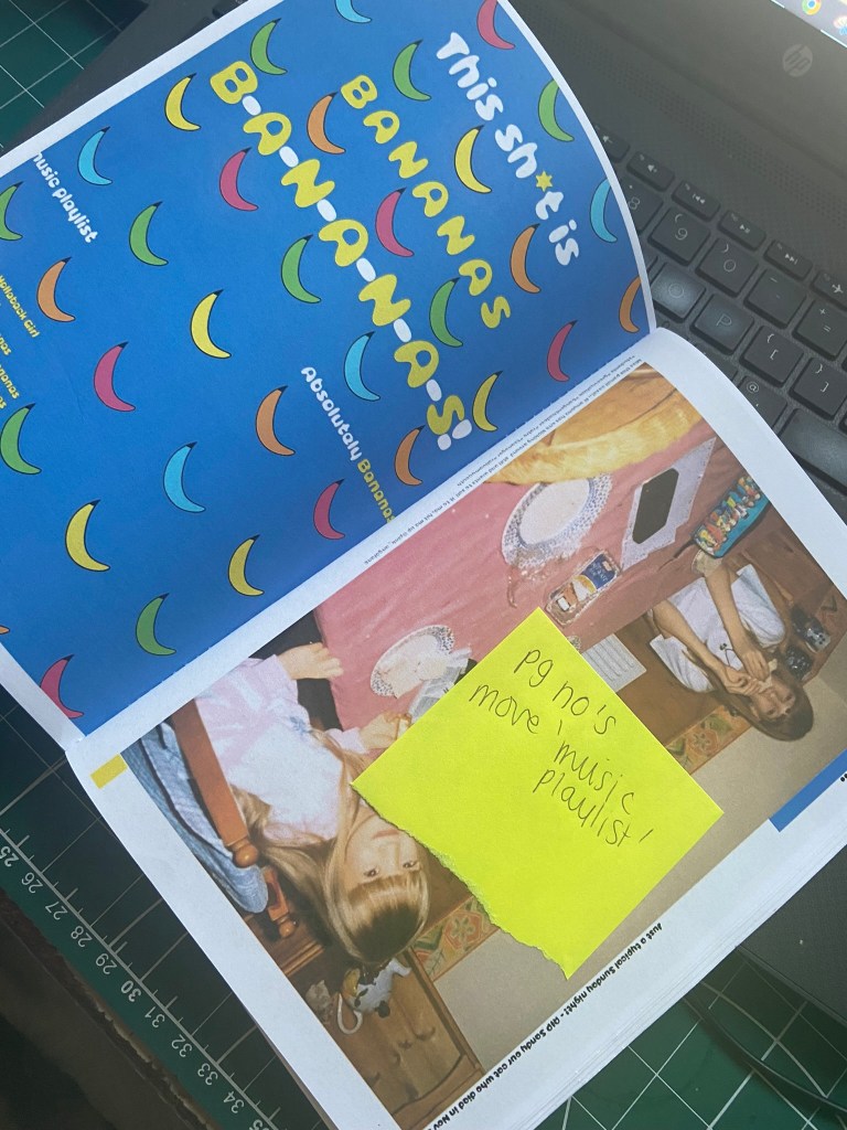
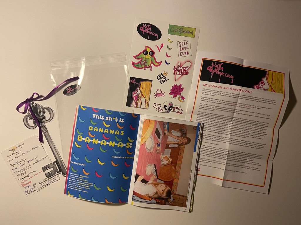
Pages 12-13: Bananas playlist
From researching the zines that I bought from Magazine Heaven and Etsy, one of the things that I noticed was that a few of them had playlists for the reader to listen to while they connected with the stories, articles, poems in the zine. I decided that this was a nice touch and went out to try and find some songs that related to bananas! I found a few; Hollaback girl and this shit is bananas.. being some of the lyrics I knew! I made this one the title piece for the page! I just wanted to make a fun double page spread to slot in between my stories. I went onto Illustrator and also made some vector art of some bananas to use as the background for this piece.
On the right page I found another classic photograph of me, my sister and our old cat Sandy circa 2001 on a Sunday evening once again having a banana sandwich and with my sister and Sandy having a Ham one! I liked including old photographs in my zine because it felt more personal to me and it allows the reader to identify and relate to the stories more. The photographs themselves tell a story!- that is what this zine is all about! Stories!!
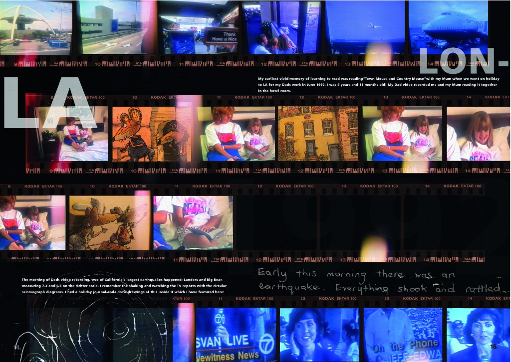
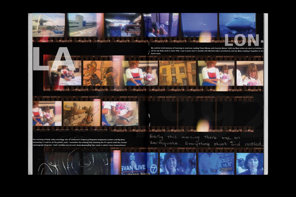
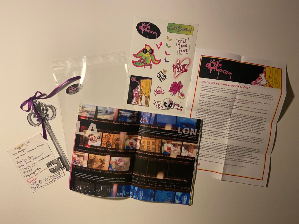
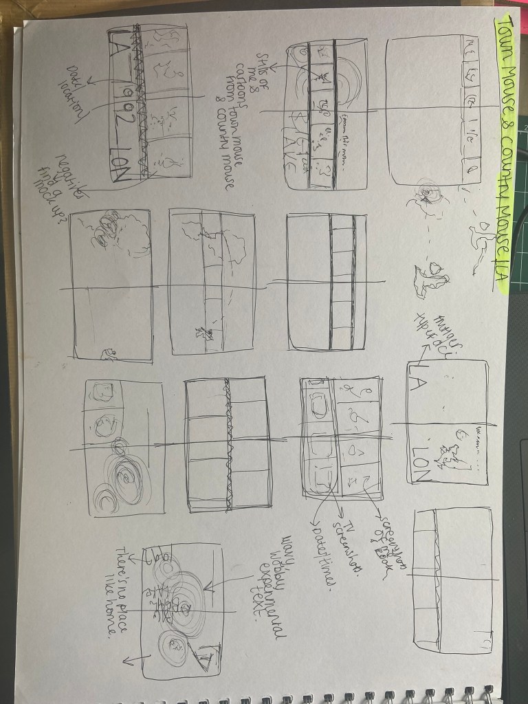
Pages 14-15: Town Mouse and Country Mouse
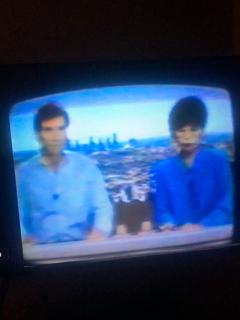
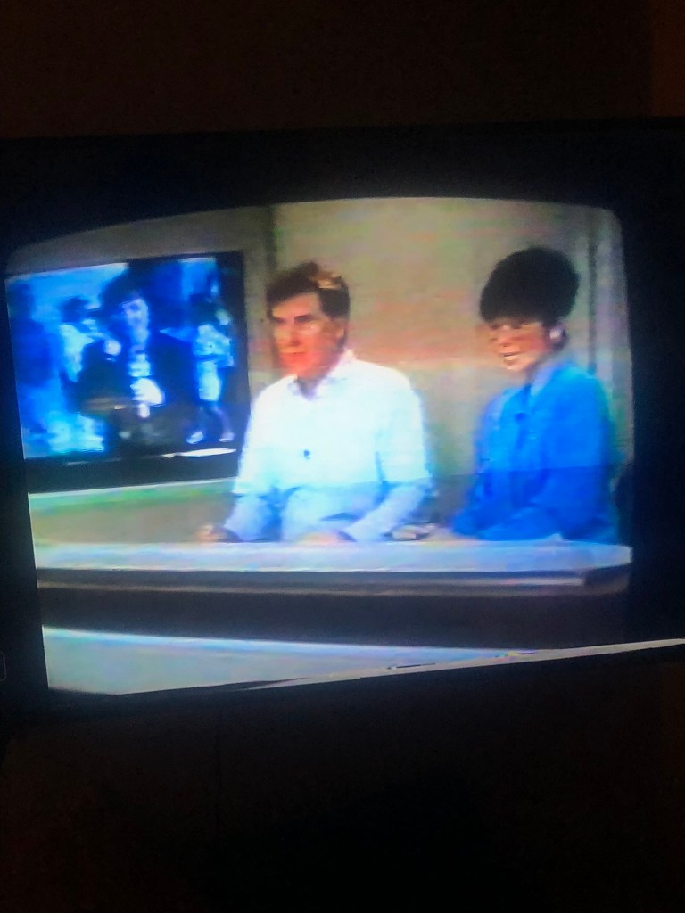
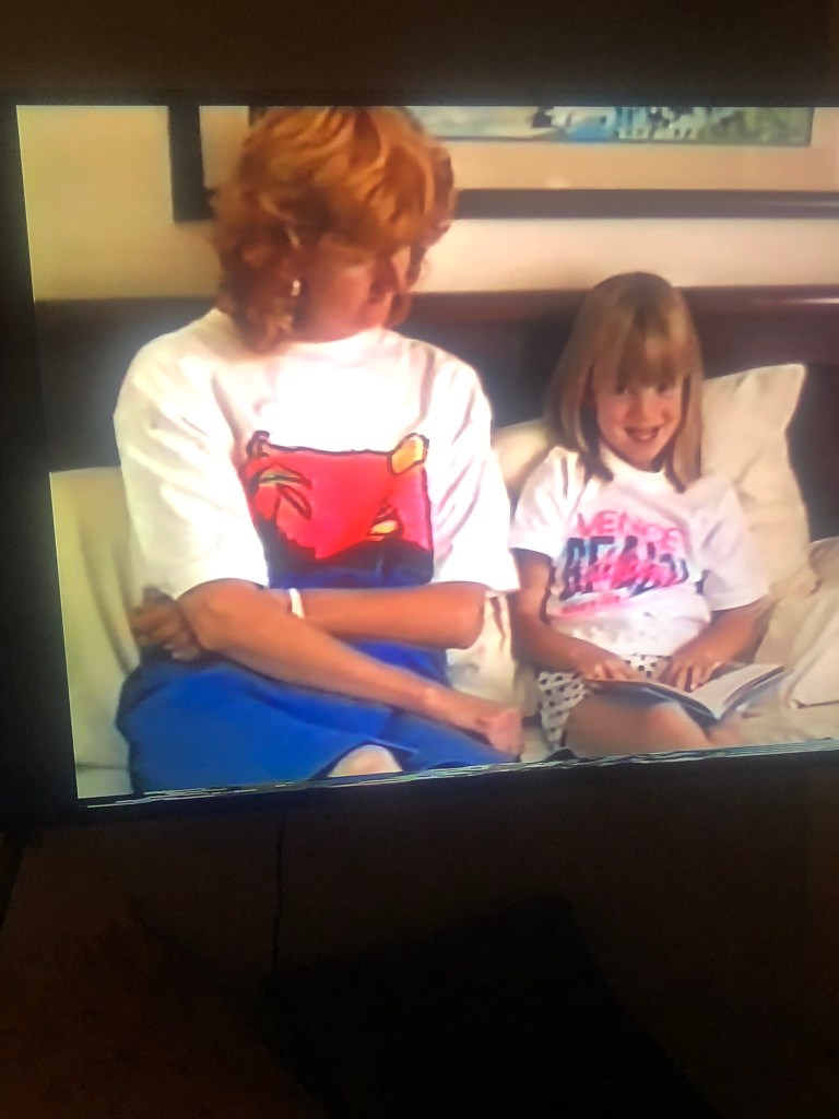
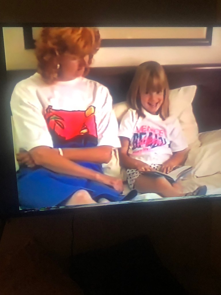
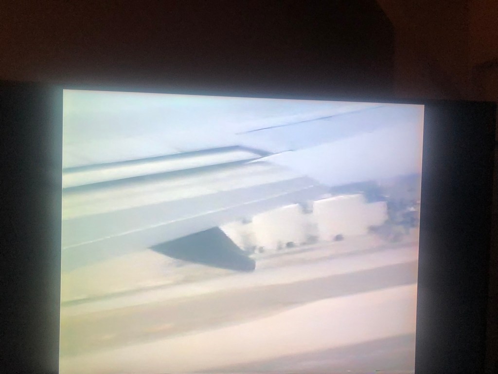
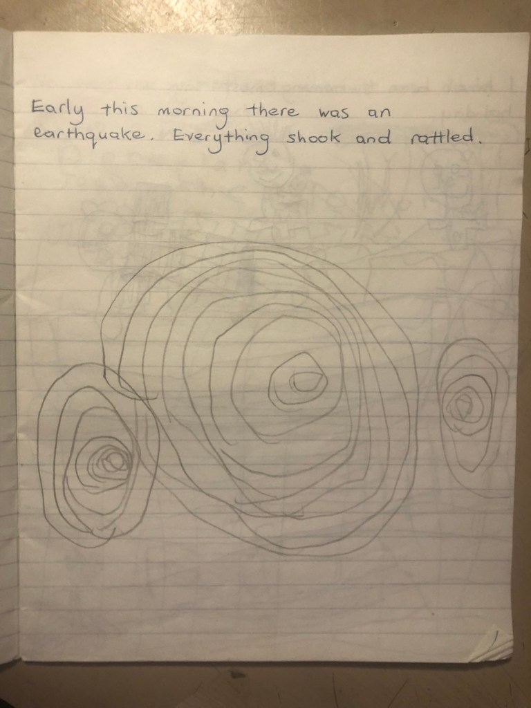
This double page spread is dedicated to Town Mouse and Country Mouse; this is an important book in the history of me and the books that have influenced and inspired me. This is the first book that I can remember reading along to when I was learning to read. My first memory of this book was in a hotel room in LA when I was 4 years old in 1992. I remember reading along with my Mum when an earthquake hit! It was the Landers and Big Bear earthquake and it was a biggy measuring 6.4. My dad had a Camcorder at the time and loved filming EVERYTHING! (which is actually pretty amazing now when I rewatch all the videos back!) he filmed me and my Mum reading along to the pages of Town Mouse and Country Mouse and I decided that I needed to use this in my zine to show how an interest in reading at such a young age helped me to grow and develop – the importance of books and reading!
To design this double page spread I had the idea of photographing stills from the video footage and imposing it onto negatives which would go across the page. I went to work by playing the old footage back and pausing frames and photographing them:
I photographed a range of video frames so that I had a wide variety to choose from. I wanted some also that showed being on holiday and which showed the TV news report from the earthquake because that is also a part of the story and memory! I also photographed snippets from the Town mouse and Country mouse book to mix in with the photographs in the negatives.
I also have a sketchbook from the holiday that my Mum made into a holiday diary, she also used it to help me learn to write. She would write a sentence and then I would repeat the same sentence below hers. In this sketchbook she wrote a sentence about the earthquake and I drew the seismic waves below it, I decided to use these in my zine!
I then had the task of importing all the photos I wanted to use into Photoshop and tweak the brightness/contrast/levels/vibrance etc… I then found a negative mockup online that I bought from a designer which made the process of placing the photographs into the photo spaces on the negatives much easier! I wanted some negative space once again so I left a space in the middle of the right page.
I used Frutiger typeface which ties in nicely to the airport/holiday feels!
The mock up!
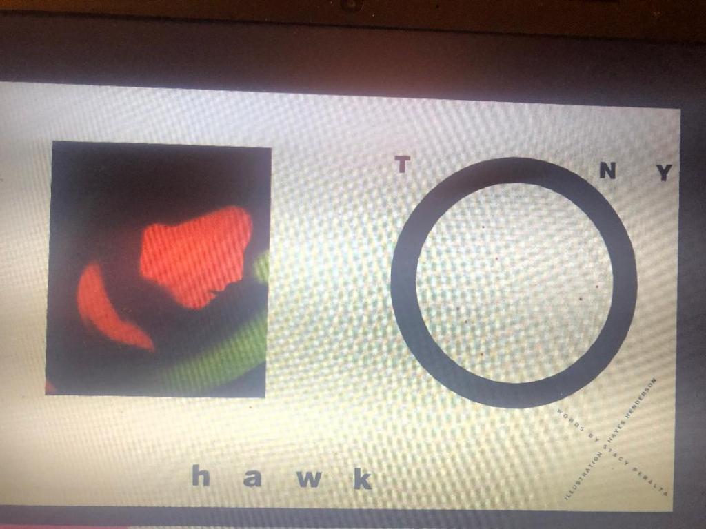
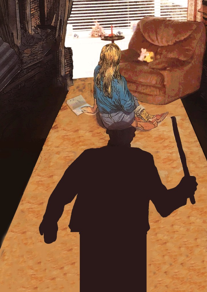
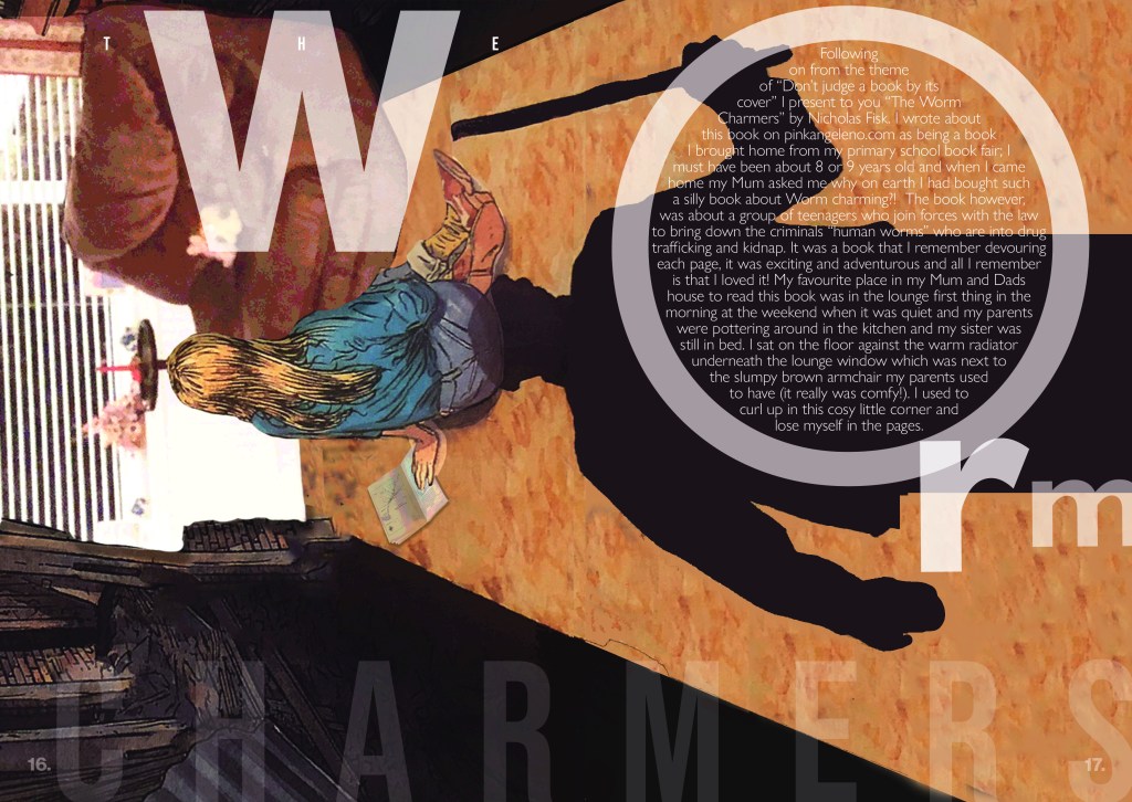
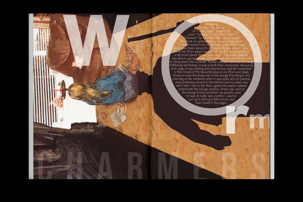
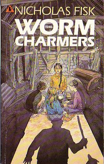
Pages 16-17: The Worm Charmers
The typography I used on this layout was again inspired by David Carsons Masterclass:
My quick photograph that I took of the screen as I was watching it doesn’t so it much justice as the “o” has text to fit the inside of it. I really liked this idea for the title of my piece!
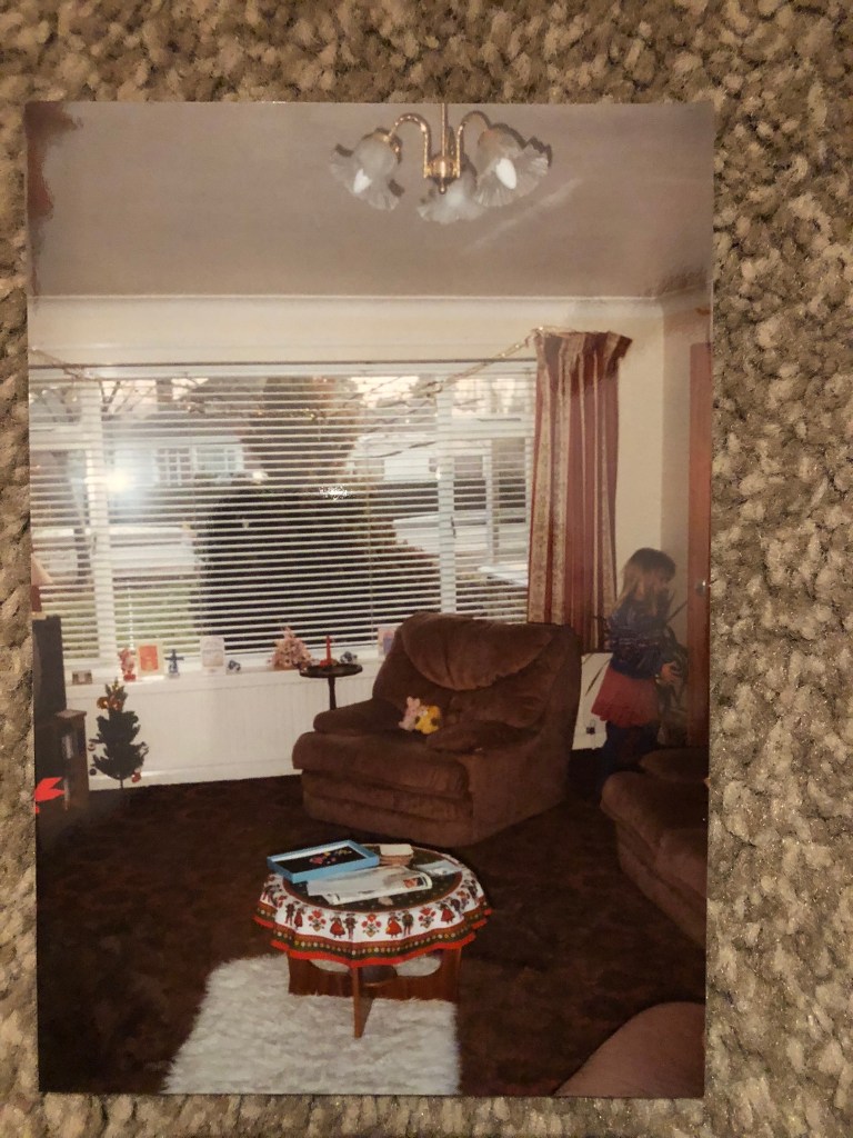
I didn’t know what images to use for my layout; I knew I needed to use the cover of the book but wanted to make it a little more interesting… I have personal memories of this book and where I used to read it in my Mum and Dads house that I wanted to include but to start with I struggled to know how to do it. I used to read this book propped up against my Mum and Dads old comfy brown sofa chair right next to the warm radiator and finding a photo of this in my Mums photo album helped to give me the idea what I went with for these pages…
It is just my Mums house now and it has massively changed since these days!!
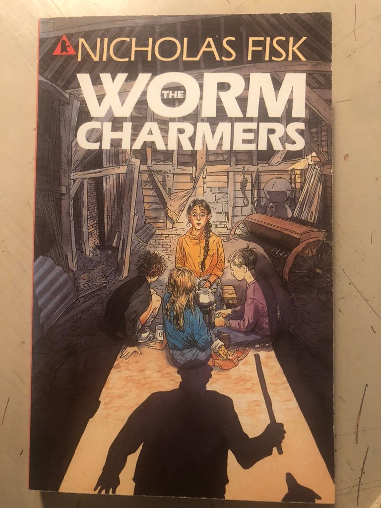
I decided to take the original cover of The Worm Charmers and alter the cover to place Mum and Dads old chair on it. One of the little girls on the cover of the original book looked like me as a child and I thought about using her to represent me!
This is the original cover:
The little girl in blue could have easily been me as a child!
My photoshop manipulation skills aren’t all too great but I tried my best to blend the photograph into the original image. I also added a book on the floor to represent The Worm Charmers. I think the image overall works quite good!
The final mockup!The mockup!
I quite like how this layout turned out! The spacing between the letters and the contrast between the light/dark/small/big text.
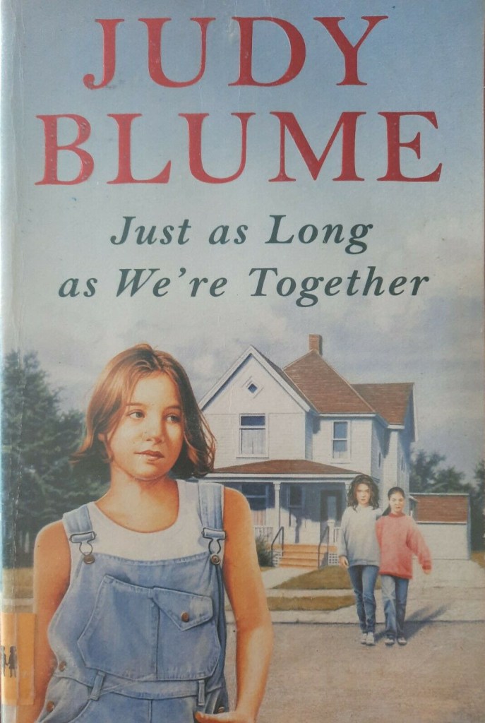
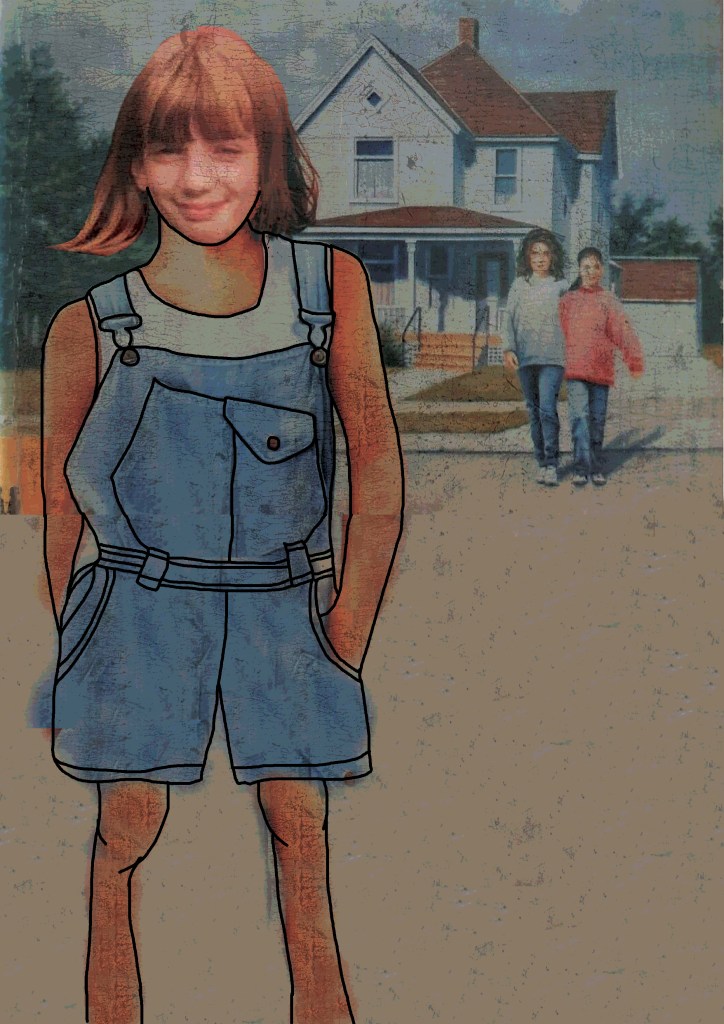
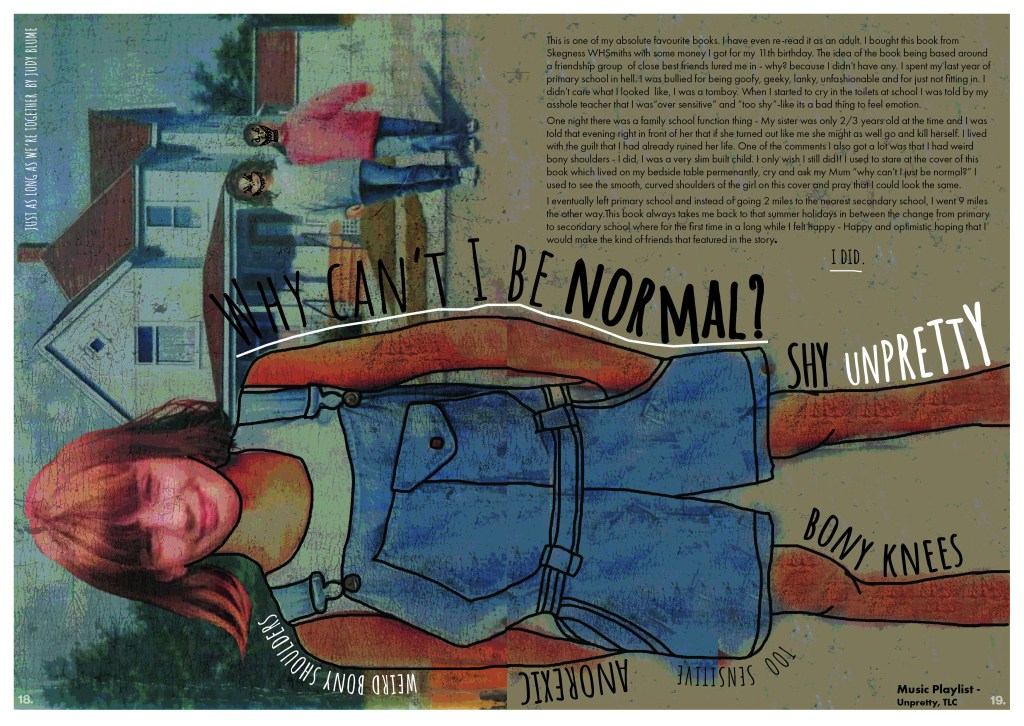
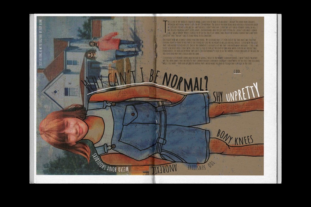
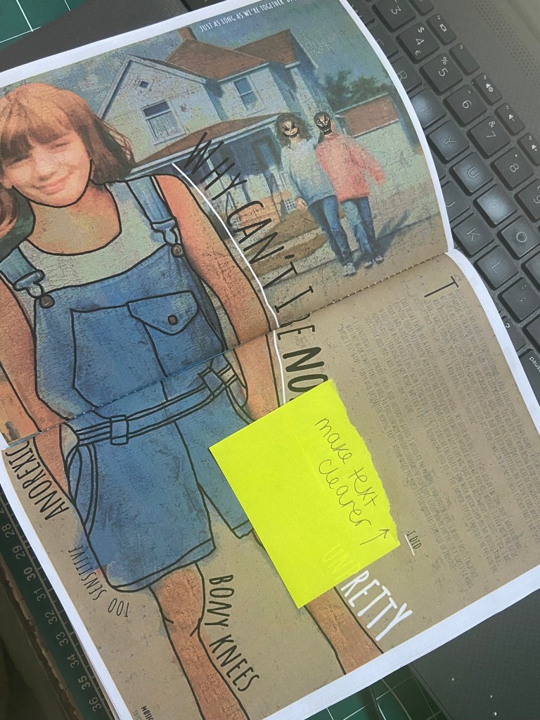
Pages 18-19: Just as long as we’re together
This was one of my most memorable books growing up. I read this in the summer holidays between leaving primary school and starting secondary school. I was bullied badly in the last year of primary school for not being “cool” and not fitting in with a clique. When I bought this book I bought it on the basis it was about a strong friendship group and that is what I craved back then. I wanted to have a group of girl mates who wouldn’t be nice to me one day and ignore me the next! When I read the story I hoped that I could possibly have what the main character Steph had. I resonated with the front cover so much too which showed an illustration of Steph in denim dungarees and her normal frame.
This is the original cover:
I was painfully skinny as a child and used to get bullied for this, I used to hate my bony shoulders – I used to look at the illustration of Steph and wish I had perfect rounded shoulders like she did…
For this design I decided to try my hand at photo manipulation again in Photoshop and use a photograph of me from that era and impose it onto the illustration of Steph! I wanted it to look childlike and like it had been doodled onto the cover so I added a thick black line around the outside of her. Around the outside of the design I wanted to write words that represented the cruel comments I used to get and how I was feeling. As mentioned earlier some of the zines I researched had playlists in.. the only song that comes to mind when I think of body image is Unpretty by TLC. I included this on there.
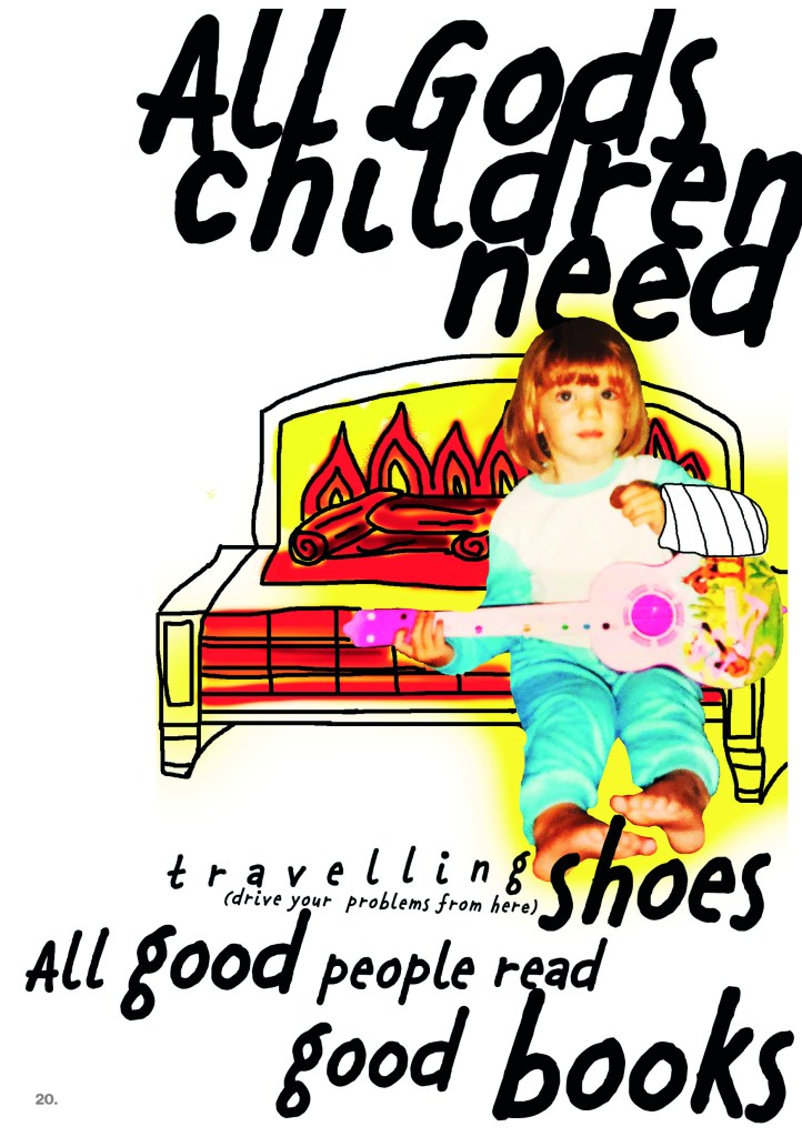
Pages 20-21: Global influences
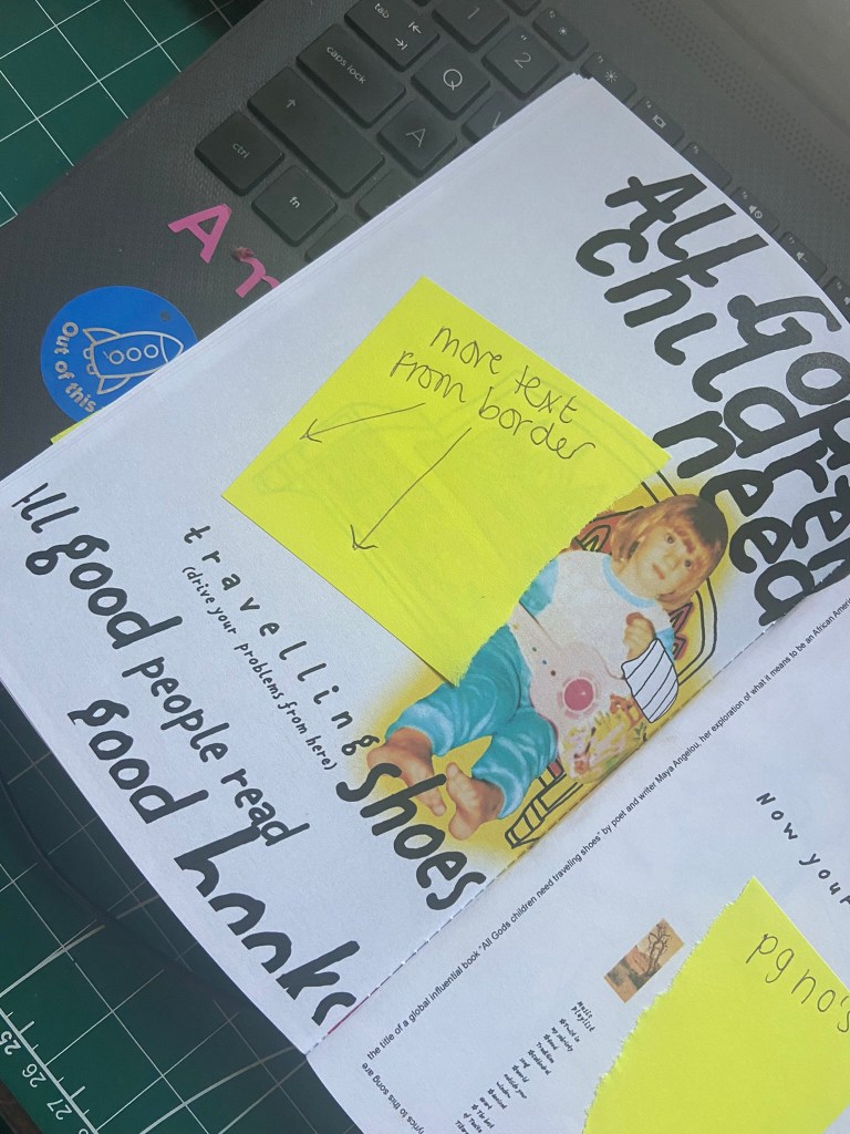
This double page spread is about one of my earliest memories from my childhood to a song that my Dad used to play a lot of at the time – Tanita Tikaram, Twist in my sobriety. I have this song and album on my phone playlist and when it came on random when I was designing my zine I listened carefully to one line of the lyrics “All good people read good books” and I wondered to myself if I could use that lyric to create something arty in my zine. I didn’t really know what the lyrics meant to this song so I actually googled it and found out that the lyrics are actually a title to an influential book by poet/author Maya Angelou; she was African/American and wrote a lot about her struggles as a black woman to fit in to society. Her work has been widely read globally and has influenced and inspired a lot of African/American people. This was perfect! I could tell the story of my memory and continue to make my zine personal to me as well as link it to something globally impactful.
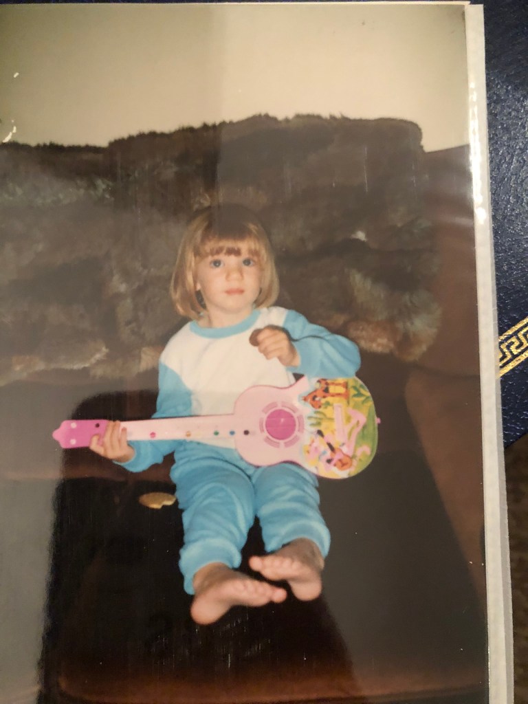
I wanted to continue making my zine digital but knew I needed to use different mediums and media throughout. My memory involves me dancing around my Mum and Dads old living room in our old bungalow age 3 with my plastic guitar to Tanita Tikaram and my Dad doing the same but with a wooden ukulele until I fell on the hot fire and injured my arm and ended up in A&E. I googled an old photo of what the fire looked like and then decided to draw it and colour it in really fiery colours. Again, I found a photograph of myself aged 3 with the guitar that I thought would be personal and relatable to include:
Again, with influence from David Carson I tried to do some more experimental typography – experimenting with text bleeding off the edges.
The left hand side page is very busy and bright and I wanted the right hand page to be much more calming than that. I love negative space and wanted a lot of it for this design. The only images I used relate back to Maya Angelous subject in her book – her homeland South Africa. I wanted the colours of this to match the warm Oranges, Reds and Yellows of the fire on the previous page. I also followed the rule of 3 by adding a subtle orange square at the bottom of the page. Design psychology is that design elements work better in 3’s and also it allows the eye to be drawn all the way down the layout. I carried on the lyrics from the left page to the right page “now your conscience is clear“… clear can also relate to the negative white space on the page.
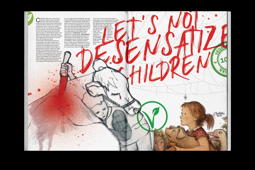
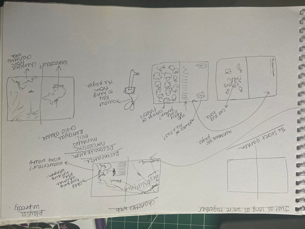
Pages 22-23: Charlottes Web
This was another influential book for me growing up. It was one that was read as a classroom read by my year 4 teacher and then I loved it so much that I asked my Mum to buy me it to read by myself. I think this book influenced me to be vegetarian as an adult.
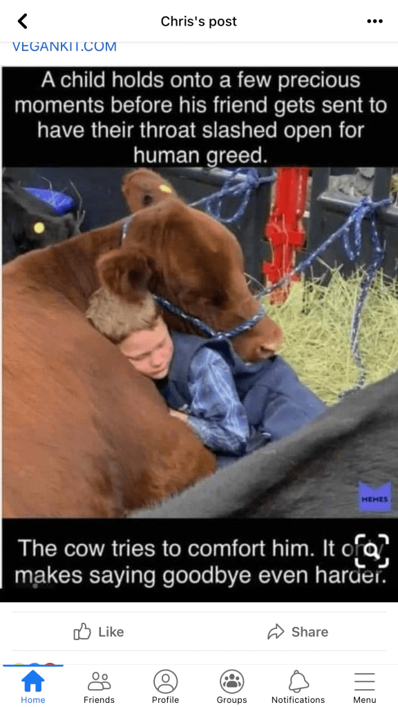
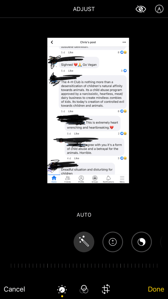
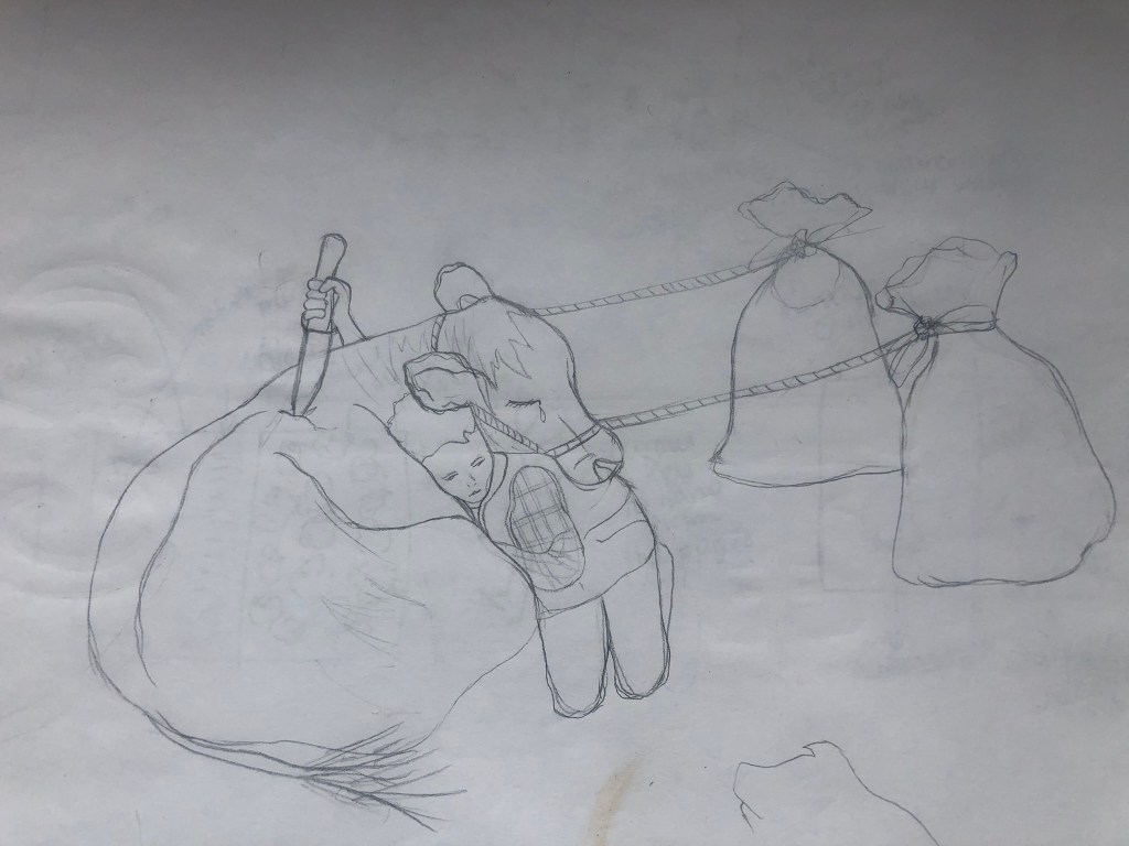
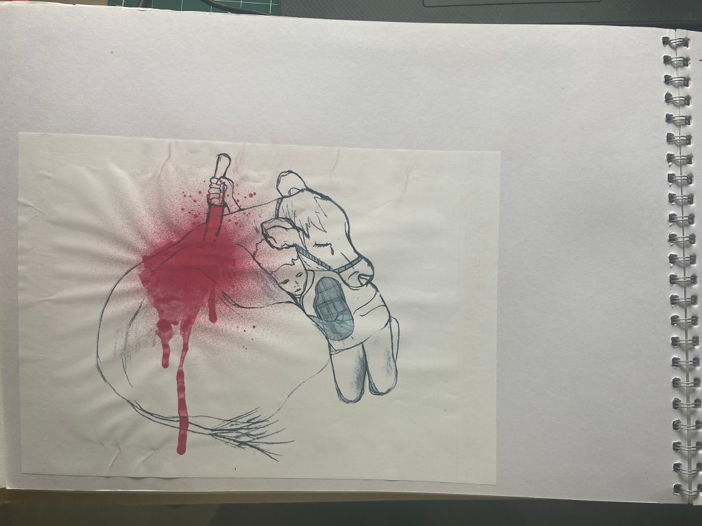
There was a post that I saw on Facebook which helped inspire the layout for this. The post showed a little boy at a cattle market where his parents were selling off his cow for meat, he was hugging the cow goodbye. It really made my heart ache and pulled at my feels. This is a similar story to that of Wilbur the pig and Fern in Charlottes Web and that is why I associated the 2 together. Being read this story as a young child made me aware of the importance of feeling empathy and compassion towards other living beings. It allowed me to show and feel love between humans and animals. The comments on the Facebook post were “child abuse” and “desensitization” and these really struck out to me. I had to use them in my piece. I wanted to use the photograph of the child and his cow but figured that would be a copyright issue, so I decided to draw the photograph and use my drawing instead:
I then took my drawing and needed to gore it up ever so slightly to get the point across that I was trying to make. I wanted the innocent little boy to be holding a knife and to back stab the cow; this shows how nice humans can be but also shows the sly, back handed greed stabbing the knife in the back.
I decided to use a runny water colour in a deep red to create the appearance of blood on the cow…
I then imported my drawing into Photoshop to work my magic on the rest of the layout.
I wanted a striking, bold title for this piece and the comments from the original Facebook post kept ringing in my head, I decided to go with “let’s not desensitize children“. The typeface I used also resembled smeared on, painted blood.
The cover of Charlottes Web that I have and that I read as a child has illustrations of Fern and some of the other farmyard animals on it. The illustration isn’t particularly cheerful and I thought I could use this to my advantage on my piece. I have this sad drawing of a cow being killed by his human friend and then I have the sad illustration of Fern and friends from Charlottes Web… what if I used these as an audience witnessing the murder of the cow?… I set to work putting the images together in Photoshop. I also drew a spiders web and had Charlotte (the spider) dangling down watching it all happen before her spidery eyes! I included some Vegetarian logos on there too to show how it has influenced me as an adult able to make my own decisions, my decision to be a Vegetarian out of love for the animals.
The mock up!
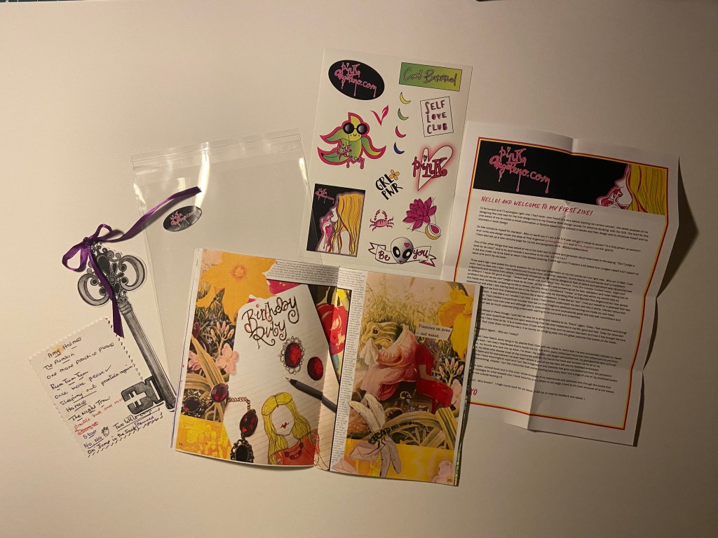
Pages 24-25: Kingcup Cottage
This is another book that pulled at my heart strings as a child. Again, it taught me empathy and how important it is to acknowledge and care for others feelings. Francesca the Frog lives in a damp. watery house and wants to organize a birthday party for herself and invite all of her friends.. she spends ages making lovely food and making her house look decorative but when the other animals receive her invites they are cruel and selfish and do not want to go because her house is cold, wet and damp.. instead of letting her know they rip her invites up or one animal using it as a sail for his toy boat. When the day of the party comes Francesca is left all alone crying at her party. I remember as a young child seeing the illustration of Francesca crying and feeling really sad for her (my heart still hurts when I see the illustration now!!). This book reminds me of when I turned 30.. I went to a lot of trouble to organise a party at my old house, i made food, brought drink… balloons.. banners and I said to my Mum that I was worried that people would not turn up for mine and I would end up sad and lonely like Francesca!- Luckily that did not happen but I thought I would make that the memory to accompany this book!
For my 30th I made my own dress.. (ish…) I took a really old vintage red dress and adapted it to make it look more modern and suit me on the day. I spent ages beforehand drawing out designs and ideas for this outfit and what kind of jewellery I would wear and how I would style my hair etc… I have used one of them drawings on my layout! My birthstone is Ruby as I am born in July so the theme was Red. Red is a strong colour on this layout! I then used the sad illustration of Francesca and a photograph of me in my red dress which I collaged together to create a cut and paste, collage effect.
The text on this layout is a little on the smaller side.. but again, zines do not have to be perfect publications and have particular layouts and it is readable so I allowed myself a free pass for it! I made the text wrap around the outside of my first image.
This layout is very full on.. there is very little negative space and a lot for the eyes to take on! I like the bright colours from the original illustrations mixed in with my own drawings and photographs.
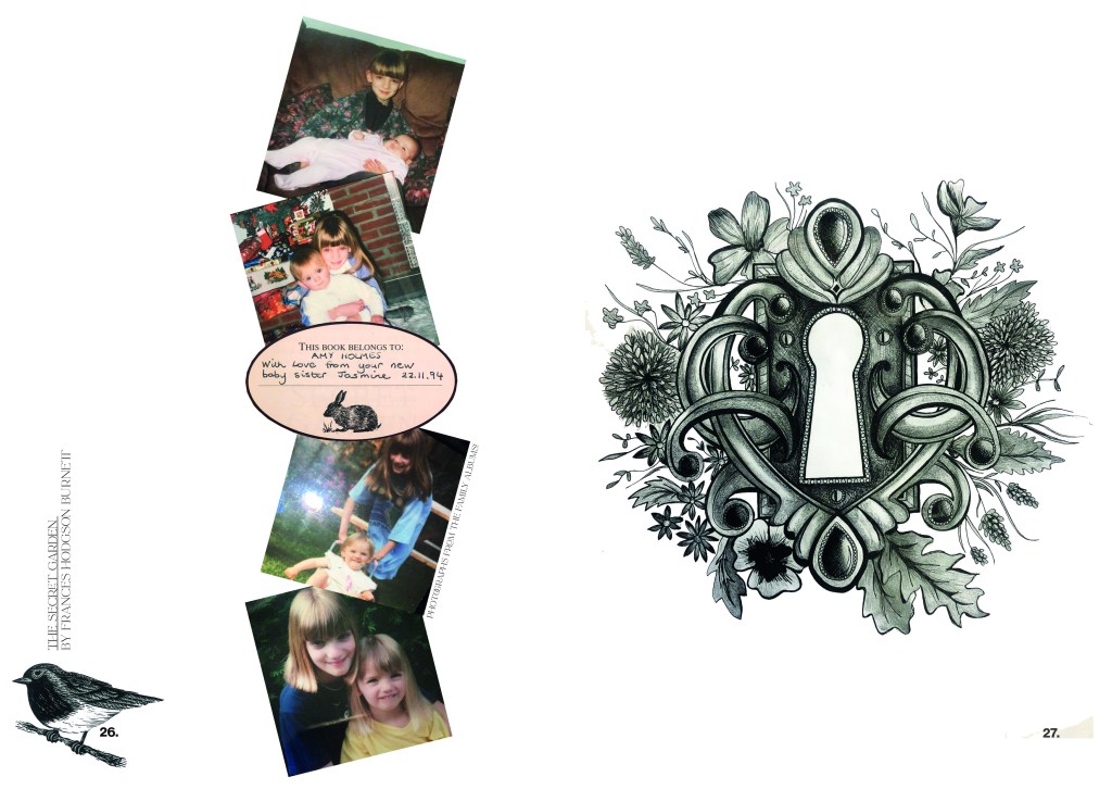
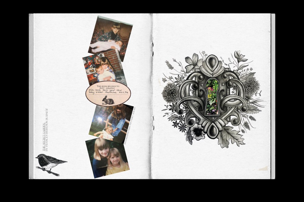
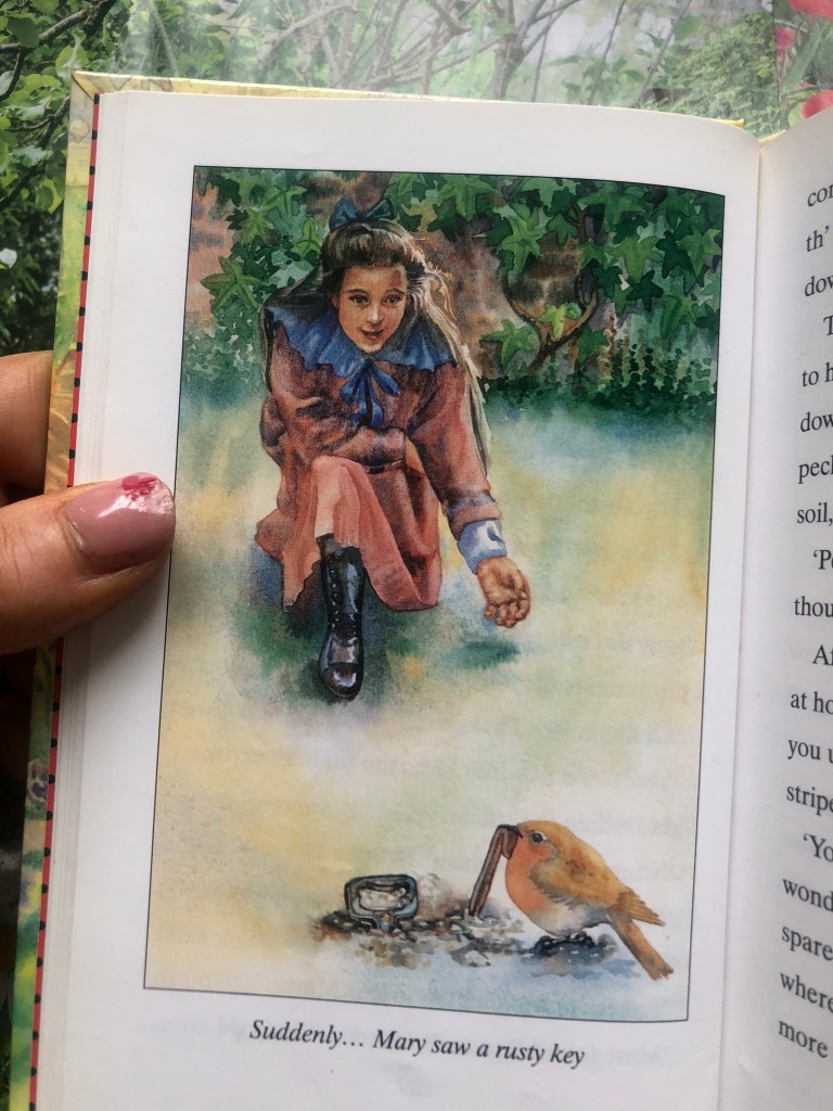
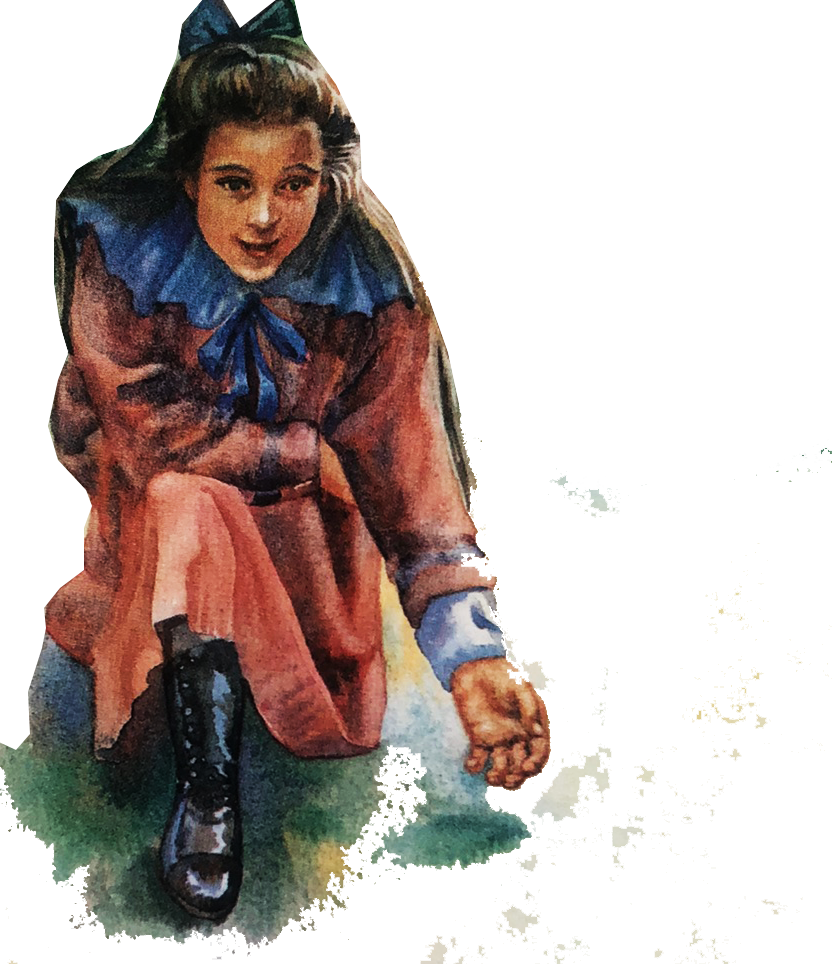
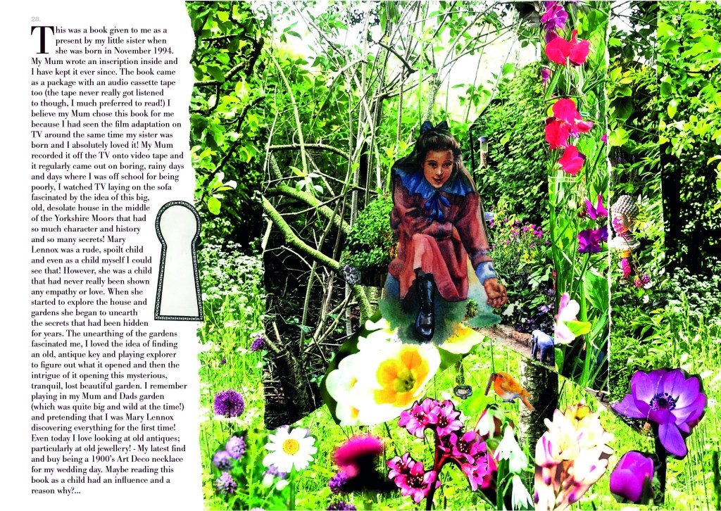
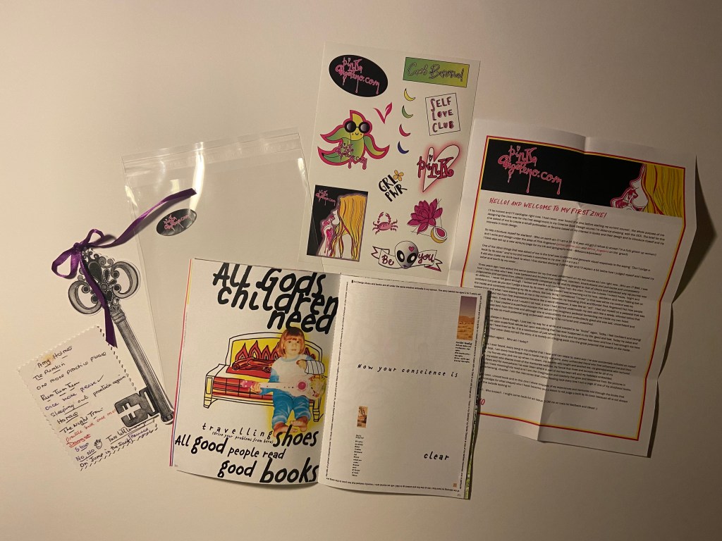
Pages 26-29: The Secret Garden
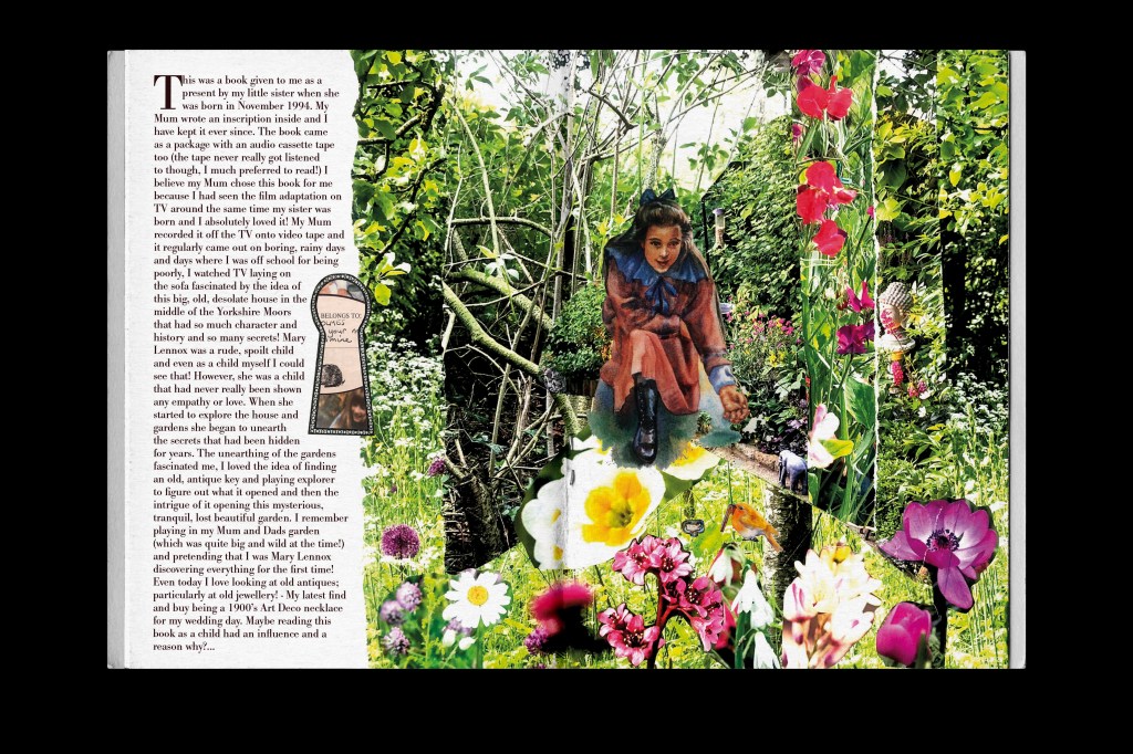
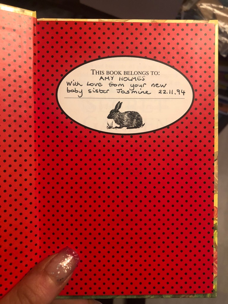
The Secret Garden was a book that was given to me by my Mum and Dad as a present from my then newborn sister Jasmine. It was a book and cassette duo but I barely listened to the cassette I just wanted to read the book! As I mentioned in my previous post, my Mum tape recorded the film off TV for me and I loved it so I guess her idea was for me to enjoy the book too!
I remember watching the film and reading the book as a child and being fascinated by finding hidden objects and hidden gardens. My Mum used to take me to a garden centre in our village at the time and I found what I thought back then was a hidden garden. In my head no-one else but me had discovered this gem.. It was a tiny little track leading behind the garden centre and it was adorned with flowers and overgrown bushes and trees, it has hidden ornaments that had eroded away over the years and I was genuinely fascinated by it – quite possibly because of this book! About 7 years ago when I lived with my ex partner in a big, old, Edwardian house I was digging one day and found a hidden sign like something out of Alice in Wonderland which also fascinated me.. when I eventually moved out and got the next house on my own I had a patio area which was covered in ivy and I placed this sign there and that was like my secret garden! Even many years later this book had an impact!
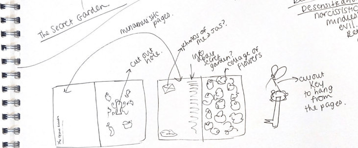
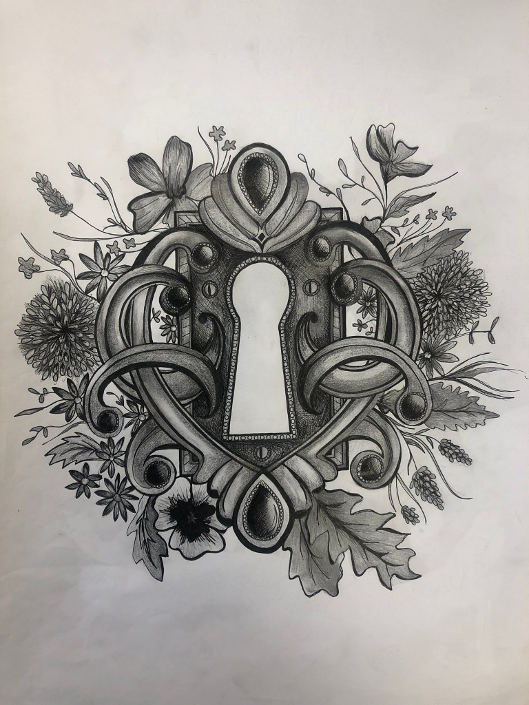
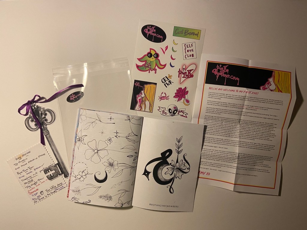
For this layout I wanted to try and bring the same intrigue!- I wanted there to be like hidden, surprise elements and little details for the reader to find! I wanted to bring in different medias for this one so I decided upon an ink drawing (which I loved doing!) and a collage!
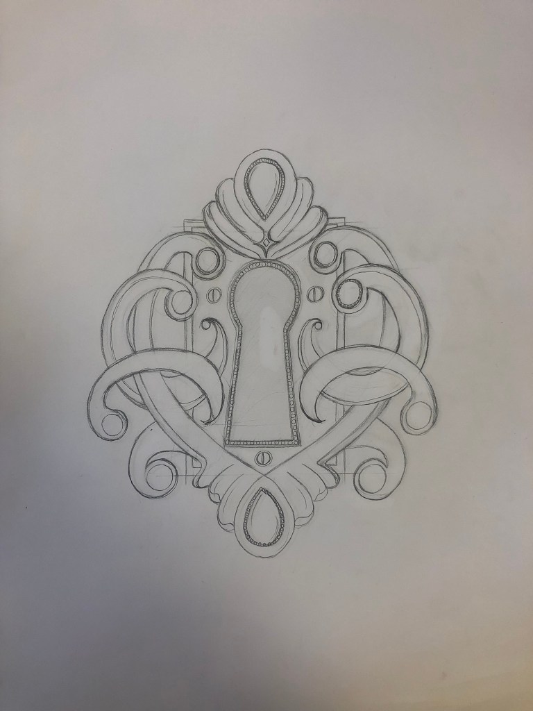
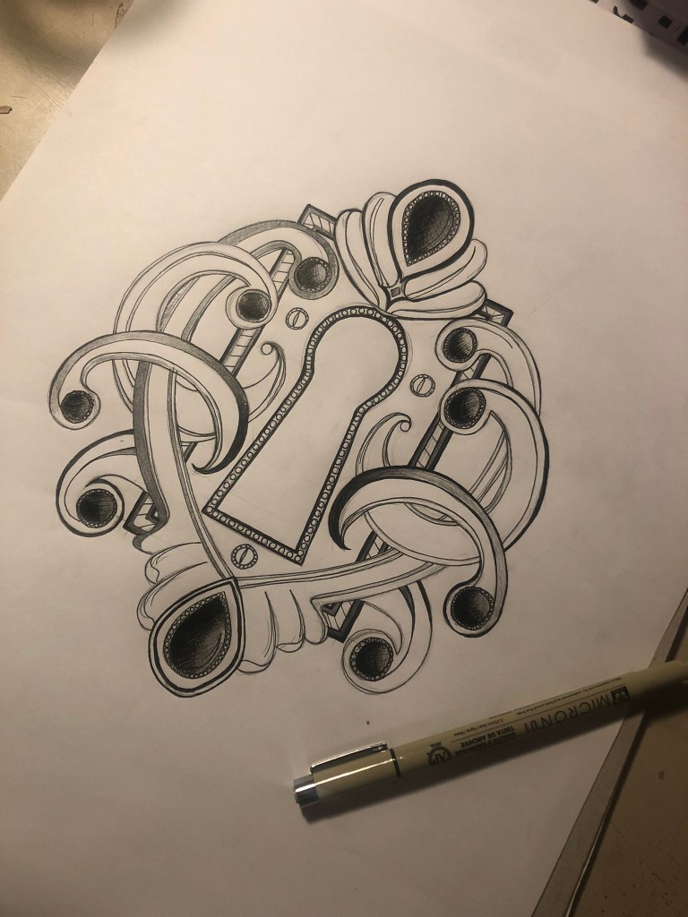
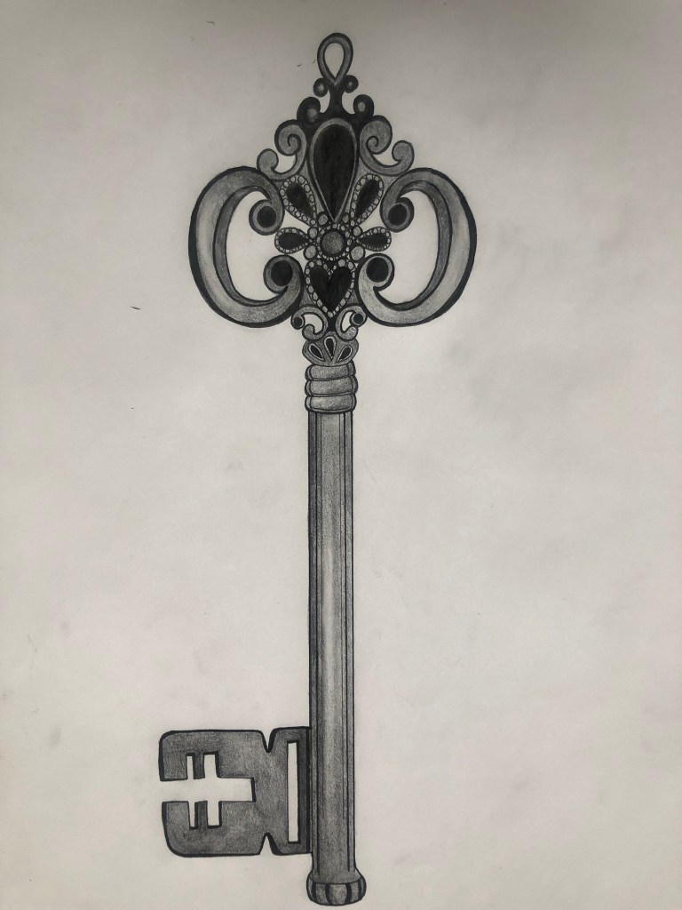
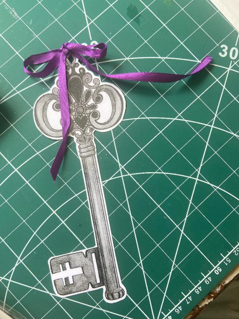
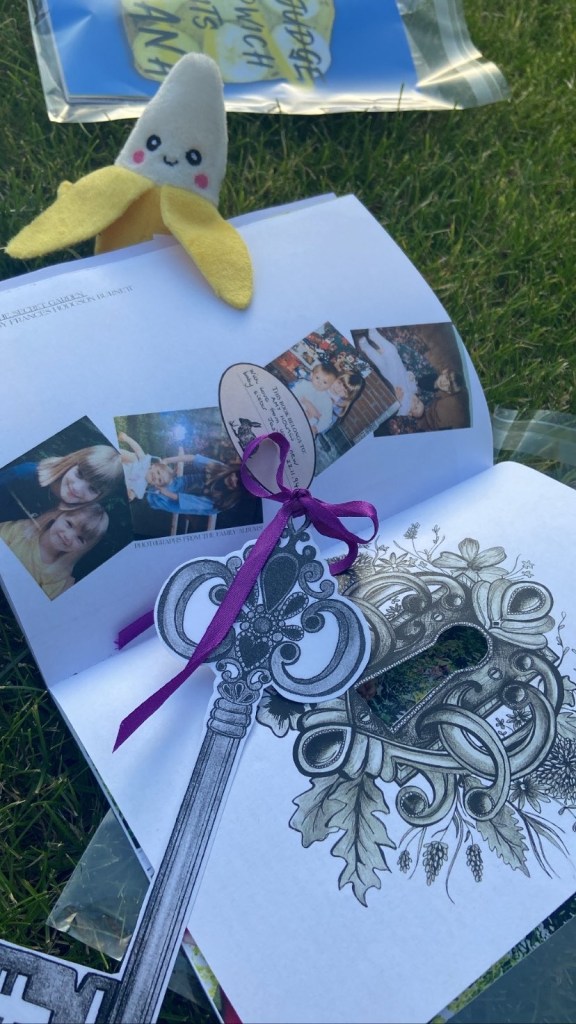
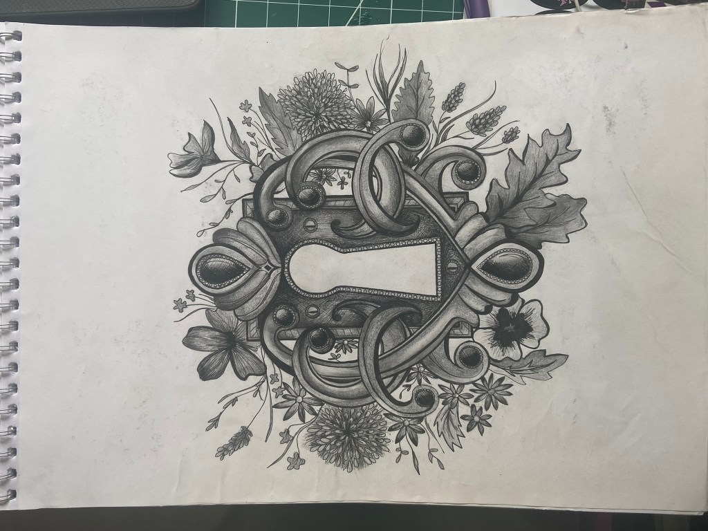
When I think of The Secret Garden I always think of a lock on a really old heavy wooden door covered in flowers and ivy and hidden! I wanted to try and achieve that in my drawing! The key is also a massive part of the story so I had the idea of again, an ink drawing of a key and maybe using it as a bookmark separate to the zine as if it were a real lock and key, placing some ribbon through it too to make it really decorative! I also thought it would be a really cool idea to cut the hole out of the lock in my zine so that you can see through to the other page!
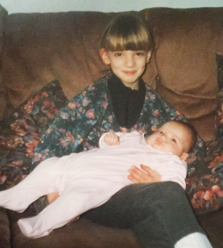
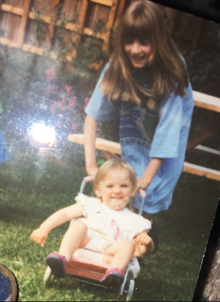
In the original book I have there are black and white drawings which tied in well with mine, I used some of these drawings to place in the corners of my layout. I also once again found some photographs of me and my sister through the years growing up as this book really was a celebration of her being born.
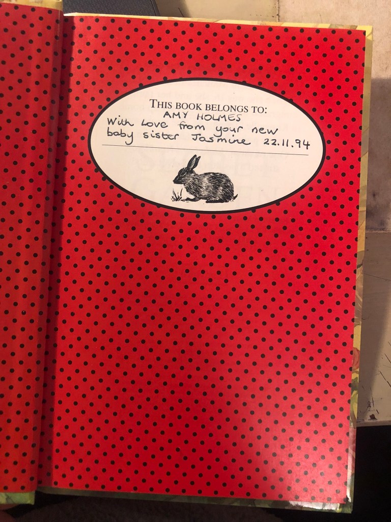
I also included the original “This book belongs to” where my Mum wrote in it!
The first double page spread for The Secret Garden was very minimalistic and clean:
The mockup!
I then went about designing the second double page spread for this book which would have the story behind why I have chosen this book to be featured in my zine etc!…
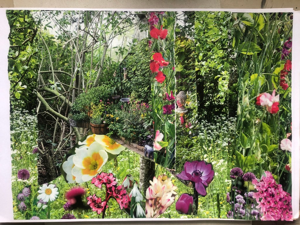
I decided to try out a collage and for this I went to Tesco on my lunch break and grabbed a copy of Gardeners World!- it seemed like the only gardening magazine with a lot of photographs in it! I then went about cutting out flowers, trees, bushes… anything that would make a good collage and look like an old abandoned garden!!
I then decided to try my Photoshop manipulation again by taking original drawings from the book and merging it into my collage!
These were the illustrations in the book that I could choose from!
I then cut around the illustrations in Photoshop and went ahead placing them on my collage!
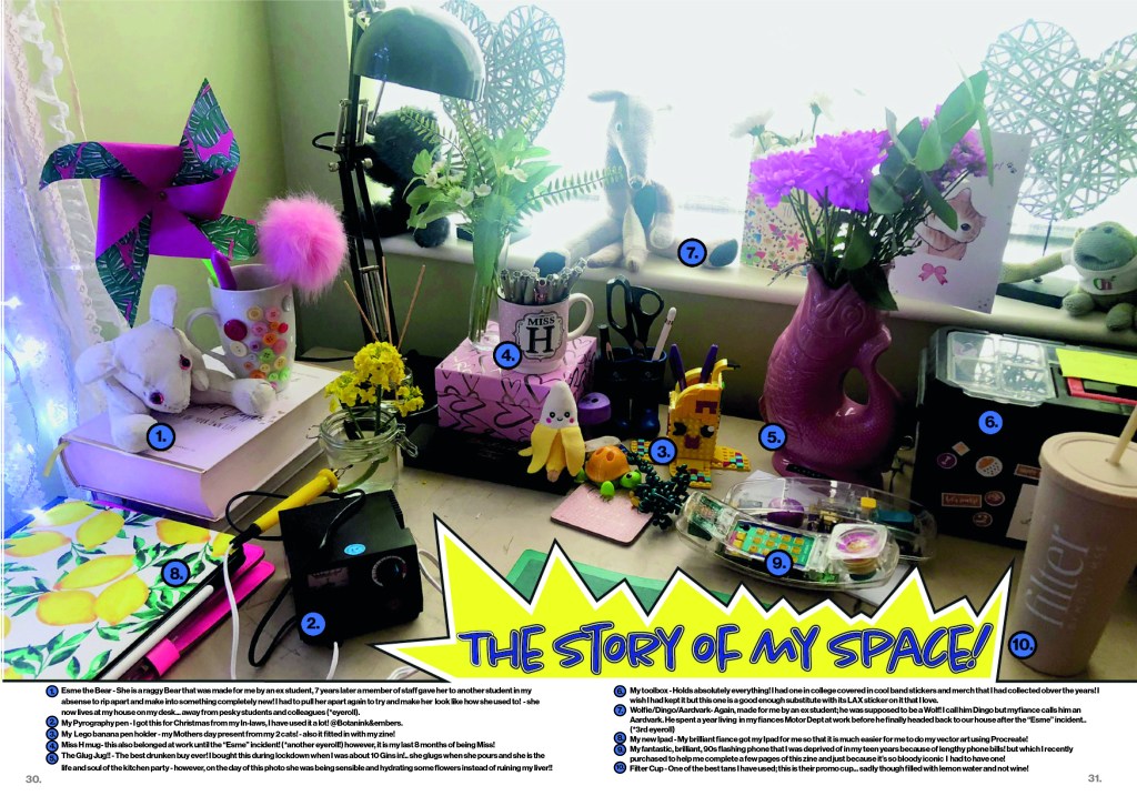
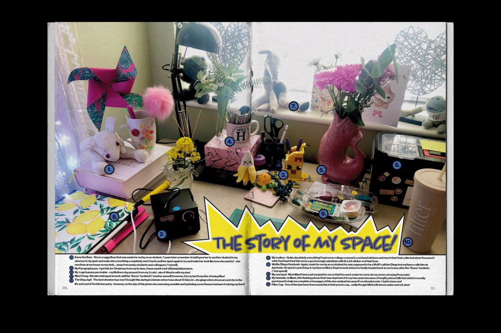
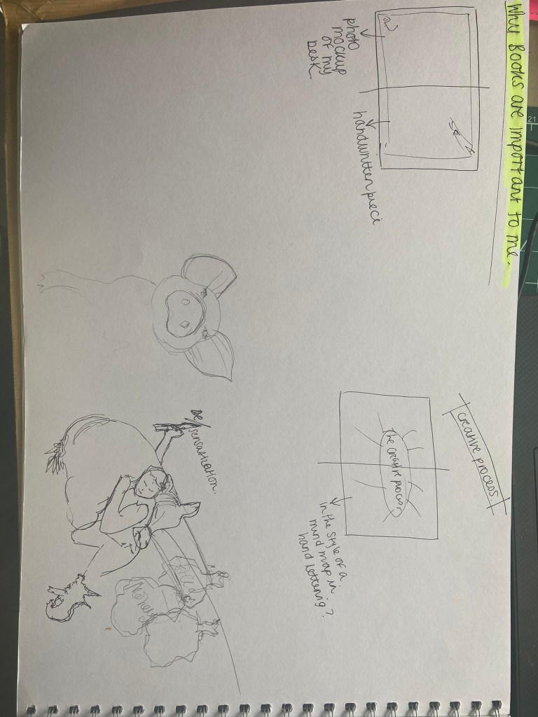
Pages 30-31: The story of my space
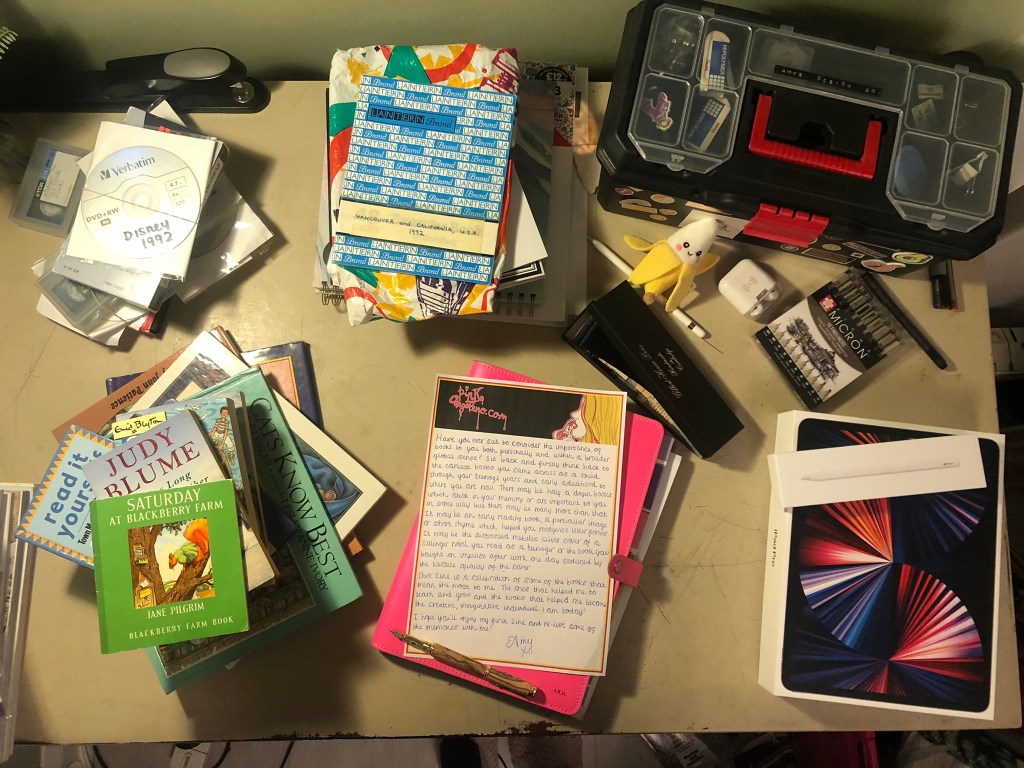
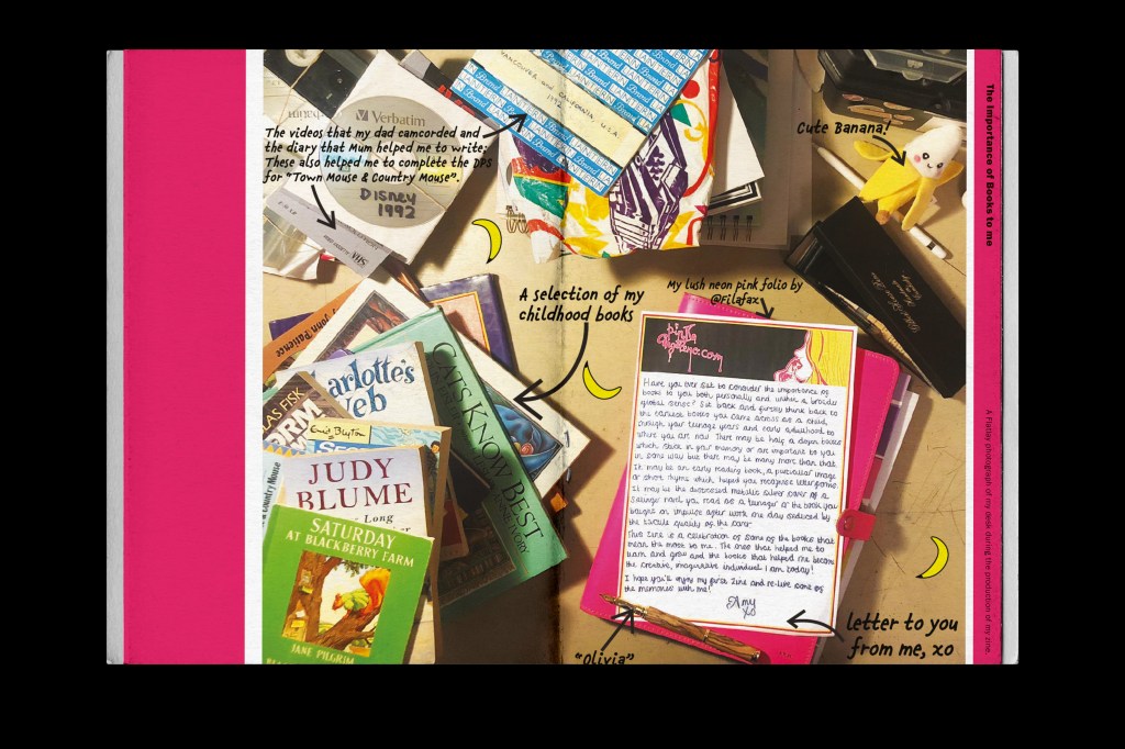
This page was to show part of my creative process which was asked of me in the brief! I thought if I showed something personal like the space I work in that it would give the reader an insight into who I am and what I like! I decided to photograph my desk in my house and use it as the double page spread! I thought back to Core Concepts where one of the exercises I had to do was information graphics by creating a map or layout of something and showing a key to what’s what. I decided to do similar for this piece! Show my desk and use a key to label and annotate important things on it!
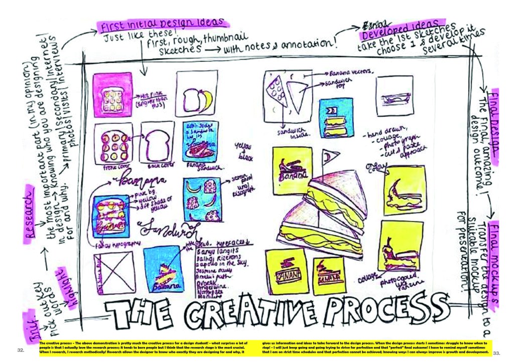
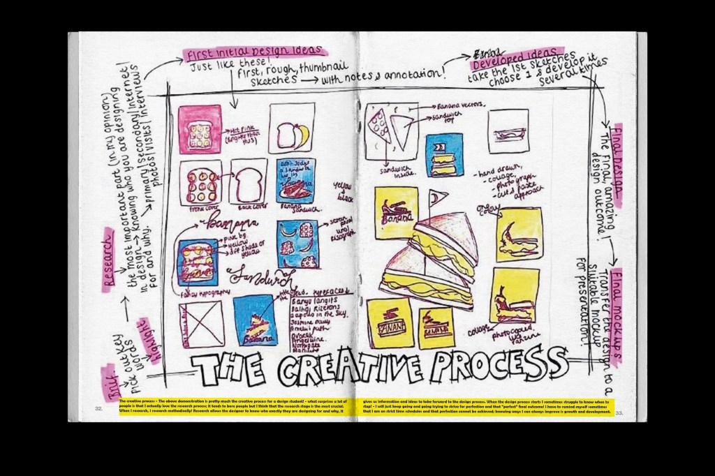
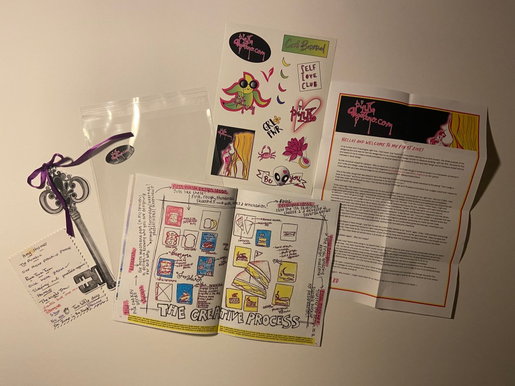
Pages 32-33: The Creative Process
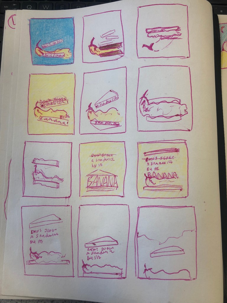
This was another double page spread that is designed to show the creative process that I go through when being given a brief to work to. I decided to use a page out of my sketchbook to illustrate this; it was a page I did while sketching ideas for the “Don’t judge a book by it’s cover” exercise which resulted in the “Don’t judge a sandwich by its banana” design outcome. I then wrote annotations around the outside of it explaining each step (in order!) of the creative process that I go through when designing for a brief.
In keeping with a handmade DIY zine I have been very doodly for this layout to try and include other media apart from just digital (even though it is digitally put together).
The mock up!
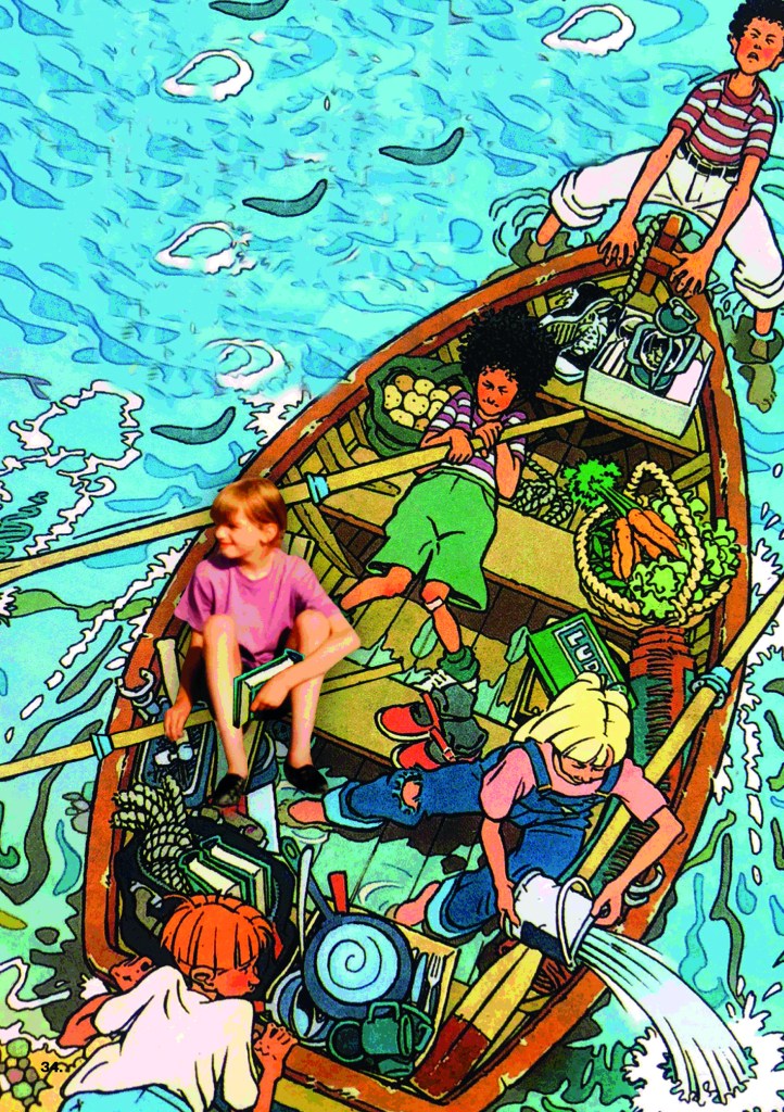
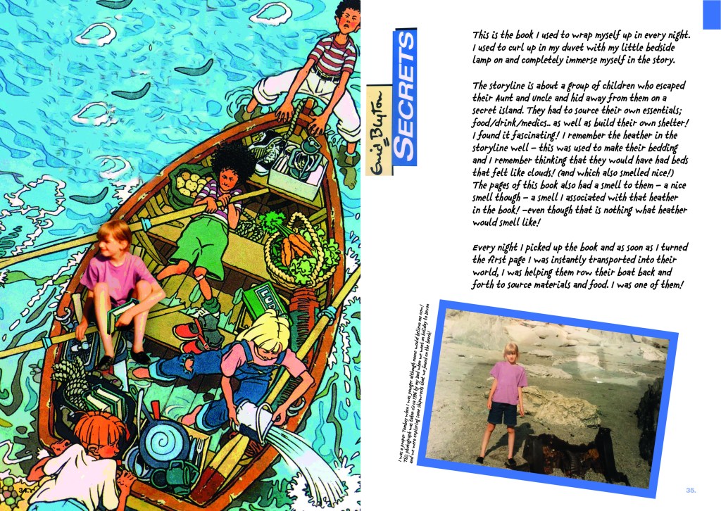
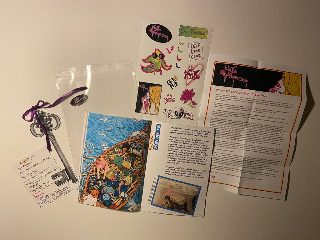
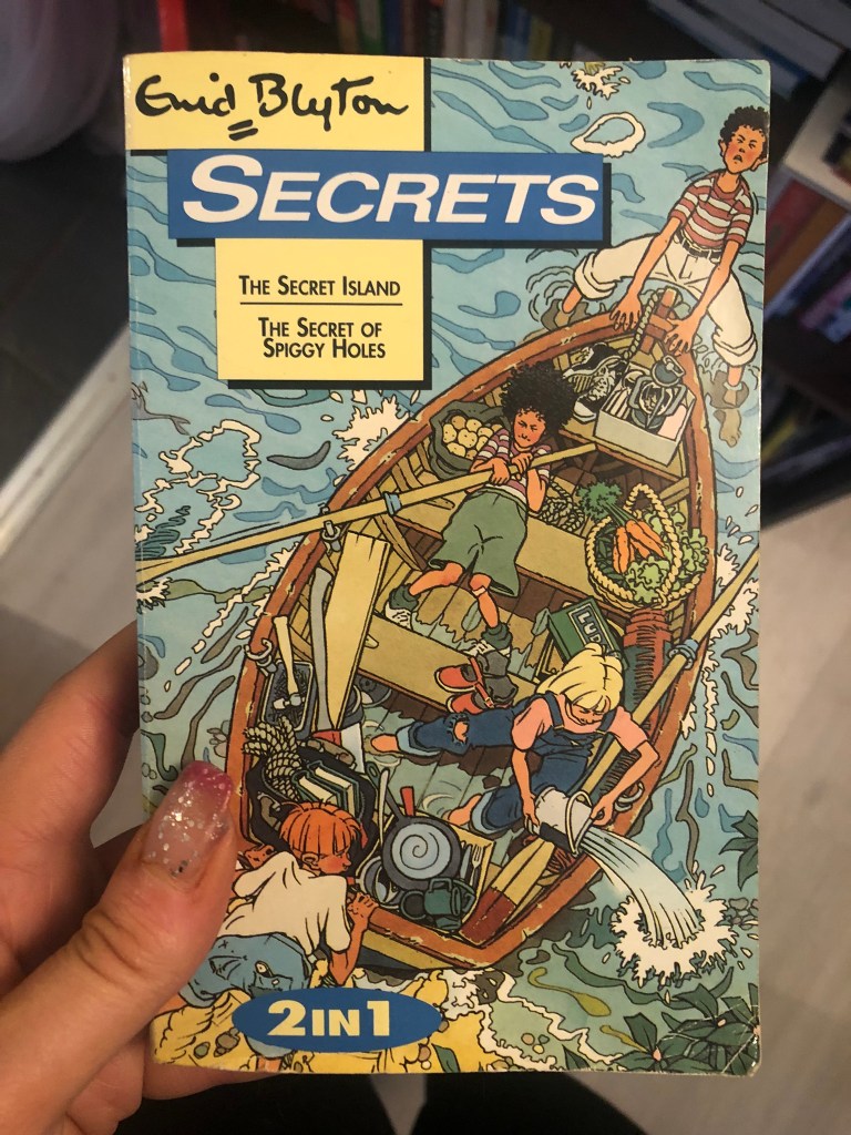
Pages 34-35: Secrets by Enid Blyton
This was one of my favourite books growing up! It was full of adventure and intrigue and I loved it!
The cover illustration for the book is already a really nice cover and insight into the book so I thought I would keep that and just manipulate in Photoshop once again a photograph of me onto it.
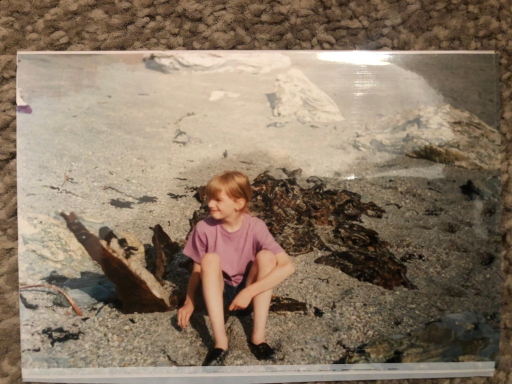
There are photographs of me taken around the time I first read this book at the Jurassic Coast down south where me and my Dad were looking at old ship wrecks and finding cool shells and old treasure! This book inspired the adventurer in me and was possibly the main reason that in them photographs I was loving life so much exploring! I decided to use them photographs in this layout to pretend that I was one of them! When I used to read the book I used to be swept away into their world and my imagination made me one of them. I think me making myself one of the characters on the book show how imagination can transport you anywhere. I also made me have a book which again I manipulated in to show that I am reading pages from it and imagining myself to be in the story.
I tried to add a posterise filter effect to my photograph to try and make myself look a little less real and a little more illustrated! I am still yet to learn a lot in Photoshop!
For the second page I wrote about my memories surrounding the book and a little about the storyline and once again added a personal photograph of me with a bit of writing explaining it!
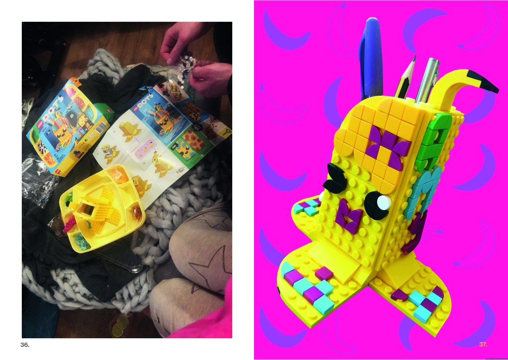
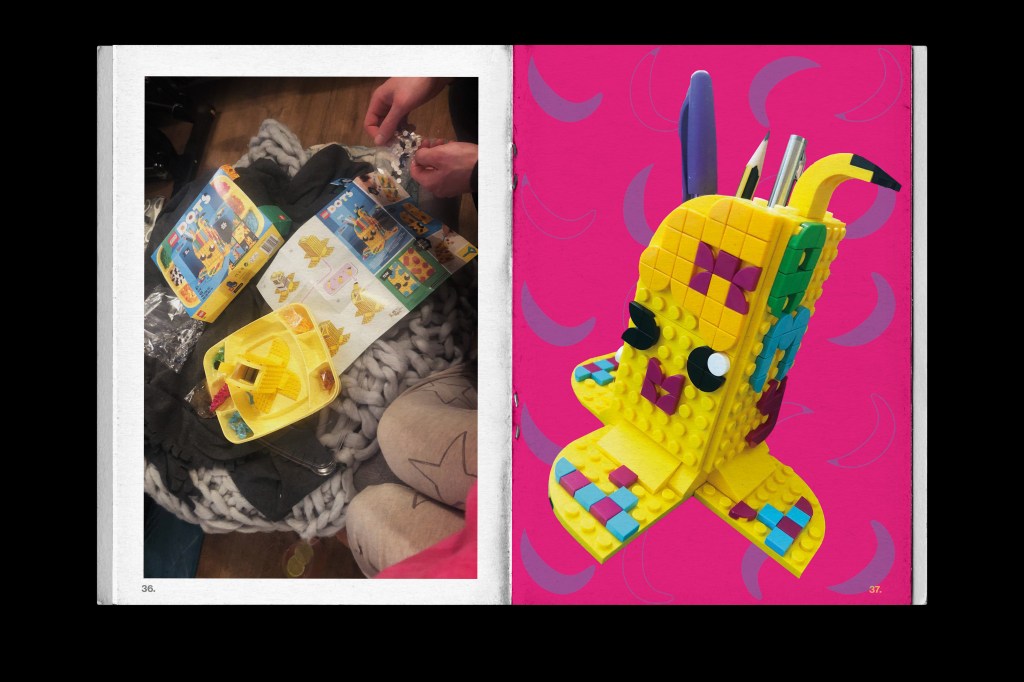
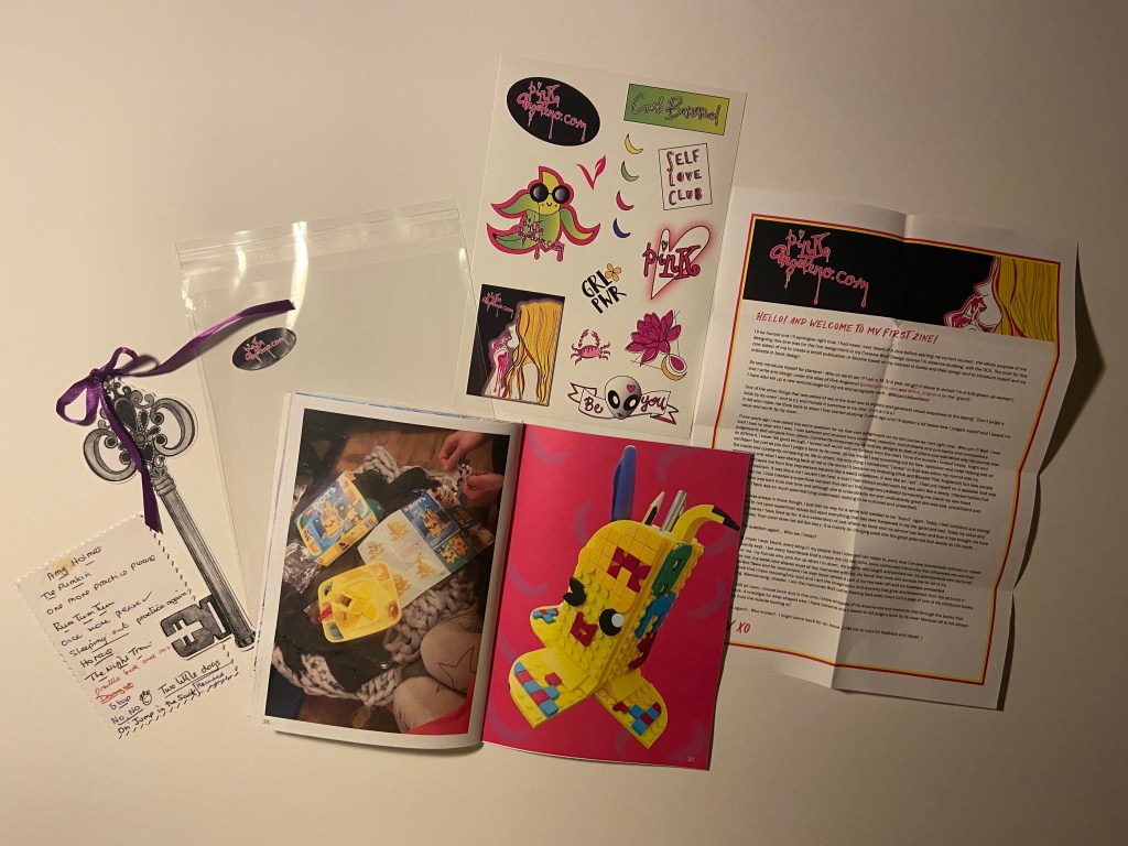
Pages 36-37: Playing with Lego
This layout was purely just something fun to add into the zine! For Mothers day my fiance bought me the Lego Dots Banana pen holder set from our 2 cats! He got me the Banana purely because I wanted to build it and include it in my zine considering it is banana themed!
I took a photo of us sat building it and then took a photo of the finished pen holder! I took the final photograph and then cut around it with the lasso tool in Photoshop and put a nice vibrant pink background behind it! The contrast between the Pink and Yellow is spot on!
The mock up!
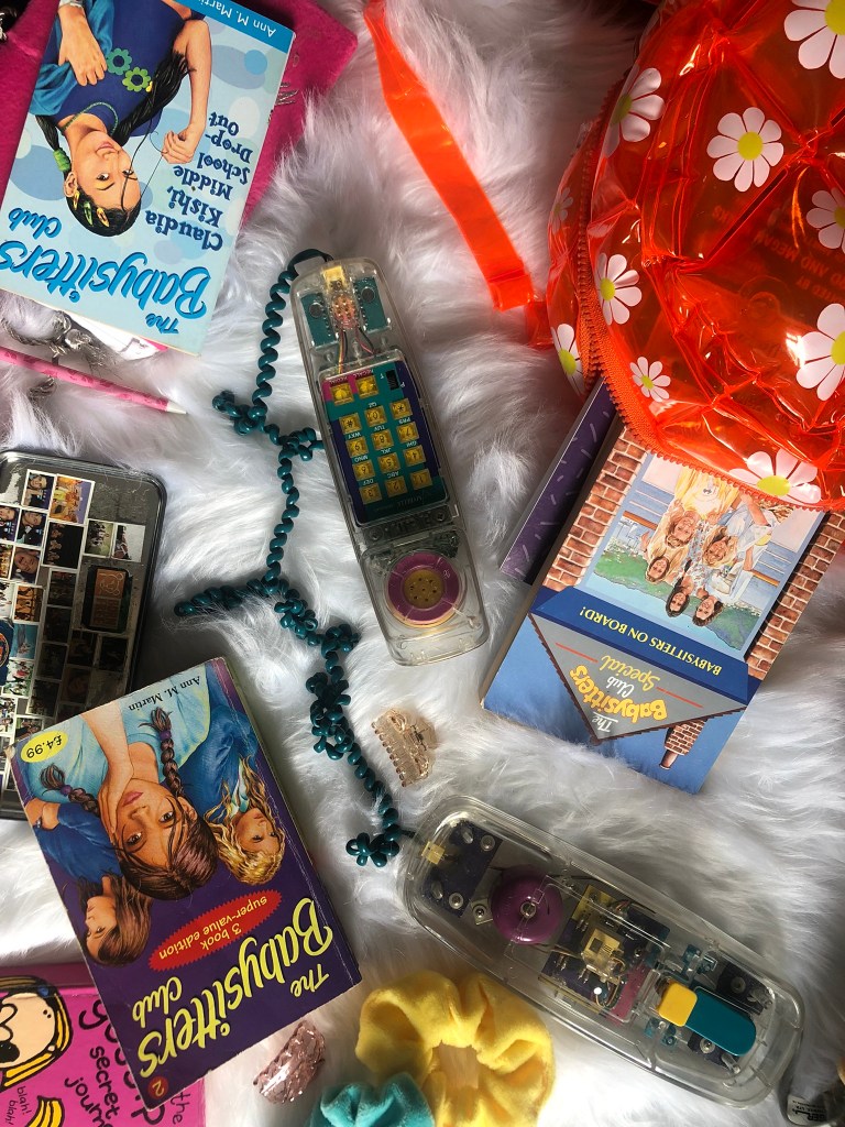
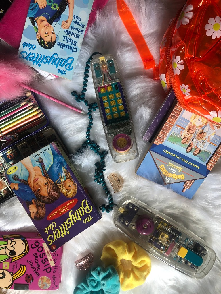
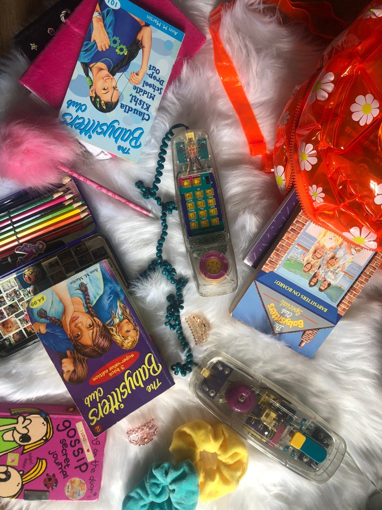
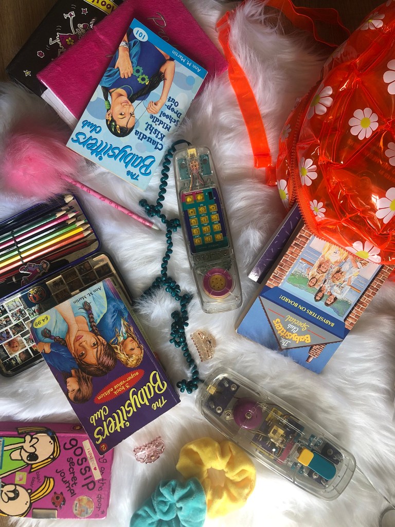
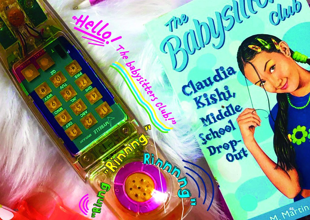
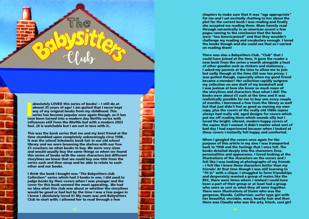
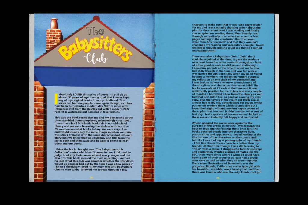
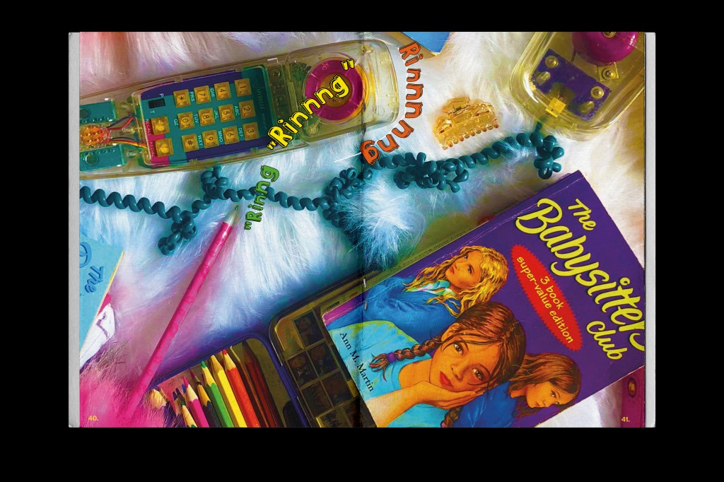
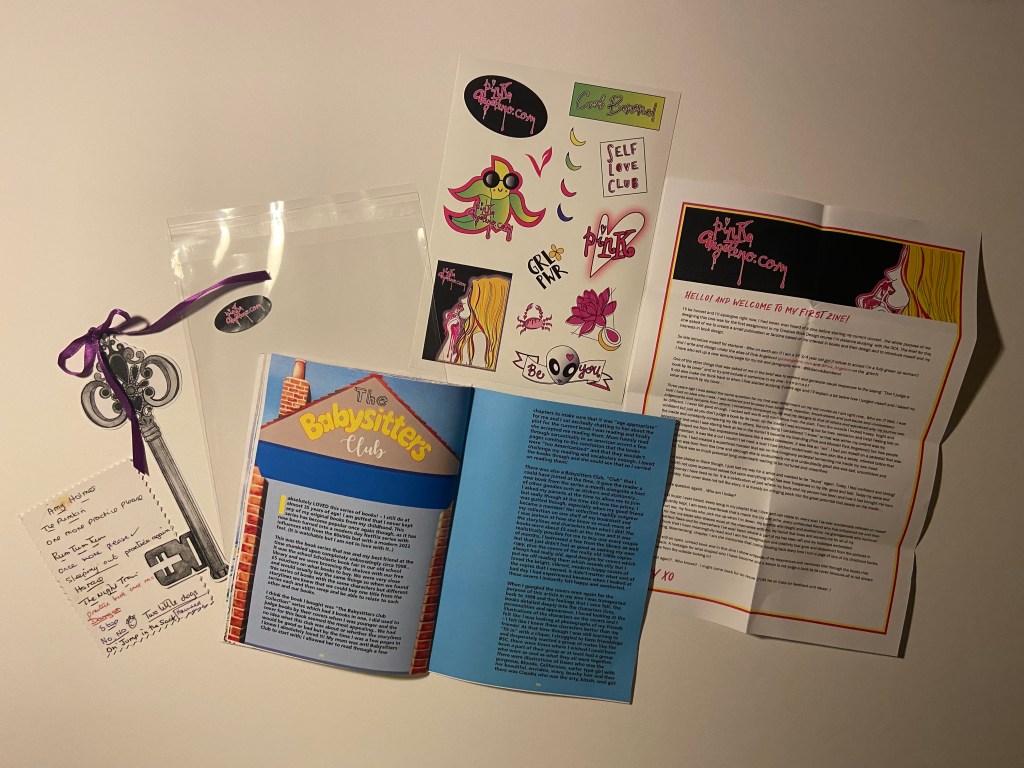
Pages 38-47: The Babysitters Club
This was a big section of my zine!- but it was the series of books that I loved the most! It was probably one of the last times I read properly again too! When I hit my late teens I hardly read at all; only biography’s and books relating to Design!
The Babysitters Club was a HUGE part of my childhood and early teens; as I wrote about in one of my previous posts! (influential books) and I really wanted to do it justice in my blog!
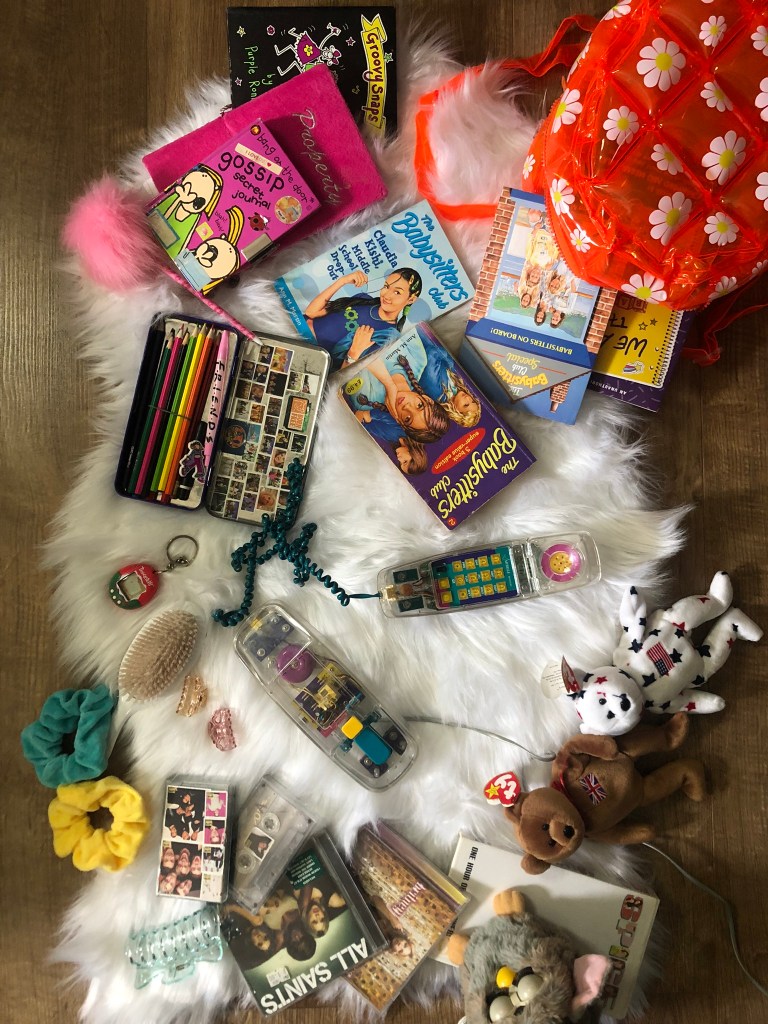
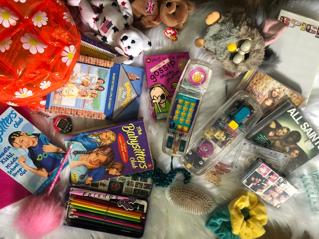
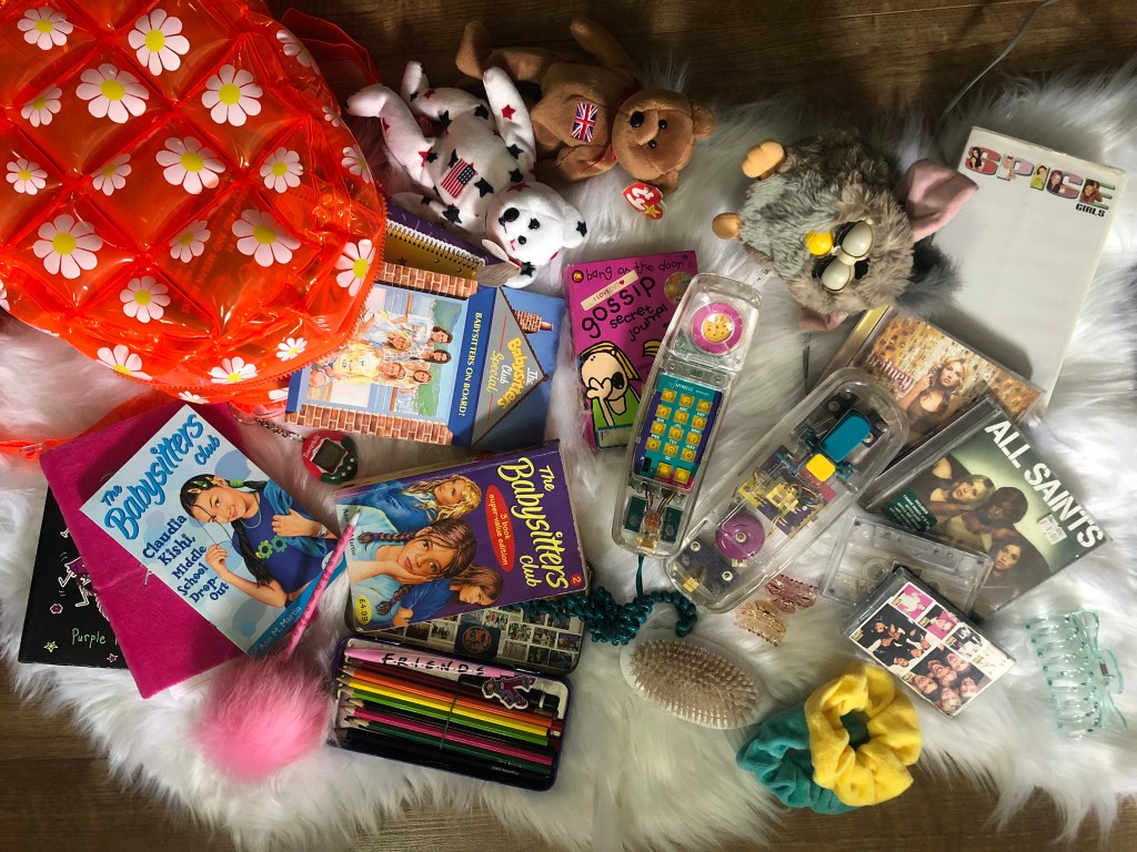
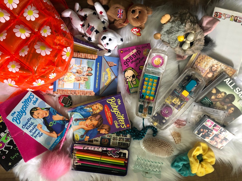
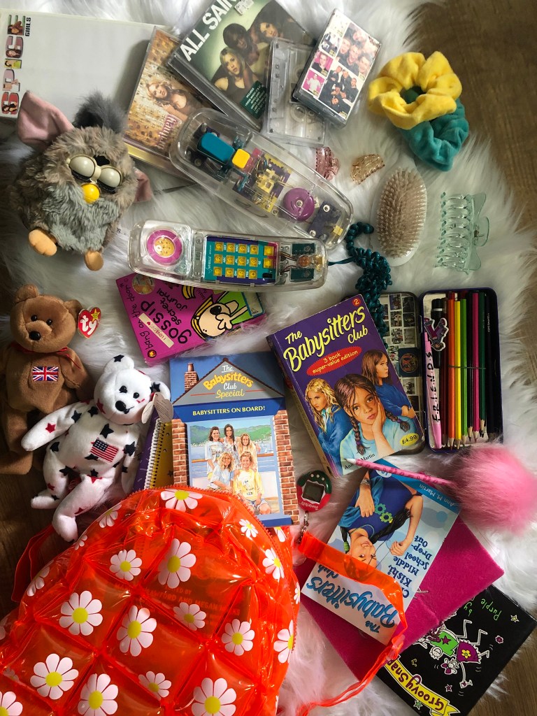
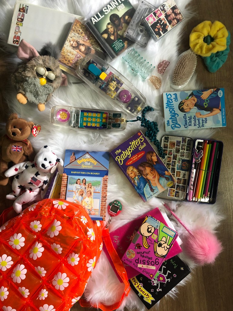
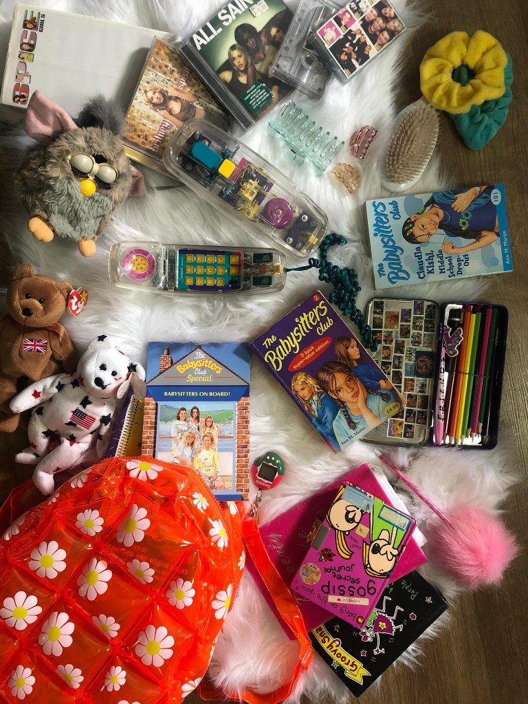
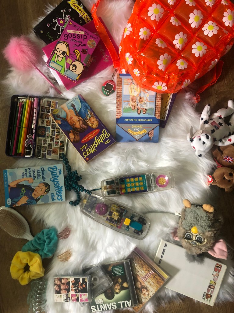
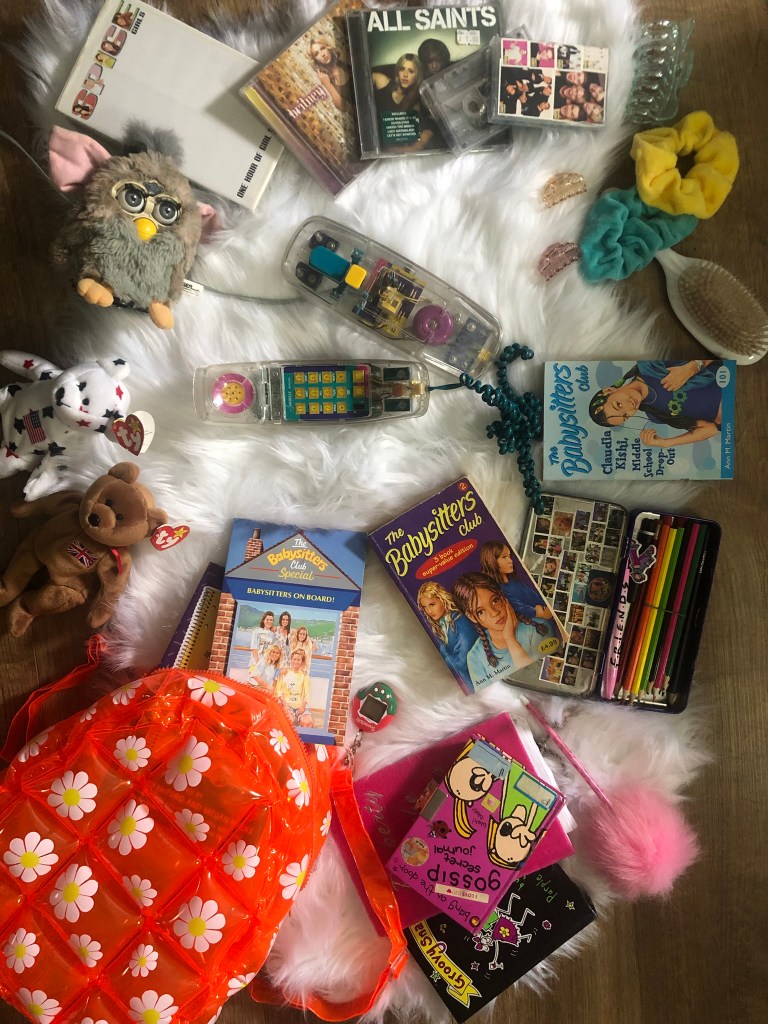
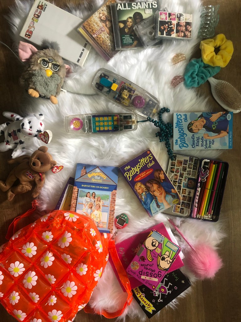
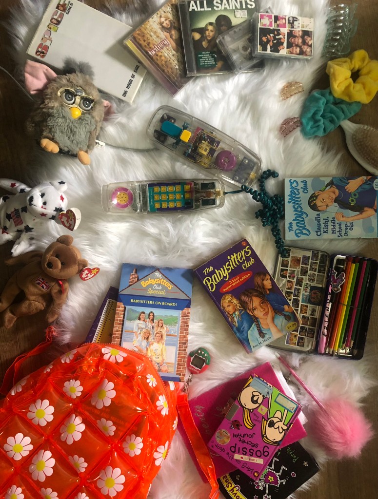
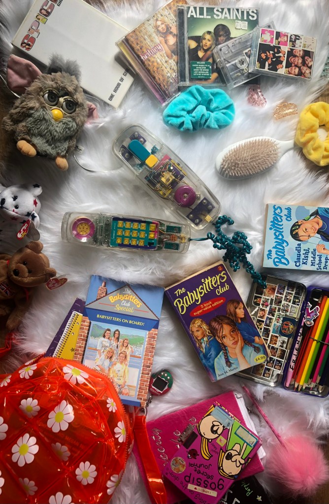
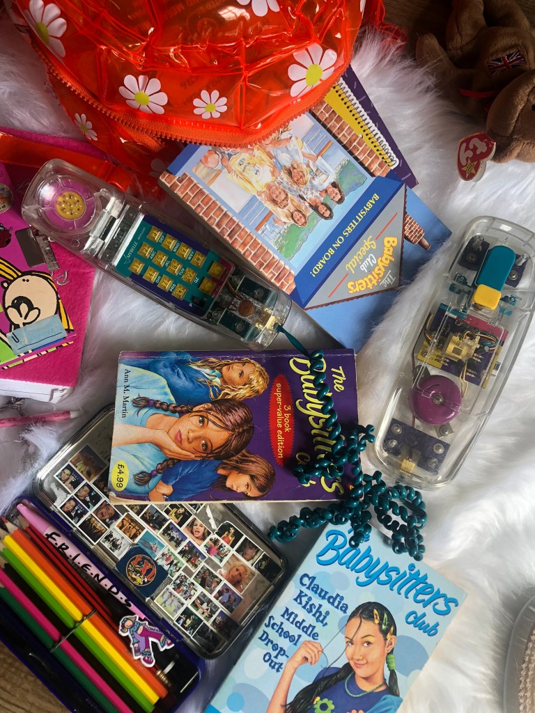
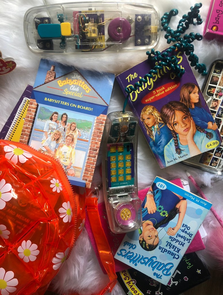
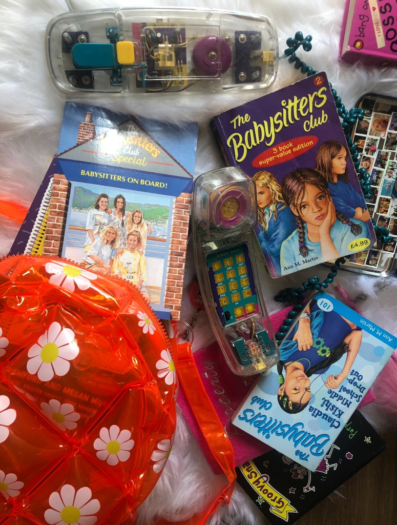
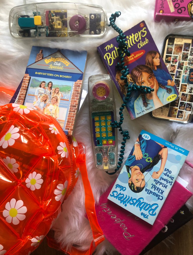
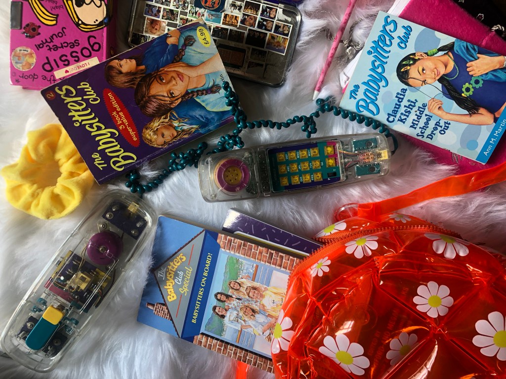
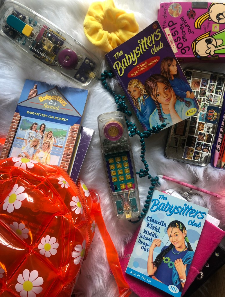
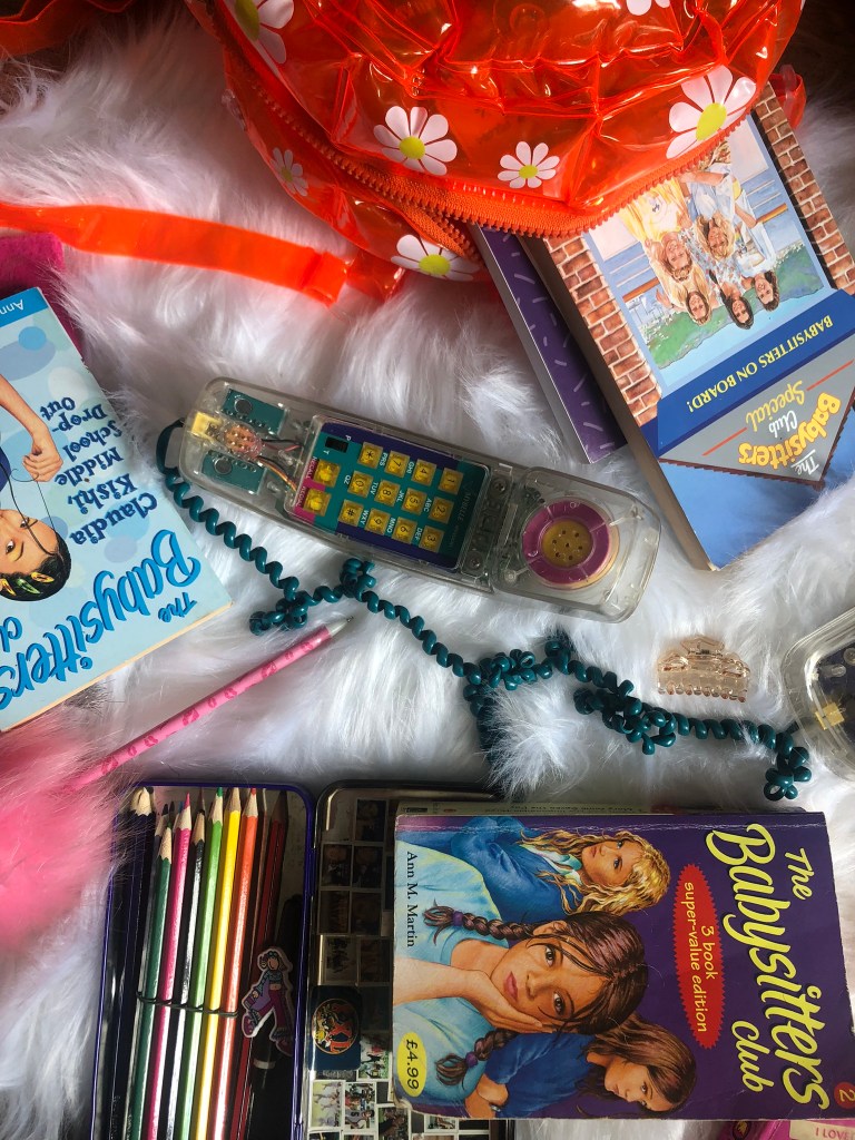
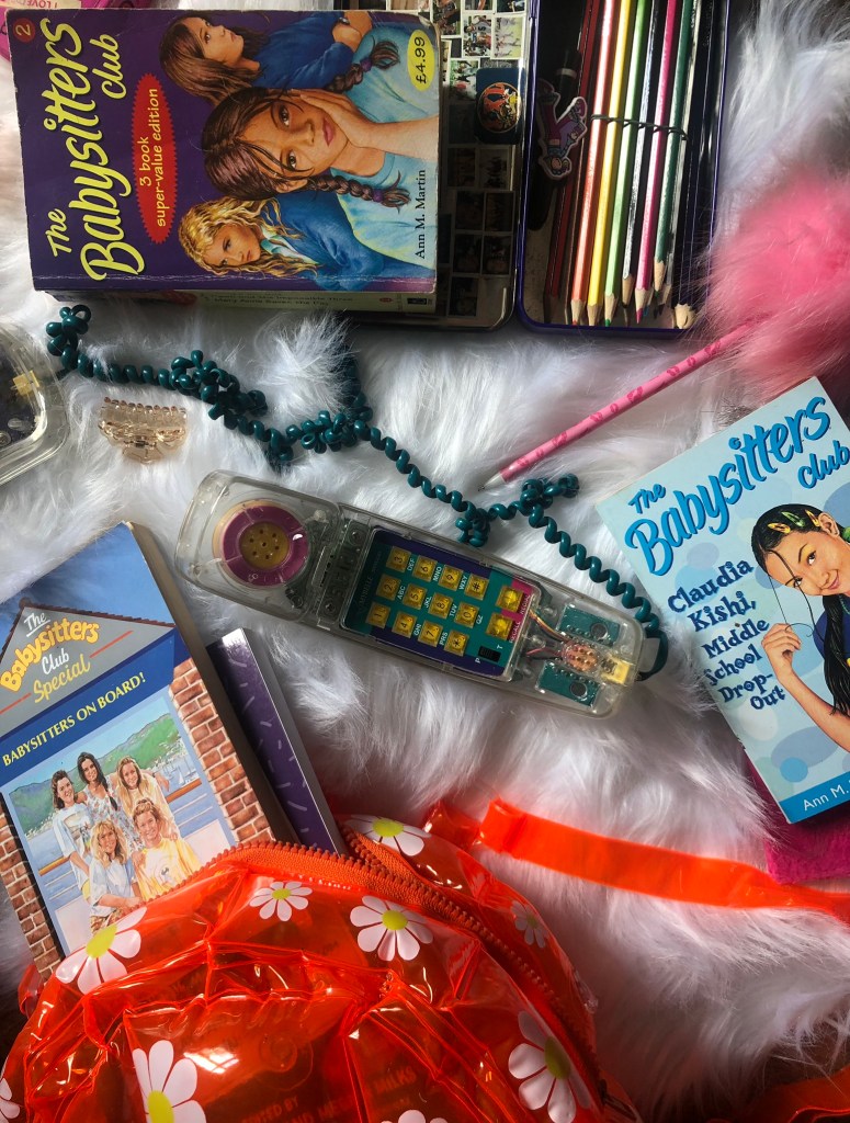
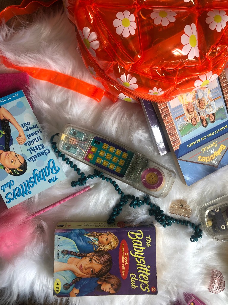
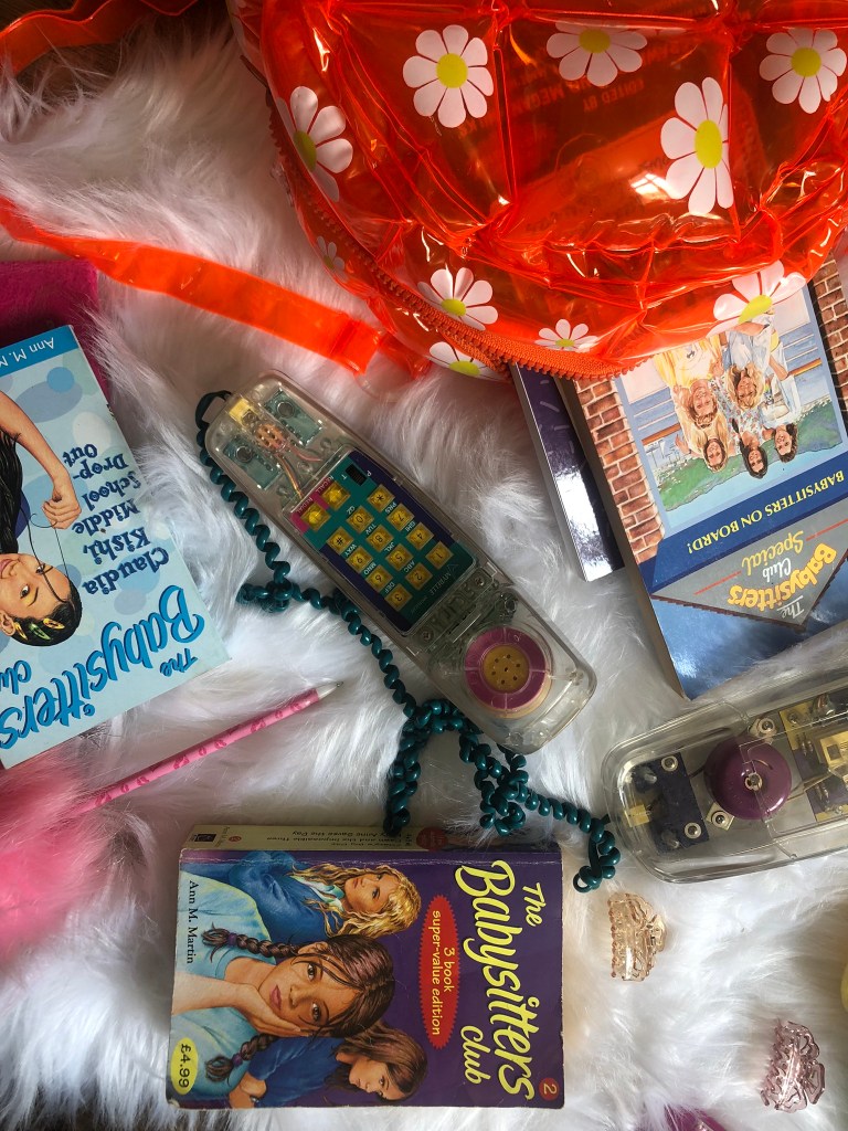
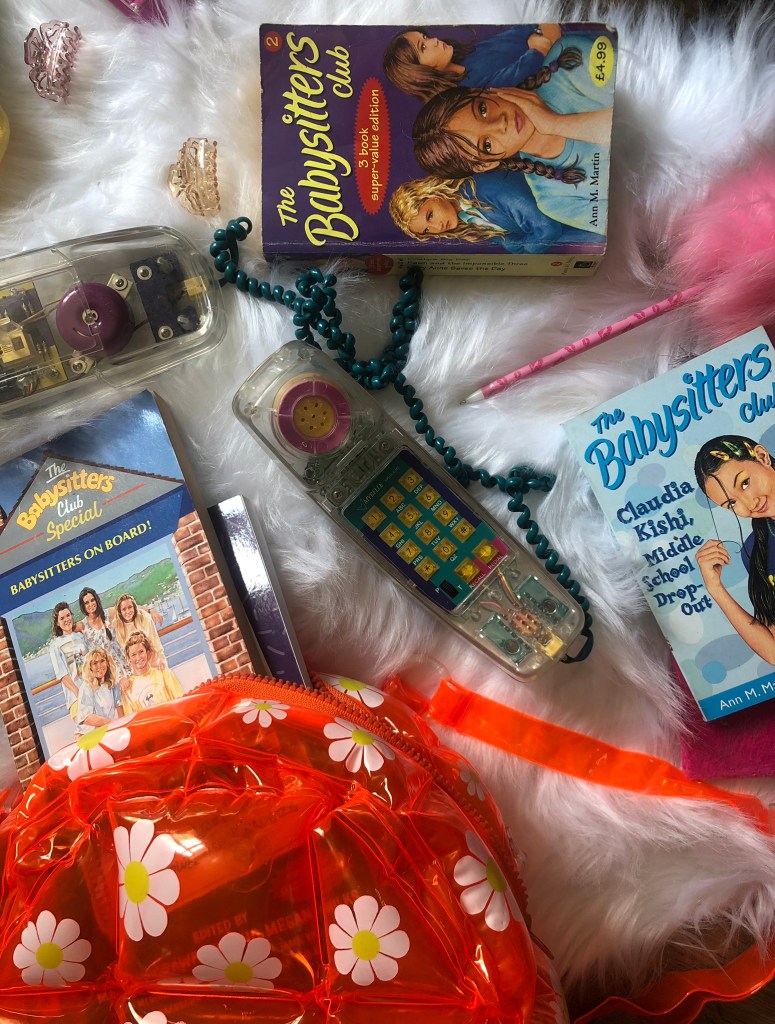
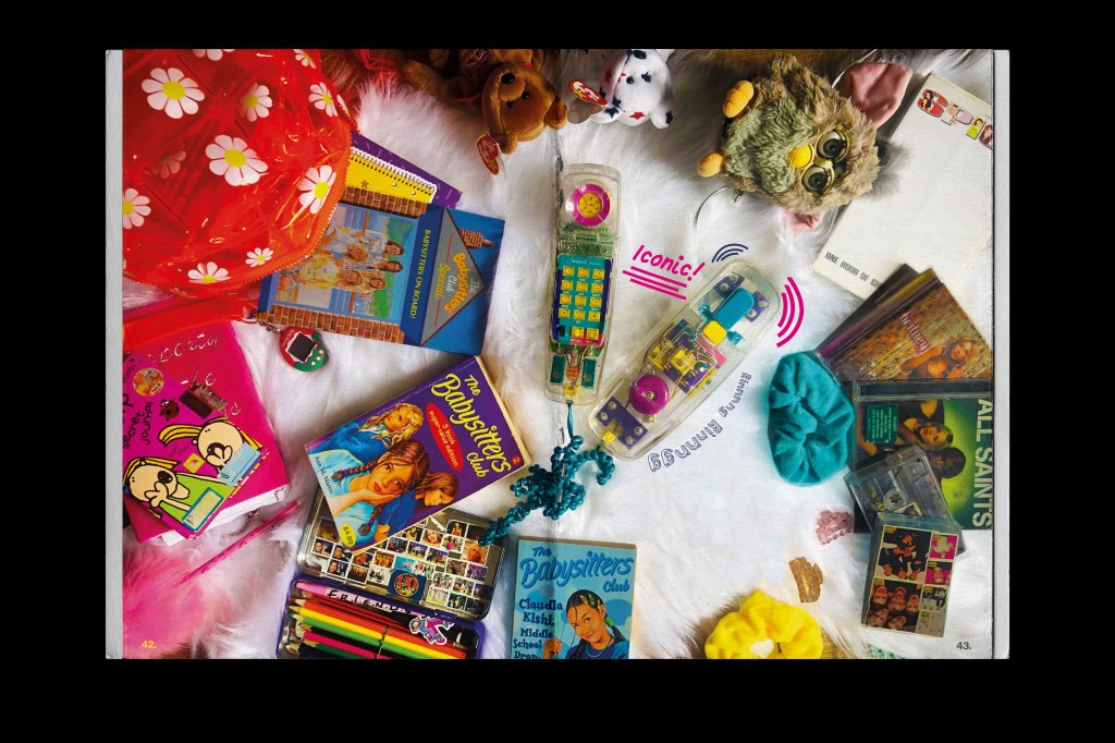
The write up I did on this series was quite lengthy so I knew it would have to go over a few pages! I wanted to set up some photo props for this article too! I have quite a lot of stuff from the 90s when I was a teenager and thought it would be cool to use them as I read these books around the same time. These books also sum up the lives of teenagers from the 80s/’90s so it seemed perfect! My original idea was to also create stickers and a pull out poster but time constraints held me back from that!
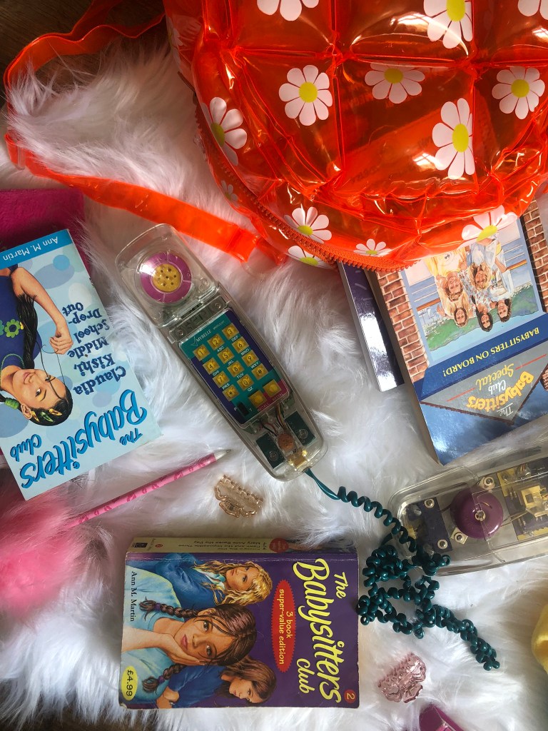
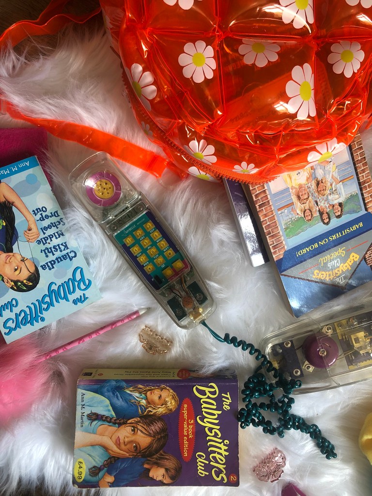
Instead when I was off work for 12 days with Covid I decided to rearrange my living room (with the energy I absolutely didn’t have!) to lay out my props and do some flatlay photography to use for this article:
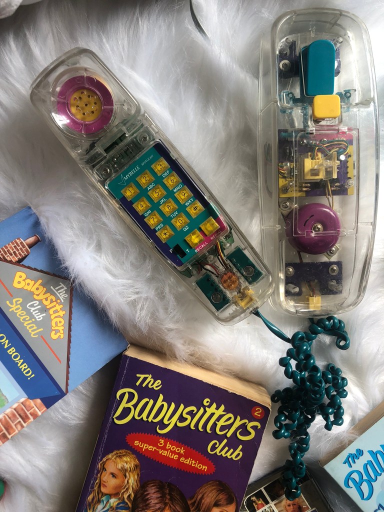
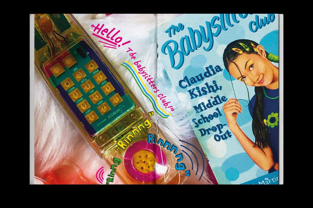
I had to go and repurchase a few of the items such as the books, the phone and the inflatable bag. The books I bought were exactly the same ones I read as a child except for when I reached my late teens I gave them away to charity shops because I felt like I was too old for them and would never want to read them again! The phone was a massive influence in my teen years because my friend Liz owned it and we spent so many nights round hers phoning boys and friends and having a laugh! I was never allowed one because I ran up the phone bill! This phone is also iconic in the Babysitter Club series because it features in them! Claudia owns it and they use it as the Babysitter Club hotline!
I also know that I took a lot of photos because I wanted to get the right shots for my piece!
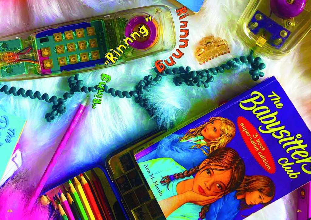
I chose the final photographs that I wanted to use and then took them into Photoshop to alter and adjust:
I wanted to make them look fun and something that I would have enjoyed looking at or blu tacking to my wall when I was a teenager! I added some animated text onto the photographs to make them more fun and childlike.
I wanted to make one of these spreads into a full size poster to come free with the zine but with time constraints and also the cost restraints with having it printed large it just wasn’t feasible.
The other 2 double page spreads are for my lengthy write up about the series! I ran the text over the 2 spreads and I kept a similar colour scheme and layout so that it is obvious that they relate with each other.
The theme of the covers of the books is universal throughout (except for the limited editions and summer series) and I wanted to bring that same theme into my zine:
The Mock ups!
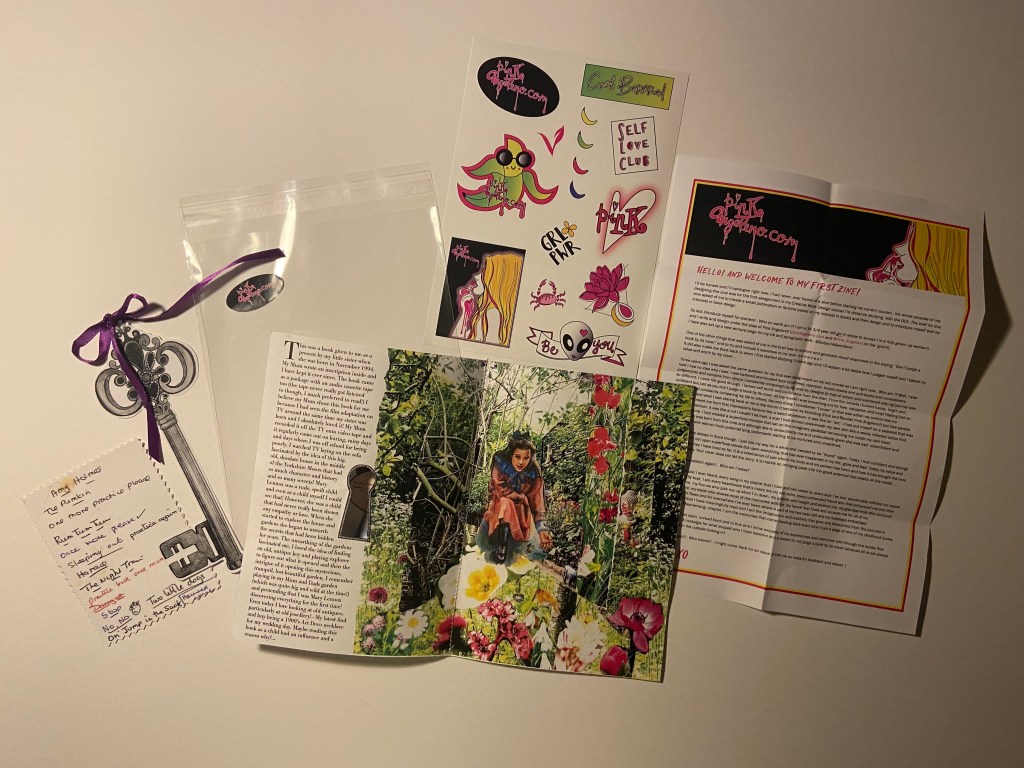
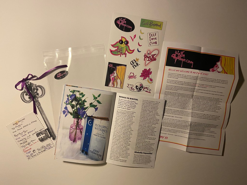
Pages 48-53: Books vs Digital
The brief stated that I needed to find global influences and links back to the books that I talk about in my zine. From doing the exercise influential books I had already made a list of books that could link back or have connections to more global subjects.
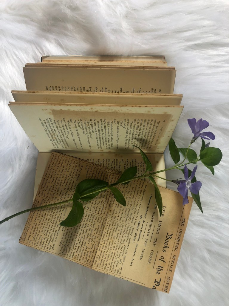
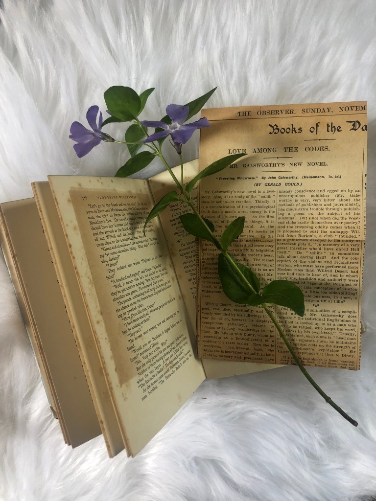
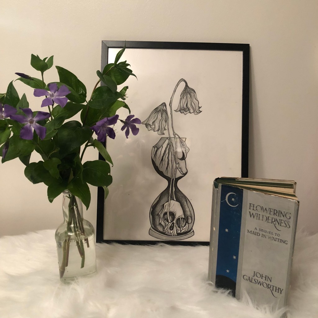
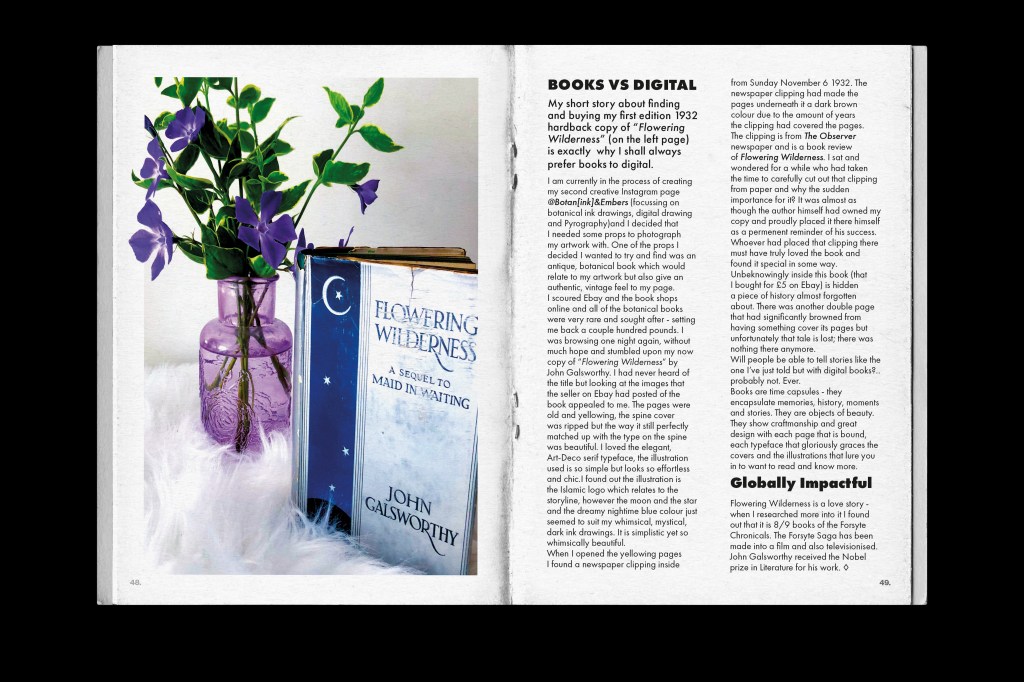
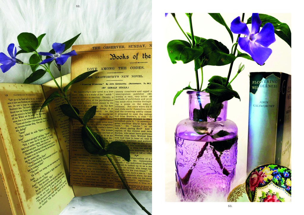
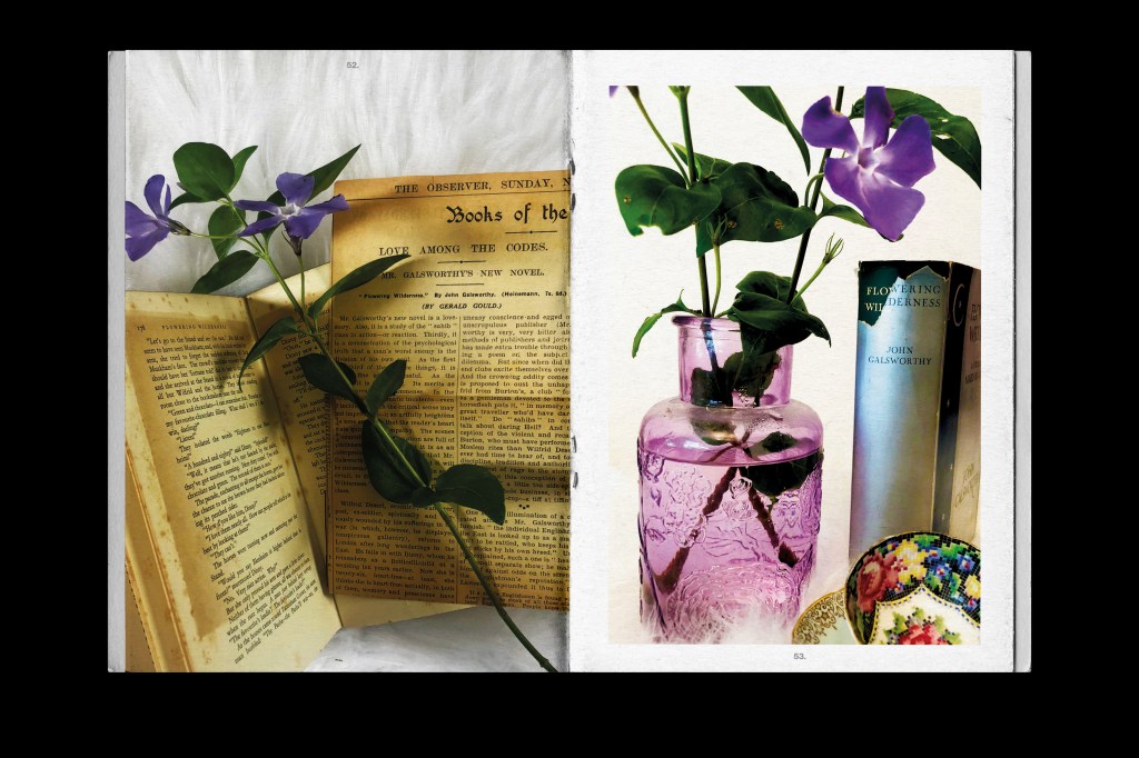
However, when creating new content for a potential creative sideline I came across a first edition copy of Flowering Wilderness and when I researched into the title (just out of curiosity) I found that it linked to further global influences that I could use to feature in my zine.
I bought the book off Ebay for £5 because I liked the simplistic looking design of the cover and also the typeface on the cover. I was really looking for an old Botanical book to use as a photo prop for my new Instagram page Botan(ink) and Embers which will be a mix of my botanical ink drawings and some pyrography. Instead I came across this cover and just loved it! It looked whimsical and boho and it has the flowers link into the title. I even liked how the book cover was torn down the spine. It is a truly beautiful book! This also argued my case that books are better than digital because you can’t find beauty in digital. You cannot find beauty in a worn down digital book!
I explain in this piece how books are time capsules; they encapsulate memories, history, stories and are objects of beauty! They show craftmanship and great design with each page that is bound and each typeface that gloriously graces the covers and the illustrations that lure you in. I explained that how in this book I found a newspaper clipping from the time the book was published (1932). The clipping had been produly placed in the book as a keepsake as the article was a beaming review of the book. Whoever owned the book must have been so proud of the work that had gone into it. There is a story behind the clipping; who put it there? did they know the author? was it the author?.. you just won’t ever get that with digital. Argument settled and won!
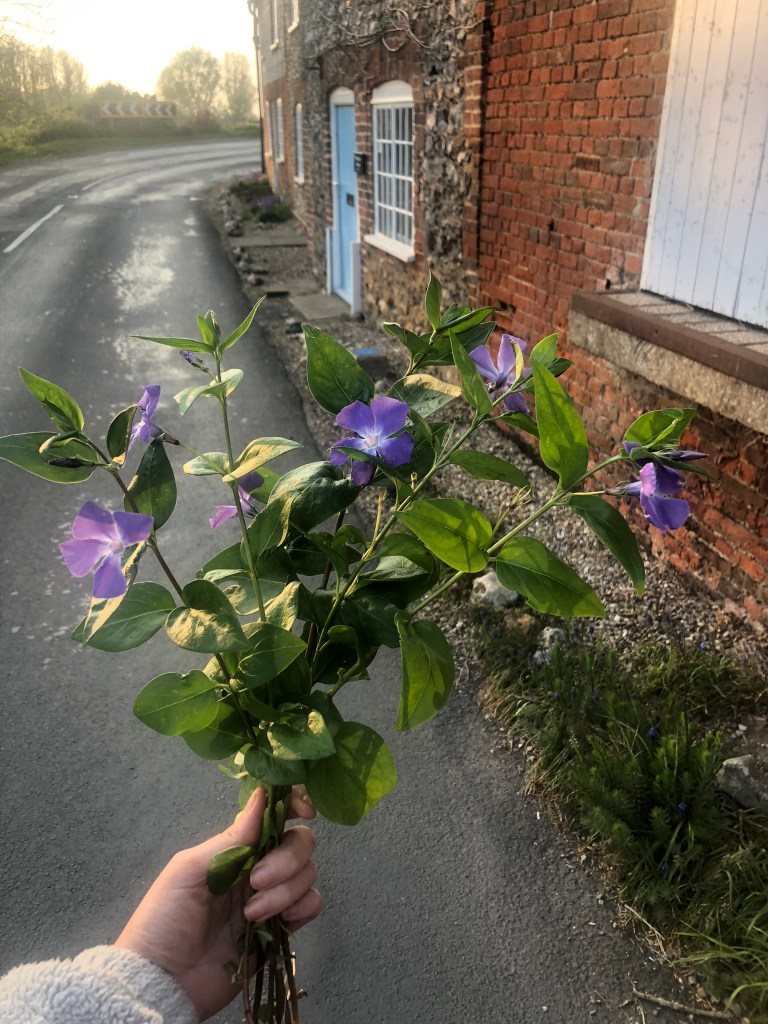
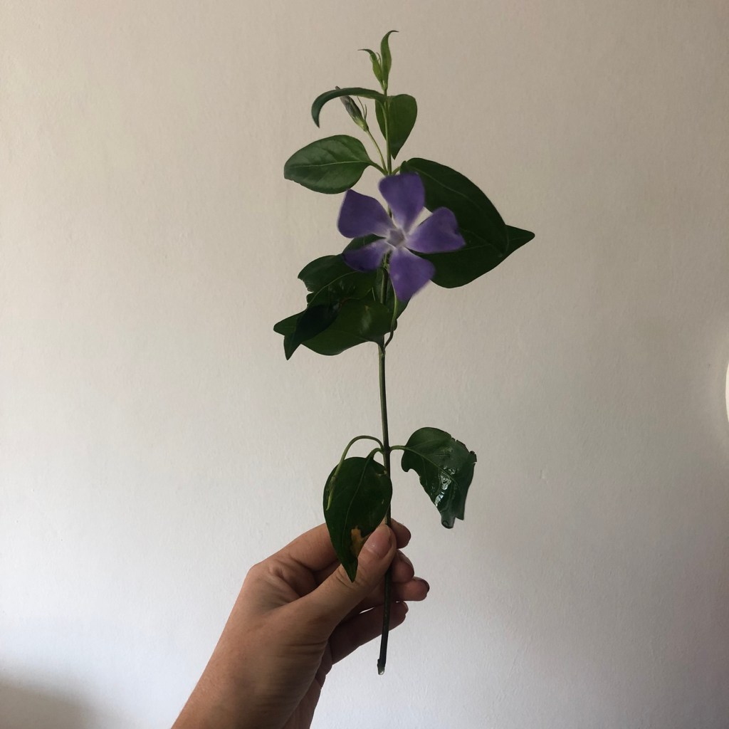
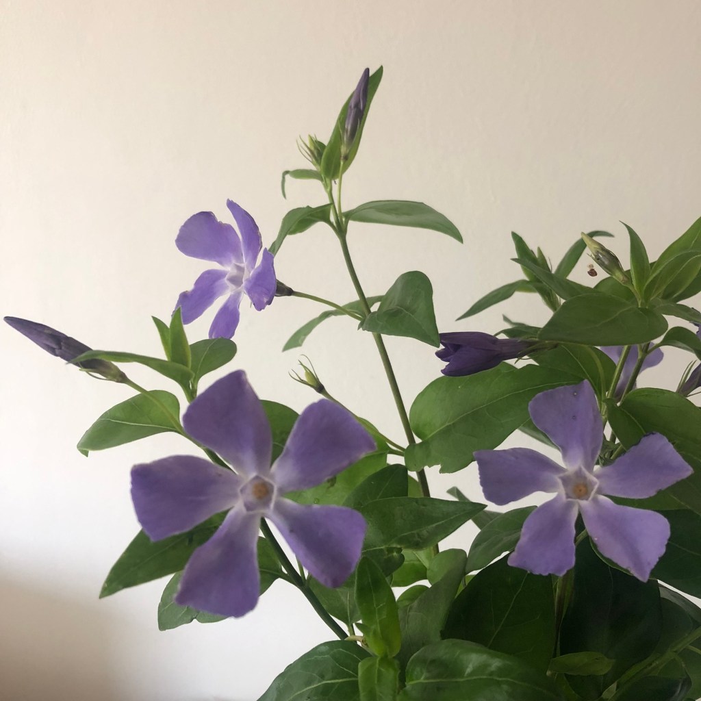
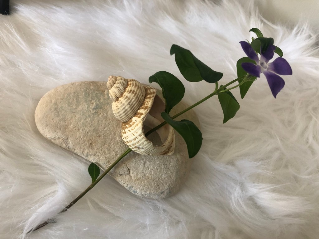
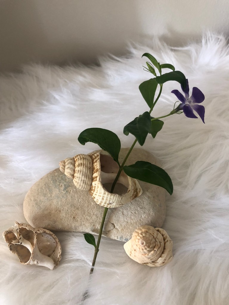
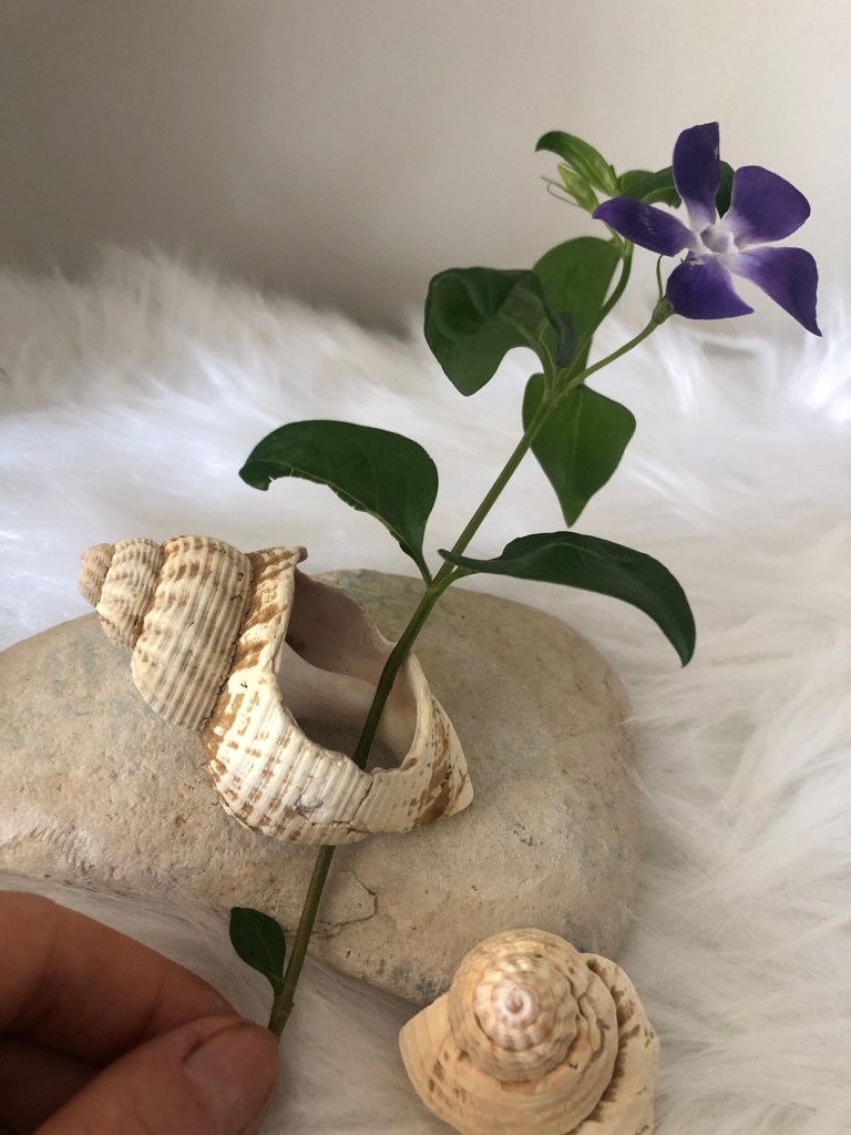
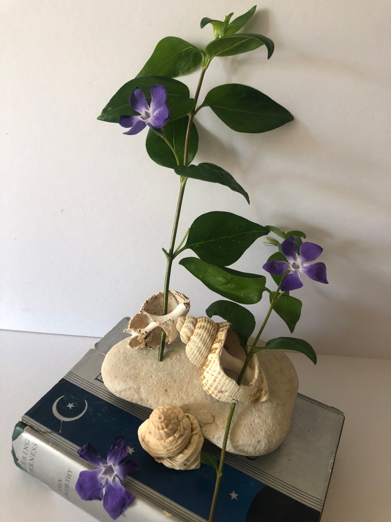
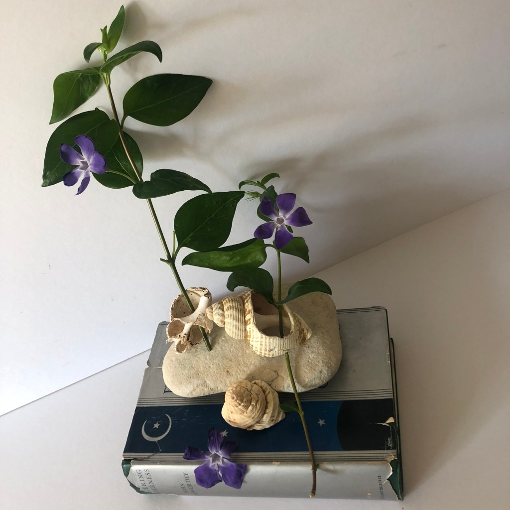
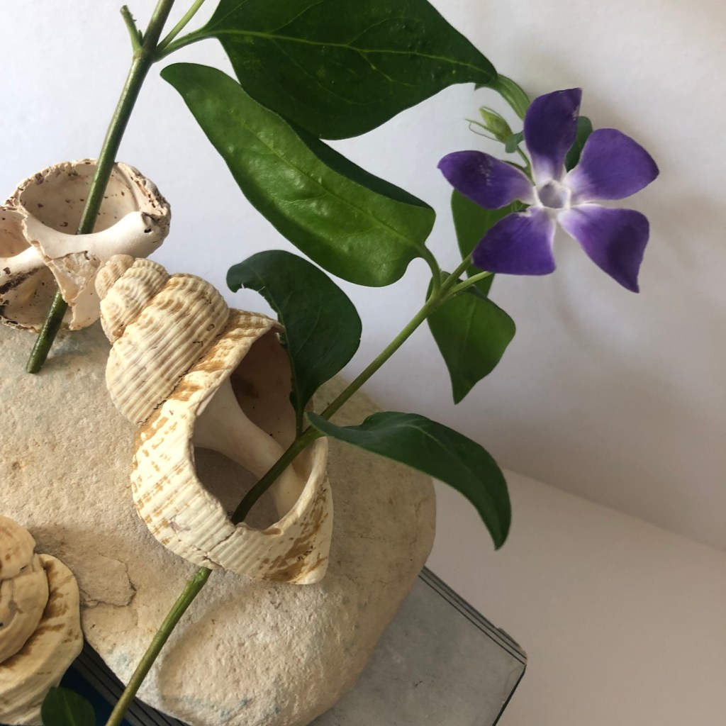
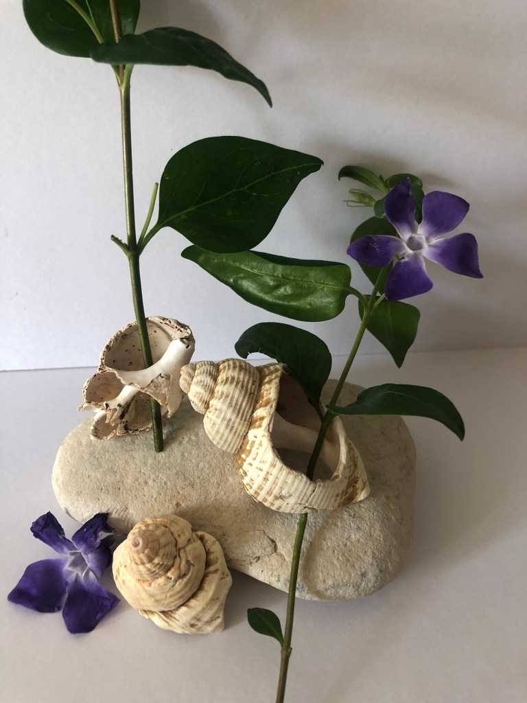
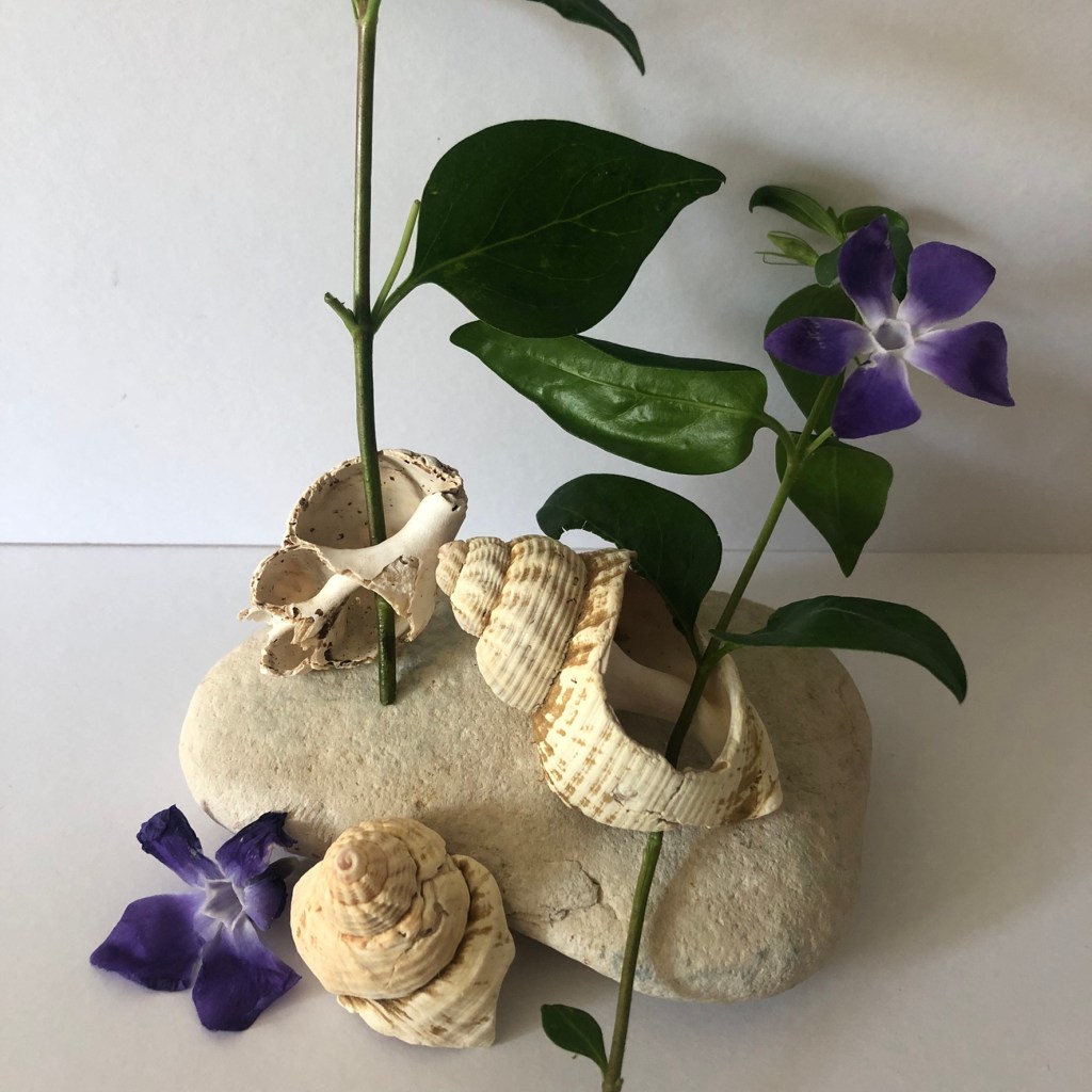
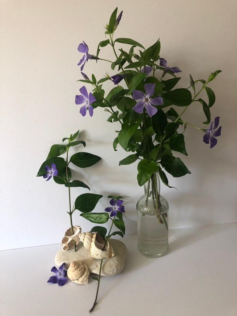
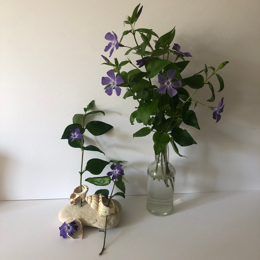
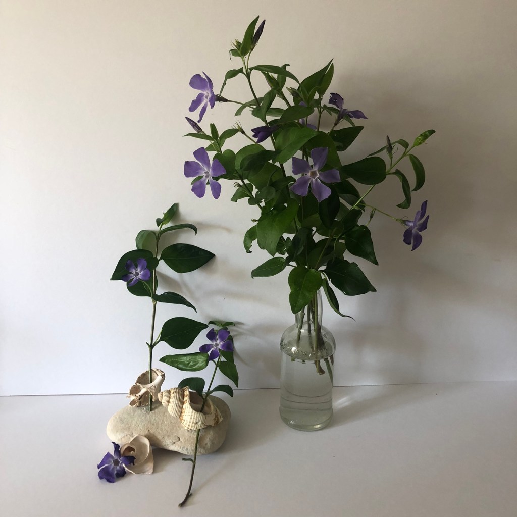
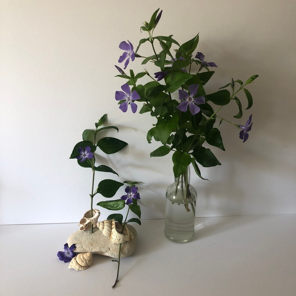
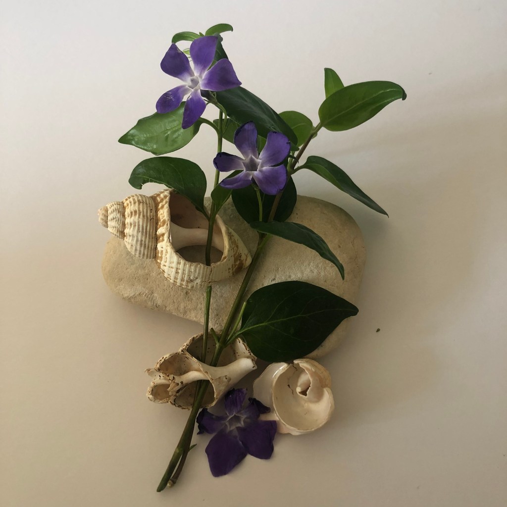
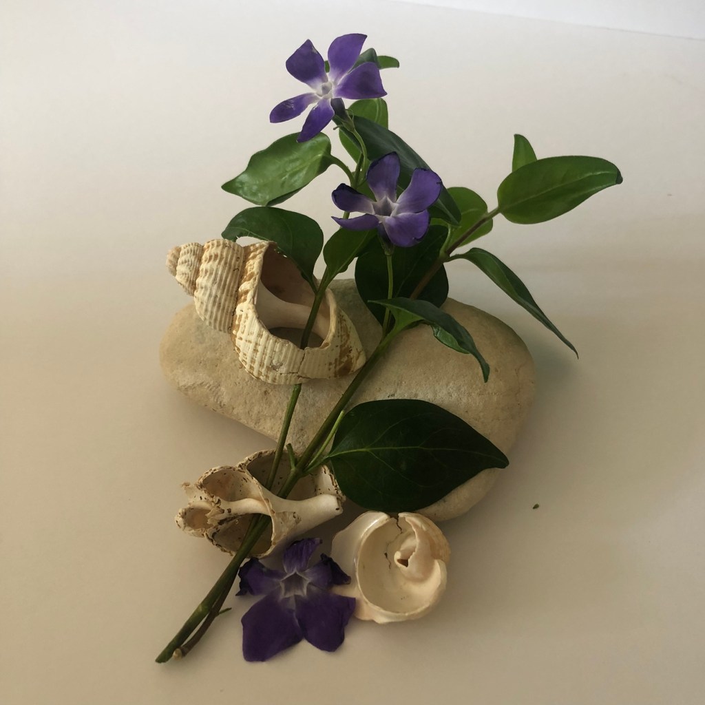
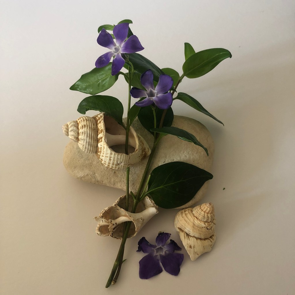
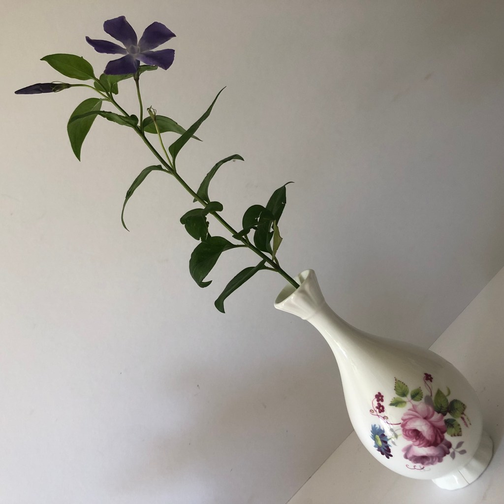
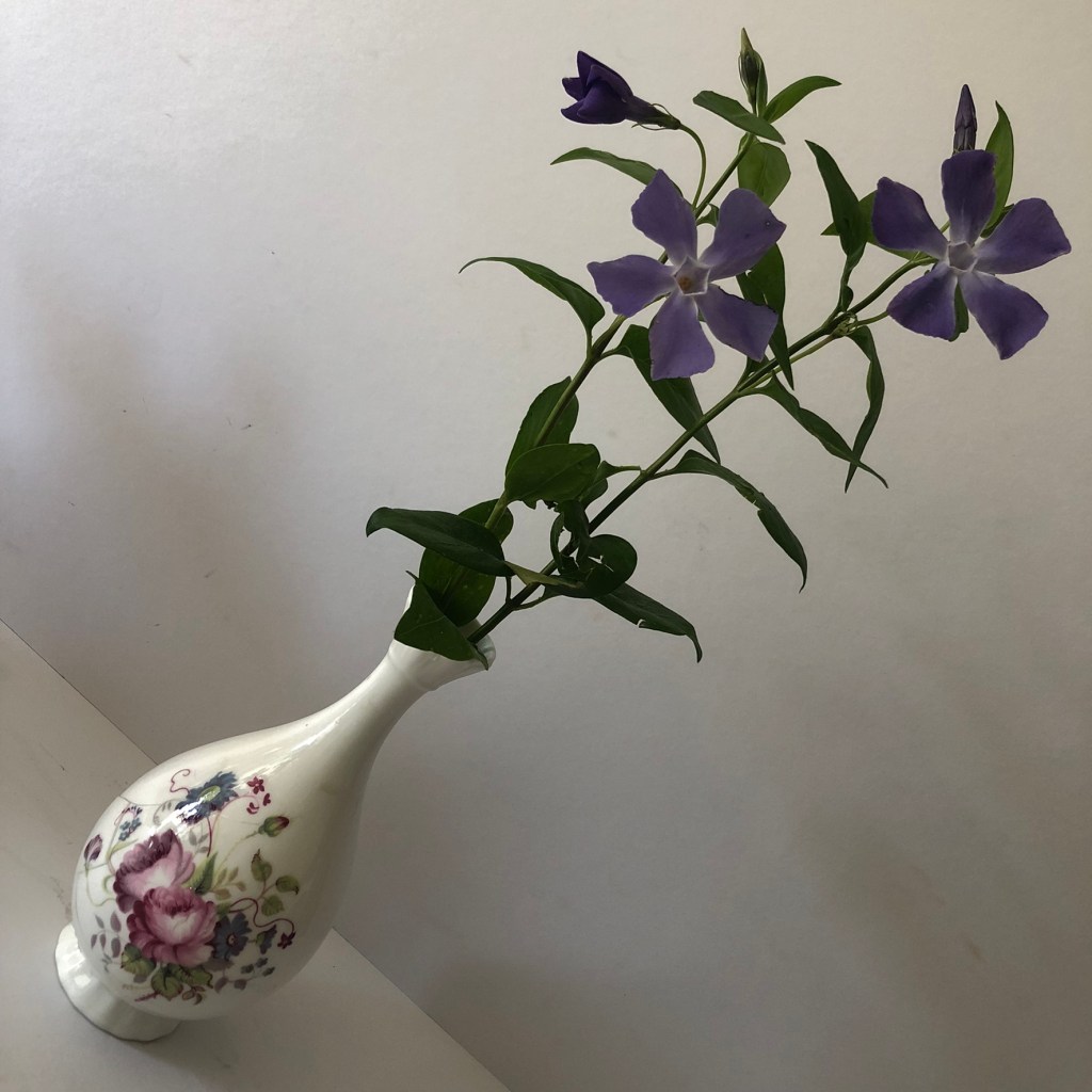
Once again I took loads of photos but purely for my Instagram page because I had no idea that I would be featuring this book in my zine at the point! I am a little bit obsessed with Periwinkles and when I had Covid and I couldn’t go anywhere I dragged my other half around to different countryside spots to find some wild ones to pick for decoration around the house, to photograph and I also tried to press some inside my books.
I found the ones above in a little roadside village on the Norfolk coast road! I was quick picking them and taking the photos because it was on a blind bend! The brickwork of the houses though was so lovely and the views so picturesque!
My favourite ink drawing above from Core Concepts!
I added in a little bit of self promo here! (above!) with the logo I created for my Instagram page Botan(ink) and Embers… I’m yet to add content so watch this space!
The photographs above were just too beautiful to not use! – one also shows the clipping of the newspaper that was carefully and proudly kept inside the book.
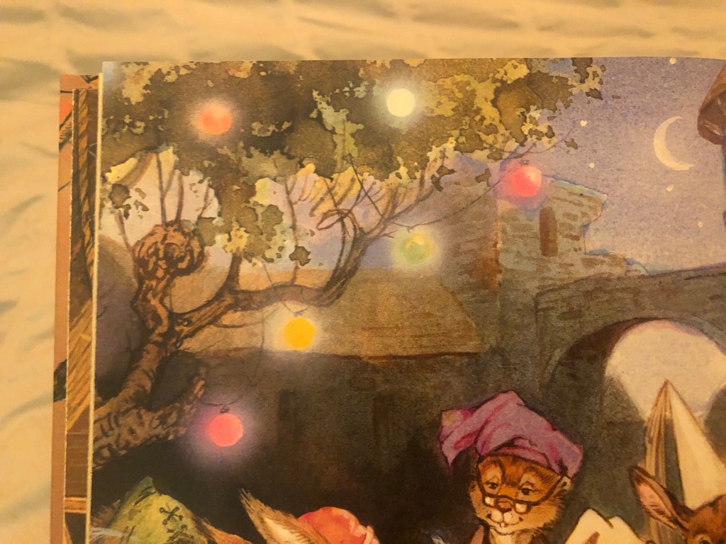
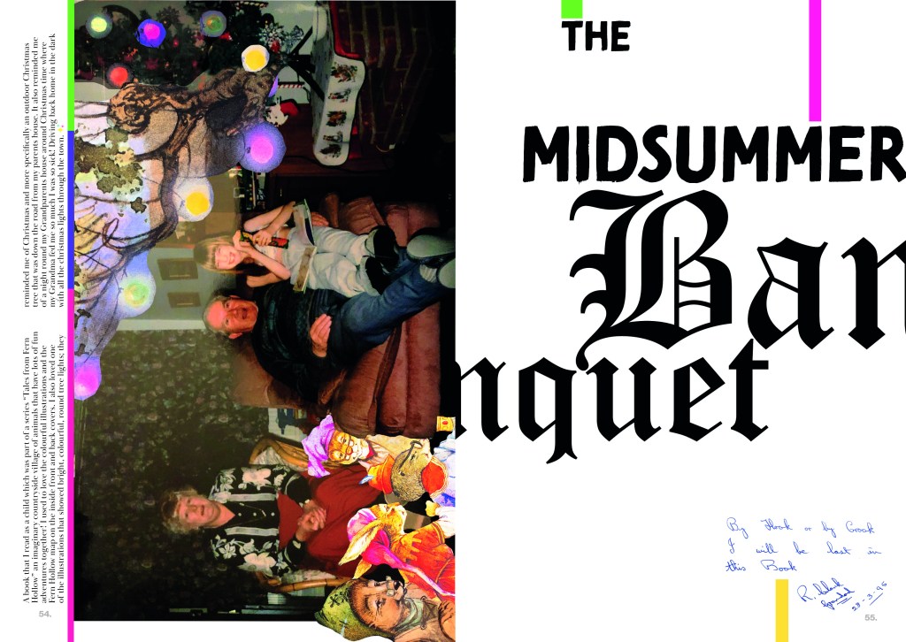
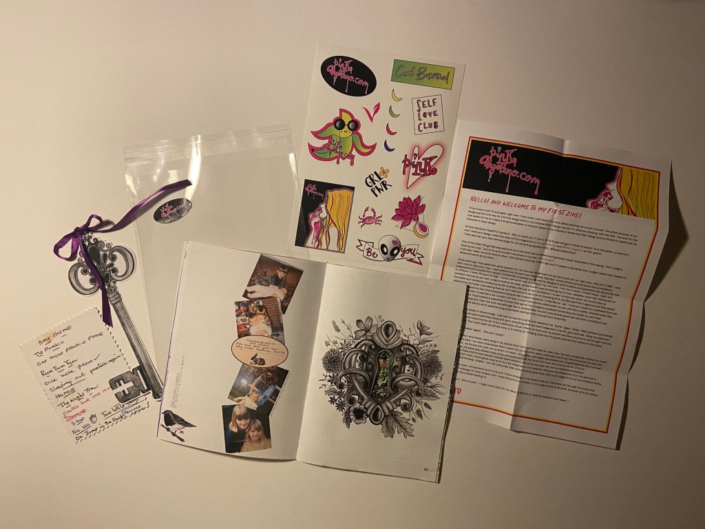
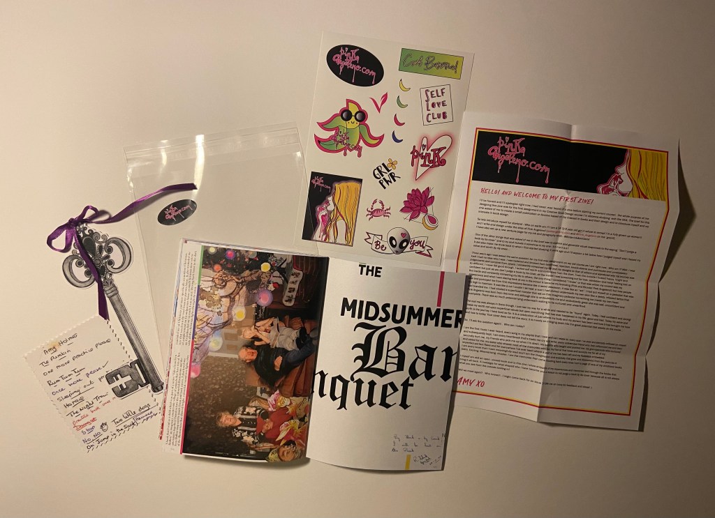
Pages 54-55: The Midsummers Banquet
This page I dedicated to my grandparents; (my Grandma is no longer here sadly) I never read the book with them ever and they probably would have no recollection of it but the illustrations inside trigger a memory that involves them and that to me is as important as the book itself. This is what books are about! They evoke and awaken memories and feelings!
I always loved the bright lights in one of the illustrations in this book – it reminded me of a Christmas when I had a MASSIVE meal at my grandparents (my grandma loved to feed us treats and make sure we had enough to eat!!) My Dad was driving us home through town and they had just turned on our towns christmas lights which were twinkling through the dark car windows at us. I remember I felt so sick from all the food! I had an old antique bell in my hand that I think I had rescued from a stash my Grandma and Grandad had randomly found and were showing us that night! The bright Christmas lights reminded me of the lights in this story and ever since then whenever I see this book that memory surfaces!
I knew this layout would have to surround this memory! Memories tell the story as much as the book!
I found a photograph of me with my grandparents at Christmas time which tied in well with this memory! I am reading a book (not The Midsummers Banquet) and eating a tube of Fruit Pastilles or something sat next to the mini Christmas Tree..
I then had the idea to merge the Christmas lights from the book into the photograph of the tree… I then had the idea to merge in some of the characters from the book in there too! I started to work my magic in Photoshop again! – although I really do need to take a lesson in photo manipulation because I have attempted a lot of it in this zine!
I took influence from David Carson again for the typography. I wanted to use contrast in the type – serif and sans-serif- big and small. Banquet very much portrays a medieval feeling with its serif font, whilst the rest of the type contrasts against that with their sans-serif font.
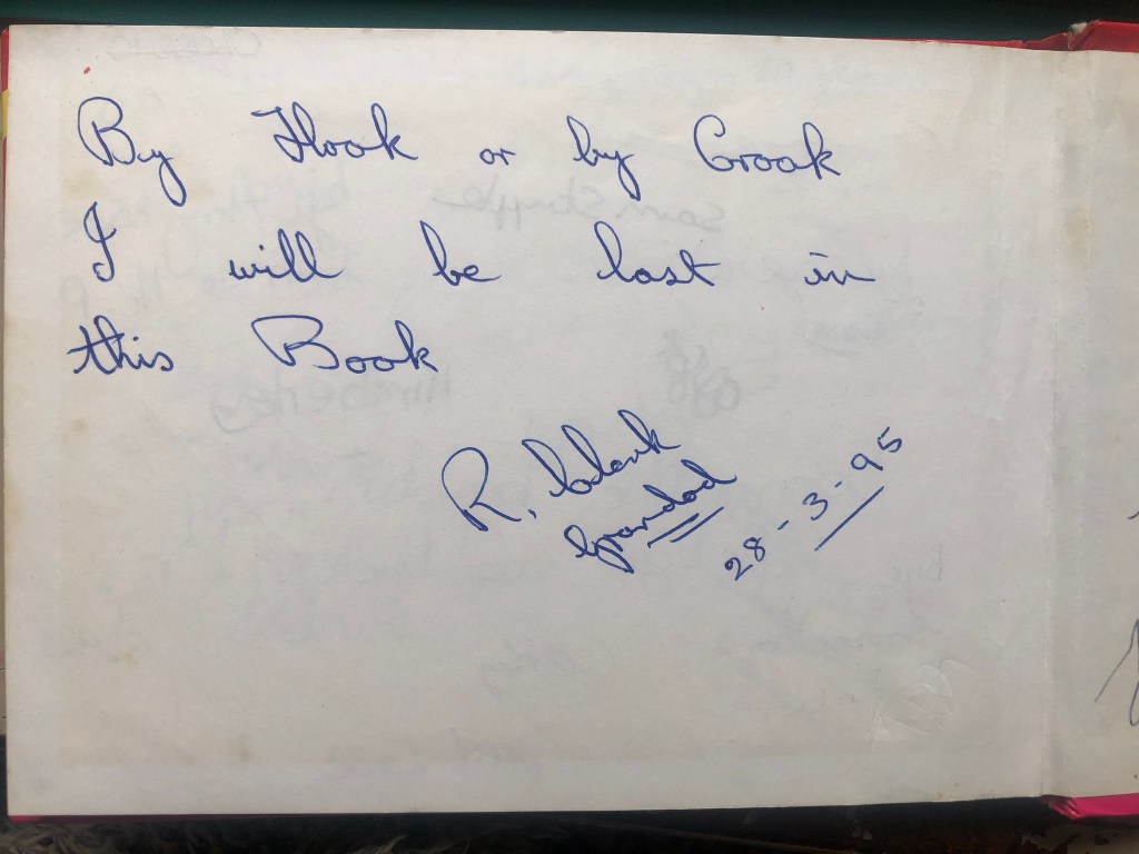
I also used a quote my Grandad wrote in my Disney autograph book way back in 1995 which I thought would be ideal for the last page of my zine!
Below I used the “rule of 3” again where I created 3 blocks of colour which relate to the colours of the Christmas lights and help with hierarchy to help your eyes travel down the design.
The mock up!
The Back cover!
Not much to say about this page really! – The colour matches the front cover and I have added some self promo for my website and Instagram page by including my logo and Instagram handle!
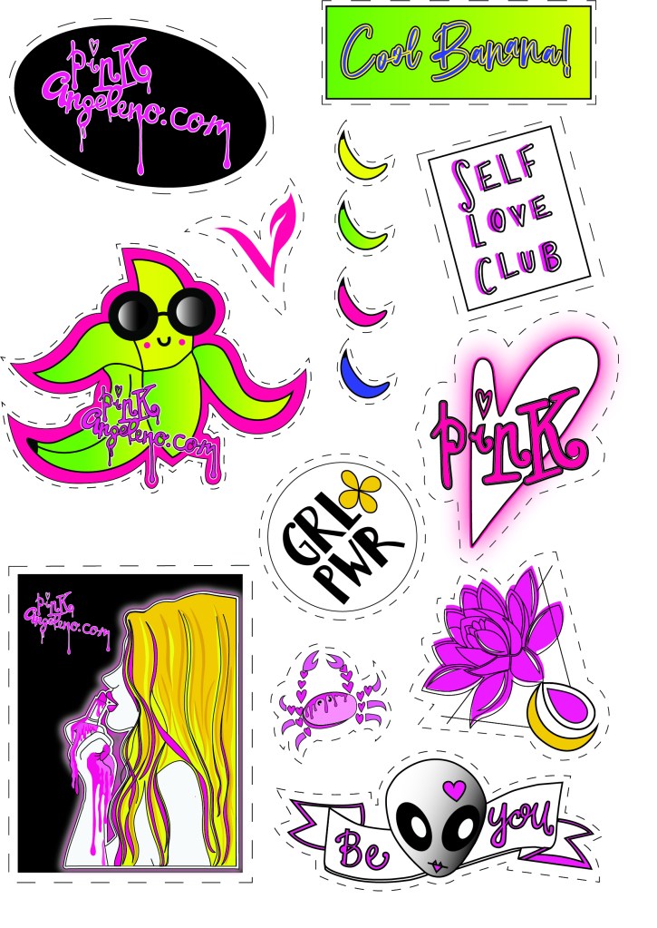
The stickers!
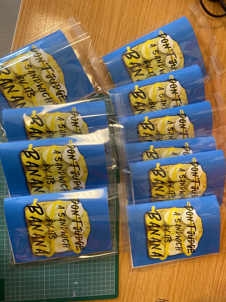
I ordered some clear plastic A5 wallets from Amazon to put my finished zine in: (zines actually- because I printed quite a few of them to try and distribute around!- I’ll come back to that later!..)
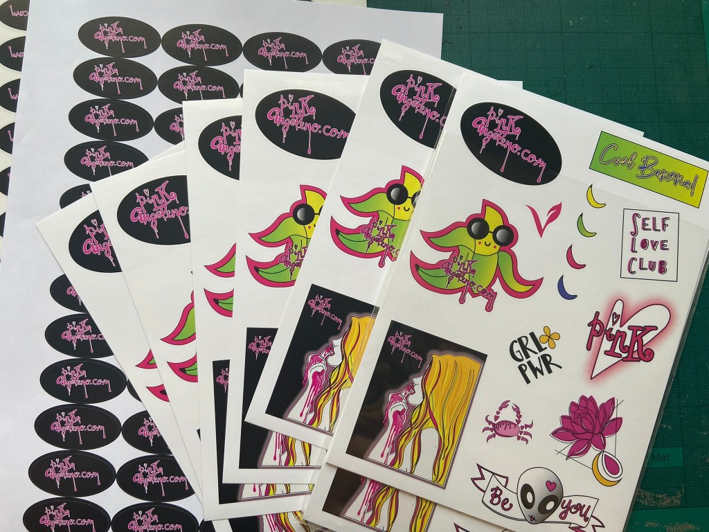
I then decided I would quite like to print some of my past and present vector work into stickers as a freebie with my zine! It was a nice and easy process! I went through stickershopuk and they arrived within days!
I decided I wanted the sticker pack sets that they can print for you. This allowed me to have up to 20 stickers on a sheet of all my different designs.
All I needed to do was create my A5 sheet in Illustrator with all my artwork on and provide them with cut lines around the artwork so they knew where to cut! It is my first time sending off for professional print so I was a bit apprehensive as to whether I had sent the correct files etc.. I should have more faith in myself because the files I sent were perfect and turned out really good! I sent a PDF version which allows much better quality than just a jpeg itself.
I also wanted some pages of the same sticker with just my website name on so I created a single image for them too:
I wanted the sticker above to stick on the back of the cellophane cover when you go to open the zine.
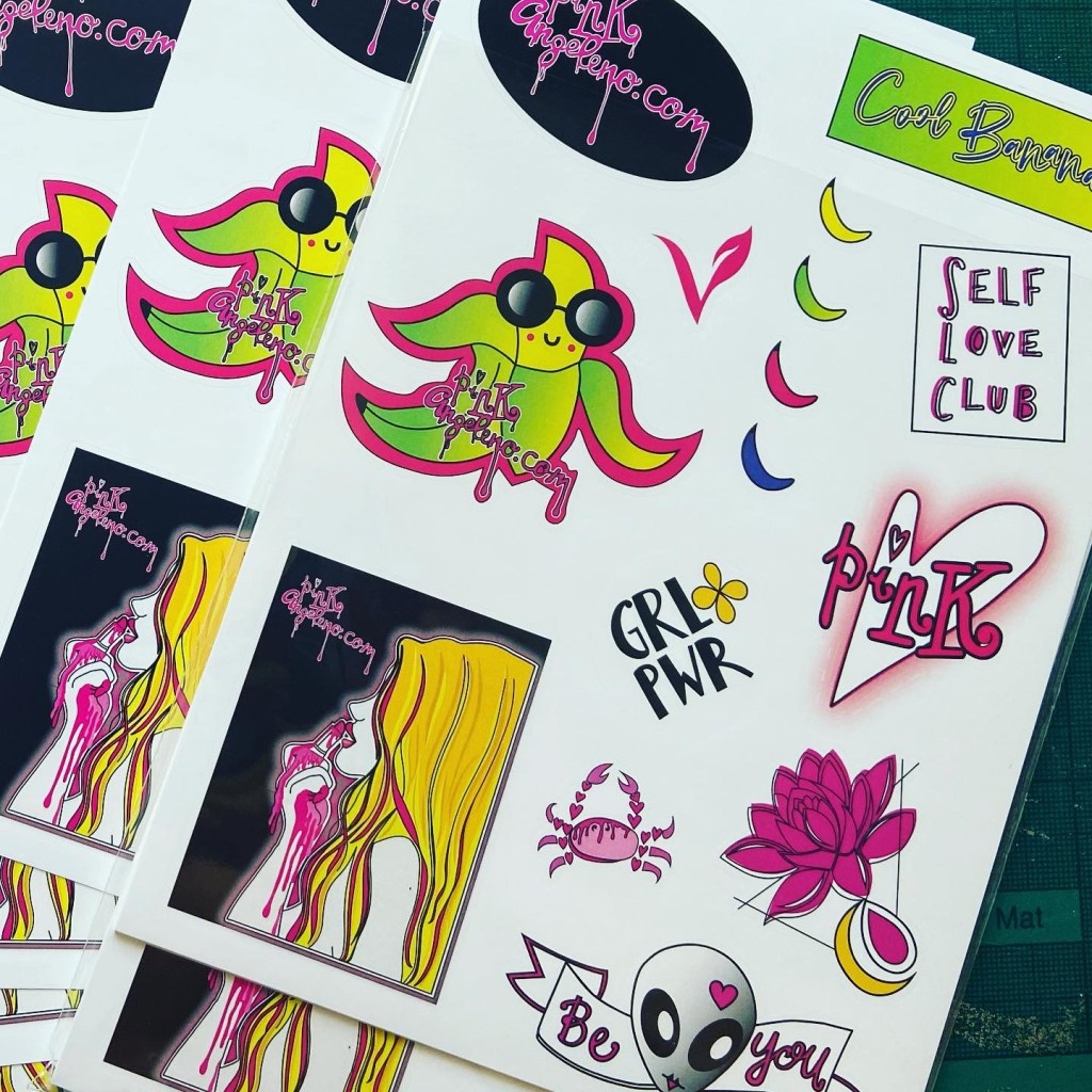
The stickers were not cheap! – but hopefully they were worth it!
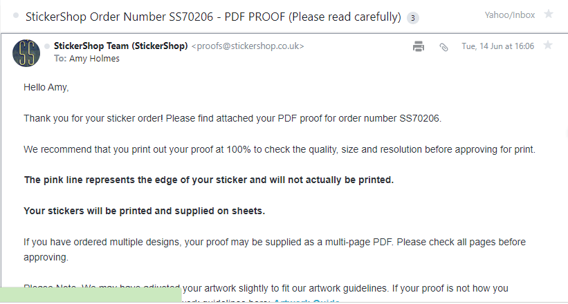
Before they began printing I had to approve the proofs they sent.. all was fine!
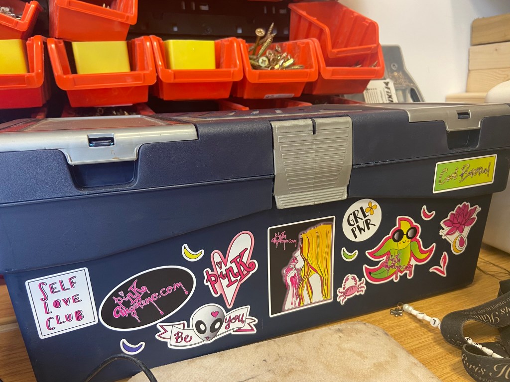
When they arrived I was very pleased!
They also looked amazing when I put some on my work toolbox!
Paginating pages
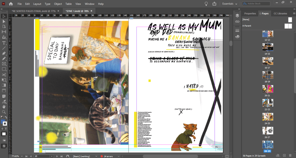
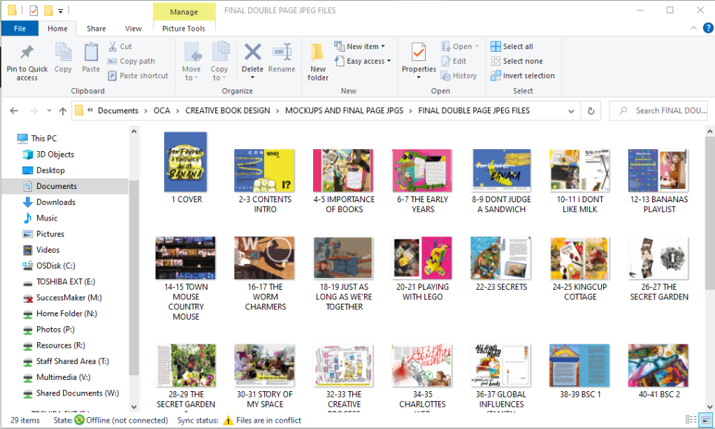
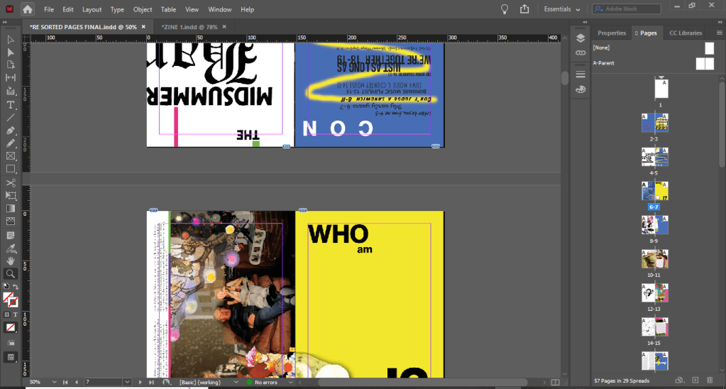
When I had finished designing my zine in InDesign I had a file full of double page spreads that were not correctly paginated (see below)
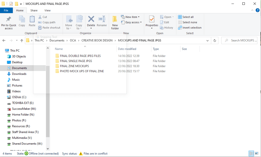
I exported each single page and each double page spread into separate folders so that I could import them easily into a new document (see below!)
I then created a new document to import the jpegs onto their correct pages. This was simple because whenever I altered and changed anything on the original document it linked to the new document:
Paginating pages should have been easy because InDesign has a built in feature that allows you to print books. InDesign automatically paginates the pages for you! – Also as well as this I completed the exercise previously which shows you how to arrange pages! Which I did once again:
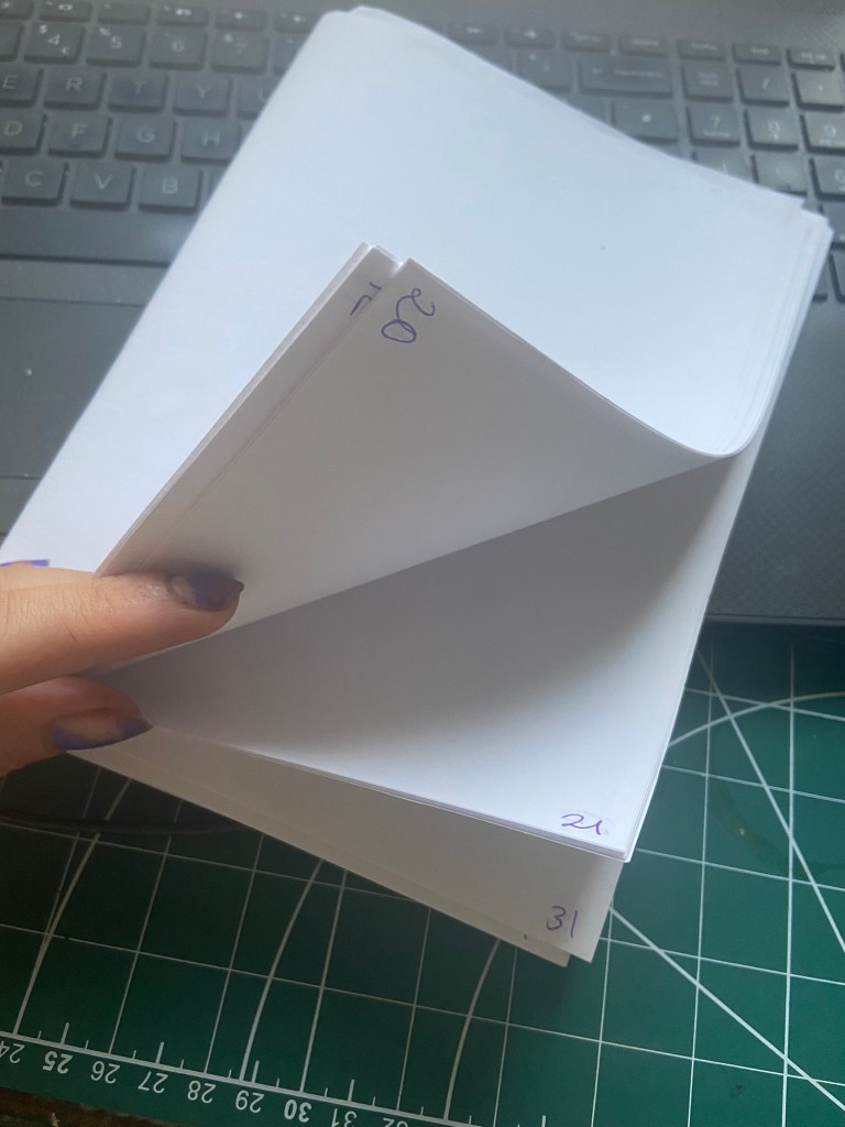
In my case though the process was an absolute nightmare! I was printing (sneakily!) to the really nice quality laser colour printer at work and for some reason when you print 2 sided to it it flips the pages upside down! *eyeroll* this meant that I had to paginate the pages and then flip some upside down too so that when they were printed they would print the correct way! I am sure there must be a much simpler solution to this!- this is something perhaps I need to study into more depth when I have more time but I must have spent about 3 days sweating like a crazy woman stood at the printer trying to get it right!
Upside down!
Proofing
After all the hard work, sweat and almost tears (from the paginating!) that had gone into my zine I wanted to make sure that when I printed it out there were minimal mistakes in it. I proof printed it in completely the wrong (and costly!!) way to be honest, I should have printed it out in black and white but I wanted to see what the colour quality was like and I felt like I could properly see what needed changing by printing it out as it should be. I printed a few proofs with alterations before the final finished version!
I changed page numbers, typos, changed print borders, moved things away from the bleed areas.. changed the size of type so it was legible and readable, changed the quality of jpegs and images.. I found a lot of changes that I then had to go back and correct!
Printing and binding my zine
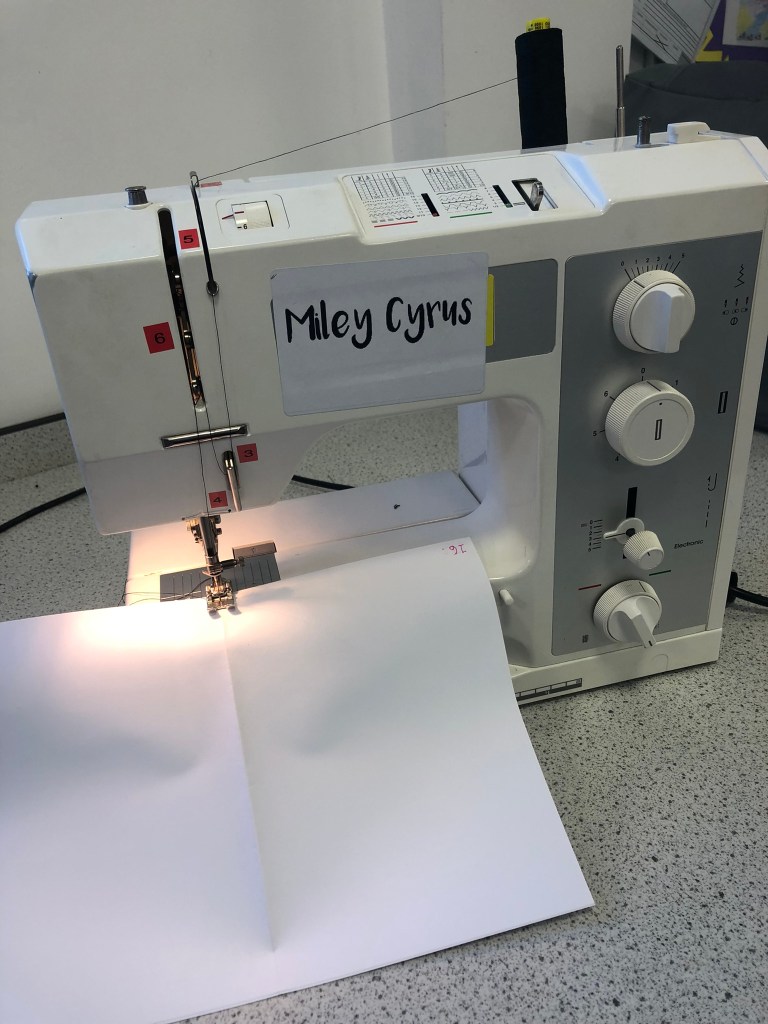
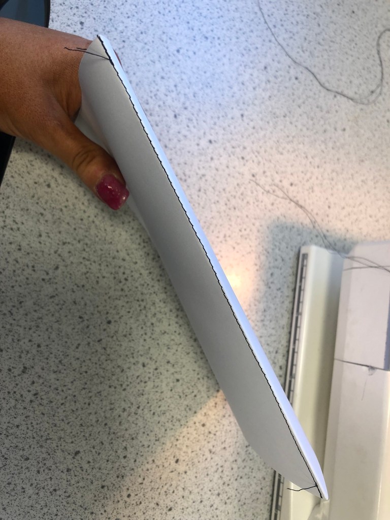
When my zine was proof read and all correct I then printed a few copies out! This is where I defied the brief slightly; I totally forgot that the brief asked of me to simple staple my zine together.. I guess this is where I haven’t met the brief! However, the way I bound my publication together is still acceptable and professional and is still one of the ways I researched in my previous exercises. I work in DT within education and have access to sewing machines so I machine straight line stitched down the spine of my zines. It is a very secure method and it looks professional!
The machine stitched spines
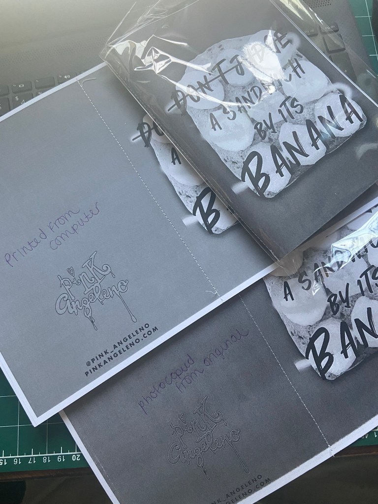
I then also experimented with printing vs photocopying. I found that printing in colour and black and white directly from the file on the computer was fine. The quality was not compromised in any way. However, when I photocopied a printed colour copy the quality was definitely not as good!- this would be the way that the zine would be cheaply made and distributed too.
Below you can see the difference between the two by looking at the logo quality on the back:
The way I have digitally made my zine so high quality would be ideal for being professionally printed and for being sold in a bookshop. For anything that needs to be made cheaply and distributed quickly in black and white would need to be much more hand made.
Final zine mock ups and photographs!
The video of my zine!
The video of my zine took me a while to accomplish as well! I knew I wanted to do a video to show it properly in real life! I got Chris to film me leafing through the pages on my desk and then the idea was to take it into Instagram on my @Pink_Angeleno account and try to add audio and turn it into a reel!
This didn’t work as the music I wanted use (Ealot-“It’s time”) wasn’t one of the songs that I could choose on Instagram. I would need to import my video elsewhere and then import the audio in separate. However, I was able to speed up the video a lot using Instagram and then resave the video back to my phone to import elsewhere. Working with video is something I have never had any experience in; I would like to improve in this area!
I then found in Creative cloud Adobe Premiere Rush and this worked a treat! I bought the music off Amazon for 79p and was able to then save it to my computer and import it over to place over the top of my video. Chris calls the music I have chosen “elevator music” but I just love the happy vibes it gives off! It is perfect music for time lapses etc!..
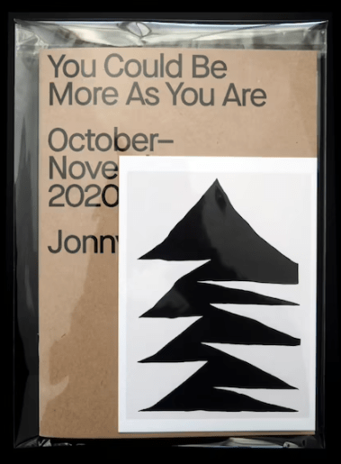
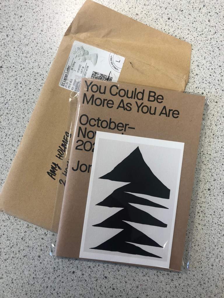
A photograph of the final finished zine!
Distributing my zine (or at least attempting to!)
As I mentioned above, my zine is quite high quality so would be better to be professionally printed and distributed in bookshops and magazine shops (such as Magazine Heaven).
I did think I would contact a zine group in Lincoln which is one of my nearest cities and see if they could direct me as to where to send my zines! I was thinking it would be great publicity for my Instagram page to just get my zine out there and get feedback and public attention!
The zine group I contacted consisted of 27 members, which to be honest I don’t know what I was expecting from such a small group at all but I was hoping they would be helpful than what they were!!
They all seem to be happy to stay a small group and happy to communicate about meeting up down forums and discord but not particularly helpful in advising me – a newbie ziner who actually wanted some help! *eyeroll…*
This is what I posted in their group and no-one actually responded to me:
There was then a lad who basically copied what I had done and advertised his cool, punk, music, underground zine and asked again for people to go and download a copy from his webpage… (this is where I need to become more geeky and learn how to use websites more!!)
Not being bitter or anything (obviously! ;p), I then deleted my post and left their group.
All I can conclude is that I don’t like beans and that they obviously don’t like banana sandwiches?! ;p
So with much thanks to Beans and Zines, I am still looking for other places and people to help me promote my work!
I might just take some of my stickers and stick them around towns and cities to bring traffic to my Instagram page!
Also, we are renovating our house at the moment and adding a wall into a bedroom to make 2 bedrooms. It is an old 1600s cottage so it already has a lot of history but Chris came up with the idea to bury one of our wedding invites with a photograph of us into the plasterboard wall and then maybe one day when we are long gone someone will find it and know who lived here and the date! I might bury one of my zines in there too! Can you imagine in 100 years when someone knocks the wall down and finds my zine and gets to read all of my stories?! Amazing!! – Stories will live on always!
Conclusion
I really enjoyed this assignment! Having come into this with absolutely no idea whatsoever of what a zine was I can now honestly say that if I had free time on my hands I would go and design some more and join some zine fests! The only thing I found difficult was the paginating of the pages! This took a lot of my time trying to get my head around and sort out!
I would like to think I have most of the points in the brief and met them in creative ways. I have created a much lengthier zine than the 16 pages that was asked of me; but I really enjoyed this assignment and I really wanted to get as many childhood books that inspired me in there as possible to give a better understanding about my interests and my history with literature so far! I have tried to use designs and research from the previous exercises too to include in my zine; such as the main front cover and the “Don’t judge a sandwich by its Banana” article which coincide with the Don’t judge a book by its cover exercise. I have global influences in there, musical influences from book titles and my whole zine is basically a journey from my childhood to now through the books that have influenced, inspired and helped me to grow and develop into the creative adult I am today. I have introduced myself in there through the form of personal letters, memories, photographs and through my designs themselves.
Although my zine is entirely digital, I have tried to add elements of other different mixed media such as Ink drawing, collage, paints, photo manipulation, handwriting, photographs, flat lay photography and by using physical items such as the bookmarks and the letter inside to open. I have used the traditional cut and paste style but modernized it by bringing it into digital.
I have looked into the future of the book and presented an argument across about how I feel books are so much more than just reading books.. they are objects of craftmanship, beauty, information.. they hold memories, they are heirlooms and artefacts to pass through the generations and in their own rights tell their own stories about their owners and previous owners.
Overall I am very proud of my work that I have completed and that of my finished zine and shall now continue to go on a search for where to leave a few copies for some feedback and to hopefully achieve what I strongly argued in my zine; sharing information through the form of physical pages but not only that, sharing photographs and memories for many more years to come!
I might have jumped the gun and covered most of this exercise in my previous post!
*”Visually explore how your artwork sits within the format of your A5 pamphlet – how it frames the artwork, how different pages sit together or how you might begin a narrative”
I created 2 front covers to choose from (as I pre-read the course material and knew that I would need to relate it all back to Assignment 1 and making my zine!) and then I mocked them up onto a zine mockup that I purchased from a designer on Behance:
I then mocked the covers I designed onto the zine front cover:
As it turns out my mock up zine was well received on Instagram when I posted it to my design page:
An Instagram page called “DeZiners” messaged me to ask if they could feature my work on their page! They also asked me if I had anymore content for them to show but I told them that great things are in progress!… *cue Assignment 1! They told me to be in touch when I have more content for them to publish to their gram.
I could expand on this though!… I could show what this could potentially look like as a double page spread in a zine!…
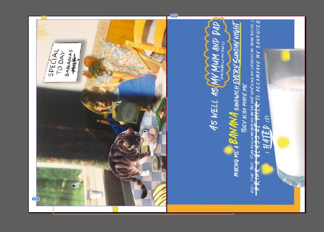
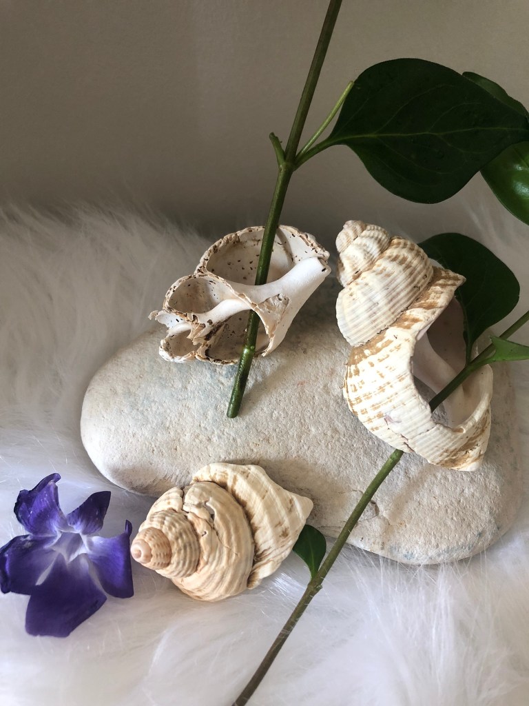
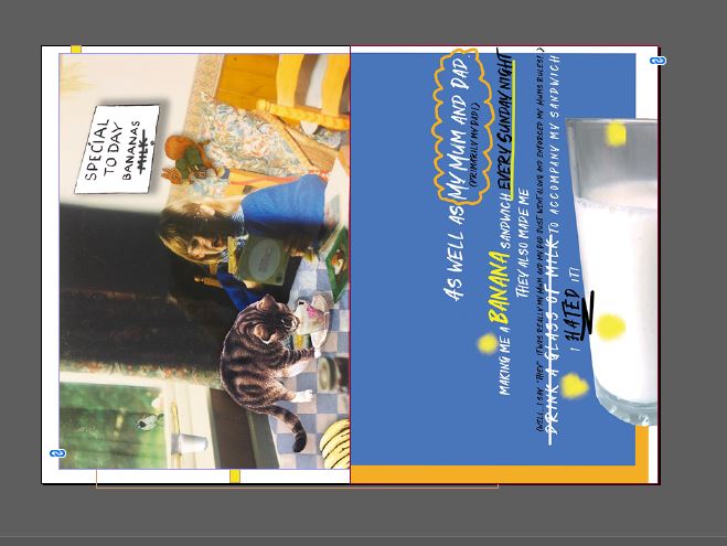
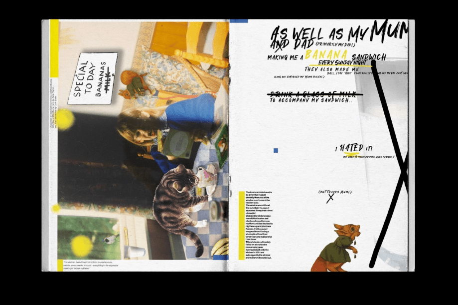
As well as My Mum and Dad, (primarily my Dad!) making me a banana sandwich every Sunday night (as I explained in my previous post!) they also made me (well, I say “they” it was really my Mum and my Dad just went along and enforced my Mums rules!..) drink a glass of milk to accompany my sandwich.. I HATED it! – I still hate pure milk – my fiancé drinks a glass of milk and I honestly think he is a weirdo! ;p anyway, I was a skinny, anaemic child and this was my Mums way of getting calcium and “goodness” into me! Thanks Mum! ;p BUT I could collaborate this as an extra page next to the design I have just designed to make it a double page spread!
For this I need to find a stock photograph of a glass of milk.. or better yet ask my weird fiancé if he fancies a glass of milk at 21:09 hours!… to which he said yes! ;D………..
… and I mentioned the weird light that my fiance uses to access our loft in my previous post that I use to take all my “professional” blog photos…. see below! ;D
I also remembered and found a hugely embarrassing photo of myself at the kitchen table having my lunch or supper or something… I had new glasses and I remember I was reading to try them out! – funny because I’ve never needed or worn glasses since!? Anyway, the photo was from the same time era as the banana sandwiches and I thought I could try and include that somehow in the designs! – I am also reading “Saturday on Blackberry Farm” in the photo which I wrote about in exercise 1!
I took the photo and collaged into it a collection of images taken from some of my childhood books which reference bananas and milk; “Saturday on Blackberry Farm” (which references Milk and Bananas) and “Cats know best” which relates to milk.
I then exported it as a JPEG to import into my InDesign layout:
In this piece I have tried to make it look like a digital “cut and paste”. It is like I am reading at the table and being totally consumed by the book and letting my imagination go wild, It is like I am imagining that these animals are real. The animals that appear at the table are all from books I read as a child and reviewed in my first exercise.
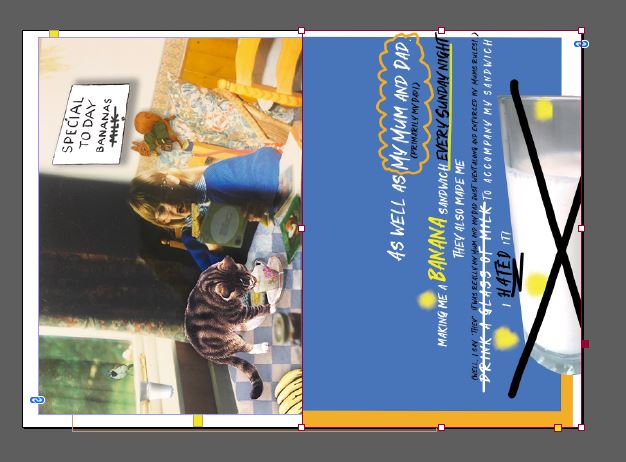
I then decided to do some practice layouts (below); I have included the glass of milk to create a new narrative but these layouts at the moment make no sense really, they are purely just to mess around with different layouts and placement of objects and text within the layout.
I like layout 1 and 3 best. It has been at least half a year since I last did some layout design and it took me a while to get back into it. I created the bottom 3 first of all and by the time it came to designing the top 3 I had relaxed, I wasn’t overthinking it too much and I loosened up my creative process.
I then chose the layouts from above that I liked the best and expanded on my double page spreads to try and create more of a narrative and so that they made sense to actually read and look at.
I wanted to do this; 1) To show how my design fits to a layout, how I will present my work and to create a narrative 2) to use in my zine and 3) to send to the DeZiners to post on their Instagram page and to get recognition for my designs!
(** DeZiners did not contact me back or use my spread for their Instagram… *eyeroll!**)
The narrative for the cover of the zine is “Don’t judge a book by its cover” and I have explored that through the use of my food combination- Banana sandwich; In a few pages I went into more depth with this subject explaining what significance it has to me personally and to link it to the subject of books and in particular my childhood books.
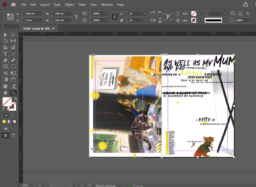
I am massively influenced by the work of David Carson and Chris Ashworth particularly the “grunge style” typographic work that they produced for Ray Gun magazine in the 90s, I decided to try and use some of that influence in my layout.
The screenshots below are what I started with. These developed significantly later on, but my initial ideas for these to start with were to use colours that link to the title cover page but be playful in the placement, style and size of the typography. The end screenshot showed that I loosened up my approach after a few layouts but also made me feel that I wasn’t “grungy” enough in my approach. I didn’t feel that there was enough contrast either in the colours used and the weights and size of my typography. The bright colours all clashed together and made it hard to distinguish between the 2 pages; they both blend together.
What I ended creating next is what I went with in my final layout;
The colours are toned down but they still marry up with the colours used on the title page
There is much more negative space, the layout has room to breathe around the outside
The “rule of 3” is present in my design (There are 3 crosses on the right hand page which have relevance to the design but also lead the eye down the design. There are also coloured blocks; 3 on each side to lead the eye down and across the design but also to bring an element of colour from the title page)
It has a Carson/Ashworth/Ray Gun influence to it
There are influences from my childhood books in there which also relate to the theme of “milk”
It is personal to me; Zines are personal, artistic pieces of expression
It uses a mixture of my own photography and digital collages from other sources
It has a narrative; it tells the story of the saying “Don’t judge a book by its cover” which ties in with my own personal story behind the Banana sandwich and my childhood.
Production
For Assignment 1 I will be creating my very own zine with the brief strictly specifying that it should be A5, 16 pages, simple folded and stapled.
For the production I need to consider:
1. How to print or reproduce my content
2. what sort of paper to use
3. How to bind it (although the brief does specify staples)
4. How many copies I will create.
Below I shall carry out some research into the best methods to achieve the above points.
Printing and reproducing:
There are 4 possible ways to print my zine:
Home inkjet printing
Photocopying (from a black and white photocopier)
Laser printing (from a bigger industrial office printer)
Commercial printing (sending designs to a professional printers)
How my zine is printed depends on whether it is a “short run” or not (small amount of copies produced). My zine will be a short run because really I only need to create one zine for the purpose of my course and to be marked and to photograph for my blog (unless I create an absolute masterpiece and attempt an experiment to see how well it would do if I tried to sell it on Etsy!). This gives me options; all of the above except for commercial printing; this would only be a good option if I was printing vast copies of the zine.
The other thing to take into account when printing is how many colours I will be using in my zine. If I were to use commercial printing, the more colours that you use in your designs the more it would cost. To try and keep printing costs down to a minimum I would need to be using a maximum of 4 colours to keep costs low. With commercial printing the more copies you print the cheaper it would be.
My options for my DIY zine are home inkjet printing, photocopying or printing from a laser printer (sneakily at work!) The cheapest of them options being to photocopy but then that stops the use of colour in my zine. Home inkjet printing can be pricey; my Canon printer costs £45 for both B&W and colour inks and it really does not go very far!- it is also a slow method of printing. Inkjet printers are a better option for less frequent printing or for only a few pages at a time. Inkjet printers have more tonal value and are better at blending colours but I much prefer using the laser printer when I can even though inkjet printers are the better choice for artists and designers for this reason! The laser printer prints out really high quality and glossy pages whereas I mostly get a dull, “liney” look from my inkjet. Laser printers also hold much more paper in their trays which allows the job to be quicker not having to keep refilling up. They have a high printing capacity.
If I were to make a handmade zine completely from pen or pencil or some other mixed media medium I could scan the pages in or take photographs and then make them into a PDF to print in the same way as I would if I were to design it all in digital and then print accordingly. This would be an option if we are moving with the future and creating digital zines!
It all depends on the images I am to use in my zine too. If I was photocopying the pages, the use of photographs in my zine would be poor quality. If I was producing a Punk inspired, newspaper style zine, photocopying would be exactly what I would need. There is always the option to photocopy onto coloured paper or use different papers for the inside of the zine to add colour in that way. The photocopier would be great for the first test piece prototype; just to print out and make sure that the pages match and the layout, borders and bleed are all as they are intended to be.
There is also the option to just make a complete handmade zine!- The thing is with choosing this option is that it would not be easy to reproduce. There would never be one the same.
I also explored in my previous post about printing my zine in b&w… this is how it can be done:
Paper:
The paper that is used in a zine would make a difference to me as to whether I wanted to pick a copy up and read it or not! From my research the best zines I have looked at have different papers for the “guts” (the inside pages). I own magazines that use different textured weighted paper and it always adds interest to the publication. The pages could use different coloured paper, textured paper or materials. The choice might be to have regular paper on the inside and then a heavier weight of paper for the front and back covers. For a photographic zine glossy, thick paper would want to be used for the guts and for the covers. There are different weights of paper too; again, photographic zines might require a more thicker, heavier, glossier option whereas for mostly text zines the use of a thinner, lighter paper might work well.
Zines are DIY and the cheaper option would be to just use white, copier paper throughout to keep costs low and also so that it can be printed by any means. The thickness of the paper that I decide to use will also depend on what printer I use to print my zine out. Some printers work better with different textured/weighted paper than others.
I also explored in my previous post about printing my zine in b&w but using coloured paper… this is how it can be done:
Binding:
I could look into all kinds of fancy binding for my zine but the brief specifies that it will be based on a simple fanzine publication with simple binding. My choices are what I explored and wrote about in my previous exercise:
Staples
machine stitching
hand stitching (saddle stitch)
I would choose staples as an option or the straight machine stitch just because they are quick and easy to do and easily accessible. However, to people who don’t have access to a sewing machine this option might be the last option to choose! The hand “saddle” stitch is easy to do although it would take longer to complete this method on a lot of copies! If a decorative look is what is being desired though, this would be a good option to choose as you can change the colour of thread, add beading and sequins and make it a piece of art!
Copies –
I shall only need to create 1 perfect zine for the means of my study and to be assessed! – of course I shall be printing some test copies out to make sure that everything prints correctly- but as I wrote previously, I might decide to reproduce a few more copies and try my luck to see if I could sell any online!
Browse the American based Smithsonian Libraries’ Artist Book archive to identify books that you find interesting or questions the notion of the book in some way. https://library.si.edu/collection/artists-books
Explore fanzines in more depth by reading Teal Trigg’s chapter Definitions and early days (pages 6–43) from her book Fanzines: A do-it-yourself revolution (2010).
Document visual examples of work you find interesting with annotations in your learning log. You’ll be using some of this research in your first assignment.
My Findings:
When I first saw this research point and thought about artists books and fanzines I was thinking inside the box that I would be researching roughly put together booklets in booklet form. What I have found though is that a lot of the artists books and fan zines are sensory and use a lot of creative mediums and mixed media such as:
Hand drawn art, Typography, Printmaking, screen printing, Lino printing, photography, poetry, experimental narratives, Graphic Design, pop-up book design, laser cutting, 3D/mechanisms, Textiles (silk printing, Batik), tapes/washi tapes, Risograph and zines made out of cardboard packaging and even vinyl records!
I also watched the videos as to how they are printed out, what medium they are printed on and how they are put together. I thought that most zines would be created and then all the final pages be photocopied to be printed off onto paper but the ones I watched in the videos were made all kinds of ways. There was one on there that used plastic CD sleeves sewn together to create the pages of their zine.
It showed on the video them using a sewing machine to stitch their vines together down the middle of the book inside or using a long armed stapler. (Staples though for a big production run could be quite costly so I understand why they would stitch the pages together). Stitching pages together is an art form in itself; I remember when I was at college we had a lesson in book binding- it was 1) to try and open our creative minds to making a unique portfolio of our own work at the time! (pre-digital era!) and 2) for a book we had to create about Morocco! The way we bound the spine was by hand with a needle and thread and then added a rigid spine over the top to further secure it.
I don’t have a close up of the stitching I did on this book of mine at the time but I do have a couple of photos for it just for a laugh!… (I just hope my work has improved from them days!! :D)
DIGITAL CAMERADIGITAL CAMERA
The zine community is a lot bigger than I thought too; the DIY zine movement consists of zine readings, zine workshops and zine fests. I watched some YouTube videos which featured a few zine fests and workshops where students collaborated and created their own zines together. There is also reading events too mainly held at bookshops where people show up to promote and read out pages from their zines for people to hear.
I was interested as to whether there was any Zine fests in the UK and there is a main one in London but there is also one near me in Lincoln which is predicted to happen in February 2022 providing on the Covid restrictions. It would be interesting to attend this potentially to get some research for this course.
From watching the videos on YouTube I was able to pick some names out of people with blogs to potentially look into: Jessicka Addams who is in a punk band and writes a zine called “After grrl” which explores feminist issues. Then there is Kathleen Hanna a member of Bikini Kill; the American punk rock band formed in Olympia, Washington, in October 1990. The group consists of singer and songwriter Kathleen Hanna, guitarist Billy Karren, bassist Kathi Wilcox, and drummer Tobi Vail. The band pioneered the riot grrrl movement, with radical feminist lyrics and fiery performances. Their music is characteristically abrasive and hardcore-influenced.
I also watched some YouTube videos by Esther Watson and Mark Todd who are a dynamic duo who teach zine making in group sessions and who have also written a book called “Whatcha Mean, What’s a Zine?: The Art of Making Zines and Mini Comics”. There was also a lady called Taylor Yates who created a zine called Selfish but when I look her up on Google I don’t think this zine is still in existence. I found some other artists and their zines too: dirtyliketheweeds.com (Doodledaze), @monsteryandme, @iam_aureliajiang and “love is strange” by Elize Strydom.
I also wanted to research typographic zines too as Typography is an area of interest of mine and also because one of my favourite books is a zine made by an influential new designer called Roy Cranston; he designed a poster a day for a year a couple of years ago and from that he became recognised as a designer to look out for! He designed limited copies of a zine featuring his best posters from the year and a bit of information about them. It is one of my favourite books to look at when I need inspiration:
I then decided to go onto Pinterest and see what I could find on there. On there I also found some typographical zines very similar to Roy Cranston’s by an artist called Sophia Clausse:
I really like the experimental style of these designs.
I created a new board called “Artists books and zines” and started finding zines that stood out to me and grabbed my attention.
Etsy Research:
11/01/2022 – I also had a look on Etsy to see if I could browse and purchase a couple of zines to read, stick in my learning log and to give me a feel for what they are all about and what mediums and materials the artists use to produce them. I found 2 very different ones that caught my eye and which also got good reviews from Etsy customers. One is called Charm by a girl called Charlotte with her small company Zines by Charm:
“I’m so ugly, make me pretty” issue 004 of charm zine is about how the media affects self image, especially in young women. 22 pages of submitted art, poetry, playlists and more!“
I am guessing that the artist Charlotte is quite a young, influenced girl and she is writing her zine as a personal piece about the insecurities around growing up in modern day society that is so led by social media, pop culture, celebrities and appearances. As a woman now in my mid-thirties, I know what it was like to grow up without having social media, growing up as a teenager I never had self image issues. It is a subject that has been brought to my attention though in recent years because of working within a secondary school and dealing with the pressures and insecurities that teenagers go through growing up today. I think I would find it interesting to read further a more creative approach to this subject. Charlotte has made the cover in a Punk style (it also reminds me of the Burn Book out of the Mean Girls film). I can see that she has printed it onto glossy printer paper and the massive border on the front cover to me suggests she has made her zine without the use of design software and all handmade and scanned in.
I bought a second zine from an artist called Jonathan, his zine is very different to the one that I purchased from Charlotte:
Jonathans zines seem to be influenced by Graphic Design and Abstract Art. The cover of the zine attracted my attention and intrigued me as to what the zine may be all about with the catchy, playful title. Again, the zine had positive reviews from his Etsy customers. I am intrigued by how he has put his zine together and by how it is presented in its plastic protective cover.
I shall report back further when the zines arrive in the post and when I have properly read them.
‘You Could Be More As You Are’ is an A5 zine that documents my work output during October & November 2020.“
14/01/2022– An update on Jonathans zine which arrived in the post yesterday! – My initial thoughts of the zine were that it is very professional, well thought out and a lot of time and pride has been taken in it. It is not like a typical fan zine in the fact it is not of a “cut and paste” approach. It has all been meticulously created in digital in design software. It is by far a more sophisticated zine. The handwritten thank you note and free promotional postcard are a nice finishing touch to the order! The paper that was used for the inside pages (the guts) gives the zine a luxurious, modern feel and the front cover which is a heavy card holds the zine together well and compliments the inside pages. I particularly like how he has written on the back cover of the zine what his zine is all about, the price and even the attention to detail to share what card he is printing on; Nettuno is an Italian luxurious, textured card. I feel like I would want to create a more luxurious zine than one that just uses copier paper.
As I open the inside of the zine I am greeted by the artists signature and the print number that my zine is, mine is 25 of a limited run of 40. There is a short blurb explaining what the zine is about again and explaining what mediums he used in his work and what it represents to him. I would have liked to have seen a bit more writing and notes in his zine just to talk through certain pieces that meant the most to him maybe and what the thought process was behind certain pieces. His work comes across very abstract and he leaves it very much to the readers discretion as to what they interpret the work to be and represent; I have struggled to understand it. Jonathans zine is all photographs of his work but there are also actual photographs which he has taken around his house or studio.
It has been helpful to see Jonathans zine, I have taken inspiration from his signature, the print run number, mentioning what medium he is printing on, the plastic cover to protect the zine, the luxurious paper he uses and the free promotional items.
I shall wait now for Charlottes zine to arrive..
19/01/2022 – Charlottes Zine arrived!
I might have to admit that I massively underestimated Charlotte and her zine! – Don’t judge a book…!
Her zine was actually the most helpful to look at and to draw inspiration from. There is a lot of creativity, love and care been put into this zine and I love that is is all from the “cut n paste” style. From having a look at her Instagram page she has a lot of followers who follow the zine and help contribute to it (she calls for contributors for her zine by posting ads on Instagram) this zine features a lot of contributed pieces from fellow artists about issues that relate to the zine subject (female self image) related posts.
This zine differs from the one that Jonathan designed and made because it contains all kinds of creative media. There is as much writing in this piece as what there is imagery. It also has a contents page, issue number and links to her social media which helped me to find her, see all of her other stuff and find other zines that relate to her similar work.
I love how all of her zine is handmade with collages, stickers, personal handwriting, photographs, washi tape (which she sealed the envelope with as well actually!) and then all professionally printed and staple finished. I like the finishing touch of her also including a free sticker and a business card to promote herself further.
Out of all the zines I have purchased I think Charlottes is my favourite.
Magazine Heaven – zines
As well as Etsy I decided any excuse to go and have a look in Magazine Heaven at Rushden Lakes was alright with me! As I have written in previous posts for various assignments I love looking around Magazine Heaven.. there is just so much variety! There is a magazine for just about everything! I looked on their website before I went to see if they sold any zines.. and they did!
Me and my fiance were scouring the shelves for the ones I found and taking sneaky pics of them to document on my blog! I did purchase a few of the ones that looked interesting though to keep and use for reference when designing my own zine.
Here are some close up pages of the ones we found:
The ones I decided to purchase were “Scorchin” and “Bright“.
Scorchin is a nostalgic zine reflecting on 00s and 90s trends.. as a child of the 90s I decided to purchase this to go back into time and relive my youth:
The idea for Scorchin is a good idea but it’s not quite hit the spot for me! – I feel like this magazine has been designed and written by people born in the early 00s and growing up in the late 00s because the content inside is reflective of the 90s and 00s era but not quite how I remember it!- There is a lot of emphasis on Bratz dolls; these were popular in the late 00s by the likes of my younger sister who was a young child for the majority of the 00s! There is a lot of fun things inside this magazine but a lot that I can’t relate to. I like the idea of the free poster and stickers though – again, it is based upon Bratz dolls so is completely irrelevant to me – but it adds a nice touch to the zine
The look of the zine does remind me of an early colour printed word processed document, designed using word art and the funky backgrounds etc! It does have an aged, retro feel to it! The typefaces used are very computerised which is nostalgic to y2k. The zine is glossy and overall professionally put together. To be sold in a high street shop it must be quite popular and have some money behind it to be able to have it professionally printed.
The next zine I bought was called Bright. I brought Bright because it is an animal friendly vegan publication, I am vegetarian but strongly agree with animal rights so decided to give it a go!
I bought 3 versions of this zine; the first 2 copies were earlier publications. The first one being matte paper throughout and a cardboard cover. The second copy was a bit more advanced and used glossy paper inside and the most recent copy I bought had more or less become a small book. It had a spine and was professionally printed and bound; this shows that the publication is taken well by the general public, well enough for there to be more money spent on the publications on improving them and making them better. There is a section within the publication where readers send in their letters and collage artwork; this reminds me of the cut and paste approach.
All in all it was a nice excuse to use “research” to have an afternoon out!
The brief also asked that we browse the American based Smithsonian Libraries’ Artist book archive to identify books that we find interesting or question the notion of the typical book…
I am not a fan of the website, unless you know specifically what you are searching for you have to browse absolutely everything! There are long lists in alphabetical order of artists but not necessarily photos of their work next to it which involves having to click on every artist to get a glimpse of their work. I much preferred to look at the zines I found online as reference instead.
From first glance at the slideshow on the website (which was a bit more helpful showing artists work!) the work that I saw was very interactive. It makes us question the traditional book; can a book merely be a metaphorical window to a story. There was a lot of 3D books creations! Some of the designs were pretty much a box book filled with items (a collection inside a collection!) There are concertina books, pop-up books, books in the form of a passport and even a book that was designed and made into an old camera- you have to look through the lens to see the content on the inside.
The brief states that I must find and develop the ideas that “have legs”, I had never heard of this phrase before but I quite liked it! The idea that a design has the potential to “walk” and grow!
The idea that I liked the most from this page of sketches was the ice-cream and fries. The idea I had of unusual food combos that shouldn’t work together but do and that people might grin their nose up without first trying was inspired by “Don’t judge a book by its cover”. The idea that someone would look at the book cover with the ice-cream and fries photo/drawing/digital vector art on the front and immediately have an opinion.. There would be 2 types of people to form an opinion; the first person that is intrigued as to why there is ice-cream and fries on the front; intrigued enough to open their minds to look and read further.. or the second person who might instantly decide from appearances and first glance that ice-cream and fries is weird/yuck/unappealing and why would they want to read a book about ice-cream and fries?! The ice-cream and fries is supposed to teach the lesson of “don’t judge a book” with one image. I decided to change the saying to “Don’t judge a fry by its Ice-cream”.
I researched on Google and Pinterest to see if I could find some images that might inspire my designs:
I also decided to conduct my own survey to see if anyone else had any good ideas for weird food combos that work.. To be honest the answers that came back were not particularly imaginative or helpful (particularly the joke drug reference!…) Tuna, Cheese and Mayo ?? I thought that was just normal? I don’t think people truly grasped what I was trying to ask!
I was that certain on my Ice-cream and fries idea that I went out and bought a sundae glass especially to stage my own photos for it:
BUT!..
I then read further into my course book and read the brief for Assignment 1: the brief specifies that I need to “creatively respond” to my chosen saying (Don’t judge a book by its cover) and to use the fanzine to present my ideas and whether any of the text or ideas can feed into my cover designs. I know that I want to make my zine personal to me and that everything I am putting in it will relate to me. I knew that Ice-cream and fries doesn’t.. I have never tried the combo and I HATE ice-cream! The next best alternative idea from my sketches that follows the same theme would be the banana sandwich; this does relate back to me because when I was younger (primary school – early secondary) my Mum or Dad (mostly my Dad though!) used to make me a banana sandwich every Sunday night for my tea (for some reason my Dad always seemed the best at mashing up the bananas!). My Mum used to cook meals for us all every night of the week and this was the one night that her and my Dad used to sit down just the two of them and have an Indian supermarket ready meal at the table in front of the TV. Me and my sister used to have this quick and easy tea before they sat down for their tea and then during their time we would get ready for school the next day. I still have mashed banana on toast even to this day. As before I decided to change the saying to: “Don’t judge a sandwich by its Banana”.
I decided to again have a look on Google and Pinterest and see what I could find:
I particularly liked the hot Pink with the yellow of the banana and the blue background with the yellow banana. If I was to use this potential design idea to create an actual cover, I could potentially use it as the cover for my zine. It relates to the course material, it relates back to me and it would definitely hopefully intrigue people (well, creative like minded people hopefully!) to pick up the zine and investigate further! It is telling people who don’t know me or my zine to not judge a book (or me!) by its cover.
With this new idea in mind I then went on to sketch some further developed ideas:
From these developed ideas I had the design idea to create a banana sandwich for the cover; the question now though was how I created this design… should it be a photograph? drawing? illustration? Vector drawing or abstract piece? What medium do I create the design out of?
I really liked this style of drawing that I found, I had the idea to try and recreate something similar to this for my design:
I needed to also think about the typography I would use; I found some hand lettering on Google- “Banana sandwich” and I really liked the look of it. The idea that I had in my head for the typography was something bold and modern but that looks like its been written or painted onto the cover.
I went onto Fontspace website to see if there were any free typefaces which I could download. I found quite a few that I liked:
I then again selected the best ones from the list which left me with the ones below:
I love the curls on Barcelona but I am drawn to the style of Macquire.
I did some rough mock-up covers in Photoshop of the typefaces I found just to see how they could look on a front cover. I can see Macquire being the strongest choice.
To design a cover with a banana sandwich as the main subject, I had to find some stock photos of a Banana sandwich or make a Banana sandwich myself and photograph it. I searched the internet for stock photos but could not find any- I then decided to go down the route of photographing my own!
These are the photographs I took:
I took a few photos at different angles and different poses – I made a full on banana sandwich, a slice of bread with slices of banana, a slice of bread with mashed up banana (how it is supposed to be! ;), a full photo of a whole, skin-on banana and then some final photos of half a banana whole and the other half mashed up. These are all the angles and poses that appear in my design ideas.
I had 2 design ideas that I liked the most and that “had legs” which I decided to develop further:
I then went into Photoshop and started work on developing the ideas!
What I ended up designing I was fairly pleased with. I like the use of bright colours; the Blue really makes everything “pop“. I wanted to keep the designs simplistic, bold and fun. I had to alter and manipulate the colours of the banana sandwich because the original photograph was very dull (I took the photo at night time and attempted to use my fiancés large standing flashlight that he uses to enter our loft!) and also because the sandwich had white tones in it which I needed to remove because it made it look like an egg sandwich! I did the same with the banana photograph; I wanted it to be a really bright and vibrant banana!
These are the 2 covers I ended up with:
Design #1Design #2
I then decided to mock them up onto a zine mockup to see how they would look.
I then decided to mock them up in b&w to see what they would look like if I had to use a photocopier to print them:
and again to see what they would look like if I printed in b&w but on yellow paper:
Critiquing my designs
My worries about my designs are the line across “Don’t judge” – what I was trying to emphasise here was “Don’t” which should not be done so it needs a line through it, however it could be misconstrued as to judge the sandwich by its banana or “A sandwich by its banana” which I don’t mind because I like banana sandwiches! Either way I quite like how it makes the reader question what it is all about! If I was to use this as the cover for my zine it would certainly provoke some kind of response as to what it is all about! – I think that is what zines are all about though; to be slightly whacky, quirky, weird and artistic in their approach! They can be taken however the reader views them.
As I was critiquing my designs I decided to bring the “mashed banana” yellow bottom back in design number 1 just to see if I preferred it back:
I also found a blemish of Blue inside the top counter of “B” in Banana that I needed to get rid of.
With the blemish gone I then had to decide which bottom “mash” I liked; I think the curved bottom works the best out of both because it matches the curve of the banana.
The design that still works the best and stands out to me is the original design.
Overall I like how they have turned out! They have met what I originally sketched and imagined in my design ideas.
This exercise is getting me used to thinking about the layout of my zine for assignment 1. It is showing me how the pages collate together and in what order so that when I come to design pages using InDesign I can lay them out easily ready for print; either home printing or to send to the printers. This was actually a useful exercise because in previous exercises in Core Concepts the briefs were to create a typographic book and a few pages of an “A-Z” book, I massively confuse myself when laying out the pages correctly in InDesign! If anything I can use this exercise as a template for moving forward with my zine; I can refer back to the mini books I have made for this exercise to help me get the pages correct on my actual zine. In the printing industry a lot of printing companies print pages by individual PDFs but some still use the paginated format which this exercise would be perfect for.
I started off with the first example; the small mockup A6 booklet. With this one you take the A4 and fold it in half and half again to create an A6 mini booklet. I have seen a lot of this style for sale on Etsy when I did my research into zines, a lot of these designs use the inside folded out page for a poster, map or anything else that would want to be on a larger scale. Pages 6,3,2 and 7 would make up the poster or map or whatever it is the designer would want to fill the pages with. I quite like this idea.
The next example was the full size mockup which will help me the most with organising my pages in order and especially if I wanted to get something professionally printed where they use the paginated format:
In InDesign it will make it easier to correlate my artwork to the actual pages. This just means that a lot of ahead pre planning will need doing to know what I am putting on each pages; I will need to have a plan and structure for the book narrative. I would need to have all the content for my zine and collect it in sections which will allow it to be better organised onto the relevant pages and tested out to make sure it all works. I would constantly review placement as I worked along.
Although there is no real right or wrong in the art of zine making, having some kind of structure is extremely helpful. So once all the content of the zine is working, get to work in planning your structure out. Like a book, create a content page, or separate the different works collected into sections – for example, ART / PHOTOGRAPHY / POETRY. This will then allow you to manage better the ways in which the information is organised, which makes life easier for both you and your readers.
While I was playing with the folding of the books I decided I would have a go with the binding too:
This is the long arm stapler for binding. This is a very popular and quick and easy way of binding but for a long run of publications it can prove costly buying the boxes of staples.
I then had a go at stitching the spine; my job in Design Technology in a secondary school means that I have subject knowledge also of Textiles. Using one of our trusty Bernina machines (Miley Cyrus – yes! we name our machines after pop stars!) I stitched down the middle of the inside spine. This method is so quick and easy and a much stronger method than the stapler. It just depends on whether or not people have access to sewing machines for this method. This method of binding would be cheaper than using staples, a reel of thread goes a long way and would be able to stich a lot of spines; working out a lot cheaper.
The next method I tried was binding by hand stitch; saddle stitch. (I mentioned this before in a previous post; I already tried this out when I was at college for a book I designed on Morocco) I followed a tutorial video on YouTube to remind myself of how to do this method of binding (I have embedded the link below) The method was really quick and easy to do!
This method could be done using embroidery thread which I have used or using the thinner machine thread. I have used the thicker embroidery thread so that it is seen more in my photographs but also if you wanted a really decorative binding this would be good for it.
This exercise has been a short and sweet one to complete! It has actually been quite fun having a go with binding and also now that I have created a prototype of a zine layout that I can use as a reference for my first assignment.
Before I started to mind map and sketch ideas for this brief, I wanted to first do some background research to understand the origins and meanings behind the idioms:
Bookworm/s:
Bookworm was a term first coined in the 1590s as “a person devoted to study”. It was in reference to the larvae of certain insects that eat holes in the bindings and paper of old books. Quite almost literally a bookworm is someone who devours books.
Originally, ‘bookworm’ was an entirely negative term: ‘worm’ was an Elizabethan insult that meant “wretch,” and to be called a ‘bookworm’ was an insult. The term still carries a tinge of disapproval—who wants to be called a worm?—but is widely considered to be more positive than it once was.
If someone is described as a closed book it means that they are shut off and do not give much away; we do not know anything about them. On the flip side to be an open book means that you can be easily read and understood and that you are open to communication and revealing yourself.
The oldest trick in the book:
Dating back to the 19th century it simply means a method of deception which has been used so often that it is no longer likely to be effective.
It is a means of diverting attention and tocreate a diversion; search out a scapegoat and put the blame on someone else.
You can’t judge a book by its cover:
“Don’t judge a book by its cover” is a metaphorical phrase that means you should never judge the worth, value or appearance of something or someone alone.
“The origin of the idiom “Don’t judge a book by its cover” has its roots in George Eliot’s The Mill on the Floss (1860), in which Mr. Tulliver has used the phrase in order to discuss The History of the Devil by Daniel Defoe. There are a lot of allusions related to this phrase, according to some other sources; this phrase has its origin in Chinese history.
Different writers in their respective eras had used this idiom in different contexts, because this idiom can be used in different contexts due to its meaning and match with different situations. We use idioms at special points in different situations and contexts. This idiom has been also used by Edwin Rolfe [de] and Lester Fuller in their respective novels. Edwin has used it in his 1946’s murder mystery novel and Fuller in his novel Murder in the Glass Room. These both writers had used this idiom in the form “You can never tell a book by its cover.” The phrase has also its history in an edition of the African journal American speech during 1994 and it was used in the form “You can’t judge a book by its binding”. – https://grammarhow.com/dont-judge-a-book-by-its-cover/
In someone’s good/bad books:
To be in someone’s good books means that you are in favour and they are pleased with you, to be in bad books is when a person is angry and displeased with you.
In the Middle Ages ‘one’s books’ was understood to mean ‘one’s reckoning or cognizance’, that is, the esteem in which one was held by others. To be ‘out of someone’s books’ meant you were no longer part of their life and of no interest to them. This meaning is first recorded in The Parlyament of Deuylles, 1509 – “He is out of our bokes, and we out of his”. The use of books to indicate favour or disfavour is enshrined in several phrases – ‘good books’, ‘bad books’, ‘black books’.
The saying also refers back to the term “in good/bad graces” which dates back to the 1400s.
By the book:
The idiom “By the book” means to do something right and adhering to existing rules, regulations and laws. The first recording of this idiom was by Shakespeare in Romeo and Juliet in 1597 with “you kiss by the book”; the book being referred to was the Bible. The Bible is essentially the universal “book of rules”.
It is thought that originally, “by the book” was a reference to swearing on the Christian Bible in under oath. To swear by the book was to swear you were telling the truth.
When I started to research into these idioms I honestly thought I would find more background history than what I did. I thought I would find more information about how these sayings came about but as it turns out all I have to go with is the knowledge I originally had on what the phrases mean.
Sketching ideas:
I decided to mind map and research more into “You can’t judge a book by it’s cover”. I started with ideas around being deceived and things not always being what they seem or appear. My thought process went in the direction of one of the books I wrote about in the first exercise – “Oliver all alone” where a young puppy is left at home at nighttime by his owners and starts seeing things around the house that are not real such as a tiny house plant that appears massive in the shadows on the wall. It also reminded me of the poison apple in Snow White; although it was red and rosy it was rancid and poisonous inside. This then made me think of food that might looks nice on the outside but is awful on the inside and to eat and vice versa.. and then to food combinations that shouldn’t work but what do. I wanted to emphasise the don’t judge by appearances or by preconceptions. I googled some food combos that shouldn’t work together but what do and one of them was ice cream and fries which really took me by surprise! I have never heard of this food combo before which is surprising because the more I researched into it the more I found out that it has been a known delicacy for a while! The one that I thought of and what I used to have every Sunday night for my tea was a banana sandwich. I still love them now! A Pineapple was another one; because it is spiky, prickly and scary looking from the outside but sweet on the inside!
I also thought about designing very plain, boring covers with just the minimal typography; I even thought about designing a cover using Comic Sans for the font – Don’t judge a book by it’s cover just because the typography is crap!!
The brief also asks me to think about the composition; where my objects and text will sit in the frame (book cover): For one idea I have situated “Don’t judge a book” on the spine of the book as this is the actual physical book, I have then placed “by its cover” on the front cover of the book. For another design I have come up with the idea of a Ben and Jerrys style ice-cream tub with “Don’t judge a book by its cover” featuring on the tub itself. I have only done basic thumbnail sketches at this stage though so further development in the next exercise will show how I develop the concepts, ideas and layouts.
This also got me thinking about a book I bought when I was younger from the school book fair called “The Worm Charmers“; I have already explained in previous posts about the fact my Mum was very picky over the quality of books I read and when I got home with this as my purchase her response was – “Why on earth have you brought that? worms?!” thinking the book would be ridiculous. I started to read it and was gripped by the storyline of crime, drug trafficking and kidnap! I can remember at the weekends curling up against the warm radiator in the lounge and losing myself in this plot… the point I’m making though? Don’t judge a book by its cover. My mum assumed I had bought a weird book about worms and charming worms out of pots or something like you do snakes!! haha! but in fact it was about something completely different with a good storyline!
“Whenever I hear the word ‘reader’, I reach for my mobile device.
Today’s ‘reader’ is as likely to be a digital apparatus or software interface as a living person leafing through the pages of a book.
Countless hardware and software products are designed to display, filter, push, and aggregate published matter. Screen readers turn text into speech, creating accessible material for sight-impaired users.
News readers digest blogs and news posts, feeding them back to users in quick-view formats stripped of context, while digital readers serve up books and magazines for instant consumption.”Ellen Lupton, Graphic Design: Now in production, 2014. Walker Art Center, Minneapolis.
Ellen Lupton, Graphic Design: Now in production, 2014. Walker Art Center, Minneapolis.
Given the current development of the book from printed to digital technologies, what do you see as the future of the book, for readers and book designers? Where do you see the book heading? Show and tell. Try and summarise your thinking into a series of short statements, quotations, images (collage) or ideas. Be creative in how you approach this. Use your learning log to reflect on the essay and your own thoughts and visual ideas about the future of book design. This research will feed into part of your first assignment.
Research task: The future of the book
Explore some of the factors that are at play in shaping the future of books globally by reading Chapter 7: The Future of the Book from David Finkelstein and Alistair McCleery’s An Introduction to Book History (2005). This fifteen page chapter (pages 118–132) is available electronically in the library here:
“This chapter will examine four related aspects of the immediate past and present of the book – technology, industry organisation, readership, and the role of the state – to identify the drivers and direction of the changes that will create the future of the book.”
David Finkelstein and Alistair McCleery. An Introduction to Book History, 2005. New York: Routledge. Page 119
Getting started!
Well! The first problem I stumbled upon was that the link to the chapters in the books did not work! – This could help highlight the argument that physical books are better than digital!
Having scoured the web trying to find a PDF version to read to non-avail, I looked on Amazon to see how much a copy would be to purchase – again, letting me know just how much first editions and out of print books are treasured; £104!
I then managed to find the title on the online OCA library; an E-book version! This is one of the reasons why digital is so handy! – I cannot be physically at the OCA library but I can access the library online wherever I am in the world!
What do I see as the future of the book for readers and book designers? Where do I see the book heading?
I personally have always preferred a physical book to a digital book and I believe that a good connection with books from a young age really does help to educate and inspire creativity and imagination. I think because when I was a child and always had my head in a book that it helped me to become the creative individual I am today. I also prefer the “physical being” of a book for the smell of the pages, the bright colours of the ink, whether the pages are shiny and glossy, whether they are matte, if the book has pictures or no pictures and the memories that each title holds to the person that owns it. Books can also be passed down through the generations, I still have all of my childhood books as I showed in exercise 1! There is also a joy in finding rare out of print books or titles that you did not know even existed in old musty book shops; books that might tell a story in their own rights by having notes, markings, doodles or personal messages inside them from previous owners or their loved ones. Books can also be “recycled” by passing them on to other readers; friends, family etc or by donating them to a second hand shop. Books can be seen as unique works of art, sentimental in value and objects of beauty and for being displayed than necessarily just for being read. The book can be a tool for communication, reading, entertainment, or learning; an object and a status symbol. Books will always continue to fulfil a need; they have done for hundreds of years and I believe they will for hundreds more.
I was also scrolling through Facebook one evening and I found on a group I follow a post about someone who found a rare, beautiful book and when they got it home to further inspect and read it they found a four leaf clover that had been dried and preserved inside the pages! I think this shows just how beautiful and special books can be!
I was also watching a series on Netflix called “You don’t know me” and I watched this snippet and had to include on here! Sums up how books are better than digital!
Funny though how I have done all the research for this exercise digitally…. without a book!
How have people developed and learned through the ages though? – through communication and through books! I first feel like I need to observe how books came to exist before I can know their destiny..
The History of Books
Definition of Books: Books are defined as a collection of sheets of paper (pages), or similar material, hand written, or printed and bound together and encased between protective covers.
Before books even came into existence there were stories. Storytelling was a way of daily life, it taught people life lessons whether that be warnings or to entertain. Storytelling was a way to get people together to share joy or keep danger away, Fables, myths and fairytales began this way and it is essentially how language began.
The earliest “book” was that of cave drawings or stone carvings. Older civilisations would record their lives through these drawings and the earliest examples of “writing” were numbers and lists etched onto stone slabs or pieces of bark to record and show information. Mathematical figures were first to appear rather than being literature.
The ancient Egyptians were the first to write on “pages”. These pages were created by weaving stems of a Papyrus plant and then flattening them to create the “page”. These were then glued together to become a scroll. This technique was also adopted by the Greeks and Romans hundreds of years later. The Greeks and Romans also invented wax tablets, these were wooden blocks layered with wax so that messages or stories could be scratched into them; this essentially was the first etch-a-sketch. Calf and Deer skin was also used as it was less likely to tear and also because there became a shortage of Papyrus.
The beginning of picture books emerged in 600 AD when beautiful, hand sketched illustrations started appearing on parchment. These were known as “illuminated manuscripts” and they helped depict and enforce a story or message.
The first actual book which was written on paper was made in China. The paper was created by mushing mulberries, hemp, bark and fish together to form a big pulp, once it was dry it could be pressed and dried to create the paper. These sheets were the size of a newspaper and was called a “leaf”. As soon as the leaf was printed with ink it was known as a “folio” which is another word for leaf. As more and more individual books were made they became works of art and precious. A lot of these books held important information or religious texts.
In the 14th century the Jikji, a collection of Buddhist teachings was printed in Korea using moveable metal type where pages could be printed using movable components to produce characters or punctuation marks. Following this breakthrough, a century later Johannes Gutenburg built a printing press using the same technique which he then went on to print the Gutenburg Bible from. At the point in time printers started appearing everywhere across Europe. Books were now much easy to print.
A man named Aldus Manutious founded a printing press in Venice with the desire to create pocket-sized books that retold the Greek Classics. His wish was for well-to-do folk to be able to pop the book into a satchel and carry it with them when cycling, meaning books could be transported everywhere.
In 1832 the first ever book clubs came about through one penny books. The first book covers appeared in America and Britain at this time and they were gothic horror stories that were nicknamed Penny Dreadfulbecause they cost a penny to buy and own. At that time not everyone could afford a penny for a book so this was how the book clubs came about to share the stories together.
It was during the 19th century that publishers started printing hardback books – these were aimed at much wealthier families. Hardback books were seen to be great works of fine literature and paperbacks were stereotyped as less intelligent. The publishing house Random House was also founded by two American brothers – Firstly named Boni which sent books out by mail order but then sucessfully became Random House.
Following closely in 1935 was Penguin; a hugely successful British publisher that printed their own branded books that appealed to everyone.
As time passed the book then evolved into modern technology with the invention of the typewriter, the rise of the computer and CD-ROMS and CD drives with Encyclopedia discs being accessible as a new source of wide information. The internet becoming also a brand new source of even wider information and then the first audio books recorded on cassette tape progressing to CD moving forward to audiobooks on ebook or the Kindle. The shift into digital began around the middle of the 20th century starting with the mass- digitalization of books by Google and the mass-distribution of electronic books by Amazon. In 2010, the number of people using an e-reader at least once a month was 1.8 million; in 2019 it was 18.1 million.
I started to think about the things that could be impacted if digital took over;
Health factors
Books are considered to be a calming hobby. Sitting in a cosy corner of your house, a 10 minute chill out on the bus or train on the way to work, sitting on a bench with a book on your lunchbreak, reclining on a sunbed abroad with a cocktail and a book.. the book is seen as good for your mental health and mindfulness. Everywhere we look everyone is constantly “switched on” to their mobile phones; so much so that we are always being encouraged to “switch off” and take a break from technology. What would happen if the only way we could get our “mindfulness” or to wind down and relax was through an app on our phones or tablet? Before sleep it is encouraged to have at least half an hour before where you turn your phone off or leave it on the side for the night.. a lot of people are leafing through a book until the last minute they turn off the light and go to sleep. How much would this impact our mental health and general health if we moved completely to a digital life. The impacts on our eyes – the straining, the tiredness, the light – headaches… poor general health. Most e-book readers have LED screens which emit blue light, a range of the light spectrum that is harmful to the human eye. Looking at such a screen for long periods of time may affect our body clock, and lead to problems such as sleep deprivation. Having a shorter attention span might also be an issue; the urge to click adverts or different links that might appear on the E-book or publication that is being read. If a book is being read on a device where other notifications from social media might be intruding, the urge is also there to divert and look at something else.
The younger generations
I am always amazed by how many parents give their toddlers an iPad as a soothing device or play an iPad whilst out and about to keep the child occupied.. it often goes through my mind how did my parents cope with me as a terrible two… and a “three-nager” (I was a problematic child!) when I was out and about in the pram… they couldn’t give me an iPad and let it occupy me to the point that I was a perfect child when out in public. I might offend parents with this bold statement but these are my opinions and I might change my mind as I become a parent myself. My views are quite traditional in the fact that I would like my children to grow up in their early years technology free. I would like them to lose themselves in a book and for their imaginations to take over, for them to be able to have creative freedom rather than it be fed them through an iPad. I would like them to go outside and play, learn life skills and create imaginative narratives with their toys, I would like them to play with other children their age and learn communication skills rather than just wanting to watch the iPad. This is the sad way I feel the world will go if we rely on digital for books. The younger generation will not know what it is like to be technology free, this will be “normal” for them. Children will not know what it means to choose a book for themselves, to pick up the book and enjoy the bright pictures, to smell the pages and have the sensory experience.
How really have people evolved, communicated and learned over time? – through the use of some sort of book.
Communities
Moving books to digital could have an impact on the wider community. Every city, town and a lot of villages in the world have a local library, it is here that people come to immerse themselves into a good book or take some away to read in the privacy of their own home. This is a place where members of the public meet up for discussions on books, meet for a quiet read or just find themselves meeting new people.
Bookshops would also be impacted (if they are not already to some degree), especially independent bookshops. Again, I can remember when I was younger and wanted to source a book and the only way of being able to do it was to go into a bookshop and look for the title, ask the bookshop assistants to search through the archives of books that it might be or use the ISBN code on the book to give to the bookshop assistants to especially order in for me! When I was at university when I wanted to source out of print books the only way to find them was to trawl through really old bookshops that specialize in out of print books. I searched for all of mine in Stamford and let me tell you I paid a small fortune for some of them books!
This being said the survival of bookshops and the constant running of public libraries goes to show that they are defying the prediction that the “end of the book” is near.
Recession and economy
Recession could have been a big impact on the rise of digital – especially I have noticed in the magazine industry. As I have written in previous posts in my last course, I love magazines! However, there have been many that I have loved but lost due to what I believe is the state of economy and financial implications. One of the magazines I used to like to buy was Company magazine. When I started reading it in the early 00s it was like every other general women’s glossy magazine but then in the late 00s it had an overhaul in every possible way; it became more arty in appearance with the illustrations, hand lettering and more extravagant type. The medium that they used changed; the pages were matt and thick instead of glossy and the adverts were cut down to a minimum allowing for more content. A few years ago they announced that they had stopped paper copies being bought on the newsagents shelf and taken it digital instead due to financial difficulties. I have no doubt that the magazine is still as great digital but I much preferred having a paper copy in my hand to be able to read in any order at any time, anywhere and to be able to rip out pages for mood boards, being able to rip out a picture of a dress I really like and take it shopping with me to find…
By any means I don’t think the future of the book will go this way, there are far too many great publishing houses out there that are financially secure but I do feel the state of the economy and financial issues have had an input into why digital has been so successful. The latest issue being Covid19 and the lockdown. Lockdown saw a 24% increase in E-book sales in the UK simply because the bookshops were shut and everyone had nothing to do apart from hobbies (reading). It is now even possible to read magazines online such as using Amazon prime.
Sustainability
Global warming and ways to save the planet are a massive topic in modern times. Another reason to go digital would possibly be because of sustainability. The future is green and cutting down trees is becoming an issue, it takes 17 trees to produce 1 metric tonne of paper; typically pulpwood grown for harvest. Each tree therefore produces 59 kilos of paper. One tree could produce just under 100 paperback books with a 400 page paperback book weighing 600g.
There was a demand for 190 million books in 2018 which required about 1.9 million trees. The target was to plant 11 million new trees in the UK over 5 years. As they grow, trees remove carbon dioxide from the atmosphere: the recommendation was to plant a trillion trees to create a carbon sink large enough to help slow climate change. It’s difficult to give an accurate estimate of the exact amount of CO2 a tree can take from the atmosphere but a decent estimate is around 20kg of CO2 equivalent (CO2e) per tree, per year. Pulp trees are usually harvested at around 25 years old so they capture around half a tonne of CO2e each from during their lifetime. Cutting down trees might, then, seem like a bad idea. However, a lot of the carbon captured by the tree will remain embedded in the paper that makes up your new book. The widespread implementation of sustainable forestry practice should mean that the trees that are cut down will be replaced by new ones, so the most obvious environmental impact of the traditional paperback is not as significant as it initially seems.
There are transportation issues as well as books would need to be transported from the warehouse to a customers home or the bookshops that they are being sold at. Transportation requires the use of vehicles which is using fuel. Emissions are made worse by the growing trend in “next day delivery”.
As I mentioned earlier on in my post, books can be “recycled” – passed onto friends and family or donated to charity shops.
Is the tablet the antidote to the problem?…
A tablet contains a mass of common materials such as plastic and glass through to precious metals such as gold and elements that are used in LEDs and speakers. These materials have high embedded CO2 as a result of making the product and from processing and transporting which makes the tablet more resource intensive than the book. The tablet also requires charge; e-readers have much lower energy use than tablets which make them more energy efficient than the tablet and also they last longer on a single charge.
After my research what are my thoughts for the future of the book?
I do not believe that digital will take away the real physical books. I have researched the pros and cons to both the book and the digital book and whereas the digital book might be more environmentally friendly, I believe it is not sustainable as the only source of literature. The digital book takes up less storage space and is definitely lighter to carry around but I do not think it will take the joy out of being able to flip back and forth, mark pages with highlighters, making notes and bookmarking pages. I work in a school and I don’t think that digital textbooks work. Technology can be a b**ch! – connections get lost, wi-fi passwords are not easily attainable, networks are not secure and not every student can afford or access an iPad or tablet and then it is the issue that every student would have to purchase their own eBooks. If students do not have access or do not buy the books there is immediately issues in learning. A decade or 2 ago, text books were stored in a classroom and easily accessed by students and teachers to flip to the page they were studying and instantly start learning immediately. Students at University might want to refer back to pages and make notes on post-its in them as they go, not having to click back and forth on a tablet to keep referring back. Creative studies students will want to photocopy pages, make collages, montages and have visual references on their shelves constantly.
I believe that technology will always move forward. There will be further improvements on the way we read books digitally – possibly in the health aspect more, making sure that it is more healthy for our eyes and vision when looking at a screen for long periods of time. I feel though that technology is taking over and we as humans are becoming lackadaisical by letting machines take over. Human jobs have been taken over by machines and technology and I feel that is the way we will go next (a bit like the Matrix!- be able to plug ourselves into the system and learn something which is automatically fed to us with software through a machine!) I feel that in time and the busy lives that we all lead that humans might stop reading altogether and resort to audio books to quickly listen and absorb information whilst multi tasking other activities. I think also that in time the tablet will replace the laptop and general computers. Everything is getting smaller and I think that in the future you will be able to do everything at the click of a finger in one place that is probably small enough by then to fit in the back pocket of your jeans!
Sketchbook pages
Chapter 7: The Future of the Book from David Finkelstein and Alistair McCleery’s An Introduction to Book History (2005)
“Exercise 1: Influential books Consider the importance of books to you both personally and within a broader global sense. First of all, think back to the earliest books you came across as a child, through your teenage years and early adulthood to where you are now. There may be half a dozen books which stick in your memory or are important to you in some way. There may be many more than that. It may be an early reading book, a particular image or short rhyme which helped you recognise letterforms. It may be the distressed metallic silver cover of a Salinger novel you read as a teenager, or the book you bought on impulse after work one day, seduced by the tactile quality of the cover. Identify these books in your learning log, use photographs and annotation to create an illustrated list documenting the books that are important to you, for whatever reason. Now, connect your influential books to those with a more global reach. Identify seminal works that have informed or challenged some of the areas you have identified. These may be scientific, artistic, historical, political, geographic, fictional, poetic or religious texts. For example, a book from your childhood could connect to other seminal children’s books by association, such as Heinrich Hoffmann’s Der Struwwelpeter / Shockheaded Peter (1845) or Charles Perrault or the Brothers Grimm. Likewise a book featuring dinosaurs might connect to Charles Darwin’s Origin of the Species. When we appreciate the breadth and influence of books, we begin to appreciate the extent of a book’s potential impact. Books carry and communicate ideas; powerful messages can be contained within seemingly innocuous bound paper pages. In your learning log, create another list of books, with accompanying images and annotations, which you believe to be more globally important, but connect to your first list in some way. This activity will feed into your first assignment, so document your ideas in your sketchbooks and learning log to refer back to later.”
My Influential childhood books
I quite like this first starter exercise; and believe me I definitely have enough content for it!!
My Mum made sure from an early age that I engaged in reading; she always felt that reading was vital for my English and so that I progressed in reading at school. When I was very little I read exciting stories with enchanting illustrations and then as I got older into my later years of primary school Mum was always pushing me to read challenging books – particularly ones without pictures and a lot of small text on the pages! I didn’t mind this though because I had a vivid imagination, At bedtime I would sit in bed with my bedside lamp on and I would escape into an imaginary world, I imagined every character, every scene and every place in every book. I really feel now as an adult that I am as creative as I am because I had these experiences with books when I was younger. When I look back now at the covers of the books that I used to read, I can remember exactly how I pictured the story in my head many years ago. All of these books hold fond memories or remind me of time and places in my childhood, even the memory of some of these books remind me of what they used to smell like!! There used to be an old book shop in my town that Mum used to take me to when I was in my last years at primary school; I used to like going in there on a Saturday morning and remember feeling excited searching for all the Famous Five books with their exciting covers that I had not yet read. The shop smelt of really old, fusty books and the pages of the books smelt the same.. there was something quite special about this smell though and I can still remember it today!
I shall go through below the main books that I remember growing up, luckily my Mum boxed them away and saved them for me.. In my teenage years where I used to have friends and boys over was embarrassed at my book shelf filled with childhood, immature books – It wasn’t very cool and I tried to give them away to charity!… All were saved apart from my Babysitter Club books – I was OBSESSED in my early teens! Mum however was not, she deemed them as “Americanised slang” these sadly did not make the box. I shall delve more into these books later on!…
Town Mouse and Country Mouse
The memories and thoughts behind the book and story
This is probably my earliest memory of reading books. I was 4 years old and learning to read. I have this memory captured on video back in the day that I have recently had converted. I was 4 years old in Los Angeles, America at the time and I remember vividly that there was an earthquake -well, actually there was a few while I was over there!- This one was the Big Bear Lake quake of ’92, it measured 6.5 on the Richter scale. I have a memory of me and my parents stuck inside our hotel room and on the TV were news reports of the earthquake with images of the seismic waves. (Me and my Mum were creating a holiday book with pictures and writing at the time and I remember us drawing these waves in it.) The morning of this quake I sat in bed with my Mum while my dad filmed it with the camcorder, me reciting after her the pages of Town Mouse and Country Mouse. I bought this book about a year ago for my boyfriend when we first got together as he referred to me as the “City girl” and him as the “country boy” it reminded me of this story! I only recently when telling my Mum about this exercise realised that she still had the original copy!
**** INSERT PHOTOS OF AMERICA HOL BOOK
I would have inserted the video here of the memory but WordPress demanded that firstly I pay £78 for the privilege… so instead here are some screenshots from that video of me as a teeny bopper learning to read with Town Mouse and Country Mouse!
The design process; What I think to the book cover design
This is an old cover design; as I said I have had this book since I was at least 4 years old. It is very simplistic in design and uses a very limited colour palette (Blues and Yellows) for its design. The triangular border helps attract the reader to the cover and provides colour contrast (pop!) against the cool blues. The illustrations (although not my cup of tea!) are detailed and engaging as they allow the reader to look at them and engage with the characters emotions and actions.
I am not 100% on the typography used for this cover… “read it yourself” I am not sure whether should have a capital “R”. “Town mouse and country mouse” is written in a very condensed typeface; one that springs to mind is Din. The tracking though is very tight and considering this is a childs book that has been written to be able to help children read, I feel like they would have been better using a more rounded typeface (Gill Sans Infant?) and for the tracking to be spacious like what appears in the title.
The book is A5 in size which is the ideal size for a young child to be able to grip, hold and read easily themselves. One area of study in book design that I need to learn and be more familiar with is the construction of books and the weights and types of paper and card. With my lack of knowledge in this area I can say the cover is a hard board that has been covered and printed and the pages are a light weight textured paper. I imagine by the basic way in which this book has been constructed and the quality of the pages on the inside of the book that the book was produced quite cheaply. The limited colour palette will also help to ensure that the book is relatively cheap to print.
Kingcup Cottage – by Racey Helps
The memories and thoughts behind the book and story
This book always makes me feel really, very sad! – As a young child this was probably one of the first times I remember looking at the crying face and the big tears of the main character Francesca the frog and feeling great pity and empathy. The illustrations in the book also by Racey Helps are also absolutely gorgeous and really bring to life the storyline. As a small child this book really struck a chord with me and I guess taught me how to respect and care for others feelings.
The story is about how Francesca the Frog lives in a very damp house in the pond, although her house is watery and wet she takes great pride in it and really loves having people over for tea. It is her birthday and she invites all her fellow animal neighbours to come and celebrate with her, however, they all discard her invitations ignorantly and without care as they do not want to get wet. Francesca plans her party with great care making sure there are place settings and lovely food and drink – no-one turns up! When Francesca is seen sobbing by herself near her house it is only then that the other animals realise that they have not been very nice or fair to her, they then go about planning her a second party (somewhere dry!) which has a happy ending and turns out to be much better. (Even writing about this storyline and picturing the illustrations from the book evoke emotions!!) It is a storyline that came back to me when I organised my 30th party 4 years ago! – I kept saying to my Mum “I hope It’s not going to be like Kingcup Cottage and people actually turn up!!”- It is definitely one I shall read my future children about the importance of respecting other peoples feelings and being kind.
The design process; What I think to the book cover design
The book cover is beautifully illustrated with the 2 main characters of the book Pinny and Francesca and Kingcup Cottage itself which is the house in the damp, wet pond. This instantly gives the reader an idea of what kind of place Kingcup Cottage is and who lives there. It is a nice introduction to the characters and what the story may be about. The cover is bright and bold which makes it appealing for children to want to pick up and look at or read. The illustrations themselves have emotion; as I mentioned earlier, the illustrations in this book made me feel empathy and sadness for the character from how they are illustrated in the book.
The Untidy little hedgehog – By Molly Brett
The memories and thoughts behind the book and story
This book is another one I remember for having beautiful illustrations! I remember Mum brought me a lot of books similar to this one especially for the illustrations! This story is all about an untidy hedgehog who gets turned away by all his friends and neighbours for being unclean! The one thing that stands out from this book to this day though is the scene of Bonfire night in the book where the hedgehog hides himself in a bonfire and it is about to be lit by spectators – it taught me the importance as a young child that people should check bonfires or anywhere that animals may hide. I still think of this to this day when I think of Bonfire night or having a bonfire. The illustrations of the bright fireworks on this particular page though are beautiful! I also have the memory of where my Mum bought this book from – The Butterfly Park that used to be near where I live.. It shut down years ago sadly but I have many memories of going there as a child.
The design process; What I think to the book cover design
Timothy finds a playmate-By Truda Mordue
The memories and thoughts behind the book and story
This is another book similar to the last two books; It was also bought for me as a child from The Butterfly Park! I can’t remember who bought it for me, my Mum or Grandma but I have the memory of reading it with both of them. I really liked this book as a child again, for the gorgeous illustrations but also becasue I remember the excitement reading it of the cats that go on an adventure far away from their home. I remember thinking at the time how cool it would have been to have gone away from home on an adventure by myself or with a friend. I have always loved cats too so I really liked this story about one lonely cat who really wanted a playmate to explore the world with.
Saturday at Blackberry farm – Jane Pilgrim
The memories and thoughts behind the book and story
This was one of my favourite books as a child. My mum bought this book from a Deer park that we visited for a day. Again, there are scenes in this book that made me feel really sad!! – The illustrations in it are beautiful and really show emotion and tell the story! It is about a young squirrel who gets pocket money from his mum and dad but he loses it, He is really sad and ends up crying because he can not buy what he wants anymore. The young squirrel ends up doing jobs for the neighbouring animals to gain back the pocket money he lost. It shows him doing errands and Saturday jobs so that at the end of the story he can buy all the treats that he wants to buy himself. It teaches children the importance of money and how it isn’t just given out for free; that you have to work for what you want in life. I liked the part of the book where it lists out and illustrates what he bought himself and for how much (I guess this was the start of my love for shopping and buying nice things!!!)The book is exciting for young children I suppose because it shows the character earning his own money and then being able to have the freedom to buy what he wants with it; something which as a young child is a very grown-up exciting prospect!
Lucy and Toms Christmas – Shirley Hughes
The memories and thoughts behind the book and story
These books by Shirley Hughes were massively popular when I was at primary school – (mainly through the use of the lovely illustrations again!) I loved this book simply because of the illustrations. Me and my mum bought this book second hand from a school fair from what I remember; it was Christmas time when we bought it which made it seem all the more special. The story is about 2 children called Lucy and Tom and their family at Christmas. It shows how the children have thought carefully about what to buy or make for each relative and then shows each one opening it on Christmas Day. I used to love making things as presents when I was younger and I remember at the time feeling inspired by this book and the things that were made and found for each relative; such as a handkerchief for Grandma with her initials stitched on the corner. There was so much detail in the illustrations too, each time you open the pages there is something else that you missed from the last time you opened it. Even today I am massive on detail; I love intricate objects or books that are detailed beautifully with thought.
Molly’s Supper- By Jill Dow
The memories and thoughts behind the book and story
I remember this book mostly because of the title; Molly was my Grandmas name and I remember how odd it was that a cat in a story was called by the same name!! Again as always this was a firm family favourite because of the illustrations and also because I am from a family of cat lovers! It is a lovely story of Molly who lives on a farm and one day she is desperate for some milk and has to find a way to get some for herself.. it shows her adventure throughout the day on her search for milk amongst all the farm animals and machinery. Eventually at the end of the story when it is dark her owner lets her inside in the warm and gives her a saucer of warm milk.
Cats know best– By Eisler Colin and Ivory Lesley Anne (Illustrator)
The memories and thoughts behind the book and story
On the theme of cats still.. This is a book with very limited text, It was a second hand book that my Mum bought when I was very little! I was probably just a toddler when it was bought. It was bought for the illustrations again because they are exceptional! There are several cats in this book which we referred to and likened to our own family cats. It is a battered and bruised book – some of the pages have been torn and cellotaped back together and it has a very distinct, rich, old smell to the pages. It is very loved though. The book features all kinds of breed and colours of cats and in a witty way shows the wisdom and behaviour of cats. To this day I look at my cats and can hear the words to this book when they do something similar to the cats that feature in the story!
Miss McTaffety’s cats – Liz Underhill
The memories and thoughts behind the book and story
My Grandma bought me this book, The book was released in 1993 and she met the author and had the book signed for me. I was 6 or 7 at the time.. I think she went on a trip with one of her women’s clubs and this author obviously did a talk about her book. I remember her gifting me the book and telling me how the author had signed it especially for me which instantly made the book very personal and special. It is an absolutely stunning book. The pages are beautifully illustrated as all the books I have written about are but this one has cut out pages which then when you turn the page link to the next scene; For example one page shows the inside of the big house and Miss McTaffety looking out the cut out window to the outside and on the next page it shows the cut out window with people on the outside looking inside to see Miss McTaffety looking out. It is cleverly pieced together! The pages are printed on really high quality glossy thick paper too. It is a story of a sad, lonely old lady who lives alone in a big, empty house. No-one wants to talk to her and I think now as an adult I realise she had a bit of social anxiety!! – eventually she forces herself out the house to go and eat in a fish restaurant that she always liked the look of but never dare go in. The author portrays the character as very shy and nervous.. because she is so shy and nervous she cannot finish her meal sitting inside the restaurant, the restaurant chef gives her the food parcel to take home. On her route home she attracts the local stray cats who are tempted in by the smell of the fish. Miss McTaffety dishes out the remaining fish from her parcel to all the cats and as it turns out the cats never then go home or return to where they came from. Miss McTaffety houses all the cats in her big house and then becomes the affection of the people who live near her in town, she gets presents from people for the cats and visitors turn up at her door to talk to her and see the cats and in return she gains confidence and happiness. I always related to this story when I was younger as I was painfully shy and didn’t have a lot of friends…(When I was single I always joked with my Mum that I would end up like her!!). It was a firm favourite with me and my Mum and was read a lot over the years.
The Midsummers Banquet – By John Patience
The memories and thoughts behind the book and story
This was from a series of books called “Tales from Fern Hollow” and I think I had most of the books from this series. This one though holds the most memories for me and was my favourite. Immediately when opening any of the books from this series you are greeted by an enchanting map of Fern Hollow; the imaginary countryside village of animals. The map is in the style of a treasure hunt map and shows a detailed illustration of the village and all the characters houses and key buildings that feature in the story. This map really gives a sense of the place setting and the characters before you even dive into the pages. This story is about Lord Trundle and how he finds the secret hidden castle and then decides it is the perfect venue to hold a Midsummer Banquet for the village. I was intrigued by this hidden castle and even today I am fascinated by recovering old artefacts or finding lost treasures!- (again, I think this is another factor from reading exciting books like this when I was younger!) The illustrations again in this book really suck you into the story. It must have been Christmas time when I first read or received this book because one of the pages in this story of the bright, sparkling outdoor hanging lights always takes me back to a time in my life where I must have been about 8/9 years old and it was Christmas and I was going up town with my parents, little sister (well she was little back then!) and grandparents to see the Christmas decorations in real life. After we went to see the lights up town we went back to my grandparents and my Grandma fed me so much yummy treat food that I couldn’t sleep all that night because I felt so sick!! We ended up going through old antiques and antique decorations at my Grandparents that night and I ended up coming home with and antique bell from what I can remember.. In my head I associated the bright, pretty lights in this story to the Christmas lights I was going to see in town that night. There is also a tree in a garden down the road from my mum which always had (and still does!) really big, bright, round outdoor hanging lights in all rainbow colours that always reminds me to this day of this book!
Oliver all alone– By Christine Harris
The memories and thoughts behind the book and story
I remember buying this book at Christmas time, I think my Mum wanted to get some books that were Christmas themed for that time of year. There was a book shop in town at the time which now I can only describe as being just like The Works of the day.. This book was released in 1994 which would make me 7 years old at the time and again the illustrations drew us in! This story is all about a young Labrador puppy called Oliver that a family buy for Christmas, the family have to pop out for the day and unfortunately have to leave Oliver at home… The story shows the adventures he has in the empty house while his owners are out. He is so small and young and it shows how he is scared of shadows on the wall and thinks that they are monsters (It turns out it was the shadow of a plant). I remember that on each page there is a little teddy bear that follows him around the book, I don’t think it was intentionally illustrated to be hidden and found on each page but every time I read the book I used to point out where the bear was hiding; this was something again that fascinated me.
The Runaways – By Ruth Thomas
The memories and thoughts behind the book and story
This was a book that my Mum bought as a present for me from my little sister for my 11th birthday. My sister was 3 at the time and signed the inside of the cover in her scribbly toddler writing and the letter “S” in her name backwards which as a young child was a trait of hers! At this time my mum was buying me books with very limited pictures inside, she was trying to build up my English and reading skills. I liked books about adventure and this book was another one of them.. It is all about 2 children who are the complete opposite to each other in personality, race and gender but connect together because they just do not fit in with other children their age and because of issues at home. It was a different book to the ones I read at the time, I was used to The Famous Five or quite childish adventures whereas this book hit harder and more grown up issues. The story is set in London and as a young 11 year old it was a whole world away from what I was used to growing up in a very sheltered life in the countryside.
Charlottes Web
The memories and thoughts behind the book and story
I first came across this book in Year 4 at primary school, our teacher Mrs. Cowlan used this book as the class reading book and used to read it to us for 15 minutes a day. I loved this story and after we had finished reading it in class I asked my Mum to buy a copy for myself. I have always been a life long lover of animals and at the time Mum used to buy me Animal Action magazine to make me aware of animal welfare and the importance of looking after animals at a young age; this book tied in with that. The story of Wilbur the pig who born a runt was destined to be killed but a clever spider called Charlotte helps to keep him alive. This book really makes you feel empathy towards animals and to understand that they are just like us; they require love and affection, they breathe the same as us and they have feelings just like us.
The Silver Sword – By Ian Serraillier
The memories and thoughts behind the book and story
This is another class book that was read to us by our teacher in Year 6 at primary school. It is another book that I asked Mum to buy me for Christmas that year as I really enjoyed it and wanted to read it again by myself. I was really interested in History when I was younger and this story tied in well with the subject of World War that we were studying in History at the time. I also used this book in my previous course; Core Concepts as part of a book cover design exercise as it ties in beautifully with Swiss typography and Swiss Graphic Design. It is the story of a family who were separated in Warsaw during World War II. The Dad was a teacher in a school and was the main character of the story trying to locate his family members. His wife was taken away to a concentration camp and his 3 children ran away trying to escape. It shows the struggle and great journey that they all embarked to be reunited in Switzerland many years later.
A Patchwork of Ghosts – By Angela Bull
The memories and thoughts behind the book and story
This was a book that I rented out from the library at least 2/3 times. I loved a good ghost suspense/ thriller even when I was little! (I was about 8/9 when I first read this book!) I still like watching ghost thrillers today, even though I get scared by them afterwards!!
On this occasion the book cover design did not attract me to the pick the book up, it is a strange cover – it shows the ghost of the girl who is in the story and a patchwork design which is crucial to the storyline, the design isn’t particularly eye catching or attractive for a childs book but the story was amazing at the time when I was younger! I remember reading this for the first time and getting really scared when I put the book down! My Mum used to say to me “If it scares you why do you carry on reading it?” my reply was that it was too good to put down and not know what happens! I remember when I used to go to bed and read it my mum used to pull my bedroom door ajar and I hated it because it was so dark upstairs on the landing and it felt really eerie reading this book! (The arguments I used to have with my Mum trying to make her keep my bedroom door wide open!!) – I used to find comfort when the neighbour next door to my Mum and Dad used to go into their office and put the light on which faced the landing and shone into my bedroom! (He was an architect and worked for hours on end at his desk!) The storyline of the book is all about a ghost of a girl that is communicating to the living girl through a patchwork quilt… whenever the living girl wraps herself in the patchwork quilt and falls asleep the ghost of the girl comes through. When the girl wakes up she has to piece together what she has “dreamt” and try to work out the mystery behind the house. At the end of the story it tells how this rustly, noisy patchwork quilt was actually full of diary entries from the dead girl that she hid inside the quilt. I remember my Grandma Holmes made a patchwork, crochet quilt that used to come out on cold nights to put on top of the quilt on my bed as extra warmth and this reminded me of this story!
*
The Secret Garden– By Frances Hodgson Burnett
The memories and thoughts behind the book and story
I watched the 1993 adaptation of the book before I actually read the book but I really loved it. I was 7 years old and when my sister was born in November 1994 and it was first present my Mum bought me from her for being a new older sister. It is the ladybird edition and it came with a audible cassette tape so that I could listen or read along by myself. I don’t think I ever listened to the tape, I always preferred to read and use my imagination. The story revolves around a key that was found and then finding out eventually that the key unlocked a hidden garden that was hidden away out of grief. The children in the book restore the garden to its former glory so that it can be used and loved once again. Even to this day I like unearthing hidden treasures or anything that old that has beauty in it that has been hidden away or needs restoring. or finding detail in objects or anything old and intricate and I think that this is hugely influenced by reading classics like The Secret Garden.
Secrets – By Enid Blyton
The memories and thoughts behind the book and story
This was one of my favourite books when I was in my later years of primary school. The story of a group of children who leave home and make a home on a deserted island by a lake. As a young child it was exciting to read about a group of children the same age as me living by themselves and adapting to life on an island without any grown ups. They have to keep their own animals and sell their own produce as well which was something that you don’t think about as a young child! I remember my Mum bought this book for me from a book shop in Peterborough when we went for a day trip out on the train together. Mum did read a few pages at bedtime to me but this was a book I liked to indulge in myself and create an imagination in my own head of what the characters and the places looked like. The cover of this book was also exciting as it shows the children escaping on a rowing boat with all their food and possessions. The detail of the artwork in the cover really sets the narrative for what is happening in the story.
Just as long as we’re together – By Judy Blume
The memories and thoughts behind the book and story
This is one of the books that probably meant the most to me growing up. It is still one of my favourite books. I read it and I am taken back to the time in my life when I first read it. I bought this book in Skegness for my 11th birthday. I hated primary school in year 6 because I was badly bullied by a group of girls, I was painfully shy and I didn’t fit in. Sports Day at primary school always fell on my birthday; July 9th and I absolutely hated it!! Luckily for me my parents always allowed me to have the day off and have the day out somewhere to escape it! This particular year in 1998 was a day to Skegness! I remember I got £50 for my birthday and it was the greatest feeling ever! – usually my parents were strict on what I was allowed to spend or buy (My Mum is very much a saver and I am the opposite!) but this day I felt so rich and that I could buy whatever I wished! I went into WH Smiths and bought a copy of “Just as long as we’re together” I’ll admit I was usually drawn in by the covers of a book, the cover of this book was just a girl in the foreground and 2 girls behind her. I remember the book cover design gave me moody feelings. The storyline of the book is based around the main character Stephanie and her friendship with 2 girls and transitioning from a child into a teenager. The storyline seemed appealing to me because I had never fitted in with a group of girls, I had had “best friends” who liked me one minute and then the next moment I was off school sick or went away on holiday they swapped and traded me in for another mate. I longed for a good group of long term girl mates. I had this title on my bedside table until the summer holidays of year 6 going into year 7 secondary school, I remember I still had another book to finish so this one stood still on my nightstand for the time being. I remember the cover was very significant to me. I was very naturally skinny as a child, you could see my ribs! I used to eat whatever I wanted and never put a lb of weight on! (something I wish I still had the ability to do today!!) I was not the most fashionable child; I was a tomboy and had no clue about fashion.. My Mum was also strict that she didn’t want me growing up too quickly dressing in older girls clothes and also money was tight for my parents back then (I went to a school disco in adidas popper trousers and bright orange trainers to give an idea of how ungirly I was!!) I was bullied for being lanky, uncool and not having a great fashion sense. I had buck teeth and my feet were huge! I had tall, dangly long legs, huge boat feet and a bowl cut haircut and fringe! One of the cruel comments I got one day was that my shoulders were so bony. I remember looking at the cover of this book and seeing the girl with her perfect rounded, healthy shoulders and crying wishing that I could just be “normal”. In the book Stephanie was described as being “chubby”, she was also a tomboy and didn’t care much for fashion. When I started reading this book in the summer holidays before secondary school I felt like I related to her (apart from the so- called “chubby” part!). I hoped that when I went to my new school I would find a group of girls who I would fit in with and that I could live a similar life to the 3 characters in the book. Luckily for me, I did! Apart from a few blips with a few bitchy girls in the early years of secondary school, I went on to have 5 amazing years at secondary school with a good group of mates.
The Babysitters Club – By Ann. M. Martin
The memories and thoughts behind the book and story
I save the best until last because I absolutely LOVED this series of books! – I still do at 34 years of age! I am gutted that I never kept any of these from my childhood. This series has become popular once again though, as it has now been turned into a modern day Netflix series with influences still from the 80s/90s (It is watchable by the way but I am not in love with it..)
This was the book series that me and my best friend at the time stumbled upon completely unknowingly.. It was the school book fair in our old school library and we were browsing the shelves with our £5 vouchers on what books to buy. We were very close and would usually buy the same things so when we found this series of books with the same characters but different storylines we knew that we could buy one book from the story each and still relate to each other and our books. I cannot remember which title I bought first.. but I do know that I absolutely loved it! My mum was very anti Babysitters Club, I allowed her to read through a few chapters to make sure that it was “age appropriate” for me and that she approved. Mum read through sarcastically in an american accent a few pages and then came to the conclusion that the books were “too Americanized” and that they wouldn’t challenge my reading and vocabulary enough! I loved the books though and she could see that so I carried on reading them! There was also a Babysitters Club, Club that I could have joined at the time, it gave the reader a new book from the series a month alongside a host of other goodies such as stickers and stationery.. – sadly though at £60 it was too pricey at the time for me to join. I was gutted though!
***PHOTO OF ADVERT IN BSC BOOK FOR BSC CLUB
I built my collection of books up to about one shelf full on my bookcase. The books were about £5 each at the time and It was possible for me to buy one every couple of months. I borrowed a few from the library as well but that just didn’t feel as good as owning my own copy, plus the covers of the really old 1980s copies always had really old, aged designs for covers which put me off reading them which sounds silly but I loved the bright, vibrant, modern happy covers of the copies that I owned. It didn’t matter what sort of bad day I had experienced because when I looked at these covers I instantly felt happy and comforted. I looked at the illustrations of the characters on the covers and it gave me a cool idea of who the characters were! – It let my imagination run wild! There were illustrations of Dawn who was the gorgeous, Blonde, Californian surfer type girl with her wavy, beachy hair and then there was Claudia who was the arty, kitsch, cool girl that everyone wanted as a friend…
These were all the covers I owned at the time!
The books were so detailed into the characters lives, personalities and appearance. It was like you got to know them so well that you could have actually been a part of their group; there were times where I wished I could have been a part of their group or at least had a group who were as cool as what they all were together. The books covered lots of teenage topics which at the time I related to so well. There was at least one character in the series that every girl in the world could relate to. I flitted between Claudia because I was always very arty and Dawn, just because she was beautiful, cool and Blonde – (at the time I wanted long blonde hair!). I found myself in the late 90s/00s when I was a teenager trying to live my life like the girls in the club.. One of my other best friends at the time, Liz, was a lot like Claudia in the fact that she had a super cool bedroom. She was allowed snacks and sweets up there and she had her own phone in her room too which was seriously cool. Mobile phones at the time were not even really a thing. The phone she had at the time was the phone they now actually use in the Netflix series – a Vintage Retro Mybelle Transparentphone which flashed every time it rang! (There is one on Ebay that I have my eye on – even though I don’t even use my landline!!) I have seen stickers made of this too that are being sold on Etsy and online marketplaces to celebrate this series of books! These weren’t just books – this was a lifestyle!
Since the Netflix series hit, there have been new books especially written for adults now who read the series as children and teenagers – I myself am interested in reading them! There has also been a short documentary on Netflix based around Claudia Kishi and how her character positively impacted so many Japanese/American girls who struggled to fit in at the time and how it made them pursue creative careers.
The modern day cartoon style covers they have designed for the series though I absolutely HATE!!! They have turned the books into adaptation, comic strip style stories which completely takes away the imagination from the reader and replaces it with absolutely awful illustrations (in my opinion!!) It came to light when watching The Claudia Kishi Club documentary that one of the Japanese/American women they interview who used to religiously read the series as a teenager actually is the designer of these covers… Bring back the old covers!!!
One word……. AWFUL!!
Global impactful books
The next part of this exercise was to look at global impactful books and relate them in some way to the titles that influenced me as a child. This is the part of the exercise that I found difficult to start with. How do you relate cat stories to an globbally known impactful book?! The Babysitters Club.. How is that related to something globally impactful?… I am not a massive reader now that I am older and had no idea or knowledge of the most impactful books! I decided to start the search on Google with ” global impactful books”:
A lot of these titles and authors I had already heard of.. the issue was how on earth my books related to these? The books on this list are mostly impactful to the world as they were written at the time that something revolutionary happened within its sector. Issac Newton wrote about the theory of gravity right about the time he discovered it and as it was revolutionary to the world. I asked my fiancé to find me a revolutionary, impactful book about felines and the best we could offer was Jackson Galaxy (“my cat from hell” tv series!) and the fact he revolutionizes training your naughty kitties worldwide!!
What I found though is that I was overthinking the process and trying to constrain all the books from my childhood in a box with all the 50 influential books I found online. What I realised I should be doing is what I do best! – Research. Once I delved into the background of my childhood books, the stories and the authors what I found were links to other sources, authors and books who have made an impact somehow in literature.
Let me show and tell and link some of my childhood books to something more on a global reach!…
Town Mouse and Country Mouse – This book in my opinion means “There’s no place like home” which I suppose I could relate to the Wizard of Oz but the storylines are completely different. Town Mouse and Country Mouse in my opinion is about accepting that not every 2 people (or mice!) are alike and that we come from different backgrounds and different places and that we should be accepting of all different personalities and ways of life. This subject could tie in closely with topics around race, age, gender, religion… equality for all.
However when I googled the book I found information about the origins and adaptations of the story that I never knew! The meaning behind the story was completely different to my view on the book. All my life I have just thought that the story was a nice little tale of 2 random mice written to help small children to read and how I bought a copy for a joke present for my fiance when we first started dating because I was the “city mouse” always busy and awake all hours and he was the “country mouse” in bed quietly by 10:30pm! The story though actually originates from classical Greek times in the form of one of Aesop’s Greek fables. Aesop was a slave and a storyteller believed to have lived in Ancient Greece between 620 and 564 BC. He wrote a collection of fables which during recent, modern times have been adapted and reinterpreted into modern fiction; The Town Mouse and Country Mouse being one of them! The story in Aesop’s time was of the two mice but one of the mice who was rich and lived a luxurious lifestyle and ate bread and wine all day and the other mouse who was poor and lived on a diet of raw beans. The rich mouse lived in the same environment as the cat who killed his Mum and Dad and family and who frequently attacks the mouse. The poor mouse declared that “I’d rather knaw on a bean that knaw on continuous fear”. The moral of the story I guess in this instance is that “money cannot buy happiness”!
Horace, the English speaking Roman lyric also included it in one of his humourous plays at the time comparing town living unfavorable to living life in the country. Another key figure from Roman times involved the story in his personal writing too; Marcus Aurelius – A Roman emperor and philosopher from 161-180. He was one of the rulers known as the “Five good Emperors” bringing stability and peace to the Roman empire.
In later years Beatrix Potter adapted the story in her story “The tale of Johnny Town Mouse” in 1918. Her version of the story relates to my initial opinion of the story that tastes and opinions differ.
Kingcup Cottage – In my opinion this book is all about creating friendships and respecting others. It is about having empathy and understanding how your actions can affect the lives and feelings of others. In a superficial tone it is also about birthday parties and party planning! Maybe pond life also?… (the book circles around Francesca the Frog who lives in the swampy pond). I had no idea what to link this title to in a global sense…
I decided to look into the author and illustrator Angus Clifford Racey Helps (1913-1970) to see if anything that he did linked to anything more global. He started his career by reading stories to his daughter every night, when he had to go to war he would write the stories down to send her with some accompanying illustrations. He was located in the UK in Barnstaple, Devon where the scenic landscapes helped the creative process of storytelling more. Nothing that I researched about the author linked me to anything more global though… However I did stumble upon an article online stating what should have been the most obvious question to ask?.. What is a Kingcup? A Kingcup is another name for a Marsh Marigold otherwise known as a Caltha Palustris. Caltha Palustris is commonly used in English literature; Shakespeare’s and Charlotte Bronte’s work being some that include it.
The first writings of this plant came firstly from Joseph Pitton with his book called Populago. The first accurate description of Caltha Palustris came from Carl Linnaeus in 1737 with Genera Plantarum but he redescribes the species under the correct name in Species Plantarum in May 1753.
Species Plantarum lists every species of plant known at the time the book was published in 1753. They were classified into genres and it was the starting point for naming plants.
Saturday at Blackberry Farm – Blackberry Farm is the fictional farm in which the series of 25 books written by Jane Pilgrim were based. The stories and series followed the animals who resided on Blackberry Farm. The stories were first published in the 1950s and retailed at one shilling and sixpence. (This old currency decimilisation appears in Saturday on Blackberry Farm). In my opinion this book teaches life skills and taking responsibility and ownership for money and things that you own. The book has a very “tough love” approach but teaches the skills needed for growing up in a work environment.
Reading bedtime stories to her young children inspired Jane Pilgrim to create her own stories. Jane was inspired by the farm animals that she had known and loved as a child on Exmoor and in the Lake District. The farm animals and their adventures are brought to life with exciting, engaging and colourful illustrations by F Stocks May. F Stocks May Illustrated many older children’s books during the 1950s including ‘The Boys Book Of Heroes’ and ‘Heroes Through the Ages’.
There was not a lot to link back with for this title, I struggled to find a link to global influences. The only other thing I could think to relate the book back to was something relating to endangered Red Squirrels as the main character is one. I then went back to my original thoughts of teaching children the understanding of working for their money and that relates to Plato (Greek philosopher) and his educational philosophy – Plato believed that the interests of the state are best preserved if children are raised and educated by the society as a whole rather than by their biological parents; what this means in short is that he believed that children should be pushed to become members of society rather than to be mothered by their parents all their life. This is similar to Hazel the Red Squirrel where she has to learn the importance of money through earning it herself and to not have it given her easily by her parents.
Platos most famous book is called The Republic and it was written in 375 BC. It is Plato’s best-known work and has proven to be one of the world’s most influential works of philosophy and political theory, both intellectually and historically.
Lucy and Tom at Christmas – This book shows the lead up and excitement surrounding Lucy and Tom preparing for Christmas Day with them stirring the Christmas pudding, making cards, paper chains, choosing a tree and writing letters to Father Christmas. Similar to Saturday at Blackberry Farm it teaches children the importance of giving and thoughtfulness towards others; whether that be giving homemade gifts or shop bought gifts. Once again though I struggled to link it to a globally impactful book. The most obvious stories to try and link it to would be something Christmas themed such as the nativity or the Bible Christmas story with Baby Jesus or the story of St Nicholas.
I looked into St Nicholas and early stories and books. I came across “A visit from St Nicholas” poem written anonymously in 1823, which is the early version of what we now know as “Twas the night before Christmas“, it was later published in 1837 by Clement Clarke Moore who took ownership of the story.
The poem has been responsible for all of the conceptions of Santa Claus from the mid-nineteenth century until present day. It had a massive effect on the history of Christmas gift giving which links back to the story of Lucy and Tom at Christmas which focusses around them picking gifts for everyone.
Cats know best – This book I imagine mainly exists because of the beautiful illustrations! – The storyline focusses on Cat behaviour; how they eat, sleep, play, interact with other cats, interacting with humans… The only subject to link this book to would be something related to cat psychology or behaviour. Jackson Galaxy is a popular choice for present day; with his program on TV for training AWOL kitties and his accompanying books but I decided to look for earlier writings of cat psychology.
I googled “earliest books on cat psychology” and it led me to Old Possum’s Book of practical Cats published in 1939 by Faber and Faber which is a collection of light poems by T.S Eliot based around feline psychology and sociology. This book was the storyline for Andrew Lloyd Webbers 1981 musical Cats.
The poems were first written in the 1930s in the form of letters to his godchildren. The name Old Possum is assumed to have been his nickname. They were collected and published in 1939 with cover illustrations from the author and then republished soon after in 1940 fully illustrated. The poems were republished again in 1982 and 2009.
Miss McTaffety’s Cats – The story of the old lady who lives by herself in a big old house isolated, alone and lonely. No-one notices her and nobody talks to her until one day she feels brave and ventures out for dinner and ends up adopting a houseful full of cats. The only links I could think to associate this title with is anything to do with looking after the elderly, depression, loneliness or social anxiety because the main character really had to pluck up great courage to venture out the house.
I went onto Google and came across a publication called “The Social world of older people; understanding loneliness and social isolation later in life“. I have copied the blurb of the book from Amazon below:
“A timely and welcome contribution to the research on loneliness and kindred phenomena.” Lars Andersson, International Journal of Ageing and Later Life, 2010.
Developments to the physical environment, scientific and technological innovation, the reorganisation of work and leisure and the impact of globalization and global capitalism have all influenced the nature of the world in which we now live. Social engagement and relationships, however, remain important at any age and their quality is a key element contributing to the quality of life of older people.
This book provides a detailed account of loneliness and social isolation as experienced by older people living in Britain. The authors consider the incidence and effects of isolation and loneliness, identifying the factors which lead to such experiences and considering potential interventions. They also argue that these feelings are experienced at all stages of the life course and not unique to the social world of older people.
Victor, Scambler and Bond rationalise that this is an important area, as both loneliness and social isolation are negatively associated with both quality and quantity of life – whilst the maintenance of social relationships is seen as a key component of ‘successful ageing’.
The Social World of Older People is important reading for students of social work, gerontology, community care and social policy as well as being of interest to policy makers and practitioners in these fields.
The Midsummer Banquet – This is a story that always fascinated me whenever I read it. The main thing I loved about the story was when Lord Trundle found the map that led him to discover the hidden, derelict gem of Fern Hollow Castle. The story went onto explore the hidden artefacts and heirlooms that had been hidden and totally forgotten inside the castle. As a young child reading this title it was the excitement of finding lost treasure! Even to this day as I mentioned above, I like old artefacts and vintage finds with a story behind them! – My dad redecorated his 1600’s cottage and when he was peeling off layers of wallpaper and rebuilding the main staircase he found some brightly illustrated wallpaper from the time that the house would have been built; this fascinates me! – I now needed to link this book to another global read… my main thoughts were books on medieval times, old castles, banquets..
I decided to use Google to help my findings, I searched firstly for “medieval castle and banquet books” which led me to some modern day stories about castles and knights and princesses. I then decided to search for “famous medieval castles” which led me to Warwick Castle which was built by William the Conqueror in 1068. William the Conqueror leads us to the Battle of Hastings and the Bayeux Tapestry which gives me a wide scope for book titles relating to this subject!
When I did another search for “best books on the Battle of Hastings” this is the title that kept appearing in the searches; The Battle of Hastings by Jim Bradbury. The blurb below is the description of the book seen on Amazons website.
“The Battle of Hastings is probably the best-known and perhaps the most significant battle in English history. Its effects were deeply felt at the time, causing a lasting shift in cultural identity and national pride. Jim Bradbury explores the full military background to the battle and investigates both the sources for our knowledge of what actually happened in 1066 and the role that the battle plays in national myth. The Battle of Hastings starts by looking at the Normans – who they were, where they came from – and the career of William before 1066. Next, Jim Bradbury turns to the Saxons in England, and to Harold Godwineson, successor to Edward the Confessor, and his attempts to create unity in the divided kingdom. The core of the book is a move-by-move reconstruction of the battle, including the advance planning, the site, the composition of the two armies and the use of archers, feigned fights and the death of Harold. This is a book that anyone interested in England’s most famous battle will find indispensable”.
Charlottes Web – The story of how a spider saved the life of Wilbur the pig from the fate of slaughter. The story revolves around the main characters Fern and Wilbur but really the star of the story is Charlotte the Spider. The book as well as being a charming story is also quite informative about Spiders and this is where I think I would link it to further global reading but I also read interesting details about the storyline on Wikipedia which I have quoted below as these could also link to other global reads;
“Death
Death is a major theme seen throughout Charlotte’s Web and is brought forth by that of the spider, Charlotte. According to Norton D. Kinghorn, Charlotte’s web acts as a barrier that separates two worlds. These worlds are that of life and death. Scholar Amy Ratelle says that through Charlotte’s continual killing and eating of flies throughout the novel, White makes the concept of death normal for Wilbur and for the readers. Neither Wilbur nor the rat Templeton see death as a part of their lives; Templeton sees it only as something that will happen at some time in the distant future, while Wilbur views it as the end of everything.
Wilbur constantly has death on his mind at night when he is worrying over whether or not he will be slaughtered. Even though Wilbur is able to escape his death, Charlotte, the spider who takes care of Wilbur, is not able to escape her own. Charlotte passes away, but according to Trudelle H. Thomas, “Yet even in the face of death, life continues and ultimate goodness wins out”. Jordan Anne Deveraux explains that E.B. White discusses a few realities of death. From the novel, readers learn that death can be delayed, but that no one can avoid it forever.
Change
For Norton D. Kinghorn, Charlotte’s web also acts as a signifier of change. The change Kinghorn refers to is that of both the human world and the farm/barn world. For both of these worlds change is something that cannot be avoided. Along with the changing of the seasons throughout the novel, the characters also go through their own changes. Jordan Anne Deveraux also explains that Wilbur and Fern each go through their changes to transition from childhood closer to adulthood throughout the novel. This is evidenced by Wilbur accepting death and Fern giving up her dolls. Wilbur grows throughout the novel, allowing him to become the caretaker of Charlotte’s children just as she was a caretaker for him, as is explained by scholar Sue Misheff. But rather than accept the changes that are forced upon them, according to Sophie Mills, the characters aim to go beyond the limits of change. In a different way, Wilbur goes through a change when he switches locations. Amy Ratelle explains that when he moves from Fern’s house to Homer Zuckerman’s farm, Wilbur goes from being a loved pet to a farm animal.
Innocence
Fern, the little girl in the novel, goes from being a child to being more of an adult. As she goes through this change, Kinghorn notes that it can also be considered a fall from innocence. Wilbur also starts out young and innocent at the beginning of the novel. A comparison is drawn between the innocence and youth of Fern and Wilbur. Sophie Mills states that the two characters can identify with one another. Both Wilbur and Fern are, at first, horrified by the realization that life must end; however, by the end of the novel, both characters learn to accept that, eventually, everything must die. According to Matthew Scully, the novel presents the difference in the worldview of adults versus the world view of children. Children, such as Fern, believe killing another for food is wrong, while adults have learned that it is natural.”
From reading this blurb on Wikipedia I decided to go down the route of linking Charlottes Web to pieces of writing relating to death and dealing with the eventuality that it will happen.
The Secret Garden – The Secret Garden is the story of Mary Lennox who moves from India after her parents die and has to climatize to Yorkshire living. She goes on the hunt for a Secret Garden that was hidden and the key buried somewhere due to a family tragedy. In the hunt for the secret garden she makes friends with a Robin who visits her and the garden regularly. Frances Hodgson Burnett wrote a sequel to The Secret Garden in response to a readers letter called My Robin which leads me to the first link connecting it to books more global. In My Robin Burnett reminisces about her love of English robins and how a robin was so significant in The Secret Garden. Burnett was also inspired by the work of Emily Bronte with her famous titles Wuthering Heights and Jane Eyre; both were set in the Yorkshire Moors and both story narratives were about orphans sent to mysterious mansions. I think Emily Bronte therefore is my global link to this book!
The first half of this exercise was nice, easy and enjoyable!- (I am thankful to my Mum for saving all of my childhood books!) but the second half of the exercise required more thinking power for me! In my adult years I am not much of a reader and I do not have a great deal of knowledge of books in a wider sense. The only knowledge of books I have are of children’s books I read when I was little and of design books that I read now to help me with my course. From digging deeper and realising that books hold hidden meanings, powerful messages and communicate ideas with wider issues explored and doing some background research relating to that, I was surprised at just how much a lot of authors and titles relate and link back together and how much they all draw inspiration. A book as innocent as Charlottes Web could influence a young 7 year old to become a Vegan animal rights protestor in future years just by the way the book communicates an innocent yet powerful message.
This piece of writing is all about sharing my experiences of Core Concepts and my Graphic Design journey from the past 2 years studying with the OCA but also most importantly to reflect back on my learning, development and progress in my level 1 journey. This is the (lengthy!) original version of the script I used for my reflection video for my formal assessment of my work.
Two years ago I applied to study and design with the OCA. I was working 2 jobs at the time I applied; full time days and very late evenings. I lived alone, I was working non-stop, I had no money and I felt I had really messed my life up. I was working purely to survive. Sick and tired of hearing “I don’t know how you work 2 jobs!” and “You are wasting your talents” I decided my full time job as a Design Technology Technician was no longer enough to satisfy the creativity within. I wanted to achieve better. Spurred on by friends, family and encouraging colleagues I Sent the application off to study with the OCA. It is probably one of the bravest things I have done. It was spontaneous and I had no idea of what to expect from the course, I was worried I would fail and be kicked off the course, I was worried I would let people down and mostly I was worried that my lack of knowledge with Adobe software would hold me back.
I told myself one thing – You can’t grow in a comfort zone and that even if I passed my degree and it didn’t grant me an amazing job to go to at the end, I would just be glad that I owed it to myself to have a second chance with no regrets, no “what might have beens” and that I had the courage to learn, develop and achieve it. The luxury of having a portfolio of amazing work which I am proud of and have achieved all by myself matters most to me.
I had no idea of what I was doing when I started the course. I felt I had gone in way over my head. I found myself looking endlessly at other peoples learning blogs and comparing how much my design knowledge was lacking compared to all the amazing work I was seeing! There was one particular student whose work I was in awe at; I sat and studied his work to try and work out how he had created it and constantly beat myself up over the fact I would never be that good. I had no idea what hierarchy was, what a layout was? How on earth was space so important? – What does negative space even mean and why is it negative? Working to a grid..? What was that all about? How do you even know what kind of grid to create and how do you know when you are doing it right and how to create one? It just looked to me like a lot of lines randomly placed on a page! I came across David Carson’s work and was inspired by the fact he is so successful but never formally trained. Carson famously does not work a layout to a grid, which I massively approved of at the time- I had no knowledge of the grid! Little did I know back then that the grid would become my best friend by part 4 of Core Concepts and I would be willingly throwing myself at a Fibonacci grid!
At the time I started the course I even doubted myself creating sketchbooks; something I always thought I was strong at! I thought that I was doing it completely wrong! I was also massively confused at the difference between a learning log sketchbook and an online learning blog. I had no idea how to create my wordpress blog and it absolutely petrified me! I think it took me 3 months of sitting for hours on end to finally get Pink Angeleno or “Graphically Pink” as I called it back then up and running! I realised afterwards that there is an OCA template for beginners to make it easy! -Too late! I did however feel a sense of pride that I had created it entirely from scratch!
My first assignment although it excited me, scared me! The assignment was based upon “Who am i? – Introduce yourself!” At the time I did not honestly know! I felt completely lost and in a really vague stage in my life which is something I played on for my final designs! I therefore based that whole assignment on what I did know; my beliefs, my likes/dislikes and how I thought people perceived me! – (A whole lotta pink and blonde!) It was a very personal and raw assignment for me. It allowed me to express a lot of my vulnerability and feelings at the time in a creative outlet. I clung onto that assignment for 6 months before I plucked up courage to facetime my tutor Bee Wiley. I think it took me even longer to pluck up the courage to submit it! I wanted to ask Bee in that first FaceTime if I had potential to be good and to move forward in my studies or whether I was wasting my own time. Her words still echo and stay with me: “Why have you waited this long to get in touch? You think you are behind everyone when actually they could all learn a lot from you!” My confidence started to creep slowly back. My thorough and methodical research will always be my strongest point. For me I cannot design without firstly exhausting the research process. Research is the backbone of what is expected in a successful design. Without first knowing what or who we are designing for, we cannot design. Assignment 1 will always be a piece of work I am proud of, despite how now looking back I would change a lot of things. Again, Bee told me that I was developing in the practise of becoming a Graphic Designer by finding improvements in my work looking back at it. Perfectionism also slowed me down on this assignment; something I still fight with and have to work on daily. My time management was not good because I was constantly changing, adapting and improving my outcomes. Perfectionism is a double edged sword for me; it allows me to massively take pride in my work and develop ideas but it also eats massive chunks out of my time and deadlines.
By the end of Assignment 1 I had a much better knowledge of Photoshop and Illustrator. I had become much more confident and created unknowingly from assignment 1 what is now my design brand – Pink Angeleno! I also created it using Adobe software which is something I never thought I would be able to achieve or teach myself….BUT I still had a long way to go… At the time of completing assignment 1 I lacked the basic understanding of file formats and how to export files ready for print and I stayed up until 2am one morning frustratingly trying to understand why I was uploading a really low resolution Jpeg to my Instagram from my emails! I had no idea of the 300 dpi recommended print resolution, I did not really know the difference between CMYK and RGB and when it came to presenting my work at the end of Assignment 1 I had no idea what a mock-up was! – I ended up visiting B&Q and collecting some really colour- clashing sample wallpaper to photograph my printed postcards on! Assignment 1 was a good starting point to build up my confidence and to welcome me back into studying. It was a good place to grow and develop from….
I feel like my biggest growing phase on my course was the stage between assignment 1 and the end of assignment 2. I really put a lot of time and effort into learning the basic principles of Graphic Design. I watched TED talks, I researched Designers, I read a lot of influential design books and I visited exhibitions and listened to podcasts. I joined Skillshare which is where I learned a lot of digital techniques and I found the courage to share what I had created online. After assignment 1 I decided to share my learning blog website (pinkangeleno.com) to the outside world for critique. It was a massive, nerve wracking, daunting step for me and it took me a while to hit that “share” button. I knew it was another fear I needed to overcome to develop in my learning experience. How could I learn and improve my work when I hide it away from the world? I followed this up with creating my Pink Angeleno Instagram account to share my content with other Graphic Designers and OCA Graphic Design students, to see what other students were producing and to be more social but most importantly to use it as an online portfolio to share my work. This has worked very well since. I have connected and made friends with a lot of OCA students and learned tips, tricks and useful digital processes from them.
There is one person though who I credit for most of my learning of Graphic design knowledge and that is Chris Do. Chris Do is an American Graphic Designer and teacher whose YouTube channel (The Futur) has been invaluable in my learning and development on my course.
One of my favourite pieces in my portfolio is the book cover design exercise from Part 2 of Core Concept; designing a series of covers for 3 HG Wells book titles. At this stage in the course I was still learning and grasping digital technology. I had ideas in my head of what I wanted my designs to look like but had no idea how to achieve that in digital. I had always produced traditional hand drawn designs which always seemed old fashioned and an outdated approach to design. It had become my personal style I wanted to push myself to find a way to keep my signature hand drawn look but bring it up to date in the modern digital age. I feel like this is what I managed to achieve with my finished book covers. I used a Skillshare class to help me achieve a modern duotone effect on all 3 of my covers to create a modern/classic look but in keeping with the old, traditional style of HG Wells. I also uploaded and shared my finished piece with the class on Skillshare which showed how much I had grown in confidence. I also started experimenting with layout, hierarchy and type legibility. I struggled with the legibility on the cover for “The Time Machine” as I chose a very pale yellow colour for the title. The yellow tied in best with the theme of the flowers and the aged look of the paper on the cover and I was torn between aesthetics and legibility.
At this stage I was trying to teach myself the basics of Typography. The only knowledge of typography I had at the time was that Helvetica was the choice of typeface for most designers. At the time though I didn’t really understand why? I struggled to come to terms with how a very plain and boring looking typeface was so relevant in design. I was starting to learn the basics of layouts, hierarchy and negative space. I also learned about the importance of contrast within a design; whether it be colour or in typography. Although I was still influenced by Carson; which would show in the exercise Photomontage where RayGun hugely inspired the end result.. I was now inspired by a new designer called Roy Cranston. His work encapsulates old design principles with new, modern approaches and he is very much inspired by Swiss Graphic Design. This was the first time I dipped my feet into Swiss Graphic Design and had heard about the International Swiss style. For the remainder of Core Concepts Swiss Graphic Design would be a massive influence in my work.
“Too much or not enough information” was the turning point and my biggest growth spurt. This was the exercise that really showed off all that I had learned so far with layout and hierarchy in particular and show how much I had developed. It was also a massive confidence leap in the fact I studied a massively controversial group for the design. I am very proud of this piece. I was still using traditional mixed media but manipulating it in digital by this stage. I was feeling very confident that I had a good digital understanding and I was developing as a designer by how I had the instinctive intuition to know instantly how best to design the hierarchy and layout. I had laid the foundation for the rest of my future exercises and assignments.
Part 3 of Core Concepts brought about Abstract Cities… This was the exercise that I seemed to hear the most about over student forums and group emails. Everyone seemed to hit a brick wall with it. It had got itself a name as “the infamous Abstract Cities”
Abstract Cities takes no prisoners; It took me 3 long months to conquer it – but conquer I believe I did!
The exercise had so much depth to it; Researching the countries, researching abstract art, researching existing travel guides, researching book design and the intensive sketchbook work from initial ideas right through to finished developed designs. The main objective of the brief was to understand what colours to use and how to use them in my designs. I started off with extensive research on each of the 10 cities; the culture, colours, landscapes, architecture, food, religion… most students work I had seen focussed around the architecture of the countries but I initially decided I wanted to take a different approach. I wanted the travel guides to be based around the colours, aromas, atmosphere and excitement around the food and drink of the countries. I sketched ideas, I problem solved until I was blue in the face; I could not seem to make the abstract blocks of food be representative and recognisable to its country. I could not make the subject of food work effectively with the abstract brief. I had never struggled for inspiration and ideas before but this exercise really pushed and challenged me. There were many times I felt I had hit a wall with it. Perseverance and hard work pays off though! -I ended up finally having to go down the route of architecture which again took weeks and weeks of problem solving. The abstract part of the brief was the hardest fight to battle. How to make a front cover represent a city and for something to be recognisable without actually showing the physical thing. How could I make the architecture look like the country it belongs to without making it look like the actual building itself? I decided to choose a recognisable building from each city and search for a clear photograph of it to draw from and to strip it down to its simplest most recognisable form. I wanted clean, functional, recognisable, simplistic designs for all of my 10 covers. By this exercise I had learned the importance of negative space and how it is very much 50% of the design itself. This was really prominent in this exercise. I was also starting to show further advanced knowledge and experimentation in typography and hierarchy. Once I had conquered and successfully completed one design, the 9 others swiftly followed suit. My perfectionism massively came out to play in this exercise; I desperately wanted to push myself to come up with the best possible outcomes. I would come up with an idea, I would design, develop and exhaust it but then still try and find a better outcome. In industry this is something that would not be factored into strict deadlines with time constrictions so is something that I need to still work on.
By this stage of my studies I was massively behind my time schedule, I was working full time but also every night in my second evening job. My evening job kept me in my house and paying my bills so there was no way I could afford to give it up but it was frustrating me at the sacrifice I was having to make with my course to try and catch myself up. I was working at full steam and to full capacity.
Part 4 of the course focussed around Typography. This is the area which I have always considered my weakest, I was very apprehensive and nervous for it. I had never been able to get my head around how typography could be used creatively in design. To me type had always been very black and white, rigid, inexpressive and emotionless. Type was just type, I never really knew a way to make it look good as part of a design. A memory kept coming back to me of a critique in my old university days where one of the lecturers ridiculed me in front of everyone suggesting the “typography police” needed to be called for one of my designs. That old fear of failure and creating seemingly criminal work kept alarming in my head. I however had grown, I was becoming a completely different designer to the one I had been before and through shear dread I still confidently dived straight into Typography and I didn’t disappoint myself. I thought Typography would be my weakest link but it actually turned out to be one of my finest hours on this course in my opinion. It is the area I enjoyed the most and it is the subject that I learned and developed the most. It was also the moment of my studies where I was financially able to give up my second job. I still had part 5 of Core Concepts to complete in a months’ time before my course deadline was up and the panic was well and truly on. I knew that it would not be easy to try and get it all completed and finished to a good standard.
The anatomy of type was fascinating and really helped me to understand how much work, time and design goes into making typefaces. The once “black and white, rigid, inexpressive, emotionless” type was slowly starting to gain colour and a personality. I learned how type affects our moods and emotions, I learned how type reflects the subject it is talking about. I researched and learned extensively about the typographers; and not because I had to but because I wanted to. Knowing the history and the stories behind the designers really helped create a narrative for who and what the typeface was designed for.
My favourite exercise in part 4 and one of my favourite pieces to date is “If the face fits” where I created a type specimen book for typefaces that I could use within my future work. I had a newfound love for typography and I had already discovered that I liked book design so this was an exercise that I threw myself into quite confidently. My dislike and lack of understanding of the grid system from the beginning of my course had totally gone by this stage of my studies. I had an understanding now of hierarchy and the importance of the placement of elements on a design. I was now aware of how to manipulate the characteristics on a layout. Where I placed elements on my pages influenced how well the design naturally flowed. I looked into this design principle more by experimenting with a Fibonacci grid. In keeping with the Swiss typography, this grid is very mathematical and allows visual appealing proportions. It allows harmony to the overall design. I used this grid layout for all of the pages of my type specimen book.
From studying designers such as Roy Cranston I had become familiar with designers who had influenced his work such as Wolfgang (vine-gart) Weignart, Josef Muller Brockmann and Chris Ashworth. It was from these influences that I broadened my knowledge of Swiss typography and found a link between the strict, methodical, mathematical, “form follows function” ideals of Swiss typography from the 1950s/60s to the modern “Swiss grit” from the likes of Chris Ashworth that is very popular today. This exercise also allowed me to show experimentation in mixed media within my typography and then to further edit and manipulate using digital software. “In the face fits” I chose a handful of popular Swiss sans-serif typefaces to study and design for, I was able to use my extensive knowledge of Swiss Typography to strongly influence my design ideas and development. From researching the designers and the function of the typefaces I was able to create a specimen book which reflected the typefaces themselves, the era of the typeface and the designers. As part of the exercise I also had to research and design for serif, script and decorative typefaces. This is something which once again pushed me out of my comfort zone. My knowledge up until that point was believing all great typography was purely Sans-serif and that fun, “gimmicky” typefaces were frowned upon. I used this to my advantage though by picking typefaces that didn’t take themselves too seriously and which I could create fun, quirky “tongue-in-cheek” designs for. It all worked out well and the final book in my proud opinion is a stunning collection of typography.
I departed part 4 with assignment 4. This was a chance for me to experiment further with layout, hierarchy and typography in an area which I enjoy. I was quite intimidated by this assignment though and the amount of work that I felt I needed to do for it in the very little time that I had. The assignment was to create a typeface for a magazine called “Type” and to then write an article for it drawing upon all of my knowledge of Typography. The idea of designing a typeface and all the work involved with designing one from scratch made me anxious. From the research I had done at the beginning of part 4 I knew how much research, work and time goes into designing a typeface. This was extensive work for such the limited time I had, (I had a month left on my course at this point).
I threw myself in to this assignment with a new found confidence from the successful completion of part 4 Typography. I spent a solid few days immersed in tracing paper, a box of pencils and many variations of sketches of my typeface I had designed. Botanical illustrations, photographs and colours influenced my typeface that would be called “Vine”. I watched a tutorial with Chris Do on how to create your typeface into a fully, working, downloadable typeface using software called Fontself. When I downloaded Vine onto my laptop and was able to use it as a working typeface I really felt like I had achieved something great. Although it is with its flaws, it is a great starting introduction and foundation for creating a typeface in the future.
I had 2 weeks to finish the last unit of my course. Working 2 jobs had finally caught up with me! I persevered with gritted teeth and pulled “all nighters” to complete the course. I honestly did not think I would make the deadline. I massively had to work on my perfectionism in this unit… when I designed an outcome that met the brief I simply had to stop; there was no time to strive for perfection and for further improvements or development. From practising this on all the briefs in the last unit I feel that moving forward in my degree I will be able to better manage my time and know that “perfect” is an unobtainable goal.
I am very proud of what I have achieved in Core Concepts. I started the course with only a basic understanding of Graphic Design from what I had learned in my studies in my earlier life and I have finished this course with extensive knowledge of the subject.
I have learned colour theory, I have a good knowledge of typography and further know the history and design principles behind typefaces and their typographers. I can now work a grid to a layout and negative space is my best friend! I have developed my use of textures, mixed media and collage.
Before I started Core Concepts, I would create something visually stimulating but have no regard as to whether the design was functional. What I know now is that design can be aesthetically pleasing but it must sell an idea to a client, it must communicate a message and it needs to be “user friendly”. I now understand “form follows function”. Design is as much psychology as what it is creativity… it is like being able to perform magic to an audience! It is learning human behaviour and communicating through it. I am looking forward to developing and progressing what I have learned in my next unit; Creative Book Design – an area in which I learned from Core Concepts that I am interested in and interested to pursue as a potential career option for the future.