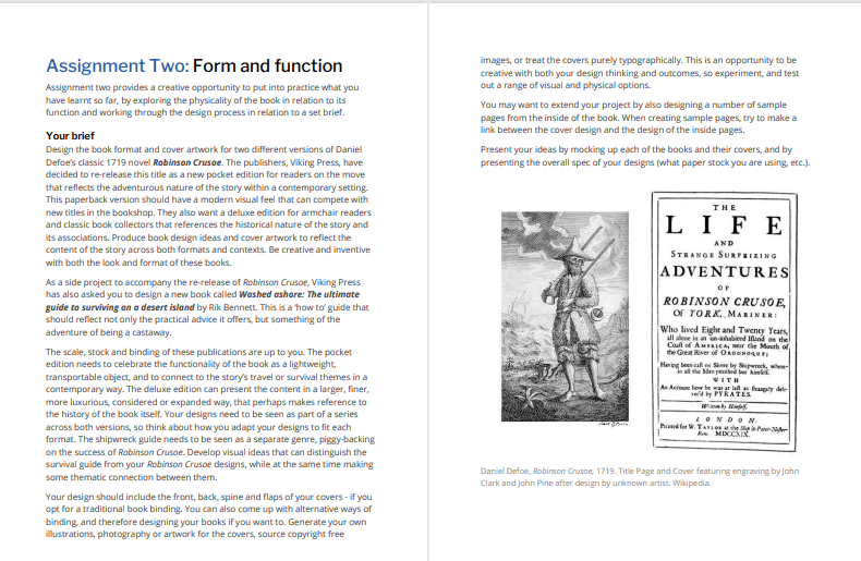
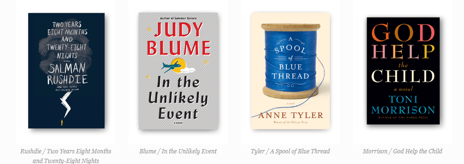
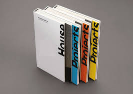
Assignment 3: My little book of Good and Bad Typography

The Brief

My First thoughts about the brief and reflecting back…

Completing this 3rd part of this course has actually taught me a lot more about the grid system and layouts than what I already knew and it has helped me to develop my knowledge more which made this assignment much more enjoyable and I am very pleased with the finished designs and finished books!

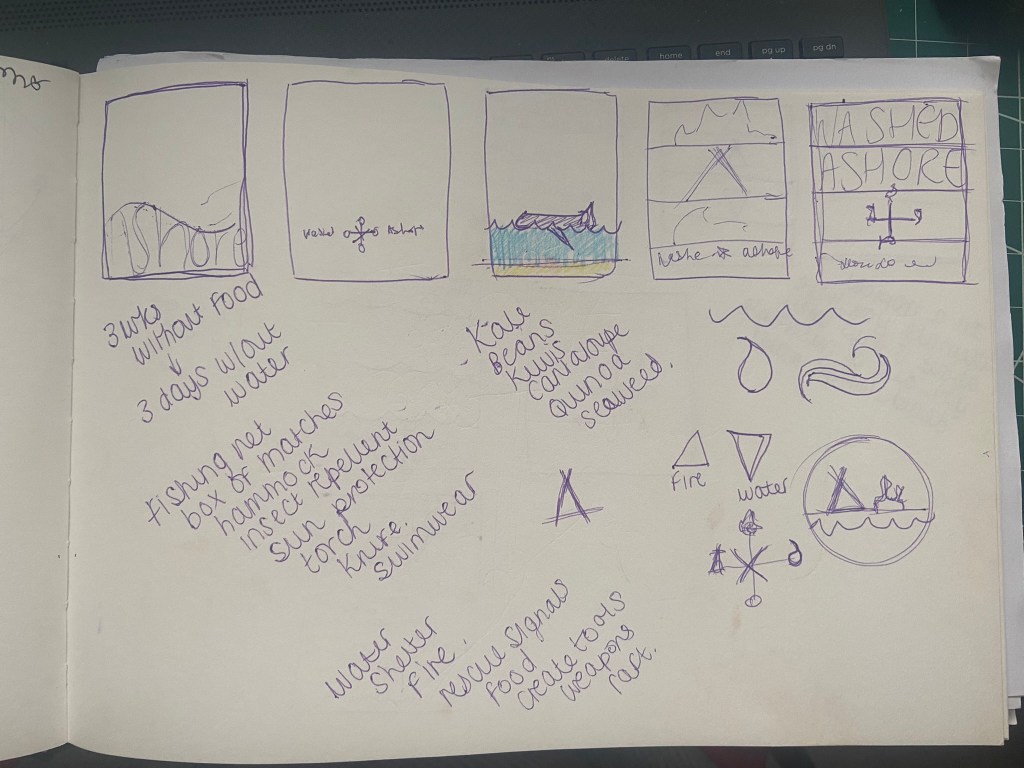
I started to brainstorm ideas for what content to put inside of my books one late night whilst I had to sit in my car ALL night and wait patiently for my fiance in A&E! (minor accident, few tetanus jabs later!..) It worked out quite well though because I watched a few videos (until about 4am!) on LinkedIn by a really quirky dressed American Graphic Design teacher about typography which really helped me to create the written content for my pages:

The main topics that I was considering were:

  • Contrast
  • Grid
  • Kerning/Tracking
  • Skipping a weight
  • no more than 3 fonts
  • Justified left, ragged right
  • Readability-clarity-legibility
  • negative space
  • Hierarchy
  • Bad typefaces – Comic Sans, Papyrus
  • Not distorting type
  • Typos
  • Widows/orphans/rivers
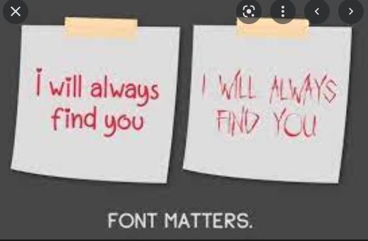
  • Fonts matter

There was a lot of rules that I could use in my books! I was worried though that my books were only 8 pages! This meant that I could only be allowed 3 double pages in each book and I knew that I would be writing and designing for one rule per each double page spread which meant I had to choose wisely! I didn’t want to cram loads of information over single pages. This would mean that I would have to choose a few rules that are similar and could be classified under the same subject: E.g – I decided that skipping a weight, choosing 1 typeface but different fonts within the same typeface and using contrasting colours would all come under the rule and the “creative umbrella” that is Contrast. Skipping a weight creates contrast as does choosing different fonts within the same family and using contrasting colours.

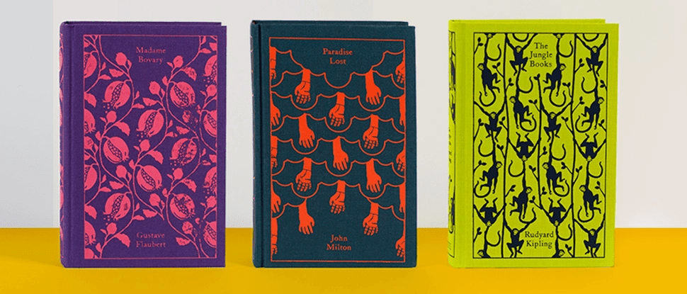
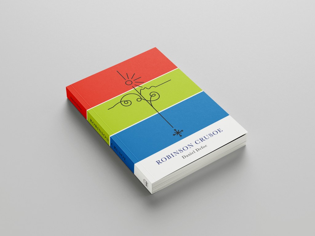
I had designed similar in Core Concepts for “If the Face fits” – a typeface sample book and I really loved that exercise! I was really pleased with the layouts that I produced for it and I knew that I had a lot to compete with for this assignment! I wanted to at the minimum achieve the same results as last time if not excel and design and create something that has developed and grown since then! The layouts for my type specimen book were very clean, minimal and spacious.

I have to admit I felt threatened by the title “My little Book of Good typography”, I felt frozen by the fear to get started for fear of attempting to create a book on Good typography but it ending up being bad! I was worried that what I have learned so far would be good enough to create a title of this nature! At the same time I was also worried about creating a book on bad typography because I am such a perfectionist that I really struggle to do things bad!! There was a lot of growth and development within this assignment; as my Fiance said – “It has travelled far”.

Let’s see where it went…

Research

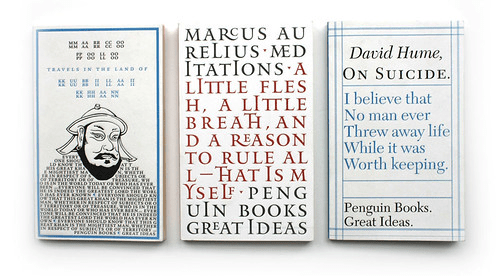
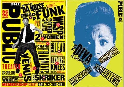
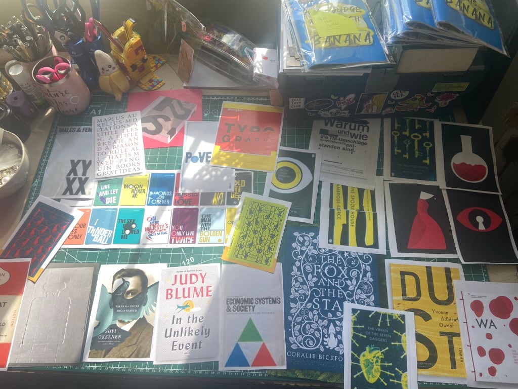
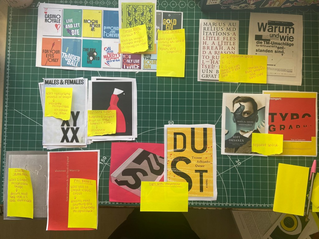
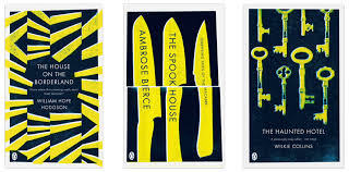
As I mentioned above I did a lot of researching into potential topics to use within my books in the early morning of a night sat in my car at A&E! Watching them videos though was helpful and I did pick things up that I didn’t already know! – Type classification and how to choose typefaces that contrast and work with each other. I also did a search on good and bad typography books and stumbled upon a book from Craig Ward, (which looking back now I have only just realised that I used his quote on the back of my Good typography book!) his book called “Popular lies* about Graphic Design” intrigued me as I liked the look of the clean, minimalist layouts and it was also a small, pocket sized book which closely matched the brief of this assignment.

When I first saw the brief for this assignment I was hell bent on creating ugly pages using Comic Sans as this is one of the most hated typefaces but It was after reading one of the articles in his book that I decided against it; it made me rethink that is it actually hated or is it just massively used and overused in the wrong context that just winds people up?… A victim of misuse! It was a debate that I actually couldn’t justify using in my books in the end plus it seemed too cliched; I imagine everyone would have that appear in bad typography.

Craig Wards book basically highlights popular Graphic Design rules and pulls apart whether they are actually tried, tested and they work or whether they are just “lies”.

These experimental layouts then lead me to remember about another book that graces my bookshelf:

“Show your work” by Austin Kleon, it is another little book full of simple layouts aiming to boost creativity and confidence.

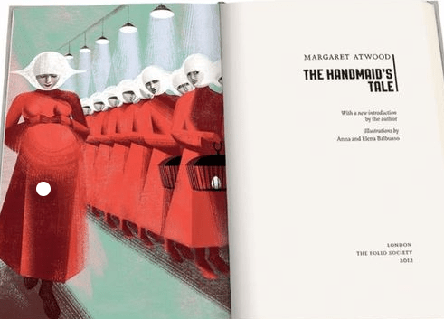
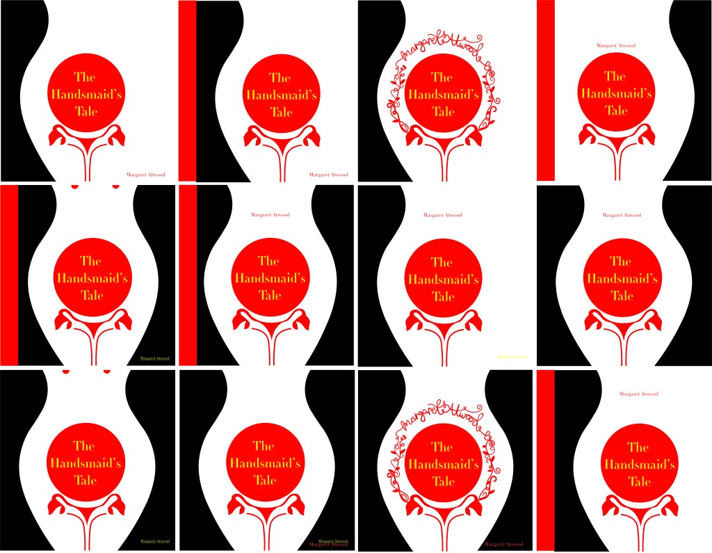
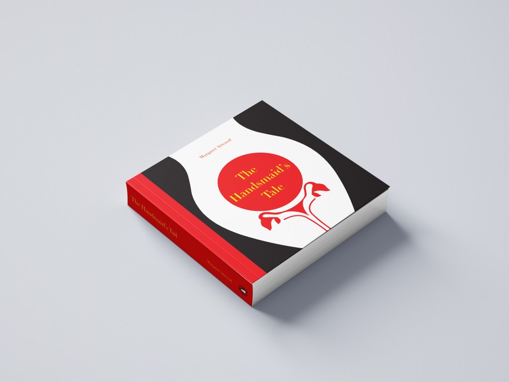
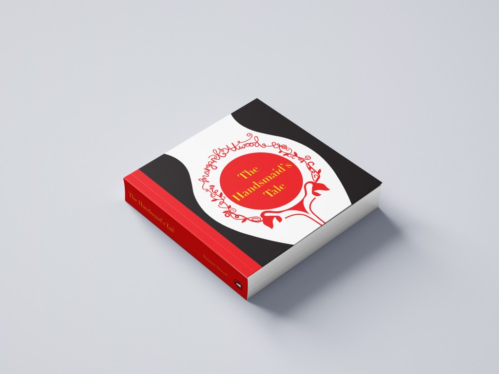
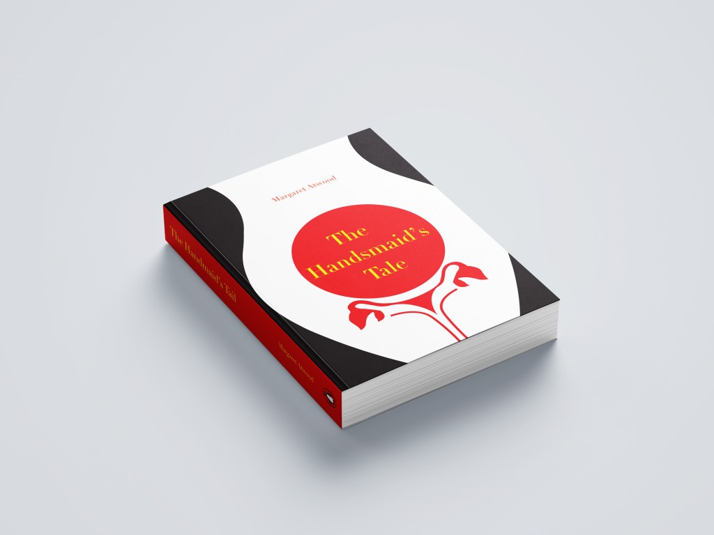
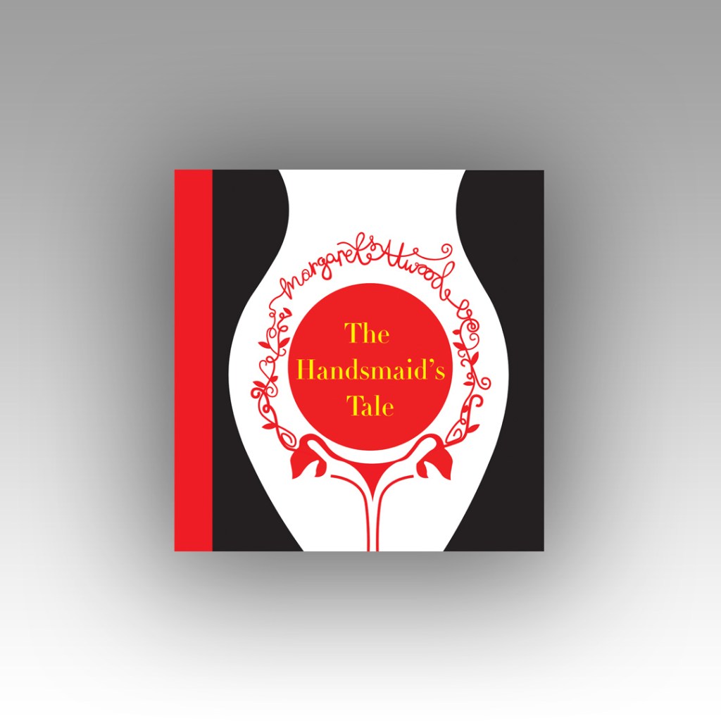
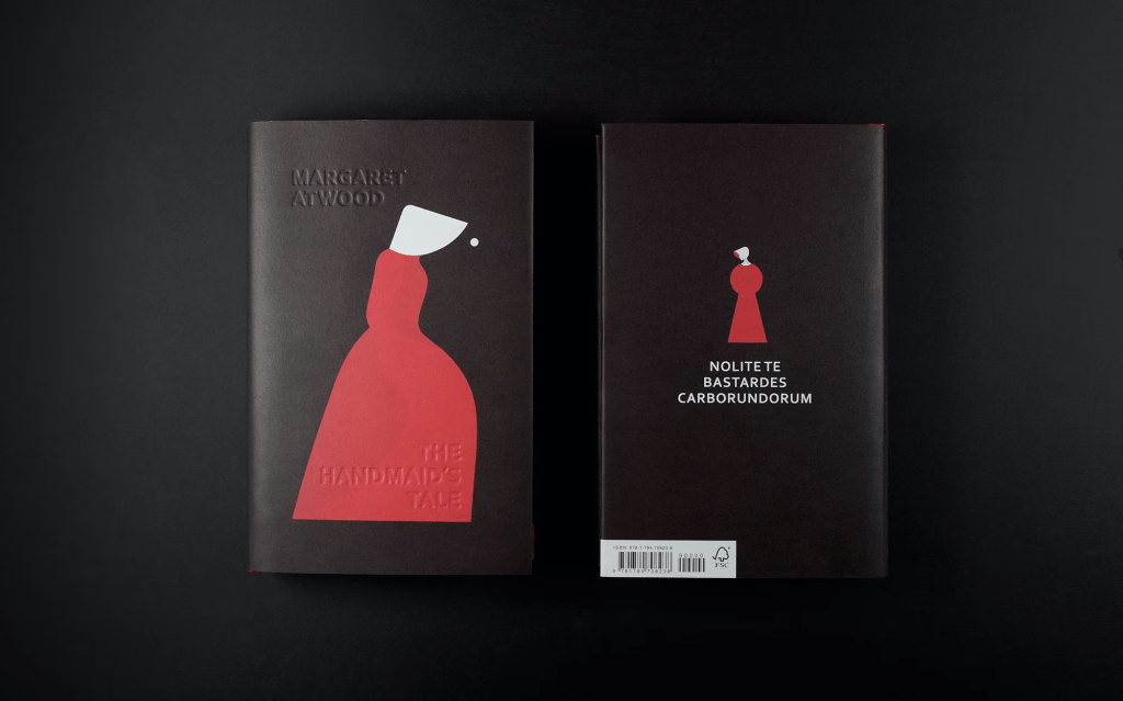
Taking into account the feedback I received from my tutor on my Handsmaids Tale book (where I created a mockup of my design on a square book) where my tutor suggested that not many books are squared and I may wish to rethink my decisions for future books – I looked at this little book which is squared and figured that this assignment might be an exception to the rule – I actually took a risk and using the same measurements as Austin Kleons book I used the same measurements to create mine further on into the assignment.

It started with 2 photographs…

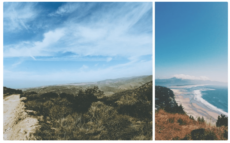
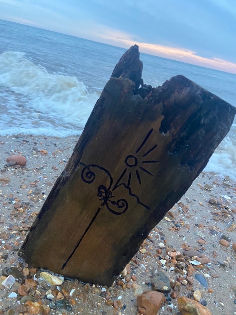
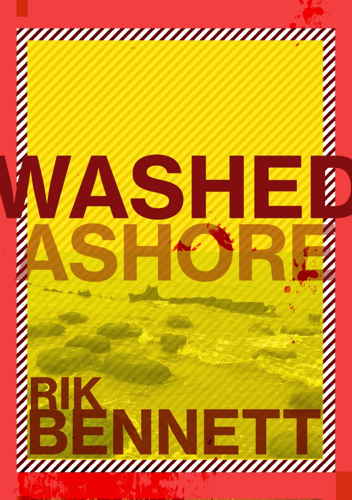
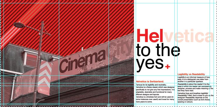
Late August I had a lot of trips out to various places; one of them places was Norwich (My wedding dress is there!) and as I was randomly walking around – I have only been there a handful of times now – I spotted some great typography on an old building that I loved the look of. Beautiful Swiss type on a classic old, industrial feeling building in a really urban, gritty, dirty environment. Good typography really is invisible! The typography that sits there completely overlooked on a daily! I had never even heard of the company CinemaCity before I took the photograph of it – I just assumed it was an old company that had gone under over time! However, I took the photograph and put it on my @Pink_Angeleno instagram page as a story about great typography that is completely overlooked.. I stored it on my phone and it was only weeks later that I decided that this would be a great photograph to use in my book! The typeface used was Helvetica and that is one (if not the one!) of the most loved typefaces of all time. I could do a piece on how great Helvetica is and how it is perfect because of its legibility.

I’ll be honest I didn’t even sketch any initial ideas for this! The ideas flowed from the photograph and as soon as I took it into digital to mess around with it, it got developed and changed until I reached the best design outcome! The rest of the Good typography book flowed from this one photograph – the feel, the colours, the vibe!…

I then needed my bad typography book to follow in the same footsteps and again, it’s only out of pure chance that I ended up taking a photograph on one of my other trips out in late August to Bristol that ended up being stored on my phone and then brought out for my book!

Late night in Bootlegger in Bristol with my Dads girlfriend after drinking my bodyweight in Sauvignon Blanc, cocktails and Jack Daniels doubles my drunken, incoherent self decided that sat next to me was a really bad sign! I was possibly babbling on about Graphic Design to my Dads girlfriend at that point.. who knows? All I know is that in that drunken moment I had to photograph this sign.. because? I just did!

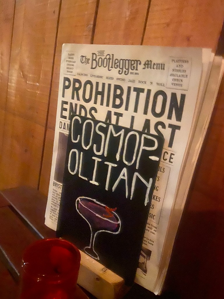
Cosmops!!! All I could picture was an inexperienced young member of staff, (bad I know!) who had been told to create some chalkboards to advertise cocktails, they started off great but then realised they had run out of room and decided to just hyphenate it because that was the best thing that they could do in that situation other than having to wash it off and start again and take the time again to carefully arch each letter and make each one the same size…! It made me chuckle at the good effort and attempt but at the fact that it just wasn’t right!

I didn’t realise at the time I took this drunk photograph that it would be the idea and basis behind the bad book of typography for this assignment!

Looking back there are also examples of bad typography I only wished I had photographed! – What I learned from this assignment is that if I see anything I feel like I need to photograph I don’t need to think about it – I just should! I am creating a folder on my phone of random images that could later be used in future work! – Another example I wish I photographed was a sign that was placed on a tree opposite our house by one of our ridiculously interfering neighbours!.. She had placed some herbal plant in a big recycling bag at the base of a tree and wrote a sign saying – “please help yourself, put it in your house, its GOOD for you!” I made myself chuckle by reading it out in a hideous, monstrous voice because the way she had written it looked and read so aggressive and unhealthy!! I could have used that as a photograph to accompany why fonts matter!!

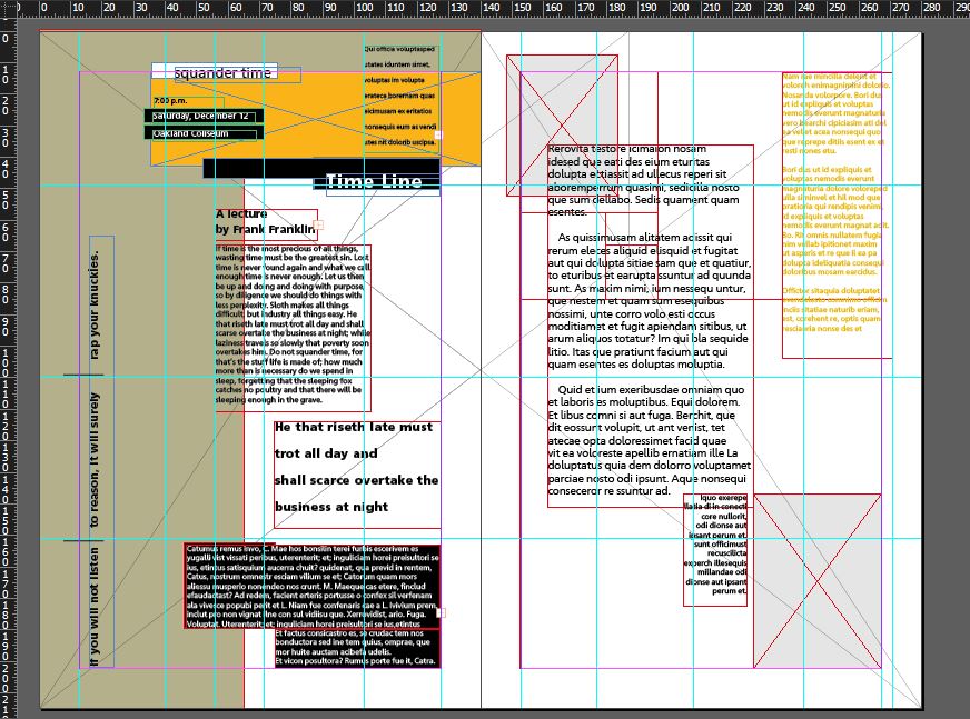
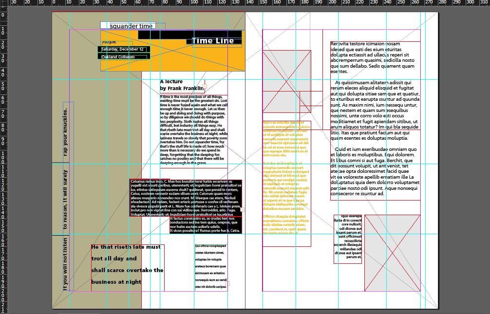
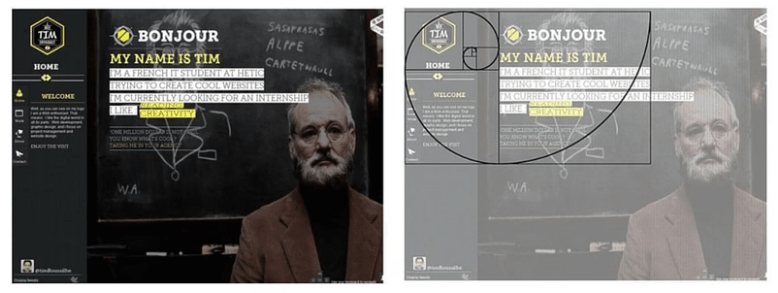
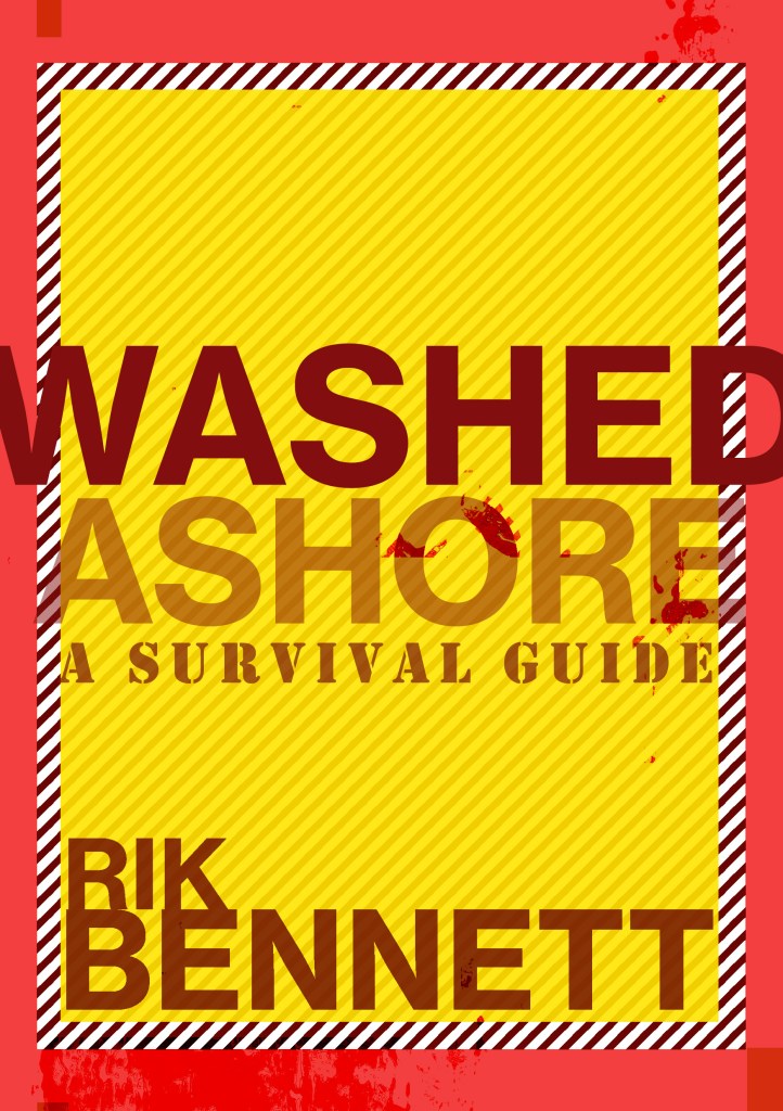
Good Typography page 1 &2! Hel to the yes with Helvetica and legibility.

Starting off with my photograph as what was then a really rough idea!- I imported it into Photoshop and had a mess around to see what I could do to change the colours, vibe etc.. I wanted to keep it very much in keeping with Swiss typography by keeping Red as the main dominant colour. The corner of the Red Royal Mail van set the tone for the red too!

I messed around with firstly putting a photo filter over the top of it, it added a mood to the sky but other than that the image just wasn’t striking or “modern” enough to use as a main image in a book!

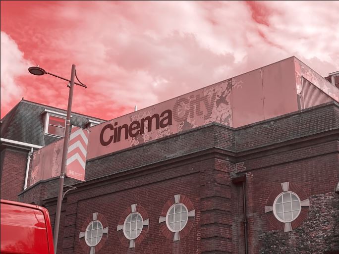
The same week as I also started messing around with this, I also had my first Graphic Design interview for a job that I wouldn’t have really minded having a chance with! (I never actually heard back from them after the interview though!… *eyeroll) but during my process of prepping for it like an absolute mad woman (thanks again! like!… really appreciated!) I had to study their website to find out a little bit about them! -I noticed that their branding was also Red and I also noticed that they used a nice striped background on a lot of their images which gave me the idea for my photograph…

I did like this and decided to try and recreate it in the background for my CinemaCity!

I am still learning Photoshop, so googled how to create a diagonal striped pattern and then placed it behind my photograph. I then used the polygonal tool to cut out the sky on the photograph so that the striped background was visible but didn’t cover the main image.

I then changed the colour of the stripes near the lamppost which made it look like streaks of light were coming out of it which I thought looked quite cool! This layout felt more striking and modern which I was much more happier with!

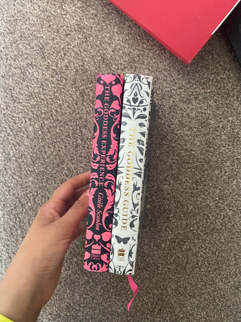
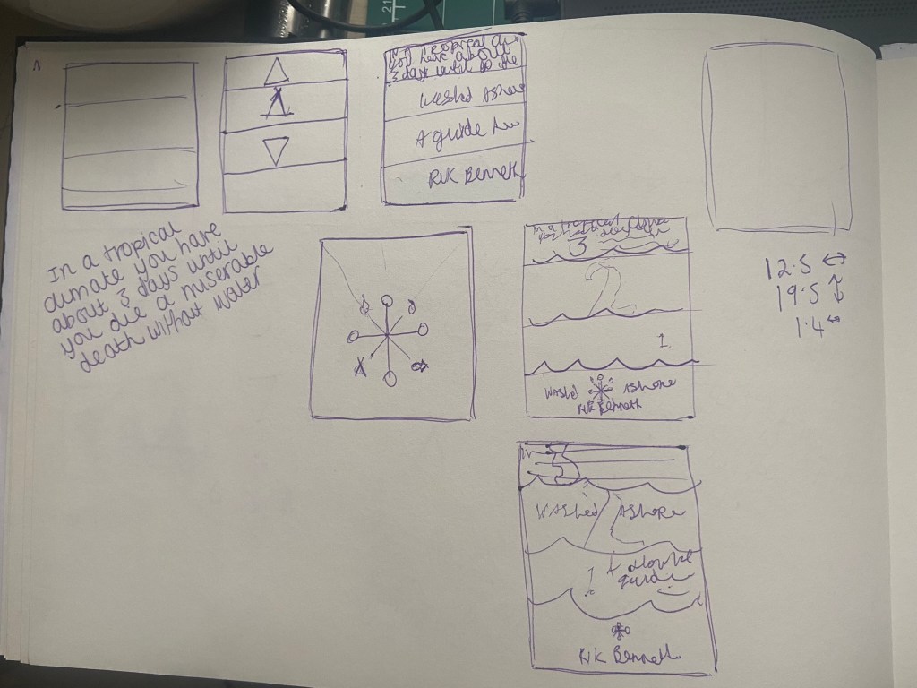
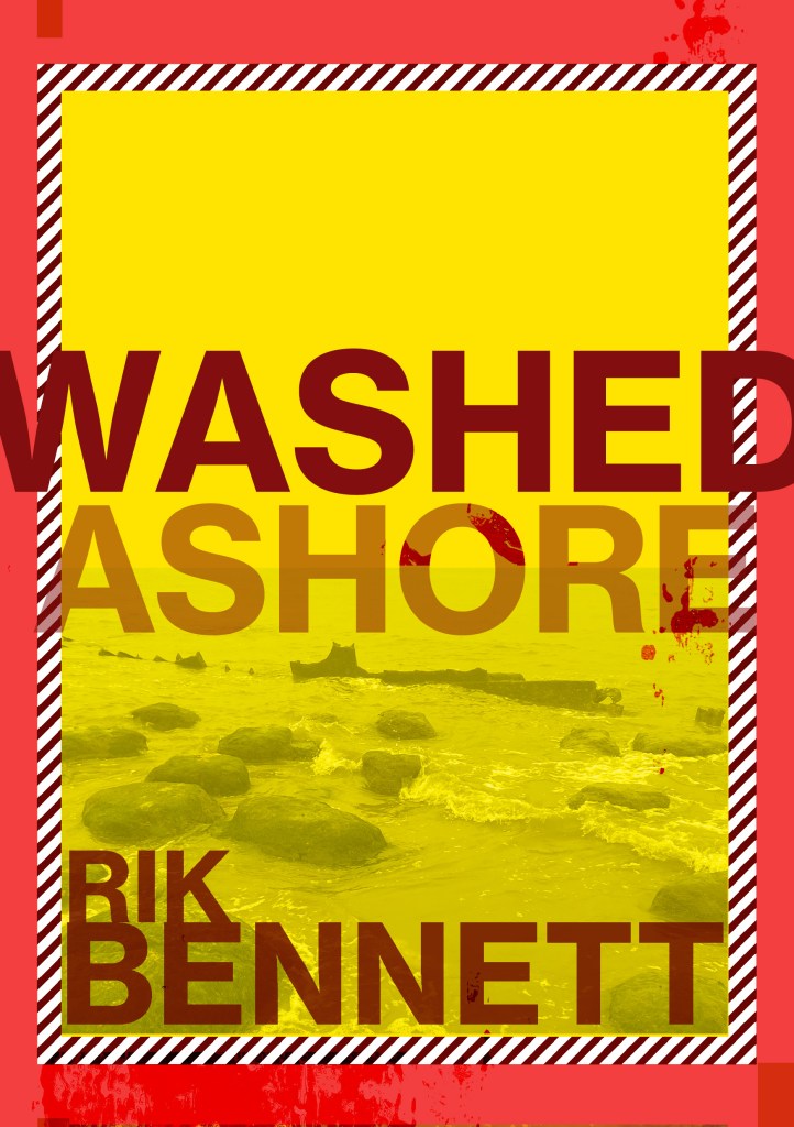
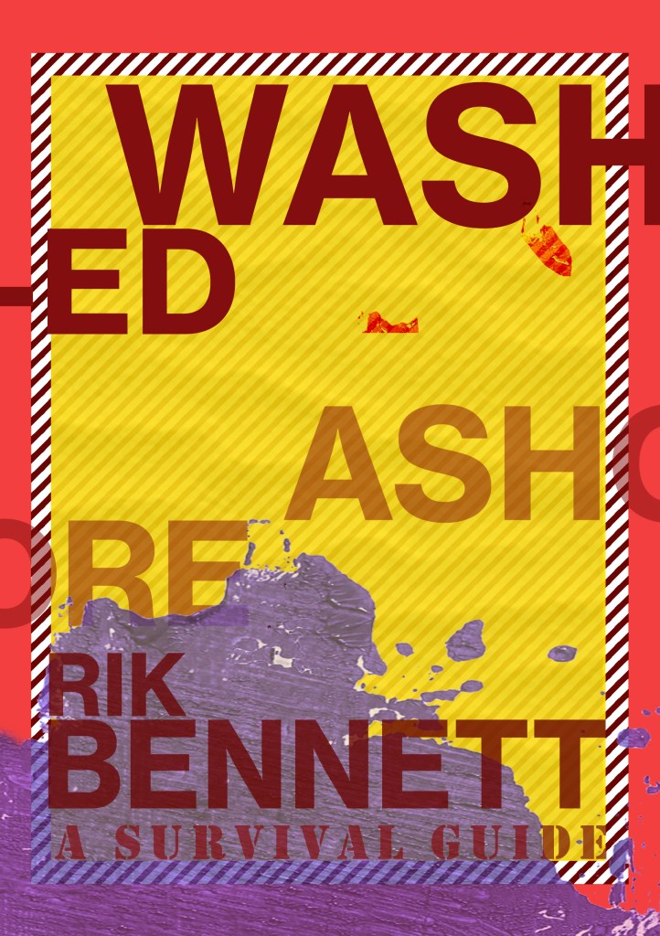
I didn’t want the image to cover the whole layout, (I decided to make the size of my book 12.5 x12.5 which meant that this layout was 25 x 12.5) I wanted to have a spacious feel to the layout and make negative space very much a part of the design.

I then needed to concentrate further on the hierarchy and content for the layout:

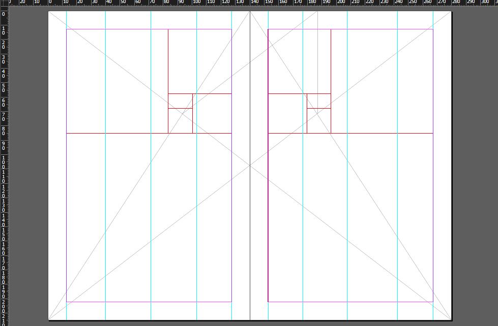
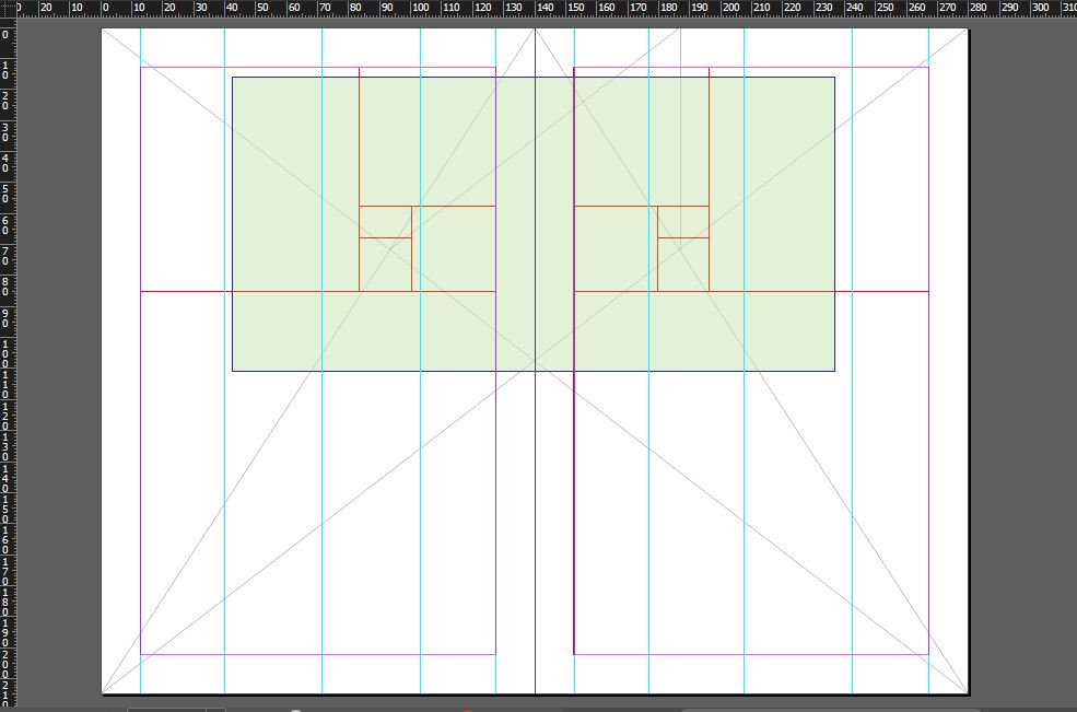
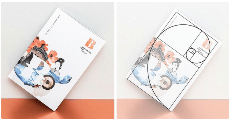
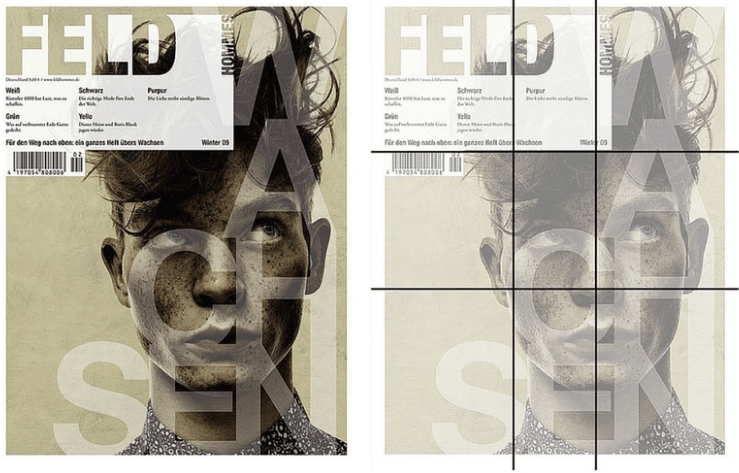
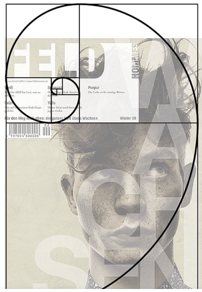
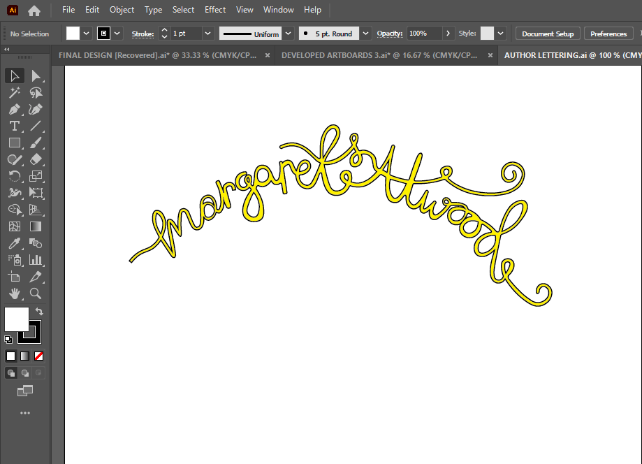
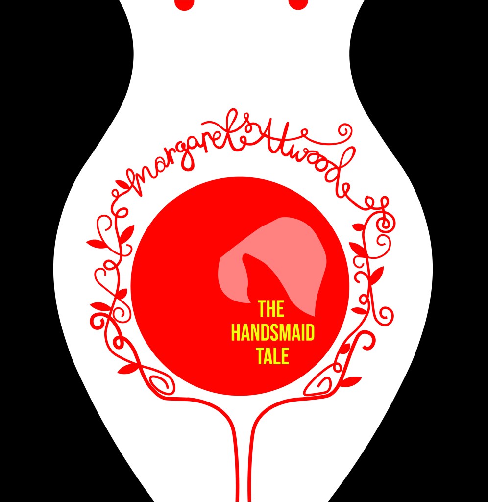
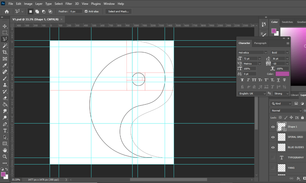
I decided to move the photograph to the left but then I decided that I needed to put some of the knowledge I had learned in part 3 to some use and create a grid to work my layout around; I created a golden section/ spiral grid and worked the rest of the layout around it. The “eye” of the layout as I call it!- or the point of the spiral is where the main focal point is on the layout; it is eye level and it is where the eye travels to first. This is the spot where I have put the Swiss cross. I then found that my eye is led to the text below to read what the layout is about and then the photograph is the nice visual imagery that accompanies the whole layout!

I wanted something catchy for the heading of the piece!- a pun! something cheesy but which catches your attention and makes you want to read further! I did start off with just writing Helvetica but then decided that was far too boring! – How do I convey how good this typeface is? Hell yes! I kept Helvetica but then toned down the opacity on part of it so that the main heading reads “HEL to the yes” I liked it!

I wrote about how Helvetica is a very neutral typeface – it gives no impressions, it is what it is. I then thought about the saying that goes “he/she is Switzerland” meaning sat on the fence and not taking sides.. it also helped that Helvetica is Swiss so this made perfect sense! The sub heading to the piece was “Helvetica is Switzerland”. I then accompanied this with a piece of writing about legibility vs readability – 2 important topics within typography.

I wanted to keep it minimal and clean looking and wanted negative space to play a big part within the layout; I split the right hand side page into thirds and kept the content very much to 2/3, allowing the top of the spread to breathe and remain spacious!

I did then print a test page out just to see whether the content was readable! – the last thing I want is to lecture about readability and then the reader can’t actually read what I’ve created because the type is too small! I decided to change the layout slightly and make the text larger just to see if it was more easily read. It worked, but it didn’t work as well as the smaller text. I felt it lost a bit of its strong structure.

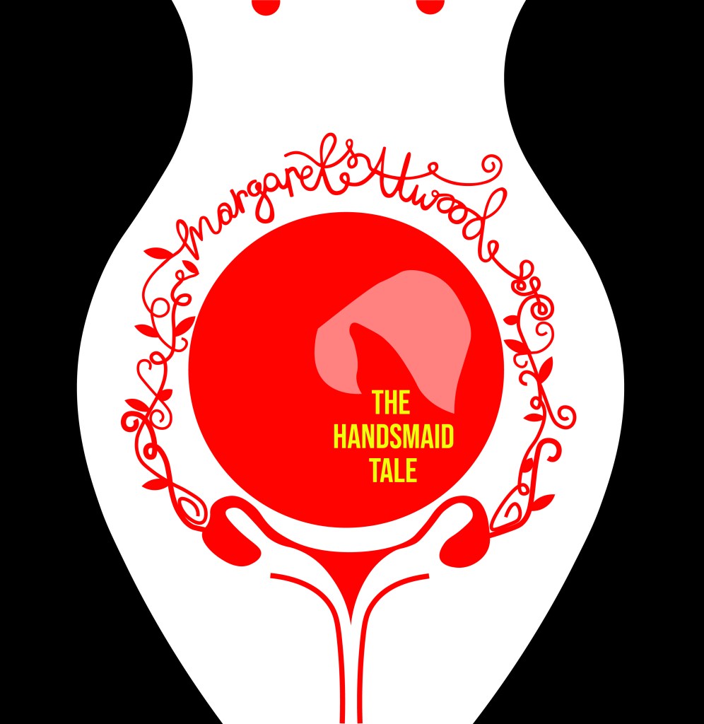
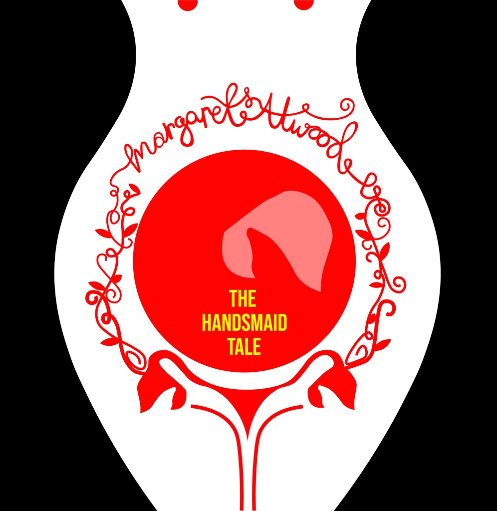
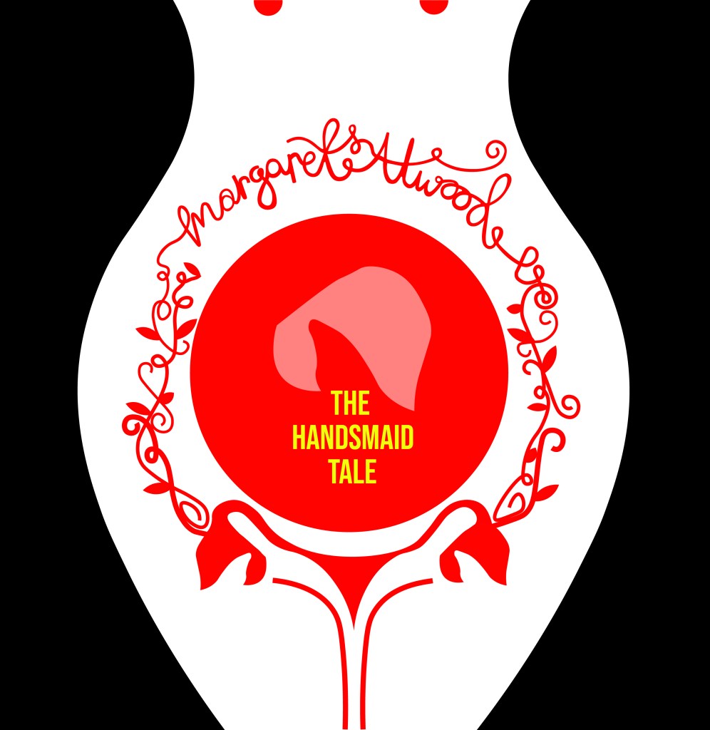
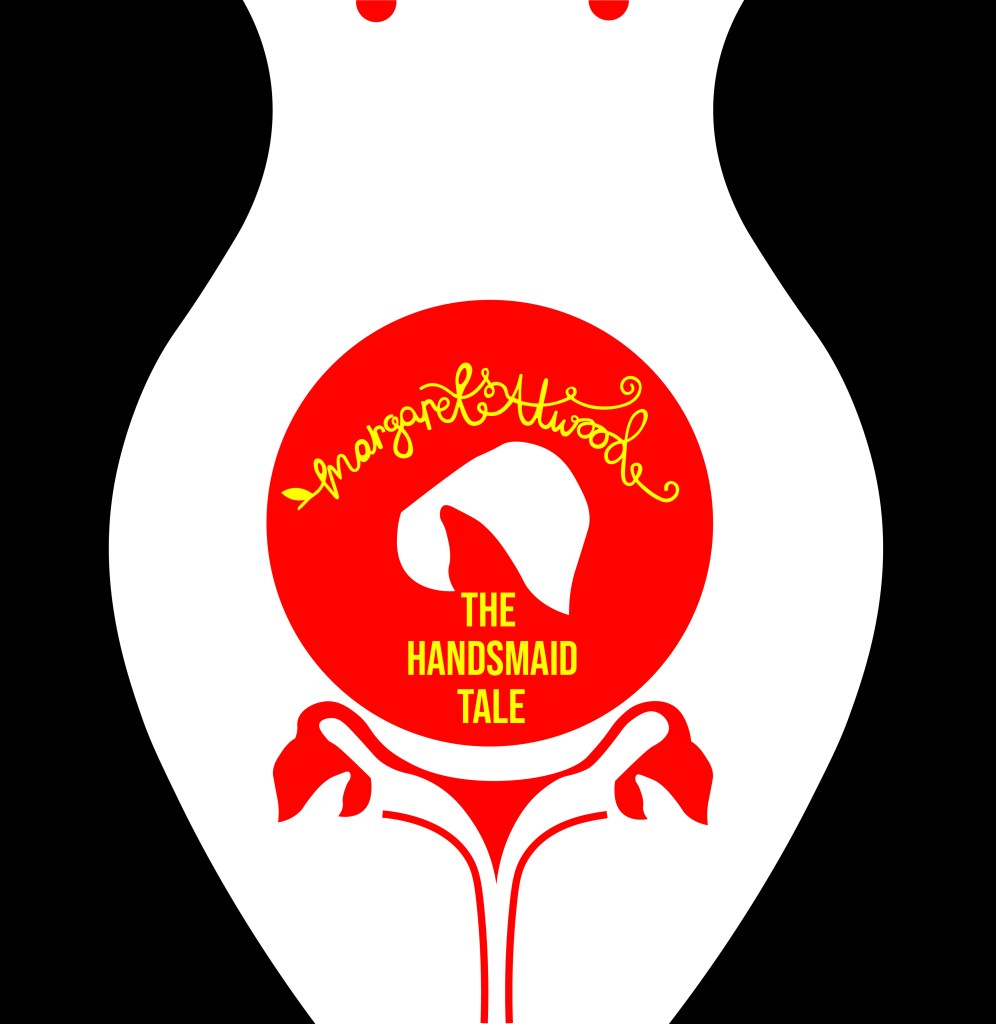
It then got me on to thinking about what a potential front cover might look like for this book and how I might create the other pages to mirror this layout… I was thinking about how I could potentially tie both books together – the only idea I had was like Yin and Yang! – Good, bad, light and dark, hot and cold, sweet and savoury! That was what these books were! one was Yin and the other was Yang! I started to explore possibilities around this idea and how the pages and layouts might work around it…

I sketched a few ideas… I had the idea of the books joining like the Yin Yang symbol; It would involve a section out of the books being cut out though, this would make the layouts smaller, busier and tighter. It would also make one of the books back to front which would be Ok because that could be the bad typography book!- one thing we don’t do in the Western world is read from back to front – consider it another rule broken!

With this in mind I started to create some ideas for a potential front cover..

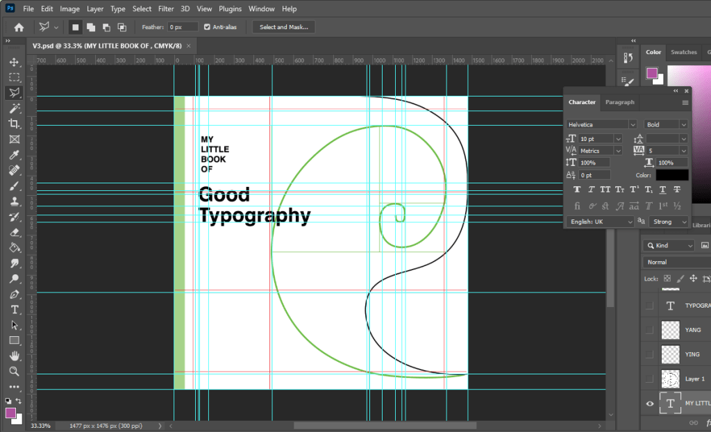
Using the Golden spiral grid I created my first Yin Yang shape… the circle of the symbol is in the main focal point of the spiral. The book and the pages would be cut to the symbol.

I then added further and started to try and build in the typography to the design…

I absolutely hated it but carried on! – it reminded me of a really dull, 1980s textbook I was probably made to read when I was a teenager!

It looked slightly better with larger text…

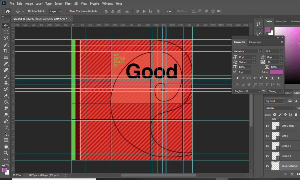
I then tried to bring in the Red…. It then looked like a Constructivist, aggressive book!

Brought in a bit of Green to try and contrast against the Red and also to soften it… Green is more of a natural colour.

I then decided to try and highlight the grid and the golden section more… I highlighted the rectangle which formed the golden spiral of my Yin symbol.

I then added the lower part of the symbol.. hated it, it looked like a foetus!

I hated the covers I had produced… but going back, I looked at how I would have to potentially change the layout to work with the cut out book and pages. I drew out the outline of the Yin symbol and worked out which part of the page and layout I would lose on both sides. It seemed a good idea… but I hated it. I felt that it would have to be cut by hand when I had printed the finals out and it would look shoddy and unprofessional. The phrase “keep it simple” resonated with me and I went back to the drawing board.

I then had the idea to tie in the Helvetica double page spread with the front cover. This could work… it would all lead nicely into each other then.

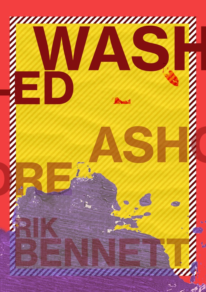
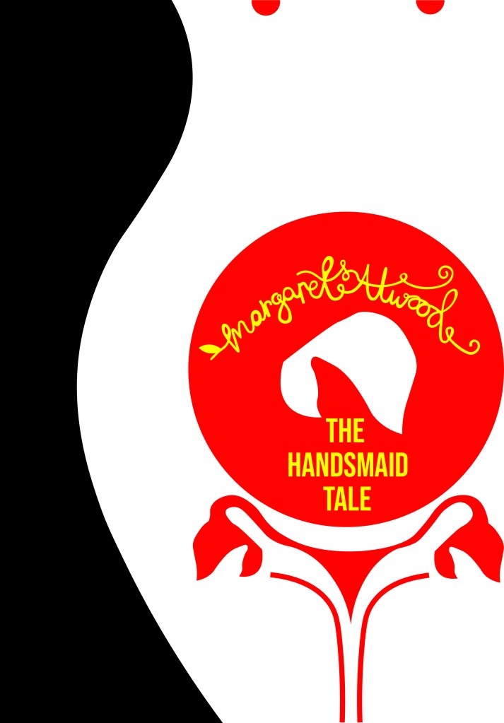
I then went back and tried a few designs for front covers using the Cinema City photograph:

I wanted to highlight “good” by making it larger but it just blended in with the Cinema City which is not what I wanted it to do! I wanted the title and the image to stand out each by themselves and not blend in together!

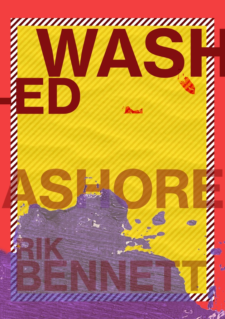
I felt that this worked better.. but I just didn’t love it. I didn’t want to go with it and regret my decision later when I decided that I hate it!

This was heading in the right direction! There was just something not quite right yet! – I felt like it was the stripes taking the attention away and smothering the rest of the design!

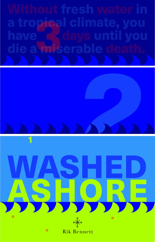
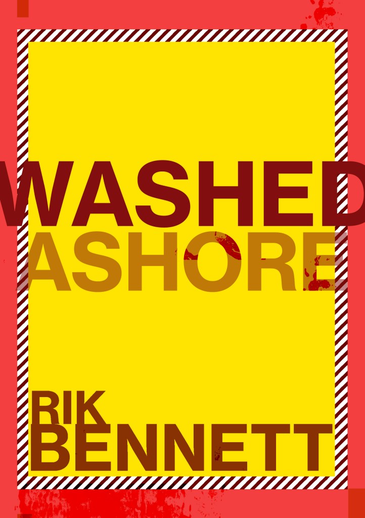
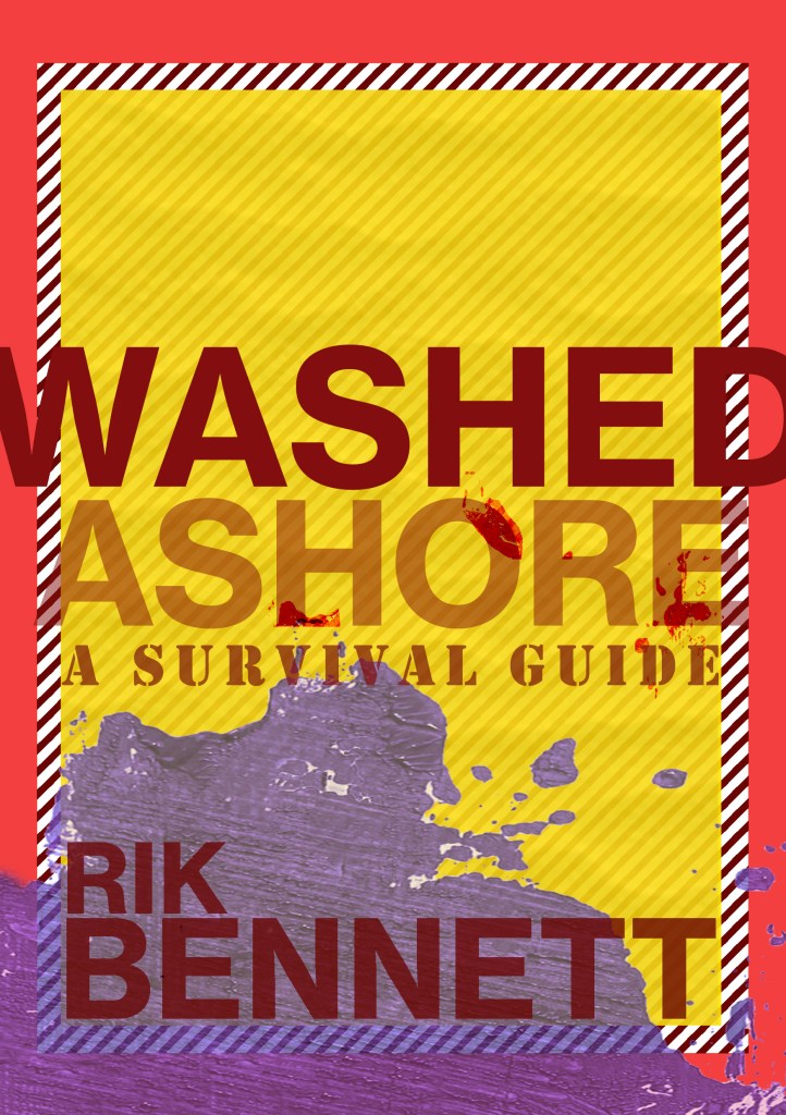
When I removed the stripes it worked so much better!!! It was clean, spacious, minimal.. the colours worked together and it just felt like Swiss typography! I loved it!
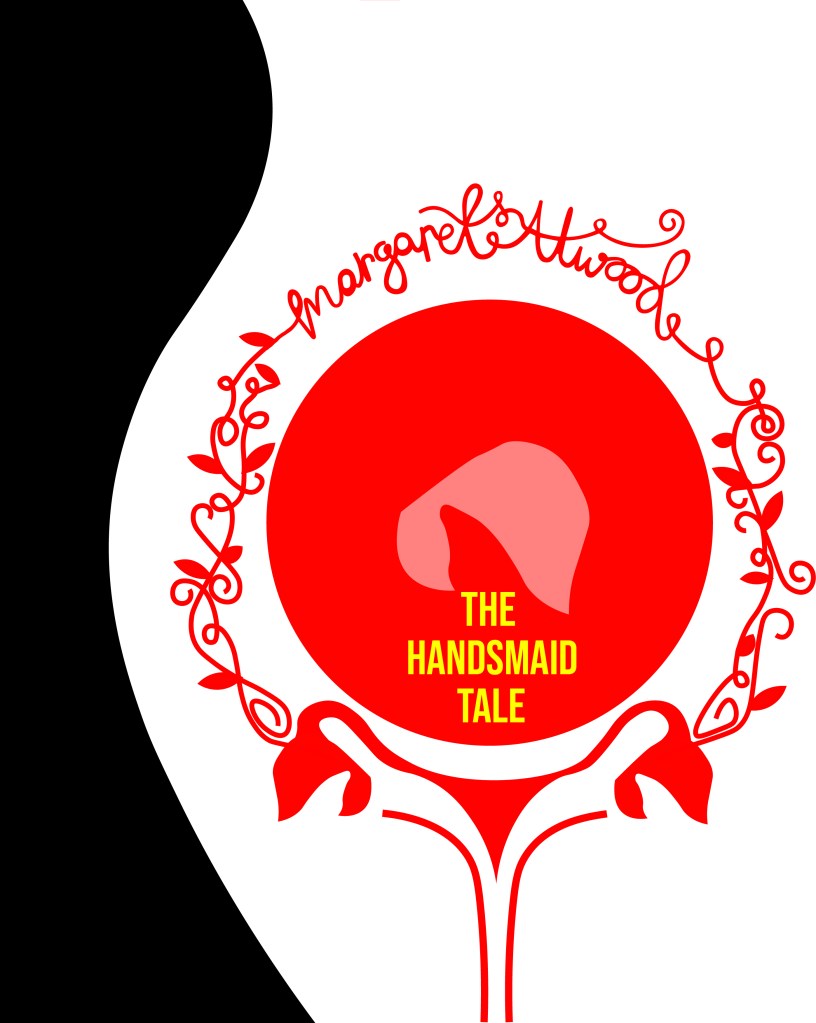
Loved it!!

Loved it a little bit more when I added in the grid element!!

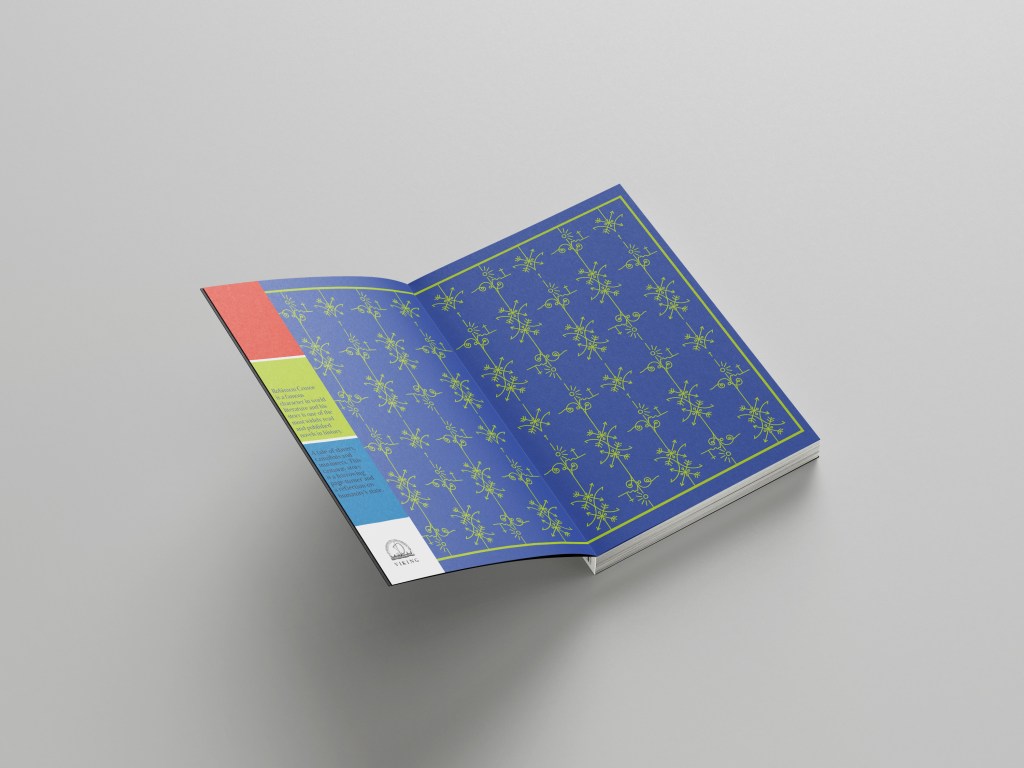
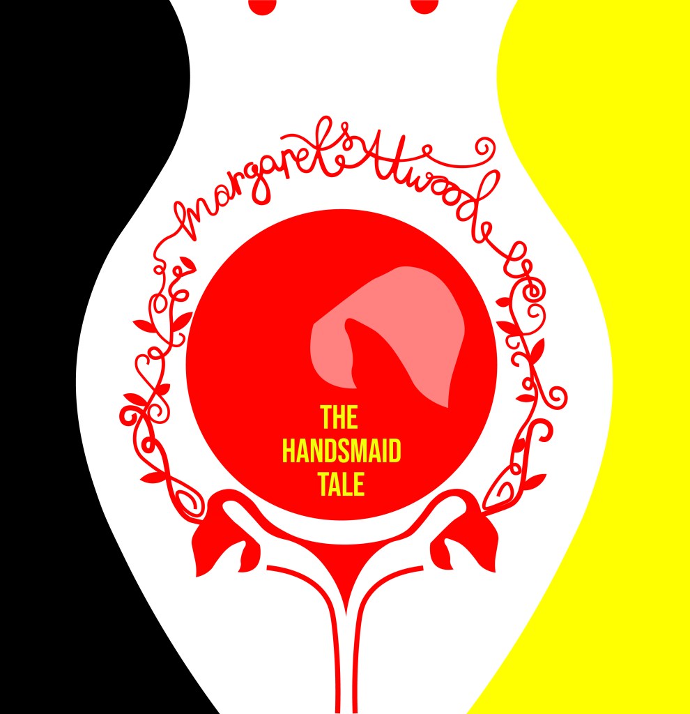
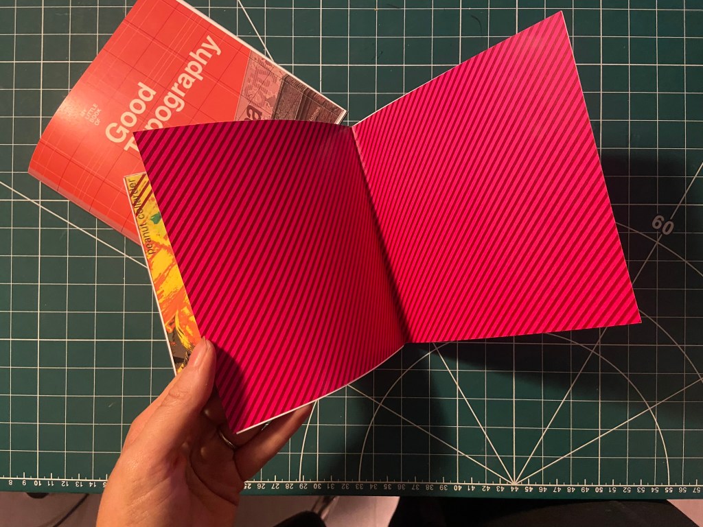
I really wanted the stripe design to follow all the way throughout the book;, I had to take them off the front cover because it stifled the rest of the design but I decided that I would create inner inside covers with just the stripes to then lead into the rest of the book!

With the front cover, inside pages and the Helvetica layout smashed I was on to a good start! I then looked into what else I could do for the other pages…

Good Typography pages 3&4, Contrast!

For the next good typography pages I thought that I would do contrast – purely because like what I mentioned earlier there are several rules that come under the contrast umbrella.

  • Contrast using contrasting colours
  • Contrast using harmonious complimentary fonts within the same typeface family
  • Contrast by using different font sizes and skipping weights, using different line weight thicknesses

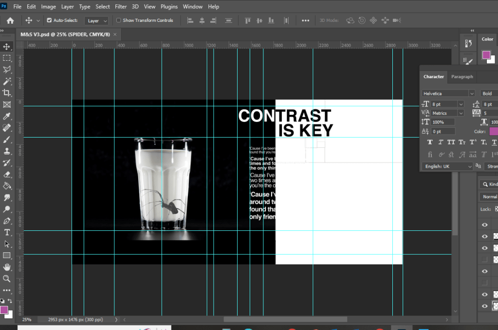
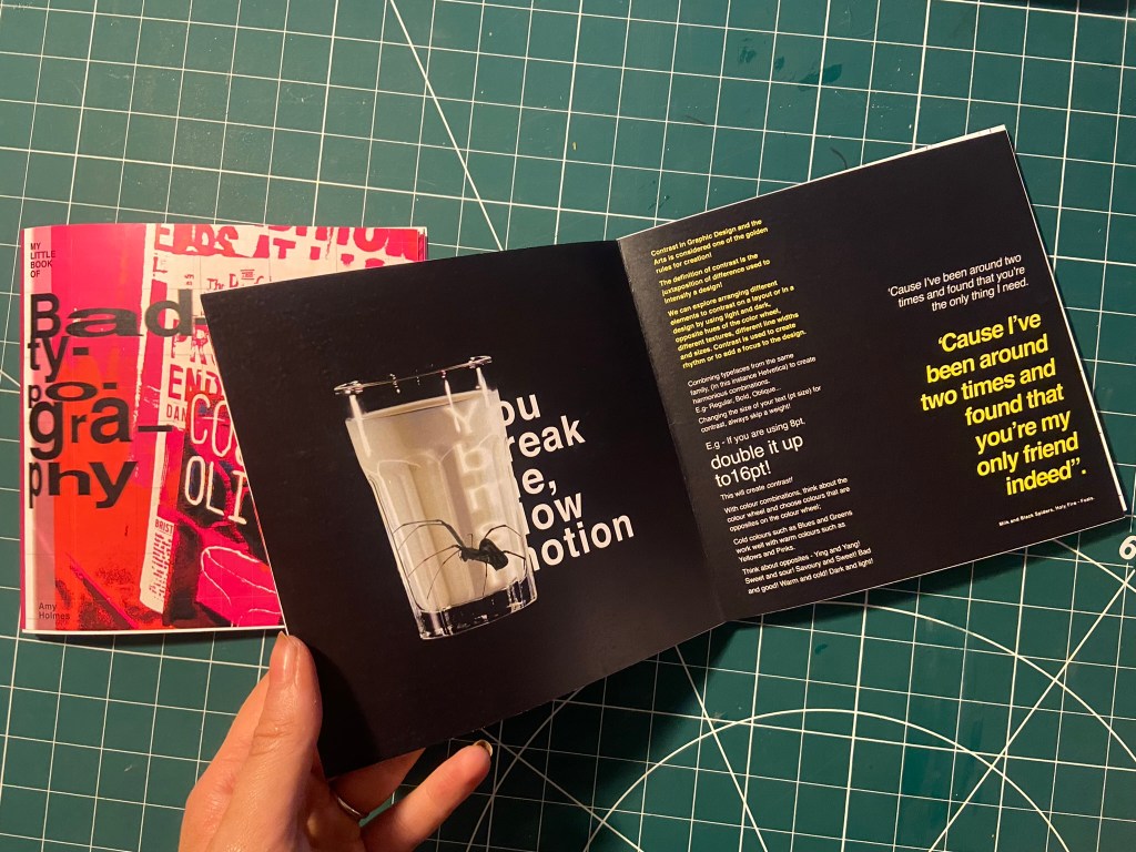
One of my favourite songs is Milk and Black Spiders by Foals and a few days before I started designing for this layout it was playing in my car on the way to Tesco and my fiancé was asking what the song was about, he was like “I guess its about contrast really isn’t it” this got me thinking about including the song and the metaphor of the black spider and the white milk as the subject for my contrast spread!

As a starting point I needed stock photography of a Spider and milk! I was going to take my own photograph of a glass of milk but felt that a free stock photo that I found on Pexels.com was perfect:

I then found one of a Spider which was also perfect! I could cut around the spider using the lasso:

I started off by creating a similar layout to the one I did for Helvetica. I wanted to keep the imagery very simple – I was undecided whether I wanted the Spider walking near the glass of milk or the spider (cruelly!) submerged in the glass. Submerged in the glass seemed a bit more dark and edgy for the feel of the piece! I also knew I wanted to use some of the verse of the song on my layout “You break me, slow motion” is a very haunting verse to use for an edgy looking layout!

Messing around with the dark/light, black/white on the layout…. it just didn’t seem to work though

I much preferred the milk and spider to be alone on the left hand page. It was clean, spacious and it felt like it gave an isolated, lonely, daunting, edgy feel to match the mood of the colours and the layout.

Using the saying “contrast is key” I tried to mess around with the layout again, there just was no contrast at all in this though – the text is all too big, it all blends in together and looks too harsh!

I tried to mute the “contrast is key” and have it bleeding off the page but it just wasn’t right…

I created contrast with the song lyrics by alternating between white and yellow text. I used yellow because it contrasts well against black and also because it is like a warning colour- this layout is about Spiders which brings warning to most people who have a fear of them!

It was important for me to achieve contrast in the written content; I had a large body of text and I had to try and keep it readable in such a small publication but I also needed it to contrast against the rest of the layout.

The end result of the Milk and Black spider was promising though!- I decided to distort some of the text behind the glass and reflect it to look larger as though its in liquid. I manipulated some of the spiders legs in Photoshop to make them bend to look as though it is pressed up inside the glass.

I think the final layout for this works well!

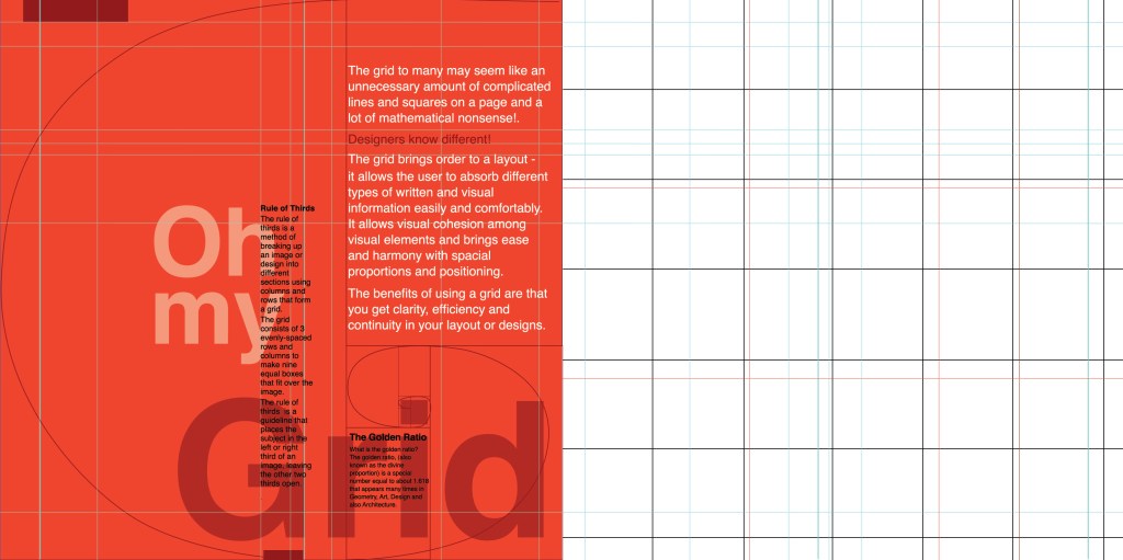
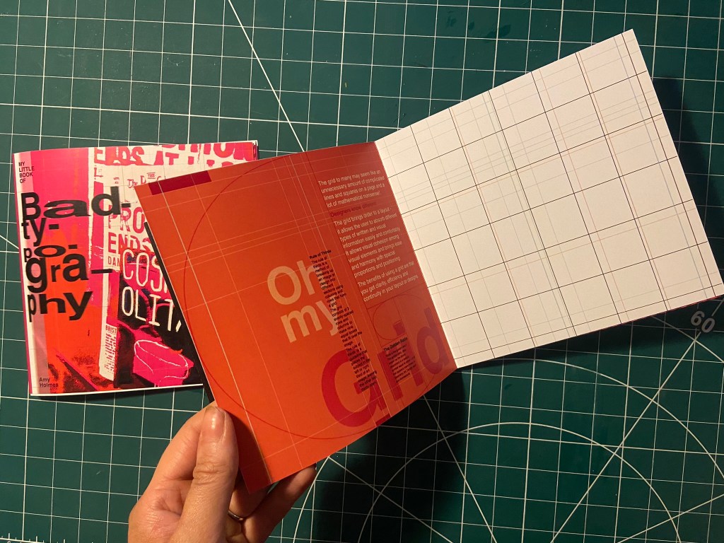
Good Typography pages 4&5, Oh my Grid!

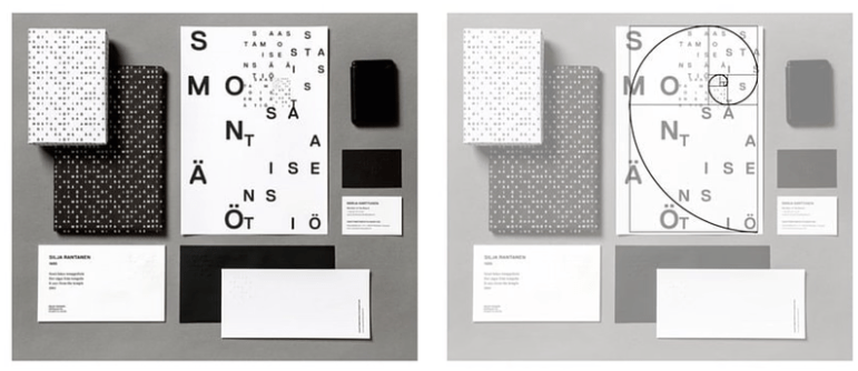
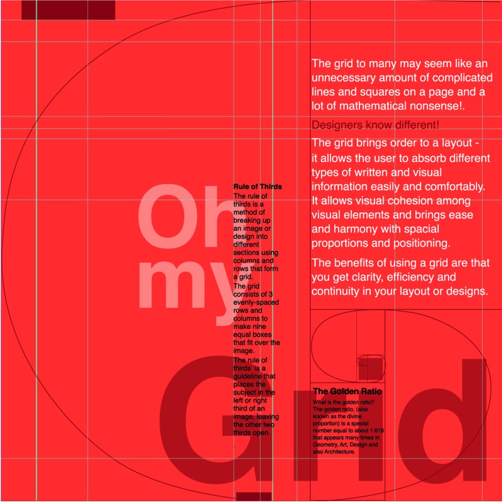
I felt like the next best subject for my book was the grid system as the majority of this third unit has been based around the importance of it! I have also learned a lot in this unit from doing the grid exercises and research so I decided to try and include it and show off what I have learned the best I could in my layout!

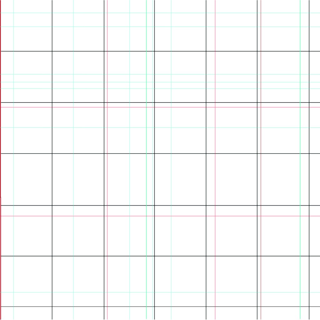
I started off by drawing out my grid!

The pun “Oh my Grid” immediately came to me! It might have been because I wrote about how a lot of people might see the grid system as a lot of complicated and unnecessary lines all grouped together on a page and immediately panic and think OMG!! I did think to change it to “oh my good grid” to try and highlight that grids are indeed good! There was not enough contrast here though, the main heading needed to be bolder and stronger than this!..

This was indeed heading in the right direction! The red married in with the main theme of the entire book but also worked in this layout considering that grid layout was popularized by iconic designers such as Josef Muller Brockmann who originated from the International Typographic Style (Swiss typography!).

I then included the Golden Section into my layout and the rule of thirds.

I decided that Oh my Grid worked better; it slips off the tongue and it is immediately obvious.

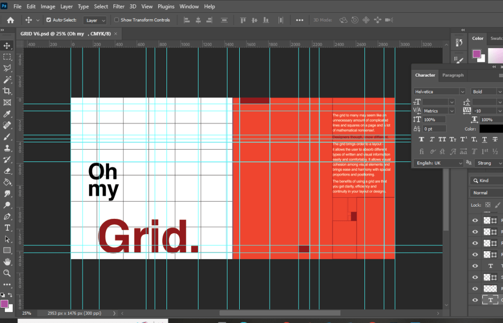
I then included the golden spiral into the layout which ties in with a little bit of text which tells you about it. This is a strong layout but I think it got better!

This layout happened completely accidentally! I accidentally moved the text so that it overlapped the other text and I actually really liked it! I switched the pages around and decided to keep the right hand page completely free apart from the grid outlines.

I also changed the colour of the small text to black because I felt that in Red it blended into the Red background more which made it more difficult to read!

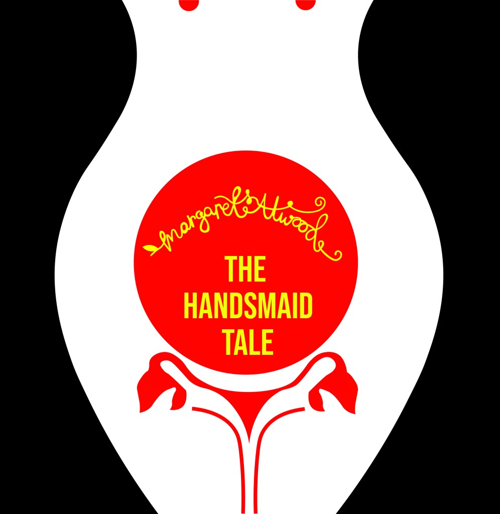
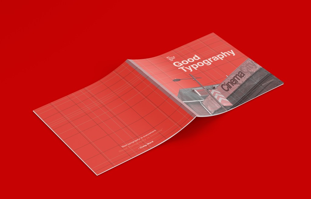
I just needed a back cover!

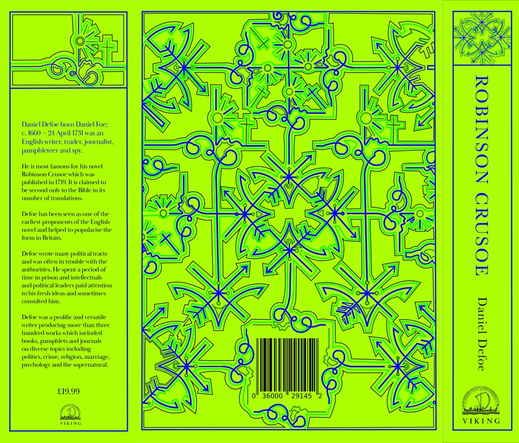
I wanted the back cover to be pretty much the same as the front cover but minus the photograph.. I wanted it to be very simple, I didn’t want to put a massive blurb about what the book was about – the book and the images should do the talking for itself! That is where I found the quote from Craig Ward – Bad typography is everywhere, good typography is invisible”.

I also lowered the opacity on “Good typography is invisible” to make it look more invisible!

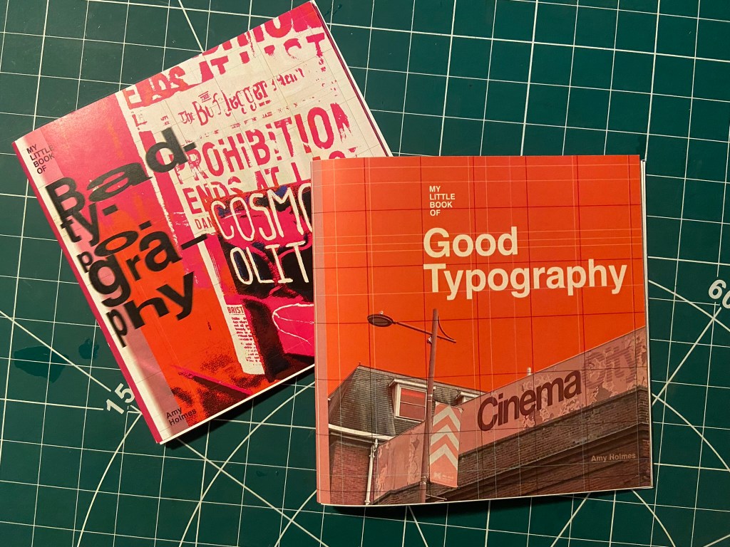
I was very pleased with all 3 layouts! I just now wanted to go back to the inside front pages and add a photo credit for the photograph on the front cover!

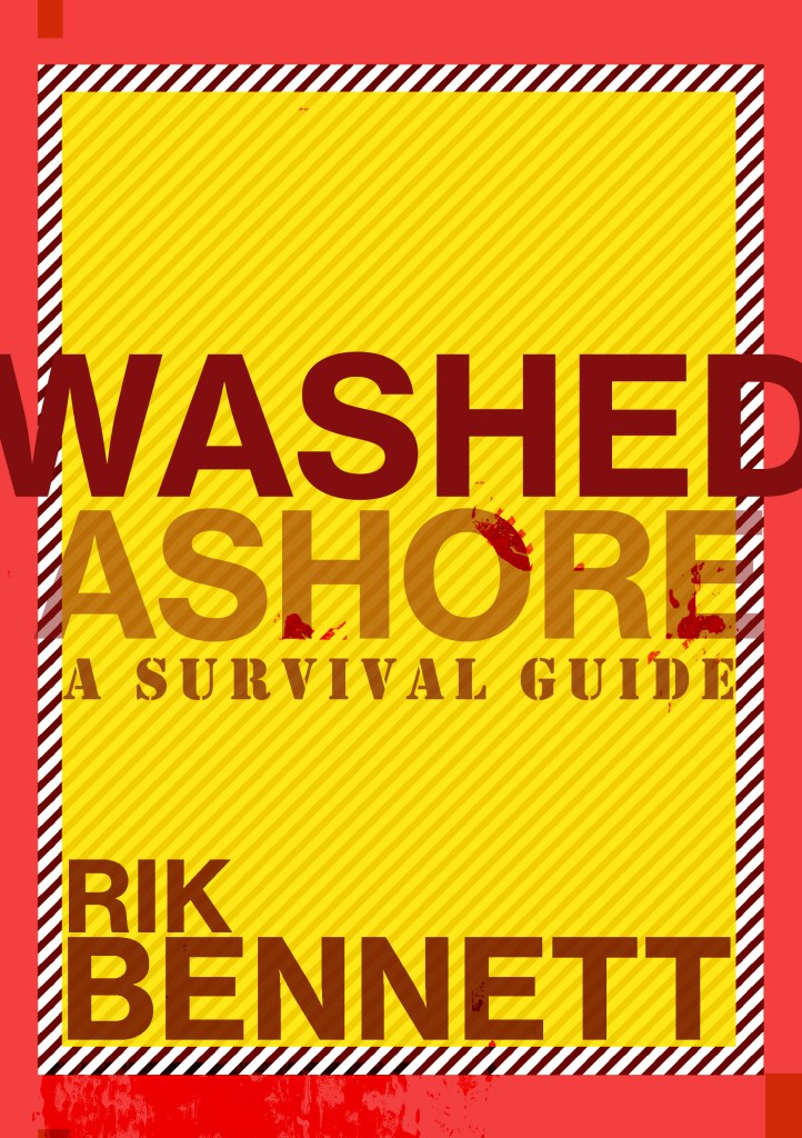
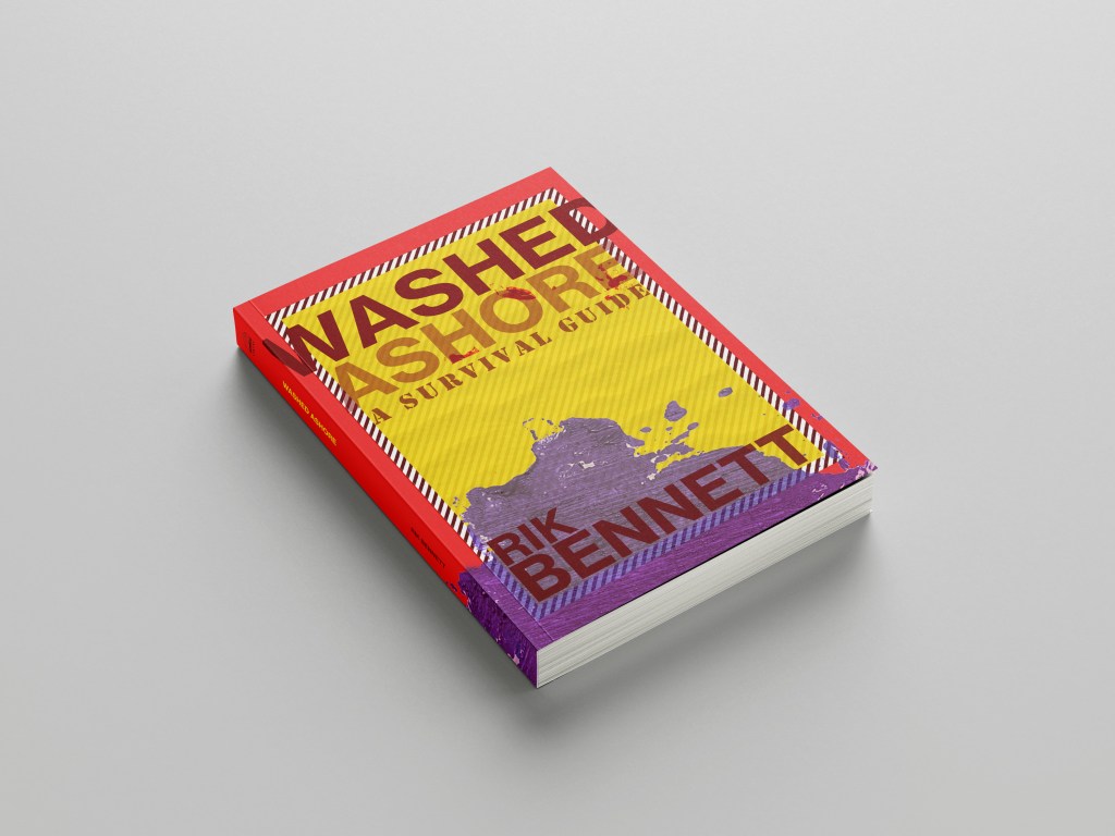
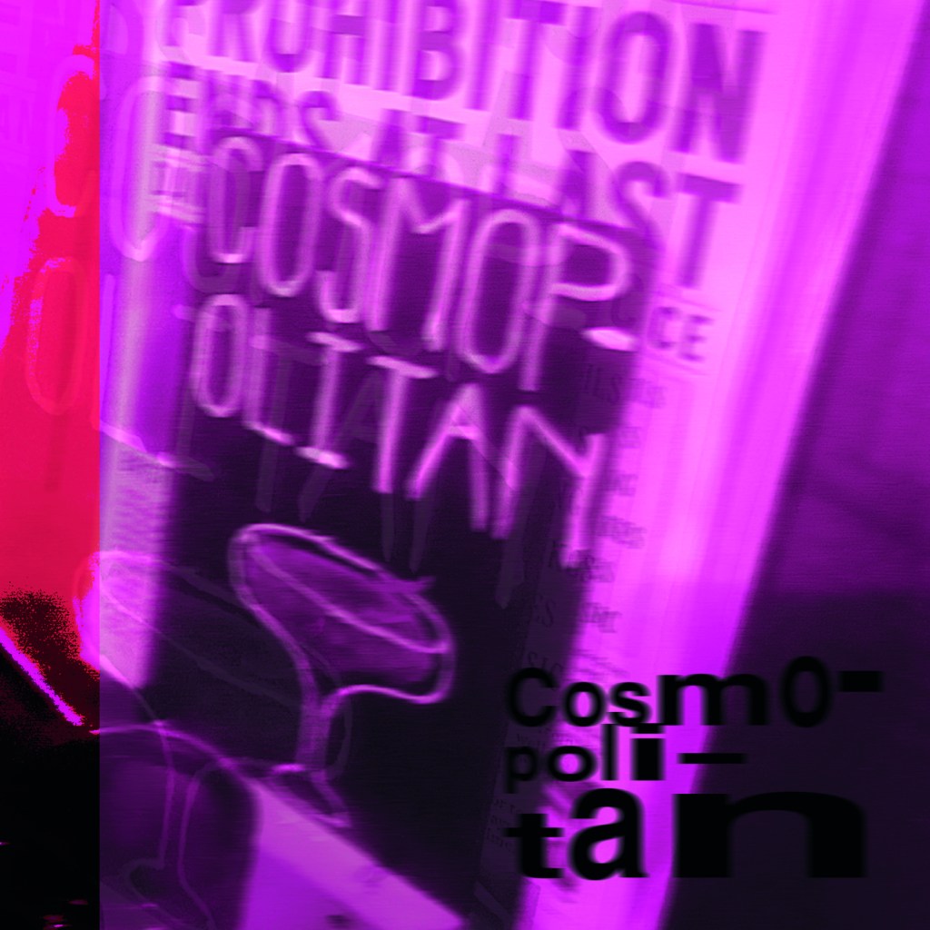
My little book of Bad typography, Cosmops and Hyphenation!

As I mentioned further up this post, I already had my main photograph (Cosmops!) that had set the tone and was inspiring the rest of my book; although I liked this photograph and thought it was a classic example of typography gone wrong, I was also worried that the hyphenation topic wouldn’t be a strong enough one to warrant being in this book – the more I looked into it though, hyphens are seen as a no no to a lot of designers so I decided to take the risk and go along with it and to see what I could come up with!

This layout also travelled the distance! It went from being too “safe” to me being brave and experimenting more with it!

Similar to what I did for Cinema City, I changed the colour of the photograph by adding a filter to it.. when I think of cocktails, I think of girls drinking them and I think of the colours pink or purple. I decided to go with Purple. I didn’t want to be too girly, I wanted a deep purple colour to be a bit more edgy and atmospheric.

I refer back to my comment about girls drinking cocktails; the most famous example I can think of is Sex and the City!-

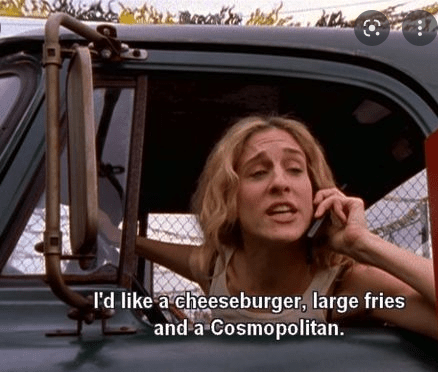
I decided to use this as the main quote on the page, further on though I turned against this idea; my fiancé said “I have no idea what that means…” it dawned on me that this book is for everyone not just Sex and the City fans!

As you can see above I played around with the layout a lot! Creating contrast, taking into account negative space and trying to create a harmonious hierarchy! It just seemed “too safe” for a book about bad typography though… I needed to get more experimental.

All I could hear though in my head was MOP MOP MOP! Mopping up those Cosmops on a night out! Drink some Cosmops! I got silly and used this as the main heading for the pages:

This was more experimental.. it was far more David Carson and Raygun.. What if though I could try and reflect the place I was in (drunk!) when I photographed this sign?.. it would also tie in with mopping up (soaking up!) the Cosmops! I used a blur filter to blur the text and the photo ever so slightly… just enough to disorientate the reader ever so slightly!…

Nailed it! It feels very Punk and Acid house! It feels like a drunk Saturday night out!

I also played it unsafe by hyphenating all of the text to make it really uncomfortable and hard to read!

My little book of Bad typography, Too many (type) faces!

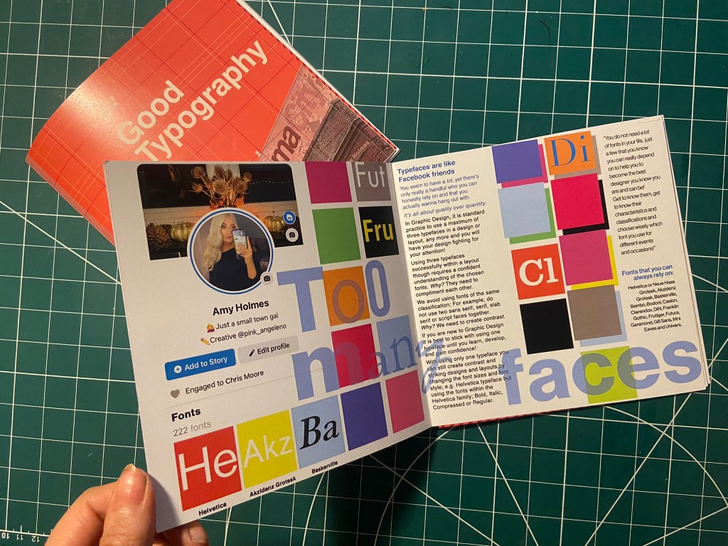
I decided that the next topic to appear in my book should be “too many typefaces”, Two pages about how using too many fonts can be bad for a design. I had the idea in my head of typefaces being like people- friends on Facebook more specifically. People boast about how many friends they have on Facebook when actually they are more acquaintances and people that you keep on there just to nosy at! A lot of people have complete randoms on their Facebook just to keep their friends number up! I am talking quality over quantity; rather having a handful of friends than loads that are crappy! It is exactly the same with typefaces, I have loads on my computer but I always go back to the ones I love and use frequently!

This is also a layout that travelled far! Again, I felt it was “too safe” and too “magazine” for my liking. It felt like a glossy spread in “Pick me up” magazine than it did belonging in a chic little book about bad typography!..

Using my Facebook for inspiration, I only have 222 friends… (probably 220 acquaintances!!) I screenshotted my Facebook app and imported it into Photoshop to manipulate and include in my design layout!

It was easy to match the typeface to Facebooks app – Helvetica! Duh! 😉

I just cut out friends and replaced with fonts.

I wanted to keep the feel of the layout like something that would be on Facebook – I used the same blue as the Facebook logo. I used the “what’s on your mind?” section of Facebook to use as a speech bubble type thing to talk about how using a maximum of only 3 typefaces at one time is crucial in Design.

“Too many fake mates” didn’t really highlight what the piece was about… It gives out mixed messages and meanings.

I took out the photos of my “mates” and replaced them with a coloured square featuring the beginning of the name of a typeface to represent my font friends.

The spread below reminded me of a page out of Pick me up magazine… It just wasn’t right for a book.

It then went back to this… which I thought I was going to go with…

It then went to this which I was certain I would go with!… (plus my profile photo changed by this point!)

But! It just wasn’t “bad” enough… it all felt too regimented, clean and like it belonged in the book about good typography!

I then went along with this one!- It was busy, bright and too much going on for too many typefaces!

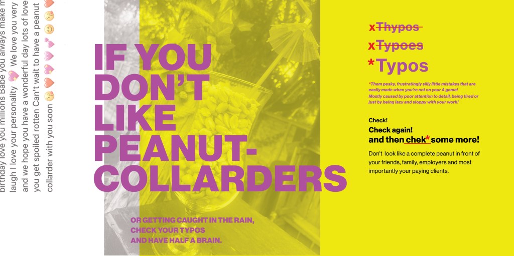
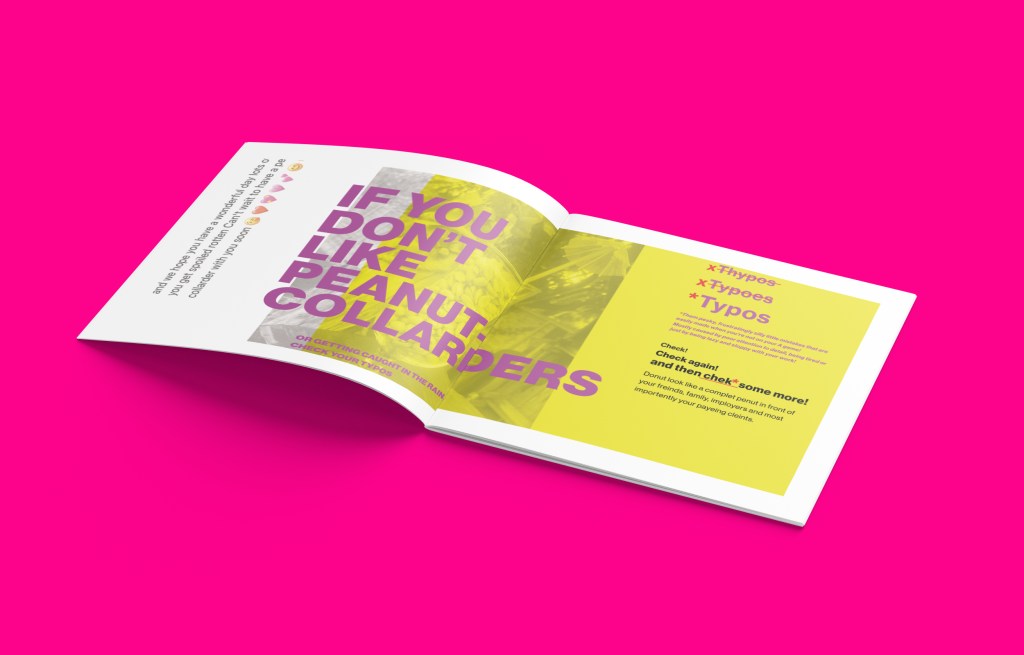
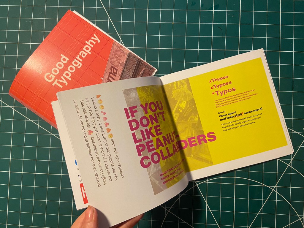
My Little Book of Bad Typography, Peanut Collarders! – Typos!

This next part of My little book of bad typography was inspired by a Facebook post that one of my distant friends wrote to one of her best friends.. I read it and (cruelly!) might have laughed a bit and instantly screenshotted it to use as material for Typos!! – the topic of my next pages!

Ok!.. so the infamous message was this!

Possibly a little bit mean…. ;s but c’mon!… it was too perfect to not use! Do you like Peanut Collarders?… ;p

Firstly I needed to know what a Peanut Collarder might look like! – cue our outdoor bar, a pink umbrella straw, a large bag of peanuts and a Pina colada glass!..

Like I have for all the other layouts, I imported a photo of my Peanut Collarder into Photoshop and placed a yellow filter over the top.

I then also altered and imported in the Facebook message (obviously protecting the identity of who wrote it and who it was intended for!) Obviously I had to use the Pina Colada song as the main heading for the layout! – It started off with “Do you like Peanut Collarders?” but then evolved to “If you don’t”.. then don’t create typos!!

Once again though the layout seemed too “safe”, I really liked the look and feel of the layout but it needed to be made more “bad”.

I then spelt “Typos” three times making sure that the first 2 were definite typos!

This then evolved into a host of typos in the main body of text – it related more to the nature of the book and it reflected typos perfectly!

I then had a think about the inside pages; on my Good typography book I had the striped red inside pages… I wanted similar for this book too but in keeping with the Pink, Punk colour!

I also included another photo credit for the photograph taken in Bootlegger!

I then had to work on the front cover for the bad typography book! I had big shoes to fill from the first cover! I did like the David Carson inspired pages I did for Cosmop so I wanted to follow in the same footsteps!

I had loosened up a lot from starting this assignment so for this cover I just went for it!

It only took 2 attempts and I knew I had cracked it! The response I got on my Instagram when I uploaded them was proof enough! –

I have noticed that as the time goes on and I gain more and more confidence I am able to stop second guessing myself and put out a design after only a shirt while working on it and know that it was the right decision!

They did look good on my Insta feed though I do have to say!… They got a lot of love from my fellow OCA peers too!

It was then time for the back cover.. I pretty much wanted the front cover to roll over to the back because I loved it so much!

Bad typography is everywhere so that is all I literally wrote on the back!… it did change ever so slightly though because when I imported the jpeg into InDesign I actually liked how it looked when I zoomed in on a certain part of it!

Perfect!

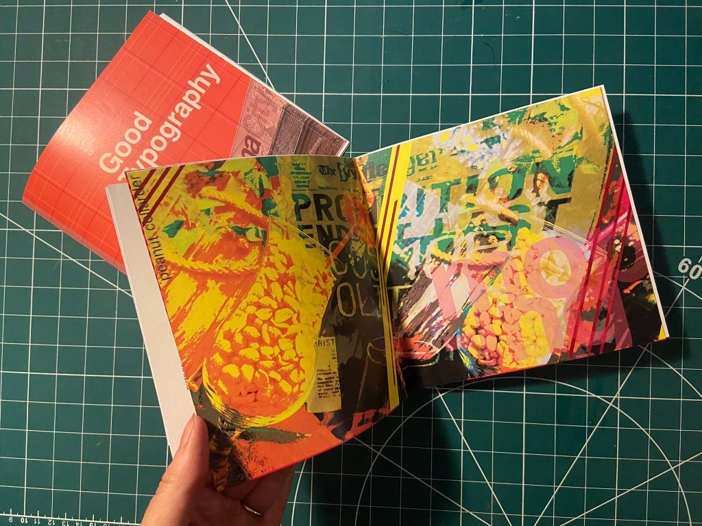
I also wanted to do a similar thing for some inside back pages for this book, in the style of David Carson and collages and like what I have done for the front cover and the Cosmop layout!

It looks like absolute mayhem! Peanut Collarders, Cosmops… wild night out!

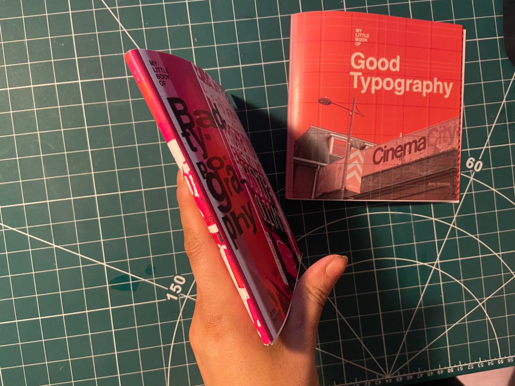
Making the final books

As always when creating a final book I always set up a document in InDesign and then import any images I create in Photoshop in to then add text etc… this time I worked differently, I created everything in Photoshop and exported the jpegs and then imported them all in!

My methods of printing the books are not ideal; I did not take this one to professional print I just did as I did with my zine and printed it out at my workplace using their laser colour printer. I really struggled to correctly paginate my pages when I printed my zine to my work laser printer last time because the printer flips the pages weirdly! I found that I had to lay pages put upside down and at different sizes to print correctly last time! – it was a nightmare! I tried the same this time, I paginated all the pages but because there was only a certain number of pages there was a double page spread on each book that printed out blank! I did not want blank pages in my books so instead I went back and printed each spread off individually and bound my book together in a different way!

The paginated versions that I printed for my first trials!

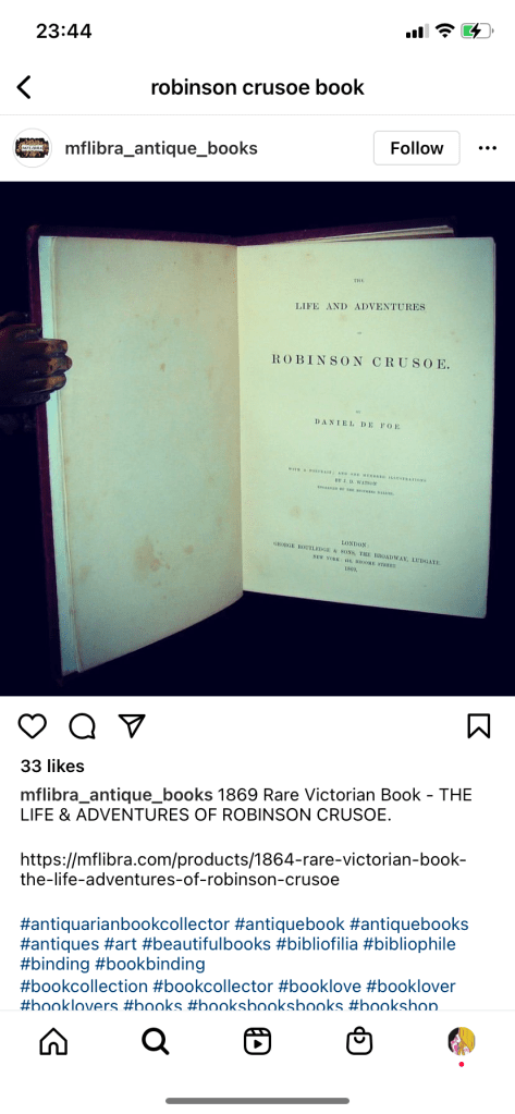
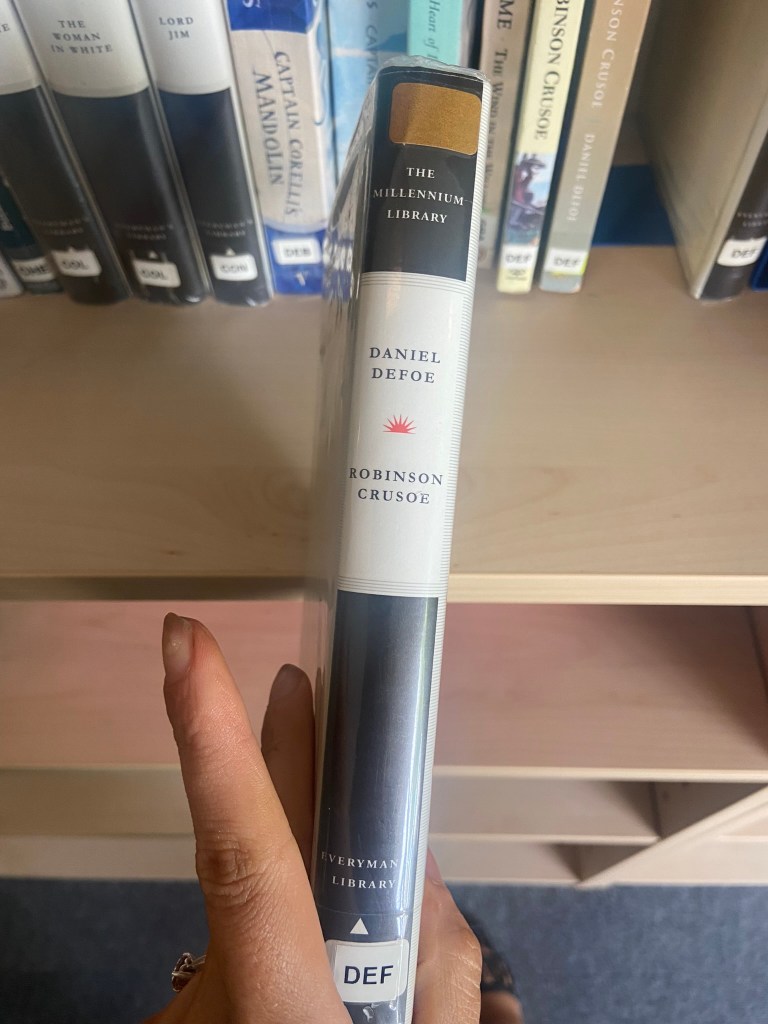
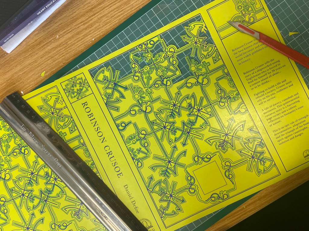
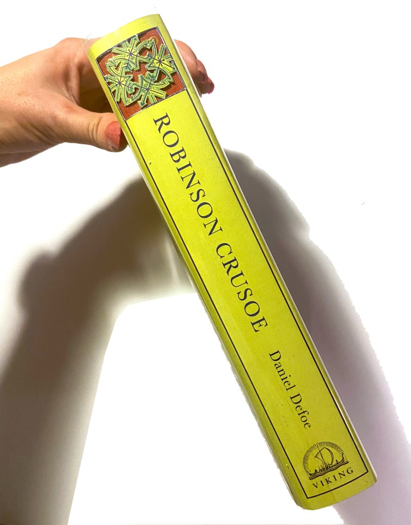
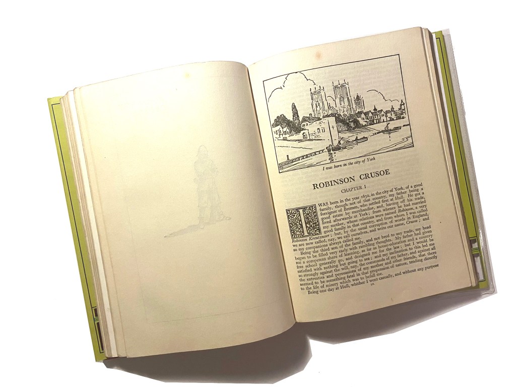
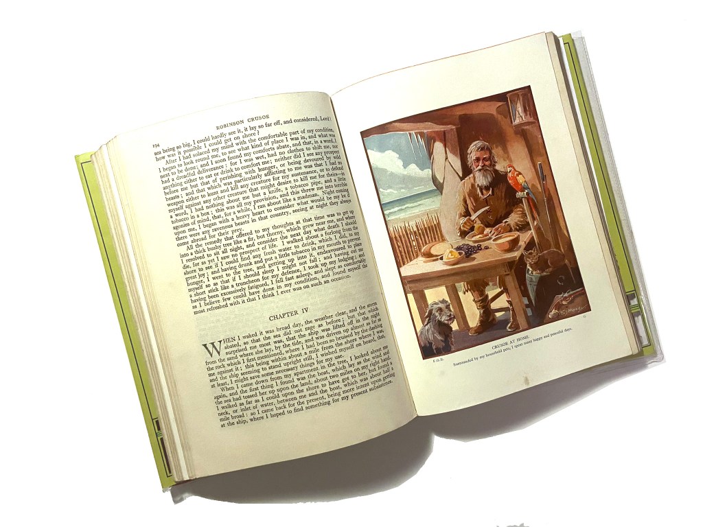
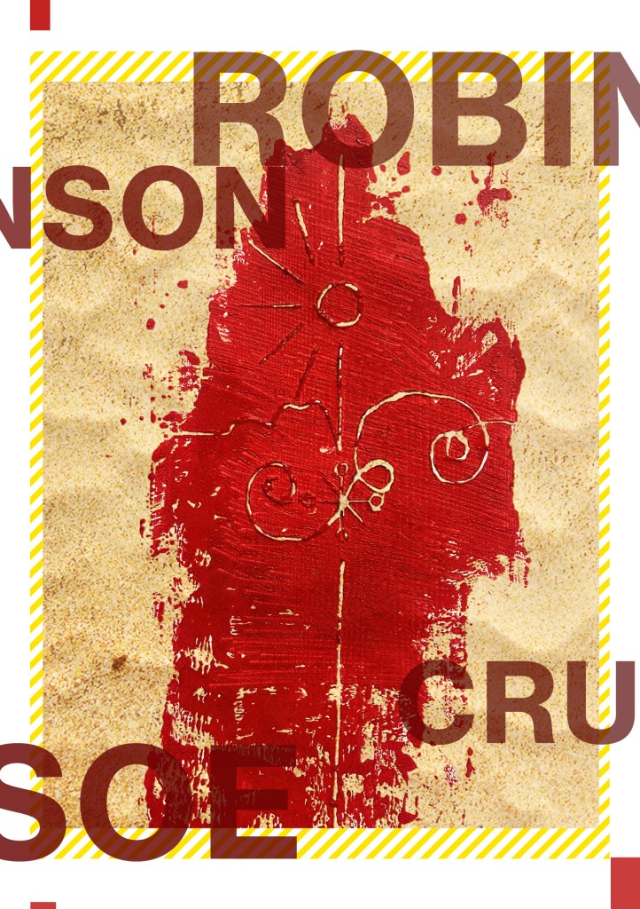
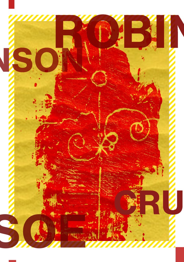
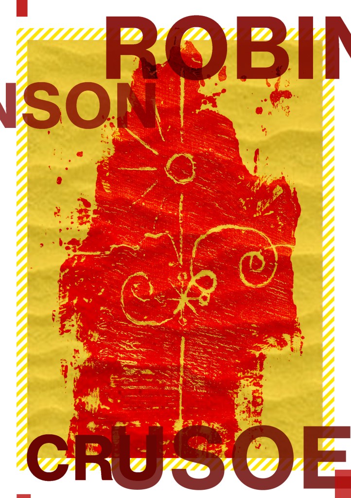
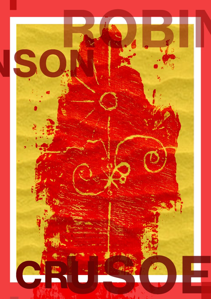
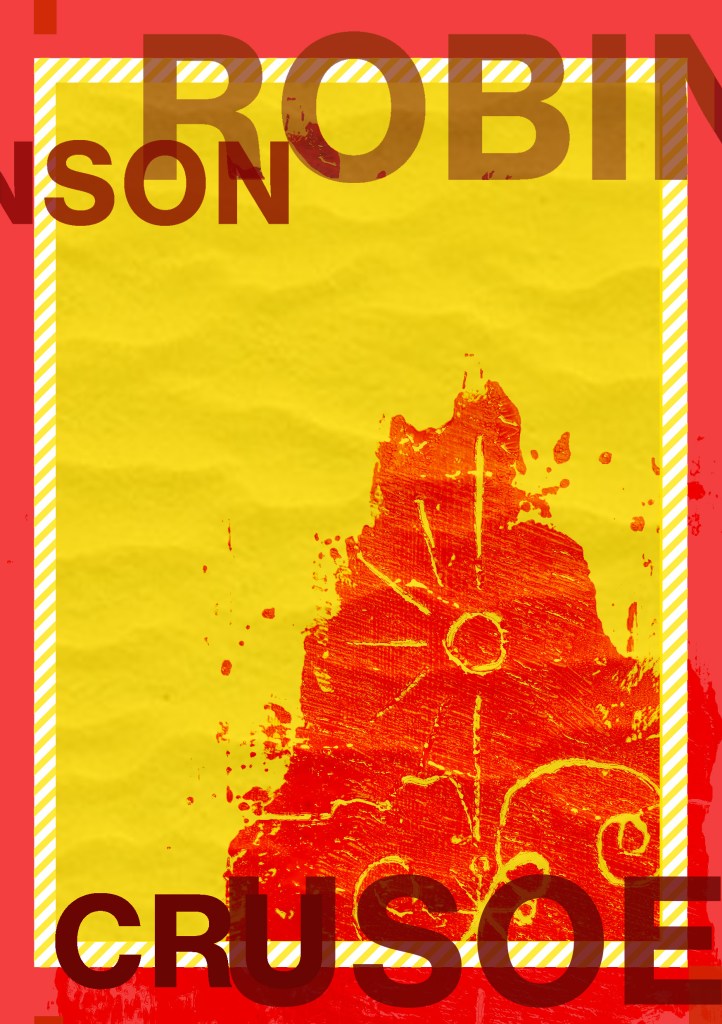
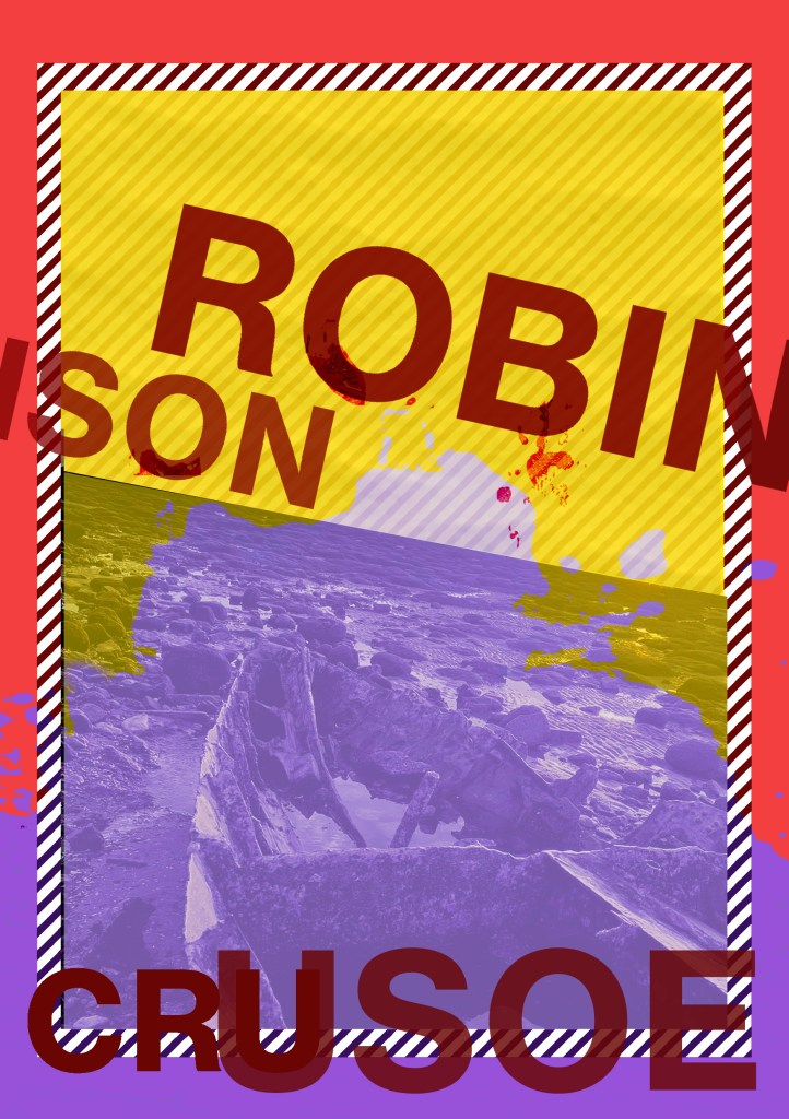
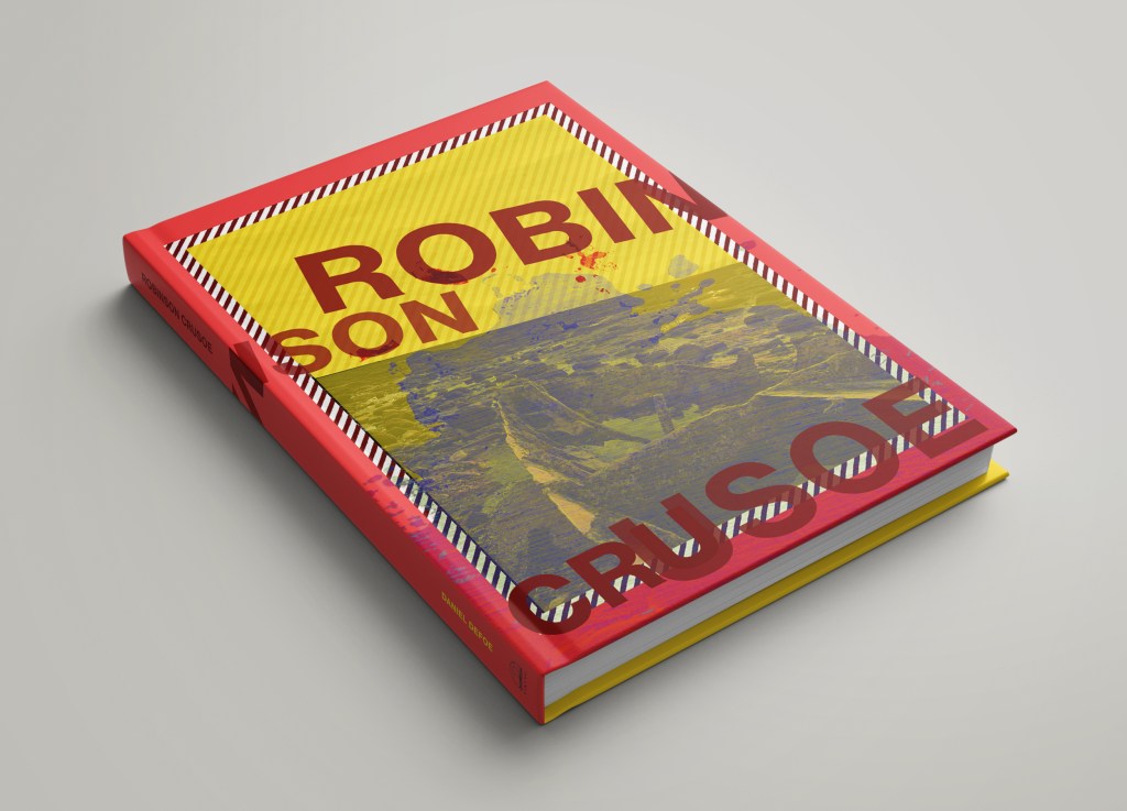
I printed my books out using the same paper stock as I used for Robinson Crusoe; a lightweight glossy card stock – (it is somewhere between paper and a really thin card!)

I then used photo mount and glued the pages back to back, the way I bound my book actually made this the perfect paper stock to use because by the time I had finished I had really sturdy glossy little books! The spine was quite prominent too and sturdy!

Conclusion

The one thing I will note that I have done differently this time is that I have very little initial sketches!- Usually I have handfuls of little doodles which help inspire my designs; this time however I was working from my instinct and digital development! The 2 photographs inspired my thought process and then digitally from there everything just flowed! My confidence has increased since the start of this assignment, I am really pleased with how my books have turned out. The response on Instagram and from friends and family has been positive too! The verdict has mostly been that they look very striking and professional! In my next assignments I wouldn’t make the same exception and have such limited drawings but I took a risk with this assignment to work digitally and it paid off! I am so much more confident with grid systems too which is something a few years back I never thought I would say! I used to hate the grid and be one of the people I wrote about!- just a page full of unnecessary, complicated lines! I really enjoyed this assignment and I think my skills and layout design has come on leaps and bounds from “If the face fits” in Core Concepts. Next time though I shall probably look into having them professionally printed; it will also give me the experience in dealing with industrial printers and outside professionals!

Exercise 3: Experimental Typography

The Brief

First Thoughts… (and a very “lovely” memory!…)

I am learning to like Typography and to become more comfortable using it because ever since the experience I am about to detail below, I always get worried, doubt my choices, wonder if I’m making the right choices! and basically just stare at a blank canvas for a while frozen in self doubt and lack of confidence!..

I had a bad experience at University in 2007, A fresh faced 20 year old (my first time around doing my degree before they very nicely “kicked” me out.. *eyeroll) when I had to “show and tell” or “critique” my work to my tutor and peers; the work I had to present was a poster about the sound of type? (I did it like The Sound of Music style) using shapes and typography to illustrate it.. Now I know it was by far from a work of art back in the day.. even I am looking and cringing but HEY look! Even today I’m still learning ok! Seriously though, was there really any need for my tutor to absolutely humiliate me in front of everyone, make everyone laugh at my work and by making me sob down the phone in my old little KA (called Biddy, RIP bless her…) to my mum in Iceland carpark telling her my work was shit by his comment of “ER… SOMEONE CALL THE TYPOGRAPHY POLICEEEE!”- what happened to constructive criticism? I mean I can’t even remember his name, all I remember is he looked like Shaggy from Scooby Doo and he was a complete smug, 30 something arsehole! (basically me now.. ish! ;p) All the way through this exercise though I had HIM and that stupid horrendous memory in the back of my mind as the designs I have created for this exercise are very similar to that which I created in 2007. I mean, hadn’t he ever heard of David Carson, RayGun?…

So! Mr. Shaggy, (from a certain university that was mentioned by Mr. Gilbert in The Inbetweeners!!) Get calling the typography police once again because this one is for you! Enjoy it! 🙂

Back to the Brief…

Back to the Brief…

I had heard of the book title but had no idea what the storyline to “20,000 Leagues under the sea” was all about. From doing a bit of research I found that it revolves around this mystery “whale-like-object” that sailors and merchants had seen in the sea and were intrigued to track and find out what it was. They then realise that this mystery creature is actually a modern submarine with people on board. When they go aboard the sub they come under attack by squid and goodness knows what and so the story goes!…

I wanted to concentrate on the 3 important elements from that storyline which is the “whale-like creature” the sea and the squid.

I started off by messing around with some type to look like waves before I properly thought about the layout etc…

I then started off by creating myself an A4 document and then creating myself a Golden Ratio grid which I then also included The Golden Spiral to know where my main focal point was on the layout:

I wanted a nice spacious layout – minimalist and clean. The legibility and readability is important but I wasn’t too bothered about making legibility and readability my main objective because it is pure experimental work! David Carson in his experimental typography always said – “Don’t mistake legibility for communication“, just because something is legible doesn’t always mean it communicates anyway so I might as well be experimental and just see what happens!

I spent HOURS messing around with different layouts for this! I moved type around all over the place to try and best communicate the story!I decided to use Baskerville typeface as this is a typeface that was popular in book design, it is a Serif typeface so is more ornate and decorative than a Sans-Serif to add more interest and was also from the same time period as the story.

I like the space at the top of this design. I placed the very beginning piece of text in the eye of the Golden Spiral to make it the main focal point and first place the eye goes to when looking at this layout. This is the first piece of information that needs to be absorbed by the reader to know the main subject of the story and also the feelings and vibes that it gives.

An enormous thing” is an important part of the extract and story because this is what people called this mysterious “whale-like object”. I needed to emphasize “enormous” and show that it belonged in the sea. I used the wave tool in Photoshop to adjust the word so that it looked like it was in the sea and then adjusted the point size of some of the letters and also the horizontal and vertical scale to (controversially!- sorry typo police!) stretch the letters out! I also adjusted the tracking and kerning to make the letters look more interesting and to add some contrast to the piece!

I duplicated “Enormous” and made the copy the shadow underneath; again, to highlight how big the thing is and also to add some light and shade to the piece. I used 4 wavey chunks of colour to represent the waves and placed the type over the top appropriately.

Could I create an image from letters?…

I then decided that I wanted to create a picture out of type… This was also one of my first ever assignments when I did my BTEC in Graphic Design at college when I was 16! I created a type”face”, a face out of letters! (I wish I kept that because it WAS good!)

I did though a few years back create a very similar one (I nicknamed Brian May because it looked like his curly hair!) for a display board in our Graphics room at work :

I had the idea to portray the “enormous thing” using letters and characters but I needed to research first what the “enormous thing” looked like according to previous artists/illustrators who designed the previous book covers for this story. I had a look on Google and found this illustration which seemed a good place to start!

https://www.denofgeek.com/culture/link-tank-20000-leagues-under-the-sea-prequel-tv-series/

I imported the image into Photoshop and reduced the opacity so that I could layer letters over the top of it to try and recreate the shape of it using letters and characters. I ended up with this which was mostly made up of A’s, O’s, ), C, I, =, and a ‘.

I then had a go at positioning it on my layout… I didn’t like it on there much!

I just felt that the layout looked too crowded and full with the image placed on it. It also didn’t emphasize the “enormous” size of the mysterious thing as it looked so small on the page…

I then designed this version below:

For this version I cut the drawing in half and placed half above the sea (which is where and how people would have seen it in the storyline!) and half below the sea. The way it forms with the wave makes it look like it is circling the sea creating the waves as it moves. The extract is all about the movement and speed of the mysterious being and I feel that this shows this. I haven’t suggested whether the enormous being is a creature or is man-made technology – it is open to the viewer what they interpret it to be! The O on the monster could be an eye or it could be a window… the A’s on the monster could be natural spikes or they could be man-made weapons on the side of a submarine… I also feel that it allowed for more space on the design and it balanced out the layout.

There was still room for development though… time to try and get some squid involved…

In this version I used “AN” as the eye or window of the monster. I wanted “An enormous thing” to stand out to the reader. I used the text in the bottom corner on the previous layouts to create octopus/squid legs which are trying to attack the mysterious being… I have text upside down and then the text below the right way around to ensure that the eye ends one sentence and starts the new one directly below instead of having to drag the eye all the way to the end of the sentences to read. Again, I wasn’t too much of a fan because there was not much space left on the layout – it all looked too crowded and displeasing to the eye.

I then moved on to create this new layout below… experimenting more with the blocks of text.

I had created movement in the waves and for the “enormous thing” but the block of text underneath the sea (bottom left side) was very much still and lacked movement which would very much be questionable considering it is supposed to be submerged under water!

I decided to make the text look as though it was floating in the depths of the water; making some wavey, making some stretch and move with the waters push and pull motions and making some text seem larger and smaller to look as though they are reflected in the water. This is more creative and interesting than just being a block of “still” text. I felt like there was still enough space and that the hierarchy of the layout was balanced.

I then went one final step further to create the same layout but blurring the text ever so slightly to look as though it is under murky water:

The mockups!

Exercise 2: Double page spread

The Brief

First Thoughts

I remember having an exercise very similar to this in Core Concepts and I have to say that even though I very much see the relevance and significance, I hated it all the same!- the mundane task of dissecting a layout and then recreating it in various ways…

But! Here I go…

Choosing a layout

I started off by choosing a book to pick a layout from to dissect – the book I chose is very relevant to this unit and to the upcoming assignment; “Stop stealing sheep and find out how type works“. My copy is very worn and tatty with all the pages loose and barely hanging in there but I chose a double page spread that I could analyze and copy for this exercise!

The double page spread I chose was completely at random by simply opening the book up and seeing which pages I ended up with; it turned out that I did rather appreciate the sentiment of the article which is why I have chosen to replicate the main verse of it instead of using all Lorem Ipsum:

An article about appreciating the value of time!

Despite what the authors state in the top right paragraph about this spread, (they suggest that this DPS is quite a minimalist layout) I feel that there is quite a lot crammed onto it!

The layout and the colours remind me of something that I might find in a Bauhaus book, there is everything here to make a Swiss classic! – Sans-Serif font, a layout to a structured grid, lack of photography or images, geometric shapes, 3 contrasting colours…

Despite my personal opinion that I would have liked to have seen less content on this spread, everything on this layout does flow nicely. It jumps comfortably up and down and from left to right… there are no curves or need for the eye to jump massive spaces from one element to another. It is all very “blocky” and quite regimental in its approach. It is clean and for the amount of text that is being presented on this spread, legibility and readability is the most important factor.

The rule of 3 is being used; there are 3 blocks of black to tie the elements together and the same with the Yellow colour – the yellow text clearly is related to the diagram in yellow.

I think that this grid is quite simple.. columns of 6 potentially:

Just because of the way the layout is very “blocky” and flows that way I think that it is following a simple grid like this one and that the elements are being lined up to its relevant column.

Recreating the layout…

I then went about the painful process of drawing out the layout and measuring everything on it:

At the end of this long drawn out process it looked like I have drawn a floorplan of a house!

Next came the slightly less painful process of recreating this in InDesign:

Below shows the elements sat in their measured positions.

Below shows the layout without the guides and grid present:

Using a 10% shaded area for the decoration on the page, I also used Lorem Ipsum for the main body text apart from the lecture by Frank Franklin which I enjoyed and wanted to show.

Before I even read this spread I was trying to guess what font had been used and the point sizes of the text. I knew that the typeface used is a Sans-Serif; my first thought was Franklin Gothic to tie in nicely with the authors name! I did try it out and it did work but it wasn’t quite right.. I then did think about Frutiger as the letters were more bold and rounded and then as I read the article I realised that they actually mentioned they used Frutiger on this spread for its “more humanistic touch” which improves legibility by keeping the shape of the letters more open and more distinct from each other.

On the right hand side looking at the point sizes of the text I figured that the main body of text was a bigger size and that the two accompanying pieces of text would be about 2 point sizes smaller. I went for 10 on the main body text and then 8 for the two other pieces of text. I figured 10 is possibly more on the smaller size for print and would be the least I could go for this large piece of text to keep the legibility and readability.

Again, above is the layout without the grid and guides present.

Below is what my final recreated layout looks like! (I did make the coloured boxes full opacity just to show the likeness to the original!)

Extending the Exercise: new layouts

I then looked at how I could further change the original layout some more by completely changing and moving the elements around.

I decided to create my own grid, using the same page measurements as the original (A5) but by bringing in my 6 column grid and creating a Golden Ratio and spiral:

From the research I have done previously on The Golden Ratio and Golden Spiral, I learned that the main focal point of a layout is at eye level and at the smallest point of the spiral (where I have highlighted using the grey rectangle below!). I knew that this is where I needed to place the most important information or elements from the layout.

Alternative layout no.1

I like negative space and felt that the original layout didn’t really seem to have a lot of it, in this version I have created space around the outside to allow the layout to breathe. I have organised the elements of the layout by importance by putting the information that I feel needs to be read first around the “eye” of the spiral (eye level). My eye is first drawn to the title and then straight to the accompanying article with my eye then travelling on to absorb the rest of the (less relevant) information. I have aligned the text boxes to the columns of the grid gently allowing the eye to comfortably navigate and jump between the text. On the right hand side page I have allowed for space in the bottom corner and aligned the main body of text next to the main body of text on the previous page (again at eye level).

The only thing that would need to be well thought out is how far near the spine the text is on each of the pages because if this double page layout was going into a 400 page thick book, the text might get lost in the gutter of the spine when the pages cannot be opened fully.

Alternative Layout no.2

Alternative Layout No.3

Alternative Layout No.4

The page that I have changed on this layout is the right hand page. I was trying to take all the elements away from the focal point (eye level) just to see if this made a difference to where the eye travelled and what information was absorbed first; it does, but I am surprised that I don’t think it distracts in a bad way. My eye is now drawn to the area of negative space in the top corner and negative space is as much a part of the design as anything else and I think it also helps balance the double page spread out; on the left hand page the bottom corner is the negative space – there is balance in the hierarchy.

The Conclusion

So, although this exercise has been painful it has also been worth while completing as I have learned a lot about hierarchy and where to position elements on a layout. Again, the importance of a grid has been emphasized to me once more. I am learning to see the grid as more of my friend than a bunch of confusing, mathematical lines and workings outs on a page! Although I still think I need to research, study and learn more about grids so that I can comfortably use them without the fear of doing it wrong and feeling nervous and apprehensive about the process!

Research Task 1: The Golden Section

The Brief

This is one of them exercises that I 100% understand is crucial in good design and I am always striving to learn more; but due to its mathematical nature and the fact that my maths is rubbish, I dislike this exercise more than any I have done previously!

That said, I have touched on Golden Ratio and the Fibbonacci grid by myself in my “If the face fits” assignment from the Core Concepts unit where I used it to help me create interesting layouts for my type specimen book. Over the last few years of my studying, I have grown to like the grid a lot more than I did! When I first started with the OCA I really did not like the grid!- I just saw it as a lot of unnecessary lines on a page just set out to unnecessarily complicate matters! Whenever I tried to create myself a grid I did not know what I was doing, where I was supposed to put lines, how many lines or what went where! It is only now with having done a lot of layouts that I understand just how important it is to place elements in certain places on a page, hierarchy, how certain things should align in harmony together and the importance of creating space on a page. David Carson famously does not design to a grid and whilst I appreciate his experimental work and like his impulsive layouts, I don’t necessarily agree with him that this method works for everything!

It has been a while since I last looked into the Fibonacci Grid so I shall use this exercise as a refresher to remind me of what it is all about again!…

The Golden Section

“Though largely forgotten today, methods and rules upon which it is impossible to improve have been developed over centuries. To produce perfect books these rules have to be brought back to life and applied.”
Jan Tschichold, The New Typography, 1928

The Golden Ratio, (as it is also known!) is a mathematical (arghhhh!) ratio. It is commonly found in nature and when used in design it helps create organic and natural looking compositions that are aesthetically pleasing to the eye. Getting back to the awful mathematical side of it; The Golden Section exists when a line is divided into two parts and the longer part (a) divided by the smaller part (b) is equal to the sum of (a) + (b) divided by (a), which both equal 1.618. (Yikes!). In design though, it all comes down to aesthetics with creating a sense of beauty through harmony and proportion; the phrase that springs to mind is a certain je ne sais quoi.

The Golden Section has been around for thousands of years; from the Pyramids to Michelangelos “The creation of Adam” on the ceiling of the Sistine Chapel, even Mona Lisa played a part with the Golden ratio and then onto more recently with the Pepsi logo.

Our bodies and faces even follow this mathematical ratio.

So, how do we use The Golden Ratio in Graphic Design and how does it help?

The Golden Ratio helps compositional elements of the design including layout, spacing, content, images and forms. Negative space is very important in a design; it is considered part of the design itself but whereas I usually use instincts to guide me to where to place elements, the Ratio can be used to guide where elements are placed. This will ensure that spacing and proportions are calculated. If there are several elements to place on a layout the Golden Ratio will allow consistent proportions throughout the design.

So whats next? What better way to try and learn it than to physically try it out for myself?….

(*cue my instant regret at achieving an E grade in GSCE Maths!)

Trying out The Golden Section

So the first step is for me to draw a square and multiply one side of it by 1.618 and I should end up with a rectangle of “harmonious proportions”….

Ok! so 7.76 x 1.618 =

So far so good!…

Now apparently if I lay the square inside the rectangle this is the Golden Ratio!..

Now apparently if I keep applying the Golden Ratio formula to the new rectangle on the far left of the image above I will eventually get progressively smaller squares.

(*This is the part where my brain has to deal with numbers and figures and goes into a meltdown!)

Here goes!…

This confused my slightly because I was still trying to multiply one of the sides x 1.618 but I figured I am trying to make the squares smaller so needed to divide a side by 1.618!

and the last stage!…

Ok! So I successfully managed that! – but now what happens if I try and have a go at the Golden Spiral?…

The Golden Spiral (or Fibonacci Sequence) is a series in which the pattern of each number is the sum of the previous two numbers (ARGHHHH!) starting at 0 the sequence is: 0,1,1,2,3,5,8,13,21,34,55,89,144 etc! By then adding an arch in each square you end up with the Golden Spiral!

The Golden Spiral features in many natural forms – Ferns, Flowers, Seashells and even hurricanes!

https://www.canva.com/learn/what-is-the-golden-ratio/

Looking at layouts

When using The Golden Section to help with spacing and placing elements on a layout, it is always best to place the main focal point of the design in the centre of the spiral as this is naturally where the eye is drawn to – this is shown in the website design below:

This website design above looks quite content-dense but is organised to the Golden Ratio and the Golden Spiral. The focus is the upper left where the eye is drawn first to “Bonjour my name is Tim” and then travelling past the description and to the menu buttons – it hits the logo and then comes to a stop where the next pieces of information to be absorbed are the negative space with the photography.

The Rule of Thirds…

I have heard of the rule of thirds before and regularly use it in my designs but I was unaware that this too relates back to the Golden Section. I always referred to it as “the power of 3” and I thought that when creating a layout you made sure that there were 3 elements on the page that the eye could travel in-between. When arranging objects for flatlay photography the rule is “power of 3” organise objects into groups of 3 otherwise the eyes attention is automatically drawn away!

I had experience of this when I went on a free flatlay photography course a good few years back! (See below!)

This is a magazine layout which uses the rules of thirds and the Golden Spiral:

Reference: https://www.canva.com/learn/what-is-the-golden-ratio/

The designers who have used the Golden Section…

Look into the golden section more generally, by exploring how artists and
designers have used these principles, and more specifically in book design, by
looking at J. A. van de Graaf’s ​Canons of Page Design​, Jan Tschichold’s ​grid designs​,
or other grid systems for organising the page:
https://en.wikipedia.org/wiki/Canons_of_page_construction

The canons of page construction, (also known as the “Secret Canon” used in many medieval manuscripts) are historical reconstructions on the careful measurements of books and the mathematics and engineering methods of the Medieval or Renaissance era. It was used in book design to divide a page into pleasing proportions. Since its popularization in the 20th century these canons influenced modern book design with page proportions, margins, type areas and the construction of books.

The notion of canons (or law of form!) of book page construction was made popular by Jan Tschichold in the mid/late 20th century, he wrote: “Though largely forgotten today, methods and rules upon which it is impossible to improve have been developed for centuries. To produce perfect books these rules have to be brought to life and applied.” Jan Tschichold described his discovery of the use of the ratio as “a method to produce the perfect book”. Tschichold’s Golden Canon’s crowning glory was that it proved that the ideal height for the text block was equal to the page width.

The geometrical construction of Van de Graaf’s canon which works for any page width:height ratio, enables the book designer to position the type area in a specific area of the page. By using the canon the proportions are maintained whilst creating pleasing and functional margins of size 1/9 and 2/9 of the page size.

Too much maths for me to handle right now!…

The resulting inner margin is one-half of the outer margin which to some modern publishing houses might be a different way of doing things! – With the inside margin being a lot closer to the spine when there is a really thick book of over 400 pages, you start breaking the spine to be able to read that closely to it before the text gets lost in the gutter. The modern publishing house approach to this is to flip the gutter and outside margins.

I decided to draw my own to give me an idea of what I was doing and so that I could also use it in my own design work:

This method was discovered by Van de Graaf, and used by Tschichold and other contemporary designers; they speculate that it may be older. The page proportions vary, but most commonly used is the 2:3 proportion. Tschichold writes: “For purposes of better comparison I have based his figure on a page proportion of 2:3, which Van de Graaf does not use.” In this canon the type area and page size are of same proportions, and the height of the type area equals the page width. This canon was popularized by Tschichold in his book The Form of the Book.

Part 3: Exercise 1 – Type Samples

The Brief:

Find as many examples of type as you can from a range of sources, including newspapers, magazines, flyers, leaflets, online, and printed ephemera. Broadly classify them into serif and sans-serif groups. Explore your computer to see whether you have any of the typefaces mentioned on the previous page. Find other examples on your computer that relate to these classifications. Print these off and begin to create a collection of type samples.

Document and present
The work you produce for this exercise will feed directly into your assignment, so collate your notes, printouts, traced letterforms and samples of type you have gathered. Consider how these could be inventively and visually integrated, and how your ideas could be creatively developed further for your assignment.

Type Samples – Collected examples

I went to Bristol a few weeks ago and in a charity shop I found some design magazines; one that I found was one called Riposte, (I am still not sure what exactly the magazine is about! *shoulder shrug) but it has some lovely typefaces in it so naturally I had to buy it for £2!

For this exercise I knew I had to use it! Inside I found some typefaces that I like! – This magazine publication is very minimalistic and uses a selection of Sans-Serif and Serif typefaces. As far as other classifications are involved such as script, decorative, blackletter etc there isn’t any of that!

This is an example of a Sans-Serif typeface; The typeface looks geometric in appearance by the way the o,u,s and r are quite rounded. The line weight of this typeface is quite light; the width of the stems on F, T,H,M.E,Y and A is quite thin. The overall look of this typeface is clean, modern and minimalist. Exactly the traits of Swiss type where clarity and readability is more prominent than it’s aesthetics.

As I mentioned above, Geometric typefaces are based on a circle, triangle or square and reflect the modernist movement of the late 20th century and typefaces that closely match this appearance and classification are: Futura, Kabel, Century Gothic and Avante Garde.

This below is another page from the magazine; as well as the typefaces being appealing I also like the quotes and sentences! “Focus on your breath” with a massive pause in between to represent pauses and breaths taken in and out. Even though there is only type on the page and the type that is being used is not particularly expressive, it is very calming.

This typeface is again a Sans-Serif and although both typefaces I have looked at in this publication seem quite inexpressive, this one below looks more unfriendly than the one above. I don’t know if that is because it is a condensed typeface- (it looks as though it has been squashed down slightly!) or whether it is just because it is bolder and the line width is thicker than the one above.

This typeface looks rounded again and follows suite in the footsteps of the typeface from above in that it is minimalist, bold, clean and oozes clarity.

This below typeface is interesting, although it is a Sans-Serif it is trying its hardest to morphe into a Serif! There are not serifs but from looking at the bowl on the lowercase a, b and d you can see that the typeface becomes a lot more shapely and fancy in its appearance and the line thickness changes! The lowercase U shows a dramatic change in weight and line thickness. Similar to the rest though; clarity is the aim of the game and legibility and readability; another clean, bold, minimalist typeface!

The typeface below is an example of a Serif typeface; the articles reflects the potential use of the typeface. The article is relating to “savage” female beauty and strength and to represent that they have used a very feminine yet bold looking typeface. A lot of Serif typefaces are perceived as being feminine because of the beautiful ornate and decorative serifs at the end of the letters. This typeface is particularly nice as the line weights are different. There is a nice contrast between the thick weight next to thin weight on the letters; the perfect example of this is the x. The typeface is also used in Bold and Italic which emphasizes part of the sentence and also adds contrast – this is also classed as a “harmonious combination” where 1 typeface from the same family is used but different versions of it are used alongside each other, i.e. italic and bold.

The magazine cover below is an example I found lying around the classroom I work in; it was in the pile of newspapers that the kids paint on etc… The cover stood out to me as it is really striking! The contrast of the Yellow background with the black and white text and the negative space with the striking, unusual image that is used just make it a impactful layout!

The typeface that is used is another bold, Neo-Grotesque Sans-Serif that looks slightly condensed again, (looks like it has been pulled up!) It looks like a tall typeface! The line weight and thickness of all the characters in this typeface seem to be the same. Just like the other Sans-serif typefaces I have looked at clarity and cleanliness is key and legibility and readability paramount.

The below are examples of typefaces I liked from a paper sample book. I have realised that I do love a Sans-Serif font! Most of the ones that capture my attention are Sans-Serif! I just love Swiss Typography and bold, impactful typefaces! I do prefer the thicker, weightier typefaces though compared to the thinner ones; they just stand out more and grab your attention more!

The stem on Gin looks a lot like the “plugged” in typeface from above; it angles off at 45 degrees! I really like this typeface! – the Red gives it a bold Bauhaus/Constructivism feeling too. The typeface that is used in “killing it” is too thin for my personal liking. “Kind” looks kind – I think because although it is a Sans-Serif typeface, the swoosh on the end of the K makes it look soft and friendlier. This typeface could be classed as Humanist because the leg on the K is showing elements of hand drawn and designed.

The Run/Slow is a good example of how different weights of a typeface can help to portray a message, (as I mentioned earlier Sans-Serif typefaces are not very expressive, if they were a person I imagine they would lack interpersonal people skills and be like a introverted closed book!) but I can almost hear these typefaces talk to me – “RUN” telling me to go quick, fast and loud and then “slow” telling me to take it easy and calmly. The thick, bold letters of “RUN” really emphasise this and the smaller, thinner weight of “slow” portrays a much slower, calmer pace.

Type Samples – Computer examples

I have and use a lot of typefaces that I have got online either through paying for and downloading or through Adobe Typekit:

I also had to download a few of the Swiss typefaces as a lot of these I found were not available on Adobe.

I have a lot of typefaces that I have also installed from Typekit onto my Adobe account:

These are mostly all of the ones I have linked to my Adobe account! There was too many to cram onto one page!

Identify

Choose five different typefaces from your classification collection and now look for examples of how they can be used for reading in different contexts. For example: which typeface would be appropriate for a magazine, science book or newspaper? Have you collected a typeface that might be suitable for all these subjects? As a way of testing out which typefaces might be appropriate for a particular job also consider them as inappropriately as you can – find contexts in which they don’t work, look ugly or feel ‘wrong’ in some way. Do this by experimenting visually with your typeface choices.

Before I started the next part of this exercise I already have some funny memes and photographs stashed away for how font choice is so important! Type into Google Fonts matter and the amount of funny typeface blunders that come up are hilarious!

Choosing the right typeface is crucial to delivering the right message with the right tone and appropriateness!

The brief was to choose 5 typefaces and look for examples of how they could be used in a reading context.

I decided picked 5 typefaces from my catalogue that I either like or have had experiences of how much font choice matters already!..

I picked Lemon Milk because I don’t even remember downloading it but as soon as I saw it again I loved it! Watermelon Script is the typeface I chose for my wedding Save the dates. La Luxe Serif was downloaded for The French Hen exercise in Core Concepts but I just like the Parisian, chic look of it. Lust because I have had a recent “fonts matter” experience with it!… and Mina, just because it is a beautiful typeface but I am just unsure how well it would work on a lot of publications and designs.

Lemon Milk is a gorgeous Sans-Serif typeface! I would classify it as a Geometric Sans-Serif as the letters are very square. The typeface gives me 1920s vibes which would be significant to the Constructivism and Modernist movements; the typeface is modern in its appearance and has clarity, cleanliness, legibility, readability and minus any decorative features.

I think that this typeface would look lovely used in headings in magazines, menus, invites, packaging (it might make a really good chocolate bar wrapper!) and as display type for advertising. I don’t think the uppercase alphabet in this typeface would be formal enough to be used in a main heading in newspapers; it is quite modern and experimental to be used in a serious publication such as a newspaper. The lower case alphabet in this typeface however would be good for side headings in magazines and possibly in newspapers.

The below image is from Lemon Milk download page on befonts.com and shows how different the lower case letters look in this typeface compared to the bold capitals. The advert they have created shows that the lower case alphabet is very friendly, soft and comforting whereas the upper case is very bold, dominant and intimidating in comparison!

This is a typeface that is quite versatile and can be used for many publications, designs and occasions. The only 2 I might not associate it’s uppercase characters with are a newspaper main heading or headline for its modern less informal look and for birthday cards, (as per Sans-Serif typefaces in general) the typeface is quite expressionless and emotionless and wouldn’t really convey the celebratory feel!

Watermelon Script was a Serif font that I downloaded to use on our wedding Save the dates! I wanted something fancy and romantic and swirly and this is the one I chose!

This typeface would be good to use on invites, birthday cards and personalized gifts. In a fashion magazine if there was an fashion shoot it could be used as a heading for that – I imagine it being used in a Spring/Summer fashion shoot as the typeface has happy, flowy, summer vibes! – It’s name is Watermelon Script which in itself sums up happy, summer vibes! This sort of typeface would not be good on anything with a serious nature; it would definitely not be good to use in obituary adverts or to print onto the order of service cards for a funeral!

The readability and legibility of this typeface is not instant or bold enough for it to be used in anything large scale such as billboard advertising. I would say it is not a commercial typeface but more a typeface for personal and decorative use.

This typeface is classified as Script and I feel that it would come under the decorative/ornamental bracket of this type classification – It responds to the needs of a client who is after personalised, decorative designs. It has an outrageous style that is not typical to be used or liked by everyone in everyday designs and settings.

I bought La Luxe Serif online when I needed a typeface for one of my assignments in Graphic Design Core Concepts; The French Hen. The French Hen was a branding assignment and required me to come up with a whole new logo/signage for it etc… I like the different width strokes of the letters and the curves of the serifs. It is a very elegant, formal typeface.

When I came across this typeface I instantly saw a menu of a Parisian style cafe/bar in a tiny cobbled street with tables and chairs outside. It also has a very country kitchen feel to it – a large kitchen with shabby chic table and chairs with puffy Cath kidston-esqe cushions on the seats and wooden worktops and an island with an Aga oven and ceramic sink!

This typeface is ideal for use in the fine dining restaurant/café/bar sector or for anything country home style! I can see this typeface being used in a shop that sells expensive pieces of furniture and décor for the home. Once again, it is not a display font – it is not good for use in advertising because of the readability/legibility and the fact that you need to be able to read and understand a message quickly and instantly in advertising; as for large scale print, it could work as part of a log printed large scale. It could be used for company branding and be a recognizable typeface for a company. It is a much formal typeface than Watermelon Script and could be used commercially for a business.

I downloaded this typeface once again for one of my previous exercises; it was chosen as a typeface that I would have never usually chosen and used in that context in my work. It is quite gimicky but I said that surprisingly I quite liked it and decided to keep it on my computer. I decided to use it the other day as the typeface on a label for some of my zines that I was planning to leave in a few places I was visiting over the weekend just gone. It looked completely fine on my screen…

But when I printed them out and stuck them to my zine I realised that the “Love” actually looked more like “lore” just because the line width of the V is that thin that it didn’t print accurately. I thought I could potentially get away with it as I was in a rush printing them out and to be honest I wasn’t particularly too pedantic with them as I just wanted to make it clear to people that when they see my zine lying around they are free to take it! It was only when Chris turned around to me and said “What is lore?” that I realised I had failed in my task!..

This typeface IS a gimicky font that is not very practical at all! I wouldn’t even say it has a lot of use in a decorative sense after what happened with my labels! The skinny line width of the letters make it very hard to read and understand what the letters are from a distance. This is not a display font!- it would be useless in advertising or small printing. The thin line width would not be picked up in small printing, this eliminates a lot of stationery and small adverts from its uses.

This typeface is classified as a script typeface based on the fact it is influenced by handwritten letters. It is a very calm, easy going, easy flowing typeface. It reminds me of summer evenings with a warm summer breeze sitting in a nice summer dress in a seafood restaurant with the white wine flowing. This also reminds me of the high street jewellery shops that I found in Spain in Marbella La Canada shopping centre; not expensive jewellery but reasonably priced glam costume jewellery. It would be good to use as a logo for a fine dining restaurant or wine bar and potentially for the name of a fashionable, young, modern retail shop. It would not be suitable for anything formal; you wouldn’t see an estate agents, bank or solicitors on the high street using this typeface for their branding or in their logo. This typeface might work for an independent creative though such as a jewellery maker/artist/illustrator/florist. It is a very feminine typeface and one which I imagine to be used in a leisurely, slow paced business or environment.

It is not suitable for advertising on billboards or anywhere fast paced for the fact that it wouldn’t have the instant readability and impact that is needed to convey a message in a short period of time. Again, it is not suitable for small print as the legibility and readability would be poor trying to recognise what each character is. It could be used in a fashion magazine though in a fashion shoot layout just like this typeface that I found below featured in Vogue magazine:

Develop

Trace some interesting, unusual and everyday letterforms onto clean paper. This will help you to understand the distribution of weight of line within a particular letterform. Draw over the tracing to enhance the line and fill in the letterform with an even dark grey tone – HB pencil is fine – to recreate the impression of print.

I really like the typeface used for “Wave”! I love the different line widths used and how it makes it look so elegant and clean but at the same time it stands out and it is bold because of the contrast created by using the different weights!

I like drawing type with a fine liner- particularly type with different line weights. I like creating bold strokes but then adding fine details with the different weights! Contrast is key and by using different line weights and thicknesses ensures that contrast is present in a typeface! – The only thing that needs to be paid attention to is that line weights are not too skinny like the Lust typeface above where some of the type cannot be distinguished. My least favourite typeface above was the one that was used for “lips” that typeface for me is just too skinny and distorted! It is difficult to read and looks like it was designed in the space of 5 minutes whilst having a daydream doodle!

The typeface that is used for “Restful” is quite nice; it has different line weights and looks elegant and classical -the f gives me musical vibes – Forte.

This exercise was also a nice reminder of how type is designed and how the letters are composed of lots of different parts.

Exercise 2: Paper and Binding choices

The Briefs:

“The kind of paper stock you choose will be informed by the nature of the job you’re
doing. If you were working commercially, then checking paper quality – the
weight and finish of the paper – is something you would do with your client, as
paper choices can add both quality and cost to a design job. The advent of high
quality digital printing in almost every high street has made high finished
standards much more achievable and affordable – although you might be
amazed at what can be achieved with a photocopier and coloured 80gsm paper!
Knowing what papers are available and their qualities is an important part of
what you might offer as a commercial book designer.
One way to do this is by
requesting sample books from commercial paper merchants, or talking to your
local printers, who can give you a swatch of the papers they recommend for you
to share with your client and keep for future reference. Another way of doing this
is by looking at as many different kinds of books as you can and critically start to
gauge the weight, grain and finish of the papers.

Doing some research…

I decided to spend some money and order some books prior to completing these exercises to try and clue me up some more on the printing process and how books are bound and made!

I have done a little video doing a bit of a review on these books!..

Do all books keep the same paper choices throughout?

What I noticed from the previous exercise of analyzing 6 books I own was that they all used different paper stock. Out of pure coincidence, all of the books I looked at and studied in the previous exercise had hardback covers (I didn’t really notice this when I picked them out!) and they all used a fairly thick paper stock- either glossy or matte. I noticed that the books that used mainly photographs used a glossy, thick paper stock which would make sense considering that photographs always look better printed glossy. With Sophie Calle’s Exquisite Pain book different stock paper was used throughout. Exquisite Pain used glossy stock paper at the beginning through to the middle of the book. In the middle of the book there was a textured slightly thinner paper and then from the middle all the way to the end there was a matte finish stock paper. The end matter of the book again used the textured paper in plain black. I found that in the books that had illustrations glossy paper wasn’t used too much; it was mostly a medium weight matte finished paper.

For paperback books I have found that the inside paper stock is quite textured and a relatively light paper stock. Paperback books are cheaper to produce and are lightweight because most of the time they need to be easy to pick up and go and read whenever and wherever. There is nothing particularly fancy about a paperback book; they are usually fit for purpose and a quick read before they are passed on. Hardback books are considered much more luxurious and higher quality and are much more desirable as collectors pieces to read and then use as pieces of art to display in the home or office.

What’s the relationship between the covers and the paper inside?

The cover sets the tone for the rest of the book inside; the only book from the previous exercise that disappointed me slightly was The Secret Garden seasons laser cut edition. This book had a grand cover- beautifully laser cut which set the standards high for the rest of the book. Sadly though I don’t think the cover matched what was going on inside of the book – I would have liked to have seen coloured tip edged pages to match the rest of the colour theme on the book. The pages were a medium weight and were smooth and coated which made the book feel high quality but I feel there could have been a bit more luxury added to the pages. If the front cover is quite grand I feel like the inside pages need to meet the high standards of the covers.

Which books do you like the feel of, and why?
I much prefer hardback books because as well as being able to read them they are works of art in themselves. Greater designs can be achieved with hardback books because they have more scope; paperback books are cheaply, quickly and easily produced. I really like the cloth bound covers on hardback books – I like the timeless, classic, contemporary feel that this gives the book. If I’m designing a cover for a hardback book I would want it to be relevant for decades and still have a contemporary modern day look which is timeless. I found that with the cloth bound books simplicity is best – in fact simplicity overall works best! If the book was to feature a lot of photography or illustrations, I like the thick, glossy pages as they would be great to print onto and the print quality would be high. I quite like textured paper for inside hardback books – especially with a cloth bound cover; it would be a complete sensory experience!

How does the book block adhere to the cover? How does it adhere to the spine? Is it stitched or glued?

It was interesting to see how the spine is made when looking at David Carson’s – Nu Collage and the exposed spine he uses on his book. It shows that several pages at a time are sewn and bound and then attached to each other. The front and back boards are then attached and the pages adhered to them on the inside. Reading “Making books” and watching “The Art of the Book” tutorials on YouTube really helped me to understand how books are sewn, bound and glued together.

Research Task: Paper and Bookbinding

Further inform your understanding of paper and bookbinding by reading pages 165–180 of Alan Pipes’ chapter ‘On Press’ available as a downloadable resource at
http://www.oca-student.com/

I struggled to find a digital copy of “On Press” in the online library; all that appeared were actual physical copies on shelves in various universities.. so I decided to purchase a 5th edition copy from Ebay. I figured I could refer back to it in future exercises and assignments anyway and that it would be invaluable to my learning.

Collect lots of different paper samples, and assemble these into a standalone book, or integrate them into your sketchbook. See this as the start of an ongoing resource that you can add to, and refer back to. Add notes to your paper sample book/sketchbook identifying the paper source, stock, and any reflection on the paper’s qualities. You may want to extend this investigation by exploring how your paper samples can be folded, combined, stitched, printed on, or bound together. Explore your samples’ physical properties by working with them, testing them out, and visually documenting the results of your research.

I did my research prior to this exercise because I knew that I would need samples of papers and that they would take a while to appear in the post.. about 2 weeks ago prior to starting this exercise I started to request for free samples from various printing websites.. I struggled though to find free samples from book printers. The samples that I received in the post were mostly business stationery, wedding stationery and different kind of papers for brochures and leaflets and posters etc… I found that the samples which arrived in books were far more helpful and organised than those that sent me individual pages.

I have done a video showing some of the papers that I received and my thoughts on them:

The best samples were definitely the sample book from Book Printing UK as it was informative and had a lot of samples from different books and different papers and the book of paper samples from Solo Press. This featured a lot of techniques I hadn’t particularly thought of before such as spot UV and gloss lamination.

I wanted something that I could refer back to that was actually really helpful for me.

I started doing some research online and came across the company GF Smith:

https://gfsmith.com/the-making-of-the-collection-2020

They have compiled a sample book featuring 450 pages of different stock paper which they sell on their website for £39.. I managed to get 25% off with a generous student discount. It is costly, but I felt it was worth it considering that I now have a ready made, professional book that I can refer back to time and time again with papers that are actually suitable for book printing.

I had a look on their Instagram page and designers and creative businesses alike had all commented that they had purchased this sample book and it is invaluable to helping them achieve the best design outcomes.

https://gfsmith.com/the-collection-2020

There are a lot of papers in this book! A lot that I never even knew existed! There are even soft, furry white papers in here! My favourite is the Takeo paper though.. it looks like cloth; It would be ideal for a cloth bound publication! There is a black paper that is ideally named! – Go to Hell Black!!

Part 2: Assignment 2 – Form and Function

The Brief

First Thoughts

My first thoughts about this assignment was that it is a big assignment and a lot to design for! I was also nervous about figuring out what papers to choose for the publications; there is so much choice and trying to work out the different weights and figuring out which papers do the best job for each part of the book seemed like a foreign language to me even though I did the previous exercise studying the different paper samples etc.. I just figured that I would go off using my GF Smith paper samples; after all I can physically see and feel all of them to know what would be best!

Research

I started to research first, obviously I knew who Robinson Crusoe was and I knew vaguely what the story is about but I didn’t know enough to be able to design two books. About a week before I started this exercise my Mum had some old books that belonged to my Grandma and Grandad when they were children which she no longer wanted and didn’t have room for. For the purpose of this course and because I didn’t really want to lose them, (there’s that sentimental feeling that books give you! – trying to keep hold of them as they are heirlooms and hold their own story and history within their own right!) I took them off my Mums hands. One of the books was a thick, red, cloth bound omnibus of adventure stories of which included Robinson Crusoe which was a bonus! From first glance at the brief it states I needed to mock up my covers; I usually do this in a digital form by finding a book mockup online and placing my designs onto it. I thought this time though it would be a good idea to mock up my design onto this actual book! – it would then hold even more stories and history; firstly that it was gifted to my Grandma for being a good student at school and secondly it would have a new cover designed and made by her granddaughter 70 years later – my grandchildren might hold onto this copy and try and figure out why I designed a new cover for it so many years later! You never know, they might be artistic and add their mark onto it too!

Also, a hardback collectors edition does not need to be lightweight – they are made to purely keep at home on a bookshelf with no need to carry around so this was a perfect book to model it from.

I now had a copy of Robinson Crusoe in my hands; I didn’t have the time though to sit and read it all. I decided to cheat a little bit and find a pdf version online which I skimmed through; I also read a few summaries of the book. Reading these were interesting! There were so many takes on the story- bad and good! Some people were saying it is a marvelous tale of bravery and adventure whilst some other reviews were that it is a seriously outdated story of slavery and racism (They also used the image to accompany their review of Desmond out of Lost which confused me because I couldn’t see the link between the two!! *shoulder shrug) I could see both sides of the argument but also understand that is it an incredibly old story and times progress and evolve!

The key points that I picked out from the story were:

  • Friday – the slave boy that Crusoe rescues from the island and brings back home.
  • The cross that Crusoe builds on his arrival to the island – to use as a religious artefact but also to use as a calendar to tally and scratch the days off onto.
  • The Parrot, Goat and Dog that he owned on the island
  • The Cannibals and mutineers that he had to avoid
  • The footstep in the sand that he found which petrified him and reminded him that he was not alone on the island.

Having had a quick glance at covers they all seemed to be based around the same ideas; the island, sun, sea, sand, parrots, illustrations of Crusoe in raggy clothing on the beach… I did not want to create another cliched cover. I wanted to try and venture outside of the box and design something that wasn’t completely obvious.

I went onto Pinterest to start off with and researched more into the different covers and even just shipwrecks, sea and being a castaway in general just to come up with some ideas, colours and moods.

As I was on a tight timeframe I didn’t want to waste any time I had in trying to research into covers as I knew that this assignment wouldn’t be a quick process! – therefore even sitting in bed at nights I was looking at Amazon, Ebay and Instagram to see their copies of Robinson Crusoe!

I liked the cover above with the anchor and the simple RC. This gave me sailing vibes and the anchor definitely relates back to the sea. The ornate border around the outside gives it a classic feel but also relates back to the era of the book.

I even found myself looking at the book section in Tesco every time we went for a shop just to see what cover designs there were for similar books or any book actually! I wanted to see what different covers existed that I could steal some inspiration from! I found a few:

These intrigued me because I was under the impression that for paperback books you didn’t generally have coloured tipped pages.

The book below was interesting becasue the inside box was cut out to reveal the page underneath. The cover also ran short on the right hand side – it gives the impression of the sun moving across the sky at certain times of the day. The cover is very simplistic as well. It is bold and catches your attention.

I also found the Goddess Guides on my sisters bookshelf; I totally forgot these existed given the fact that the white copy used to be mine and I bought her the pink copy as a birthday present! These are beautiful covers! The covers have a fuzzy felt feeling! – really soft and luxurious to touch. They also feature a repeat pattern which is where my ideas were leading…

I also went into our LRC at work and had a look at a few copies in there to see what designs already existed:

These were very basic, uninspiring copies. They also seemed very dated and not very contemporary in feeling.

One cover that I found that really intrigued me was the cover for Robinson Crusoe that Coralie Bickford-Smith designed. It was quite coincidental as well considering she was one of the designers from the previous exercise that we had to research into and also considering that before I started this unit I had no idea who she even was.

This wasn’t an obvious cover design for the story – not any of this design represents being shipwrecked, sea, sand, island.. parrots! – it shows stages of the moons using hatched lines. Why the stages of the moon? it shows time – time spent and lost on the island. It is a very clever approach and really makes the cover more intriguing. It would definitely makes me pick up a copy and question and try and work out how the cover relates back to the story and what the story could be about. This is the sort of design outcome I wanted to achieve. I also liked the simplicity of it. There is beauty in simplicity – good design doesn’t need to be complicated.

Coralie Bickford Smiths cloth bound covers also interested me in the previous exercise and I wrote about how I would use the influence and inspiration from these to use in my own.

Image from Penguin Books

The other books I wrote about in the previous exercise that influenced me were the seasons editions designed by Kate Armstrong:

Initial ideas for Hardback collectors edition of Robinson Crusoe

I decided that for the hardcover version of Robinson Crusoe I would like to create something similar.

I wanted to take inspiration from both the above designers but for my design to not be too similar. I decided that the original book I was going to use of my Grandmas to mock the design onto was already cloth so I could have a paper cover and try and laser cut a design so that the cloth book showed from underneath the design. This would give a classic, contemporary look. I also have a laser cutter at work so felt that this wouldn’t be too much to achieve! I just had to figure out the design and then try and create a path around it in which it would be cut.

Knowing what to do for the design that wasn’t cliché and like everything else I had seen was challenging at first. I knew I wanted simple and an old exercise from many years ago when I was at college reminded me of how to go about it – take a complicated image and strip it down to its bare essentials. A bit like this assignment about form and function – take something down to its simplest.

The cross kept coming back into my mind because it had 2 significant meanings – 1) for the calendar it was used for and 2) for its religious impact on Robinson Crusoe and how it helped keep his faith throughout his time of being stranded. The religious aspect would have also been more meaningful in the 1700s when the book was written – it shows the history of the story.

I didn’t want to just show a cross on the design though because this would indicate it is a religious book to the unsuspecting reader. From researching Bickford- Smiths covers and Kate Armstrong’s I wanted to mirror something similar in the way they used a repeat pattern to cover the cover. I started sketching ideas around the cross and other elements of the story to see what I could come up with. In the back of my head remembering to strip everything down to its simplest form.

I was trying to from a cross as part of an anchor (remembering the cover above I talked about that gave me inspiration with the anchor and the RC) Could I form the rest of the story in with this simple illustration? Could I add some waves and the island and it become a symbol yet an image that is easily understood what it is?…

I took a photograph of one of the sketches and imported it in to trace around in Illustrator and create some artboards of different ideas to compare and develop.

I started by measuring my Grandmas book; width, length, width of spine… to give me the dimensions for my document. Once I had the correct size document I then traced around my sketch.

The simple outline I ended up with was this:

Here it is explained!

I played around with putting an anchor at the bottom of the design but I felt it trapped and constrained the design – it felt like it had more space to breathe and more negative space being empty at the bottom.

I felt it had potential… I messed around with it as a single image on a cover and by accident ended up unknowingly at that point with the design for the paperback edition! However… for this version I did change my mind and make the design into a anchor at the bottom, I felt it just explained the image more.

At this point though I had to figure out a way to repeat the design to make a repeat pattern and then work out a way in which I could laser cut it out to make the final cover!

I played around with the design below and felt it was moving in the right direction but it wasn’t quite there!..

I played around a lot more until I came up with this:

This looked classy and contemporary. I liked it. All the design is was the simple line drawing repeated and rotated at different angles to form a repeat pattern. Now I had the basis for my design I needed to create a path around the design so that I could laser cut it out eventually…

I did need to decide what colours to use for my design though. The original book of my Grandmas is Red so I needed colours that would compliment this. The colours I was thinking were contrasting, cool colours like blues or greens – these also tied in with island and sea theme.

I like the top middle design below because the green and the pink outlines really worked together but then I realised that Pink and Red would not be a good combination! The middle bottom version worked perfectly – I know the old wives tale of “Blue and Green should never be seen” but I made an exception in this case because they worked a treat together!- plus this saying comes from mariners and sea goers from the fact you should never paint your boat blue and green because it is bad luck and would not be seen out at sea.. I guess this ties in well with the fact that Crusoe was shipwrecked!!

Using the influence from the book cover I researched with the anchor and the simple RC, I decided to use this influence on my own cover and that is where I have left the space free at the bottom. I wanted R.C to be embossed onto the actual book. I had no idea how I was going to do this yet especially as the book is one that belonged to my Grandma. All I did know was that I would have to use the back of the book as the front was emblazoned with “The Favourite Omnibus”.

The next step was to create the book cover layout in InDesign.

I measured the Red book again to make sure that I had the exact measurements I needed.

I measured the front of the book and then created an InDesign document to that exact size. I then turned off the option in InDesign to allow pages to shuffle which meant that I could place pages next to each other on a layout. I then moved 5 pages alongside each other before changing the size of 3 of them to allow for the spine and the 2 inside cover flaps.

I used Baskerville typeface for this whole piece; it is such an elegant, classic typeface and it ties in with the era of the book itself. The modern repeated design and the modern, bright colours mixed in with Baskerville typeface really gives the whole design and book cover a classic contemporary look. I might be biased but I think it looks beautiful! 😉 I included the use of laser cut elements on the inside flaps too.. I planned to design inside cover pages and this would allow that pop of colour to show through!

I used the use of the grid to align my text up across the whole layout and to make sure that the hierarchy and design was balanced all the way throughout. On the inside front cover I wrote a short blurb on Robinson Crusoe and what the story was about, on the inside back flap I wrote about Daniel Defoe – this allows for the reader to know the history and historical references behind the author and the story.

I tried to use contrast throughout the design with different size text (large next to small) and by highlighting certain areas of text using the Royal Blue colour. I wanted repetition throughout the whole design.

I also used the Viking Press logo as this was the publisher that the brief stated I needed to use.

Even creating the layout of the whole complete book cover was challenging because the biggest printer I have at work is A3 to print out on. My book layout slightly overlapped A3. I had to create the layout as a whole but then also create 2 more documents to split the layout into 2 halves and then when I printed them out join the 2 together seamlessly at the spine with some photo mount! It worked easier than I expected to be honest!

From doing my research I always knew I liked cloth bound books but in this case I had the cloth bound book in the form of my Grandmas book, I then knew that my laser cut design and the book layout as a whole needed to be printed onto some kind of strong paper or card. Card wouldn’t allow me to have a luxurious feeling and normal 80gsm paper would be too thin for the job and easily rip as well as not giving that professional, luxurious feel.

What I managed to source was this:

It is a thin, glossy card. It is very smooth to touch and gives a lovely shine and shimmer. I printed my book cover layout onto it using a laser printer so the quality was very high! It is also thick enough to be able to be cut into but not weak enough to rip. It is the right weight to be folded neatly around the actual book too.

In regards to designing the rest of the pages for the book I was restricted. I didn’t want to ruin the pages of my Grandmas original book that I was mocking my cover onto. The book itself has hard board plain insides that had started to yellow and I felt that I could design some inside cover pages and cover these using the same card from above into the existing book.

This was the design that I went with:

It ties in with the design on the front. It uses the same colours as the front and the use of the block Blue colour really adds a pop of rich colour against the Green front cover when you turn the page over. Again, it gives a classic contemporary feeling. The repeated pattern seems quite luxurious and regal in appearance but the bright colours really modernise it and make it stand out.

Although I can’t include any pages in this book because the book is whole as it is and I didn’t want to ruin any original pages from the book, I did create some pages just for an example that could be used within this book if it were to printed into a new cloth bound book just like my Grandmas.

If I was to professionally publish my own version of this book I would have a Red, clothbound hardback book like my Grandmas and include my laser cut designed cover on its 160gsm glossy card and then have a plastic cover over the top to protect the book and the cover from the elements. It is a hardback collectors edition so it needs to be kept clean, protected and dust free. It also makes it feel and look more luxurious and expensive compared to its paperback friends! The inside pages would be from the GF Smith book of paper samples – I have chosen 115gsm Glacier White paper for the pages of the book because it is thin enough to be able to turn the pages easily but it is also a luxurious, smooth finish (as I attempt to show in my video!) I wanted to use a more luxurious feeling paper for my hardback collectors edition to what I would use in my paperback edition.


Attempting to laser cut…

The majority of my time spent on this assignment was trying to problem solve ways around trying to cut it out on the laser cutter! (*spoiler alert* I still ended up doing it by hand with a scalpel!)

The problem is that although I love the little, old antiquated laser cutter at work it is not compatible with Adobe or modern programs! To get my design from Illustrator over to the laser cutter I had to use the laser cutters software which is 2D Design.. (that is another b*tch!!) and manually draw around my design again so that it is readable for the laser cutter. That was great! – 2 solid work days later (whilst the rest of the school were on activity days!) I had perfected the stencil in 2D Design… I had also completed the whole book cover layout in InDesign which I was really pleased with. The plan was to print out the layout from InDesign of the whole book cover – including the original front cover and then place this onto the laser bed in the laser cutter… using the 2D Design document with the second stencil of the design I drew, use the laser cutter to go over my original drawing on the printed copy on the laser bed.. sounds complicated right?.. It actually really was… trying then to communicate to the laser cutter the exact, precise location to cut.. nope… 2 days completely wasted on this!

Below shows me drawing out my original design in 2D Design to create the stencil!

I took my printed copy of the layout I produced in InDesign and cut it out using a scalpel knife – it didn’t give the same professional appearance but it was the best I could offer at this point! For another solid work day I spent cutting out the front and back covers of the book!

The mockup

Once I had finished cutting out my cover I then went about mocking it up onto the original book. I was overall pleased with how it turned out. If I was to redo it I would possibly make the border area of the front and back covers wider because I found that I lost some of the border when it was placed onto the book (have a look at my video!).

I did mess up though (as I also explained in my video) because I was trying to find a way to emboss the R.C onto the cover; I had a letraset sheet in 84pt Helvetica and I knew before I even transferred it that this would be the wrong choice! – Helvetica is a very emotionless, strong, bold sans-serif typeface and the cover I have made is very soft and feminine in its appearance especially with using Baskerville (a very delicate and classic serif typeface) throughout the design. I instantly regretted my impulse decision. I then realised that I couldn’t scratch the letters off the cover so I knew I would have to take photographs of the final product and then Photoshop the letters out and Photoshop some Baskerville on to it!

I also added my own inscription into the book cover so that my future generations of relatives can see that the book has been handed down and things have been added to it. This book has its own story now!

I took these photographs and imported them through iCloud and then went about the process of tweaking them in Photoshop so that they were fit to upload to my social media design account @PinkAngeleno and so that they could be used as the final mockups for my design!

The Mockups

The paperback pocket sized, travel friendly edition

Designing for the paperback edition was a lot easier – it turned out that I created the cover for my paperback edition completely out of experimentation and it turned out that it just worked!

The Hardback edition and the paperback edition are very different publications in the fact that the hardback edition is a heavyweight, luxurious collectible work of literature and art whereas the paperback is purely a travel sized book that would get stuffed into a backpack or a pocket, the spine would get creased, the pages would get creased and it would be a much cheaper publication to produce in general.

Although they are both very different in publication, I needed the design to be very similar though; I needed them both to be seen as though they were part of the same series. If you was to put them alongside each other I needed them to be seen as though they related to each other in some way. I needed repetition in design. I decided to use the same colours, the same motif and the same typeface.

This was the accidental experimental design that I was messing around with for the hardback edition but then I ended up using for my paperback edition:

It uses the same motif or line drawing that is used in my hardback edition – which I repeated to make the pattern on my front and back covers. I used the same 3 main colours and placed them into 3 blocks. This is a very simple, bold and an attention seeking cover.

The Red also ties in with the hot sun, the Green ties in with the island and the Blue ties in with the sea – they are all in order according to the design too.

I have a tiny travel guide book to LA which I modelled this cover from. I measured up the LA guidebook and it was 110mm x160mm and as I did before with my hardback edition I created an InDesign document and then added 5 pages to create the front, back, spine and 2 inside flaps. I chose to do the book this size as it is a book to be taken places and to travel with, it is a book to take with you on your own adventures!

I then created a very similar layout to that of my hardback edition. I didn’t need to split the design over 2 sheets this time as the size of the book cover fitted on an A3 sheet and was easily printed onto 1 sheet. Again, I used the same 160gsm glossy, card paper stock that I used for my hardback cover – just because it prints a dream and because it gives a nice glossy appearance and is strong to keep a book protected.

I also created the pages that I would mock up inside the paperback edition; again, very similar to those that I designed for the hardback edition but different in the fact that I used less colours and they are not as ornate. The inside front cover uses the same design as the hardback edition but isn’t in the striking Blue – it uses Blue as the main colour but on a white plain background. These pages in this paperback are to be printed on basic 80gsm printer paper and for it to be a basic, cheap and lightweight as possible. I have done a little video below to show my choice of paper:

As my video above shows, I then decided to print the cover out and attempt to see how it would be put together properly in industry. I started reading “Making Books” by London Centre for Book Arts and also watched “The Art of the Book” tutorials on YouTube by Shepherds of London:

https://store.bookbinding.co.uk/store/department/123/THE-ART-OF-THE-BOOK/

This gave me an understanding of how I would need to print and collate the pages and back boards etc to bind and make into a book. With my printed version of Robinson Crusoe though, there wasn’t enough pages to make up a book and my spine was too thick for the limited pages I had. I did however paginate my pages correctly in InDesign so that when they printed out they were all in order, (It wasn’t such a long drawn out process since I already had experience in doing the pages for my zine!) I then could see how I would sew the pages and bind them together and then my front and back cover would be printed onto a hard board and the inside front cover adhered onto the inside with the pages of the book glued to the spine.

The Mockups

Washed Ashore by Rik Bennett: A survival guide

In the brief it stated that this book must “piggyback” off the success of the other 2 books Robinson Crusoe books I have designed. Therefore it didn’t need to be the same but it needed to relate back to the other 2 and be seen as part of the series.

The book would be a survival guide and all I could picture in my head were the same things that appeared when I did a Google search of survival guides… big stencil fonts and warning colours (yellow, black, red…), symbols and bold, attention seeking covers. I didn’t want cliche again, I didn’t want to recreate yet another stencil font symbol riddled cover!..

I wanted this title to be similar to the paperback edition I did for Robinson Crusoe. As with the hardback design and the paperback design using the same colours and typeface I wanted this one to use the same colours to keep the repetition but I knew that Baskerville on a Survival guide possibly wouldn’t be the way!- I needed a strong Sans-Serif font to do the job! I chose Neue Haas Unica – Some nice Swiss type on there! I did however still use Baskerville for the authors name.. I thought this would add contrast and repetition from the last 2 covers!

I started brainstorming ideas around what I could do for the survival guide… I even watched Castaway to try and get some ideas for what I could use on the cover! Chris kept telling me to use Wilson as the main design… *eyeroll! ;D

I looked at symbols but knew that I didn’t want to use what everybody else had done.. i.e. tents, fire… I even researched plane safety cards to see what illustrations and simple diagrams they used to symbolize warning and survival!

I then googled “How long could you survive on a desert island” and the piece of writing that I read in reply to that question gave me the idea for the rest of it!..

It seemed a bit gruesome really and morbid.. but the fact that the first things people think you will need when you crash onto a desert island are shelter, fire and food etc… no-one actually thinks that without fresh water you could have everything else you need but still die! I wanted to bring this shock tactic and fact onto the front cover of the book.. I’ve not seen another survival guide use this approach.. it gives a snippet of what the book could be about, presents the reader with a gruesome fact and then would leave you intrigued as to what else lies in the book or what else the book is about.

I decided to use the same block of colour approach as I used in the paperback Robinson Crusoe, they would then both look similar together.

The 3 blocks of Blue running down the design also represent the sea and the 3 days it takes until you die from lack of water. I wanted to use typography in this piece and using the numbers which follow down the blocks this is like a countdown.. 3, 2, 1…. are you dead from lack of water and knowledge or have you read the book and you have survived? It also uses the rule of 3. When you reach the bottom of the layout and the design you are greeted by a block of yellow which is the sand, washed ashore! The 3 blocks on the sand keep repetition within the layout and also represent sand grains and the rule of 3.

The numbers are also placed so that your eye has to follow them down and across to the end of the layout. Number 2 is bigger than the others to add contrast and number 1 is cleverly placed floating at the top of the last blue block.. this could symbolize that it has survived and swam to safety or died and is floating at the top! – that is down to the readers discretion as to whether they are going to allow themselves to be educated by the book on survival techniques!!

The cover is very bright and bold and grabs the attention of the reader by the text at the top and by what is happening with the numbers going down the page. It is a balanced composition and hierarchy.

Just like the last 2 book covers I have designed I designed this one in the same way. This book is slightly bigger than the travel, pocket sized paperback I designed for Robinson Crusoe; that was a bit bigger than A6 and this book cover is a normal paperback size of a bit bigger than A5 – 125mm X 195mm.

As with the last two layouts I have designed I did exactly the same for this one and created a document in InDesign and created 3 pages, 1 of which I altered to make the correct size for a spine. For this design I didn’t include inside front and back cover flaps.

I relied on the grid again to line up my text and so that I correctly positioned elements on the design.

I wanted my survival guide to have an element of humour to it… I don’t think that a survival guide on being a castaway on a desert island is a really serious topic considering it doesn’t happen all too often and is quite an impossible thing to occur! – I picture this book as a light hearted, entertaining, funny holiday read!

I really like the added reviews at the top of the book! – me and Chris came up with some creative, clever reviews!!

For this book I would want to go somewhere in-between the other 2 books.. Robinson Crusoe hardback edition was luxurious and used luxury paper, Robinson Crusoe the paperback edition was more basic as a travel, pocket sized book that would be folded and creased inside a backpack or pocket whereas this copy would be somewhere in-between – possibly a book you would take on holiday with you but not carry around in a bag.. maybe just a coffee table/bedside table read. It wouldn’t need to be super light weight because of the fact it is not being carried around. I envision a glossy mid-weight cover and glossy lightweight pages inside…

What I found from using my GF Smith paper sample book was the Max range which is suitable for magazines, books and advertising. The 100gsm weight glossy paper in Natural Matt would be ideal for the pages of the book as the paper is still lightweight but adds a bit more of a luxurious feel compared to the lightweight 80gsm pages of the paperback Robinson Crusoe. I then decided on the 250gsm natural matt glossy card for the cover as this is thick enough to support the rest of the book and be able to not be creased and bent easily.

The Mockups

What have I learned from doing this assignment?

I feel like I have learned a great deal that I didn’t have much knowledge about until I started this assignment or unit!

My GF Smith paper sample resource book has been a blessing! – this allows me to have every kind of paper sample literally at my fingertips with useful information to accompany it on what the best uses for the papers are! I would have struggled a great deal without it by having to rely on my my free samples sent out by individual printing companies which are ok.. but they are not as informative or organised into categories like the GF Smith paper samples.

I also went out and bought some books to read up on and research and “Making Books” was one of them that was helpful… I was hoping to have made one of my book cover designs into a proper book using the help of this book and “The Art of the Book” tutorials on YouTube which are particularly helpful in getting started with bookbinding… The only thing that hindered this was my deadline for this assignment. I spent a lot of time trying to perfect the laser cutting aspect and for the hardback edition that I lost a lot of time because of that. I shall definitely be trying out book binding though and attempting to make some of my own sketchbooks and notebooks to use as gifts etc!

I now know a lot more than I did about Robinson Crusoe!.. and it definitely pushed me out of my comfort zone because Robinson Crusoe is definitely not a cover I would have chosen to design for myself!

Overall, I am pleased with my design outcomes; other than regretting not making one of the covers into an actual bound book I feel like I have learned a lot more about how books are professionally printed and bound and how that as a designer my job just isn’t to design the cover but also to design and figure out what papers are used and how it will be printed etc…

Working on my Tutor Feedback

The symbolism captured in your line illustration for the deluxe version is great. Why did you use just one line weight; could you have experimented with different weights or drawing by hand or drawing in
the sand or painting with a fine brush or etching into wood etc? Developing your illustration
into a pattern is visually pleasing but how does the illustration style and laser-cut technique
reflect the narrative?

In my spare time I actually do a bit of Pyrography so it seemed appropriate that I could try this out! – I guess that in my head at the beginning of this brief I had looked at so many modern covers that I had the vision in my head to go with a similar idea! I like grungy and gritty mixed media designs so it would be a good idea to give a few experimental designs a go! Pyrography onto driftwood would work well with the narrative too because it could have been carved by hand out of sheer boredom by Crusoe as he was stranded for hours, days, weeks, years on the deserted island.

My in-laws have a plot of land with some old glasshouses on and let me tell you there is nothing you couldn’t find in there! – after searching for a short while I came across the perfect piece of flat wood which would work well enough to etch onto. I etched my fine line illustration onto it, (thicker lines just did not work with this illustration as the lines got lost and blended in together).

I then couldn’t think of a way to make a piece of wood look attractive on a book cover so I decided to take it for an outing out to the beach and see if I could take some scenic photographs of it!

It wasn’t the most sunny, scenic day in Old Hunstanton on this day, even though it was July!- It was a little cloudy and we very almost got cut off by the sea trying to photograph the old ship wreck! I was gutted the sea was coming in quite quickly and we couldn’t have had some photographs with the piece of wood right near it! – fits the narrative right?

I started off with these photographs and none of them thrilled me! – how I could turn these around into an interesting, engaging book cover I never knew!

I then decided to photograph from a different view point… taking a sharpie and drawing onto some rocks for effect to see how that might look!

I was just put massively off by the fact that my freehand illustration on the rock looked like a face! All I could see staring back at me was a smiling rock!

I then took a few more photos and whilst I got a few nice action shots of the sea kicking in – the rest weren’t much good!

I then decided to try and use the wood to create some different mixed media techniques:

I used a pencil originally to etch over the top of the wood but then decided to just try an embossing pen over the top which worked really nicely. I then decided to try and block print with it by using lino paint and a roller to roll the paint over the top and then press down onto the paper. I liked this technique because it looks like the illustration has been drawn into blood; Robinson Crusoe does have a darker side to its story with the Cannabilism and murders so this could tie in with the narrative!..

I decided to explore around this idea first! I imported the photograph into Photoshop and developed a few ideas! I also got some photographs of some sand textures and imported them in and overlaid them with my photograph to make it look as thought he blood has been dragged across the sand and then drawn into. I also created a diagonal striped line pattern in Photoshop as this represents danger and is also used in warning signs – I also like the minimalist/Constructivist look of it. I have experimented with Typography by breaking the text up and by changing

My favourites are these ones:

I then developed these a bit more:

I decided on these two in the end; one slightly more minimal than the other

I decided to also go back to the shipwreck at Hunstanton Beach that I was previously unsuccessful at reaching before high tide! – I wanted to see if I could get any good photographs of the ship wreck to include on one of the covers so that it would tie in more with the narrative. I went on a beautiful afternoon at low tide and I was lucky enough to get great photographs this time!

https://www.edp24.co.uk/lifestyle/real-story-behind-the-mystery-wreck-of-hunstanton-sands-935446

https://norfolktalesmyths.com/2019/02/17/hunstanton-the-s-t-sheraton-wreck/

The story behind S.T Sheraton is really very interesting! It is amazing that such a big, iron clad ship can erode so much in half a century.

Wreck of the Sheraton on Hunstanton Beach
The Sheraton wreck as it used to be at low tide. Photo taken July 1948 © Copyright William Grindrod 

I then took my favourite photos and edited them in Photoshop; there was a couple in the way of my epic sunset and front of the boat snap and I really wanted to edit them out!

I then started to mess around with ideas in Photoshop of different layouts which included the photograph of the front of the boat; I did have the idea to include the original illustration that I used in all my previous covers (the one I etched into the wood!) but instead I decided to use the paint effect that I created using the block of wood, change the colour and use it to represent the choppy, dangerous waters.

These covers give me Bauhaus vibes. It also reminds me of Constructivism:

Constuctivism was an early twentieth century art movement founded in 1915. Constructivist art was abstract and aimed to reflect modern, industrial society and urban space. The movement rejected decorative styles in favour of an industrial look. Constructivists used their art in favour of propaganda and social purposes and were associated with Soviet socialism and the Russian Avante-Garde.

Although Robinson Crusoe is in no means related to this art form, I liked the minimalist, bold look. The colours contrast each other well and represent the sea, sand and danger! Even the text at an angle represents a ship going down which does tie in nicely with the narrative of Crusoe. The overall look of the cover gives sea sick, dangerous choppy waters, rough sea vibes.

I then went back to look at the cover for the survival guide – “Washed Ashore” my tutor liked the potential in my original design but just did not see that it worked as a survival guide or to tie in with the two Crusoe novels. I can see her point of view from reading through her feedback; although she liked my humorous approach for my original cover for it, she said there was trouble distinguishing whether it is a novel or a guide.

I decided again to use the same layout that I have used in the other two designs as this would work on a survival guide; the warning colours, the diagonal warning stripes… I started to mess around in Photoshop with some layouts and some ideas:

I ended up liking 2 designs;

The one on the left is just pure experimental typography and I actually like the most but the one on the right is possibly more appropriate for the type of book it is supposed to be. I have been defeated by cliché by using the stencil font for “A survival guide”; it is not something I wanted to do but other than doing what most existing covers do by using symbols this seemed the less cliché of the two evils!!

Exercise 4: Designing a Cover

The Brief:

“A rat in a maze is free to go anywhere, as long as it stays inside the maze.”

Margaret Atwood, The Handmaid’s Tale, 1985

Following on from the discussion of George Orwell’s novel 1984, look at the covers for Margaret Atwood’s equally dystopian novel The Handmaid’s Tale (1985), in which a woman finds herself surviving inside a harsh American fundamentalist society that sees women’s roles as subservient cooks, matrons, and mothers. Alternatively, you can pick a different book to respond to but it needs to be one with more than one cover design so avoid recently published books.

Are there key conceptual motifs being used over and over again within different cover treatments?

Can you identify more expressive versions of the covers? Check the date of each version and try to speculate about the historical, political or social context for each one. (Don’t spend long on this but it’s important to realise that creative design doesn’t happen in a vacuum.)

Using one of the main motifs you have identified (such as the uniforms that feature in the book), the title of the book, author’s name, and no more than three colours (including black and white) generate as many different layouts of the cover design as you can. Think about how you can dynamically layer, organise, frame, clash, or balance these elements. Work quickly and come up with lots of different visual possibilities.

This is a similar exercise to the Lightbulb Project in Graphic Design 1, which aims to generate quick design possibilities by arranging your typography, motif and colours in as many, and as varied, ways as possible.

Use thumbnail drawings or DTP layouts to achieve at least ten fundamentally different layouts. This is a warm-up exercise that will help you with your approach to designing a cover for assignment two.

I really liked this exercise even though I had never heard of the book before I started this brief! As always I started off by doing some research into previous covers and reading a summary of the book to get a feel for what the storyline was about. I then found out that there is a series (4 seasons) that is streaming on Amazon Prime (which now I am HOOKED on!) so I also started watching that initially for some inspiration and to try and set the mood for my designs. It is a hard hitting, scary watch!- some scenes take your breath away and make your heart and stomach leap out of your mouth!

I started to research into existing covers on Pinterest which is always one of the best sources for visual references:

I also referenced anything I saw that gave me further ideas or that I thought I could use as inspiration in my designs.

There are lots of covers that have been designed for this book; most of them reference the Handmaid with her red dress and bonnet. This was the main motif that was used but I wanted to try and come up with more expressive designs that people had not yet explored.

One of the images that gave me inspiration was this one that I found on Pinterest:

This illustration is from a 2012 copy of The Handmaid’s Tale although it reminds me of something that has come out of a Sci-fi book from the 1960’s/70’s as it feels like it has a futuristic feel to it! The illustration shows a pregnant Handmaid who is looking down at her tummy. When I saw this illustration and looked at her belly, in my head I saw a round, Red circle and I knew this is what I needed to try and use in my designs. I knew I wanted to try and depict the red Handmaid but bring in the fertility element of the storyline.

After doing research on different books in the previous exercise, I had an idea of what I liked and didn’t like and knew that I wanted a very sharp, clean, minimalist cover. The brief also asked that we used limited colours so I knew that an intricate design was out of the question. From doing the previous exercise and researching Suzanne Dean and her award winning minimalistic cover of The Handmaid’s Tale I knew I wanted to take inspiration and draw ideas from this.

I started to sketch some initial ideas in my sketchbook. I was trying to make the designs as minimal as possible- stripping them right down to their bare essentials- the basic shapes and layout.

Some of the ideas I came up with were winners and helped me to go forward and develop the ideas but a lot of them just didn’t work! The third along at the top was supposed to symbolize a pregnant tummy but just ended up looking like a droopy boob!! The ones that worked the best are the most simple. I liked the black that I used as the outline silhouette of a woman’s body. I was playing around with the idea of negative space within a design at this point. I then had the idea to depict the unborn child (first in foetus stage) and then just using the bonnet to depict the unborn female in the womb. I also used small red circles on the earlier designs to depict nipples; I wanted to push boundaries and design outside of my comfort zone. The book is all about exploiting women and stripping women of their freedom and their rights and I know that in todays society “free the nipple” is quite a controversial movement! I wanted to advocate this in my design and do more or less the opposite what the book storyline doesn’t do! However, I did reframe in the end from using them in my final design 1) because when I removed them it allowed for negative space at the top of the design and didn’t distract the attention from what I actually want the readers to see and 2) because I felt it would be too much and sexualise the book; I didn’t want the cover to imply “sex” at all – I just wanted the cover to show the womanly, strong, female body and for it to represent the pregnancy storyline.

When I had more further ideas of what I was doing I then took the designs forward and developed them into more artboards- eliminating designs at each stage until I finally came up with a handful that I could choose and further develop and improve.

I also experimented with hand lettering because my original idea was to have floral branches and twigs coming out of the pregnant tummy and then evolving into the authors name at the top. I wanted the design to be very feminine and hand lettering just allows a more softer approach that by using typography.

I did change the design from that which I drew above though; instead of having the branches and twigs coming out of the thigh and pregnant belly I had the idea to include the ovaries and make the twigs and branches come out of them instead! I took a key motif (the bonnet) and changed the context of it slightly by making it form the 2 ovaries. I really like this idea because it is using one of the obvious key motifs but using it in such a way that is more expressive and different.

This is a screenshot of the hand lettering I drew from my design above using Illustrator.
This is a screenshot of my artboards in Illustrator.

I experimented with hand lettering but also with typography; I wanted to do some design ideas that used typefaces. I was torn between two; Bebas Neue and Didot. Bebas Neue is a Sans-Serif and is very condensed. I initially thought I wanted a sans-serif font that comes across non-expressive, Bold and abrupt but then I thought about the womanly cover and decided that a much softer, feminine typeface would be needed. Didot was the perfect choice! It is a serif font and appears soft and feminine but it is also a lovely, attractive typeface to be able to read (It is popular in glossy fashion magazines!). I then experimented with the leading of the text; I like the tight, condensed look of Bebas Neue but I did think that from a distance it would make it difficult to read if the leading was too tight. I opted for Didot and gave it a much more relaxed, spacious feel.

I then developed on the artboard ideas further and experimented with different variations of the typography etc.. I eventually realised that I liked the versions I had done using Didot and with the authors name above in small. I experimented also with colour; the brief specified we were to use no more than 3 colours and the ones I originally experimented with were Red, Yellow and Black. The yellow worked perfectly for the typography as a clash of colour against the rest of the design. It allowed the title to stand out on its own. The red represents the book and the Handmaid and I felt gave it a very communist feel (which actually wouldn’t be too far from the storyline in the book!) Having such simple use of colour really allowed my designs to be striking, clean and really stand out. The colours also contrast each other beautifully.

Just for further feedback and reassurance I printed the artboard pages out and asked my colleagues which ones stood out the best to them. They all agreed with the ones I had chosen as my favourites and these were the ones I took forward. I know that I did not have to produce a final design or cover for this assignment but I enjoyed the exercise so much and really liked my design outcome that I wanted to make it into a final piece for my portfolio and my Instagram account. When I was mocking the designs up, I decided that I liked both versions and wanted both to appear in my portfolio and on my Instagram for comparison so I included both. I do however prefer the version without hand lettering and this would be my choice of final design.

I mocked them up onto a square hardbook book – I had the idea in my head of making a square book as this would allow for more space on the cover:

I then mocked them both up onto a paperback edition:

However, because I had designed my design to fit a squared cover I did lose some of the negative space from my original design. I still like it though!

The final designs:

Responding to tutor feedback

My overall feedback for this exercise was really good! One of the things that my tutor mentioned in her feedback though which really let me down was that she thought I hadn’t done any first initial sketches before I took it through to digital – it was so frustrating because I did! (*massive crying face right now!) I just totally forgot to import the photo of my sketches onto my original post!!!

So, here they are! (better late than never!)

My tutor also commented on my questionable choice of a square book.. which actually now looking back from a few months ago when I completed this exercise I actually completely agree with her. It is unusual to find a squared book unless it is a children’s softback or hardback. I think at the time I massively struggled to find a free A5 decent paperback and hardback mockup online so ended up with the square version!- poor design choice!

Therefore I rethought my decision and mocked my book up nicely onto an A5 mockup:

My tutor then let me know in her opinion she preferred the version of my design where I used hand lettering as it made the book come across more feminine. I totally agree!- I think I just doubt my decisions sometimes and struggle to make final decisions! I could rectify this in the future by doing surveys or something similar where people vote on the final design.. either that or by asking people to critique my work more! The best place to do this would be my workplace as they all have DT experience!

Another question that was highlighted was why did I make the decision to choose yellow as the colour for the type? – simply, I just wanted a contrast from the Red! Yellow and Red both work great next to black but contrast against each other!

Exercise 3: Book Designers

The Brief:

This exercise hopes to broaden your understanding of other book designers’ work by looking at their cover designs. Start to identify the kinds of book covers you are drawn to, and critically assess why you think these designs are successful.

1) Undertake a combination of library and internet research into the following designers, identifying a number of book cover designs for each. Reflect on their conceptual and/or expressive approaches to design. Write a very brief description of your selected cover designs and a brief overview of the designer – try to focus on keywords rather than long descriptions. Do this in note form, using the designer and the chosen example design to visually inform how the information appears in your learning log.

  • Phil Baines
  • Coralie Bickford-Smith
  • Derek Birdsall
  • Kelly Blair
  • Irma Boom
  • Suzanne Dean
  • Julia Hastings
  • Linda Huang
  • Jost Huchuli
  • Ellen Lupton
  • Peter Mendelsund
  • Paul Rand
  • Paula Scher
  • Jan Tschichold
  • Wolfgang Weingart

Phil Baines

In 1958 Phil Baines was born in Kendal, Cumbria. He was studying for the Roman Catholic Preisthood in Durham where he abandoned his studies in his fourth year. He took quite a change in career and enrolled in 1981 onto a foundation course at Cumbria College of Art and Design. The Following year he moved to London to study Graphic Design at St Martin’s School of Art.

Baines work was mostly experimental typography that took inspiration from medieval manuscripts and writings (His studies in priesthood could have inspired this!) Baines work was influenced by written sources rather than visual. Baines was also inspired by the use of Letterpress which was popular at the time as this was a process he felt he could do all himself without the need for outside production or involvement. Baines then went on to study for two more further years at the Royal College of Art and he graduated during a pre-recession boom for Graphic Design. His work was then featured a lot in Typography Now: The Next Wave and he contributed two typefaces to Fuse and guest edited its fourth issue.

In 1991 he became a part-time senior lecturer in typography back at St Martin’s and he has remained there since. He became a professor in 2006 and St Martin’s has been a client of his design work ever since; college promotional material, Toulon typeface (which is incomplete) and signage.

Most of Baines work has been for Arts organizations and galleries and his DIY ethic extends to his chapel-like-studio which he built from his own design in his back garden. He also reproduces his own stationery.

As Baines started the beginning of his life studying religious studies, I can see the religious influences in the book covers above. I am not a massive fan of these designs if I am completely honest. They remind me of what I might see in a Cathedral or in a museum about monks or priests or medieval times on information boards etc.. Even though they are modern designs, they have a very dated feel to them. The designs are very simplistic with the use of very little images. I like the middle book cover design the best; I do like the typeface that is used and the fact he has separated the author, title and publisher into sections by adding the Red. Although it is a busy looking cover it has a lot of negative space and room to breathe because of how the letters are spaced out.

I like the above designs the best. I like the use of the bright, contrasting colours unlike the previous designs. I like how he has tried to make the letters visual as images as well as just letters themselves. These designs still give me religious vibes though which is not really something I like.

Coralie Bickford-Smith

Coralie Bickford-Smith is a Graphic Designer who studied and graduated from Reading University after studying Typography and Graphic Communication. Coralie currently works at Penguin Books (everyone’s dream job right! *sigh) and her work has featured in numerous international magazines and newspapers including The New York Times, Vogue and The Guardian. Coralie worked on a clothbound series for Penguin which attracted worldwide attention and harks back to the world of Victorian bindings and a golden age of book binding. Coralie has also been commissioned by a wide range of clients including Fortnum & Mason, Waterstones and Arts Council England. In 2017 she was awarded an honorary Doctor of Letters by Reading University.

Her work above reminds me a lot of Surface Pattern Design possibly because her book designs use a lot of very repetitive designs. The colours are also very rich! They remind me of rich tapestries or luxury textiles! – This makes sense though as she designs cloth bound titles!

Her Gothic series is slightly different in feel though! There is still the use of repetitive design in some elements of the book covers but she uses one main focal point on all of these books. The series all tie in together with the same colour scheme she has chosen (Blue and Yellow). I wouldn’t say I get horror vibes from this series though… I get more of a trippy, weird vibe like the moment you step into a circus tent in front of the circus mirror or when you see something move out the corner of your eye that you’re not quite sure if you imagined! These book covers I feel are meant to unnerve you and make you feel uneasy but they are not what I would picture as horror. I do like the look of them though. I like how she has used simple imagery to convey the story and a little sneak peak of what might be happening inside as well as having continuity in the series with the colour scheme.

Derek Birdsall

Derek Birdsall was born in Wakefield, Yorkshire in 1934 and attended Wakefield College of Art and Central School of Arts and Crafts in London. Birdsall was taught the difference between beautiful lettering and typography- concentrating on clarity and legibility. Birdsall didn’t qualify however and therefore started his career late in the 1950s and 60s where he got most of his work through design commissions. He designed covers for Penguin Booksand Pirelli calendars. He also art directed Nova magazine in the 1960s and designed books for the Tate, V&A and the British Council. In 1987 he also started teaching at the Royal College of Art.

Derek Birdsalls designs are very simplistic and revolve around good typography being the main focus of the design. The designs above are very cleverly using type to create an image in your head. He uses very simple colours which contrast against the black. His designs are not show offy but they show clever ideas in a very simple, bold way. Birdsall likes the use of negative space within a design- negative space is a huge part of the design itself! The above designs are that which are similar to Bauhaus and Swiss typography. They are strongly influenced by the era Birdsall best designed in; the 1950s/60s.

A lot of his work actually looks like it would appeal to me, I have ordered his book “Notes on Book Design” so that I can get some helpful knowledge on better designing my own covers!

Kelly Blair

There wasn’t a lot of information about Kelly Blair other than what is on her own website. She states that she is a freelance Illustrator and an Art Director of Pantheon books and that she loves Cats and Dogs and Instagram. I followed her on Instagram and to be honest her content is pretty varied; a lot of photographs from random things that she finds daily that influence her.

Her designs are also very varied; I cannot distinctly see a style she necessarily has and that can be recognized as her designs. She uses a mixture of illustration, photo manipulation and collage work in her designs. It also looks like she uses her own style of lettering to use on the titles such as the You cover. The only cover I am familiar with is the cover for Judy Blumes In the unlikely event which is one of her new adult novels. Some of her cover designs seem to be quite representative and “obvious” and more or less spell out what the book is about; such as Judy Blume (plane crash) and A spool of Blue thread (pictured as a spool of Blue thread).

Irma Boom

Irma Boom born in 1960, is a Dutch Graphic Designer who specialises in book making. Irma Boom has been described as the Queen of book making! She has created over 300 books and has a reputation for being really artistic within her field; she has a bold, experimental approach to her designs and challenges traditional books both physically and printed.

Having researched her the little bit for this exercise her work has intrigued me and made me think outside the box about how far you can push the boundaries of book design! Irma uses embossing, die cutting, she adds scents to her pages by mixing scents in with her writing and drawing inks and she challenges the size and thickness of books with her “fat books”. Creating a sensory tactile experience when designing and making books is very important to Boom and she aims to inspire discovery and interaction.

She has been known to have books without page numbers or an index and to print a book in reverse. Book covers of hers have been left blank and the book itself been distorted in size and thickness. Inner pages have had hidden colour codes or motifs and every detail she analyzes to maximize its potential to engage and outdo the digital competition!

Suzanne Dean

Suzanne Dean has been Creative Director at Vintage Books (which is part of Penguin!) since 2000. She designs and art directs all of Vintage’s imprints which include Jonathan Cape, Chatto & Windus, Harvill Secker and Bodley Head. Suzanne established the design for the Vintage Classics list in 2007.

Mark Haddon, Haruki Murakami, Ian McEwan, Julian Barnes, Yuval Noah Harari, Richard Flanagan, Margaret Atwood and Rachel Kushner are a few well known authors that she has designed covers for. Her covers include The Curious Incident of the Dog in the Night-Time, The Sense of an Ending, Sapiens, Atonement and The Handmaid’s Tale.

Before working at Vintage, Suzanne graduated from Kingston University, where she studied Graphic Design. Her first job was in general design, focusing on food packaging and brochures. A year later she was approached to join Penguin Books as a Senior Designer, working for Hamish Hamilton. Three years later she joined Macmillan, to work on the Picador list.

I really like the above design for The Handmaids Tale. The textured cover with the embossed title and the simplistic design that clearly portrays the handmaid in her white bonnet and Burgundy dress. The back cover is a keyhole that has been played into the image of a woman- this symbolizes the woman’s imprisonment. It is very simplistic but well thought out. It makes you stop and think and understand what is happening in the design and to then eventually find out what the story is about.

I also like the Bond covers above; I like how the typography is quite experimental and is depicting images using just the type and negative space alone. I like how the colours are simplistic and bold and how they ooze the era from the time the books were written (the 50s and 60s).

Julia Hasting

Julia Hasting was born in Bremen, Germany and she attended the Kunsthochschule Kassel where she and some first year students studied an advanced design class of the poster designer Gunter Rambow. One year later Ramboe took on a position at Karlsruhe University of Arts and Design and picked a number of students to apply for the school and to move with him. Hasting was already working with commercial clients so seemed the best fit for this! – In 1997, she founded her design practice and was designing corporate identities, posters and books .

In 1998 she met Phaidon Press’s Art Director Alan Fletcher in London to which he spotted her potential and hired her to design more books for Phaidon. Her outlook and design methods shaped Phaidon setting a new standard in the industry. In 2000 Hasting moved to New York City to become an Art Director and lead the design team for Phaidon. During her time at Phaidon she had many award-winning books and became one of the most successful art publishers in the world.

Linda Huang

Linda Huang is a graphic designer based in New York. Her work has been recognized by The Type Directors Club, Print Magazine, The New York Times, among many others. Huang is currently an associate Art Director at Vintage & Anchor Books- part of the Penguin Random House.

I really like this cover because I can hear and feel dust move when I look at it! It is like the wind blowing and moving the type and the dust across it!- very cleverly done! I like the bold use of typography and how simple but effective it is.

Jost Huchuli

Jost Huchuli is a little bit of what I like!- Swiss typography! Old school Swiss type designer who is known for his book covers. I love Swiss typography where everything is sans-serif, legible, readable and has clarity! I’ve had a look on Amazon again because his book “Detail in typography” might be another read that would interest me!

Ellen Lupton

Ellen Lupton is a Graphic Designer and educator known for her love of typography. I have seen a few Skillshare classes that she has done on typography and Graphic Design! Ellen has written numerous books about Graphic Design for a variety of audiences; she has written for Print, Eye, I.D and The New York Times. Ellen also does a lot of poster design.

Peter Mendelsund

Peter Mendelsund is the associate Art Director of Alfred A. Knopf and is also a classical pianist. His designs have been described by The Wall Street Journal as being “the most instantly recognizable and iconic book covers in contemporary fiction.”

I really like the idea behind this cover… I am not going to lie, I don’t like the typeface!- it feels all too much a little bit Microsoft Word.. but the idea behind the cover being a play on the title and how it plays out a different version of the hierarchy but actually how your mind still sees and is able to read it correctly.

I have noticed he used collage quite a lot in his work too such as this one below- I quite like how a simple cut out collage is all the cover needs to represent what its talking about.

He also designed a series of books for the Czech author Kafka and these books puzzled me slightly!- I just kept asking myself what is the significance of the eye on every single cover?! The designs were colourful and simplistic and supposedly great but I just didn’t get it! I then read that the eyes create intimacy and paranoia (I guess when you go to sleep and picture some evil eyes peaking over the bed at you in the middle of the night kinda thing!) The eyes I guess are the window to the soul so I can see where he might want to convey a horror through the use of eyes:

So, as you can see, I’ve gone with eyes here (not the first or last time I will use an eye as a device on a jacket-book covers are, after all, faces, both literally and figuratively, of the books they wrap). I find eyes, taken in the singular, create intimacy, and in the plural instill paranoia. This seemed a good combo for Kafka- who is so very adept at the portrayal of the individual, as well as the portrayal of the persecution of the individual. I also opted for color. It needs saying that Kafka’s books are, among other things, funny, sentimental, and in their own way, yea-saying. I am so weary of the serious Kafka, the pessimist Kafka. Kafkaesque has become synonymous with the machinations of anonymous bureaucracy- but, of course, Kafka was a satirist (ironist, exaggerator) of the bureaucratic, and not an organ of it. Because of this mischaracterization, Kafka’s books have a tendency to be jacketed in either black, or in some combination of colors I associate with socialist realism, constructivism, or fascism- i.e. black, beige and red. Part of the purpose of this project for me, was to let some of the sunlight back in. In any case, hopefully these colors, though bright, are not without tension”.

https://www.flavorwire.com/146667/new-kafka-book-covers-by-peter-mendelsund

Paul Rand

Paul Rand is one of the most iconic Graphic Designers of our time. He was best known for his corporate logo designs which include famously IBM. Rand was famous for pioneering a distinctive American-modernist style and for changing Americas mind on Visual communication and corporate identity. His influence was European Avant-Garde and he brought these ideas to America mixing Art with commercial design. Through his use of colourful combinations, typography and different media he wanted to show his desire to “Defamiliarize the ordinary“.

From looking at the book covers he designed you can clearly see an Art and political influence. De Stijl and Dada is present in these designs as well as an abstract influence. The book covers are mainly designed from basic shapes and basic colours. The first cover is giving me Josef Albers vibes with the overlapping of colours and shapes.

Paula Scher

I am quite familiar with Paula Scher having watched her episode on Netflix Abstract. Paula Scher is famous for her hand type! She also illustrates drawings of maps. Paula mixes influences from pop culture and fine art into her designs. In the mid 90s she redesigned The Public Theater identity and her popularity grew from there. Scher is inspired massively by wood type and this was a massive influence in the new look of the Public Theater- the idea was to get people who normally wouldn’t be interested in going to the theater going!- The design was to appeal to a broad audience from the inner cities to the outer boroughs, especially those who hadn’t been attracted to theater. Her iconic wood typefaces, silhouetted photographs and bright flat colors for the theater’s posters and billboard brought it back to life and appealed to a new audience. Her emphasis was that text or type needs to have movement.

Jan Tschichold

Jan Tschichold was a German calligrapher, typographer and book designer. He played a significant role in the development of graphic design in the 20th century. He developed and promoted principles of typographic modernism and subsequently idealized conservative typographic structures.

Tschichold was the son of a sign painter and he was trained in calligraphy and because of this Tschichold began working with typography at a very early age. Raised in Germany, he fled to Switzerland during the rise of the Nazi party as they found Soviet posters in his house and associated him with communists. His emphasis on new typography and sans-serif typefaces was deemed a threat to the cultural heritage of Germany which traditionally used Blackletter Typography. The Nazis seized much of his work before he was able to flee the country.

His direction of the visual identity of Penguin Books in the decade following World War II served as a model for the burgeoning design practice of planning corporate identity programs. He developed a standardized practice for creating the covers for all of the books produced by Penguin. He personally oversaw the development of more than 500 books between the years 1947-49.

Wolfgang Weingart

I am familiar with Weingart as he is a massive influence of Chris Ashworth and Roy Cranstons whose experimental typography work I have explored in past assignments. He was a Swiss Graphic Designer who specialized in Swiss typography or New Wave or Swiss punk typography. Weingart takes the basic principles of Swiss typography but then puts his own twist on it by bending the rules and creating a “Weingart style“.

I really like Weingarts style; I love the use of bold, san-serifs fonts and a clean, minimalist look. I like how the text is all different sizes and widths to create contrast and the use of negative white space.

2) Compare and contrast some of the cover designs.

For example, how does the cover of Peter Mendelsund’s Kafka series compare with Coralie Bickford-Smith’s gothic horror series for Penguin? Are these expressive or conceptual in nature? Are they both conforming to genre expectations, or are they challenging them in some way? Do Jan Tschichold and Ellen Lupton’s cover designs have anything in common? Make a drawing, sketch or tracing of the covers you’re comparing to help give you a better understanding of the imagery, typography, and arrangement within the design.

Use your learning log to reflect on your comparisons, identifying which covers you think are the strongest and why.

I first decided to print out some of the covers and lay them out on my desk to see which ones contrasted and compared:

I then put Post-It notes on the ones that I could identify as being similar or contrasting in any way:

I have compared Derek Birdsall’s designs with that of Suzanne Dean (below) and from appearances they do not look similar at all, the design principal is though. Suzanne Deans illustration of The Handmaid is simplified down to its bare essentials; the illustration is the woman’s shape but just using blocks and shapes of colour to take it down to its simplest form. Derek Birdsall’s designs follow the same principal but using simple typography and basic imagery to convey the design. Birdsall’s designs use a lot of negative space and that is similar of Dean’s design. From Looking at Suzanne Deans illustration we as a reader can tell it is a woman wearing a red dress and white bonnet. from looking at Birdsall’s design we can see from Males & Females through the use of simple typography that XY is male and XX is female -nothing else needs to be added to this design, design at its simplest and purest. They are both conceptual in nature because there is hidden meanings behind both of these designs styles.

The next 2 books I have compared which are similar in their principles are Derek Birdsall’s work and Irma Booms work. Both of these designs are embossed onto the book and both are significant and recognizable in their own right. Birdsall uses type to construct his cross symbol whereas Irma Boom doesn’t need type to symbolize that the image on the front of her cover for Coco is a Chanel bottle.

I next compare the designs below because I noticed they all use negative space but in a very different way. In the first design by Kelly Blair negative space is used in a creative way as part of the design by using the space to represent the shape of a Dove. The middle design by Phil Baines uses a typeface that is the same size for the whole cover but the spaces in-between the letters allow the design to breathe and for negative space to be present to some extent. The white border all of the way around the design allows it to breathe also. Wolfgang Weingart’s design allows for negative space but in a different way again; It’s use of type is very different too in that it uses text of different sizes and weights. Weingart’s bottom cover design shows negative space in that some of the type is missing.

Another 2 designs that are similar are that of Paula Scher and Linda Huang. They both wanted to design type with movement. I particularly like the design by Huang because it is so simple but so effective. The reader can almost feel the breeze on their face and the words and dust moving!

I compare Coralie Bickford-Smiths gothic series with Peter Mendelsund’s Kafka eye series and for continuity within the series I do like Mendelsund’s designs; it took a while for me to get my head around what the eye actually meant but now I have a better understanding I can see how an eye would work on each of the titles. The books themselves I believe are surreal and bohemian pieces of writing which I am sure again, explains the eyes! Also it might explain the bright colours and how the covers are quite surreal compared to what the stories are about. When you compare them to Bickford-Smith’s designs she has clearly shown that the books are dark and mysterious and might be of horror genre. She has used contrasting colours which make the designs bold and there is no doubt to what feeling the book covers are giving off and also what the genre may be. This is where the 2 designers couldn’t have been more different from each other if they tried!

3)  Now, select three or more designers from the list that you are particularly drawn to either because you like their work or because you don’t understand their approach and research their design careers in more depth. Think about how they’ve responded to very different design challenges, whether they have an underlying conceptual and/or expressive approach and how their work has evolved over time.

The designers I am going to choose to look into more are:

  • Coralie Bickford-Smith
  • Derek Birdsall
  • Suzanne Dean
  • Jan Tschichold
  • Wolfgang Weingart

I am already familiar with the work of Tschihold and Weingart but I like their work so it is always good to learn more about them.

A closer look at the work of Coralie Bickford-Smith

I was intrigued to research more into Coralie because she designed the cloth bound covers for the Penguin classics; from doing the previous exercises and looking at different books I really like the look and feel of cloth bound publications. Designing for my own covers in the future I shall keep this in mind! Having a closer look at Coralie’s website I can see that she writes and illustrates some of her own children’s books! She also designs her own prints and jewellery that you can buy from her website.

I followed Coralie’s work on Instagram and it seems she has royal approval with a photograph of Kate Middleton at Kensington Palace with her cloth bound series on her shelf! Her Instagram also shows a lot of influence from William Morris which makes a lot of sense when you look at her cloth bound covers. When I first researched her style earlier her work reminded me of textiles and surface pattern design. When I think of William Morris I think of leafy, floral patterns and I can see how this has rubbed off into her designs.

Her first and earlier titles “The Fox and the star” and “The Worm and the Bird” are quite different to the cloth bound classics that she did for Penguin in that these 2 titles were her own work and style of illustration and drawing. The covers she did for Penguin were similar to that of pattern design in that the designs were repetitive and taking influence from William Morris and Textile design. The covers she did for Penguin from what I can see on her Instagram was a lot more digital work than that of which she did by hand for her first 2 books.

https://cb-smith.com/

A closer look at the work of Derek Birdsall

Derek Birdsall has strong typography roots and influences from Swiss typography and this is where I wanted to explore more about him as this is an area in which I am interested. I am looking forward to receiving a copy of his book – Notes on Book Design to read what he has to say about typography and what makes a good book cover.

Derek runs a design business called Omnific Studios with his business partner Martin Lee. The most high tech piece of equipment they have in the studio is an electric typewriter – Birdsall designs books still in a much traditional way!

Birdsall chose the name Omnific, whose latest incarnation he founded with Lee in 1983 because the idea of a design studio bearing its founders’ names made him nervous. He had a chat and decided that words starting with ‘O’ or ‘Q’ sounded nicest. Birdsall combed the dictionary dallying over Quarto and Octavo before choosing Omnific: ‘It’s nice looking and it meanings all-creating.’

I’m fond of telling people I was born just a year after the Bauhaus folded,’ says Birdsall. (He was born in Yorkshire in 1934.) ‘My first instinct when asked to design the Bauhaus book was to avoid doing so-called “Bauhaus” typography – in fact, there’s no such thing. That meant no sans serif type. Instead, I used Walbaum, which was cut in Weimar around 1805. The Bauhaus was in its own way a perfectly conventional art school –a hotpotch of styles, lifestyles and beliefs out of which some recognizable characteristics emerged. One of the most curious discoveries in doing the book was that an early Bauhaus emblem contained a swastika – well before the Nazis arrived. As designers, we tend to pluck from history those things that suit us. My first and best idea was that the book should look like itself.’

The Bauhaus book illustrates one of Birdsall’s most cherished views about what he calls ‘design redundancy’. He looks back to a time when printers produced elegant books without any need of an external ‘designer’ and strives to achieve simplicity and even a certain obviousness of effect. If a design works, says Birdsall, then there is every reason, whether it is your own or someone else’s, to use it again. Articulate and literate, he is highly suspicious of individual designer styles or fashions and is rooted in the classical influences which shaped his training.

In 1964 Birdsall formed the forerunner to Omnific Studios with Derek Forsyth, the advertising manager at Pirelli. Immediately Birdsall designed the first Pirelli calendar. He used the Beatles’ photographer Robert Freeman to set a Pirelli style based on the female form that swiftly became one of the visual icons of the era. When Birdsall and Forsyth fell out at the end of the 1960s, Birdsall handed over the Pirelli account to Forsyth. But there were other clients who would give him the creative freedom to remain at the leading edge of international graphic design. IBM commissioned him and remains a client today. 

My favourite quote of his though has to be this one which I whole heartedly agree with!

‘White space is the lungs of the layout,’ booms Birdsall over my shoulder. ‘Clients don’t understand the function of white space. It’s not there for aesthetic reasons. It’s there for physical reasons. I want to do this entire book without a single reference to aesthetics. ’

https://www.eyemagazine.com/feature/article/white-space-black-hat

A closer look at the work of Suzanne Dean

Before working at Vintage, Suzanne graduated from Kingston University where she studied Graphic Design. Her first job was in general design, focusing on food packaging and brochures. A year later she was approached to join Penguin Books as a Senior Designer working for Hamish Hamilton. Three years later she joined Macmillan to work on the Picador list.

I have read an interview on Penguin website with Suzanne Dean and an author called Julian Barnes who she designs most of his book covers for. In this interview it shows you the first cover she designed 20 years ago which was for this author:

This is definitely a long way from The Handmaids Tale cover she designed!

If I put the two covers side by side we can see how far Dean as a designer has progressed!

I also listened to an interview with her:

https://spinemagazine.co/articles/interview-suzanne-dean

A closer look at the work of Irma Boom

I wanted to look a bit more closely at Irma Booms work because I quite like how she mixed handmade and different mediums with digital. I like how she questions what the role of a book is and how she challenges it. I never knew that the Chanel book she designed to be embossed was embossed all of the way throughout with no ink present.

Boom hasn’t always been received well though as she found out in 1987 when she was commissioned to design the annual Dutch postage stamp book:

“To start with, I thought everybody was right and I really was shitty. It was 31 years ago. And actually I’m currently working on a book which is about those stamp books. Part of that is about the controversy. I got hate mail, people totally disliked these books in every sense – the quality of the paper, the printing, the typography. As revenge against Total Design, I used Univers, Futura, Gill, used all the typefaces, everything! I was saying, “You didn’t want me? Well, I’ll do it again. Things didn’t get much better after the book was released, though. It was from the design community, surprisingly. And of course, not surprisingly, from the stamp collectors who had a subscription to the series. Many of them sent their books back – they said it was bad printing, complained there was no hyphenation, there is text running off the edges. They complained about everything!  In the beginning, I thought people were right and it was a mistake, but now it’s considered my first best-designed book. A colleague of mine at the time described it as a giant, gigantic mistake. But a brilliant mistake“.

The book is now a part of the MoMA collection.

https://www.itsnicethat.com/features/irma-boom-in-conversation-graphic-design-160320

4) Finally, identify at least three different book designers you find visually engaging. To do this you might want to visit a library, bookshop, or browse online. Identify who designed these covers and find out more about them. Try to work out why you are drawn to them. Is it to do with genre or their approach to design? What is it about the design that captures you? What sort of imagery (if any) is used on the cover? How does the text relate to the image? What atmosphere or style does the cover evoke? Summarize your thinking in your learning log focusing on the kinds of book covers you are drawn to and why? Continue to document what these covers look like.

Kate Armstrong

I knew as soon as I read this part of the brief that I wanted to find the illustrator or designer who designed the laser cut seasons series of books that I talked about earlier that I love! After doing some online research I found out that the illustrator is Kate Armstrong. I also found out that the series in which my Secret Garden book belongs is the last series she is doing! I just think the laser cut design is so beautiful and intricate! – the only issue is now that die cutting/laser cutting is quite popular in book design and isn’t really revolutionary or new anymore.

I just LOVE the Dracula edition… and previous in my post where I said it had sold out and I only found it in Whitby Abbey – I went on the English Heritage website and it IS on there! (I may have cheekily brought a copy too..)

https://www.english-heritageshop.org.uk/bk-hb-dracula-limited-edition-bookmark

I had a look on Kates Instagram to see what other work she has done and by looks of it she does a lot of hand lettering, book cover design and Bibles!… She works for Harper Collins Christian.

Oh! One last thing.. she bakes some pretty nice looking cookies too!

https://www.instagram.com/katealbiecreative/

Jessica Hische

Jessica Hische is a lettering artist that I have followed for some time. I have one of her books and took inspiration from her when I was doing some lettering on a chalkboard.. I also have a book by Penguin on their classic Penguin covers (which is a good read!) and I remembered seeing a series in here that I also researched as part of Assignment 5: Core Concepts. Hische designed a Drop Caps series of books using just her lettering as the covers.

I love how they are all colour coded and the letters that she designs match the feel and era of the story that she is designing for.

Alex konahin

Alex Konahin is a self-taught graphic artist, born in 1981 in Goulkevitchi Russia. He lives and works in Riga, Lithuania. He has worked for famous organizations such as Hachette, Amnesty International and Penguin Random House.

I came across some of his work again, in the Penguin classics book. He designed a cover for The Bloody Chamber by Angele Carter and it was all ink drawn and absolutely amazing! I love ink drawing- it is something I am good at but only wish I could be even better at! The back cover design for this book reminded me a lot of what I drew in my zine for The Secret Garden double page spread I did, where I did an ink drawing of a lock. His drawings are phenomenal though in the attention to detail and the amount of work that has been put into it! – There is something about Black ink drawings that is so special; it makes the piece look so deep, thoughtful and beautiful!

Conclusion

This was a top heavy exercise!- probably the most research I have done in an exercise to date! (or at least it seems like it!!) I understand the reasoning behind it all though and it has helped to find new designers that I had previously never heard of. (I have bought 2 books about the new found designers to read up on!) It has also helped to open my mind about good book design and also opened my mind about challenging briefs and to not to conform to traditional ideas.

Exercise 1: The Function of Books

The Brief

Identify a range of books that have fundamentally different functions in terms of how these books are engaged with – how they’re held, where they’re read, by whom, and for what purpose. Try to look at least six books, but you can extend this if you want to. The differences between these books might be determined by their genres. For example, you might look at a cookery book, a biography of a sports personality, a travel guide, a work of historical fiction, a teenage film tie-in like Twilight, this course guide – the choice is yours.

Think about how each book’s form reflects its function. The front cover is an obvious starting point (and the focus on your upcoming assignment) but try to look more broadly than this. Think about things like page extent, paper quality, typeface, the weight of the book, imagery and more. Is the book illustrated with photographs, reproduced images or drawings? Are these concentrated in one or two places or distributed throughout the book?

What about the front matter and end matter? Historical novels like Hilary Mantel’s Wolf Hall may have family trees and/or a list of characters as part of the front matter. A scholarly biography will usually have many pages of end-notes and references.

Reflect on this in your learning log, with examples of some of the books you’ve selected. Identify how each book designer has reflected the genre and function of your chosen books in their final design.

First Thoughts

This exercise is getting me to think outside the box and open my mind to the fact that books are far more than just informational or imaginary pieces of literature! My mind in fairness was already open to this! I know that books are far more than just thick or thin blocks of pages with lots of words in them! We are way past books purely existing to belong on fusty shelves in old libraries! Books are pieces of art! They show off the craftmanship of the author, the illustrator or the maker of the book! Having a coffee table full of iconic books purely just for show in a home is now fashionable!

We ARE judging books by their covers. The appearance of a book matters just as much as the content inside nowadays. Hopefully the 6 titles I have chosen will prove my point!

My Chosen Books!

1) Louis Vuitton travel guide to Madrid

This is a luxury Louis Vuitton guide to Madrid that I purchased when I was studying the Abstract Cities exercise in Core Concepts:

https://uk.louisvuitton.com/eng-gb/products/madrid-city-guide-english-version-nvprod1250046v?gclid=CjwKCAjwwdWVBhA4EiwAjcYJEBjn5JCoD3mnvFHYuWQDaLHMkTKr8U6cIQUQ5NKwA4om25wcxA9doBoC1CAQAvD_BwE

In this series there are many popular cities and they all have their own colour schemes. This one is a mustardy colour and it reflects all the way throughout the book. Even the photographs are duotone using this colour. It is Louis Vuitton so the quality of the book is pretty good! It arrives inside Louis Vuitton trademark Orange packaging (the fastening is a bit rubbish!-it snapped on my trying to open it!) and when you take the book out it is hardback, cloth bound front and bac. I like the fact it is cloth bound, it adds that element of luxury and also gives the book an old, vintage, classic feel to it. This is a book that I could have on my bookshelf in 50 years time and it would still be as appealing as what it is today- it it timeless.

What is the function of the book? – The function of this book ultimately is to help you navigate and tour across Madrid but it also does so much more than that.. This book is a statement as with all Louis Vuitton products; yet it is one of their cheaper products costing just £25 which could be considered costly for an A5 guide book but not when you consider it is designer. You can navigate around Madrid with a £5 tour guide from a bookshop or newsagent but with this tour guide you are fashionably navigating around the city like an A-list! This book is a coffee table piece- you can imagine it displayed in a fashionable home or a showhouse alongside some Chanel and Dior books on a glass coffee table with a fur rug beneath it!

What is the front cover like? – The front cover is very simplistic. It doesn’t need to speak volumes though because again, its Louis Vuitton! but also because the cover is cloth bound. The instant you pick this book up you are transported into luxury! As I mentioned before the feel and texture of this front cover is classic timeless – in 50 years time this is still going to be as relevant and as desired as what it is today. The book corners are also rounded. Louis Vuitton use Futura typeface which again is a timeless classic! The cover simply says “Madrid” in a dark brown colour, but the tracking between the letters is spaced out – I think this allows us to take longer to read it and process it. That in itself is making a bold, attention seeking statement. There is also a Louis Vuitton city guide stamp which looks like a stamp you would have inside of a passport or a sticker that would appear on old luggage- this again is a nod in the direction of vintage and classic but also in a subtle way shows what the purpose of the book is. The city guide stamp also ties all the series together – this is like Louis Vuittons branding for its travel guides.

How many pages? – The page extent of this book is 320 pages.

What is the paper quality like? – The paper quality is lovely! The corners of the paper are perfectly rounded off to match the front and back covers. The feel of the paper is very smooth and soft – the pages themselves are very thin, they feel just a little bit thicker than tracing paper! This tells me that this wasn’t a cheap book to print and that every last detail has been thought about and quality ensured. The edges of the paper are also in keeping with the colour scheme; they appear in the same mustard/green colour.

It also states on the Louis Vuitton website that this book has been sustainably printed and manufactured:

Louis Vuitton is implementing a responsible wood sourcing policy by working to find alternatives to the endangered wood species protected by CITES (Washington Convention). The wood used in this product is FSC© (Forest Stewardship Council©)-certified, a standard that guarantees the sustainable management and exploitation of forests, in addition to respecting biodiversity and benefiting the local communities that live or work there. To reinforce our commitment, Louis Vuitton is proud to rely on the expertise of Canopy, a global non-profit environmental organization dedicated to the protection and preservation of forests, animal species and the climate.

What Typeface? – Louis Vuittons trademark typeface is Futura; a timeless classic! The typeface is a sans-serif which makes it the perfect option for legibilty and readability as well as for bold, statement titles and headings. The simplistic approach of the front cover with just the stylish, bold typeface really works well.

What is the weight of the book? – The weight of the book is what I would expect from a standard A5 book that’s job is to pick up and read inside the house and to live on a bookshelf or coffee table.. however this book is to be carried around in a backpack or a travel bag/handbag as the city in question is being explored and because of this it does feel quite heavy for that. I would also contribute the heaviness down to the fact that it is a hardback book and cloth bound.

What is the inside of the book like? Images/text? – The inside of the book very much matches its exterior. The colour scheme runs throughout. Fashion photographers contribute to the photographs inside the book which again screams statement, quality and money! The photographs are duotone which match the colour scheme but I also imagine would keep print costs down. The overall cost of the book to print I imagine would not be cheap considering its quality, but they have managed to keep print costs down by using minimal colours; The colours used are the green and black.

There is use of blank pages in the green colour – I think these are supposed to separate the chapters of the book. The layout of the text in the book is set to a 2 column grid with the text feeding down the 2 columns. The layout has continuity by using a bold, all caps heading followed by a sub headings in the green colour followed by the main body of text that is in black. Some of the text is highlighted but again it is using the green colour. In the outer margin on the pages are the page numbers and “Madrid Louis Vuitton” which match the spine of the book.

The spine- The spine of the book is in a different colour to the rest of the book. The spine is a dark brown – this could be so that is contrasts nicely against the green. The brown allows the green to pop out! I also think that they use the dark Brown colour because it ties in nicely with their luxury luggage which is what they are famous for selling. There is only text down the bottom half of the margin – again, using Futura typeface in all caps and bold. At the very bottom is the famous Louis Vuitton logo.

What about the front matter? – The front matter is the very front chapter of a book; it is usually the shortest too! On the inside front cover there are 2 pages of the dark brown and when you turn the page again there is another blank page of the dark brown followed by just a black and white photograph of the city. If you turn the pages for the next 2 double pages these are just black and white photographs again. Turn the page again and there is a double page consisting of 1 blank green page and the one on the right with the opening title. The next double page consists of another blank page on the right hand side and a tiny piece of text on the bottom left explaining about the series of Louis Vuitton city guides. The book then continues to explain about the city. There are a lot of blank pages in this book at the very beginning – a lot of negative space! I think it gives a very expensive, clean, luxurious feel to the guidebook.

What about the end matter?- The end matter in this book consists of Louis Vuitton’s Guide for travellers which is a chapter that gives the history about Louis Vuitton, it advertises their luxury travel luggage and it even gives a helpful, illustrated step by step on how to pack a suitcase correctly and spaciously! It is quite a cool closing chapter to the book! There are then the index pages and a couple of pages that mention the photography and editorial staff. It then closes with a few lined pages where the reader can make any notes if they wish to. The inside back cover again is the dark brown colour with the Louis Vuitton logo and stamp on the bottom right.

Conclusion! – If I were to design a timeless, classic book that I wanted to stand the test of time I would definitely take notes from Louis Vuitton! They are experts in quality assurance and luxury! I really like how this book is very simplistic in its approach and uses very minimal colours and seems effortless and basic but actually the amount of thought and work that has gone into the layout and continuity of the book to make it an exceptional piece of art and design! I love the cloth binding- this really sets it apart from a lot of other books in its genre. If you want to travel in luxury and have that A-list experience in your city vacay then this is the book that would do that! The only thing that is against this book that other books in its genre might win at is the weight; this book although a nice size in A5 is a little heavier than what you would expect a guide book to be… but it compensates in other areas where other books might have failed; such as in the fantastic photography, the added content at the back and the inside tips from fashion insiders on the best shops, restaurants and bars in the city.

2) The Rainbow Bible

I personally am not religious in any way, I received this as a gift from my grandparents on what I presume from the date written inside was my christening. My Mum only gave this back to me a few weeks ago and I almost forgot that I had it! It is a nice gift for a newborn baby as a christening gift! The Bible is a lengthy piece of literature!- I can imagine a lot of young people would give up reading it! This seems like a child friendly way of introducing the Bible with the use of intense, bright colours and they way the publishing house has broken the book down by including helpful resources that explain in depth certain aspects of the book. This seemed like a good book to explore in depth though as it is possibly the most famous book and writing! The fact that it is so lengthy and complicated, I was interested to explore in more depth how they have problem solved this in a childs version!

What is the function of the book? – The function of this book is to present the holy scriptures of Christianity. I would not imagine that the Bible would be used as a piece of art or as a means of displaying as art in a home. I cannot imagine it to be a coffee table conversation starter! Usually the people that would buy a Bible are religious people who want to use the Bible as a reference to guide and practise daily or to read at nights before reflecting and going to sleep. It would be used as a means of prayer also and maybe be kept by a bedside table in the home. The Bible could be used (as it was in my house when I was a student at school!) as a reference for Religious Studies homework.

The copy I have though I feel is for reference but also to be aesthetically pleasing as I feel it is trying to reach out to younger generations to encourage them to read it more through the use of the intense, bright colours and the illustrations. It is a copy of the Bible that I feel would be used as gifting purposes only for special events such as christenings or as Sunday school gifts.

What is the front cover like? The front cover has a shiny, glossy protective coating over it. This is to protect the book but to also make it appear high quality. The front cover depicts Jesus potentially talking and preaching to children; again, it is aiming at children through the front cover also. The illustration is very high quality and the colours are very bright and intense. The title Holy Bible uses gold foiling which again adds luxury and an old, antique feel to the book. The Bible is a very old, treasured piece of work so this is reflective in that title. The front cover is also hardback which makes the book look more expensive and high quality and that will also lengthen the life of the book potentially from creases and bending.

How many pages? – The Bible is a lengthy piece of literature at 269 pages long – again, I feel like this could be a lot more but the point size of the text inside is very small!

What is the paper quality like? – The paper quality in this Bible is very thin!- it is the same weight as tracing paper! Using this quality and weight of paper in this publication makes the book again seem expensive and luxurious – a timeless book to be treasured! The only thing I will say is that this Bible is meant to be aimed at children but using this quality of paper possibly isn’t the wisest with young, clumsy hands! The pages can be easily ripped and torn.

What Typeface? – The Bible is a very intricate, ornate piece of work. The typefaces that are used in the Bible are ornate, decorative, serif typefaces. The fancy look of serif typefaces helps to showcase this piece of work as treasured and priceless.

What is the weight of the book? – The size of the book is A5 which is what I would expect the size to be of a Bible.. it is quite lightweight though to the hardback Bibles that you would find in a church or likewise. I think this is because the pages are so light with being as thin as they are!

What is the inside of the book like? Images/text? – The inside of the book is obviously text heavy! The pages are split into 2 columns of text. The columns are very tight and close together though with just a line that runs down the middle and helps separate the 2 pieces of text. This is again because there is a lot of text to try and cram into minimal pages. At the beginning of every paragraph there is the use of drop caps- drop caps and illustrated letters were used and seen as a thing of beauty, luxury and for real treasured, ornate, historical, important pieces of writing. The text in the book is also very small and the leading is very tight. This would not be friendly for young children to read – it would be challenging for a lot of adults! I think that the text has been made the smallest and tightest it can be though because there is a lot of text again! A bigger point size would mean that the text would go over many more pages and the book itself would be a much thicker and heavier volume.

There are some gorgeous illustrations in this book though – 16 full colour pages to be precise. These are also printed on a much thicker paper (bordering a card thickness) I think these illustrations help to break up the masses of text and to also feed the imagination and depict better what is happening in some of the stories and pages. It also adds a little something extra to make the book that little bit more treasured and high quality.

The spine- The illustration from the front of the book carries on into the spine and the back cover. The illustration runs all the way around the book. The title Holy Bible on the spine is again in the gold foiling but from the distance sitting on a bookshelf I would struggle to see the title because it blends in with its dark background; the dark brown of the trees in the illustration.

What about the front matter? – The first inside cover shows the “presented to” page which is for when you give the book as a gift for someone; like my grandparents did with me. This page is very ornate and allows the person to write their own personal message for the person they are gifting the book to and for it to be seen and felt as if the gift is to be treasured. On the following pages there is a prayer that is inside a coloured, ornate border and the opening title page for the book with a dedication to King James (which is the time this version of the Bible was published) it also states that this was a copy that was to be used in churches! On the following pages before Genesis begins there is further dedication and blessings to King James.

What about the end matter?- The end of the Bible has the 10 commandments in a coloured border on the inside back covers and then before that there are several pages of key word pronunciations so that you can better read and understand.

Conclusion! – This is a very attractive version of the Holy Bible, it is perfect for gifting to special people in your life or for special occasions. It is aimed at children which I can see from the use of bright colours and the illustrations but as far as the thin pages and the pages full of small text are concerned, it isn’t entirely child friendly. This I imagine was a difficult task for whoever designed this edition anyway because the Bible isn’t exactly the easiest book to design for. It isn’t like the Bible can be shortened or reworded either! I said above that the Bible isn’t really a piece of art but I am going to contradict myself and say that maybe this edition is! It is more for the purpose of gifting and having as a keepsake to pass down the generations and for admiring as a thing of beauty more for the practicableness of reading it.

3) Exquisite pain by Sophie Calle

This was a book I purchased when I was at college. I was interested in the author and photographer Sophie Calle and her controversial work that I have explained more in my video!

The book is a little smaller than A5 and is very simplistic again. The book is cloth bound again for that timeless, classic look and similar to the Bible uses foiling for the front and back covers. There is also an embossed image on the front which is different and isn’t seen in many books. The colour scheme throughout is Red; Red can be quite a difficult colour to convey.. it can mean love or anger and I think that this book is a mix of the two considering it is based around a relationship break down and break up of hers that affected her for many years…

What is the function of the book?The function of the book is to journal her diary and photographs on a countdown to the end of her relationship. It is informative but only for people who wish to delve into the personal life of Sophie Calle. Other than the stories that are being told it is a publication filled with personal and random photographs that she took on each of the days leading to the relationship breakup. The book is supposed to be quite sorrowful and expressive and I think this is portrayed with how it looks. The author is a photographer and her style of work is very quirky and controversial and I think the style of her book she wants to express itself as a piece of art… the fact that since it was published in 2003 it is now a rare and expensive book!

What is the front cover like? The front cover is hardback and cloth bound. As I have said with the previous cloth bound titles this is to make the publication look more luxurious, expensive and a timeless classic. This book will not date, I have had it since 2003 now and it still looks as though I could have brought it brand new today. The simplistic cover is timeless and will stand the test of time. The title and authors name on the front uses red foiling. As I explained above, I think Red was used to convey her love for this man and also the anger at her hurt and loss. The foiling makes the simple cover just that bit more aesthetically pleasing. There is an embossed image of an old vintage telephone which it used as this was the way she used to contact him and ultimately he contacted her to end the relationship. It is embossed in the cover like a stamp-this could also be seen as how this event in her life was imprinted into her for many more miserable years as she explained in the book. The publishing house also appears at the bottom of the cover. All in all the cover is very simple and basic, I think this is how it was supposed to be though – it is about a relationship breakup so it is not going to be happy and cheerful! Also, I think with the simplistic cover it allows the reader to be more intrigued as to what is happening inside the book.

How many pages? – The page extent in this publication is 281 pages.

What is the paper quality like? – There are various papers used in this book. The majority of the pages are a glossy, thick, high quality paper but there are also some textured papers in this publication. The thickness of all the paper I would say is the same but it uses glossy, matte and textured paper. The first half of the book is her 95 day countdown to unhappiness and the pages leading to day 1 (the middle of the book) use glossy paper; this could be because she is a photographer and usually you print high quality photographs using glossy paper. The textured paper is used in the second half of the book where the countdown and the photographic journaling end and she allows other readers to join her in explaining their moments of Exquisite pain. It is like the author uses different papers at different stages of the story. The edges of the pages of the book are a shiny metallic Red which again links in to Red being love and pain but also luxury.

What Typeface? – For the titles and main body of text she uses a clean looking serif typeface but to highlight the days of unhappiness in her book she uses a san-serif in bright red- possibly because this is more aggressive, bold and abrupt.

What is the weight of the book? – This book is very slimline; slightly slimmer than A5 size. It is quite a chunky read but to hold in your hands is quite a petite read! (excuse the french pun!) I can imagine this book being read sat outside in French cafes.. it is the perfect size to fit into a handbag or for a student (reason why I bought it!) to carry around in a bag.

What is the inside of the book like? Images/text? – The first half of the book is Exquisite pain. The first half of the book is love and anger wrapped up together. It is a photographic daily journal leading up to day 1 where her love leaves her forever. It documents raw emotion. The colour Red represents this; it runs deep throughout the first half of the book and there is continuity with each page having a Red border around it. On the photographs that accompany her daily writings there is the use of the red sans-serif bold, abrupt typeface that stands out and if it had motion would slap you around the face! When the middle of the book is met this signifies the moving on stage where she seeks reassurance and pain from others in sharing similar stories and she decides to constantly repeat her story to others and her feelings of loss and anger daily until gradually it gets so repetitive and she eventually tires of it, is fed up feeling like it and eventually gets over it. The second half of the book is very repetitive in the storyline and the layout. The left hand pages are the same content pretty much on (give or take a few sentences she changes) every page until the end. She is telling herself ever so slightly on each page different versions of her hurt to try and evict the feelings from her body. The left hand pages are where she asks other reader and French civilians to tell us their own stories of hurt and pain. The second half of the book uses the matte textured paper and loses the abrasive red border around the pages; it is not as intense as the first half of the book… it has a more calming effect.

The spine- The spine is quite balanced out. It has the authors name at the top, the title of the book in the middle and the publishers logo embossed at the very bottom. Again, the text uses the red foiling and the use of the clean serif typeface.

What about the front matter? – The front of this book slowly and gradually (almost quite bitter and sarcastically) lead you into the story. The first inside covers are plain black and then following on from that there are several pages of double white pages with the left hand page being left blank. The first right hand page has a simplistic logo at the very bottom of the publishing house and the right hand page to follow that one has a page with just a small title at the top. The next page following on is a sarcastic dedication to the man who left her and who she dedicates the book to. The following page after that describes the dictionary meaning for Exquisite pain. There are then two red double pages that follow where she explains what the book is all about before the story begins.

What about the end matter?- The end of the book isn’t quite a slow, tormenting lead.. the end of the book uses a very clever way to display an Index and then just signs off simply with the printing information and a final blank closing page with just the iconic telephone sat right at the bottom as a haunting reminder of what was.

Conclusion! – As with the other cloth bound books that I have looked at for this exercise I feel like this allows for a timeless, classic look that will stand the test of time. Exquisite Pain in itself is a work of art as well as a journal detailing a story of heartbreak, hurt and sorrow. The book is again very simplistic in its design but it is reflective of the mood and feeling of the book. The only thing I am not keen on is the type on the back cover. The grid is one column and the text is spread the whole way across but then stops about 1/4 from the bottom. There doesn’t seem to be a hierarchy for this. The tracking and spaces between the words is too much too. It is like you have to drag your eyes reluctantly and literally jump from word to word to read it. I like the hidden meanings behind different elements on this book; the embossed telephone that is a haunting reminder – embossed and imprinted into her emotions. The red that appears throughout to symbolize the love yet anger she felt.

4) The Secret Garden (seasons laser cut edition)

I bought this copy purely because I wanted to buy the special edition of Dracula that I found on a visit to Whitby Abbey but stupidly didn’t buy!.. they are now sold out everywhere else! I ended up buying this copy of The Secret Garden because I am familiar with this story (whereas I am not with Dracula I suppose..) but this copy doesn’t look as beautiful as the Dracula edition:

The edition of Dracula is just strikingly beautiful! The Red and black contrast each other beautifully whilst the black also signifies darkness and fear with the red echoing the presence of blood. The red pages also tie in nicely with this. It is just a hauntingly, beautiful piece of work!

Whilst my copy of The Secret Garden isn’t as beautiful, it is still a fine piece of art and craftmanship!

What is the function of the book? – The function of this book is to tell the story of The Secret Garden but to also be treasured as a limited edition copy and for it to be seen as a work of art. The appeal of the book isn’t necessarily for the story itself but to awe in the beauty that is in the laser cut design. This is a collectors book that would be put on display as a work of art as well as literature. I bought the book for the aesthetics alone and the Dracula edition lured me in even more so I am sure a lot more people would buy this for the way it looks as supposed to just the story itself.

What is the front cover like? The front cover is a beautifully laser cut design relating to the book, cut out on a pale green card. The underneath book is a purple hardbook book. There is a protective sleeve on the book as the book is a collectors edition to keep it clean and protected from sun fade and dust. I am guessing the designer chose the laser cut design to be printed on pale green as this best represents a garden. I also noticed that the rest of the books in this season Spring series feature pale pastel colours on their covers. Pastel. pale colours are very popular in the Spring season so this is possibly why? Dracula was in the Autumn series which would explain the bolder, darker colours that represent each book in that series. The title The Secret Garden is embossed into the hardback book with gold foiling underneath the laser cut design.

How many pages? – There are 282 pages in this book.

What is the paper quality like? – The paper quality in this book is that what I would expect in a normal hardback book. The pages are of average weight and are matte texture. They don’t have any fancy tipped edges.. the cover does all of the speaking for the book. I also looked on Amazon where I bought the book and found the details for the print and pages:

two-color printing on 105 gsm stark white paper with sewn binding.

What Typeface? – The typeface used on the front cover is a clean looking serif typeface. It is embossed snuggly on the hardback book where there is a gap in the lasercut design. The same typeface flows into the pages and the story.

What is the weight of the book? – The weight of the book is typical to that of an A5 hardback book and similar page extent. This wouldn’t be a book that is needed to be carried around anywhere though, it is purely to be treasured and looked after in the home so it doesn’t necessarily matter about how much it weighs.

What is the inside of the book like? Images/text? – The inside text of this book is just like any other story book of its kind. The colour scheme of purple runs throughout and matches the cover of the book. The chapter headings are in the colour purple and there are full page illustrations in there with quotes from the book in a script typeface which are in a similar style to the laser cut cover and again in purple.

The spine- The laser cut design from the front goes on into the spine and the back cover. There are little windows laser cut out on the spine at the top and bottom. There is also the title of the book in the middle and the authors name at the bottom. These are written in purple onto the green lasercut card.

What about the front matter? – When you open the front of the book there is the blurb on the book on the inside cover. On the right hand side page there is a purple page in the theme of the laser cut cover with a “This book belongs to..” space where you can gift the book to a special person and write their name in for them. It is very ornate and intricate in design which matches the feel of the laser cut design- laser cutting is a very intricate and fine skill. On the following pages the colour scheme of purple follows through and on the left hand page is the number edition of the copy that you have.. mine is 6323 of 10,000. This is presented to you on a sticker that has obviously be applied by hand with care which also goes to show you the exclusivity of this book. The next right hand page is the title page for the start of the book and has publisher details etc and the following pages that then follow are the contents of pages and the beginning of the story.

What about the end matter?- The end of the book pretty much comes to an abrupt end.. on the inside back cover there is a double page filled with purple and then on the pages before that on the left hand page is the end of the story and the right hand page a blank page with “The end” on it.

Conclusion! – I really like this book but purely just for its laser cut design and the fact I can display it and it looks so beautiful! I don’t like it as much as the Dracula edition though because that was truly stunning! I also like the added touch with the free laser cut bookmark which also has a protective cover on it. It is a nice added extra to a collectors piece. The protective cover is a great idea for a collectors edition as it will help keep the book safe from spillages, sun fade and dust and help keep its value.

If I had to be extremely picky I would have chosen different colours for the book and have tipped edge pages (the page edges a different colour). The purple is a lovely colour but I feel that the green could have been a darker green (but again that wouldn’t tie in with the rest of the Spring series considering it is supposed to be pastels for Spring!) I would have liked to have seen a greater contrast with the colours.

5) Little Women (1964 edition)

I have always loved the film Little Women. I first watched it when I was about 7 years old and I just loved the different personalities of all the 4 sisters! One of the characters is called Amy and she was blonde and she is the artist in the family so I always steered more towards her as my favourite one! My Grandma even bought me a limited edition decorative plate that depicted Amy in France painting at her easle. I absolutely loved it until about 20 years later when my Dad smashed it to bits accidentally and I ended up buying a replacement that is the same but just isn’t… When I found this copy of Little Women at my Mums in her old stuff that I didn’t even know existed, I had to steal it! I thought it would be a perfect example of a timeless classic and how well they age through the years!

What is the function of the book? The function of this book was to tell the story of Little Women to young children; I have read the ending though of this book and they have missed out the death of Beth so I am guessing this was a copy that was supposed to shelter children from the harsh reality that Beth got ill and died!- I can imagine that this would be typical for the time period it was published! It was clearly aimed towards children from the bright and engaging illustrations that are on the cover. I just love how Amy is portrayed to be Blonde and Pink- just like me! ;p

What is the front cover like? The front cover is a cloth bound hardback front with the gorgeous illustrations of the 4 siblings – the illustrations are so detailed and it is easy to see the personalities of the siblings from the drawing! The illustrative cover though is printed on a glossy sheet and then stuck over the top of the cloth cover. The bright, engaging illustrations really draw you in to wanting to turn the pages and read the rest of the book. The text on the front is justified left which is the correct way of doing things!- but it is placed on the right hand top side of the cover where there is a gap between the drawings. The title is also in Pink which matched Amy’s outfit below it. The logo for the publishing house is on the bottom right hand side.. I would have liked to have seen it align up with the title above more but that’s just being picky!

How many pages? – The page extent of this book is 60 pages. A nice amount for a young learner.

What is the paper quality like? – The paper is almost like a thin card – making it ideal for a children’s book where children might be rough pulling on the pages!

What Typeface? – The book uses a mix of sans-serif and serif typefaces. There is a contrast between the two on the front cover- the authors name is a sans-serif font whilst the title is a serif font. The serif font runs throughout the whole book.

What is the weight of the book? – The weight of the book again is about right for what you would expect an A5 hardback book to be.. It weighs more than a typical children’s book of today but is better as a hardback because it protects the book itself from spillages, dirt and from being torn or bent.

What is the inside of the book like? Images/text? – The book is a mixture of illustrations and text. On the pages where there are illustrations they are beautiful- they run over the text. The illustrations have that beautiful vintage look and style to them. The pages that don’t have illustrations are full of text but the text isn’t small- it is legible and readable enough for older children and early teens.

The spine- The spine is cloth bound with the title and publishing house embossed into it. The pages are also stitched together which is an old fashioned way now. Usually nowadays the spine and pages are glued.

What about the front matter? – There are not many pages at the beginning of the book before the story starts. There is the inside front cover which has another beautiful full sized illustration of the 4 siblings.. the next double page is dedicated to the publishers information and the main title page for the book

What about the end matter?- The end of the book is the same as the front of the book- there is the same full sized illustration of the 4 siblings which covers the back inside cover. The page before that is blank and then the page before that the story comes to an end.

Conclusion! – Just like the other books on here that I have looked at with a cloth binding this one was no exception; I really like how classic and timeless a cloth cover looks. I didn’t think about just having a cloth spine though and having the cover printed glossy over the top of the cloth. I really like the bright animated illustrations in this book too – they make the book come to life! It is quite nice how for a children’s book it isn’t too much of a hefty read either!

5) David Carson – Nu Collage

I bought this book at the start of enrolling with OCA! I was new to David Carsons work and when I found he had a new book out I had to order it! It is also signed by him which makes it even more special! My photograph I took of it when I received it also made it to his Instagram page which was also quite cool!

This is very different from his usual work! – (watch the video to see his toe and you will see what I mean!!) this book showcases a lot of experimental collages he has done through the use of photography. This is a very minimalistic book and mainly focuses around the artwork than text, there is a lot of negative space in this book too which makes it a very clean looking publication.

What is the function of the book? The function of this book is for David Carson to document his collages and to show off his work- it is more or less like a portfolio of his nu work. There is very limited information in the book- just annotations and notes about the pieces he has showcased in there. The book in itself is a work of art and would definitely be a coffee table conversation starter for a designers home.

What is the front cover like? The front cover is a very clean looking design. The front cover is a hardback with a lot of white negative space and one of David Carsons designs in the middle. The design he has chosen for the front cover works really well against the clean white background. The red and black contrast against it. There is also experimental typography which he is renowned for and even that is in different point sizes so that it contrasts.

How many pages? – There are no page numbers in this publication! It is however a chunky publication! It is a book that you dip into every now and then- I don’t think I’ve read this page by page ever.. I just dip in and take inspiration from pages when I see fit! I think Carson wanted it to be a laid back portfolio of work and if anyone wants to reference parts of it to do what he would probably do and use post it notes or scraps of magazines etc!.. The lack of pages numbers could show a lack of structure but this just goes to prove David Carson’s personality; that he doesn’t go by rules- he goes with what feels right for him!

What is the paper quality like?– The paper quality is like a glossy, medium, thick card. I think he has chosen glossy because the publication is full of photography and glossy really works well with photographs – it also makes the publication look high quality.

What Typeface? – What typeface exactly!!- David Carson is famous for his experimental typography and in this book it is no different! Except in this book the typography he uses is mostly cut out of magazines and composed into collages. The text that he uses to annotate his collages is a sans-serif font- he writes in his own nu style of writing e.g. rite instead of right, he uses small i’s instead of capitals… he really is following his own rulebook in this publication!

What is the weight of the book? – This book is a chunky, hefty book! It is very heavy! That could be a combination of the hardback covers and the thick paper that is used for the pages. This definitely is not a book to be carried around!

What is the inside of the book like? Images/text? – The inside of the book is a lot of white negative space and photographs of his collages, studios, family.. it is a portfolio showcasing everything recent that is happening in his life. There is very little text, only when he annotates a collage or explains a little bit about a photograph he has taken. The photographs and his artwork very much lead and the text just accompanies.

The spine- I remember hearing an interview with David Carson before he released this book saying that he really liked the exposed spine when he saw copies start being produced and he wanted to keep it that way. It is a modern approach to book binding and is definitely a way of making his book stand out against the rest in its genre. The exposed spine shows the work that has been involved in gluing and stitching the pages together. It is also nice to see the bleed of the pages come through and create random blocks of colour.

What about the front matter? – There is no front matter as such to this book; there is no introductory it is just straight into it with his designs. There is the inside front covers which have a strike of blue through (a hint to his surfing interest) and which luckily for me he has signed!

What about the end matter?- The end matter is similar to the front of the book – there are no pages especially dedicated to closing the book in anyway but David Carson does dedicate the second from last page of the book hoping that the reader has enjoyed the publication and then the page after that is a nod to the publishers and anyone who helped contribute in any way. There is still a design on the inside back cover so he goes all the way to the end of the book. literally. The back cover has a photograph of him and has a little bit of writing about the designer and what his new work is all about.

Conclusion!- From taking a closer look at this book I really like how there is no structure or rules to it and how it is a reference book but within its own rights a reference book purely to dip in and out of whenever inspiration is wanted. I like the use of negative space and the modern, clean look it gives off. I also like experimental typography and how this book doesn’t conform to what a typical book should look like! – especially with the exposed spine!