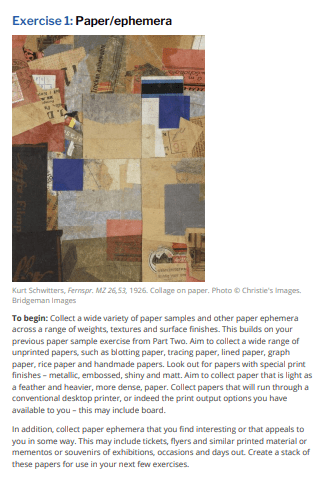
I am the unfortunate stage of being too close for comfort to the end of my course so I am going to have to act fast, I need to have my book turned around in a week! Obviously in industry it would not happen like this!
My workflow phases:
Phase 1 – Scoping
I know what I wish to do for my assignment 5, a book on Vernacular typography and I have a bank of images that I have already pre-anticipated and photographed and have ready sat on my computer. I won’t include this into my work phase plan now as I know that I already have them, but ordinarily time would need to be taken out to collect data, photographs, interviews etc for content for a book. I need to have at this phase a strong idea of what I want my book to be.
The next stage would be to plan what else needs to be done at the beginning stages, I have images, I need content but for that I need to research and that comes under the next phase… I know I have a short timescale to turn it around so I would need a day planning what content I would want to include in my book, I would plan this out around a flat lay plan, sketching pages of my book and writing what would go on each pages. This would be an idea to see what images I have and to print them out onto a contact sheet and choose which ones I shall be taking forward for my book.
Phase 2 – Creating content
The next stage would be to research thoroughly vernacular typography and make sure that there are no holes in my work. The last thing I want to do is to give inaccurate information about my chosen subject in my book. I also need to write all the content for the book as I am not only the artist and designer but the writer too. I then need to proof read over and over again to make sure that there are no grammatical mistakes, typos etc… I will also take the time to edit the photographs that I have banked and chosen to appear in my book and make sure that there is enough content to make a successful book.
Phase 3 – Design
This stage is where I would begin to start putting it all together, this is the phase that I don’t have very long to turn around. This is the stage where I set up the document correctly sized in InDesign and start making design decisions for the book such as the covers, the general layout, what colours to use, what typefaces to choose, arranging the type, creating grids and the placement of any images or my photographs.
Phase 4 – Pre-Production
This is the phase where my perfectionism comes into play and I get super anxious over checking and double checking absolutely everything! This is the point where I save the finished document to about 3 different external hard drives and then have to export absolutely everything! I will export to PDF so that this can be sent to the printers, I will export to PDF so that a digital copy can go online, I will export jpegs upon jpegs so that these can be uploaded to social media!
Phase 5 – Printing and Production
For my past few books I have printed them out myself by pain staking paginating the pages so that they will print on our awkward yet beautiful colour laser printer at work, this is all dependent on the size of the book though, usually the books and my zine that I have printed before are under 50 pages so that it is fairly easy and not too much time taken to do. If my book is quite big I shall upload a digital copy online and then send away to have professionally printed. Other than some post cards, greetings cards and promo stickers I have never had anything professionally printed at this level before so it would be an experience to go through this printing process and understand how to set documents up to print and how to send off for print.
For Assignment 5 I shall be writing, designing, creating and making my own book so if I look at the publishing models, I definitely fit under Model 2 which is an established alternative more closely aligned with artists’ books.
Artist/Designer – Publisher – Editor – Production – Printer – Distribution – Retail
But let’s just start from the beginning and have a look at the publishing process in general.
Phase 1 – Editing
If I were to have my book published in industry I would need to pitch my idea for my book to multiple publishers and quite possibly have an agent to help promote myself and my work so that publishers would take me seriously as an unknown first time author. Once a fist book is sold successfully it would make the process easier the second time around. I would have to send a darft or a manuscript to the publishers to try and get them on board with my ideas. This team isn’t just limited to editors though as there would need to be a team of sales, marketing and publicity to help promote the book to a wider audience and to gauge whether the book would be successful and be worth investing in to bring profits in. The best case scenario is that the publishers like the draft and approve a contract!
Once a contract has been drawn up and it has been signed the book starts the editing process. This consists of three phases; structural editing, content editing and technical editing. Structural editing concentrates on the book and the story and makes sure that everything makes sense and that the content is clear. The publishers all along the journey will make suggestions for changes which can either be accepted or rejected by the author or artist. After the structural editing phase is complete this brings in phase 2 where the book is checked for factual accuracy; this wouldn’t really be necessary in an artists book, however for a book on typography with history and dates it could be… A content editor will revise your work, make sure the style is consistent and the content is structured and makes sense.
The editor has a lot of control in this case scenario, they have a lot of power to make major changes which to independent artists and designers this could be soul crunching when suggestions are made that might be difficult to agree with.
A technical editor would then review the work to proof read it and make sure that there are no grammatical mistakes and spelling mistakes. Once this has all been completed and agreed and accepted by both parties this stage of the Publishing process is over, it then leads on to the design and production process…
Phase 2 – Design, Typesetting, Printing and Proofreading
This is where a designer would be brought on board to create the covers and any artwork for the book. They would also make sure that the book is presentable when it is printed. The designer would design covers for you that you would choose, you would choose fonts and someone would typeset the book. A test print or proof would then be printed to make sure that everything looks good and there are no hidden mistakes that would come to light in the final prints. Once you have a draft in your hands that looks great and is approved it would be on to the final phase!…
Phase 3 – Publicity!
This is where a team of marketing and publicists need to promote your work everywhere to try and get it maximum attention! They need to ensure that the book sales are high! They might advertise it in adverts in magazines, newspapers, billboards and via ads online..but they might also advertise it on podcasts, interviews and through word of mouth from other authors. Another major player in promotion especially in recent years is social media; Twitter, Facebook, Instagram.. They will also be in touch with book distributers and book shops, book chains etc to persuade them as to why they need to stock your book! This process all happens way before the book is even sent to print and copies are flown out on the shelves!
A publishing house will have a house style (identity!) that they ensure that all books they publish promote for them, think of it as like a uniform for their brand. The publishing house would work one step ahead of you and would aim to start work on a book 15 months before scheduled publication date.
Luckily, in Assignment 5 I shall have much more control and creative license over my own work!
I will be playing the writer, the designer, the artist, the proof reader, the editor, the production team, the publicists, the social media promoters.. the only thing I won’t be doing is physically printing the book. I might even be distributing the book – to book fairs and various promo places to get my work seen!
This is my publishing process from my desk, at home!-
First ideas – mind mapping them ideas for a book!
Research – Making sure that the ideas I have are factual and correct! Researching for inspiration and content for the book
Initial ideas – Having initial ideas and a flatlay plan of all the pages and content
Writing content – proof reading – proof reading some more – maybe a little bit more by passing it around friends and relatives!
Production stages – creating covers, creating artwork
Creating layouts – laying content, art, images, text on to design software
printing draft versions – making alterations – more alterations – check for more typos!
printing proof colour copies to make sure that all colours are CMYK and not accidentally RGB (I’ve done this several times… I won’t do it again!)
Creating PDF versions of my book – making it digital online or finding an online printing company who can print me a few copies
Promoting on my social feed! There it goes onto Pink Angeleno for any future job opportunities or anyone who might be just interested in reading it!
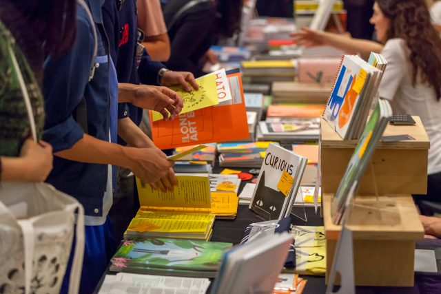
I have never been to a book fair although my friend Sam keeps encouraging me to! I gave Sam a copy of my zine and she instantly asked for more to give out to her friends and then said to me I should think about trying to get some work published!
I have only known Sam for a couple of months, she is a close friend of my Dads girlfriend Jude, Sam writes poetry and has a couple of books she has had published on Amazon. She hired a designer to design her book covers though and she said that the next book she writes she will commission me to design the cover for her! Sam goes to a lot of zine fairs (I wish I had known her when I first started designing for my zine!!) and she goes to a lot of book fairs around Lincoln and up north with her author friends.
Here is a link to Sam’s book in case you was curious!
She very kindly gifted me a copy and I can recommend “Poo bag in a tree” as a good, funny read!
Anyway! back to the book fairs!…
When I think of book fairs I just think of a load of stalls crammed into a Cathedral or some other important building (I went to a print exhibition in Manchester cathedral!)- a chance to buy other peoples work and get inspiration from other work that might be on display. I guess if there are publishers at these events then it would be amazing to showcase your own work in the chances that your work might be liked and recognised and published professionally!
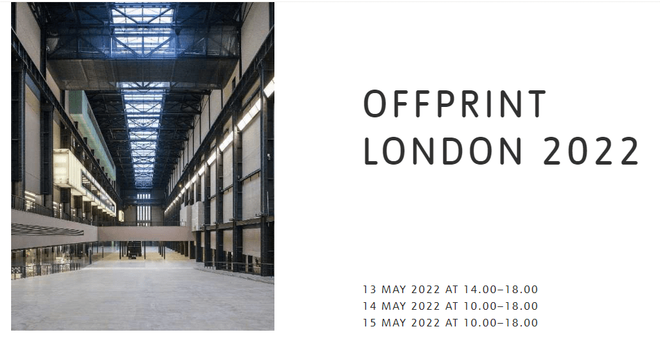
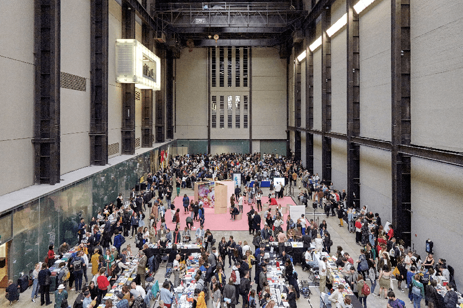
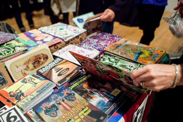
Offprint London
When I first google this event I am taken to Tate Gallery’s page and then redirected to a French (very interesting motion design website!) where it tells me the dates for 2023 book fair. Offprint runs alongside Photo London and began in 2015 as a one-off commission for Yannick Bouillis of Offprint Paris from then director of Tate Modern, Chris Dercon and his curator of photography Simon Baker.
Offprint allows the artist to have full independence and to take full control of their own work and have full creative license by controlling where there work is shared. Offprint trades in books, zines, magazines, CDs, posters, prints and much more!
The next event here in the UK in Tate is in May 2023
Art Book Fair, London
For 4 days Whitechapel Gallery is transformed for the Art Book fair. There are over 70 creative and cutting edge publishers there for the event. The Art book fair has a vibrant mix of art books, independent titles and magazines from all around the world.
Exhibitors range from publishing behemoths to independent presses and represent a diverse international cohort from 16 different countries, from Chile to Israel, Korea to the USA.
Small Publishers Fair
The Small Publishers Fair is the the annual gathering of books by writers, artists, poets, composers, book designers and their publishers. The Small Publishers Fair brings to Conway Hall sixty nine publishers from across the UK and further afield. It is a snapshot of some of best small press publishing around today and includes artists’ books, fine press editions, poetry pamphlets and zines. The organiser Helen Mitchell has organised the event since 2012, she has over 30 years experience of working in the arts.
Helen works from home in Norwich and used to work for Coracle Press and she collects small press publications. I am guessing that zines would class as a small publication and be included in this fair. The fair seems to cater for a lot of poetry and Artist’s books and ephemera relating to print collaborations.
International Contemporary Artists’ Book Fair
The International Contemporary Artists’ Book Fair held in Leeds is the longest running artists’ book fair outside of London. It celebrated its 20th anniversary in March 2017. Throughout its history the Fair has attracted national and international participants and welcomed thousands of visitors from across the UK. From looking at the schedule for this book fair it looks quite interesting as there are zine and printmaking workshops, these are classes I would be interested in if I was to visit.
The book fair has over 50 stalls all run by creatives, artists and independent publishers. It is the perfect opportunity to see original artwork and talk directly to artists and makers about their work.
It is a weekend of packed talks and workshops for all ages. From flip books, photo books and graphic novels to one off artworks and documentary publications, the Book Fair is an opportunity to see and buy directly from up and coming artists.
This sounds like a more arty book fair that I would be more inclined to visit than the others so far!
The Sheffield International Artists’ Book Prize
The International Artists’ Book Prize is organised and held at the city’s Bank Street Arms. It is a different approach to book fairs as it is free to enter but there are cash prizes for artists books in any format and from anywhere in the world. At least 4 cash prizes of £2000 are awarded and all of the submitted work will be shown in the exhibition!
The aim of the exhibition is to develop the profile of artists books and increase their audiences. It actually had sponsorship from the OCA!
I actually quite like the sound of this fair! When I think of book fairs I think about going around and buying other peoples work and viewing other peoples work but not necessarily having the chance to promote your own with a chance of a cash prize at the end! It is a good way to get your work noticed.
Dublin Art Book Fair
Dublin Art Book Fair is held at Temple Bar Gallery and studios. It takes place online and on site, the gallery in the heart of Dublins cultural quarter transforms into a centre for Art and artists books. Dublin Art Book Fair welcomes small, independent artists and creatives. There are books on show for art, design, visual culture, philosophy, architecture, select fiction and poetry but particularly there is a strong representation of books made by artists.
This sounds like it is another good book fair for artists who are in full control of designing, writing and creating their own work and wanting full creative license for it.
BABE Bristol Artists Book Event
I visited Bristol in the summer and it struck me as a really arty place so this doesn’t surprise me at all that it has a book fair..
The Bristol Artists Book event takes place on the university campus and consists of over 100 artists, collectives, small presses, independent publishers and talks and workshops.
There was a children’s pop up card workshop at the last book fair that I would have totally been on board with!… I don’t care if I’m older than 12! There were also print making classes there too which really interest me.
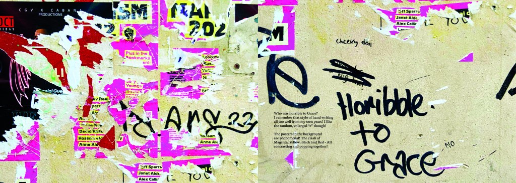
I had a look at this assignment in my book a couple of months back so that I could plan ahead and know what I was doing in advance for my assignment! I was torn between Influential book designers and Typography. I knew that I was way out of my depth doing my altered book and this was something I didn’t want to delve back into for a little while at least! I decided that I would want to do typography because that is the area I knew and enjoyed the best but I also knew that I didn’t want it to become another version of “My little book of Good typography” because I had covered a lot of the basics and the rules of typography in that. I knew that naturally my head would try and create another more or less identical version of that book because I liked the finished outcome so much! I needed to find another typography subject that would head in a new direction from the last book of typography I designed.
Something slightly different…
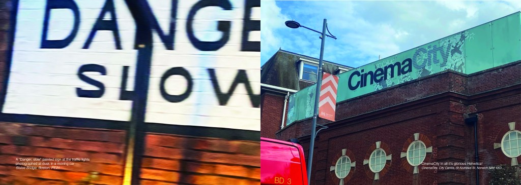
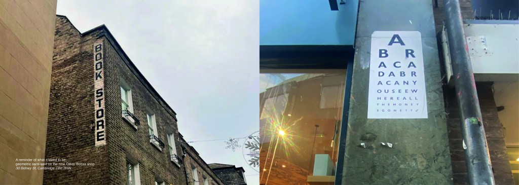
The idea came to me when I went to Norwich to try on my wedding dress after it came back from being made. I took my best friend with me and by the time we got back out onto the streets of Norwich out of the bridal shop it was getting dark and the streets were emptying. I had never really noticed the typography in the streets before, the graffiti struck me and I was just inclined to take cool photos of some of it (to the bewilderment of my friend!) I told her that I bank photos of cool arty stuff to use in future projects as textures or stock photos etc.. When I got home it got me to wondering whether I could make a book about the typography that is found in the streets?.. I had to really research this one, making sure that there were no holes in it. Could urban typography be classed as typography?.. I mean, I class anything that’s written as typography? Anything that communicates a message and conveys an emotion to us through type is typography, right? I just found the lettering I was finding on the streets really beautiful and I wanted to explore it further. I researched Vernacular typography and this is the lost art of sign painting and traditional methods of advertising on the streets before commercial printing came about. I found a lot of articles online by a designer called Molly Woodward who takes photographs of a lot of signs from the lost art of vernacular typography. Her kickstarter project is to try and map, document and preserve some of these fantastic hand lettered signs.
A lot of the articles that I found online relating to vernacular typography study buildings and signs in Brazil and American states. I found a few learning blogs from OCA students on vernacular typography too which also made me a bit anxious.. was I jumping the gun, would there be a project in the future exploring this?…
I didn’t find much of the old style of vernacular typography on my travels sadly, but then I researched further online and found a University lecturer who taught a project on vernacular typography looking at the signs above hotels and B&Bs in Blackpool:
Sarah Horn the designer of En Suites looked for standout typography, intricate letterforms, funny names and bold colour palettes. I quite liked the idea of how she was documenting type but also capturing time and age through her photographs; these are photos that people will be able to look back on in years to come and see what the town looked like at this point. That is another thing I found with vernacular typography; it very much shows the culture of the place and the people who live there. I also liked the fact that in the Creative Review article she states that she wanted to do a simple book in a size that reflects a souvenir guide; she is really designing for the culture of Blackpool. Blackpool is very leisure and tourism so a souvenir guide matches its aesthetics perfectly! I like how she has pretty much made a flip book of inspiring photography- it is not a sit down and read from front to back book, it is not particularly informative but its aim is to dip in and out and use as a research book. A book to flit in and out of whenever inspiration calls for it. I wanted to create something similar!..
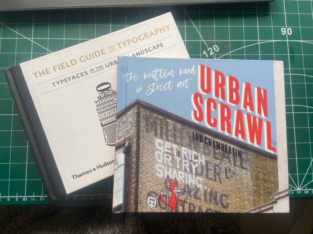
I also bought 2 books from Amazon which are very similar to that of which I wanted to create. One book is called “Urban scrawl” and concentrates more on showcasing graffiti hand lettered styles and the other book is called “The field guide to typography, typefaces in the urban landscape” which is like a bird spotting book of Graphic Design!- it shows examples of typefaces in the wild and then classifies them into what typefaces and era they are. I liked this idea and thought that I could potentially classify any typefaces that I found in the wild!
I was very anxious though as to whether I was meeting the brief of the assignment. The brief did say “alternatively identify your own project”… this was a different kind of project but typography nonetheless?.. I wanted to think outside of the box and go exploring down different avenues.. I didn’t want to play too safe but also I had crippling anxiety of my assignment being rejected for not meeting the criteria!
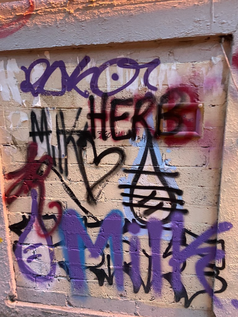
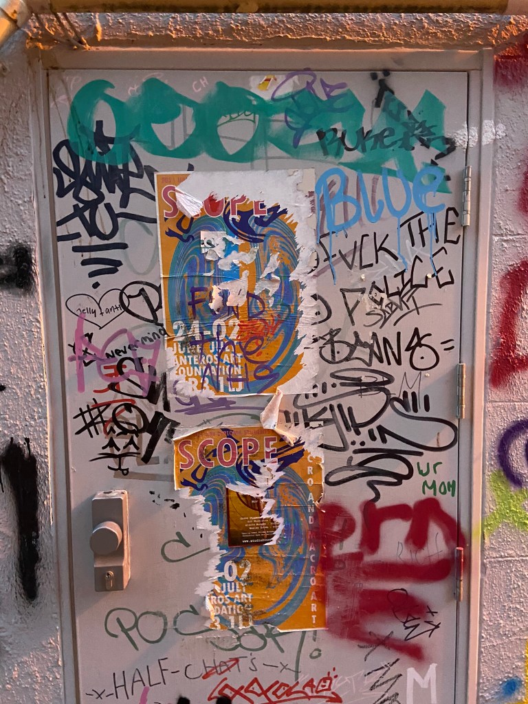
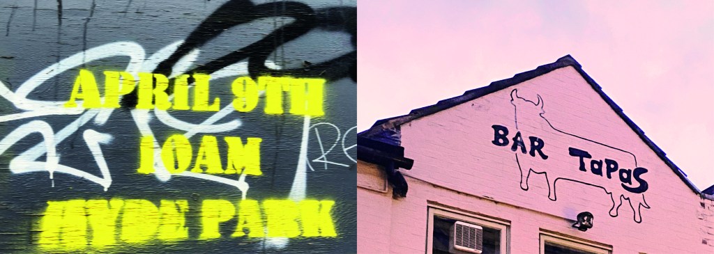
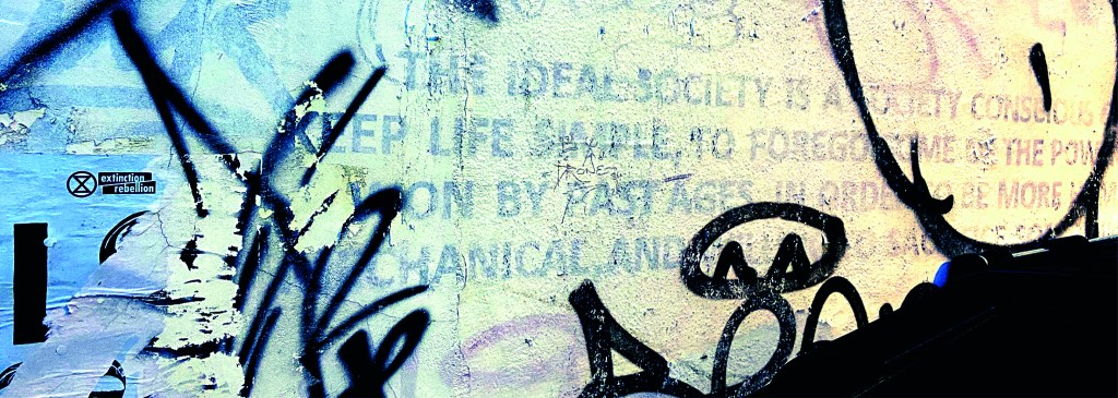
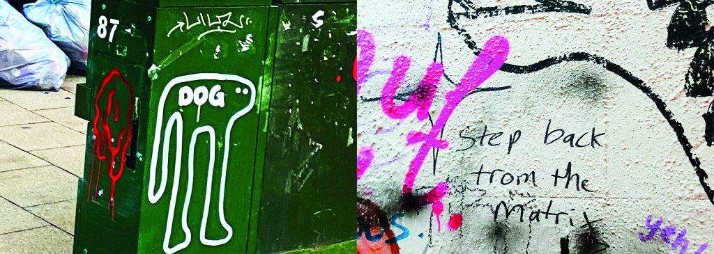
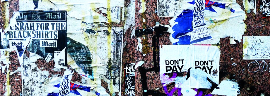
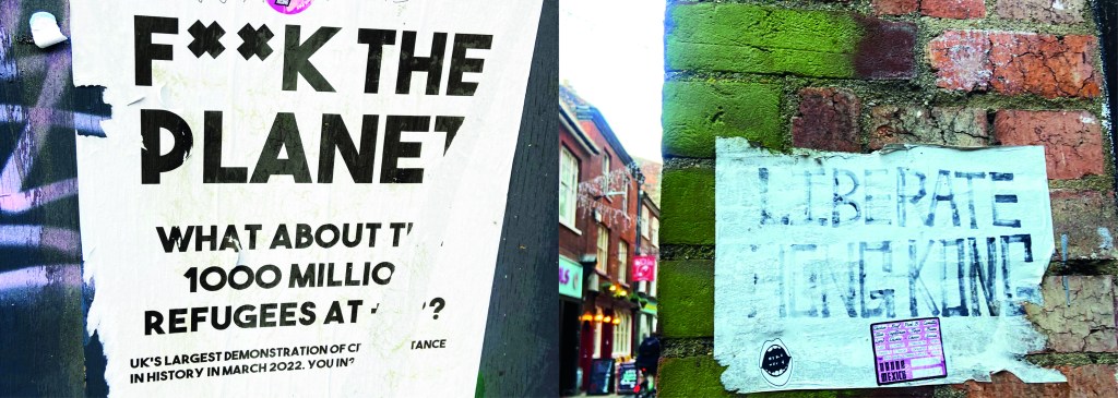
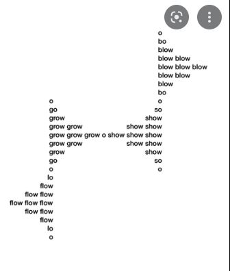
I wanted to include graffiti and street art in my book too as although these are not using typefaces, they are still a personal style and they are still hand lettered words with personal handwriting. There were many conflicting articles online that state that graffiti is not typography, I can see both arguments.. it is definitely not a traditional practice of typography but I wanted to concentrate on how insignificant ramblings or graffiti scriptures hand written on a wall can inspire a future digital typeface or fresh new designs.
I felt like I could have sit by myself for hours and days trying to justify to myself how I could or could not class this as typography.. I just had to be brave and go with my instincts…
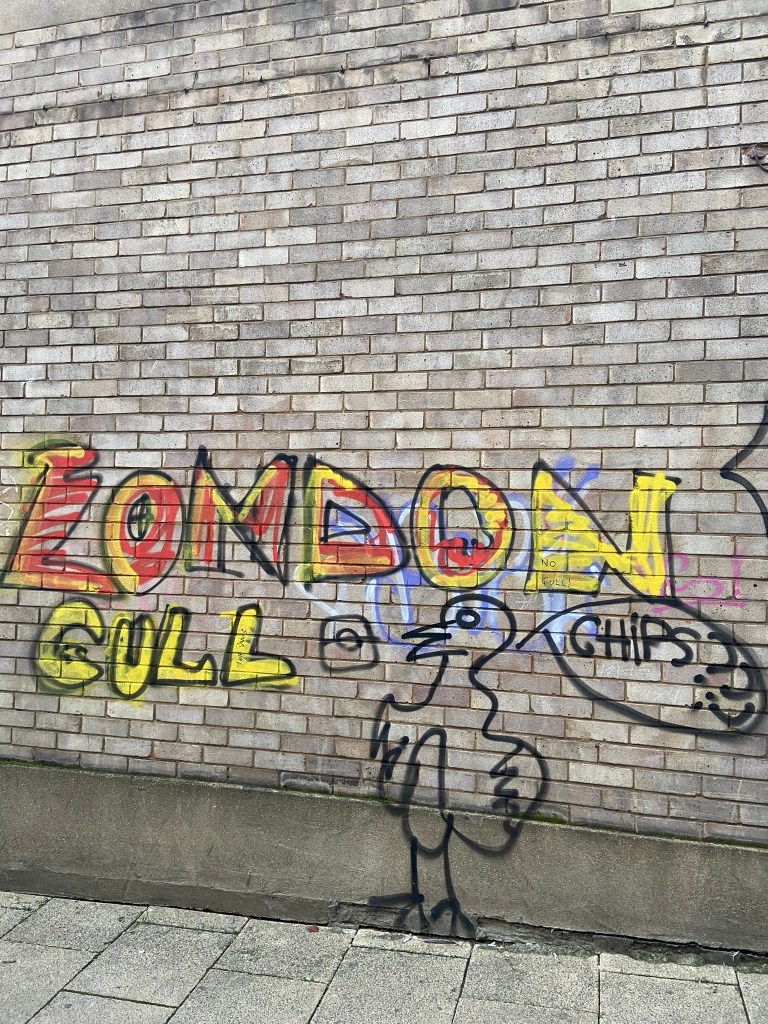
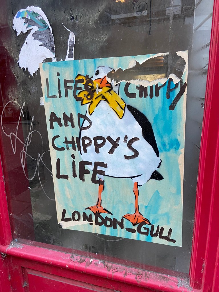
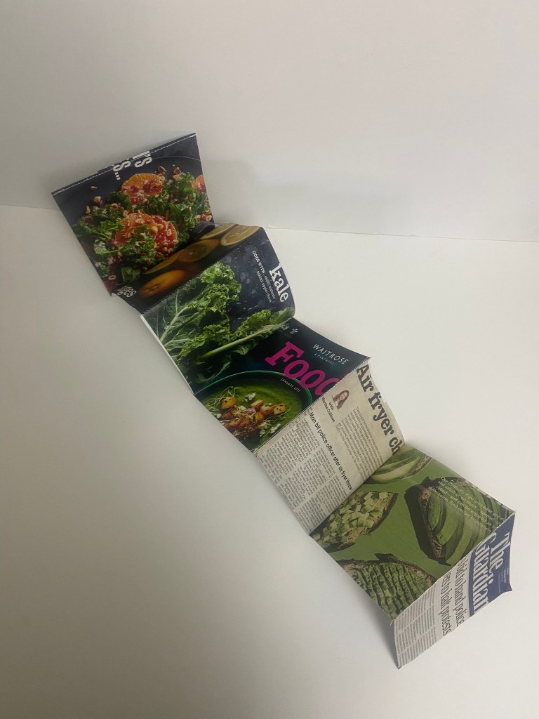
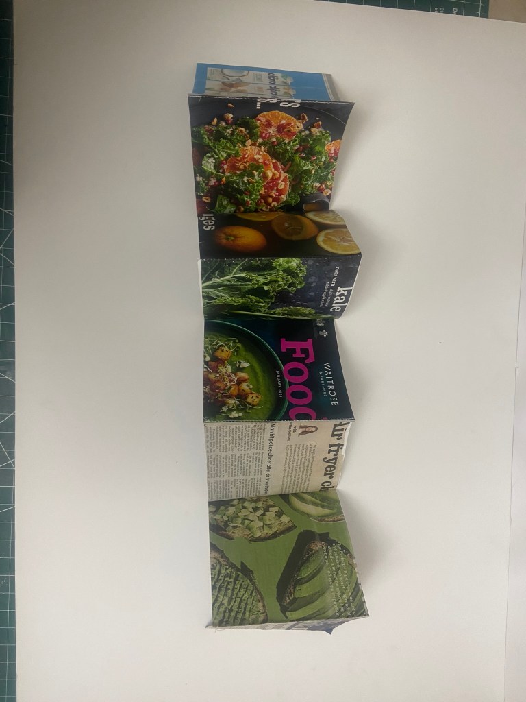
The photographs
I had already got a small bank of photos from different towns and cities but I knew that for what I wanted for my book Norwich was by far the best place I had seen for urban street typography and art! Norwich is a 2 hour drive from our house and me and Chris left at 3pm on a Monday afternoon. Chris stuck an hour on the car in the carpark and told me to fill my boots! Off we set off down every nook and cranny looking for any sort of inspiration for my book. A lot of people stared wondering at me as I photographed graffiti that spelled out “boobies” among many! I didn’t care if it was relevant or not right now!- I just needed a hefty bank of photos to choose from! We literally photographed everything! Chris turned around to me at one point and said “I didn’t even know we would find this much to be honest… when you said about coming all this way to Norwich I thought it would be a waste of time! Actually though when you look, you can find a lot!” EXACTLY! This was what I wanted the purpose of my book to be! Inspiration is everywhere, you just have to be looking!! A lot of this vernacular typography is hidden, it is there is full view of us daily but we overlook it and take it for granted. Even the graffiti has sentiment, there are messages there to be taken into account.. we just choose not to see it as we associate graffiti with bad and not good. Chris said “graffiti is vandalism though, you are just celebrating vandals ruining things..” I replied that beauty is in the beholder, we did find some lovely examples of sentimental graffiti in nice hand lettering that I could imagine being traced around in design software and being developed into a new typeface!
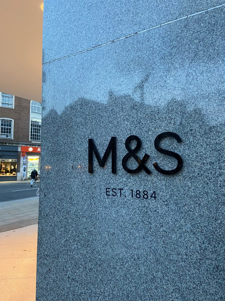
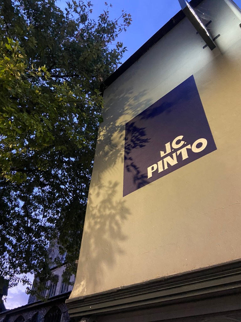
Chris was asking if I wanted to photograph shop fronts such as M&S that have the really nice ampersand and classic typeface; whilst this is lovely, M&S is too commercialized now. M&S in Norwich is the same as M&S in Brighton which is the same as M&S in London which is the same as M&S in Bristol!…These signs as elegant as they look with their typefaces are rather quite samey.. we have seen it before. I was looking for non-commercial beautiful typefaces. A lovely example of one I found was of an 84 in the ground of the church yard in the middle of town in Norwich:
It is a busy walk way and cut through to town but there was this beautiful 84 trodden into the ground. As I was photographing it a man hurried past me right in the way of my photograph and then looked behind him to question what on earth was I doing?.. What was I doing? What is HE doing… he is oblivious to what was beneath him! Another example of how type is everywhere but you need to choose to see it!
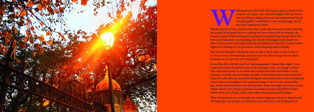
I really enjoyed that afternoon.. as weird as that might sound to some people. I was in no rush,..(well, the carpark I guess..) I wasn’t shopping, I wasn’t eating out, I wasn’t spending any money.. I was just walking round with my Fiancé and my iPhone being aware of my surroundings, being aware of the here and now and letting the creative vibes in.
Here are all the unedited photos that I took that night, including some that were already in the folder on my phone entitled “Urban typography”:
We definitely had fun walking around and looking at the random writings on the wall!
Some of them I was genuinely surprised by! Usually with graffiti it is just mindless ramblings and unintelligent one word scrawls.. Some of these were actual philosophical meanings that were carefully hand lettered and written onto there! I also found a lot of nice looking typefaces on our travels; there were a few with numbers and lovely looking ampersands which were rather very nice! The old pharmacy in Ely had lovely serif typeface inscribed into the building.
Now that I had banked a lot of good photos, it was time to go home and research further into what content I was going to include in my book which would decide what photos I needed to import into Photoshop to edit to include in my book.
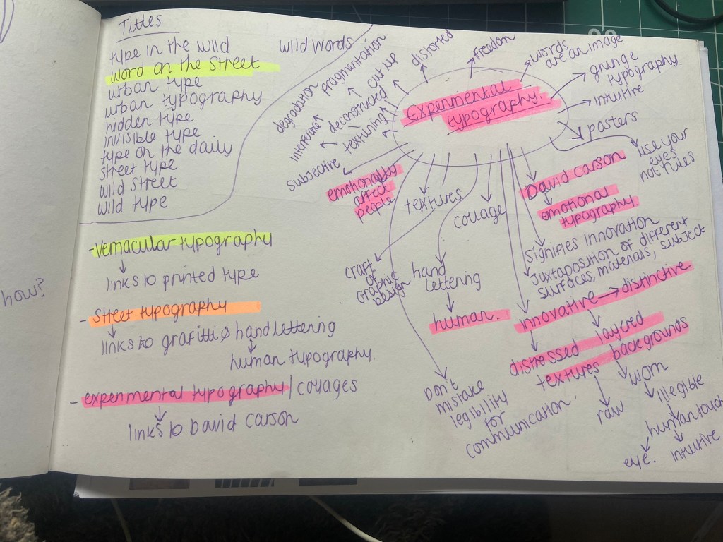
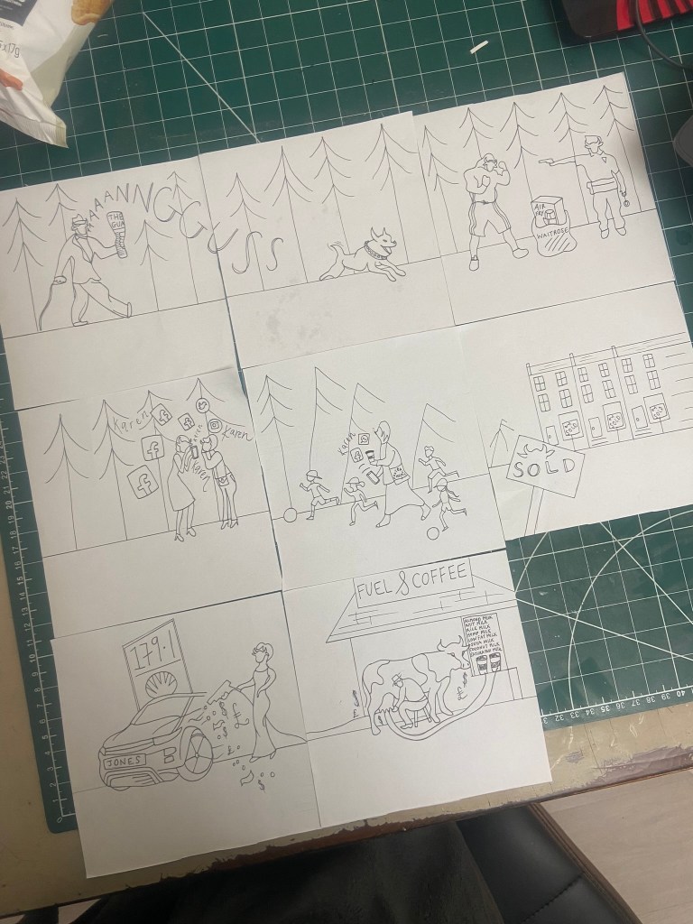
I started off by producing a rough flatplan of my book. I didn’t know yet how many pages I would be having in my book but I could start by planning out the beginning of the book with intro pages, contents etc.. I also needed to plan out how I was going to get vernacular typography, street art and collages into one book and split it accordingly. I had the thought at this beginning stage to colour code each section of the book which is why there are colours following some of the pages.
I also printed out contact sheets of all of the photos I took and highlighted them against their category; Vernacular, graffiti, experimental.
I also mind mapped some research around vernacular typography, street typography and experimental typography:
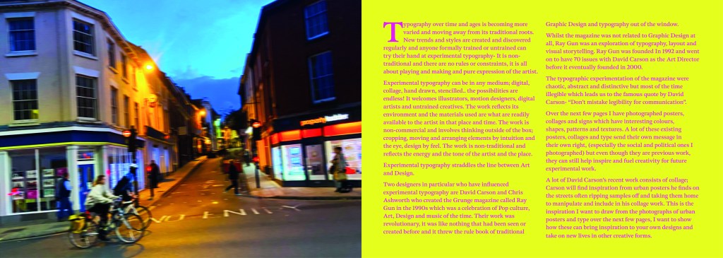
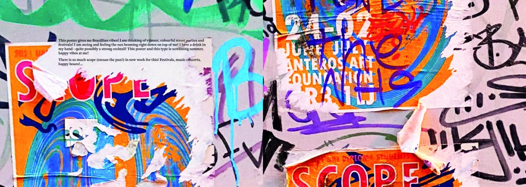
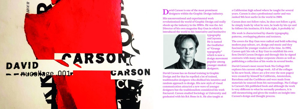
I figured out that my book would have three chapters: Chapter 1 on vernacular typography which would feature the shop fronts, signs and any interesting typefaces I found on my travels. Chapter 2 would focus around the street art; Graffiti and more humanist typography done by hand lettering and handwriting. Chapter 3 would focus around posters and collages that feature interesting type which would then lead into a little bit of information about David Carson whose recent experimental typography work involves collage.
It was difficult to sketch ideas around my layouts as a lot of what I am using are photographs, instead I sketched out ideas for the style of layout that my book might have.
I whittled my photographs down and organized them into their groups ready to edit and bring into my book later.
Timings for my book
The photographs that I took for my book were taken late October whilst I was on half term from school, I started this assignment on Monday 7th November and it was complete by Wednesday 9th. This is not something I am particularly proud of- but I did work my socks off for 14 hours straight on both days whilst being off sick from work, (I have been ill for 3 weeks now!). I had to really organize myself and know exactly what content was going in the book. I am so fortunate to have pre planned ahead and taken all of the photographs I took for the book! In industry I know there are fast turn arounds but nothing possibly as quick as this for a published book! In an ideal situation I would have liked to allow myself more time to add more content- more creative outcomes from the examples that I found (the end, hidden chapter in the book!). Although the turn around for my book has been quick, there hasn’t been any corner cutting. I have successfully included everything I wanted to from my initial idea and I have checked it numerous times for typos. I have just been really unfortunate this year of studying in that I have had so much personally happening.. house renovations, our wedding in 3 months which has been full on organizing!, hen parties, (one of my own, that I organised.. *eyeroll) full time work, fitness and numerous of silly little health incidences this year that have hindered my study time quite significantly! I do like the fact that I had full creative control over my book, in industry I would have been the artist, author and designer and it would have been my content and vision which would drive the book forwards.
The size of my book
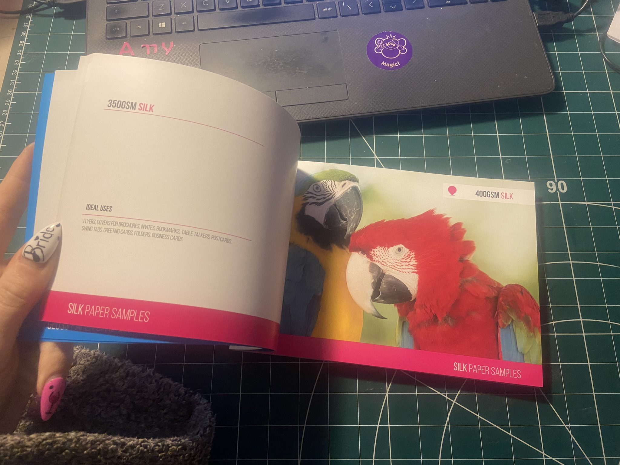
I now needed to figure out the size of my book. From doing previous exercises in this unit I have a Solopress paper sample book that I quite like to keep handy for reference and I really like the size of it. I measured it up and it was 21cm x15cm landscape. This is also very similar to the En Suite book that Sarah Horn designed. It is also a very similar size to the 2 books I bought on Amazon.
I decided to go with this size and created my document in InDesign. In my last assignment I made the silly mistake (I didn’t even know what I had done until my tutor pointed it out!) of designing everything in Photoshop (including text!) and then importing it into InDesign. I have no idea why I did that because I have never done that before! I know that images are edited into Photoshop to be imported into InDesign and any text is always done in InDesign and any vector illustrations in Illustrator! I was not going to make that mistake this time! I started editing my photographs in each folder one at a time increasing the vibrance and lightening up wherever was needed. I wanted really bold, striking, bright and colourful photographs for my book!
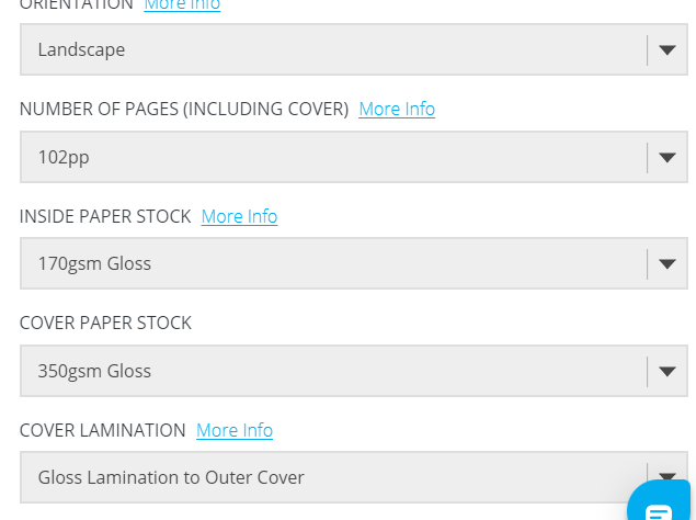
Referring back to Solopress printing book I keep as a reference, I had a look to get my book professionally printed from there. Although I had such a short time designing my book and I couldn’t possibly have a physical copy in my hand for my final course deadline, I plan to have some copies printed so that I can present these for assessment when that date rolls around. The cost of the print depends on how big the book is. My book with all the photographs actually turned out to be a proper book! I only envisioned 40 pages maybe for my book as I have had a nosy at a few fellow OCA students blogs and seen that their work consisted of about that mark.. Mine ended up being 102!! I just had so much good photographic content for it that I didn’t want to miss any out! I also really enjoyed putting it all together.
I inputted some details on Solopress website to see how much my book would cost to have printed:
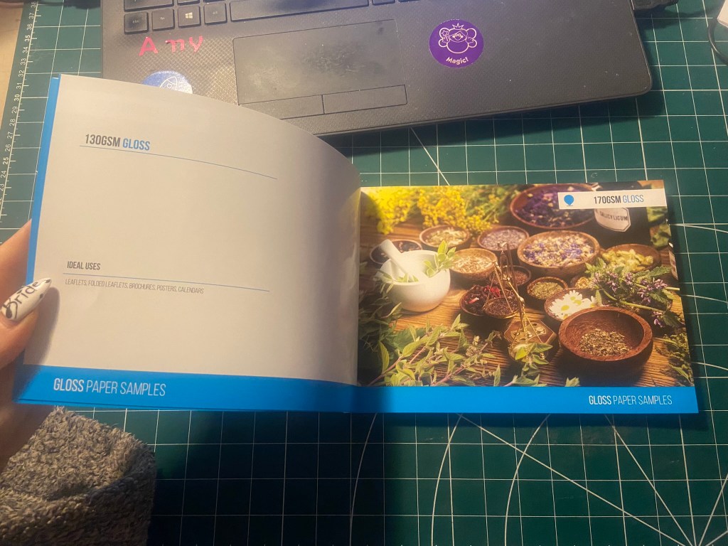
From looking at their book I flicked through the pages to see what options would be best for my book. I wanted an A5 perfect bound brochure as these were suited for a lot of pages. I like the 170gsm gloss paper for the insides; I needed a glossy paper to show the beauty of the photographs. I also wanted a chunky, glossy front cover so went for the heaviest stock option they had in glossy for the cover. There was paper stock in silk available at 400 gsm but glossy suits the nature of my photo book more.
The costs were not cheap… but then for a full colour, big book like the one I have produced I would imagine that this would be the typical price. It is better to order more copies than less at this point! I would probably try and order 10/15… give some out as promo for my work.
For the time being the best option for my book when I had completed it, was to find an online digital place where I could house it for the time being! I refer back to part 1 of this unit where I state I am not a fan of digital books, I am still not.. but desperate times called for desperate measures and at least this way I had a fully functioning book that could be read in a digital state for the time being!
I found this website, which is actually quite good for importing in your PDFs and it creates a flipbook of your work!
I edited all of the photographs for the book in Photoshop and then created all of the content using InDesign.
My book would be primarily a photo source book to flick through for inspiration so I knew that when It came to laying it out, it needed to have a photograph a page. The front and back covers I designed last because I wanted to finish the whole of the book to see if any inspiration or cool images would be made by the end of the book to include on the cover.
This is page 2 and 3 of the book. I wanted contrasting pages so that they were bright and vivid and stood out. A lot of the photographs in the vernacular typography first chapter were blue in colour or had a blue/grey tint so I decided that Blue was the appropriate colour to start this chapter off!
I wanted a bit of an introductory to the book and a chance to self promo my work. In InDesign I worked to a 6 column grid and positioned my text over 4 of the columns.
For the squiggly graffiti page I cropped a section of the photograph below and then put a filter over the top to give a cool effect!
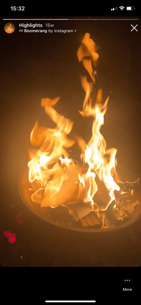
When I was in Bristol over the summer I took a cool photograph (and a video!) of people “jumping the fire” as the lad told me in the video I took, this is tradition in Bristol.. a right of passage and means that you belong to the city of Bristol. It might be complete Saturday night drunken bollocks but I really liked the photo I took on this random night! It is very urban with the lights and the graffiti and the people in the groups and walking by. It has atmosphere and a vibe if nothing else! I had to use it for the opening page of the book! I edited the photo in Photoshop to increase the vibrancy and added a little bit of a posterise effect.
I opened the book also with a short piece I wrote on the importance of type everywhere. I used Red for this page to mirror the dominant red colour in the Bristol photo.
For the contents I created a page very similar to the opening pages where I took a section of a photograph from my collection and overlaid a filter on the top to create a new feel. I used a contrasting colour to the yellow- red which again ties in to the previous pages and also pops out against the yellow and helps the headings stand out. The typefaces that I am using are Helvetica compressed for the main headings and title – it looks quite “street” and stencil like and then for the body text I have gone for a contrasting and complimentary typeface called Meno Text Semi Bold. This sans-serif is ideal for body copy and really compliments Helvetica.
For the Chapter 1 opening pages I have done similar again, cropped a section of a photo and then laid a filter over the top to create a cool effect and tried to choose contrasting colours. The red is very dominant in my book and the blue is the colour I chose to colour code the first chapter of my book as most of the photos have a cool, blue/grey tinge to them.
The photograph I chose to use first for vernacular typography is below; I really like this one as I’ve explained in the info I have written explaining in my own words what vernacular typography is. For each page of writing I have done I have tried to keep the background white to allow for better readability and I have either aligned the text over 4/6 of the columns or distributed the text over the 2 halves of the page depending on how much text there is as to how much room I needed to take up.
Before I started showing different typefaces from my locations in my photographs, I needed to give some information on how to tell them all apart and how to classify them to readers who might not already know.
I also did the same for serif typefaces and their classifications… This will help the reader identify which typefaces belong to which classification and better help them when they go out into their own urban environment and find some of their own!
Again, I did the same technique with the left hand page by taking a section of a photo and putting a filter over the top and then I chose contrasting colours for the facing page to make the pages pop and really stand out.
These 2 pages were a personal introductory to street art, I documented how important it is to be aware of your surroundings, live in the now and really take in everything around you because you never know what you might find! I used a photograph I took of a street light near a church yard in the middle of Norwich, I just remember thinking how pretty the orange leaves looked against the brightness of the lamp.
The same as every opening chapter I have done up until now, another left hand page created from a cropped section of a photo and then with a filter put over the top. I have used contrasting colours again to make the pages pop.
For the double pages below, I used another photo that I randomly took of the street in Norwich at dusk. It just gives an urban feeling for the opening of Chapter 3.
This is where I introduced David Carson to chapter 3. I felt like it was relevant to include him in this chapter as a lot of his new recent work is very similar to that what I found in urban posters and collages in the street. Carson takes a lot of inspiration off the street for his own designs and collages. He rips interesting letterforms off posters or packaging that he finds and incorporates them into his own work. I wanted to show in this chapter how you can take inspiration from these posters, collages and type on the street and import them into your own work to create new, fresh work.
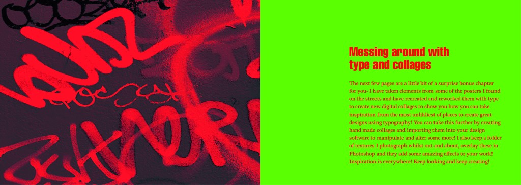
These are the opening pages to the last section of my book which is where I try to bring some inspiration by showing how you can rip text, images, textures, patterns etc off materials you find in the urban environment and bring them into your own work to create some cool art, designs and type.
I created a few examples, I would have liked more time to spend on this hidden chapter as this is really what inspired me to create this book! I would take photos and then use them as textures or as backgrounds or inspiration for any future work! It would be quite cool in the future (even just for fun!) to create a book full of these new, fresh designs made from existing type and work.
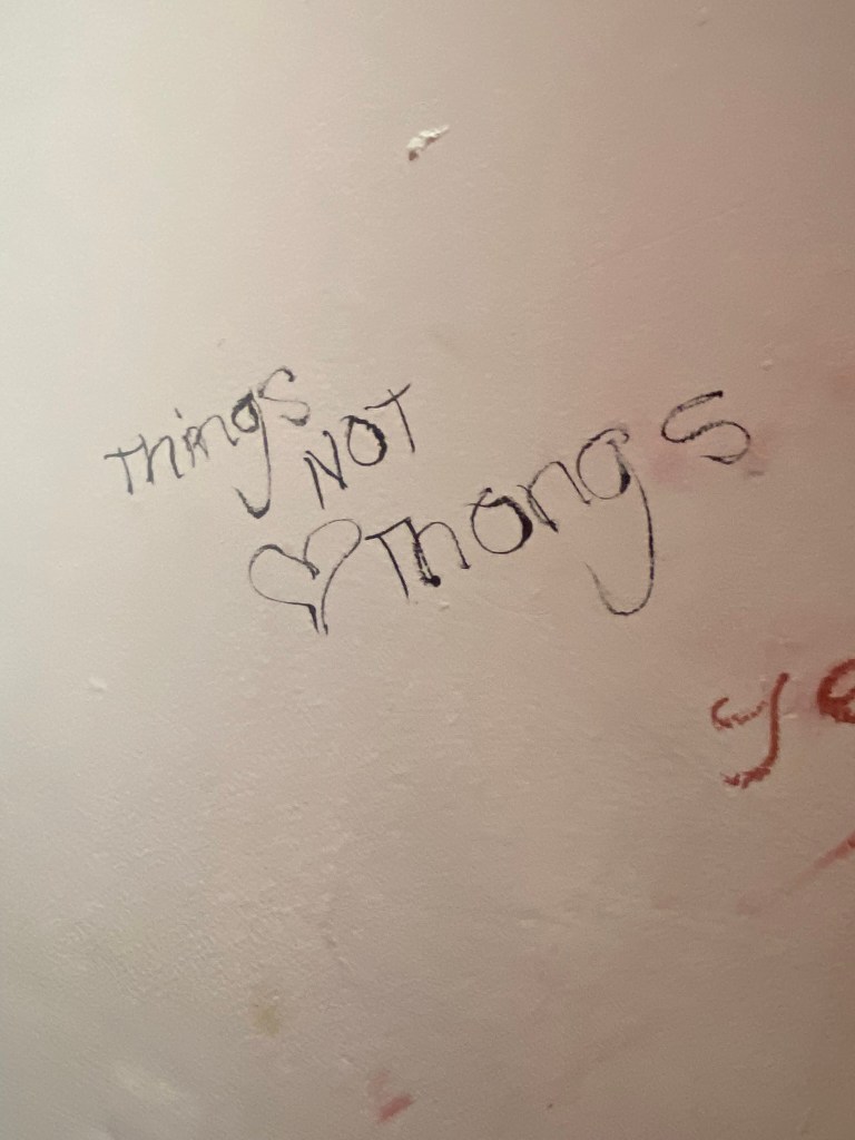
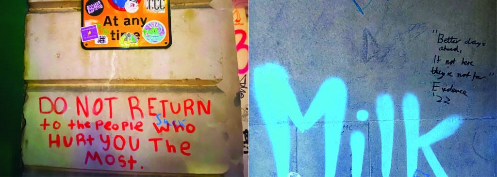
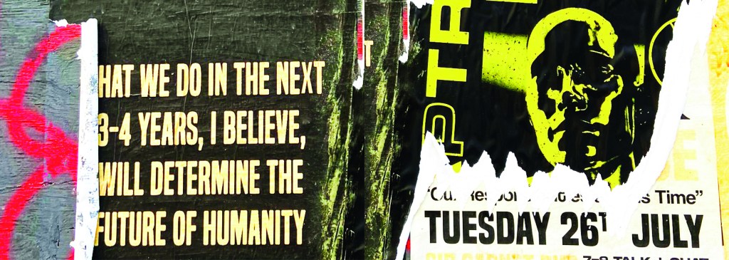
I closed my book off in a similar way to how I opened each chapter. I used the same pattern for the inside back cover as I did for the inside front cover. There was one piece of writing I found on a wall in Norwich where someone had scrawled out a nice sentiment. I don’t know if it is religious, I would guess that is is a song lyric.. nonetheless it had an obvious effect on the person who chose to carefully write it out on a random wall! For someone struggling with a hard time and looking for a sign or something to tell them things will be ok, this is it! I’m not sure if we can class it as typography?… its humanist, its hand writing, we could take the hand writing and create a typeface from it… what a nice little quote though if nothing else and it is a nice way to close the book.
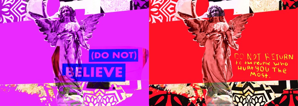
I designed the front and back cover last of all and I’ll be honest I almost totally forgot to!..
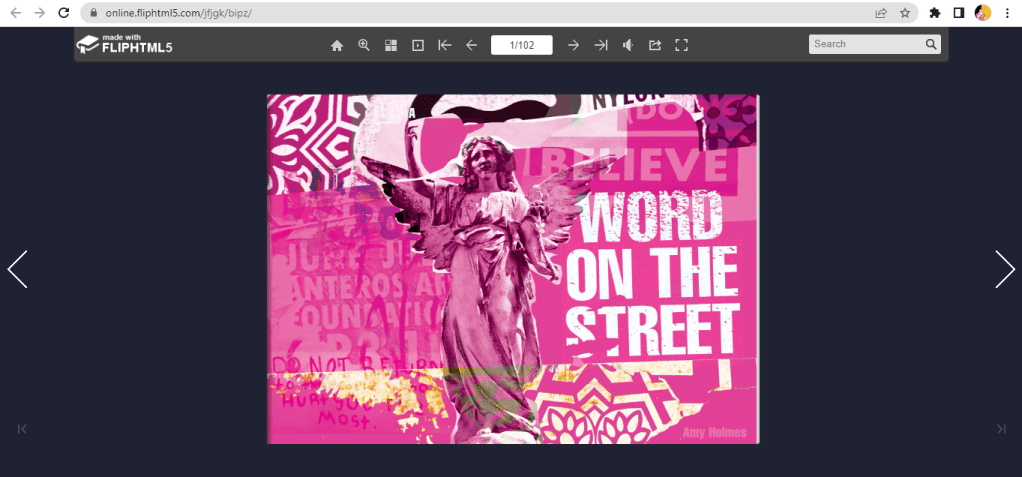
I created these using one of the collages I put together for chapter 3 using snippets of type, snippets of mandala/floral inspired paper and clips of posters. The head of the angel was actually on one of the posters I took a photo of, I have no idea what it might have been, it was just a head! I then went onto Google and found a body to try and best match up to this angel! It is eccentric and weird but I kinda liked it! It is like the word of God! I couldn’t help resist balancing a capital A on his/her finger either!
It is not a typical cover for a Graphic Design typography book and after I designed it I was a bit unsure whether it would actually work… I started to design a back up cover which had a photo of the vernacular typography on that building in my hometown (the first photo in my book!) but then I reminded myself that I wanted to do something I hadn’t previously done.. I found myself moving closer to “My little book of Good Typography “again with how I used a photo for the cover of that. Nope, I would carry on with this cover.. if nothing else it intrigues you as to what it is all about! It almost looks very Punk!
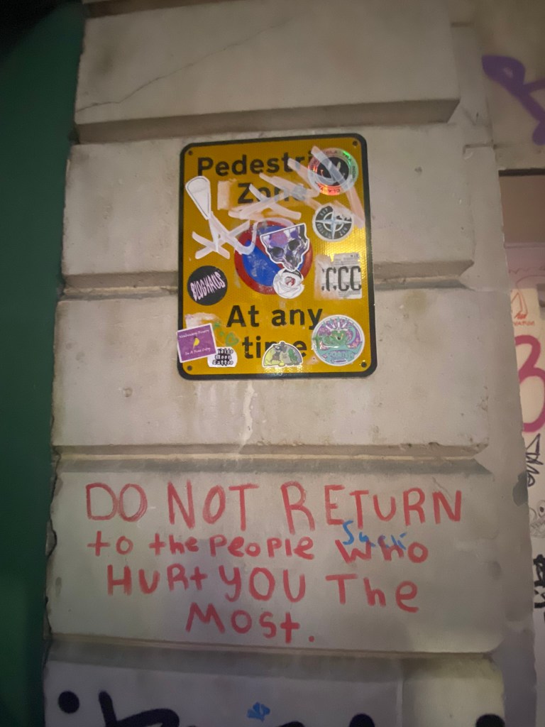
Another one of the quotes I found on a wall I included on this cover and in the book “Do not return to the ones who hurt you the most”, who would have thought you would read these little messages on a wall? Coming from someone who was once in a violent relationship I cannot relate more. It is hauntingly beautiful. The handwriting also had potential to be imported in and turned into a typeface..
I mean, it would be a very childlike typeface but I can see it! I really like the curved shapes of the rounded letterform.
In Fact!.. Let’s just create a page for it! Writing this blog made me decide to create 2 extra pages for it because it shows how you can take inspiration and then create new designs and type and potential typefaces with it!
I really enjoyed designing and making this book, it was a shame I couldn’t see it professionally printed before I submitted this assignment but for my formal assessment I shall have a copy to photograph and include in my portfolio. I am pleased I managed to find somewhere to upload it as a digital flipbook though, it gives a sense of what it will look like when it is professionally printed. I am disappointed with how little time I have had for this assignment, although I am pleased with how hard I have worked to achieve the final outcome that I have. At the beginning of my journey with the OCA and even at the beginning of Creative Book Design, I was very much a perfectionist and just couldn’t leave my work alone. I would reach a final outcome and then have to constantly perfect it. This short assignment has taught me to create designs very quickly and to be content with the outcome I reach just so that I stick to deadlines. I am pleased that I used photographs that I personally took in this book, it makes it more personal to me and knowing that I put the hard work in to source the photos. I really like the photos I took as well, there is a broad range of different styles and typefaces to keep the reader enthusiastic throughout the book. My only worry is that I will be graded down for not using traditional typography, especially as I haven’t even studied vernacular typography in this course at all! I just wanted to show how typography can exist outside of the design studio and is available 24/7 for everybody at any level of training regardless of whether you have design knowledge and experience. How inspiration can be found from the unlikeliest places and how very often we overlook graphic design that is around us daily. I gave my mother in law the link to my book and she said she forgot that there was so much design around her daily and that next time she was out and about she would pay attention more often… Chris even sent me photos whilst on his Stag do of unusual typefaces he found on his travels! It’s contagious! everyone soon shall be observing type out and about in the wild!
My first thoughts around this assignment is that it was well and truly out of my comfort zone! When I first started my course I used to do everything by hand and tried to shy away from digital as much as possible and now I was finding myself trying to shy away from practical and hide back behind digital design! I like the mixed media aspect, I like experimenting with different textures and techniques and seeing what can happen but I did feel stumped behind the fact that I was altering a small book with existing pages and I felt that there was very limited possibilities! When I first looked into altered books all I saw were a lot of books with the pages cut and moulded to create a shape – the books were not really usable or readable, they were just created like that to be aesthetically pleasing and for decorative purposes. There is a book in our sixth form Centre at work that has been made just like this and just sits on the side to welcome visitors:
This type of book is very clever but I knew I did not want to create this, I knew that I still wanted the book I altered to be engaging; I still wanted people to be able to read it and look at the pages. This is where when I did my research further I had to be sure that I was altering a book and not creating an artists journal which I struggled to distinguish between at the beginning!
I did approach this brief with a certain amount of resistance and reservation – the fear of taking a whole, perfectly bound book and then completely ripping it apart and changing it worried me! It was like making that first move with a paintbrush stroke on a blank canvas!
Research
For me this assignment was a little bit different from all the rest I have done. Usually, I research into what the brief is asking and then come up with design ideas to then take forward and design and make. This seemed different though because it is already a book that has been made. I found the idea of designing pages for it difficult because the pages already had content on them! Instead I researched more into front cover designs and mixed media. I knew that however I made this altered book it would include the use of mixed media.
I also did my usual process of looking at Pinterest for ideas on what an altered book was! Some of the examples I found though were a fine line between an altered book and an artists journal book. Out of the 2 I preferred the artists book as there seemed more scope for creativity!
I also found some examples of altered/artists books on Facebook from an artist based near me:
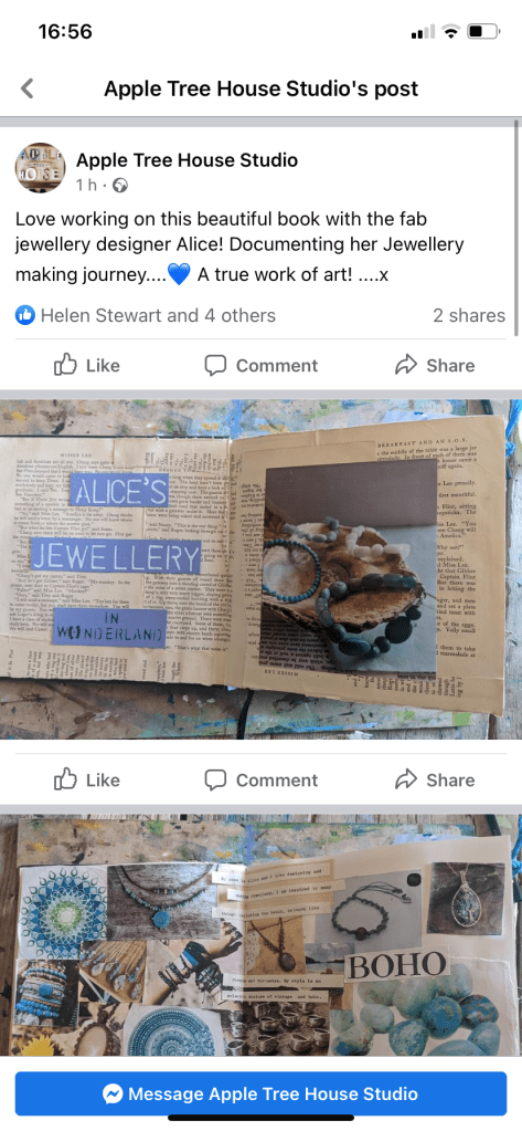
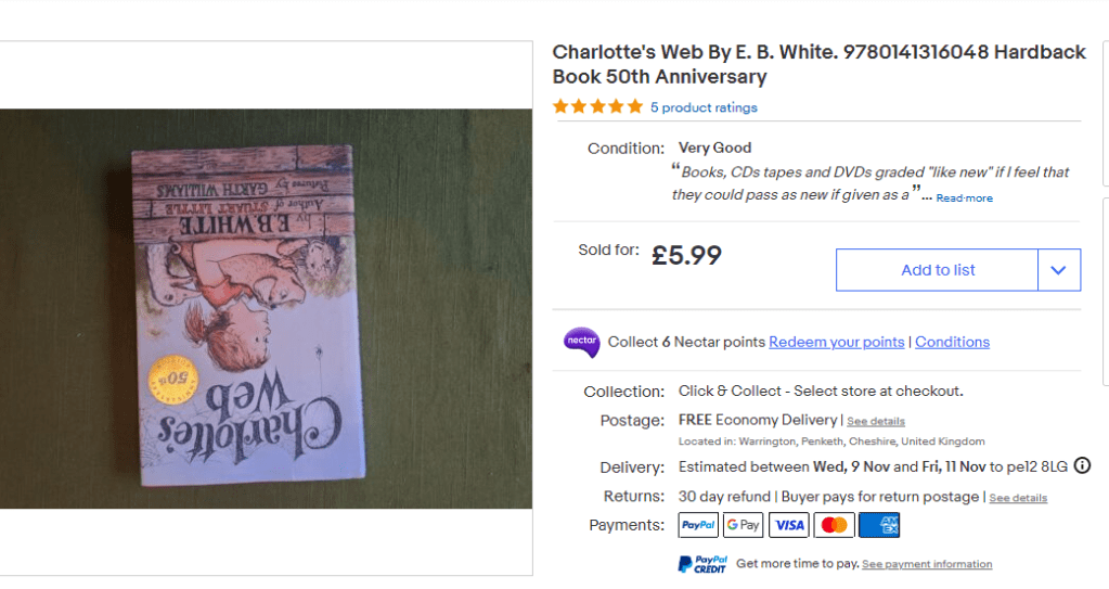
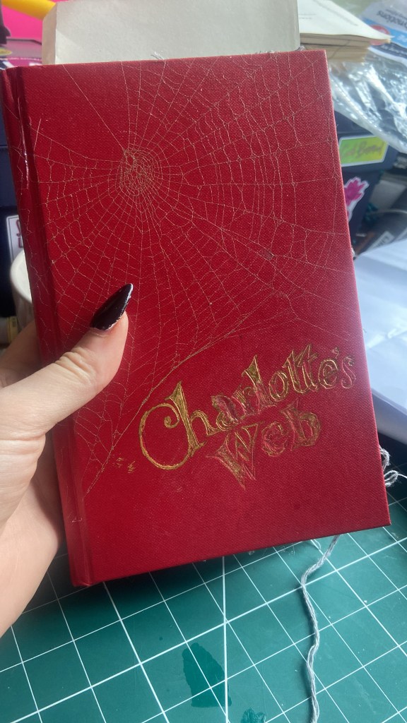
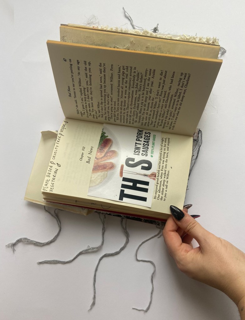
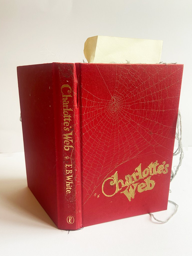
I first needed to figure out what book I wanted to design for. I had a few options in my head… The Secret Garden, Little Women, My Story by Marilyn Monroe… I wanted to ideally alter a book that meant something to me though and had value to me growing up or from the time I read it. Charlottes Web then seemed like an obvious choice as it was a book that was read to me when I was 9 years old at school and which eventually helped contribute to me being a Vegetarian later on in my life.
I had a copy of Charlottes Web already, it was the copy my Mum and Dad bought me for Christmas straight after our classroom teacher finished reading it to us at school, I wanted my own copy so that I could reread it by myself.
I didn’t fancy ripping this copy to bits for my altered book though, so I continued to browse online.
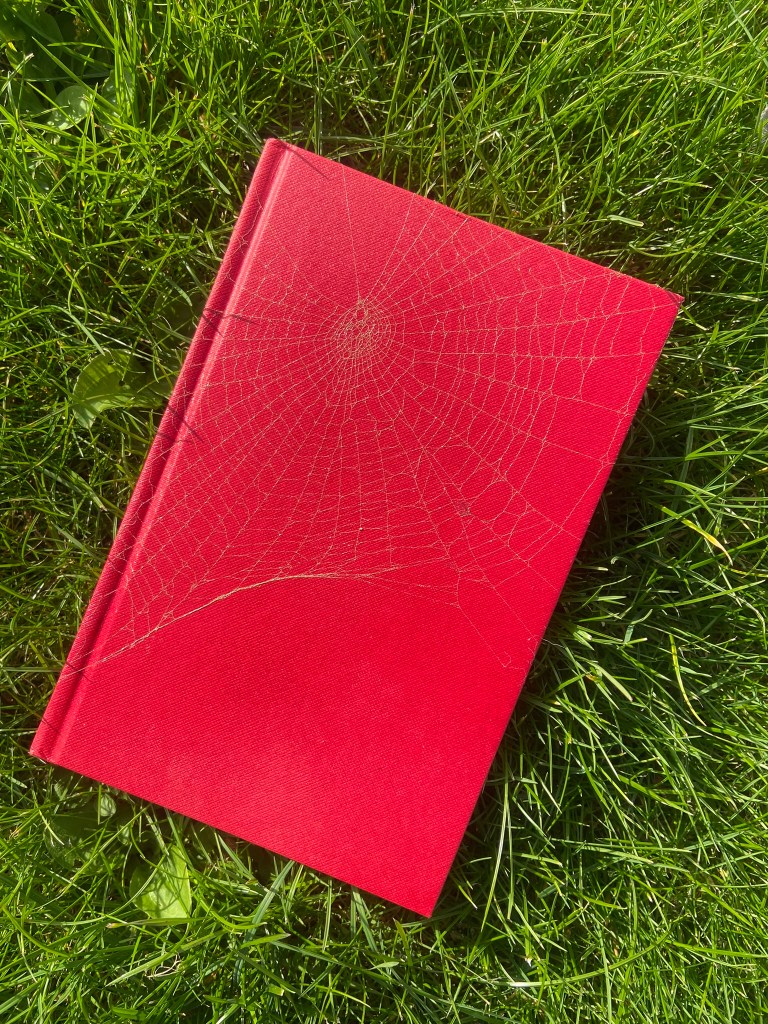
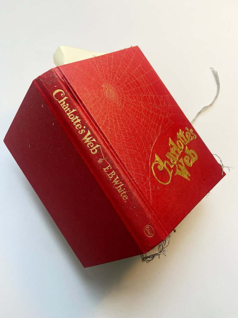
I found another one on Amazon that seemed nice; the cover was beautifully illustrated and I thought I could do something with this copy for definite! I ordered it and it arrived but it just wasn’t what I was expecting! It was smaller than I imagined, much smaller than my original copy of Charlottes Web, I struggled to see how I could create something great with the copy I now had in my hands.. plus a few days after ordering this copy I instantly regretted it after watching a foiling video on YouTube. I like the really classic looking hardback books that have the beautiful gold lettering on the front and only after watching this video online, did I realise that I could potentially achieve that using a pyrography pen which is something I own! I needed a copy of Charlottes Web with a dust cover and a lovely blank canvas underneath it!…
This is the copy I found on Ebay with a dust jacket and a red hardback cover underneath…
When it arrived, again, I don’t know what I was realistically expecting because every copy I’ve bought looks quite small! I think in my head I was after a chunky, big ish sized book!
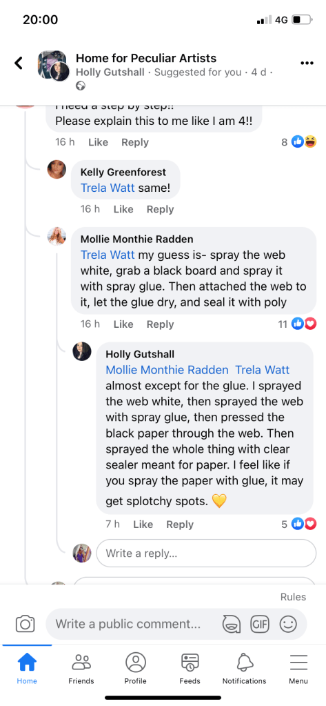
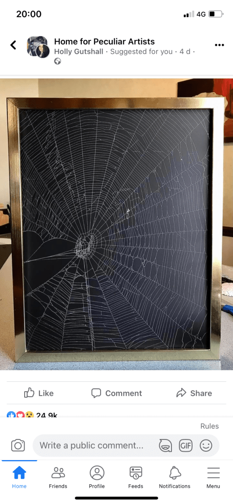
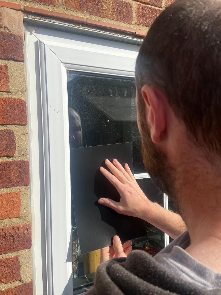
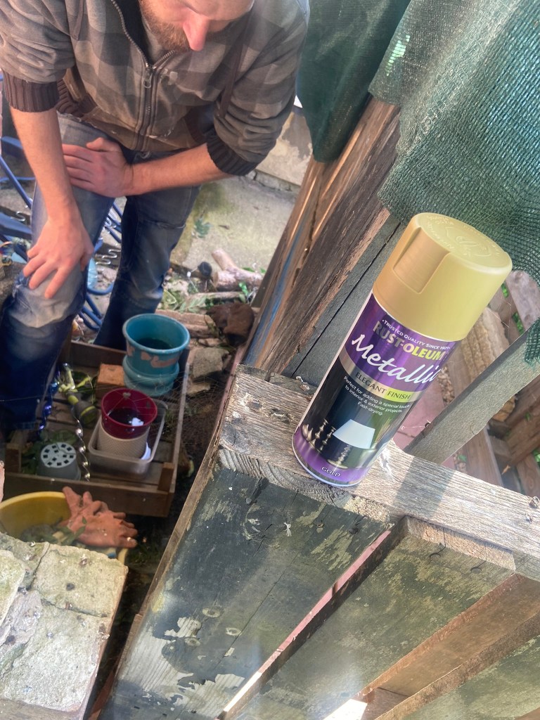
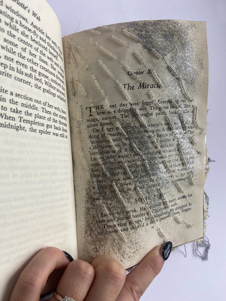
I immediately tore off the dust jacket and observed what the hardback cover was like.. perfect! As well as knowing that I wanted to do the gold foiling on the cover I also knew that I wanted to try out a very natural mixed media technique that I found whilst randomly scrolling through Facebook! There is a group on there that I follow called “Home for peculiar artists” and this technique I found was definitely that! I stumbled across it a few weeks before I even started Charlottes Web and at the time I thought to myself whoever would ever sit down and think to do that!.. strangely it intrigued me though so I carried on reading. At the time though I wasn’t even sure if it was cruel to some extent.. having done my research before I carried it out myself it seemed absolutely fine. This weird technique that I found was capturing real spider webs and preserving them forever as art!
Obviously I needed help for this… I think spiders are very fascinating clever little creatures but I do not want one anywhere near me! I enlisted the help of my Fiance who just looked at me like I was insane when I told him I wanted to spray some cobwebs gold and capture them onto my book cover!
We did a few trials first to get the hang of it.. feeling mean for stealing spiders webs we obviously made sure that no spiders were near and we also researched that spiders over night create new webs in no time whatsoever so off we went to work!
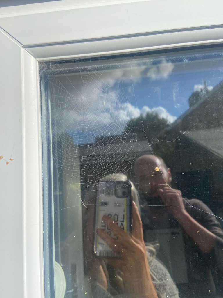
There were a few webs in the windows which Chris did not like the idea of spraying until I assured him that the paint I was using could be washed off with some Elbow grease!! One of the trial pieces we did went really well but the other 2 collapsed with the pressure of the spray from the spray mount and spray paint.
I could use all of these in my altered book though! Nothing was a waste!
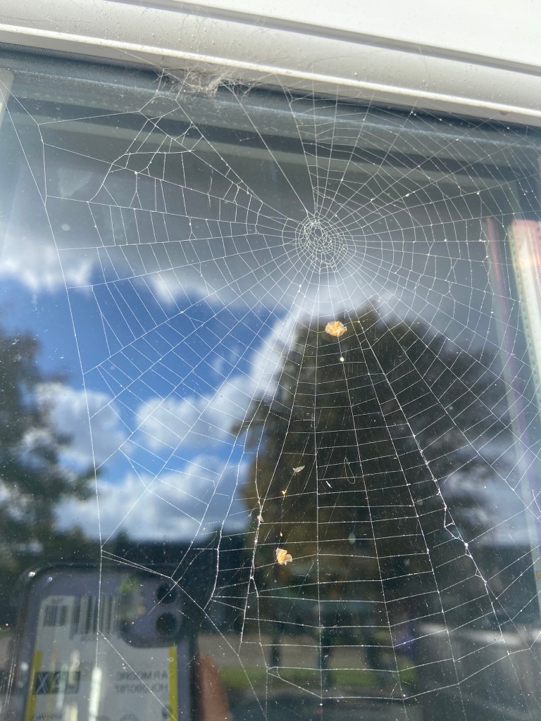
We then just went straight into it and found a beaut of a web behind our bar in the garden and just decided to take the book cover and go for it!
I wanted room left in the bottom corner to potentially try out the gold foiling so I made sure to ask Chris to position the web more at an angle over the top half of the book! What I ended up with looked beautiful! There were remnants of old flies in there though so I had to rather macabrely try and cut them out using a scalpel knife being very careful not to cut into the web!
I now had a book with a beautiful, intricate cover that I was too scared to touch again to be honest, in case I messed it up and ruined it!
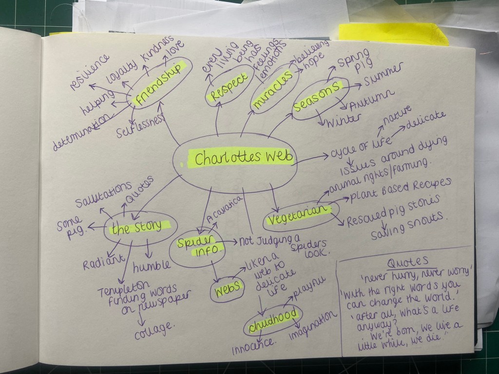
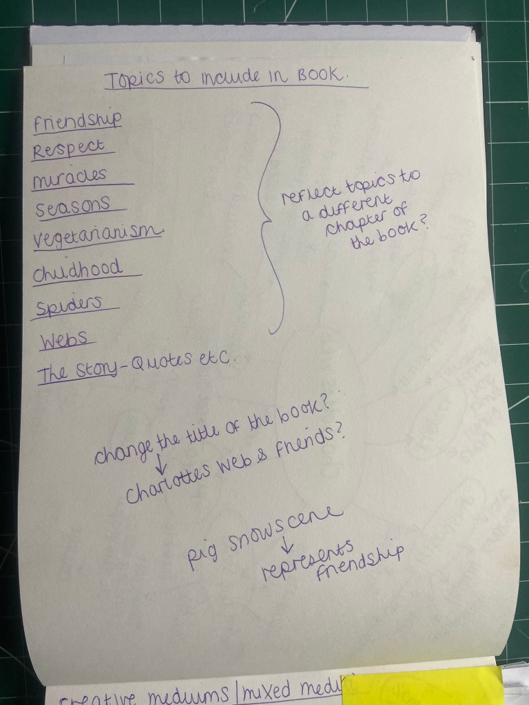
I went back to my sketchbook and listed some ideas as to what I could include in my altered book and what sort of mixed media could I put in there..
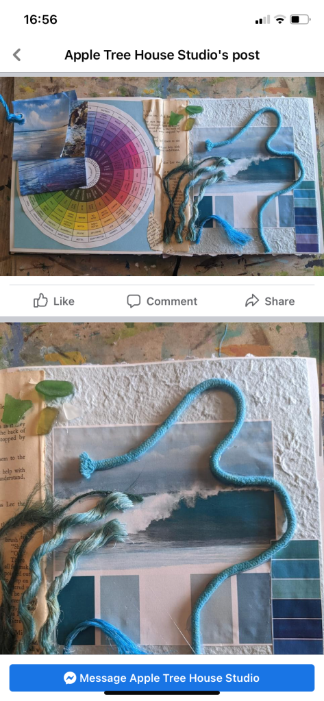
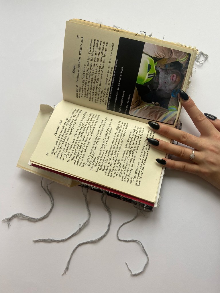
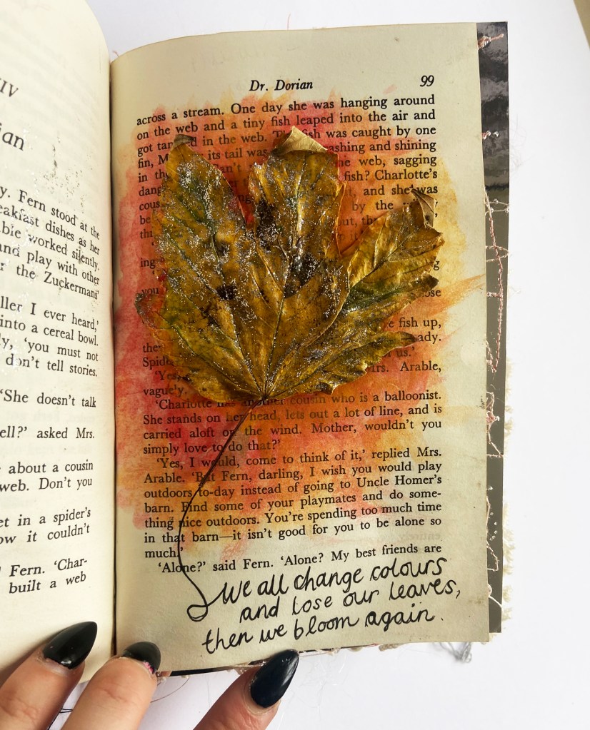
Charlottes Web is a book that focuses on friendship, miracles and the cycle of life and these were the subjects I felt I needed to try and touch upon in the book. Seasons played a prominent part in the book too because the book tells the story around time and the seasons and how change and life evolves with each season. The other thing that obviously means more to me than the average reader would be the Vegetarianism side to the story, the fact that a Pig is having his destiny taken away from him, his right to live! I wanted to get some animal rights in there somehow, but at the same time didn’t want to ruin the general feel good vibe of the book and story itself.
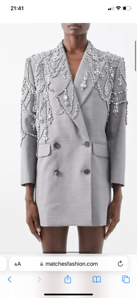
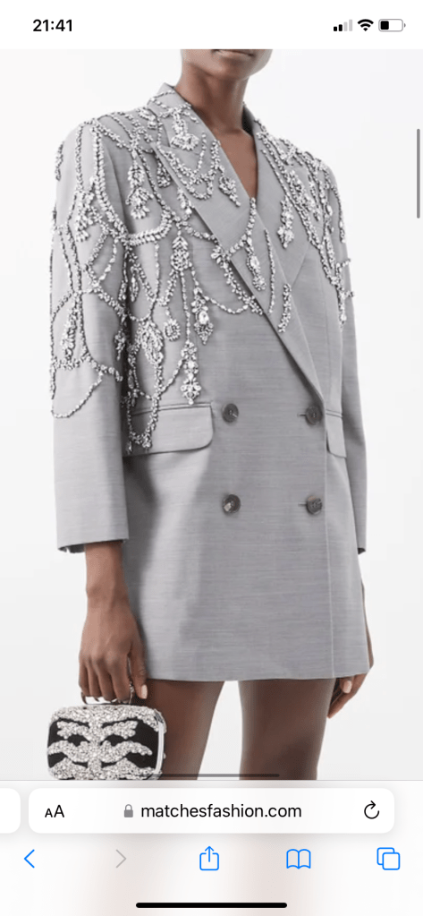
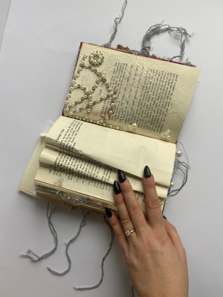
Charlottes Web is based around hope and miracles and that life is as beautiful and delicate as a spiders web. I really wanted to emphasise in this book the natural beauty and how delicate a web is. I found online a photo of Zendaya wearing an Alexander McQueen wool blazer, (£13,000 in case you fancy it!) and I just loved how it looked delicate like a web and so intricate with its beading. I knew I had some beads like this left over from when I customized my Jimmy Choo wedding shoes that I could make use of in my book.
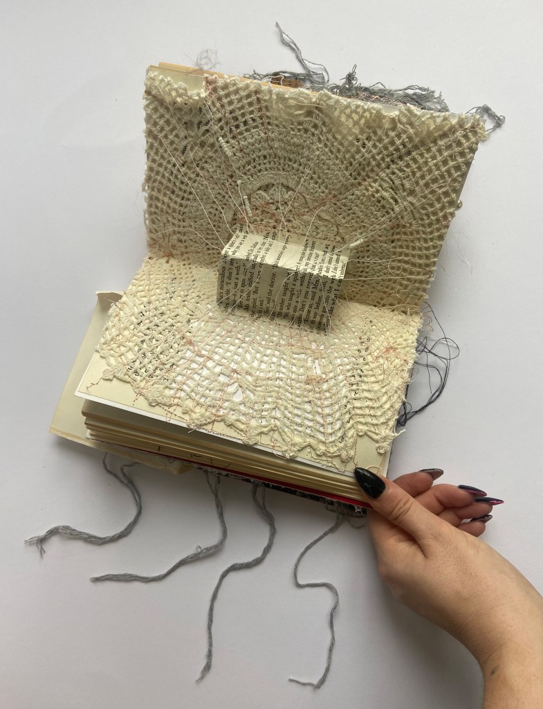
I looked into lots of other mixed media techniques; I am familiar with machine embroidery as I used to do a lot of that, but when it came to doing some inside my book it was tricky as the pages were that lightweight they often ripped and tore under the pressure of the machine! The same also happened when I started beading onto the pages, the pages were very frail and thin to be beading into!
It was difficult to try and sketch out design ideas for this book because I never really knew what I wanted to do for it until I just dived right in and got on with it!
I initially when I first started this assignment changed my mind a little and started making my altered book into a bigger format – I very almost scrapped the cover I had made with the cobwebs and tried to make the book in the form of like a sketchbook. It was only a day later that I realised that I wasn’t actually meeting the brief because I wasn’t altering the book really anymore, I was taking the book and placing it into another book! I had to get the idea out of my head that I needed to work on a bigger canvas!
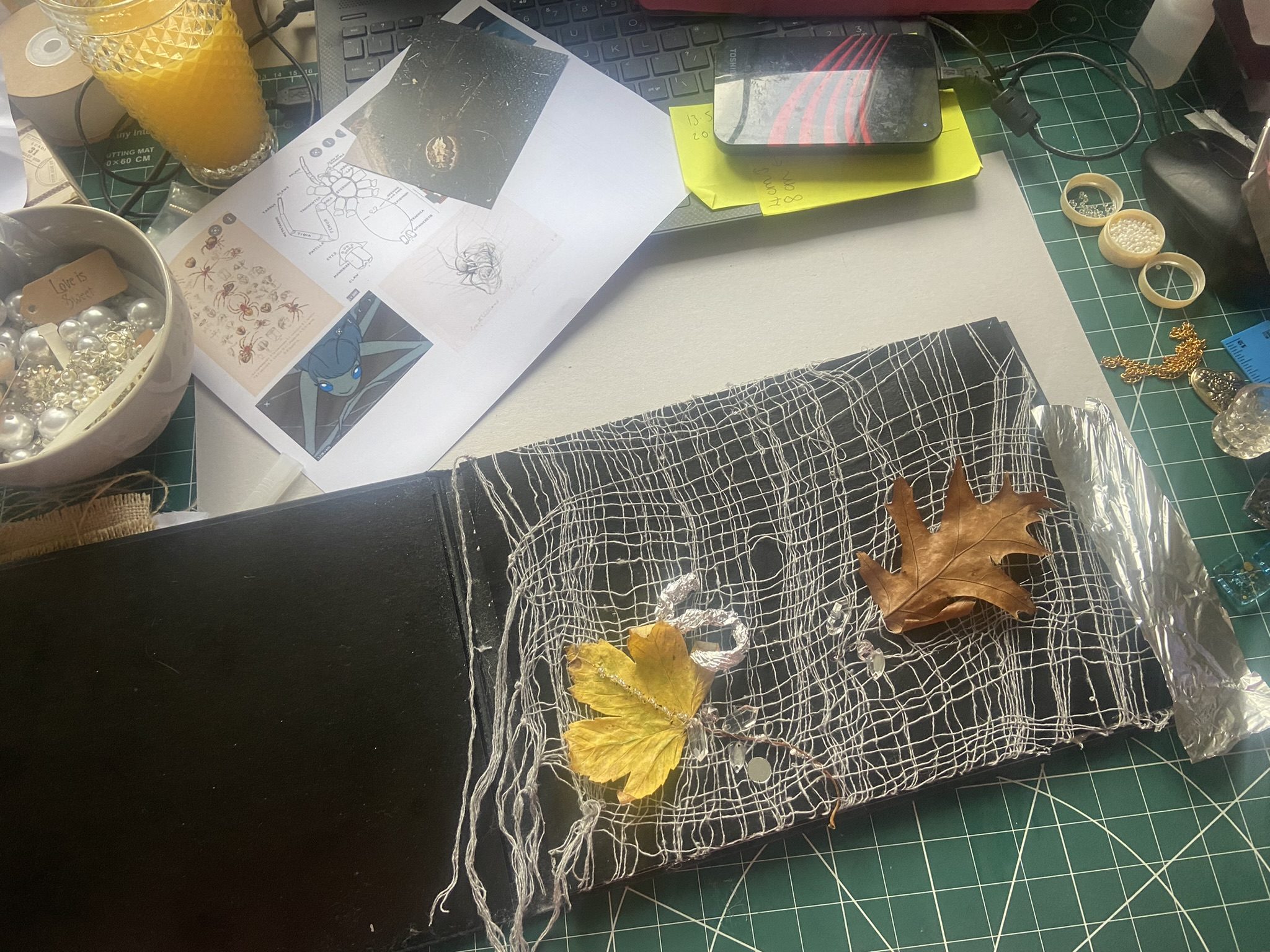
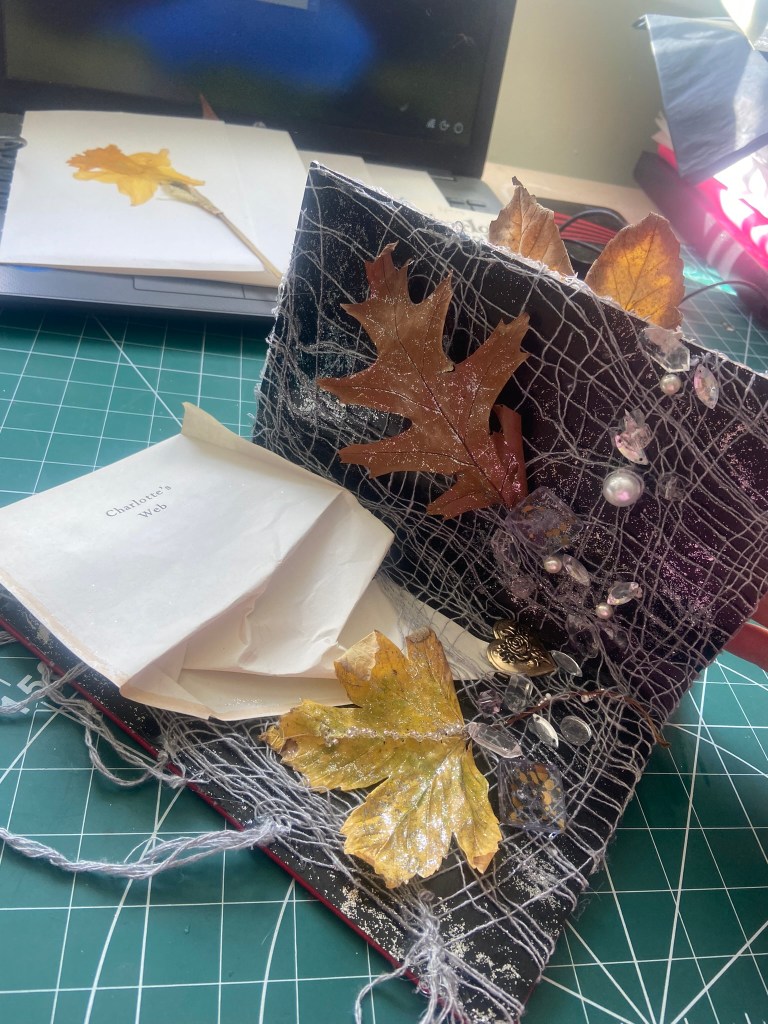
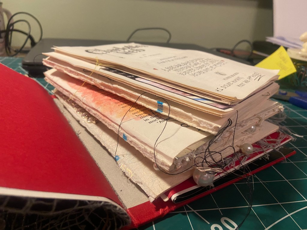
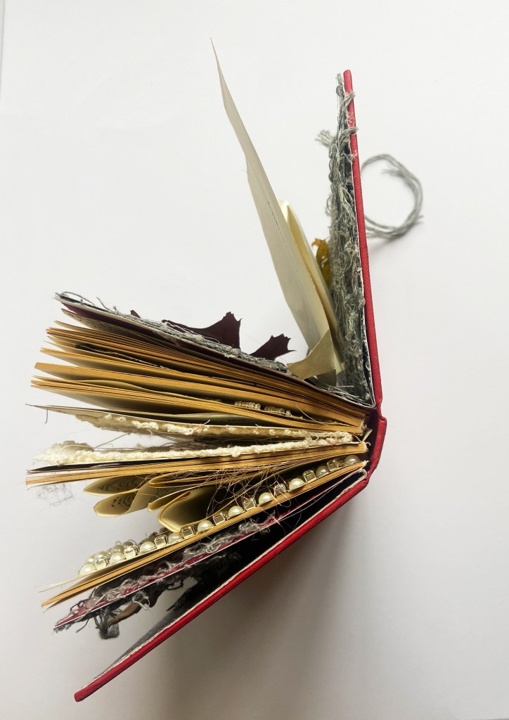
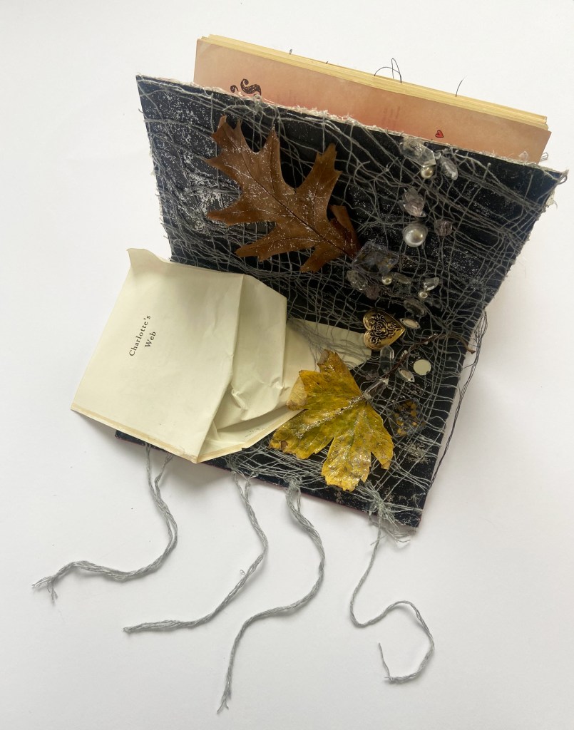
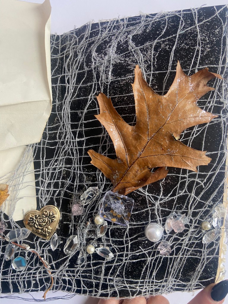
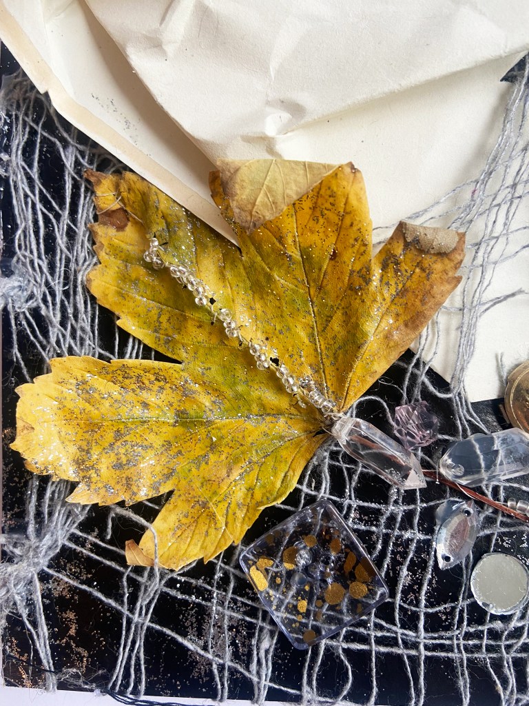
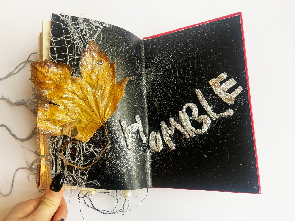
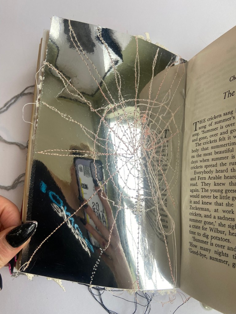
I did love what I had started to create though on the inside covers of this book, even if I did come to the realization that it was more an artists book than an altered book in the end! My original idea for this was that I was going to rip the book into sections (by season!) and fold and curl them up and tie the pages together with ribbon and then slot them into the web! (they might look a bit like flies in the web!). The cobweb material was what I had left hanging around after Halloween, it seemed obvious to use some for this! I also collected some large leaves from the tree outside to represent seasons changing and nature and to also look like they were being blown and caught up in the web.
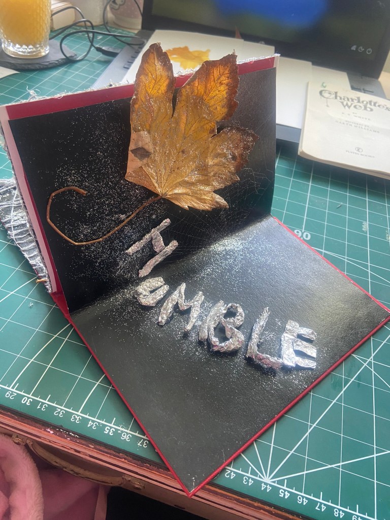
I used one of the test webs we trialed for inside the cover and to place the word “Humble” next to.
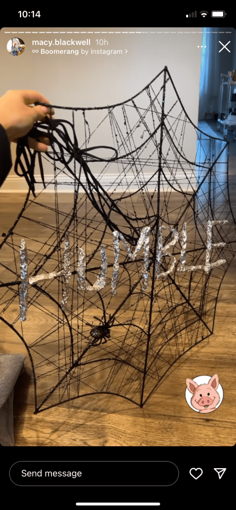
The tin foil letters I stole from an idea I saw on an influencers Instagram page:
For her halloween decor she was obviously going along the theme of Charlottes Web! I thought the tin foil letters were a good idea and attempted to make my own!
After a day of laying everything out in this “new book” I realised that I needed to bring it all back home to the original book…
The next day I unstuck everything and cut to size and restuck it all back into the original book.
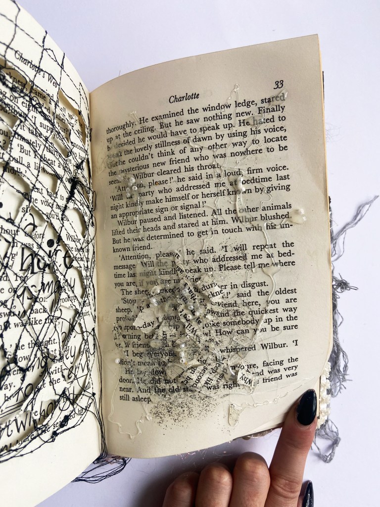
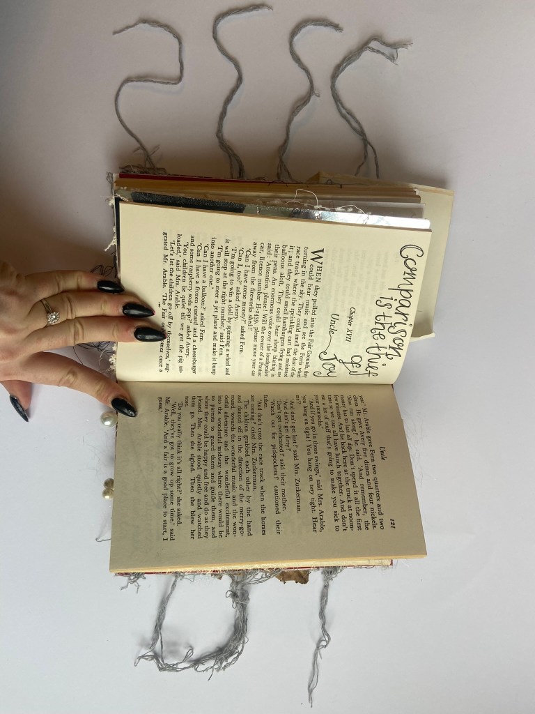
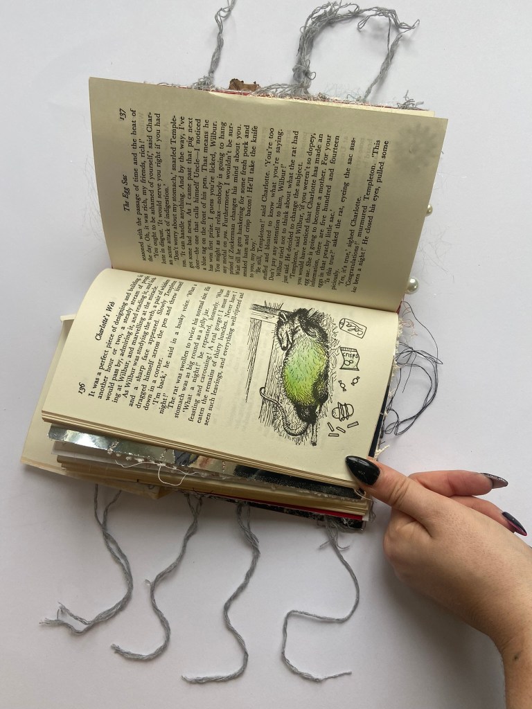
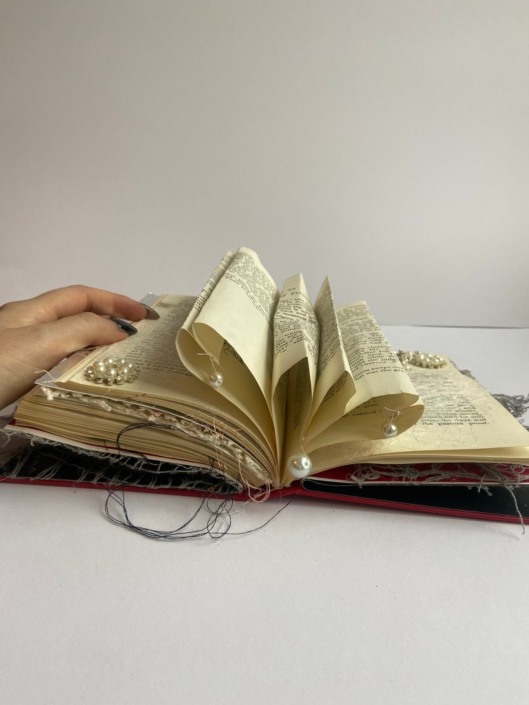
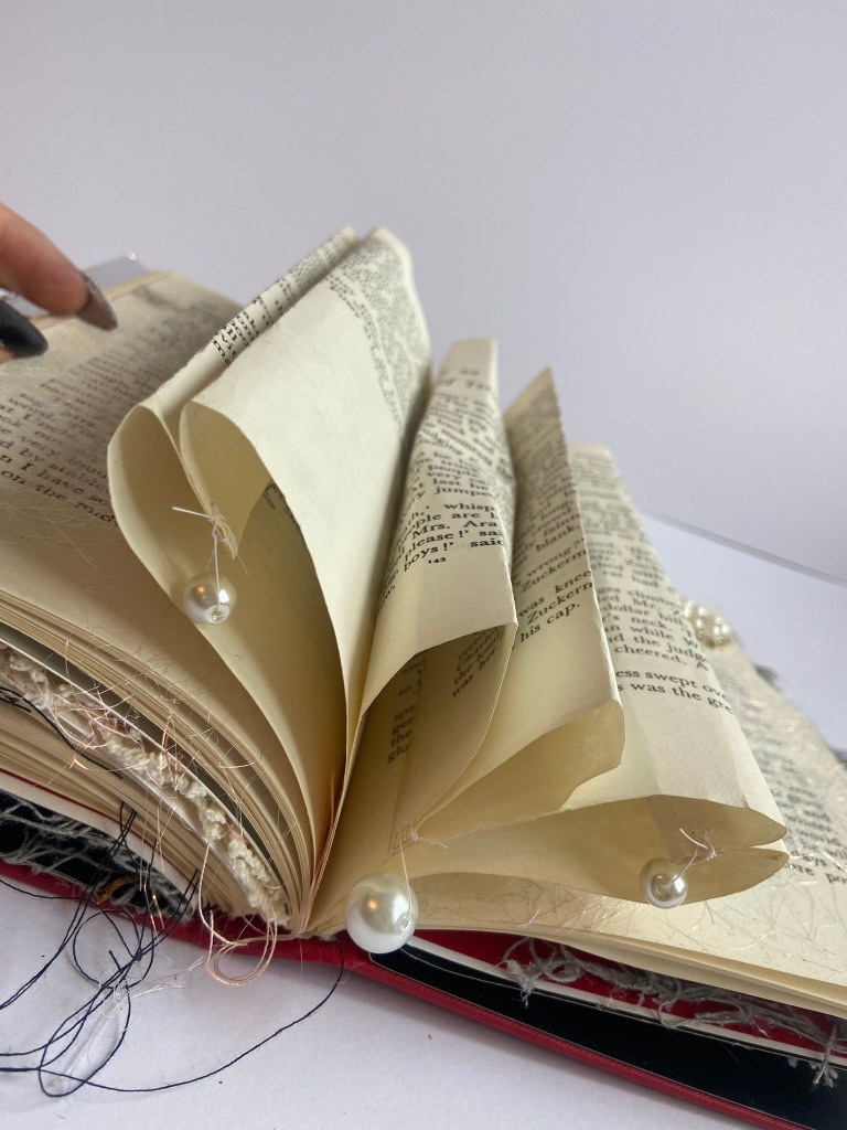
You can see from the photos below some other experimental mixed media work I was trying out in my book! I attempted to try and curl paper to look like love hearts!- this worked well until I actually closed the pages on my chunky book and it completely flattened and ruined the shape of the hearts! I also thought it would be nice to add some delicate, intricate pearls to the love hearts too! You can see on my final photos how these look completely different once they are squashed inside the pages!
On the pages with beading I also used some Angelena fibers; these are like glittery, fine pieces of angel hair! You arrange them how you want and then press them inside some greaseproof paper and iron over the top and then the fibers stay together and you can position them within your work how you wish! I allowed them to lightly cover a few of the pages in my book; they could also represent spider webs and the delicate nature of them.
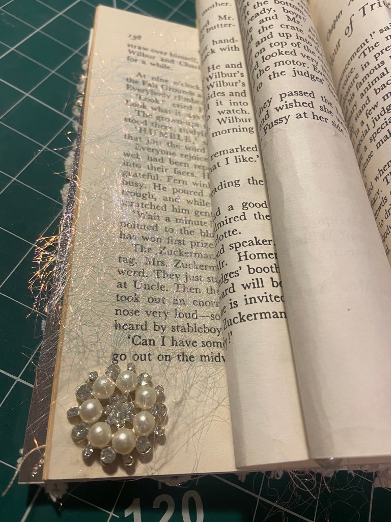
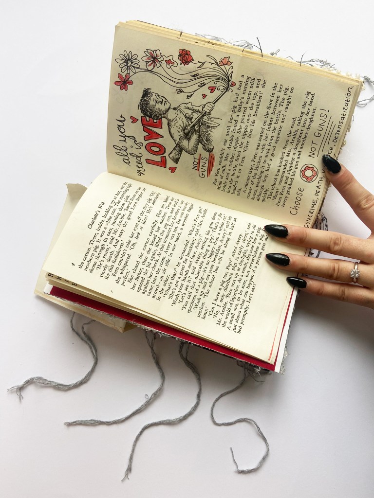
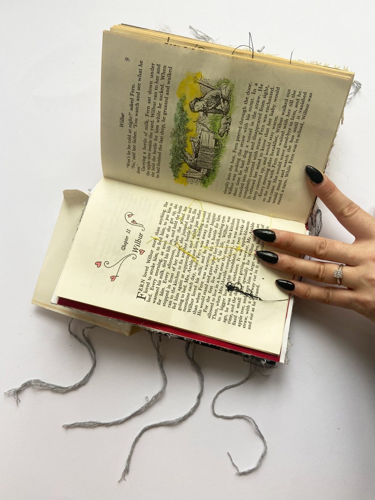
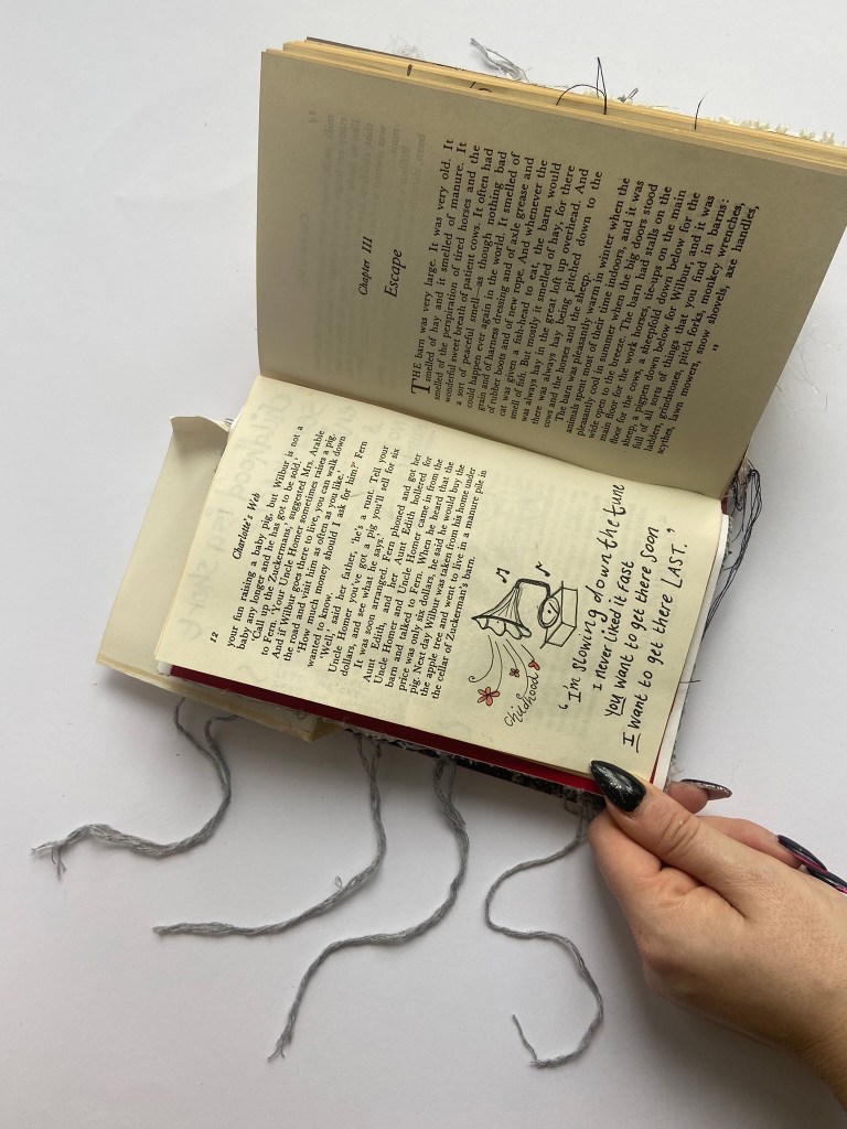
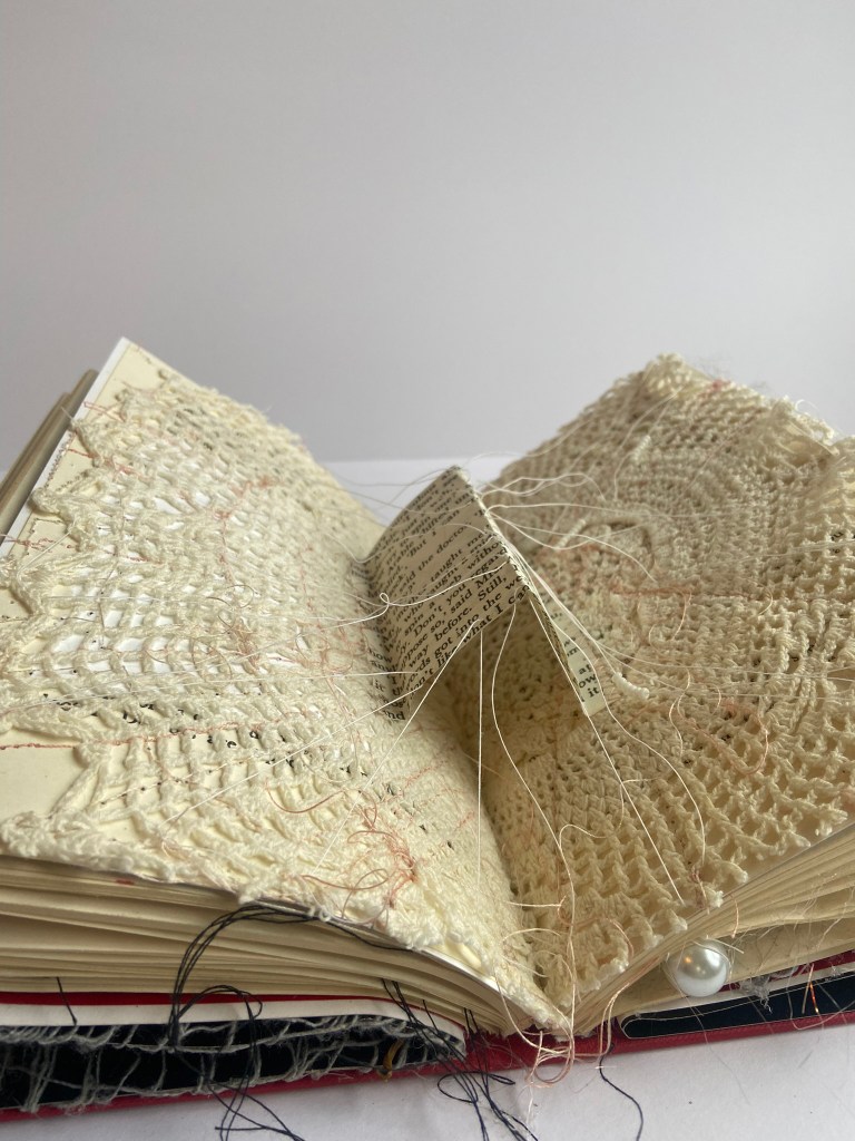
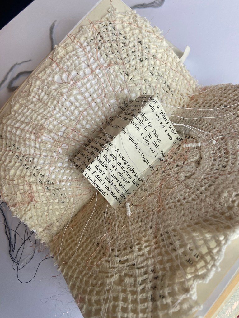
There are a lot of original illustrations in Charlottes Web by Garth Williams which I changed ever so slightly to add message or meaning to the book. There was a page where Ferns mum was worried about her talking to the animals and spending too much time on the farm and she was doubting how a spider could write words into webs.. the Dr told her that to a spider it is as easy as her knowing how to crochet a doily- it’s instinctive. I used one of my Grandmas crochet doily’s she made when she was still alive for this page, I made it look like a web; I free embroidered it on the pages and then tore out the part of the story where the Dr is speaking to Ferns mum. I then stitched some cotton all the way around to make the web look more realistic
When it came to the gold foiling on the cover of the book, I had a few issues. I started to pyrograph on a really low setting over the top of the gold foil and to start off with it was working! By the time I got half way through “Charlottes Web” it wasn’t imprinting the foil onto the cover. I ended up having to get Chris to pick me up a gold pen from Hobbycraft to finish the words off.
You can see how the above photo shows the scratching of the pyrography pen on the front cover but doesn’t show the gold foil imprinting onto the cover. I tried with a higher temperature but that just melted straight through the foil!
The photo above shows how I finished off the letters with the gold pen; it has worked and filled with colour but it doesn’t look professional. The pen has smudged and looks gloopy and thick. I was stuck though and needed an option to fix it so the gold pen had to do!
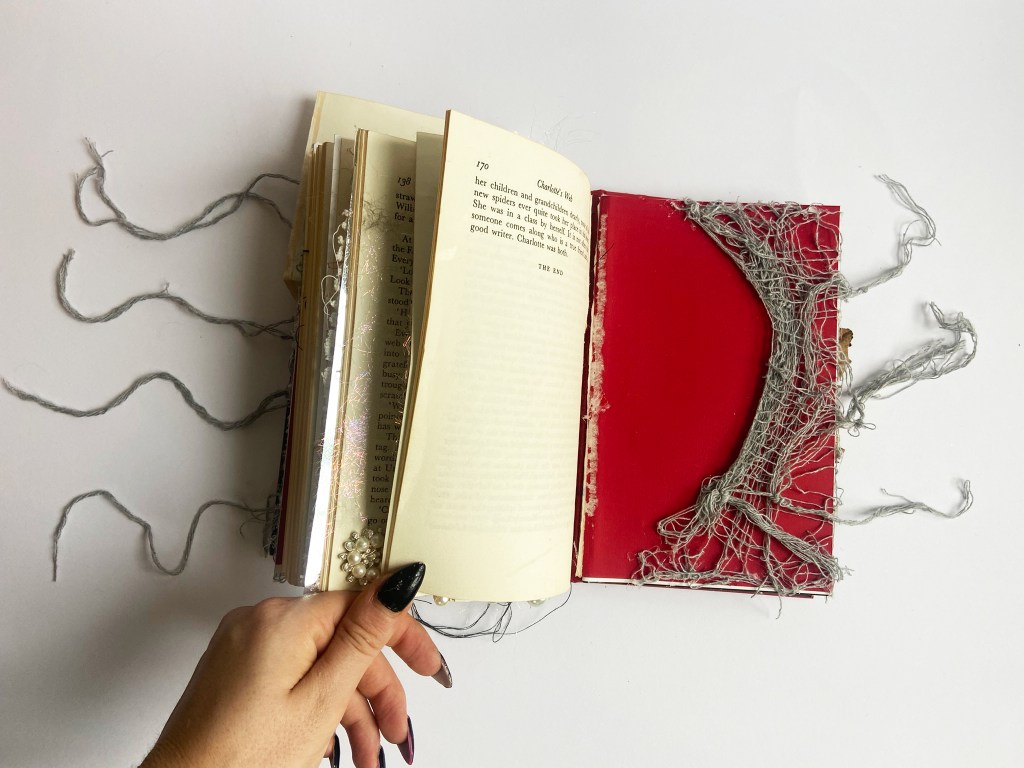
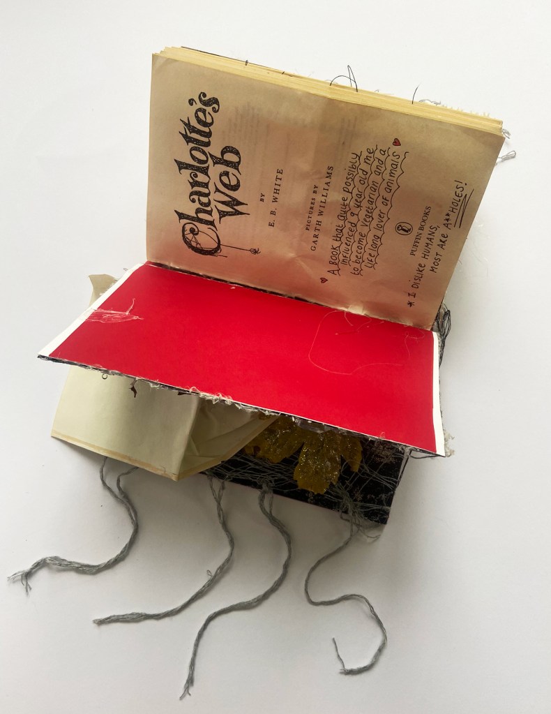
When it came to putting the pages back into the book I had to rely on my (broken!) glue gun, which cost me 2 blisters on one of my fingers! I had to glue along the spine and wedge all the pages back into it! This was more difficult because the pages were nice and chunky now! The book definitely did not close after! That is why I included the strands of wool hanging out the sides of the book-I did think I could tie the book shut using these, they did not work! Instead they just knotted up and really pulled at the glue inside of the book.
The Final Book
The Videos
This is a sped up time lapse video of my book!
This is a video of me talking through the process and the pages! Please ignore my really croaky voice! I have been ill at home now for 2 weeks with horrendous flu and chest infection!
Conclusion
At the end of this assignment I was pleased with what I had achieved, considering when I first started working on it I was scared at how bad it could potentially go! I wish the foiling on the cover had worked out better but most of all I wish I had more time!! With my course very close to completion, I had to really be strict with myself on the timescale for this and make sure that I did not go over my deadline. There were a lot more mixed media techniques that I researched that I would have liked to have tried out for this and filled more of the pages with. My favourite pieces in the book are the natural cobwebs I “borrowed” for the making of my book and the inside covers, I really liked how these turned out! I really like the mixed media approach and in the future shall definitely look at doing some more work similar to this but because I love digital I shall always bring it back to that instead of producing purely handmade work!
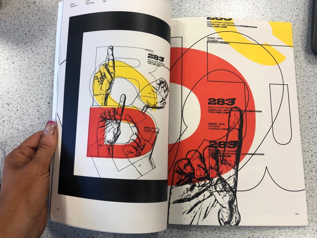
Two of the artists that I looked at in part 1 of this unit were Roy Cranston and Sofia Clausse. Their work is very similar in the fact that they both create books showcasing their work but their work couldn’t be worlds apart.
I have been a fan of Roy Cranston now for a few years, (as I have wrote in several previous posts!) in about 2019 he rose from being a student designer practicing layouts and designing a poster a day to eventually being recognized within the design industry and going on to complete work for Nike among many others. After he completed the year designing his posters and layouts he then decided to turn them into a limited run zine, (which I had no idea what that was then!) and he collaborated with PRINT in New York to print and distribute them. After advertising them on his Instagram and with only a small limited run I had to have a copy and gladly paid the £30 ish. I was more devastated that I waited 6 months ish for it to arrive because this was just before COVID struck and the world shut down! Roy Cranstons zine is a professionally bound book filled with all of his digital poster designs. This is where he very much deviates from Sofia Clausse in the fact that her work is very hands on, handmade, traditional and mixed media.
I like the fact that although Roy Cranstons work is digital, there are elements that have been photographed, scanned and imported in from other places to help create the content for his digital designs. He is very alike to David Carson in that different textures interest him and he is able to bring that handmade element and use it to trigger a handmade/digital approach.
I used to be very hands on and traditional but I have to admit that it is through artists such as David Carson, Roy Cranston and Chris Ashworth that I love taking handmade/found elements and using them to help create something greater digitally.
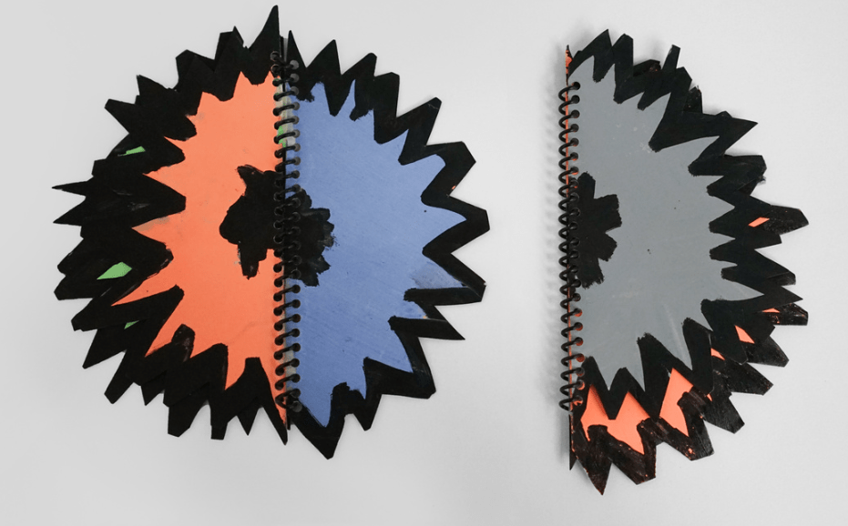
Sofia Clausse work is not digital at all! Her work consists of mostly ideas through mixed media. She paints, weaves, uses different types of paper to complete very abstract pieces of art. A lot of her sketchbooks are hand drawn and hand made and not professionally produced at all! She spiral binds a lot of her work which is a technique I had never thought of using in handmade pieces! Typography that she produces is all hand drawn and hand produced lettering unlike Roy’s digital catalogue of typefaces at the ready! What I would like to achieve in future work is a mix of the 2 artists – Roy’s handmade/digital approach but with the raw, uniqueness of Sofias hand produced art.
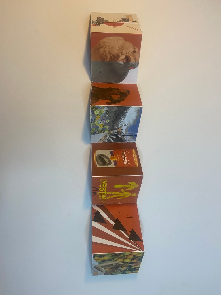
Here is a refresher on the 16 pages I created! I decided to keep all of the pages the same from the original exercises.
The only thing that I would change from the previous exercise would be the ability to be able to print them out using the colour laser printer. As I explained in my previous post, sadly I have been at home now for 3 weeks really ill and haven’t had access to the normal lovely laser printer at work that I like to use for all my exercises and assignments! 😦 I have been dedicated to using my home inkjet printer which just does not give as good print quality! The images with a laser printer would appear bold and glossy and vibrant whereas a home inkjet printer they appear dull and matte. Despite this though I still had to move forwards and take what I had and use what I could to create a new book for my 16 images. I printed 16 more pages off using A4 white copy paper.
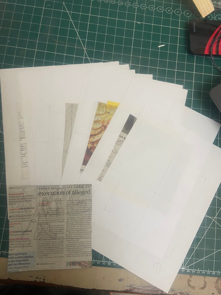
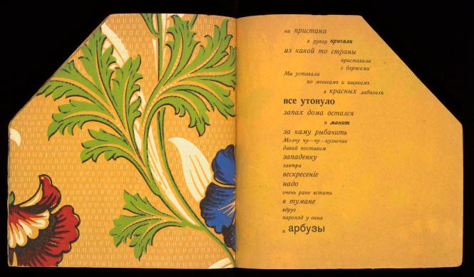
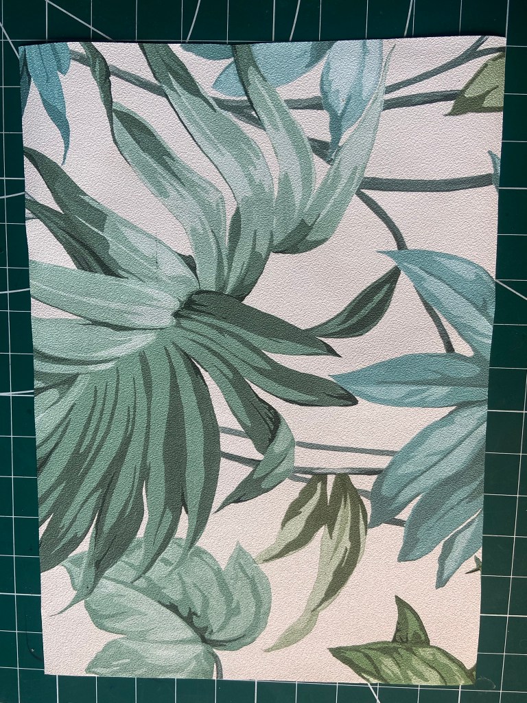
My images are small measuring just 10x10cms each and ideally I wanted to keep them this small 1) because I liked the idea of the being in a cute little flip narrative book and 2) because home inks are a nightmare and easily run out before you know it! Sadly, I needed to keep costs down! Going back to my previous “Concrete poetry” exercise where I had to design for the poem and then print it out, I decided to print it out on leafy wallpaper (that I stole from B&Q!) because 1) it represented the “resting on laurels” with the Bay Laurel leaves and 2) it took the poem back to its original roots where it was printed onto cheap wallpaper to keep costs down! I still liked this idea and let me tell hya!… I needed to keep my costs down so I decided to get my Fiancé to kindly “borrow” some more of the leafy loveliness that was the wallpaper in B&Q whilst I stayed at home dying so that I could then use this to back each of the 16 pages and make into my little narrative flipbook!
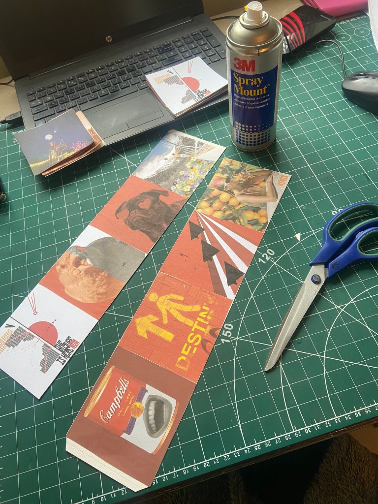
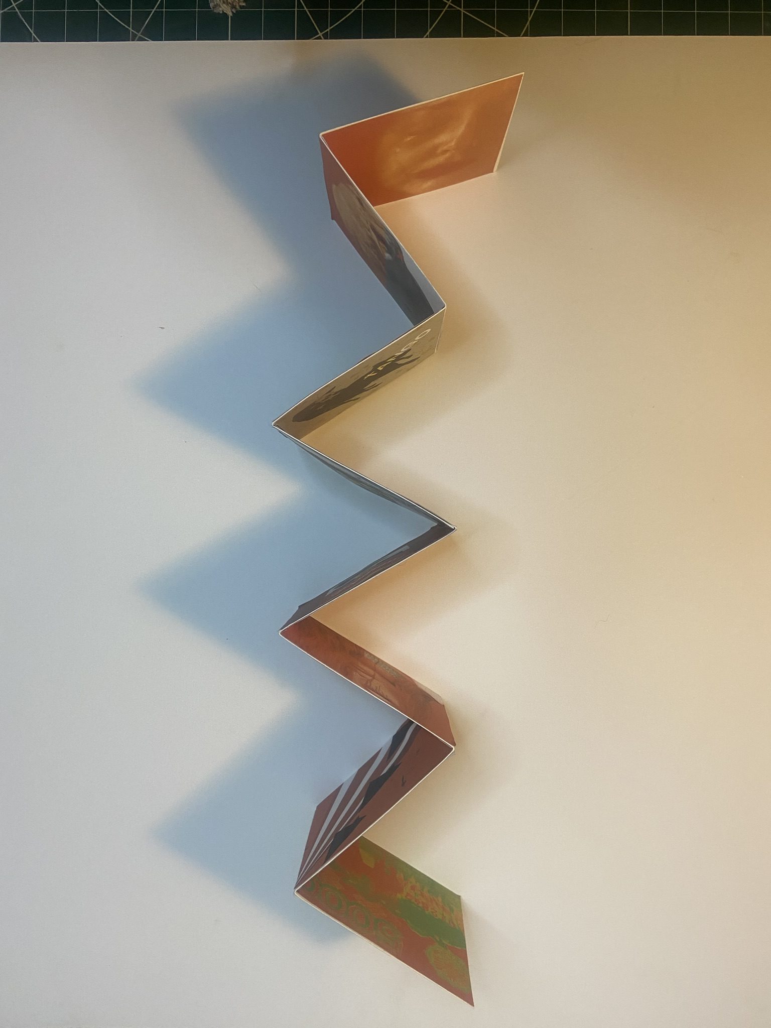
Once I had acquired the wallpaper I went about cutting 16 10x10cm squares and then using spray mount I stuck one image to the back of each square of wallpaper. At the end I had quite a chunky little book! I organized the pages in order that they appear in the poem.
If I was to go about this process again, had I had more time and better printing facilities, I would have created A4 documents in InDesign and arranged my 16 images over a few pages and then cut some A4 sized wallpaper to feed into the printer and print my designs directly onto them. The sad, harsh reality also though is that I have had to cut corners on my exercises as I am massively out of time in my course!
I originally wanted to create an open spine book. I really like the look of my David Carson book that is open spine and fancied having a go at one myself. The only medium I had though to try and replicate this was a glue gun!- In typical fashion, my glue gun decided to not work mid flow! (I found myself having to force the end of a paintbrush in the end of the gun to squeeze the glue out as the glue decided to get stuck and melt all inside the gun!!) Despite this I created a gluey, open spine but it looked messy and I just didn’t like it! I then went on to Plan B and using some greyboard, created a front and back cover and spine for my book. On the inside covers I used the leafy wallpaper and on the front I printed out a section of my design for the original poem I did in “Concrete poetry”.
I did contemplate using my sewing machine to bind the spine together but the pages would have been too thick for a domestic machine. I also think that if I had hand sewn the pages that it would not have been strong enough to keep the pages all bound together.
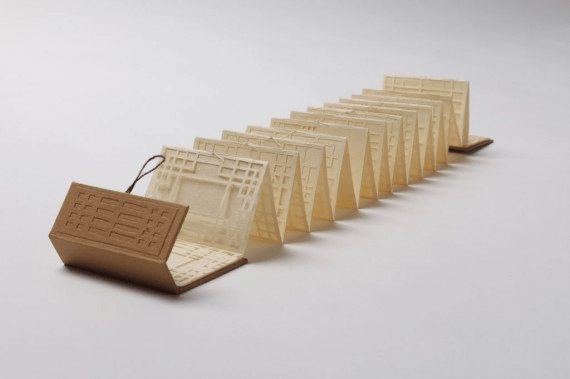
What I ended up with wasn’t the most professional job! I mean it worked and it looked ok as a tiny narrative flipbook but again with more time, money and resources it could have been professionally printed to a higher quality. I do like the texture that the wallpaper gives the book though – and in keeping with the original nature of the book being printed on the cheap, this DIY handmade book is in keeping! From looking back to artists books from Part 1 of this unit though, I did see a little book that is quite similar to my own in the fact that it is handmade and there is something quite unique and charming about this one! It reminds me that not all books need to be professional in their appearance and they can be more like zines and artists books.
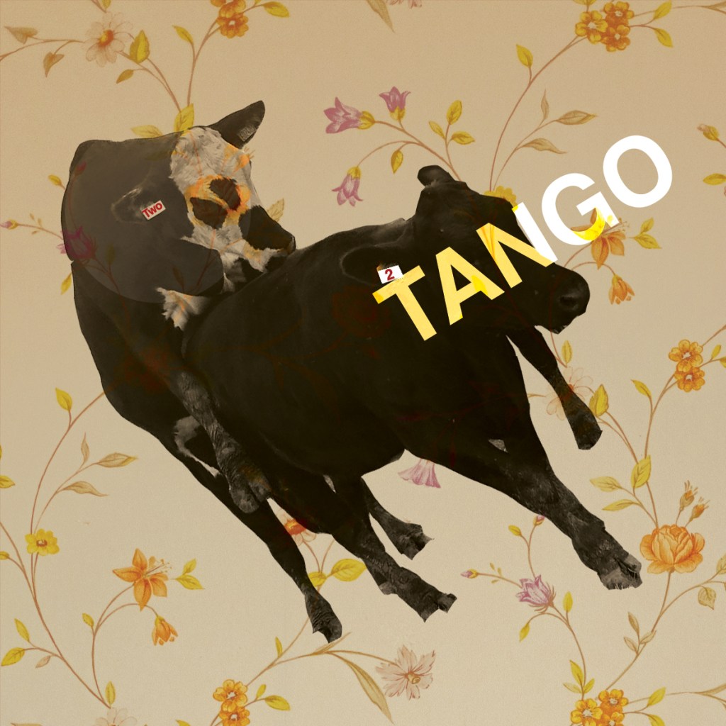
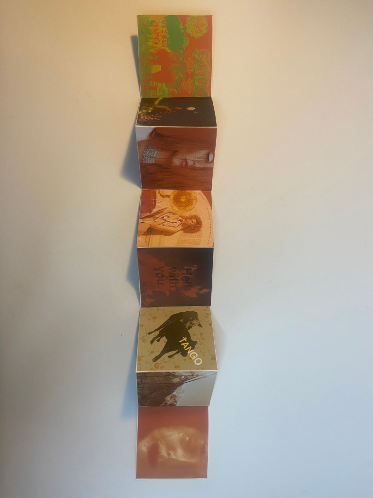
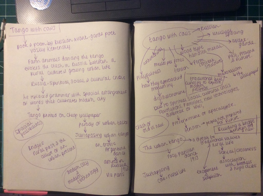
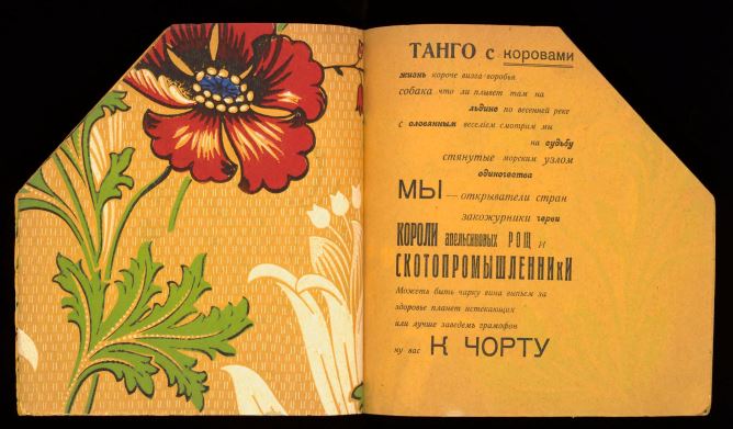
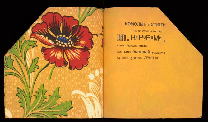
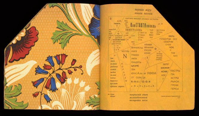
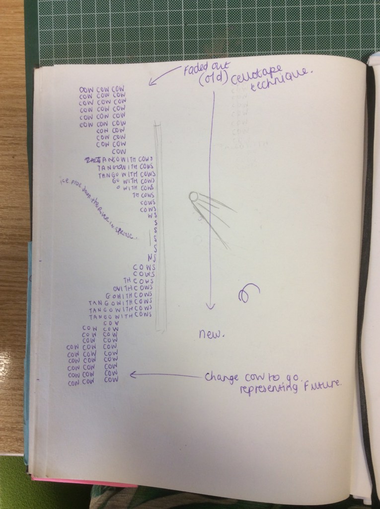
After completing the previous “Tango with the Cows” exercise I now have a rough idea about the poem and what message it is trying to give to the reader. I dissected the poem into tiny fragments and pieced it back together to come up with my own conclusion of what it means but overall the poem is quite obvious and literal which means that when it comes to choosing images to portray the poem in a book for this exercise, the images that I choose will more than likely be the images that a 100 people completing this exercise would also choose!
I started off by sketching a few ideas out in my sketchbook and by writing some ideas down and listing the potential things from the poem I could find images for and use in my book…
This exercise also seemed like a good refresher in Photoshop!
The things I listed from the poem in my list I used in my book but the sketches that I initially drew out didn’t go to plan – the ideas changed depending on what free images I could source and use.
I downloaded a lot of the images I used in this exercise from Pexels; I have used images from here quite a lot!
Some of the images were also my own from photographs that I have taken from over the months and years and totally forgot about until I realized that they have potential in this exercise!
I decided to keep the images relatively small and sized them at 10x10cm each.
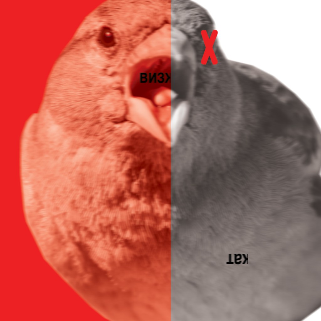
1) Squeal of a Sparrow
I started off firstly with the Sparrow; “Life is shorter than the squeal of a Sparrow” I wanted to somehow show the Sparrow beginning to “squeal” before ultimately his life was shorter and he died. I went on Pexels and found an image of a Sparrow that seemed like a good match and that I could manipulate in Photoshop.
I knew that I wanted Red to be the dominant colour in all of the book – this featured a lot in Russian, communist propaganda posters of the time and also it mirrored the style of my design in the previous exercise.
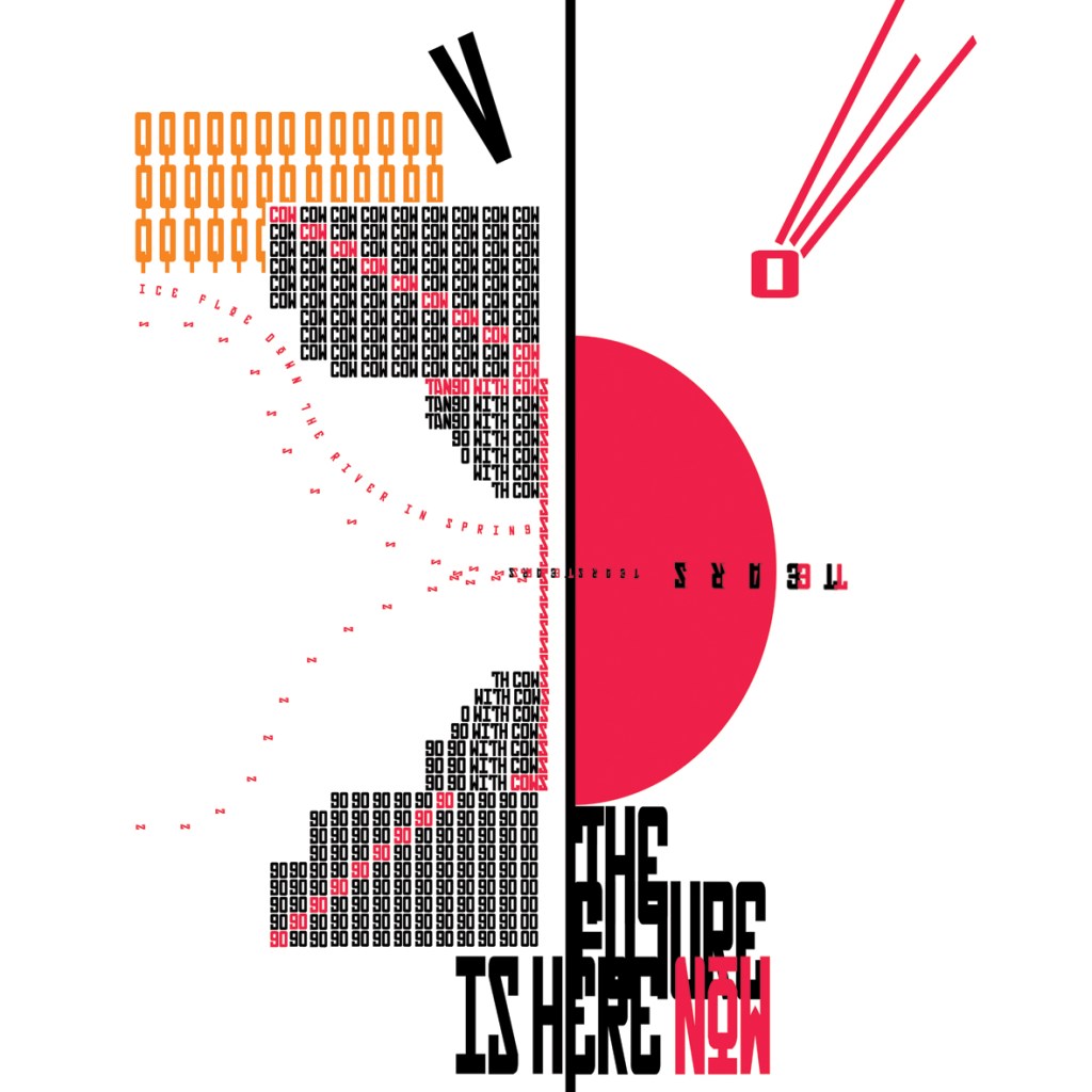
What I ended up with was this!
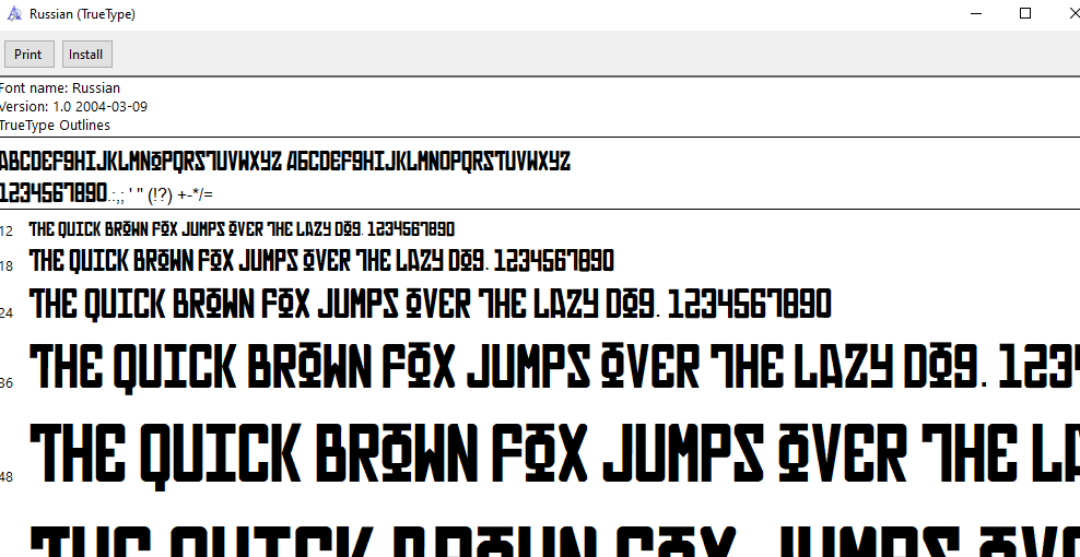
I used the same typeface (Russian) that I used in my previous design and I translated “squeal” into Russian to make it feel more authentic. The Sparrow has started to “squeal” until it is cut short and all the colour is gone and the life is taken away to leave black and white and half of the word “squeal” has dropped dead onto its back. I quite like the use of the red X on the birds eye to symbolize that the bird is dead but to also add contrast against the black and white.
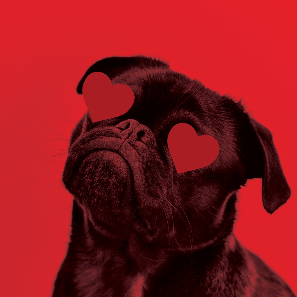
2) “Like a Dog, regardless”
I feel like the whole vibe of this poem is a sarcastic p*ss take! For that reason I wanted to try and not make the images I chose for my book too serious. This part of the poem I think is a mickey take on sitting loyal and sitting dumb like a loyal dog.. In my head I had the idea of a big dog like an Alsatian or a Labrador but instead I decided to go with a Pug as they are possibly one of the most mischievous, yappy and self centered dogs! Once again using Pexel I sourced a free image of a Pug that I felt would work well in my book:
I decided to use very little/if any wording on my images because I wanted the images to speak for themselves and hold their own narrative so simply for this design I placed a couple of love hearts over his eyes to show a loyal love and that was that for this image!
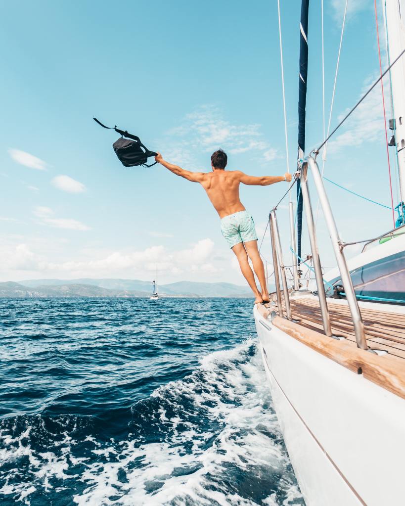
3) “Sailing on an Ice flow down the river in Spring”
The idea for this from my initial sketches through to final image was quite similar.. I had the strong image in my head of a random mix of images all collaged together to make something ridiculously unreal! I had the idea of a vintage 1950s man sailing a boat with Swiss mountains and blue sky in the background swimming in a sea of spring flowers!
I started off by sourcing another free image from Pexels of a man sailing on a boat, the image didn’t take itself seriously – I mean the man was half dressed which made it insane for sailing in the ice flow! I then brought the image into Photoshop and cut around the Mediterranean sea and tropical backdrop to try and match it with some snowy Swiss Alps!
I then went and found another free image of something that I could relate to a picturesque Swiss background and again, removed the bottom of the image so that I could quite easily montage the 2 images together:
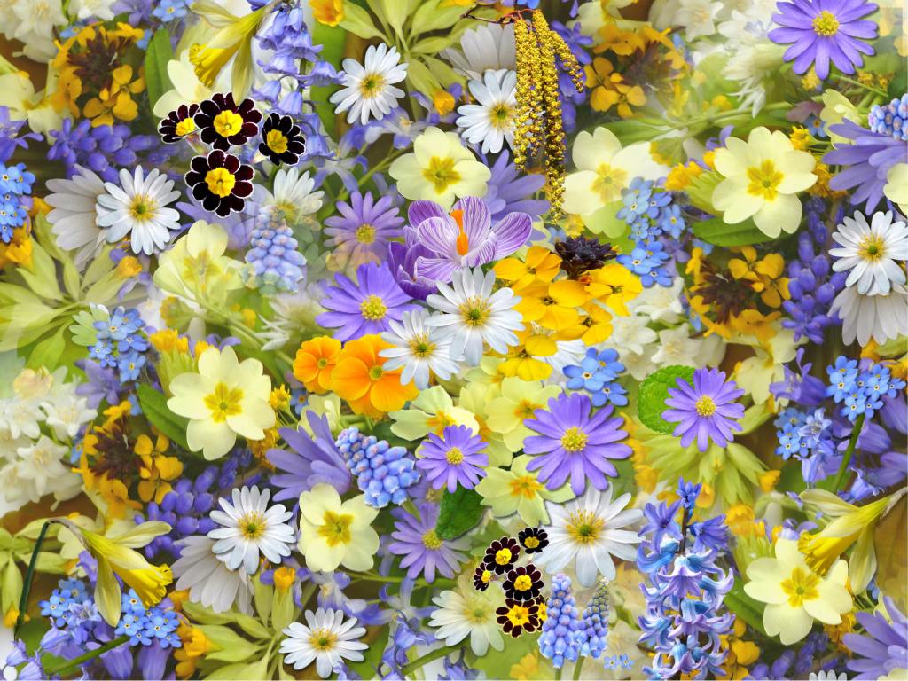
I then just needed some lovely, bright Spring flowers and then the collaged image would be complete! I found this one, again it was free on Pexels:
I liked how the flowers were a contrast of colours; the pop of bright, spring like yellow against the cool, icy blues!
The final collaged image turned out to look like this!
I decided to make the cold, Swiss mountains black and white to emphasis the cold and to also contrast against the warm spring blue sky and flowers. I also found a free image of a spring bouquet on Pexels that I cut around and manipulated in Photoshop to place in the mans hands as if he were sailing with a gift to the beauty of the landscape!
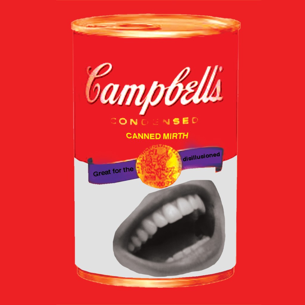
4) “With tinned merth..”
The image that I initially conjured up in my head and initially sketched and the image I ended up creating were again very similar. I had the idea of an Andy Warhol style 1950s soup can with a cheesy smile on it and a sarcastic slogan about how it would help with depression or feeling disillusioned..
I found an image of a Soup can on Waitrose website; usually I would never steal an image like this from a website because the quality of web images is poor to then take into Photoshop and manipulate further; however, I wasn’t too bothered this time as I knew the image wasn’t going to be taken seriously and the type of style that I wanted to create in this book was not professional or ” well put together” it was more roughly collaged and cut paste.
I put a filter over the image to give it a vintage feel and then found a free image of a woman with a nice smile that I then cut and pasted onto the can.
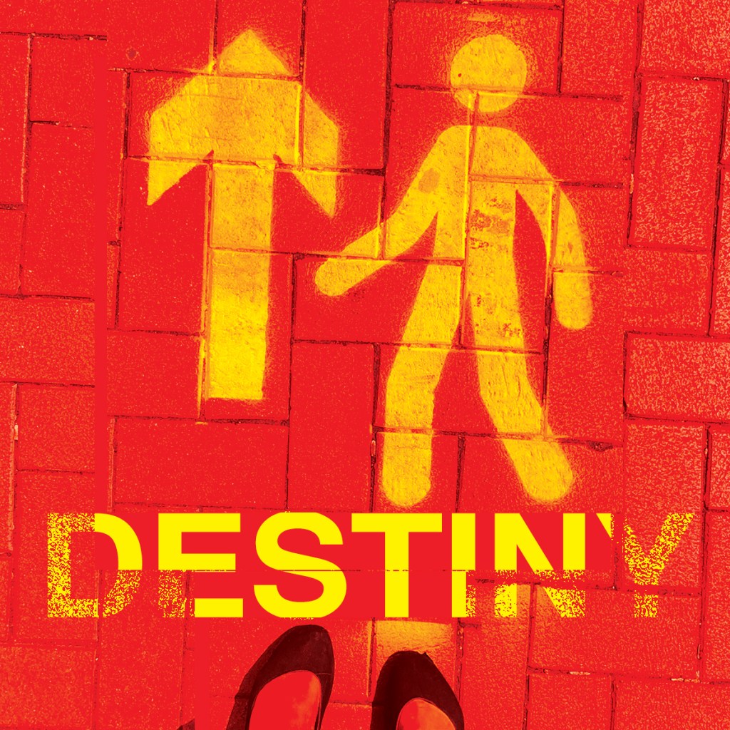
5) “… we look at our destiny”
For this part of the poem. the idea of standing at a turning point with a direction arrows in front appeared in the forefront of my mind! I then remembered when it was the Covid lockdown days that I took a photograph of some freshly painted “one way” signs painted on the floor throughout my town. I remember feeling at the time that the sign was very much how everyone must have felt; being directed one way against our will and not really knowing where we could end up. I decided to use the photo of this sign because it could also symbolize destiny and the feeling of not really knowing truly where we might be heading.
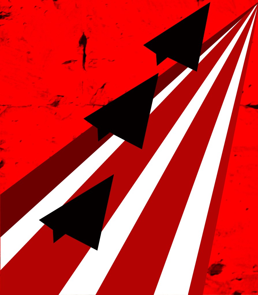
6) “..Conquerors of the air”
The idea I originally had in my head for this was 3 fighter planes from WW2 – I struggled to find a copyright free image for this! Instead I opted for some illustration work, I had the idea to create 3 blocks of colour in the shape of paper airplanes and then have them taking off from a runway made out of stripes.
I wanted a real gritty feeling to the collage also, so I added a texture behind the image of a textured brick wall.
Once again I kept the image in a signature Red to tie in with the rest of the images and to create a them throughout the book.
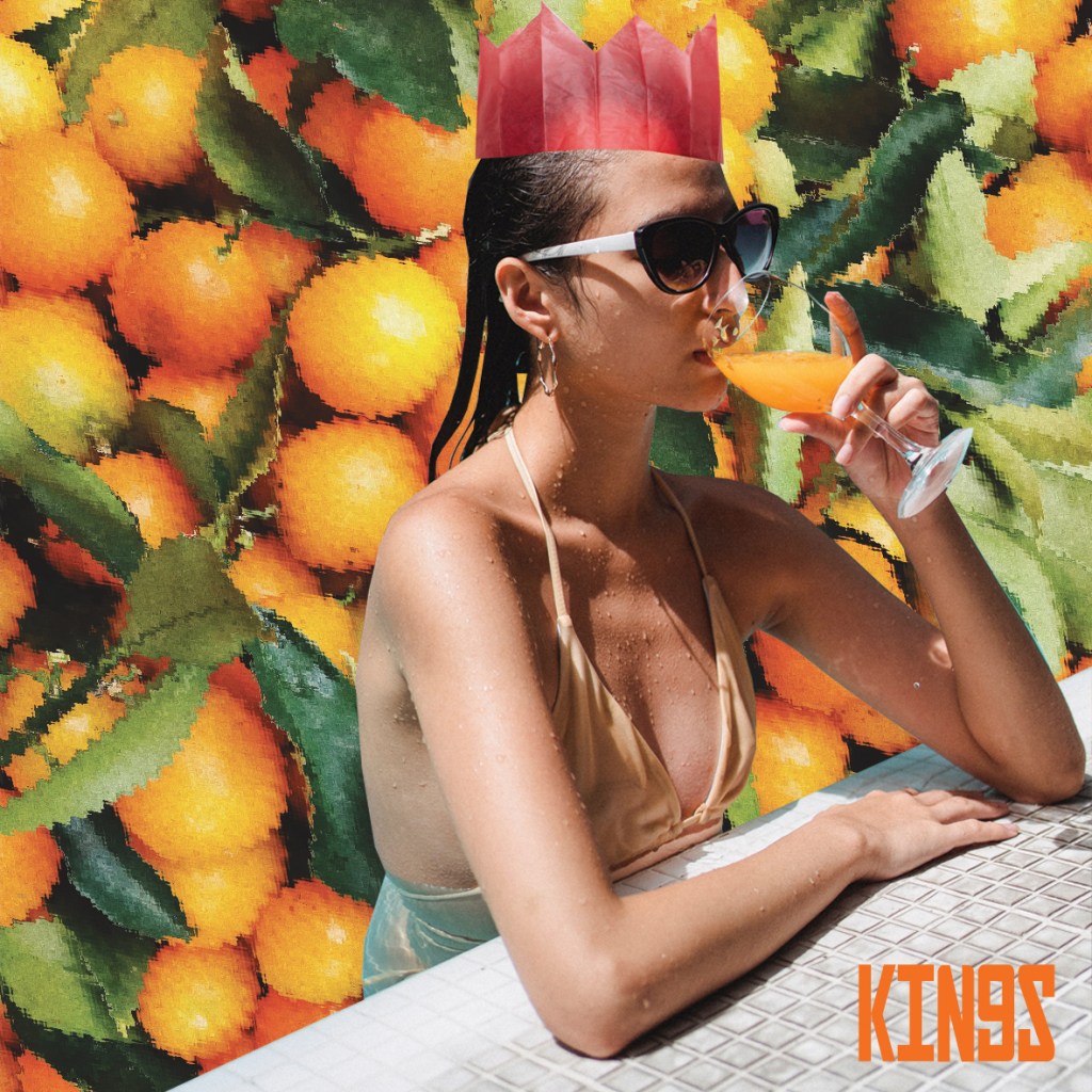
7) “Kings of Orange groves”
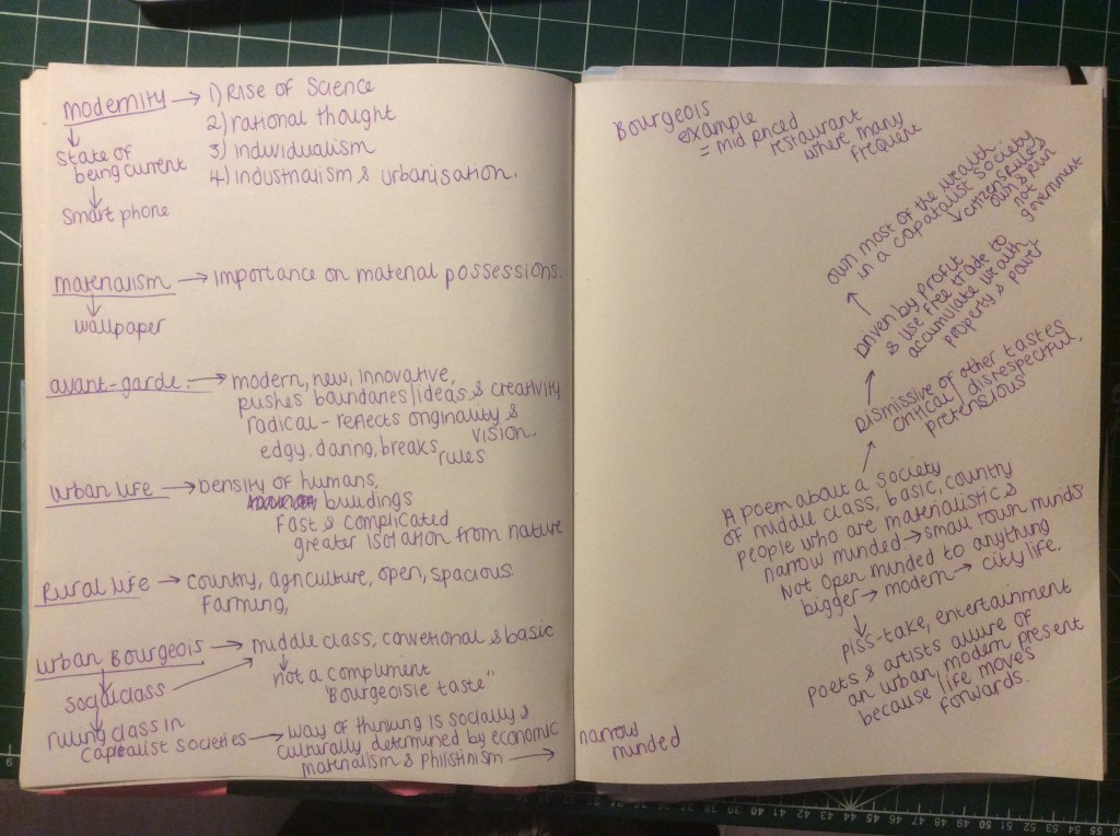
In my original thoughts and initial sketches I had the idea of a 1950s housewife living her surburban dream drinking a glass of Orange juice that they have reveled in planting and growing. Once again though I struggled with finding a copyright free image of a 1950s housewife so instead I put a modern twist on it when I stumbled upon a woman drinking a glass of Orange juice in a swimming pool – it summed up the materialistic, blasé feel of the suburban people in the poem; the “Bourgeis-ness” of the people.
I cut around the pool and I had the idea to do something similar to the ice flow and have her swimming in a pool of her “wealth”- the Oranges. The poem calls the people “Kings”, again I feel that this is in a very sarcastic manner. I did originally want to place a crown on he head but then I thought I would add some humor and p*ss take to the piece by making her crown a paper hat. It shows how these people were disillusioned by their lives. I also added a ripple filter onto the Oranges which help to make them look like they are underwater.
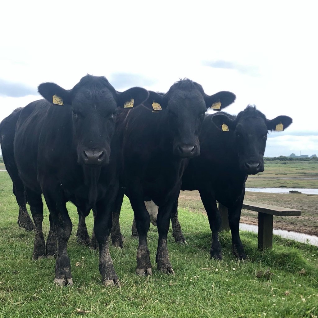
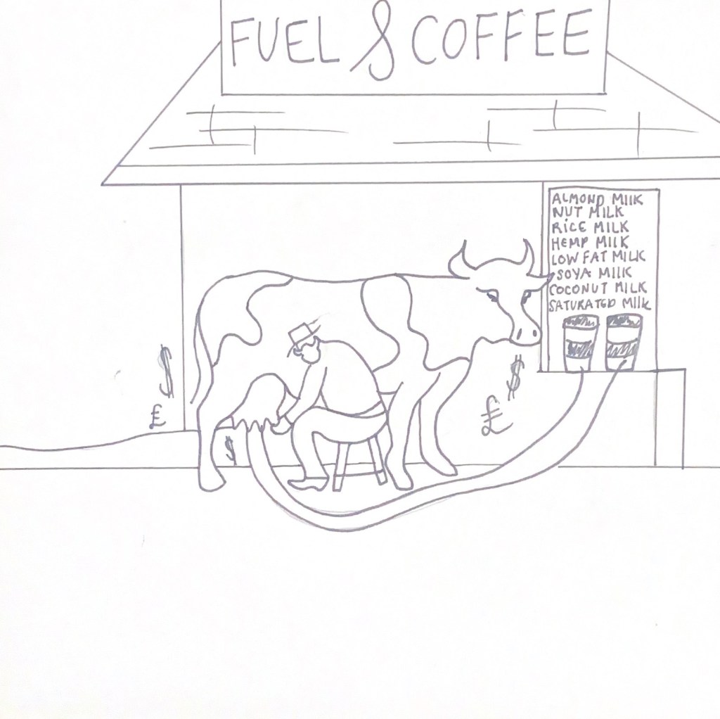
8) “Cattle”
My original idea for this collage was to show greed towards money behind the idea of keeping the cattle. The “cows” of this poem were very interested in making money and profit. The cattle were a means to an end for the people to have this.
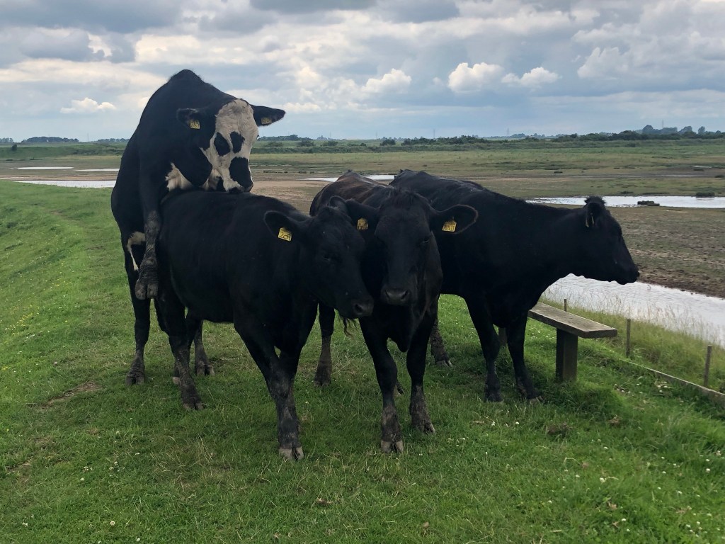
I had the idea of some Highland Cows copy and pasted onto a design with dollar notes covering their faces. I started to look for free images once again and found a load of cute ones I could have used.. however, I like to try and use my own images whenever I can and I remembered that a few years ago I went to a marsh where there was lots of wild cows that I photographed. There was one I took of 3 near enough identical cows “bros!” and I decided to use this for my image!
I then needed to find some money… when I searched it always came up with American Dollars, this would be useless for my piece as the book was about a Russian poem! I then did a generic search in Google images and found on Wikipedia a Russian note – again, not particularly bothered about the poor quality of the web image I continued to save it to use in Photoshop. I knew I wanted to be putting filters over my work anyway, the quality of the work didn’t need to be precise.
I had the note overlapping the photo; using a Red photo filter for the Cows and then making the money the colour of money and greed! – Green!
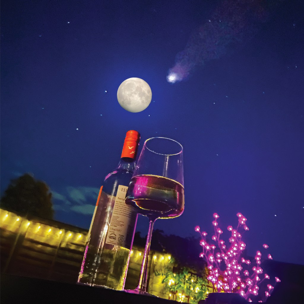
9) “Drink a glass of wine to the health of comets..”
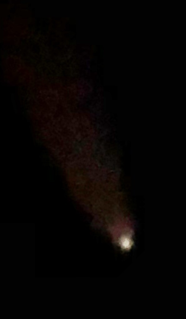
My original idea for this again differs from the image I eventually went with. I had the idea again of suburban 1950s couple having a glass of wine and holding a stethoscope up to a comet.. a tongue-in-cheek, playful approach… however, once again trying to find free, copyright images of a 1950s couple was challenging.. I then remembered back to when I got my new iPhone in May and I was drinking wine outside with a firepit on a really clear night and messing around to see how good my new camera was. I took a really good photo that I Instagrammed at the time because it was so clear! The night sky was a royal blue and the stars were twinkling! It then reminded me of how me and my fiancé have also photographed the moon through his telescope before and also one of the first nights we spent together photographing and watching comet Neowise from 2020. If I could merge all these photographs I could create my image for this part of the poem.
What I ended up with was this!
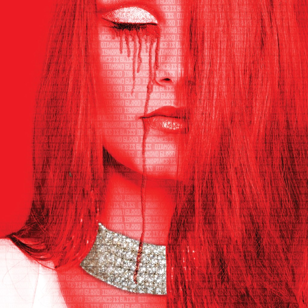
10) “Diamond Blood”
Diamond blood is where diamonds are mined in a war zone and the money and profit from these diamonds is used to fund terrorism or war. I feel like the people in this poem knew exactly where there diamonds were being sourced from but carried on naively “ignorance is bliss” throughout their daily suburban lives. I wanted to show a woman wearing a really lavish necklace but with the blood stains on her. Once again I started to find an image on Pexels that would show a lady wearing lavish diamond jewellery. I found this one which I felt I could work with and I liked the fact she had her eyes closed which showed her ignorance and lack of wanting to see the truth behind the industry she was helping to profit!
I gave it that very communist, vintage feeling making Red the prominent colour again; it also represents blood. I copied a section of the necklace and montaged it over her eyelid just for that little bit more lavish extravagance! I created the blood dripping from her closed eyes using the paintbrush tool on multiply and adding a bit of noise to create a jagged effect. Using the bevel and emboss tool I then added a bit of depth to the blooded tears to make them look a bit more realistic.
I overlapped the words “diamond blood and Ignorance is bliss” all across the image to make it clear what was happening as this to the unfamiliar is more complicated in meaning.
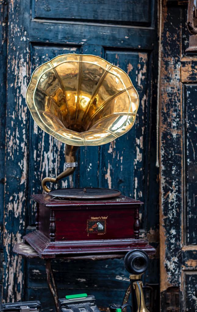
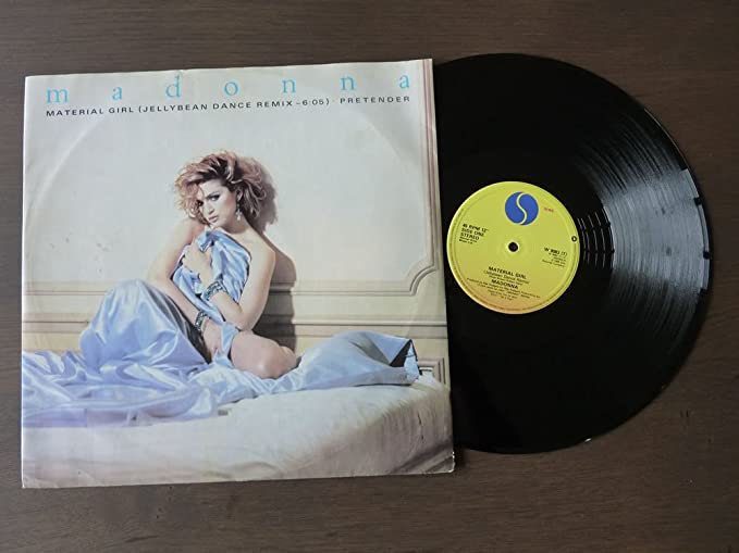
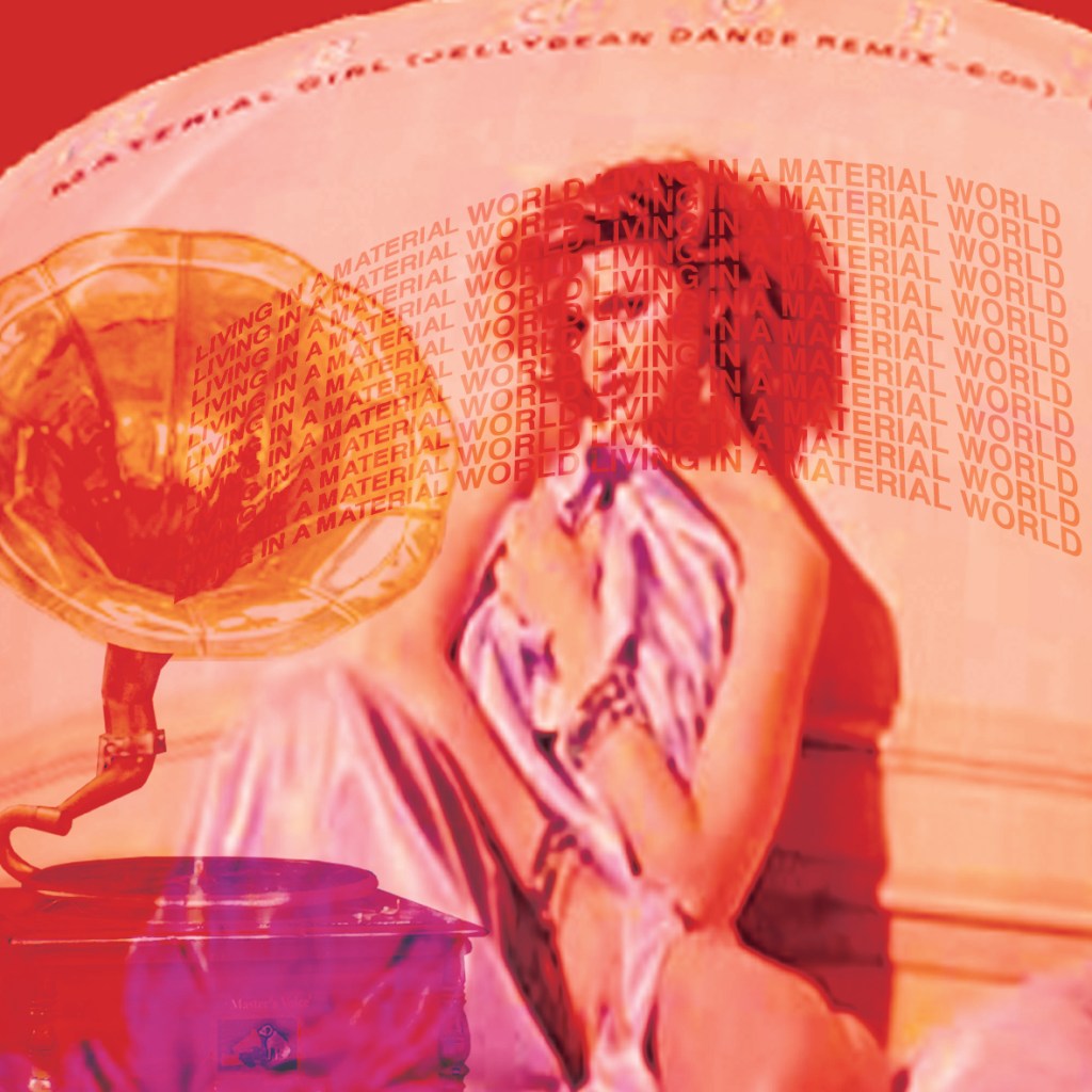
11) “We’ll get a record player..”
There is only one image of a record player that sits in my mind and that’s like one of the big HMV Gramophones! Buying a record player in this poem signifies the materialistic side of the people again – they are living in suburban hell but cover their angst and worries with materialistic objects such as the record player. The one and only perfect record to play on this would be Madonna and Material Girl! I decided to put that modern twist into the image and include the cover of the Material Girl vinyl on the front of my image. First though I needed to find a record player! – I found a free photo of a record player on Pexels to cut around in Photoshop and use:
I then saved an image directly from Amazon of Madonna’s Material Girl vinyl; again, not caring much for the low quality of the image:
I then typed some of the lyrics from the song to look as though they were blasting out of the speakers of the record player.
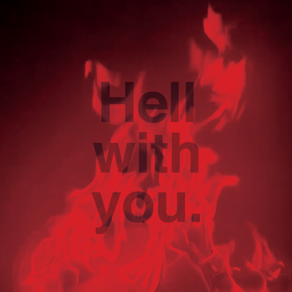
12) “Well, to hell with you!”
There is only one visual that is conjured up when hell is mentioned and that is the fiery flames that fill the pits of hell! I have so many photos of flames from our firepit that I have taken over the months that I decided to use one for this image rather than using another stock image!
I kept it short and simple with the rest of it! Good ol Helvetica with “Hell with you” over the top.
13) “I want one to dance one tango with Cows..”
This is the part of the book that I have possibly done differently to how anyone else might have done! With this part of the poem it is all to easy to picture a Cows head imposed onto a humans body in a Tango dancing move. I thought back to the photographs of the cows I took from that trip to the Marsh and funnily remembered how I accidentally caught aa snap of 2 cows in the act! “It takes 2 to tango!!”
Immediately I thought of this photo of the 2 cows against a floral suburban backdrop with maybe a big grin imposed onto one of the cows, (a bit like the tinned mirth!) as the main image! I tried it but it did look a bit distasteful and like I was trying to reference humans having sex with cows! – so I quickly dismissed that idea and simply used the term “It takes 2 to Tango”.
The pretty floral wallpaper I found on Pexels:
14) “Build bridges”
This was an obvious image to pick. I went onto Pexels and found a bridge with a Swiss picturesque mountain background to match the feel of the ice flow narrative. I liked this bridge because it is very Urban and modern looking which is what the poem is wanting the suburban people to do… take a step across the urban bridge and take a glimpse of modernity and new times.
I put the red photo filter over the top of it so that the image looked in keeping with the rest of the book and then I sneakily added in that infamous photo of the cows doing the Tango in the middle of the bridge!
15) “to the tears of crimson girls..”
I never actually knew who the “Crimson girls” were in this poem… Red is a daring colour and I guess for girls to be red I might make an assumption and assume that they are ladies of the night or professional sexually active females.. basically women causing taboo of the time by refusing to just being a basic housewife and living a suburban life under the eye of a man. I could be totally wrong though! As I don’t know why they would be crying either!.. Either way I sourced another free image from Pexels and went to work changing it in Photoshop to meet the criteria of my book.
I did originally think to make her tears red but I figured that would look too much like the diamond blood image. Instead I opted to make her hair and lips Red, I like the way that the paint brush tool makes her lipstick look like it has been blotted and rubbed onto her face! I cropped out a lot of the original photo choosing to concentrate on part of the image only. This image turned out quite faint with all the Red and when I printed it out it looked quite muted but again, I will go with my original musings of them being ladies of the night and I feel that the quite secretive, faded image adds to the mystery!
16) The poem itself
For the 16th narrative I chose to include my design for the poem from the previous exercise; It would feature as the first picture of the book.
Making the folded narrative book
For my book to be folded and stable and hold its own weight when it is stood up, I needed to use a white board for the backing. I have 16 images and I needed to distribute them evenly on both sides of the folded book so I placed the beginning 8 narratives of the poem on one side and the remaining 8 on the other side. Sadly I have been stuck at home with really bad flu for 3 weeks now and haven’t been at work to use the lovely colour laser printer so I had to do a home DIY job and print my images out using the inkjet printer. This is not something I would want to do all of the time because the quality of inkjet printers are poor – they don’t give that glossy professional look and feel that laser printers give. My inkjet printer is only a basic A4 home printer so there is no way that I could rearrange all of my pages to fit onto one sheet of paper! I needed to organize my images into groups and print them into groups to then photo mount onto the whiteboard backing. I printed all my images onto A4 plain white copy paper. If I was to have these professionally printed I would make sure that they were printed on a high quality, glossy lightweight card.
Tutor Feedback / Reworked Designs
When I submitted this exercise I knew that I had not achieved the best that I could do. I was pushed for time and I went with the easiest option rather than pushing outside the box and matching the effort that I had put in with dissecting the poem in the previous exercise. My tutor feedback reflected what I already knew; it lacked thought, creativity and it did not match my own ideas that I had of the poem. I decided to try and fix this by creating new images which would better match my interpretation of the poem.
From reading the original poem (and as I explained in the previous exercise), my interpretation of the poem was that it was about a group of superficial, unhappy, privelledged, middle class, suburban people who blissfully live in ignorance and are happy to live in a facade of fakeness.
I did a bit of research into middle class living and a lot of the things that popped up online were to do with things overheard in Waitrose and the middle class families that shop there and buy middle class things such as avocados, cashmere toilet roll, all different kinds of nut milk, Quinoa etc.. to trick themselves into thinking they are much more elite than what they actually are!
I decided to use this in my favor and I went to Waitrose, took some photographs of some of the items that were written about in the articles and then bought a Waitrose magazine and took one of their free Waitrose Weekend newspapers as material to potentially take images from or to print onto.
I then used the Waitrose magazine and the newspaper to cut out relevant, appropriate images that might closely match my interpretation of the poem. The images with the Airfryer were quite humorous as this is an icon of middle- class, lockdown suburban bliss! This is something that sums up everybody following a trend like sheep! I also found in my local newspaper a report about a fight that incurred over an Airfryer which gave me ideas for my design… The increase in fuel prices best sums up technology and greed, The Guardian newspaper is the middle class paper so I have used a piece of that to use in my design and I also have images of Oranges, Kale and avocados which relate back to the Oramge Groves but also represent middle-class Waitrose! I have to say though, I do not shop in Waitrose and I still buy Avocados, have an Air Fryer and have Kale in my stir frys!
Instead of sourcing all images from the Internet, existing images or newspapers/magazines, I wanted to try and draw a narrative using illustrations as the interpretation I had of the poem would be very difficult to piece together trying to find appropriate images to montage together to create the desired design.
The illustrations below are what I drew for the narrative.
It starts with a smartly dressed man walking his dog in the suburban park, the Dog who is called Angus (middle class!) after picking up The Guardian newspaper from his local Waitrose!
It then moves further into Suburban woodland with a man and a police officer having an altercation over an Air Fryer in a Waitrose bag. Both parties are wearing Cow masks to represent the fake mask of façade that is being portrayed and it also shows the fight against the “Cows” where they are trying so hard to maintain that middle-class front and rebel against change.
It then progresses forward to a scene where a couple of gossiping women are watching the fight from afar and are photographing it all to send to their fellow Football mums and to plaster all over social media. This is a nod to the “Karen” trend where groups of self absorbed, narrow minded women live their lives according to Facebook and try to tell others how to live their lives!
The next scene shows the Football mums and their little darlings catching up on the recent gossip. This all portrays a self absorbed, priveledged, narrow minded environment.
The next scene shows the suburban life changing and a more rural environment coming about; this represents the fear of the “Cows” moving in and stealing their suburban bliss and changing it.
The fuel and coffee scenes show the greed and the unnecessary money gained and spent.
I then started to work out how I would print the images onto the back of the Waitrose magazine and newspaper pieces I had cut out. I stuck the squares that I had cut out already in the middle of A4 sheets that I had measured out the exact middle and then printed my images directly over the top. It worked but it didn’t; the magazine and newspaper were too heavy for my finely drawn illustrations so I ended up resorting to printing them onto plain A4 white paper so that they would be easily seen.
Although I haven’t got much knowledge of Concrete Poetry, I had heard of it because briefly in my first ever assignment for the OCA (about 3 years ago!) I created some typewriter art after visiting a local exhibition about typewriter art by Barrie Tullet (who coincidentally was also one of my tutors when I studied my degree first time round!…) I also purchased his book which I still have and have referenced back for this exercise!
I feel really sad because I took a lot of photographs at this exhibition when it was on at the National Centre for Crafts and Design in Sleaford and now I cannot find them anywhere! The above link directs you to an interview with him and some of the photographs of his work which were in glass cases at the time and were inspiring to look at!
As I mentioned in my previous exercise I have Oliver my typewriter who might have to make a comeback further on in this exercise!
These were what I produced in my first ever assignment!
In my design above I wanted to illustrate the words falling down like light snow flakes.
It takes some skill and effort let me tell you! Plus it really hurts your finger tips after a while!
Taking a closer look at the designers of concrete poetry
I had a Google of some of the designers that are given as examples in the brief and had a look at some of their work; some designers work was much more explanatory than others! Having had a look at a few I much prefer the more obvious designs compared to the ones that leave me questioning what it is all about.. such as the commas by Dieter Roth. I just did not understand it at all- especially as I read that the designer didn’t like the use of commas.. why also is he highlighting only a few? very confusing! The only thing I can see is form and structure! A nice grid structure!
The one below by Eugen Gomringer reminded me of a DNA cell, I thought initially that was what it was all about! As it goes it is referring to the direction of wind. I can see that but why use the words grow and show? Still confusing!..
So far I wasn’t enjoying this exercise! – and I thought I was pretty good with poetry as well as designing!..
Henri Chopin just looks like he was an early David Carson or Chris Ashworth, although once again I can’t really make much sense of his work, I do like the experimental look and feel of it.
The only work I could actually see and makes sense of was the work of Emmett Williams; I thought that his work was quite clever in how it delivers the message visually as well as written.
I printed out “like attracts like” and analysed it!
Tango with Cows
Tango with Cows is an artists book by the Russian Futurist poet Vasily Kamensky featuring additional illustrations by Brothers David and Vladimir Burliuk. It was printed in Moscow in 1914 as a limited work of 300 books. The work has become famous for being made entirely out of commercially produced wallpaper. The book consists of a series of concrete poems made visual that use unusual typographic layouts.
Life is shorter than the squeal of a sparrow. Like a dog, regardless, sailing on an ice floe down the river in spring? With tinned mirth we look at our destiny. We – the discoverers of countries conquerors of the air kings of orange groves and cattle. Perhaps we will drink a glass of wine to the health of the comets, expiring diamond blood. Or better still – we’ll get a record player. Well, to hell with you! hornless and ironed! I want one – to dance one tango with cows and to build bridges from the tears of bovine jealousy to the tears of crimson girls.
I had never heard of this work before I researched into it. From doing my research a lot of people have the image of cows dancing a literal tango in their heads but I think the whole poem is one big metaphor! It is embracing past and present but using metaphors to convey it. The cow represents the urban old life and the sexy tango represents the modern daunting yet exciting new times. The poem is a playful take on how they approached modernity. They were disillusioned by it due to spiritual, social and cultural crisis and famines, new technologies and the outbreak of WW1. It was a tension and a feeling of apocalypse. people were not ready for what the future had to bring or offer.
The poem is about being traditional but at the same time a curiosity to explore and be open minded to modern prospects. They have used the Urban Tango as a metaphor because at the time in 1913, this was a controversial threat to urban life- with it, it brought sex and association with brothels and night clubs, to some it brought excitement and suspicion. It is a contrast between tradition and what was known to modern and the unknown. The poem relates to bridges- this is a bridge to connect old vs new. I believe the bottom half of the poem is the artists saying “Dam it! we’ll give this modern thing a go!”
I pretty much dissected the poem (see below!), I couldn’t design for this exercise without first properly understanding what it is all about! It took a while to get my head around it, it almost felt like I was back doing my English Literature GCSE!
I worked out that the poets and artists were all in favour of moving forwards and seeing what the future holds but they were ridiculing the middle class, country folk who were all pretentious living a life that was all for show and and stuck in their traditional ways. Driven by profit and the desire to create wealth and accumulate property and power and dismissive of new ideas, approaches and modern changes. Not aware not life is short and life must move forwards. The wallpaper was to make fun of the fact that middle class could not afford William Morris but just for show bought something similar. It is a bit like me buying genuine fake handbags!!
Why though was it a Cow and not Sheep?… Sheep follow crowds!
The annotations below took me absolutely aggessss to crack! Chris very almost contacted one of our work colleagues who is an English teacher to see if I was close with my dissection of it all! – He didn’t in the end because as it turns out it was way past 10pm!
This was what I interpreted the poem to be! –
“Life is short – like really short!
Loyally, you drift along and head nowhere
With nervous laughter you look at your destiny you try to overlook and suppress within, you’re happy in the “now”
We, who have fought, discovered and achieved the unthinkable and have gained riches and profit
sit on our laurels and disappointedly celebrate “impending doom” that might never happen and remain ignorant and try and talk ourselves out of buying into the materialism that finances conflicts
Or better still we shall stay materialistic and ignorant and get something so insignificant like a record player and live middle class rural heaven to keep up with the Jones’s,
Well, f**k that!
You have no balls and you’re set in your ways!
I want the daring and the open minded to join the traditionalists to build a bridge from old to new, I’d rather have tears of uncertainty for a new, modern future than those of much sameness”.
Resting on your laurels is the phrase that resonated with me the most from reading this poem; people were happy to rest on their laurels and were content with what they had achieved in the past and were not bothered or inspired to see what the future held. I wondered how I could use this message somehow in the design… I had an idea for how I could use it when it came to print the design out (which I shall go into later!)
I then had a closer look at the Art movements that inspired this poem; this would give me a better understanding of how to design for it later down the line!
The artists printing onto the William Morris inspired wallpaper was also because it was cheaper than using actual plain printing paper. It is a sarcastic nod to materialism and commercialism.
How could I best convey this poem? I did not want to use a cow as there are no cows in the making of this poem (the cow is a metaphor!) and also I can promise that 90% of people given this exercise will produce something with hoofs!! I wanted to create something that represents the deeper roots of what it represents – it would also be cool to present it in a modern day way too as if it were written today! If I were to take this poem and design it in such a way that people today could relate to it, would it still be seen in the same way or would it have a different meaning and message?… Also the brief did not mention that I needed to include all of the poem, Doing my research I found out that a lot of concrete poems just use part words, part sentences and parts of a poem that are most relevant.
Designing the Concrete Poetry
I’ll be honest; even after dissecting the poem and making sense of it the best that I could, I still felt completely lost at where to start designing for it! I decided not to use all of the poem but to only use parts! I started off with a sketch and worked from there!..
From researching concrete poetry, I liked how words blended into one block to create different meanings – this is what I tried with my version. I created a bridge for the “cows” and the futurists to join together. The O is a comet that is plummeting towards the bridge (the impending doom that the “cows” think is the future!)
Using influences from art movements such as Constructivism, Futurism, Dada and Russian Propaganda posters I came up with this for my final design. I also searched for Russian typefaces online and found a free one called “Russian” that I used for the text.
The design shows the bridge that builds the gap between middle class, surburban life and the urban, new and modernist life. On the side of the middle class “cows” I have used Orange Os and Ls to illustrate the Orange groves. There is also a V which is to represent “conquerors of the air”. I have highlighted red Cows in a diagonal line (diagonal lines were prominent in Futurist designs) which then leads to the name of the title “Tango with cows”. The S’s allow the design to join over to the other side of the bridge where the message is telling the Cows to “Go” – this means to leave the middle class rural life behind. My only complaint with this typeface is that “Go” looks like 90. Over the bridge is the sun setting over the horizon line of the bridge. I have used Red as this represents Constructivist, Futurist and Propaganda Dada designs. Plummeting towards the bridge is the comet which represents the impending doom that people felt towards change and the future happening. Flowing underneath the bridge are the tears of “bovine jealousy and Crimson girls”, the tears flow together to join.
The whole design is structured to a grid, I have tried to make the hierarchy quite balanced. I have tried to include negative space as much as I can as “spatial awareness” was particularly important in concrete poetry. I have kept the design away from the edges of the bleed so that there is room for the design to breathe and it isn’t constricted to the edges.
“The future is now” is very tight and the readability isn’t great but I wanted something quite edgy and experimental looking – the future is unpredictable and I wanted the text to represent this. “The future is now” doesn’t appear in the poem; it is purely my take of what I think is happening.
I quite like that I haven’t restricted myself with including the full poem in my design; there is a lot of text in the poem and it would really restrict what I could do in the design – space would be massively compromised… plus! It is a different modern approach with the poem, I have stripped it down to it’s simplest form without entirely taking the poem away.
Printing the final!
I really liked the idea of how the original poem was printed inside a book printed on wallpaper! I also refer back to the phrase “resting on your laurels” which is one of the main messages I took from the meaning of this poem. I had the idea of making homemade paper using leaves from a laurel bush! It sounds absolutely crazy and when I mentioned my idea to Chris he did look at me vacant as if I had lost my mind!- “How are you going to make paper, Amy?” Turns out it seemed quite simple – it requires a blender, some mushed up white plain paper mixed in with a jug of water, some Bay leaves (would also make the paper scented!), a tub full of water to create a “pool”, a wooden frame with mesh netting within it and a dry sponge.
From looking at a YouTube video it showed how the leaves and paper would be mushed up to a pulp inside the blender and then the wooden frame laid to float on a “pool” of water, (a shallow large storage box with some water) and then the paper mix poured in. By letting it float on the pool of water allows for the paper to be rearranged and organised how it would wish to look and then simply when that is done the frame is removed from the “pool” placed onto some newspaper, patted dry with a dry sponge and then left to dry!
I ordered a wooden frame and a massive bag of Bay leaves from Amazon!
I also decided that I needed a Plan B just in case the handmade paper didn’t go to plan! As I mentioned before I really liked the idea of the wallpaper, (although this wouldn’t be very original now and a bit of a cop out because the original used that!) I decided to have a look anyway as we are renovating our house and we had to go to B&Q for paint. I found some leafy wallpaper that brought me back to the “resting on laurels” meaning. I picked up a sample and then tried printing it at home to see what would happen.
What happened – Making the homemade paper really didn’t go to plan! I got a brand new blender for Christmas last year and this was the first time I used it. Imagine the scene from Bridget Jones where the soup goes everywhere!… that was me!
I blended chunks of white paper, the Bay leaves and water and then sat it in the frame in a water bath and it just came out as absolute mush!
I decided to go for my plan B with printing it out on the back of my leaves wallpaper (resting on laurels) and fortunately this worked much better!
I am very lucky with this exercise because ever since starting with OCA I have collected lots of papers!
I have a bag for life crammed full of different papers and cards! There is old packaging in there, plastics, greaseproof papers, brown wrapping paper, sustainable bags, accidental scans, typewritten pieces…
Watch the video and have a look!
I mostly find myself scanning a lot of textures and papers onto my laptop and then importing them into Photoshop to use as cool textures and backgrounds for my designs. When I have had assignments and exercises surrounding experimental typography this bag always comes in useful! – as I mentioned in the video, it is the gritty textures of rips in packaging that make for a really urban, edgy looking design. A lot of the materials and papers I have collected are also ideal for collages and mixed media which is where Assignment 4 is heading… I love the experimental work of Chris Ashworth and I listened to an interview with him talking to Chris Do about how he creates a lot of his artwork from different materials he finds, collects and then just uses in really weird but cool, effective ways! – he once cello taped some paper to his childrens shoes so that when they went about the day playing in the playground at school and trampling through muddy patches etc what he ended up at the end of the day were really gritty pieces of art he could import in and work with to create some really cool designs! Just a really simple idea but it worked! He also cello taped paper to the floor of his garage so that each time he reversed his car out and parked it back in there it would leave tyre marks of wherever the car had been that day – over time it created again a really gritty cool piece to scan in and work with!
I also have a typewriter (called Oliver!) that I bring out to play – I might bring him out to play again for the concrete poetry exercise – but in the past I have created bloopers with him and I have kept them to scan in and use as random text to play around with in designs!
I also made Chris over the summer help me go and pick up a set of trays and drawers (much to his dismay at where to keep them in our house!) which I now have organised my papers and sketchbooks in!
I have drawers organised for each paper stock – white card, coloured card, foiling, tracing paper, transfer papers, grey board, metallic papers, corrugated card/papers, foam board, watercolour pad, acrylic paper, lined paper, plain A4 paper, A3 paper, layout paper! Lots of papers!!