Postcard 4 is going to reflect my areas of interest within Graphic Design.
I want to make this postcard very much a mixed media piece.
My interests in Graphic Design are Typography (even though this is an area I need to improve on!) magazine design and layout and using more hand drawn/arty elements.
I have looked on Pinterest for inspiration and have decided I am going to use a range of different media for this postcard;
Homemade DIY letterpress/stencilling type
lino printing
Typewriter
marker pens/highlighters
ripped paper/neon pink post-it notes
collage of magazine cuttings
Acrylic paint and spray paint
Photoshop
I have always had an interest in grunge type – just like how Alternative music is my favourite; grunge type is very much this but in a visual form! If the alternative 90s songs I like were written in art form they would be written in grunge type! Grunge type is visual Nirvana!
However my design so far is quite feminine and soft in appearance. The grunge look is messy, chaotic and can be “dirty” looking. I plan to do a grunge look but soften it by using pinks. The grunge look is rebellious and my postcards have a certain feel of that with the theme of it being strong, feminism, independent, not playing by rules and wearing/looking how you want to.
I have looked at a few styles of Grunge type and some stood out to me and gave me ideas on what I could try out in my own designs. I particulary like the typewriter one. (I have an old typewriter at home I have meaning to use in a creative way.) I figured I could type some words out relating to my postcard and layer them up in a similar way to the one I found on Pinterest.
I will do some mixed media pages in my sketchbook to experiment with the different techniques.
The typewriter idea. I like how the letters are all layered on top of each other.
This image gave me an idea based around the Angeleno angel photo I found in the LMU magazine. I thought I could use that image and create a similar thing in my design.I like the Pink colours used and the style of the “Acid Wash” and “say anything”. These look like they have been stencil or lino printed.This image has given me the idea to bring the lipstick drips into my design. I could drip the lipstick off the type similar to this image and then it would continue to tie in with the previous postcard designs.
This weekend has been.. well!… I have definitely had better! After allowing myself Sunday and Sunday only to mope around in my head with my own stupid thoughts! 😦 I pulled myself together last night on my night off and spent 8 hours.. (yes 8 hours, I really needed the distraction!) on binge watching the whole series of Lost once again and trying to finally get these postcards done!
Ideally I want to have them done for the time I break up from work for the summer in 3 weeks time.
I seem to be spending so long on them but I am a perfectionist; I know that can be seen as good and bad in this industry!! I really want to finish my first assignment and know that I did the best I could. I feel like I am testing my strengths and really pushing myself again after not studying for so long. I can feel my confidence building and my skills progressing in each postcard I am completing.
I feel that I have good ideas for the final 2 and I really want to see them through to the end right.
I started off last night by doing the changes I labelled on my post-its from my previous post. I wanted to get postcard 2 finally complete! One of my lovely friends at work gave me a printer to help me with my work, so last night I could finally print stuff out at home instead of emailing it to myself at work! I printed out the 2 completed postcards last night and laid them together again and I am pleased with the outcome.
(** The only thing I need to change is the colour of the pink.. It prints out a red colour. I need to find the correct pantone colours and match them to my designs so that they print correctly.)
Thanks for the printer Mark! 🙂
I decided to keep the LA tattoos on here even though I wrote that I would take them off.
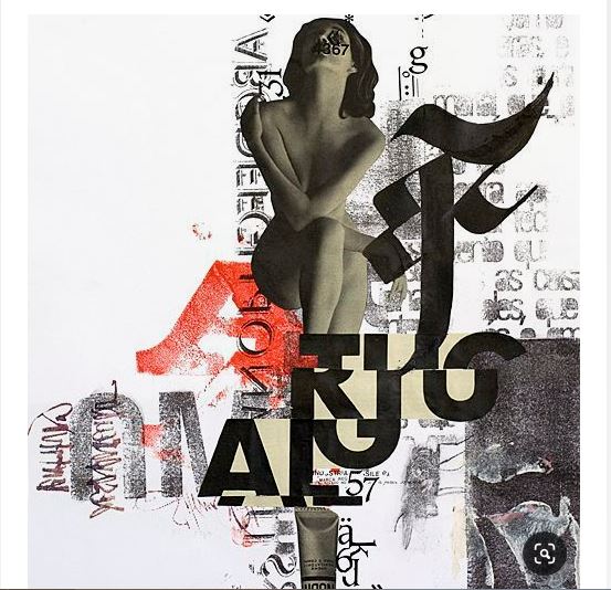
I then started on postcard 4. I have hopped from 2 to 4 because for postcard 3 I am planning on some mixed media work. This is the one I want to be inspired by Design and magazine layouts and by David Carsons work which I am interested in. I plan to bring in paint, marker pens, collage and some home DIY letterpress work on this one. I have started on postcard 4 for now because postcard 3 runs into this one.
The hand runs over from postcard 2 to 4.
I started again by taking my original drawing of the LA wing map and placing it into Illustrator, and with the pen tool tracing around it.
I am going to change things on it from my original drawing as now I have had time to sit down and look at it I can see ways to make it look better and tie in more with the other 2.
Saturday was a scorcher in Peterborough! Whilst sunning myself with a pint in the beer garden, my sister, (who was driving so had a half pint non alcoholic beer..) had a rather funky glass which gave me a bit of inspo! I wanted to “accidentally” drop the glass in my bag but figured it was way too hot to be bailed out of a cell for theft and I had a torturous shift at work ahead of me!… 😀
I knew I had to photograph it though and blog about it as part of my research!
The glass as you can see for yourself uses a very nice, fancy style of type and uses a tattooed, illustrated man!
It is very similar to the style of illustration I have done for my postcards and the tattoo illustrations I have drawn. On this glass all the tattoos on the man relate to the make of beer and how and where it was made etc. It is an unusual design for a glass and an unusual choice of typography.
The whole feel of it is quite laid back and fun. The slogan is “The soul of beer” and I think they have used the choice of a tattooed man to literally illustrate this because tattoos are very personal, they mean something to the person who has them tattooed and they very much become an “identity” “Soul” is you, what you are made of; beliefs, feelings, emotions, places you’ve been, people you know, the impact you leave on people… I feel this very much relates to what I am trying to communicate in my postcards.
The overall message on this beer glass is that the beer encompasses “soul” the tattooed man shows pride in his soul and Bedford where it is obviously made. It also possibly shows that it is very much a “mans drink”.
So today on my lunch break I sat with more print outs of my current postcards. Like last time I put them together to see if they work and wrote on post it notes changes I want to make to adjust this weekend… I sat with my work colleague and surprised myself for the first time ever that I was actually quite open in talking about my ideas, thoughts and feelings about my work so far. Usually I am shut off and keep everything close to my chest – the fear of rejection or not pleasing!
I was telling her that I need to make changes to my postcards in that I need to add more “Graphic Design” into them. Curently I feel that my work has my own style attached to it but I am worried that at the moment it looks too illustrated rather than Graphic Design.
By the end of my lunch break I decided that ideally I need 4 postcards instead of 3. My original idea was that the 3rd and final postcard would be LA themed, I have now decided to add an extra postcard and split the wing image across both. One will represent my design influence and the other will still be LA themed.
This is what I mocked up…
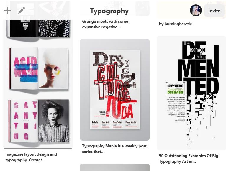
I started to look on pinterest for inspiration. I decided I need something pink that will fit in with the current theme of the first 2 postcards but I need something that looks more design and represents Graphic Design or influential designers.
My “Pink Branding” board on Pinterest
I really liked these images:
I like the way Chanel is written. I like the colours and the style of type. It looks to me like brush strokes. This is different… using marker or highlighter pens to make an impactAnother example of the Chanel and the brush stroke appearance The top image although I think is marker pen reminded me of post it notes… I had the idea then of using bright pink post it notes and importing this image through into PhotoshopI like this. This reminded me of David Carsons work with the ripped paper and the collage style. I like the simplistic type at the top and the colour that is used. This uses a map design; similar to what I want to achieve with my LA design postcard. I like the colour used and the bright, modern look of it. The type and colour makes an impact.
My designs and style of work are quite modern in appearance, I want to one of the designs back to the origins of Graphic Design/ what area of design I am interested in but I still need to keep the same modern, bright appearance that it has currently. To reflect a style such as Bauhaus for example just wouldn’t work. I then started to think about what I am interested in…
I love magazines…
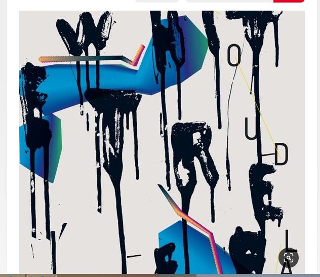
Now I don’t just mean the naff celebrity gossip ones that come out every Tuesday (even though I am a little addicted to these also :s) I really like a good quality, well designed, quirky, attractive looking magazine. One of my all time favourites has always been Nylon. Nylon is alternative, its arty, quirky and the way it is designed and laid out is always very different. I later learned that Nylon took some of influence from David Carson and Raygun. I then thought what about doing something similar in my design. To have influences from magazines with the type and layouts but have the quirky, collage influence from Carson.
David Carsons new book. You can see the style of collage and type.
I really like the highlighter/marker pen idea and I have messed around with that approach in some thumbnail sketches. It then got me into thinking how I would incorporate magazines into my design… like Carsons work where he rips up pages and uses them in his work, how could I use this influence in my work? I then thought I have the LMU magazine that got sent me (I wrote about this in my research section on my blog) the magazine was designed by Pentagram so it would also have that designer influence. If I could take pages out of this magazine and incorporate them into my design. The articles from the magazine all also relate to Los Angeles and around “what is an Angeleno” which ties in with my design.
Make a collage from pages of this magazine and then add the marker pen idea and maybe some other mixed media.
The LMU “Los Angeles edition” designed by Pentagram.
I am going to sketch out some more thumbnails and experiment with some mixed media;
Letterpress/screen printing
ink splatter
marker pen/highlighter
brush strokes / brushed type
post it notes
lipstick
collage
using the highlighter approach mixed in with the Angeleno and having the idea to make the type run down it similar to the drips on the previous postcards.
As I wrote in one of my previous posts; I wanted to work on the leg tattoo illustrations and make them more relevant to me. I decided to add my actual tattoo design onto it. I had the tattoo done for my 30th birthday and the design represented a lot to me in regards to new starts, rising out of adversity, entering my 30s single, stronger and independent. It also partly relates to my star sign and the moon. I designed the tattoo myself so I figured it is an important thing to show on this postcard as that does truly represent me. I will now work the other tattoos around it instead of having them as random images dotted about on the leg.
My wrist tattoo I designed and drew myself.A close up of part of it. I quite like how the pink filled in lotus is not in line with the rest of it. I like the bright bold colour and the way they stand out
So on Sunday I was at a loose end by myself and decided to go for a ride out in my car to Peterborough town to have a “window” shop. It NEVER turns out to be a window shop and much to my banks dismay I ended up spending.. AGAIN!
I think since starting this course it has made me more aware of what is around me.. I find myself looking at things for sale in the shop not for the item but because I like the packaging or the type or lettering used! I find myself keeping labels or picking up random hand outs and booklets just for the inspiration itself.
I have mentioned before that I have a love for Paperchase… again, I never really noticed the shop much before I enrolled onto the course! Now however I have to go in whenever I go to Peterborough. This weekend they had the £3 sale on and I could have spent a fortune! Instead I picked up some more postcards for inspiration! (I have pinned them to my wall at home as like a visual moodboard!) and picked up some female empowered pin badges! I liked the designs and the lettering they used was very similar to what I am trying to achieve in my own designs!
The packaging is also very similar it that its using a drip effect, this one is more like a watercolour effect though! It has a rebel feel to it. Like modern punk, graffiti style. It is meant to come across as strong and empowering.
The girl power pin badges
The wall above my laptop covered in Paperchase postcard inspo!
I then find myself wandering from shop to shop looking everywhere for inspiration and cool finds! On my venture to find Neon Pink acrylic paint (I never found any FYI) John Lewis do a range of high end quality cards which have a similar illustration theme to mine. Some were based around girl power and some were based around astrology, crystals, dream catchers and mindfulness etc. The cards were priced at a steep £4 each so I opted to take a sneaky pic of 2 instead! :p
The lettering used is similar to my style of work which is why they stood out to me. I feel the illustrations are very simply designed though, although they are modern. They use foiling and glitter also – This is possibly why the price of them is more than a standard card as the printing processes used for these would be much more expensive.
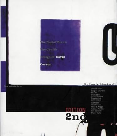
Having watched a few documentaries and films featuring Graphic Designer David Carson I decided to have a read of one of his books. This one is a 2nd edition and is filled with photographs, interviews and features work from the magazines where he made his mark such as Raygun.
The book starts off with an email from a student who wants questions relating to Carsons work to help with his uni course. The questions answered by Lewis Blackwell (Co author on this book) looks into the origins of his work and discusses the reactions to his work.
Carsons work is well known to not follow any rule book. He completely bypasses grids, the use of only one type size and the use of different typefaces, his work has even featured typos and errors that has not been recognised before going to print but then somehow he plays this off and continues to use these errors to make his work great. I like how he basically does whatever he wants! He goes more by what feels right than sticking by the rule book.
So I took the Lost Angeleno illustration away for the time being (for further improvements from my last post!) and decided to replace it with this one…
I had already designed the heart illustration for my Graphically Pink page but the idea sprung from a daft drawing a work colleague sharpie penned on my arm at work the other night, a heart tattoo with “Mom” drawn inside.
Thanks Matt! 😛
It made me jokingly think to myself if I had a tattoo for every guy I invested feelings in who had wasted my time and broken my heart I would have them halfway down my arm! I liked this idea for my design to show the vulnerability again; to show how I wear my heart on my sleeve and to show the strength in the weakness that regardless of the hurt… you carry on. I started messing around with the idea and drew out some random scribbles next to the heart with crosses through them to represent mens names… obviously I want the names to be faded and unrecognisable. I then decided to carry on the theme from postcard 1 with the drips of lipstick and include this bleeding from the heart. One of my earliest doodles which I still have is from when I was 14/15 years old and it was a broken heart with the words “Stupid cupid who needs love?” written around it. I have included part of this on my design also. I felt I needed to add this to show the “unlucky in love” factor rather than the fact it might just look like I just get through a list of men!
I also printed out rough versions of both the postcards so far and laid them out together to see if they worked and to see what would further need improving. I put post-its on the areas I wanted to add changes to and then carried out these changes on Illustrator. A few of the changes was to add a few further drips which would carry on from each other over the postcards, to improve the hand and then I drew on the heart idea illustration idea.
laying them both out and deciding what works and what changes need to be made so far This is the hand lettering I did for the Stupid Cupid, it is very similar to the original I drew years ago.
Following on from my previous post I have added some of the yellow into this postcard. I think it follows on more from the first one by adding this colour
I played around with the idea of this logo for one of the leg tattoos but decided I actually hate it!
Type whether hand lettered or typed should be legible and easy to the eye to read. It needs to flow and be comfortable to read! – I actually feel lost trying to move my eyes from letter to letter to fathom out how they work together and what they are. This idea will need completely redesigning!
As I wrote in my previous post I am not entirely happy with how the tattoo illustrations on the leg looks.. I want to more or less create one main image filled with all the different illustration icons so that the idea flows better.