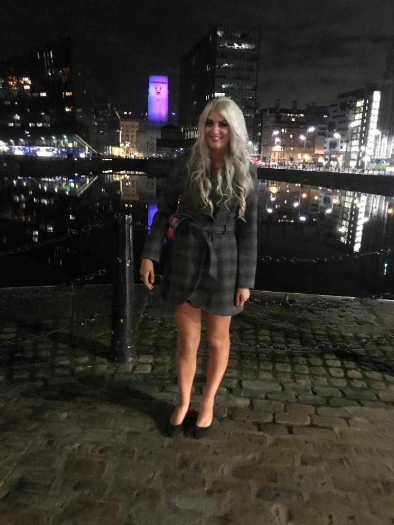
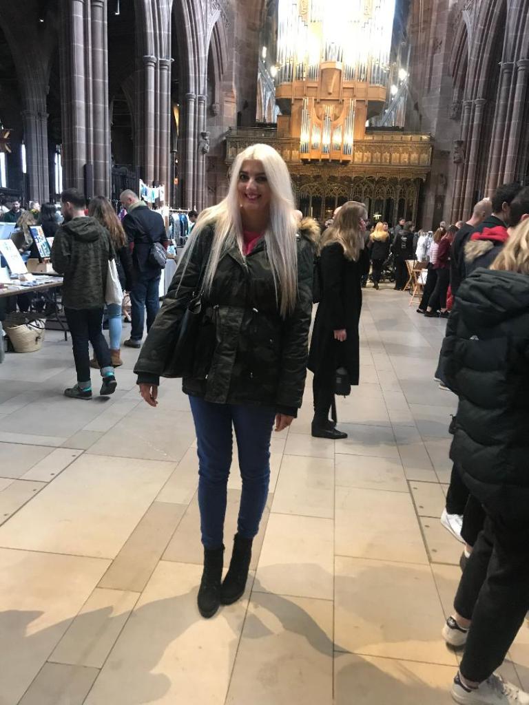
This weekend I took some time out.. time out from working non stop and spent the weekend in Liverpool and Manchester. I had not been for about 5 years so it was nice to go back!
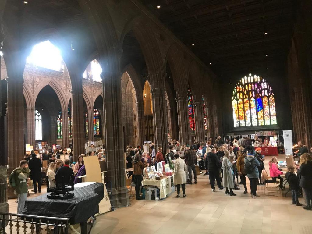
The main reason behind going (other than I needed a break!) was because there was a print fair in Manchester Cathedral on Saturday; featuring designs and work from graduates, designers, illustrators and fellow creatives! I wanted to see what there is out there!
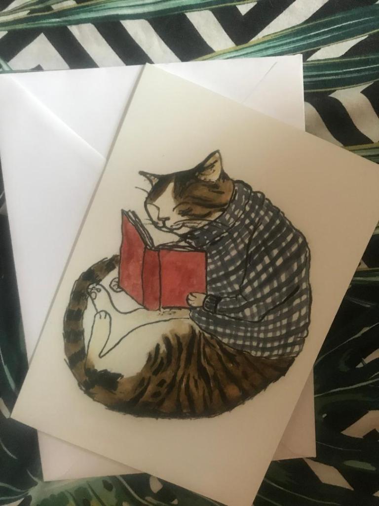
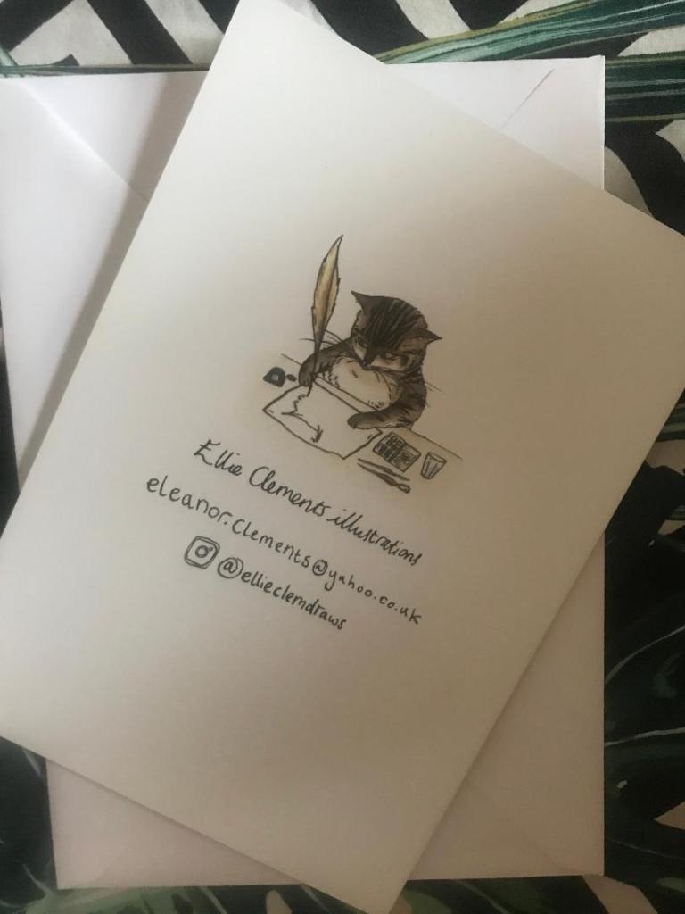
It was very busy and featured some brilliant work from local artists. The majority of the work was screenprinted and there was also a lot of illustration work. I was drawn to an illustration by a lady there called Ellie Clements @ellieclemdraws of a cat reading a book! 😀 I don’t know what it is about the drawing but I just loved it!
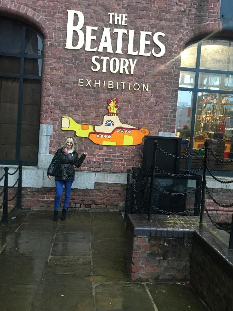
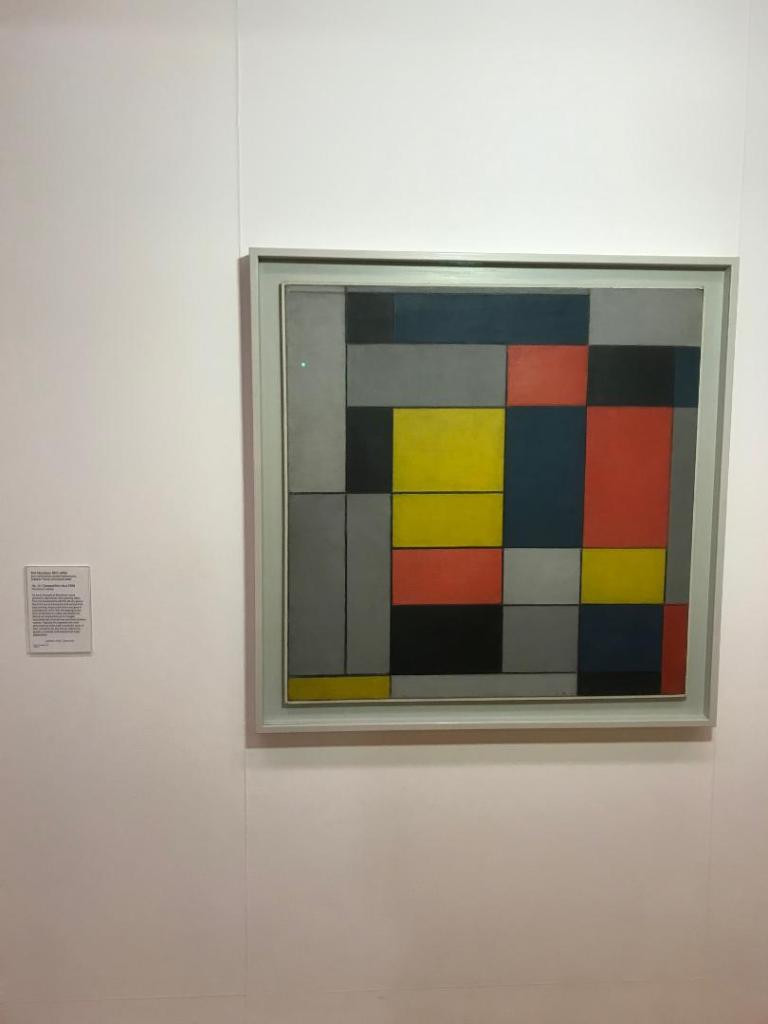
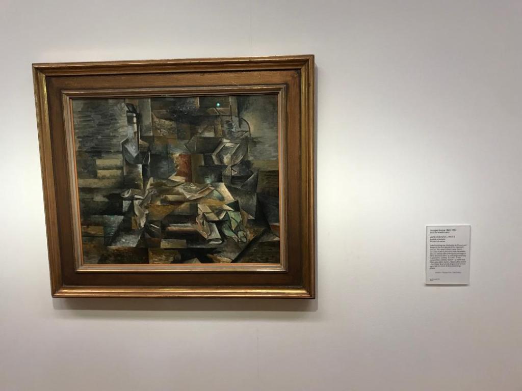
I also spent the saturday afternoon and night in Liverpool. I had a look around the Tate museum.. usually I don’t get much inspiration from the type of work that features in this gallery but this time there was art which might help me with my work!
They had work from Lowry in one of the upper galleries; a lot of the art that featured alongside his was also very industrial – inspired by the industrial revolution. There was also work from Mondrian from the De Stijl movement and also some cubist work!
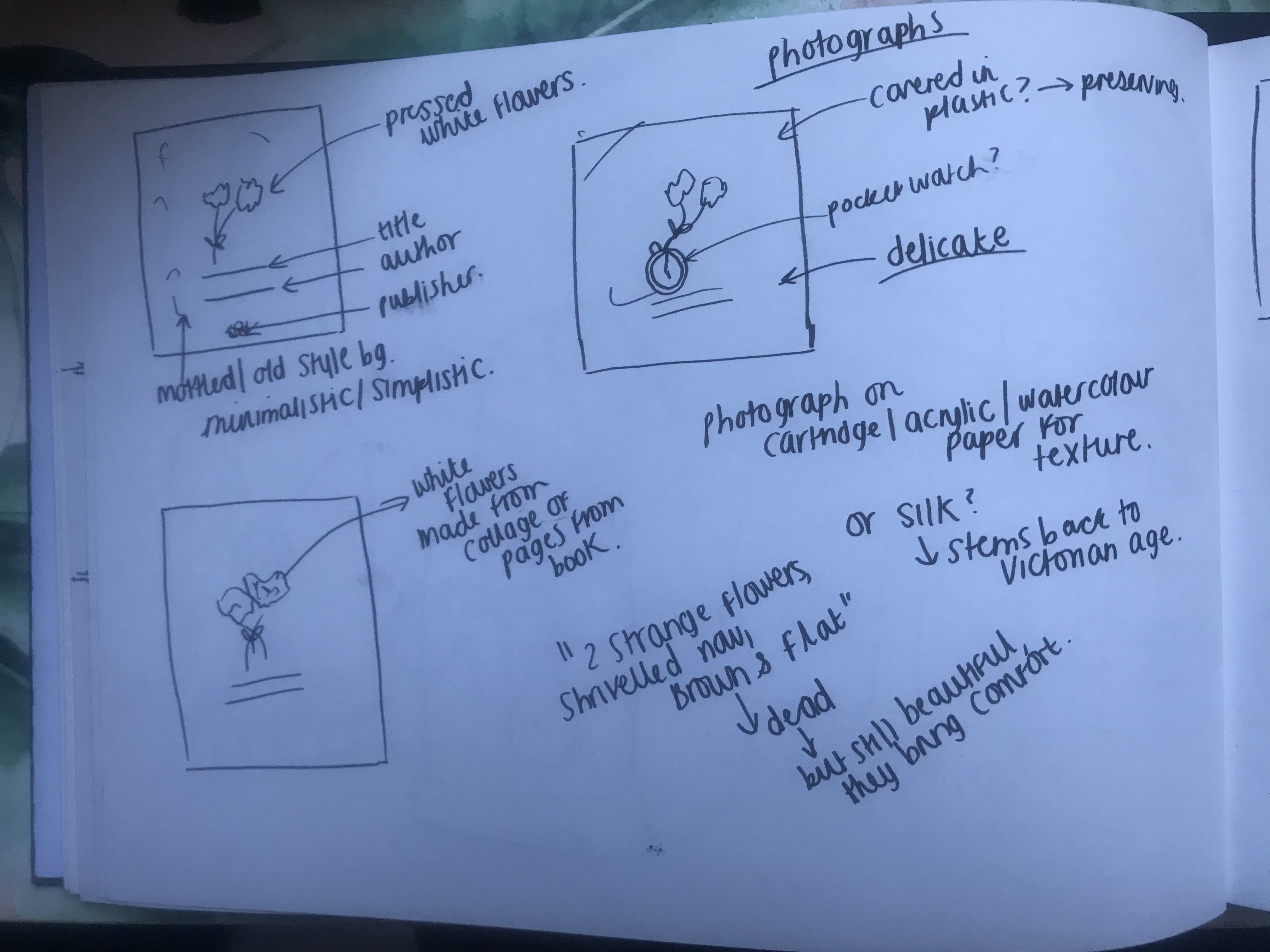
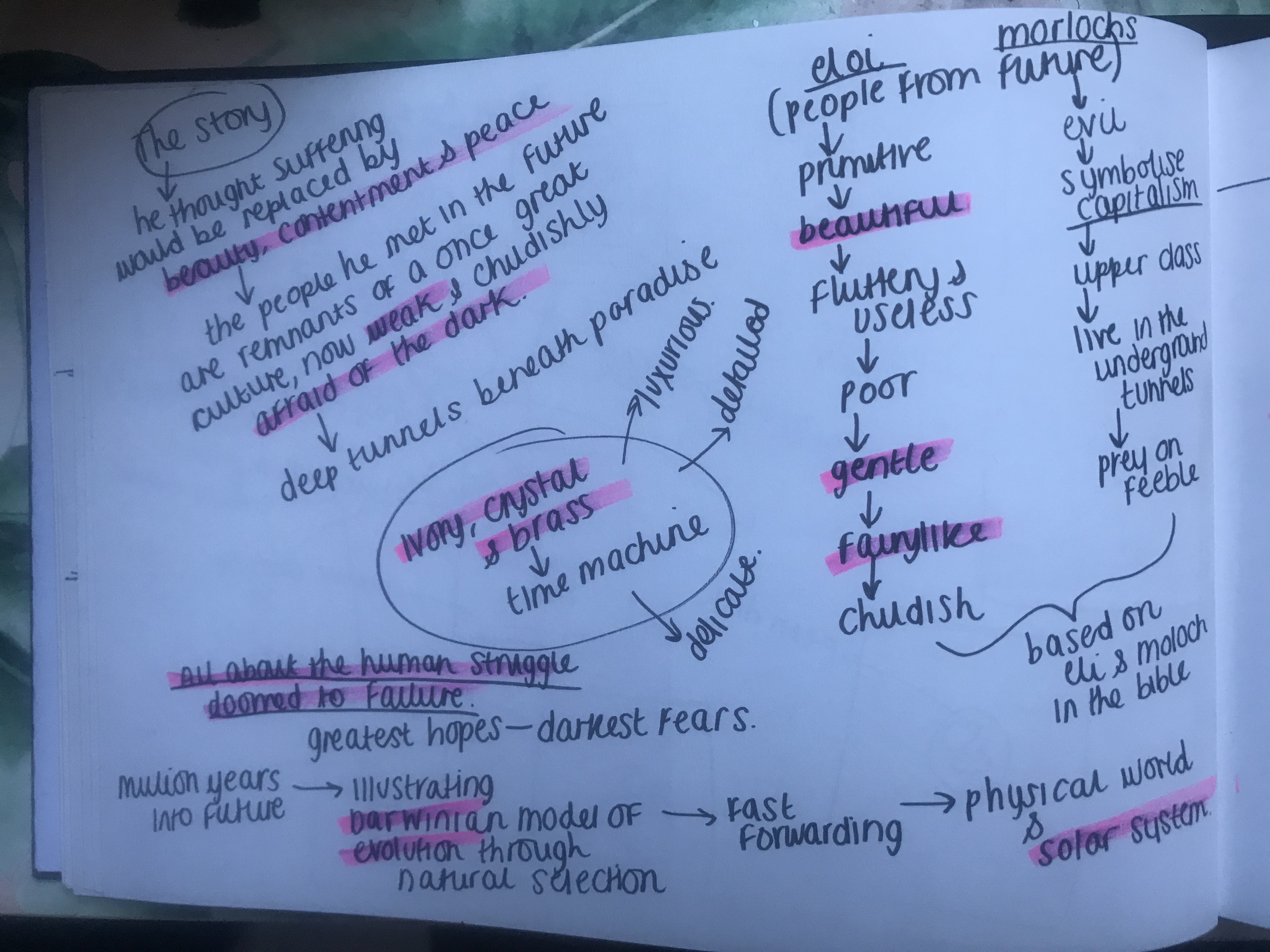
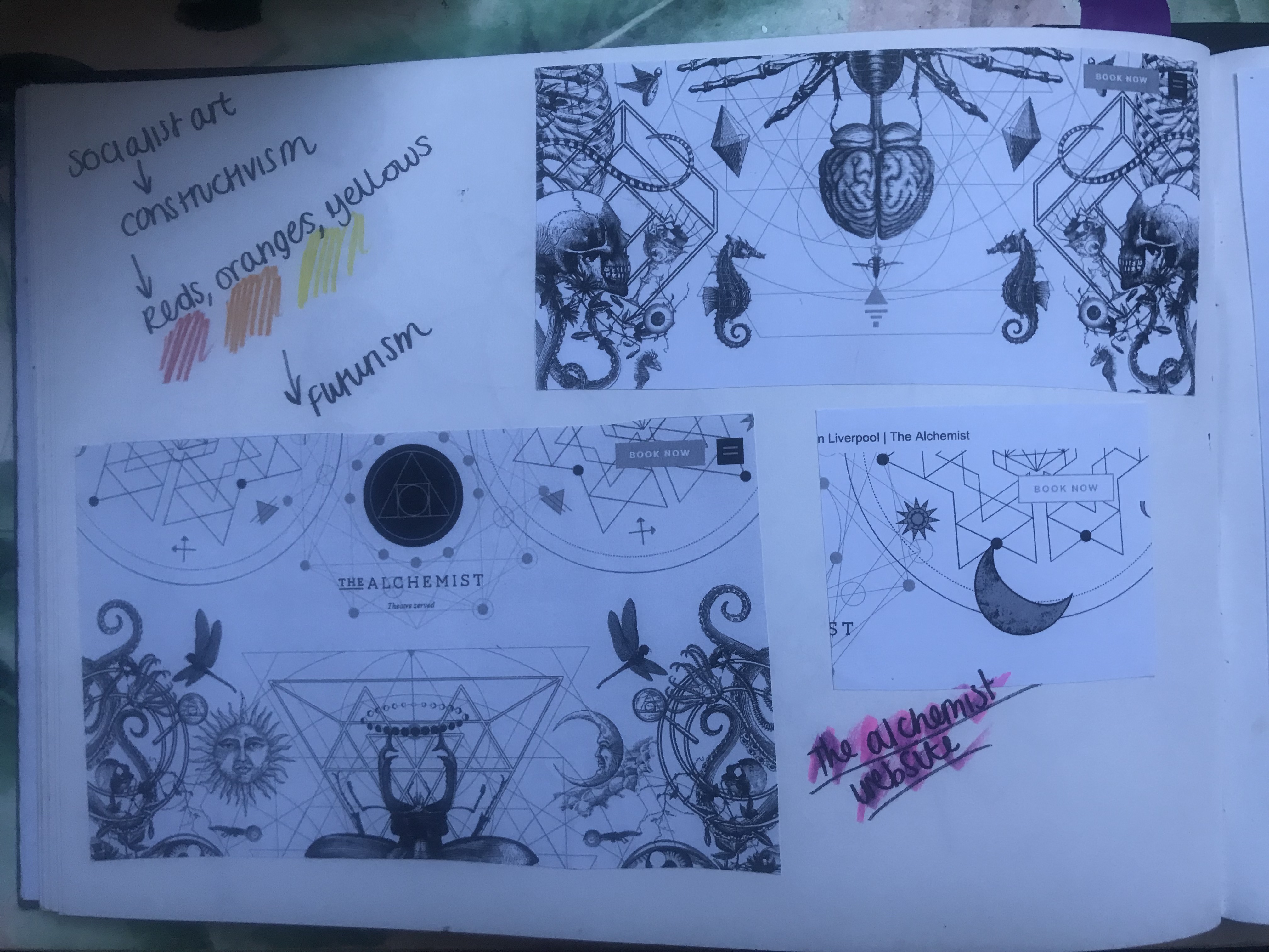
As I wrote in my previous posts, I wanted to look into different art movements from the era that the books were published (late 1800s-1907). HG Wells books are science fiction based and hugely influenced by future events so I wanted to look at art movements which might depict this.
I looked at De Stijl, Art Deco, Futurism and Russian constructivism.
Futurism however seemed the most obvious, appropriate art movement to look at. Futurism was all about the notion of futuristic and extraordinary technological development. It conveys an idea of scientific and technological advance. The art movement was made up of themes of classic science fiction. Futurism also suggests an idea of time, this hugely influenced Victorian writers such as HG Wells.
I bought a book from Amazon to have a look at the style of Futurism. There was one photo which inspired me, it looks futuristic and something that is inspired by the industrial revolution. It gave me ideas for a black and white line drawing type of design. It looks like a technical drawing and a design like this would work well on one of the books such as The Time Machine.
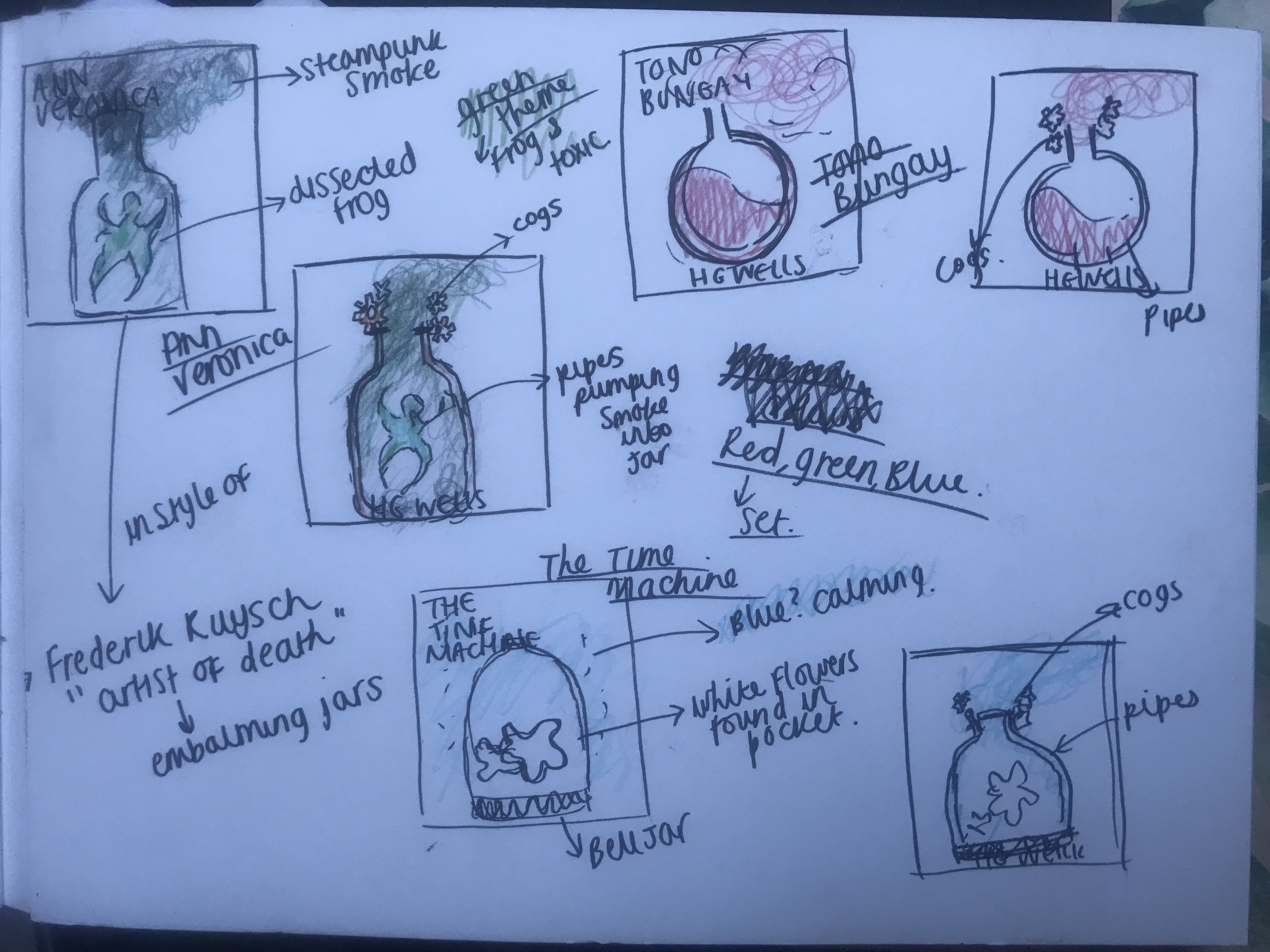
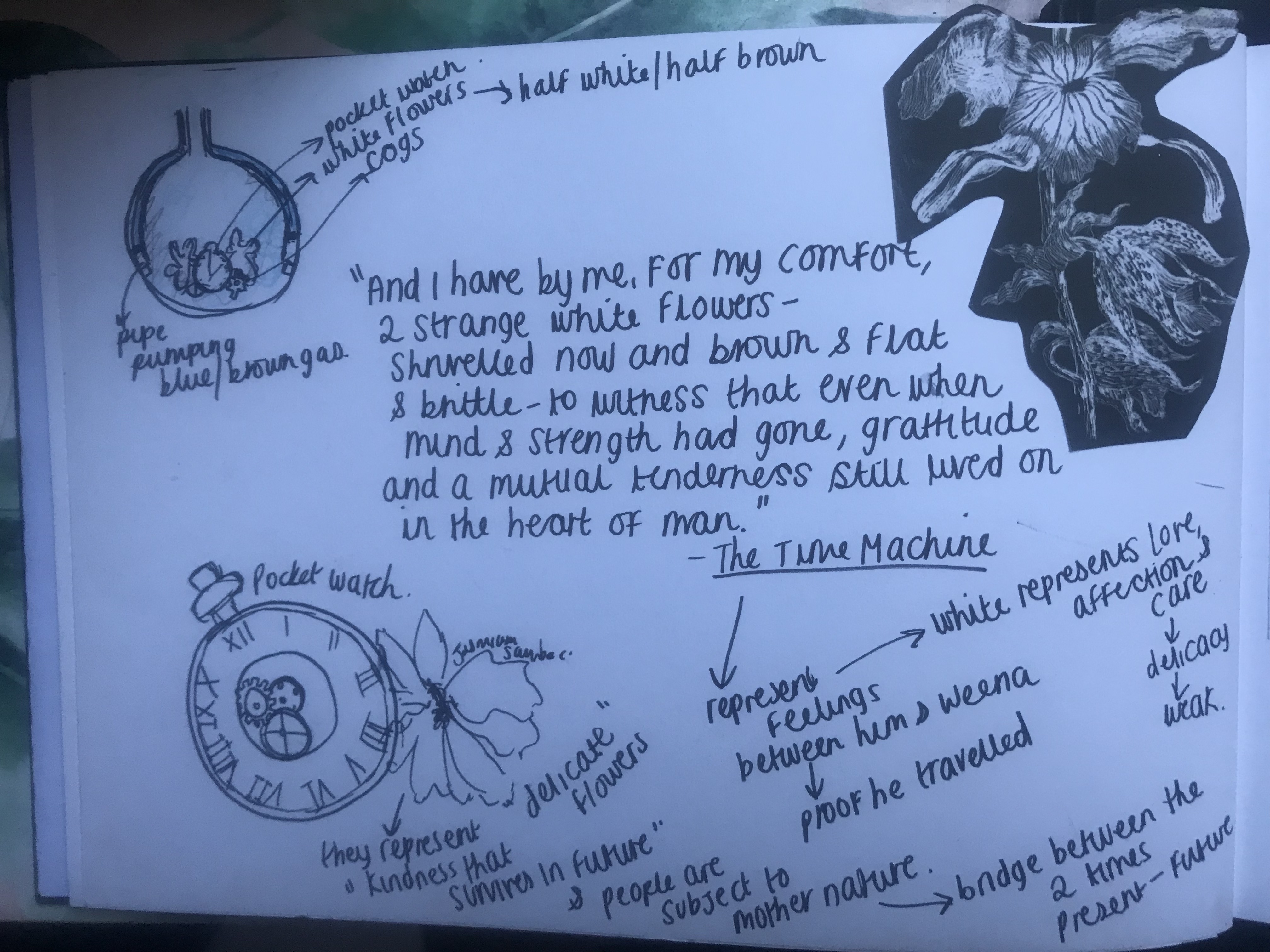
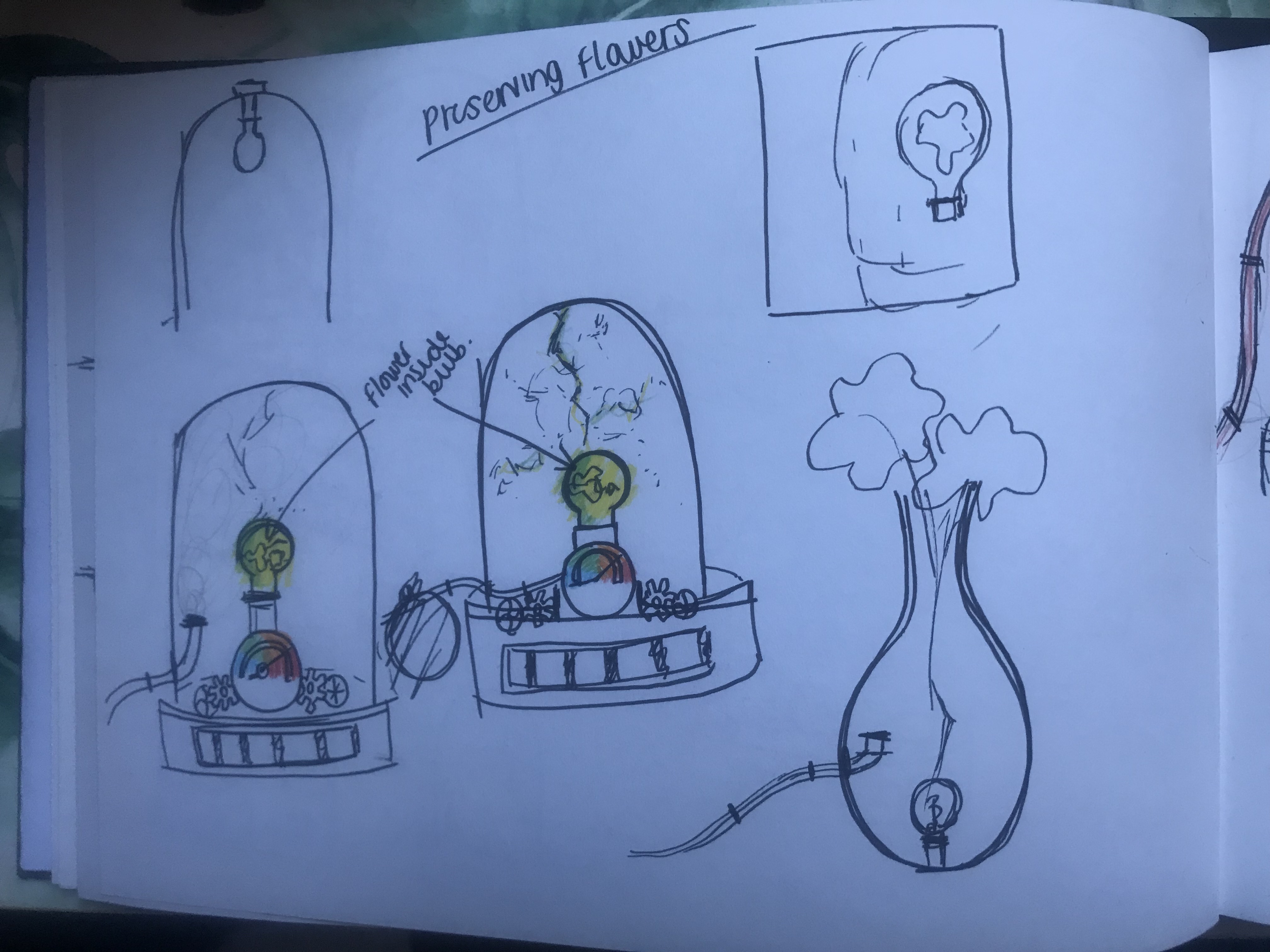
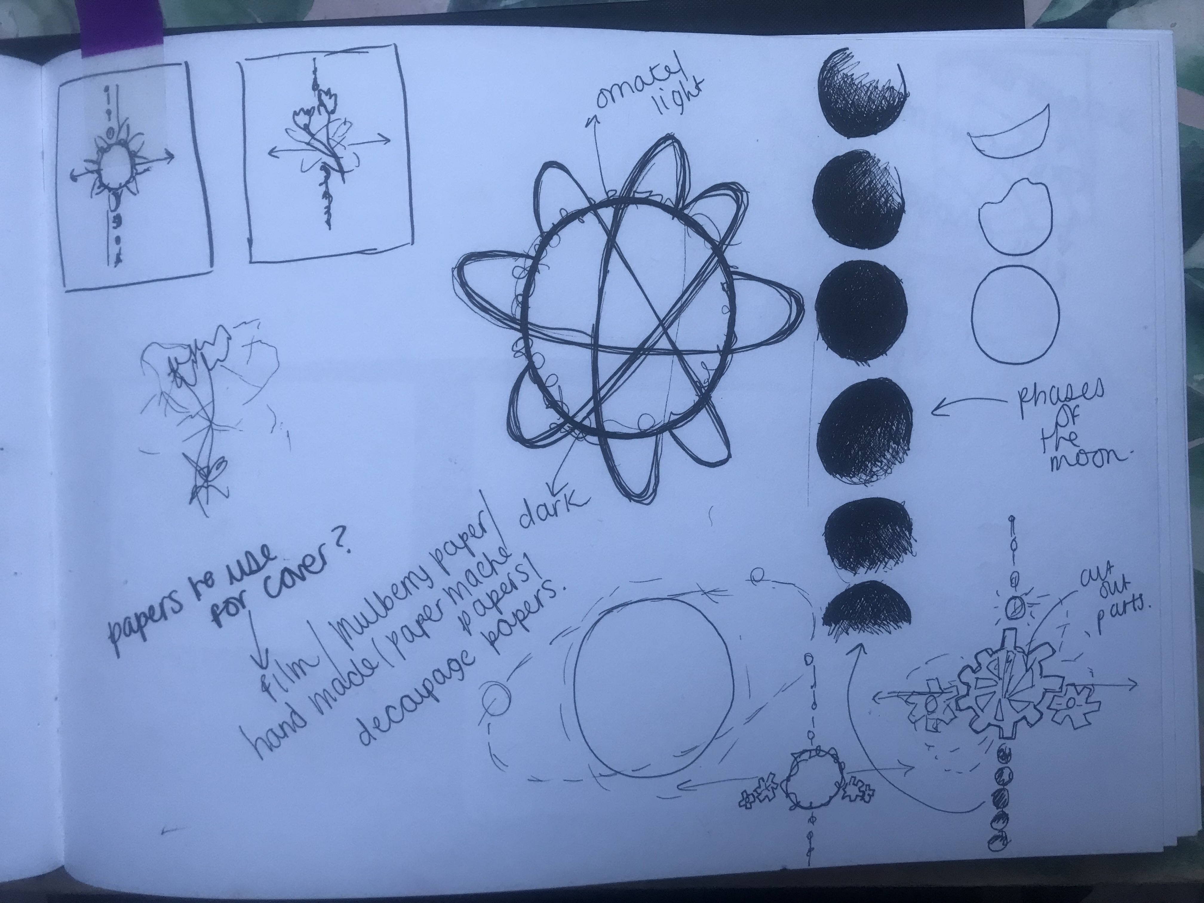
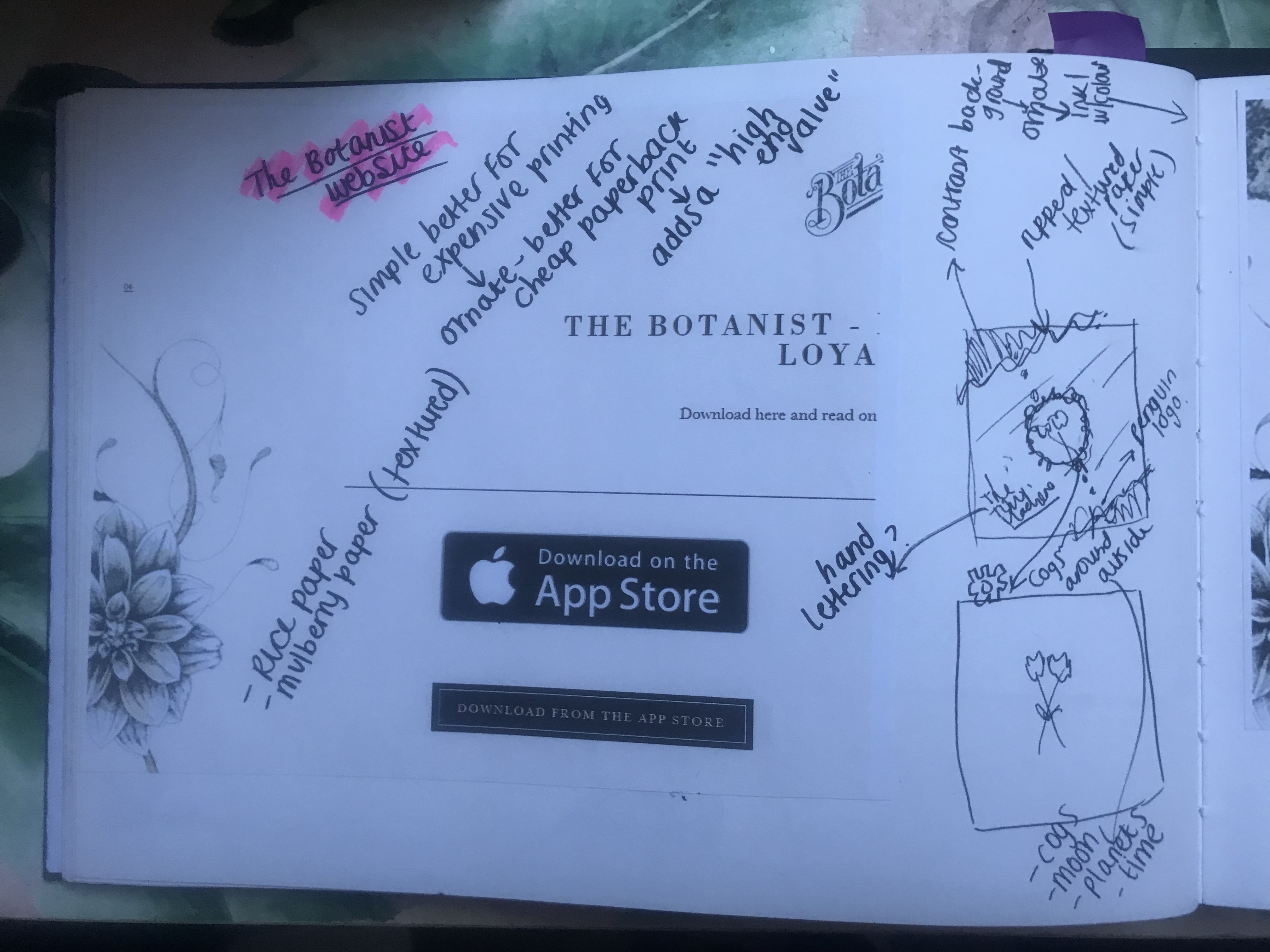
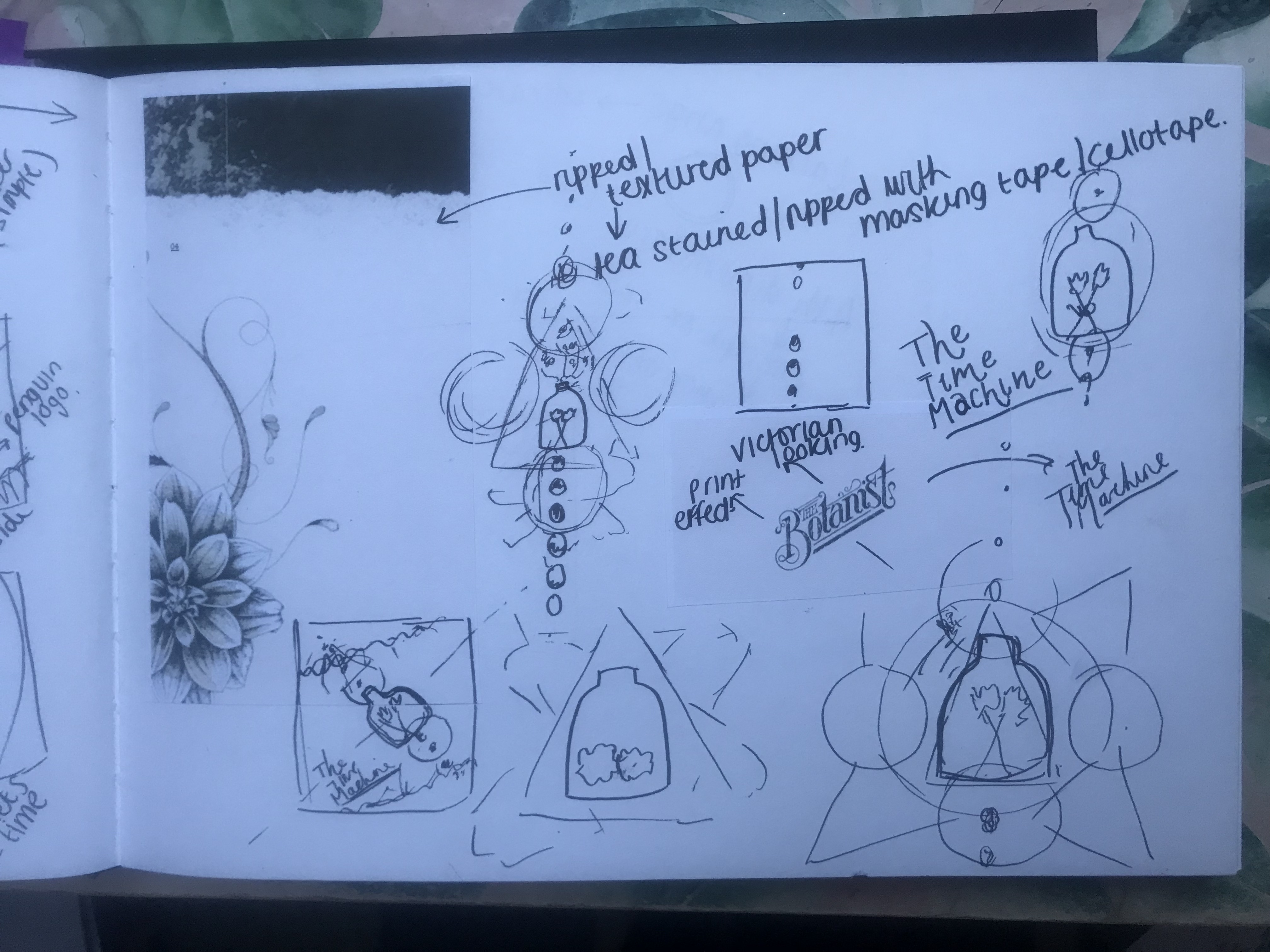
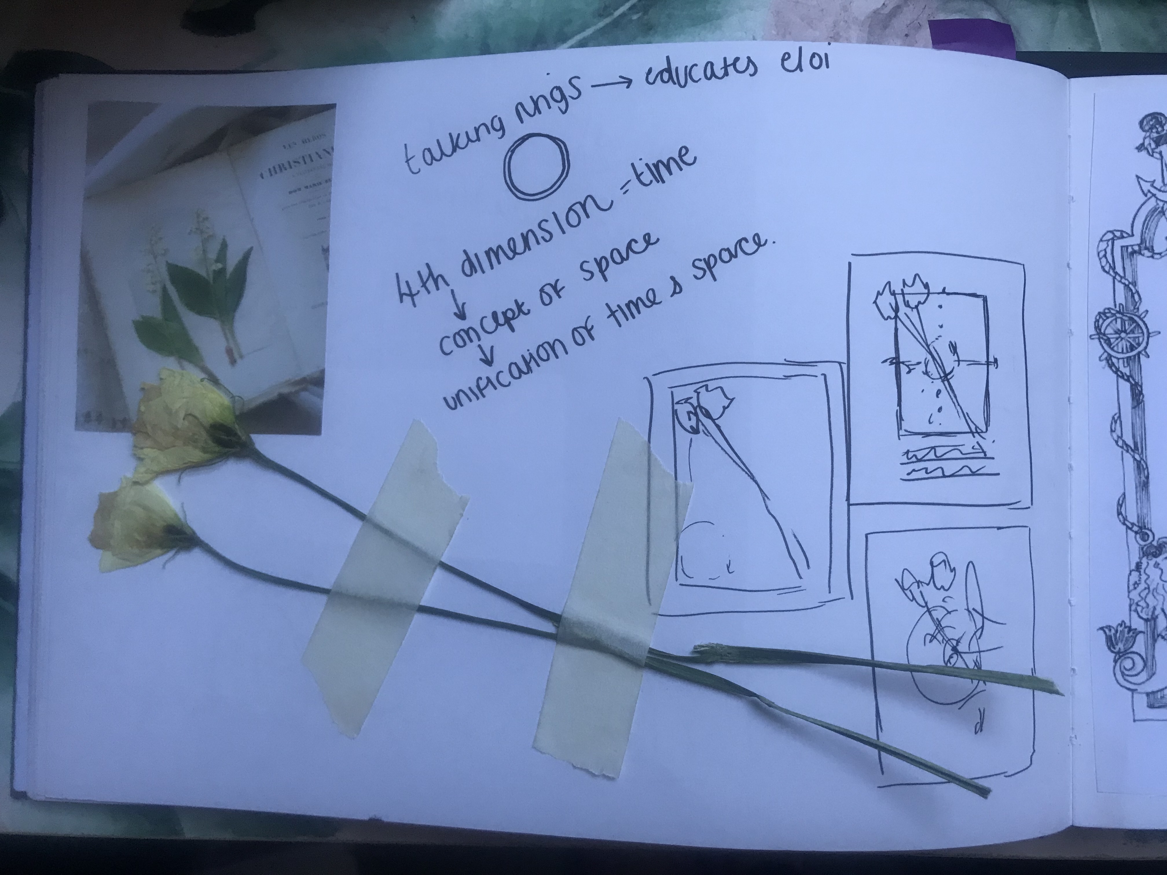
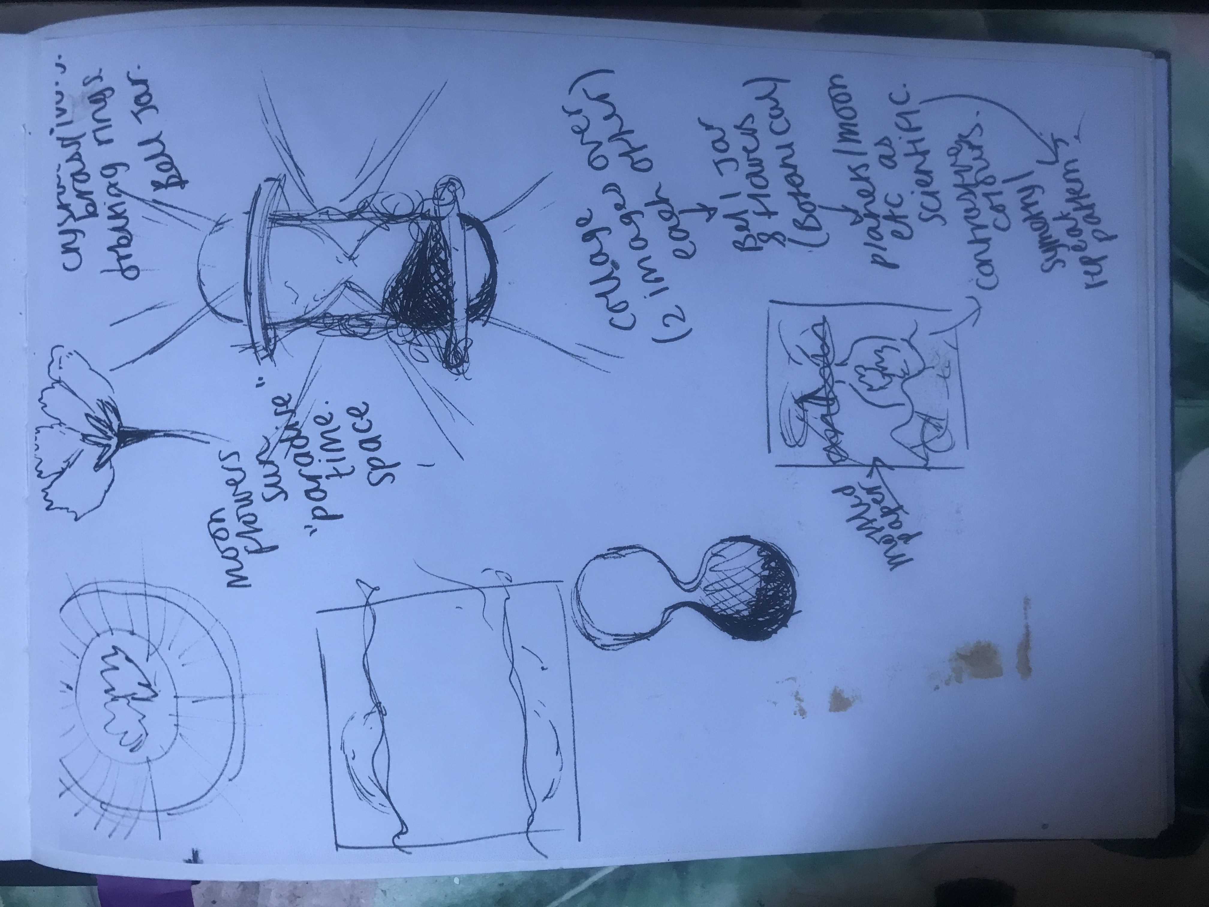
I then thought about how to go about designing for The Time Machine.. I thought about “What is time?” It is a concept of space – the past, present and future.. time zones. Time is an illusion and reality is timeless. The idea of time being a concept of space made me think of negative space in a design, that I could use “space” as part of the design.
I then thought about how to illustrate time on a book cover without using the obvious thing which is a clock itself. Also what style would I do this in?
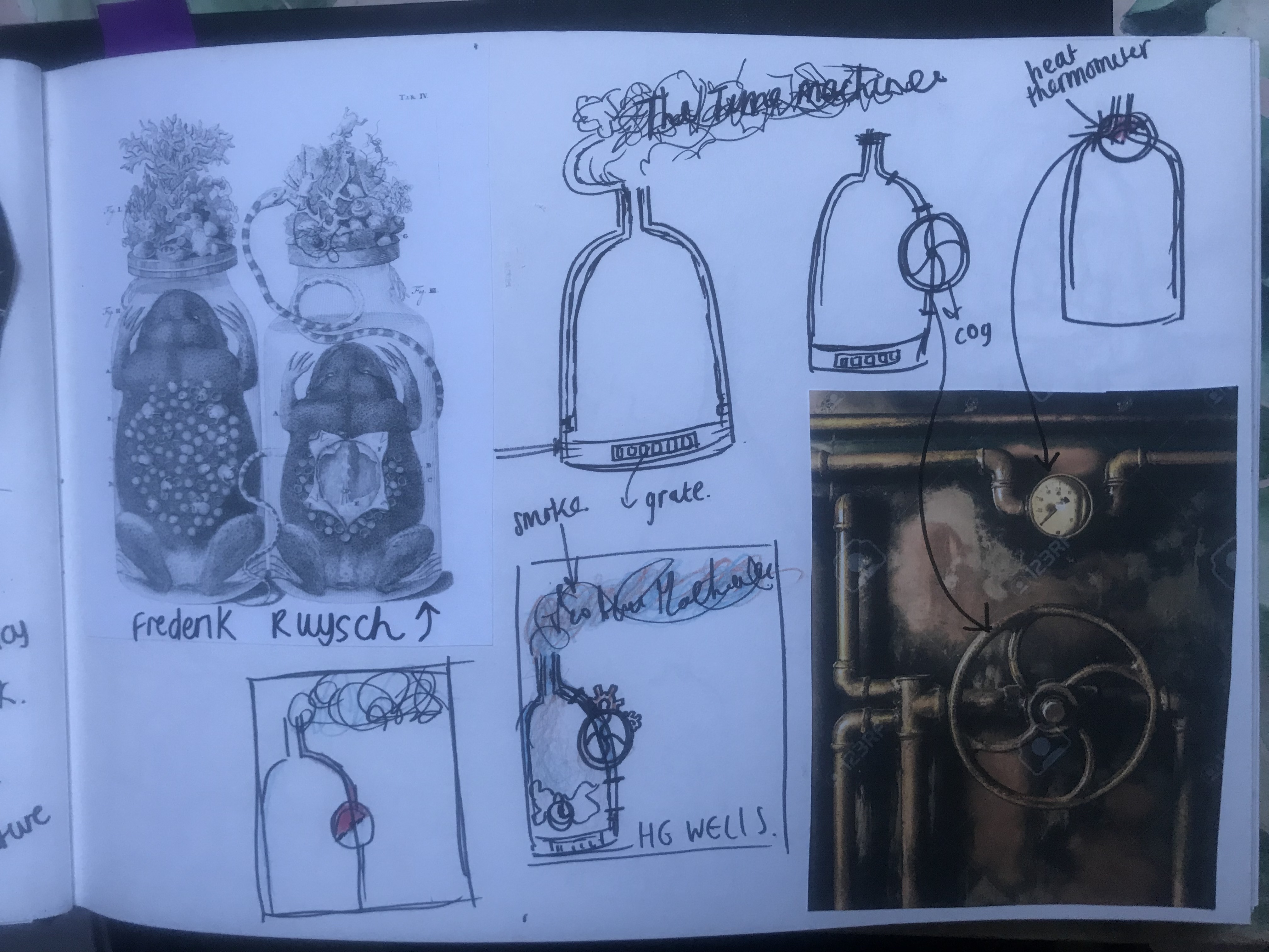
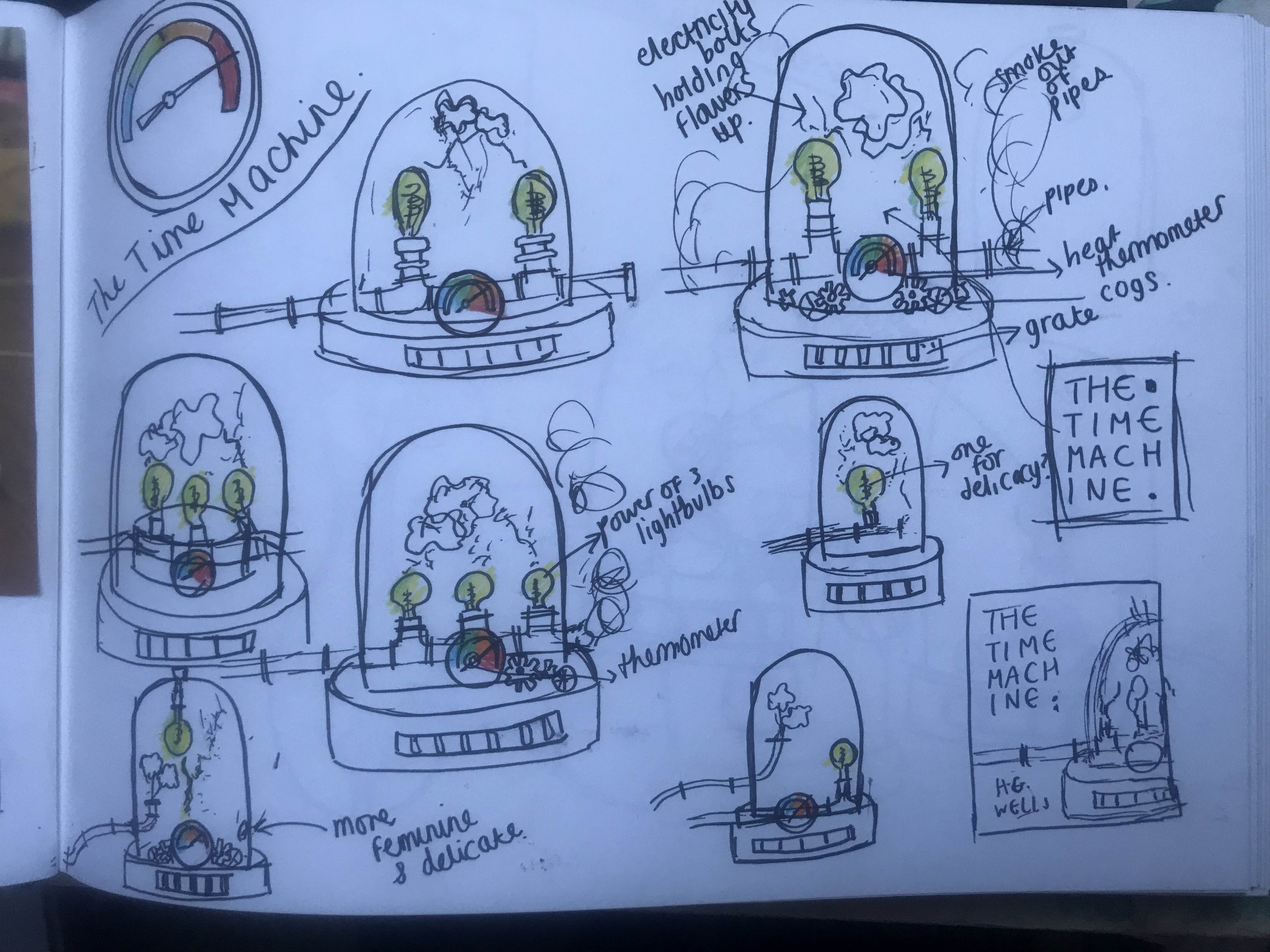
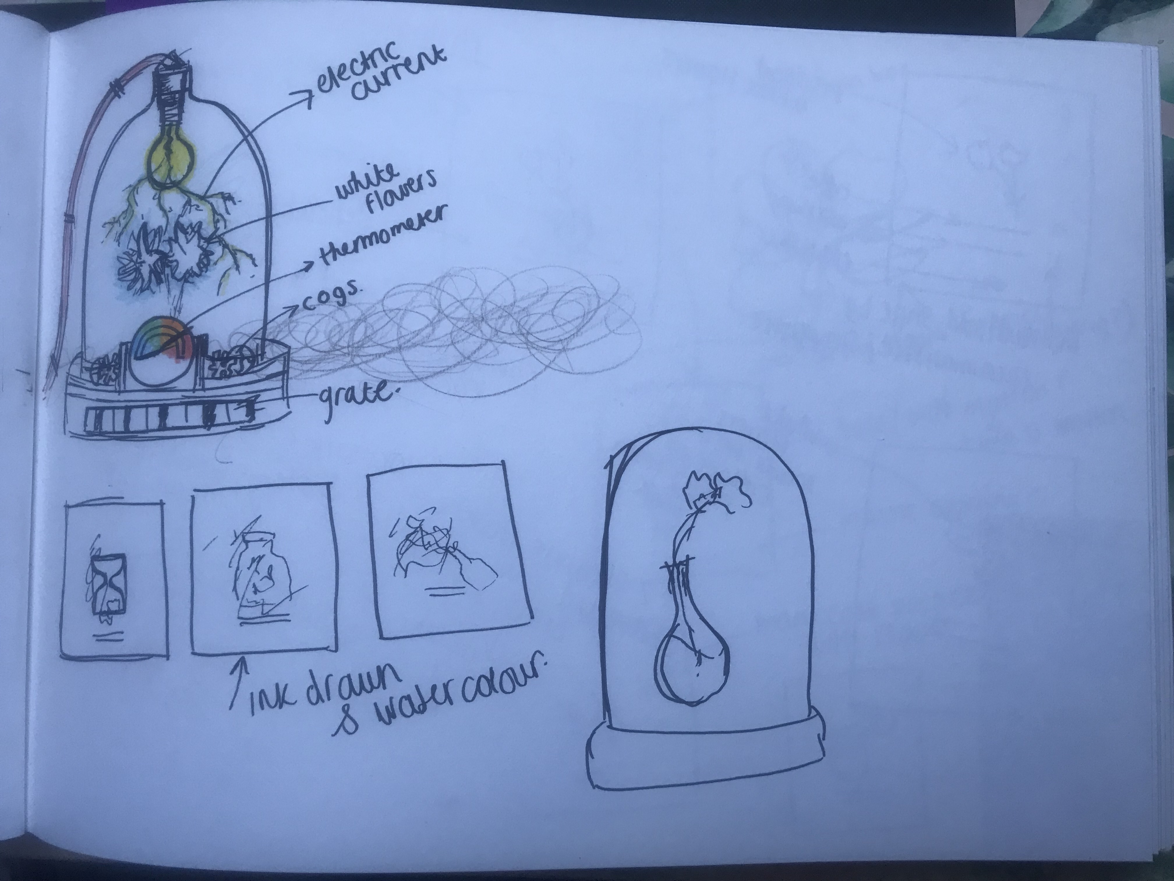
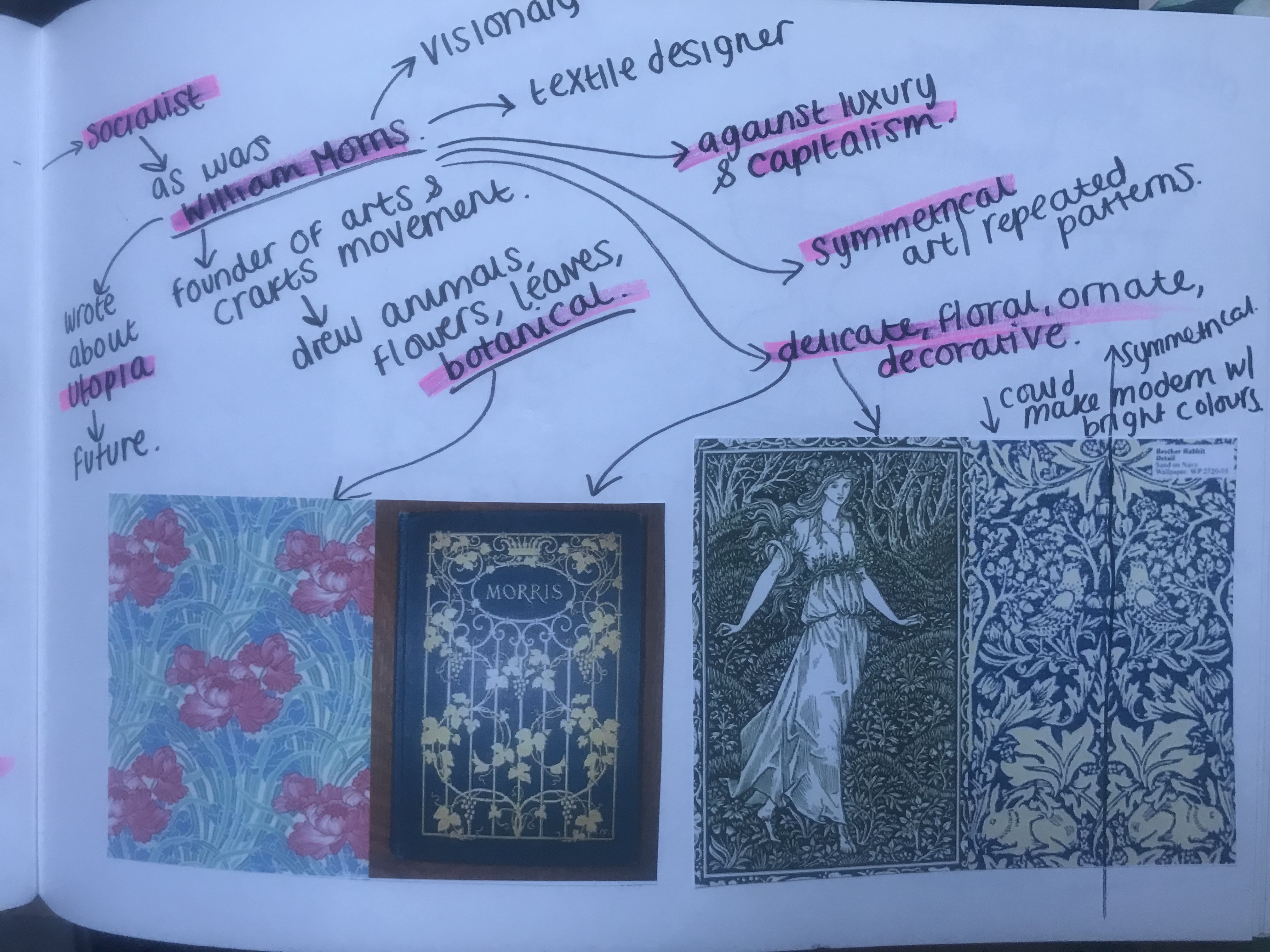
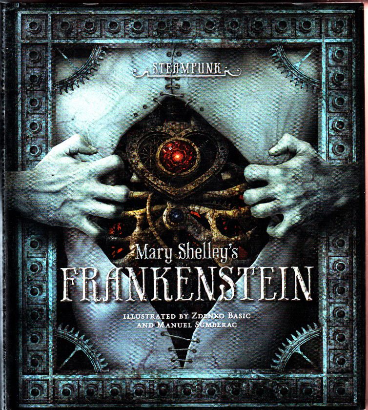
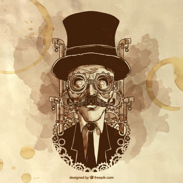
When I think of The Time Machine I think of clocks and cogs and mechanical movements. Another art form came to mind… Steampunk.
I know absolutely nothing about Steampunk other than it is where people rally around wearing Victorian costumes and flying goggles and go to Steampunk festivals! I decided to research into exactly what it is, the style of art it produces and try and find links to HG Wells.. which I did! From researching I found that Steampunk is hugely influenced by Victorian Literature and in particular HG Wells and The Time Machine.
What is Steampunk?
Here are some images which give an idea of the look and feel.
Steampunk is a genre of Science fiction it combines historical elements with Science Fiction. It is influenced by Victorian writers; In particular HG Wells and his classic The Time Machine.
Steampunk features steam powered machinery, clockwork and electricity. It is influenced by cars, planes and machines. Steampunk was very much the Victorian eras view of science in literature and the industrial revolution in Europe in the 1800s. It is the Victorian era reimagined with modern technology that simply runs on steam power.
“What the past would look like if the future had happened sooner.”
It is all about mixing old with new. Steampunk is a visual style. It is machinery and elegance, Gothic Victorian. “Retro-Futuristic”. It is dark, dirty and grungy.
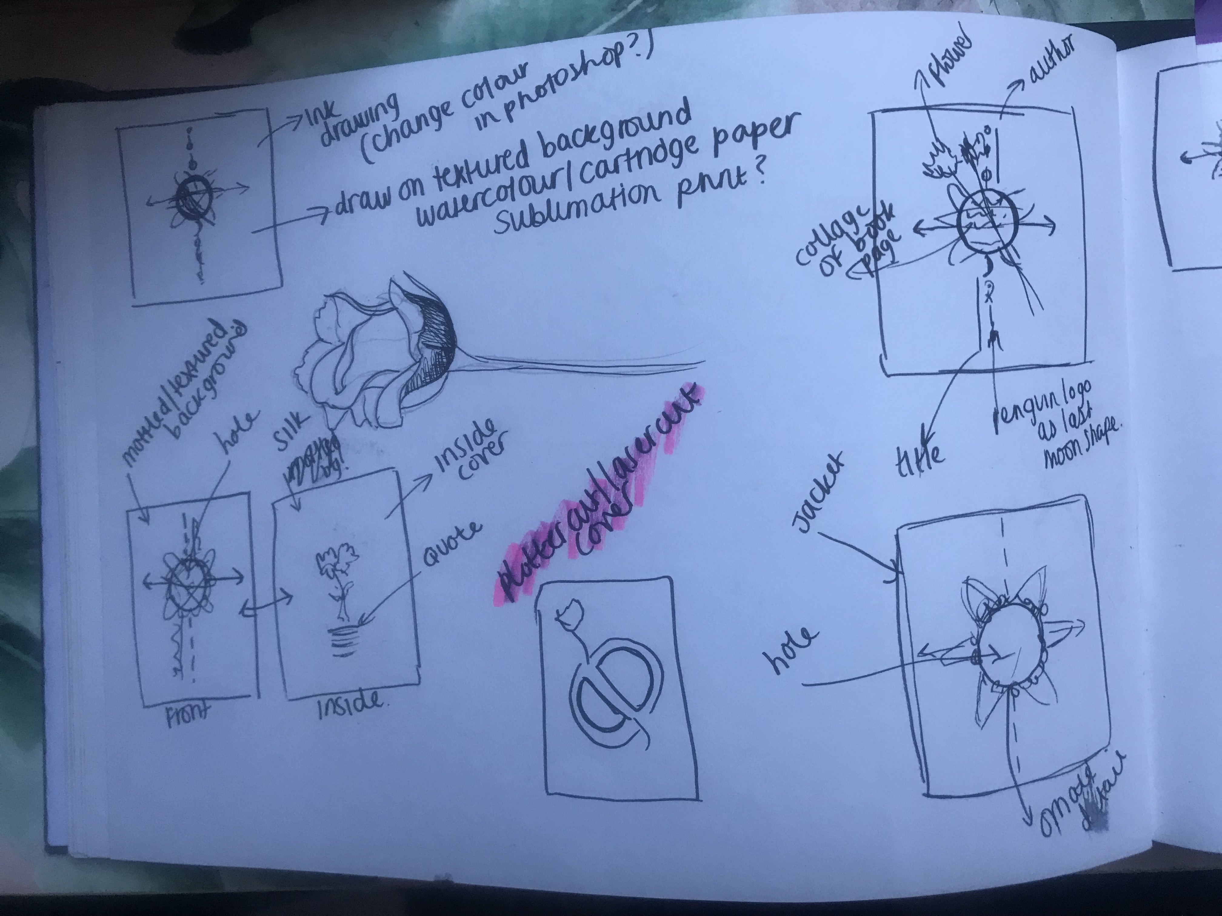
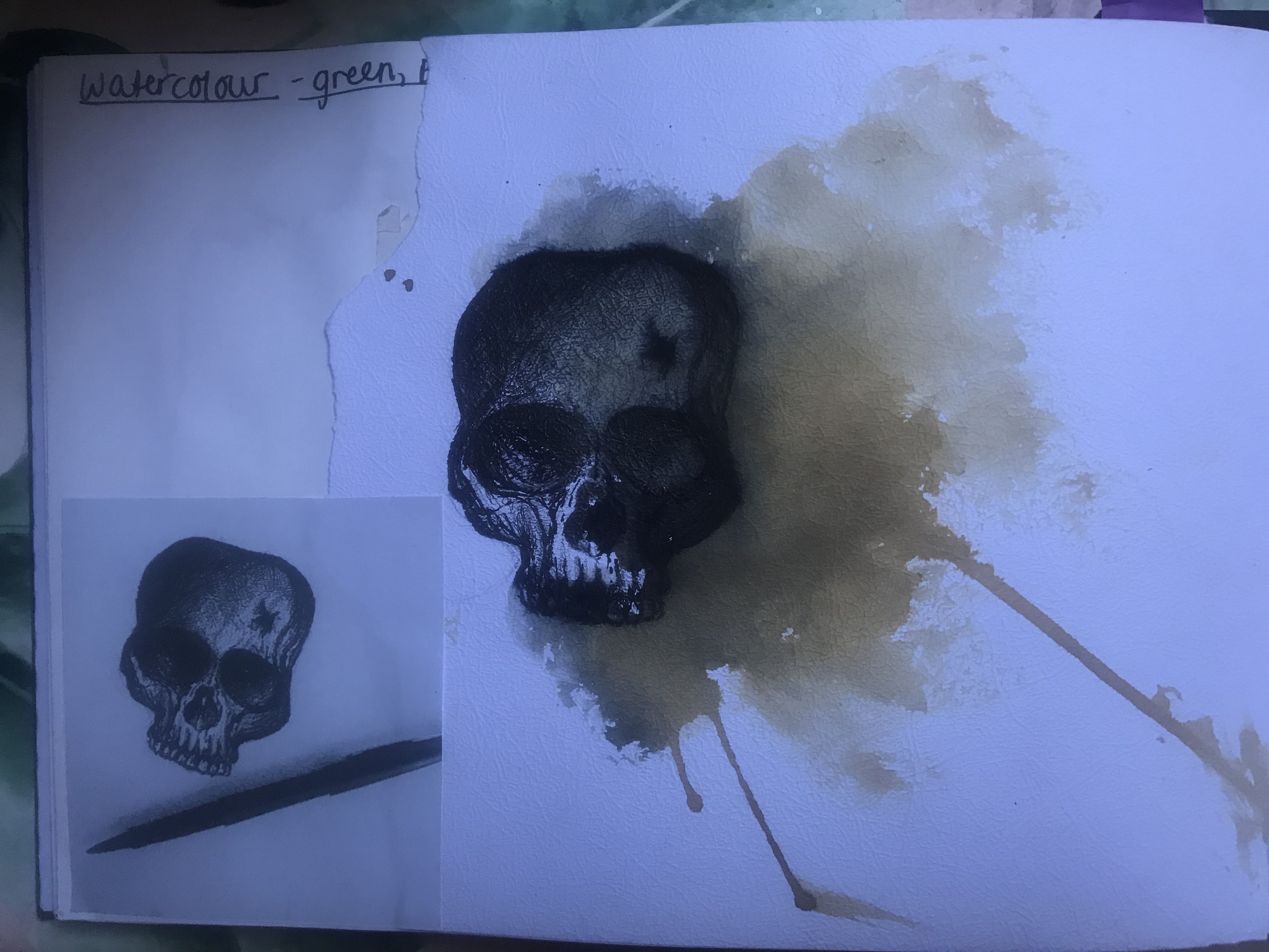
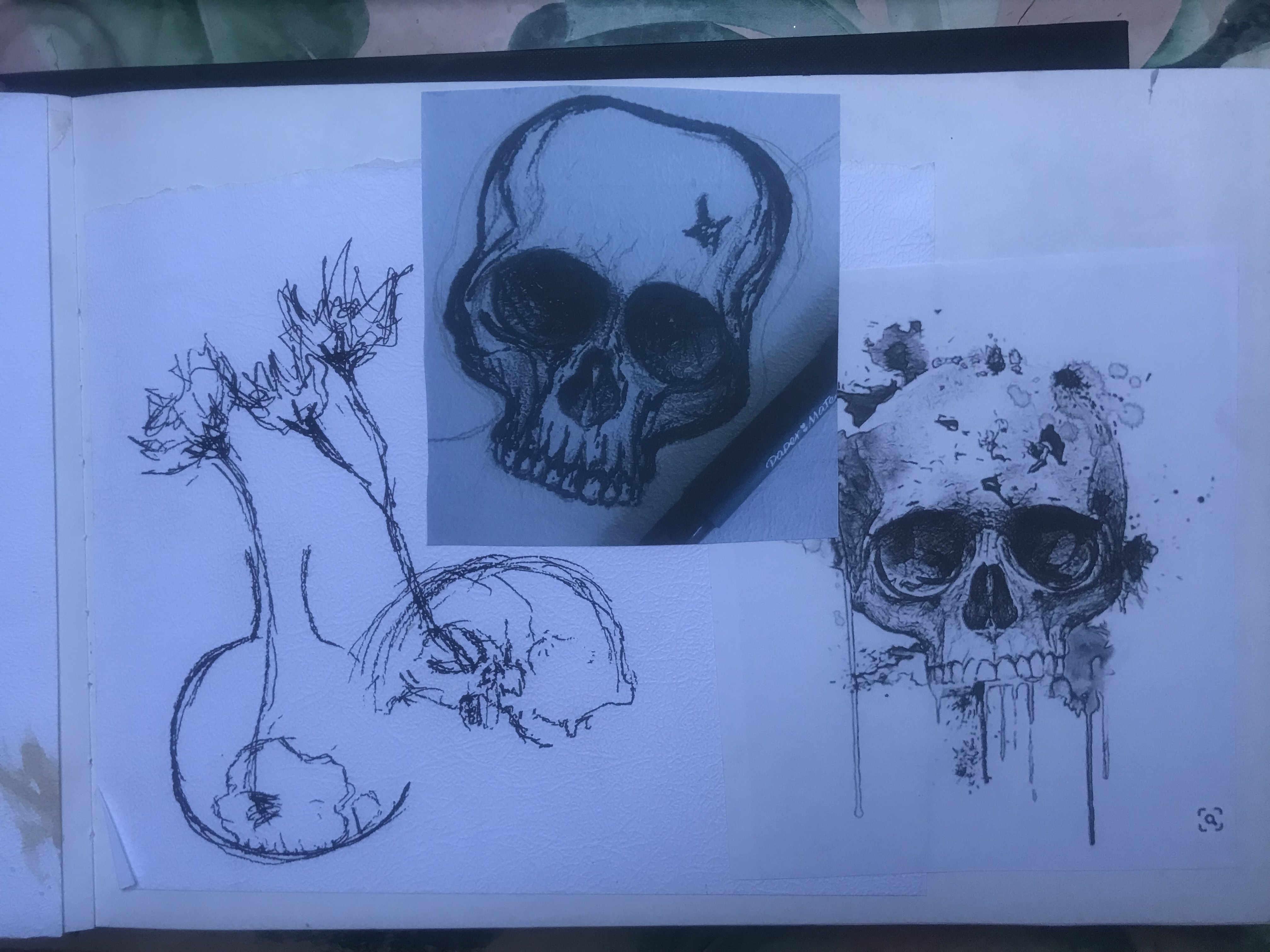
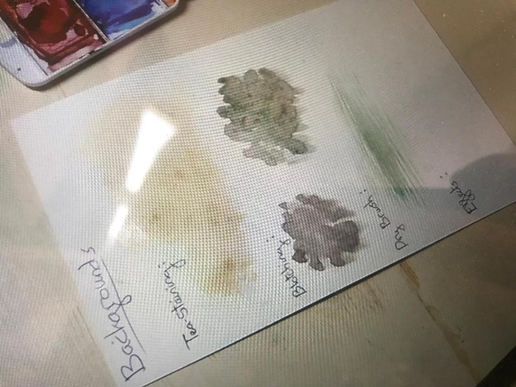
From reading my feedback from Assignment one, I was told to keep experimenting with different media. I decided that for this piece I wanted to go back to what I enjoy most and do some hand drawing. I love doing black and white ink drawings. I wanted to get a feel for what Steampunk drawings and designs look like. I watched a Skillshare tutorial by an artist called Sara Blake, her drawings are amazing. The video shows you how to take your hand drawings and alter them in Photoshop to make several different variations to us on different projects. I think that this is what I want to do. A black and white ink drawing inspired by Steampunk for all 3 of my covers and then take them into Photoshop and alter them, add colour, add effects to make it suitable for digital print such as books!
Here is the link to the skillshare video and some screen shots of Saras work.
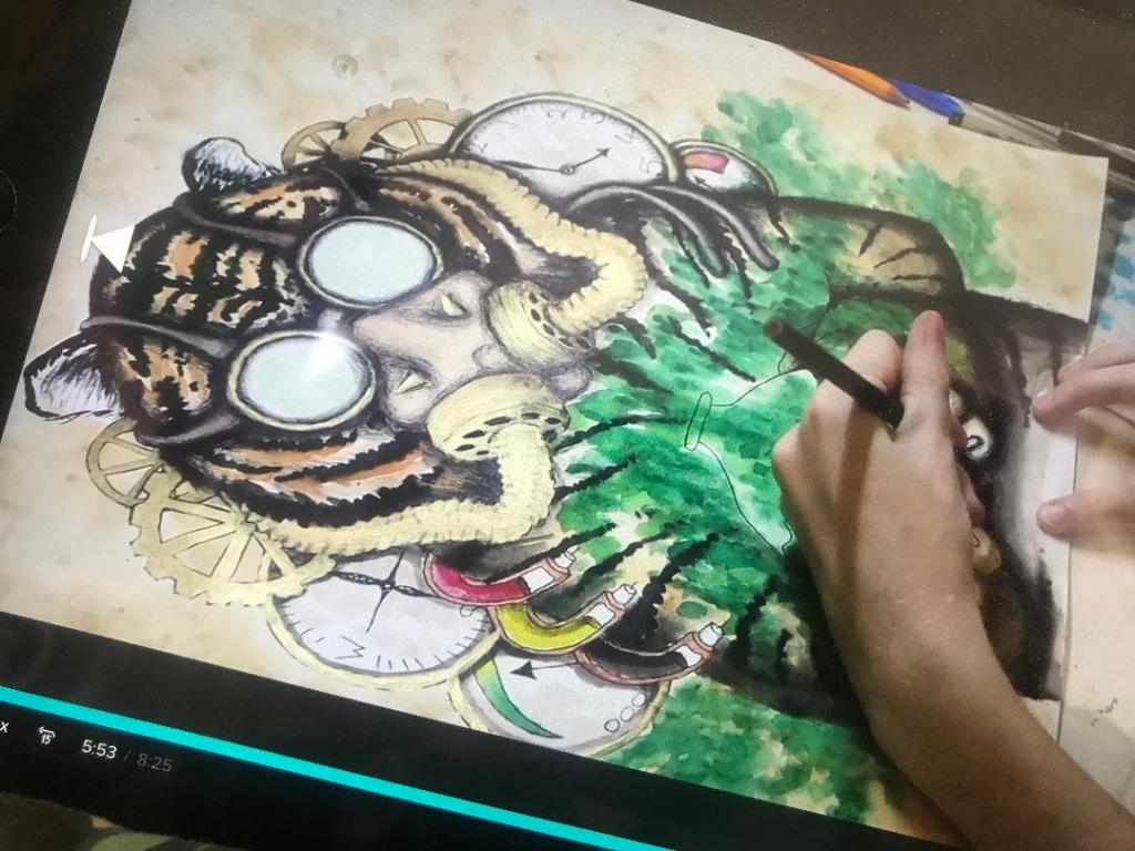
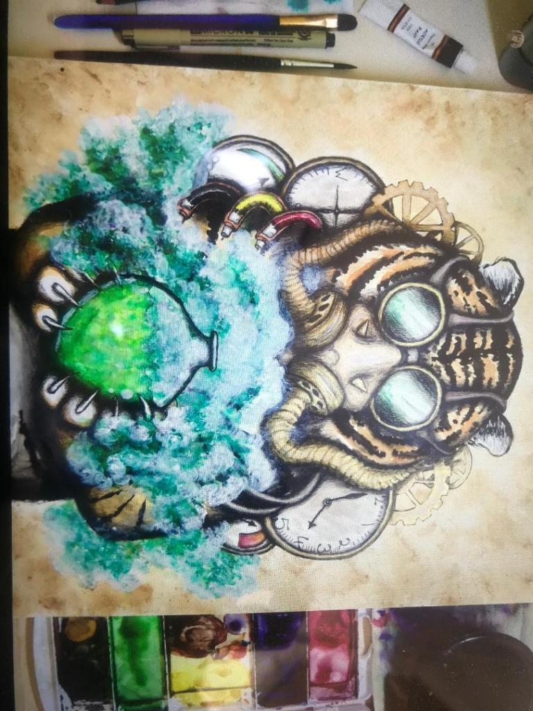
I then decided to look at tutorials showing me how to draw Steampunk inspired drawings. I came across one on Skillshare by an artist called Charlotte Jordan in Florida, she takes you through step by step some of the techniques and methods behind achieving Steampunk.
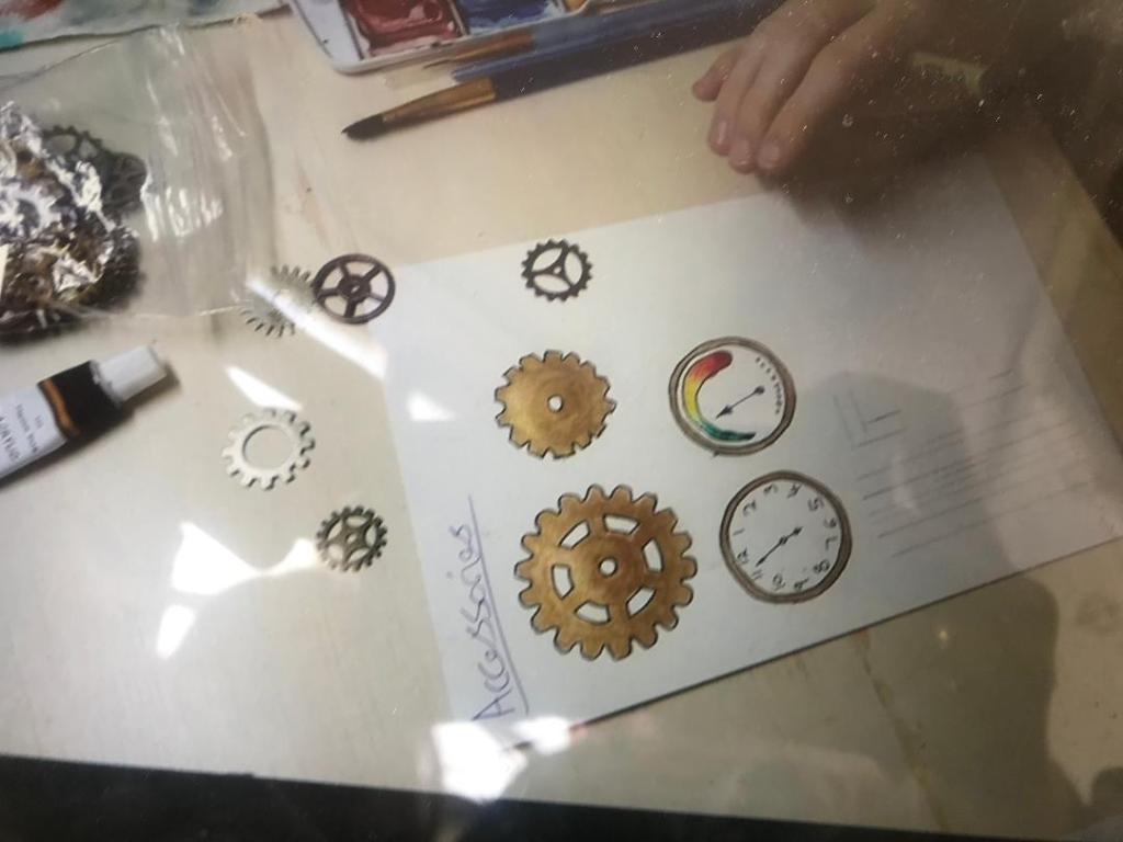
The above images are screenshots of her class. I love the Tiger piece, I love the smoke and colours from the bottle. This inspires me to try and do similar with my own designs, Tono Bungay for one in particular. Smoke is a big part of Steampunk.
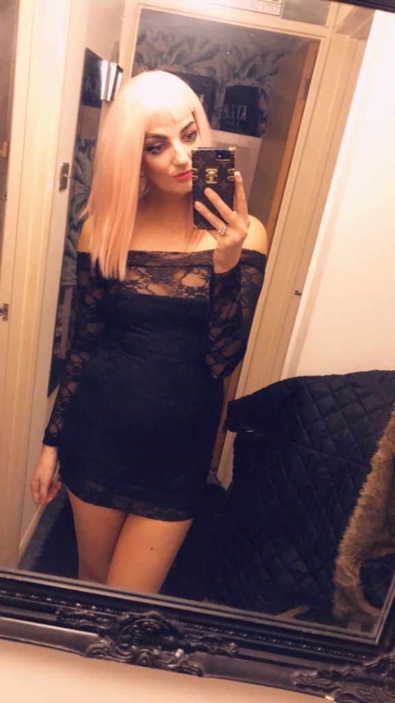
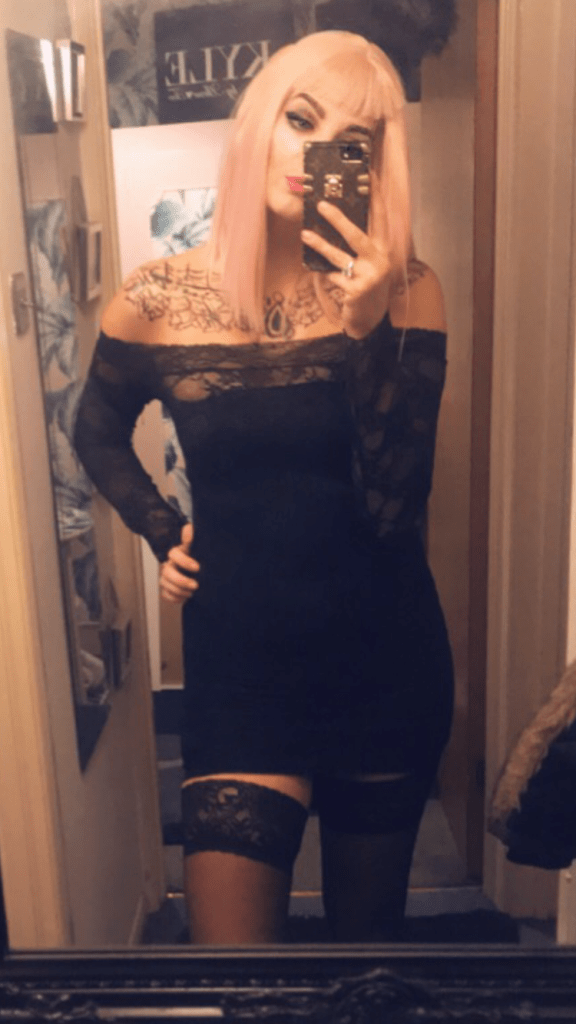
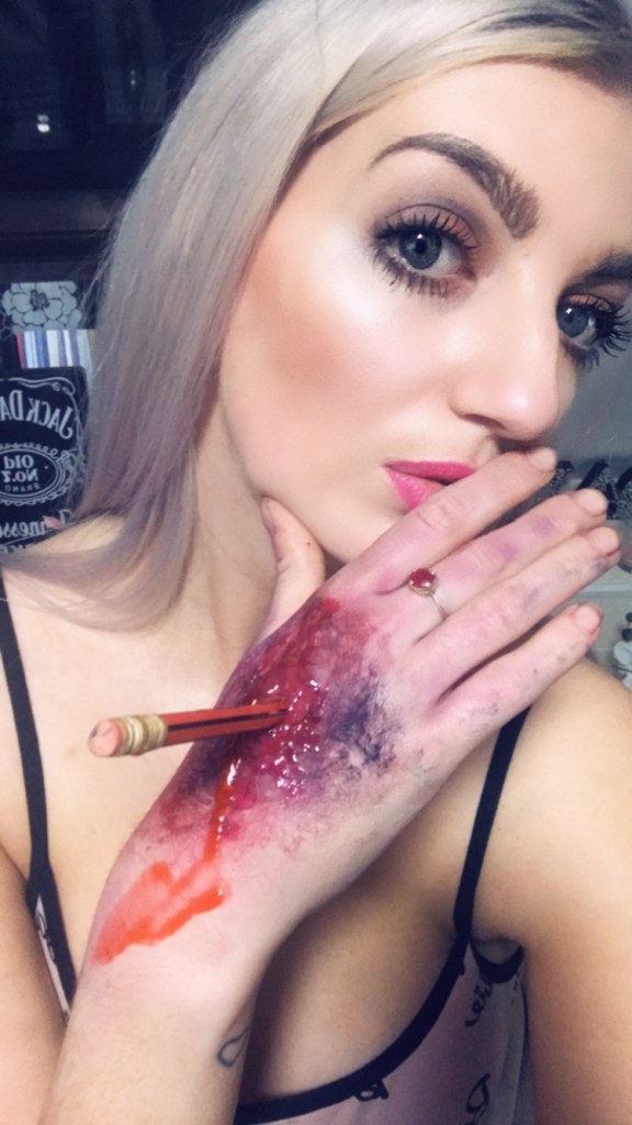
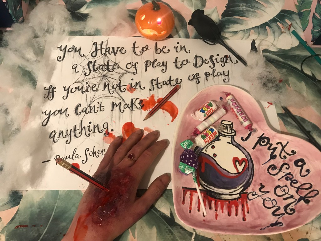
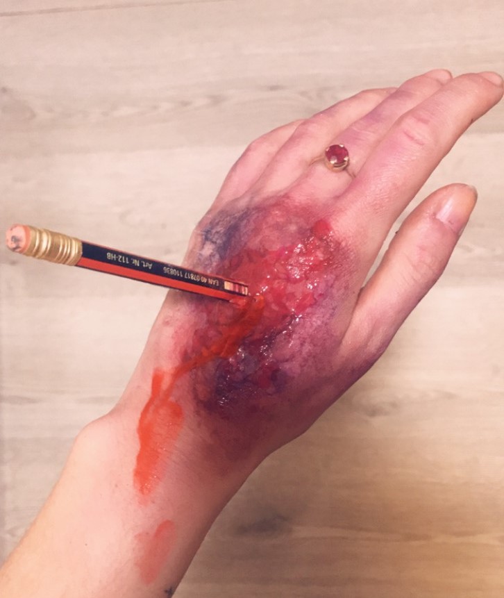
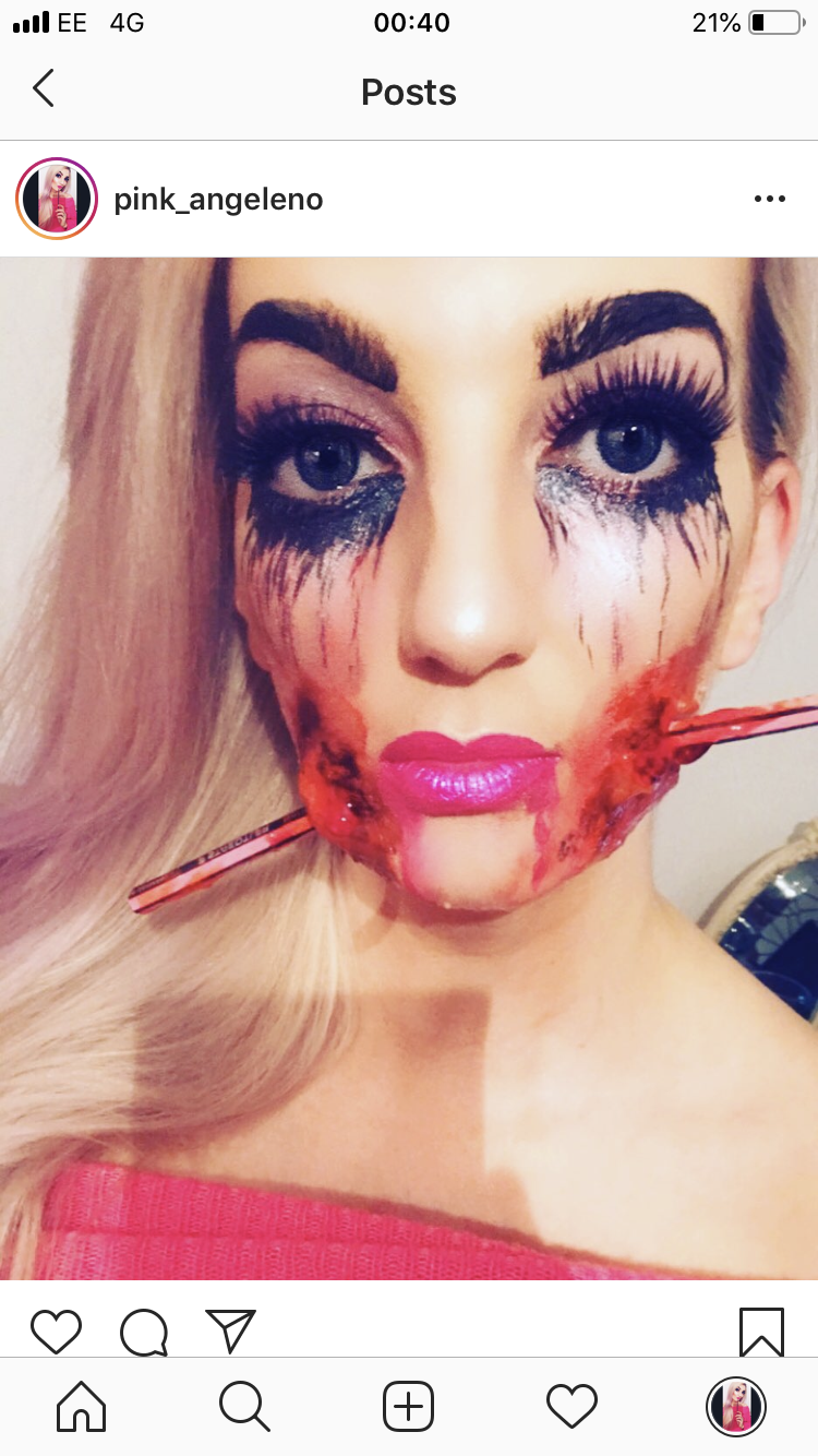
You have to be in a state of play to create and do amazing things! (as says Paula Scher…) – Usually I go all out for Halloween dress up but this year it was actually quite tame for me! There was no dress up at work this year like previous years, so I settled for a night out and a few photography pieces for my blog! (I thik its secretly kus they don’t like me winning every year! ;p)
I’ll let you into a secret… I weirdly have a latex allergy – It literally gives me third degree burns and blisters like CRAZY! (I almost got blood poisoning and sepsis the last time I got it bad!…) so unfortunately I cannot use the magical liquid latex to give me amazing scars! – I would like to keep my body parts!! Instead I use a special fx wax by Snazaroo! Without fail it works great year after year for £3.99 on ebay for a small round palette of it!
There is a fine art to creating scars! – let me tell ya you have to warm this wax up well in your hands because trying to smudge it into your skin hurts!! I pride myself on creating some realistic scars though!
I love Halloween, love dressing up! LOVE IT!
Let me know what you think!
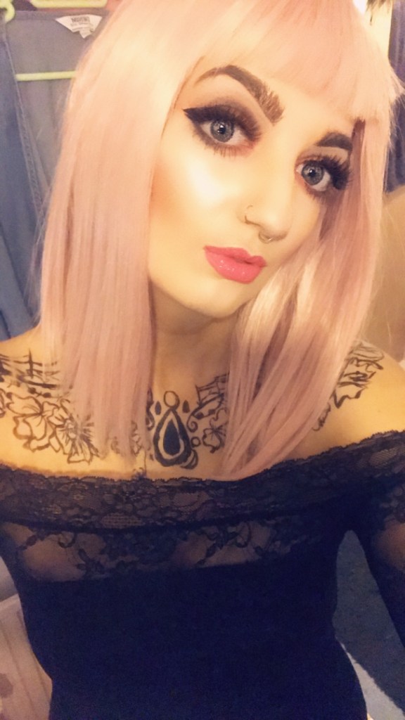
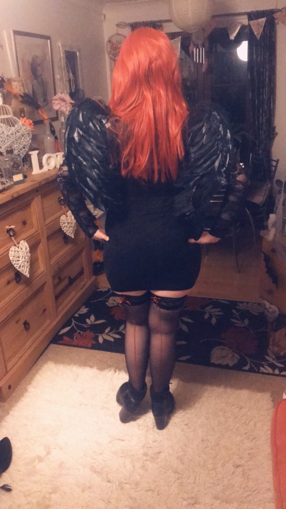
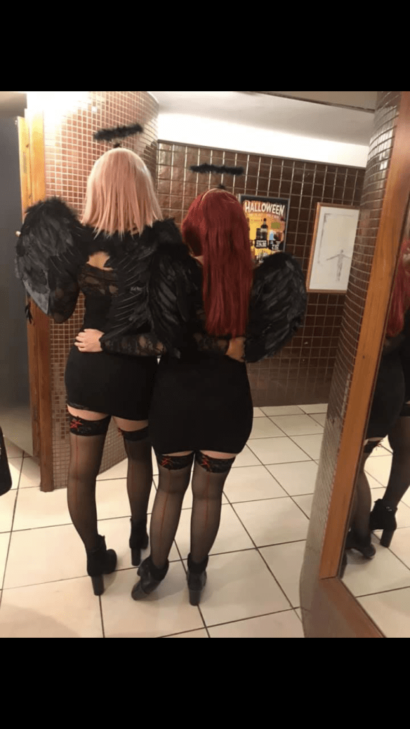
This year I went on a night out (was supposed to be a classy, sensible ish night out – 4am I roll in!! *eyeroll) as a fallen angel. My best friend wanted in on the act and we dressed up identically. I already had the most perfect dress for the occasion that had been sitting away unused in my wardrobe, so my bestie went out and brought the same one and we pretty much rocked identical outfits! Emma is the tomboy out of us both – she rocks short hair and an undercut and is basically the opposite of me. Don’t get me wrong – I like alternative and arty looks; my music and art taste definitely do not match my exterior! – but I would never be anything other than pink and blonde so we decided to switch! I was going to rock short hair, an emo look and Emma was going to do girly and have long hair like me.
I LOVED my new look (complete with nose rings!) let me tell ya.. if I ever have to cut off my long blonde locks (at knifepoint mind!) I would deffo rock this look! Sometimes it’s good to dress up and be someone completely different! I loved my arty alter ego.
“What did you do in half term Amy? In your time off from the day job?”
Welllllll………
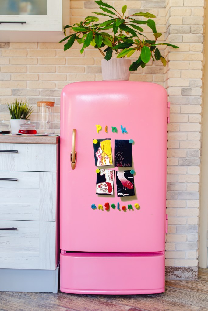
I decided to photograph my final postcards on a… fridge. Whenever you receive a postcard in the post where is the first place you stick it to? The fridge. of course.
I then got the amazing idea in my head to order those kiddie alphabet letter magnets and spell out “Pink Angeleno” whilst they proudly displayed my finished postcards. £8 spent on Amazon later, one next day prime delivery and here I was sat on the floor of kitchen (as you do!) arranging the letters into their letter categories on my freezer door! (FYI the alphabet letters are perfect for spelling out expletives when you cannot seem to get the perfect photograph for your blog!!)
p.s. These magnets from Paperchase are hilarious and cute for the fridge!
I then had what I thought was another brilliant idea…. why use a plain boring white fridge when I could go into a home electronics store and photograph them on a PINK fridge! easy peasy of course… one trip to John Lewis later, (my sister promised me there was a pink fridge in that store – there really wasn’t, it was BLUE (*eyeroll..)
its amazing… expensive and BLUE!…look at the shine on that handle tho!
The assistants in John Lewis thought I was an absolute mad woman trying to stick magnets and postcards to a blue (non magnetic by the way!..) fridge door that I told them like the pro I pretend to be “Its ok! I can photoshop the door Pink!!” (**cue another eyeroll!)
Admitting defeat I returned to the internet in search of a photograph of a beautiful pink fridge. Disappointed as I like to take my own photographs I was swayed by the fact that I found what I thought was THE perfect fridge. The perfect fridge was on Adobe stock photos for £20 a month.. although the first month was a free trial period. Perfect! sign up, get perfect fridge photo, cancel trial!….. Nope! signed up to Adobe stock with not just the wrong but non-existent email (really must learn my uni email addy!)… one rather expensive phone call to Adobe in America later (I’m still not convinced she understood my British accent enough to cancel that wrong account!)… my EE phonebill… through the ROOF! (thank you to the nice EE man for giving me a £30 goodwill gesture refund!) #FAIL. BUT!… It did magically download the desired fridge image..somehow?!
here she is!
Next step was to use my epically bad photoshop skills (I am learning!) to try and mock up something that might look half decent! 3am in the morning later and I kinda have something ok ish that I can work with!